When you stand in a room that feels instinctively ‘right,’ you are likely standing at the intersection of a 3:1 spatial ratio—three parts positive space to one part negative breathing room. This precise architectural proportion is the secret weapon of an elite homestager, ensuring a room feels intentional rather than merely filled. Beyond the furniture, it is the manipulation of volume and the strategic placement of sightlines that dictate whether a buyer feels at home or like a guest in a showroom.
The shift in modern property presentation has moved away from the sterile ‘white box’ aesthetic toward a more evocative, sensory experience. Today, we aren’t just selling square footage; we are selling a lifestyle narrative grounded in tactile authenticity and environmental mindfulness. By layering organic textures and bespoke lighting, we create a spatial cadence that resonates on a subconscious level, turning a walkthrough into an emotional connection.
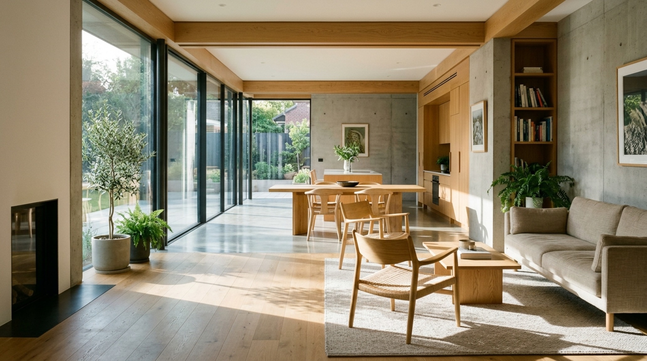
Spatial Flow Staging: The Architecture of Movement
Before a single candle is lit, the layout must breathe. A successful layout prioritizes the primary circulation paths, maintaining a strict 36-inch standard walkway clearance. When we talk about spatial flow staging, we are discussing the choreography of movement through a home. If a potential buyer has to turn their shoulders to pass a sofa or sidestep a dining chair, the psychological spell of ‘easy living’ is broken.
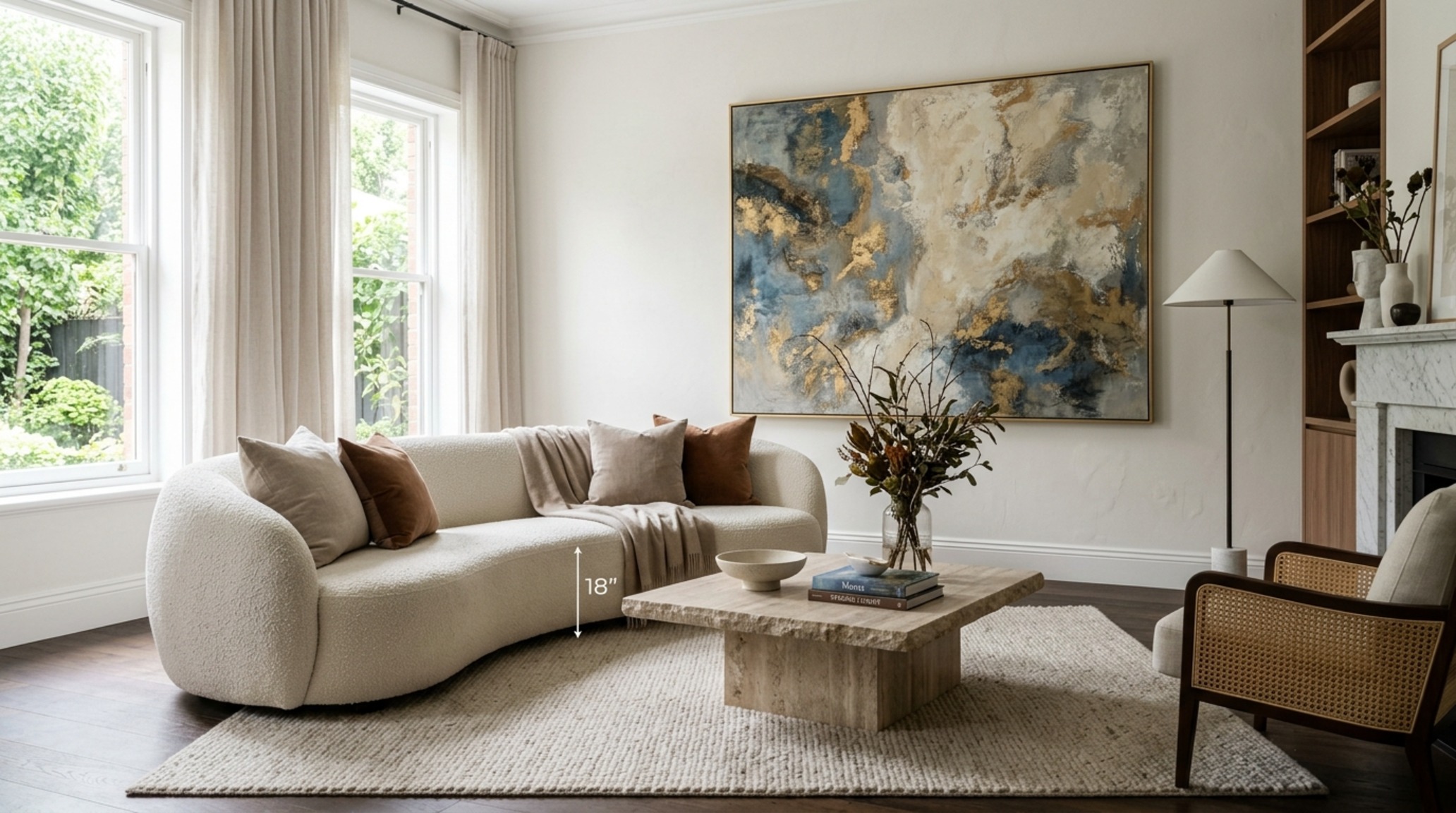
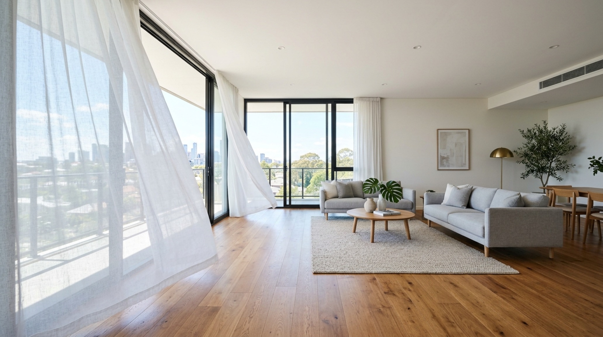
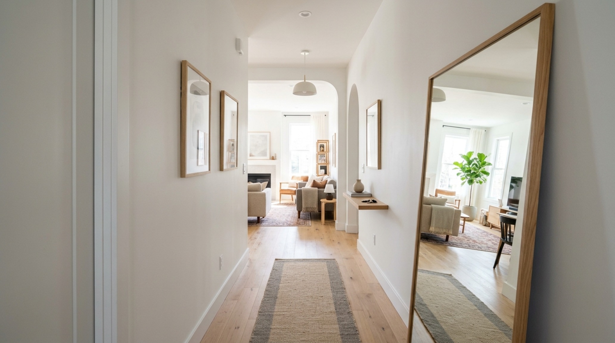
To achieve this, we look at sightline alignment. In an open-plan living area, the back of a sofa should never be the first thing a visitor sees upon entry. Instead, we utilize low-profile silhouettes or floating arrangements that allow the eye to travel across the floor plane to the furthest window. This technique maximizes the perceived volume of the room. We also adhere to the 18-inch coffee table reach rule; it’s a functional ergonomic standard that creates a sense of comfort. If the table is too far, the seating feels disconnected; too close, and the room feels cramped. It is this minute attention to architectural clearances that separates a professional intervention from a DIY attempt.
The Power of Negative Space
Negative space is not ’empty’ space; it is a visual palette cleanser. In high-end property presentation, we purposefully leave corners vacant to emphasize the quality of the floor materials or the height of the baseboards. This allows the hero pieces—perhaps a vintage bouclé armchair or a custom fluted oak console—to command the attention they deserve. By resisting the urge to fill every void, we communicate a sense of luxury and calm.
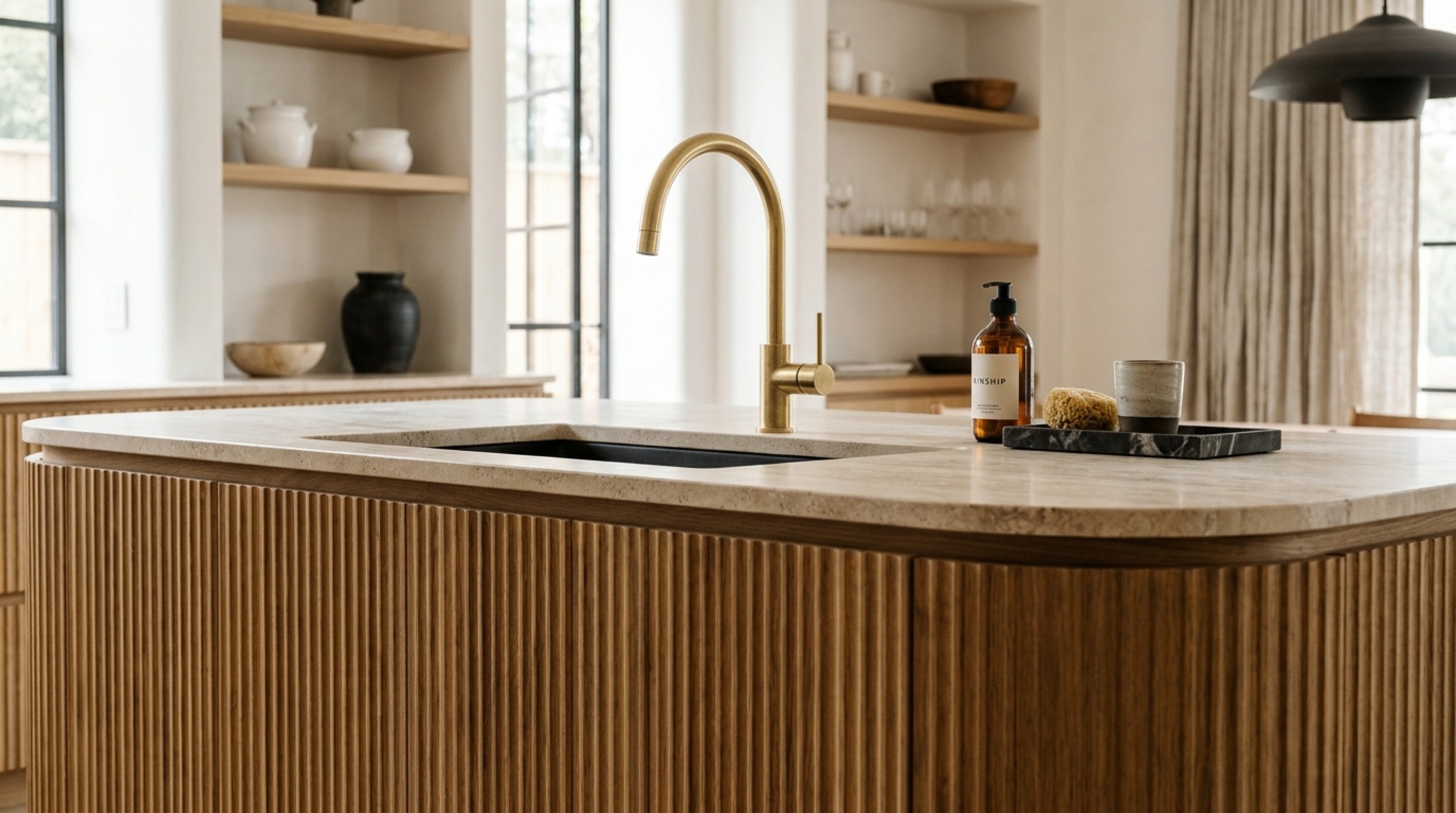
Luxury Staging Trends: Materiality and Tactile Grounding
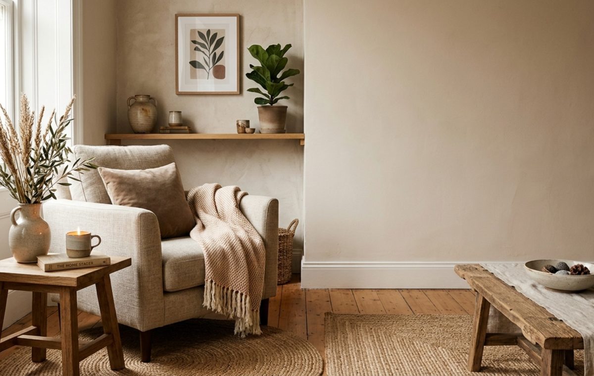
The contemporary market craves honesty in materials. We are seeing a significant departure from synthetic finishes in favor of what I call ‘tactile grounding.’ Luxury staging trends now lean heavily into the use of honed travertine, fluted white oak, and raw linens. These materials have a weight and a temperature that photos can almost transmit through the screen.
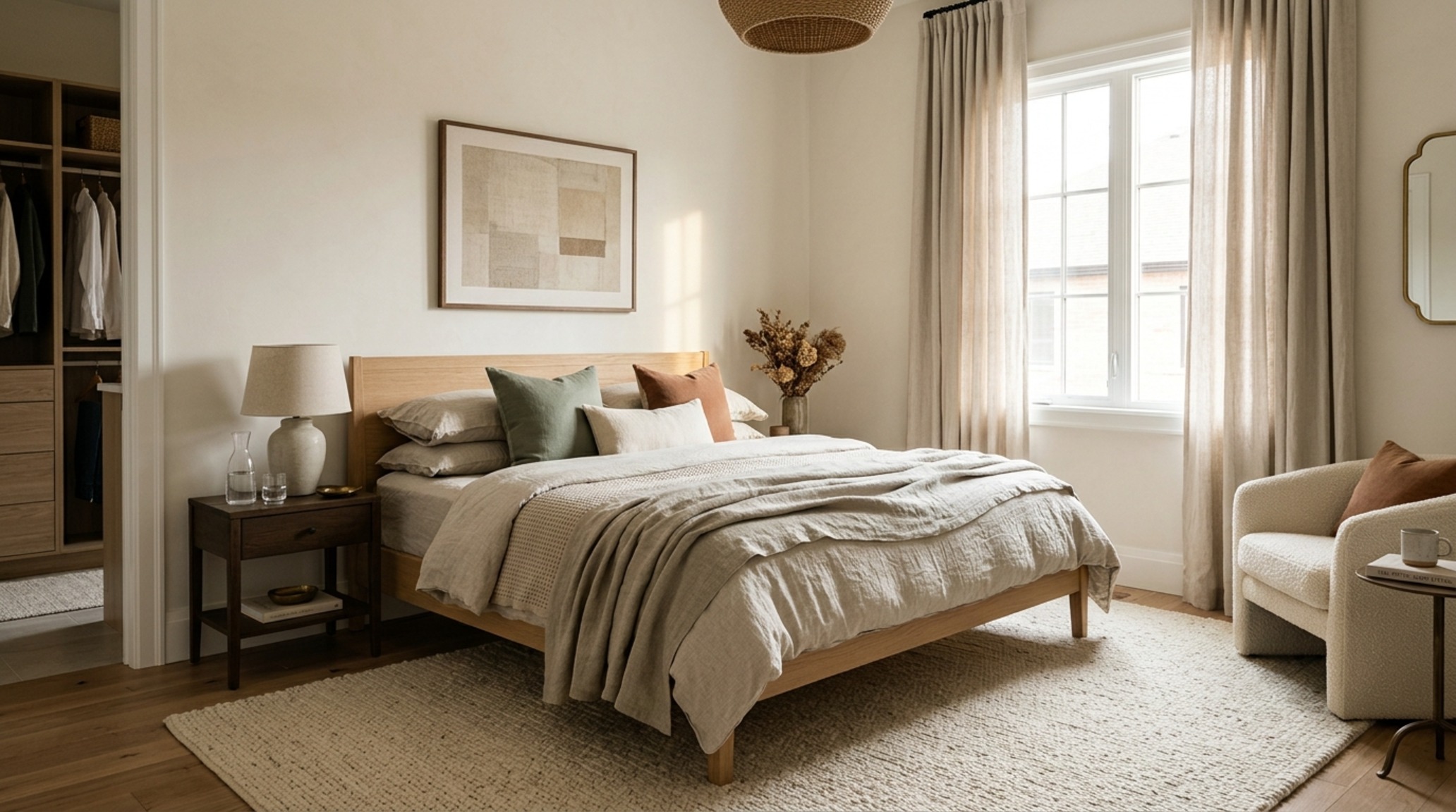
Honed travertine, specifically, offers a matte, sophisticated texture that absorbs light rather than reflecting it harshly. When used in a coffee table or a mantle display, it provides a timeless anchor for the room. We pair these stones with the softness of 100% Belgian linen drapes. The way linen catches the light—with its slight irregularities and natural slubs—adds a layer of ‘lived-in’ luxury that polyester blends simply cannot replicate. This sensory depth is what makes a property feel like a permanent sanctuary rather than a temporary stage.
Integrating Sustainable Finishes
Sustainability is no longer a niche preference; it is a requirement for the modern high-end buyer. We prioritize pieces finished with low-VOC oils rather than heavy lacquers. Reclaimed wood elements, when used sparingly, introduce a sense of history and soul. A single, oversized branch of seasonal greenery in a handmade ceramic vase often does more for a room’s atmosphere than a dozen mass-produced decorative objects. It’s about the quality of the ‘visual calories’ you are feeding the viewer.
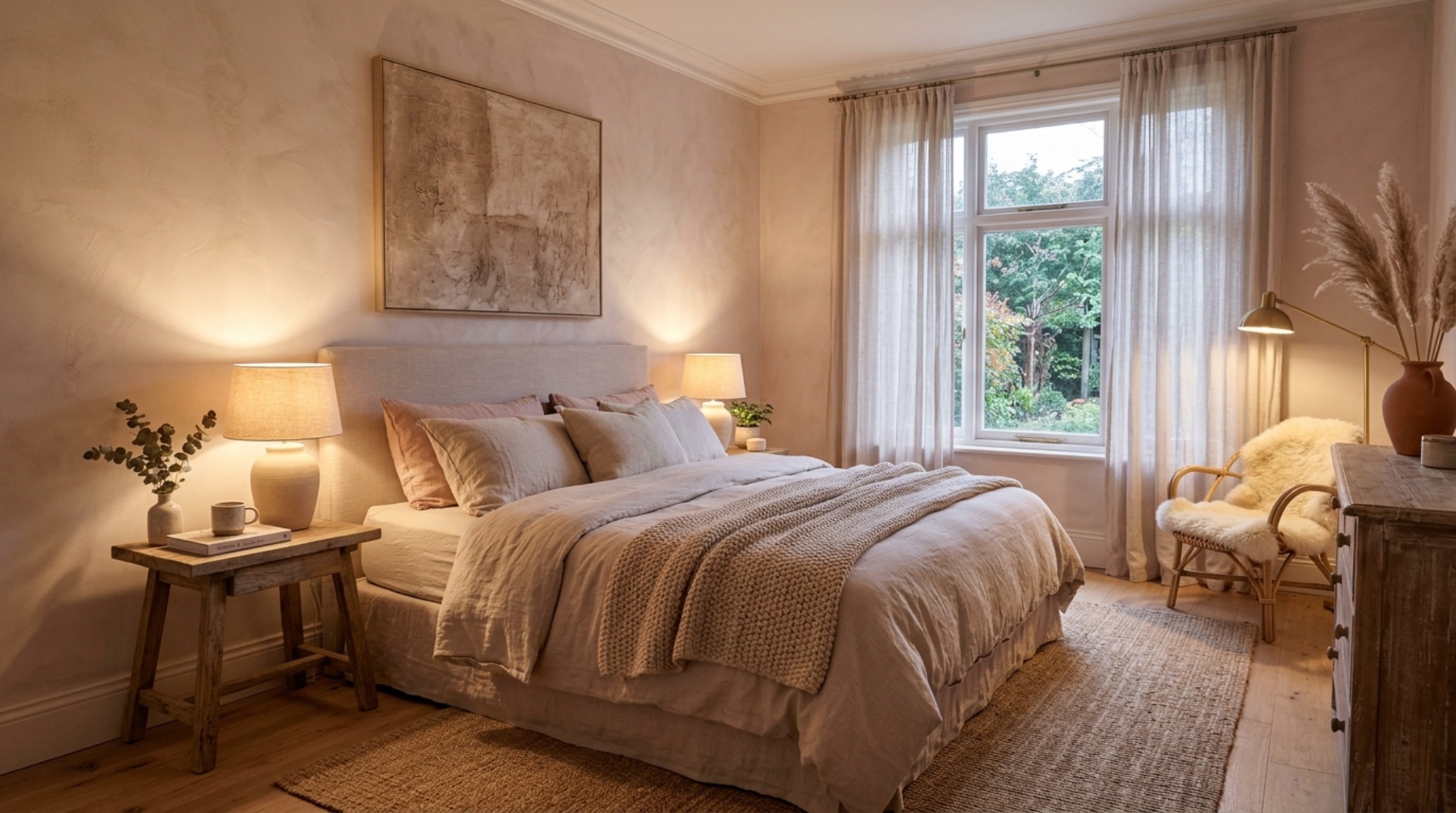
Real Estate Property Styling: The Psychology of the Palette
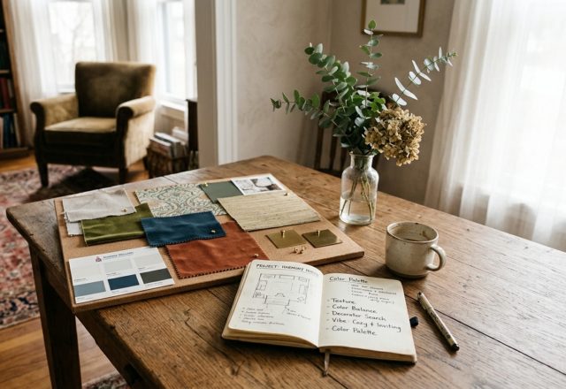
Color is the most immediate way to alter the mood of a space, yet it is often the most misunderstood. When executing real estate property styling, the goal isn’t to be ‘neutral’—which can often translate to ‘forgettable’—but to be ‘atmospheric.’ We utilize complex neutrals that shift with the time of day.
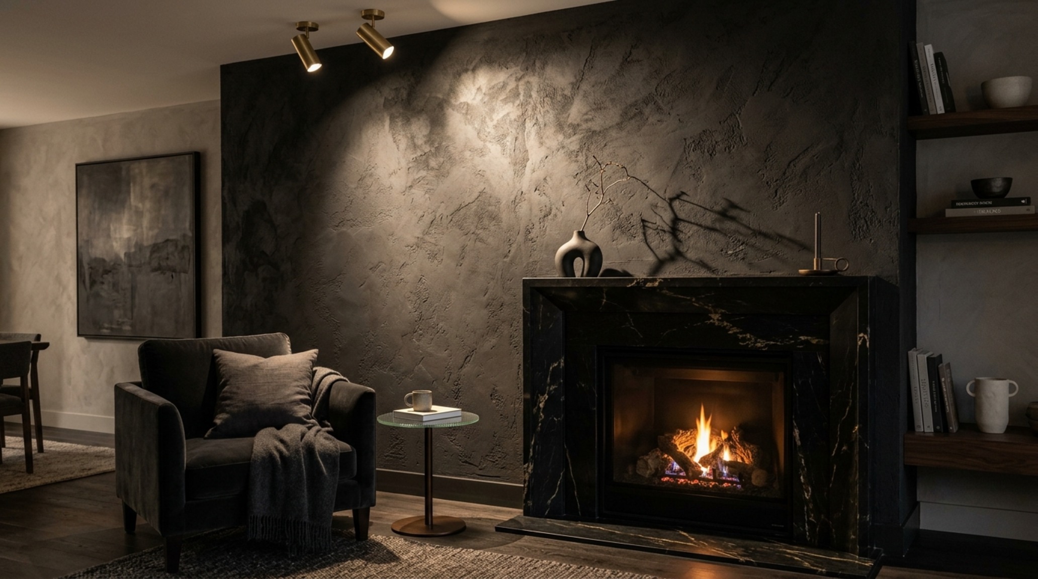
Benjamin Moore’s Swiss Coffee is a staple for a reason; at 75% strength, it provides a warm, creamy backdrop that doesn’t lean too yellow under 2700K lighting. For a more sophisticated, ‘new heritage’ feel, we often turn to Farrow & Ball’s Setting Plaster. This soft, dusty pink acts as a neutral but adds an unexpected glow to a primary suite or a formal dining room. The key is to maintain a cohesive thread throughout the house. We might use a saturated Slate Charcoal in a powder room to create a ‘jewelry box’ effect, but the main living areas remain light and airy to maximize the sense of scale.
Contrast as a Framing Tool
We use high-contrast accents to frame architectural features. A matte black curtain rod or a slim-profile metal floor lamp can act as a graphic line, drawing the eye toward a high ceiling or a particularly beautiful window frame. This ‘shadow play’ adds definition to the softer elements of the room, preventing the design from feeling ‘mushy’ or indistinct in professional photography.
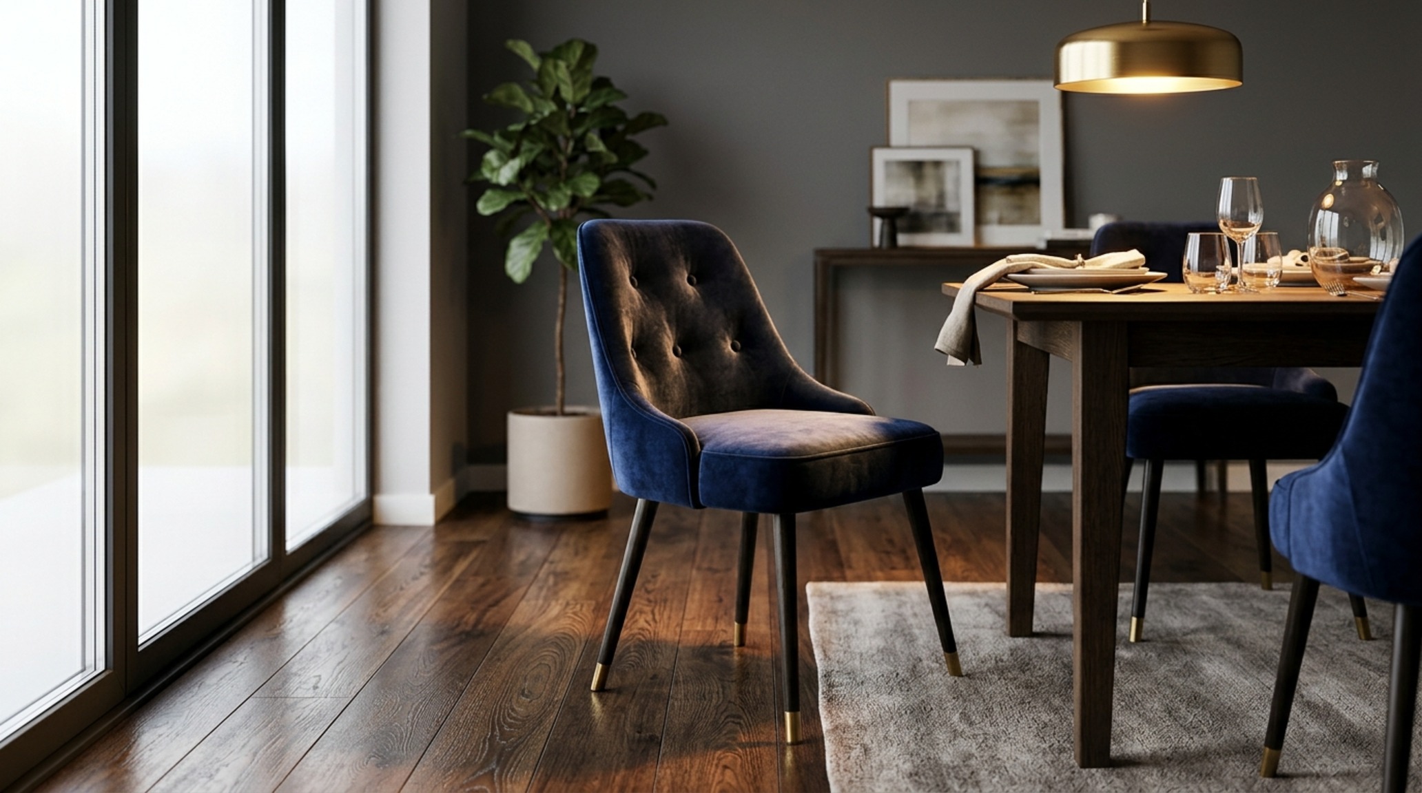
Virtual Homestager Services: Lighting and Digital Precision
In cases where physical furniture isn’t an option, virtual homestager services have evolved to become incredibly sophisticated. We are no longer looking at ‘sims-like’ furniture; we are looking at photorealistic renders that account for light bounce and global illumination. The technical key here is the 90+ CRI (Color Rendering Index) rating of the digital lights.
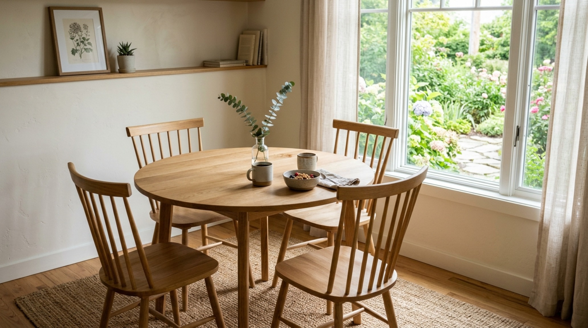
In a physical space, we specify 2700K warm ambient lighting for living areas and 3000K for task-heavy zones like kitchens. When staging virtually, we replicate these temperatures to ensure the digital ‘furniture’ sits naturally within the real architectural shell. We pay close attention to how light hits the ‘grain’ of a virtual wood table or the ‘weave’ of a virtual rug. This level of detail is what convinces a buyer’s brain that the space is habitable and high-quality. Digital staging is most effective when it follows the same architectural clearances—like the 30-inch dining chair pull-out rule—that we use in physical setups.
Homestager Furniture Rental: Curating the Narrative
The logistics of homestager furniture rental are where the strategy meets the pavement. We don’t just rent ‘sets’; we curate collections. A mix of mid-century silhouettes with contemporary sculptural pieces creates a home that looks like it was assembled over time, which is the ultimate hallmark of luxury.
We focus on the ‘anchor’ pieces first: the sofa, the dining table, the bed. These are the items that define the room’s function. For a living room, we might select a curved sofa to soften a room with many hard angles. We then layer in ‘character’ pieces—a vintage stool, a textured rug, or a piece of large-scale abstract art. These elements provide the emotional ‘hooks’ for the buyer. It’s about creating a narrative where they can see themselves hosting a dinner party or reading a book on a Sunday morning.
Professional Homestager Cost: The ROI of Atmospheric Design
Understanding professional homestager cost requires looking at it as an investment in market speed and final sale price. The fee typically covers the design consultation, the logistics of furniture moving, the rental period, and the meticulous ‘fluffing’ of the final look. When a home is styled to this level, it often spends 70% less time on the market.
The value lies in the removal of ‘visual friction.’ When a buyer enters a cluttered or poorly lit home, their brain immediately begins calculating the ‘work’ required to fix it. A professional intervention removes those mental hurdles. We address everything from the scent (think subtle notes of cedar and bergamot rather than overpowering florals) to the acoustic quality of a room (using rugs and drapes to dampen echoes). This holistic approach ensures the property is perceived as ‘turn-key,’ which carries a significant premium in today’s market.
Material Schedule & Architectural Clearances
Summary of authentic finishes, designer paint selections, and standard architectural clearances.
Before you embark on your styling journey, remember that the most successful homes are those that balance high-design principles with an approachable, human warmth. Start with a rigorous decluttering to reveal the ‘bones’ of the house, then systematically layer in your layout, your materiality, and your light. By working with a homestager, you are not just decorating a house; you are articulating its potential. As we look toward the future of residential design, the homes that will stand out are those that prioritize this sensory-rich, sustainable, and spatially intelligent approach. It is in the quiet alignment of a sightline or the soft texture of a plaster wall that the true feeling of home is found.
Editorial Silo • Recommended Architecture Studies
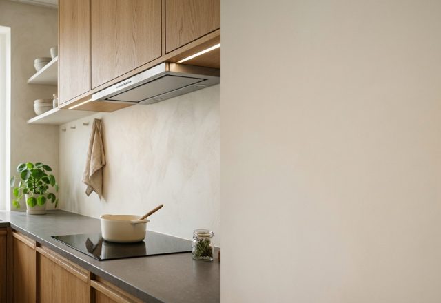
- 12 Range Hood Styles: Minimalist Designs — Archival Design Case Study
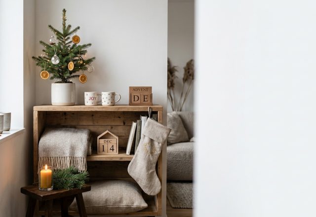
- Christmas decoration designs for seamless compact living — Archival Design Case Study
The Curated Design Compendium
An intimate visual portfolio documenting the intersection of ergonomic utility and bespoke aesthetic warmth.

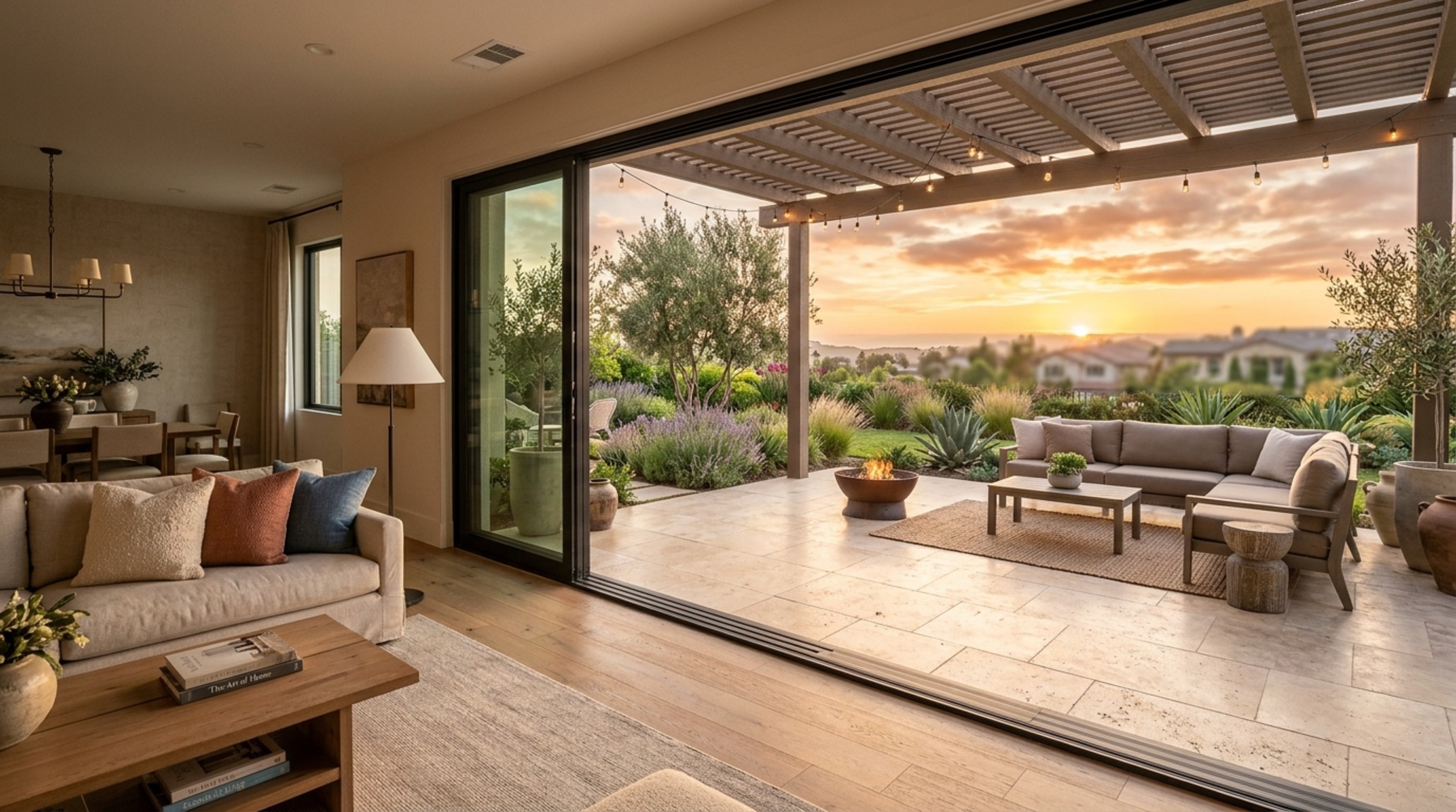
Curated Visual Lookbook
Design Gallery & Spatial Studies
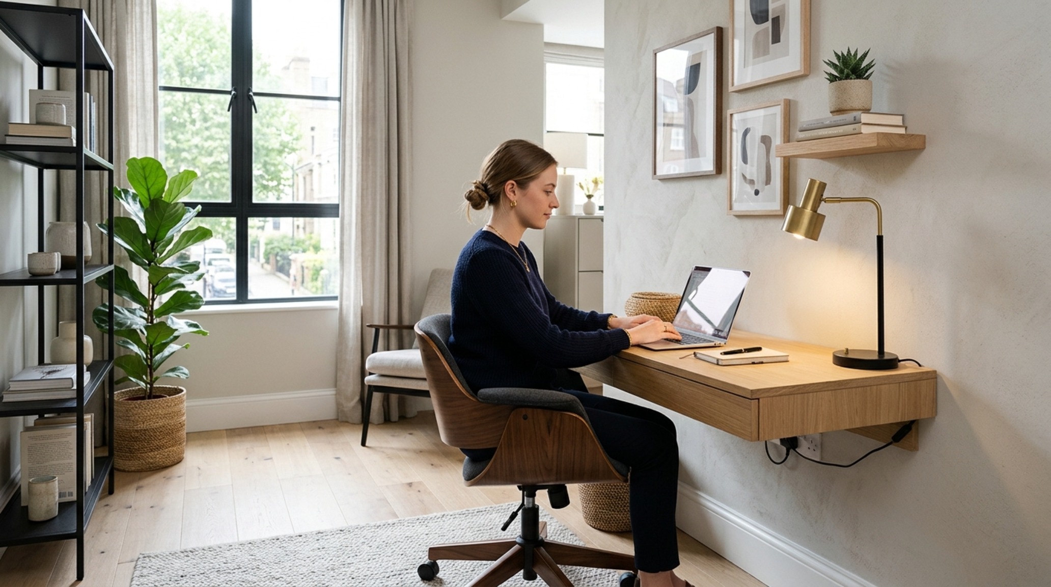
A visual curation of architectural arrangements, lighting concepts, and material palettes featured in this space.