The Architecture of Intimacy: Beyond the Utility of the Countertop
Why is it that some high-end kitchens feel like a cold, sterile laboratory, while others draw us in with an almost magnetic pull? We often mistake expensive stone and high-end appliances for the soul of the room, yet the most profound design tension usually lies in how we negotiate the space between the stove and the guest. In modern residential architecture, the success of kitchen layouts is the silent arbiter of whether a home feels like a sanctuary or a high-traffic transit hub.
The shift in 2025 isn’t just about color; it is about the sculptural manipulation of volume. We are seeing a move away from the rigid, perimeter-bound thinking of the past toward a more fluid, sensory-driven approach. By understanding the interplay of light, the ‘weight’ of materials like honed travertine or fluted oak, and the rhythmic logic of spatial clearances, we can transform a functional utility into a social sculpture. This requires a departure from the generic and a deep dive into how architectural logic meets human emotion.
L-Shaped Kitchen Floor Plans: Opening the Sightlines of a Home
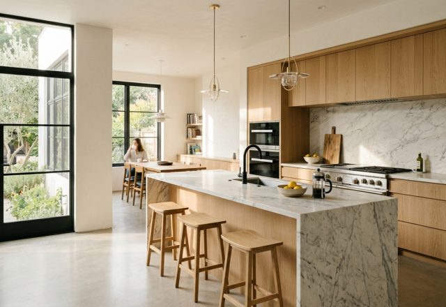
The L-shape has long been the workhorse of the residential floor plan, but in contemporary high-end design, it is being reimagined as an exercise in negative space. By anchoring cabinetry to two perpendicular walls, we liberate the remainder of the room to breathe. L-shaped kitchen floor plans are particularly effective in homes where the kitchen must share its DNA with the dining or living area without overwhelming the aesthetic.
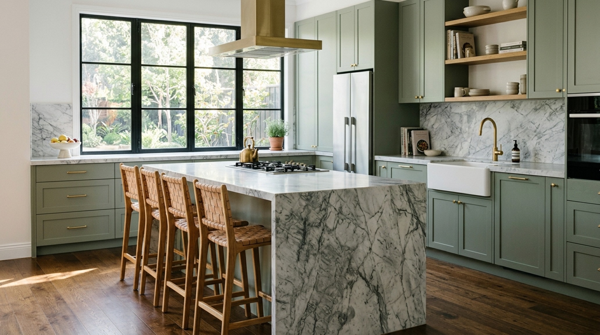
To elevate this layout from ‘standard’ to ‘bespoke,’ designers are now utilizing ‘concealed kitchen’ elements. Imagine a run of tall cabinetry in a deep, biophilic shade like Farrow & Ball’s Studio Green, where the appliances are hidden behind pocket doors. This allows the kitchen to visually retreat when not in use, behaving more like a piece of sophisticated millwork than a utility zone. The ‘short side’ of the L often becomes a dedicated coffee or dry bar, utilizing a different material palette—perhaps a mirrored backsplash or a distinct stone—to signal a change in function and mood.
Galley Kitchen Spatial Flow: Mastering the Corridor of Light
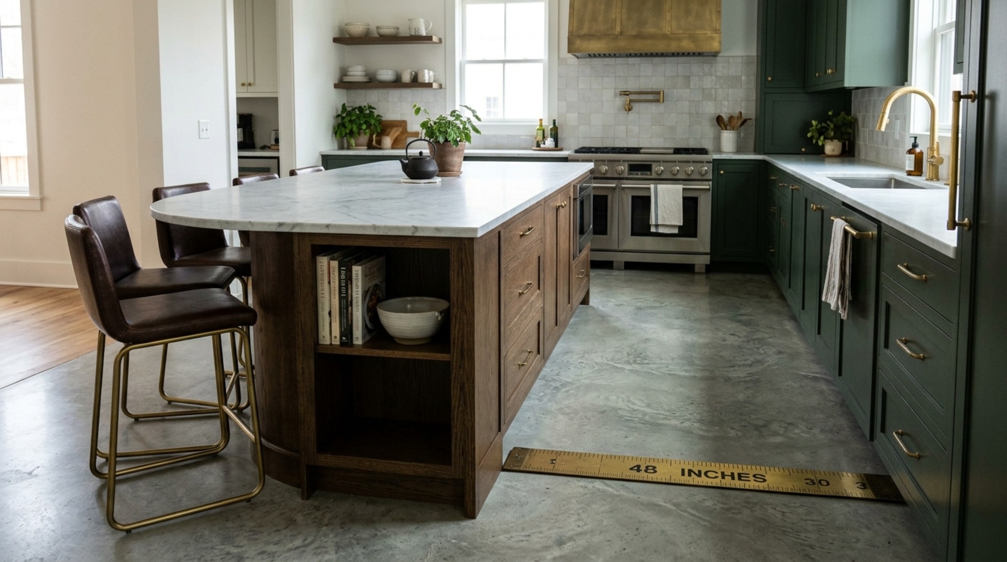
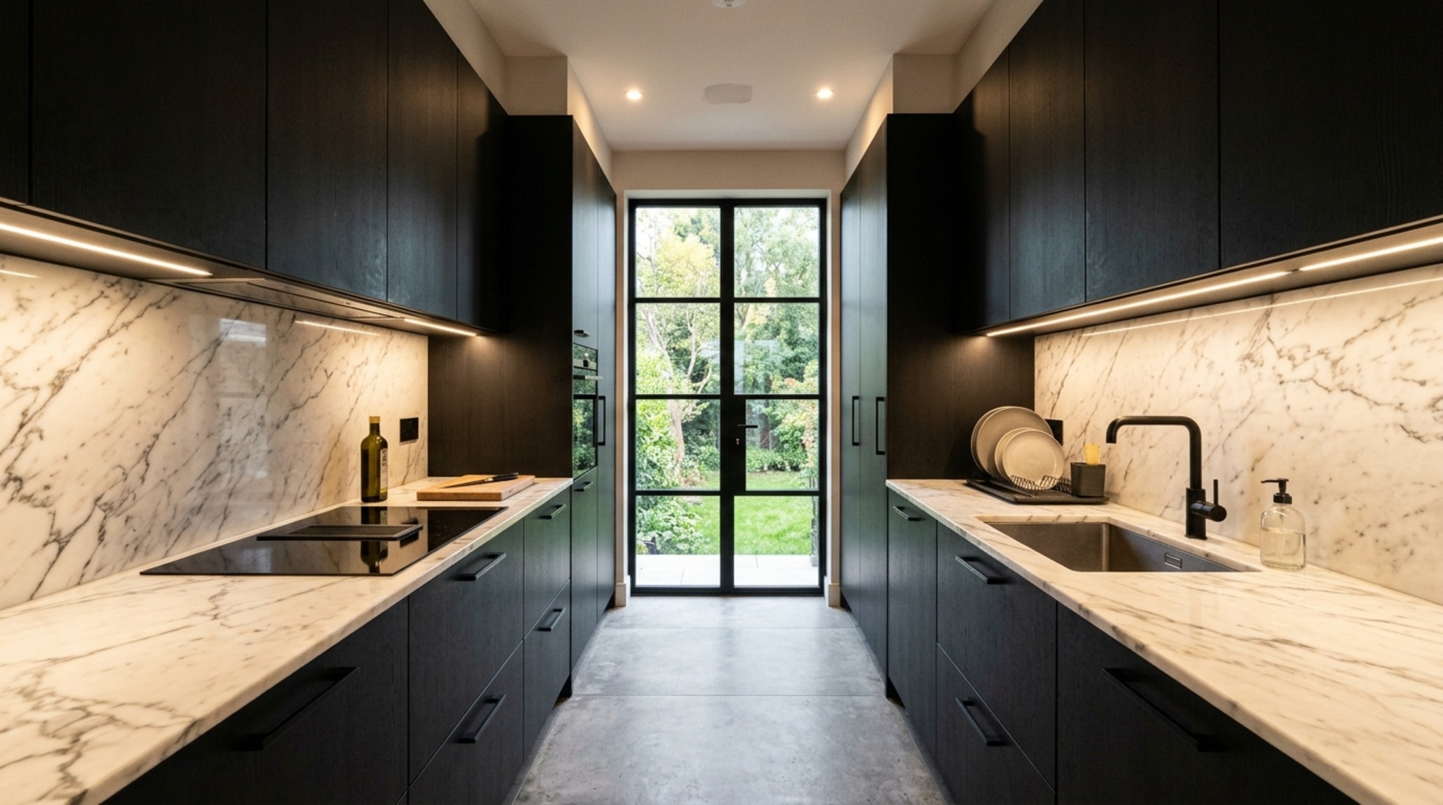
Often dismissed as a relic of cramped urban apartments, the galley is experiencing a renaissance as a masterclass in efficiency and dramatic lighting. The modern galley kitchen spatial flow is no longer about a narrow squeeze; it is about creating a powerful architectural axis. When designed with a minimum 48-inch walkway, the galley becomes a runway of texture and light.
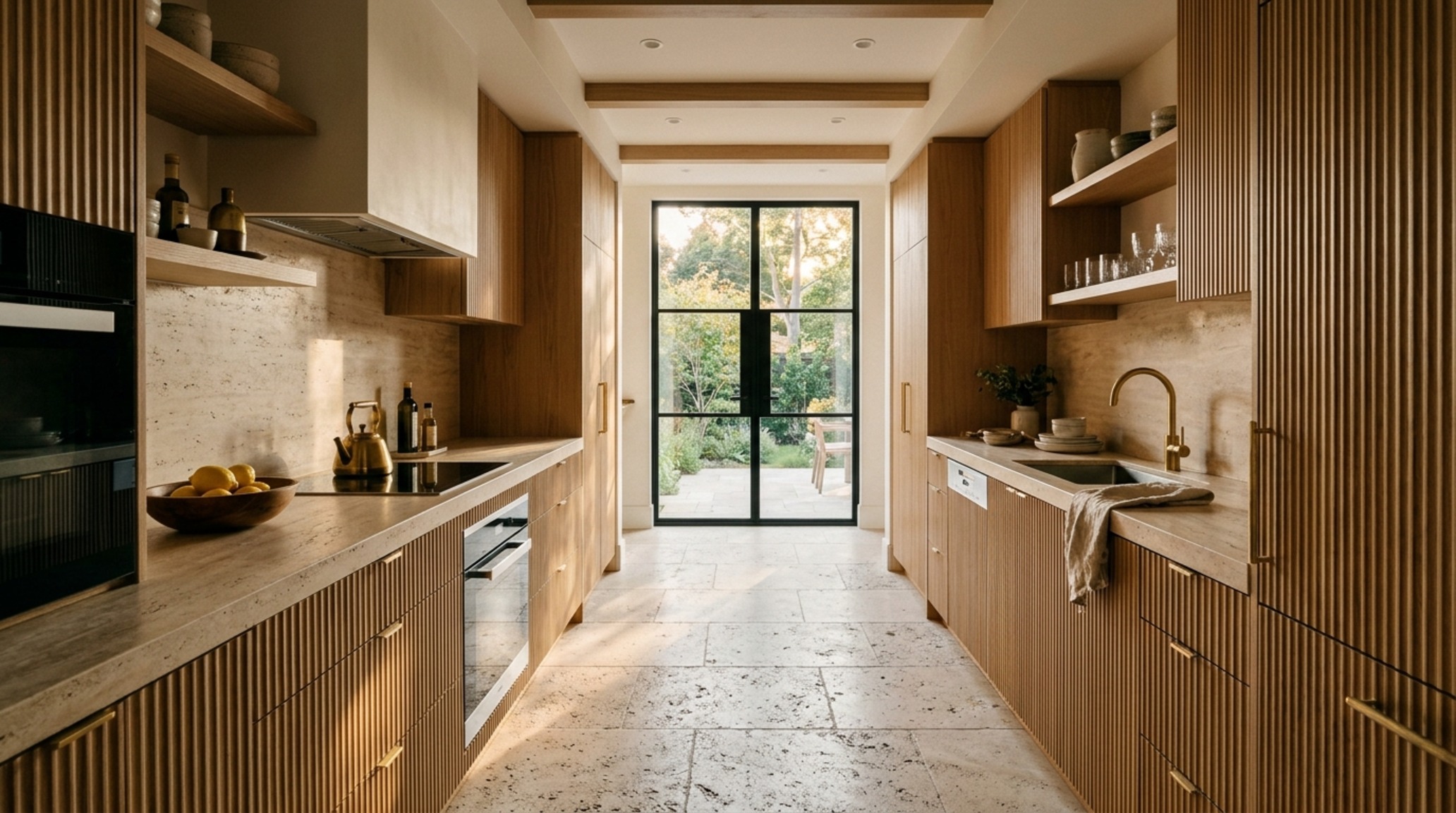
The key here is ‘material weight.’ By placing heavy, dark cabinetry on the lower half and opting for floating shelves or ‘skinny shaker’ glass-fronted uppers, we pull the eye upward and prevent the ‘tunnel’ effect. To maximize light, we often align the galley with a primary window or a set of steel-framed French doors. This ensures that natural light grazes the vertical surfaces, highlighting the tactile grain of sandblasted oak or the subtle movement in a marble backsplash. It is a layout that demands precision—every inch is accounted for, and every sightline is curated.
Kitchen Work Triangle vs Zones: The 2025 Functional Shift
For decades, the ‘work triangle’ (the path between the sink, fridge, and stove) was the gold standard of kitchen design. However, as kitchens have evolved into multi-functional social hubs, this rigid rule is being replaced by ‘zoning.’ The debate of kitchen work triangle vs zones is central to how we live today. Zoning acknowledges that the modern kitchen isn’t just for one cook; it’s for a family that is simultaneously making school lunches, hosting a wine tasting, and finishing homework.
“The luxury of a modern kitchen isn’t found in the BTU of the range, but in the lack of friction. It is the ability for two people to pass one another without a choreographed dance.”
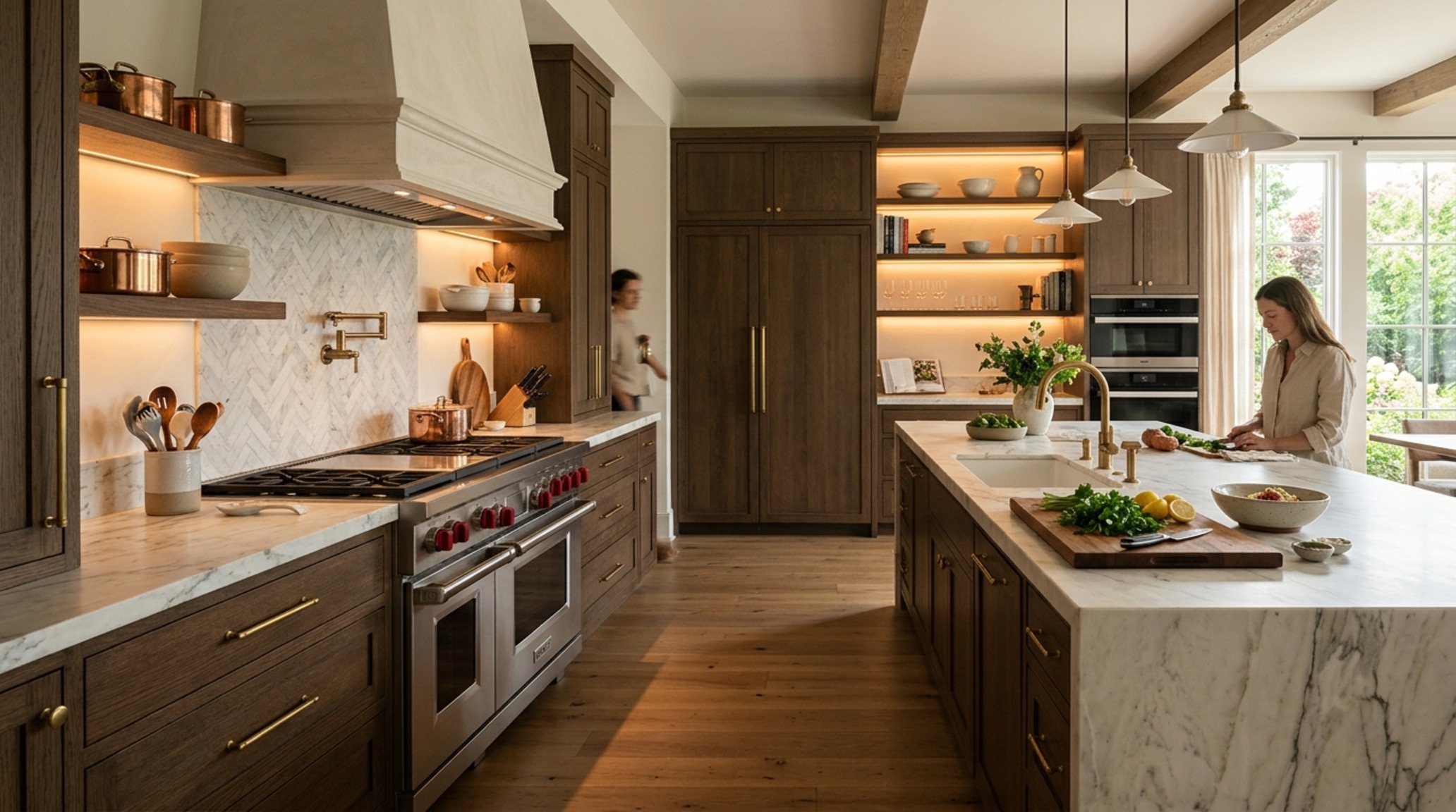
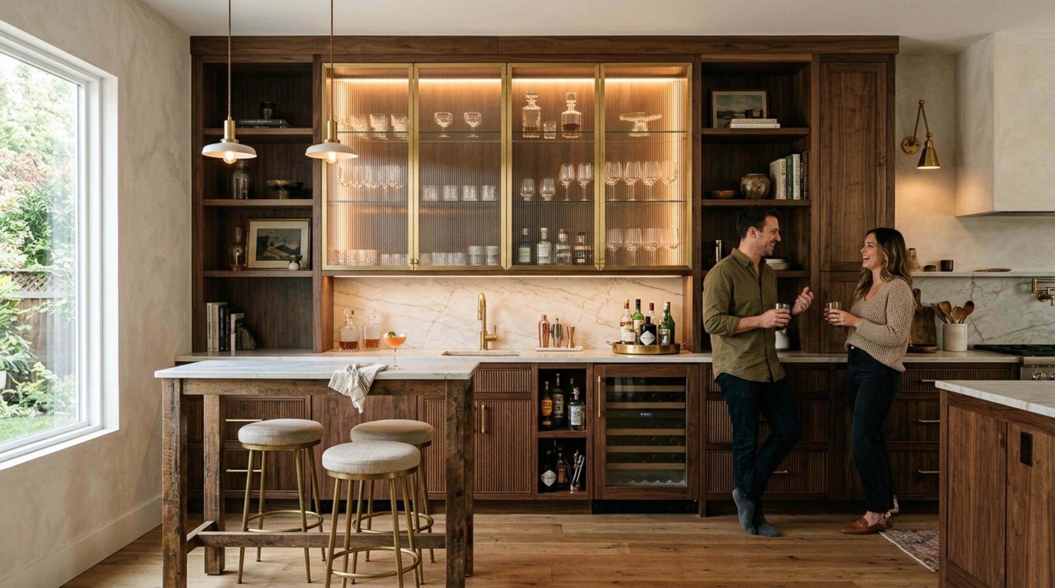
In a zoned layout, we group appliances by activity: a ‘prep zone’ with a secondary sink, a ‘cooking zone’ near the range, and a ‘social zone’ near the island. This prevents the primary cook from being trapped in a high-traffic cross-section. We often use lighting to define these zones—3000K high-CRI task lighting over the prep areas, while 2700K warm ambient light glows from within open shelving or beneath the island’s toe-kick to ground the social space.
Ergonomic Kitchen Design Rules: The Math of Comfort
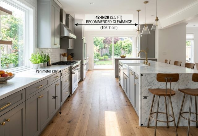
Beauty without ergonomics is a betrayal of design. To create a space that feels effortless, we must adhere to the ‘math of the room.’ Ergonomic kitchen design rules dictate the invisible boundaries that make a space feel right. This includes the standard 36-inch counter height, but also the nuanced clearances that are often overlooked: the 42-inch minimum for a single-cook walkway and the 48-inch requirement for a shared path.
We also consider the ‘reach’ of the user. For instance, a dishwasher should never be placed in a way that blocks the path to the cabinet where the dishes are stored. Pull-out pantries and ‘magic corners’ in U-shaped layouts ensure that no item is ever lost in the ‘dead zone’ of a deep cabinet. These are the details that separate a high-end custom build from a generic renovation—the recognition that every movement within the space should be fluid and intuitive.
Island vs Peninsula Clearance: Balancing Scale and Sociality
The choice between an island and a peninsula is often a question of footprint, but it is also a question of social dynamics. Island vs peninsula clearance is the most common technical hurdle I see in my practice. A freestanding island requires a minimum of 36 inches of clearance on all sides to remain functional, though 42 to 48 inches is the sweet spot for a truly luxurious feel.
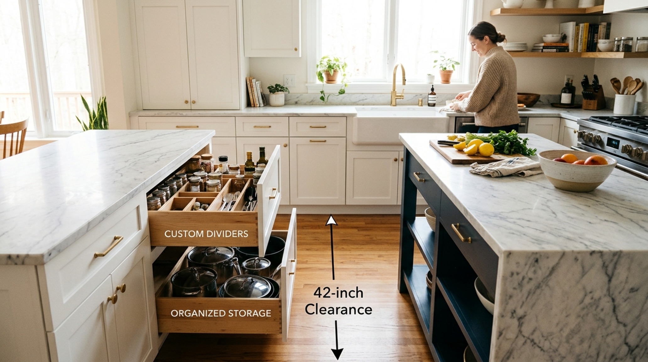
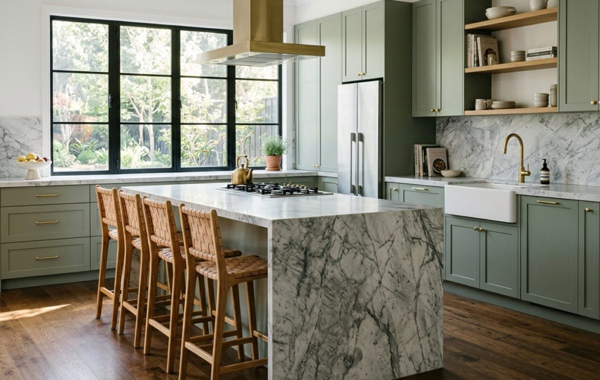
In tighter spaces, a peninsula—which is attached to a wall or cabinetry—can offer the same social benefits as an island without the heavy circulation requirements. For 2025, we are softening these structures with curved joinery. A radius-cornered island in a soft Sage or Emerald biophilic palette breaks up the hard right angles of the room, making the traffic flow feel more organic. This ‘sculptural grounding’ turns the island into a piece of furniture rather than just a storage box.
Small Kitchen Layout Dimensions: The Luxury of the Compact
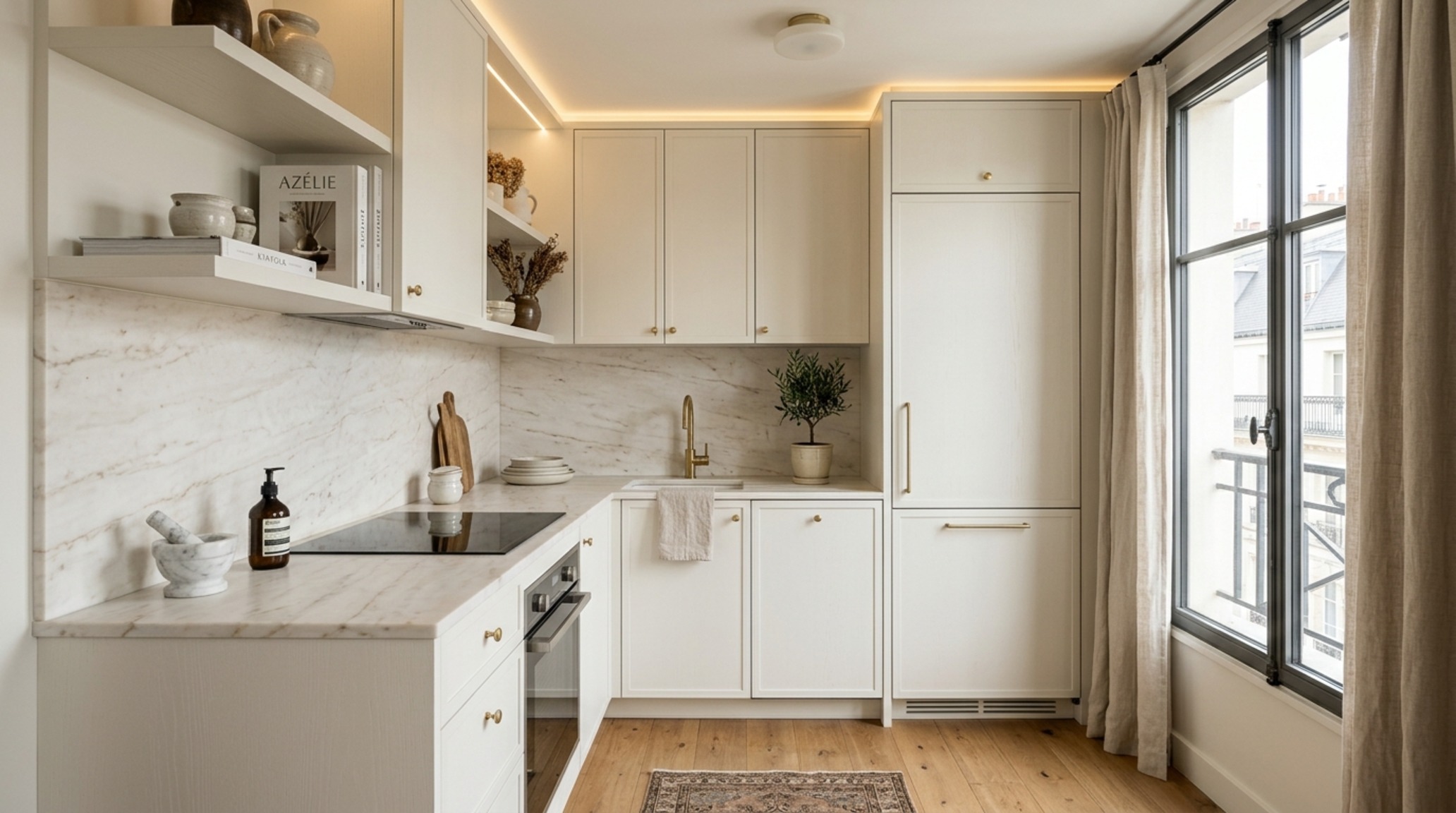
A lack of square footage should never be an excuse for a lack of style. In fact, small kitchen layout dimensions often force the most creative architectural solutions. The ‘concealed’ kitchen trend is a lifesaver here. By integrating the refrigerator and dishwasher with custom panels that match the cabinetry, we eliminate visual clutter, which makes the room feel significantly larger.
We also look at ‘verticality.’ In a small space, taking cabinetry all the way to the ceiling creates a sense of height. Utilizing a monochromatic color palette—perhaps Benjamin Moore’s Swiss Coffee on both the walls and the cabinets—blurs the boundaries of the room. When the eye doesn’t hit a hard stop at a color change, the brain perceives the space as continuous and expansive. Mirroring this with a 12-inch deep ‘skinny’ pantry can provide massive storage without encroaching on the precious 36-inch circulation paths.
Design Anatomy & Specification Guide
Bespoke specification schedule outlining tactile textures, lighting ambiance, and ergonomic proportions.
Ultimately, the most successful kitchen layouts are those that honor the messy, beautiful reality of human connection. Whether you are working with a sprawling L-shape or a surgical galley, the goal is to create a rhythm—a cadence of stone, wood, and light that welcomes the spirit as much as it serves the chef. As we look toward the future of the home, the kitchen remains our most vital sculpture, a place where the logic of architecture meets the warmth of the soul.
Editorial Silo • Recommended Architecture Studies
- Ergonomic Mastery: Functional & Space-Saving Hacks for Kitchen Cabinet Floor Plans — Archival Design Case Study
- The Architect’s Aisle: How To Design A Kitchen Island & Master the Precision of Kitchen Island Proportions — Archival Design Case Study
The Design Journal Lookbook
Architectural studies focusing on material integrity, natural light articulation, and serene proportions.
Curated Visual Lookbook
Design Gallery & Spatial Studies
A visual curation of architectural arrangements, lighting concepts, and material palettes featured in this space.