The Geometry of Human Movement: Why Performance Architecture Starts in the Kitchen
Morning light has a way of exposing the subtle friction in a room, catching on the hard edges of a poorly planned island or highlighting the cramped neck of a dead-end corridor. When we discuss the fundamental architectural logic of kitchen lay outs, we are really talking about the silent choreography of daily life—the invisible pathways that dictate whether a morning coffee feels like a ritual or a hurdle. It is a discipline where millimeters matter more than moods, and where the quantitative data of human reach determines the long-term success of the home’s most vital organ.
For the modern homeowner, the shift toward high-efficiency living has moved the conversation beyond the mere aesthetics of Shaker cabinets and marble slabs. We are now in an era of performance architecture, where the primary objective is to minimize ‘step-fatigue’ and maximize the intuitive flow of movement. This means prioritizing ergonomic landing zones, calculating precise circulation paths, and acknowledging that a kitchen must adapt as we age. When kitchen lay outs are executed with mathematical precision, the space becomes an extension of the body, allowing for a seamless transition between prep, cook, and clean cycles without the mental load of a clunky floor plan.
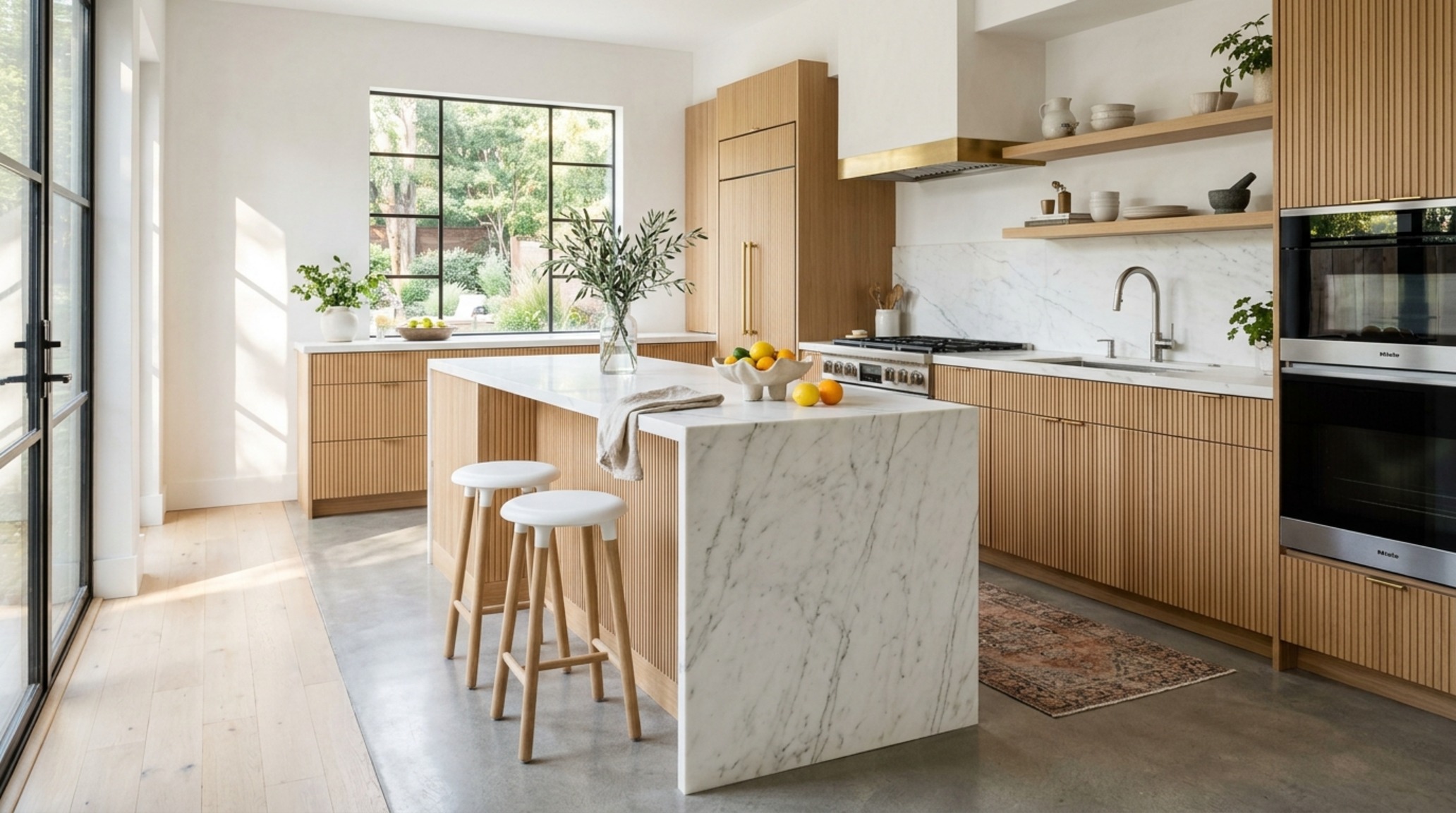
Kitchen Island Clearance: The Social and Functional Buffer
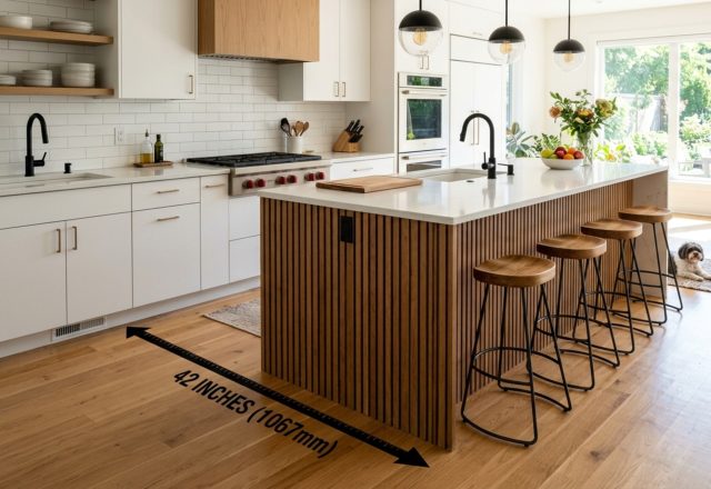
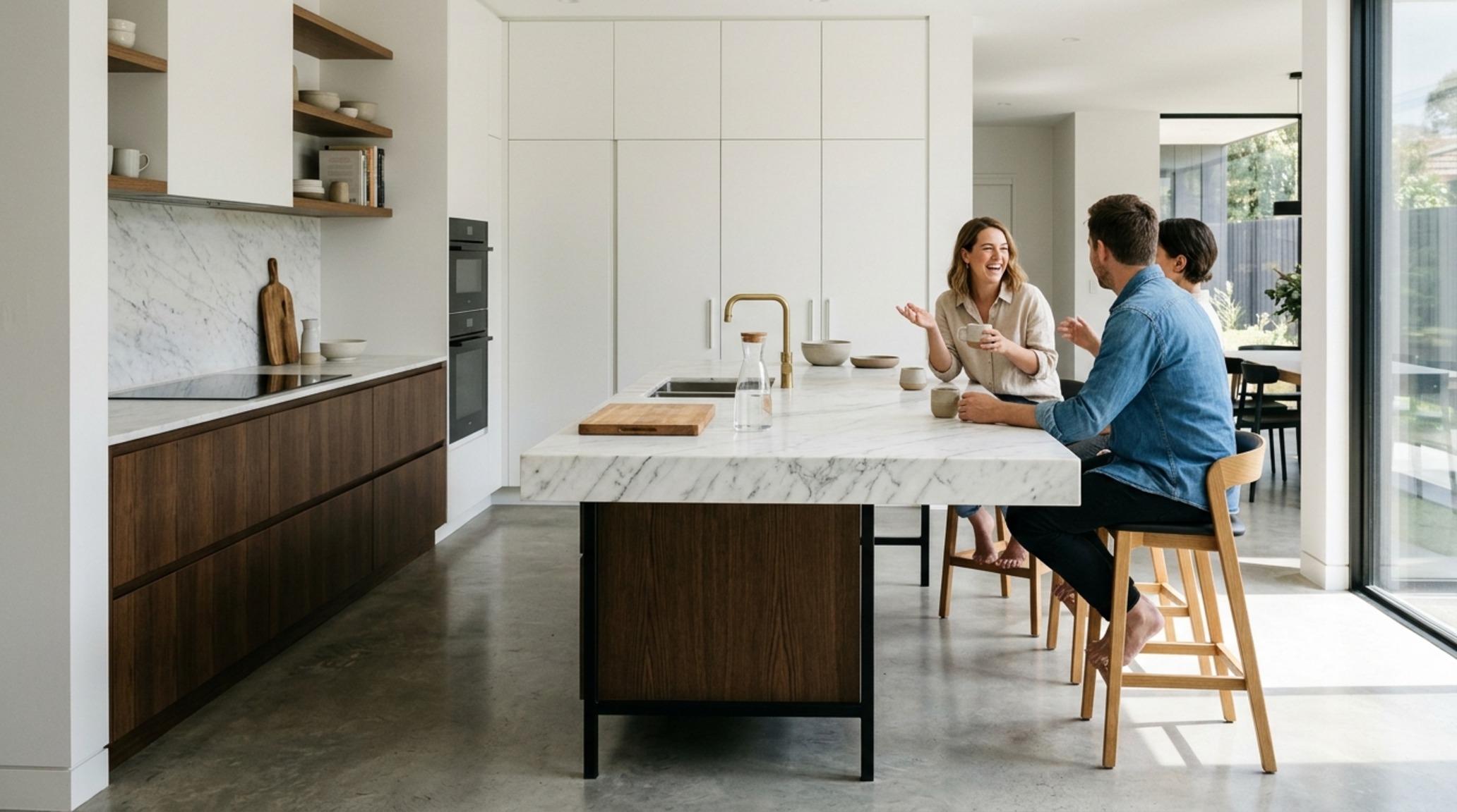
The island is frequently the gravitational center of the modern home, yet it is also the most common site of spatial failure. Getting the kitchen island clearance right is the difference between an effortless social hub and a permanent architectural bottleneck. Professionally, I advise a minimum of 42 inches for a single-cook aisle, but for households where multiple people are prepping simultaneously, 48 inches is the gold standard. This allows two people to pass back-to-back without the ‘kitchen dance’—that awkward shuffle of tucking in elbows and hips to let someone else through.
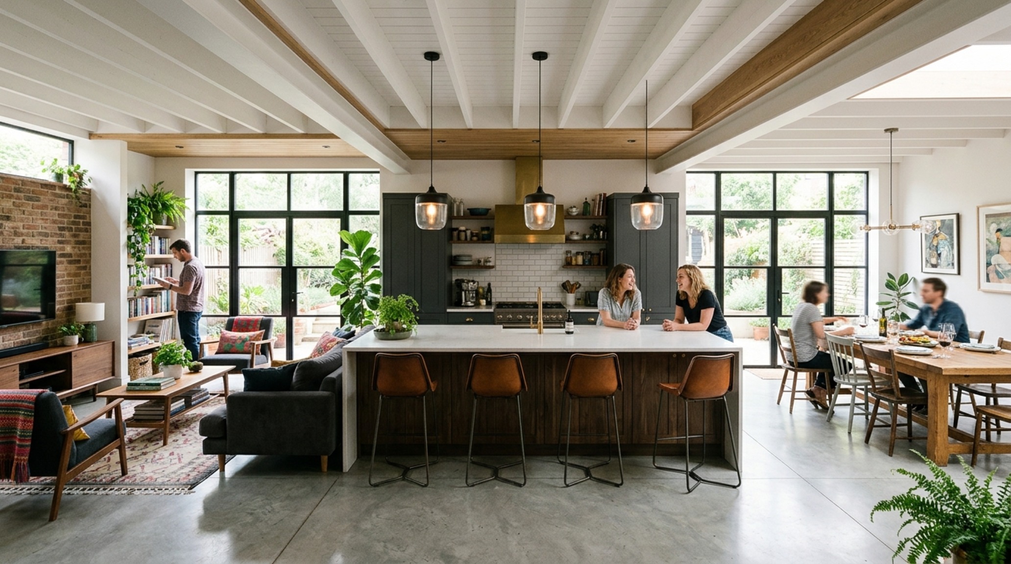
Beyond the walkway, we must consider the landing zone. An island without a dedicated 15 to 18 inches of clear counter space adjacent to the primary sink or cooktop is a missed opportunity. This ‘landing strip’ is where the ergonomics of heavy lifting come into play; you need a place to immediately set a hot tray or a heavy bag of groceries. When the kitchen island clearance is optimized, it also facilitates better sightline alignment, ensuring that the person cooking remains part of the conversation happening in the adjacent living areas without feeling isolated behind a mountain of cabinetry.
L-shaped Kitchen Dimensions: Solving the Corner Conundrum
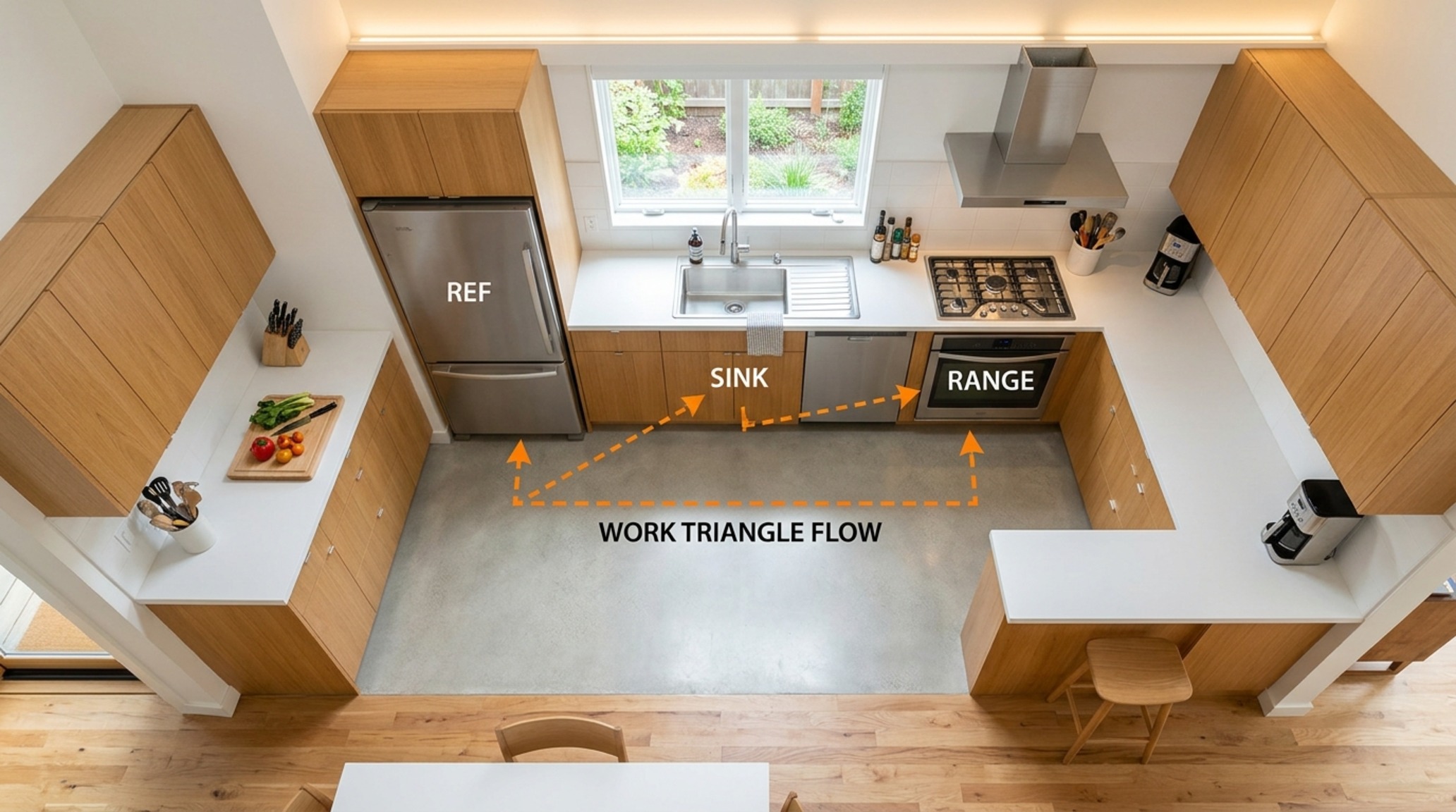
The L-shape is perhaps the most versatile of all kitchen lay outs, but its success hinges entirely on the management of the ‘dead corner.’ When we analyze L-shaped kitchen dimensions, we focus on the efficiency of the two perpendicular runs of cabinetry. Ideally, the primary work triangle—the distance between the refrigerator, sink, and stove—should total no more than 26 feet, with no single leg of the triangle being shorter than 4 feet or longer than 9 feet. This ensures that everything remains within a pivot and a step.
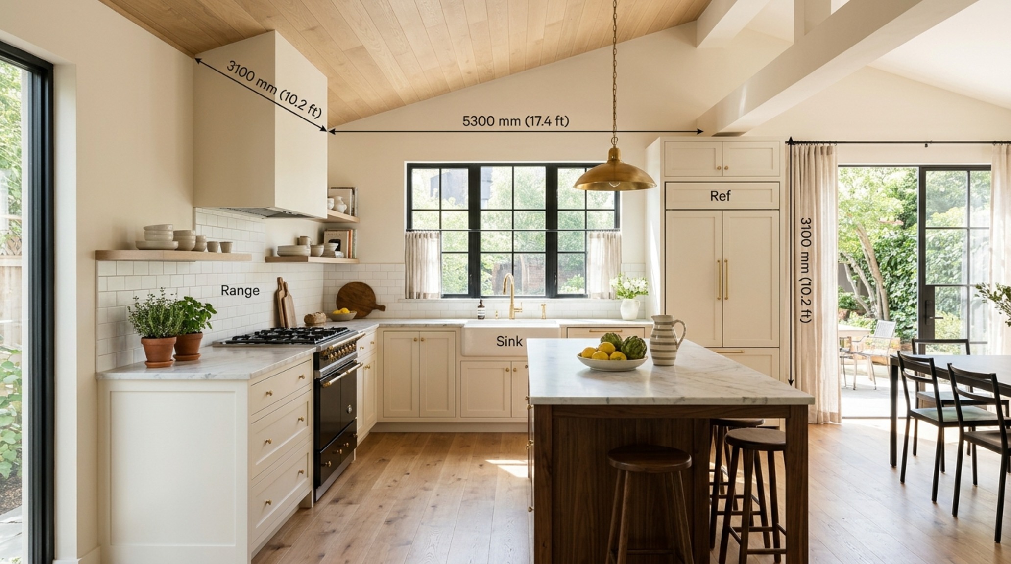
In a well-designed L-shape, the corner is often reclaimed through the use of sophisticated internal hardware like LeMans pull-outs or ‘magic corners,’ which bring the contents of the deep cabinet out to the user. From an architectural perspective, this layout excels in open-plan homes because it naturally defines the kitchen’s boundaries without the need for physical walls. By keeping one side open to the dining area, you create a sense of ‘spatial breathing room’ that prevents the kitchen from feeling like a utilitarian box. We often pair these dimensions with a high-contrast palette, perhaps a deep charcoal like Farrow & Ball Railings on the lower cabinets against a soft, luminous wall color like Benjamin Moore Swiss Coffee, to ground the space visually.
U-shaped Kitchen Efficiency: The Architectural Pivot
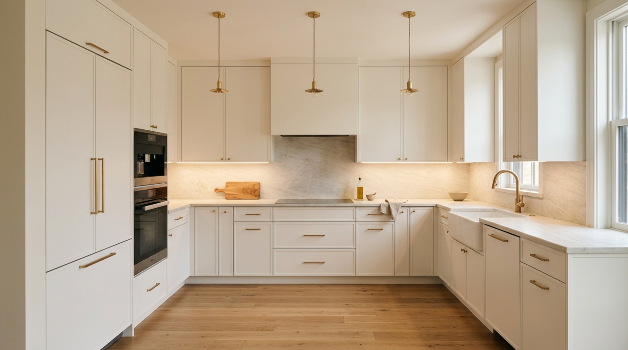
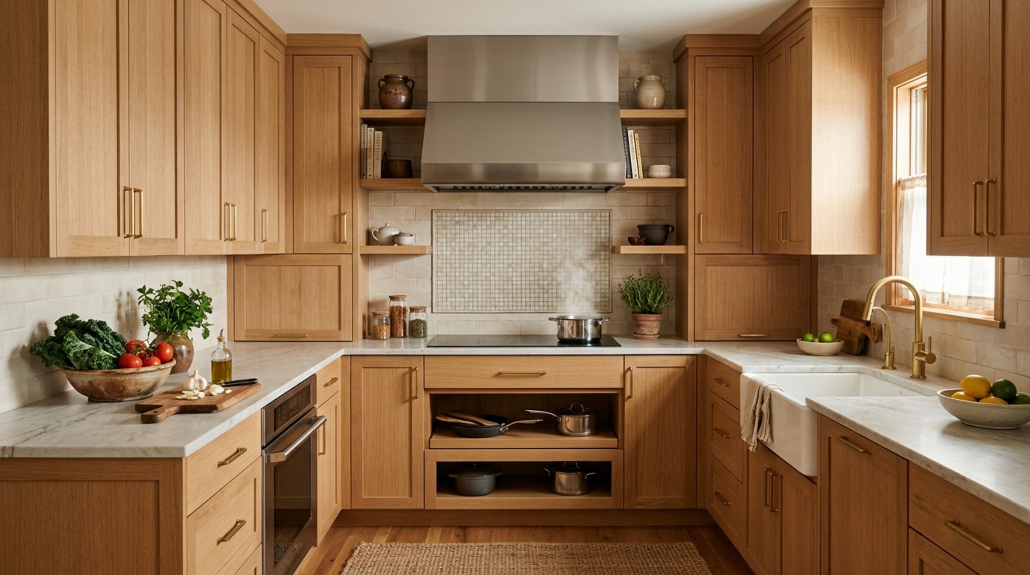
For the serious home chef, u-shaped kitchen efficiency is often the holy grail of spatial design. This layout provides a wraparound workspace that puts the cook at the center of a three-sided cockpit. The primary advantage here is the sheer volume of continuous countertop space, which allows for dedicated zones: one for baking, one for prep, and one for clean-up. However, the risk with a U-shape is ‘spatial enclosure’—if the room is too narrow, the three walls of cabinetry can feel claustrophobic.
To maintain u-shaped kitchen efficiency without sacrificing the airy feel of a modern home, we often omit upper cabinets on one or two of the walls. Replacing them with floating white oak shelves or simply leaving the wall plane clean creates a sense of negative space that allows the eye to rest. This is particularly effective when working with high ceilings. The ergonomics here are superior because the distance between the sink on one wall and the cooktop on the other is minimized, reducing the physical toll of preparing complex, multi-course meals.
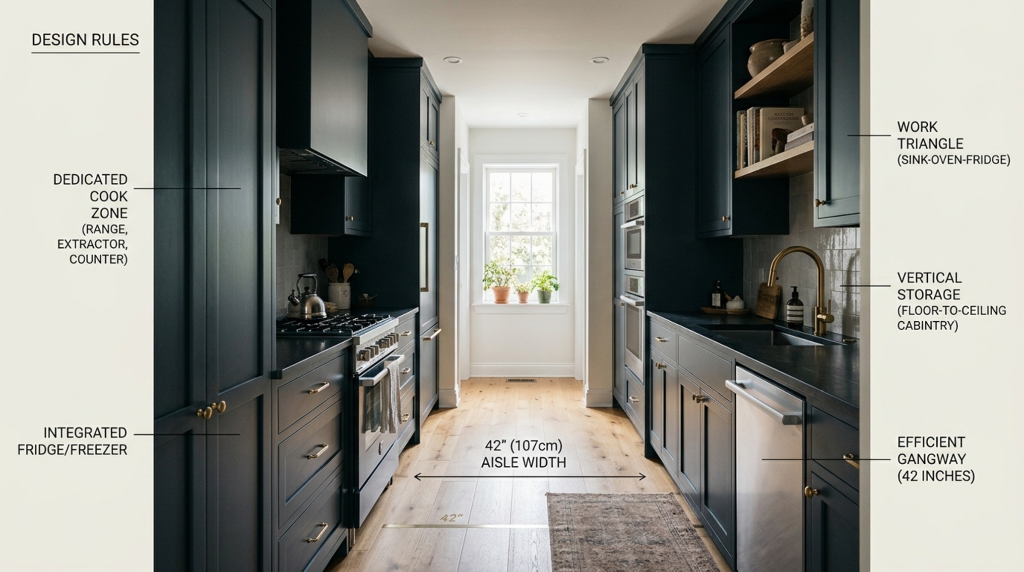
Galley Kitchen Design Rules: Lessons in Linear Precision
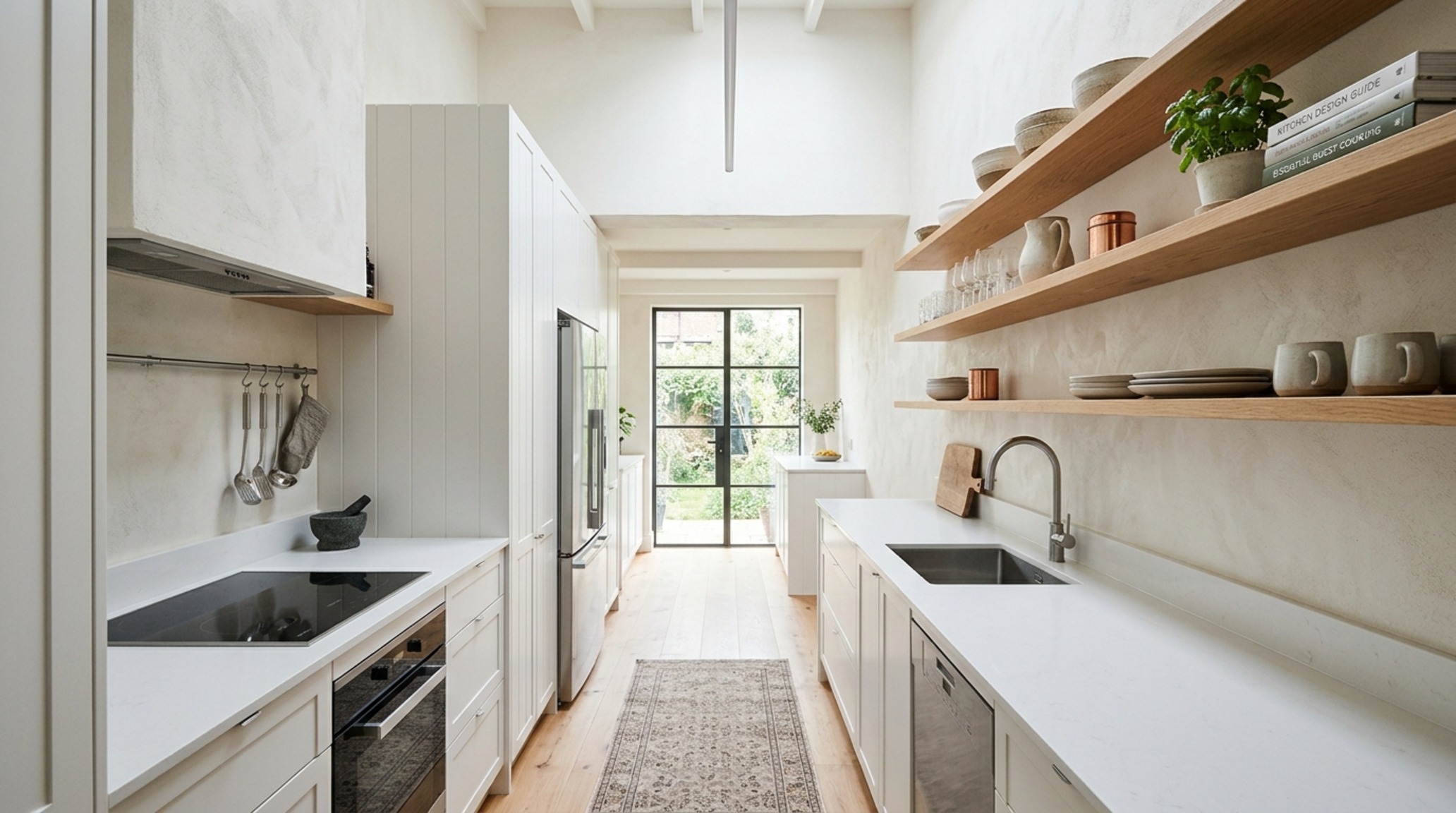
Often maligned as ‘small’ or ‘cramped,’ the galley is actually the professional chef’s favorite for its unmatched speed. The galley kitchen design rules are rooted in the concept of the ‘two-wall corridor.’ The most critical measurement here is the width of the central aisle. It should never be less than 36 inches for a single cook, though 42 inches is preferred to allow for appliance doors to open fully without blocking the entire passage. In a galley, vertical storage is your greatest ally. We look toward full-height pantry walls that utilize every inch of the ceiling height, often finished in a light-reflecting satin paint to prevent the corridor from feeling like a tunnel.
Lighting plays a massive role in making a galley feel expansive. Instead of a single central light, we use a layering strategy: 3000K task lighting under the cabinets for precision work, and 2700K ambient recessed lighting to wash the walls with warmth. This eliminates the ‘shadow play’ that can make narrow spaces feel smaller. When kitchen lay outs follow these linear rules, the result is a high-performance engine room that is as beautiful as it is functional.
Open Concept Kitchen Zoning: Blurring the Residential Boundary
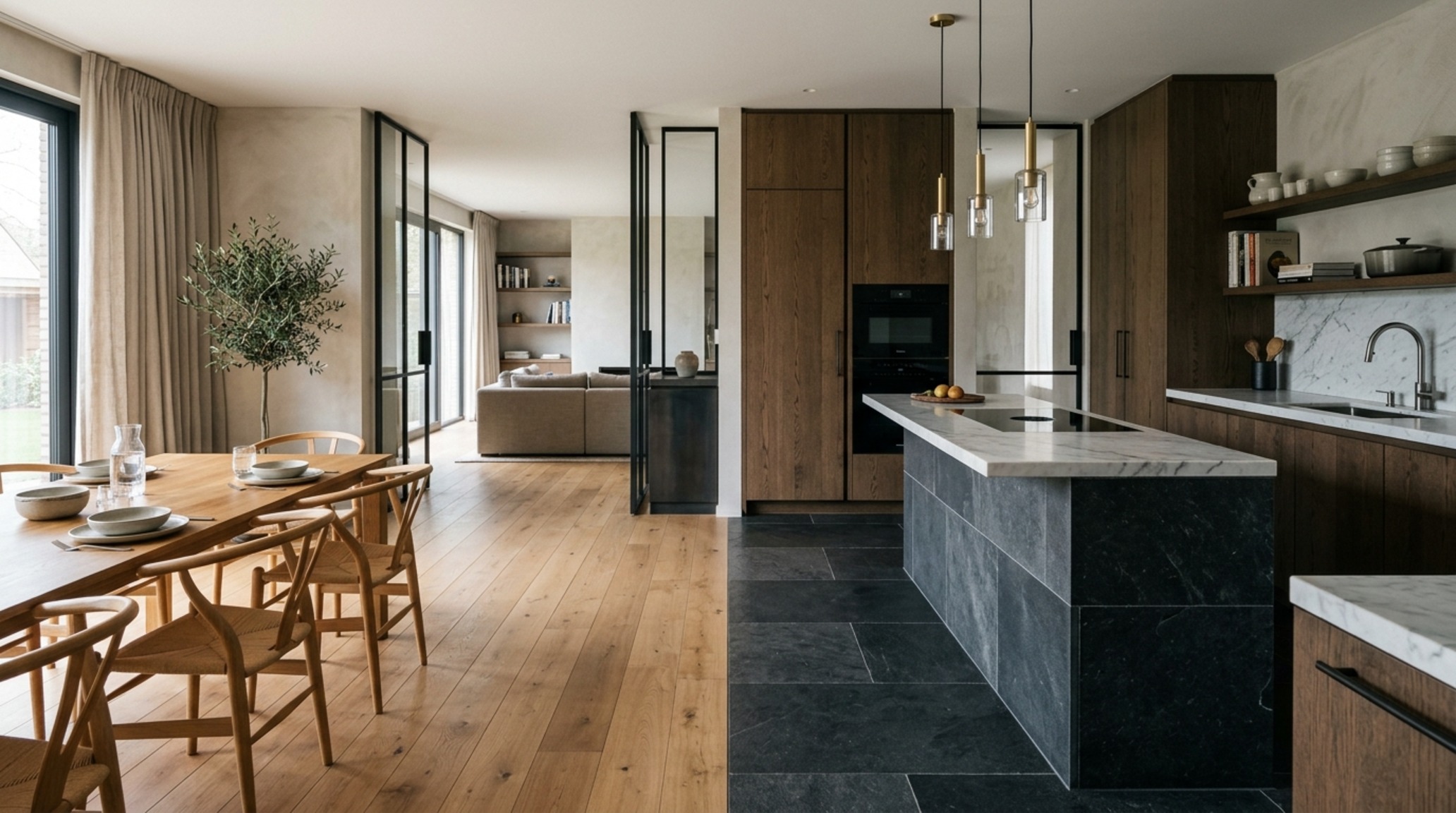
As the walls between the kitchen, dining, and living rooms continue to disappear, the challenge becomes one of visual and functional definition. Open concept kitchen zoning is the art of creating ‘rooms within rooms’ without using physical partitions. We achieve this through the use of materiality and lighting. For example, a change in flooring—from the warm oak of the living room to a honed travertine in the kitchen—acts as a subconscious boundary. Similarly, a cluster of oversized pendant lights over the island creates a ‘ceiling plane’ that anchors the kitchen within the larger volume of the house.
One of the most effective ways to manage the visual clutter inherent in open concept kitchen zoning is the introduction of the ‘scullery’ or secondary kitchen. This is the engine room—a hidden space behind a pocket door where the dishwasher, secondary sink, and small appliances live. It allows the primary kitchen to remain a pristine social stage, free from the mess of meal prep. This ‘show kitchen vs. pro kitchen’ approach is increasingly popular in high-end architectural design, as it balances the desire for an open, airy home with the messy reality of daily life.
Ergonomic Kitchen Workstations: Height, Reach, and Illumination
True ergonomics is about more than just the floor plan; it’s about the interface between the human body and the physical surfaces of the home. Ergonomic kitchen workstations must account for the varying heights of the users. While the standard counter height is 36 inches, we are seeing a move toward ‘varied-height surfaces.’ For example, a slightly lower section of the island (around 30 inches) is ideal for kneading dough or for children to participate in cooking, while a raised bar area (42 inches) provides a comfortable perch for guests.
Accessibility is also a key factor in future-proofing. Designing for ‘aging-in-place’ means replacing lower cabinets with deep, full-extension drawers. This eliminates the need to kneel and reach into the dark recesses of a base cabinet, bringing the contents directly to the light. It also means ensuring that the kitchen lay outs include wide enough clearances for mobility aids, even if they aren’t needed today. A 48-inch clearance in the main work zone isn’t just a luxury; it’s a commitment to the home’s long-term viability.
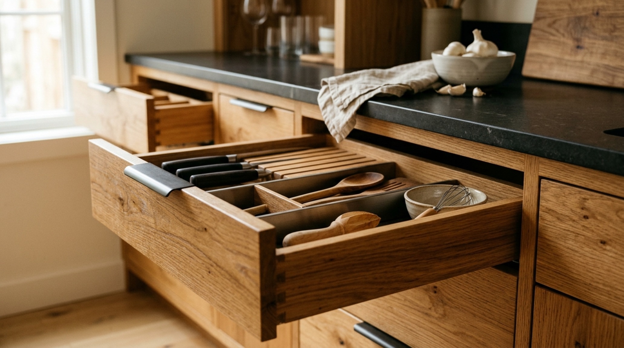
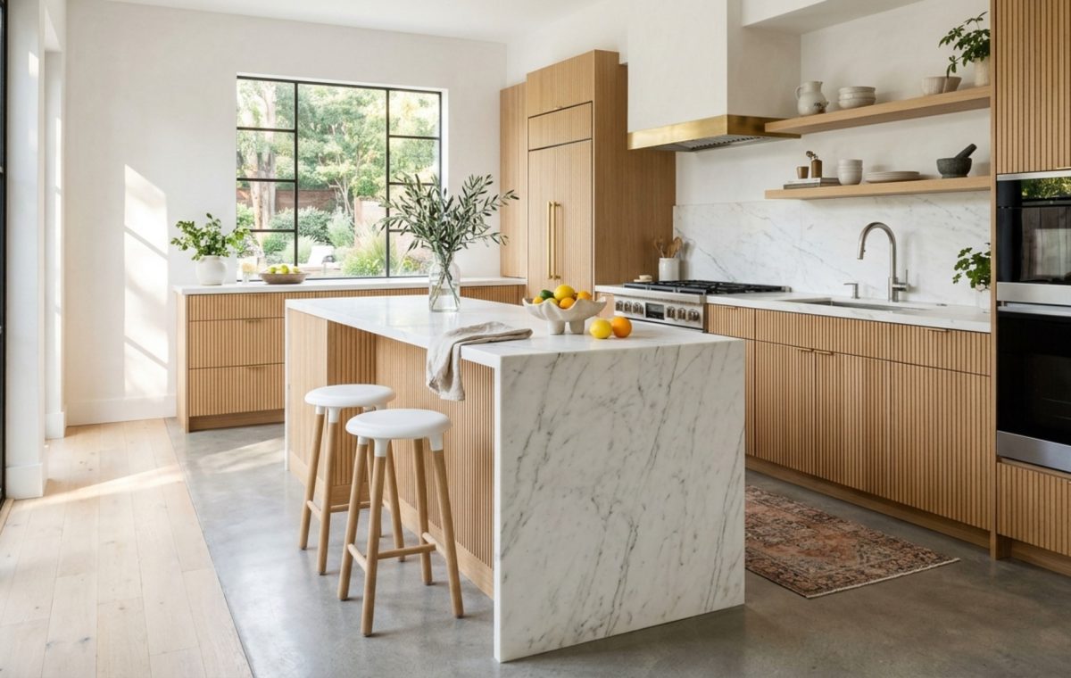
The final layer of a high-performance workstation is the Kelvin index of the lighting. We recommend a High CRI (Color Rendering Index) of 90+ for task areas. This ensures that the colors of your food—the vibrant green of herbs or the sear on a steak—are rendered accurately. When you combine this technical precision with authentic materials like fluted white oak and unlacquered brass, the kitchen transcends its utilitarian roots. It becomes a space that feels deeply grounded and intuitively aligned with the rhythm of your life.
Architectural Materials, Swatches & Kelvin Index
Comprehensive material guide featuring exact paint swatches, authentic finishes, and spatial clearances.
Designing a kitchen is an exercise in empathy—it requires us to envision how we will move through the space on our best days and our most hurried ones. By rooting our choices in the rigid data of architectural clearances and the soft nuances of human habit, we create rooms that don’t just look spectacular in a photograph, but feel spectacular to live in. Ultimately, the most successful kitchen lay outs are the ones that disappear into the background, supporting our lives with such intuitive grace that we forget the complex science required to bring them into being.
Editorial Silo • Recommended Architecture Studies
- The High-Performance Engine: Mastering Ergonomics and Invisible Utility in Kitchen Islands Design — Archival Design Case Study
- Curation of Touch: Merging Materiality and Atmosphere in Modern Kitchen Cabinet Styles — Archival Design Case Study
Curated Interior Perspectives
An editorial archive chronicling proportions, bespoke architectural joinery, and tranquil daylighting.
Curated Visual Lookbook
Design Gallery & Spatial Studies
A visual curation of architectural arrangements, lighting concepts, and material palettes featured in this space.