The Friction of Space: Why Modern Layouts Fail
Why is it that even in the most sprawling custom builds, the heart of the home often feels like a logistical bottleneck the moment two people attempt to prep a meal together? A thoughtful kitchen islands design serves as the definitive architectural solution to this friction, transforming a static block of cabinetry into a high-performance engine that drives the entire home’s social and culinary rhythm. When we stop viewing the island as a mere design statement and start treating it as a precision instrument, the domestic experience shifts from chaotic to choreographed.
We have all stood in that kitchen—the one where the refrigerator door hits the island stools, or where the ‘work triangle’ feels more like a cross-country trek. The disconnect usually stems from a failure to respect the ‘invisible lines’ of the floor plan. In my years of consulting on high-end residential projects, the most successful outcomes don’t begin with a marble slab selection; they begin with a roll of blue painter’s tape and a rigid adherence to the physics of human movement.
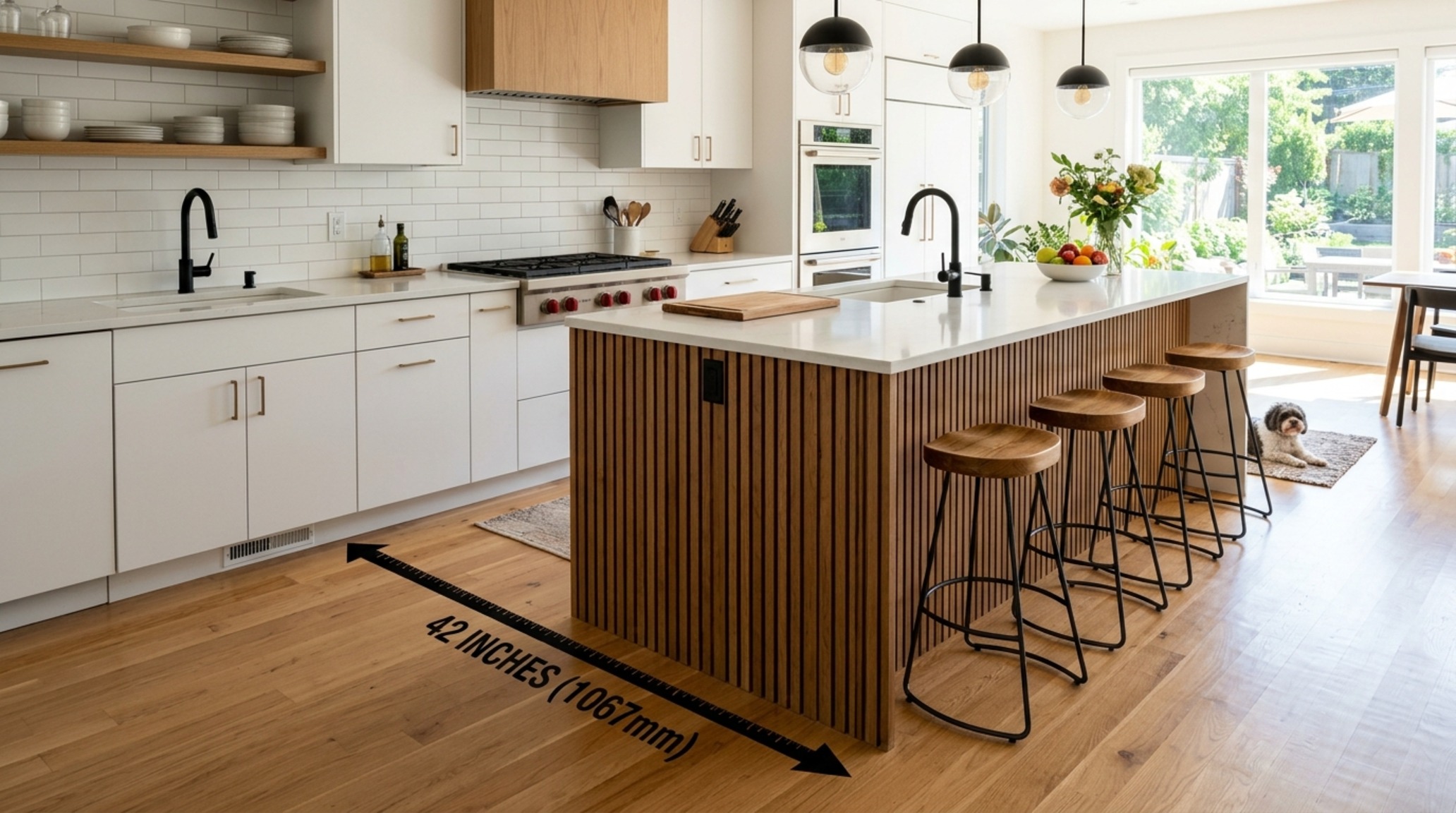
Kitchen Island Clearance Guidelines: The 42-Inch Rule and the Architecture of Flow
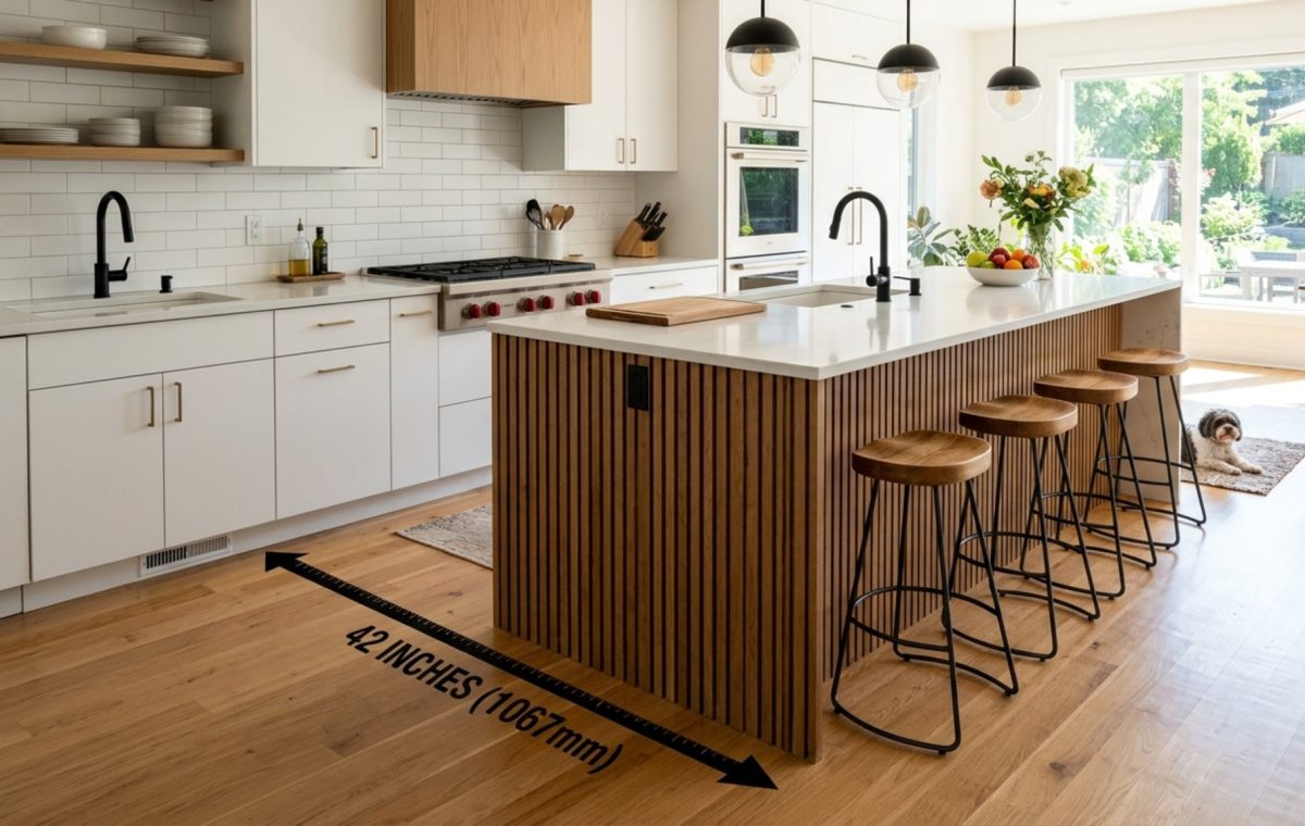
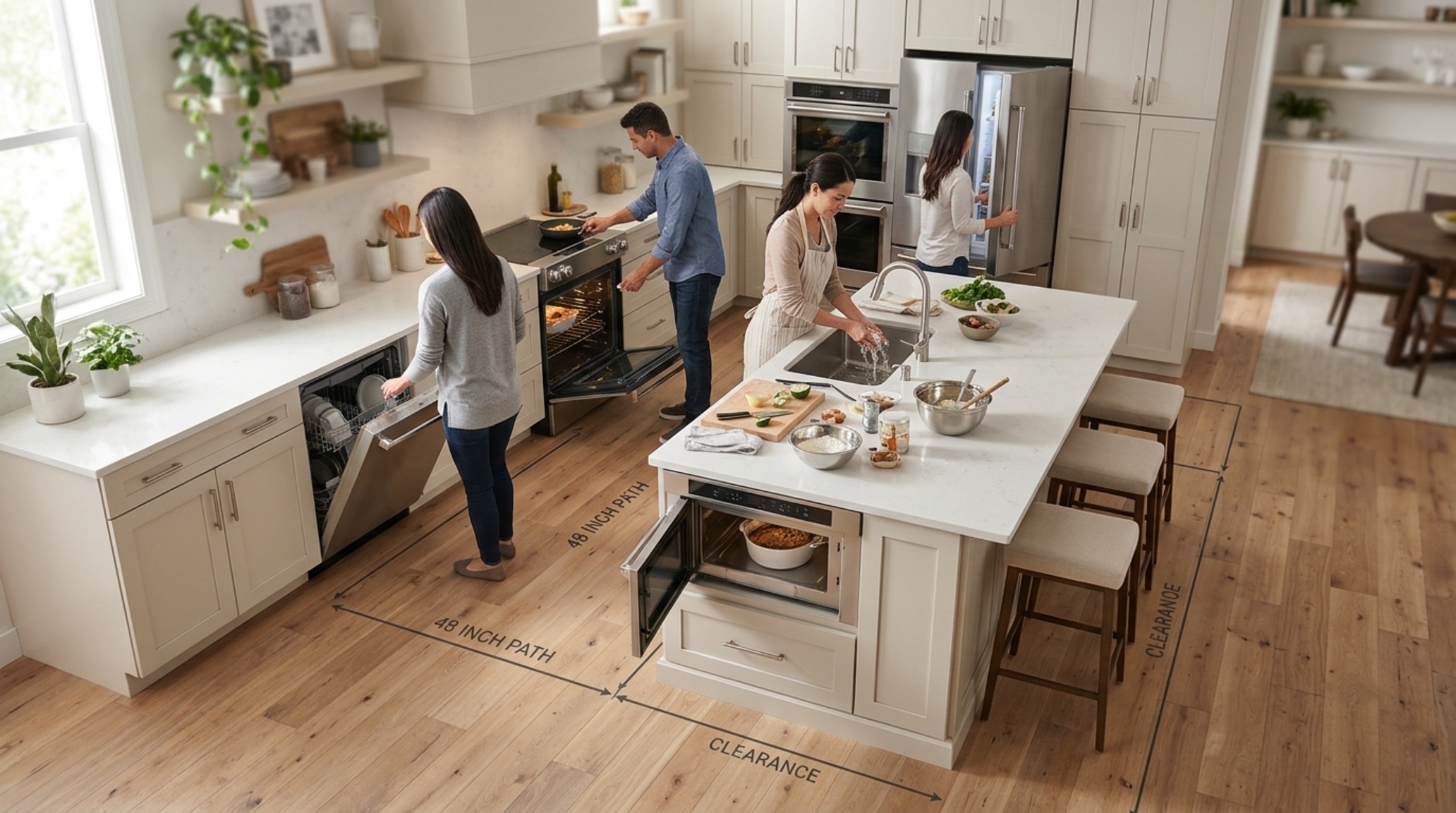
The National Kitchen & Bath Association (NKBA) provides us with the baseline, but the nuances of kitchen island clearance guidelines are where true luxury is defined. In a single-cook household, a 36-inch walkway might suffice on paper, but in the reality of 2026 living—where the kitchen is a multi-generational hub—that width is a recipe for frustration. For a truly high-performance space, 42 inches is the non-negotiable minimum, while 48 inches is the gold standard for ‘multi-cook’ environments where one person might be at the range while another unloads the dishwasher directly opposite.
Consider the ‘drawer-to-drawer’ clearance. If your island houses a microwave drawer or a secondary dishwasher, the depth of that appliance when fully extended must be subtracted from your total walkway. We often forget that a dishwasher door requires approximately 25 to 27 inches of floor space when open. If your clearance is only 36 inches, you’ve effectively walled off the rest of the kitchen every time you clear the table. By prioritizing a 45-inch ‘sweet spot,’ you ensure that the spatial cadence of the room remains uninterrupted, allowing for a graceful bypass even when the ‘invisible utility’ of the island is in full use.
Integrated Workstation Sinks: Redefining the Culinary Hub
The traditional double-bowl sink is rapidly becoming a relic of the past, replaced by the far more versatile concept of integrated workstation sinks. These are not merely basins; they are multi-tiered systems that allow for chopping, straining, and drying to happen entirely within the footprint of the sink. By moving these messy tasks to the island, we keep the perimeter counters clear for small appliances and aesthetic vignettes.
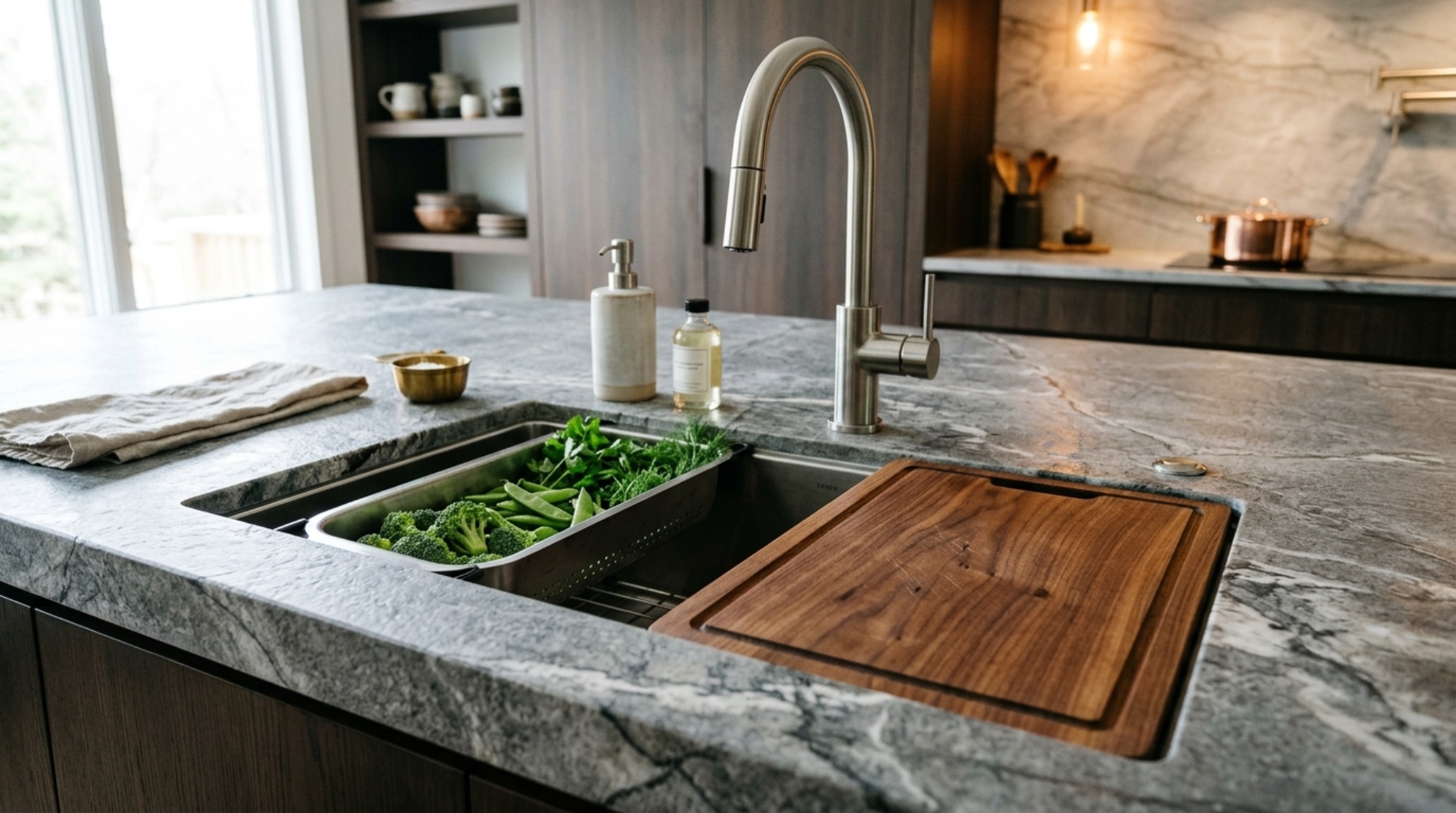
Integrating a 45-inch workstation sink into a kitchen island design turns the island into a literal prep station. When paired with a high-performance faucet featuring a high CRI (Color Rendering Index) light source directly overhead, the ergonomics of food prep improve exponentially. I often recommend the Galley or similar precision-engineered basins that utilize sliding tiers for colanders and cutting boards. This ‘invisible utility’ keeps the visual clutter below the sightline of the countertop, maintaining that pristine, minimalist aesthetic that contemporary homeowners crave without sacrificing the functionality of a professional chef’s kitchen.
Two-Tone Kitchen Cabinetry Palettes: Moving Beyond the Sterile White
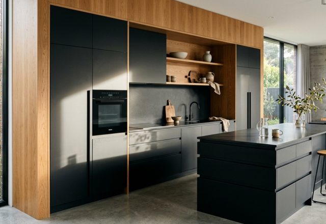
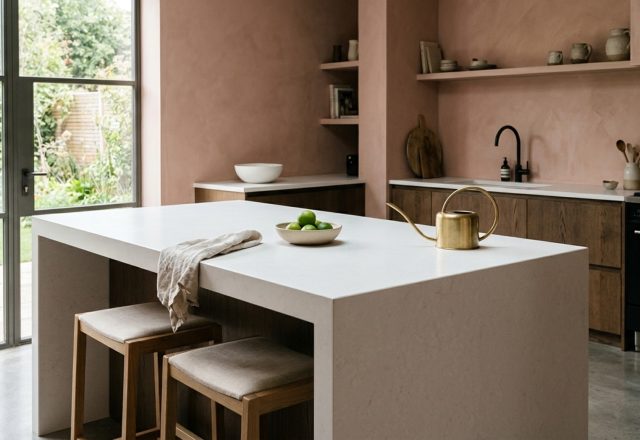
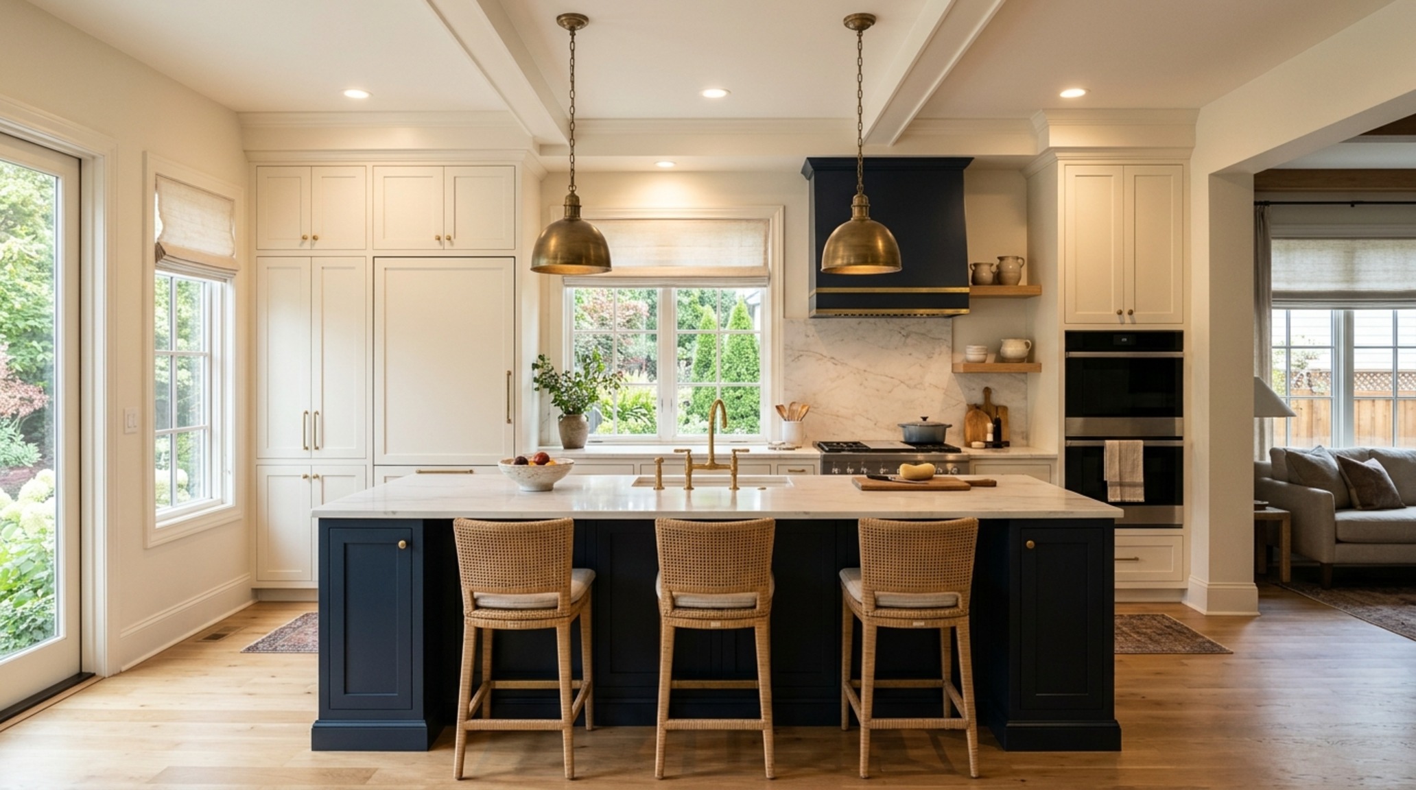
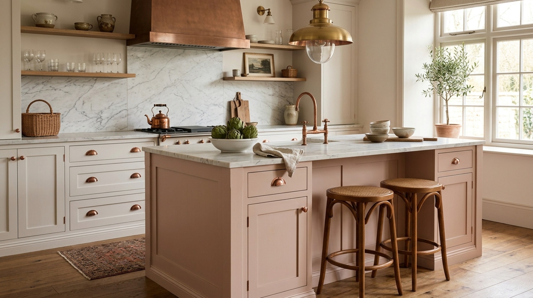
The era of the all-white laboratory kitchen has given way to a much warmer, more grounded sensibility. Today’s two-tone kitchen cabinetry palettes are leveraging organic ‘mushroom’ tones and deep, earthy pigments to create a sense of architectural permanence. Imagine a perimeter in Benjamin Moore’s ‘Swiss Coffee’—a soft, lived-in white—contrasted against an island finished in Farrow & Ball’s ‘Setting Plaster’ or a deep, moody charcoal like ‘Railings’.
“Design is not just what it looks like and feels like. Design is how it works. In the kitchen, color serves as a navigational tool, defining the island as the anchor of the room.”
This contrast isn’t just about aesthetics; it’s about visual weight and ‘tactile grounding.’ By finishing the island in a darker or more textured material than the surrounding cabinetry, you effectively lower the visual center of gravity in the room. This makes the space feel more expansive and less top-heavy. In 2026, we are seeing a massive shift toward ‘furniture-style’ islands—units that sit on recessed plinths or even tapered legs—to make these large volumes feel like curated pieces of art rather than humdrum storage boxes.
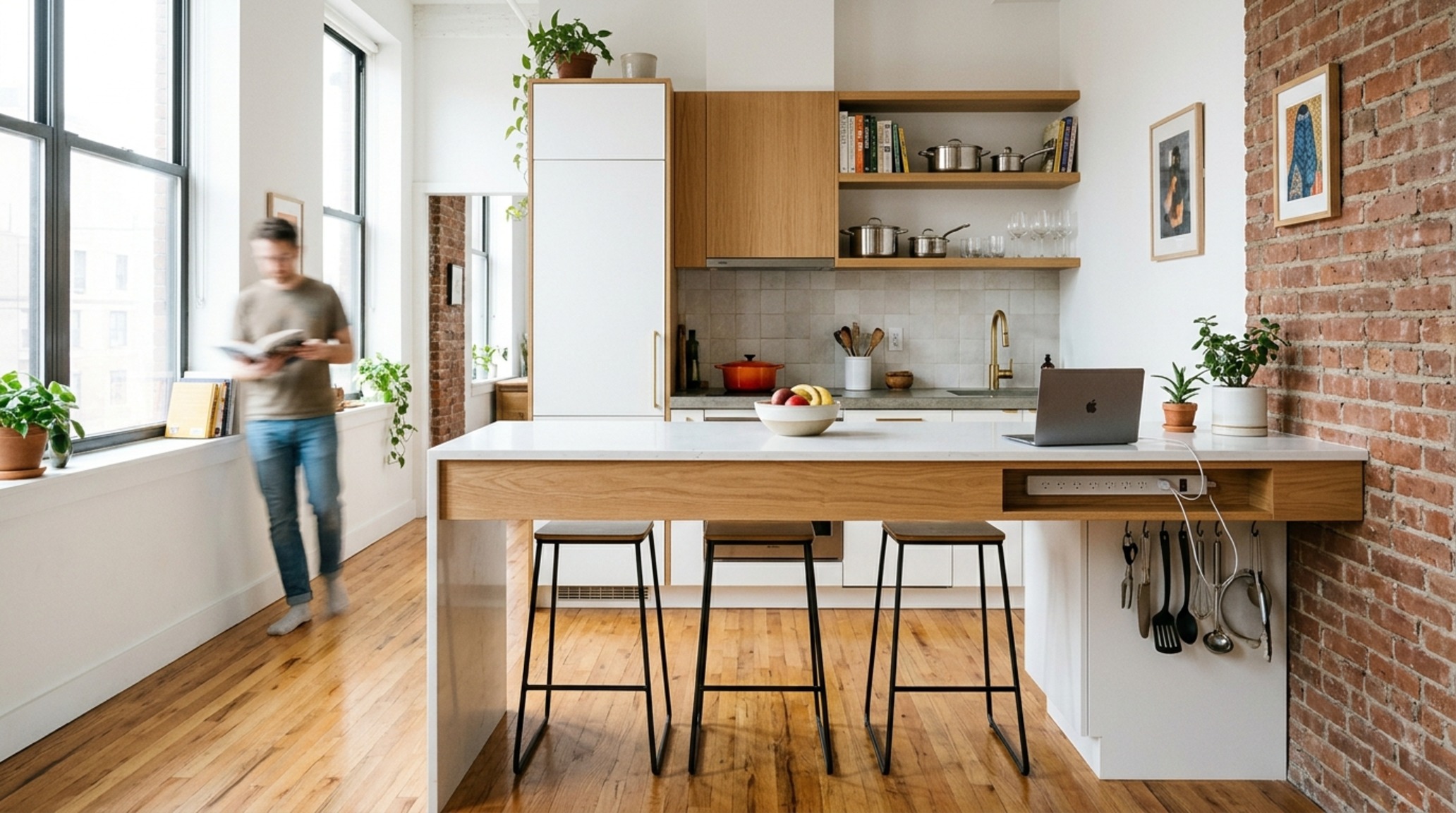
Small Kitchen Island Space-Saving Hacks: Precision in Limited Square Footage
Not every home has the luxury of a 12-foot marble monolith. In urban environments, small kitchen island space-saving hacks are essential for maintaining the ‘high-performance’ promise. One of my favorite techniques is the ‘recessed toe-kick’ on all four sides, which allows the island to appear as if it’s floating, instantly making the floor plane feel larger. Another is the ‘plugmold’ hidden outlet—tucked discreetly under the countertop overhang—which eliminates the need for unsightly plastic outlet covers on the beautiful side panels of your cabinetry.
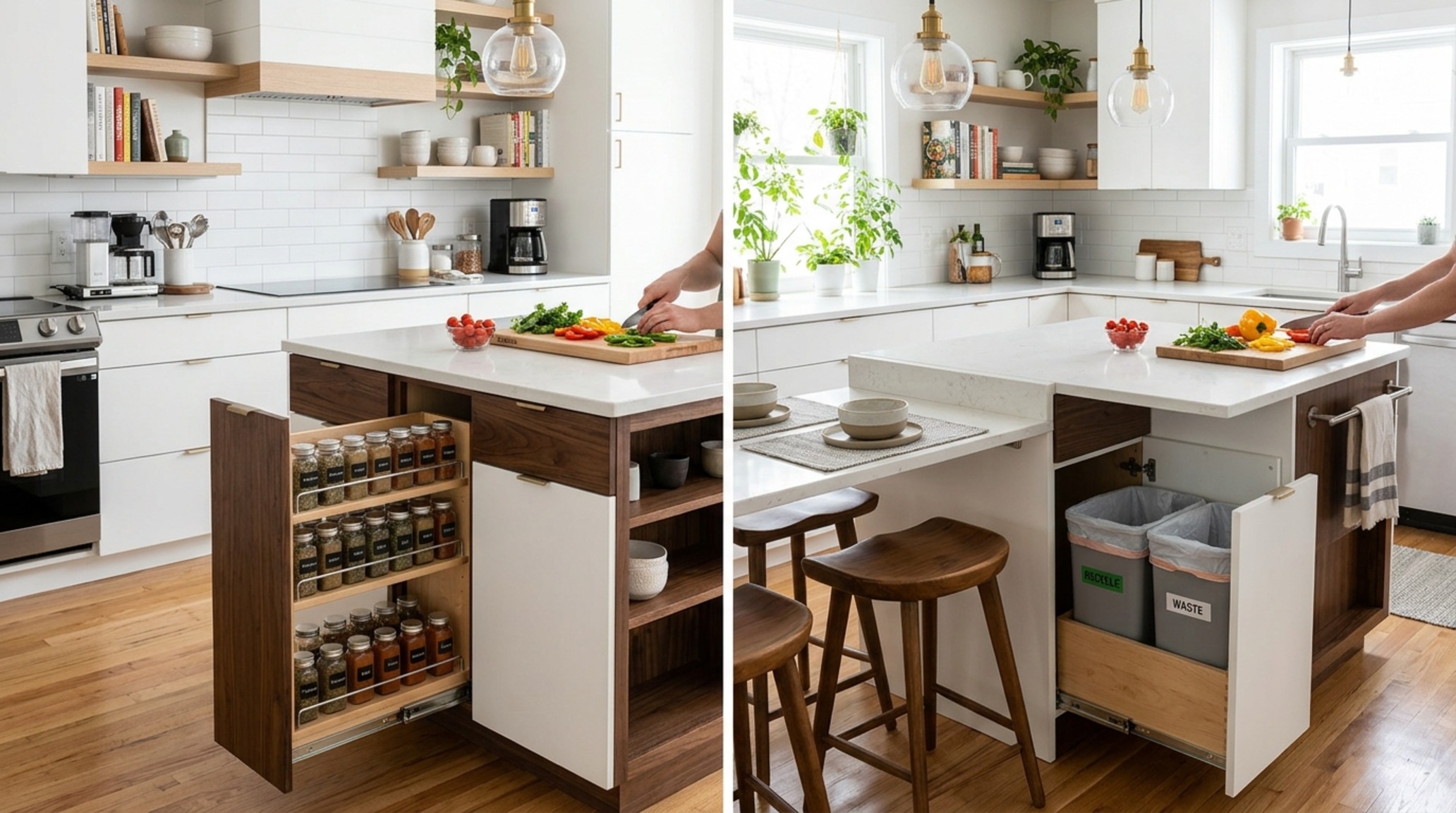
For islands under 60 inches in length, consider a ‘moveable’ component. A butcher-block end that can slide out for extra prep space or a cantilevered dining ledge that tucks away when not in use can provide the functionality of a large island without the permanent footprint. The goal is to maximize the utility-to-size ratio. Even a 24-inch deep island can house a wine fridge or a pull-out spice rack, proving that intelligent kitchen islands design is about depth of thought, not just depth of cabinetry.
Rift-Cut Oak Kitchen Finishes: The New Standard for Texture
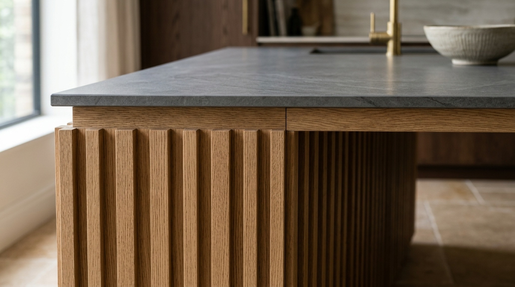
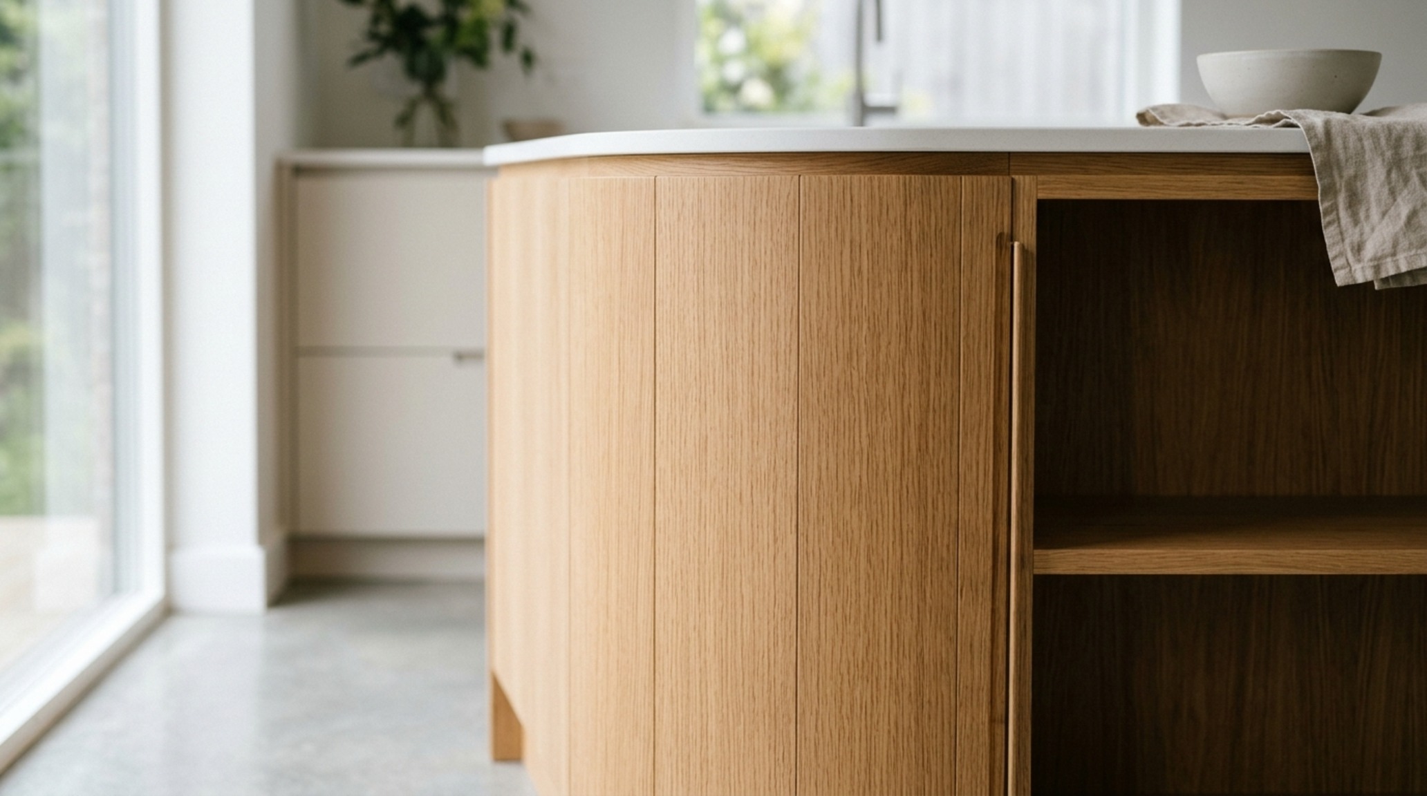
Texture is the secret language of luxury, and rift-cut oak kitchen finishes have become the quintessential medium for this expression. Unlike plain-sawn oak, which has a chaotic, ‘flamy’ grain, rift-cut oak offers a linear, consistent vertical grain that feels architectural and serene. It provides a tactile warmth that balances the coldness of stone and stainless steel.
When we apply rift-cut oak to an island, we often use it to create ‘fluted’ or ‘slatted’ details. This adds a layer of ‘shadow play’ that changes throughout the day as natural light moves across the room. Pairing this wood with a 2700K warm ambient lighting scheme—perhaps through discrete LED strips under the counter—accentuates the grain and makes the island the glowing heart of the home during evening hours. It’s about creating a ‘sensory narrative’ where the materials you touch every day feel as good as they look.
Modern Waterfall Countertop Trends: The Seamless Monolith
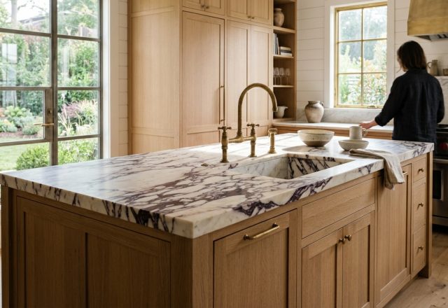
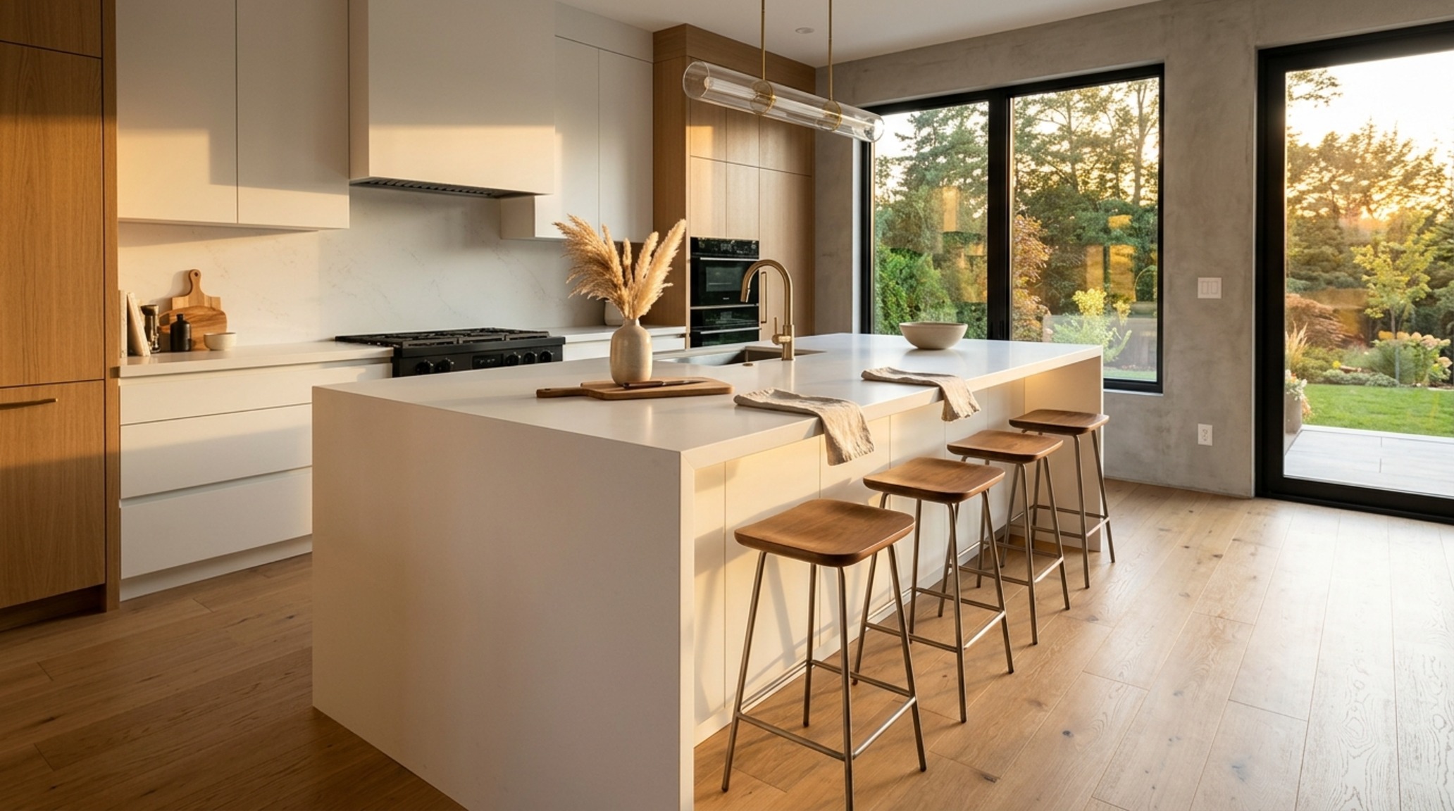
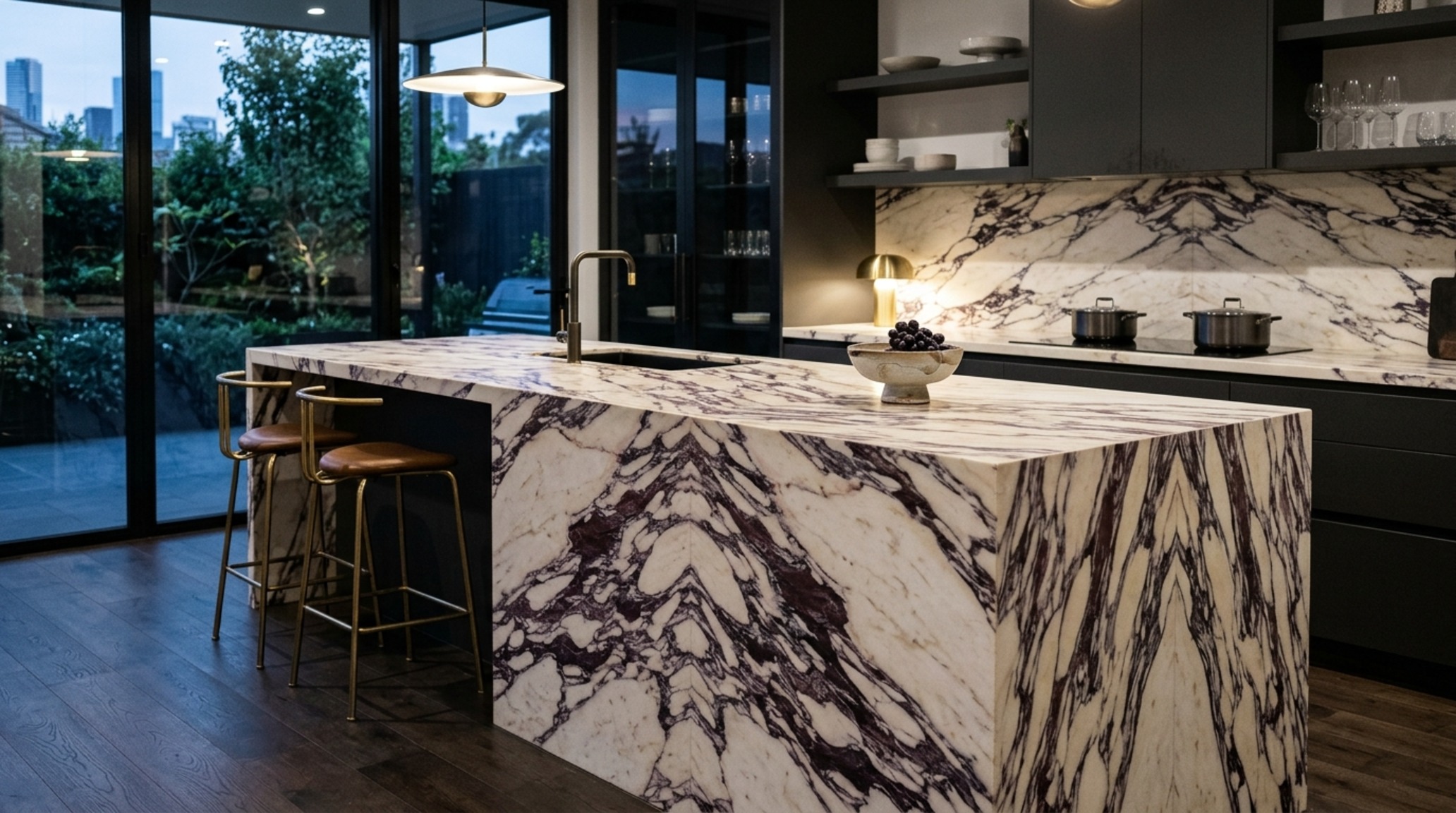
While the waterfall edge has been popular for a decade, modern waterfall countertop trends are evolving toward ‘mitered perfection’ and thinner profiles. We are moving away from the 3-inch thick chunky slabs toward sleek 1.2cm or 2cm heights in porcelain or ultra-compact surfaces like Dekton. This creates a sharp, tailored look that feels more like a piece of high-end Italian furniture than a traditional kitchen counter.
The waterfall edge serves a functional purpose as well: it protects the end-grain of your cabinetry from the wear and tear of a high-traffic household. In an open-concept living area, the waterfall edge also acts as a visual ‘bookend,’ hiding the functional side of the island (the drawers and appliances) from the formal living area. It’s a masterclass in ‘sightline alignment,’ ensuring that from every angle, the kitchen looks intentional and composed.
Finishes, Material Specs & Palette Details
Curated architectural summary documenting material selections, color swatches, and spatial flow.
Ultimately, the success of a kitchen islands design is measured by the silence of its operation. It is the absence of collisions, the ease with which a drawer slides open, and the way the light catches a honed edge at sunset. By anchoring our creative impulses in the rigid standards of ergonomics and the quiet sophistication of high-performance utility, we create spaces that don’t just house our lives—they elevate them. The kitchen of the future isn’t about more space; it’s about better space, meticulously engineered for the beautiful chaos of the modern home.
Editorial Silo • Recommended Architecture Studies
- Curation of Touch: Merging Materiality and Atmosphere in Modern Kitchen Cabinet Styles — Archival Design Case Study
- Tactile Transcendence: Best Kitchen Countertop Material & Curating a Sensory Atmosphere Through Premium Kitchen Surfaces — Archival Design Case Study
Curated Visual Chronicle
An intimate visual portfolio documenting the intersection of ergonomic utility and bespoke aesthetic warmth.

Curated Visual Lookbook
Design Gallery & Spatial Studies
A visual curation of architectural arrangements, lighting concepts, and material palettes featured in this space.