The Architecture of Efficiency: Rethinking the Compact Footprint
Why does the pursuit of architectural refinement always seem to collide with the hard reality of a fixed renovation budget? Achieving modern design on a budget is not a compromise of vision, but rather an exercise in rigorous spatial editing and material alchemy. We often mistake square footage for luxury, yet some of the most profound architectural statements of the last decade have emerged from the constraints of the ‘Dumbbell Layout’—a configuration that prioritizes a central, high-performing social core while pushing private zones to the periphery. This isn’t just about moving walls; it is about engineering a spatial cadence where every thirty-six inches of walkway serves a dual purpose.
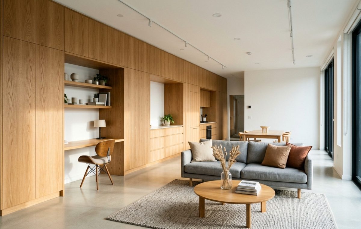
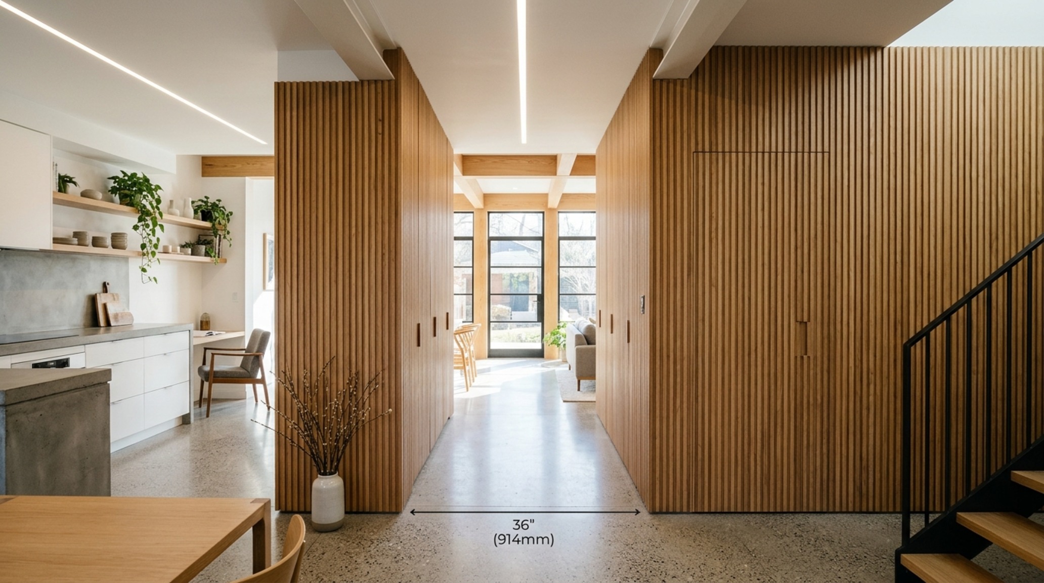
When we look at the legacy of mid-century masters or the current wave of award-winning AD100 cabins, the common thread isn’t the price tag of the marble, but the precision of the sightlines. By integrating storage directly into the architectural fabric—think floor-to-ceiling millwork that mimics the wall itself—we eliminate the visual ‘noise’ of freestanding furniture that often clutters small homes. The goal is a seamless horizon line that allows the eye to travel uninterrupted, creating an illusion of vastness within a modest footprint.
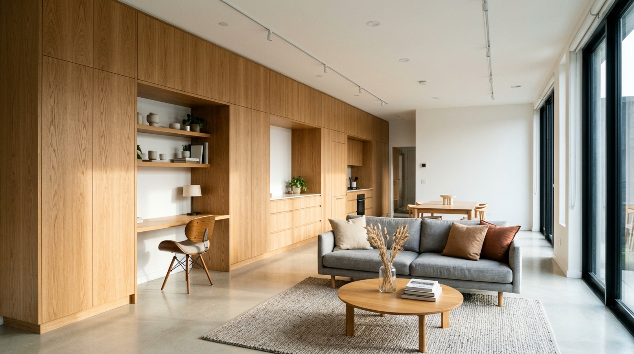
This approach to cost-effective modern home renovations relies heavily on the concept of ‘material alchemy.’ It’s the art of pairing a high-end, tactile touchpoint—like a solid brass cabinet pull or a single slab of honed travertine—with more humble, structural elements. We aren’t looking for cheap imitations; we are looking for honest materials used with architectural intent. By focusing on the structural ‘doing less,’ we allow the quality of light and the flow of air to become the primary luxury features of the home.
The Dumbbell Layout: Engineering Spatial Harmony
The Dumbbell Layout is an architectural secret weapon for the modern urbanite. By flanking the central living and kitchen area with bedrooms or utility zones, we eradicate the ‘dead’ space of long, dark hallways. In this configuration, circulation is integrated into the living space. To make this work without feeling like you’re living in a corridor, we must respect the 36-inch standard walkway clearance. This is the ‘breath’ of the house. When you drop below this measurement, the psychology of the space shifts from ‘curated’ to ‘cramped.’
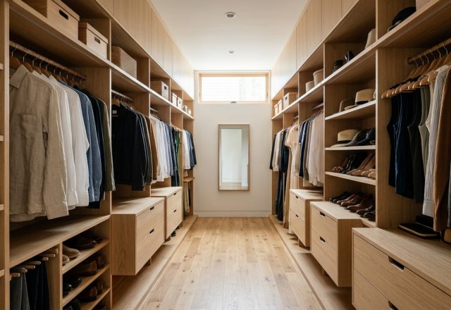
Within this flow, integrated storage becomes the quiet hero. Instead of a bulky armoire, we look toward built-in cabinetry that aligns with the structural columns. When painted in a receding tone like Benjamin Moore Swiss Coffee, these units disappear into the architecture. We are essentially building a new ‘skin’ for the room that hides the chaos of daily life. This is where luxury living on a budget tips move from theory to practice: invest in the cabinetry carcass using standard modular units, but spend the remaining budget on custom-routed doors or high-quality integrated hardware.
High-Low Interior Design Strategies: Where to Invest for Impact
The ‘high-low’ strategy is the cornerstone of professional styling. It’s the realization that while your sofa needs to be a workhorse of comfort, your side tables can be found objects or sculptural DIY pieces. In a high-performing modern home, we prioritize ‘contact points’—the things you touch every day. This includes door handles, light switches, and faucets. A high-CRI (90+) recessed light fixture makes an inexpensive linen curtain look like a bespoke installation, while a cheap, cool-toned LED will make even the most expensive velvet look synthetic.
“Spatial luxury is defined not by the abundance of objects, but by the intentionality of the negative space between them.”
Consider the ‘reach’ of a room. An 18-inch coffee table reach ensures ergonomic comfort without crowding the seating group. A 30-inch dining chair clearance allows for graceful movement behind guests. When these proportions are respected, the home feels expensive because it functions perfectly. It’s the difference between a house that works against you and one that anticipates your needs.
DIY Architectural Lighting: Sculpting Volume with Lumens
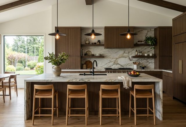
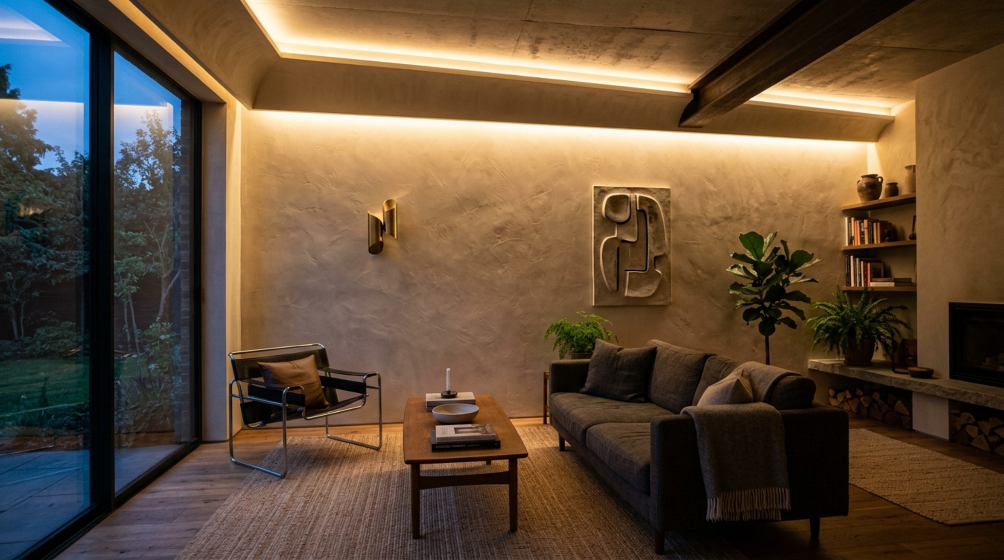
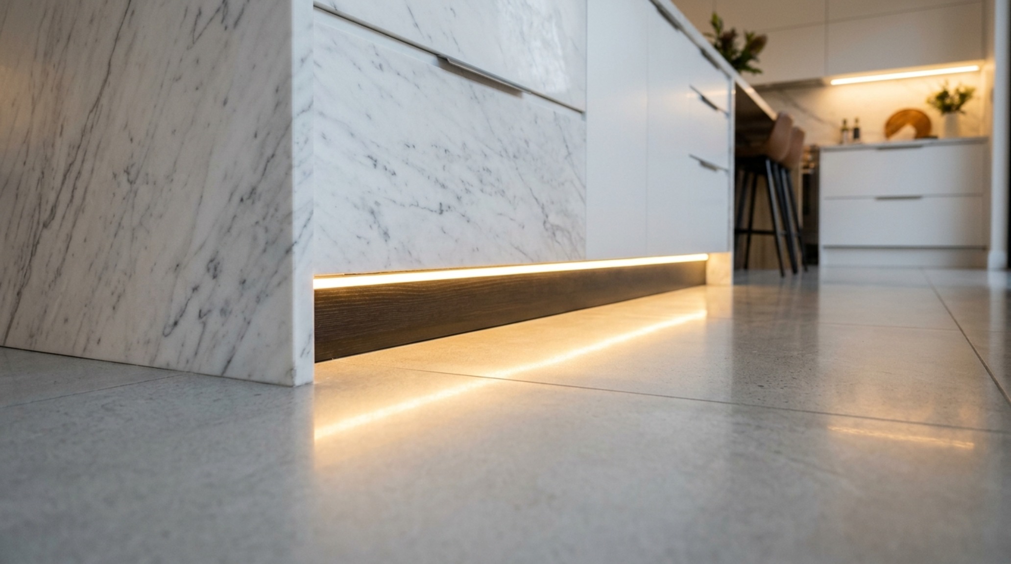
Lighting is the most underrated tool in the budget designer’s kit. We often see homeowners settle for a single ‘boob light’ in the center of the room, which flattens textures and creates harsh shadows. Instead, we look toward DIY architectural lighting to create depth. Hidden LED strips tucked behind a simple wood valance or integrated into the kickplates of kitchen cabinetry can transform a standard room into a glowing sanctuary. This ‘indirect’ light mimics the soft, diffused glow of expensive custom curtain walls.
To achieve this, specification is everything. Aim for a 2700K color temperature for ambient areas to create a warm, residential feel, moving to 3000K only for task areas like the kitchen or home office. By grouping standard-unit glass pendants or using simple track lighting painted to match the ceiling, you can direct light exactly where the architecture needs it—highlighting a textured plaster wall or silhouetting a piece of greenery. This layer of ‘shadow play’ adds a sophisticated narrative to the home that cost almost nothing to implement but changes everything about the evening atmosphere.
Affordable Modern Furniture Hacks for a Tailored Look
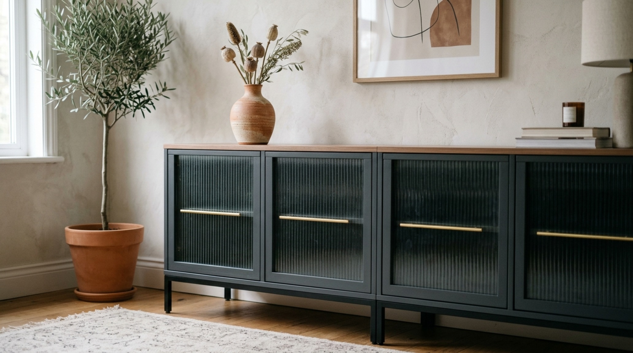
The era of generic flat-pack furniture is over; we are now in the era of the ‘hack.’ But we aren’t talking about messy DIY projects. Affordable modern furniture hacks today are about architectural refinement. It’s about taking a standard IKEA Sektion cabinet and topping it with a custom-cut piece of remnant stone from a local fabricator. It’s about replacing plastic legs on a sofa with blackened steel or oak blocks to change the profile and height of the piece.
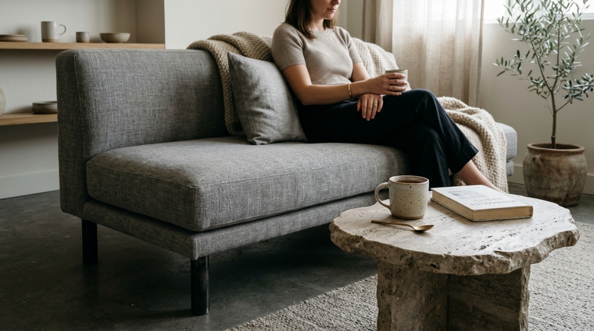
When selecting furniture for a compact layout, look for ‘leggy’ pieces. Being able to see the floor plane extend under a sofa or a sideboard tricks the brain into perceiving more square footage. A floating vanity in a small bathroom, for instance, opens up the sightlines and makes the floor feel continuous. These are the subtle cues that signal a high-end, architect-led design without the associated fees.
Minimalist Decor for Renters: Permanent Style, Temporary Footprint
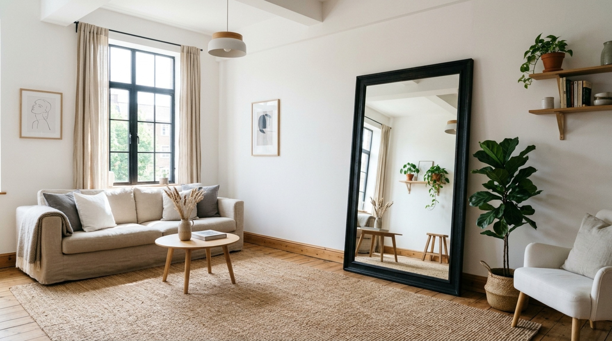
For those in transition, the challenge is bringing architectural integrity to a space you don’t own. Minimalist decor for renters focuses on the ‘movable architecture.’ Large-scale leaning mirrors, oversized rugs that define ‘zones’ in an open-plan layout, and high-quality tension-mounted lighting are the tools of the trade. If you cannot change the floors, cover them with a neutral jute or a low-pile wool rug that stretches almost wall-to-wall. This creates a unified base that grounds the entire room.
Use color theory to create height. Painting just the doors or the trim in a slightly darker shade than the walls—perhaps a muted taupe like Farrow & Ball Setting Plaster—adds a layer of ‘intentionality’ to a rental. It signals that the space is curated, not just occupied. Even the simple act of replacing standard plastic switch plates with matte metal versions can significantly elevate the tactile experience of a room.
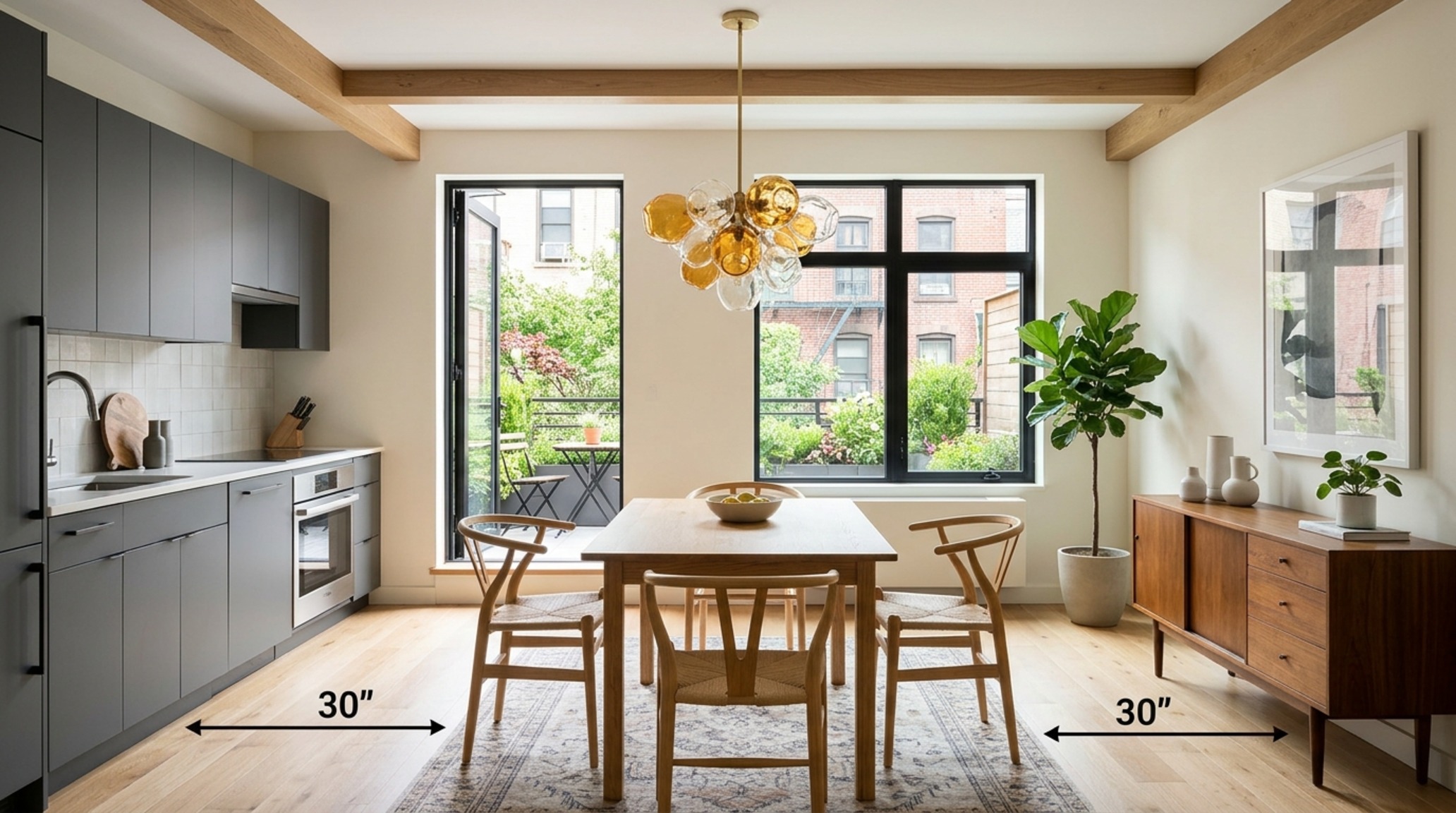
The rhythm of a room is also dictated by its ‘visual weight.’ In a small space, you want a mix of solid forms and transparent ones. A heavy oak dining table might be paired with lightweight, spindly chairs to keep the ‘spatial cadence’ balanced. It’s about ensuring the room doesn’t feel top-heavy or cluttered, but rather like a well-composed photograph where every element has room to breathe.
Visual Narrative & Detail Studies
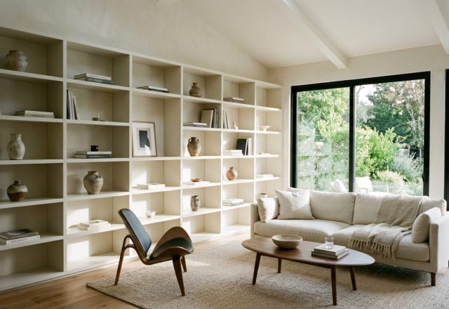
As we synthesize these strategies, we see that a home is a collection of vignettes. Each corner should offer a moment of discovery. Whether it’s the way natural light hits a fluted wood panel or the perfect alignment of a bookshelf with a door frame, these details are the true markers of modern design. By focusing on the ‘Dumbbell’ flow and integrated storage, we free our homes from the burden of excess, allowing the architecture itself to take center stage.
Comprehensive Material & Proportions Schedule
Comprehensive architectural blueprint detailing finishes, paint hex codes, and structural balance.
Ultimately, the transition toward a more thoughtful, budget-conscious home is a journey toward clarity. It is about stripping away the ‘decorative’ and embracing the ‘structural.’ When we stop trying to fill space and start trying to frame it, we discover that luxury isn’t a commodity we buy, but a feeling we engineer through light, proportion, and flow. As the lines between architecture and furniture continue to blur, our homes become more than just shelter—they become high-performing sanctuaries that honor the way we move, breathe, and live in the modern world. True modern design on a budget is the ultimate architectural victory.
Editorial Silo • Recommended Architecture Studies
- Tactile Luxury: Elevating the Material Soul of Contemporary Manufactured Homes — Archival Design Case Study
- Ergonomic Mastery: Functional & Space-Saving Hacks for Walk In Clothes Closet — Archival Design Case Study
Spatial Balance & Form Lookbook
Visual studies exploring spatial ergonomics, material authenticity, and balanced natural light.
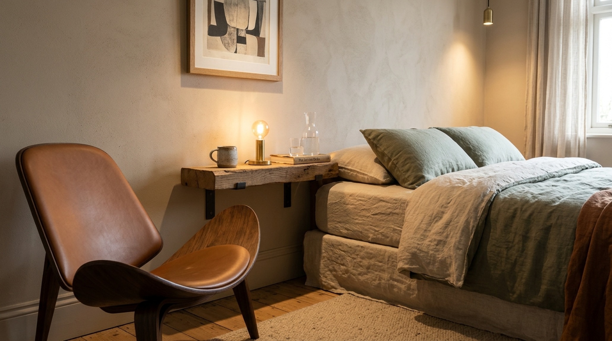
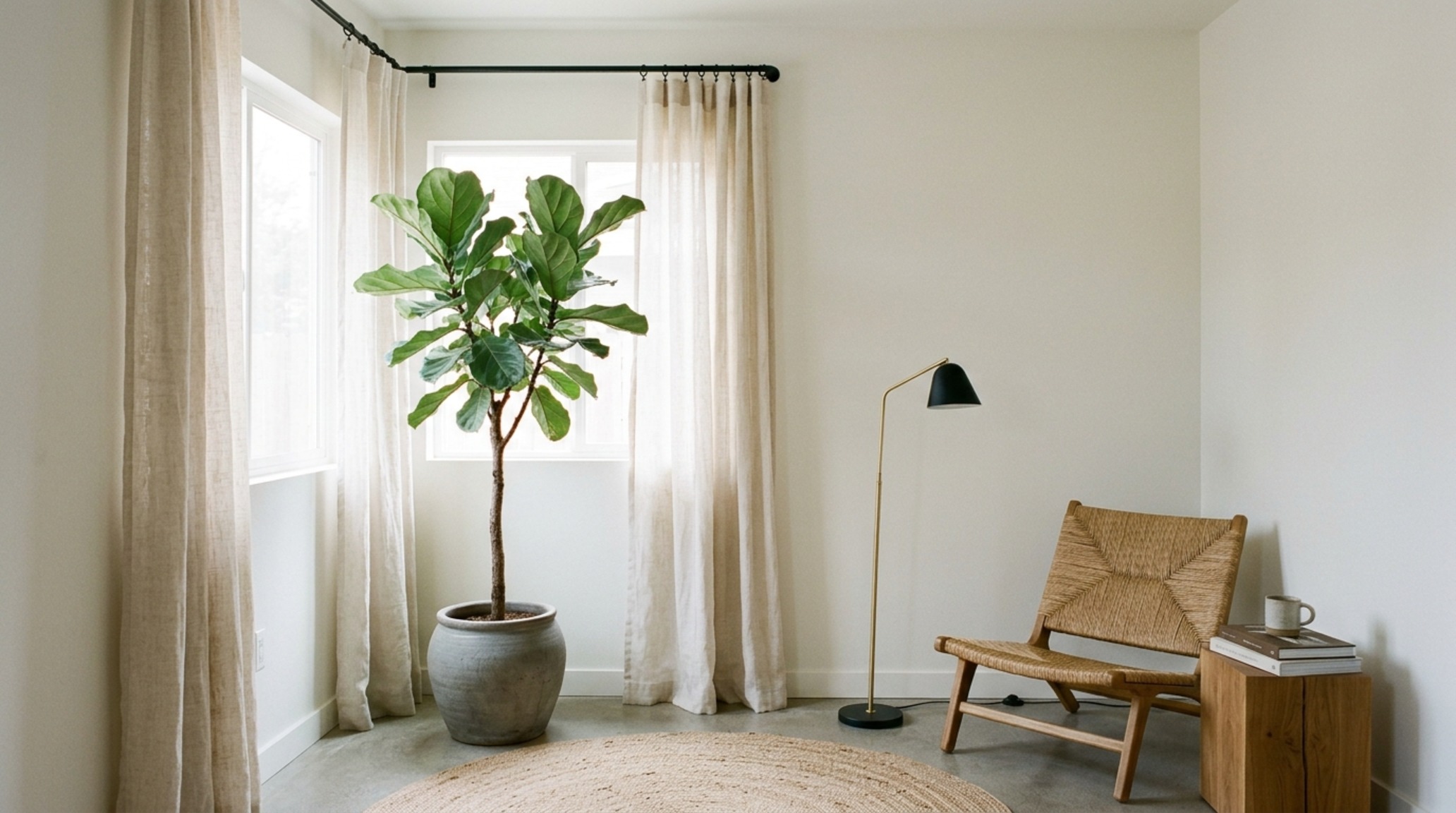
Curated Visual Lookbook
Design Gallery & Spatial Studies
A visual curation of architectural arrangements, lighting concepts, and material palettes featured in this space.