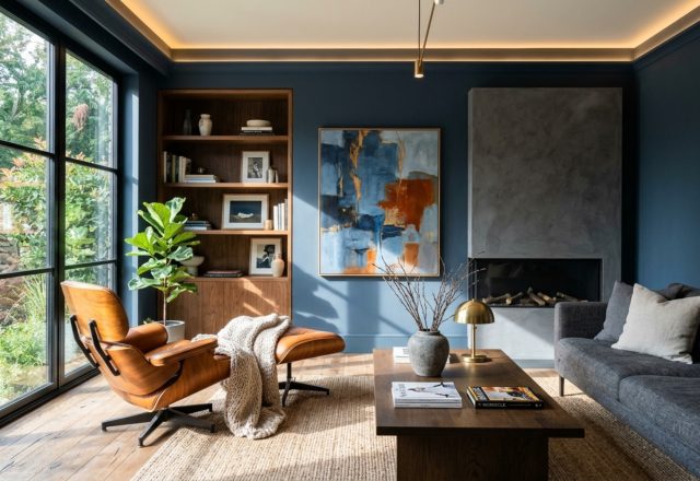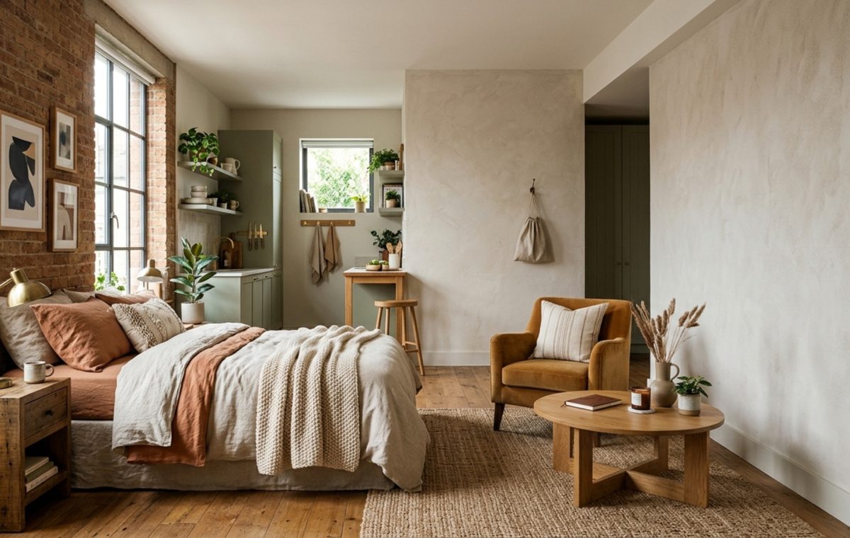
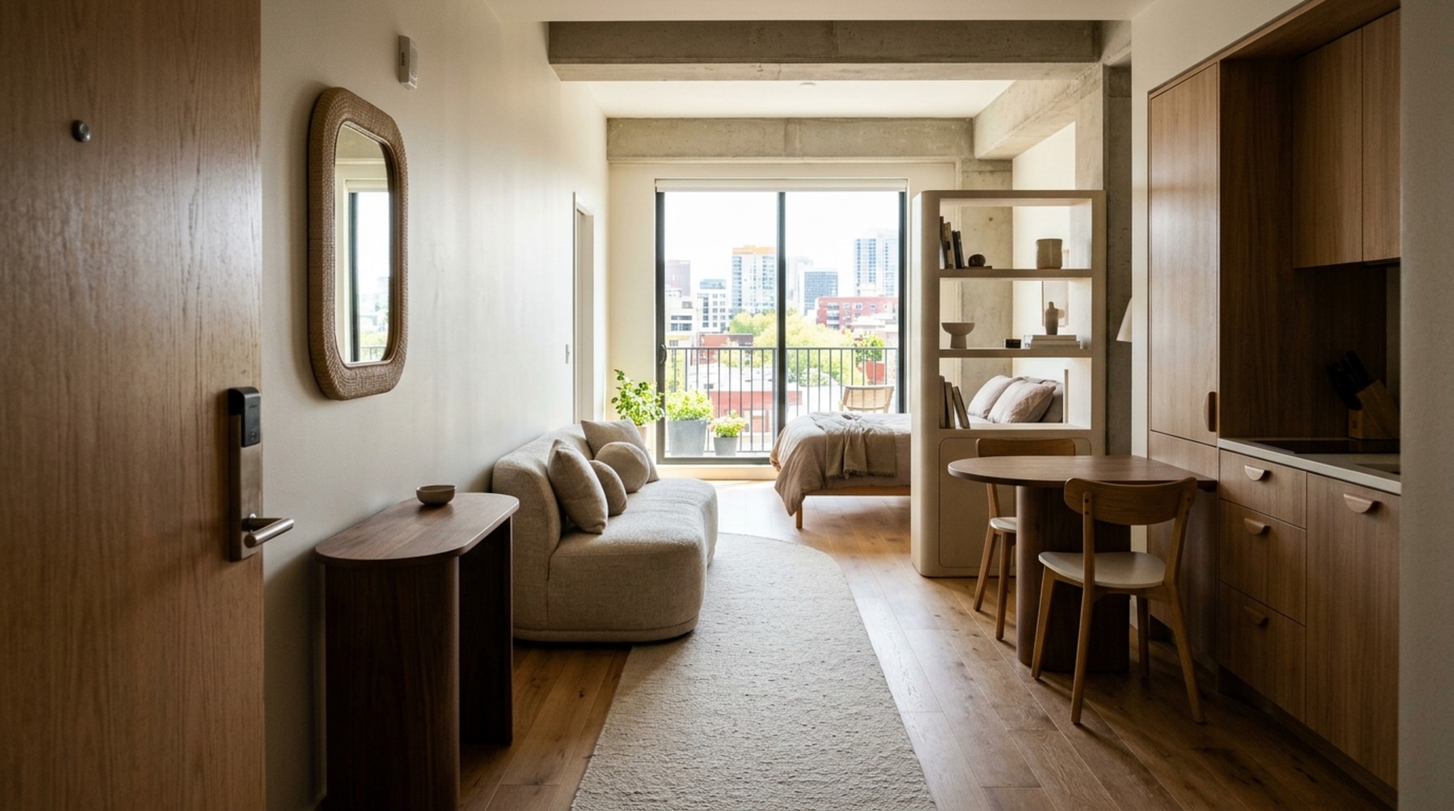
Effective studio apartments layouts prioritize the orchestration of negative space and tactile resonance over mere square footage, transforming a single-room volume into a sophisticated sequence of living experiences. I remember standing in a 380-square-foot walk-up in Chelsea where the morning light hit a nubby boucle armchair just right; it wasn’t the footprint that mattered, but the ‘spatial cadence’—the way the eye traveled from the soft oak floor to the linen-draped windows without hitting a single jarring obstacle. In that moment, the concept of a ‘small apartment’ vanished, replaced by a curated sanctuary. As we look toward 2026, the ‘Quiet Luxury’ trend is recalibrating how we view micro-living, moving away from sterile minimalism toward a sensory-driven approach characterized by ‘Oat Milk’ color palettes, curved wooden silhouettes, and deep tactile layering.
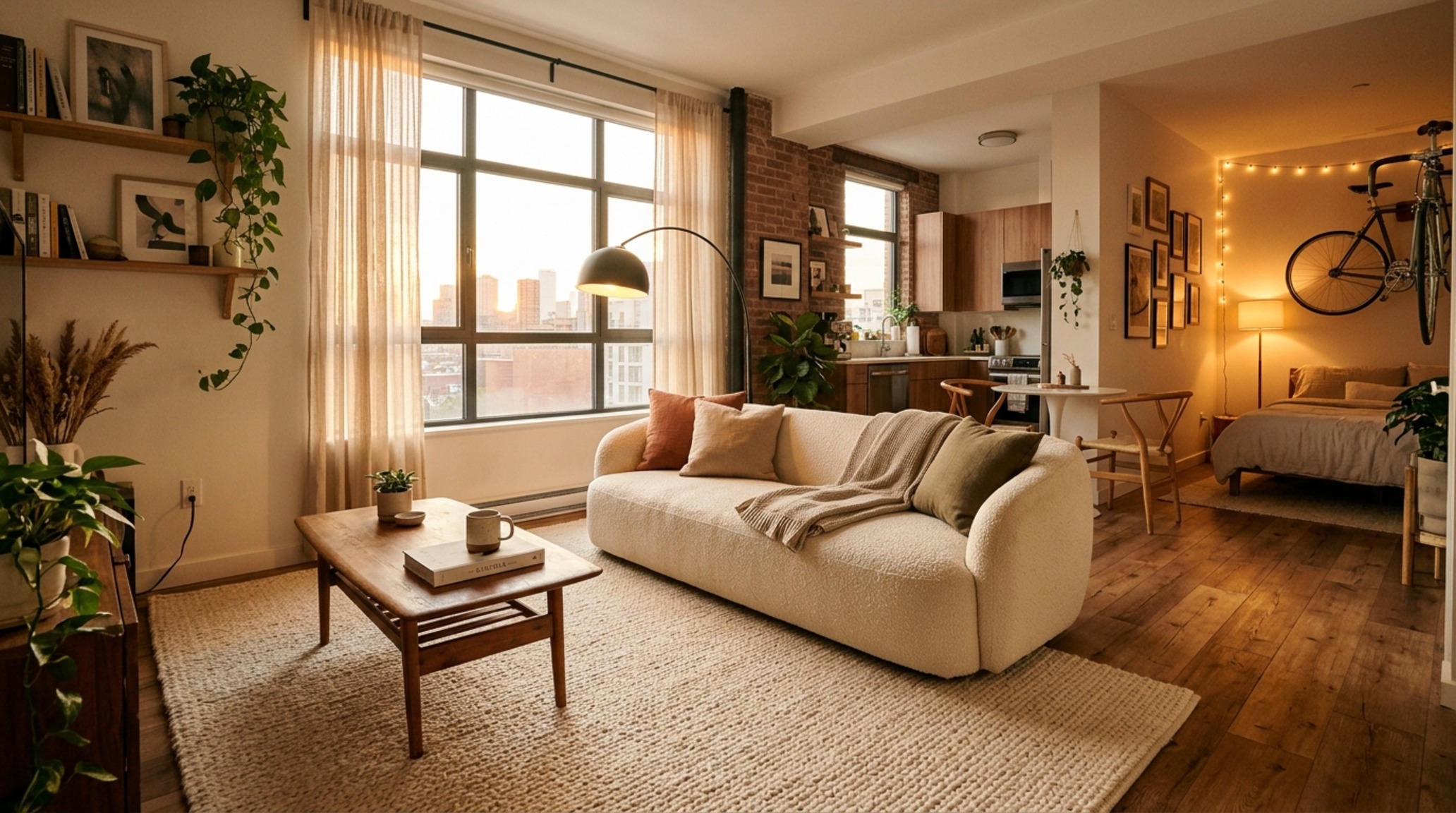
Rug-Anchored Floor Plans: The Psychology of Soft Boundaries
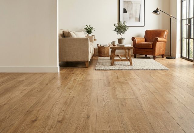
For those working within a modest budget, the floor plane is your most strategic asset. Instead of physical dividers that can choke a room, rug-anchored floor plans utilize the floor as a psychological map. By placing a high-pile, oversized wool rug in the living zone and leaving the ‘circulation paths’ as bare wood, you create an invisible threshold. This architectural trick relies on the 18-inch rule: ensure your primary seating is within an 18-inch reach of a central surface, while maintaining a clear 36-inch primary walkway around the perimeter to ensure the space breathes. A well-placed rug doesn’t just absorb sound; it defines a destination.
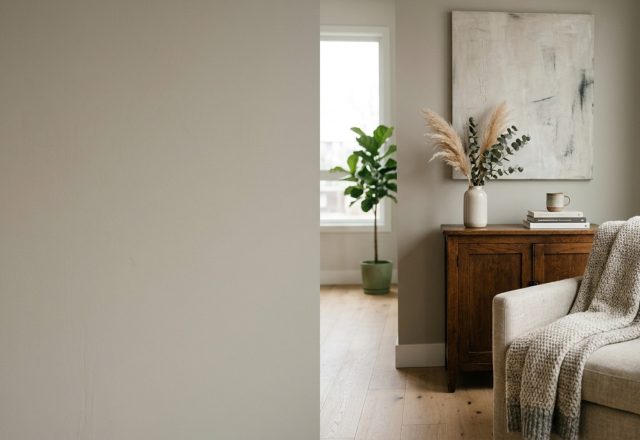
When selecting your palette, consider the subtle interplay of whites. Benjamin Moore’s ‘Swiss Coffee’ provides a creamy, warm backdrop that avoids the clinical blue undertones of standard gallery white. Pair this with a rug in a raw jute or a soft cream wool to create a foundation of ‘Quiet Luxury.’ This isn’t about clutter; it’s about curated calm. Even a budget-friendly layout can feel like a boutique hotel if you respect the negative space. The goal is to allow each piece of furniture to exist in its own ‘breathable’ pocket, preventing the claustrophobic pile-up often seen in standard studio arrangements.
Multifunctional Furniture Zones: Crafting Utility with Grace
The secret to successful multifunctional furniture zones lies in selecting pieces that serve two masters without looking like a compromise. A sleek, pedestal dining table can double as a creative workspace, but only if the surrounding ‘sightline alignment’ is maintained. Avoid the heavy, boxy desks of the past. Instead, look for slim, curved wooden silhouettes that mimic the organic flow of 2026 design trends. By choosing a table with a central base, you provide 30-inch clearance for chairs to tuck in fully, preserving the visual flow of the room when the workday ends.
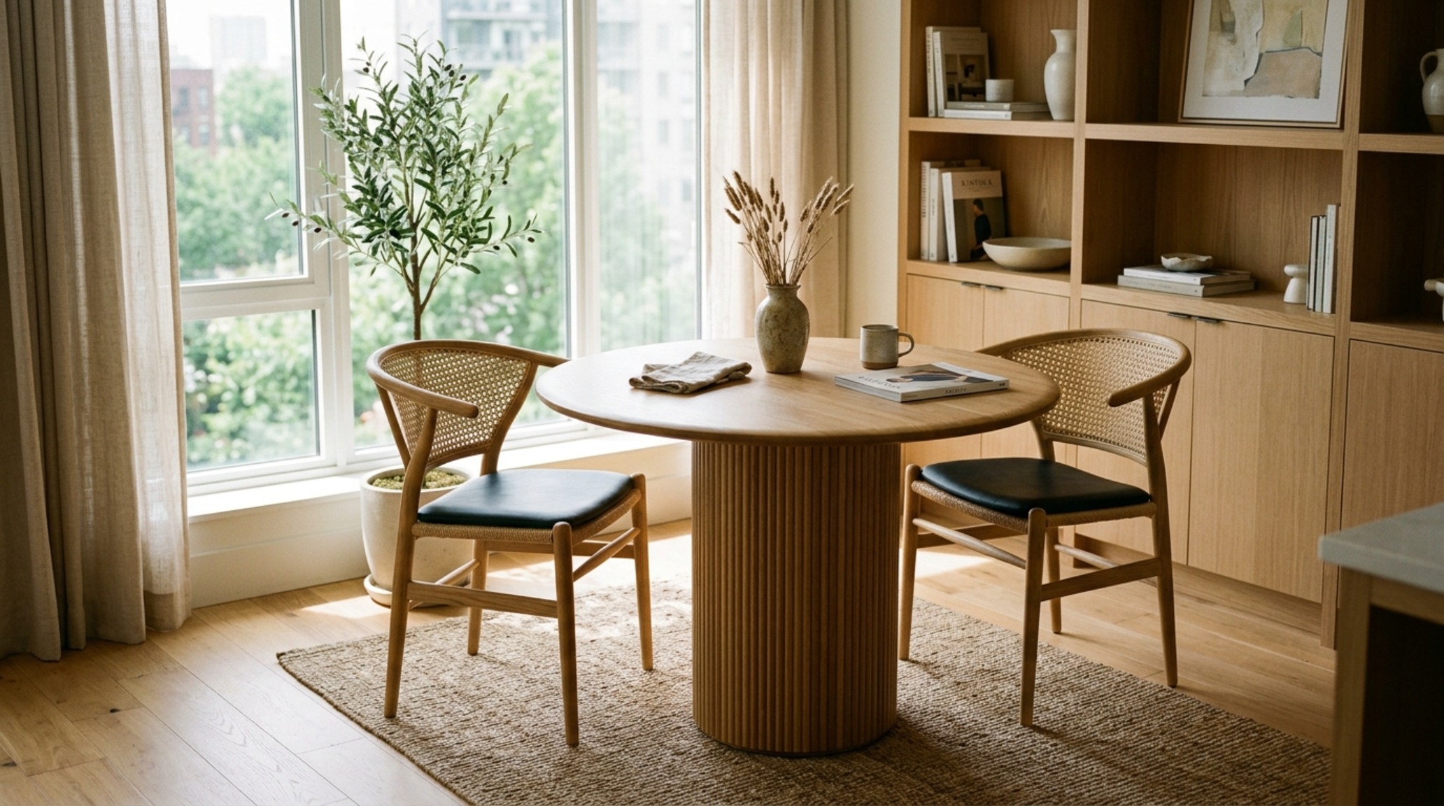
Lighting plays a pivotal role here. A common mistake is relying on a single overhead fixture. To achieve a professional designer’s hierarchy, introduce three layers of light: ambient (the overall glow), task (focused for reading or cooking), and accent (to highlight textures). Aim for a 2700K warm Kelvin rating across all bulbs to maintain a golden hour’ glow throughout the evening. High CRI (Color Rendering Index) ratings of 90 or above are essential for making those warm textures—the walnut grains, the linen weaves—look rich and authentic rather than muddy and flat.
L-Shaped Studio Flow: Directing the Eye in Mid-Tier Renovation
When you have the flexibility to invest in slightly more structural interventions, an L-shaped studio flow provides a natural advantage for zoning. This layout archetypally separates the ‘active’ kitchen and dining areas from the ‘passive’ sleeping and lounging zones. To enhance this, we look at the 2026 trend of ‘soft architecture’—using curves to lead the eye. Instead of a sharp 90-degree corner, a curved shelving unit or a rounded sofa back can soften the transition, making the studio feel like a series of interconnected vignettes rather than a single box.
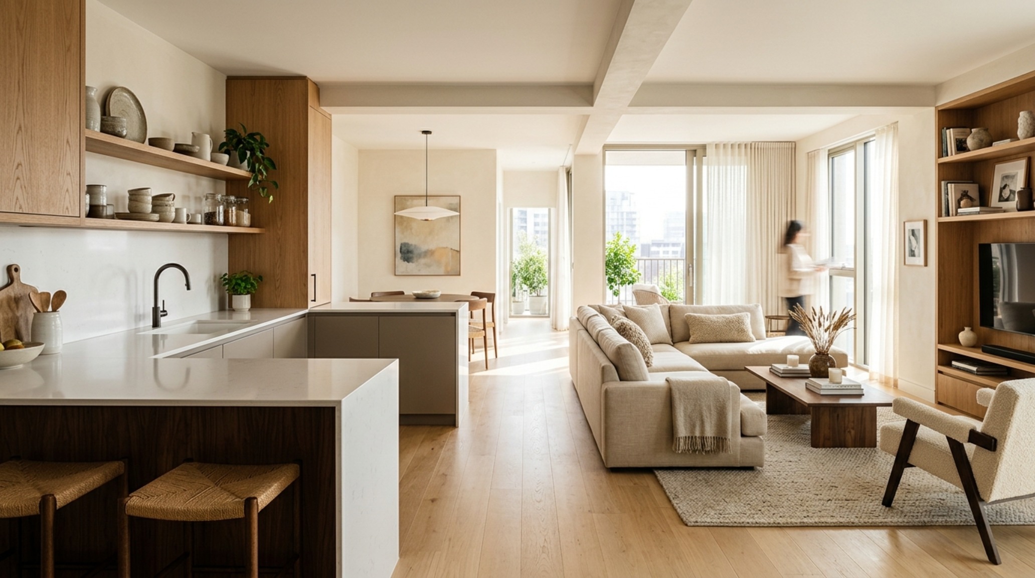
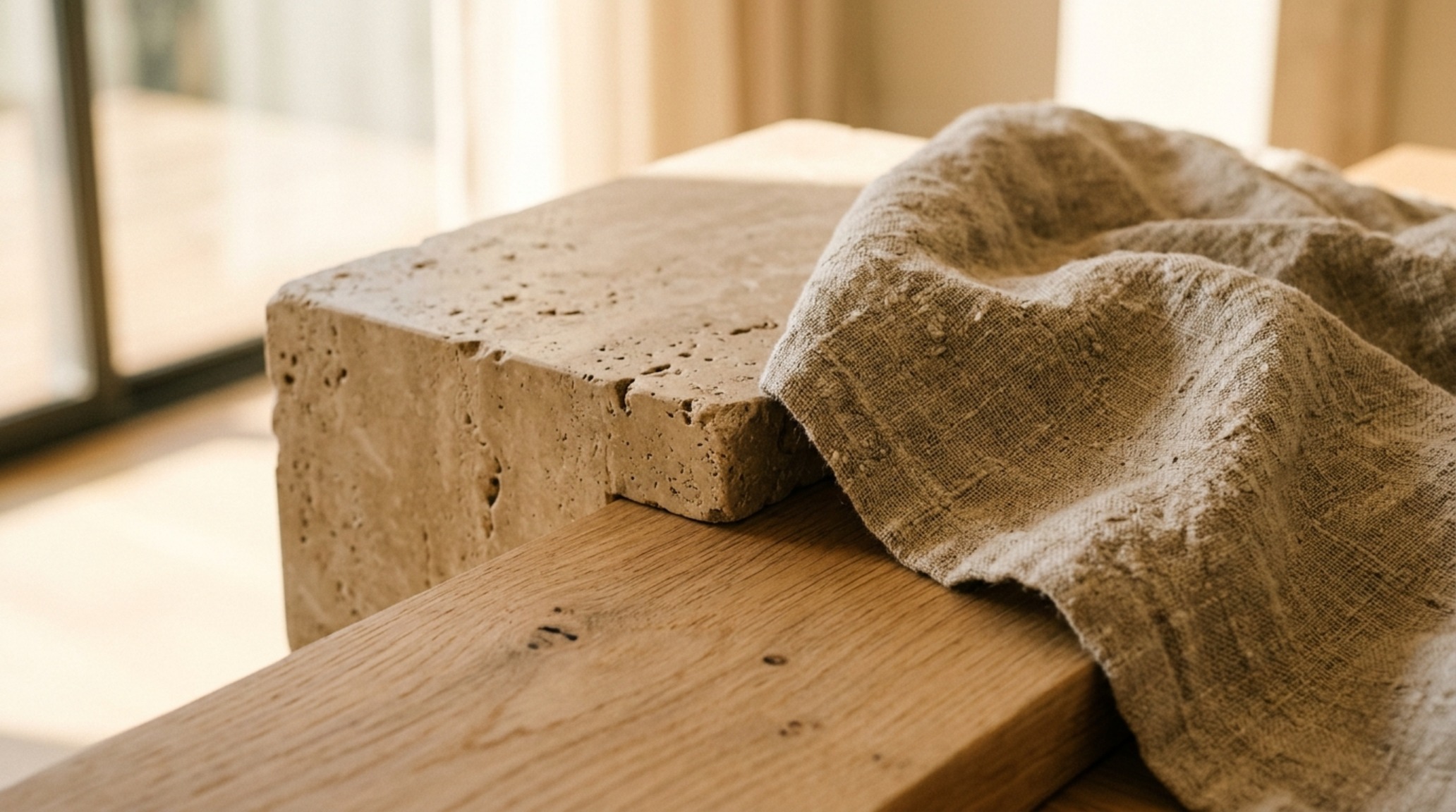
In mid-tier designs, materiality takes center stage. We transition from simple paint to tactile wall treatments. Consider a limewash finish or a subtle plaster effect like Farrow & Ball’s ‘Setting Plaster.’ These finishes interact with light, creating ‘shadow play’ that adds depth to the walls. When your walls have texture, you need fewer decorations to make the space feel ‘finished.’ This is the essence of warm minimalism: every surface earns its keep by providing sensory feedback.
Glass Partition Wall Ideas: Sculptural Transparency
One of the most effective ways to separate a sleeping alcove without losing light is through glass partition wall ideas. A fluted or reeded glass screen framed in thin black steel or warm oak provides privacy for the bed while allowing the 2700K ambient light to permeate the entire footprint. This structural choice is a hallmark of Dezeen-inspired minimalism. It creates a ‘room within a room’ effect that feels architectural and intentional. The transparency maintains the long sightlines that make a studio feel large, while the texture of the glass obscures the ‘mess’ of a bed, keeping the living area feeling pristine.
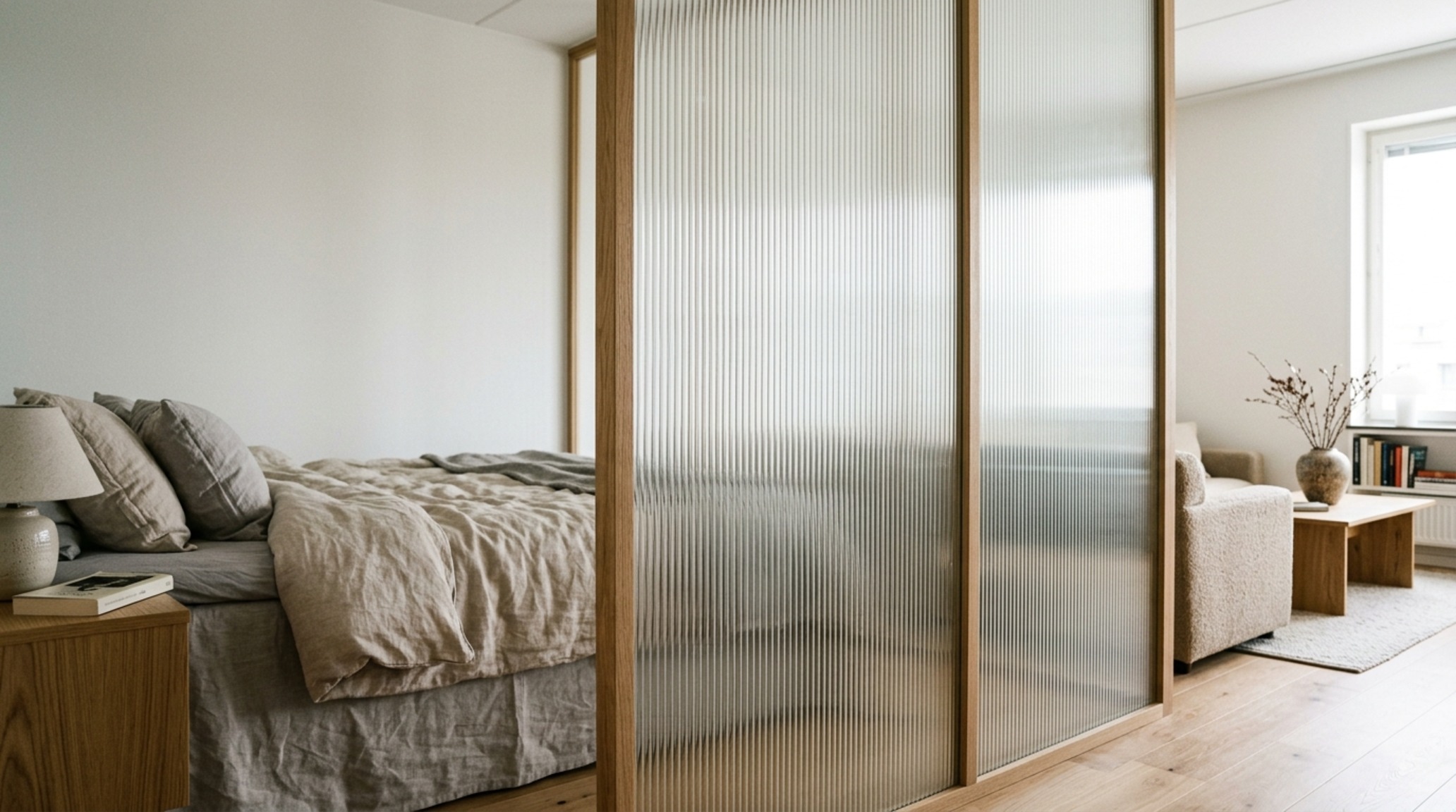
Integrating these partitions requires precise measurement. Ensure a 36-inch clearance on at least one side of the partition for comfortable passage. If the partition is fixed, consider using it as a back-drop for a low-slung console or a piece of art. This layering of elements—glass, then wood, then art—creates the ‘spatial depth’ that distinguishes professional interior design from DIY attempts. It’s about building a visual narrative where one zone informs the next.
Jewel Box Bedroom Design: The Height of Intimacy
For those ready to splurge, the goal is to turn the sleeping area into a jewel box bedroom design. This involves bespoke millwork, perhaps an integrated platform bed with built-in storage and wraparound headboards upholstered in mohair or heavy linen. In the splurge tier, we move away from ‘off-the-shelf’ solutions toward custom cabinetry that fits the room like a glove. This ‘fitted’ look eliminates the visual noise of freestanding furniture, making the room feel more expansive and expensive.
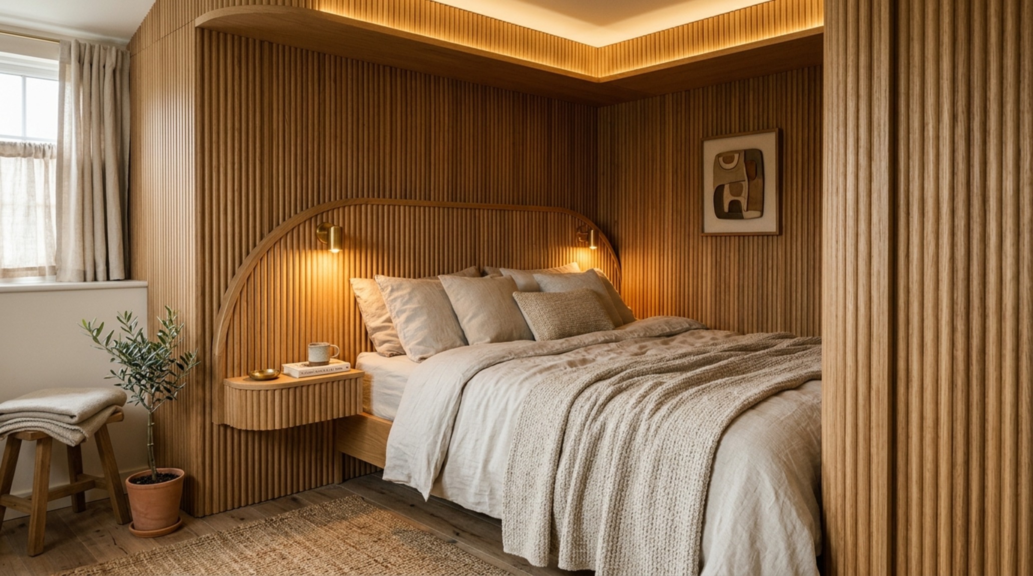
Materiality here is uncompromising. Think honed travertine side tables, fluted white oak panels, and solid brass hardware that will patina over time. The 2026 palette for these high-end spaces leans into earthy, grounded tones: deep terracotta, charcoal slate, and the omnipresent ‘Oat Milk’ white. These colors, when applied to high-quality materials, create a sense of permanence and ‘Quiet Luxury.’ The bedroom should feel like a cocoon, a stark contrast to the airy, bright living area.
Compact Kitchen Clearance: Precision in the Culinary Hub
The kitchen in a studio layout is often the hardest to master, yet it’s the heart of the home. Maintaining a compact kitchen clearance of 42 inches between counters is the gold standard for a two-person household, but in a micro-studio, you can drop to 36 inches if necessary. To maintain the warm texture theme, avoid high-gloss cabinets. Instead, opt for matte finishes or wood veneers that show a natural grain. A backsplash in a handmade Zellige tile provides the perfect tactile contrast to a smooth, honed stone countertop.
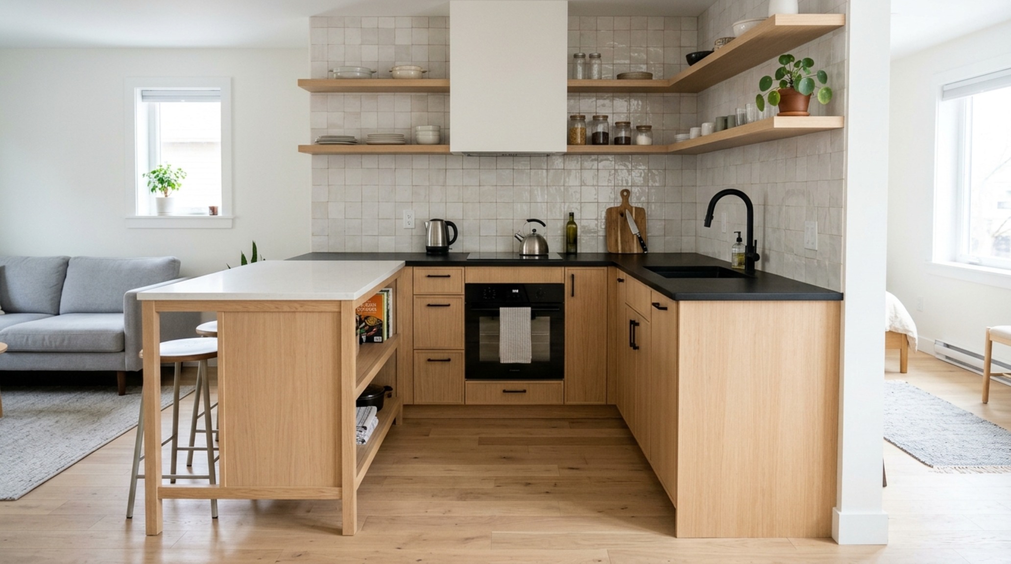
Don’t overlook the utility of vertical space. Open shelving in reclaimed wood can display curated ceramics while keeping the ‘floor plane’ clear. However, the rule of ‘visual quiet’ applies here: only display items that fit the color story. A mismatched collection of plastic containers will break the spell of your ‘Oat Milk’ sanctuary. In a small kitchen, every object is a design choice.
Design Blueprint: Materials, Light & Dimensions
A concise technical ledger of paint hex codes, architectural finishes, and dimensional standards for 2026.
Creating a cohesive studio is a lesson in restraint and intentionality. As you begin your journey toward a more curated home, keep a tactile shopping list in mind: look for linen window treatments that diffuse light, solid wood furniture with rounded edges to soften the room’s corners, oversized wool rugs for zoning, and dimmable 2700K lighting to set the mood. For more inspiration on optimizing your footprint, you can explore detailed studio apartments layouts that prioritize both form and function. Ultimately, a home is not defined by its square footage, but by the quality of the light, the softness of the surfaces, and the effortless flow between the moments of your day. The future of micro-living is warm, tactile, and profoundly personal.
Editorial Silo • Recommended Architecture Studies
- How Colors Affect Mood Ideas (2026) — Archival Design Case Study
- Flexible Greige Paint Color and Material Texture Pairs — Archival Design Case Study
Contemporary Living Lookbook
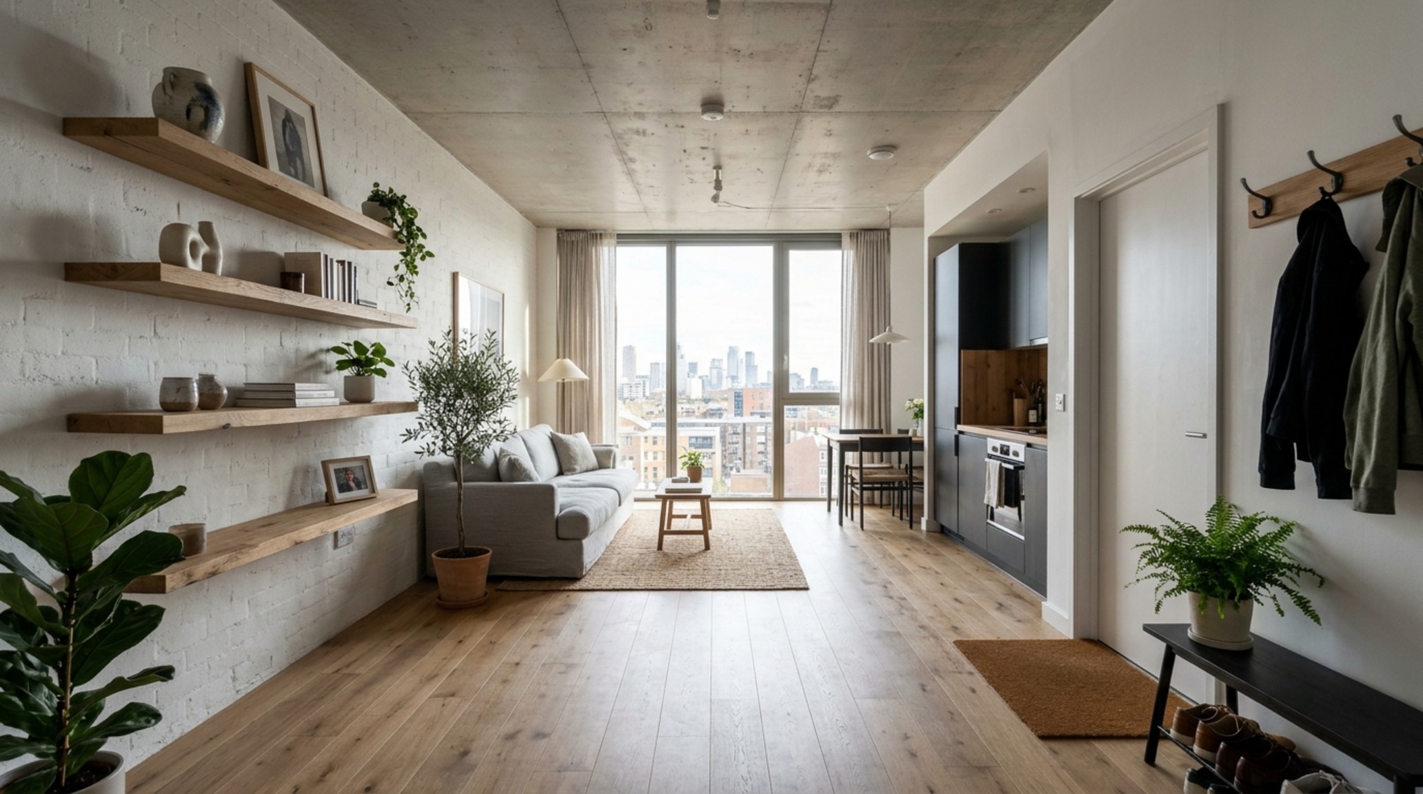
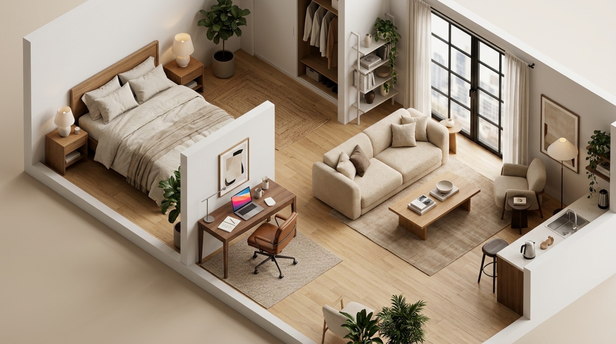
A tactile photo journey through spatial flow, tonal warmth, and balanced structural geometries.
Curated Visual Lookbook
Design Gallery & Spatial Studies
A visual curation of architectural arrangements, lighting concepts, and material palettes featured in this space.