A room that feels instinctively ‘off’ is rarely suffering from a lack of expensive furniture; more often, it is a victim of neuro-architectural misalignment. Understanding exactly how colors affect mood serves as the fundamental bridge between a house that looks good and a home that heals. We often treat paint as the final layer of a renovation, yet it is the primary sensory filter through which we experience every square inch of our spatial reality.
The Problem: The Sensory Deprivation of Sterile Minimalism / The Solution: Leveraging Color Psychology for Emotional Resilience
For the better part of a decade, we have been trapped in a cycle of high-LRV (Light Reflectance Value) whites and lifeless greys under the guise of ‘modernity.’ This architectural sterility often leads to a phenomenon known as sensory under-stimulation, which can leave residents feeling ungrounded and restless. The solution lies in shifting our perspective from aesthetic trends to color psychology—the study of how specific wavelengths of light impact our endocrine systems and cortisol levels.
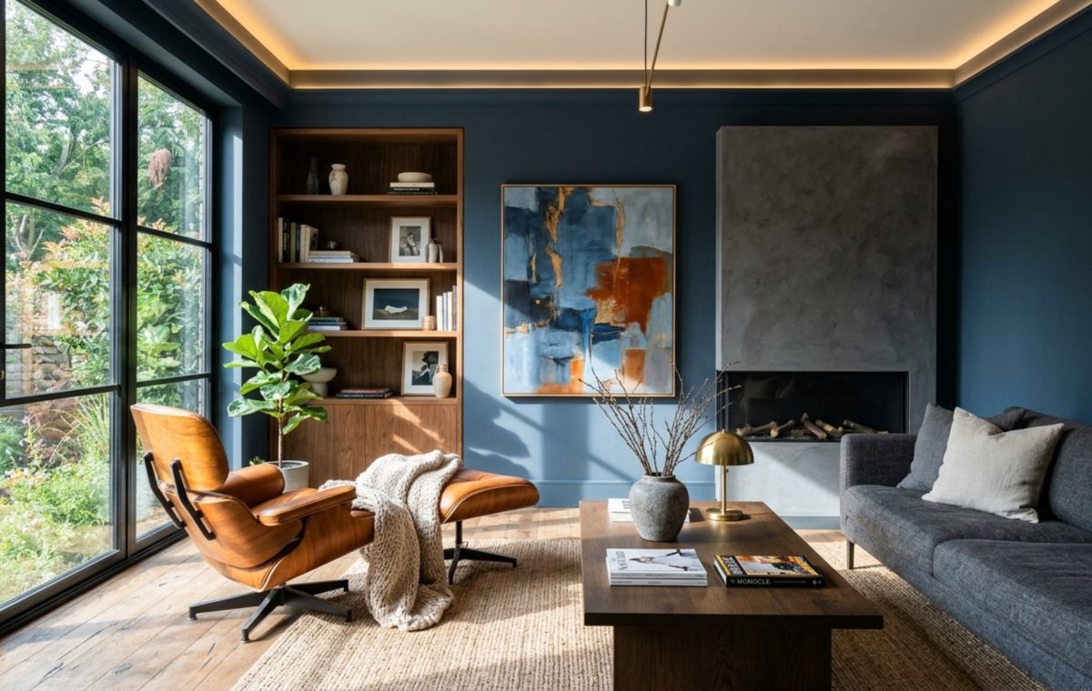
By intentionally selecting pigments that resonate with the circadian rhythm, we can transform a static room into a dynamic emotional tool. For instance, a hallway with limited natural light doesn’t always need to be painted white to feel bigger; sometimes, a deep, cocooning shade like Benjamin Moore’s Hale Navy creates a sense of depth and security that a flat white could never achieve. It provides the ‘spatial hug’ that humans subconsciously crave in transit areas.
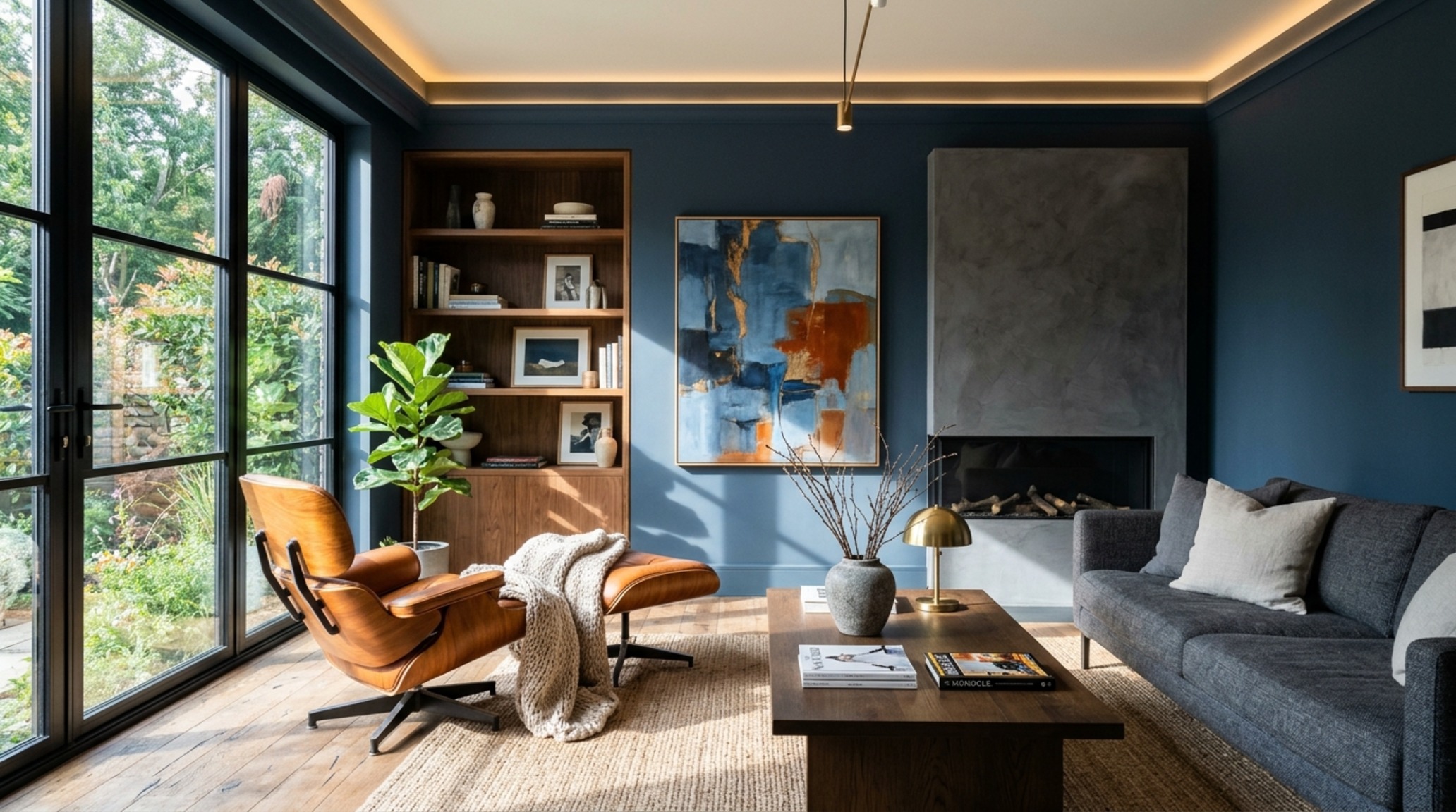
Applying Color Psychology: The Science of Saturation
Saturation is the hidden dial of emotional intensity. A highly saturated red might stimulate the adrenal glands—excellent for a dining room where conversation should be lively, but disastrous for a nursery. Conversely, desaturated earth tones, which integrate seamlessly with psychology of home decor, provide a steady baseline for the nervous system. When we look at a space through the lens of psychology, we aren’t just choosing a ‘pretty’ blue; we are selecting a frequency that signals the brain to lower its guard.
The Problem: High Cortisol in Private Sanctuaries / The Solution: Calming Wall Colors for Bedrooms that Lower the Heart Rate
The modern bedroom has become a battlefield for our attention, cluttered with blue-light devices and work-from-home residues. The problem is a lack of clear biological boundaries. To fix this, we must look at calming wall colors for bedrooms that act as a visual sedative. Soft, dusty pinks like Farrow & Ball’s Setting Plaster or muted sages like Benjamin Moore’s Saybrook Sage are not just popular choices—they are physiologically efficient at signaling the body to transition into a parasympathetic state.
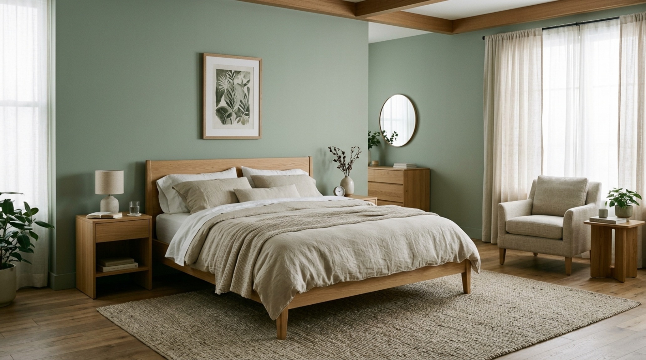
When implementing these palettes, spatial ergonomics are key. Ensure a 30-inch clearance around the bed to maintain a sense of ‘air’ around these soft hues. If the room is too cramped, even the most serene color can feel claustrophobic. By pairing these soft pigments with 2700K warm ambient lighting, you create a spectrum that mimics the golden hour, naturally preparing the brain for melatonin production.
The Nuance of Interior Paint Palettes
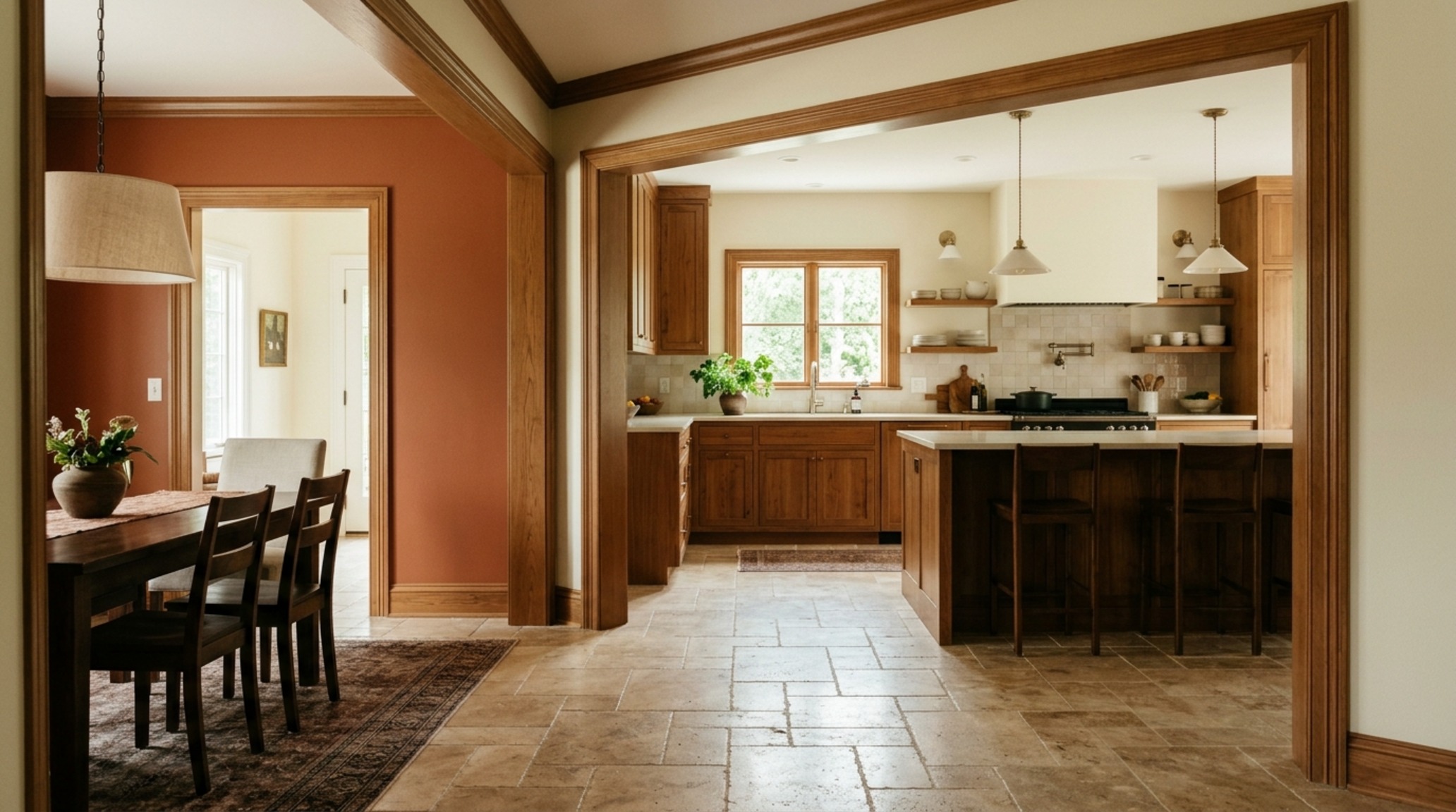
Creating a cohesive flow requires understanding how interior paint palettes transition from one room to another. You don’t want a ‘shouted’ transition; you want a whispered one. Use a ‘thread’ color—perhaps a consistent trim in Benjamin Moore Swiss Coffee—to link a sage bedroom to a terracotta ensuite. This visual continuity reduces the cognitive load of processing new environments as you move through your home.
The Problem: Creative Stagnation in the Home Office / The Solution: Using Cool Greens to Spark Cognitive Flow
The home office is often relegated to a spare corner, frequently painted in ‘safe’ neutrals that do nothing to combat the afternoon slump. Research into biophilic design suggests that our brains are hardwired to associate specific greens with growth and vitality. By using mood boosting paint trends that favor botanical greens, we can actually enhance focus. A deep forest green creates a ‘cave-like’ focus zone that minimizes peripheral distractions, whereas a minty seafoam can make a small 10×10 office feel expansive and oxygenated.
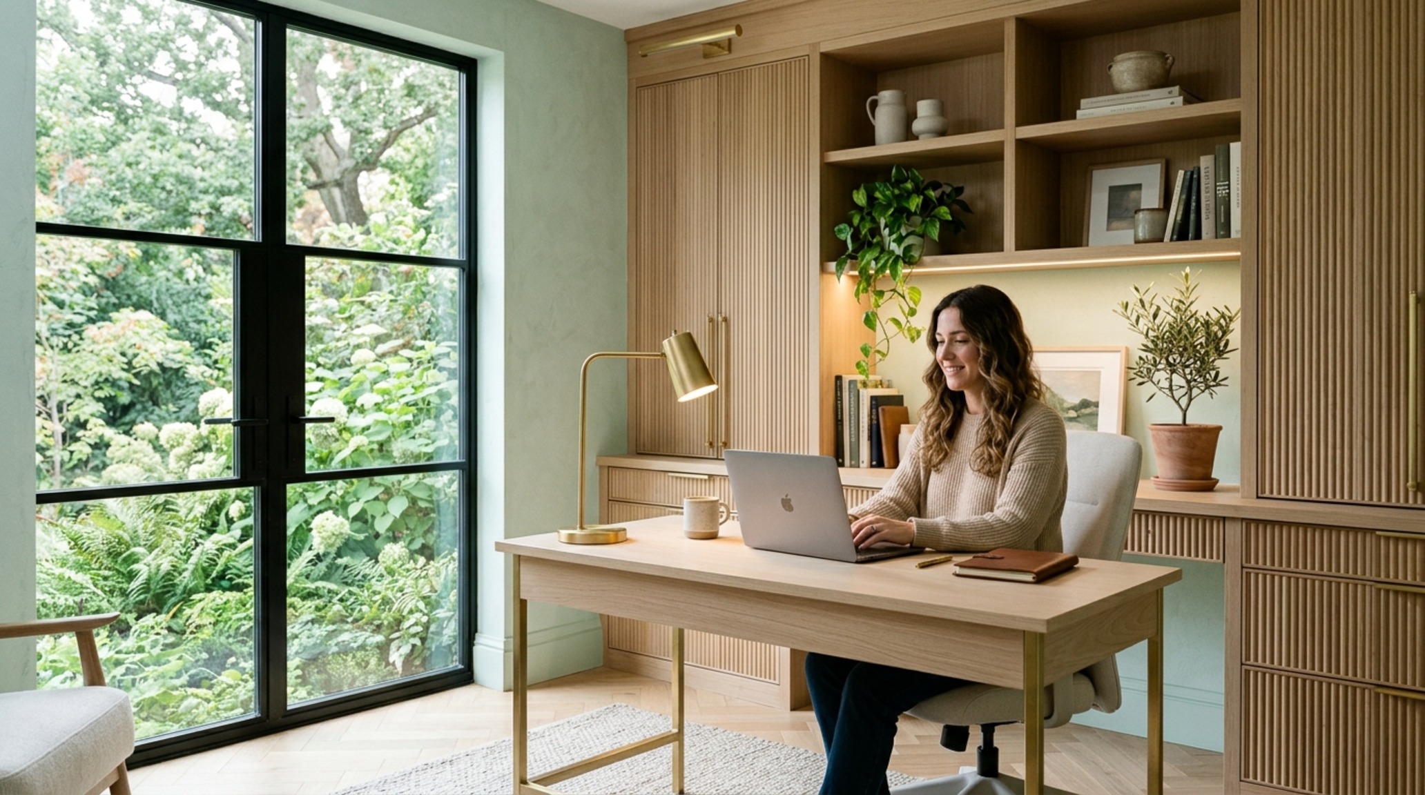
To maximize this effect, consider the light reflectance value of your chosen green. A high LRV green will bounce more light onto your desk, reducing the need for harsh overhead task lighting. Pair this with 3000K task lamps (CRI 90+) to ensure the green doesn’t shift into a sickly yellow under artificial light. The goal is to create a vibrant environment that mimics the clarity of an outdoor canopy.
The Problem: Flat, One-Dimensional Living Spaces / The Solution: Masterful Lighting and Color Interaction
A common mistake is choosing a paint color based on a 2-inch swatch in a store with fluorescent lighting. The problem? Your home is a living organism of shifting shadows and natural light thresholds. Lighting and color interaction is the most critical variable in how we perceive mood. A warm amber that looks inviting at noon might look muddy and heavy by 6:00 PM if it isn’t supported by the right artificial light spectrum.
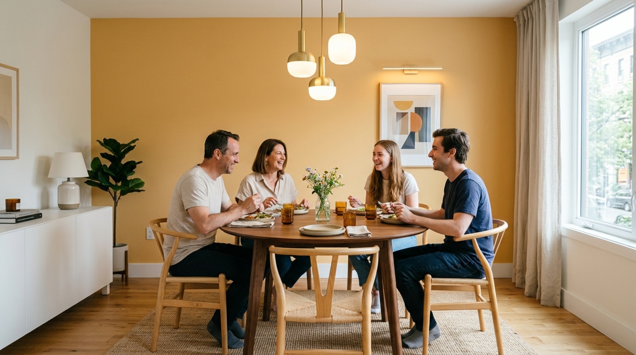
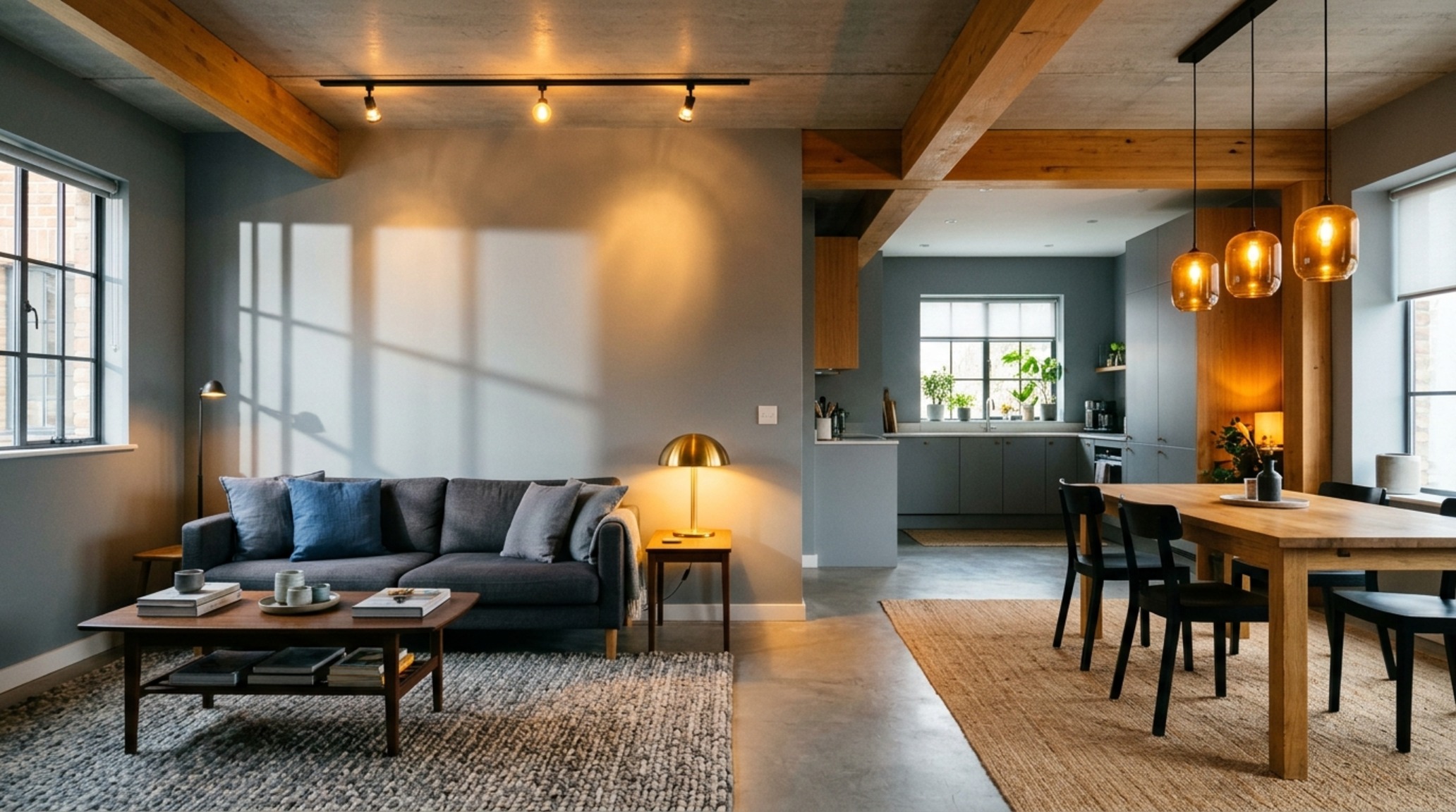
Metamerism—the phenomenon where colors change under different light sources—can be your best friend or worst enemy. To solve this, always test your swatches against a 90+ CRI (Color Rendering Index) light source. This ensures that the rich pigments you’ve chosen maintain their integrity after the sun goes down. In open-concept spaces, use warm vs cool color theory to create zones: warm ambers in the dining area to encourage appetite, and cooler greys in the transitional corridors to provide a sense of movement.
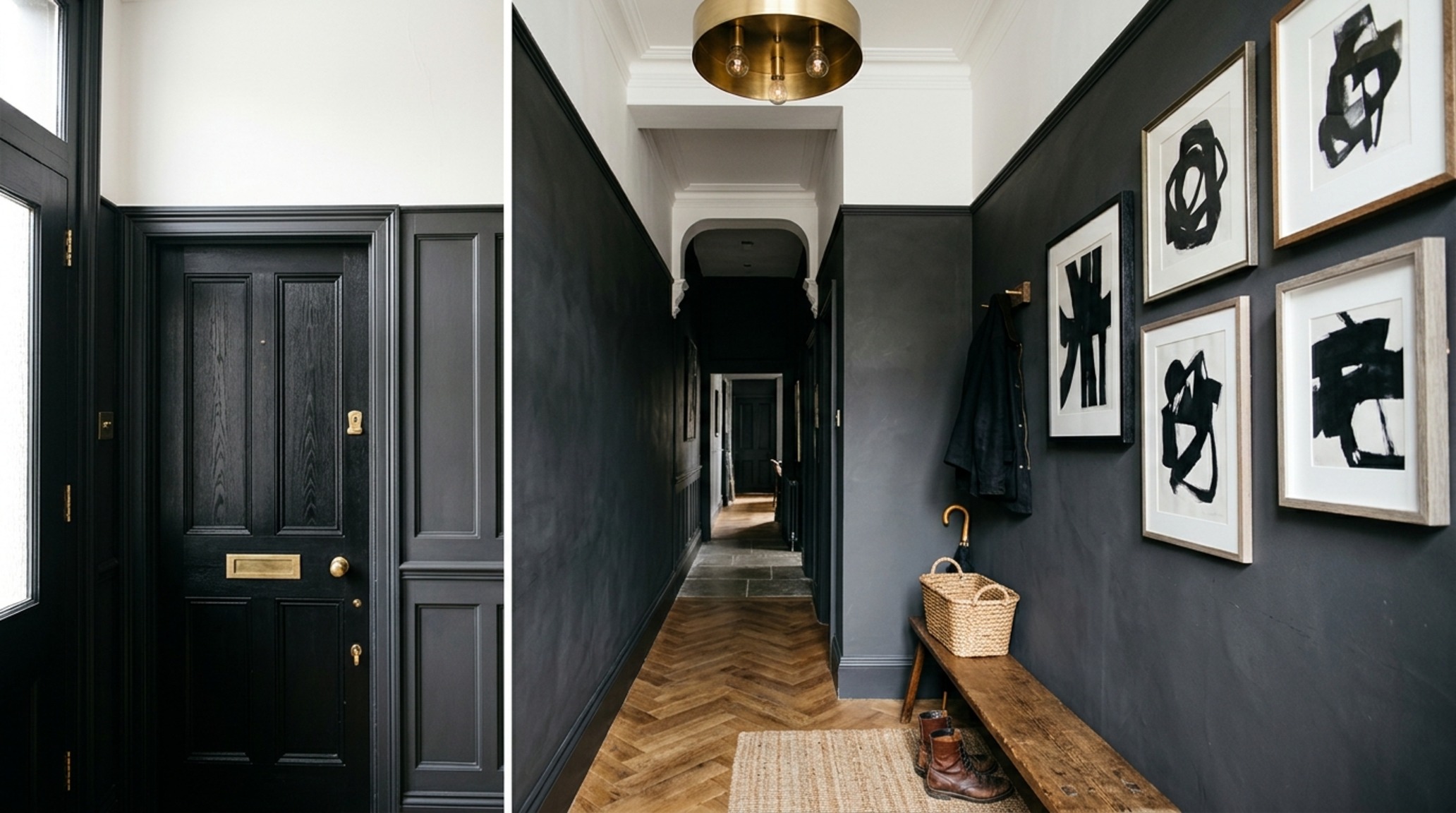
Spatial Perception & Floor Plane Transitions
How we perceive the size of a room is directly tied to spatial perception and the contrast between walls and floors. If you want a ceiling to feel higher, paint it two shades lighter than the walls. If you want a vast, drafty room to feel intimate, bring the wall color up onto the ceiling. Maintain standard 36-inch primary circulation paths to ensure that the visual weight of darker ‘moody’ colors doesn’t overwhelm the physical flow of the home.
The Problem: The ‘Grey-Out’ of Joy / The Solution: Dopamine Decor Paint Colors for Intentional Vibrancy
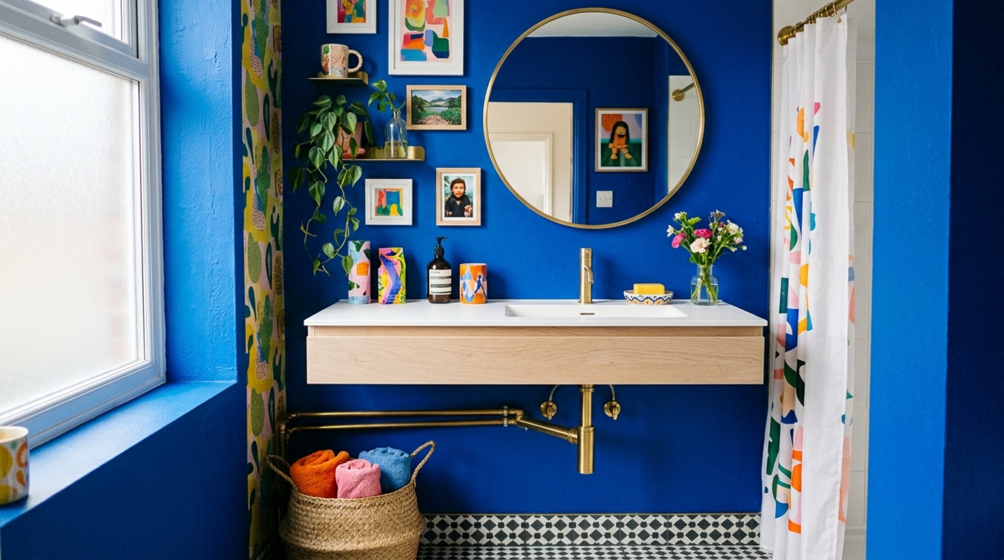
We are seeing a massive rebellion against the clinical aesthetic of the 2010s. The problem was a fear of ‘getting it wrong,’ which led to a decade of chromatic boredom. The solution is the rise of dopamine decor paint colors—vibrant citrons, electric blues, and sunset oranges used with architectural precision. These aren’t just for ‘maximalists’; they are for anyone looking to inject a sense of play and personality back into their environment.
The key to making these bold colors work is negative space. Allow for ‘visual breathing room’ by pairing a bold ochre feature wall with clean white oak floors and honed travertine surfaces. This prevents the color from becoming an assault on the senses and instead turns it into a curated focal point that sparks genuine joy.
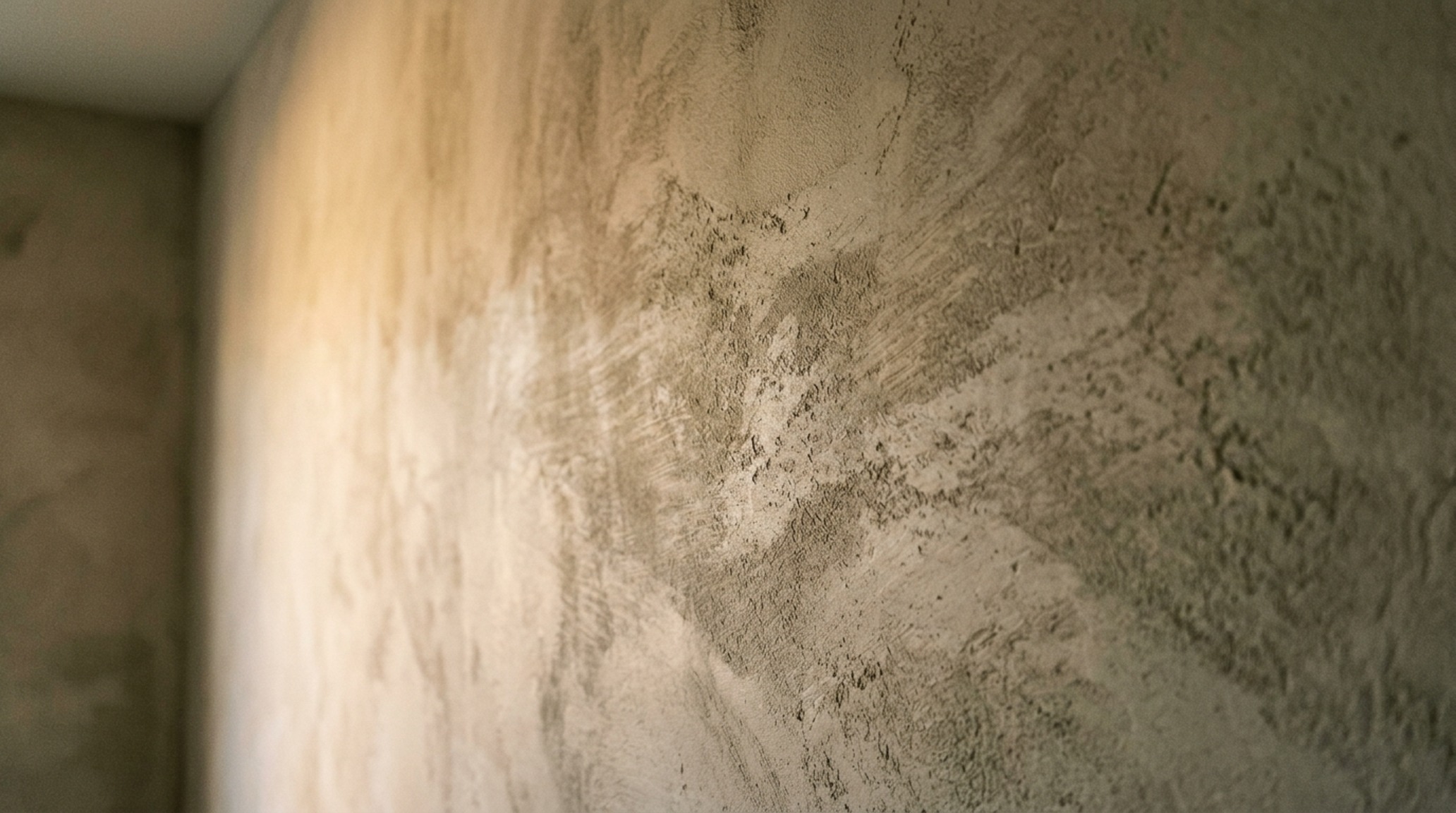
Tactile Blueprint & Material Specifications
Architectural summary of tactile material selections, lighting specifications, and spatial ergonomics.
Before you start your next painting project, remember that the mood of a room is a composite of light, shadow, and psychology. Take the time to observe the natural light at three different points of the day. Purchase large-format peel-and-stick samples rather than tiny swatches. Consider the function of the room—is it for rest, for work, or for connection? When you align your palette with your lifestyle, your home becomes more than a physical structure; it becomes a sanctuary that actively supports your mental well-being. Looking forward, the most successful 2026 interiors will be those that prioritize emotional resonance over rigid trends, proving that the most powerful tool in an architect’s kit isn’t the hammer, but the brush.
Editorial Silo • Recommended Architecture Studies
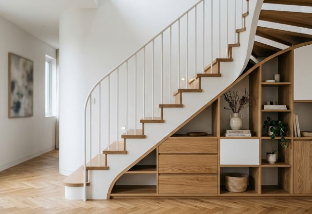
- Sculptural Under stair storage solutions — Archival Design Case Study
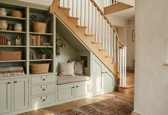
- Whimsical Under stairs storage — Archival Design Case Study
Spatial Inspiration Album
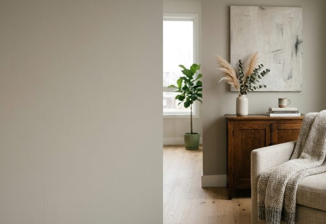
A visual anthology detailing craftsmanship, tailored millwork, and nuanced ambient illumination.
Curated Visual Lookbook
Design Gallery & Spatial Studies
A visual curation of architectural arrangements, lighting concepts, and material palettes featured in this space.