Moody Mid-Century: Trading Dopamine Decor for Dark Academia Sophistication
For the better part of a decade, the design world has been under the spell of the vibrant mid-century modern home. We’ve seen it a thousand times: the sunflower yellow Eames chairs, the turquoise accent walls, and the playful, almost cartoonish ‘Jetsons’ optimism that defined the post-war era. While there is an undeniable charm to that candy-colored nostalgia, it often feels like living inside a stage set. It’s loud, it’s high-energy, and in our increasingly chaotic world, it can be a bit… exhausting. There is a growing movement away from this ‘Dopamine Decor’ toward something more grounded, more intellectual, and infinitely more soulful: Moody Mid-Century.
The Evolution of the Mid-Century Aesthetic
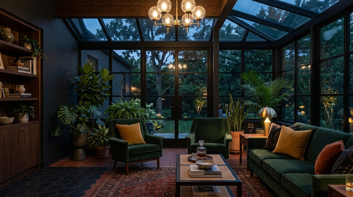
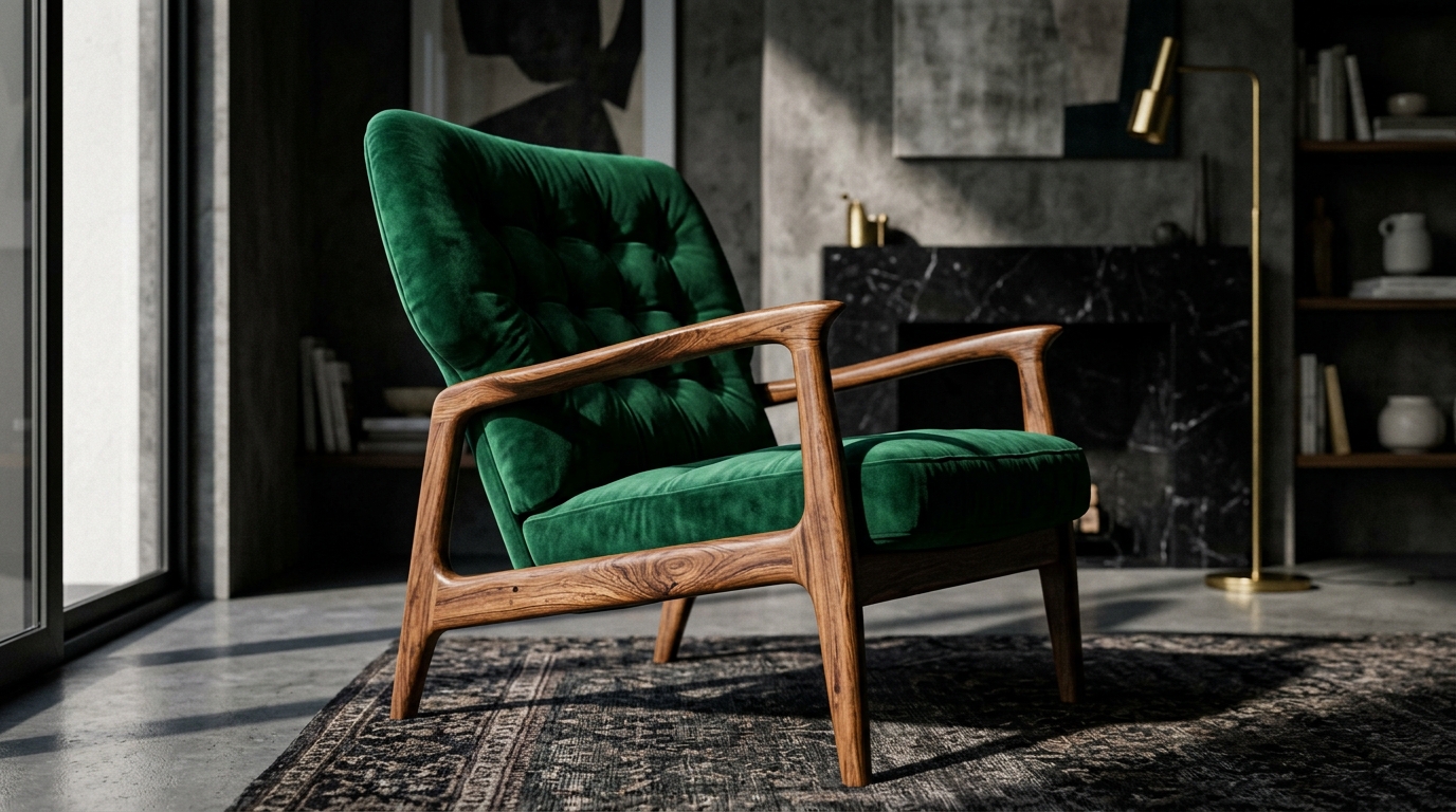
The traditional approach to a vibrant mid-century modern home leans heavily into the 1950s pop-culture aesthetic. It’s the visual equivalent of a bouncy jazz record. But there is another side to the mid-century story—a side that favors the quiet craftsmanship of the late 60s and early 70s, where the forms remained sleek but the palettes grew deeper and the materials more tactile. Moody Mid-Century isn’t about rejecting the icons of the era; it’s about re-contextualizing them. Instead of pairing a walnut sideboard with a bright orange lamp, we’re pairing it with a forest green velvet armchair and a stack of leather-bound books. This isn’t just a style change; it’s a shift in temperament.
Moving Beyond the ‘Jetsons’ Vibe
The ‘Jetsons’ vibe is characterized by lightness—both in color and in spirit. It’s an aesthetic of hope and futurism. However, as we spend more time at home, we find ourselves craving depth and introspection. The Moody Mid-Century aesthetic borrows heavily from the Dark Academia movement, creating a space that feels like a private library or a secluded members-only club. It swaps out the ‘vibrant’ for the ‘vivid,’ replacing neon pops with saturated jewel tones that absorb light rather than reflecting it. This creates a sense of enclosure and safety, a literal sanctuary from the digital noise outside.
The Foundation: The Gravitas of Dark Wood
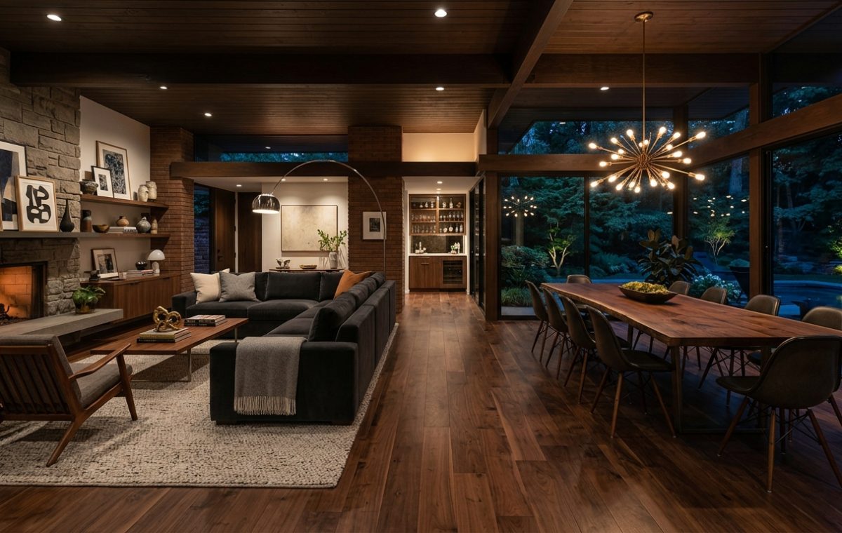
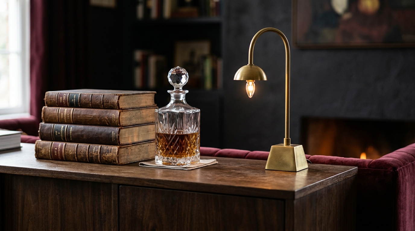
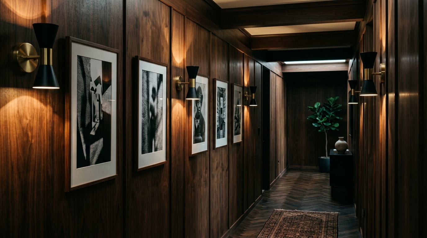
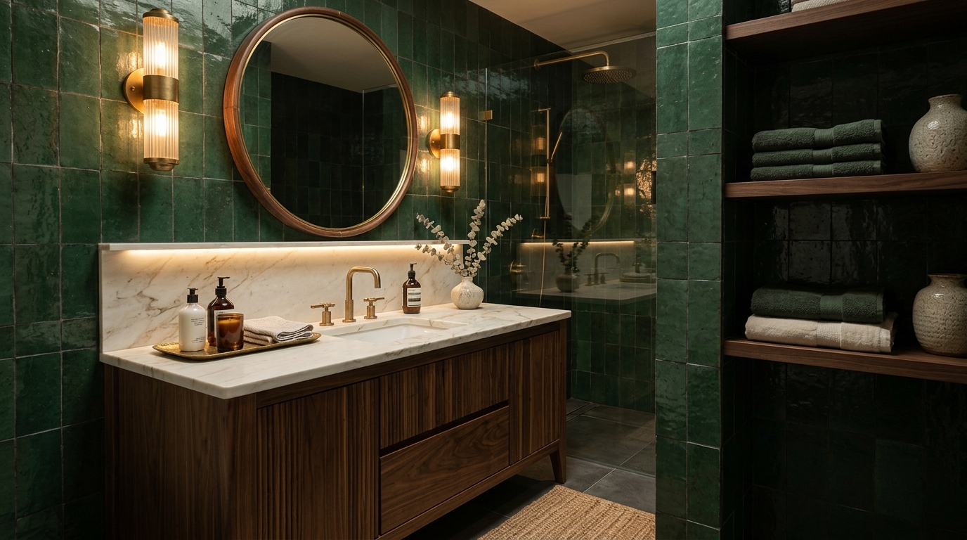
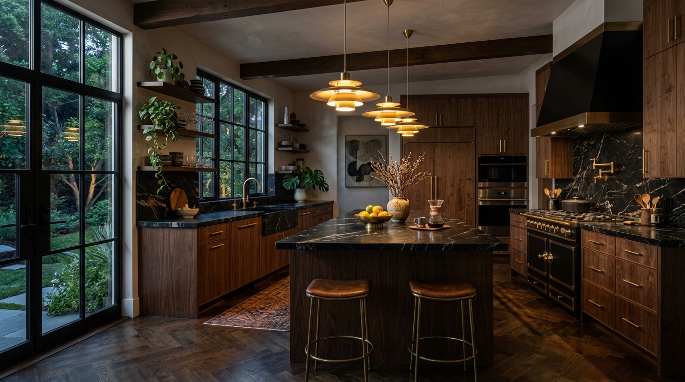
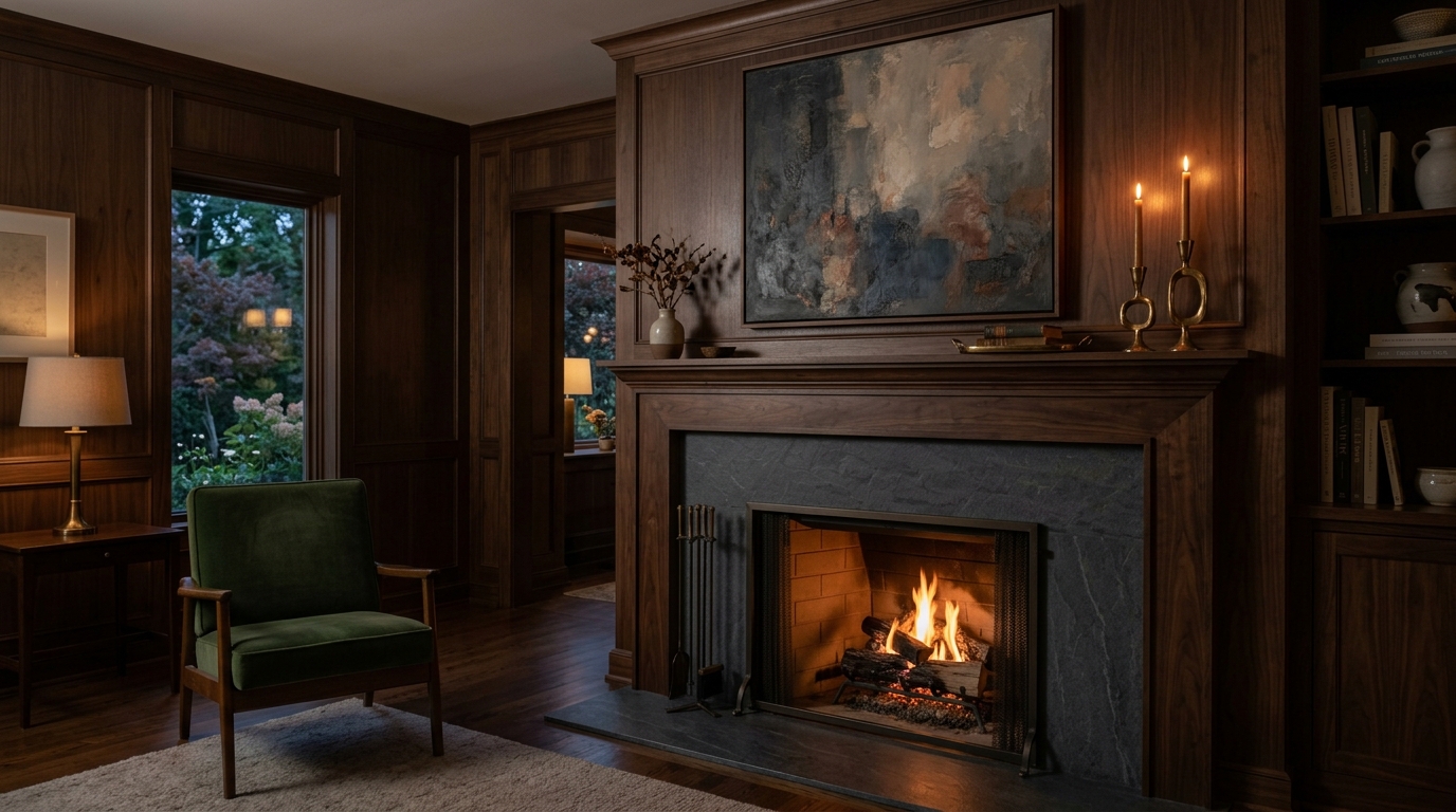
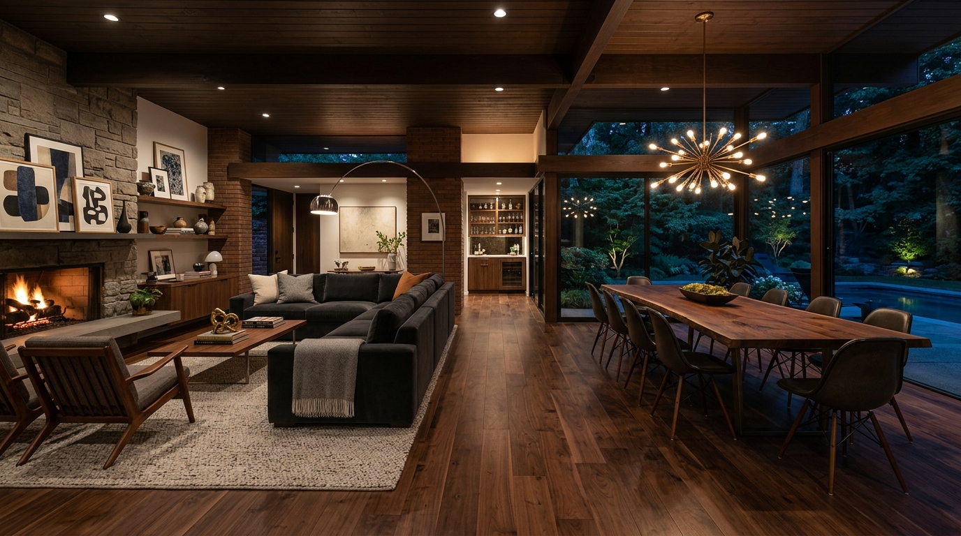
In a typical vibrant mid-century modern home, wood is often used sparingly or finished in lighter, honey-toned oaks. In the Moody Mid-Century world, wood is the protagonist. We are looking for the dark, rich grains of rosewood, oiled walnut, and mahogany. These woods possess a natural gravity; they feel permanent. The key is to lean into the organic imperfections of the grain. When you surround yourself with dark wood, the room immediately feels quieter. It’s a tactile experience that invites you to run your hand along the surface of a credenza, feeling the history of the material.
- Oiled Walnut: The gold standard for MCM, offering a matte, sophisticated finish.
- Rosewood: Offers a dramatic, striped grain that acts as a natural work of art.
- Teak: When aged, teak takes on a deeper, more refined bronze hue.
The Art of the Shadow
One of the biggest mistakes in the vibrant mid-century modern home is the reliance on ‘bright and airy’ lighting. Moody Mid-Century thrives in the shadows. This style is about ‘pools of light’—using floor lamps, task lamps, and wall sconces to illuminate specific zones while leaving the corners of the room in a soft, mysterious gloom. This creates an immediate sense of intimacy. Think of a brass Poul Henningsen lamp casting a warm glow over a reading nook, while the rest of the room recedes into a deep emerald haze. It’s cinematic, dramatic, and deeply comforting.
The Palette: From Neon to Nocturnal
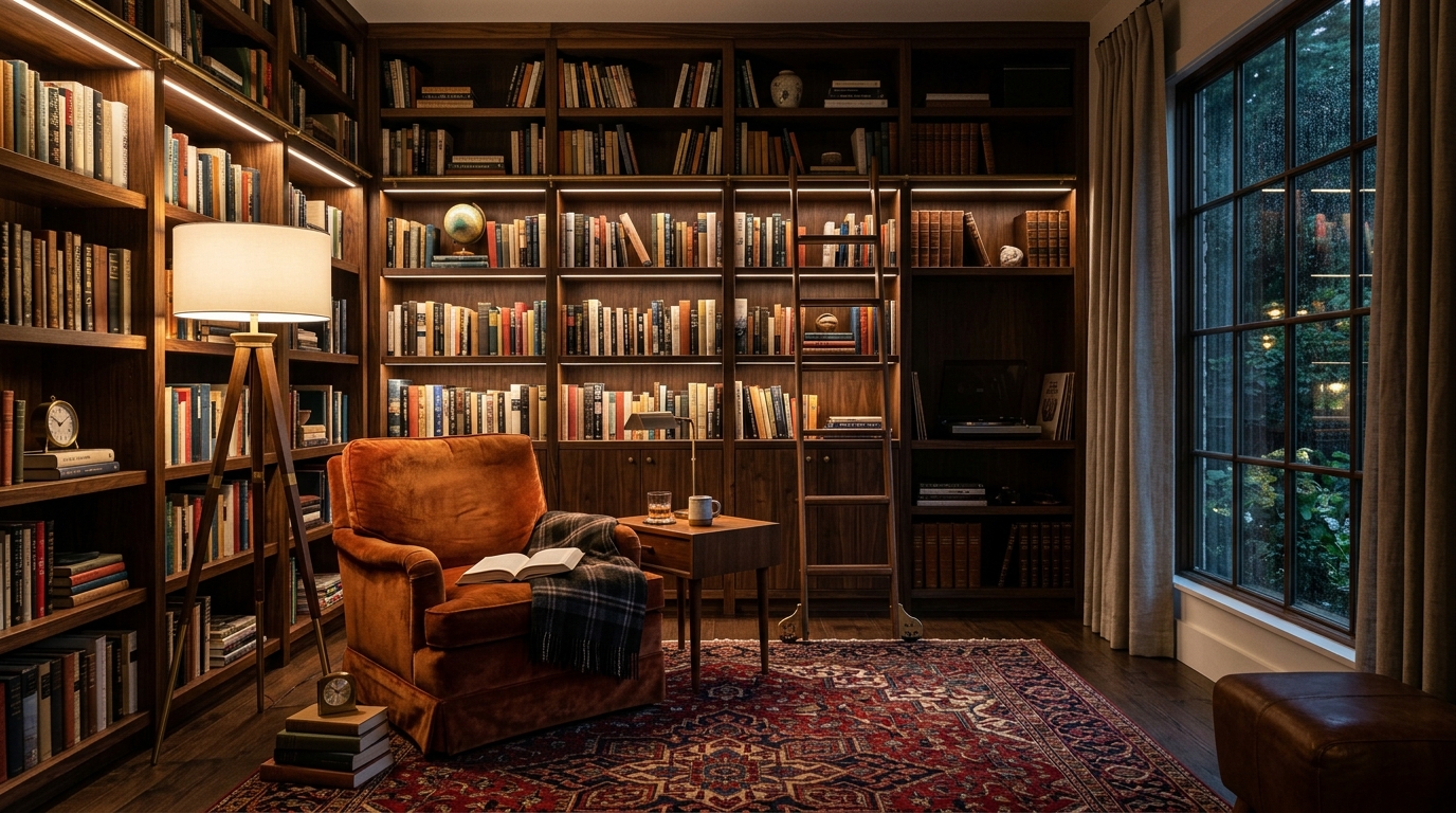
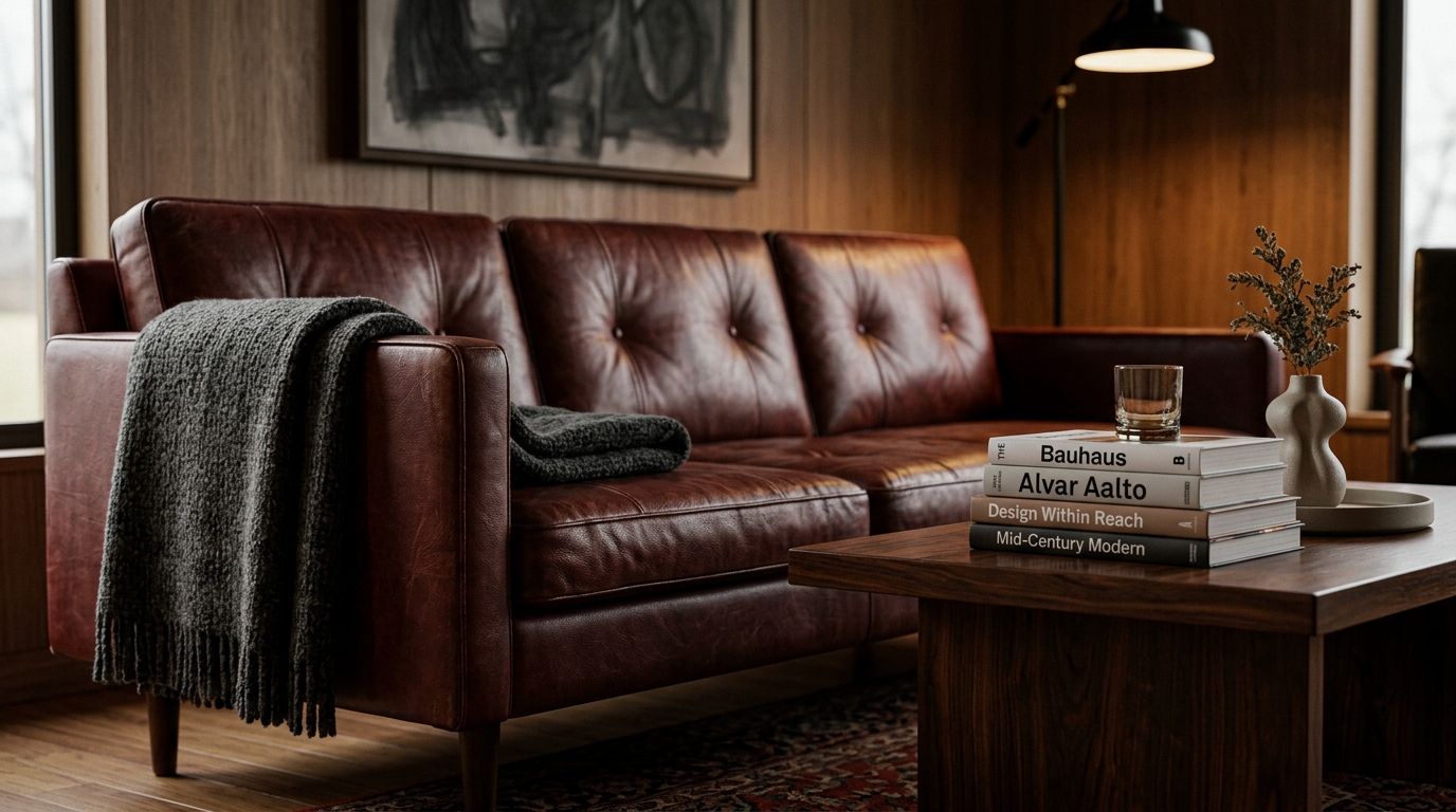
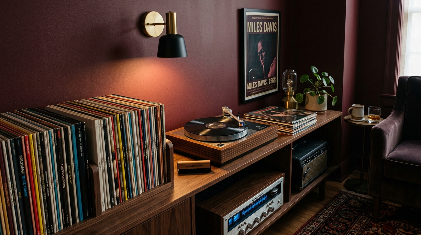
To achieve this look, we must abandon the primary colors of the 1950s. While a vibrant mid-century modern home might use a bright red rug to ‘pop,’ the Moody Mid-Century home uses a deep burgundy or a charred oxblood. These colors carry an intellectual weight. They don’t scream for your attention; they command it through their richness.
The Power of Jewel Tones
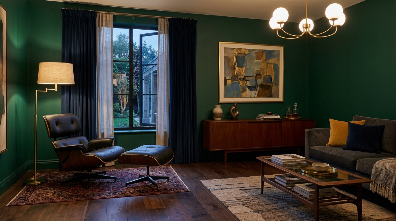
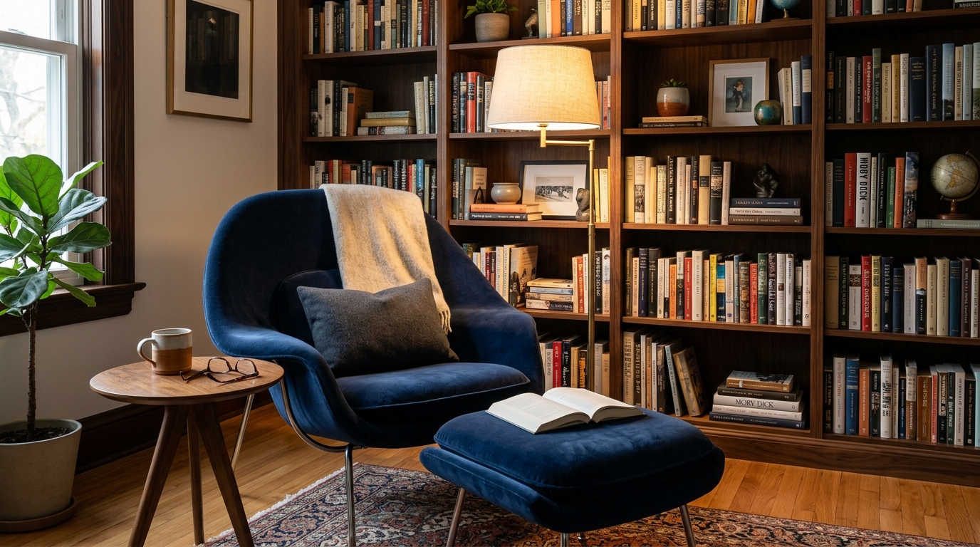
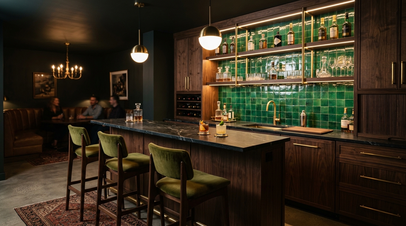
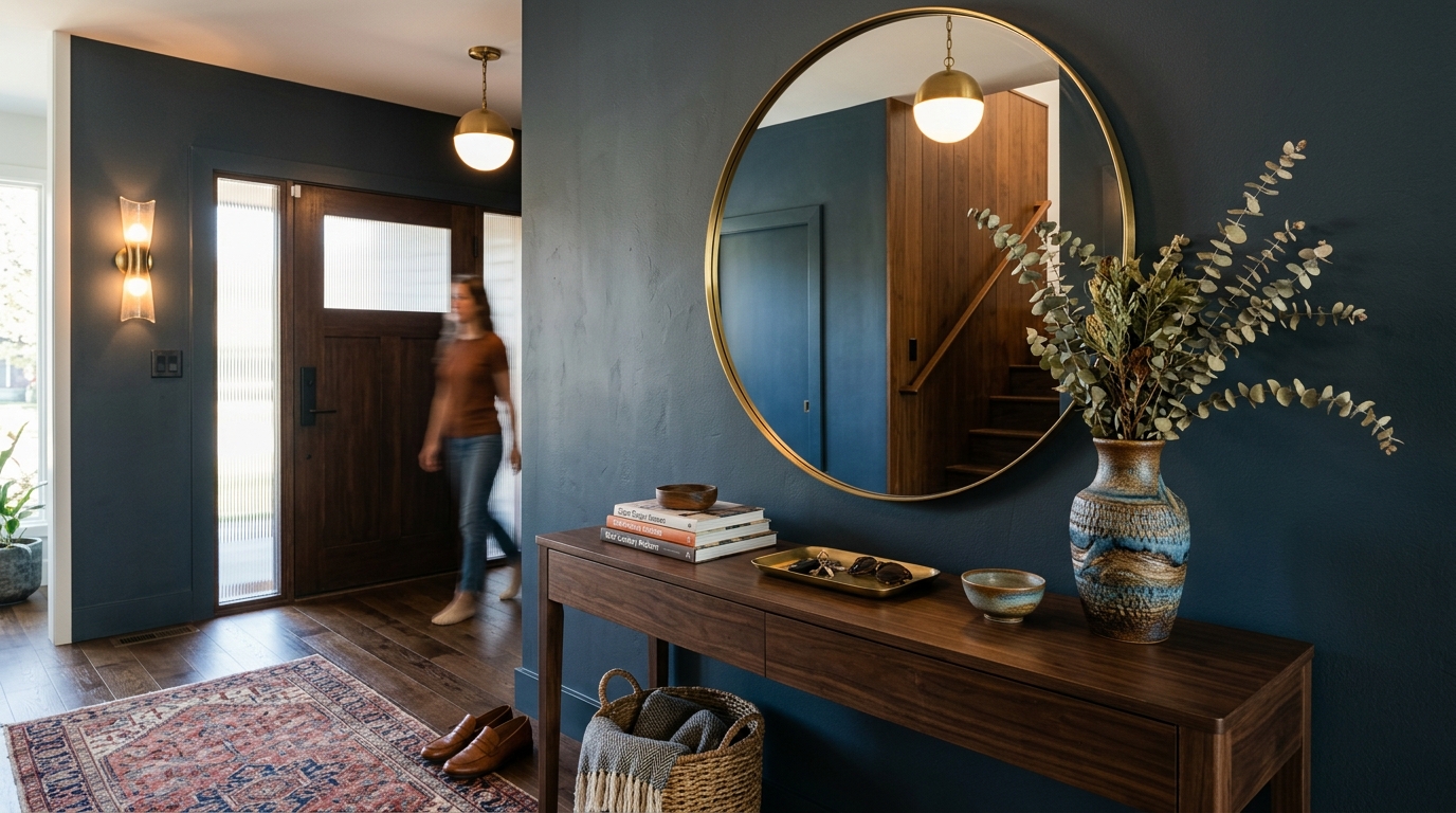
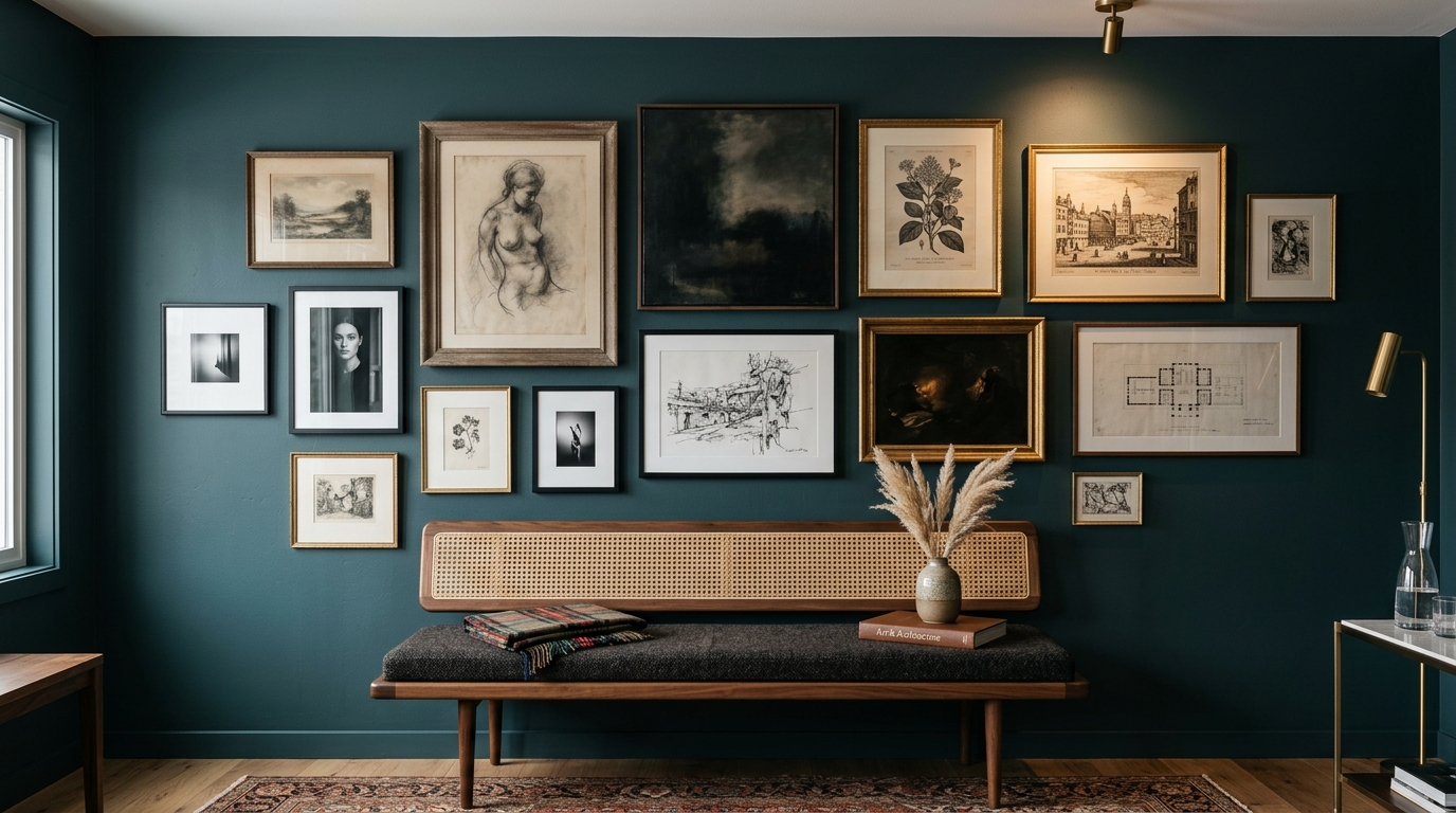
The core of this aesthetic lies in the ‘Nocturnal Palette.’ We are looking at colors that look their best at twilight. Emerald Green brings a sense of the forest indoors, pairing beautifully with dark wood. Deep Navy provides a neutral that is more complex than black or gray. Burgundy and Plum offer a touch of regal history that bridges the gap between MCM furniture and classical academic decor. When these colors are applied to walls—perhaps in a matte finish or even a subtle lime wash—the room begins to feel like a cocoon.
Dark Academia Meets Mid-Century Modern
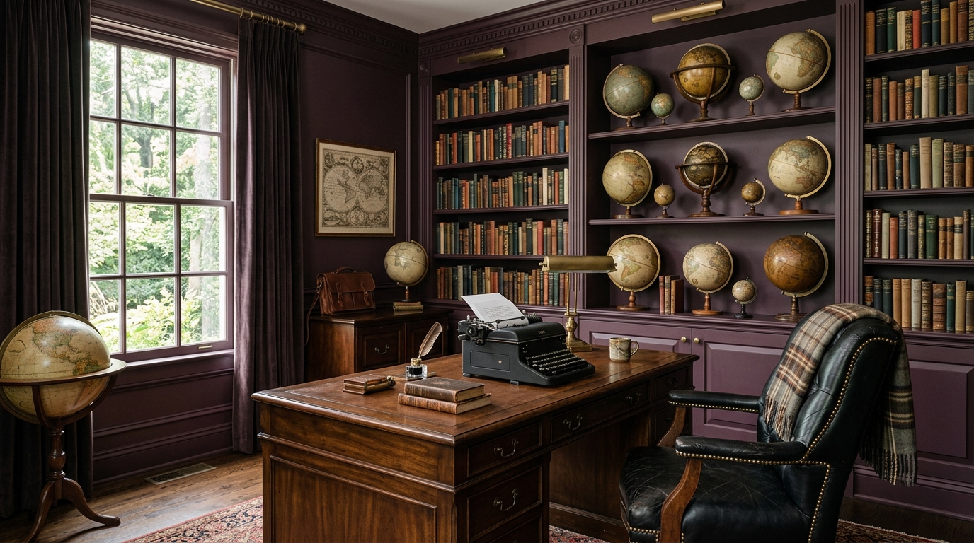
Why does the marriage of Dark Academia and Mid-Century Modern work so well? It’s because both styles value form and function but through a lens of appreciation for the past. Dark Academia brings the curated clutter—the collections of fossils, the shelves of poetry, the vintage typewriters—while MCM provides the clean lines to prevent that clutter from feeling chaotic. It’s a disciplined maximalism. In a vibrant mid-century modern home, everything is often too clean, too sterile. By adding the layers of an academic life, we give the space a soul.
The Curated Library
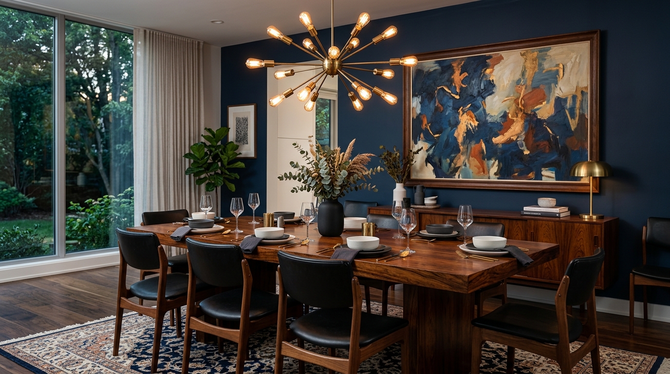
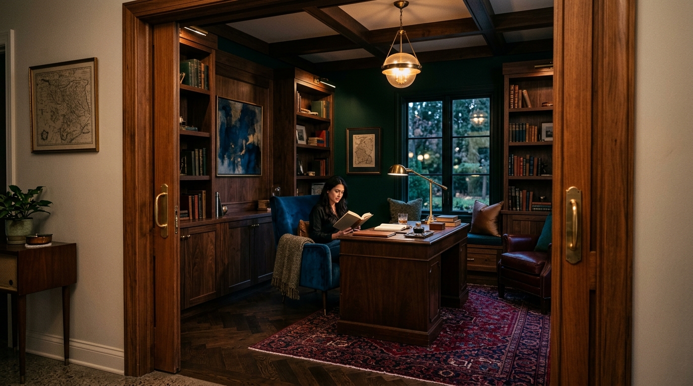
In this design philosophy, the bookshelf is the altar. Instead of styling shelves with a few minimalist vases and color-coordinated books, we want shelves that are groaning under the weight of actual literature. Mix your vintage Penguin paperbacks with hardback editions and scatter small MCM sculptures among the rows. This adds texture and tells a story of the inhabitant’s mind, rather than just their shopping habits.
Room by Room: Implementing the Moody Vision
The Living Room: The Heart of the Sanctuary
Start with a low-slung, dark leather sofa—something with a patina that suggests it has seen decades of conversation. Anchor the space with a large, plush rug in a deep charcoal or midnight blue. Replace any bright, minimalist art with moodier pieces: oil paintings in heavy frames or vintage architectural blueprints. The goal is to make the living room feel like a place where time slows down.
The Home Office: The Modern Scriptorium
This is where the Moody Mid-Century aesthetic truly shines. A heavy walnut desk, a classic Eames executive chair in black leather, and walls painted in a deep, matte ‘London Clay’ or forest green. This isn’t just a place to check emails; it’s a place for deep work. The absence of vibrant, distracting colors allows for better focus, while the rich materials provide a sense of professional dignity.
Conclusion: Why Sophistication Trumps Stimulation
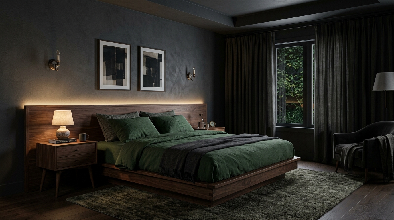
While the vibrant mid-century modern home will always have a place in the history of design, our current cultural moment calls for something more substantial. We are over-stimulated by screens and bright lights; we don’t need our homes to add to that sensory load. By choosing Moody Mid-Century, we are choosing sophistication over superficiality. We are trading the ‘pop’ for the ‘poetry.’ This aesthetic doesn’t just look good on camera; it feels good to inhabit. it provides a backdrop for a life lived with intention, surrounded by the weight of history and the beauty of deep, resonant color. It is time to turn down the lights, pick up a book, and settle into the quiet luxury of the shadows.
Inspiration Gallery
Editorial Lookbook & Photo Collection