The Evolution of the Interior Canvas: Beyond the Weight of Tradition
For decades, residential architecture was defined by the density of its envelopes. Victorian parlors relied on heavy, light-absorbing jewel tones—crimson, forest green, and ochre—to create a sense of enclosure and warmth in poorly insulated shells. In the late 20th century, we saw a pendulum swing toward the ‘builder beige’ and muddy tans that attempted to simulate sun-drenched Mediterranean warmth but often resulted in flat, stagnant interiors. Today, we have moved into a more sophisticated era of environmental design. We no longer rely on pigments to generate artificial heat; instead, we use the science of light and the optics of receding planes. Modern designers are increasingly looking toward cool colors to paint a room as a way to expand spatial volume and foster psychological clarity. This shift isn’t just about aesthetic preference; it is a calculated response to our desire for airy, expansive sanctuaries that feel connected to the sky and the landscape rather than disconnected from them.
The successful deployment of a cool palette—blues, greens, grays, and lavenders—requires more than just a trip to the local hardware store. It demands an understanding of Light Reflectance Value (LRV) and the specific behavior of photons as they enter a room from different cardinal directions. A cool-toned wall is essentially a mirror for the sky. If you miscalculate the undertone, a serene cloud-gray can quickly turn into a clinical, subterranean blue. To master this, one must approach color as an architectural material, every bit as structural as timber or stone.
The Cardinal Compass: Orienting Your Palette
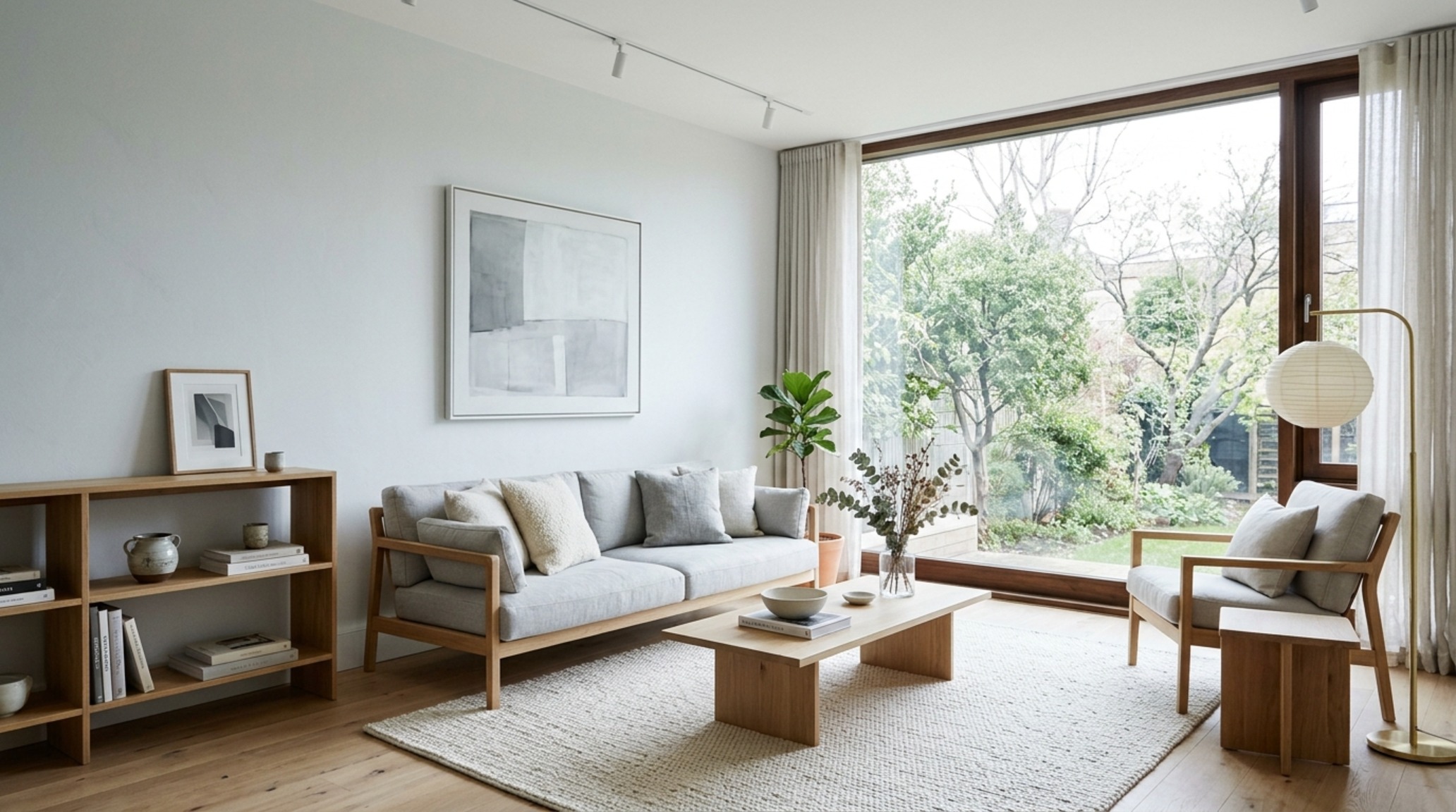
Before selecting a swatch, you must audit your windows. The quality of light varies dramatically based on exposure, and this is where many DIY projects falter. A northern exposure receives consistent, indirect, and predominantly blue-toned light. If you apply a stark, cool gray here, the room will likely feel ‘bruised’ or icy. For these spaces, a cool color needs a ‘hidden’ warm undertone—think of colors like Benjamin Moore’s Paper White, which has a touch of warmth to prevent it from feeling sterile. Conversely, a southern exposure is flooded with intense, yellow-toned sunlight. This is where cool colors truly shine. The warm sun balances the cool pigment, resulting in a crisp, clean finish that feels sophisticated rather than cold.
Eastern light is brightest in the morning and turns grayish by the afternoon, while western light is warm and golden in the late day but flat in the morning. When working with these shifts, the goal is to find a balance that feels intentional at all hours. We often recommend looking at the mid-tones—shades that have enough ‘weight’ to hold their own when the light disappears, ensuring the space doesn’t lose its character at dusk.
Receding Wall Colors for Small Spaces: Manipulating Perception
One of the most powerful tools in a designer’s arsenal is the ability to physically alter the perception of a room’s boundaries without moving a single stud. Warm colors are ‘advancing’ colors—they seem to move toward the eye, making a room feel more intimate and, occasionally, smaller. Cool colors are ‘receding’ colors. By selecting receding wall colors for small spaces, you are essentially pushing the walls back, creating a sense of breathing room that didn’t exist before. A soft, icy mint or a pale lavender-gray can make a narrow corridor feel like a wide gallery.
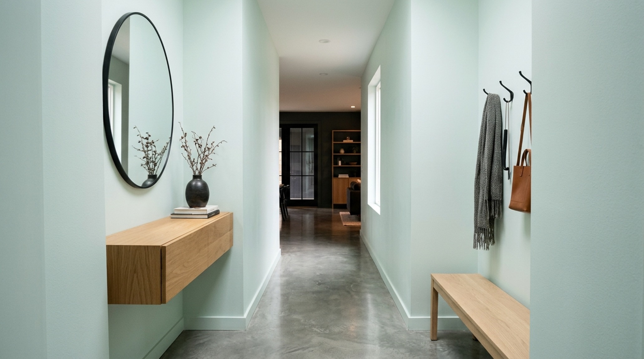
This effect is amplified when you paint the millwork and baseboards in the same cool shade as the walls but in a higher sheen, such as semi-gloss. This monochromatic approach eliminates the visual ‘break’ where the wall meets the floor, allowing the eye to travel uninterrupted across the surface. This is a classic trick used in high-end urban apartments where square footage is at a premium but the demand for a luxurious, expansive feel is non-negotiable.
The Nuance of Sky: Best Light Blue for Living Room Environments
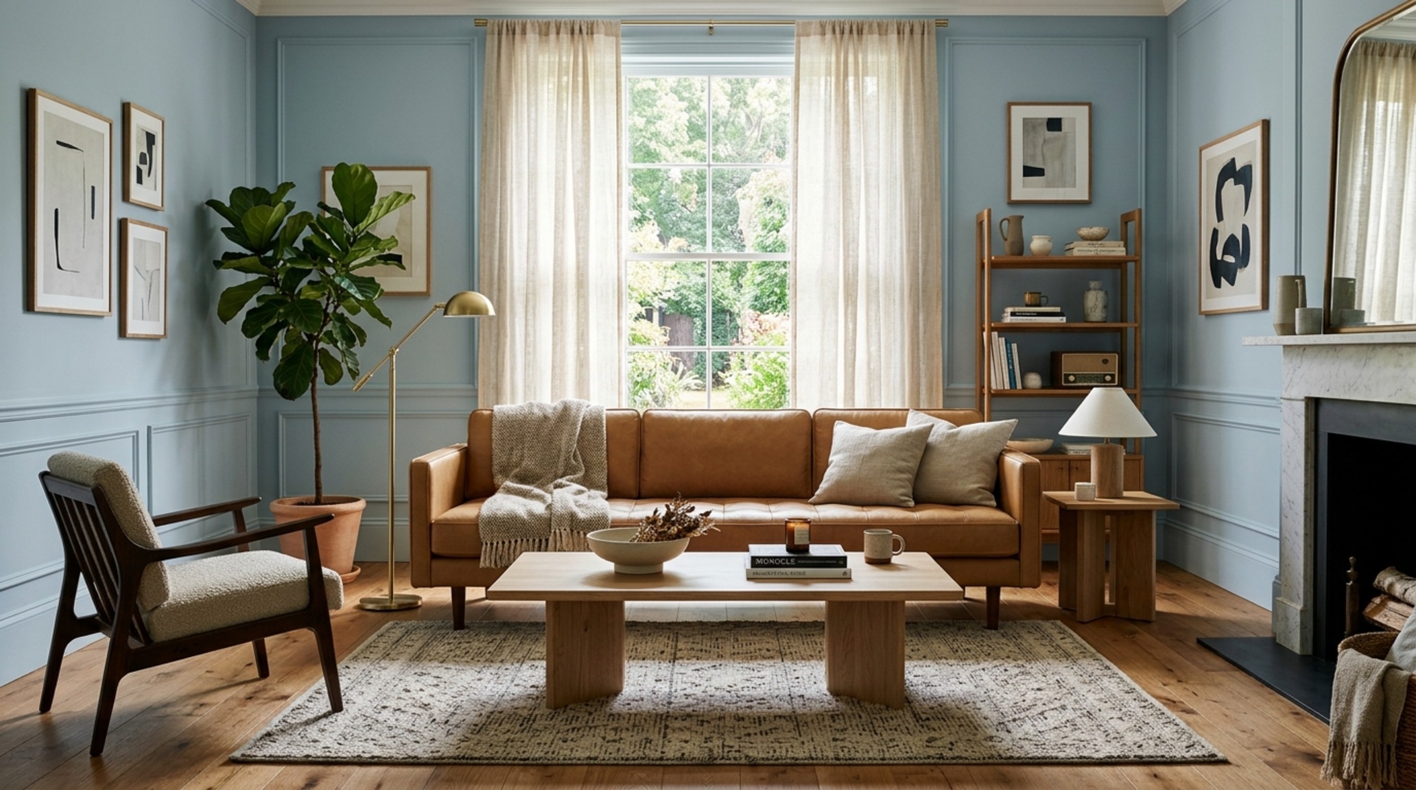
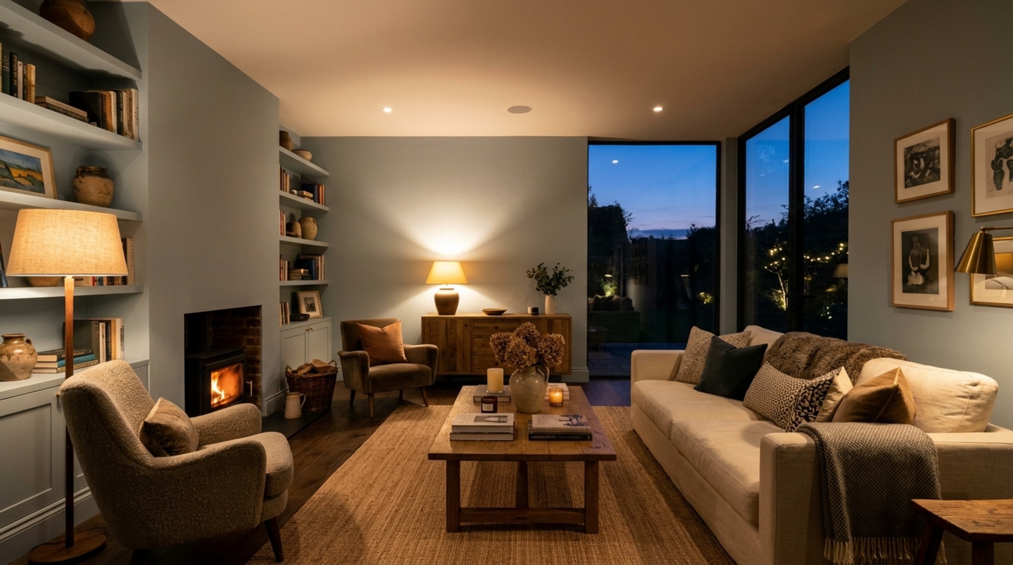
Blue is perhaps the most beloved of the cool spectrum, yet it is notoriously difficult to get right. If it’s too saturated, it feels like a nursery; if it’s too gray, it feels like a battleship. When searching for the best light blue for living room applications, focus on ‘muddy’ or ‘dusty’ blues. These are shades that have been tempered with a hint of gray or green. Farrow & Ball’s ‘Skylight’ or ‘Lulworth Blue’ are masterclasses in this. They possess a soft, ethereal quality that shifts with the shadows throughout the day.
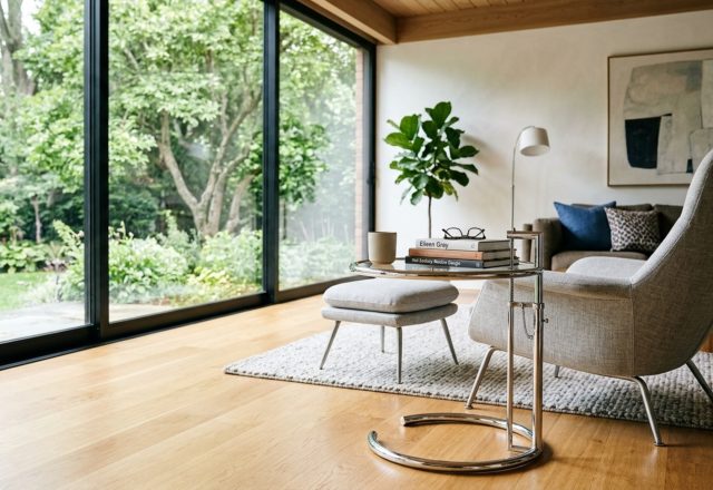
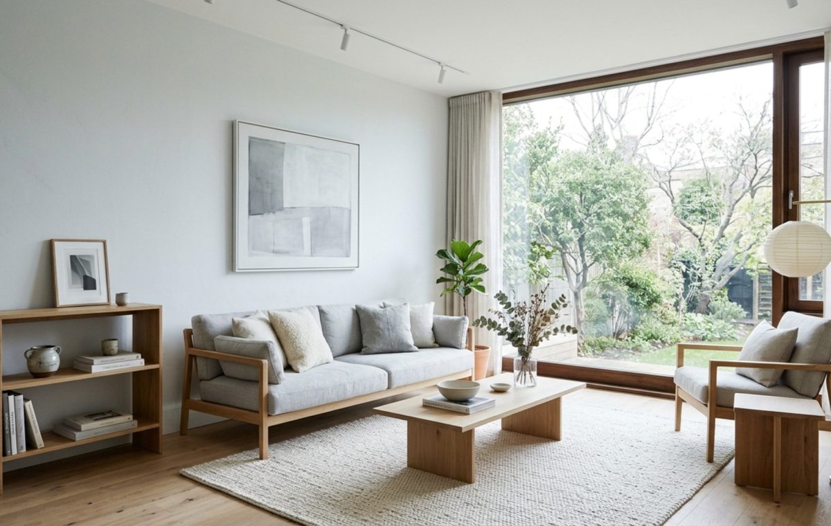
In a living space, the blue should serve as a backdrop for life, not the main protagonist. Pair these cool blues with warm natural materials—a camel leather sofa, a white oak coffee table, or a jute rug. This ‘high-contrast’ texture strategy ensures the room feels grounded and tactile. The 18-inch reach from a sofa to a coffee table feels much more inviting when the cool blue of the walls is offset by the golden warmth of a fluted wood detail or a honed travertine surface.
Modern Cool Gray Paint Swatches: Decoding the Undertone
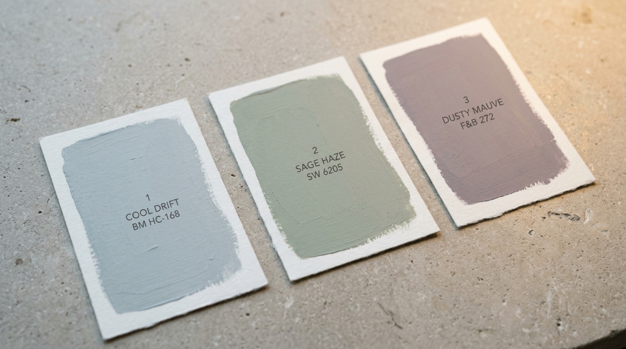
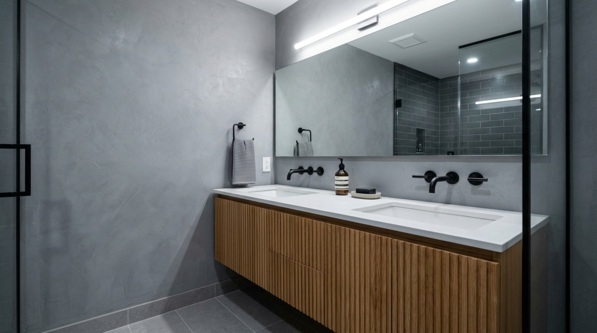
Gray has undergone a massive transformation in the last five years. We have moved away from the ‘Greige’ era and back into more decisive, cool-toned territory. However, selecting from modern cool gray paint swatches requires a discerning eye for the base pigment. A cool gray isn’t just one color; it’s a family of tints. Grays with a blue base feel crisp and modern, perfect for minimalist kitchens with stainless steel accents. Grays with a green base (like Sherwin-Williams Sea Salt) feel more organic and ‘spa-like,’ bridging the gap between cool and natural.
When testing these swatches, never paint them directly onto a white wall. The existing color will distort your perception. Instead, paint a large sample board and move it around the room at different times of the day. Observe how the gray interacts with your 3000K task lighting versus the 2700K ambient glow of your evening lamps. A true cool gray should maintain its crispness without veering into a muddy violet or a harsh neon blue under artificial light.
Calming Paint Shades for Bedrooms: The Sleep-Science Connection
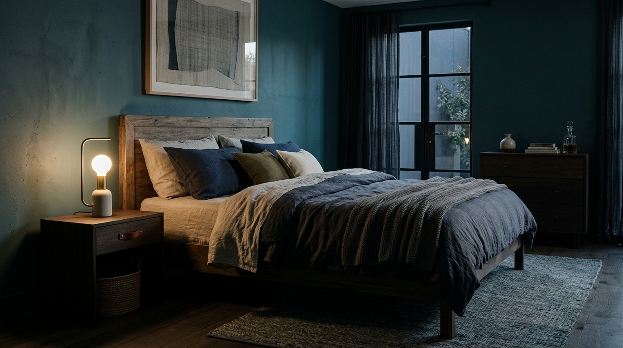
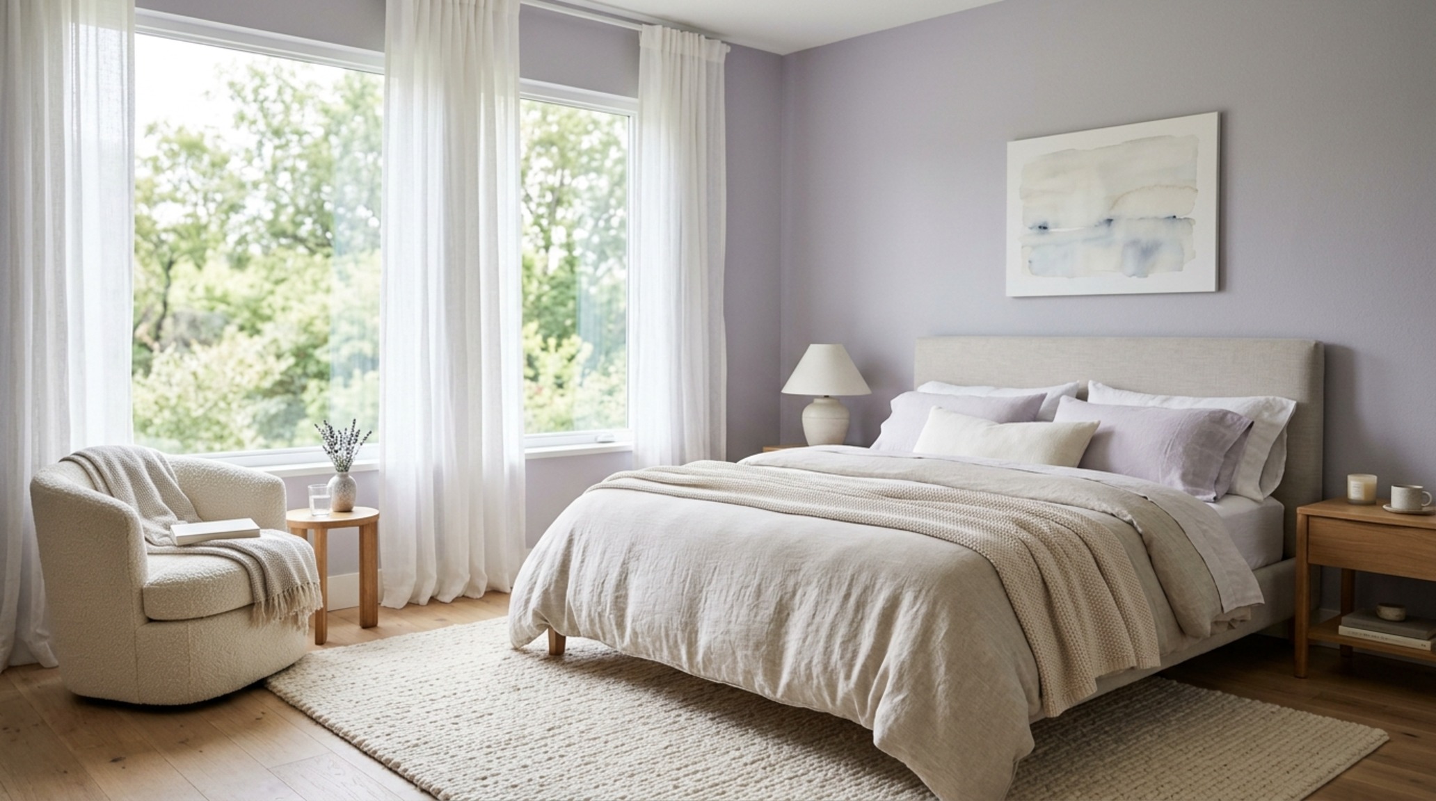
In the sanctuary of the bedroom, color is more than a decorative choice; it is a circadian tool. Our brains are hardwired to respond to the cooling light of dusk by producing melatonin. By surrounding ourselves with calming paint shades for bedrooms, we are essentially signaling to our nervous systems that it is time to downshift. Deep sages, soft teals, and misty charcoals are ideal for this. These colors don’t just look quiet; they feel quiet.
To prevent a cool-toned bedroom from feeling ‘chilly,’ focus on the tactile layers. A high-CRI (Color Rendering Index) of 90+ in your lighting fixtures is essential here. It ensures that the cool pigments are rendered accurately and that your skin tones don’t look washed out. Combine these cool walls with heavy linen drapes and a wool throw. The goal is to create a ‘cool-tempered’ environment that is physically warm to the touch, balancing the visual temperature with physical comfort.
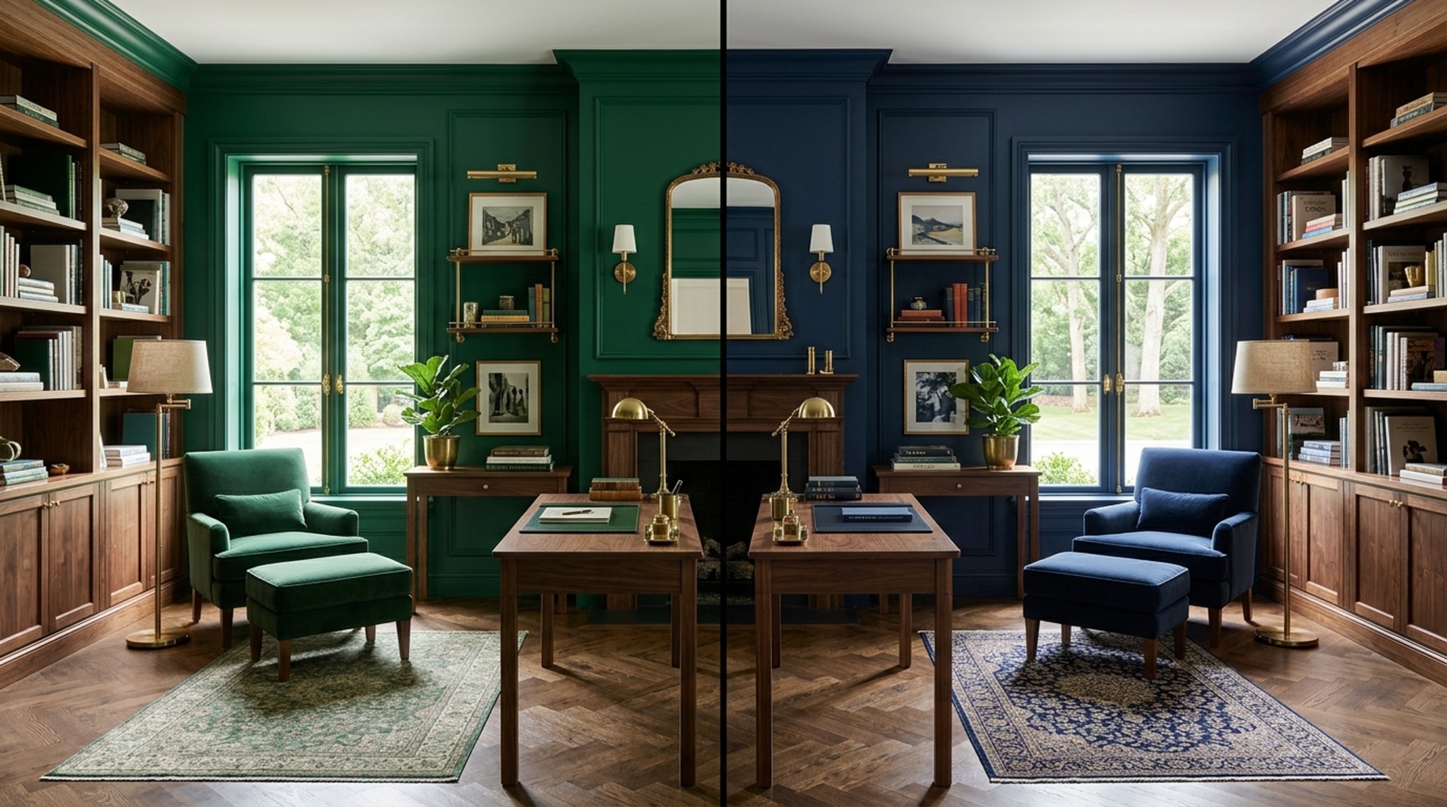
Emerald Green vs Navy Blue Interior: The Power of Deep Cool Tones
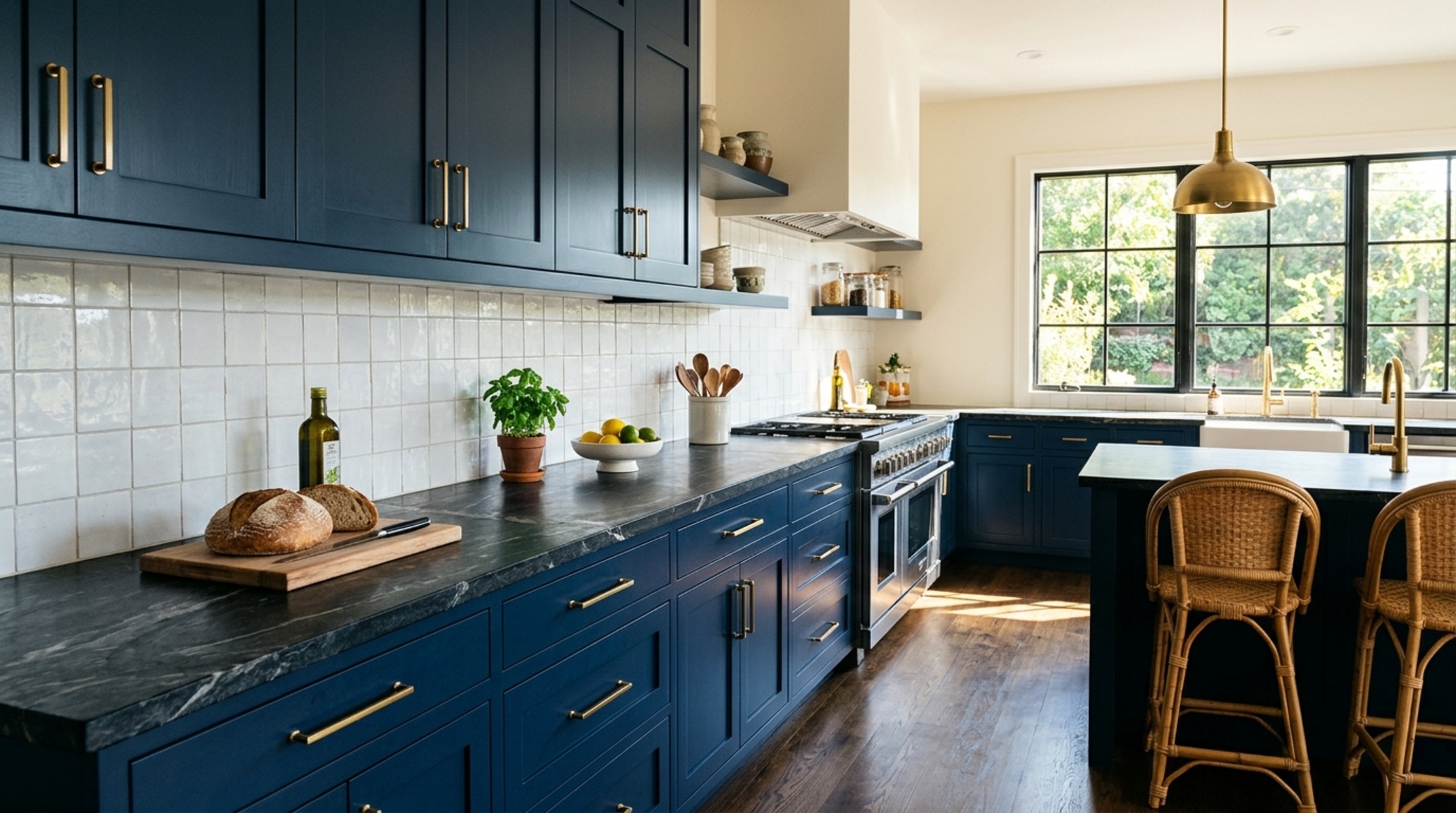
When we move into the darker end of the spectrum, the debate often settles on emerald green vs navy blue interior designs. Both offer a sophisticated, moody atmosphere, but they communicate very different energies. Navy is the ultimate neutral of the cool world. It is authoritative, timeless, and works exceptionally well with brass hardware and crisp white trim (think Benjamin Moore Hale Navy). It creates a sense of infinite depth, much like the night sky.
Emerald green, on the other hand, feels more connected to the earth. It is a ‘living’ cool tone. In a study or a dining room, emerald green can feel incredibly lush and expensive, especially when paired with dark walnut furniture and velvet upholstery. While navy recedes, emerald green has a slight ‘vibrancy’ that brings a sense of life to a space. When choosing between them, consider the ‘spatial cadence’—navy is for stillness, while emerald is for a refined, energetic focus.
Low-Cortisol Room Color Schemes: Designing for Wellness
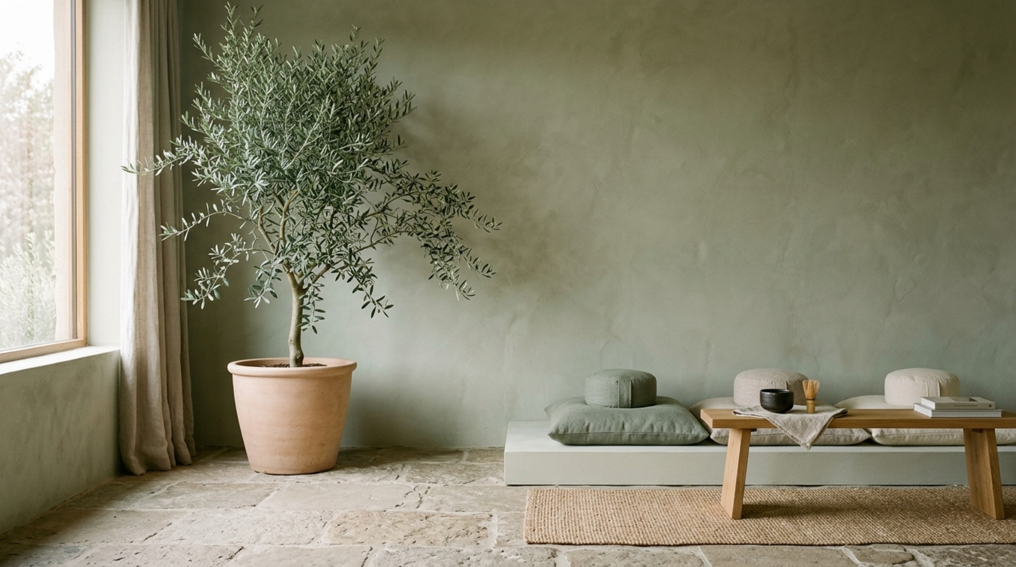
As we become more aware of the impact of our surroundings on mental health, the concept of low-cortisol room color schemes has gained traction. High-contrast, high-saturation environments can be overstimulating. A low-cortisol palette focuses on low-contrast, cool-toned harmonies—think of a monochromatic gradient of soft lichen green, pale slate, and misty white. These schemes reduce visual noise, allowing the brain to rest.
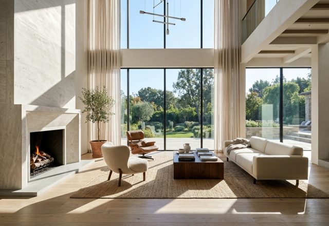
Incorporating biophilic elements—like a potted olive tree or a stone vase—further grounds these cool schemes. The reflection of soft green walls in a polished marble surface creates a sense of fluid movement that mimics the natural world. This is the pinnacle of the light-science blueprint: creating a space that doesn’t just look ‘designed’ but feels like a natural extension of the inhabitant’s well-being. Using cool colors to paint a room becomes an act of self-care, a way to curate a personal atmosphere that buffers against the chaos of the outside world.
Comprehensive Material & Proportions Schedule
Architectural breakdown detailing authentic surfaces, paint references, and standard circulation clearances.
Designing with the cool spectrum is an exercise in restraint and precision. It is about understanding that a room is a living vessel for light, and that the pigments we choose act as the conductors for that energy. When we step back and view a finished space—where the walls seem to dissolve into the horizon and the furniture sits with a quiet, tactile weight—we aren’t just looking at a paint job. We are witnessing the successful calibration of physics and emotion. The future of our homes lies in this delicate balance, where the airiness of a cool palette provides the mental clarity we need to navigate an increasingly complex world.
Editorial Silo • Recommended Architecture Studies
The Interior Perspective Vault
Visual studies exploring spatial ergonomics, material authenticity, and balanced natural light.
Curated Visual Lookbook
Design Gallery & Spatial Studies
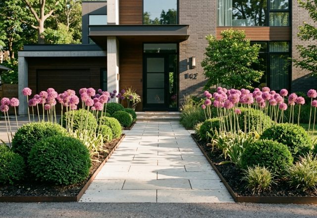
A visual curation of architectural arrangements, lighting concepts, and material palettes featured in this space.