The Tactile Aesthetic of Kitchen Tile Options: Materials, Moods & Lighting Kelvin
Choosing your kitchen tile options has evolved from a mere functional necessity into the foundational anchor of a kitchen’s architectural identity, dictating how light, shadow, and movement interact within the culinary hearth. In the contemporary home, the backsplash and flooring are no longer static surfaces; they are the rhythmic heartbeat of the room. We are moving away from the clinical perfection of the early 2000s and leaning heavily into what I call ‘tactile grounding’—the use of materials that demand to be touched and that change character as the sun tracks across the sky.
When we look at the physics of a kitchen, the tile is the primary vertical and horizontal plane that mediates between the heavy mass of cabinetry and the negative space of the room. A well-considered selection considers not just color, but the refractive index of the glaze, the depth of the grout channel, and the way a 3000K LED task light might reveal the undulating surface of a handmade ceramic. It is about creating a sensory sanctuary where the utilitarian becomes ethereal.
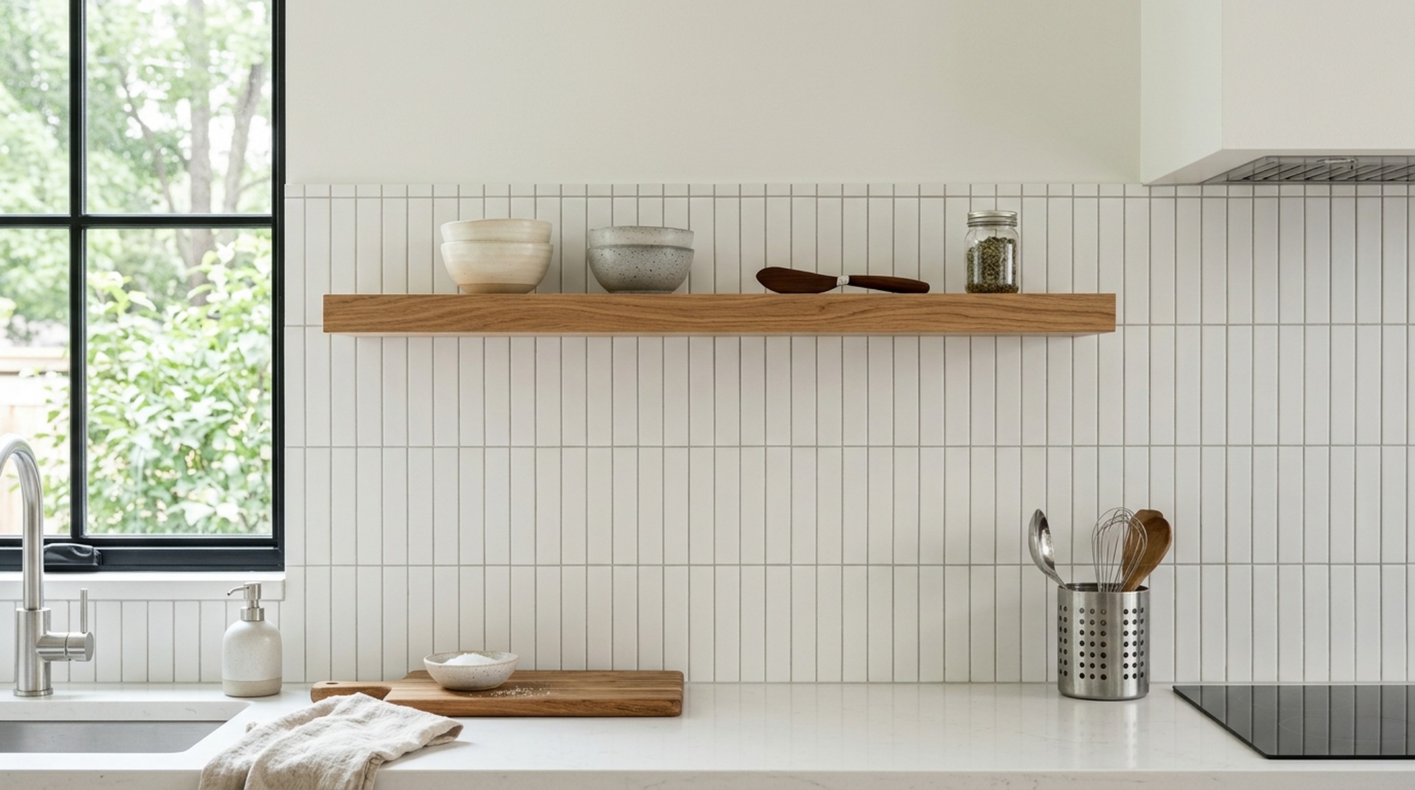
Modern Kitchen Tile Options Ideas: The Architecture of the Stacked Bond
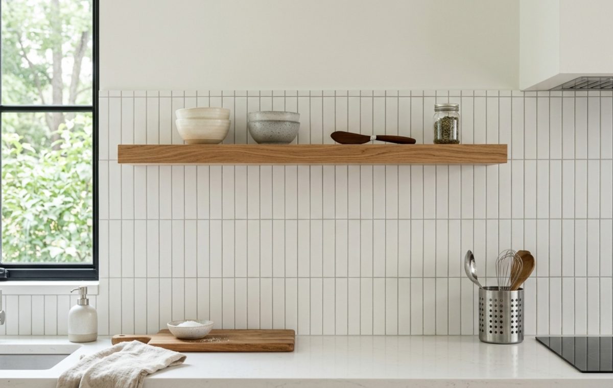
Contemporary design is currently obsessed with linearity and precision. One of the most compelling modern kitchen tile options ideas involves the shift from traditional offset brick patterns to the vertically or horizontally stacked bond. By aligning the tiles in a grid, you introduce a sense of architectural discipline that feels inherently calming. This isn’t just about ‘looking modern’; it’s about spatial cadence. A vertical stack in a slim 2×10-inch format can visually heighten a ceiling, drawing the eye upward and making the transition between the countertop and the upper cabinetry feel intentional rather than incidental.
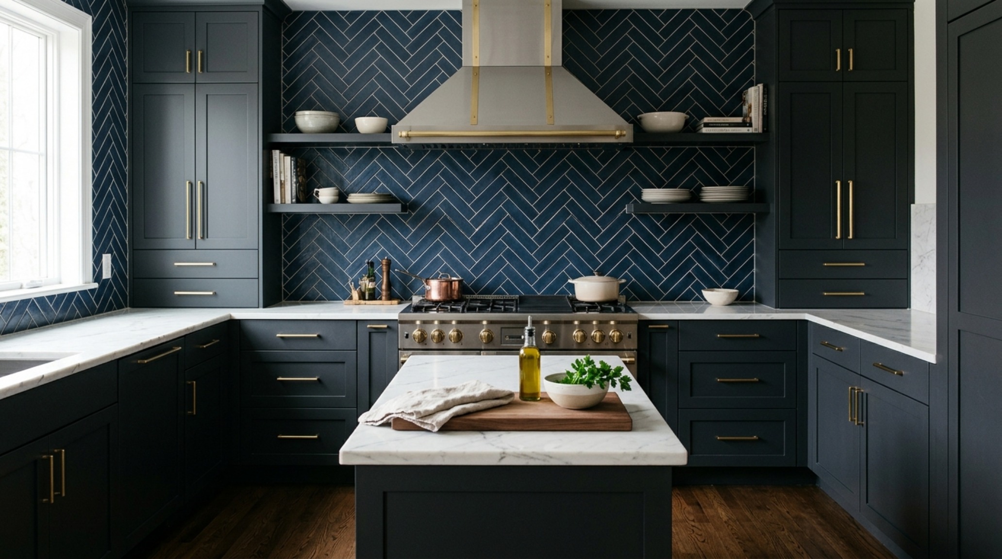
In these modern configurations, the grout choice becomes a design tool rather than a maintenance afterthought. We are seeing a move toward ‘tone-on-tone’ grouting—matching the grout precisely to the tile to create a monolithic, wallpaper-like effect. This minimizes visual noise, allowing the material’s inherent texture, such as the matte velvet of a porcelain slab or the subtle grain of a linear basalt, to take center stage. When you strip away the high-contrast grid of the past, you allow the kitchen’s architectural lines to breathe.
Luxury Kitchen Tile Options Textures: Handcrafted Patina and Organic Depth
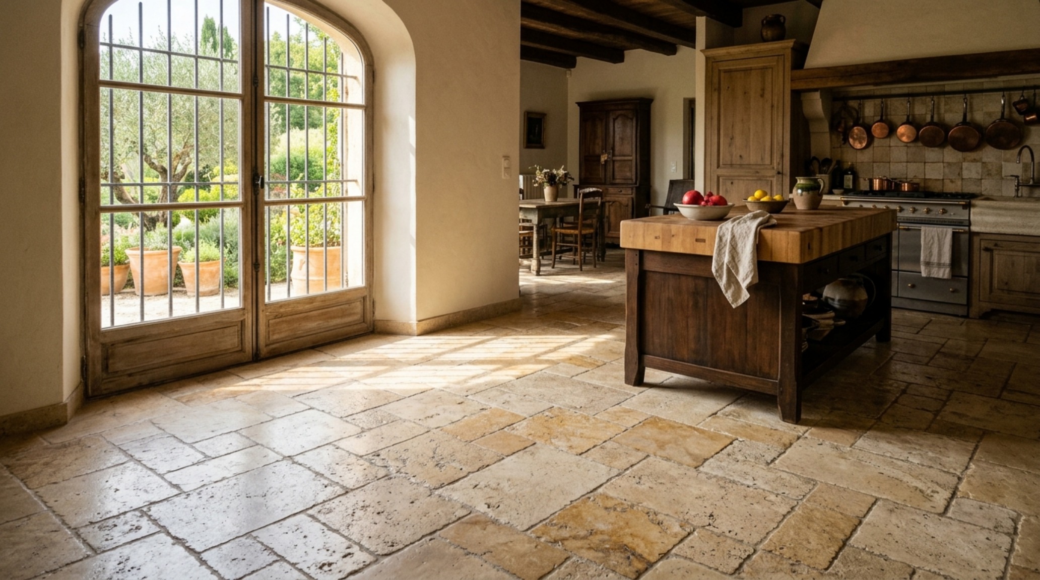
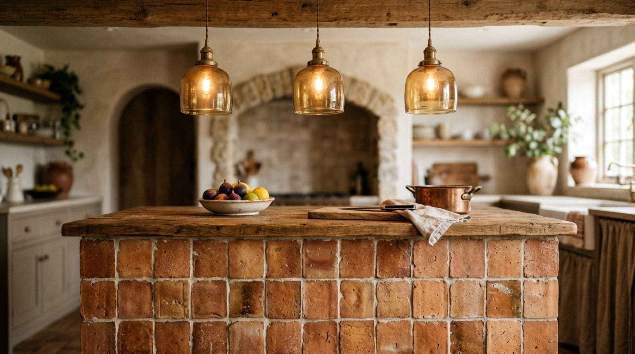
True luxury in 2026 isn’t defined by price point, but by the presence of the ‘maker’s hand.’ Using luxury kitchen tile options textures like Zellige, terracotta, and honed natural stone introduces a necessary friction into a high-gloss world. Zellige, the Moroccan terracotta tile, is perhaps the ultimate example of this. Each tile is hand-chiseled, meaning no two edges are perfectly square and no two surfaces are perfectly flat. When installed, these ‘imperfections’ create a multifaceted surface that captures light in a way a machine-pressed tile never could.
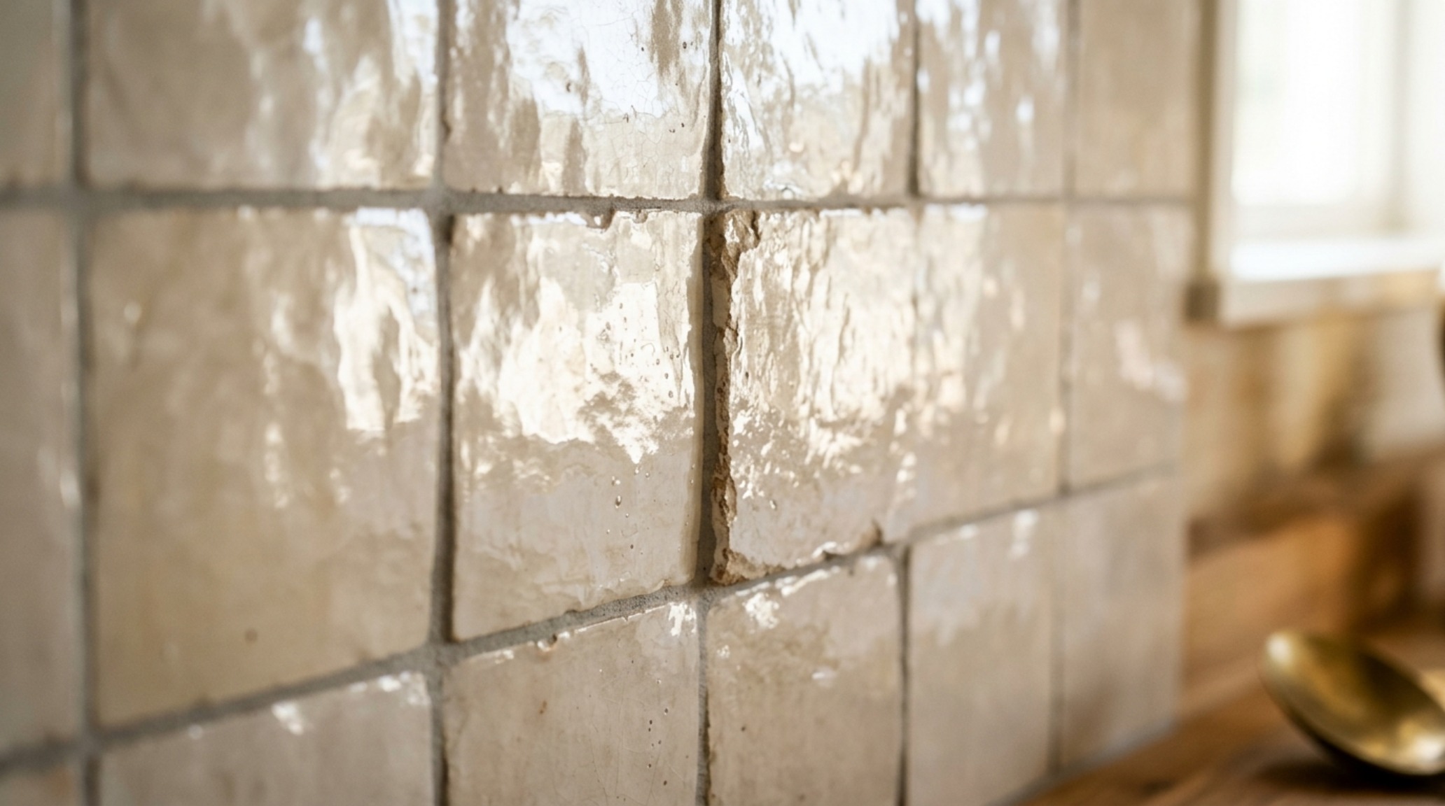
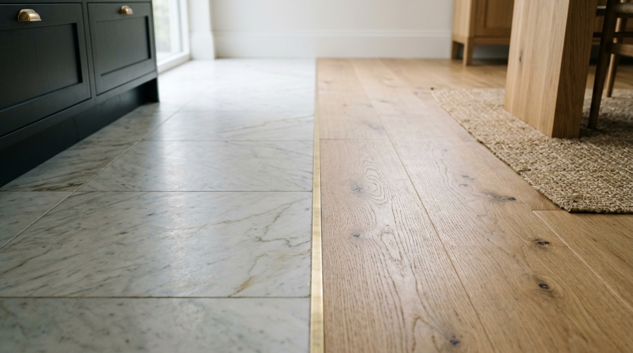
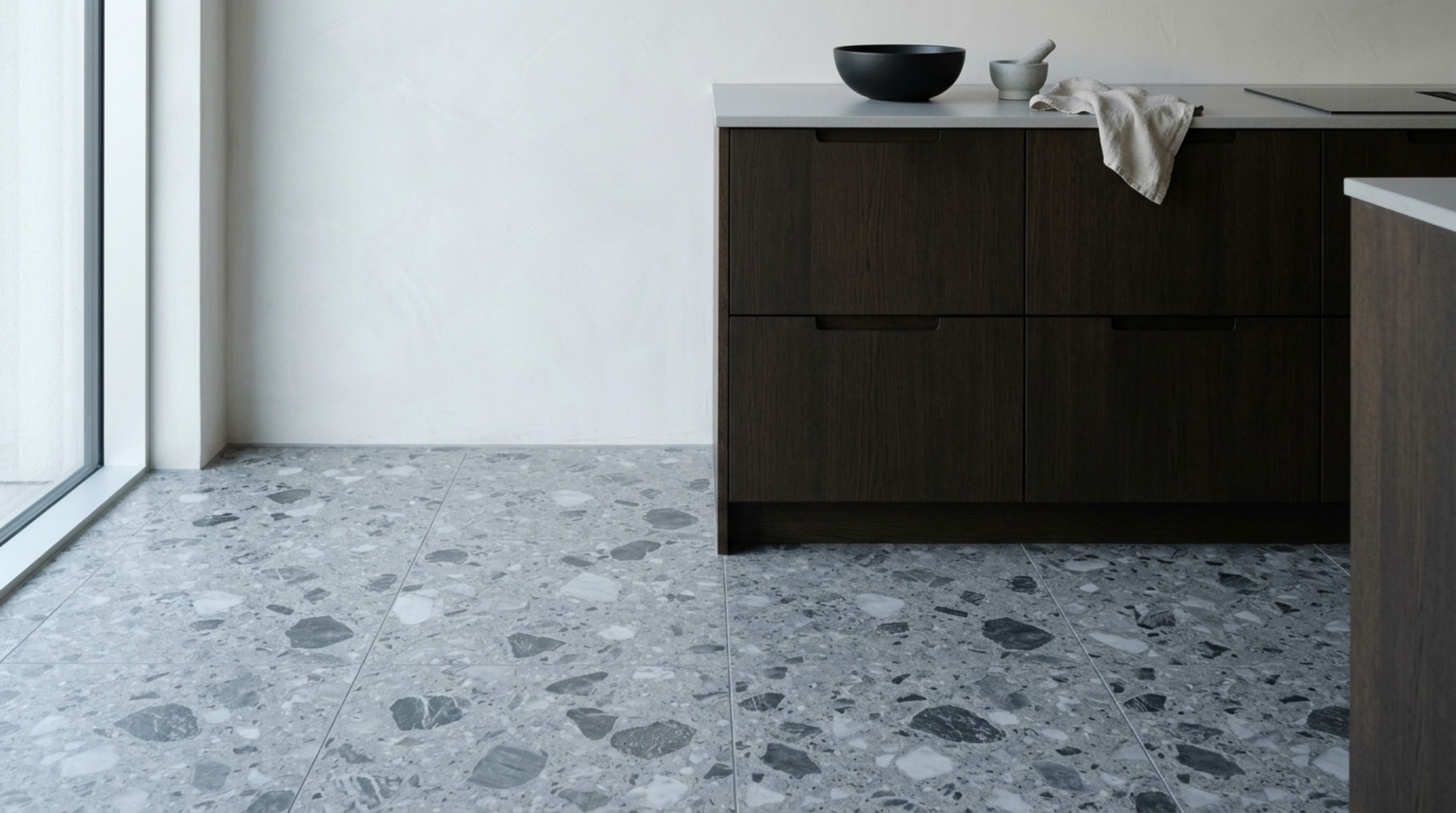
Beyond the backsplash, we are seeing a resurgence of honed (rather than polished) stone for flooring. A honed Calacatta Viola or a deep charcoal soapstone floor provides a soft, matte finish that feels sophisticated and grounded. These textures respond beautifully to the 18-inch reach from a kitchen island or the 36-inch standard walkway clearances, providing a tactile experience that is both durable and visually rich. The goal is to create a space that feels lived-in yet curated, where the patina of the stone tells a story of years of morning coffees and late-night dinners.
Small Space Kitchen Tile Options: Visual Expansion via Verticality and Reflectance
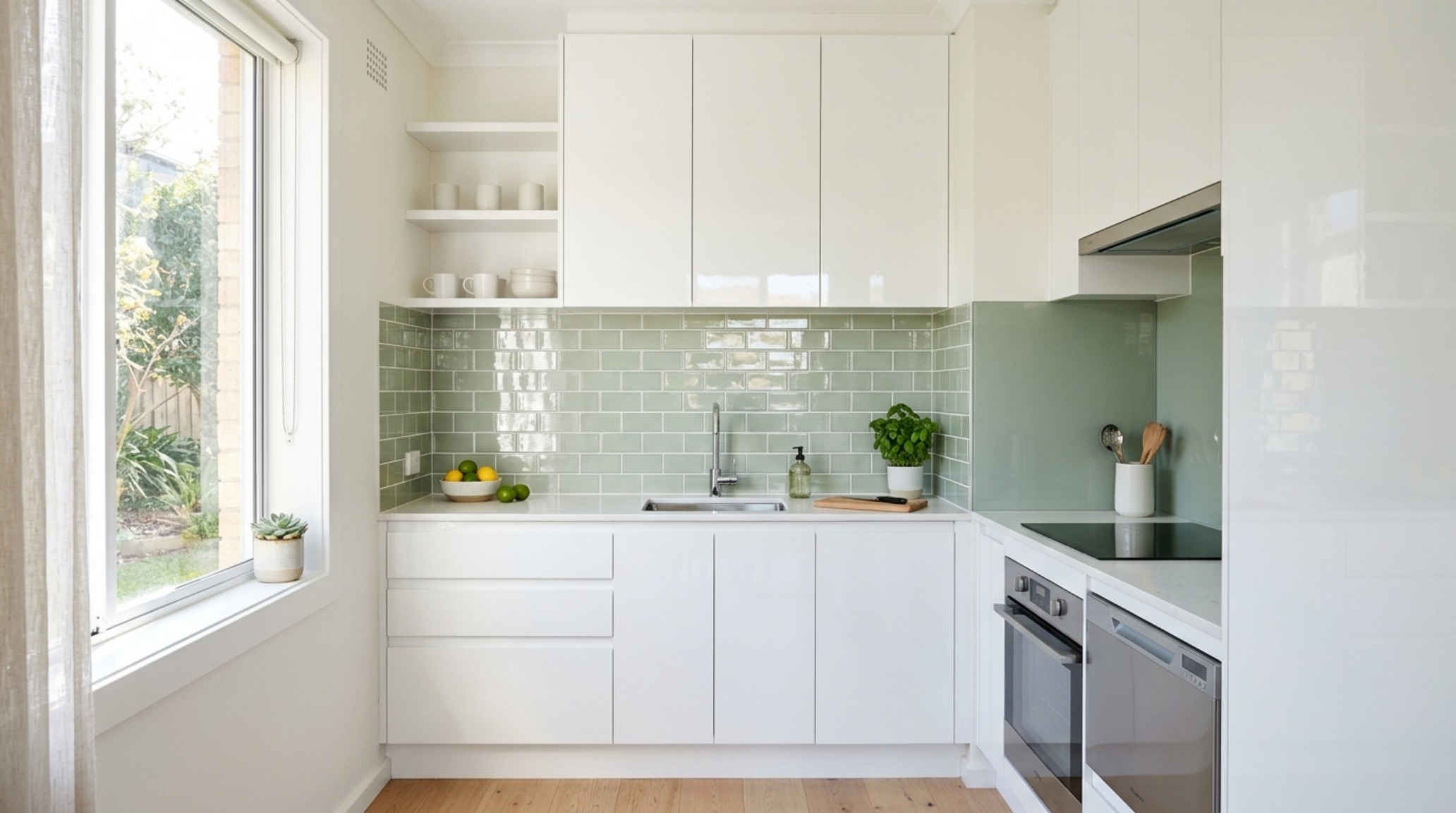
Designing for a compact footprint requires a surgical approach to material selection. In my experience, small space kitchen tile options should focus on two primary goals: maximizing light bounce and minimizing visual fragmentation. Large-format tiles (think 24×48 inches) are a secret weapon here. By reducing the number of grout lines on a floor, you trick the eye into perceiving a larger, continuous surface area. It removes the ‘gridlock’ that often makes small kitchens feel cramped.
For the vertical surfaces, reflectivity is your best friend. However, this doesn’t mean you are limited to high-gloss white. A soft ‘pearl’ or ‘iridescent’ glaze in a pale sage or a warm bone (like Farrow & Ball Setting Plaster) can provide the necessary reflectance while adding a layer of sophisticated color. If you use a vertical picket or a slim chevron pattern, you emphasize the height of the room, effectively pushing the walls outward. Pair this with under-cabinet lighting at a high CRI (Color Rendering Index) to ensure the colors remain true and the shadows are soft, preventing the ‘cave’ effect often found in smaller layouts.
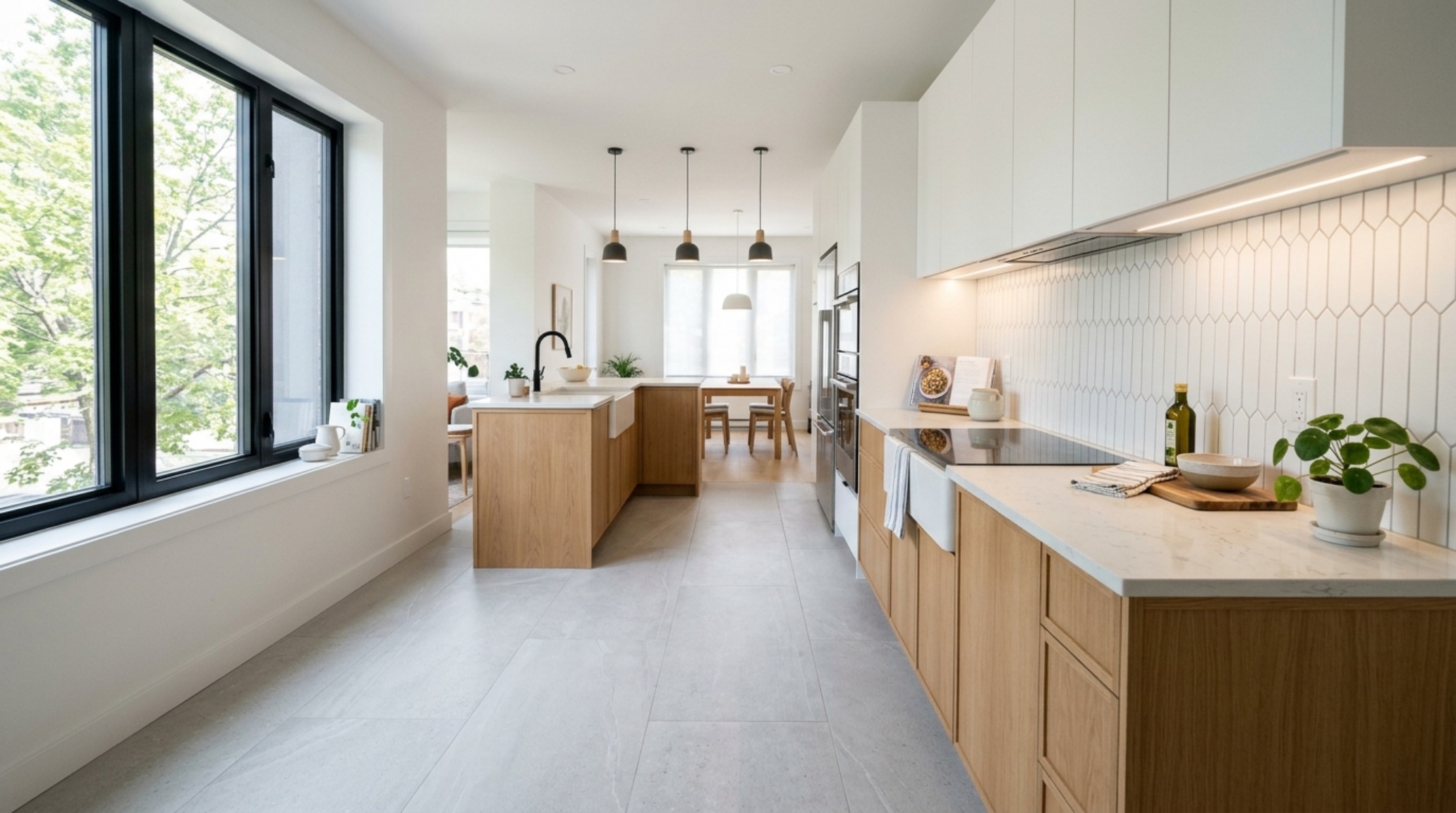
Kitchen Tile Options Lighting Guide: The Interplay of Kelvin and Texture
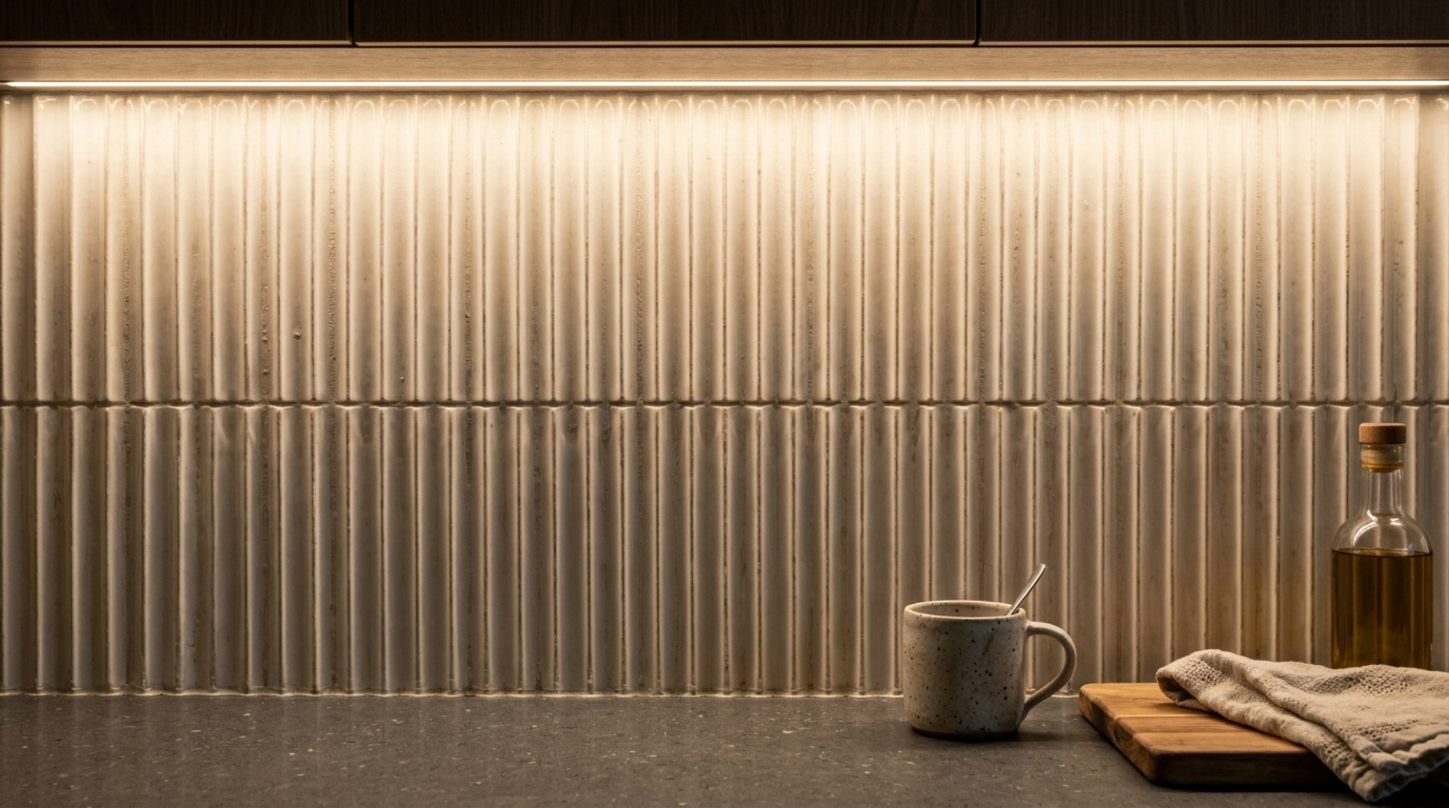
Even the most expensive tile will look flat and uninspired under poor lighting. Understanding the kitchen tile options lighting guide is the difference between a kitchen that feels like a showroom and one that feels like a home. We must talk about the Kelvin scale. For a kitchen that transitions from a functional workshop during the day to a moody lounge at night, a layered lighting approach is non-negotiable. Task lighting—the lights hidden under your upper cabinets—should ideally be 3000K. This provides a clean, white light that makes food preparation safe and colors pop without being as clinical as 4000K.
Ambient lighting, such as pendants or recessed cans, can lean warmer, toward 2700K, to create an inviting atmosphere. The real magic happens when you consider the ‘grazing’ effect. When light hits a textured tile—like a fluted ceramic or a split-face stone—at an acute angle, it creates long, dramatic shadows that emphasize the three-dimensional quality of the material. This shadow play adds an architectural depth that changes throughout the day, turning your backsplash into a living piece of art. Always specify high CRI (90+) LEDs to ensure that the subtle undertones of your tiles—the pinks in your marble or the blues in your slate—aren’t washed out by a cheap yellow or green light spectrum.
The Intersection of Ergonomics and Materiality
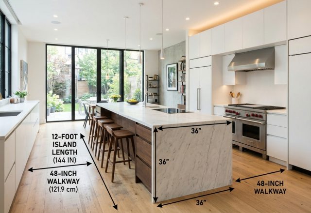
Designing a kitchen is an exercise in human-centric engineering. We must respect the physical realities of the space. Architectural clearances are not suggestions; they are the rules of engagement. A 36-inch primary circulation path is the bare minimum for a single-cook kitchen, while 42 to 48 inches is required for a household where multiple people are moving between the fridge and the range. Your tile choices must support this flow. Slippery, high-gloss floor tiles are a hazard in a zone prone to spills. Instead, look for tiles with a ‘DCOF’ (Dynamic Coefficient of Friction) rating of 0.42 or higher for safety.
Materiality also impacts the acoustic quality of the space. A kitchen full of hard, flat surfaces (quartz counters, glass cabinets, and large-format porcelain floors) can become an echo chamber. Integrating textured tiles, perhaps a beveled edge or a tumbled stone, can help break up sound waves. This is the ‘unseen’ design—creating a space that not only looks beautiful but sounds and feels calm. When you pair a soft, honed floor with a 30-inch dining chair clearance around a breakfast nook, you create a zone of comfort that invites people to linger.
Curated Concept Gallery & Spatial Vignettes
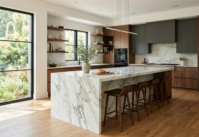
Moving through the home, the transition between the kitchen and adjacent living areas should feel seamless. We achieve this by carrying material ‘anchors’ from one room to the next. If you are using a deep charcoal slate in the kitchen, consider a similar-toned rug or a stone-topped side table in the living room. This creates a cohesive narrative that makes the home feel like a singular, well-considered thought. The ‘visual palette’ of the kitchen should be a reflection of the overall architectural soul of the building.
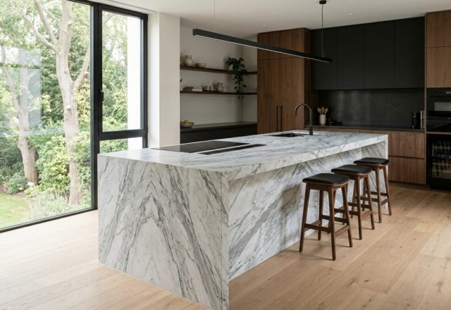
We are seeing a move toward ‘mixed materiality’—the daring combination of disparate textures. Imagine a back wall of smooth, matte-black porcelain large-format tiles contrasted against a small, shimmering island clad in handmade Zellige. This play of ‘flat vs. faceted’ is where modern design finds its edge. It’s about balance: for every high-shine moment, you need a matte counterpoint. For every sharp corner, you need a soft, rounded edge. This spatial cadence is what separates a designer-led project from a standard renovation.
Architectural Specification & Material Matrix
Comprehensive architectural blueprint detailing finishes, paint hex codes, and structural balance.
As we look toward the future of residential design, the kitchen continues to deconstruct itself, moving away from rigid utility and toward a more fluid, sensory-driven experience. The kitchen tile options we choose today are the artifacts of tomorrow, capturing the light and life of the home. By prioritizing materiality and the subtle interplay of light over fleeting trends, we create spaces that don’t just function—they resonate. It is in the quiet reflection of a morning shadow against a textured wall that the true value of design is felt, grounding us in the beauty of the everyday.
Editorial Silo • Recommended Architecture Studies
- Monolithic Luxury: Large Kitchen Island Designs & Materiality and Visual Drama in Oversized Island Curation — Archival Design Case Study
- The Architecture of Air: Mastering the Structural Flow of the Modern Style Kitchen — Archival Design Case Study
Curated Visual Chronicle
A curated lens on enduring residential architecture, tactile finishes, and serene volume.
Curated Visual Lookbook
Design Gallery & Spatial Studies
A visual curation of architectural arrangements, lighting concepts, and material palettes featured in this space.