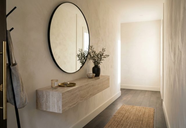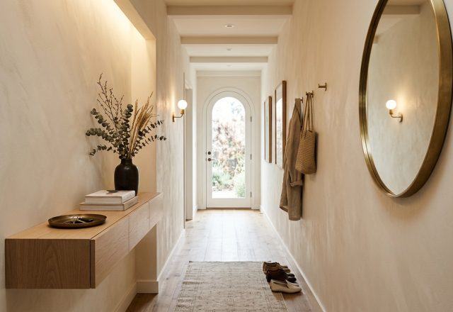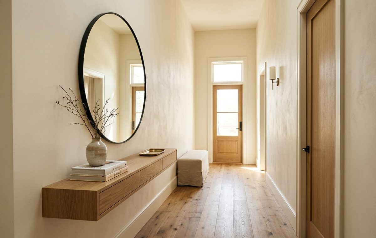
There is a specific, almost palpable friction that occurs when you cross the threshold of a home only to be met by a cramped, shadowy corridor. It’s a psychological bottleneck. As an interior journalist, I’ve spent years analyzing how spatial proportions dictate our emotional state, and nowhere is this more evident than in the foyer. The challenge is universal: we want an arrival that feels expansive and curated, yet we are often working with a footprint that feels more like a transit pipe than a room. Mastering narrow entryway ideas isn’t merely about choosing a pretty rug; it is an exercise in architectural illusion—a deliberate manipulation of sightlines, light, and materiality to trick the brain into perceiving volume where there is only a sliver of square footage.
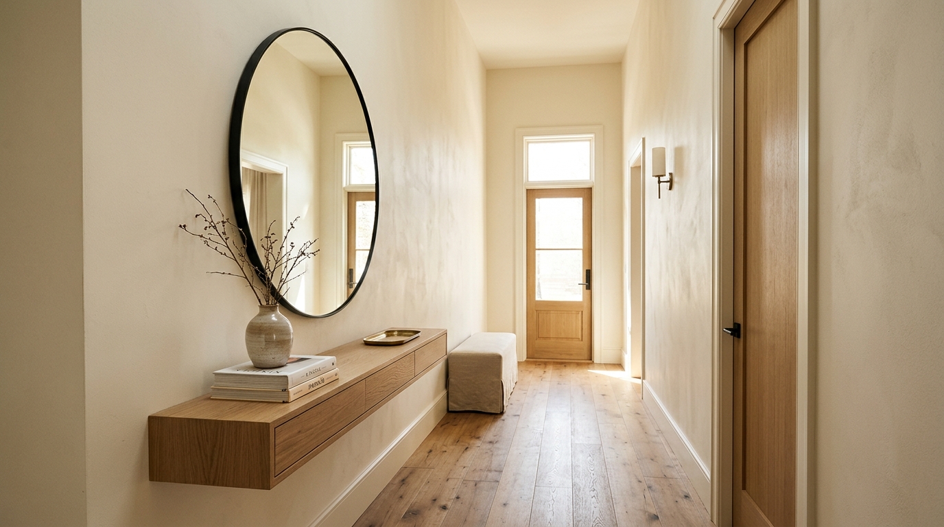
To solve the riddle of the tight foyer, we must move away from the idea of ‘decorating’ and toward the concept of ‘architectural ghosting.’ This technique involves neutralizing the visual boundaries of the space so the walls appear to recede. By focusing on verticality and a rhythmic flow, we can transform a renovation on a budget into a high-end spatial experience. We aren’t just making a hallway look better; we are re-engineering the way the eye traverses the environment.
The Architecture of Arrival: Why Traditional Layouts Fail Narrow Corridors
Most narrow entryway ideas fail because they attempt to force standard-sized furniture into non-standard spaces. In architecture, we respect the 36-inch rule: the minimum clearance required for a primary circulation path to feel comfortable. When you place a 15-inch deep console in a 42-inch wide hallway, you’ve effectively killed the spatial cadence of the home. You’re left with a 27-inch gap—a squeeze that signals ‘small’ to the subconscious immediately upon entry.
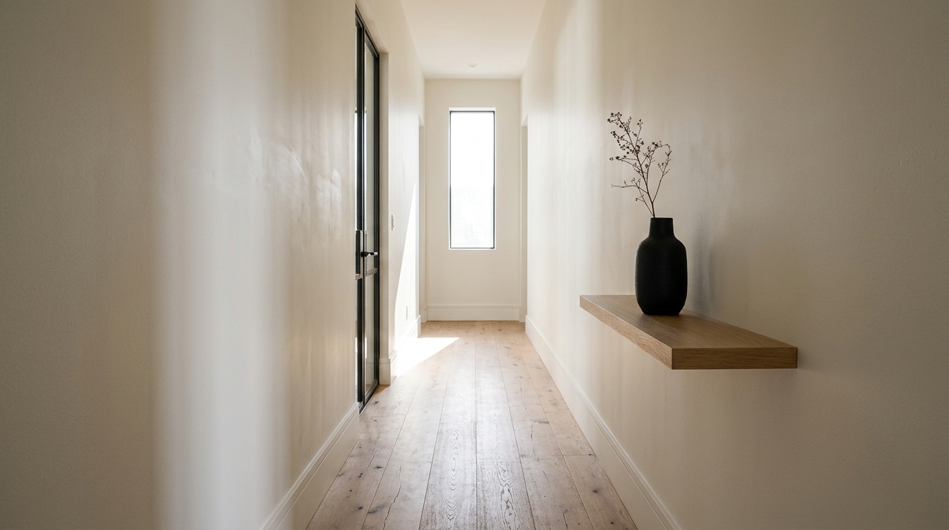
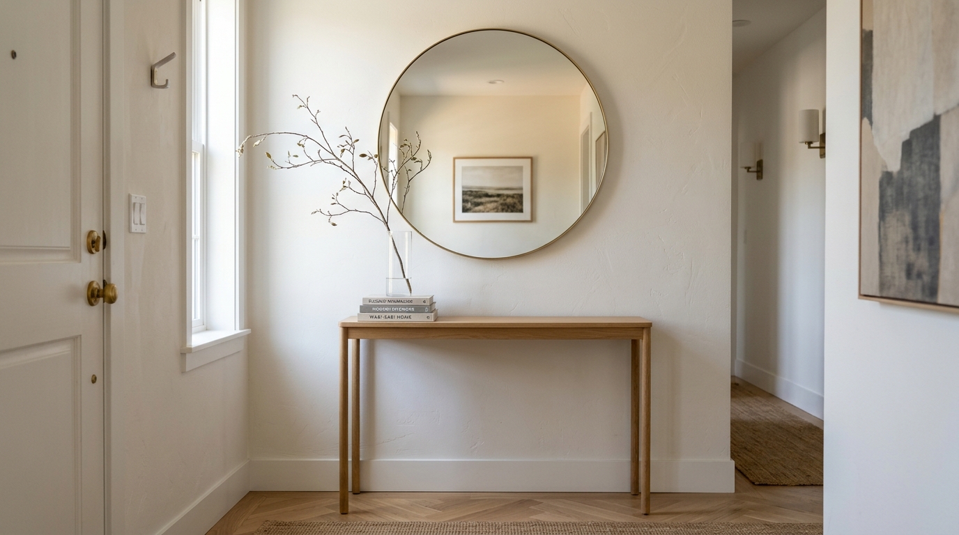
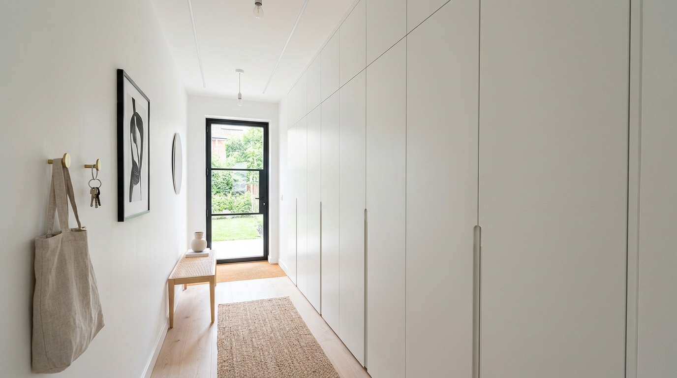
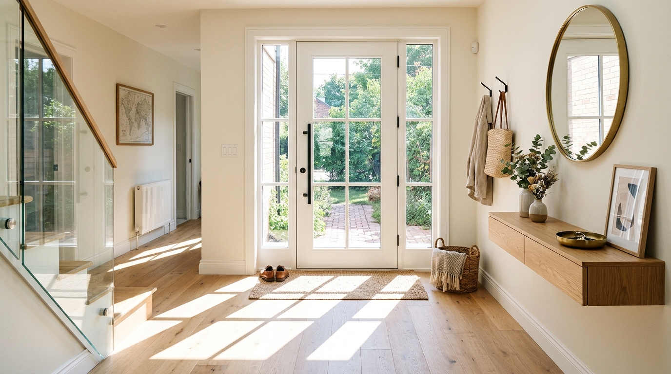
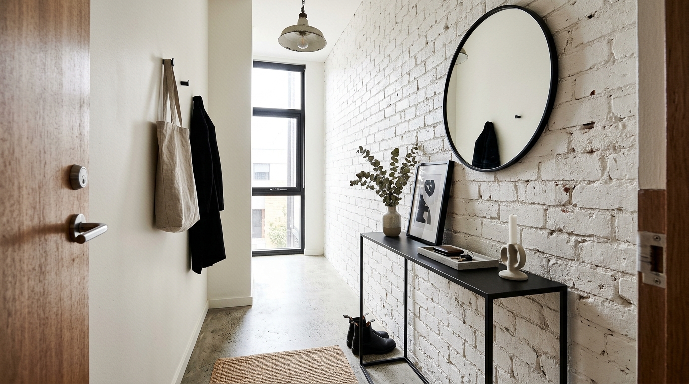
Instead, we look toward the vertical plane. The goal is to keep the floor as clear as possible. This is where the ‘floating’ aesthetic becomes a structural necessity rather than a stylistic choice. By mounting a slimline console—ideally no more than 8 to 10 inches deep—directly to the wall studs, you maintain a continuous line of flooring. When the eye can see the floor meeting the baseboard without interruption, the brain perceives the room as wider. This is the first rule of the spatial illusionist: floor visibility equals perceived width.
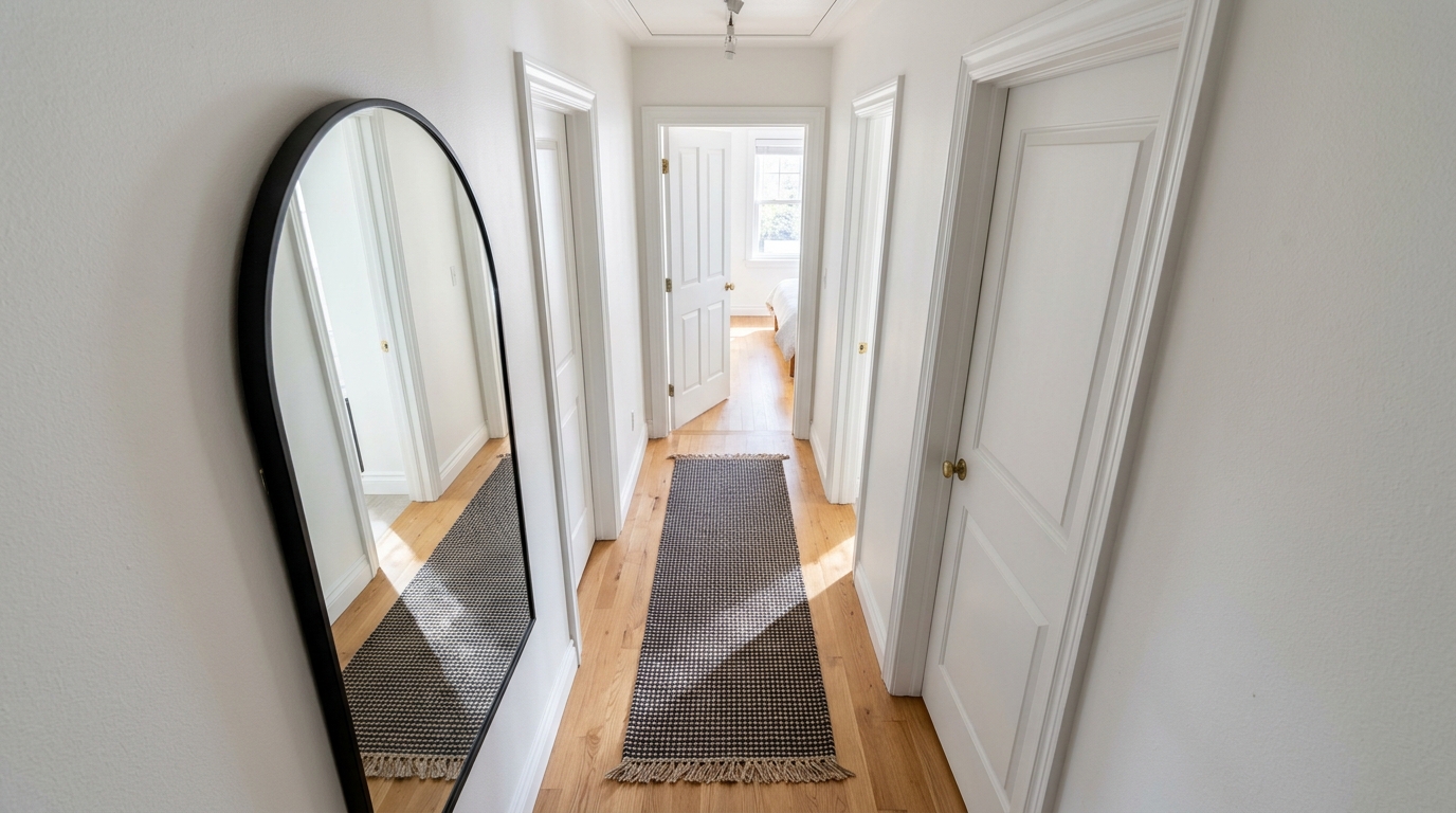
Architectural Ghosting: The Power of Color Drenching
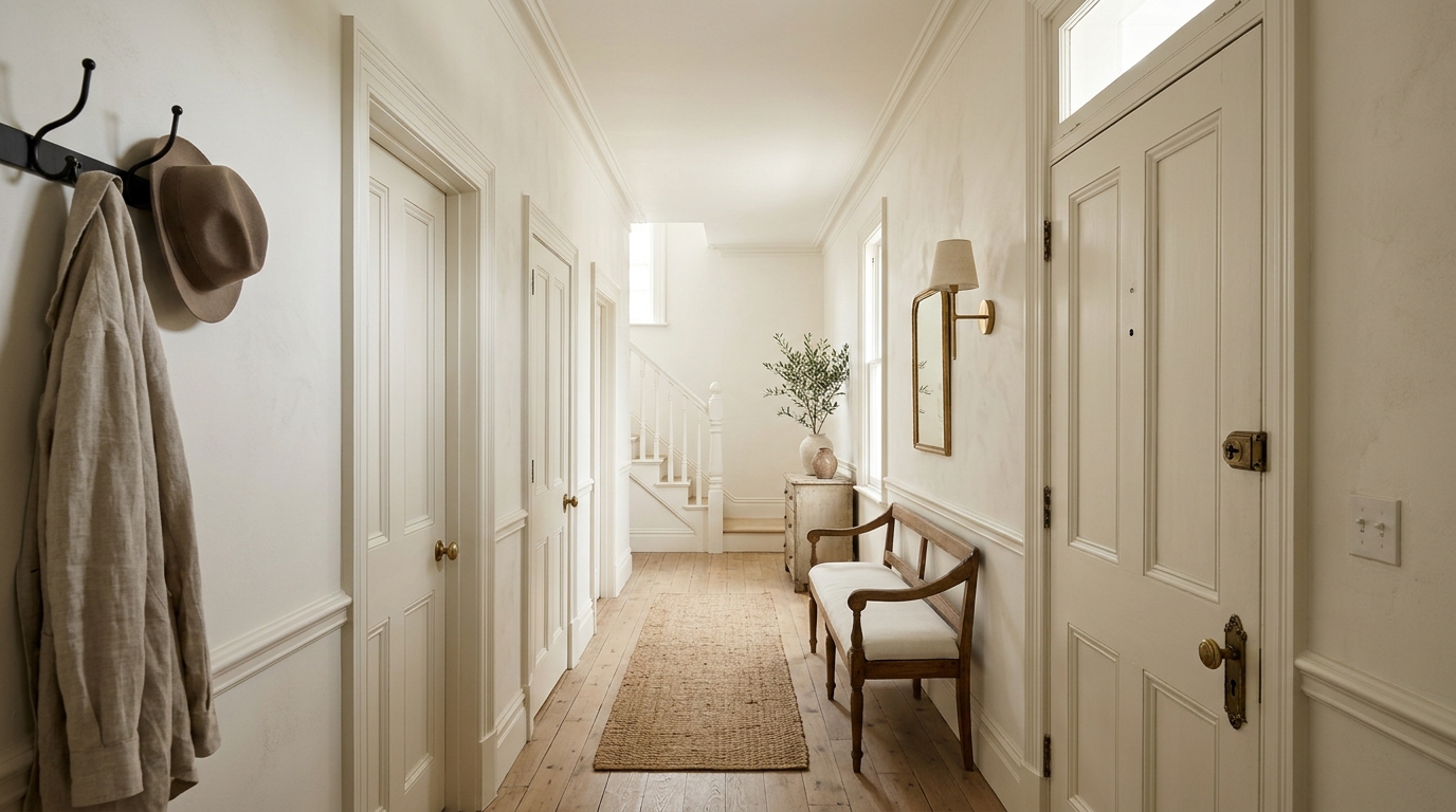
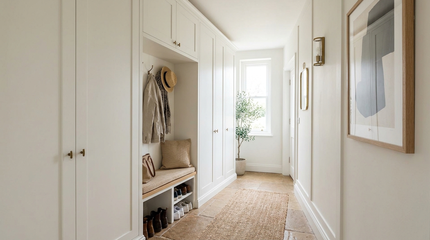
If you are looking for a small hallway makeover that feels expensive without the custom millwork price tag, color drenching is your most potent weapon. Specifically, I recommend Benjamin Moore’s Swiss Coffee. It is the industry’s ‘Goldilocks’ white—neither too sterile nor too yellow. In a narrow corridor, you should paint the walls, the baseboards, the doors, and even the ceiling in this single hue, but vary the sheens. Use a flat or matte finish for the walls and a soft satin for the trim.
This tone-on-tone approach eliminates the high-contrast ‘outline’ of the doors and moldings, which usually breaks up the visual flow of a narrow space. When the architecture is ‘ghosted’ in Swiss Coffee, the shadows soften, and the harsh boundaries of the corridor seem to evaporate. It creates a luminous, gallery-like envelope that allows your focal points—a piece of art or a sculptural sconce—to command attention without competing against the ‘noise’ of the architecture.
The Organic Modern DIY: High-End Materiality on a Budget
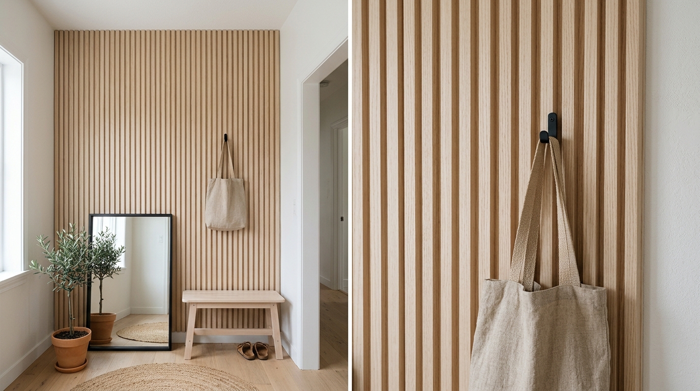
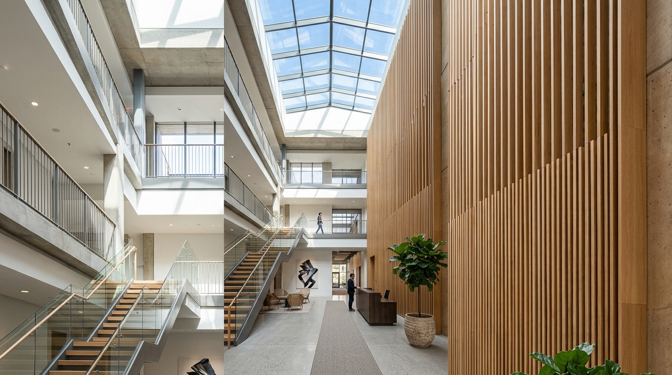
A frequent critique of narrow entryway ideas is that they can feel cold or clinical if they are too minimalist. To counter this, we lean into the Organic Modern movement. This is where we fuse the clean lines of foyer spatial design with tactile, earthy textures. Think of a DIY fluted wall paneling entryway. By applying thin, vertical wood slats to a segment of the wall and staining them in a light, white-oak finish, you introduce a rhythmic texture that draws the eye upward, emphasizing the ceiling height.
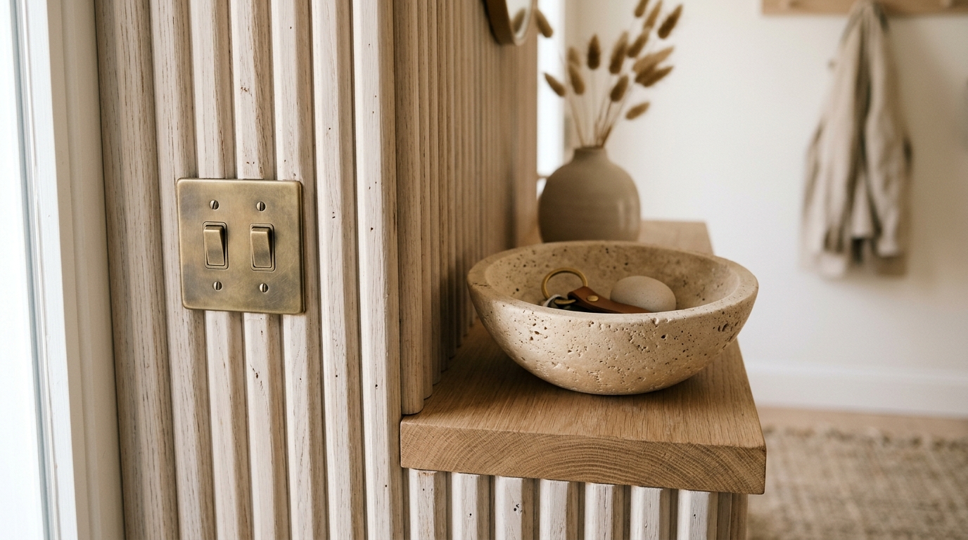
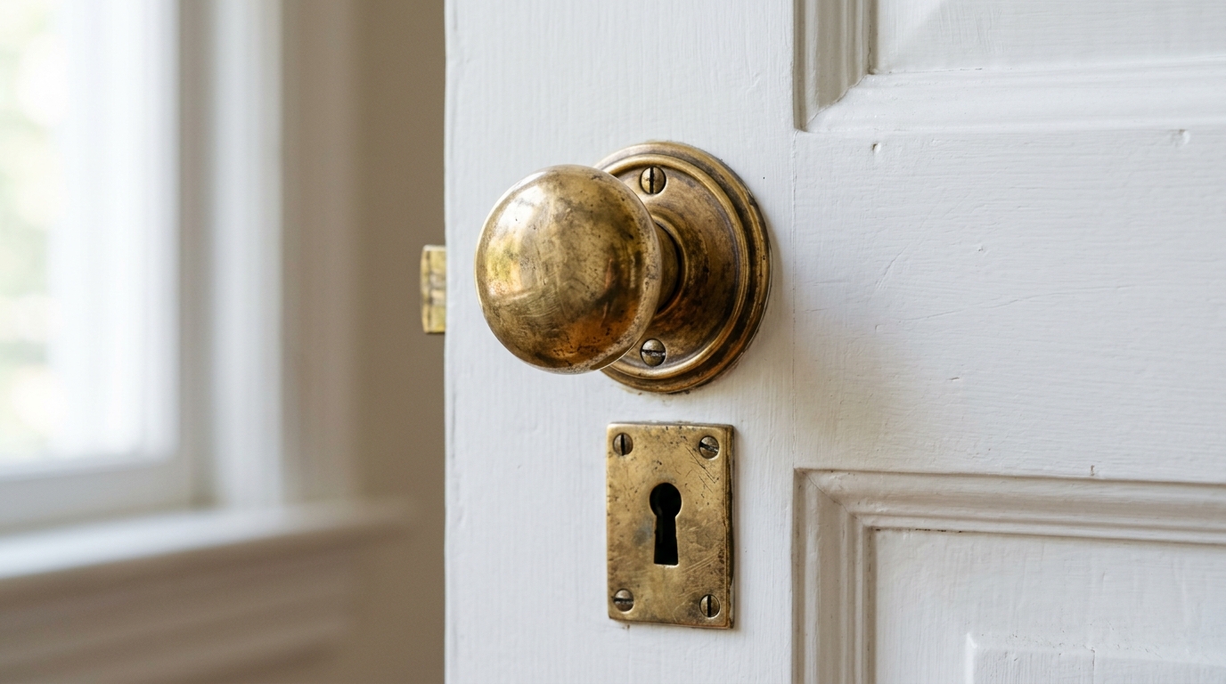
Materiality is the difference between a project that looks ‘Pinterest-viral’ and one that feels ‘Architectural Digest-refined.’ Even on an entryway renovation budget, you can prioritize one high-touch material. Replace generic plastic switch plates with brushed brass or matte black toggles. Swap a standard door handle for a heavy, knurled metal lever. These are the physical touchpoints that anchor the spatial illusion in reality. They provide a sense of weight and permanence that balances the ‘lightness’ of the ghosted walls.
Strategic Reflections: The Narrow Entryway Console Table with Mirror
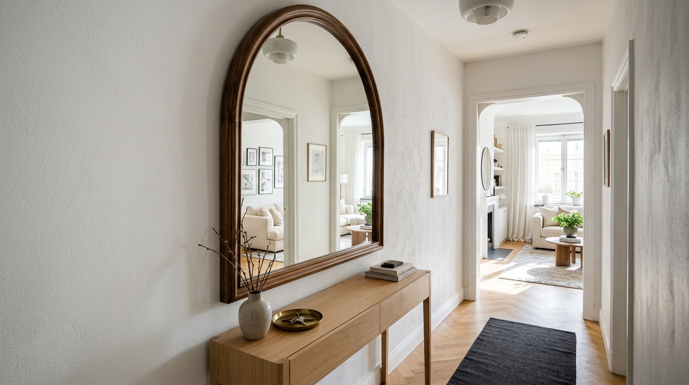
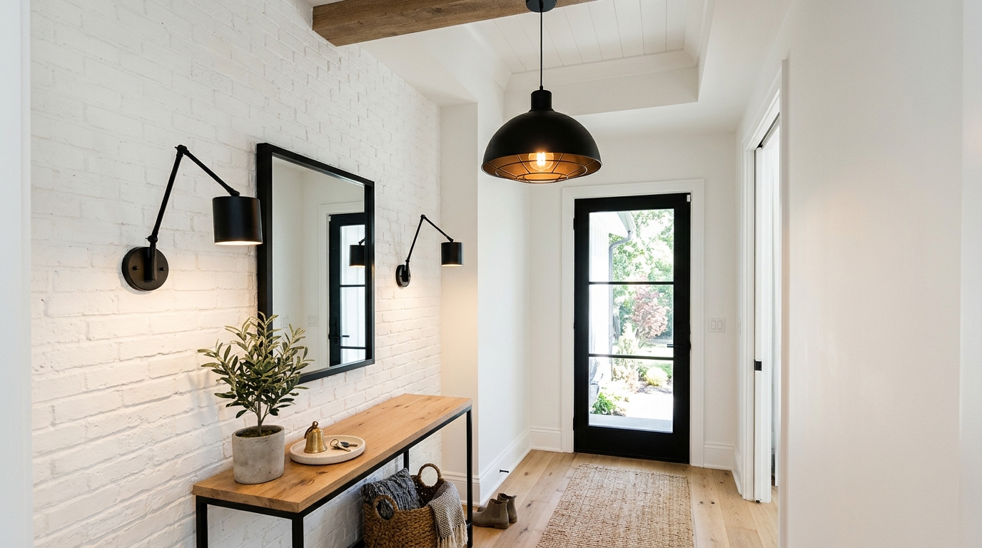
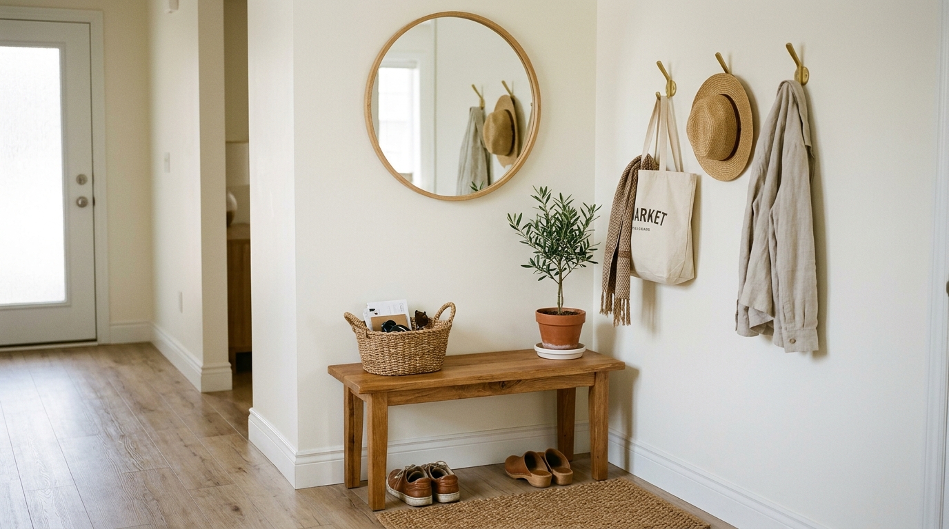
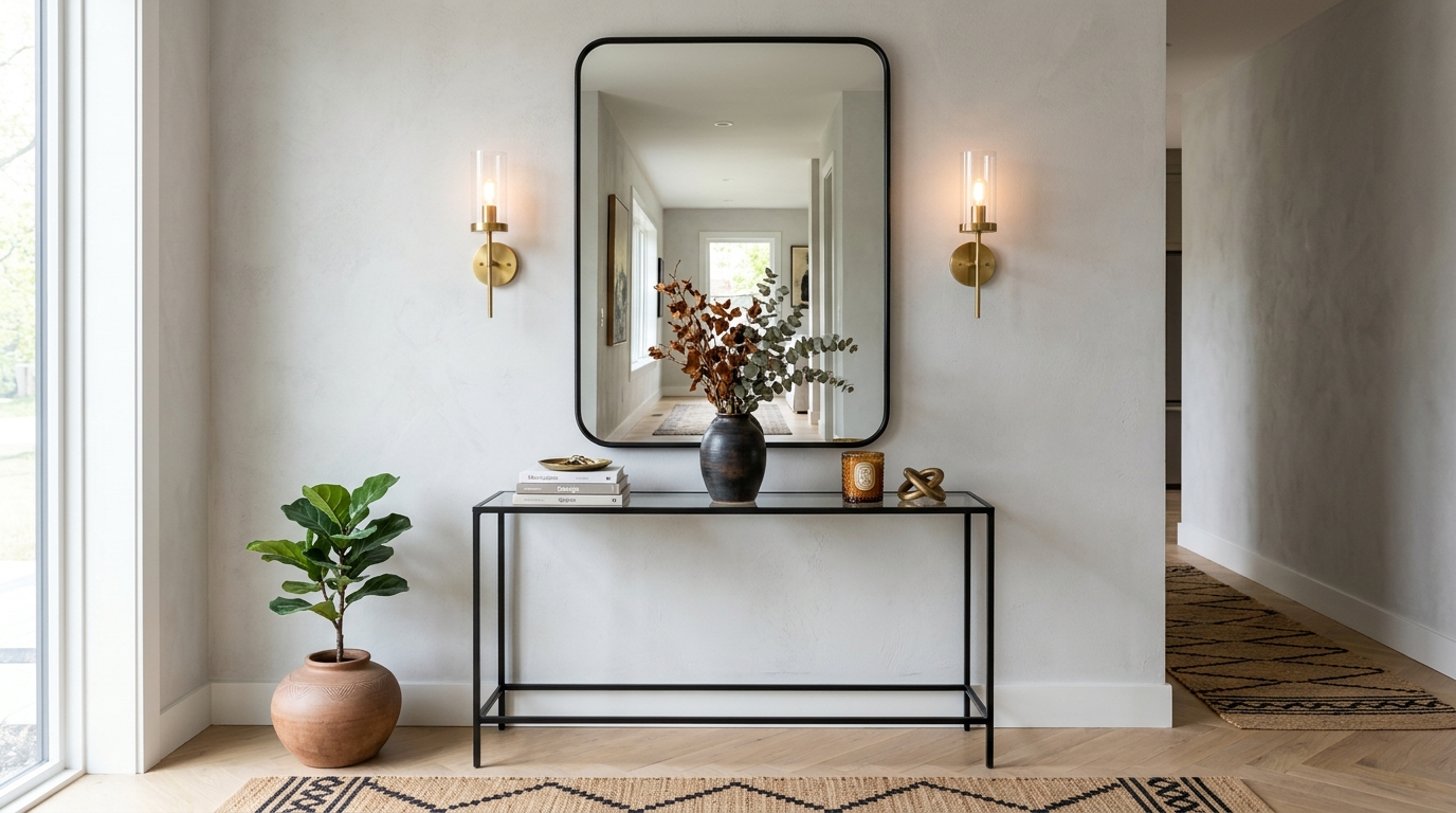
The narrow entryway console table with mirror is a classic for a reason, but the execution is where most go wrong. To maximize the ‘expanding’ effect, the mirror should be oversized—often larger than the console itself. An arch-top or a large circular mirror breaks up the rigid horizontals and verticals of the hallway. Position the mirror so it reflects a light source or an opening to another room. This ‘borrows’ space from the adjacent area, creating a false window that doubles the visual depth of the foyer.
For the console itself, consider an IKEA shoe cabinet entryway hack. The ‘Stall’ or ‘Bissa’ units are incredibly shallow, making them perfect for a narrow corridor layout. By replacing the stock plastic legs with custom wooden dowels and adding a stained oak or faux-stone top, you create a bespoke ‘drop-zone’ that manages the clutter of daily life without encroaching on the essential 36-inch walkway clearance.
Atmospheric Lighting: 2700K vs. 3000K Kelvin Spec
Lighting is the invisible architecture of a home. In a small entryway, you need to avoid the ‘interrogation room’ effect of high-output overhead lights. Instead, aim for layers. A scandi-industrial small foyer lighting plan involves at least two sources: a soft ambient overhead (2700K for a warm, welcoming glow) and a focused task light, like a slim wall sconce or a small cordless lamp on the console.
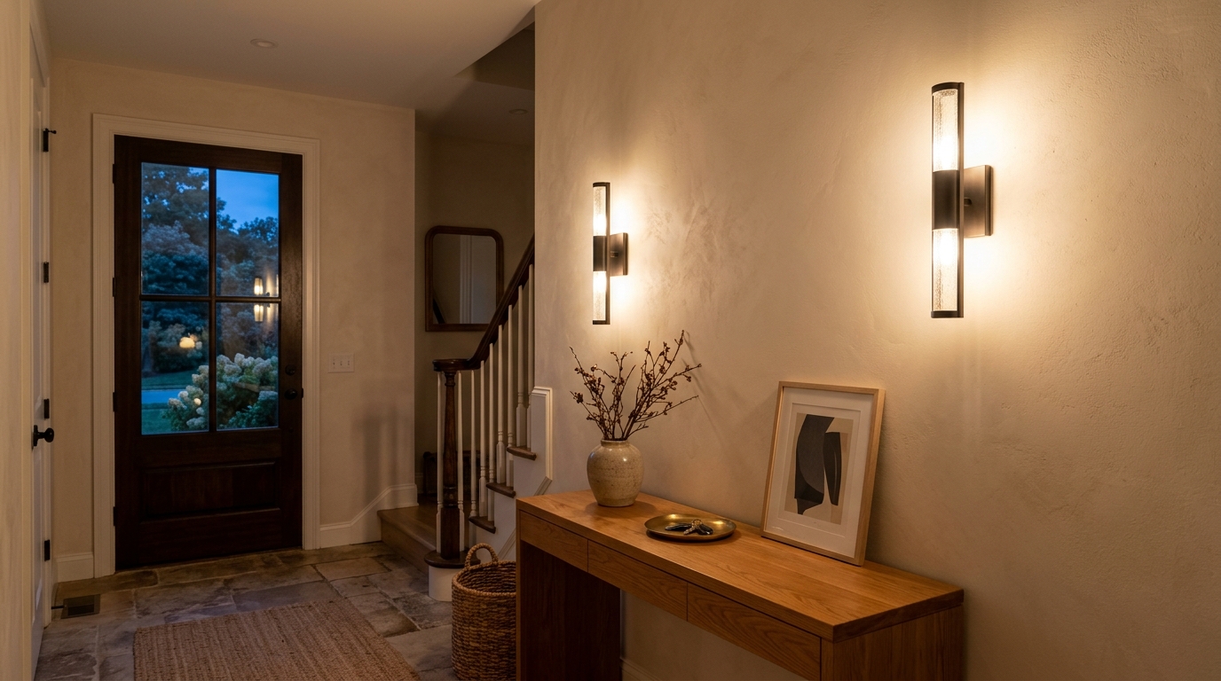
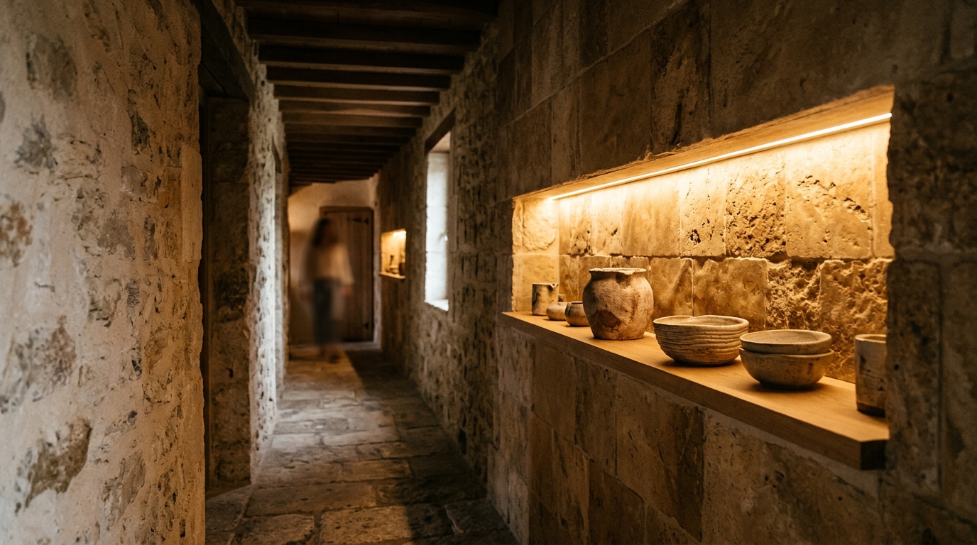
The technical specification matters. Look for bulbs with a High CRI (Color Rendering Index) of 90 or above. This ensures that the warm tones of your Swiss Coffee walls and the textures of your DIY fluted paneling look rich and true to life. Avoid 4000K ‘daylight’ bulbs, which can make narrow spaces feel cold and highlight every imperfection in the drywall. You want the light to wash down the walls, creating soft ‘pools’ of illumination that guide the visitor inward toward the heart of the home.
Tactile Grounding: The Washable Narrow Hallway Runner Rug
Flooring is often the most expensive part of a small entryway decor ideas on a budget plan, but you can bypass a full floor replacement with a high-quality washable narrow hallway runner rug. From a design perspective, the runner serves as a visual ‘runway,’ reinforcing the longitudinal axis of the space. Opt for a low-pile, vintage-inspired Turkish pattern or a chunky jute-look weave. The ‘washable’ aspect is critical for the high-traffic nature of an entryway; it allows you to choose lighter, space-expanding colors like sand, sage, or muted terracotta without the fear of permanent mud stains.
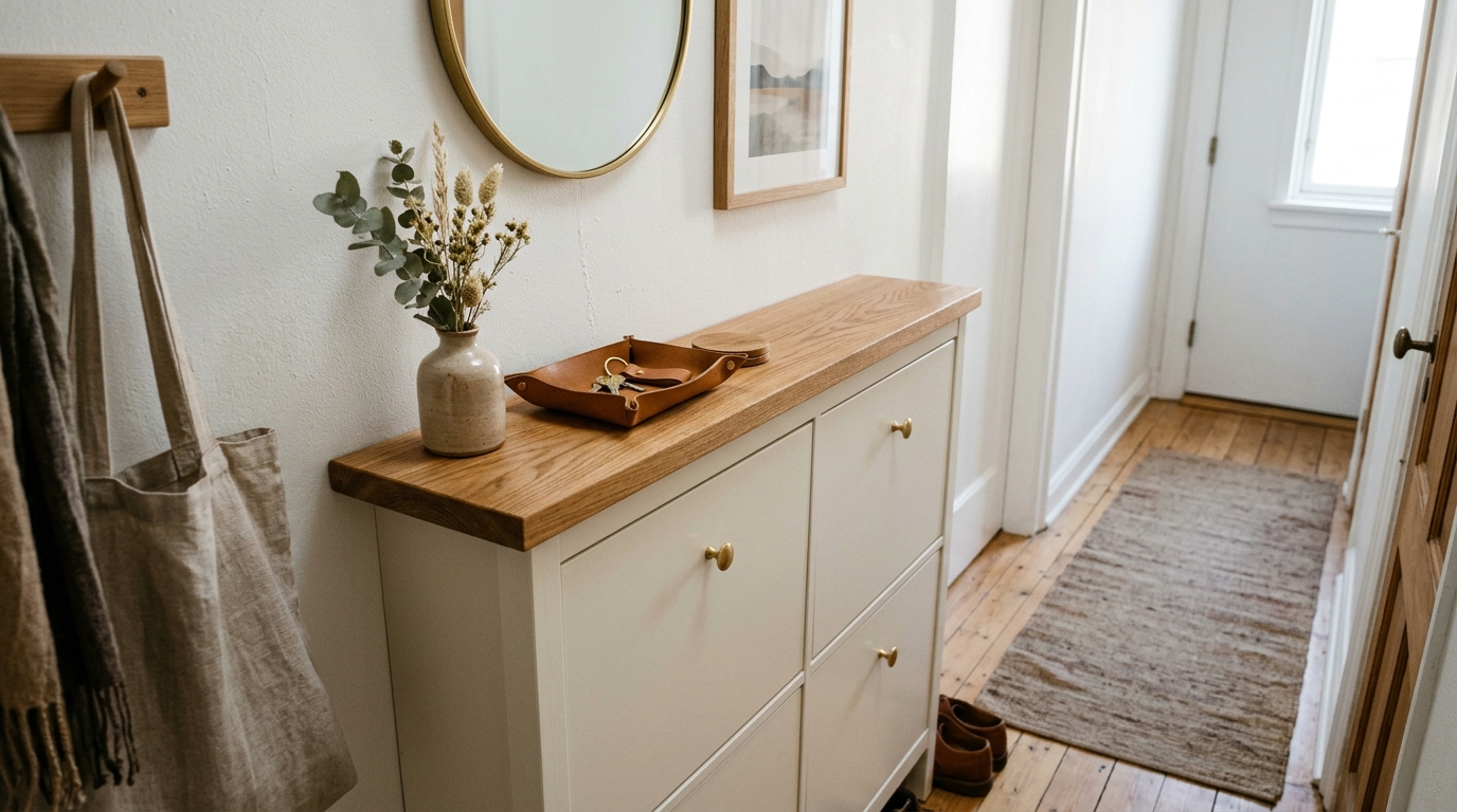
Ensure the rug is long enough. A short rug in a long hallway creates a ‘staccato’ effect that makes the space feel chopped up. A runner that extends almost the full length of the corridor creates a sense of continuity and ‘spatial stretching’ that is essential for a cohesive narrow entryway ideas strategy.
Architectural Specification & Material Matrix
Curated tactile palette, spatial dimensions, and atmospheric lighting index for this design scheme.
Ultimately, the transformation of a tight foyer relies on a shift in perspective. By applying these architectural rules—respecting clearances, ghosting the boundaries with color, and layering rich, organic textures—you create a home entry that feels intentional and expansive. These narrow entryway ideas prove that luxury isn’t a byproduct of square footage, but of thoughtful geometry and the quiet confidence of well-placed materials. Your entryway is no longer just a corridor; it is a sophisticated prelude to the rest of your life.
Editorial Silo • Recommended Architecture Studies
- Fabulous Designer Foyers: Masterful Narrow Entryway Ideas & Spatial Flow — Archival Design Case Study
- The Tactile Aesthetic of Narrow Entryway: Materials, Moods & Lighting Kelvin — Archival Design Case Study
Architectural Inspiration Lookbook
A high-resolution study in spatial proportions, tactile materiality, and light choreography curated for enduring modern living.







Curated Visual Lookbook
Design Gallery & Spatial Studies
A visual curation of architectural arrangements, lighting concepts, and material palettes featured in this space.