The Ergonomics of Social Gravity
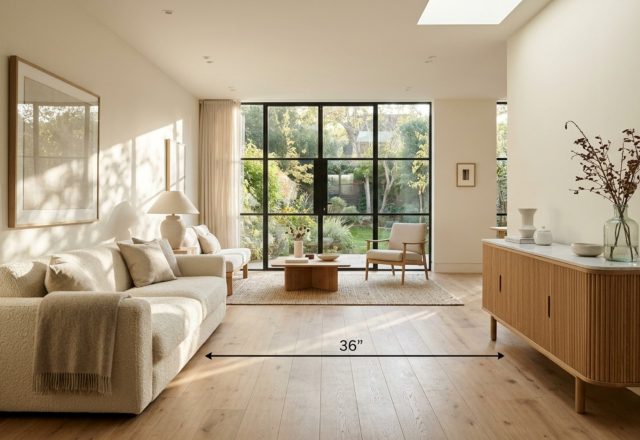
In the quiet mathematics of a home, the circulation paths define how we actually inhabit a space. It begins with the 36-inch clearance—the minimum breathing room required for two people to pass without a choreographed dance of apologies. When we analyze l shaped kitchen floor plans, we aren’t just looking at cabinetry meeting at a perpendicular intersection; we are looking at the functional center of gravity for the modern residence. This layout thrives because it respects the physics of movement, pulling the high-heat intensity of the range and the wet-zone utility of the sink into a protected corner while throwing the rest of the floor plate open to the soul of the house. By hugging two walls, the L-shape creates a generative ‘void’—a negative space that invites the island to act as the primary social bridge between the culinary work zone and the soft materiality of the living room.
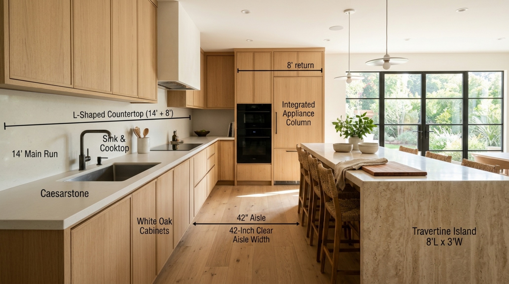
Sightlines in these layouts are paramount. A well-executed L-shape ensures that the person searing scallops at the range isn’t staring into a backsplash of subway tile, but rather catching a glimpse of the sunset through the floor-to-ceiling glazing in the adjacent lounge. This spatial cadence is what distinguishes a mere utility room from a ‘Social Spine.’ We are moving away from the isolated galley kitchens of the mid-century toward a more democratic architecture where the boundary between ‘service’ and ‘living’ is blurred by a continuous run of Honed Travertine or fluted oak cabinetry that wraps around the corner with architectural intent.
L Shaped Kitchen Dimensions and Clearances: The Calculus of Comfort
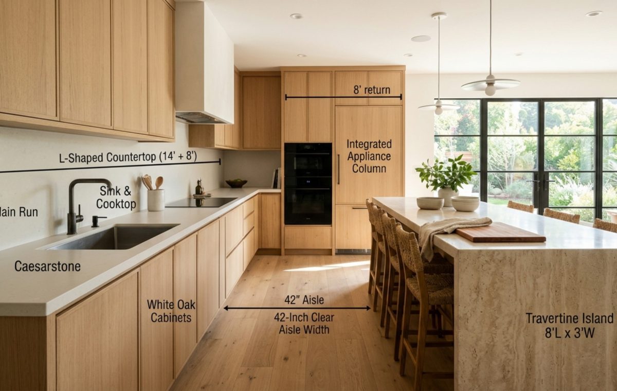
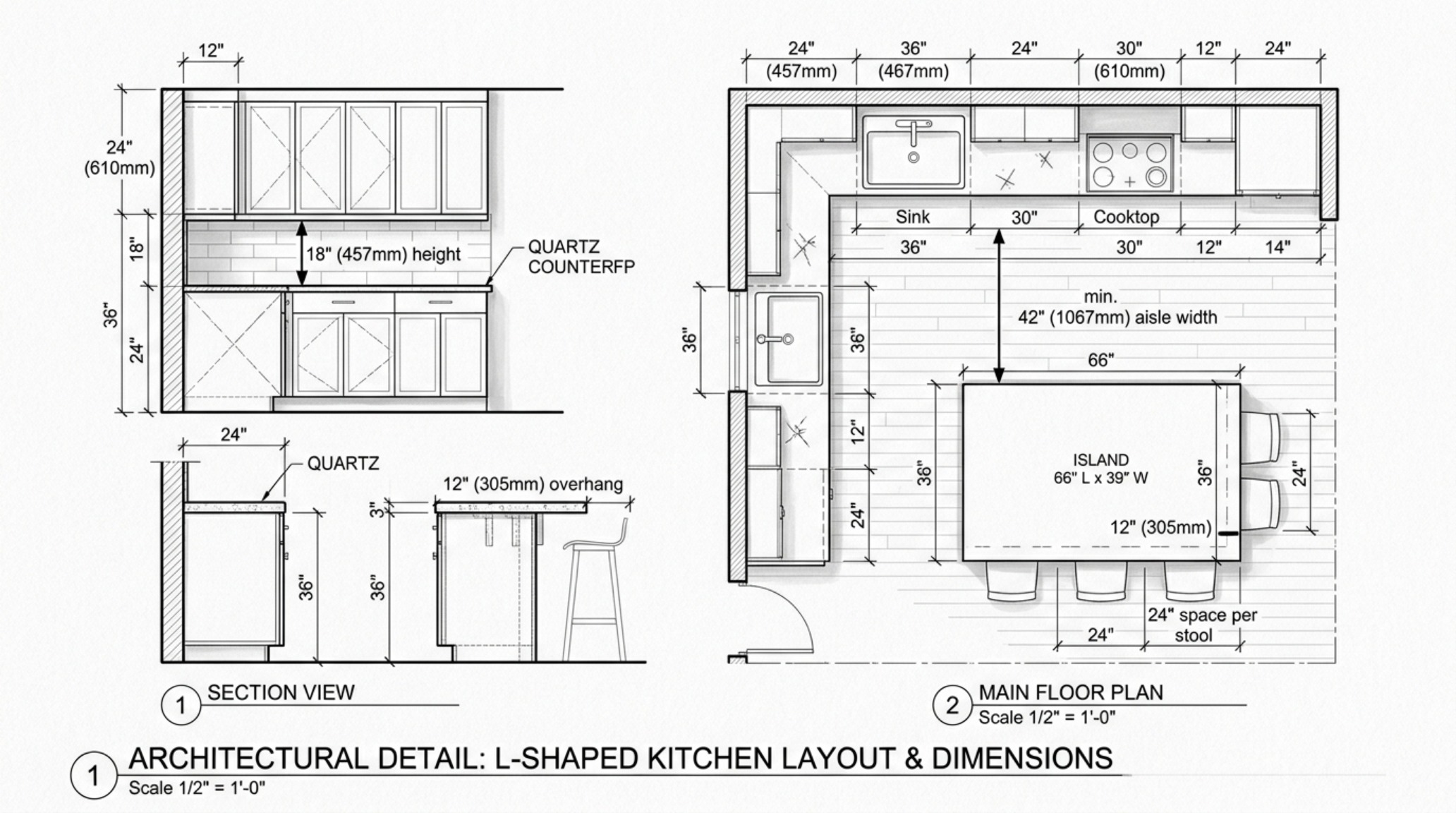
Designing an effective L-shaped footprint requires more than an eye for aesthetics; it requires a rigorous adherence to the ergonomics of the body. To maintain a fluid l shaped kitchen dimensions and clearances strategy, one must prioritize the ‘landing zones’—those critical 15 to 24 inches of countertop on either side of a sink or cooktop. In a professional-grade kitchen, we often see a primary run of 12 to 15 feet along one wall, intersected by a shorter 8 to 10-foot return. This proportion prevents the floor plan from feeling like a marathon for the home chef while maintaining enough physical distance to allow for multiple zones of activity.
“True architectural luxury isn’t found in the expensive marble alone; it’s found in the effortless 42-inch wide aisle that allows a dishwasher to be fully open while a guest leans against the island with a glass of wine, completely undisturbed.”
Consider the height of the verticality. By stopping upper cabinetry 18 inches above the counter and occasionally opting for open shelving in the ‘turn’ of the L, you alleviate the visual weight that often plagues corner designs. When the sightlines remain unobstructed at eye level, the room feels significantly more expansive. We often specify Benjamin Moore Swiss Coffee for these upper reaches to catch the 2700K ambient light, creating a soft glow that makes the ceiling feel like it’s floating. This technical precision ensures that the ‘Social Spine’ doesn’t just look good in a photograph—it functions with the grace of a well-oiled machine.
Small L Shaped Kitchen with Island: Maximizing the Social Void
In compact urban environments, the challenge is to prevent the kitchen from feeling like a corridor. A small l shaped kitchen with island is often the most intelligent solution for reclaiming the floor plan. By concentrating the heavy appliances—the integrated refrigerator and the wall oven—along the long axis, the shorter return can be dedicated to prep space or a coffee station. The island then becomes the structural ‘period’ at the end of the architectural sentence. It provides the necessary storage that a smaller footprint lacks while acting as the pivot point for the entire open-concept area.
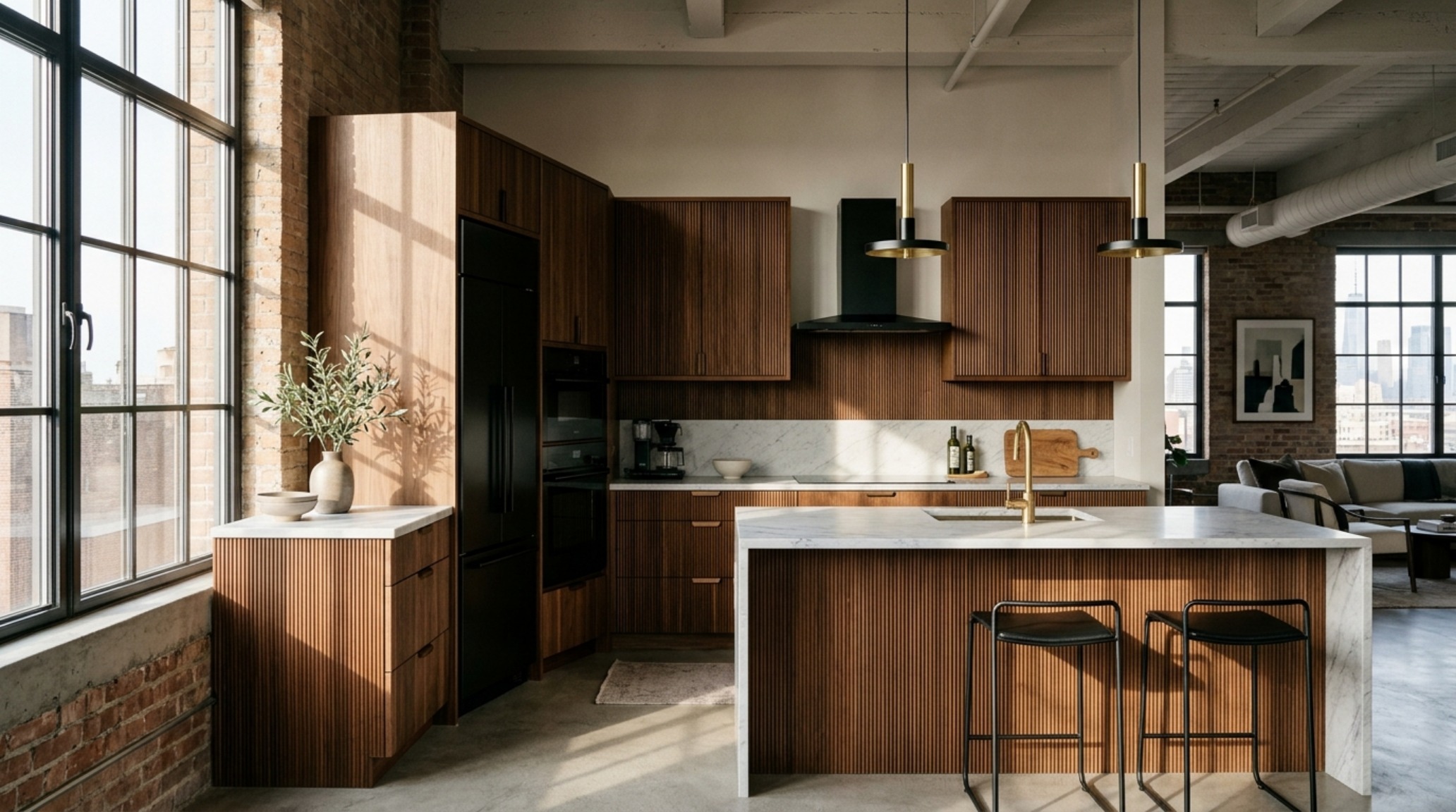
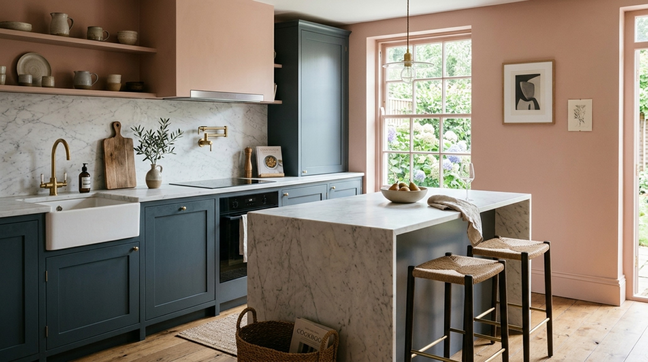
Texture plays a vital role here. In a smaller L-shaped configuration, I often lean into high-contrast materiality to define the zones. Imagine a deep charcoal cabinetry finish on the perimeter paired with a light, fluted white oak island. This visual ‘grounding’ helps the kitchen feel like a piece of furniture rather than a utility closet. The island should ideally maintain a 36-inch clearance from the perimeter counters, though 42 inches is the gold standard for high-traffic homes. This ensures that the ‘Social Spine’ remains porous, allowing light and conversation to flow through the kitchen and into the dining area without friction.
Blind Corner Cabinet Storage Ideas: Solving the Geometry of Neglected Space
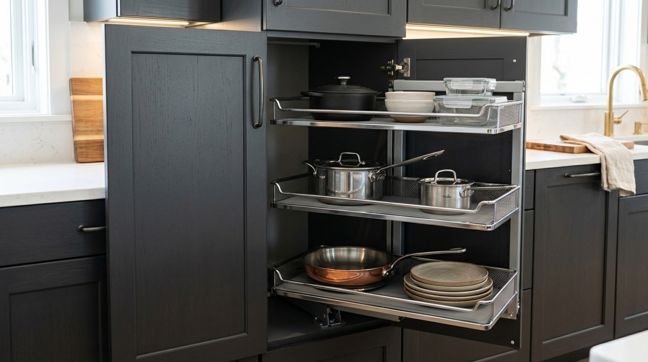
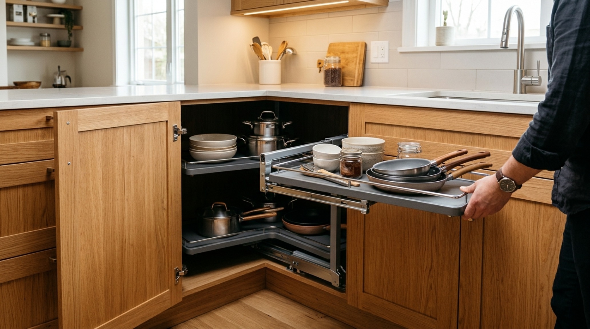
The most frequent critique of the L-shape is the ‘dead zone’—the deep, dark cavern where two cabinet runs meet. However, modern blind corner cabinet storage ideas have transformed this architectural hurdle into a secret weapon. Gone are the days of the clunky, plastic Lazy Susan. Today, we utilize sophisticated pull-out cloud systems and ‘Magic Corners’ that articulate out of the cabinet with a single fluid motion, bringing every heavy Le Creuset pot into the light. These mechanisms are the silent heroes of l shaped kitchen floor plans, ensuring that every square inch of the footprint is working for the homeowner.
Beyond the mechanical, consider the ‘void’ from a different perspective: the walk-in pantry. If the floor plan allows, clipping the corner to create a hidden larder provides an immense amount of storage without disrupting the visual flow of the L-run. This approach keeps the countertops clear of small appliances, allowing the materiality of the stone—perhaps a dramatic Calacatta Viola or a quiet, Honed Grey Basalt—to take center stage. When the clutter is removed, the ‘Social Spine’ becomes a gallery-like backdrop for the rituals of daily life.
Open Plan Living Kitchen Layouts and the Fluidity of Transition
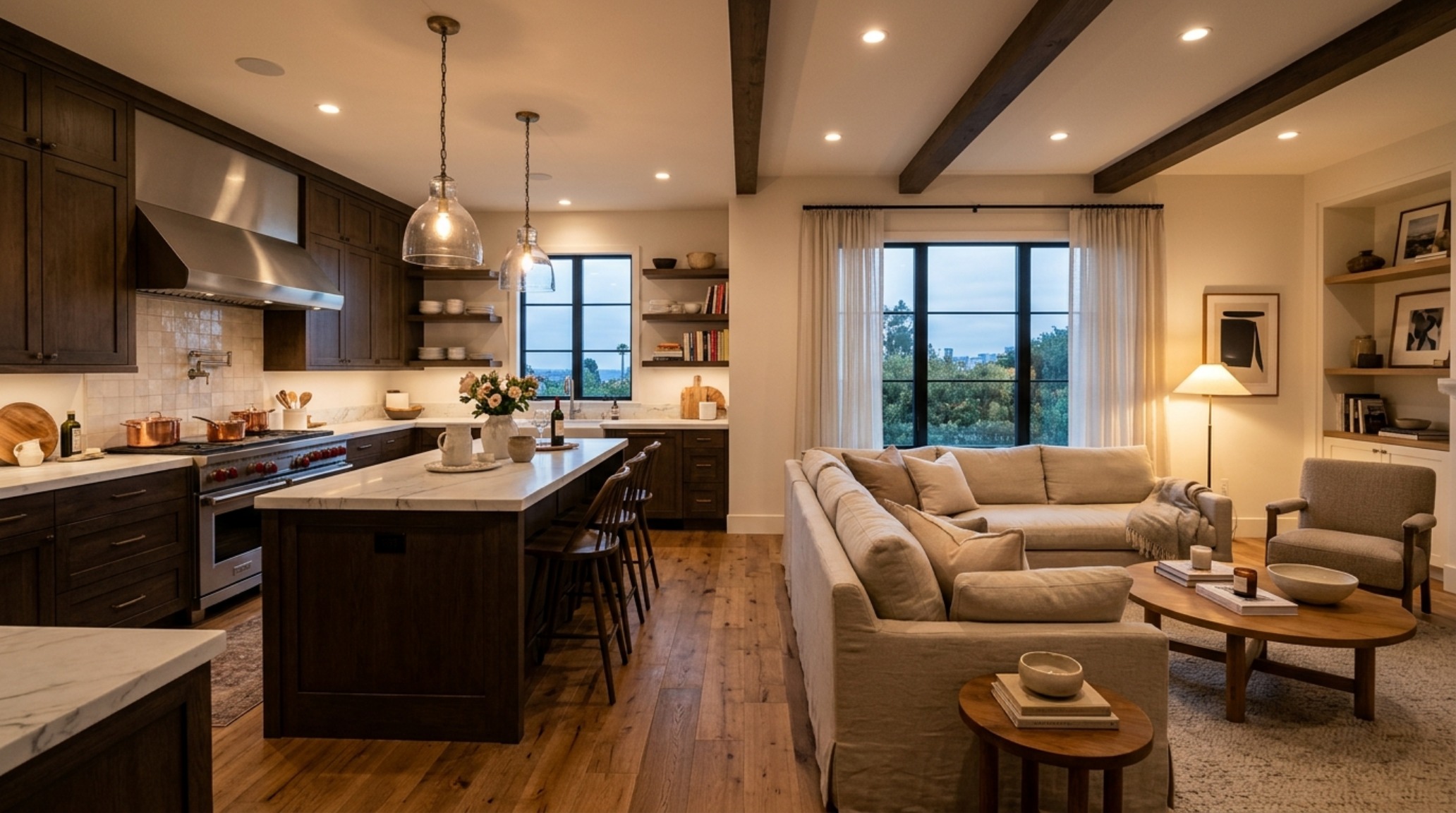
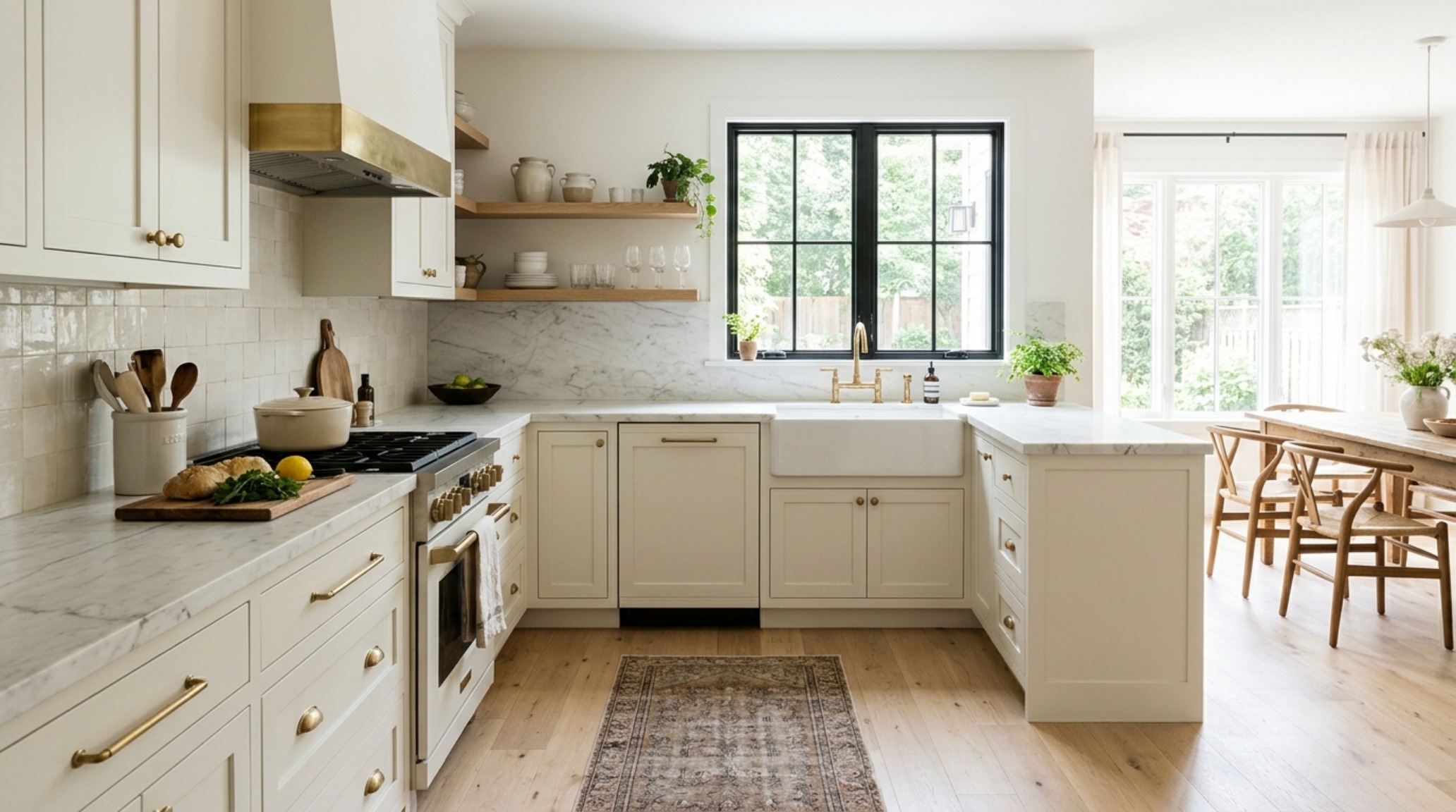
The magic of the L-shape is its inherent ability to ‘hug’ the corner, leaving two sides completely open to the rest of the house. This makes it the quintessential choice for open plan living kitchen layouts. The transition is not just about the floor finish; it’s about the sensory experience. We often use a Farrow & Ball Setting Plaster on the walls that wrap from the kitchen into the dining room to create a cohesive envelope. By using a consistent color palette, the kitchen no longer feels like a separate laboratory for food preparation, but rather a sophisticated extension of the living space.
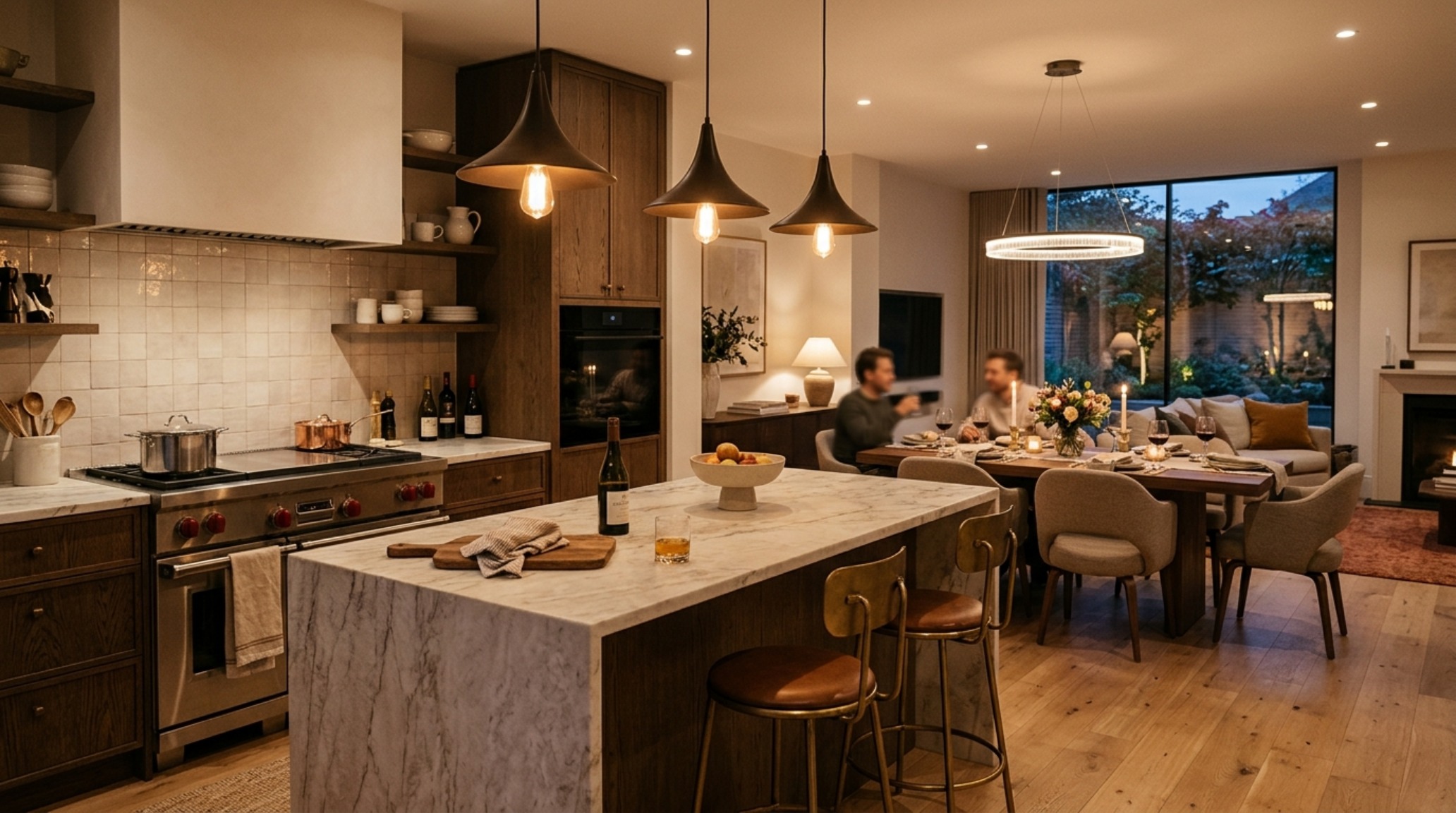
Lighting is the invisible glue in these open-concept transitions. I recommend a layered approach: 3000K high-CRI 90+ recessed lights for task work over the counters, contrasted with 2700K warm decorative pendants over the island. This Kelvin shift signals to the brain that the island is a place for rest and social interaction, while the perimeter is for precision and action. This atmospheric layering is what gives the ‘Social Spine’ its depth and soul, allowing the kitchen to transition from a bright breakfast hub to a moody, candlelit evening lounge.
Kitchen Work Triangle Optimization within the L-Shape
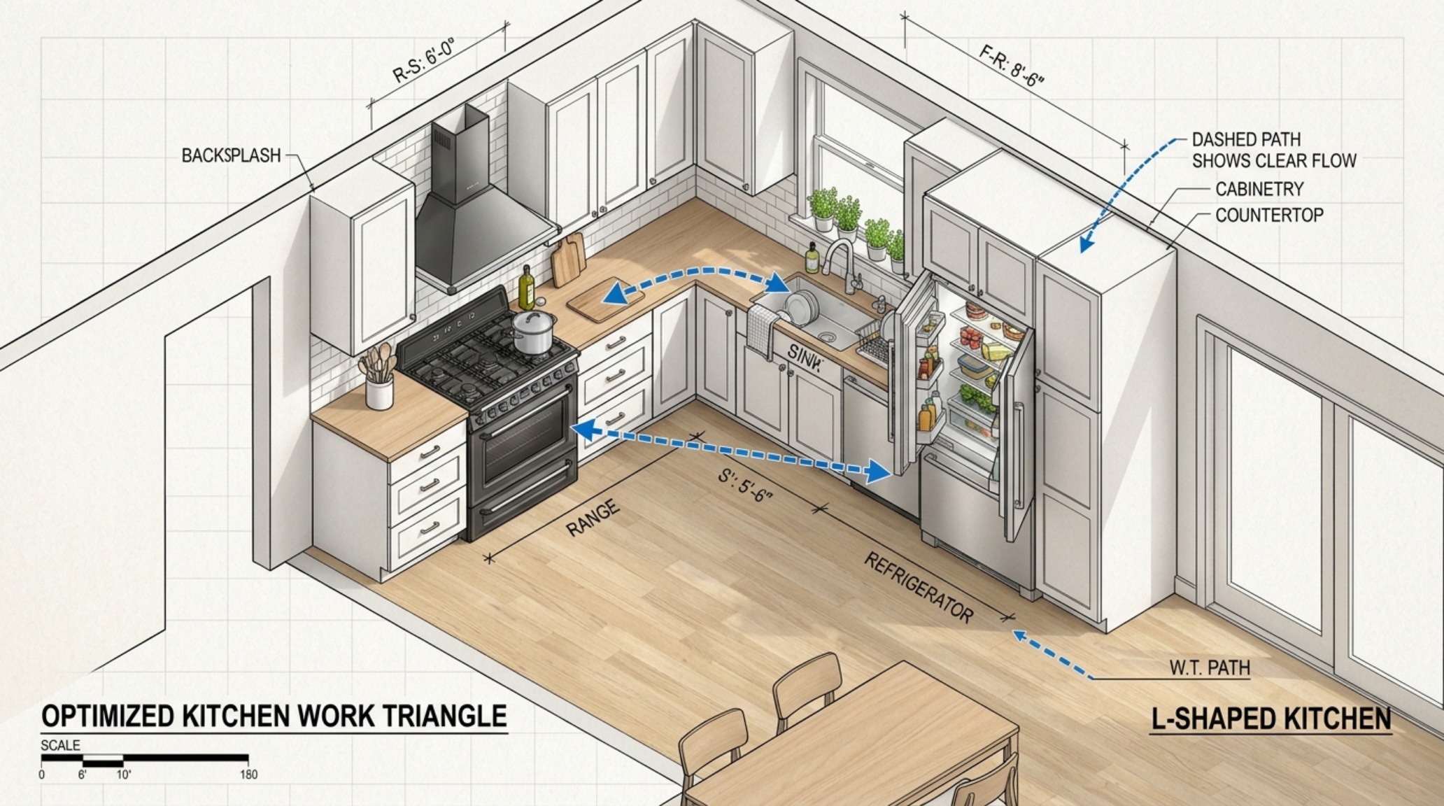
While we talk a lot about the social aspects, we cannot ignore the technical rigor of kitchen work triangle optimization. The L-shape is arguably the most efficient layout for the classic triangle—the path between the sink, the refrigerator, and the cooktop. In an L-shaped configuration, these three points are typically spread across the two legs of the ‘L,’ minimizing steps and reducing cross-traffic. The goal is to keep the sum of the three legs of the triangle between 13 and 26 feet. Any more, and the kitchen becomes exhausting; any less, and it feels cramped.
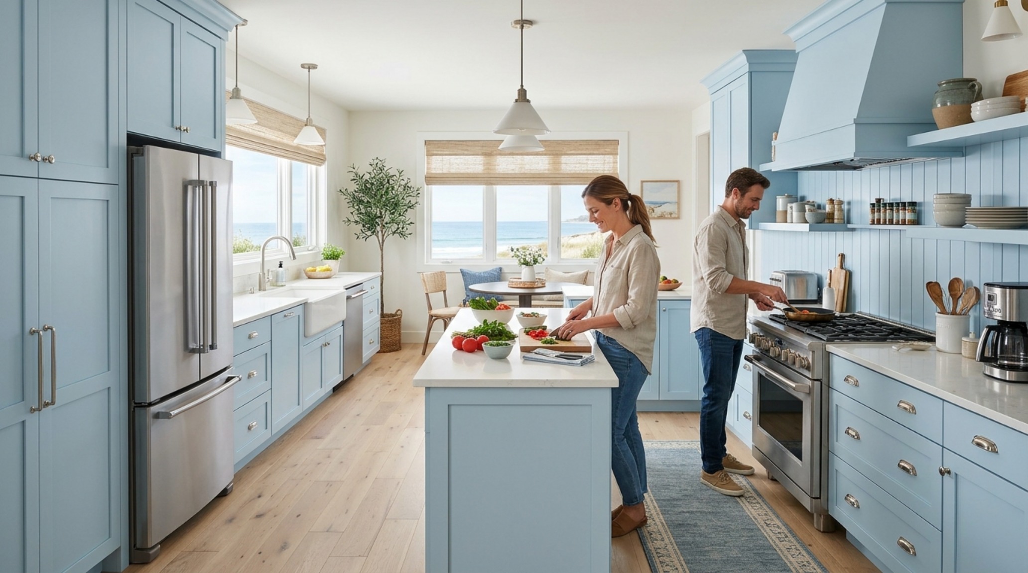
In many of our recent projects, we have evolved the triangle into ‘zones.’ The ‘Wet Zone’ (sink and dishwasher) stays on one leg, while the ‘Hot Zone’ (range and ovens) stays on the other. The refrigerator is placed at the end of the run, easily accessible to both the cook and someone coming in from the living room for a quick beverage. This zoning prevents the cook from being trapped and allows the ‘Social Spine’ to breathe. When the logistics are this sound, the kitchen feels intuitive, almost as if it’s anticipating your next move.
Asymmetrical Kitchen Layout Design: The New Editorial Standard
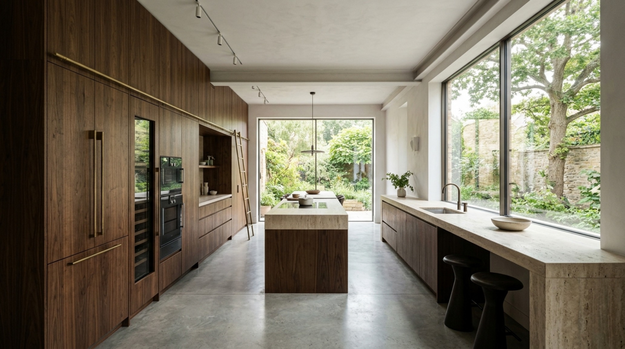
There is a growing movement toward the asymmetrical kitchen layout design, where the two legs of the L are purposefully unbalanced. This isn’t a mistake; it’s a deliberate aesthetic choice to create visual tension and interest. One leg might be a massive wall of floor-to-ceiling cabinetry containing all the pantry storage and appliances, while the other leg is a minimal, low-slung run of stone with no upper cabinets at all. This asymmetry allows for a large window or a piece of art to take the spotlight, breaking the traditional ‘kitchen’ look and leaning into a more architectural, furniture-like feel.
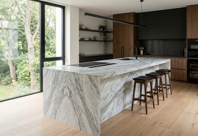
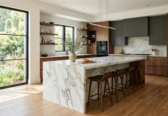
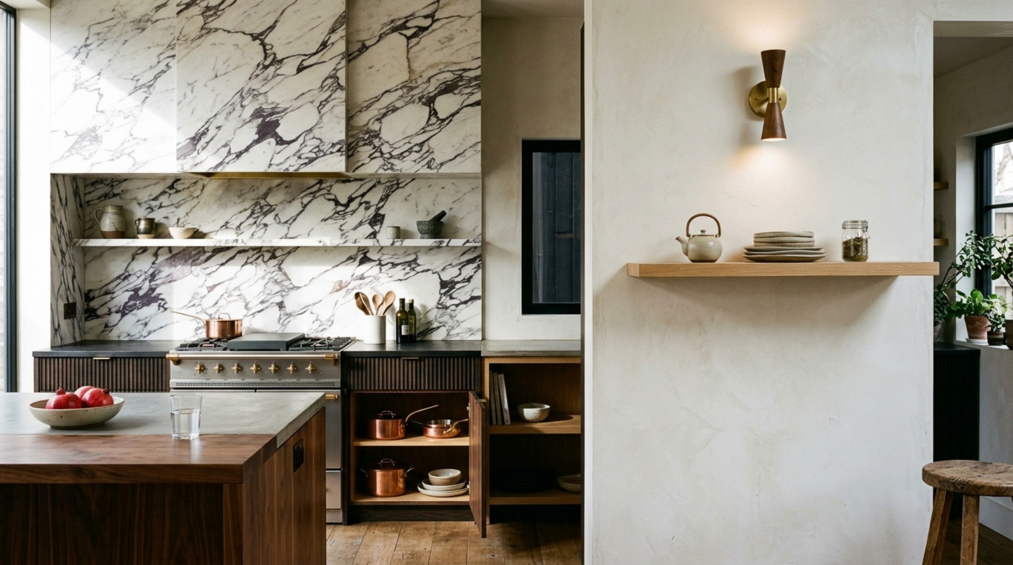
This design direction often utilizes a more curated material palette. We might see a heavily veined marble backsplash that continues all the way to the ceiling on the short leg of the L, acting as a focal point. On the long leg, a more subdued wood veneer or a matte lacquer finish provides a quiet backdrop. This interplay of heavy and light, solid and void, is what gives modern l shaped kitchen floor plans their sophisticated, editorial edge. It challenges the notion that a kitchen must be symmetrical to be beautiful, proving instead that balance is found in the distribution of visual weight.
Curated Materiality & Technical Dimensions Guide
Curated palette registry detailing authentic textures, lighting Kelvin ratings, and ergonomic reach.
Ultimately, the enduring appeal of l shaped kitchen floor plans lies in their humility. They do not demand to be the center of attention in the same way a massive, double-island U-shaped kitchen might. Instead, they provide the structural framework—the social spine—that allows the rest of the home to shine. They celebrate the beauty of the corner, the efficiency of the turn, and the luxury of open space. As we look toward the future of residential design, where the home must serve as office, sanctuary, and social hub, the L-shape remains the most versatile and human-centric anchor we have. It is a floor plan that doesn’t just house our appliances; it hosts our lives, grounding the kinetic energy of a modern household in a layout that is as mathematically sound as it is aesthetically soulful.
Editorial Silo • Recommended Architecture Studies
- The Ergonomic Edge: High-Performance Living through Precision Floor Space Planning”, 2026-10-26T17:58:32Z, “Efficiency is the modern luxury. This angle focuses on the ‘Performance Layout,’ where the floor space planner becomes a solution for complex, real-world ergonomics. Drawing from high-authority standards in plumbing clearance, storage accessibility, and multifunctional zoning, we provide a masterclass in spatial economy. This guide is for the resident who refuses to compromise on lifestyle in compact spaces. We analyze how a floor space planner can eliminate ‘dead zones’ in awkward kitchens and optimize the path from mudrooms to living areas, ensuring every fixture is positioned for maximum utility and seamless daily flow. — Archival Design Case Study
- Monolithic Luxury: Large Kitchen Island Designs & Materiality and Visual Drama in Oversized Island Curation — Archival Design Case Study
Editorial Photo Collection
High-resolution photography exploring proportions, organic textures, and spatial harmony.
Curated Visual Lookbook
Design Gallery & Spatial Studies
A visual curation of architectural arrangements, lighting concepts, and material palettes featured in this space.