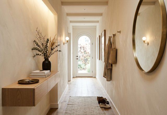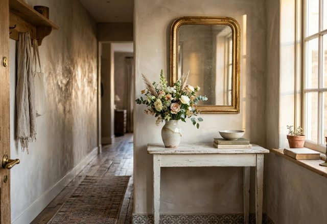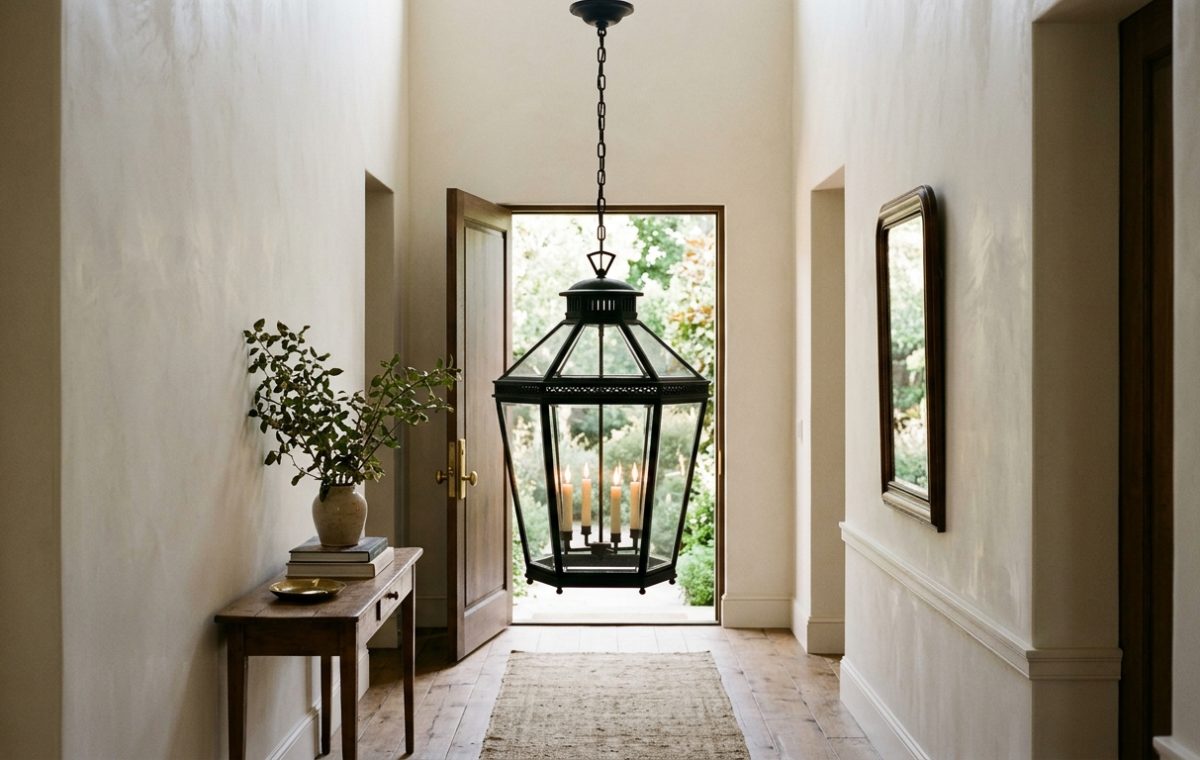
When we approach narrow entryway ideas, we usually start with the floor. We look at the footprint, measure the distance from the door swing to the wall, and immediately think about what we can lean against the plaster without obstructing the path. But this bottom-up philosophy is where most foyer designs fail. A narrow hallway is not a limitation of square footage; it is an opportunity of volume. By shifting our gaze upward and mastering the physics of verticality, we can transform a ‘bowling alley’ corridor into a breathtaking architectural experience. The secret lies in the Rule of Proportions—the intentional use of oversized lighting to anchor a space, creating a visual weight that commands attention and distracts the eye from the proximity of the walls.
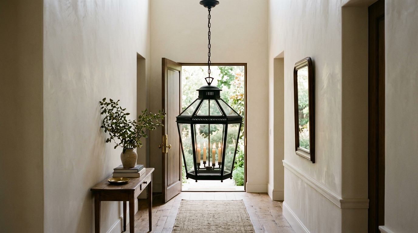
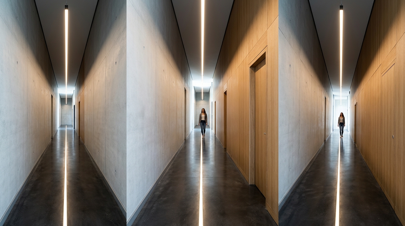
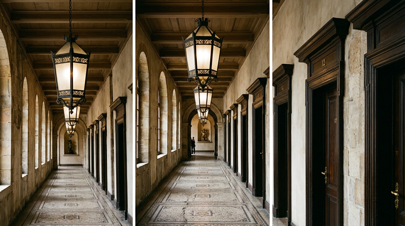
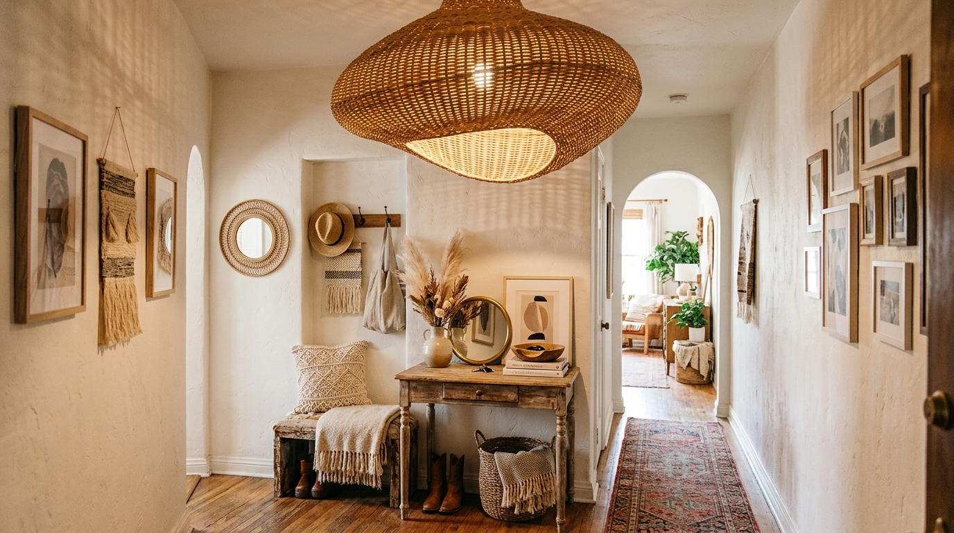
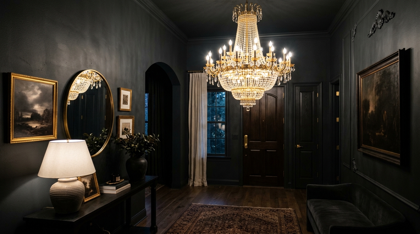
The psychology of a transition space is fascinating. As a contributing architectural journalist, I have walked through hundreds of homes where the foyer feels like an afterthought—a dark, cramped tunnel that merely facilitates movement. To fix this, we must look at the ‘spatial cadence’ of the home. A narrow entry needs a focal point that breaks the visual momentum of the hallway. When you install a high-impact statement pendant, you aren’t just adding a foyer entryway light; you are creating a destination. A large-scale lantern or a sophisticated linear fixture acts as a structural anchor, providing a sense of scale that feels intentionally grand rather than accidentally tight. It signals that this space has been curated, not just survived.
Rethinking Spatial Geometry: How Narrow Entryway Ideas Redefine Vertical Volume
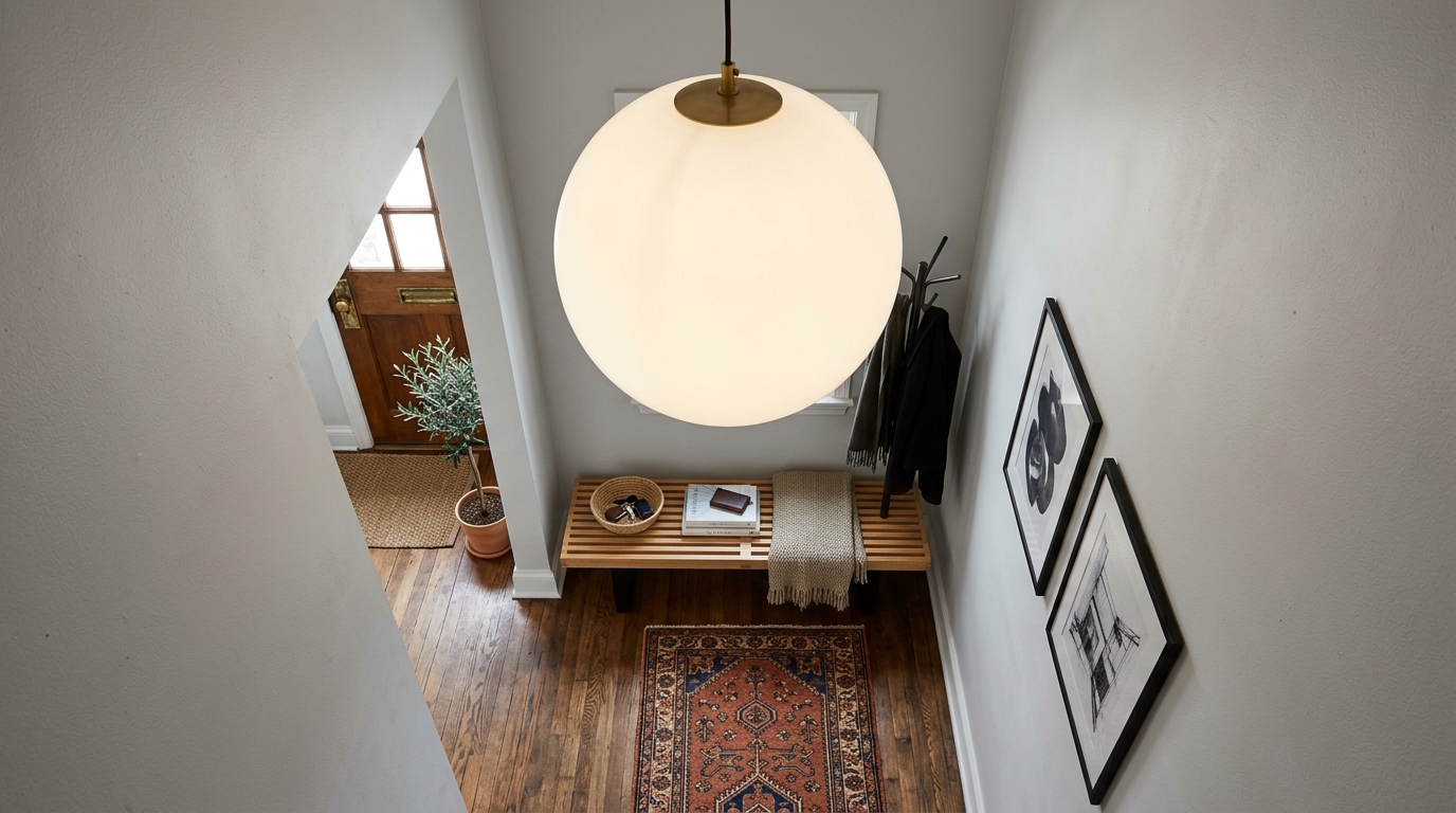
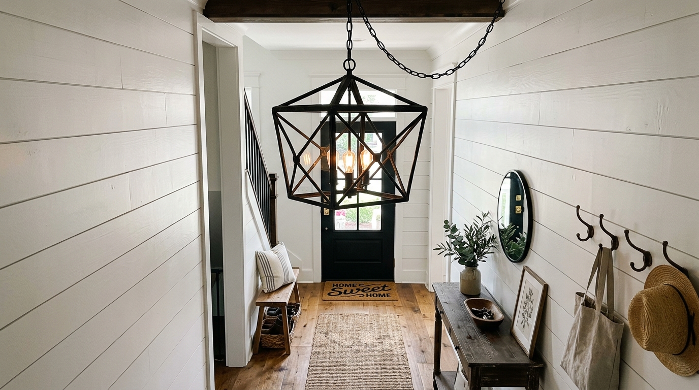
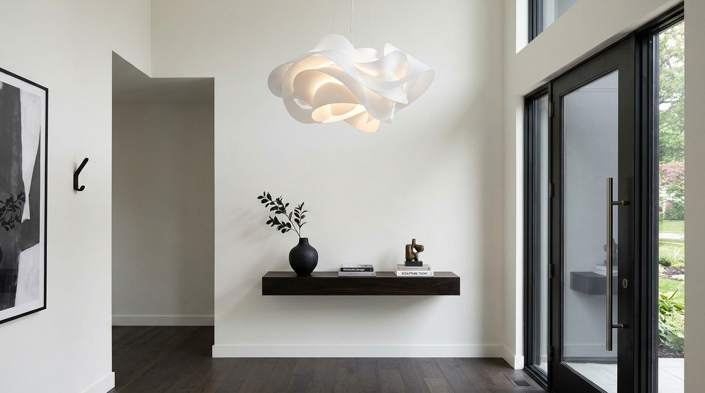
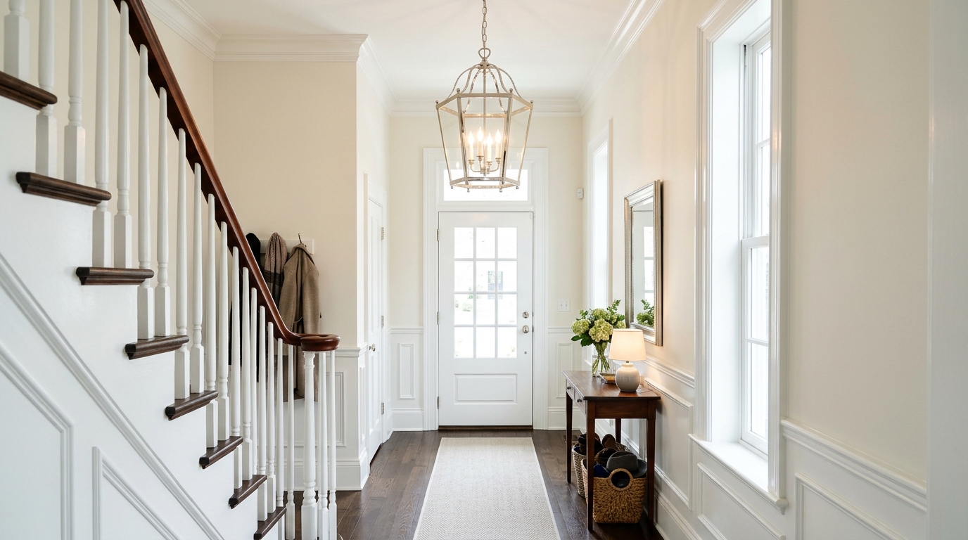
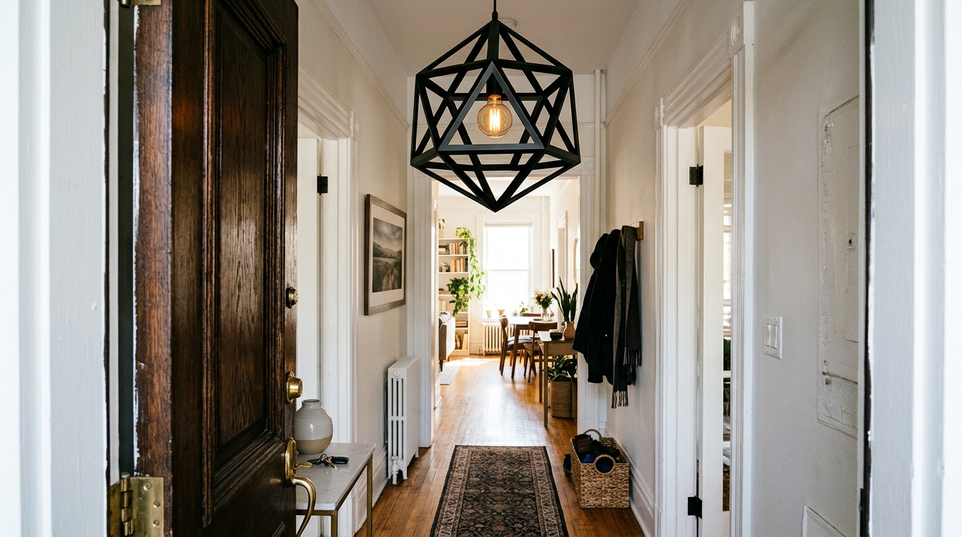
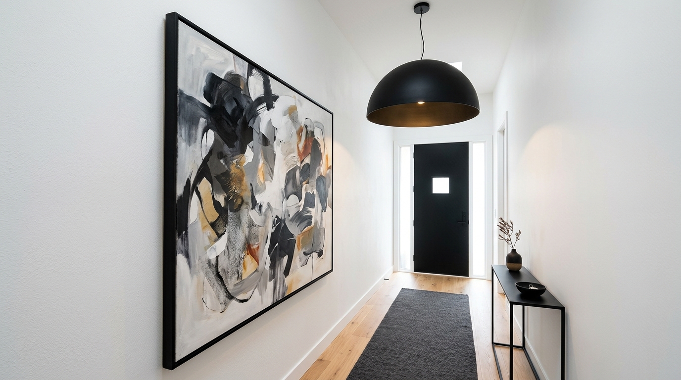
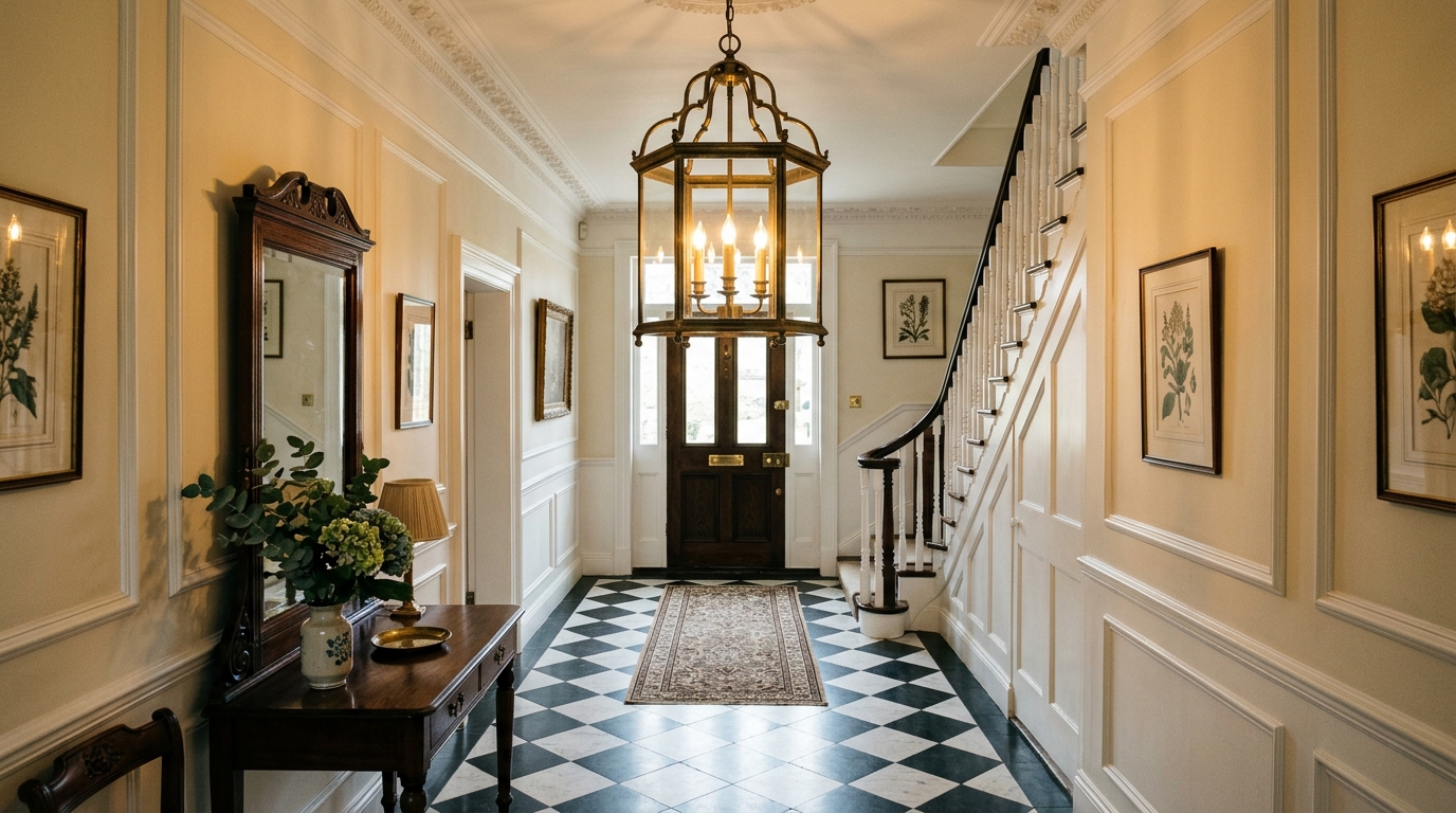
The common mistake in interior lighting design for small spaces is playing it ‘safe’ with scale. Homeowners often choose small, flush-mount fixtures, fearing that anything larger will overwhelm the room. In reality, a small fixture in a narrow hallway only emphasizes the smallness of the space. It feels meager. To achieve structural harmony, you must embrace the paradox: a larger fixture makes a narrow space feel larger. By utilizing an oversized piece—perhaps a 24-inch diameter lantern in a 48-inch wide hallway—you create a ‘hero’ moment that defines the proportions of the entire corridor. This is about the geometry of sightlines; when the eye is drawn upward to a significant object, the side walls effectively recede into the background.
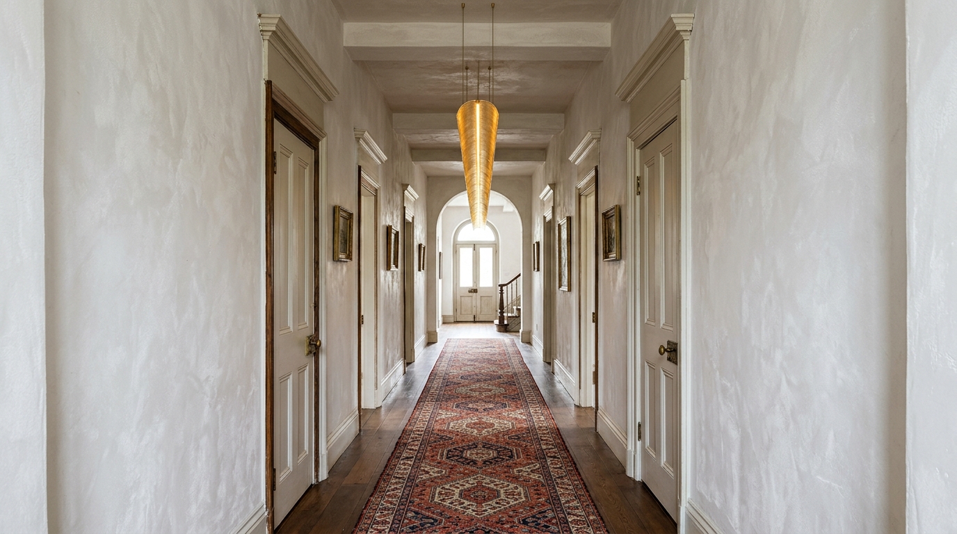
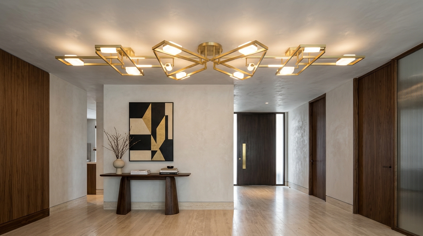
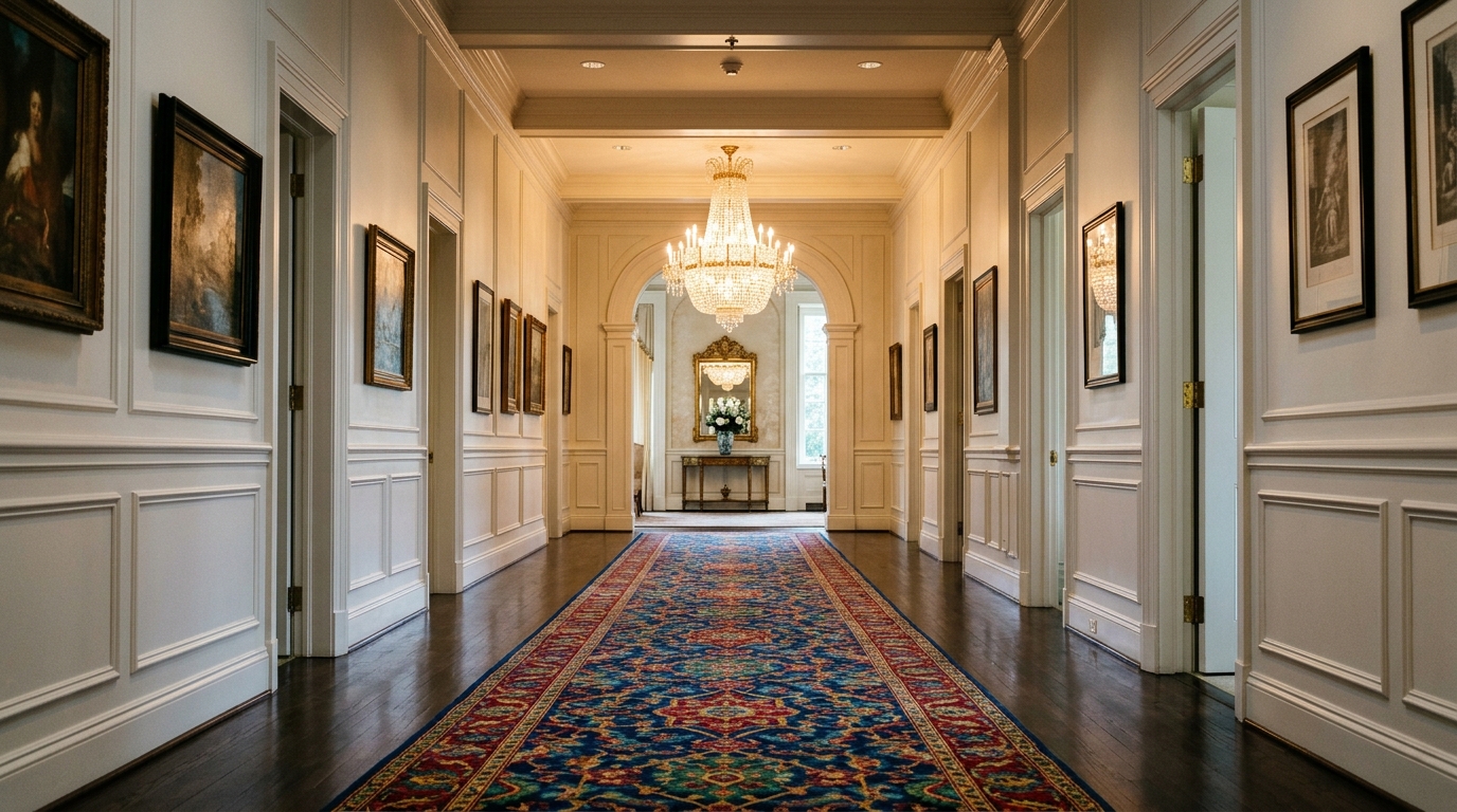
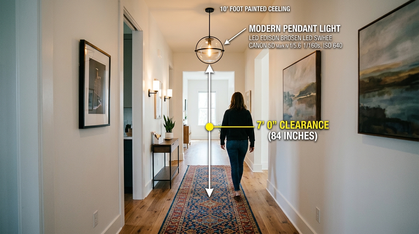
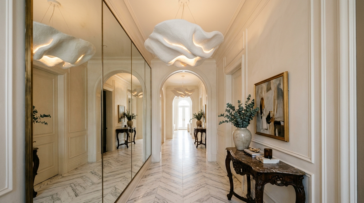
Consider the architectural clearance required for these moments. While the standard primary circulation path should maintain a 36-inch clearance, the vertical space is essentially free real estate. If your ceiling height allows for it—ideally 9 feet or higher—a hanging pendant should sit with its lowest point approximately 7 feet from the floor. This provides enough clearance for the tallest guests while keeping the fixture within the immediate field of vision. For those dealing with luxury foyer lighting for low ceilings, the strategy shifts toward wide, sculptural semi-flush mounts that use horizontal spread to mimic the impact of a hanging pendant without the vertical drop. This maintains the ‘statement’ without compromising the ergonomics of the walkthrough.
The Art of Materiality and Tactile Grounding
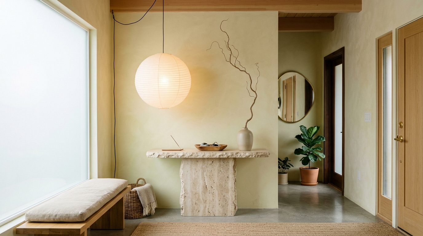
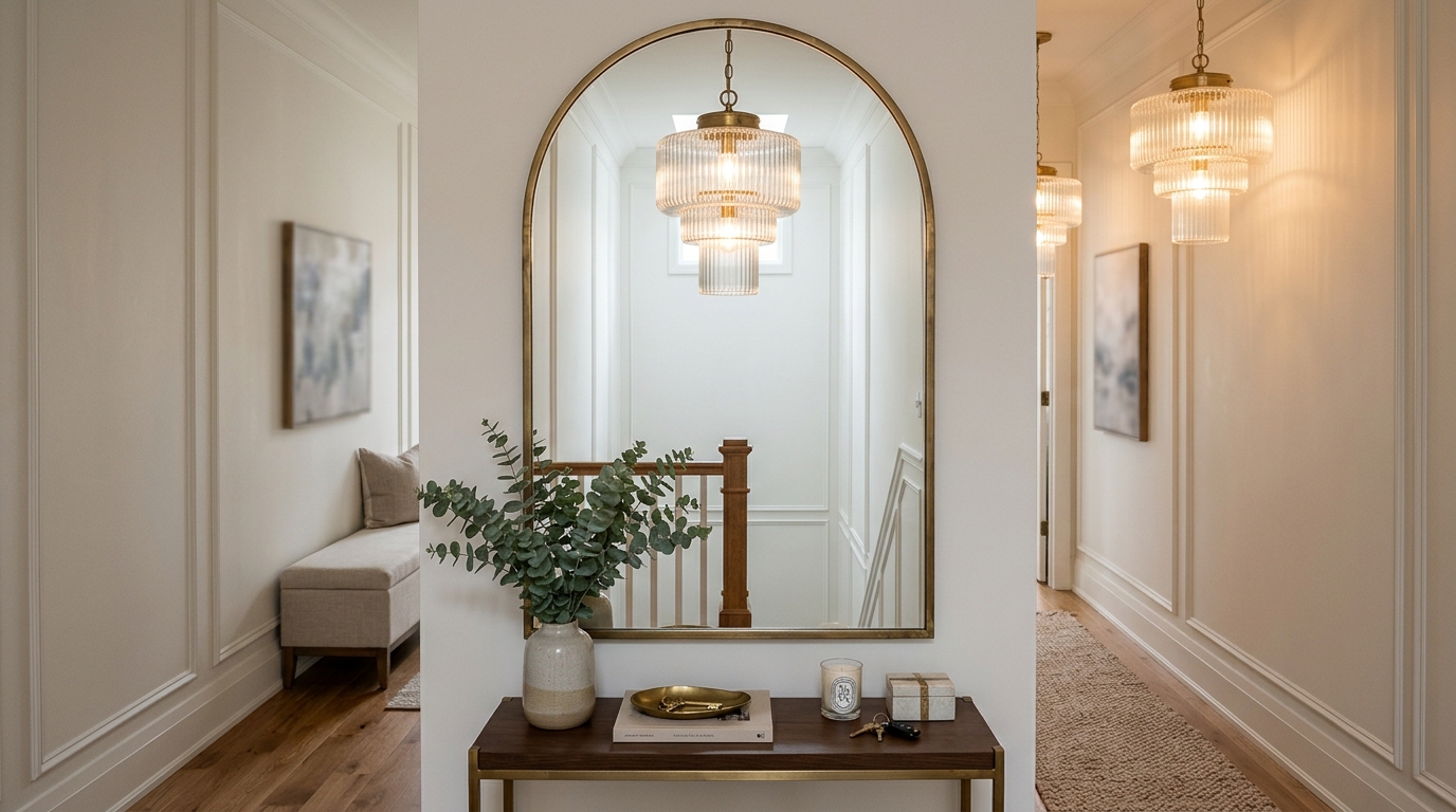
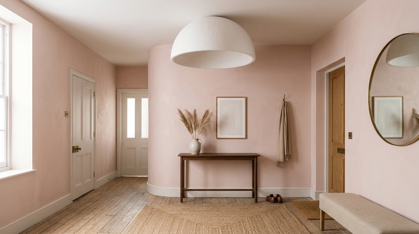
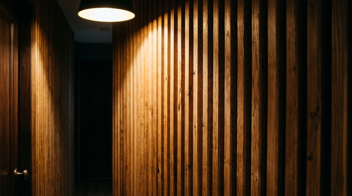
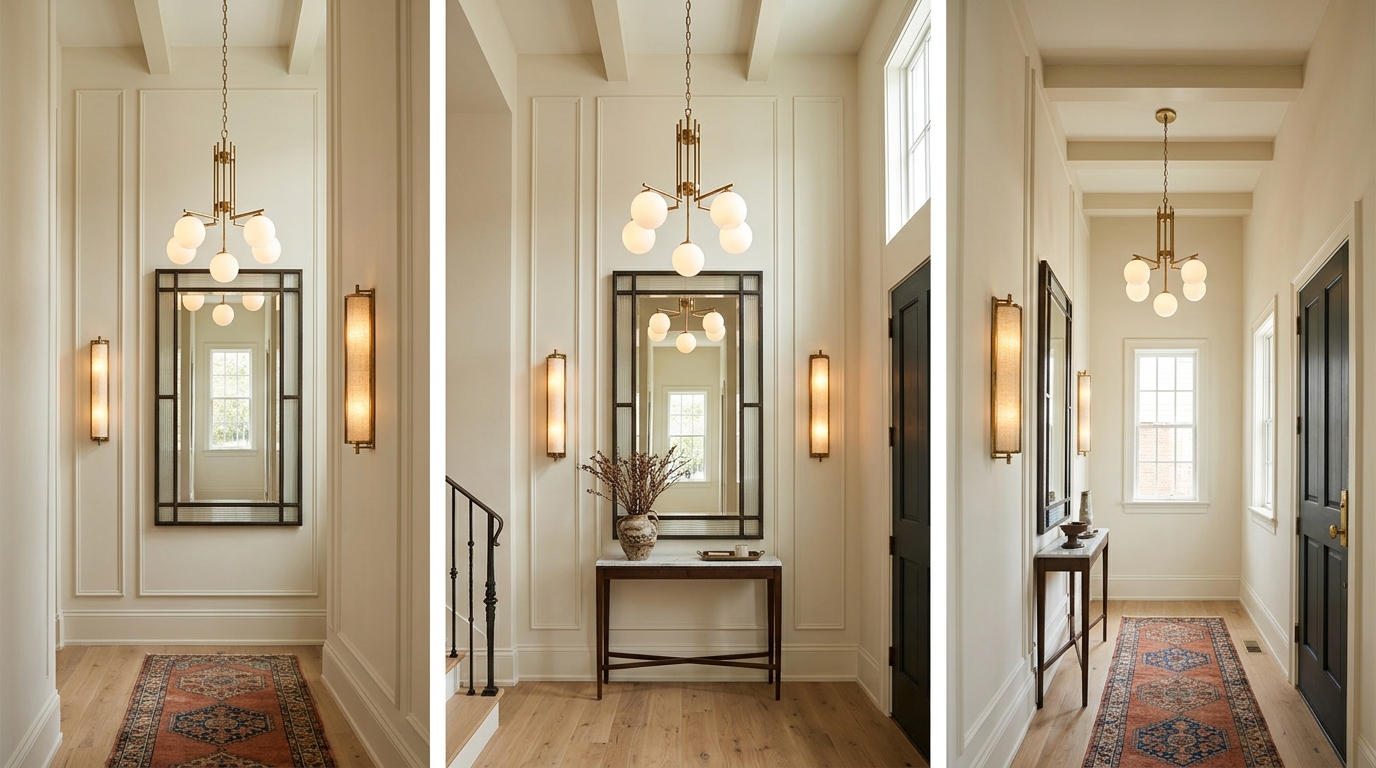
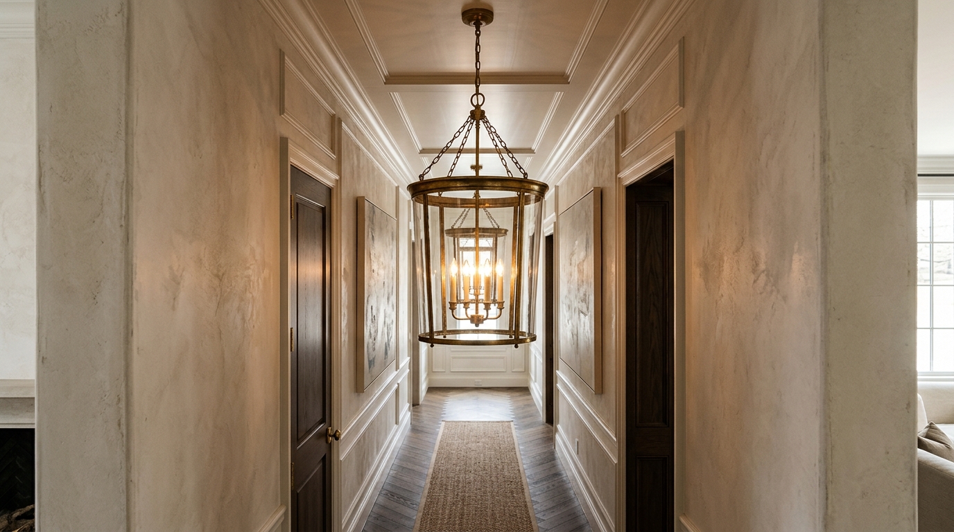
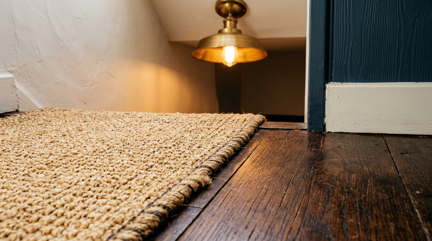
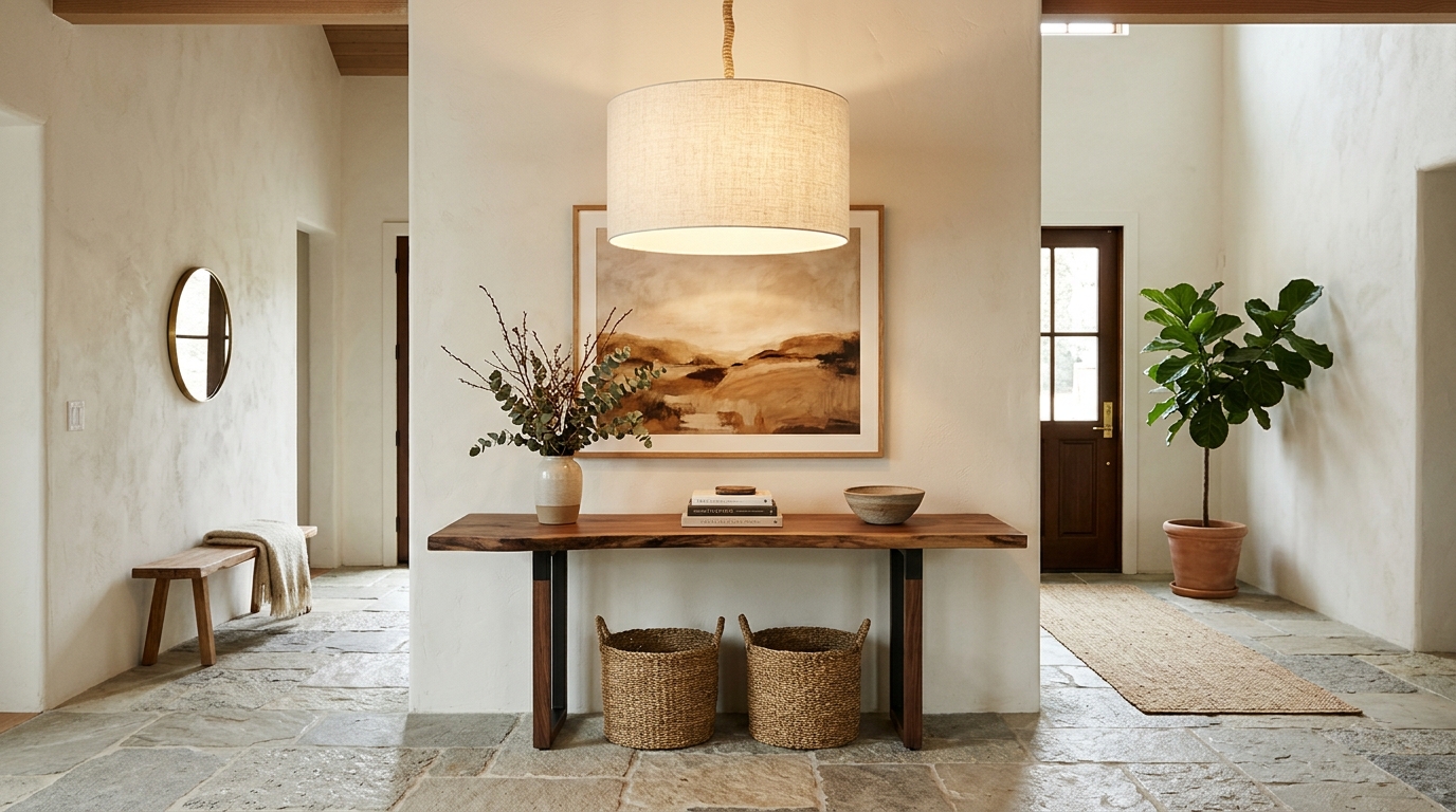
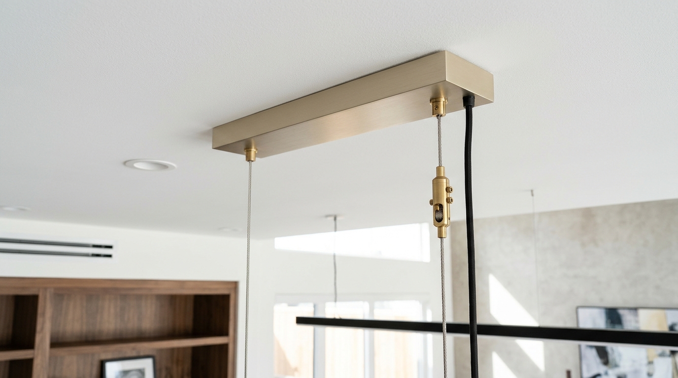
When selecting small entryway lighting fixtures, the material choice is as critical as the size. We are seeing a massive shift toward the ‘Organic Modern’ entryway decor aesthetic, where raw, tactile materials meet clean, architectural lines. Imagine a fixture crafted from hand-rubbed antique brass paired with white glass globes, or a linear wooden pendant with fluted detailing. These materials offer ‘tactile grounding,’ a term we use to describe elements that feel substantial and permanent. When these textures are set against a backdrop of Benjamin Moore Swiss Coffee or the soft, earthy depth of Farrow & Ball Setting Plaster, the light doesn’t just illuminate the room; it interacts with the surfaces to create a layered, sensory environment.

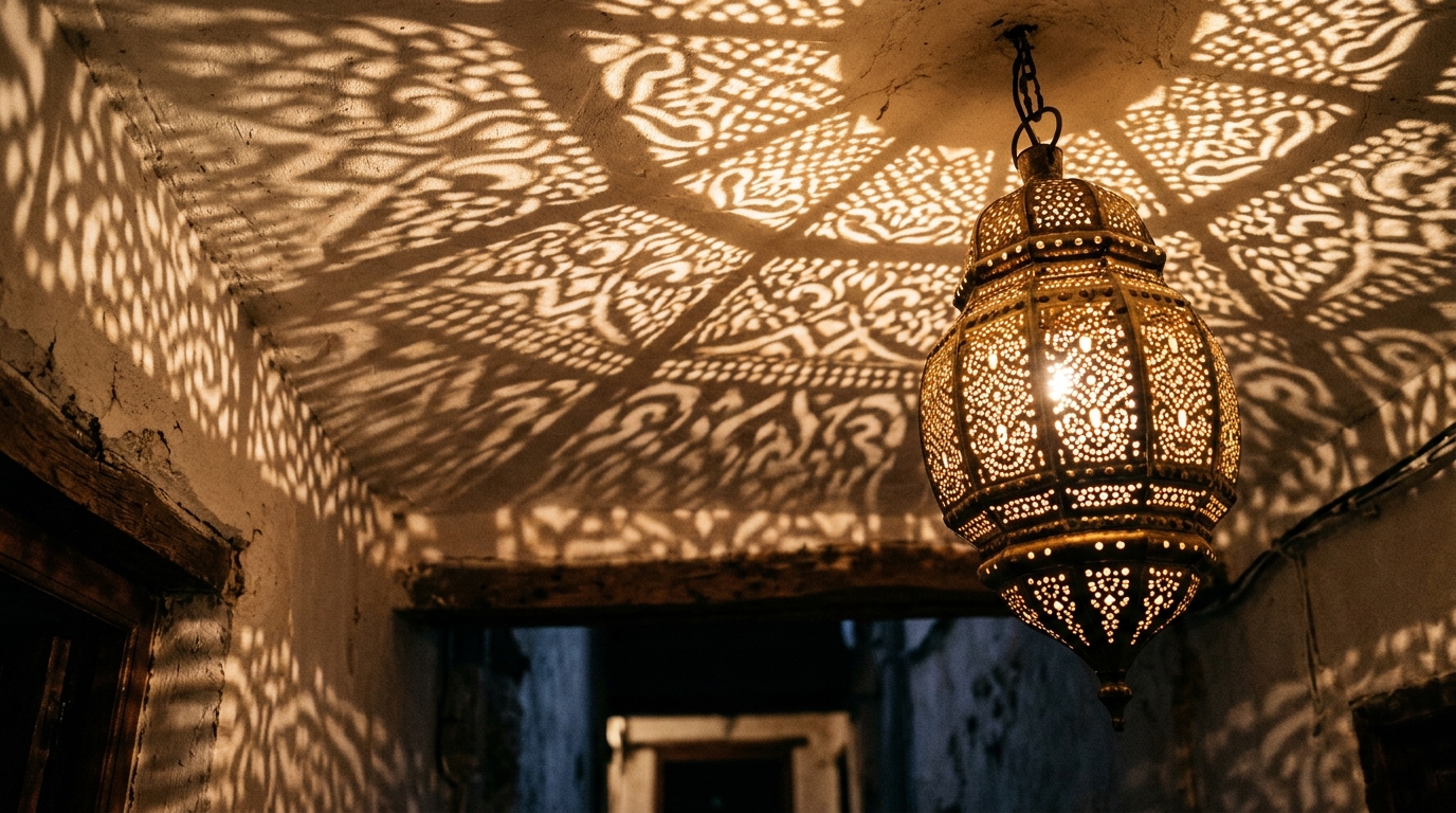
The interplay of light and shadow—what we call ‘shadow play’—is a powerful tool in narrow entryway makeover projects. A pendant with an open-frame lantern design creates a different architectural rhythm than a solid dome. Open frames allow the eye to travel through the fixture, maintaining a sense of airiness while still providing a strong silhouette. Conversely, a solid, textured ceramic pendant focuses the light downward, creating a pool of intimacy that grounds the entry. The goal is to align these silhouettes with the sightline of the hallway, ensuring that the first thing a guest sees is a masterclass in proportion rather than a cramped transition.
Atmospheric Precision: The Science of Warmth and CRI
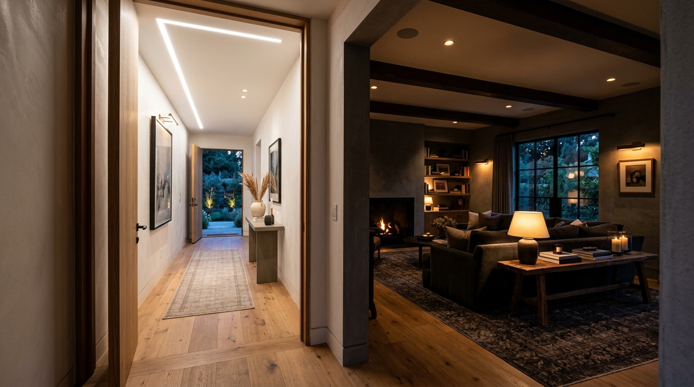
Lighting is nothing without the correct temperature. In a narrow space, the quality of light can either make the walls feel like they are closing in or make them feel like they are glowing with warmth. I always recommend a 2700K warm ambient color temperature for foyers. This mimics the soft, golden light of late afternoon and creates an immediate sense of home. However, the Color Rendering Index (CRI) is where many go wrong. In a small space, you want a high CRI of 90 or above. This ensures that the colors of your narrow hallway runner rug trends and your wall art are rendered accurately and vibrantly. Poor CRI can make even the most expensive limewash paint look muddy or grey.
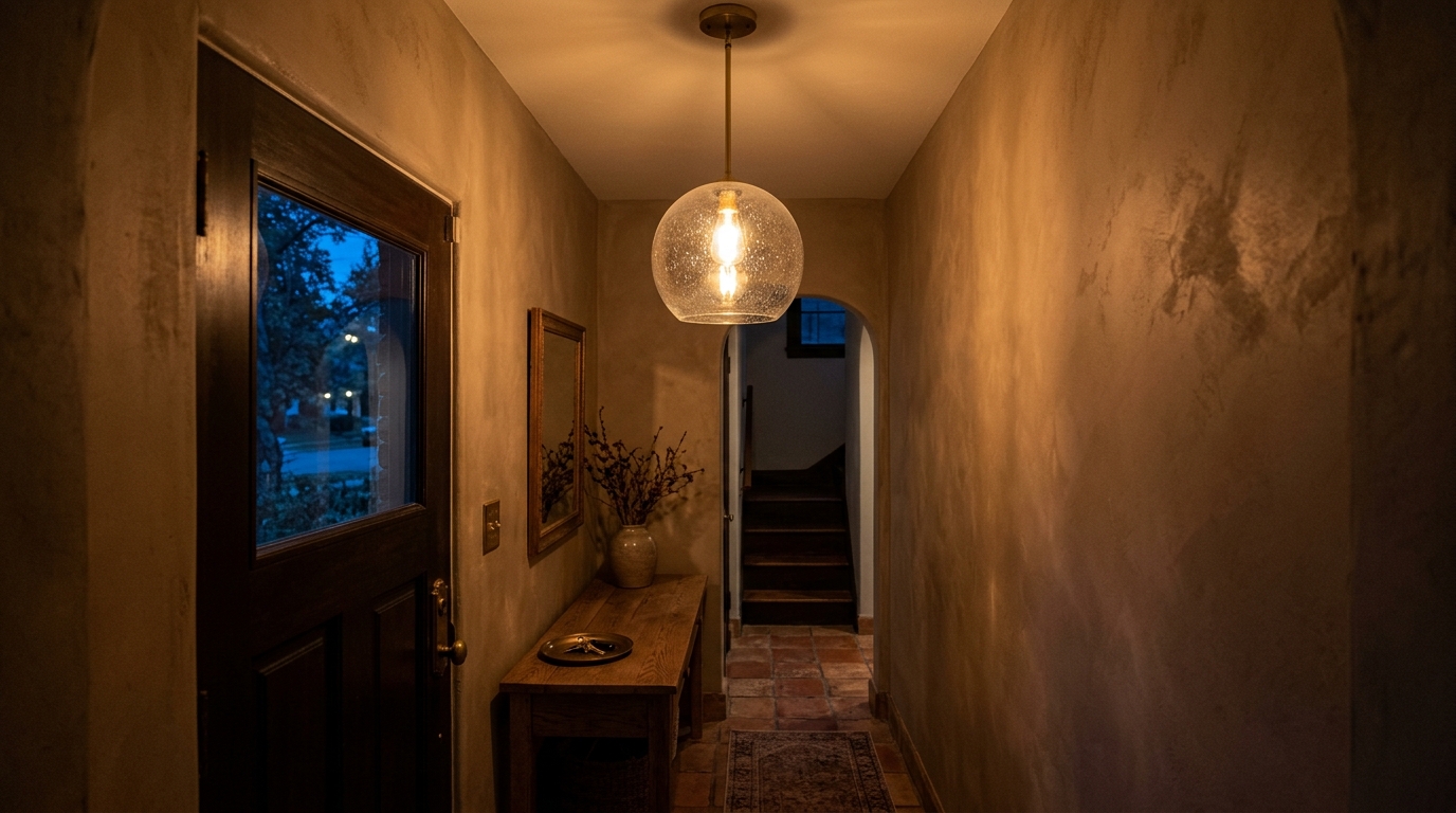
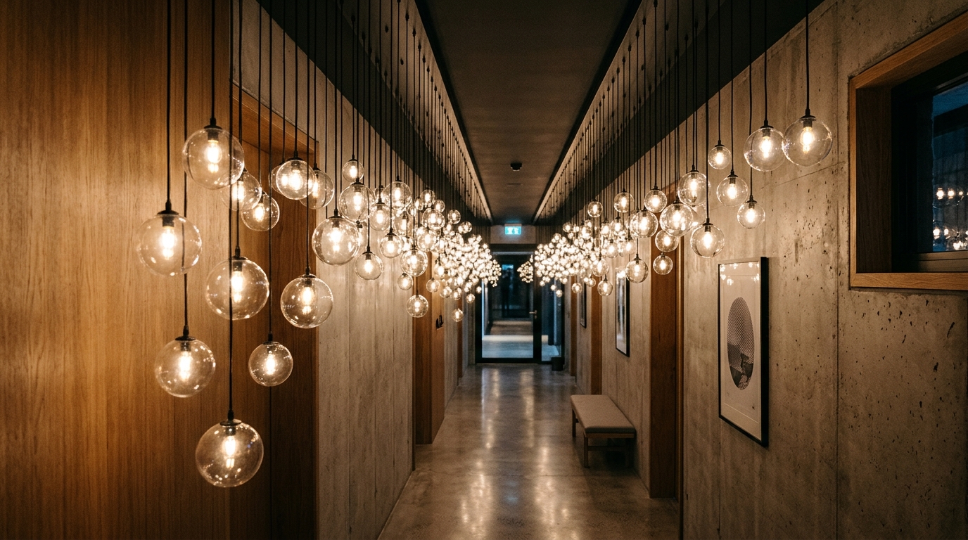
Diffused directional lighting is another technique to master. By using a pendant that throws light both upward toward the ceiling and downward toward the floor, you soften the hard angles of a narrow corridor. This ‘negative space breathing room’ is essential for making the hallway feel expansive. When the ceiling is washed in light, it visually lifts, further enhancing that sense of verticality we are striving for. This atmospheric layering is what separates a professional entryway makeover from a standard DIY update. It’s about creating a mood that greets you the moment the door opens, a soft embrace of light that feels both luxurious and lived-in.
Ergonomics and the Functional Living Snapshot
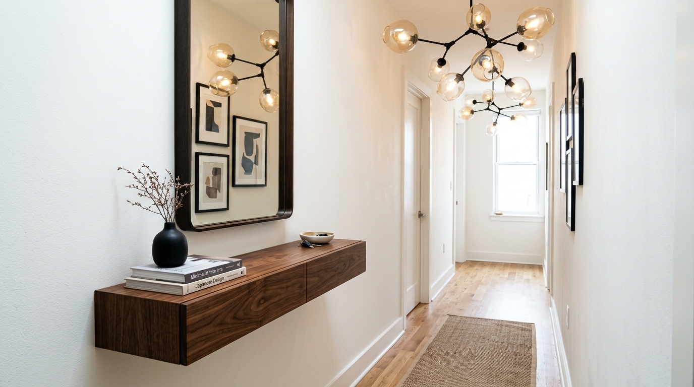
Design must always serve the inhabitant. In a narrow entry, every inch is a premium. This is why we often pair high-impact lighting with a small entryway console table with mirror. The mirror serves a dual purpose: it provides a final check before leaving the house and, more importantly, it bounces the light from your statement pendant back into the room, doubling the perceived depth of the hallway. When selecting a console, look for ‘leggy’ designs or floating shelves that keep the floor visible. This visual continuity of the floor makes the footprint feel less obstructed, maintaining that crucial 36-inch walkway for comfortable movement.
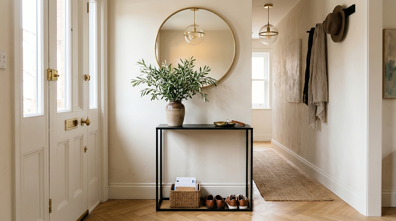
The daily choreography of entering a home—dropping keys, shedding a coat, placing mail—should feel effortless. By positioning your statement light directly over the console table, you create a dedicated ‘task zone’ within the ambient glow. This is functional living at its best: where the architectural scale of a lantern meets the ergonomic reality of a 12-inch deep console. The result is a space that feels curated, balanced, and perfectly scaled to its purpose. You aren’t just decorating a hallway; you are composing a sequence of experiences that begin the moment someone steps over the threshold.
Architectural Specification & Material Matrix
Curated tactile palette, spatial dimensions, and atmospheric lighting index for this design scheme.
Ultimately, the most successful narrow entryway ideas are those that ignore the limitations of the floor and instead embrace the possibilities of the air. By mastering the Rule of Proportions, you transform a mere corridor into an architectural statement that sets the tone for the entire home. It is a reminder that design is not about fitting things into a space, but about creating a space that fits a feeling. As you look at your own entry, stop measuring the width and start looking at the height. The right light is waiting to elevate your home from the moment you step through the door, turning a simple passage into a profound greeting.
Editorial Silo • Recommended Architecture Studies
- The Tactile Aesthetic of Narrow Entryway: Materials, Moods & Lighting Kelvin — Archival Design Case Study
- Tactile First Impressions: Mastering the Materiality and Mood of a Narrow Hallway Gallery — Archival Design Case Study
Architectural Inspiration Lookbook
A high-resolution study in spatial proportions, tactile materiality, and light choreography curated for enduring modern living.

Curated Visual Lookbook
Design Gallery & Spatial Studies
A visual curation of architectural arrangements, lighting concepts, and material palettes featured in this space.