The threshold of the home is rarely a place of quiet contemplation. More often, it is a high-traffic bottleneck where architecture meets the friction of daily life. In the context of urban dwellings—those charming but restrictive pre-war brownstones or modern glass-box apartments—the luxury of a sprawling foyer is often traded for a corridor. When searching for narrow entryway ideas, we aren’t just looking for a place to toss keys; we are seeking an architectural intervention that respects the 36-inch standard walkway clearance while providing a seamless transition from the chaos of the outside world to the sanctuary within.
The challenge of the narrow footprint is one of depth and perception. To introduce a traditional console table into a hallway less than four feet wide is to invite a physical obstacle that disrupts the spatial cadence of the home. Instead, we must look toward high-performance ergonomics: slim-profile units that disappear into the vertical plane, clever material layering that softens the utility, and the ‘Japandi’ ethos of intentionality. By utilizing ‘floating’ elements, we keep the floor plane visible, tricking the eye into perceiving a wider footprint while solving the practical demand for storage.

The Ergonomic Strategy of the Floating Volume
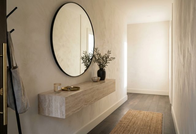
In the hierarchy of narrow entryway ideas, the cantilevered cabinet is king. There is a psychological lightness to a piece of furniture that does not touch the ground. When the floorboards continue uninterrupted to the baseboard, the room feels expansive. This is where the IKEA Trones and STÄLL units transition from mass-market utility to high-design substrates. While the Trones unit is a mere 7 1/8 inches deep, its raw plastic form requires a tactile upgrade to align with the ‘Quiet Luxury’ aesthetic.
Consider the ‘Shadow Gap’ installation technique. By mounting a series of Trones units three inches apart and capping them with a single, continuous slab of fluted white oak or honed travertine, you create a modular built-in that rivals custom millwork. This horizontal continuity draws the eye down the length of the hall, emphasizing the perspective rather than the narrowness. It is about architectural alignment; the top of the cabinet should sit at roughly 34 to 36 inches—standard counter height—to serve as a natural landing pad for the hand and eye.
Materiality and the Tactile Grounding of Utility
Design is a sensory experience, and the entryway is our first tactile interaction with the home. A plastic cabinet, no matter how functional, lacks the ‘soul’ required for a sophisticated interior. The secret to an elevated IKEA hack lies in material contrast. If the cabinets are finished in a soft matte like Benjamin Moore Swiss Coffee, the topper should provide a counterpoint in texture. A piece of reclaimed walnut or a remnant of Arabescato marble adds weight and permanence.
“Design is not just what it looks like and feels like. Design is how it works, especially when you only have six inches of depth to play with.”
When we talk about ‘zero-clutter’ living, we are talking about the elimination of visual noise. The STÄLL cabinet, slightly deeper at 6 ¾ inches for the two-compartment version, offers a more structured silhouette. To refine this, many designers are replacing the stock legs with hidden wall cleats and swapping out the generic cut-out handles for oversized, circular brass pulls or minimalist leather tabs. This shift in hardware immediately communicates a bespoke intent, moving the piece away from ‘off-the-shelf’ and toward ‘curated gallery.’

Illuminating the Threshold: The Physics of Light in Tight Spaces
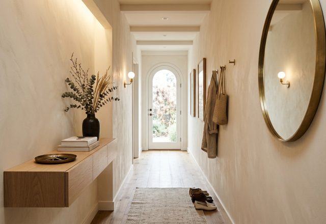
Lighting a narrow hallway requires a surgical approach. Traditional overhead fixtures often cast harsh downward shadows, making the space feel oppressive. To create an inviting ‘drop zone,’ we must layer our light sources. The primary goal is to wash the walls with light, which pushes the boundaries of the room outward. Integrating a hidden LED strip (2700K for that golden-hour warmth) behind the floating cabinet creates a halo effect that further emphasizes the ‘floating’ nature of the furniture.
For task lighting, a singular, high-CRI 90+ sconce positioned above the landing zone serves as a visual anchor. Think of the Apparatus-style minimalist rods or a simple plaster bowl light that blends into the wall. When the light hits a limewash finish—perhaps Farrow & Ball’s ‘Setting Plaster’—the slight crystalline texture of the paint catches the photons, creating a soft, diffused glow that makes the narrowest corridors feel airy. Avoid 3000K or 4000K ‘cool’ lights in these areas; they feel clinical and unforgiving at the end of a long day.
Integrating the Digital and the Physical
High-performance design implies that the space works for modern lifestyle needs. A common oversight in narrow entryway ideas is the management of technology. A truly functional drop zone must include a hidden charging station. By drilling a small grommet hole through the wood topper and the top of the IKEA unit, you can run a multi-port USB-C hub inside the cabinet. Phones and smartwatches are hidden away the moment you walk through the door, reinforcing the transition to ‘home mode’ while maintaining a clutter-free surface.
Similarly, mail management should be invisible. The depth of a Trones unit is perfect for a vertical mail sorter. One bin for ‘Action,’ one for ‘Recycle,’ and one for ‘Long-term.’ This creates a workflow that prevents the kitchen island from becoming a graveyard for envelopes. The ‘zero-clutter’ philosophy isn’t about having nothing; it’s about everything having a hidden, logical home within the architectural envelope.

The Aesthetic of Restraint: Styling the Zero-Clutter Zone
In a narrow space, every object carries immense visual weight. This is not the place for a ‘maximalist’ gallery wall. Instead, opt for one oversized mirror—circular to break the hard lines of the hallway, or a tall, arched floor mirror that leans against the wall (secured, of course). A mirror is a classic tool for a reason; it doubles the light and creates a ‘phantom’ space that makes the 36-inch walkway feel like seventy-two.
When styling the surface of your IKEA hack, use the ‘Rule of Three’ with varying heights. A small tray for keys (honed stone or brushed brass), a singular sculptural vase with a green branch, and a small stack of textured books. The goal is to create a ‘moment’ of beauty that distracts from the utilitarian nature of the shoe storage below. If you are using the Japandi aesthetic, focus on the ‘Wabi-Sabi’—the beauty in imperfection. A hand-thrown ceramic bowl provides the perfect organic contrast to the linear precision of the floating units.
Floor Treatments and the Sightline Alignment
What happens underfoot is just as critical as what is on the walls. In a long, narrow entry, a runner can either elongate the space or make it feel like a bowling alley. To avoid the latter, choose a rug with horizontal stripes or a subtle, organic texture like jute or sisal. The texture provides a ‘grounding’ effect, slowing down the pace of someone walking through the hall. Align the edge of the rug with the edge of your floating storage to create a clean, architectural line that guides the eye toward the rest of the home.
Color choice for the floor and walls should be harmonious. If you have light oak floors, a wall color like Benjamin Moore’s ‘Pale Oak’ creates a seamless ‘envelope’ of color. This monochromatic approach reduces the number of visual ‘stops’ the eye makes, allowing the space to feel cohesive and expansive. It’s about creating a ‘breathing room’ within the negative space of the hallway.

Architectural Specification & Material Matrix
Curated tactile palette, spatial dimensions, and atmospheric lighting index for this design scheme.
Designing for high-traffic, low-clearance areas is an exercise in architectural empathy. It requires us to acknowledge the physical constraints of our homes without sacrificing the poetic quality of our daily rituals. By elevating humble foundations with sophisticated materials and precise lighting, these narrow entryway ideas prove that the most restricted footprints often yield the most innovative solutions. Ultimately, a well-executed drop zone is more than a storage unit; it is a declaration that even the most transitional space deserves the dignity of good design. It is the final articulation of a home that truly understands the rhythm of those who live within its walls.
Editorial Silo • Recommended Architecture Studies
- Architectural Chromotherapy: The Physics of Color Drenching for Narrow Entryway Ideas — Archival Design Case Study
- Fabulous Designer Foyers: Masterful Narrow Entryway Ideas & Spatial Flow — Archival Design Case Study
Architectural Inspiration Lookbook
A high-resolution study in spatial proportions, tactile materiality, and light choreography curated for enduring modern living.


Curated Visual Lookbook
Design Gallery & Spatial Studies
A visual curation of architectural arrangements, lighting concepts, and material palettes featured in this space.