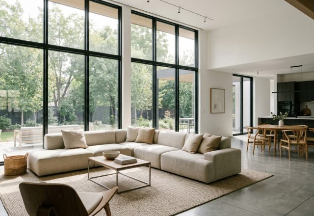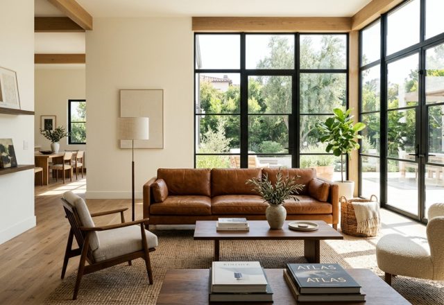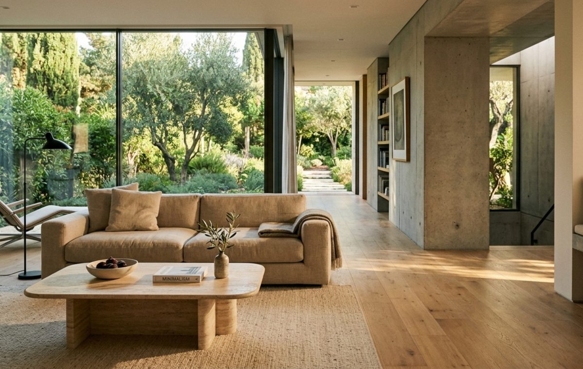
The Tactile Blueprint: Where Physicality Meets the Floor Space Planner
The way a hand-charred Yakisugi cedar plank meets the smooth, monolithic presence of a micro-cement floor creates a tension that is almost musical. Yet, that beauty evaporates the moment a shoulder clips a sharp corner or a primary walkway feels like a bottleneck. This is why my creative process always begins with the technical rigor of a floor space planner; it is the silent negotiator between the poetry of materials and the physics of movement. We often talk about ‘vibe’ and ‘palette,’ but the true luxury of a home is the absence of friction. It is the ability to move through a room without conscious thought, guided by the invisible hand of ergonomic precision.
When we approach a project through the lens of the floor space planner, we aren’t just arranging icons on a grid; we are choreographing a human experience. I think of the 36-inch standard walkway not as a constraint, but as a breath of air. In the world of high-end architectural design, circulation is the ultimate status symbol. A cramped room, no matter how much de Gournay wallpaper it boasts, will always feel frantic. By prioritizing human-centric function through digital spatial planning tools, we ensure that the tactile dialogue of the home—the velvet of the sofa, the grain of the white oak—is experienced in a state of ease rather than agitation.
Interior Design Clearance Standards: The Invisible Architecture of Ease
To master the 18-inch reach or the 30-inch dining chair pull-out is to master the art of hospitality. There is a specific psychological comfort that comes from interior design clearance standards that are respected rather than cheated. I have seen too many beautiful rooms ruined by a coffee table that sits 24 inches away from the seat—forcing a clumsy lean for a drink—or a rug that ends three inches short of the credenza, creating a visual tripwire. Using a floor space planner allows us to stress-test these clearances before a single piece of furniture is crated and shipped.
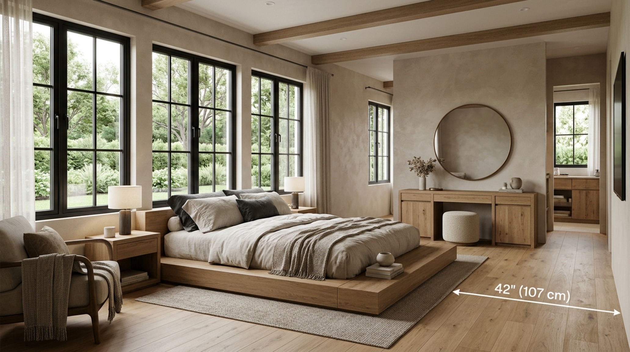
In a recent primary suite renovation, we utilized a floor space planner to solve a recurring tension: the transition between the sleeping zone and the dressing area. By maintaining a strict 42-inch clearance around the foot of the bed, we transformed a tight corner into a ‘moment’ for a low-slung shearling chair and a sculptural floor lamp. This is the ‘Golden Rule’ in action—giving the human body exactly what it needs to feel expansive. When the floor space planner dictates the layout, the furniture begins to feel like it belongs to the architecture rather than just sitting on top of it. We look at the ‘Golden Triangle’ of the kitchen not just for efficiency, but for the sensory joy of a 3000K task light hitting a honed marble slab without a cabinet door hitting your hip.
Furniture Scaling and Proportion: The Weight of Objects
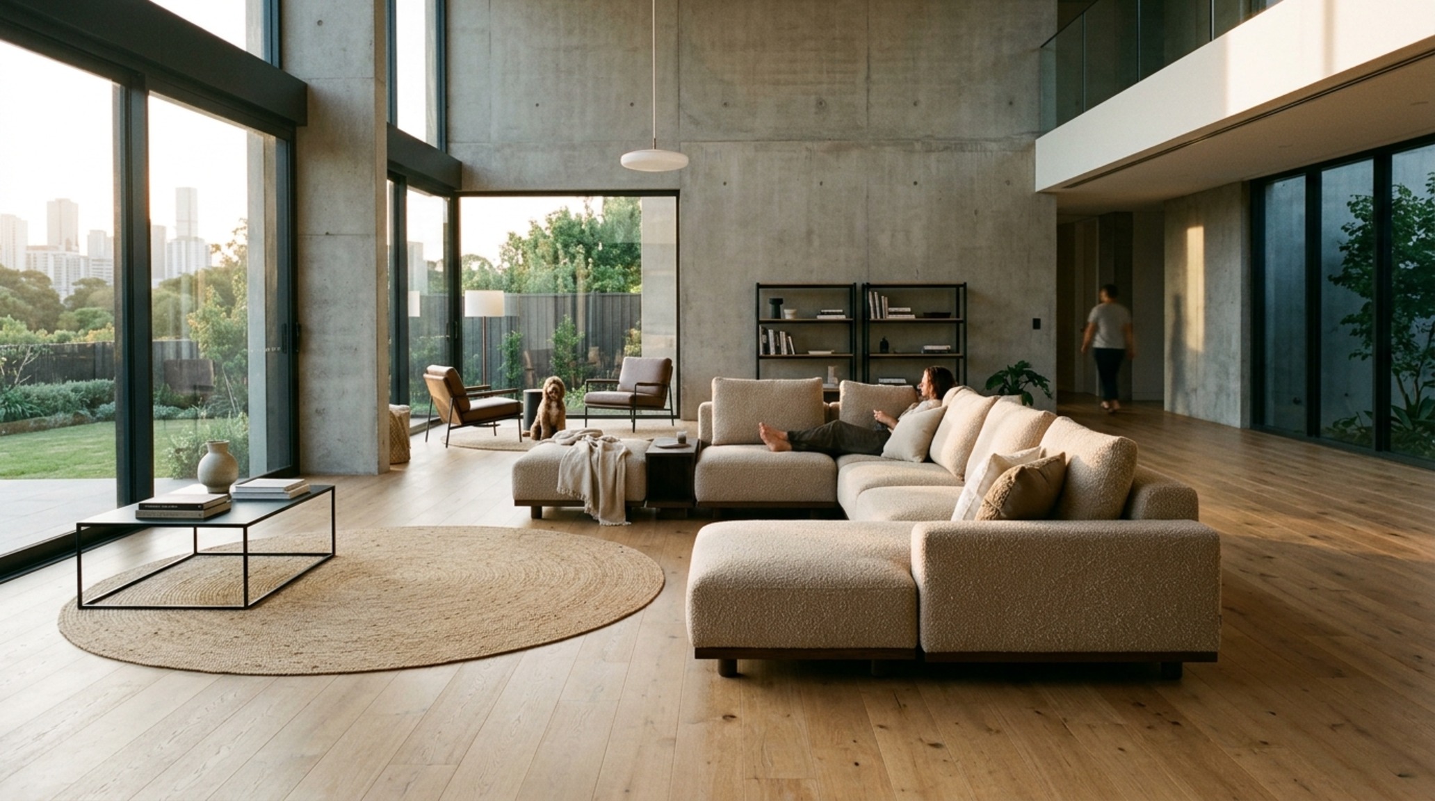
Selection of furniture is often the most emotional part of design, yet it requires the most clinical detachment. Furniture scaling and proportion can make or break the ‘spatial cadence’ of a room. A common mistake is selecting a sofa that looks magnificent in a 10,000-square-foot showroom but swallows a 20-foot living room whole. By importing the exact dimensions of a deep-seated Pierre Jeanneret lounge chair into a floor space planner, you can see how the negative space begins to diminish. You realize that perhaps a more refined, leggy profile—like a mid-century Italian silhouette—would allow the floor plane to remain visible, creating the illusion of more volume.
I often suggest my clients look at the floor space planner views in 2D first. This ‘God’s eye view’ reveals the true footprint. Are the pieces huddled together in the center? Is there a lonely corner that needs a 7-foot Fiddle Leaf Fig to anchor the height? The floor space planner acts as a reality check for our aesthetic ambitions. It tells us that while we love that oversized stone coffee table, it will leave us with only 12 inches of clearance, turning the living room into an obstacle course. Luxury is never an obstacle; it is a clear path.
Open Concept Zoning Strategies: Defining Boundaries without Barriers
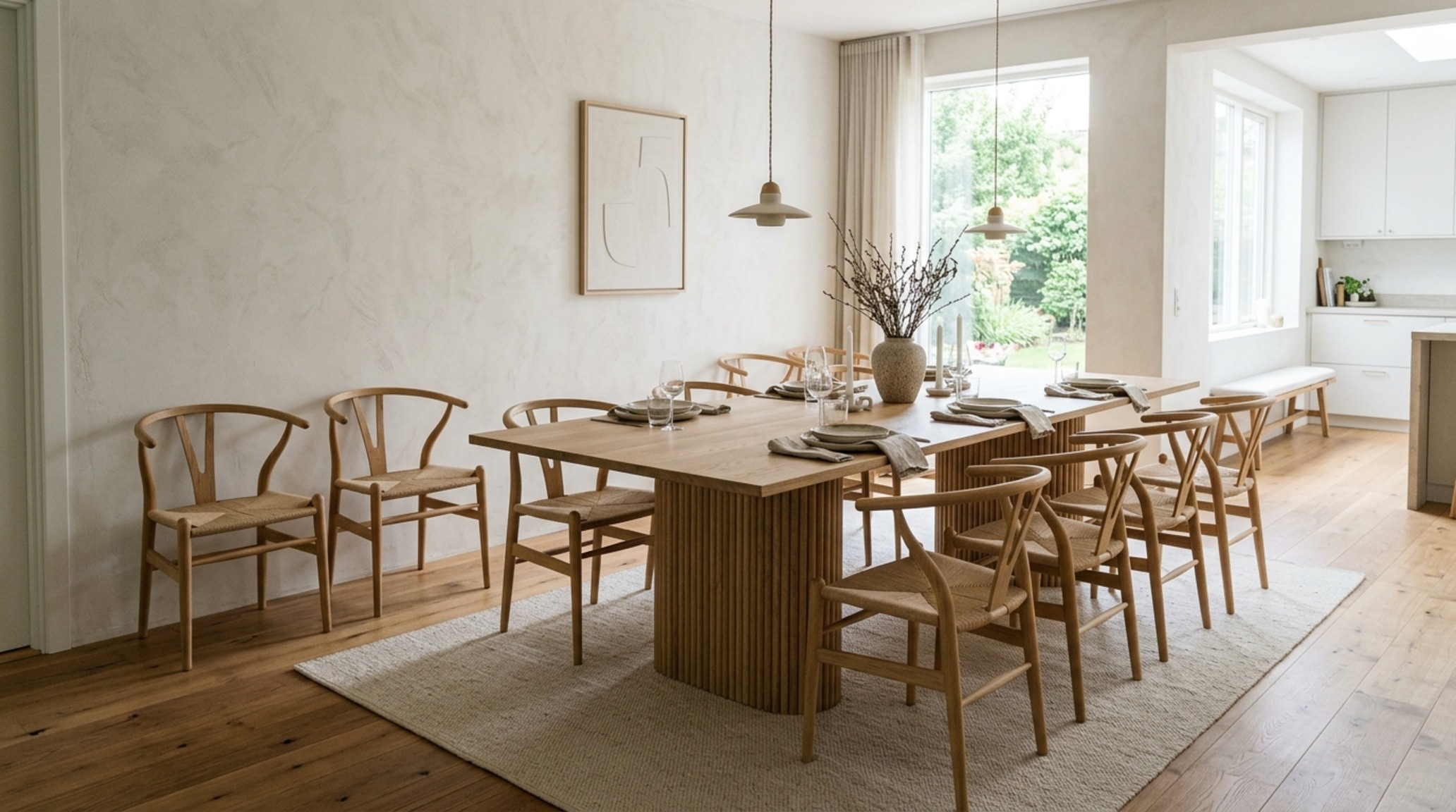
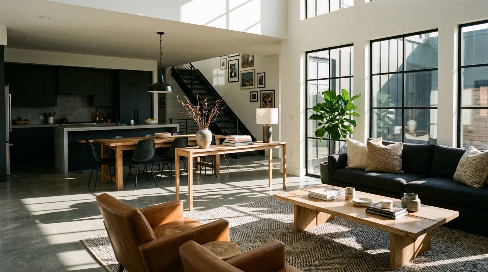
In the era of the great room, the challenge has shifted from ‘how do we fit it all in?’ to ‘how do we make this feel intimate?’ This is where open concept zoning strategies become vital. We use the floor space planner to create ‘rooms within rooms.’ A rug isn’t just a textile; it is a boundary. A console table behind a floating sofa isn’t just a surface; it is a structural wall that defines the entry from the seating area. By mapping these zones out, we can ensure that the transition between the kitchen’s 2700K ambient glow and the dining area’s candlelight feels intentional.
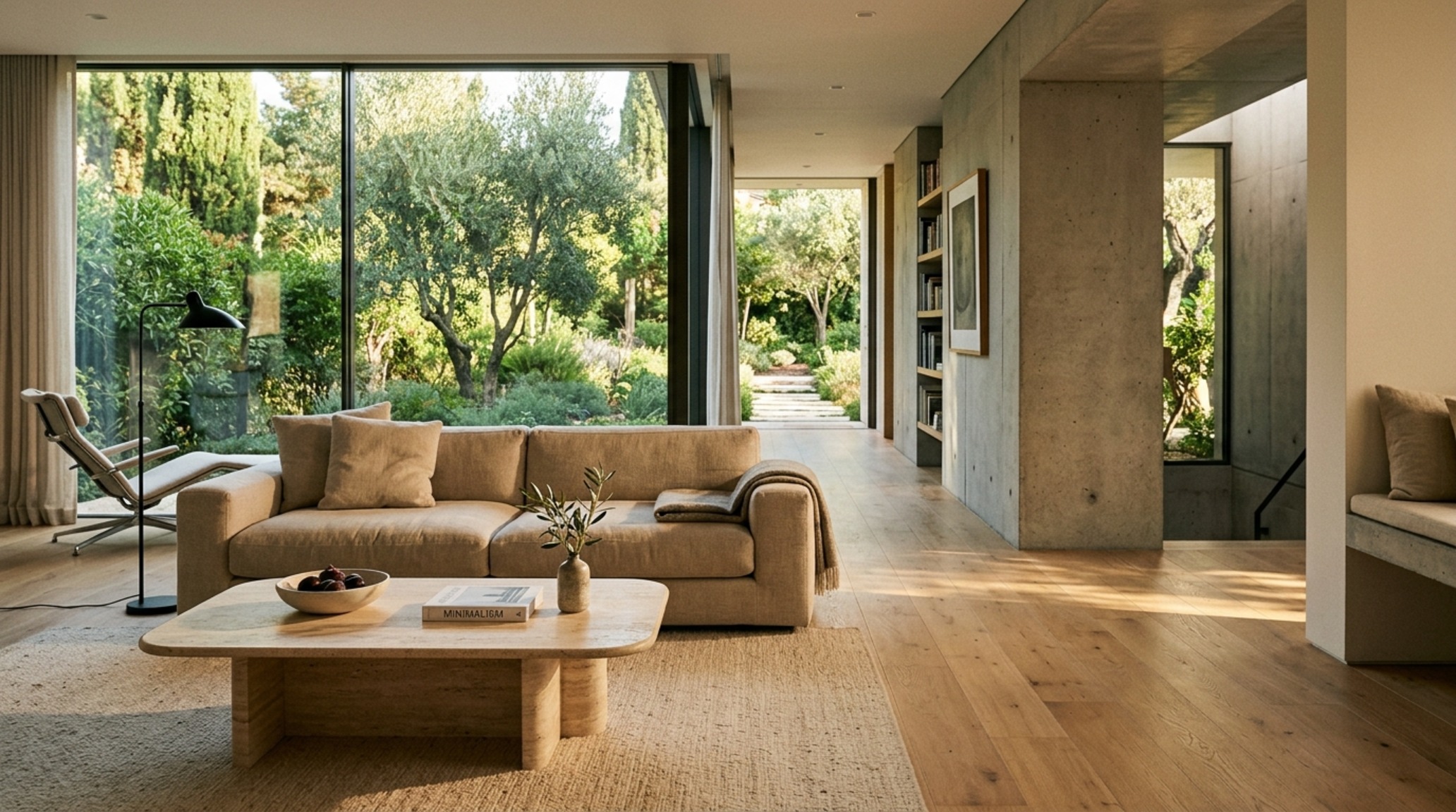
Consider the ‘sightline alignment.’ When you stand at the kitchen island, what do you see? A well-utilized floor space planner ensures that your eye travels through the room to a focal point—perhaps a fireplace clad in Roman clay or a floor-to-ceiling window—rather than hitting the back of a television. We also use the floor space planner to account for ‘swing space.’ It’s easy to forget that a refrigerator door needs 36 inches to fully open, or that a dishwasher rack extends nearly 28 inches into the walkway. By layering these functional arcs into our digital spatial planning tools, we eliminate the ‘friction’ of daily life before the first nail is driven.
Residential Circulation Patterns: The Flow of Life
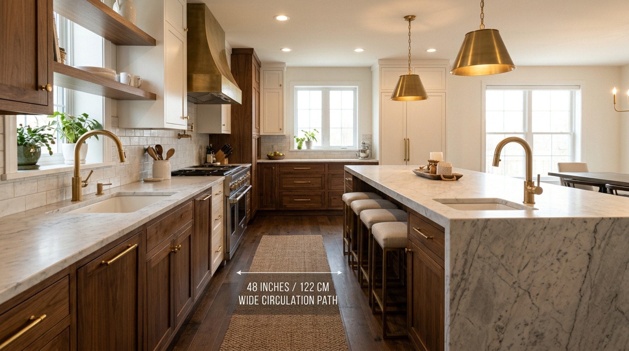
The movement of people through a home is like the flow of water; it takes the path of least resistance. Residential circulation patterns must be intuitive. If people have to dodge a dining chair to get to the powder room, the design has failed. I treat the floor space planner as a heat map for movement. The primary arteries—the paths from the entrance to the kitchen, or the kitchen to the bedroom—require a minimum of 36 inches, though 42 to 48 inches feels significantly more ‘architectural.’
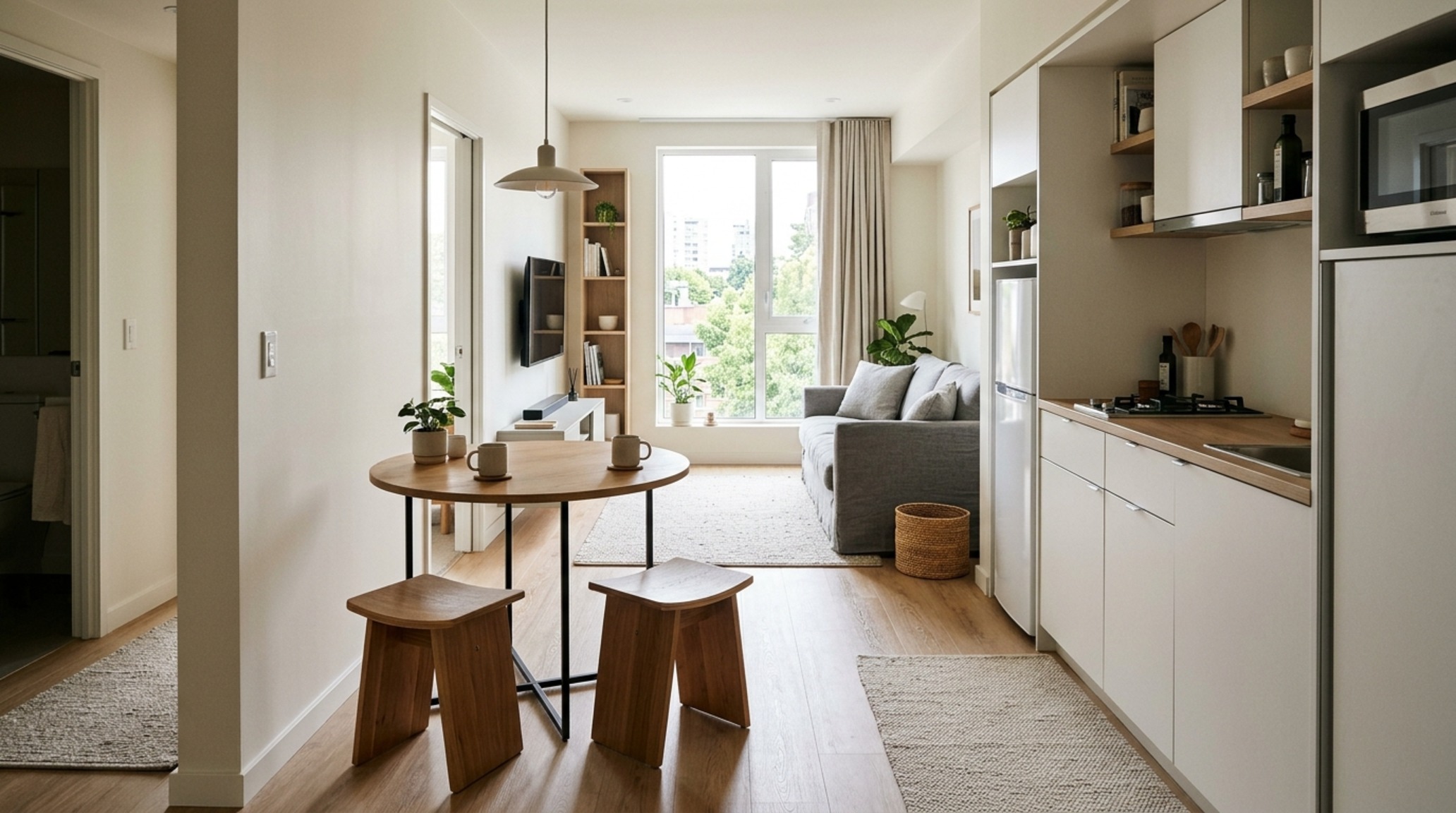
In smaller urban apartments, these circulation paths often do double duty. Here, the floor space planner is even more critical. We might use a ‘nesting’ strategy where a stool can be tucked under a console, or a dining table can be expanded for guests. But even in these high-utility environments, the 36-inch walkway remains the ‘Golden Standard.’ If you violate it, the room feels like it’s closing in on you. By using a floor space planner to visualize these paths, we can identify where ‘spatial shadows’—dead areas that serve no purpose—can be reclaimed for storage or seating vignettes.
Architectural Details & Spatial Cadence
The relationship between fixed architecture and movable furniture is a delicate dance. When we look at a floor space planner, we are also looking at the rhythm of the windows and the placement of the HVAC vents. A sofa should never partially obscure a beautiful casement window. A floor lamp shouldn’t be placed where it blocks the view of a curated art wall. This ‘spatial cadence’ is about the intervals between things. Just as in music, the silence between the notes is as important as the notes themselves. In design, the negative space—the empty floor—is what allows the ‘hero’ pieces to shine.
I recently worked with a client who wanted a massive 12-person dining table in a room that was realistically better suited for 8. We used the floor space planner to show them that while the table ‘fit’ in the room, it left only 24 inches for guests to pull out their chairs. By seeing it on the screen, they understood that their dinner parties would be uncomfortable. We shifted to a round table with a pedestal base, which utilized the center of the room and left 40 inches of clearance on all sides. This is the power of the floor space planner: it provides the data needed to make better emotional decisions. It turns ‘I want’ into ‘What works best for my life.’
Digital Spatial Planning Tools: The Modern Designer’s Compass
We are no longer limited to pencil and vellum. The rise of sophisticated digital spatial planning tools has democratized high-end design logic. A tool like a floor space planner allows a homeowner to play ‘architect’ for a day, but with the guardrails of real-world measurements. It’s about the democratization of ergonomics. When you can see a 3D room layout visualizer version of your living room, the abstract concept of ‘clearance’ becomes a tangible reality. You see the shadow play on the walls; you see how the light from a 3000K recessed fixture might create a glare on the TV if the layout isn’t rotated.
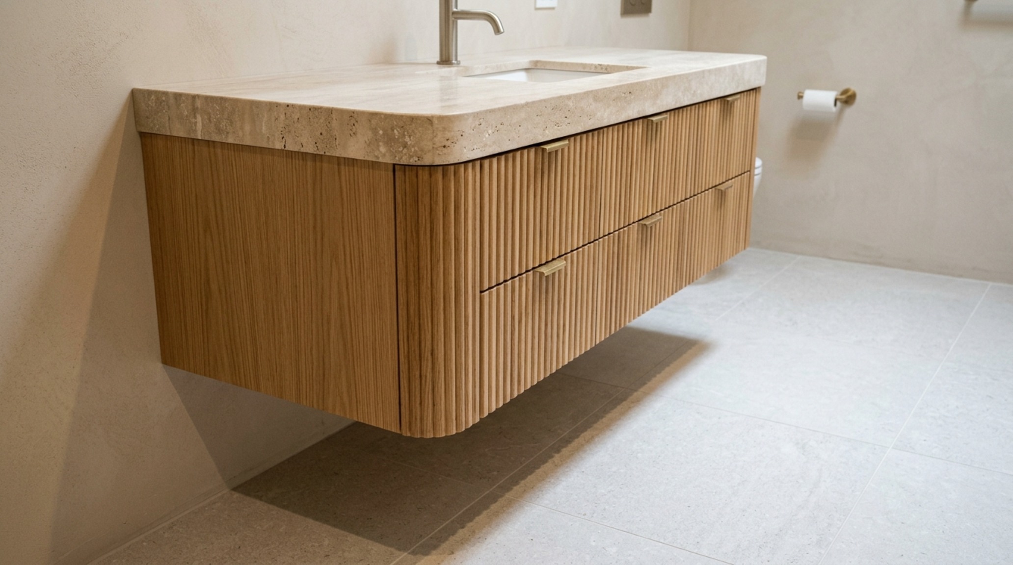
The integration of plumbing offsets and electrical outlets into the floor space planner is the final layer of professional polish. Knowing exactly where the floor outlet needs to be for a floating sofa lamp prevents the ‘cord sprawl’ that ruins a clean aesthetic. We use these tools to map out the exact location of a floor-mounted tub filler or a wall-hung vanity. By visualizing the ‘bones’ of the room alongside the ‘skin’ (the finishes and furniture), we create a holistic environment that is as technically sound as it is visually breathtaking.
Design Anatomy & Specification Guide
A concise technical ledger of paint hex codes, architectural finishes, and dimensional standards.
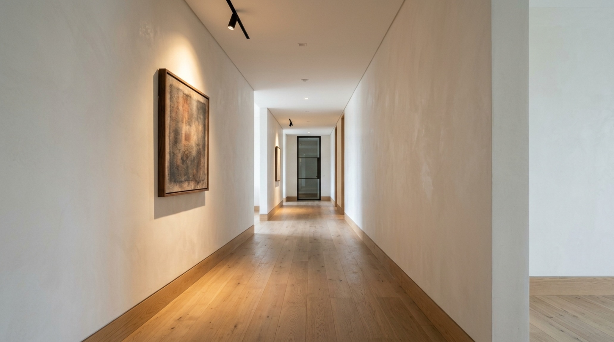
Ultimately, the marriage of high-end aesthetics and ergonomic data is what transforms a house into a sanctuary. When you use a floor space planner, you aren’t just checking off a list of technical requirements; you are honoring the human form. You are saying that the people who inhabit this space deserve to move through it with grace and ease. Whether it is the 36-inch clearance in a narrow hallway or the perfect 18-inch height of a hearth, these measurements are the bedrock of comfort. As we continue to blur the lines between technology and art, let us never lose sight of the fact that design is, at its heart, a service to the body. A well-planned floor is the canvas upon which the beautiful, messy, and quiet moments of life are painted, undisturbed by the friction of a poorly placed chair or a narrow path. In the end, good design is felt more than it is seen.
Editorial Silo • Recommended Architecture Studies
- New Interior Designs: The Architectural Blueprint & Spatial Flow Guide — Archival Design Case Study
- Ergonomic Mastery: Functional & Space-Saving Hacks for Taking Care Of Leather Furniture — Archival Design Case Study
Refined Living Space Catalog
Photographic compositions framing clean architectural sightlines and layered sensory textures.
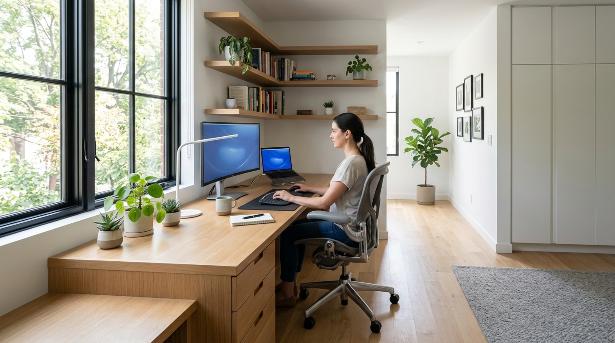
Curated Visual Lookbook
Design Gallery & Spatial Studies
A visual curation of architectural arrangements, lighting concepts, and material palettes featured in this space.