The Structural Grid: Why Artwork for Apartment Interiors Defines the Modern Volume
Choosing artwork for apartment living is less an exercise in decoration and more a rigorous study in architectural calibration. In a world where urban footprints are shrinking but our aesthetic expectations are expanding, we must stop viewing walls as mere partitions and start seeing them as structural grids. When you introduce a canvas or a framed photograph into a limited square footage, you are effectively altering the perceived weight of the wall, the height of the ceiling, and the flow of the visual narrative. It is the architect’s ratio—the precise balance of negative space and curated pigment—that determines whether a home feels expansive or claustrophocially cluttered.
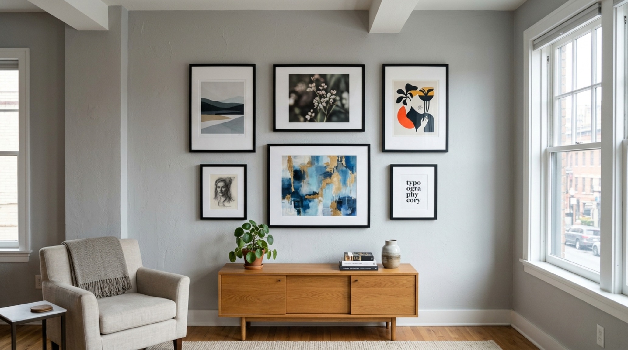
The secret lies in the golden ratio. Traditional interior design often suggests that art should cover two-thirds to three-quarters of the available wall space above a piece of furniture. However, in the tighter constraints of a metropolitan flat, I argue for a more nuanced ‘1/3rd rule’ for wall coverage. By leaving significant ‘breathing room’—or negative space—around a primary focal point, you invite the eye to move through the room rather than stop abruptly at the wall. This spatial cadence is what separates a professionally curated home from one that feels haphazardly assembled.
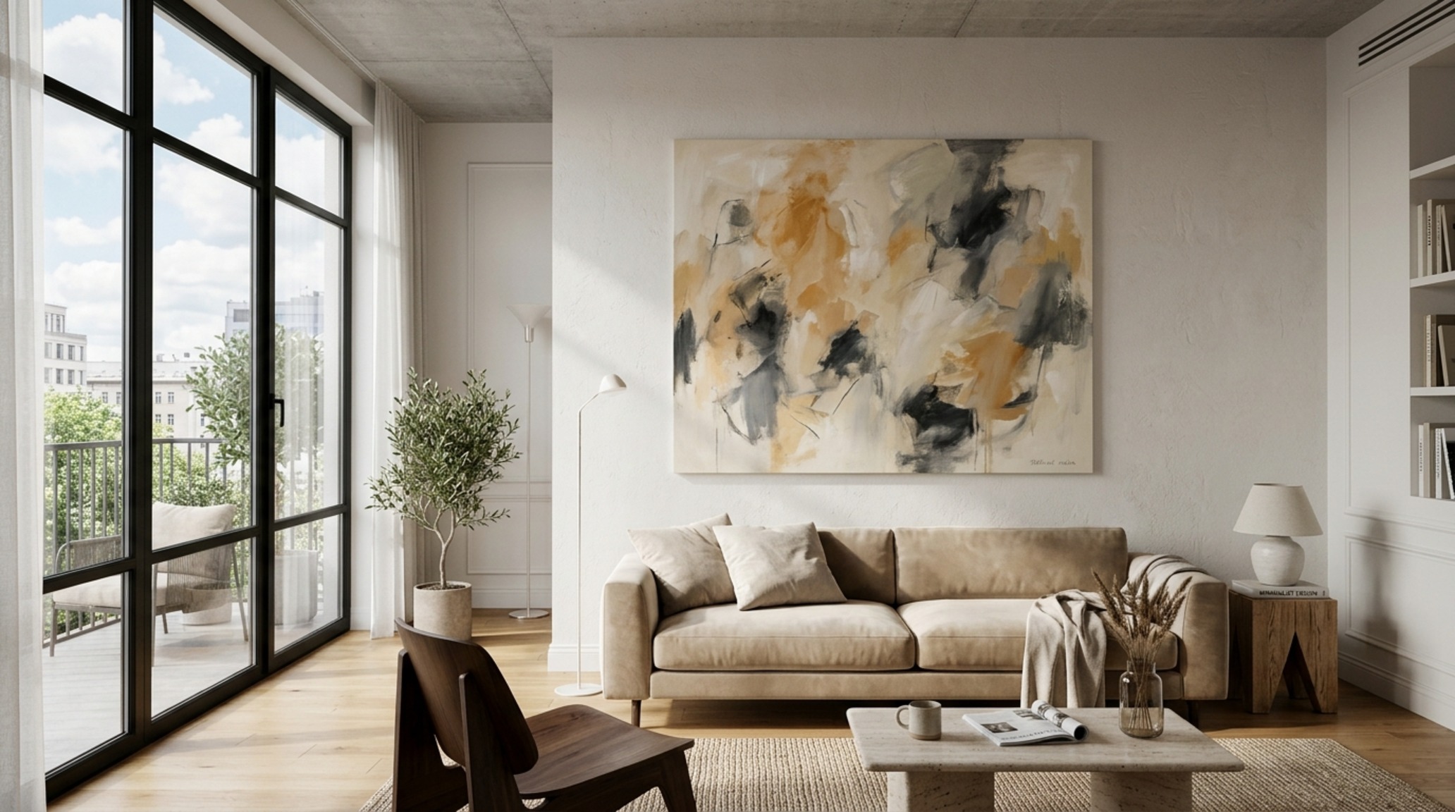
The Psychology of Contemplation Distance
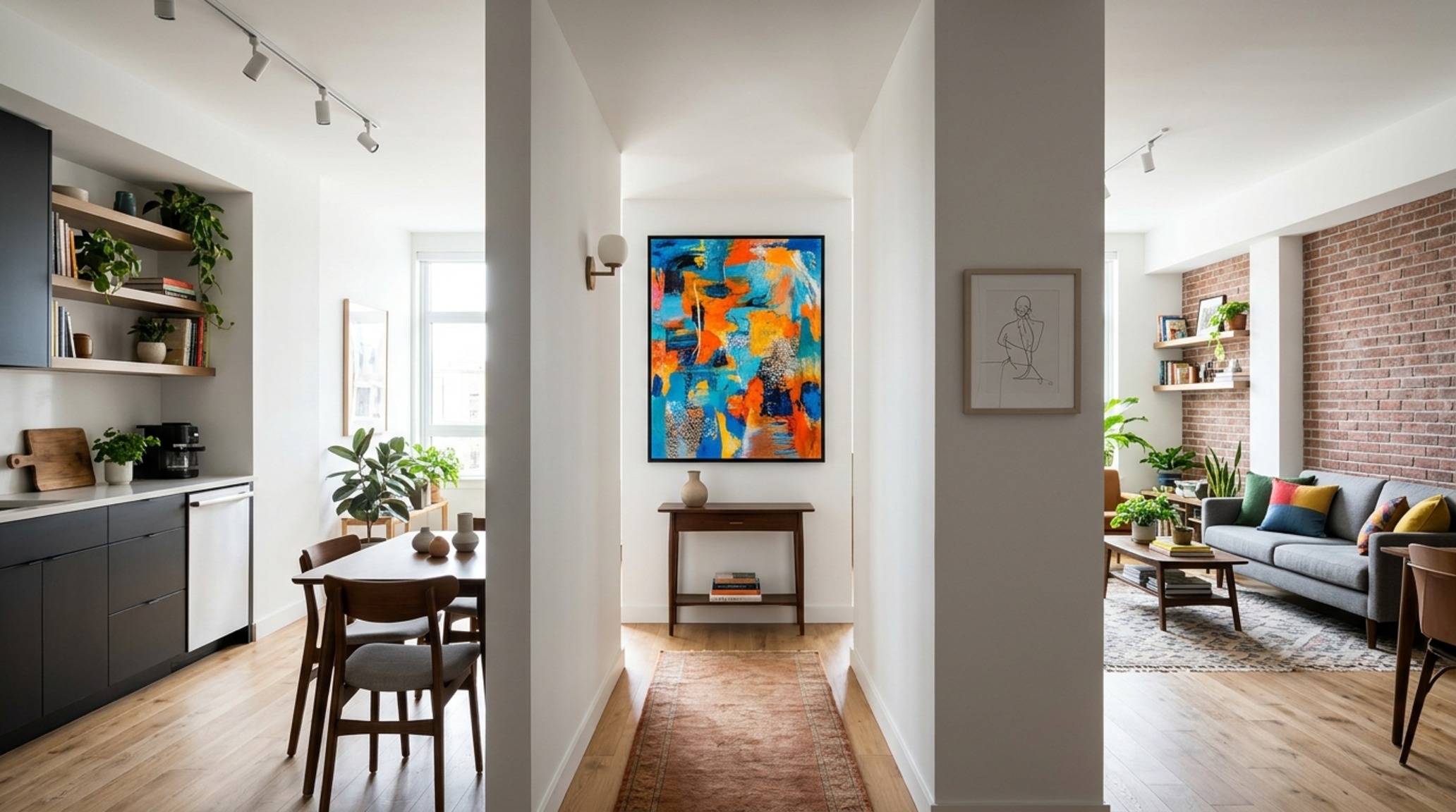
In a sprawling gallery, you have the luxury of distance. In an apartment, your ‘contemplation distance’—the physical space between your standing position and the wall—is often limited by furniture or structural barriers. If you are standing in a 36-inch standard walkway, a massive, detail-heavy oil painting will feel overwhelming; the eye cannot process the entire composition. Conversely, a minimalist piece with broad, sweeping gestures can feel serene even in a narrow corridor. We must measure the room’s ‘throw’—the longest sightline available—and place our most significant artwork for apartment impact at the end of that axis to draw the gaze forward and elongate the floor plan.
Best Art Size for Studio Apartments: Negotiating Scale and Mass
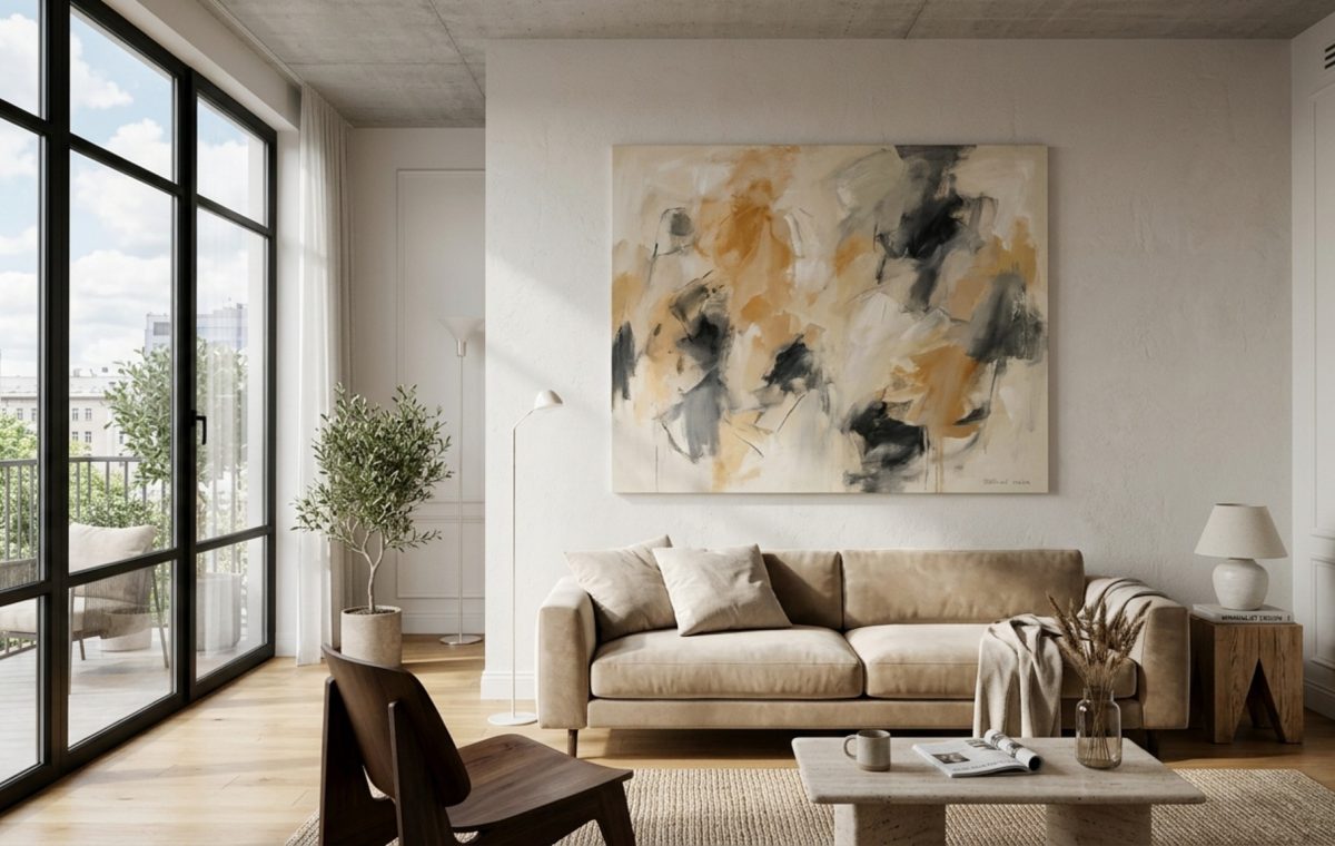
When working with a single-room floor plan, the instinct is often to go small. This is a common architectural fallacy. A collection of small, scattered frames creates ‘visual noise,’ breaking up the wall into fragments that make the room feel smaller. Instead, the best art size for studio apartments is often a singular, oversized ‘monolith.’ A large-scale piece—perhaps 40×60 inches—anchors the entire living zone, creating a definitive ‘zone’ without the need for physical room dividers. It establishes a hierarchy of importance that brings order to a multifunctional space.
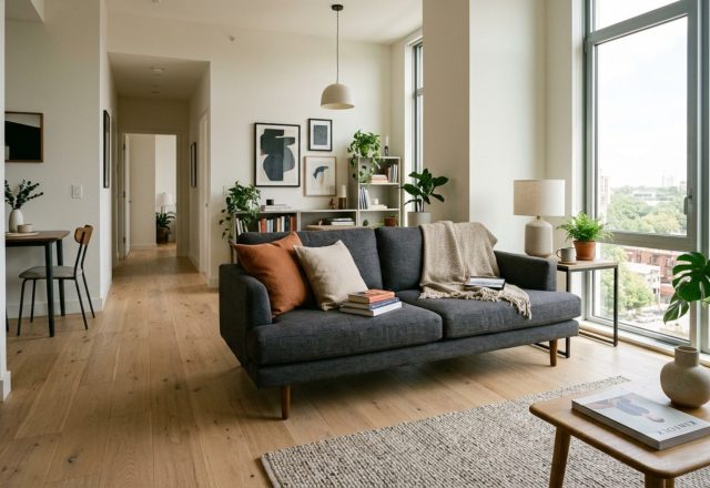
Consider the ‘Anchor Point’ strategy. If your studio features a low-profile sofa, hanging a single large horizontal piece approximately 6 to 8 inches above the backrest creates a unified block of visual weight. This prevents the ‘floating art’ syndrome, where a small piece feels unmoored in a sea of drywall. By aligning the art with the width of the furniture—ideally keeping the frame within 75% of the furniture’s total length—you maintain a structural silhouette that feels intentional and grounded.
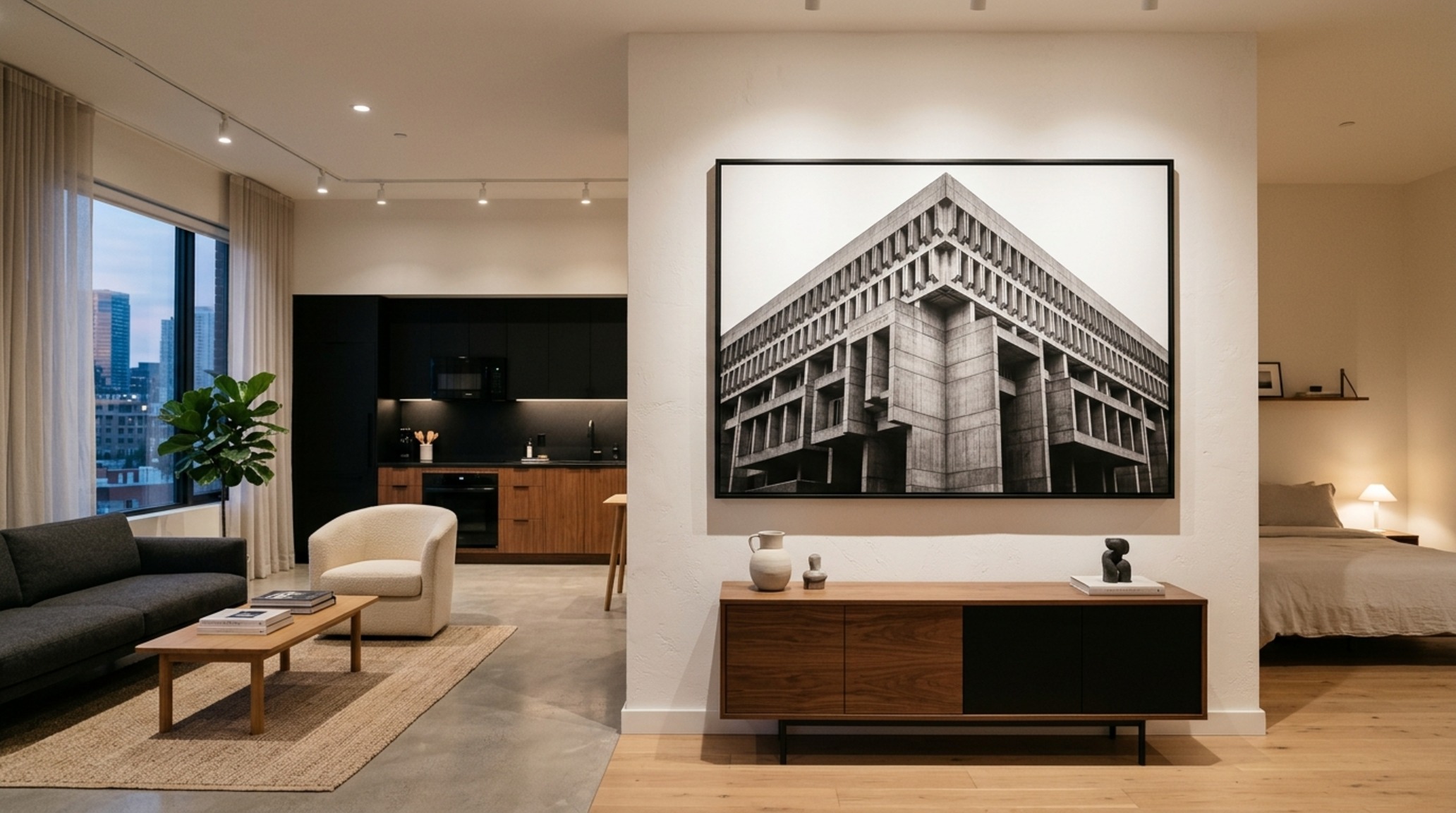
Materiality and the 2700K Atmosphere
Architecture is as much about light as it is about form. When selecting artwork for apartment walls, the texture of the frame and the glass quality are paramount. In spaces with high natural light, anti-reflective Museum Glass is non-negotiable; otherwise, your investment becomes a mere mirror for the opposite window. Regarding illumination, I always specify high CRI (Color Rendering Index) bulbs, ideally 90+. A 2700K warm ambient glow provides that cozy, residential feel, but for task-oriented areas or vibrant abstracts, a 3000K ‘gallery white’ ensures the colors remain true to the artist’s intent without leaning too yellow or sterile blue.
Art Placement Rules for Apartments: The 57-Inch Standard and Beyond
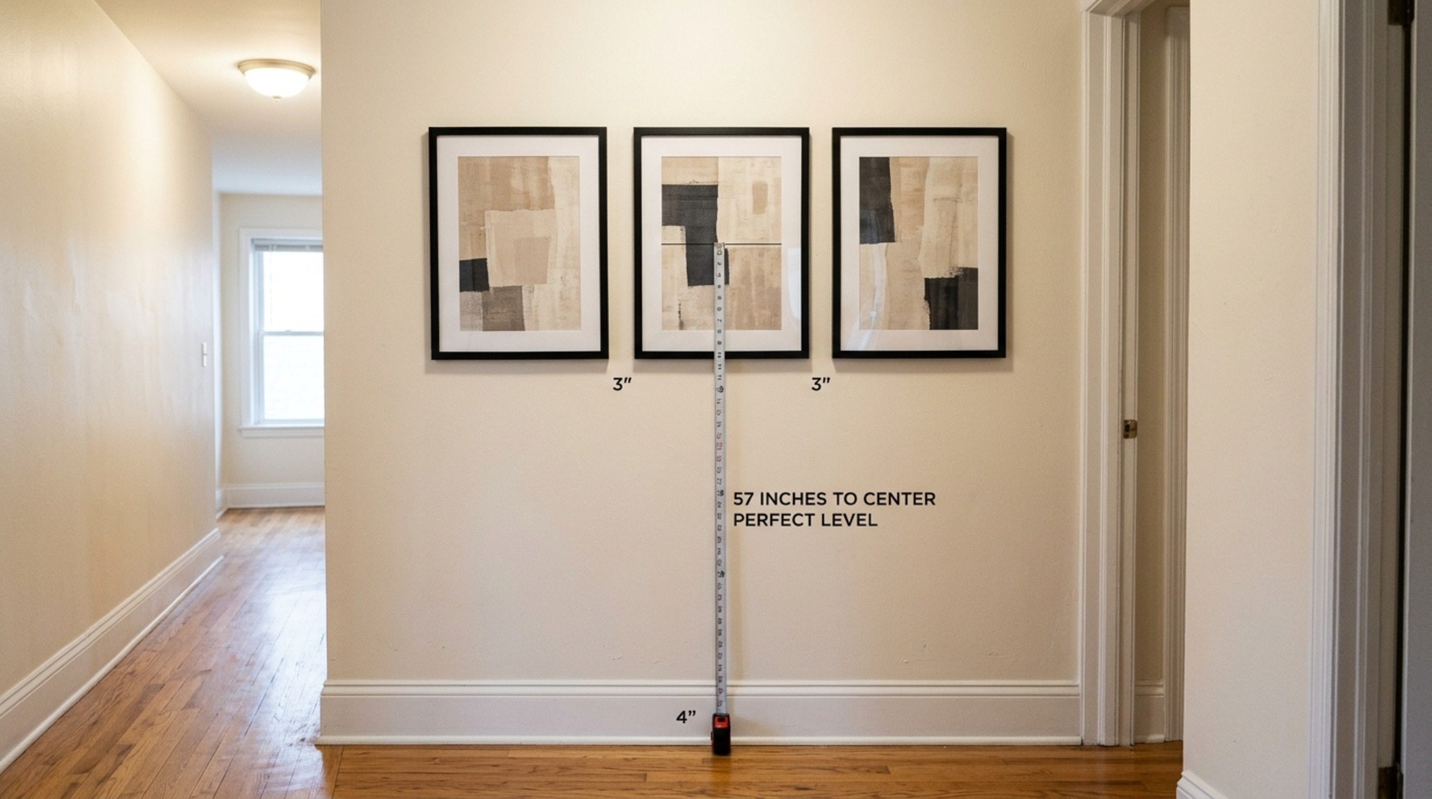
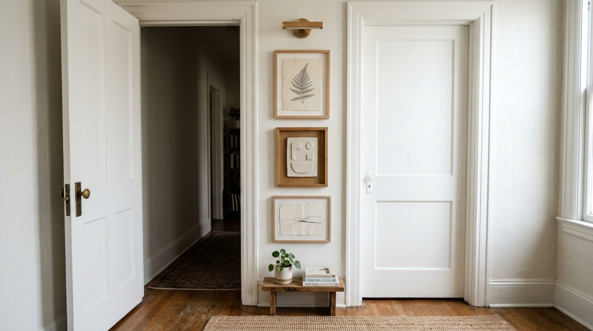
The cardinal sin of domestic curation is hanging art too high. The art placement rules for apartments dictate that the center point of any piece should sit at ‘eye level,’ which is architecturally standardized at 57 to 60 inches from the floor. However, in an apartment with lower ceilings (the standard 8 to 9 feet), I often recommend dropping that center point to 56 inches. This subtly lowers the visual horizon, making the ceilings feel loftier than they truly are.
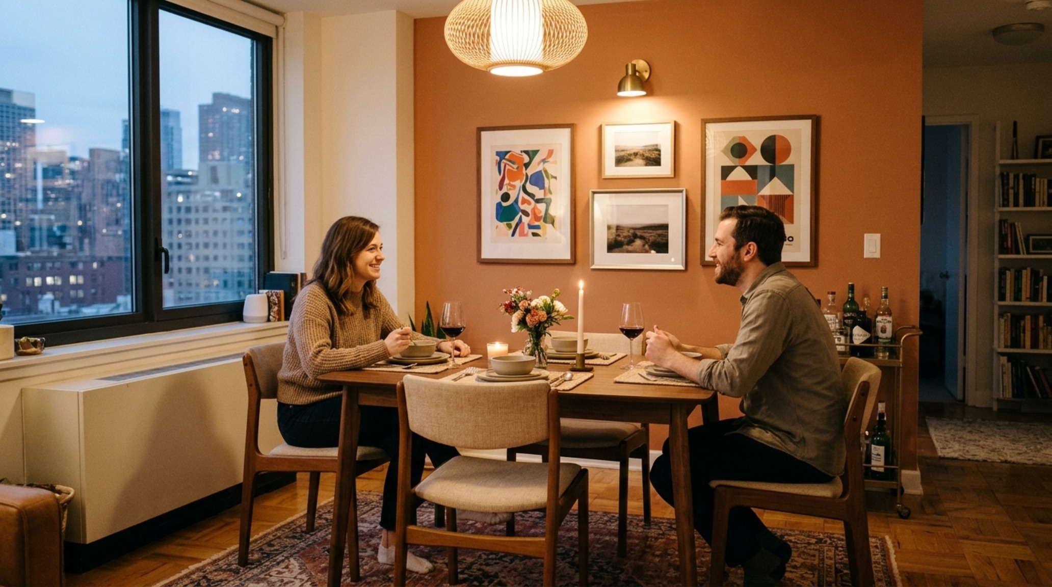
Furthermore, we must respect the 18-inch coffee table reach and 30-inch dining chair clearance. If you are hanging art in a dining nook, remember that the eye level drops when seated. In these intimate vignettes, art should be placed lower to engage the viewer while they are dining, creating a ‘gallery at the table’ experience. This shift in verticality acknowledges the human scale of the apartment, ensuring the artwork for apartment residents feels integrated into their daily rituals rather than hovering awkwardly above them.
Curating Art for Small Spaces: A Narrative of Cohesion
When curating art for small spaces, the palette is your primary tool for spatial expansion. Using a cohesive color story—perhaps tonal variations of Benjamin Moore Swiss Coffee or the earthy depth of Farrow & Ball Setting Plaster—allows the eye to glide across walls without jarring interruptions. This doesn’t mean everything must be monochrome; rather, look for ‘chromatic echoes.’ If you have a rust-colored velvet cushion, look for a painting with subtle ochre undertones. This creates a rhythmic connection between the three-dimensional furniture and the two-dimensional wall art.
Hanging Art Without Nails in Apartments: The New Structural Standard
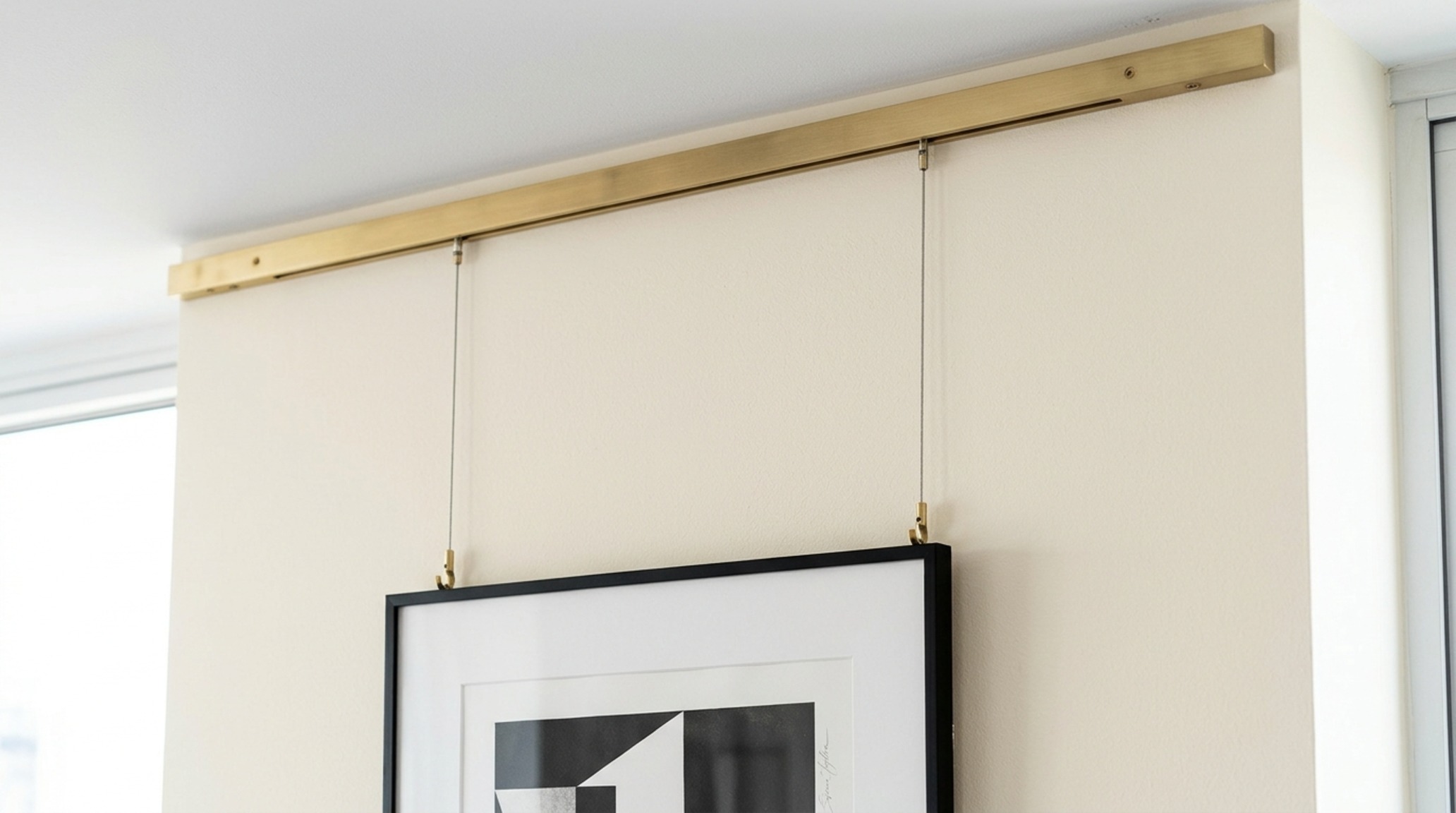
For the modern renter, the structural integrity of the drywall is a constant concern. Fortunately, hanging art without nails in apartments has evolved beyond flimsy adhesives. We are seeing a resurgence in the ‘gallery rail’—a thin, architectural track mounted at the ceiling line that allows art to be suspended via discrete cables. This is a nod to traditional museum architecture and offers total flexibility without a single hole in the plaster.
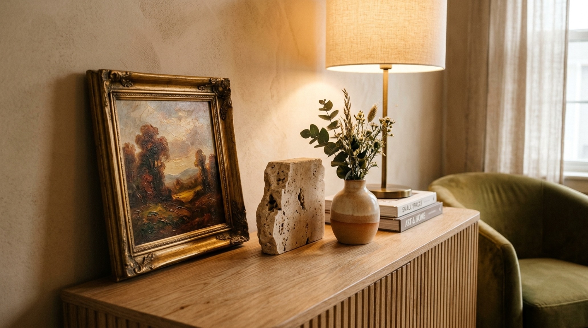
Alternatively, the ‘Leaning Strategy’ provides a sophisticated, casual elegance. Proping a large-scale piece on a credenza or even the floor (if it’s large enough) adds a layer of depth. It creates a ‘leaning plane’ that breaks the flat verticality of the wall, introducing a sculptural element to the room. When using adhesives, always opt for professional-grade tension systems rated for at least double the weight of the frame to ensure a secure, long-term bond that respects the apartment’s surfaces.
Apartment Wall Art Trends 2024: From Textiles to Tactile Relief
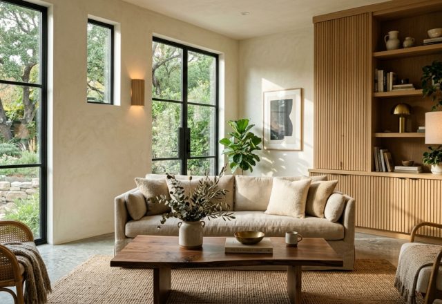
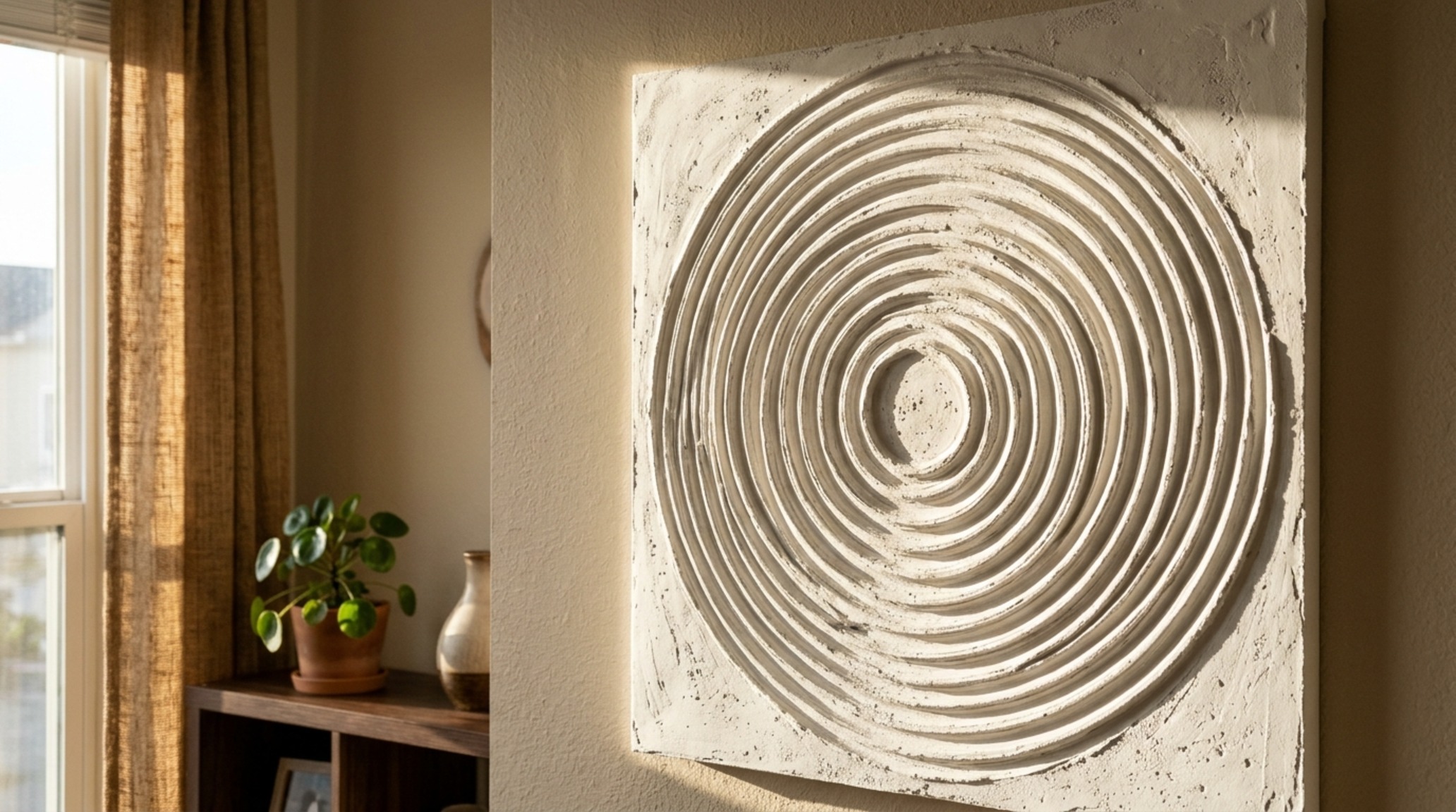
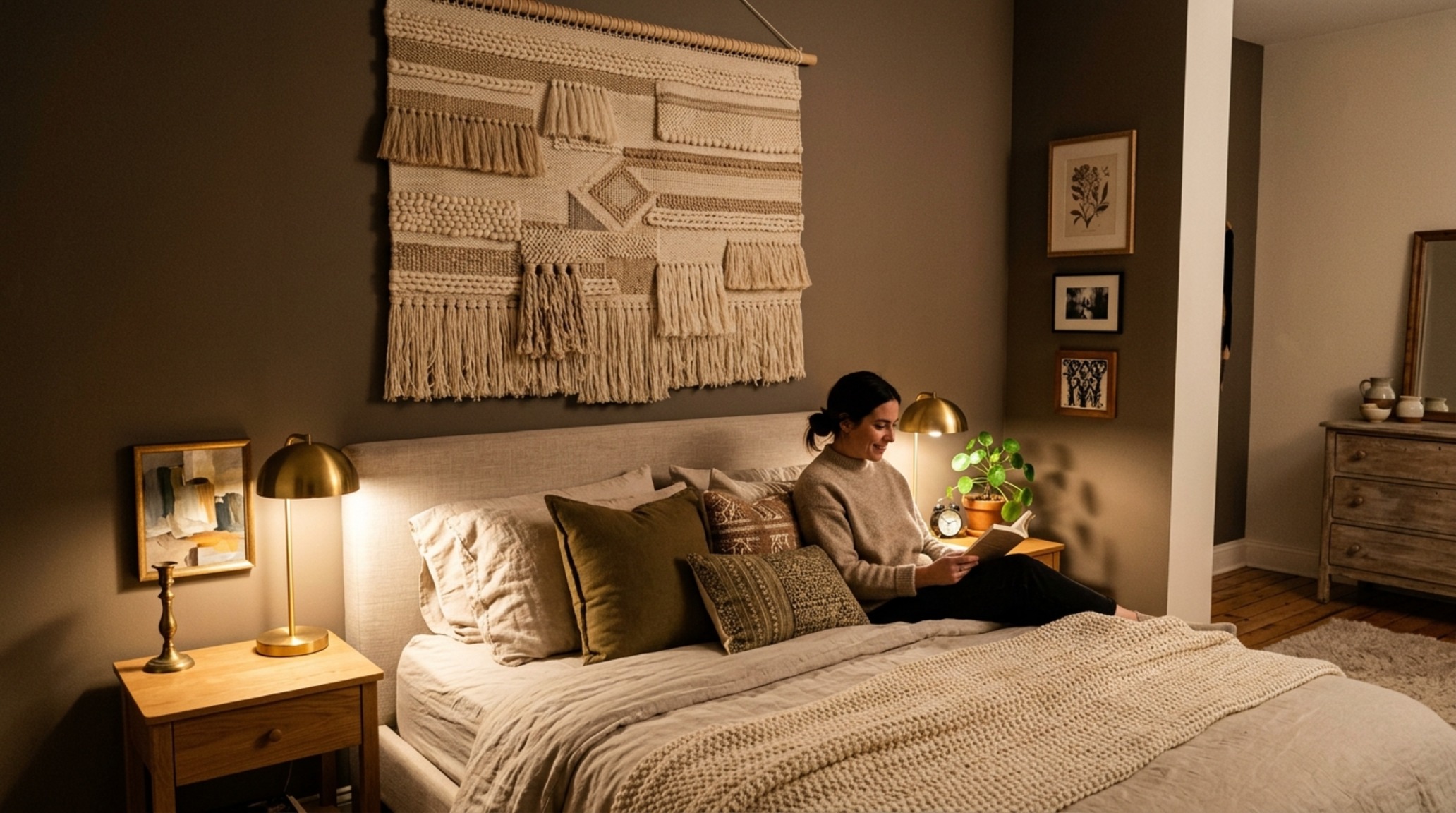
As we look at the apartment wall art trends 2024, there is a clear shift toward materiality. We are moving away from flat prints and toward ‘tactile relief.’ Think heavy impasto, woven fiber art, and fluted plaster panels. These materials absorb sound—a critical benefit in apartment living—while providing a 3D quality that changes throughout the day as shadows move across the surface. A piece of textile art, for instance, adds softness to the ‘hard’ surfaces of a modern kitchen or glass-walled studio, providing much-needed acoustic dampening and visual warmth.
The Final Alignment: Spatial Integrity
Ultimately, the artwork for apartment living should act as a catalyst for spatial harmony. It should bridge the gap between the rigid lines of the architecture and the soft, organic life lived within those walls. By respecting the 36-inch primary circulation paths and ensuring our frames don’t impede the physical flow of the room, we create a home that feels both curated and comfortable. Whether it is a single oversized photograph or a meticulously spaced gallery wall, the goal is always the same: to use art as a tool to expand the soul of the square footage.
Architectural Specification & Material Matrix
Curated architectural summary documenting material selections, color swatches, and spatial flow.
The evolution of our private spaces is a perpetual dialogue between the walls we inhabit and the objects we choose to place upon them. As we master the architect’s ratio, our apartments cease to be mere containers for living and become resonant expressions of spatial volume. In every frame hung and every canvas leaned, we are not just decorating; we are defining the very boundaries of our urban world through the lens of intentional design.
Editorial Silo • Recommended Architecture Studies
- The Tactile Aesthetic of Decorating Ideas For A Small Apartment: Materials, Moods & Lighting Kelvin — Archival Design Case Study
- The Tactile Aesthetic of Sustainable Housing Communities: Materials, Moods & Lighting Kelvin — Archival Design Case Study
Spatial Design Lookbook
Architectural studies focusing on material integrity, natural light articulation, and serene proportions.
Curated Visual Lookbook
Design Gallery & Spatial Studies
A visual curation of architectural arrangements, lighting concepts, and material palettes featured in this space.