The Architect’s Blueprint: Engineering Spatial Volume and Flow in Compact Living Rooms
For decades, the standard for residential comfort was defined by the sheer mass of the objects within it. We lived through the era of the ‘overstuffed’—heavy Victorian mahogany, mid-century sectionals that swallowed floorboards, and compartmentalized rooms that prioritized privacy over movement. But as our urban footprints contract, this historical weight has become an architectural liability. Contemporary design demands a more rigorous, mathematical approach to intimacy. Today, finding sophisticated living room ideas for small rooms is no longer about just ‘fitting things in’; it is an exercise in engineering spatial volume where every millimeter of clearance is calculated to facilitate a state of effortless flow and visual expansion.
Circulation Clearance Measurements: The Mathematical Foundation of Flow
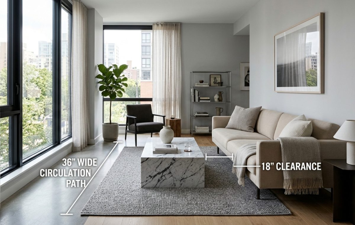
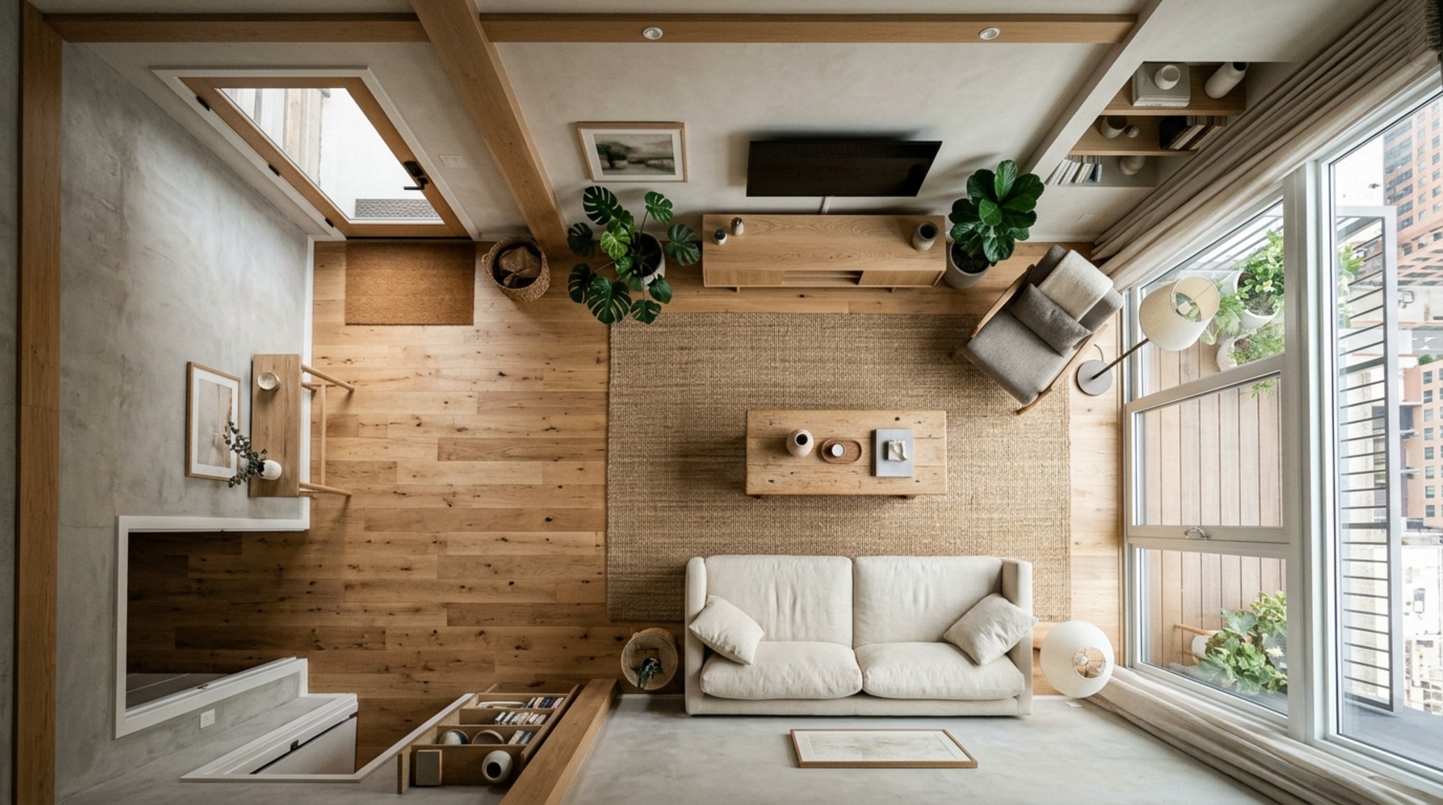
The difference between a room that feels ‘cozy’ and one that feels ‘cramped’ usually comes down to the math of the walkthrough. In architectural planning, we prioritize the primary circulation path. To ensure a space feels intentional rather than restrictive, a 36-inch primary walkway is the non-negotiable gold standard. This allows two people to pass or one person to move with confidence, preventing the ‘sideways shuffle’ common in poorly planned apartments. Even within the seating group, spatial cadence matters. A distance of 18 inches between the edge of the sofa and the coffee table is the ergonomic sweet spot—close enough for a drink, far enough for knee clearance.
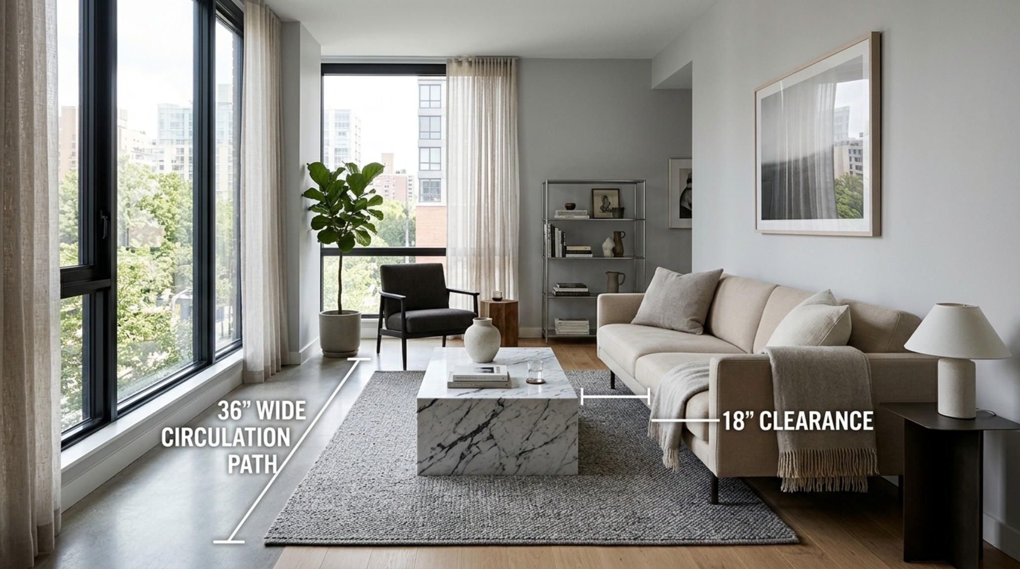
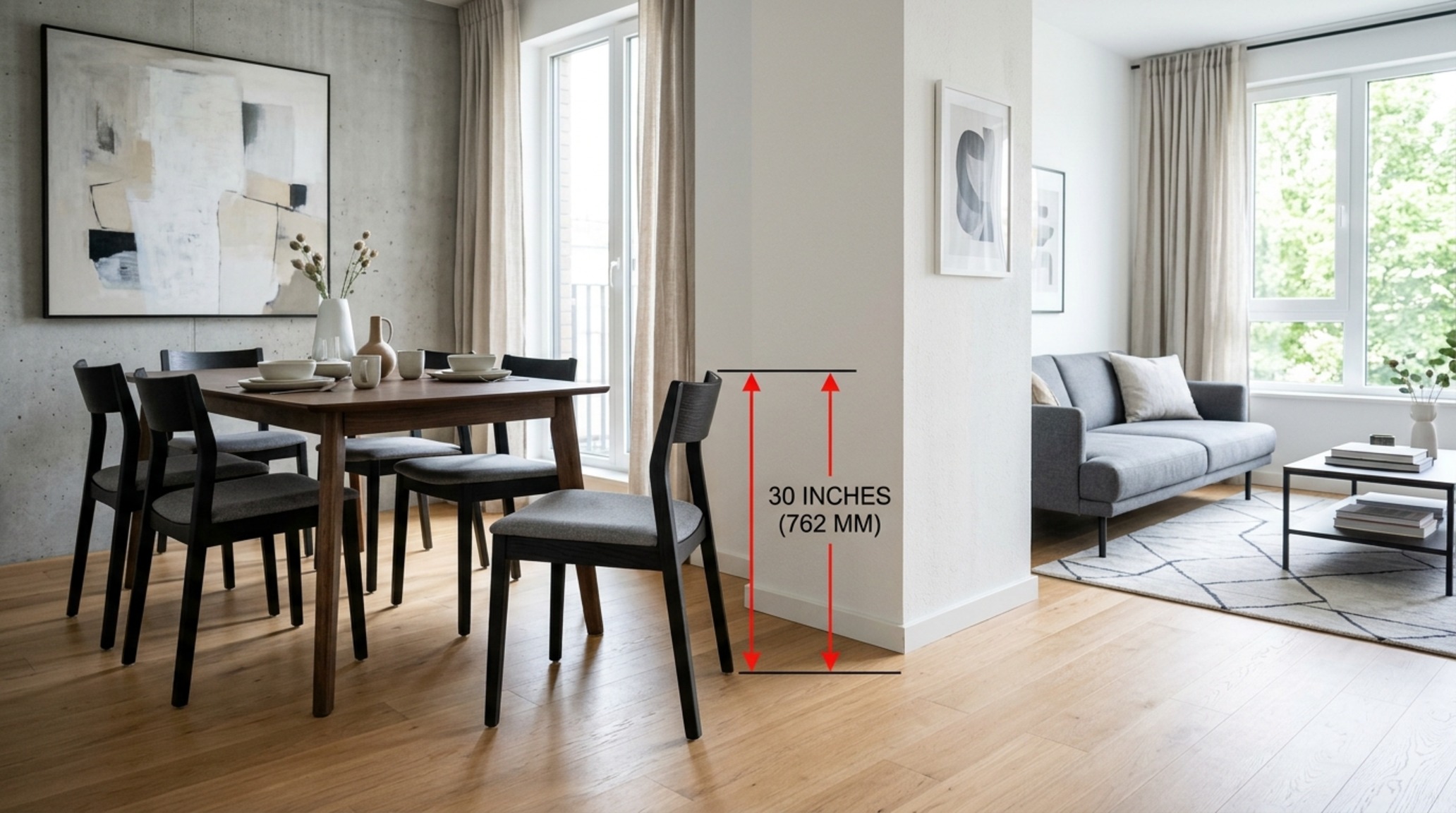
When we look at the circulation clearance measurements within a high-performance floor plan, we also consider the ‘push-back’ zone. If your living area shares space with a dining nook, you must allow 30 inches behind a chair for a guest to rise comfortably without striking a wall. By adhering to these rigid metrics, the furniture ceases to feel like an obstacle and begins to feel like a destination. We transition from decorating a box to choreographing a lifestyle.
Apartment Living Room Layout: Floating the Perimeter for Architectural Breathability
One of the most persistent fallacies in small-space design is the urge to push every piece of furniture flush against the walls. While this seems like it would maximize floor area, it actually highlights the room’s boundaries, making it feel boxy and static. Architects often advocate for ‘floating’ the furniture—pulling the sofa just 4 to 6 inches away from the wall. This creates a shadow line, an architectural ‘breathing room’ that suggests the furniture is a sculptural element within a larger volume rather than a captive of the perimeter.
In a sophisticated apartment living room layout, the arrangement should prioritize sightline alignment. Imagine a diagonal axis that stretches from the entry point to the furthest window. Keeping this path unobstructed draws the eye to the longest possible dimension of the room. Using low-profile furniture—pieces that sit on slender legs rather than heavy plinths—allows the floor plane to continue underneath the objects. When the eye can track the floor all the way to the baseboard, the brain perceives the room as having more square footage than the tax records suggest.
Small Room Paint Colors: The Psychology of Chiaroscuro and Color Drenching
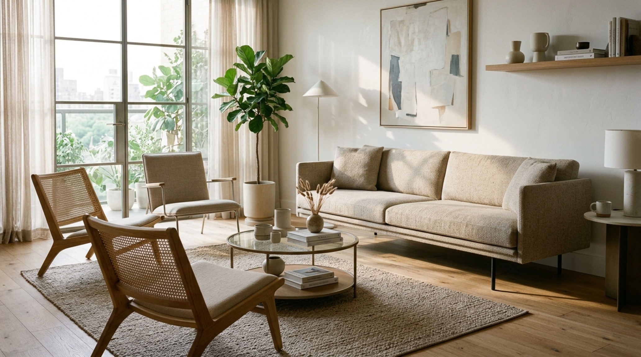
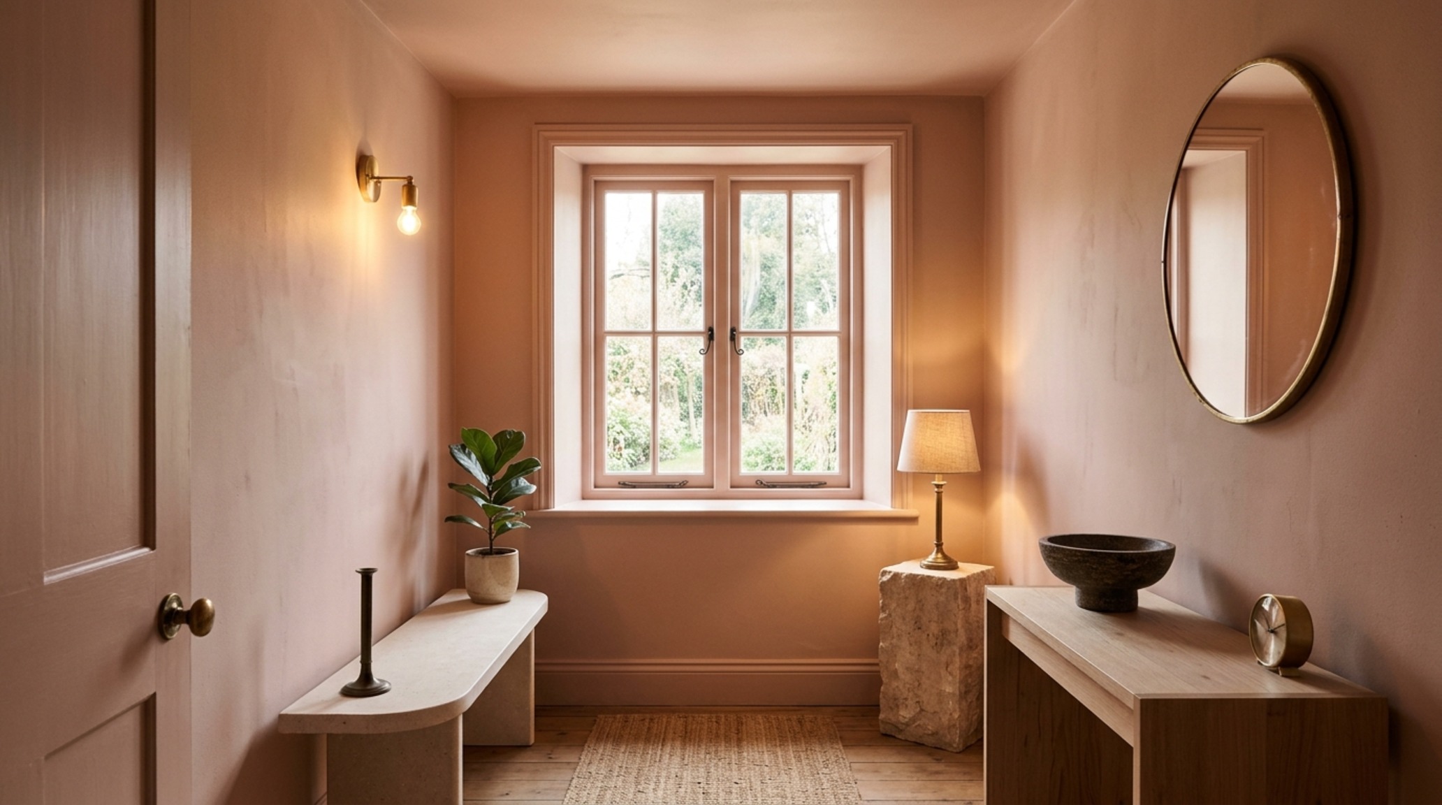
Color is frequently weaponized in small spaces to ‘brighten’ things up, often resulting in cold, sterile whites that feel clinical. Instead, we look to the concept of ‘color drenching’ popularized by Farrow & Ball. By painting the walls, trim, ceiling, and even radiators in a single, nuanced hue—like the muted warmth of Benjamin Moore Swiss Coffee or the earthy sophistication of Farrow & Ball Setting Plaster—you eliminate the visual breaks that define the edges of a room. This lack of contrast blurs the transition between vertical and horizontal planes, creating an immersive, cocoon-like effect that feels expansive through its continuity.
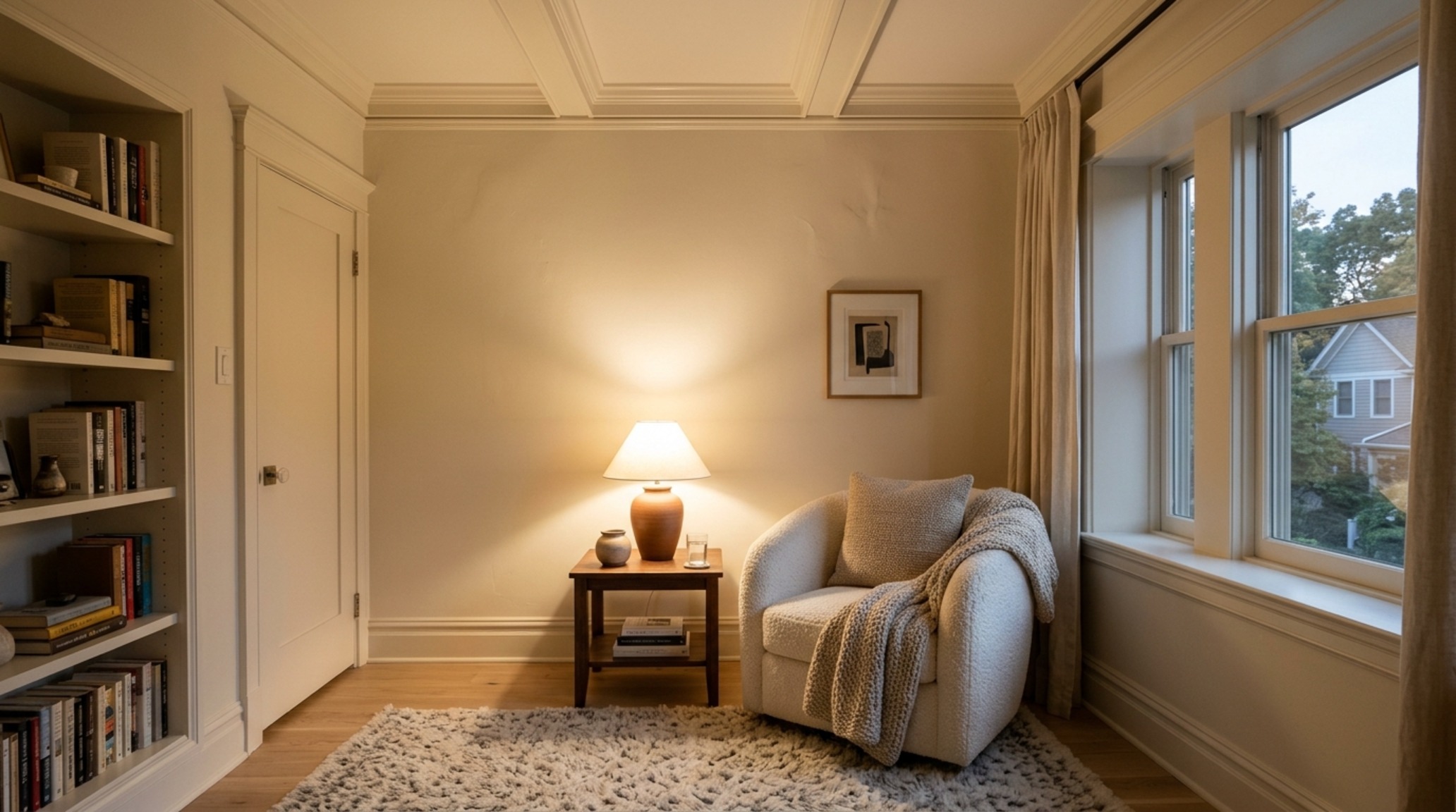
When selecting small room paint colors, the finish is as vital as the pigment. Using a flat or eggshell finish on the walls paired with a high-gloss version of the same color on the ceiling can manipulate natural light. A gloss ceiling acts as a mirror, reflecting the 2700K warm ambient glow from lamps back into the room, effectively doubling the perceived vertical volume through shadow play and soft highlights.
How to Make a Small Living Room Look Bigger: Harnessing the Vertical Axis
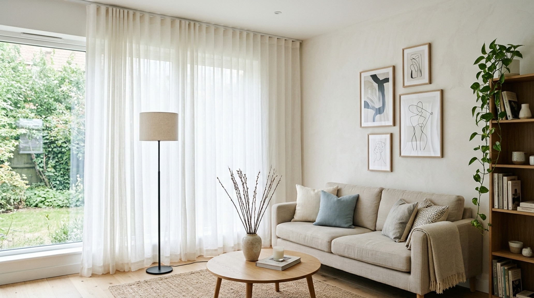
Spatial engineering isn’t limited to the floor. The vertical volume is the most underutilized asset in compact living. To understand how to make a small living room look bigger, one must look toward the ceiling. Mounting drapery rods at the very top of the wall—well above the window frame—and letting the fabric ‘puddle’ slightly on the floor creates a powerful vertical line that draws the gaze upward. This emphasizes the height of the room, distracting from a narrow floor plan.
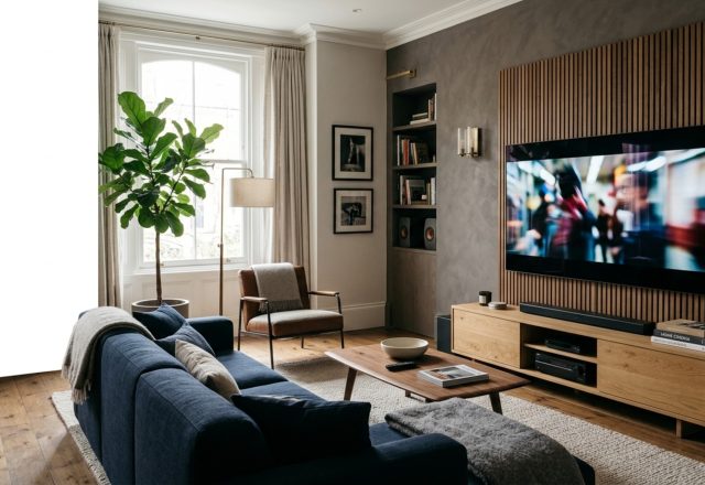
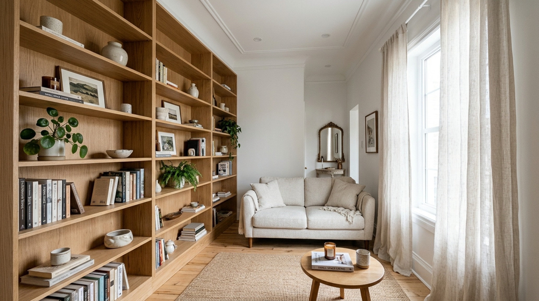
Similarly, floor-to-ceiling millwork or shelving provides a sense of architectural permanence. When shelving stops three-quarters of the way up a wall, it creates a visual ‘lid’ that lowers the ceiling. By extending the cabinetry to the crown molding, you integrate the storage into the structure of the building. This reduces visual clutter and provides a clean, vertical surface that makes the entire room feel loftier and more purposeful.
Multi-functional Furniture Ideas: Engineering High-Performance Utility
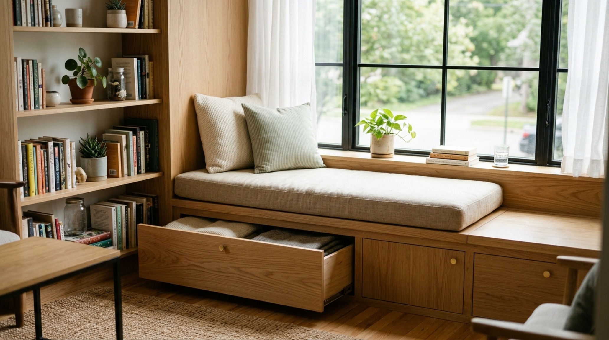
In a tight footprint, every object must justify its existence through dual-purpose utility. However, this shouldn’t mean ‘folding’ or ‘temporary’ in a way that feels flimsy. We look for pieces that offer structural integrity alongside their flexibility. Think of a solid oak coffee table with a concealed lift-top mechanism for dining, or a bespoke window seat that hides deep drawers for seasonal linens. These multi-functional furniture ideas allow the room to transition from a private sanctuary to a social hub without a single piece of furniture moving an inch.
The materiality of these pieces is key to grounding the space. A heavy, honed travertine side table provides ‘tactile grounding’—a sense of permanence and luxury that counters the ephemeral nature of a small apartment. When you mix these substantial materials with glass or acrylic ‘ghost’ pieces, you create a sophisticated balance of weight and transparency. The eye perceives the stone, but the glass allows the light to pass through, maintaining the room’s airy spatial cadence.
Minimalist Living Room Ideas for Small Rooms: The Visual Concept Gallery
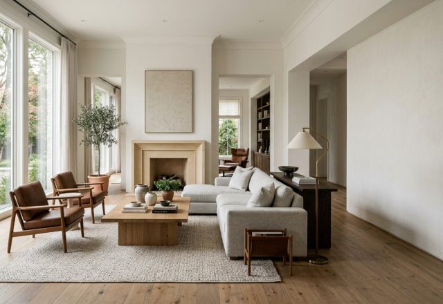
True minimalism in a small living room isn’t about the absence of things; it’s about the presence of the right things. It is a curation of form that respects the void. In this minimalist living room ideas for small rooms study, we focus on ‘negative space breathing room.’ By leaving one wall entirely blank or choosing a single, oversized piece of art instead of a gallery wall, you create a visual ‘resting place’ for the eye. This prevents sensory overload and allows the architectural details—the grain of the fluted white oak, the curve of a plaster sconce—to take center stage.
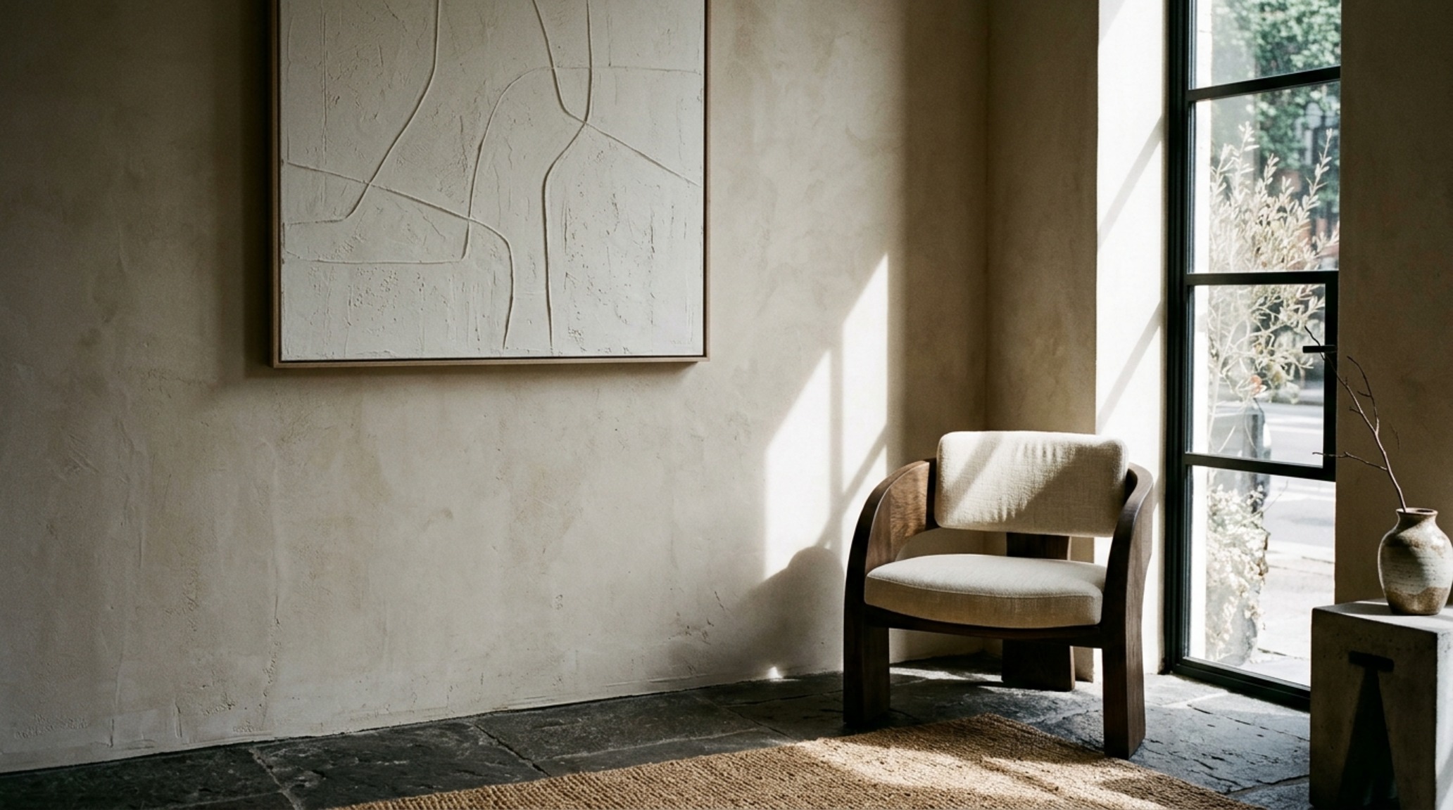
Lighting plays a critical role in this minimalist narrative. We avoid the ‘Swiss cheese’ effect of too many recessed canned lights. Instead, we layer light using high CRI (90+) ratings to ensure colors are rendered accurately. A combination of diffused directional light for reading and soft, 3000K task lighting for specific zones creates depth and hierarchy. By illuminating only what is necessary, you use shadows to define the room’s boundaries, making the space feel architecturally intentional rather than just ‘lit.’
Architectural Finishes, Swatches & Matrix
Architectural breakdown detailing authentic surfaces, paint references, and standard circulation clearances.
Ultimately, designing for a limited footprint is an exercise in honesty. It forces us to discard the performative bulk of the past and embrace a more refined, engineered elegance. When we apply these rigid architectural metrics—the careful calculation of walkways, the strategic use of vertical lines, and the immersive power of a monochromatic palette—the constraints of the room begin to dissolve. We aren’t just looking for living room ideas for small rooms; we are redefining what it means to live with spatial integrity. By treating the layout as a blueprint for movement rather than a storage solution for furniture, we unlock a sense of luxury that is measured not in square footage, but in the effortless, silent grace of a perfectly calibrated home.
Editorial Silo • Recommended Architecture Studies
- Large living room design rules for functional flow — Archival Design Case Study
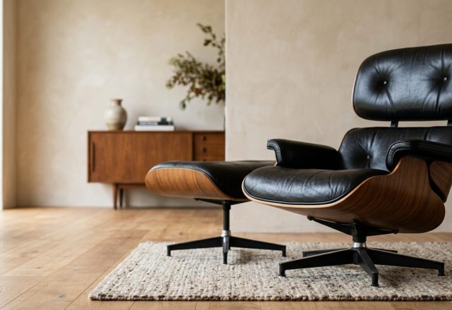
- Authentic Eames Lounge Chair Authentication Markers — Archival Design Case Study
Modern Spatial Living Lookbook
An editorial exhibition documenting finishes, architectural lighting, and bespoke spatial detailing.
Curated Lookbooks & Architectural Studies
- Whimsical Under stairs storage
- Boucle Swivel Chair Ideas for a Cozy Modern Living Room
- The Architectural Blueprint: Mastering Spatial Flow with an IKEA Kitchen Designer Strategy
- Mastering Kitchen Island Styling With Natural Textures
- Open Floor Plan Homes: The Architectural Blueprint & Spatial Flow Guide
- The Tactile Aesthetic of Tile Designs For Kitchen Floors: Materials, Moods & Lighting Kelvin
Curated Visual Lookbook
Design Gallery & Spatial Studies
A visual curation of architectural arrangements, lighting concepts, and material palettes featured in this space.