Why is it that the most expansive architectural footprints often feel the most isolating? We often assume that square footage is the ultimate luxury, yet homeowners frequently find themselves standing in a five-hundred-square-foot salon feeling adrift in a sea of hardwood. Successfully executing a large living room design requires moving past the instinct to push furniture against the perimeter, which only creates a hollow, awkward ‘dancing floor’ in the center. Instead, we must treat the volume as a series of interconnected islands, using mathematical precision to bridge the gap between grand architecture and human-scale intimacy.
The most common mistake I see in sprawling residential interiors is ‘Scale Dysmorphia’—the tendency to buy furniture that is far too small for the room’s volume, or conversely, buying one massive piece and expecting it to carry the entire space. When you have twenty feet of width to play with, a standard eighty-inch sofa looks like a dollhouse miniature. The fix isn’t just bigger furniture; it is the strategic application of spatial ergonomics and the 1/3rd rule of circulation. To turn a cold gallery into a living home, we must first address the architectural problem of the ‘Floating Island’ and solve it through intentional zoning.
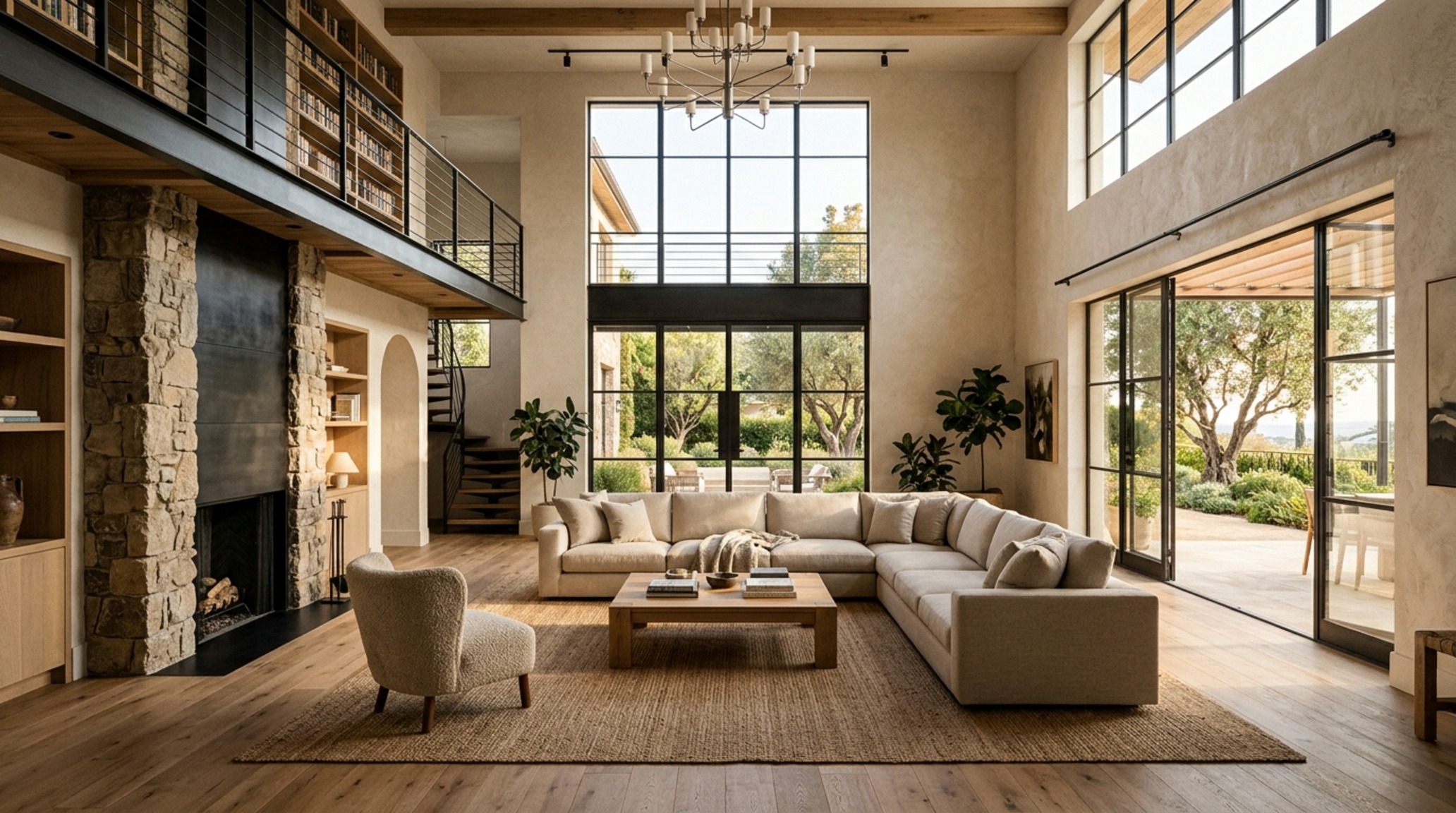
The Problem: The Cavernous Void and Perimeter Pushing
When faced with a massive room, the natural human reflex is to seek the safety of the walls. This creates a ‘waiting room’ aesthetic where the primary seating is twenty feet away from the television or fireplace, making conversation feel like a shouted cross-examination. In architectural terms, this creates a dead zone in the center of the room that lacks purpose, disrupts sightlines, and kills the acoustic warmth of the space. Without a structural anchor, the eye wanders aimlessly, never finding a place to rest, which results in a space that feels perpetually unfinished regardless of how much decor is added.
Solution: Multi-Seating Group Configurations for Social Intimacy
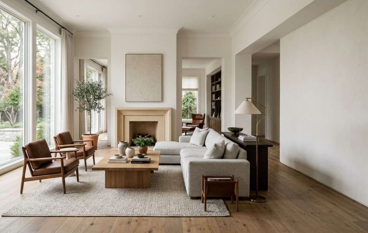
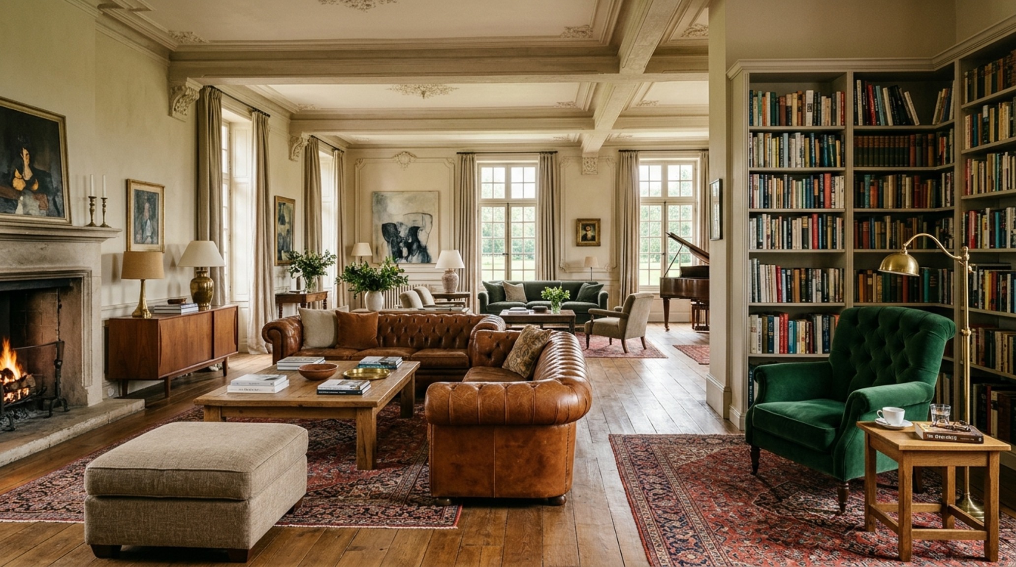
The secret to mastering large living room design is to divide and conquer. Rather than attempting to create one singular, gargantuan seating area, the most sophisticated interiors utilize multi-seating group configurations. Think of your living room as a boutique hotel lobby rather than a single-family den. You might have a primary conversation circle anchored by a fireplace, a secondary pair of swivel chairs facing a window for morning coffee, and perhaps a small game table or a reading nook tucked into a corner.
To keep these groups feeling cohesive, maintain a ‘visual thread’ through materiality. If the main sofa is a heavy linen in Benjamin Moore Swiss Coffee, perhaps the secondary armchairs feature a subtle pinstripe in the same tonal family. The goal is to create distinct ‘destinations’ within the room. Each destination should be self-contained; for a secondary seating group, this means ensuring there is a dedicated side table within an 18-inch reach and a floor lamp providing task lighting at 2700K to 3000K for a warm, localized glow. This layering of functions ensures that even if you are alone in a thirty-foot room, you feel contained and comfortable within your immediate ‘island’.
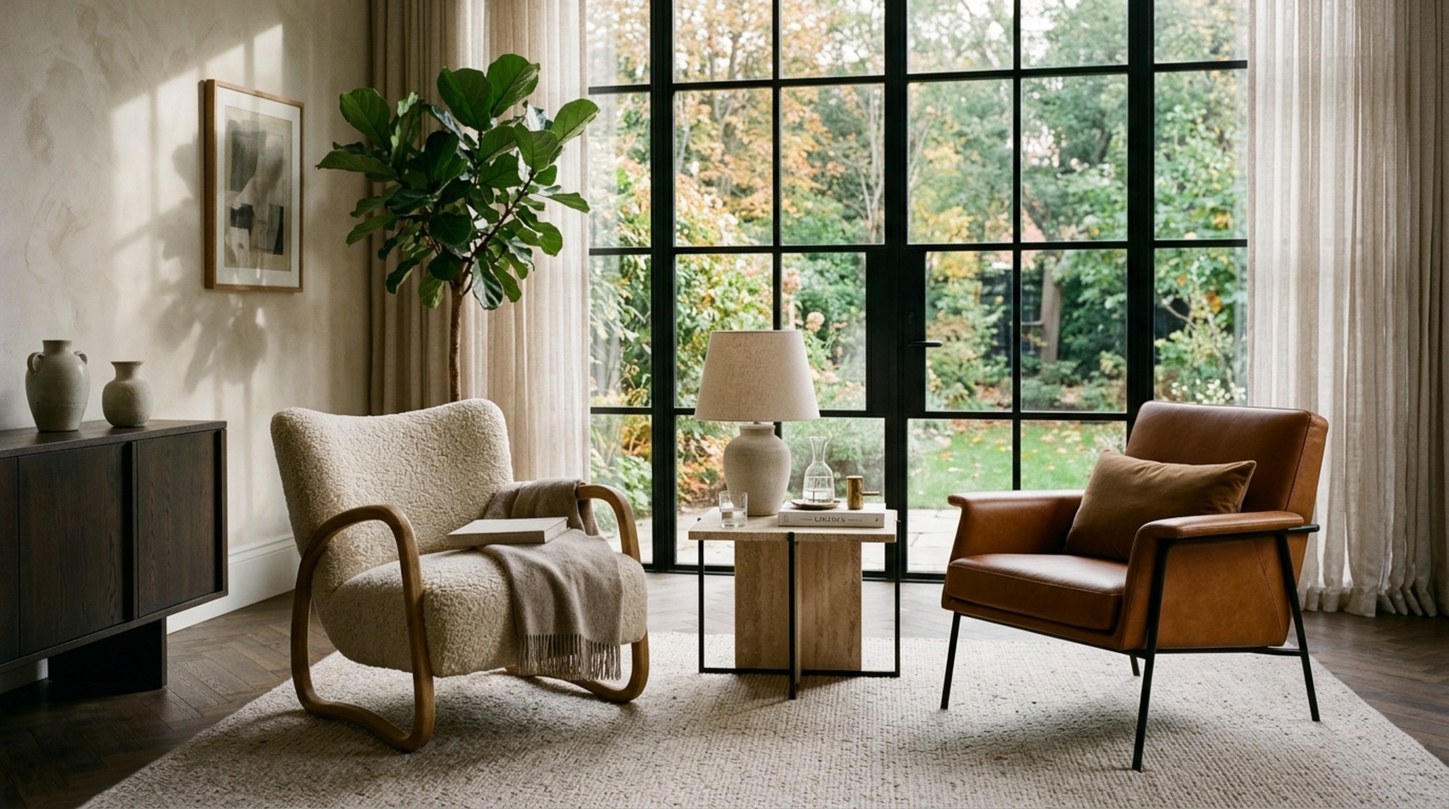
The Problem: The ‘Lost’ Furniture and Scale Mismatch
In a grand room, standard-sized furniture disappears. This is where many DIY designers fail—they purchase beautiful pieces that are simply dwarfed by twelve-foot ceilings or thirty-foot widths. A tiny rug or a spindly coffee table in a massive room creates visual friction; it looks nervous and ungrounded. When the proportions are off, the room feels cluttered even if there are very few items in it, because the negative space is overwhelming the positive forms.
Solution: Grand Room Furniture Scaling and the 1/3rd Rule
When selecting pieces for a significant footprint, grand room furniture scaling becomes your primary tool. A large room demands ‘heavier’ visual weights. This is the time for the 100-inch deep-seated sofa, the 60-inch circular coffee table, and the floor-to-ceiling drapery panels. A fundamental rule of thumb is that your primary seating group should occupy roughly one-third of the total floor area. Anything less, and the furniture will feel like it’s drifting away.
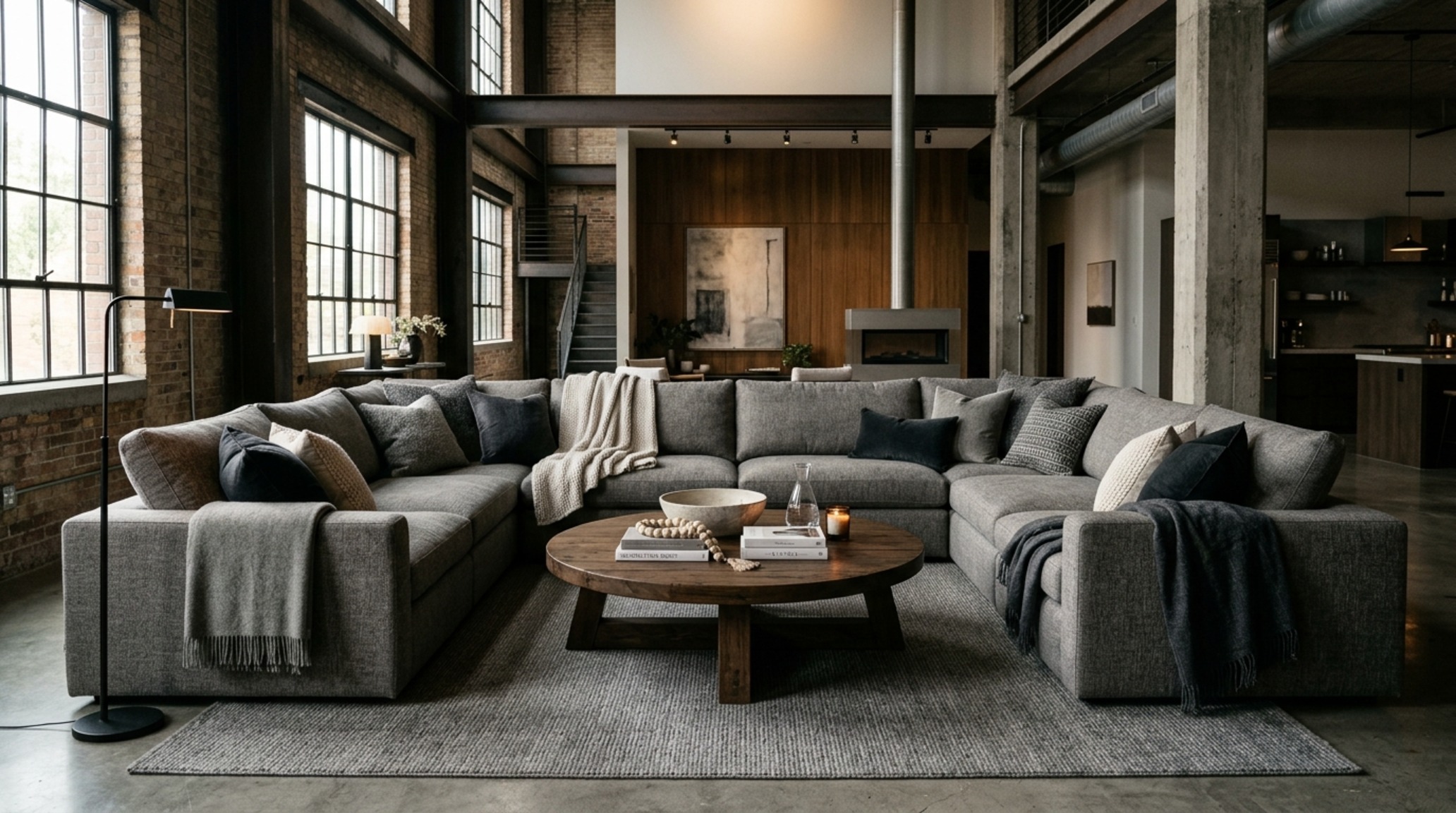
Consider the height of your pieces as well. If you have soaring ceilings, a low-slung Italian modern sofa will need to be balanced with tall cabinetry, large-scale art, or an oversized indoor tree like a black olive or a fiddle-leaf fig to bridge the vertical gap. Use ‘visual weight’ strategically: a velvet-upholstered sectional has more presence than a leggy, mid-century modern piece. In a large living room design, you want the furniture to feel like it is part of the architecture, not just a temporary inhabitant. Don’t be afraid of the oversized sectional placement; when placed in the center of the room (floating), it acts as a low-profile wall that defines the primary zone without blocking the view.
The Problem: The Echo Chamber and Visual Drift
Hardwood or stone floors in a large room act as an acoustic mirror, bouncing sound waves and making every footstep or whisper sound sharp and cold. Visually, a vast expanse of flooring also lacks ‘texture,’ making the room feel like a commercial lobby. Without clear boundaries, the different functional areas we discussed earlier bleed into each other, creating a chaotic spatial cadence that is difficult for the brain to process.
Solution: Zoning Large Interiors with Rugs as Anchor Points
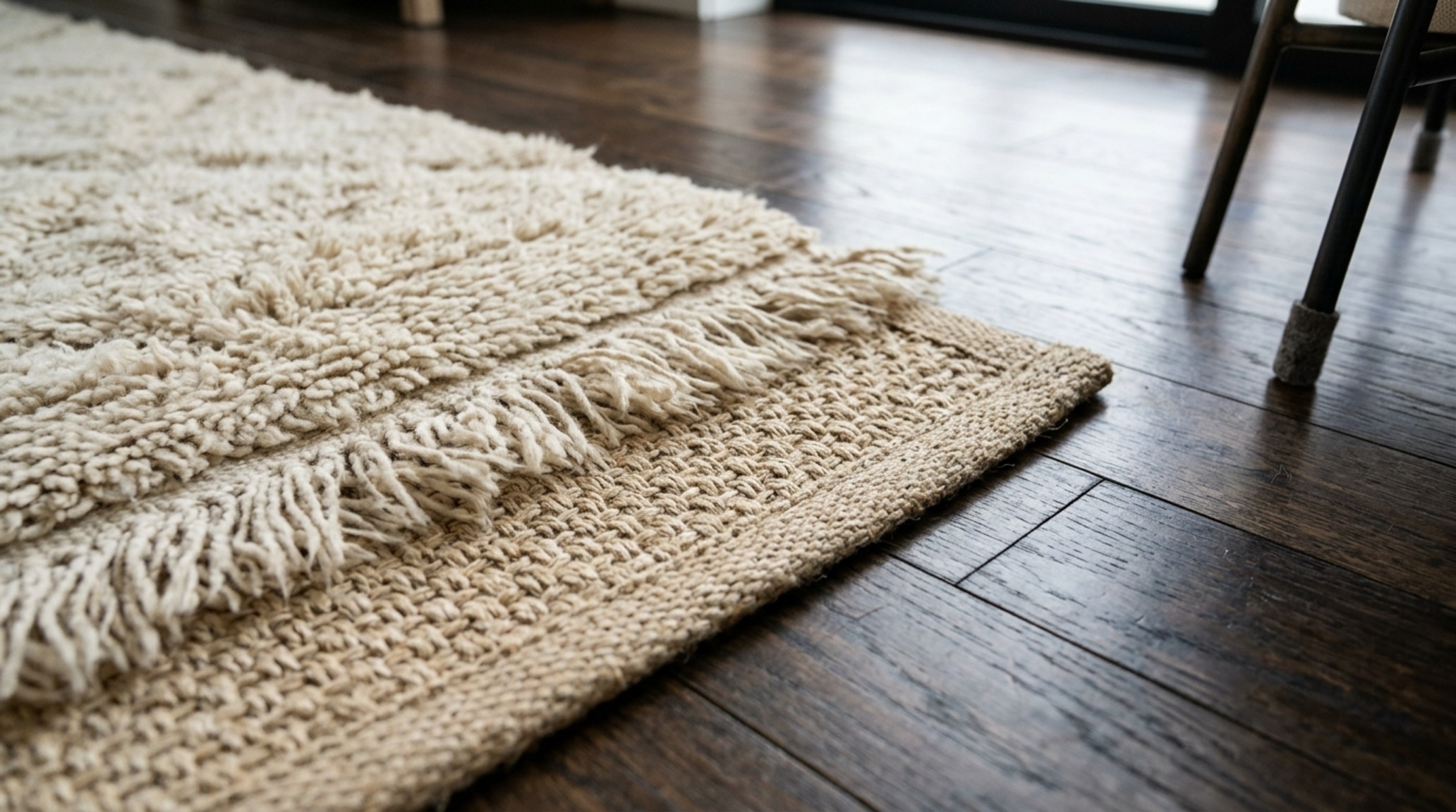
Texture is the most effective way to provide ‘tactile grounding’ in a large space. Zoning large interiors with rugs is the most powerful tool in your design kit. Forget the 8×10 rug; in a grand room, you are looking at 12×15 or even custom sizes that can encompass all four legs of every piece of furniture in a grouping. A rug acts as a physical boundary—a ‘room within a room.’ For a large living room design, I often recommend layering: a large, neutral sisal or jute rug as a base for durability, topped with a plush, hand-knotted wool rug in the primary seating area for comfort and color.
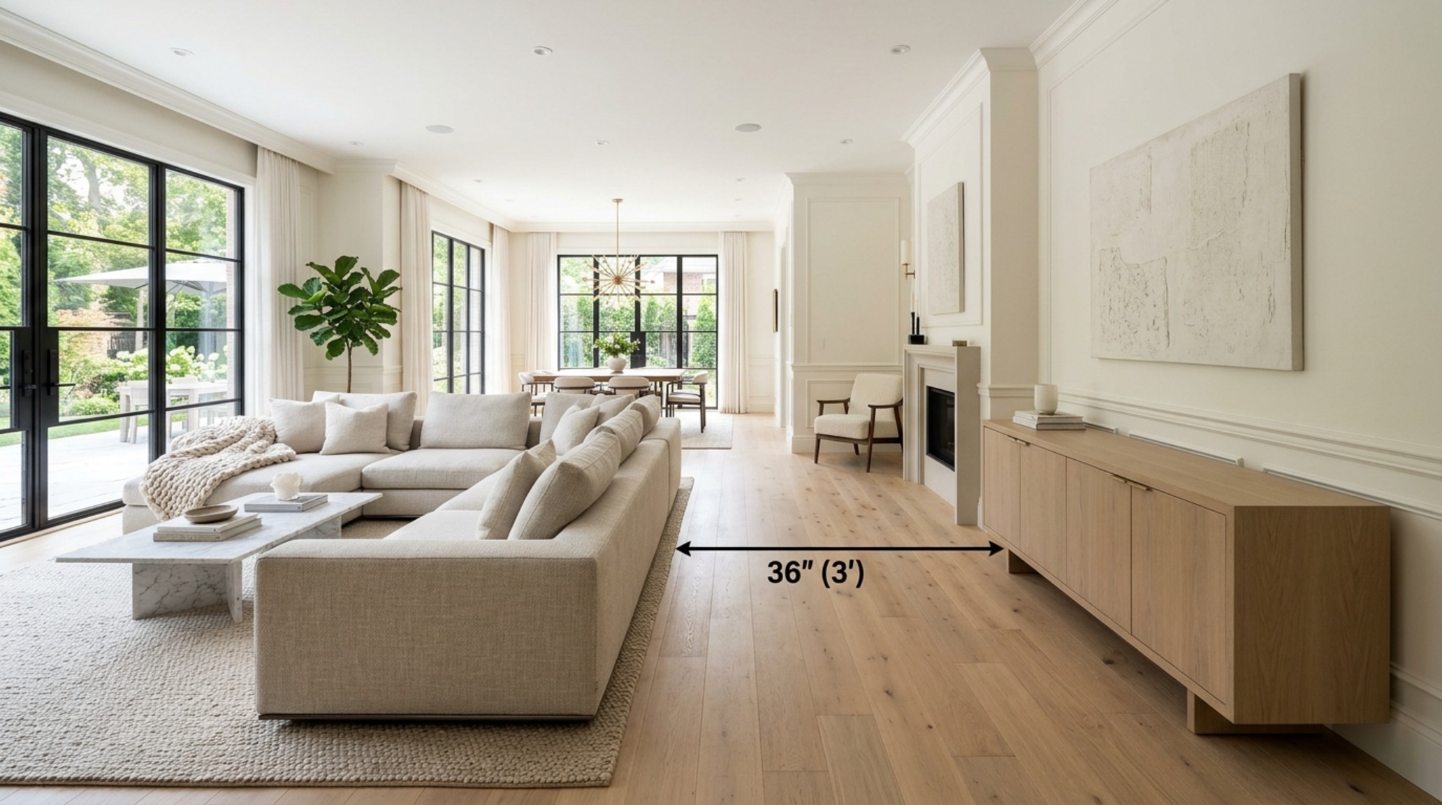
The edges of these rugs naturally define the walkways. By leaving 36 inches of bare floor between the edge of a rug and the wall (or between two different rugs), you create a natural ‘hallway’ within the room. This ensures that circulation happens *around* the seating groups rather than *through* them, which is essential for maintaining a sense of peace. When you walk across the room, you shouldn’t feel like you are interrupting a conversation.
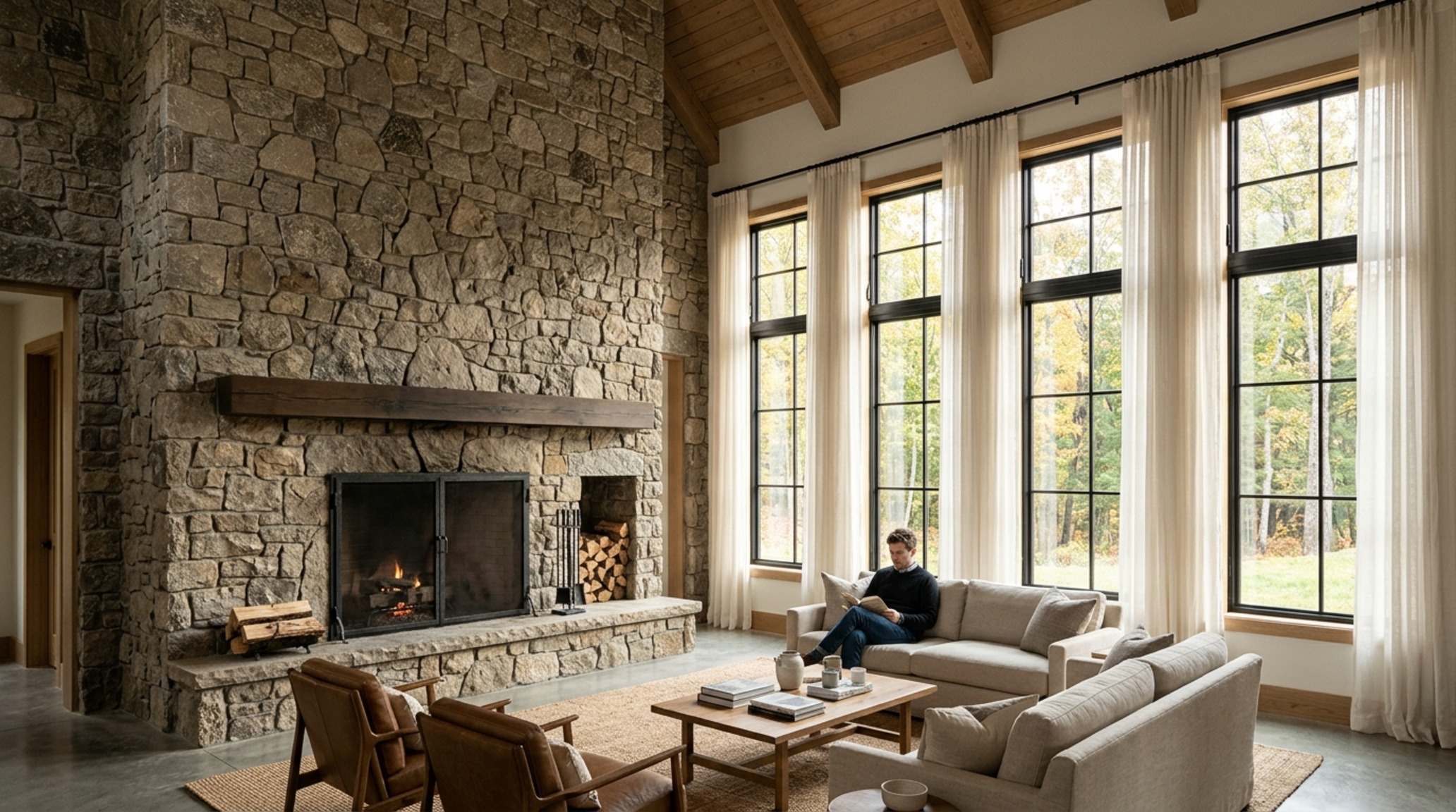
The Problem: The ‘White Box’ Vertical Void
Many large rooms are blessed with double-height ceilings, which can feel majestic in photos but clinical in person. If the walls are left bare above the eight-foot mark, the room feels ‘top-heavy’ with emptiness. The shadow play that makes a room feel cozy is lost in a wash of flat, vertical space, and the human scale is completely abandoned.
Solution: High Ceiling Decor Strategies to Bridge the Gap
To fix a vertical void, you must bring the ‘ceiling’ down visually. High ceiling decor strategies focus on creating horizontal breaks. This can be achieved through a high-contrast picture rail, architectural crown molding, or even a bold paint color that stops 12 inches below the ceiling line. Darker tones like Farrow & Ball Setting Plaster on the ceiling can actually make a cavernous room feel more intimate by visually ‘lowering’ the height through color weight.
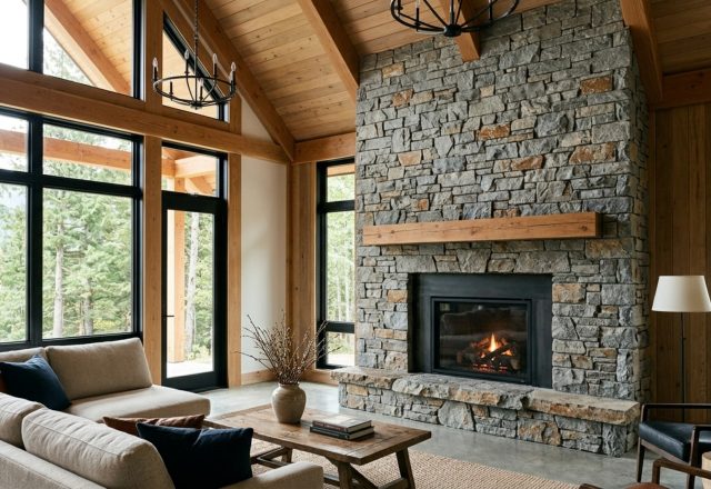
Lighting is your secondary vertical bridge. A single, small pendant light will look like a lonely spark plug in a cathedral. Instead, opt for a multi-tiered chandelier or an oversized lantern that occupies the middle third of the room’s height. This draws the eye upward but stops it before it hits the roof, creating a middle-ground focal point. Additionally, consider the spacious open concept layout carefully; use floor-to-ceiling bookshelves or a dramatic stone fireplace surround to create a vertical anchor that commands the room’s height, rather than being defeated by it.
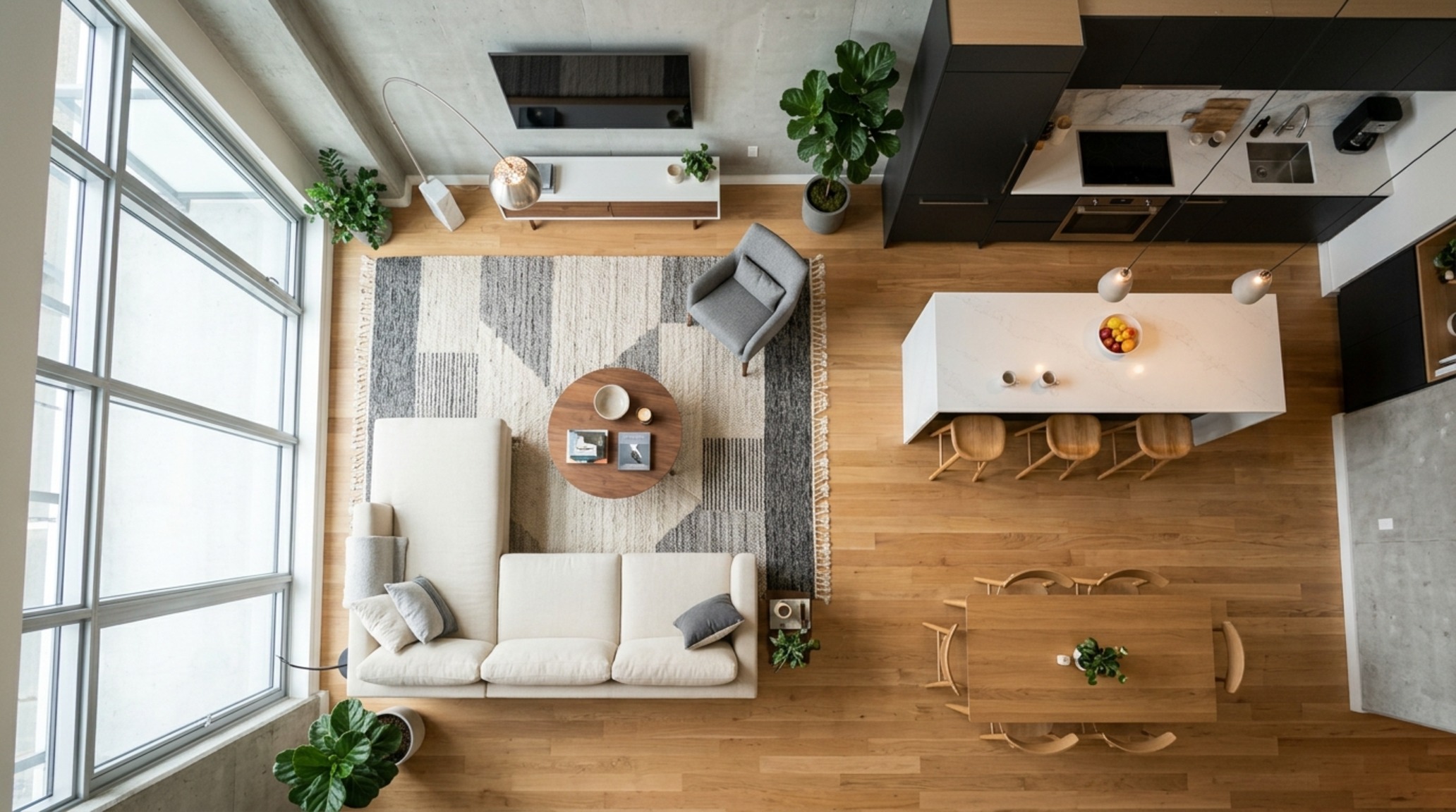
The Mathematics of Comfort: Spatial Ergonomics & Flow
Ultimately, a successful large living room design is a mathematical equation. Beauty is subjective, but comfort is ergonomic. To ensure your room functions as well as it looks, adhere to these strict architectural clearances. For primary thoroughfares—the paths that lead from one room to another—you must maintain a 36-inch clearance. This allows two people to pass each other comfortably. For secondary paths, such as the space between a sofa and a console table, 30 inches is the minimum required for a ‘breathing room’ feel.
Seating intimacy is another calculation. Humans feel most comfortable in a conversation circle that is between 8 and 10 feet in diameter. If your sofas are 15 feet apart, people will instinctively lean forward or move to the edge of their seats to feel connected. By pulling your furniture off the walls and into the center, you can maintain that 8-10 foot sweet spot while using the remaining perimeter space for walkways, art galleries, or secondary vignettes. This balance of ‘compression’ (the seating area) and ‘expansion’ (the walkways) is what creates a sophisticated spatial cadence.
Tactile Finishes, Color Codes & Spatial Ledger
Architectural breakdown detailing authentic surfaces, paint references, and standard circulation clearances.
Designing a grand interior is an exercise in restraint and courage. It requires the courage to leave some corners empty so the eye can breathe, and the restraint to choose a few massive, high-quality pieces over a dozen smaller ones. When we respect the mathematical rules of flow and the human need for enclosure, a large room stops being a challenge to fill and starts being a canvas for living. As you curate your own space, look for materials that invite touch—pitted stones, nubby bouclés, and raw woods. These are the elements that ultimately bridge the gap between the monumental and the personal, creating a home that feels as expansive as the horizon yet as intimate as a secret.
Editorial Silo • Recommended Architecture Studies
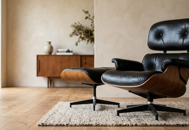
- Authentic Eames Lounge Chair Authentication Markers — Archival Design Case Study
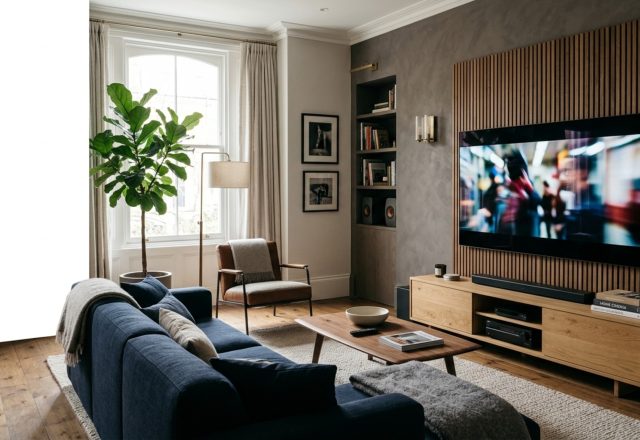
- Inspiring Home Theater Living Room Design 2025 Trends — Archival Design Case Study
Curated Materiality & Proportion
Curated spatial snapshots examining the quiet dialogue between architectural daylight and tactile surfaces.
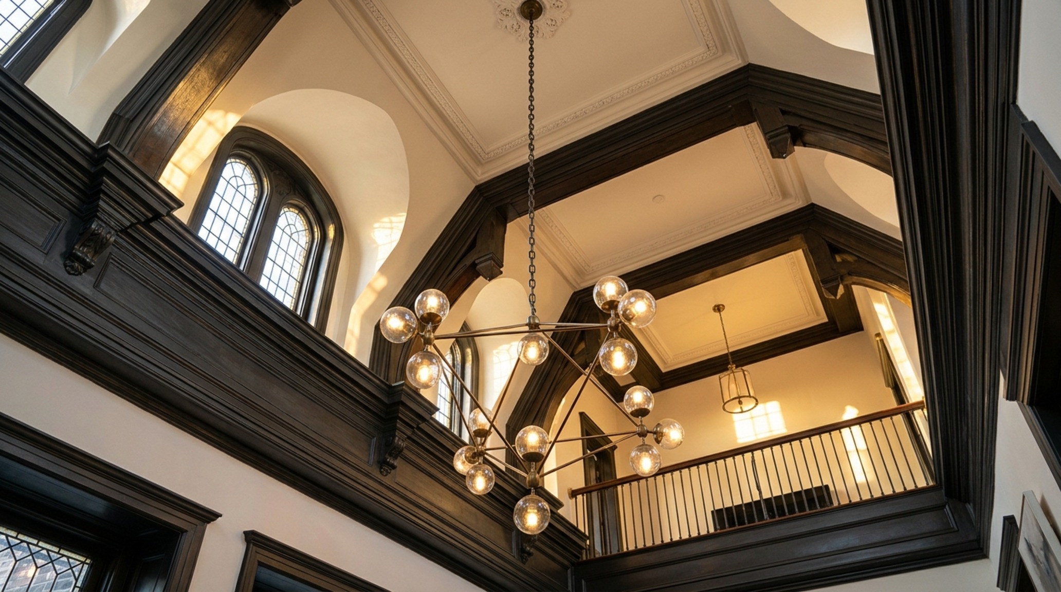
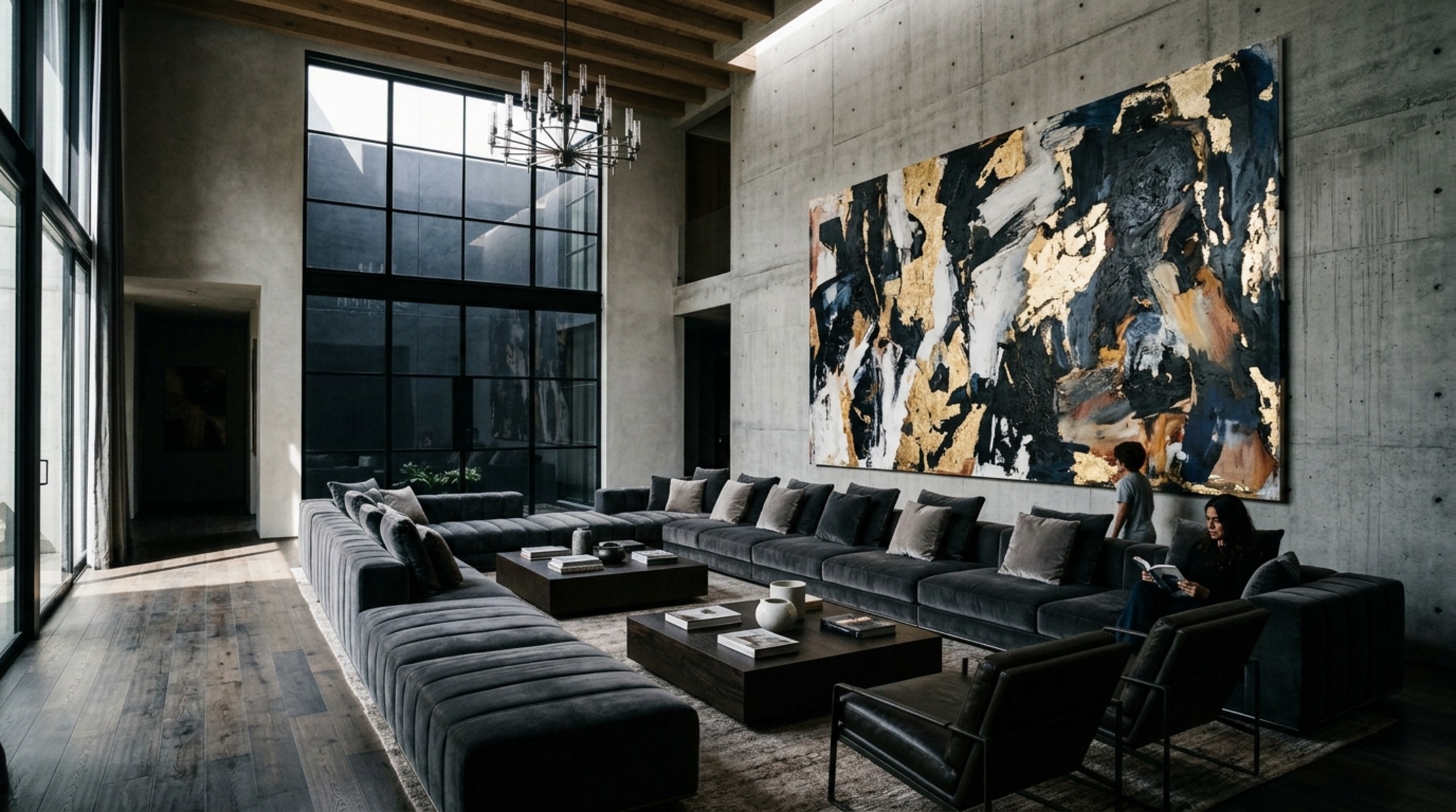
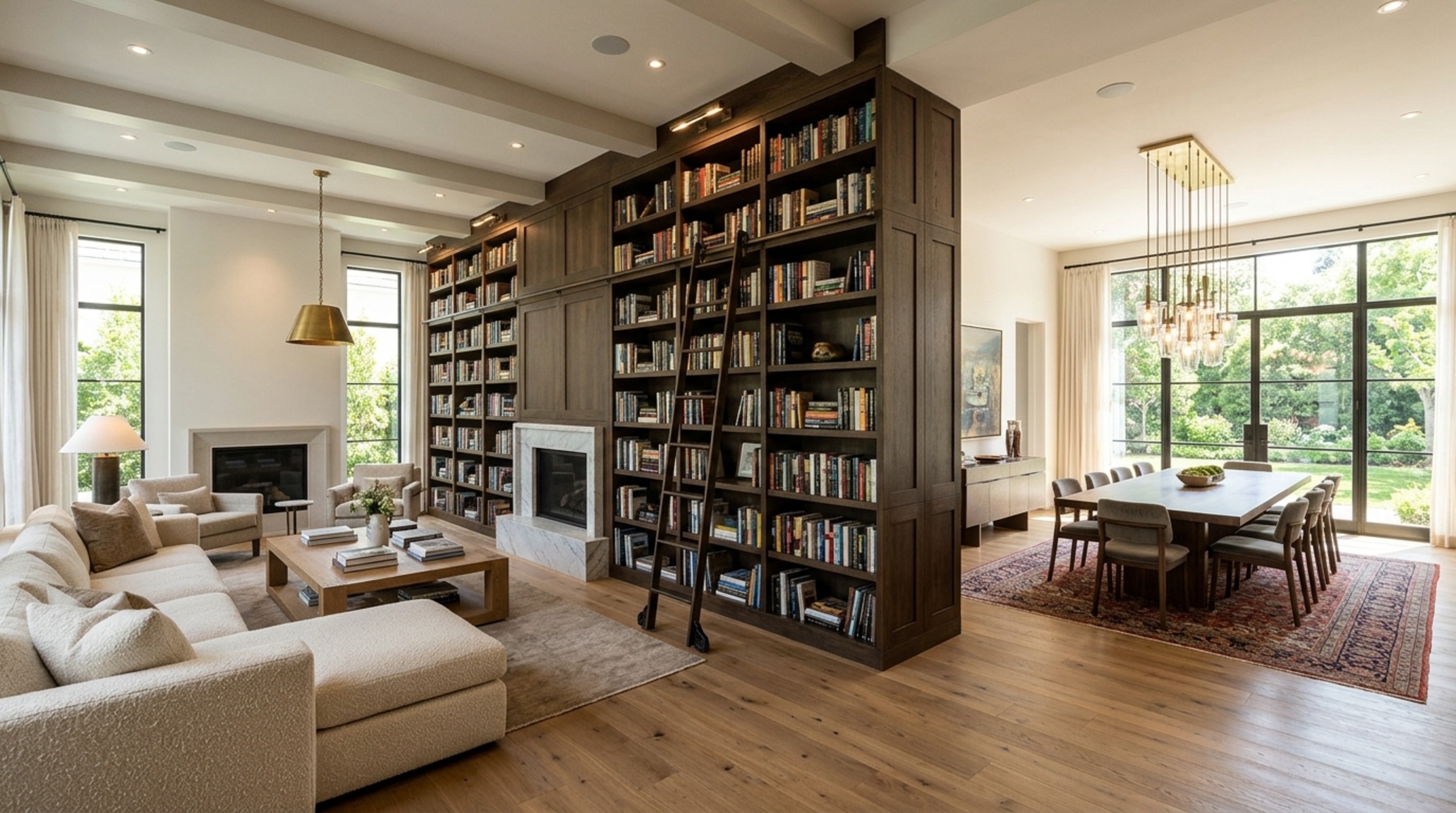
Curated Visual Lookbook
Design Gallery & Spatial Studies
A visual curation of architectural arrangements, lighting concepts, and material palettes featured in this space.