CURATORIAL CRITIQUE & DESIGN ANTHOLOGY: The Resurgence of the Sensory Kitchen
Observing the evolution of the contemporary kitchen, one notices a profound shift from the sterile, machine-honed precision of the previous decade toward a visceral, emotive materiality that prioritizes the human touch. We are moving away from the ‘laboratory’ aesthetic—all cold steel and frictionless surfaces—and entering an era of architectural softness. As an observer of these residential sanctuaries, I find that the selection of kitchen tile options has become the primary vehicle for this narrative shift, moving beyond mere splash protection into the realm of light-sculpture and tactile grounding.
The alchemy of surface lies in how a material responds to the changing geometry of daylight. A machine-pressed ceramic tile reflects light with a predictable, often flat uniformity. In contrast, an artisanal surface—pitted, slightly bowed, and glazed with intentional variance—breaks light into a thousand different directions. This creates a spatial cadence that feels alive. When we discuss the kitchen as the heart of the home, we are really discussing the sensory comfort of its surfaces. The coldness of a slab can be mitigated by the rhythmic imperfections of a hand-pressed tile, creating a dialogue between the monumental and the domestic.
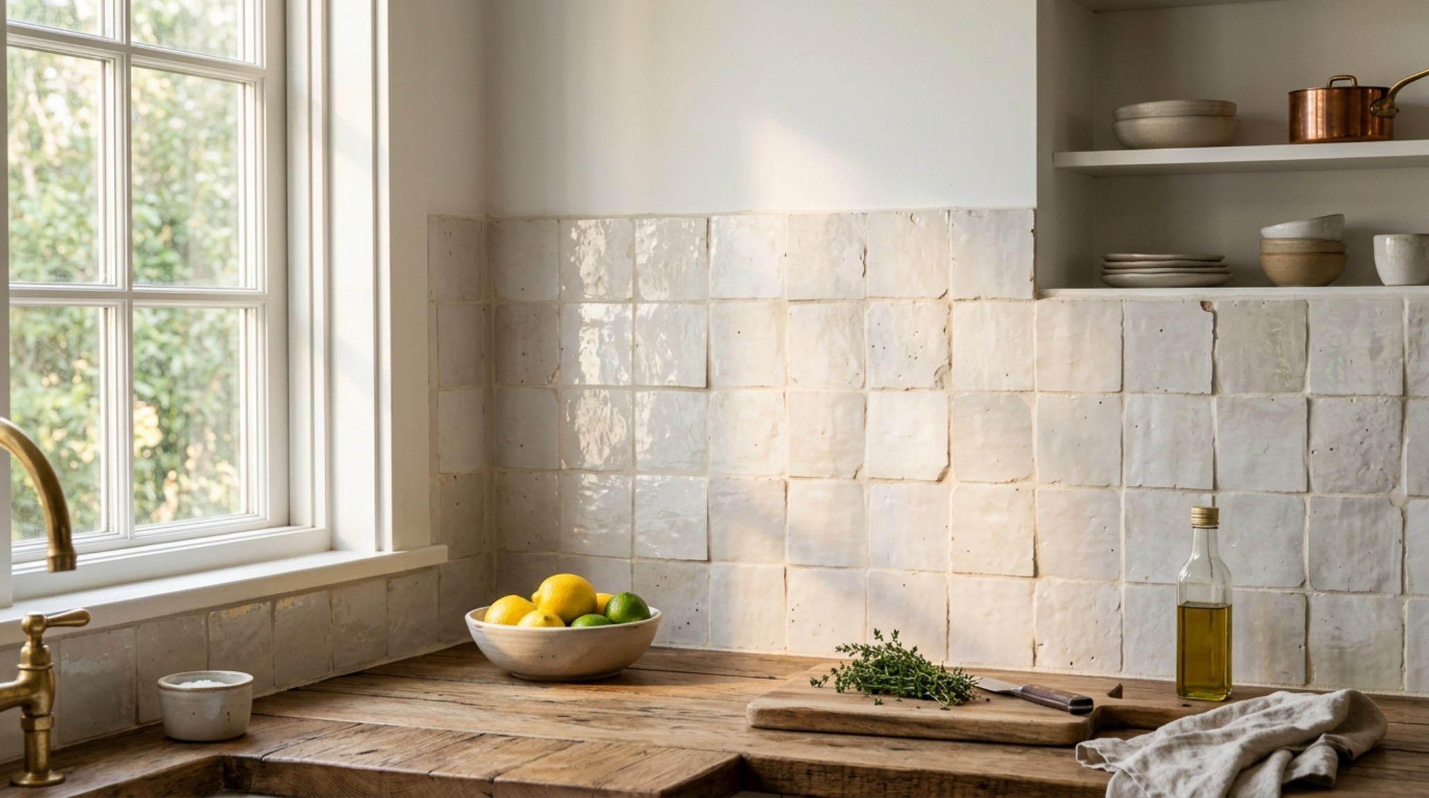
Artisanal Zellige Kitchen Ideas: The Poetry of Imperfection
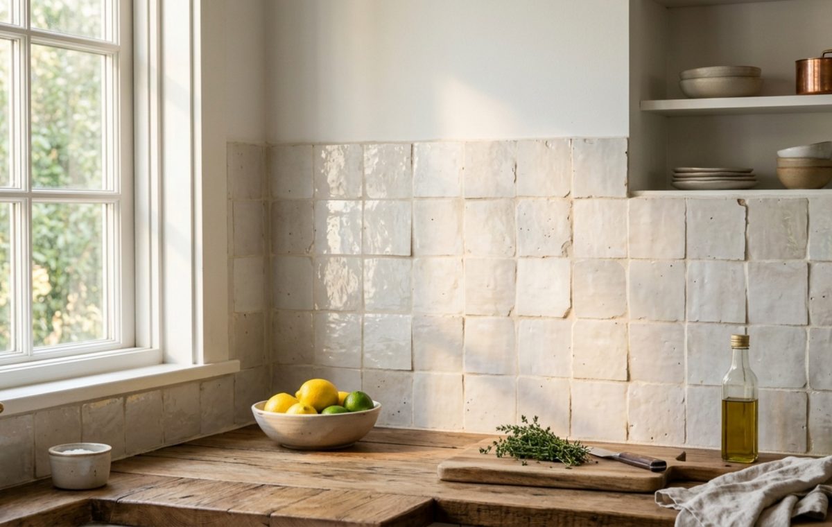
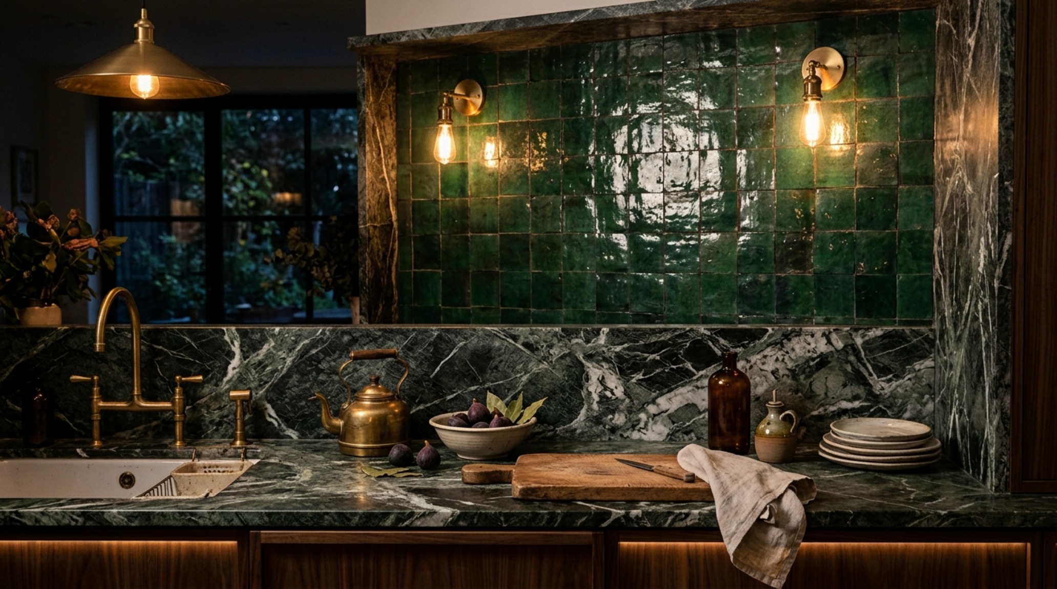
There is something inherently soulful about Zellige. These Moroccan terracotta tiles are chiseled by hand, ensuring that no two edges are perfectly square. When installed, they create an undulating surface that mimics the movement of water. Utilizing artisanal zellige kitchen ideas is less about choosing a color and more about selecting a mood. The high-gloss glaze on a Zellige tile acts as a mirror for the 2700K warm ambient light typical of a well-designed evening kitchen, while the raw, unglazed ‘biscuit’ of the clay provides a grounding, earthy contrast.
Designing with Zellige requires a departure from traditional perfectionism. The ‘butt-joint’ installation—where tiles are placed edge-to-edge without wide grout lines—emphasizes the organic silhouette of each piece. This creates a shimmering ‘texture-scape’ that pairs beautifully with the heavy, dramatic veining of a Paonazzo or Calacatta Viola marble. The contrast between the smooth, cool stone and the rippled, glassy tile creates a tactile warmth that feels both ancient and avant-garde. It is a curated look that avoids the ‘showroom’ feel by embracing the erratic beauty of the kiln.
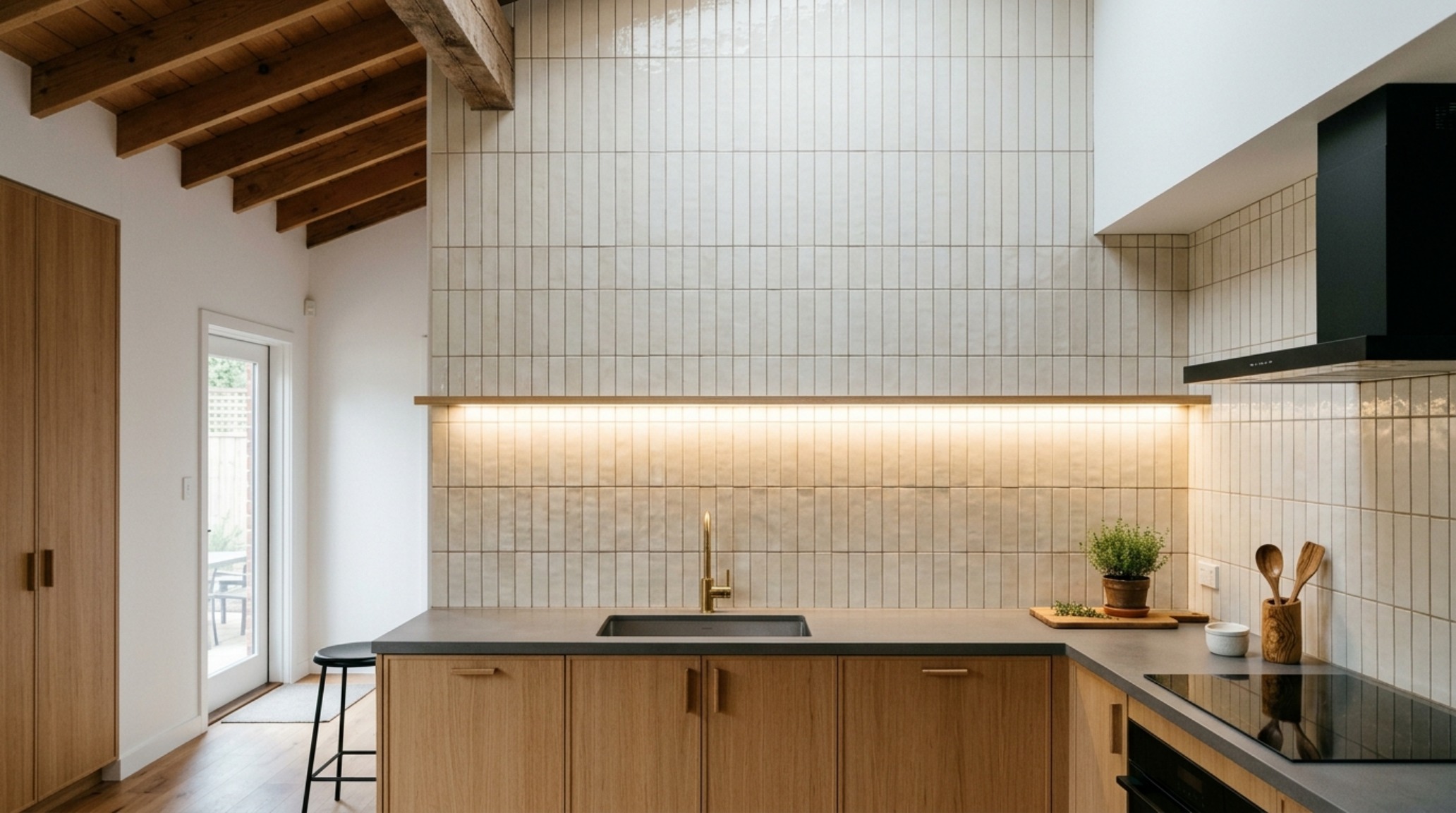
Verticality and the Ceiling-Height Backsplash Trend
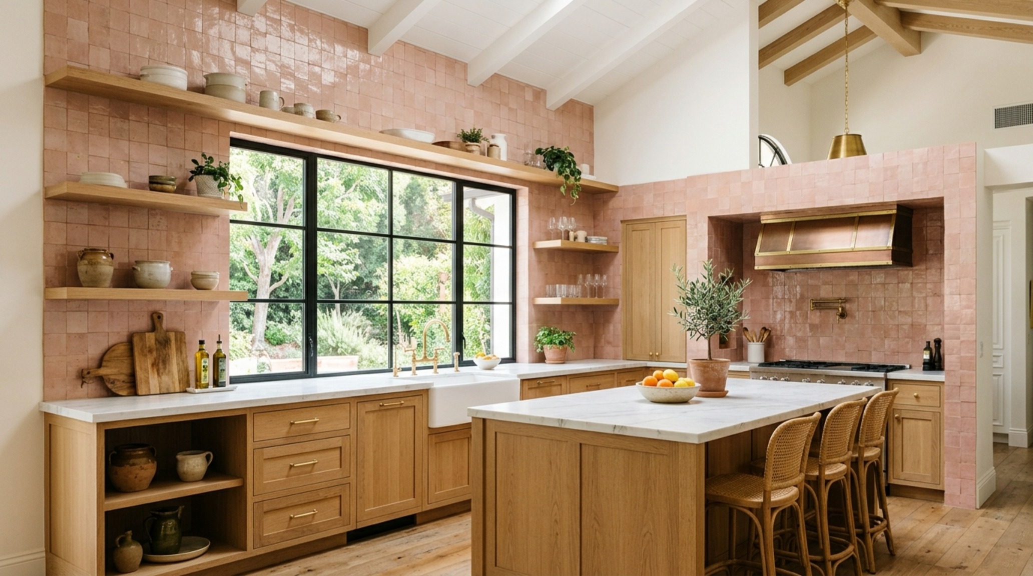
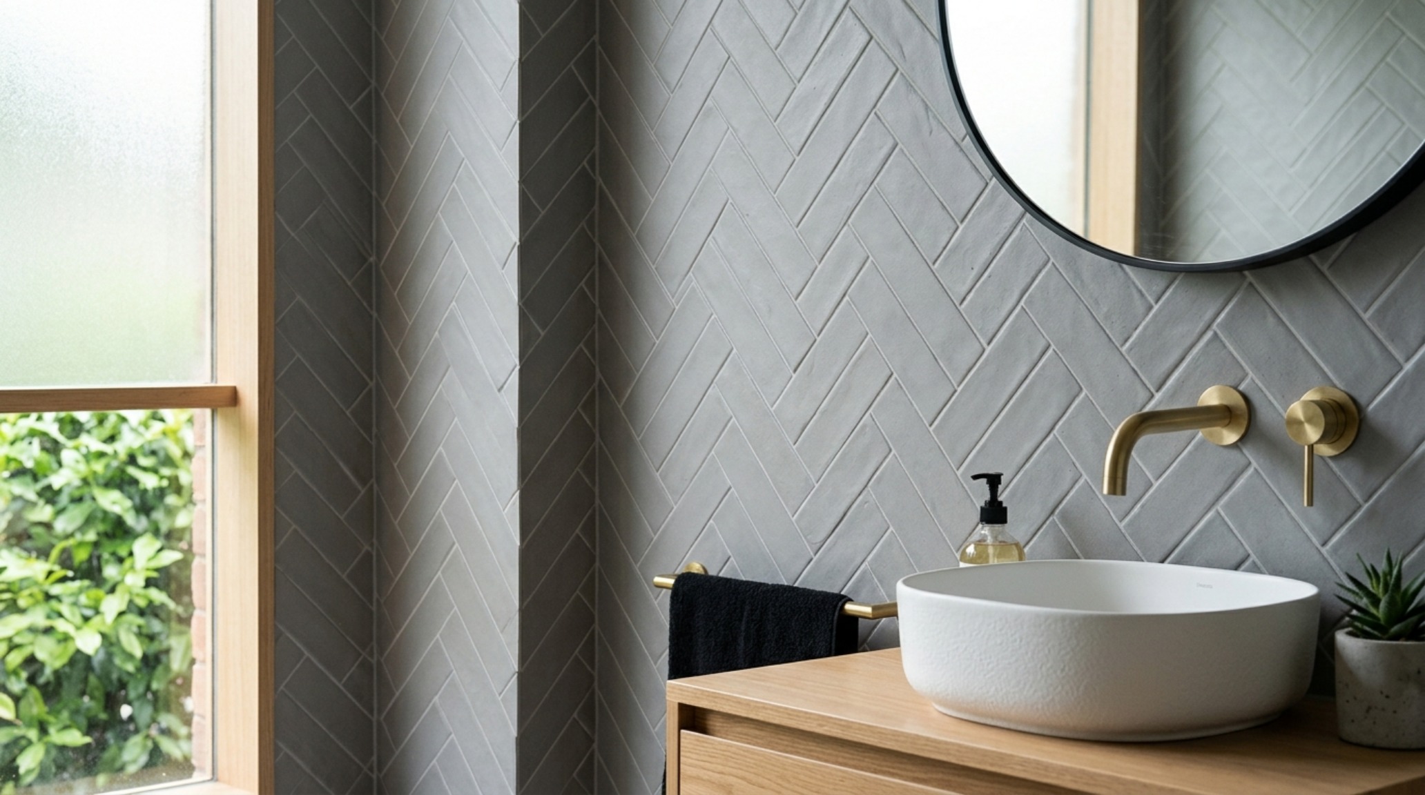
We are increasingly seeing designers abandon the traditional 18-inch backsplash in favor of a more monolithic approach. The ceiling-height backsplash trend is an exercise in spatial scale. By carrying the tile from the countertop all the way to the crown molding—or even wrapping it around windows—you eliminate the visual ‘stutter’ caused by a horizontal break. This draws the eye upward, significantly increasing the perceived volume of the room. It transforms the wall into a singular art installation rather than a functional afterthought.
When implementing this at scale, the choice of material becomes critical to avoid overwhelming the senses. A matte-finish tile in a soft, chalky hue like Farrow & Ball’s Setting Plaster can provide a quiet, architectural background that absorbs light rather than reflecting it aggressively. This is particularly effective in kitchens with high-CRI (90+) task lighting, where the texture of the tile becomes the primary ornament. The lack of negative space on the wall creates a sense of permanence and architectural intent that shorter backsplashes simply cannot achieve.
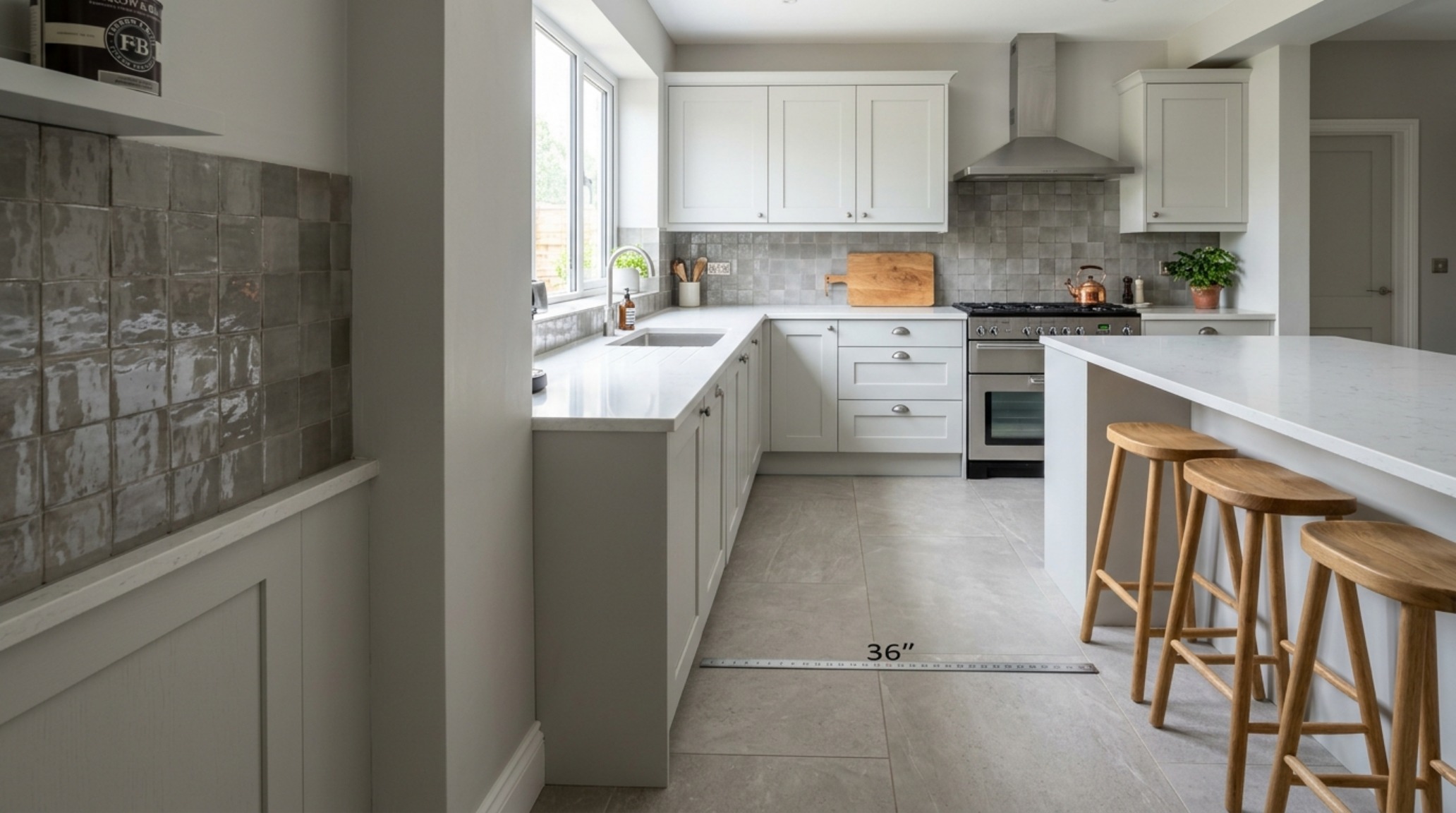
Porcelain vs Ceramic Kitchen Durability: The Technical Balance
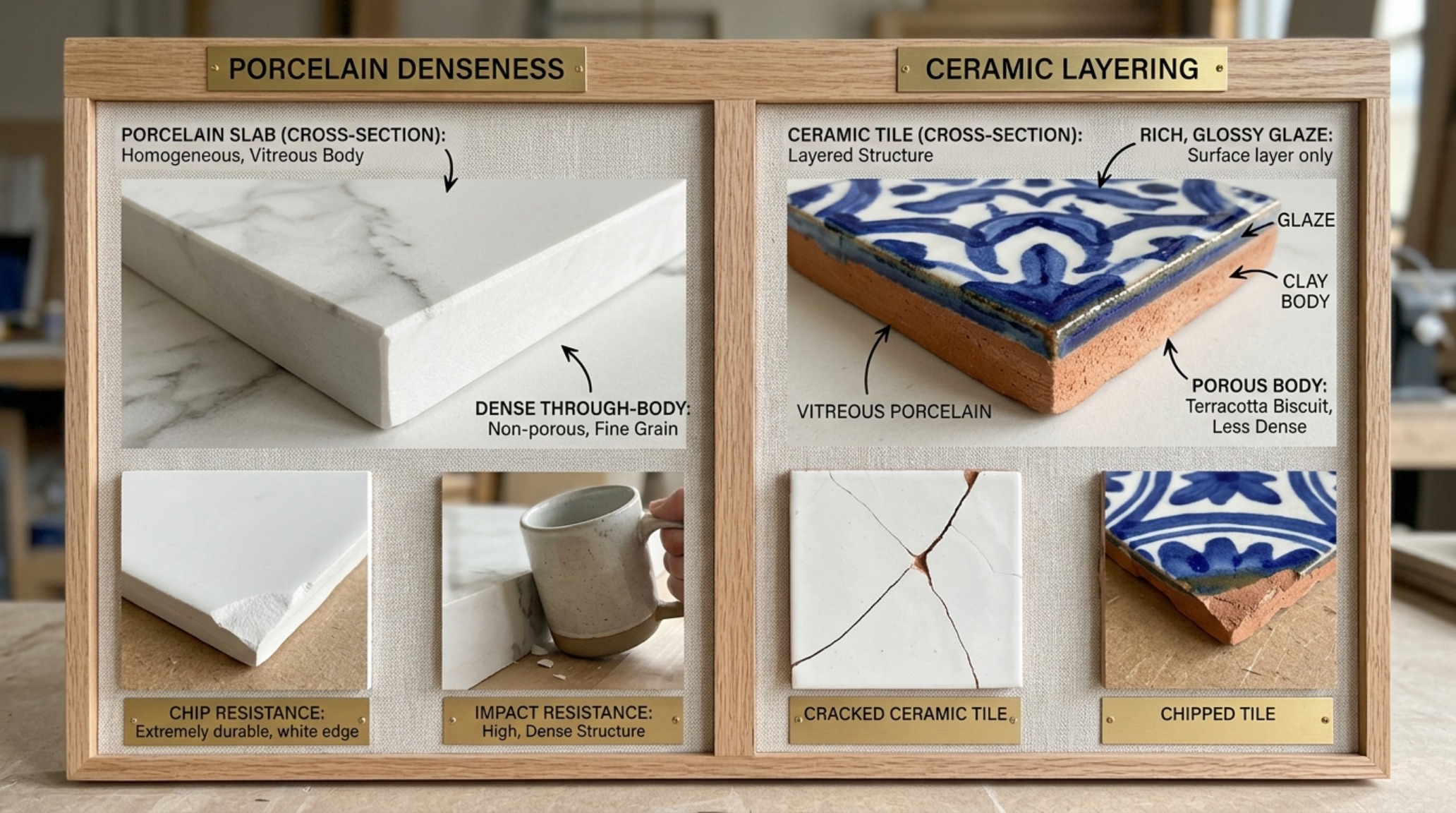
Beyond the aesthetic allure, we must ground our selections in the reality of the domestic environment. The debate regarding porcelain vs ceramic kitchen durability often centers on porosity and density. Porcelain, fired at higher temperatures and composed of denser clays, is the ‘marathon runner’ of kitchen tile options. It is nearly impervious to water and staining, making it the ideal candidate for floor-to-ceiling applications or high-traffic mudroom-kitchen transitions. Ceramic, while slightly softer, offers a broader palette for artisanal glazes and hand-painted details that porcelain struggle to replicate with the same depth.
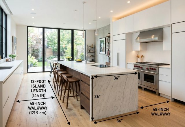
From a professional standpoint, I often recommend porcelain for the floor plane—where 36-inch standard walkway clearances must withstand the friction of daily life—and reserve the more delicate, high-character ceramics for the vertical planes. Modern digital printing on porcelain has reached a level of sophistication where it can mimic the ‘bleeding’ edges of handmade tiles, but for a truly bespoke environment, nothing replaces the tactile depth of a twice-fired ceramic glaze. It’s about choosing where to deploy durability and where to prioritize the artistic fingerprint.
Modern Subway Tile Layout Patterns: Beyond the Offset
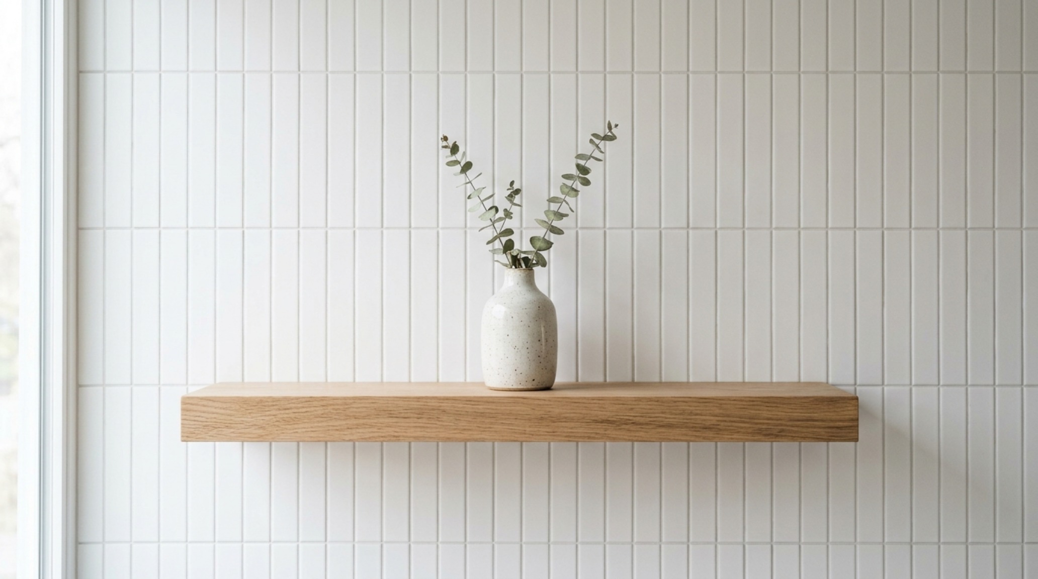
The ubiquity of the subway tile has led some to dismiss it as a cliché, but the true designer knows that the power of this format lies in its geometry. Modern subway tile layout patterns offer a way to reinvent a classic. Moving away from the traditional 50/50 brick offset, we are seeing a surge in vertical stack bonds and ‘herringbone-sideways’ configurations. A vertical stack bond, for instance, emphasizes the height of the kitchen and creates a clean, mid-century modern rhythm that feels fresh and structured.
Consider a long-format 2×8 or 2×10 tile. When stacked vertically, the linear grout lines act as architectural pinstripes. This layout works exceptionally well in kitchens featuring floating shelves rather than upper cabinets, as it provides a disciplined backdrop for curated ceramics and glassware. The key to making these patterns feel sophisticated rather than busy is the relationship between the tile and the grout. A monochromatic approach—where the grout is matched perfectly to the tile—prioritizes texture, while a slight contrast can highlight the mathematical precision of the layout.
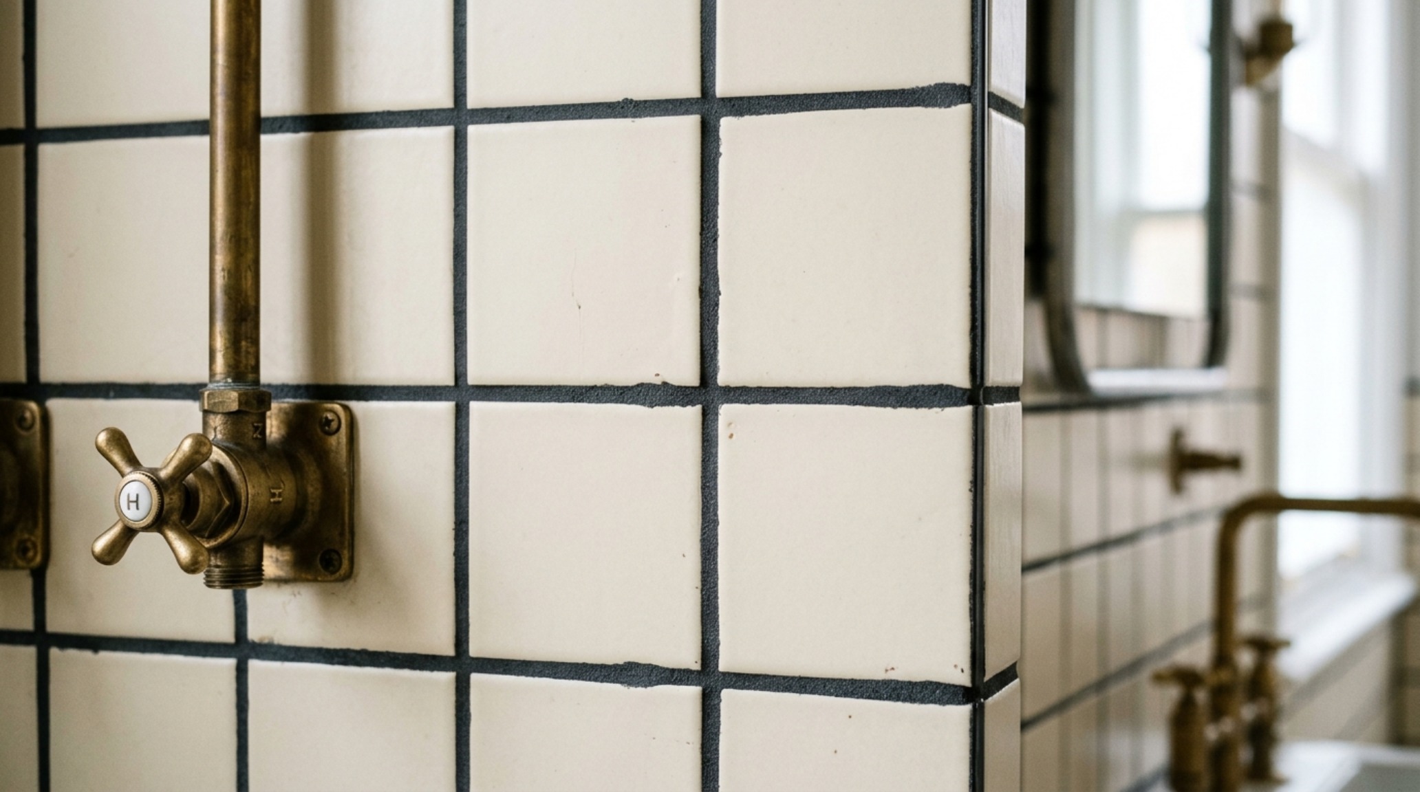
High-Contrast Grout Design: The Graphic Frame
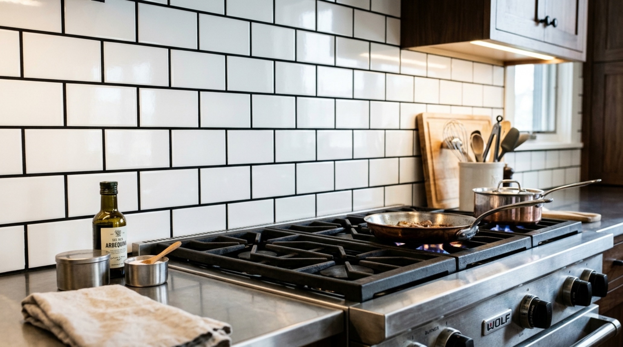
Speaking of grout, it is the often-overlooked ‘connective tissue’ of kitchen design. High-contrast grout design is a powerful tool for those looking to add a graphic, illustrative quality to their space. By pairing a light tile with a deep charcoal or slate grout, you define the boundaries of every individual unit. This turns a simple wall into a grid-like pattern that grounds the room. It’s a technique often found in industrial-leaning lofts or modern farmhouses where architectural definition is paramount.
However, the alchemy here is delicate. If the contrast is too sharp, the wall can become visually ‘noisy,’ causing the eye to dance restlessly rather than rest. The sweet spot often lies in tonal contrast rather than absolute black-and-white. For example, a warm terracotta tile paired with a sand-colored grout provides enough definition to show the ‘hand’ of the installer without the harshness of a dark line. This approach celebrates the assembly of the wall, making the construction process a visible part of the design narrative.
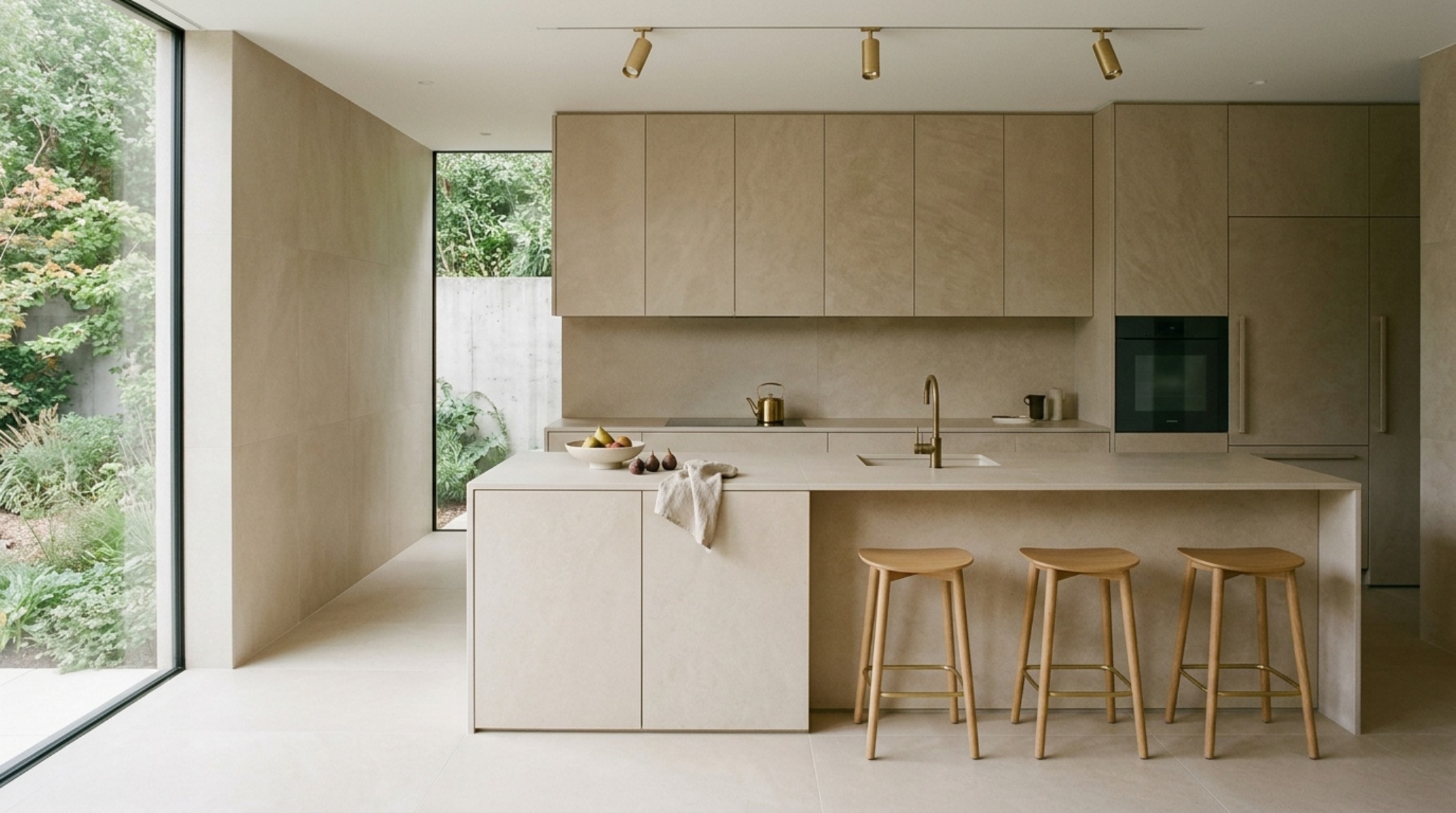
Integrated Floor and Wall Tile Systems: The Monolithic Flow
One of the most sophisticated movements in current residential architecture is the use of integrated floor and wall tile systems. This concept treats the kitchen as a singular, carved volume. By using the same material—or perfectly coordinated variations of it—for both the flooring and the backsplash, the boundaries of the room begin to blur. This creates a sense of ‘spatial calm’ that is incredibly luxurious. It removes the visual noise of material transitions, allowing the furniture-like quality of the cabinetry to take center stage.
This ‘total look’ is particularly effective in open-plan living where the kitchen must feel like a natural extension of the architecture rather than a separate ‘utility’ zone. Using a large-format porcelain that mimics honed limestone across both planes creates a seamlessness that is usually only achievable with incredibly expensive stone slabs. When the floor plane flows into the wall plane without a jarring change in texture or color, the kitchen feels larger, more cohesive, and deeply intentional. It is the ultimate expression of the ‘Alchemy of Surface’—where the material itself becomes the architecture.
Material Schedule & Architectural Clearances
Summary of authentic finishes, designer paint selections, and standard architectural clearances.
The mastery of a kitchen’s atmosphere is found in the silent interplay between light and texture. It is a slow revelation, discovered as the morning sun hits a faceted glaze or as the hand brushes against the cool, irregular edge of a terracotta tile. In navigating the vast landscape of kitchen tile options, we are ultimately choosing the backdrop for our most intimate domestic rituals. Whether through the bold verticality of a ceiling-height installation or the quiet, monochromatic rhythm of a stacked bond, the alchemy of surface ensures that the kitchen remains not just a place of production, but a place of profound sensory resonance.
Editorial Silo • Recommended Architecture Studies
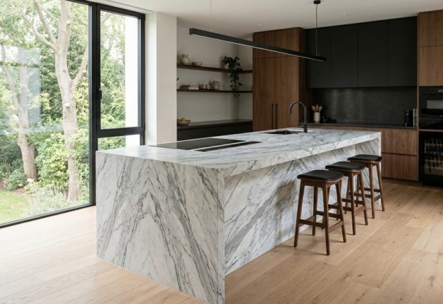
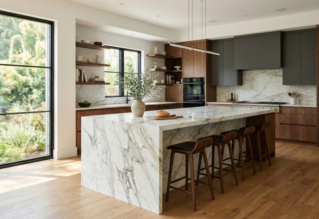
- Monolithic Luxury: Large Kitchen Island Designs & Materiality and Visual Drama in Oversized Island Curation — Archival Design Case Study
- The Architecture of Air: Mastering the Structural Flow of the Modern Style Kitchen — Archival Design Case Study
Design & Materiality Gallery
Visual documentation of honest materials, natural ambient lighting, and refined architectural balance.
Curated Visual Lookbook
Design Gallery & Spatial Studies
A visual curation of architectural arrangements, lighting concepts, and material palettes featured in this space.