Modern interior design advice must evolve beyond the superficial obsession with ‘trends’ to embrace a more rigorous understanding of how spatial volume and material density dictate human emotion.
In the contemporary landscape of home curation, we often find ourselves trapped in a cycle of visual mimicry. We scroll through digital galleries, attempting to replicate a ‘look’ without understanding the ‘feel.’ To move beyond the two-dimensional allure of a Pinterest board, one must treat the home as a living, breathing organism. Atmosphere is not a happy accident; it is the calculated alchemy of light, tactile materials, and the quiet rhythms of daily movement. When we talk about shifting the focus from the visual to the visceral, we are discussing the transition from a house that looks like a showroom to a residence that resonates with the soul. This requires a departure from the generic and a deep dive into the nuanced layering of shadow and substance.
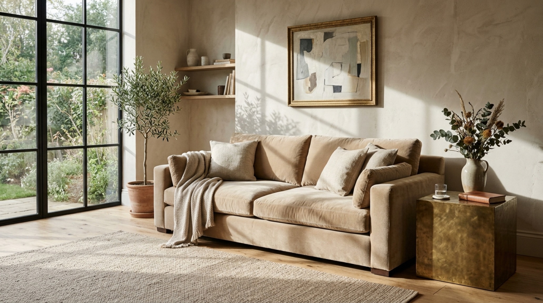
Professional interior design secrets: Reimagining the 60-30-10 Framework
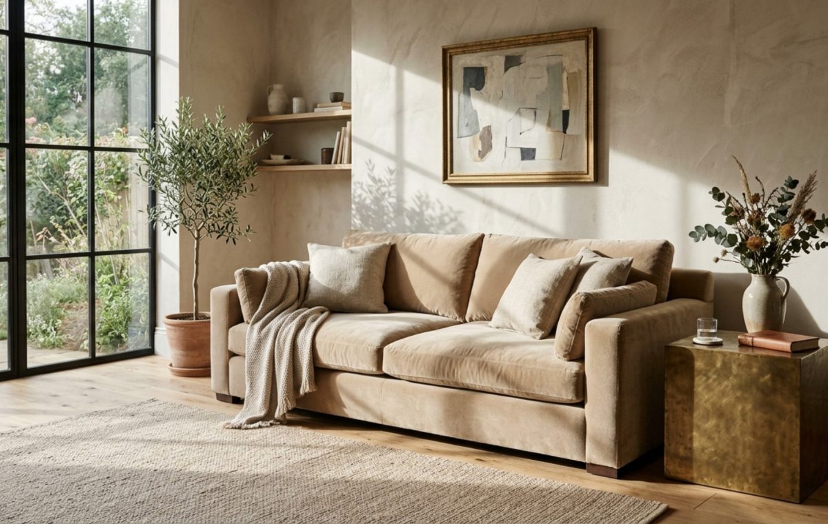
The 60-30-10 rule is frequently cited as the gold standard for color distribution: 60% dominant color, 30% secondary, and 10% accent. However, the most sophisticated spaces use this ratio as a skeleton for materiality rather than just pigment. Imagine the 60% not as a flat paint color like Benjamin Moore Swiss Coffee, but as a textural foundation. This might manifest as the vast, expansive grain of wide-plank European white oak flooring or the rhythmic application of lime-wash plaster. By assigning texture to these proportions, the room gains a three-dimensional depth that matte paint simply cannot provide. The 30% secondary layer then becomes the tactile counterpoint—perhaps the cool, matte touch of honed travertine or the heavy, inviting drape of Belgian linen. The final 10% is where we introduce the ‘jewels’: unlacquered brass hardware that patinas over time or a singular piece of charcoal-stained walnut that anchors the visual field.
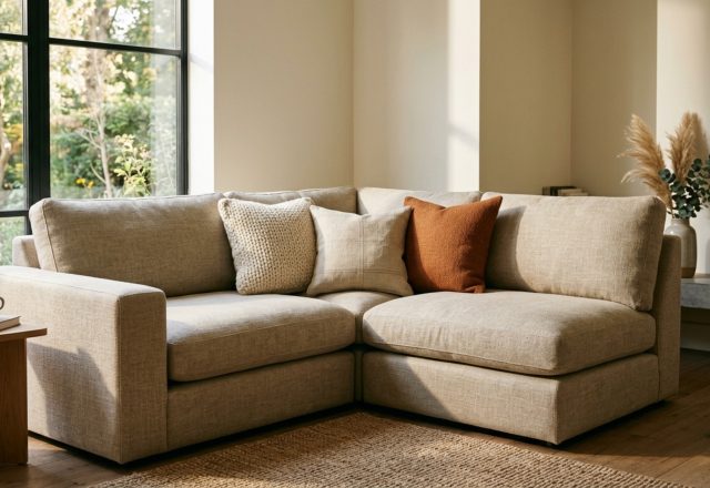
Authenticity in design is rarely found in the pristine. It lives in the slight imperfections of a hand-knotted wool rug or the way a leather ottoman softens with age. When we apply professional interior design secrets, we are looking for ways to invite these organic narratives into the home. It’s about understanding that a room needs ‘weight.’ A space filled entirely with light, leggy furniture lacks grounding. You need the gravity of a stone plinth or a deep-seated sofa to tell the eye—and the body—that this is a place of permanence and rest. This balance of visual mass is what separates a professionally curated room from one that feels transient.
Sustainable material selection and the Longevity of Touch
The shift toward sustainable material selection is no longer just an ethical choice; it is a fundamental pillar of creating an atmospheric home. Materials that come from the earth possess an inherent warmth that synthetic alternatives fail to replicate. Consider the difference between a high-pressure laminate and a solid wood surface. The latter breathes, shifts with the seasons, and reflects light with a softness that is scientifically proven to lower cortisol levels. When selecting materials, I often lean toward those that tell a story of their origin. Reclaimed timber with original saw marks or terracotta tiles fired in traditional kilns bring an ancestral quality to a modern interior, bridging the gap between historical weight and contemporary minimalism.
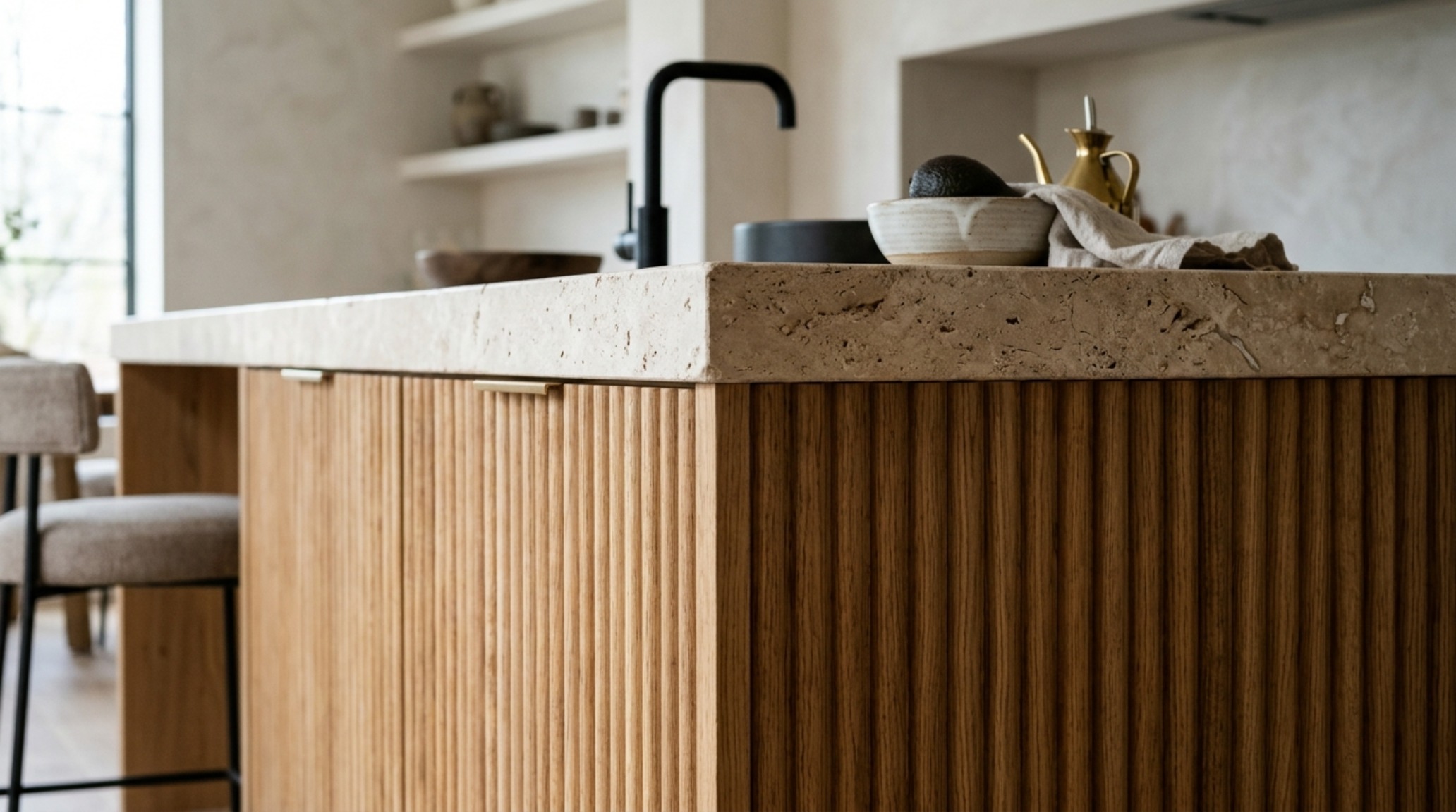
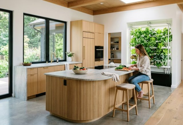
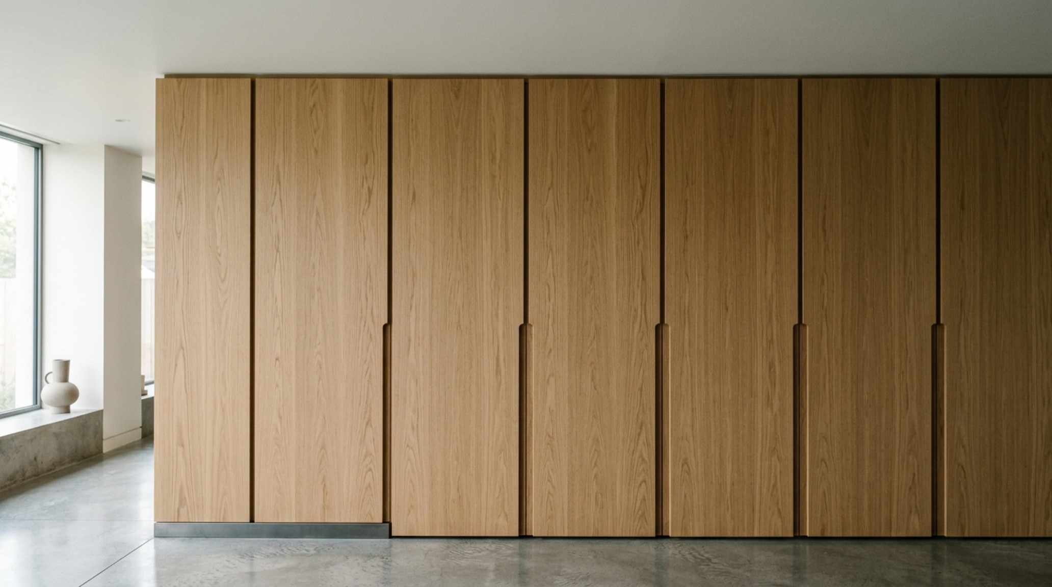
In the kitchen, this material-first approach dictates everything from the countertop to the cabinetry. A fluted oak island doesn’t just look interesting; it provides a tactile rhythm as you walk past it. We pair this with honed marble—not polished—because the matte finish invites the hand to touch it. There is a quiet luxury in the ‘leathered’ or ‘brushed’ finish of a stone, which hides the fingerprints of daily life while offering a sensory experience that is far more sophisticated than a high-gloss slab. This is where the intersection of functionality and feeling occurs; a material that is durable enough for a busy family but beautiful enough to be considered art.
Architectural Vignettes & Spatial Flow: The Geometry of Human Experience
True luxury is never just about the price tag of the furniture; it is about the luxury of space and the ease of movement. One of the most critical architectural flow and layout principles involves the ’36-inch rule.’ In any primary circulation path, 36 inches of clearance is the non-negotiable standard for a comfortable walkway. This allows two people to pass without the awkward ‘sideways shuffle.’ When we ignore these clearances, the atmosphere immediately feels constricted and anxious. Even the most beautifully decorated room will feel ‘off’ if you are constantly bumping into the corner of a coffee table or struggling to pull out a dining chair.
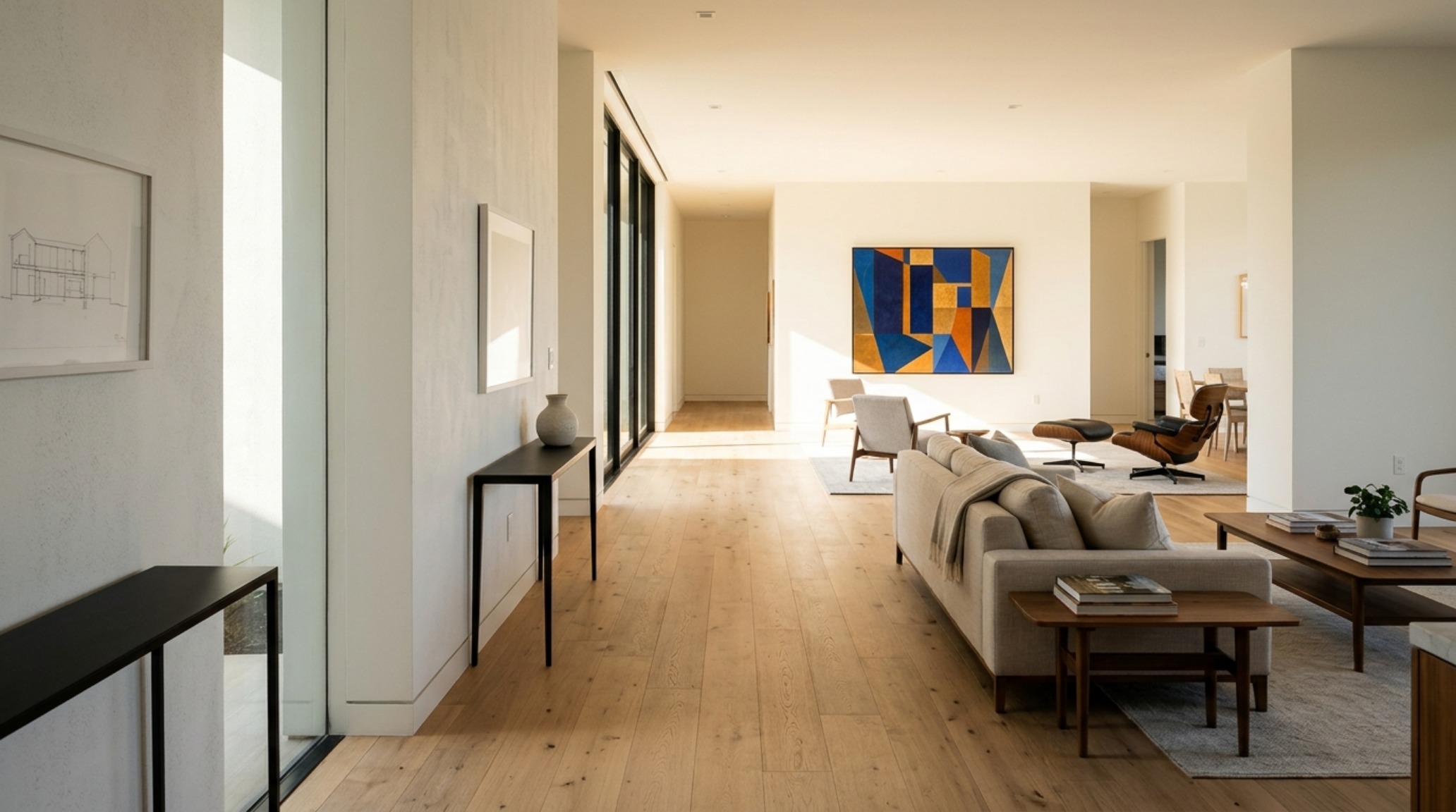
Speaking of coffee tables, the ’18-inch reach’ is a detail that many homeowners overlook. A coffee table should sit approximately 18 inches from the edge of the sofa. Any further, and you’re reaching; any closer, and you’re tripping. These micro-measurements are the invisible threads that hold a room together. Similarly, dining chairs require at least 30 inches of clearance from the table to the nearest wall or piece of furniture to allow for a graceful exit. When these spatial requirements are met, the room achieves a sense of ‘spatial cadence’—a natural rhythm that guides the inhabitant through the home without friction.
Small space design rules: Opening the Floor Plane
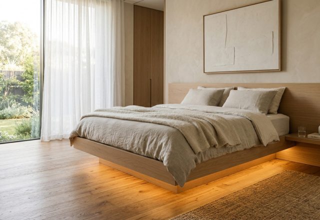
Designing for a limited footprint requires a tactical approach to ‘visual floor area.’ One of the most effective small space design rules is the use of floating elements. Whether it’s a wall-hung vanity in a powder room or a floating credenza in a narrow hallway, exposing more of the floor plane tricks the eye into perceiving a larger volume of space. When the floor extends all the way to the wall, the boundaries of the room are pushed outward. We also look to verticality; floor-to-ceiling drapery in a neutral tone like Farrow & Ball Ammonite can make an 8-foot ceiling feel like a 10-foot vault. The eye follows the line upward, creating an illusion of grandeur in even the most modest apartment.
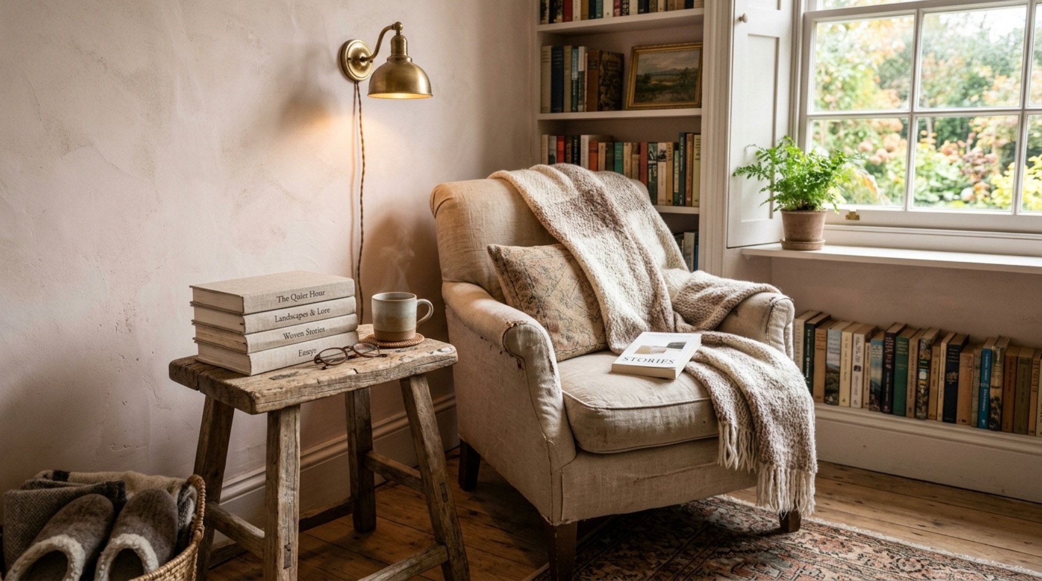
Lighting in small spaces must be layered with surgical precision. We avoid the ‘interrogation room’ effect of a single overhead light. Instead, we utilize the ‘three-point lighting’ system: ambient, task, and accent. For an atmospheric glow, I recommend 2700K warm LED bulbs with a high Color Rendering Index (CRI) of 90+. This ensures that the colors of your fabrics and paints appear true to life, avoiding the sickly green or blue tints often found in lower-quality LEDs. In a small space, a well-placed wall sconce at eye level can create a ‘pool of light’ that makes the room feel intimate rather than cramped.
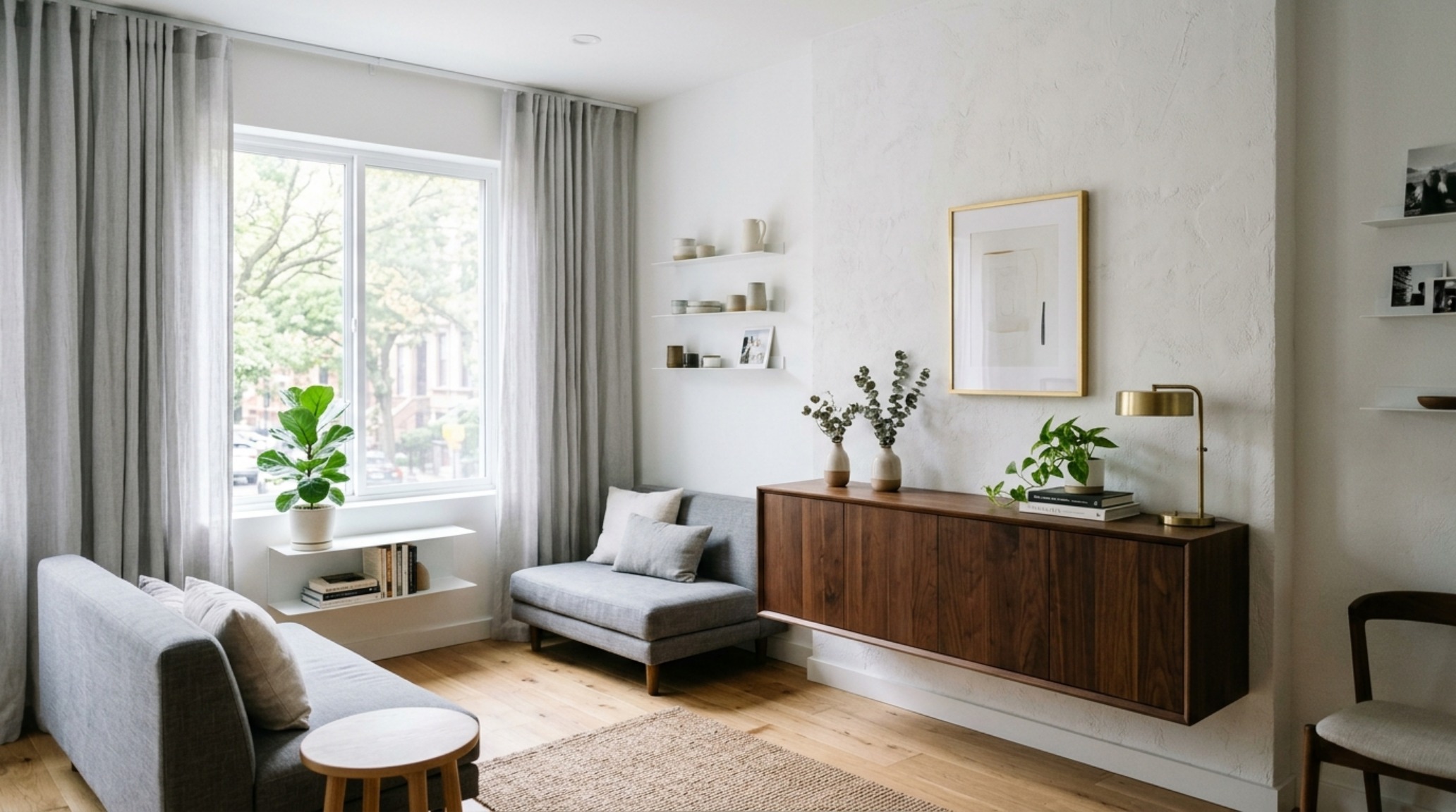
Luxury home styling tips for the Lived-In Narrative
Styling is the final layer of the alchemy. It is the bridge between architecture and autobiography. To master luxury home styling tips, one must embrace the power of ‘negative space’—the breathing room between objects. A common mistake is filling every surface with ‘stuff.’ A professional eye knows that a single, large-scale ceramic vessel on a console table is far more impactful than a cluster of ten small trinkets. We look for ‘visual anchors’—objects that have enough scale to command attention and hold the eye. This could be a large-scale piece of abstract art or a sculptural branch in a heavy glass vase.
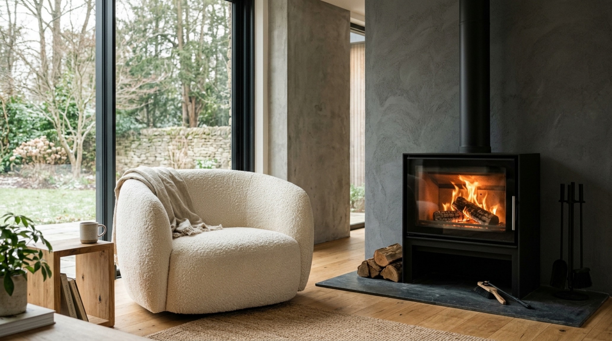
Layering is also about the juxtaposition of ‘hard’ and ‘soft.’ If you have a room with lots of hard angles—rectangular windows, a square rug, a boxy sofa—you must introduce curves to soften the spatial tension. A round marble plinth, a curved back armchair, or even a circular mirror can break the ‘grid’ and make the room feel more organic and inviting. This is the essence of ‘tactile grounding.’ We want the eye to move smoothly across the room, encountering different textures and shapes that evoke a sense of calm and balance.
Design principles for homeowners: Cultivating Intentionality
Ultimately, the most successful homes are those that reflect the specific souls who inhabit them. Following design principles for homeowners shouldn’t mean following a rigid guidebook; it should mean developing a personal filter for what adds value to your life. Every piece of furniture, every swatch of fabric, and every light fixture should pass the ‘visceral test.’ Does this material feel good? Does this light make me feel energized or relaxed? Does this layout facilitate the way my family actually lives, or is it designed for a lifestyle we don’t lead?
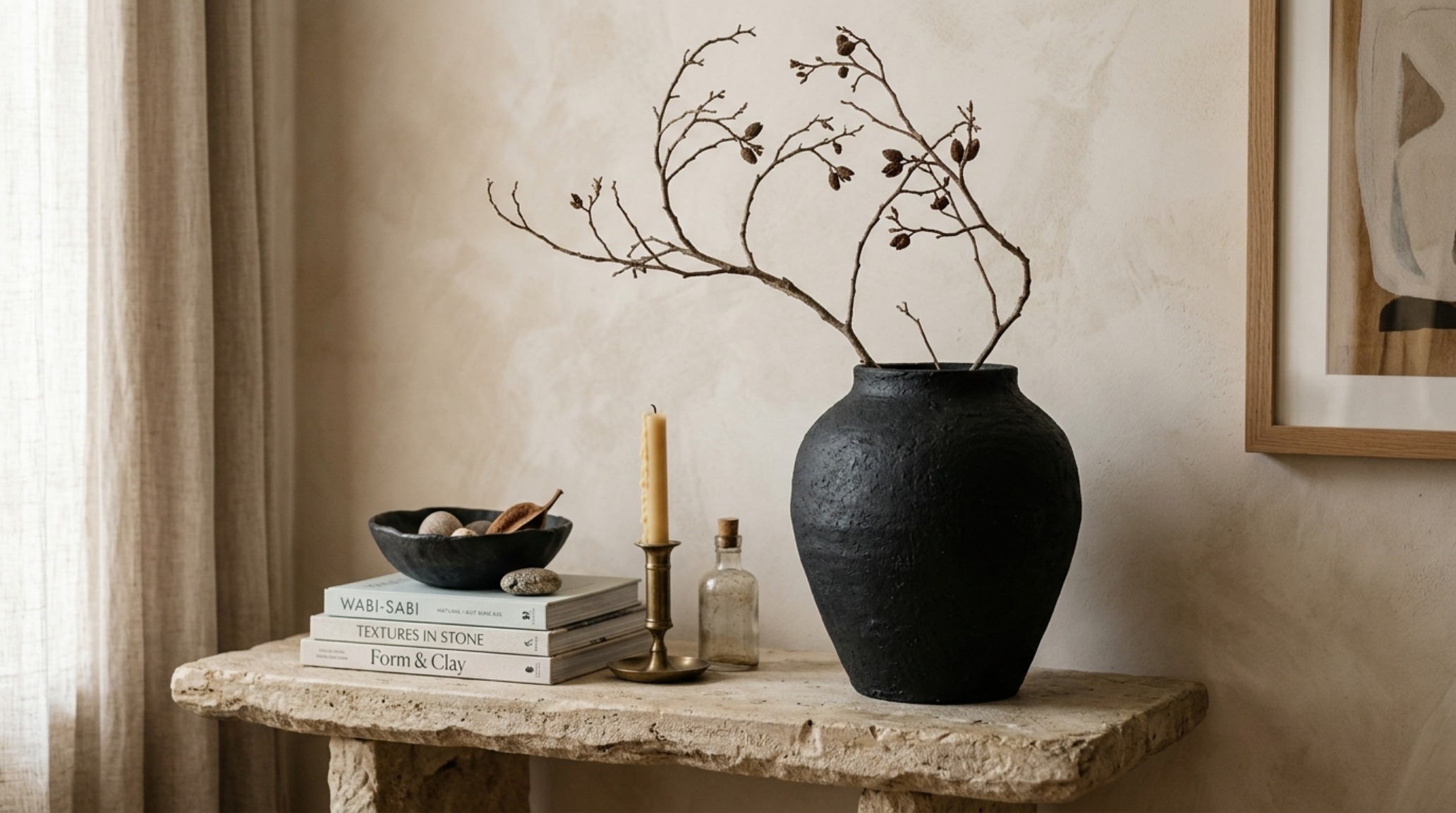
We often talk about ‘sightline alignment’—the view you have when you enter a room or sit in a specific chair. A well-designed home offers ‘vignettes’ at every turn. When you walk through the front door, your eye should be drawn to a focal point—perhaps a window looking out onto a garden, a piece of art, or a beautifully styled bookshelf. This creates a sense of discovery as you move through the house. It’s not about showing everything at once; it’s about a gradual reveal of the home’s personality.
Structural Finishes & Design Anatomy
Curated architectural summary documenting material selections, color swatches, and spatial flow.
The creation of a truly resonant interior is a slow process of curation, an ongoing dialogue between the structure and the occupant. It is about honoring the passage of light throughout the day, the weight of a stone surface under a hand, and the effortless flow of movement through a hallway. When we look at our homes not as a collection of things, but as a series of sensory experiences, we move away from the ephemeral and toward the eternal. It is in this quiet, considered intersection of shadow, texture, and geometry that a house finally becomes a sanctuary, standing as a silent partner to the life lived within its walls.
Editorial Silo • Recommended Architecture Studies
- Beds That Save Space: The Architectural Blueprint & Spatial Flow Guide — Archival Design Case Study
- The Closed-Loop Life: Mastering the Functional Ergonomics of Self Sustaining Homes — Archival Design Case Study
Modern Spatial Living Lookbook
Detailed photographic vignettes showcasing texture balances, lighting nuances, and functional luxury.
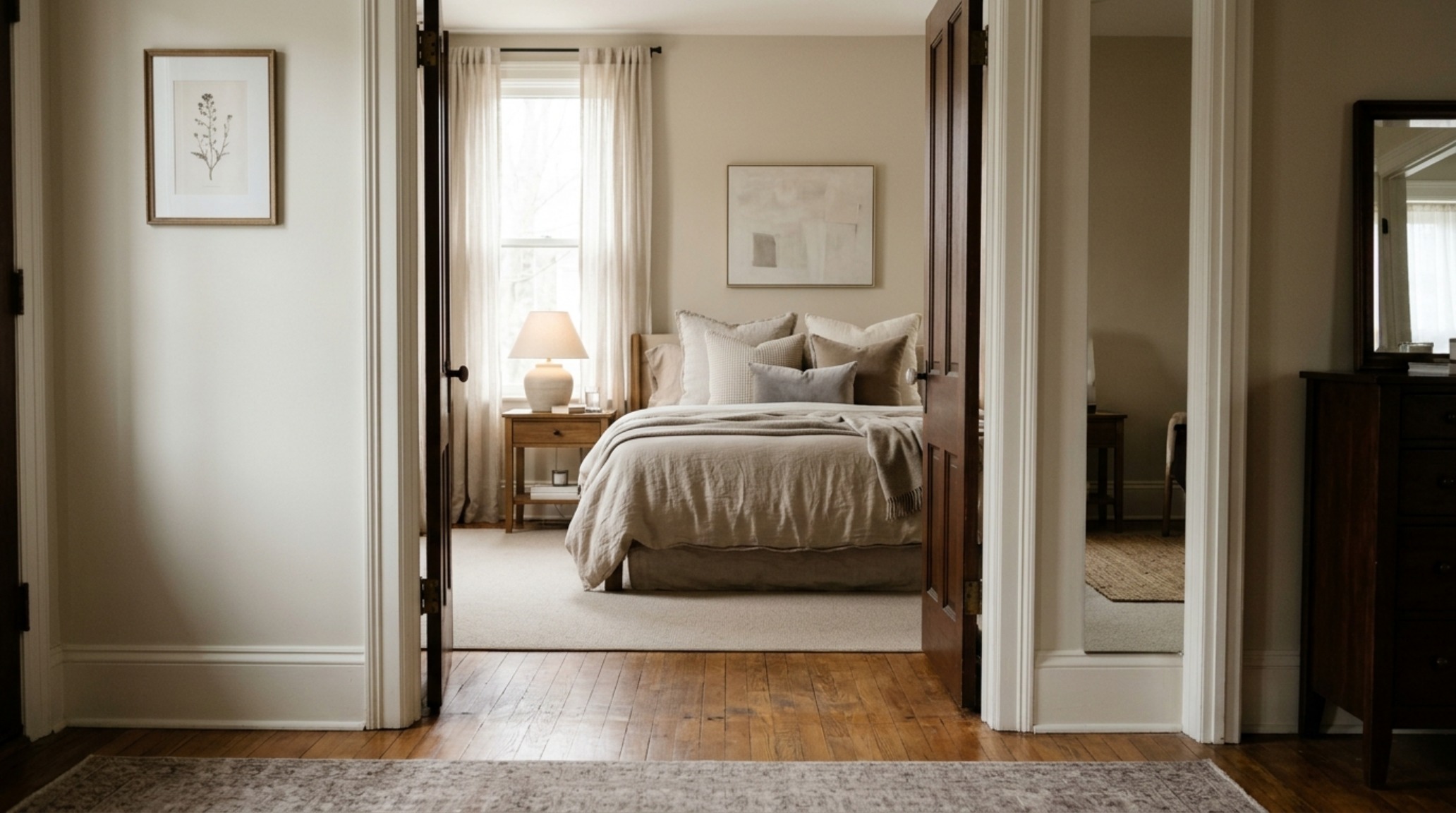
Curated Visual Lookbook
Design Gallery & Spatial Studies
A visual curation of architectural arrangements, lighting concepts, and material palettes featured in this space.