The Tactile Material Dialogue: Beyond the Floor Plan
The cool, velvet-like drag of honed travertine beneath a fingertip, meeting the grainy resistance of rift-sawn oak, isn’t just a material choice—it’s the beginning of a spatial dialogue. When you begin to design your kitchen layout, you aren’t merely placing boxes against a wall; you are choreographing the way light catches a curve and how shadow pools in the corners of a functional sanctuary. We have long been tethered to the rigid efficiency of the mid-century work triangle, but the modern culinary studio demands a more sensory approach. It requires us to map out ‘Atmospheric Zones’ where the friction of a limestone countertop or the soft reflection of a lime-wash wall dictates our movement. This is about spatial cadence—the rhythm of stepping from a sun-drenched prep station to a moody, recessed pantry alcove. By prioritizing the tactile experience, we ground the technical requirements of the room in something far more human. The goal is to move beyond the blueprint and into the realm of felt experience, where every inch of the floor plan is earned through both utility and beauty.
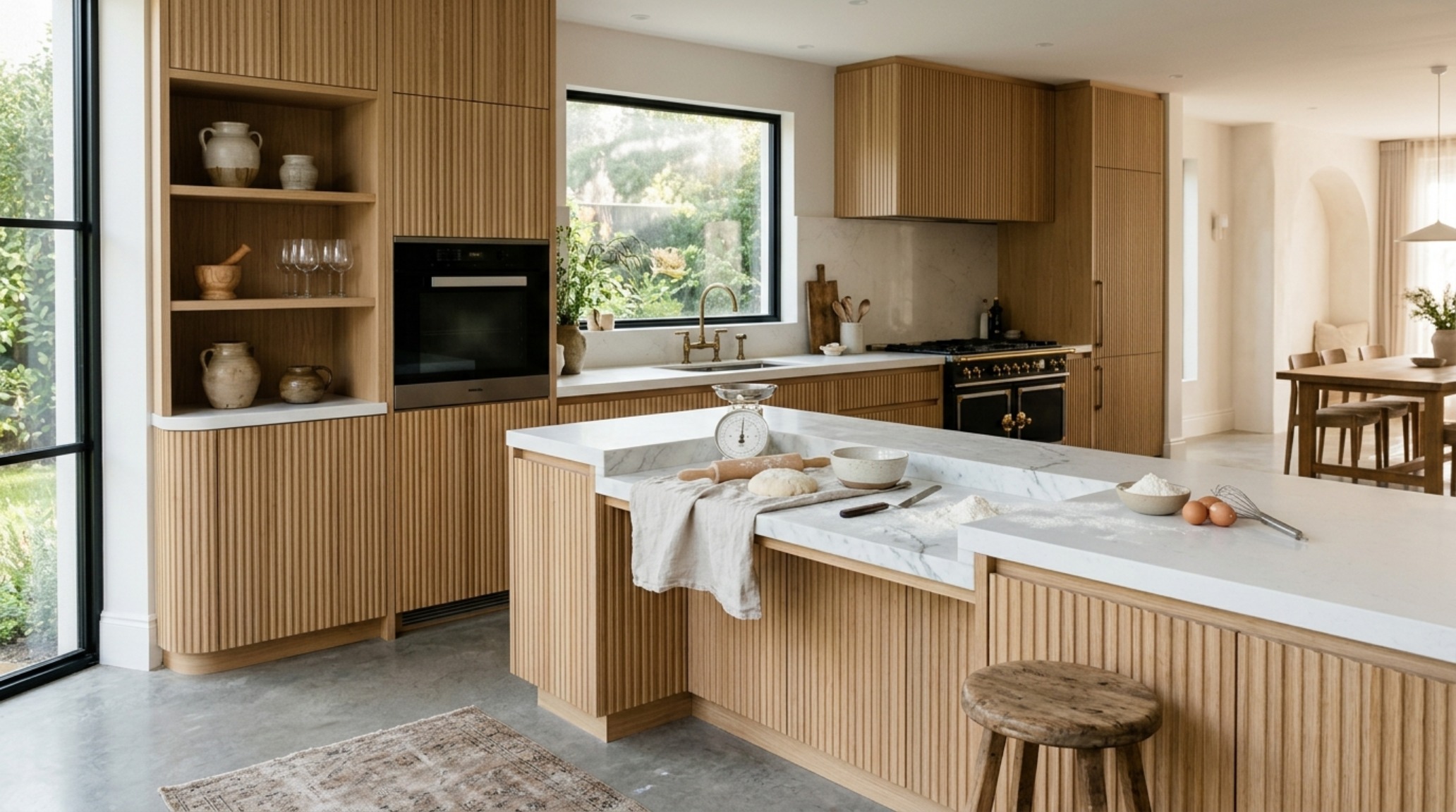
Zonal Kitchen Planning vs Work Triangle: The Modern Pivot
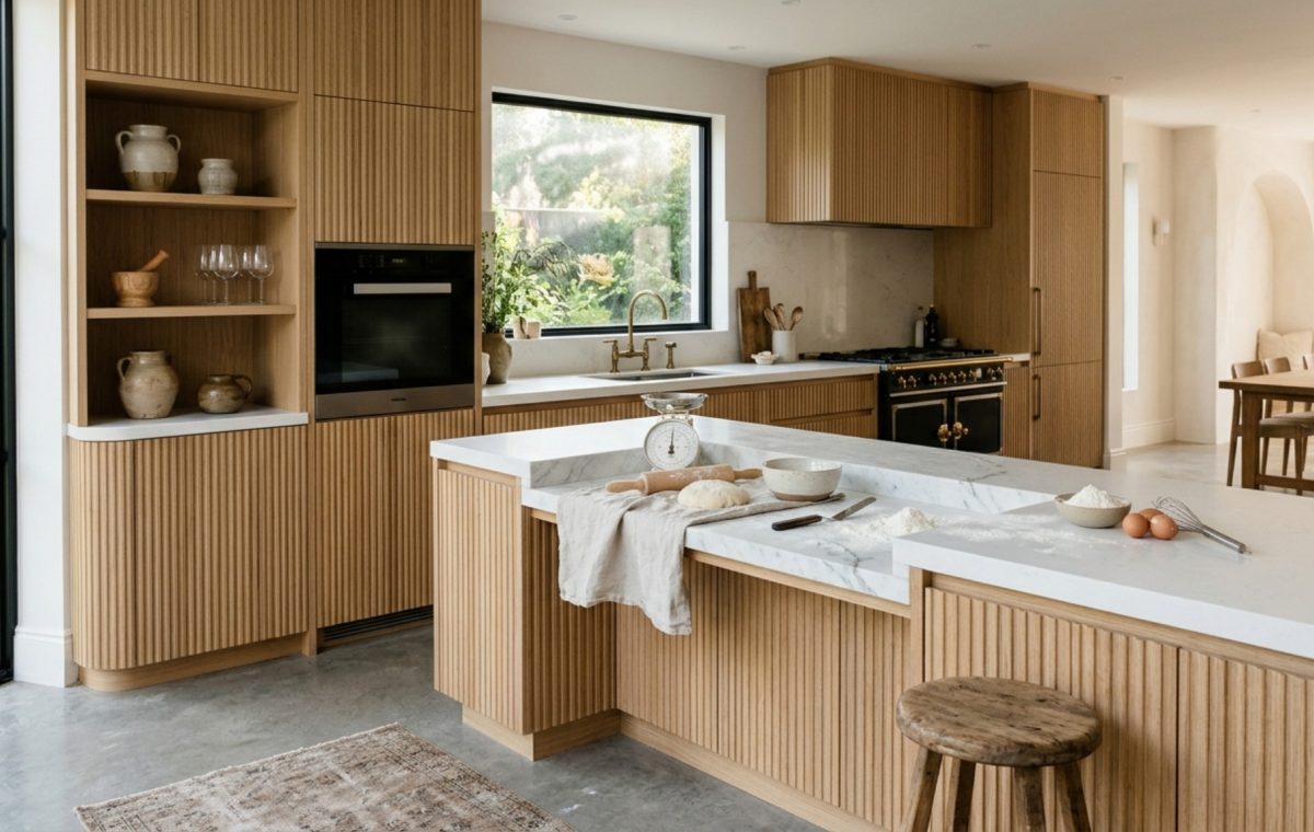
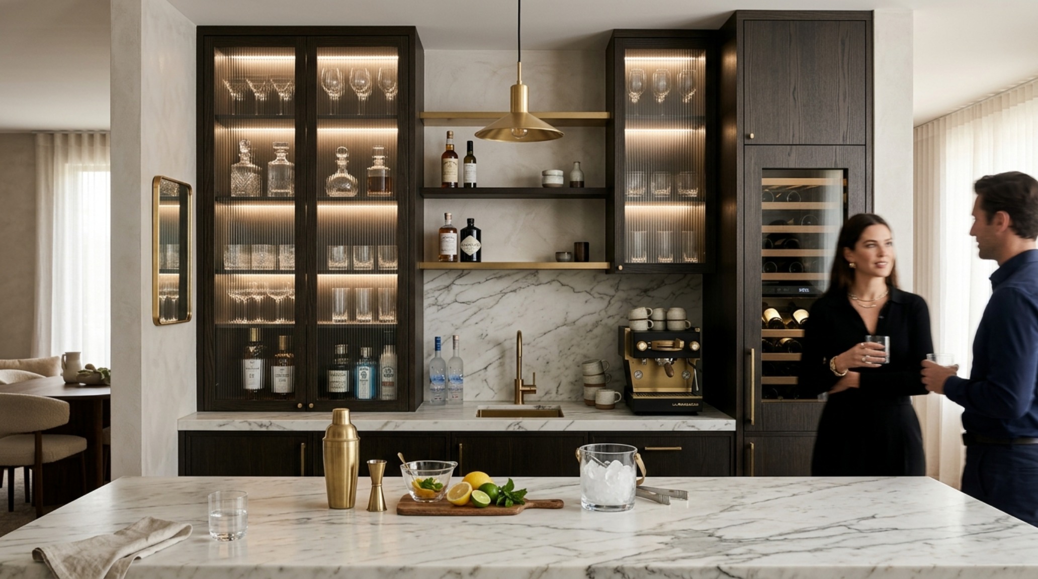
For decades, the work triangle—the path between the sink, refrigerator, and stove—was the gold standard of efficiency. However, as our kitchens have expanded into multi-functional living hubs, this linear thinking often falls short. Enter zonal kitchen planning vs work triangle methodologies. Instead of three points of contact, we now design for clusters of activity. A ‘Baking Zone’ might feature a lowered counter height of 30 inches to allow for better leverage when kneading dough, clad in a naturally cool marble that regulates pastry temperature. Contrast this with a ‘Social Zone’ centered around a large island where the materiality shifts to a warmer, brushed walnut. By thinking in zones, you eliminate the frantic cross-room sprint, allowing for multiple inhabitants to operate without collision. This approach respects the architectural volume of the room, ensuring that heavy-duty tasks are sequestered in high-utility corners while the social flow remains unobstructed. It transforms the kitchen from a laboratory of labor into a curated studio where every task has its own micro-environment, defined by both its physical boundaries and its tactile finishes.
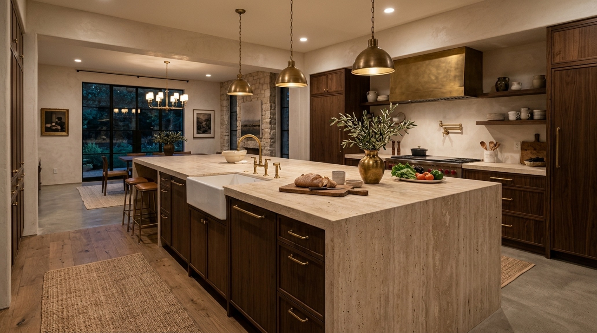
The Kitchen Island Placement Guide: Navigating Social Volumes
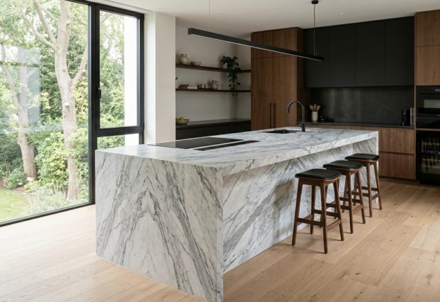
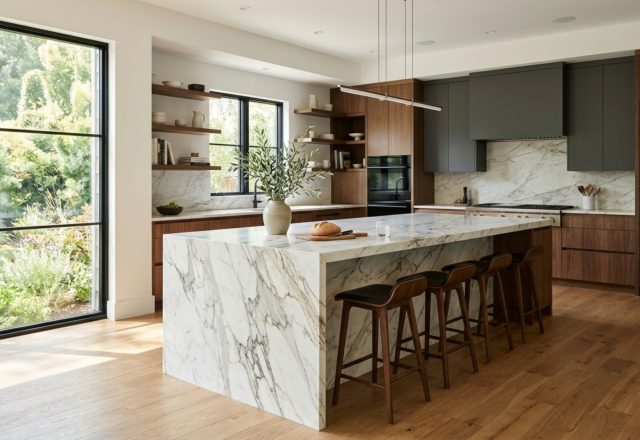
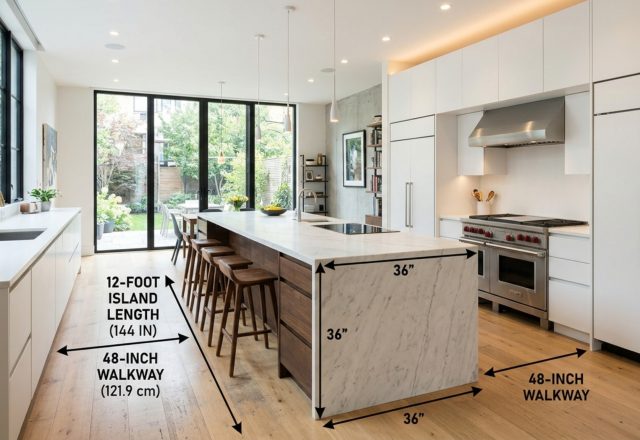
The island is the monolithic heart of the contemporary kitchen, yet its success hinges entirely on the negative space surrounding it. In a well-executed kitchen island placement guide, the focus is less on the island itself and more on the ‘clearance zones.’ To maintain a professional spatial cadence, a primary circulation path requires a minimum of 36 inches, though 42 to 48 inches is the sweet spot for a two-cook household. This breathing room is essential when you consider the swing of an oven door or the pull-out of a deep pot drawer. But the placement is also a matter of light orientation. An island should act as a catch-basin for natural light, positioned to harvest the soft glow of North-facing windows or the dramatic, lengthening shadows of a Western exposure. Consider the edge detail of the stone—a deep bullnose or a double-ogee—which creates a soft tactile transition as you lean in to engage with a guest. The island shouldn’t just be a block in the room; it should be an architectural anchor that directs traffic and invites touch, serving as the bridge between the high-octane prep areas and the softer living spaces beyond.
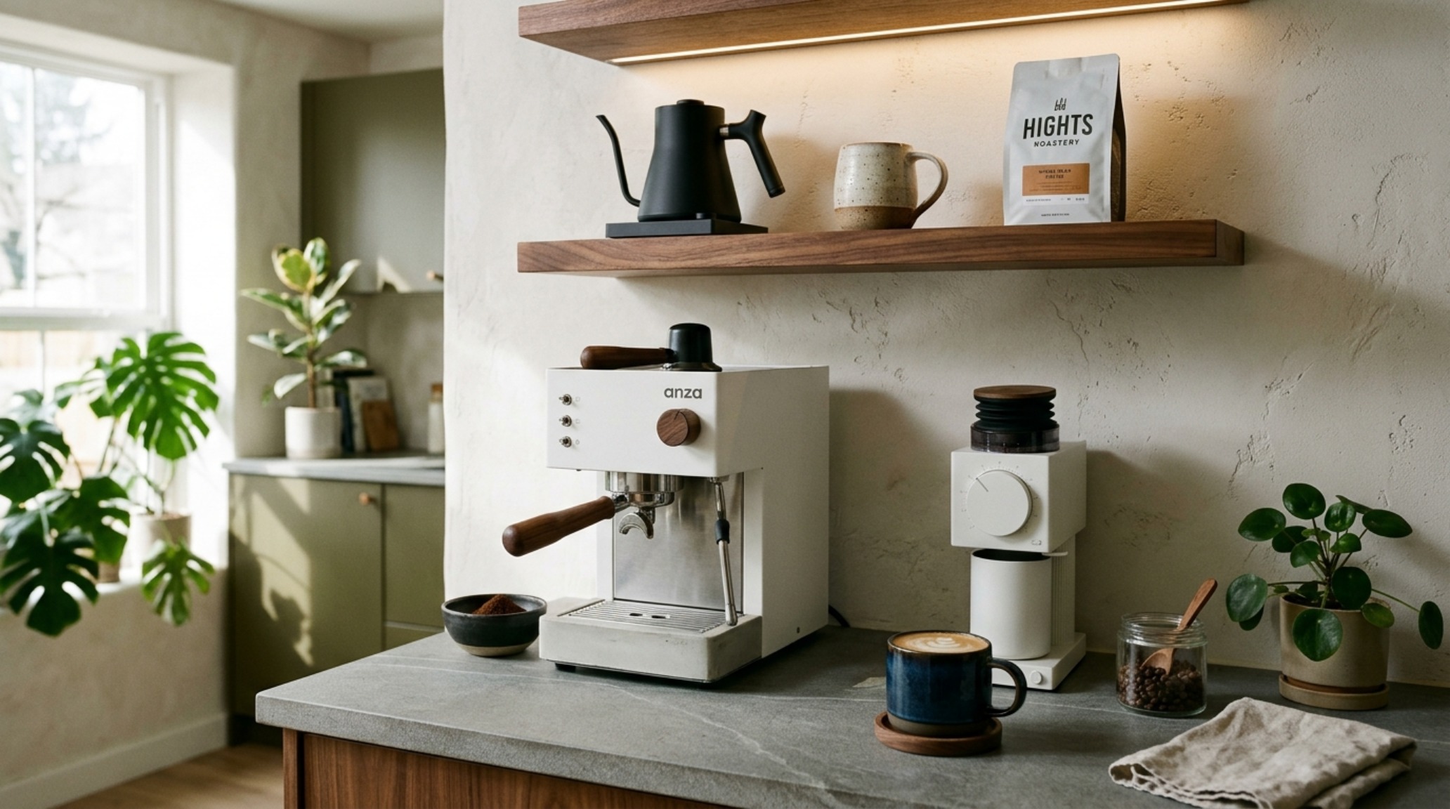
Architectural Details & Spatial Cadence
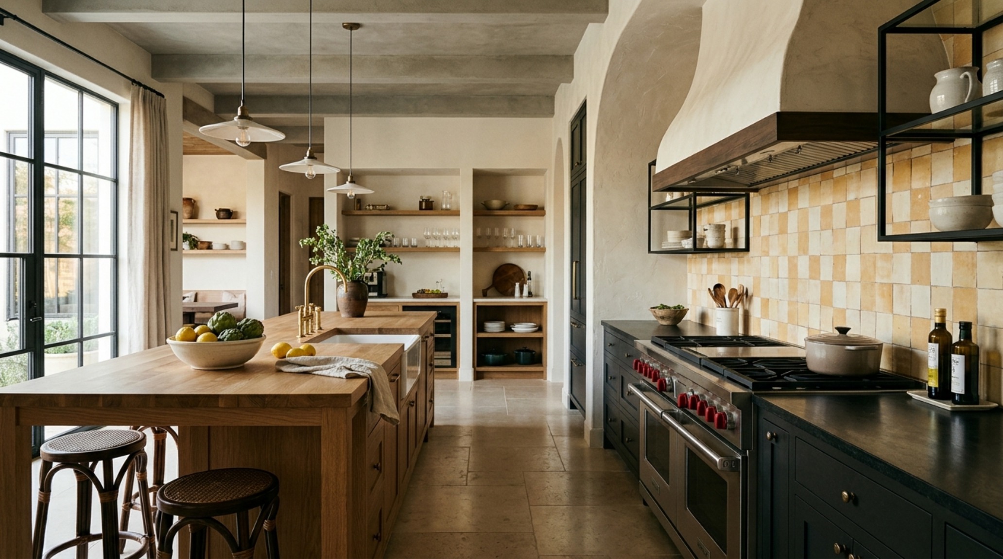
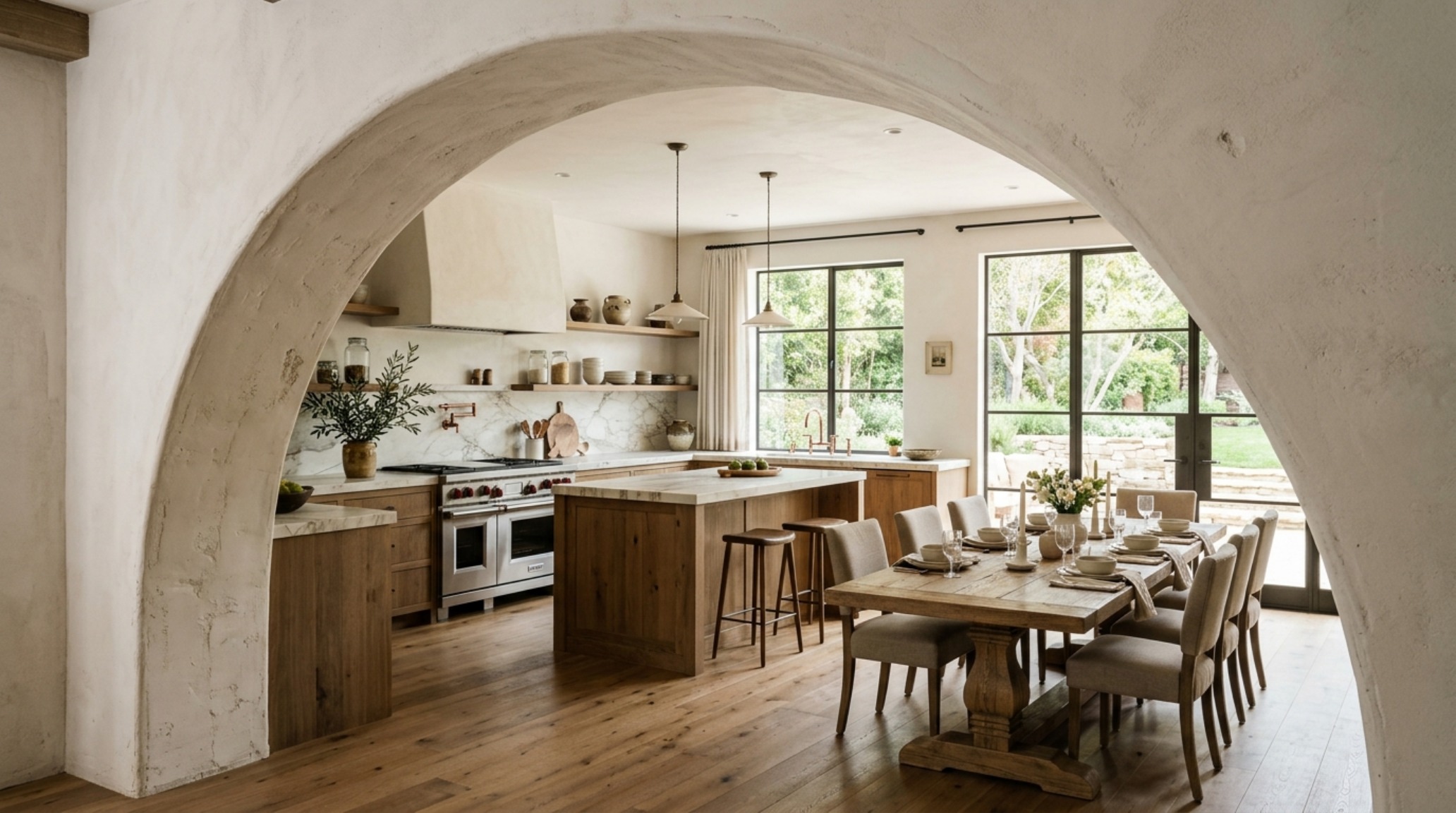
Texture is the silent director of the kitchen experience. When we introduce curved architectural details, such as an arched range hood finished in a hand-applied Roman clay, we are softening the hard edges of utility. These curves create a visual rest point, drawing the eye upward and breaking the monotony of standard cabinetry lines. This is particularly effective when designing the ‘Culinary Zone’—the area surrounding the range. By using a backdrop of Zellige tiles with their rhythmic, imperfect surfaces, you create a play of light and shadow that makes the act of cooking feel ceremonial. Lighting specifications play a massive role here; we look for a high Color Rendering Index (CRI 90+) to ensure the deep greens of fresh herbs and the rich marbling of steak are represented accurately. We mix 2700K warm ambient light for the social hours with 3000K task lighting tucked discreetly under cabinetry. This layering of light ensures that as the day transitions, the kitchen layout adapts, shifting from a bright, energetic workshop into a dimly lit, intimate lounge where the textures of stone and wood become even more pronounced under a soft glow.
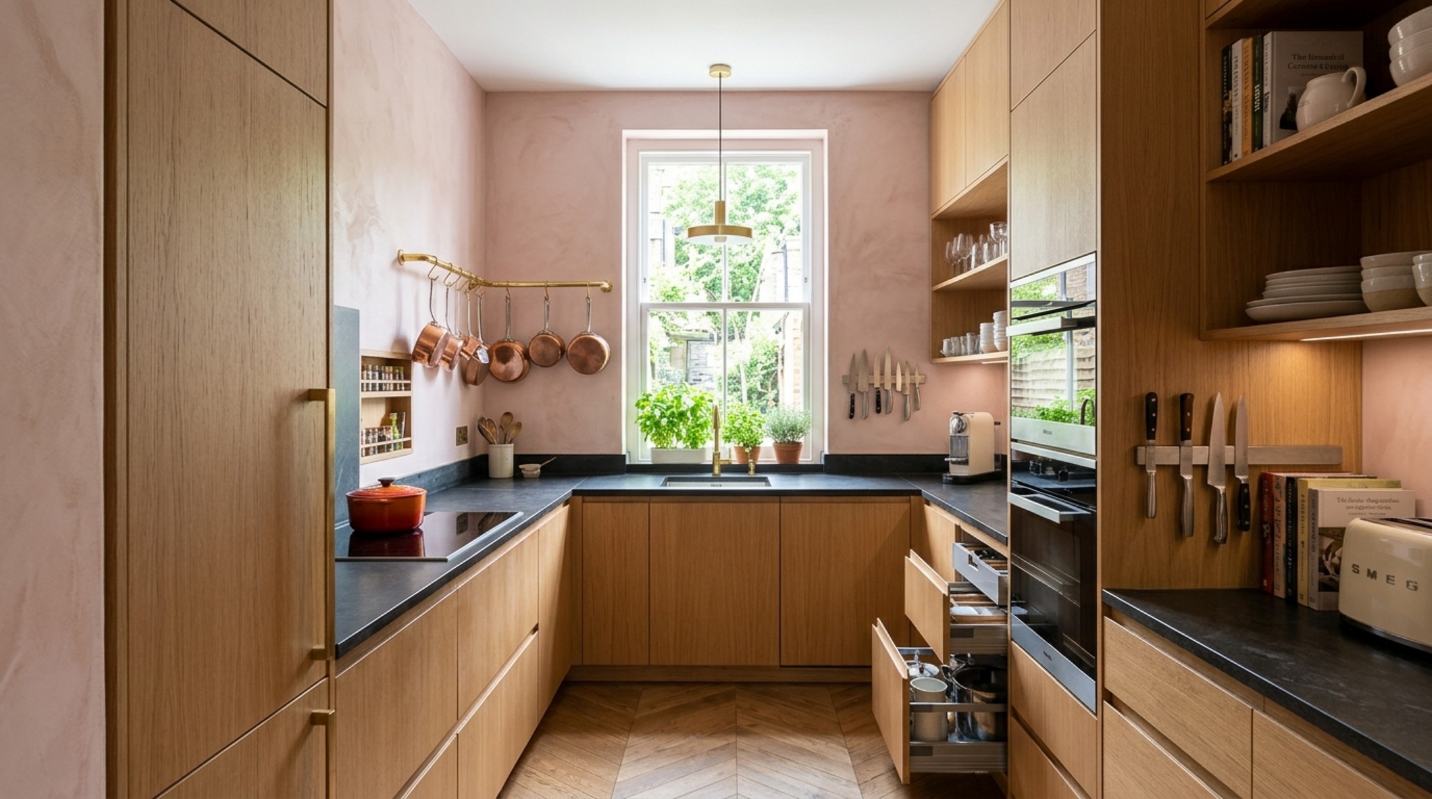
Best Kitchen Layout for Small Spaces: Materiality Over Square Footage
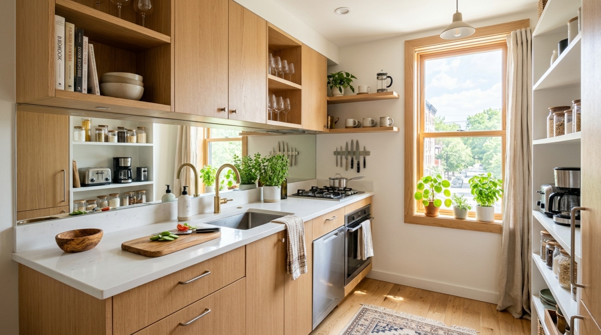
Constraints are often the greatest catalysts for creativity. When searching for the best kitchen layout for small spaces, the strategy shifts toward verticality and material continuity. In a compact footprint, a galley layout is often the most ergonomic, but it can feel claustrophobic if not handled with care. To open the sightlines, we often use ‘ghost’ textures—materials that reflect light without being jarringly glossy. Think of a backsplash in a soft, satin-finish glass or cabinetry painted in Farrow & Ball Setting Plaster, which provides a warm, earthy neutral that recedes into the background. Using a single material for the floor and the base cabinetry can also elongate the room, tricking the eye into seeing more volume than exists. Storage becomes a study in precision; every inch is reclaimed, from toe-kick drawers to ceiling-height shelving. The key is to keep the palette tight. By limiting yourself to two or three primary textures, you prevent the space from feeling cluttered. A small kitchen shouldn’t feel like a compromise; it should feel like a jewel box—highly functional, expertly tailored, and rich with tactile detail that demands close-up appreciation.
Open Concept Kitchen Floor Plans: The Art of the Threshold
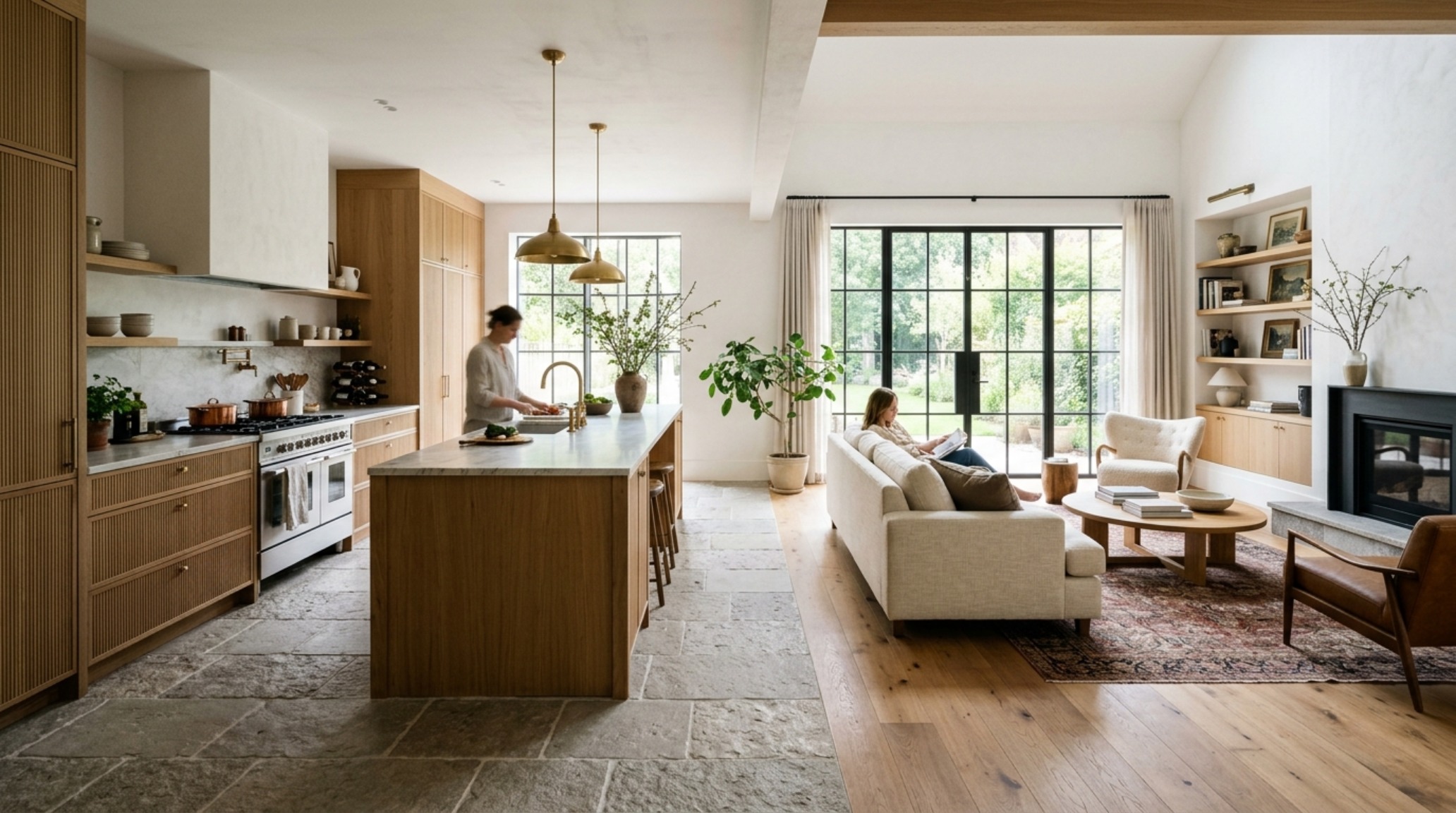
The challenge of open concept kitchen floor plans lies in the transition. How do you signal the end of the culinary zone and the beginning of the living space without building a wall? This is achieved through the ‘Material Threshold.’ A subtle change in floor direction—perhaps transitioning from a chevron-patterned oak in the living room to a stacked stone tile in the kitchen—acts as a subconscious boundary. We also use lighting as a spatial marker. A pair of oversized, textured ceramic pendants over the island creates a visual ‘room within a room,’ anchoring the kitchen in the larger open volume. Sightline alignment is critical here; when you stand at the sink, you should have a clear view of the social areas, but the functional ‘mess’ of the kitchen (the dish rack or the compost bin) should be shielded by a raised backsplash or a deep-set niche. This ensures that the kitchen remains a curated studio even when it is on full display. The layout must allow for a seamless social flow, where the host can engage with guests without ever feeling isolated or overwhelmed by the surrounding architecture.
How to Measure for Kitchen Remodeling: Precision Meets Vision
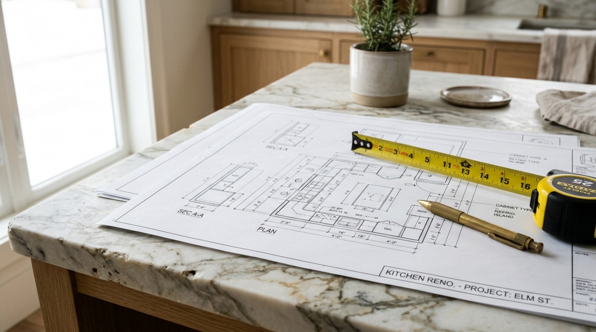
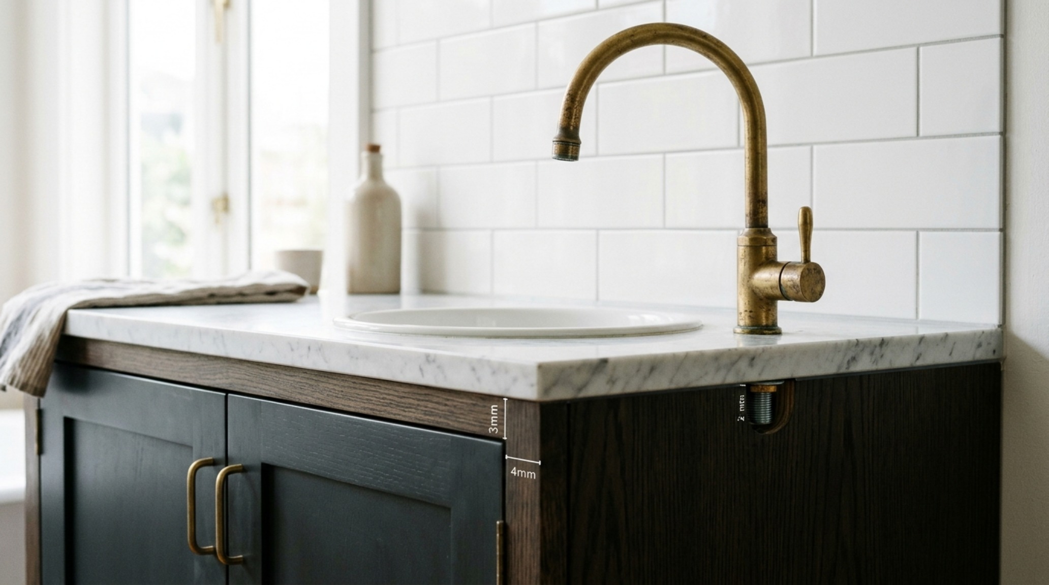
Before the first stone is cut or the first cabinet is ordered, the technical foundation must be flawless. Learning how to measure for kitchen remodeling is an exercise in architectural honesty. It’s not just about the length of a wall; it’s about the location of gas lines, the height of window sills, and the exact swing of every door. We measure in three planes: the floor, the mid-wall, and the ceiling, because no room is perfectly square. These measurements dictate the ‘breathing room’ required for modern appliances. For instance, a professional-grade range requires a specific clearance from combustible surfaces, often 30 inches to the range hood. When you map these out, you start to see the physical limits of your layout. It’s here that the ‘Atmospheric Zones’ find their true boundaries. A pantry door that requires a 30-inch clearance might dictate the edge of your prep zone, or a window placement might determine where the light-sensitive coffee station should sit. This phase of the design is the bridge between the dream and the reality, where the tactile vision is translated into the hard numbers of the construction document.
Modern Kitchen Ergonomics: The Science of Reach and Repose
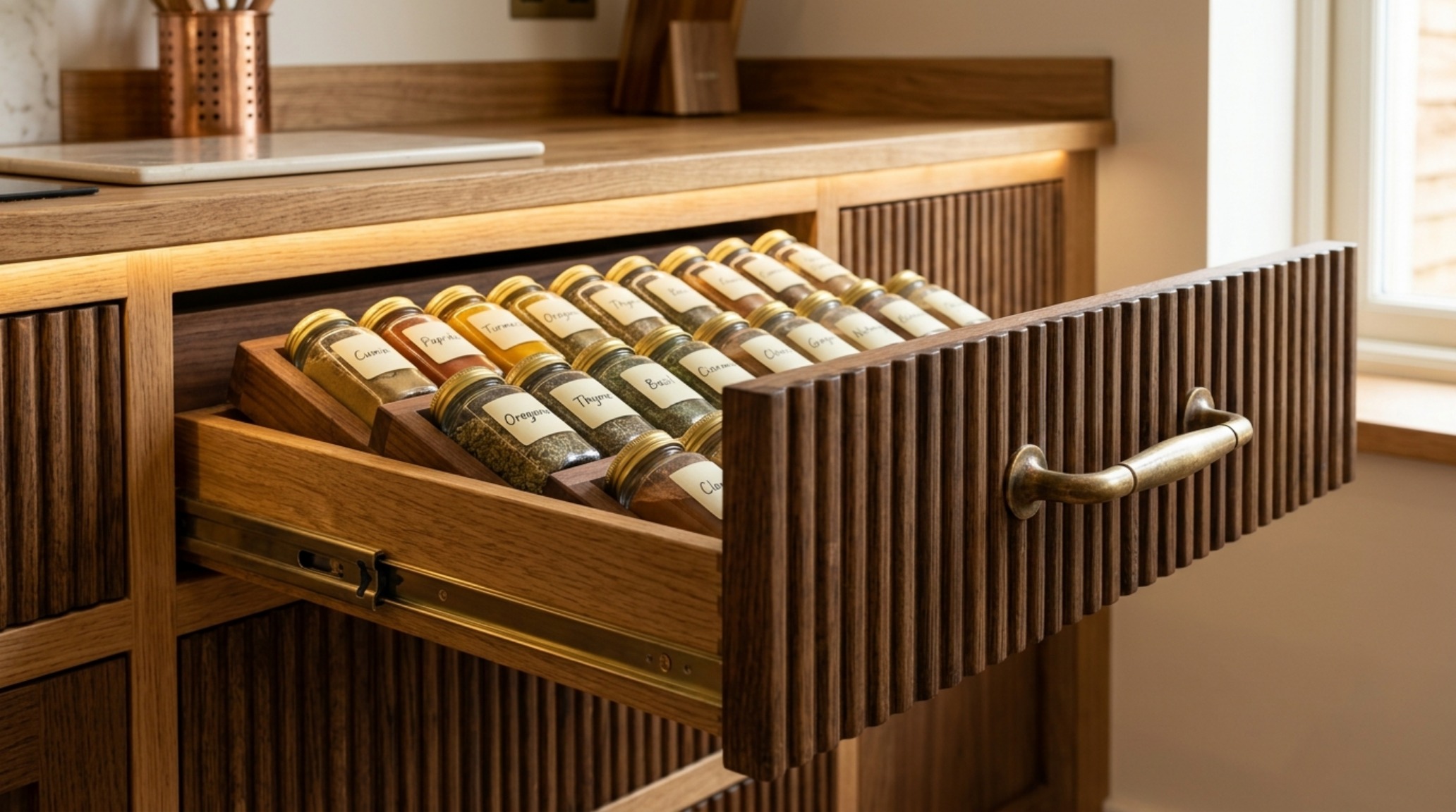
True luxury in a kitchen is the absence of friction. This is the essence of modern kitchen ergonomics. It’s the realization that the standard 36-inch counter height might not be ideal for everyone. We now design with ‘varied elevations’—a slightly higher prep counter for a tall cook, or a lower island section for casual dining and prep. Reach zones are meticulously calculated; the most frequently used items should live between the hip and the shoulder. This reduces physical strain and makes the process of cooking feel effortless. We also look at ‘tactile grounding’ in our hardware choices. The weight of a solid brass knurled handle or the smooth glide of a soft-close oak drawer provides a sensory feedback loop that reinforces the quality of the space. Every drawer pull, every faucet lever, and every cabinet hinge is a point of contact that connects the user to the architecture. When the ergonomics are right, you don’t notice the layout—you only notice how easy it is to exist within it. The kitchen becomes a place of repose as much as a place of production, a studio where the body moves with an intuitive grace born of perfect proportions.
Architectural Schedule & Palette Breakdown
Practical architectural ledger outlining surface materials, color values, and circulation dimensions.
The act of choosing to design your kitchen layout as a curated culinary studio is an acknowledgment that our homes should reflect our most essential rituals. It is an investment in the way we experience the morning light across a countertop and how we gather at the end of a long day. As the materials age, developing a patina that tells the story of every meal shared, the layout remains the steadfast framework for these moments. We are not just building kitchens; we are crafting the architectural background for the most intimate parts of our lives. When texture and light are given as much weight as ergonomics and floor plans, the result is a space that feels timeless—a sanctuary that honors both the art of the meal and the beauty of the home.
Editorial Silo • Recommended Architecture Studies
- Monolithic Luxury: Large Kitchen Island Designs & Materiality and Visual Drama in Oversized Island Curation — Archival Design Case Study
- The Architecture of Air: Mastering the Structural Flow of the Modern Style Kitchen — Archival Design Case Study
Contemporary Living Lookbook
Visual exploration of sightlines, tactile surfaces, and ambient illumination crafted for timeless spaces.
Curated Visual Lookbook
Design Gallery & Spatial Studies
A visual curation of architectural arrangements, lighting concepts, and material palettes featured in this space.