The Geometry of Tight Passages
Most entryways collapse under the weight of clutter before anyone even takes off their coats. It is an easy trap to fall into. You return home exhausted, drop your keys, throw your mail somewhere nearby, and let bags pile up in corners. When square footage is tight, even one stray pair of boots creates chaos. The solution is rarely buying massive modular storage units that swallow the hall whole. It comes down to understanding clearance and picking pieces that hug the architectural perimeter.
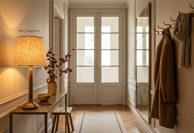
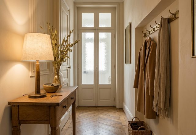
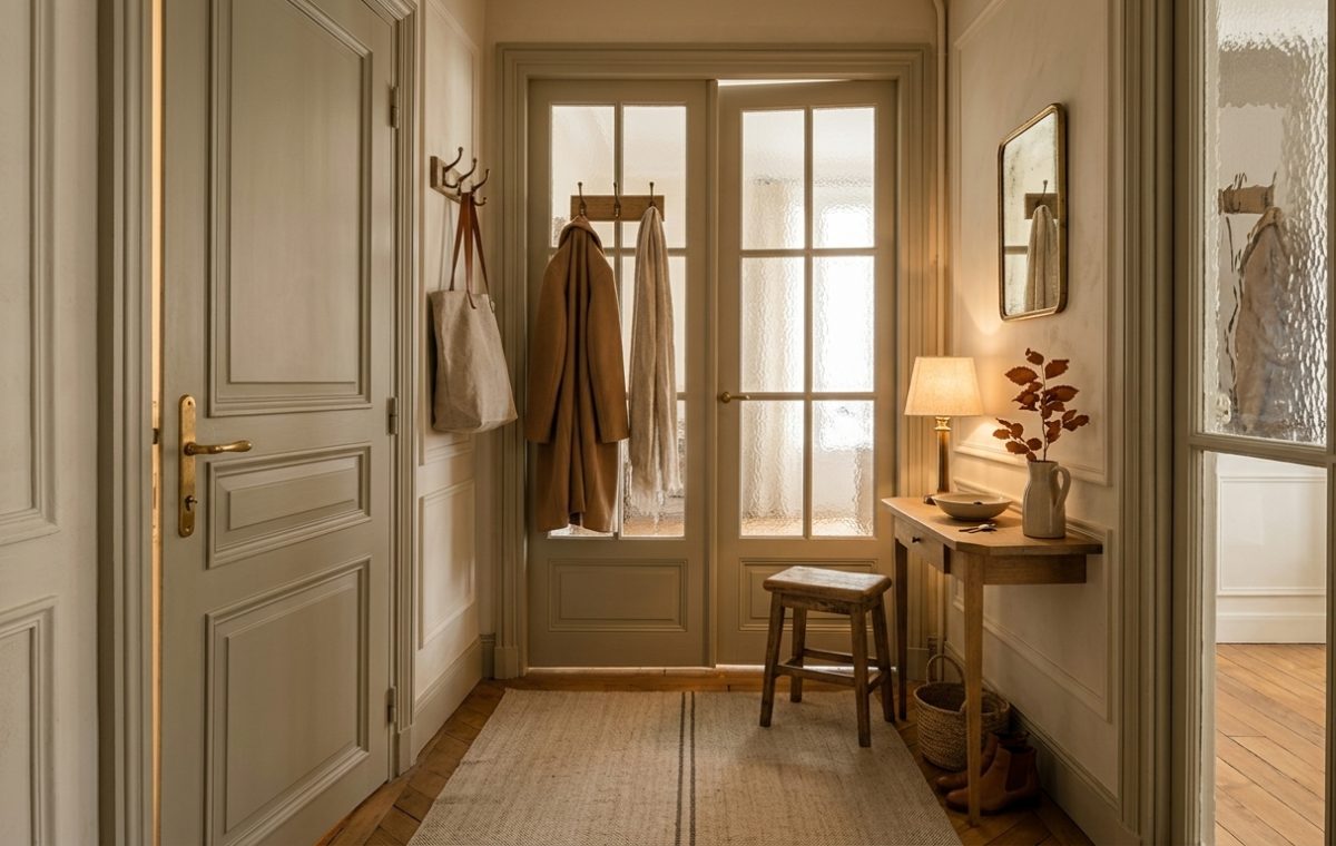
Take a look at the console table here. It barely projects ten inches into the walkway, anchored directly into the wall trim. Two slim tapered legs touch the floor, leaving open air underneath for a woven basket and leather boots. That open negative space prevents the entire corridor from feeling choked. A bulky cabinet with solid doors would have killed the sightline completely. When space is scarce, elevation is your best friend.
Letting Light Do the Heavy Lifting
Corridors are notoriously starved of natural illumination. The instinct is usually to flood the ceiling with a row of harsh recessed spotlights. Please don’t. Recessed downlights in a narrow hall create unflattering down-shadows that make a vestibule feel like an interrogation room. Instead, softer ambient lighting creates depth that expands boundaries.
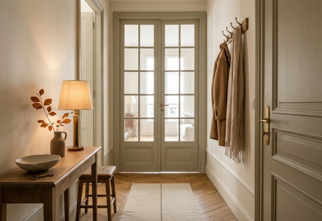
Notice how the textured glass panels on the double doors catch the morning sun without sacrificing privacy. Reeded or frosted panes filter daylight deep into the interior footprint, softening the edges of the room. Pair that with a small shaded table lamp on a low wattage. A warm pool of lamplight set at eye level welcomes you inward gently. It feels human, not clinical.
Everyday Friction and Honest Materials
A foyer must endure grit, moisture, and rushed mornings. Pretending it is a pristine gallery only sets you up for disappointment. Incorporating vintage foyer styling works well here because older, character-rich timber wears real life with grace. A scuff on an antique milking stool or a small scratch on an unlacquered brass door handle simply becomes patina.
- A low perch: A compact wooden stool offers just enough space to sit while untying boots without blocking the door swing.
- Separated drop zones: Stagger wall hooks across different wall surfaces instead of bunching six bulky coats onto a single overloaded rack.
- Textured floor runners: A heavy flatweave rug absorbs wet footprints while protecting herringbone timber floors from grit.
These elements create an intuitive landing strip. Everything has an honest purpose, but nothing screams for attention.
The Power of Tone-on-Tone Trim
A common decorating mistake is painting tiny halls bright, sterile white in an attempt to make them appear larger. In reality, stark white highlights every cramped corner and turns architectural flaws into glaring shadows. A muted warm neutral palette painted across both wall surfaces and wooden wainscoting works far better. It blurs where the trim ends and the drywall begins, tricking the eye into perceiving continuous, wrapping volume.
Look at the subtle taupe-greige wash on the baseboards and panels. The trim absorbs the light softly, turning a basic walkthrough zone into an atmospheric anteroom. How does your own front door greet you at five o’clock on a rainy Tuesday? Does it invite you to pause, or do you find yourself immediately tripping over the day’s debris?
Editorial Lookbook & Photo Collection