The traditional blueprint of the residential interior is undergoing a quiet, chromatic revolution. For decades, the ‘open-concept’ floor plan was the ultimate status symbol of modern living—a vast, unencumbered expanse of drywall and flooring intended to foster connection. Yet, as our homes evolved into multi-hyphenate spaces serving as offices, gyms, and sanctuaries, that very openness became a liability. We found ourselves adrift in ‘dead zones’ without visual hierarchy or emotional purpose. Enter the era of invisible architecture. By leveraging creative paint decor ideas and precision color zoning, we are no longer relying on physical partitions or heavy cabinetry to define our lives. Instead, we are using the transformative power of pigment and geometry to carve out functional reality from thin air.
The Psychology of Chromatic Boundaries: Why Zoning Matters
Color zoning is not merely a decorative flourish; it is a spatial strategy grounded in environmental psychology. Our brains naturally seek boundaries to process environmental data. When we sit at a desk that is color-matched to the wall behind it—a technique often referred to as architectural color zoning—our cognitive load shifts. The mind registers a distinct ‘zone’ for productivity, physically and mentally separating the workspace from the adjacent relaxation areas. This is the bedrock of the high-concept visual organization that distinguishes a professionally designed interior from a cluttered one.
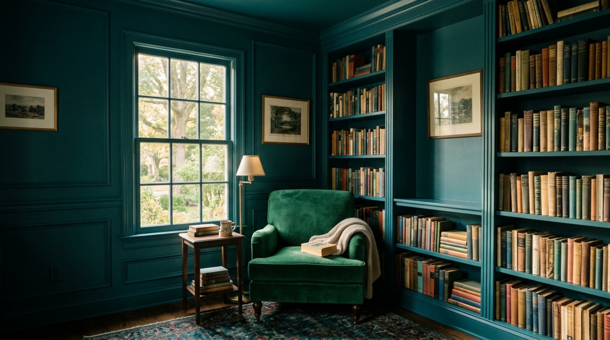
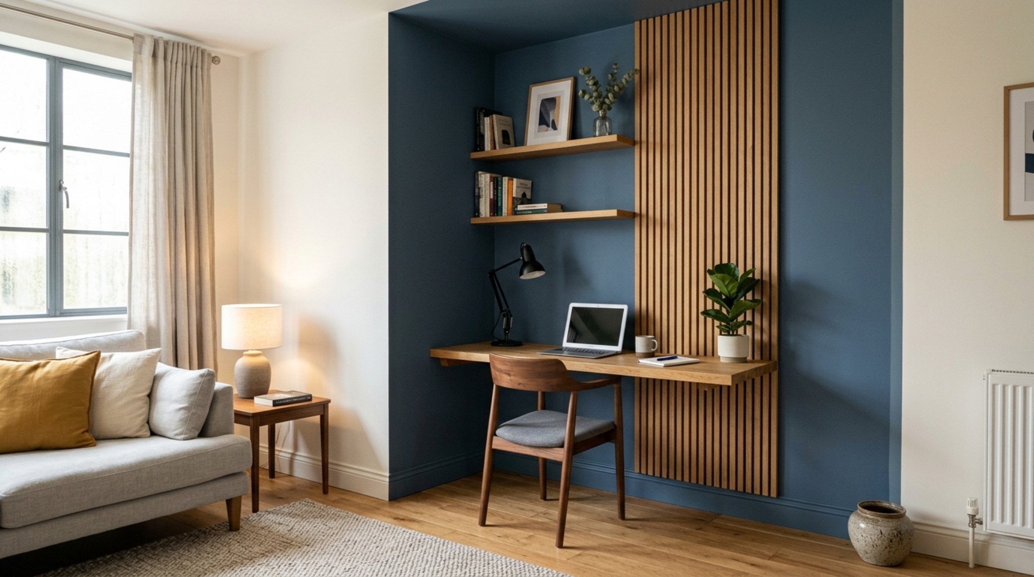
To execute this effectively, one must look beyond the single accent wall. We are seeing a movement toward monochromatic color drenching guides that suggest painting the ceiling, trim, and baseboards in a single, immersive saturation. When a reading nook is ‘drenched’ in a shade like Farrow & Ball’s Hague Blue, it creates a psychological envelope, a sense of containment that mimics the security of a library without needing to build a single stud wall. This spatial cadence allows the eye to travel through a home and instinctively understand where one activity ends and the next begins.
Defining the Threshold: Geometric Precision and Functional Paint Blocking
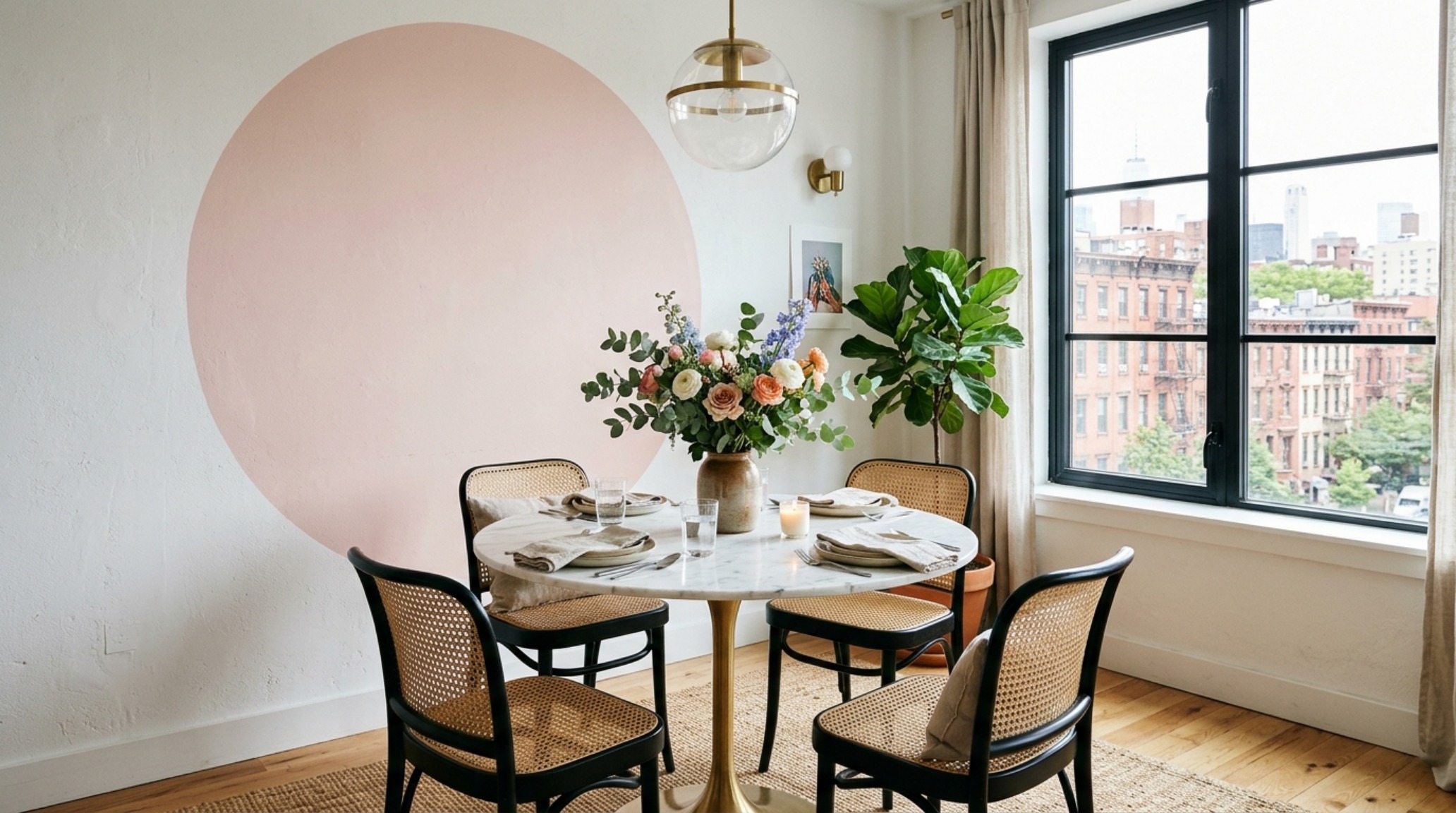
Functional paint blocking is the sharp-edged cousin of the accent wall. It involves using geometric shapes—circles, arches, or crisp rectangles—to ‘frame’ furniture and clarify its purpose. Imagine a dining area where a deep terracotta rectangle extends from the floor, up the wall, and slightly onto the ceiling. This creates a virtual ‘room’ for the dining table. For this to work, precision is non-negotiable. Designers are increasingly utilizing modern creative paint ideas for living room layouts where a 36-inch clearance is maintained around the ‘painted’ zone to ensure the circulation path remains visually clear, even if the floor material doesn’t change.
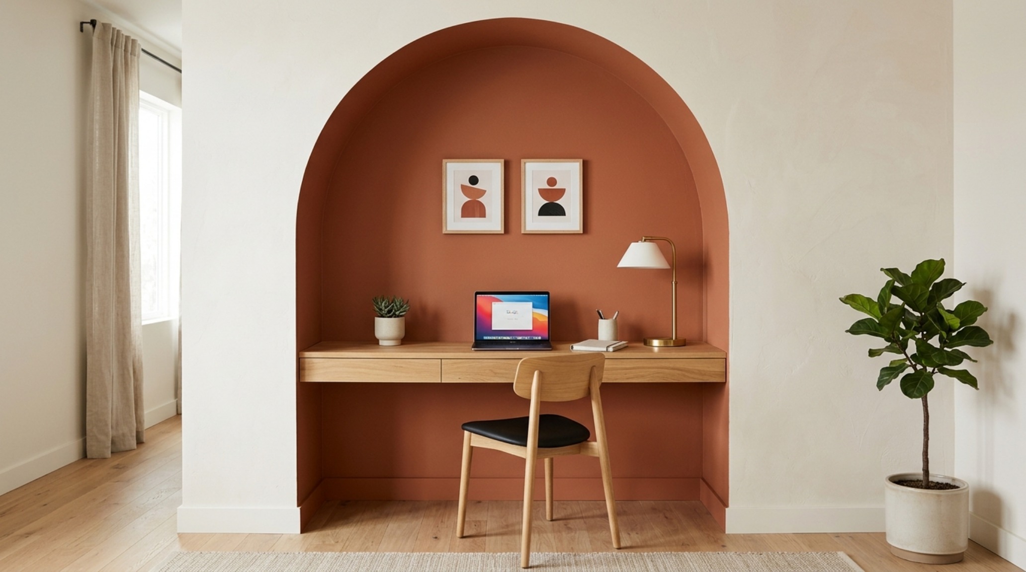
When planning these zones, consider the sightlines from the primary entry point of the room. A well-placed arch in a soft mineral tone, such as Benjamin Moore Swiss Coffee or Setting Plaster, can act as a portal, signaling a transition into a more intimate space. These aesthetic creative paint interior bedroom strategies often involve painting a ‘headboard’ directly onto the wall, extending it 12 inches beyond the nightstands to provide a sense of grounded stability. It is about creating a visual anchor that replaces the bulk of traditional furniture.
Tactile Grounding: The Rise of Limewash and Roman Clay
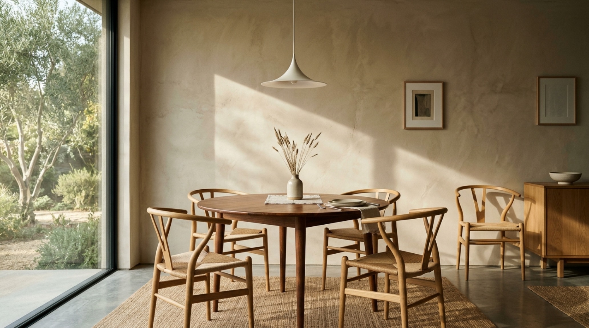
As we lean into interior paint trends 2025, the flat, plastic-sheen finishes of the past are being replaced by materials that offer ‘hand.’ The limewash paint interior movement, alongside the use of textured roman clay wall ideas, provides a depth that mimics natural stone or aged plaster. This is the cornerstone of ‘Organic Modern’ design—a style that balances the austerity of minimalism with the warmth of the earth.
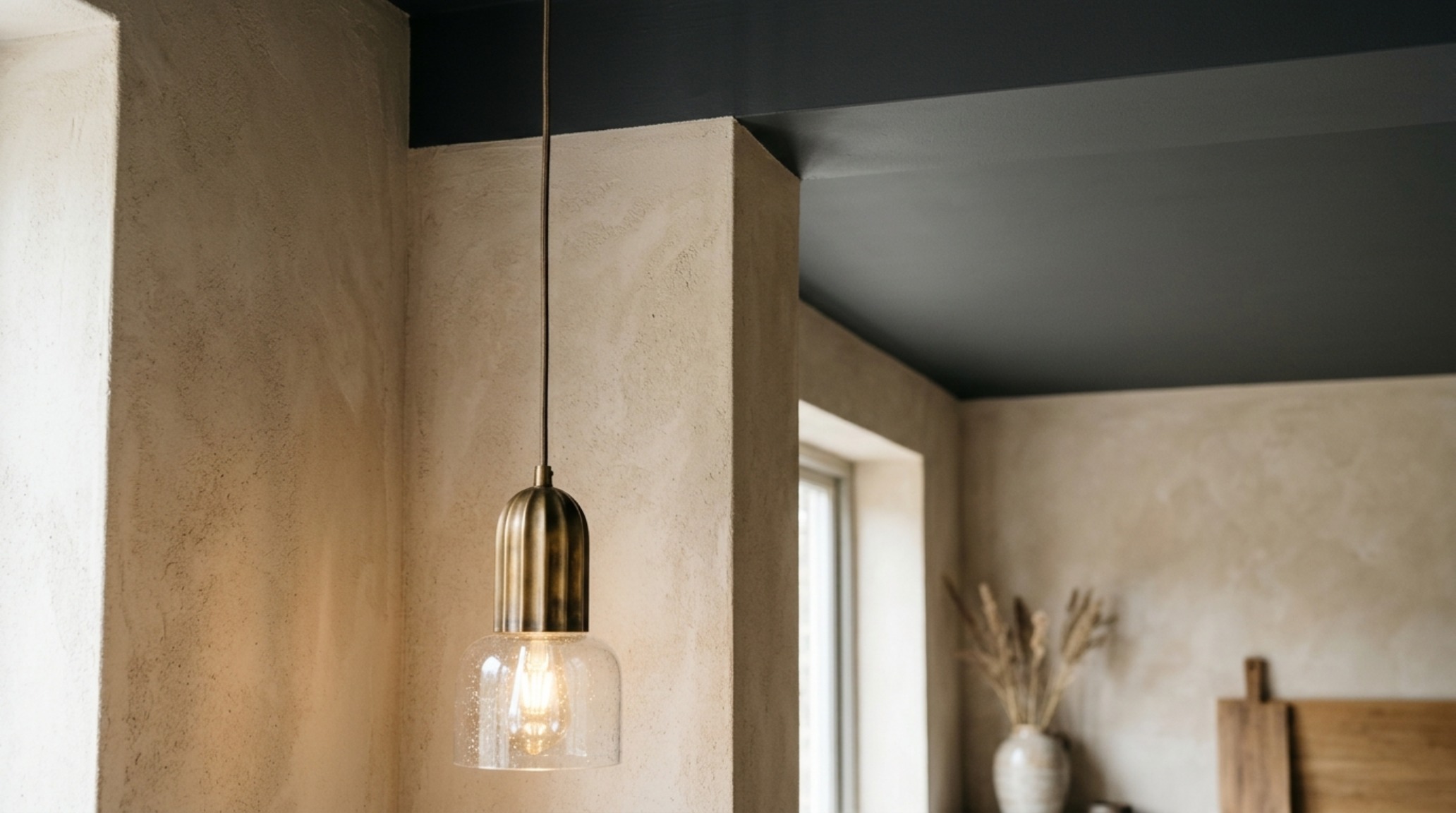
Limewash, a mineral-based finish made from crushed limestone and water, creates a soft, mottled effect that catches the light differently throughout the day. It is inherently biophilic, bringing an outdoor, elemental quality to the interior. When using biophilic green paint palettes—think muted olives like Sherwin Williams Evergreen Fog—the texture of Roman clay adds a layer of ‘shadow play.’ As the sun moves, the peaks and valleys of the textured surface create a micro-landscape of light and dark, giving the wall a living, breathing presence. This is ‘quiet luxury’ at its most potent: a finish that doesn’t scream for attention but demands to be touched.
The Technical Blueprint: Lighting, Kelvins, and CRI
No discussion of creative paint decor ideas is complete without addressing the physics of light. A color is only as good as the light that hits it. For zoning to feel intentional, the lighting must be synchronized with the pigment. We recommend a 2700K warm ambient light for relaxation zones (living rooms, bedrooms) to bring out the red and yellow undertones in earth-toned paints. Conversely, a 3000K task light is superior for home offices and kitchens, providing a crisper, more neutral white that aids concentration without feeling clinical.
Furthermore, the Color Rendering Index (CRI) is the secret weapon of the professional designer. Aim for fixtures with a CRI of 90 or higher. A high CRI ensures that the subtle nuances of a textured roman clay wall or a monochromatic color drenching scheme are accurately represented. Low CRI lighting can make expensive, high-end pigments look muddy or ‘off,’ destroying the architectural illusion you’ve worked to create.
Invisible Architecture in Practice: The Zone-by-Zone Guide
In a compact urban apartment, every square inch must perform. By applying the principles of architectural color zoning, we can turn a single rectangular room into a sophisticated multi-functional suite. Let’s look at the ergonomic clearances: a standard walkway requires 36 inches, while a dining chair needs 30 inches of ‘push-back’ space. Your color zones should respect these physical realities.
In the kitchen, a quiet luxury paint color like a soft charcoal or a warm greige can be used to ‘block’ the cabinetry and the backsplash into a singular volume. This reduces visual noise, making the kitchen feel like a piece of custom joinery rather than a collection of appliances. Adjacent to this, a breakfast nook can be defined by a floor-to-ceiling band of a contrasting hue, creating a ‘niche’ feeling where none exists structurally.
The Mudroom and the Entry: The Power of the Painted Portal
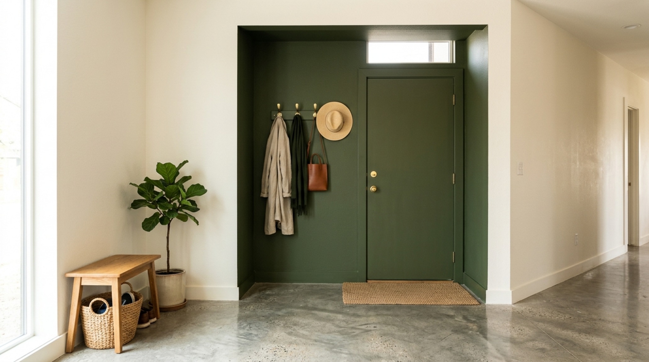
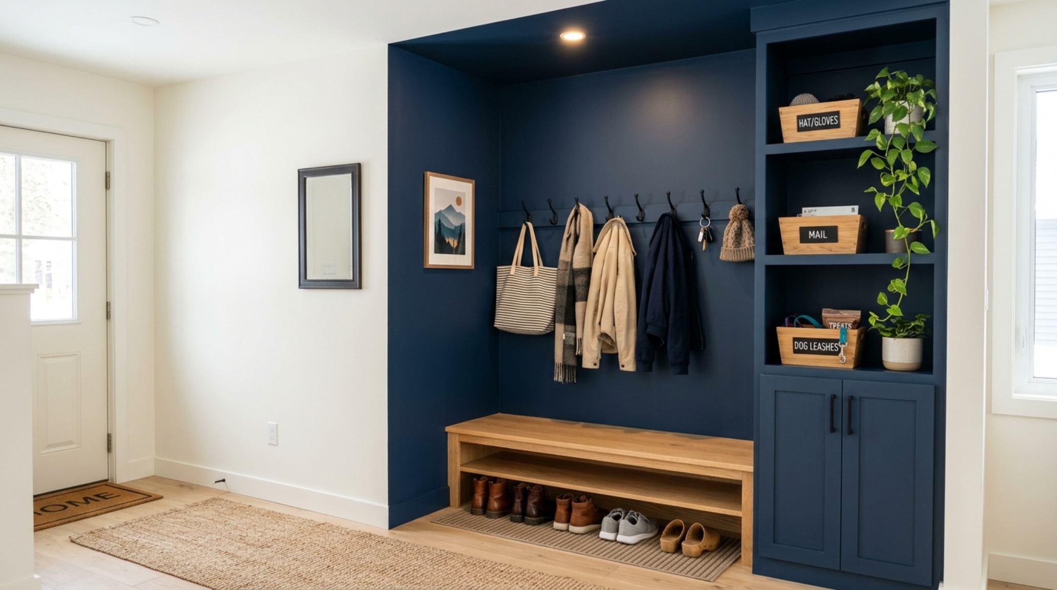
The transition from the world into the home is a critical psychological moment. Many creative paint decor ideas for entries involve ‘the portal’—painting the door, the frame, and the immediate surrounding wall area in a deep, grounding tone. This creates a sense of arrival. By using a durable, scuff-resistant finish in a biophilic green, you create a mudroom zone that feels hardy and separate from the rest of the foyer. It acts as a visual ‘landing pad’ for the chaos of daily life.
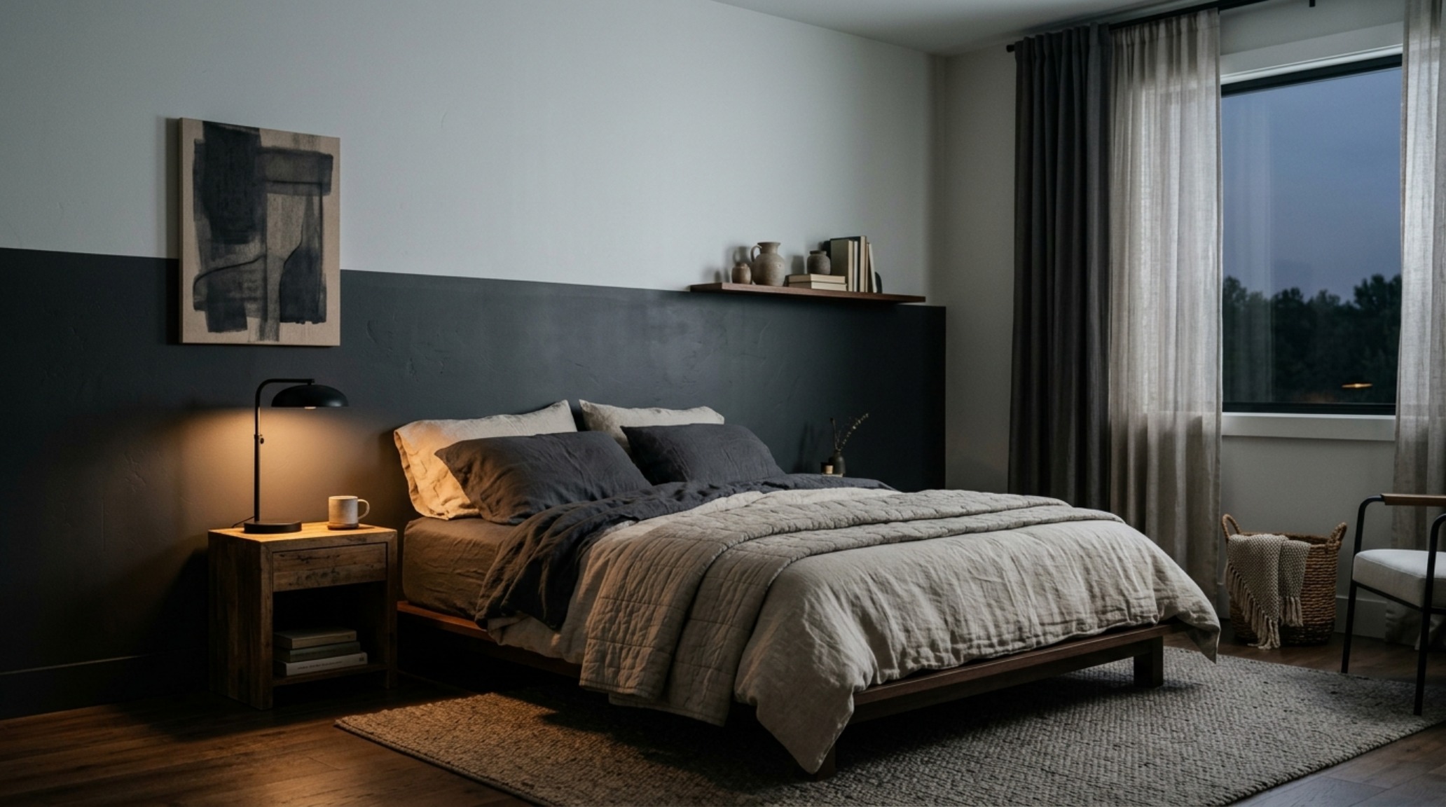
In the bedroom, the trend is shifting toward ‘the horizon line.’ By painting the lower third of the room in a darker, more saturated tone and the upper two-thirds (including the ceiling) in a lighter, airy shade, you lower the perceived center of gravity in the room. This promotes a sense of calm and ‘tactile grounding,’ perfect for sleep. It’s a sophisticated take on the traditional wainscoting, achieved entirely through the precision of the brush.
The Specification Matrix: Harmonizing Material and Hue
Designing with paint requires a holistic view of the materials it will interact with. A limewash paint interior looks sublime against the raw, open grain of white oak or the cool, honed surface of travertine stone. The goal is to create a ‘material conversation.’ If you are using a high-gloss paint for a zoned ‘jewel box’ bar area, balance that sheen with matte, tactile fabrics like mohair or heavy linen to prevent the space from feeling one-dimensional.
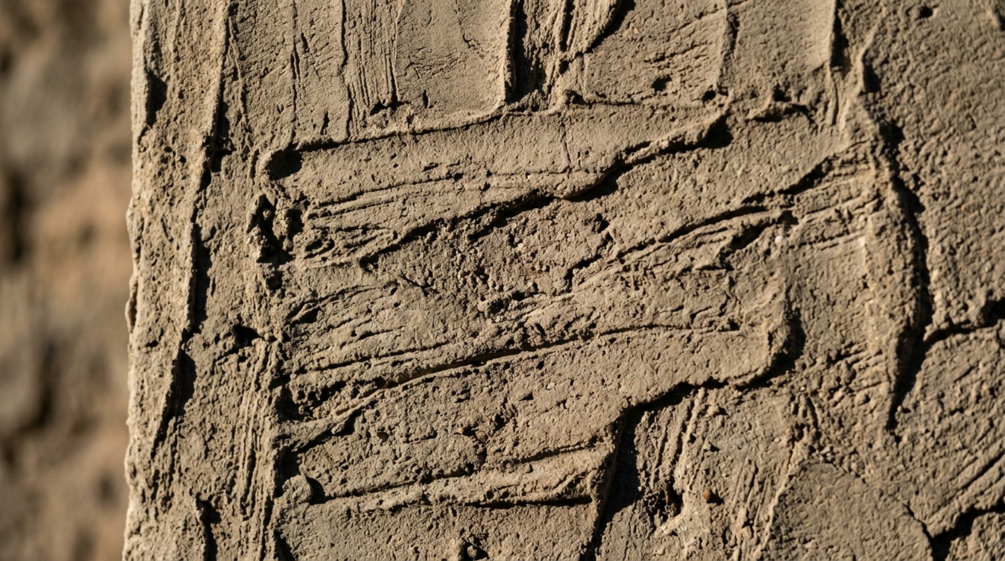
The interplay of shadows is equally vital. When you use creative paint decor ideas involving deep recesses or 3D slats (fluted panels), the paint color will appear darker in the grooves. This natural variance adds architectural ‘weight’ to the wall, making a standard 2×4 stud wall feel as substantial as masonry.
Architectural Specification & Material Matrix
Curated tactile palette, spatial dimensions, and atmospheric lighting index for this design scheme.
Ultimately, the mastery of creative paint decor ideas lies in the realization that a room is not a static box, but a fluid environment that must bend to our needs. By treating paint as ‘invisible architecture,’ we reclaim our homes from the ambiguity of open-plan living. We create order through color, comfort through texture, and clarity through geometry. The walls may not have moved, but the space has been entirely redefined, proving that the most powerful structural tool in a designer’s arsenal is often found in a simple gallon of pigment. As we look toward the future of the home, the boundary between the physical and the visual will continue to blur, leaving us with spaces that feel less like containers and more like precisely tuned instruments for living.
Editorial Silo • Recommended Architecture Studies
- Test Publish Latency Diagnostic — Archival Design Case Study
- The Sensory Entryway: Mastering Quiet Luxury with 2700K Glow and High-Texture Materiality — Archival Design Case Study
Architectural Inspiration Lookbook
A high-resolution study in spatial proportions, tactile materiality, and light choreography curated for enduring modern living.
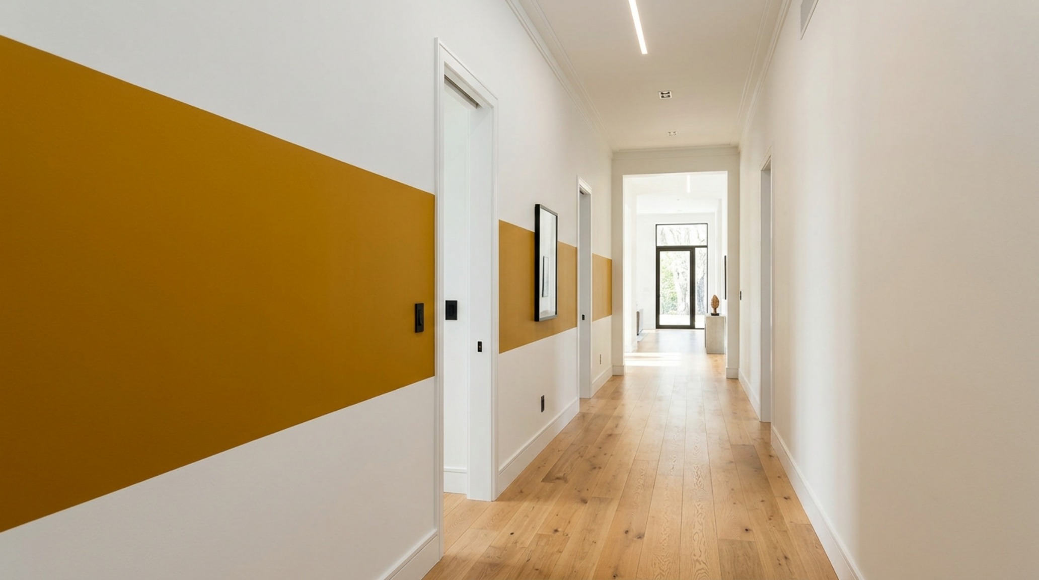
Curated Visual Lookbook
Design Gallery & Spatial Studies
A visual curation of architectural arrangements, lighting concepts, and material palettes featured in this space.