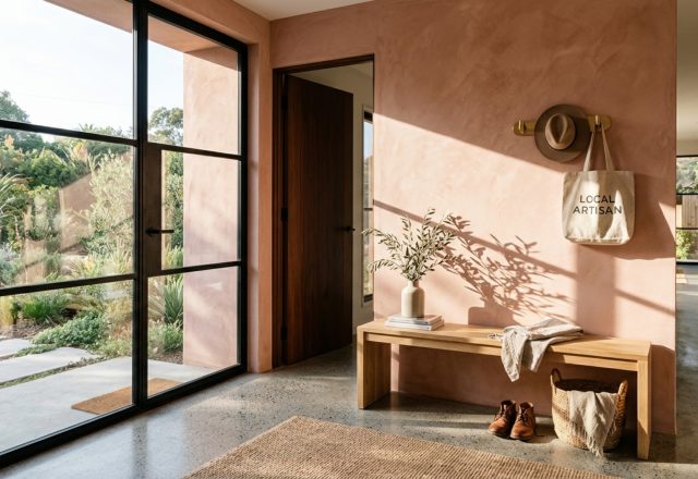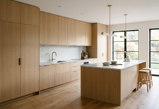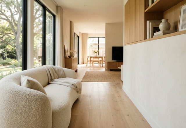
We have all stood in that specific kind of hollow silence: the boxy, beige-carpeted living room of a new rental, where the ‘boob lights’ cast a clinical glare and the walls feel less like a canvas and more like a constraint. The immediate impulse is to fill the void with fast-furniture fixes, yet the result is often a space that feels transient rather than transformative. However, achieving a soulful, high-end sanctuary doesn’t require a down payment on a brownstone. By pivoting our focus toward inexpensive apartment decorating ideas that prioritize sensory depth over sheer volume, we can conjure an atmosphere of ‘Quiet Luxury’ that feels curated, grounded, and entirely bespoke. This is the art of high-haptic design—a strategy where the way a room feels to the touch is just as important as how it looks in a square frame.
Quiet Luxury is often associated with astronomical price tags, but its core tenets—understatement, quality materials, and a focus on essentialism—are remarkably accessible if you know where to look. In a rental, the challenge is erasing the ‘generic’ without losing your security deposit. We do this by layering textures that speak to each other: the nubby resistance of bouclé against the velvet-smooth grain of raw timber, or the cool, weightiness of a found stone bowl atop a diaphanous linen runner. This architectural approach to styling turns a temporary dwelling into a permanent mood.
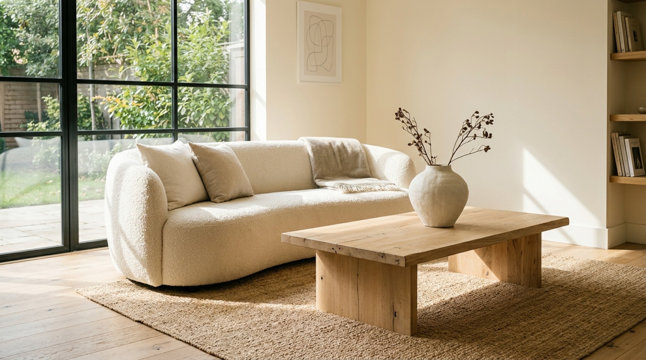
Spatial Perspectives & Material Curation: The Science of Atmospheric Lighting
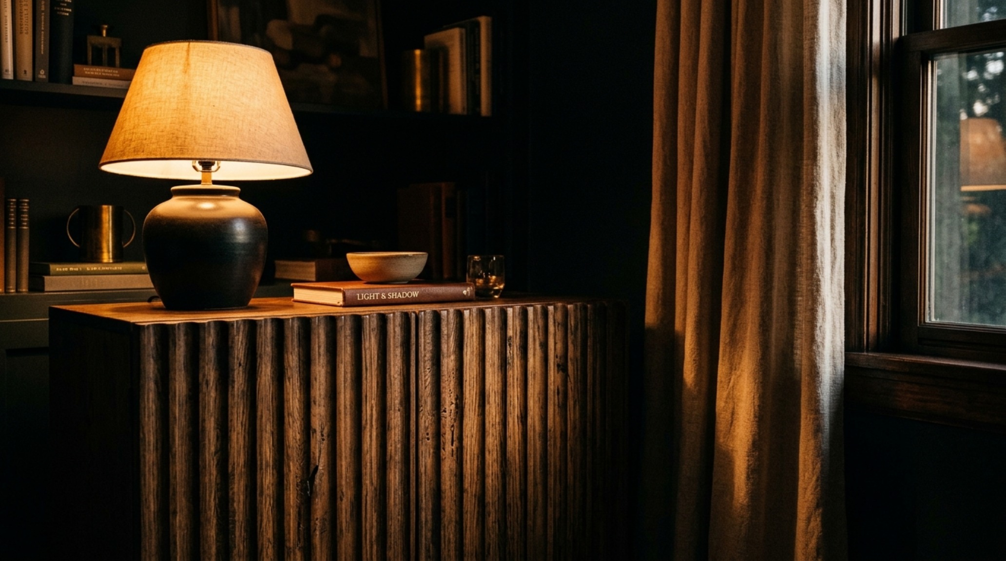
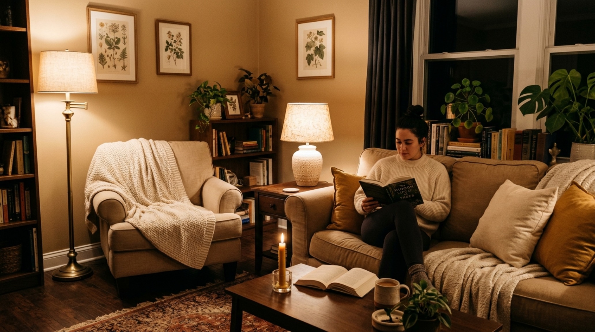
Before a single piece of furniture is moved, we must address the invisible architecture of the room: the light. Most rentals suffer from ‘flat’ lighting—overhead fixtures with high-Kelvin bulbs that flatten textures and suck the soul out of natural wood grains. To execute sophisticated inexpensive apartment decorating ideas, your first technical upgrade should be the bulbs. We are aiming for a consistent 2700K warm ambient glow throughout the living spaces. This specific temperature mimics the golden hour, softening the edges of standard-issue drywall and making inexpensive materials look significantly more expensive.
Furthermore, look for bulbs with a Color Rendering Index (CRI) of 90 or higher. A high CRI ensures that the subtle undertones of your ‘Frosted Toffee’ palette are accurately represented rather than washed out into a muddy gray. By layering this light—using floor lamps to wash walls and small battery-operated ‘puck’ lights tucked into bookshelves—you create shadow play. It is in these shadows that the haptic quality of your furniture truly shines. A thrifted oak side table might look mundane under a 4000K office light, but under 2700K warmth, the grain patterns become a landscape of visual interest.
Architectural Vignettes & Spatial Flow: The Frosted Toffee Palette
Color in a high-haptic rental should act as a background hum, not a shout. While many renters default to ‘Reptile Gray’ or stark ‘Hospital White,’ the ‘Quiet Luxury’ movement leans into warmer, organic neutrals. Benjamin Moore’s Swiss Coffee or Frosted Toffee (a sophisticated, muted tan with a hint of peach-gray) provide a luminous foundation that reflects light without the coldness of pure white. If you aren’t allowed to paint the walls, you can introduce these tones through large-scale textiles.
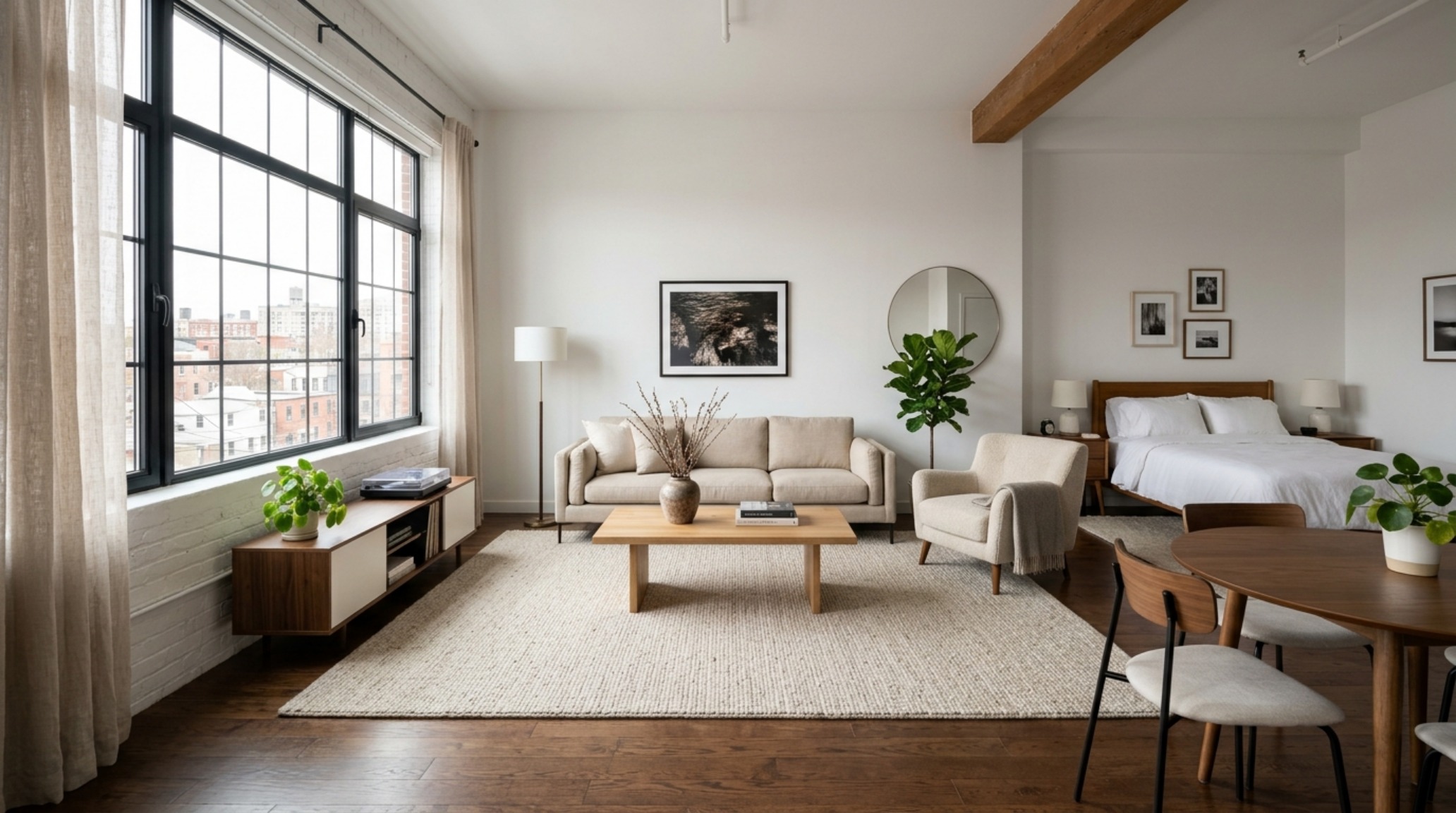
Consider the ‘vertical zoning’ method. In a small space, the eye needs a place to rest. By keeping your largest surfaces—rugs, sofas, and window treatments—within a tight tonal range of cream, oatmeal, and sand, you create an expansive feeling. This isn’t about boredom; it’s about ‘Negative Space Breathing Room.’ When the background is quiet, the individual textures of a jute rug or a chunky wool throw become the protagonists of the room. This focus on tonal consistency is one of the most effective inexpensive apartment decorating ideas because it makes a collection of disparate, budget-friendly items feel like a unified, designer-led collection.
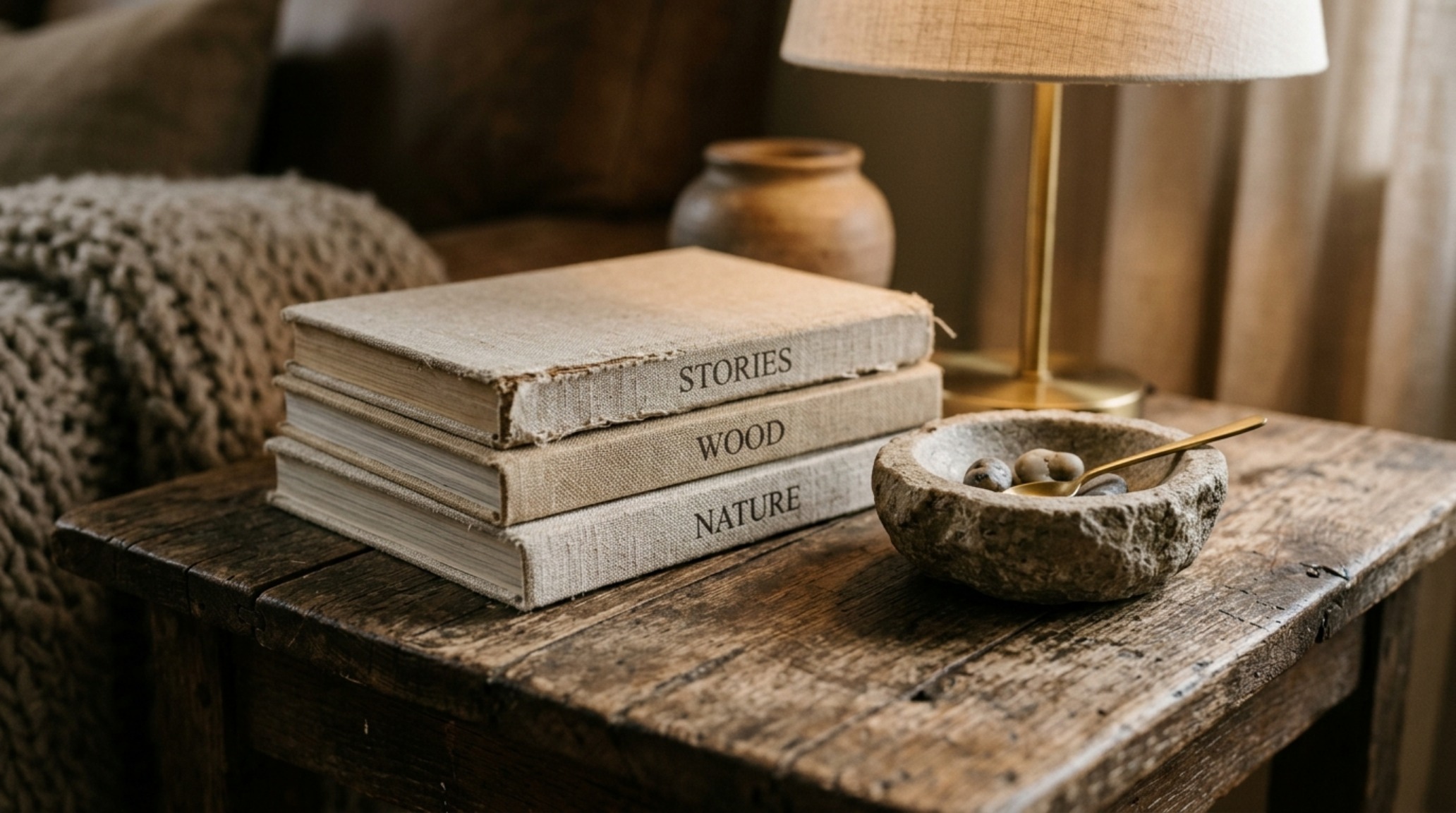
The Visual Concept Gallery: Mastering the Material Contrast
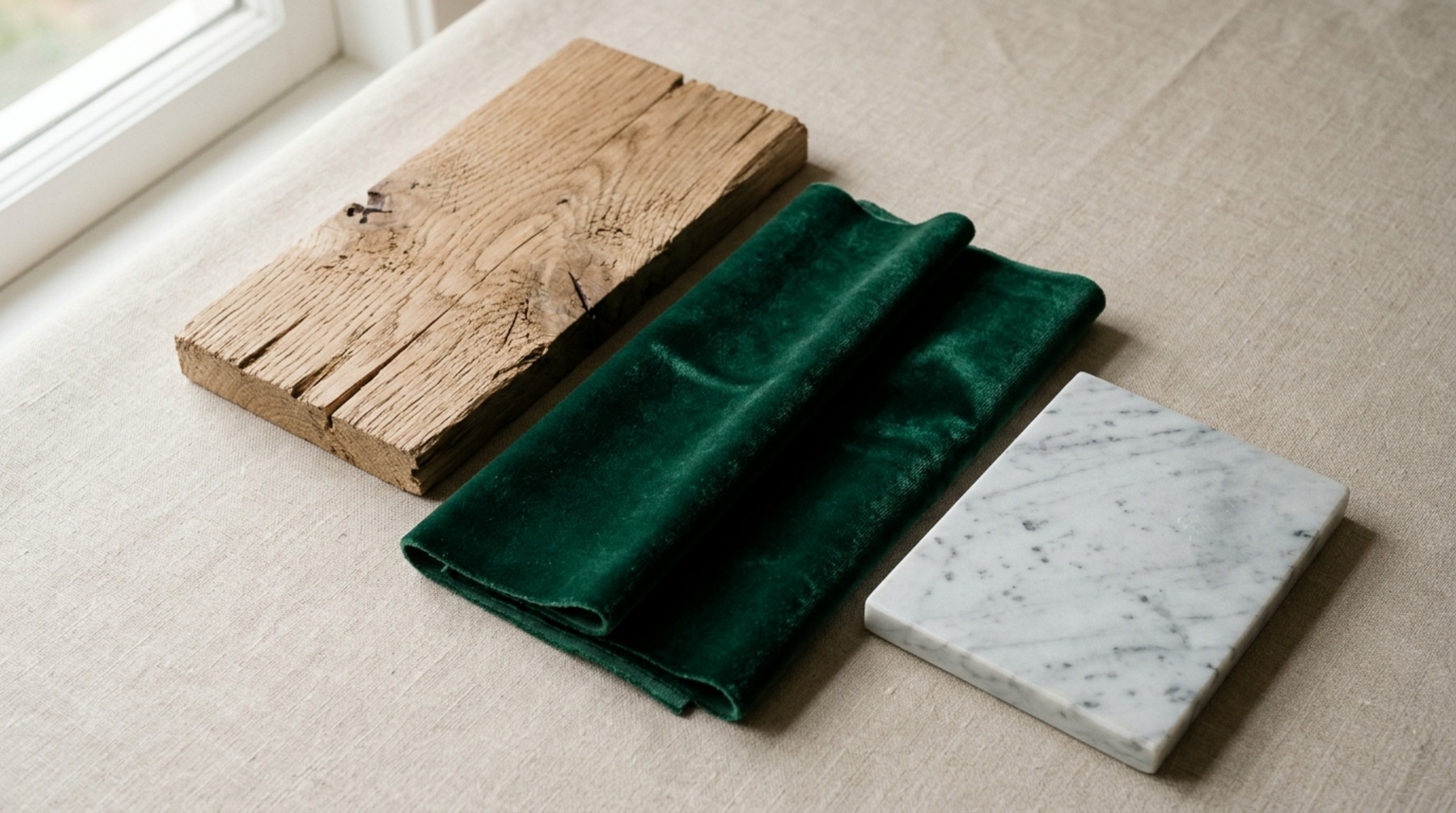
The secret to making a thrift-store find look like a Pierre Jeanneret original lies in the ‘Haptic Contrast.’ If you find a mid-century modern chair with a worn wood frame at a local charity shop, don’t just see the scratches; see the silhouette. Sanding back a dark, faux-cherry finish to reveal the raw, pale timber underneath is a powerful way to tap into the ‘Organic Modern’ aesthetic. Pair that raw wood with something soft—perhaps a DIY slipcover in a heavy cotton duck or a faux-mohair throw.
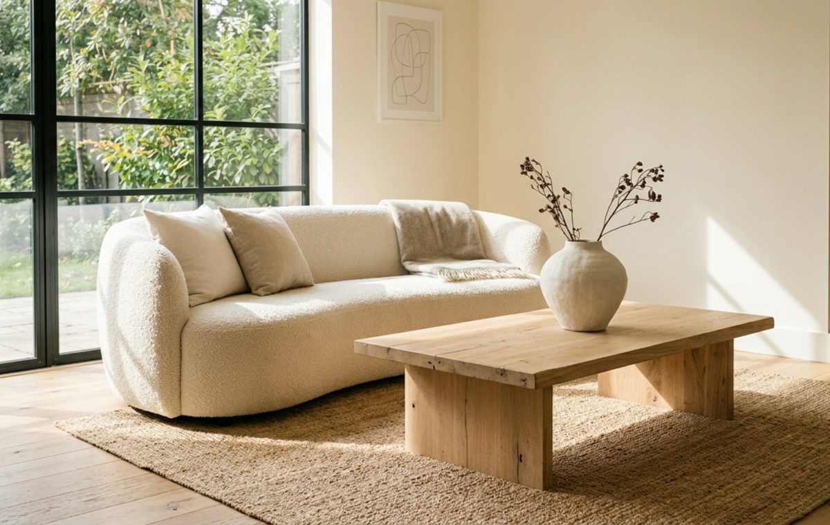
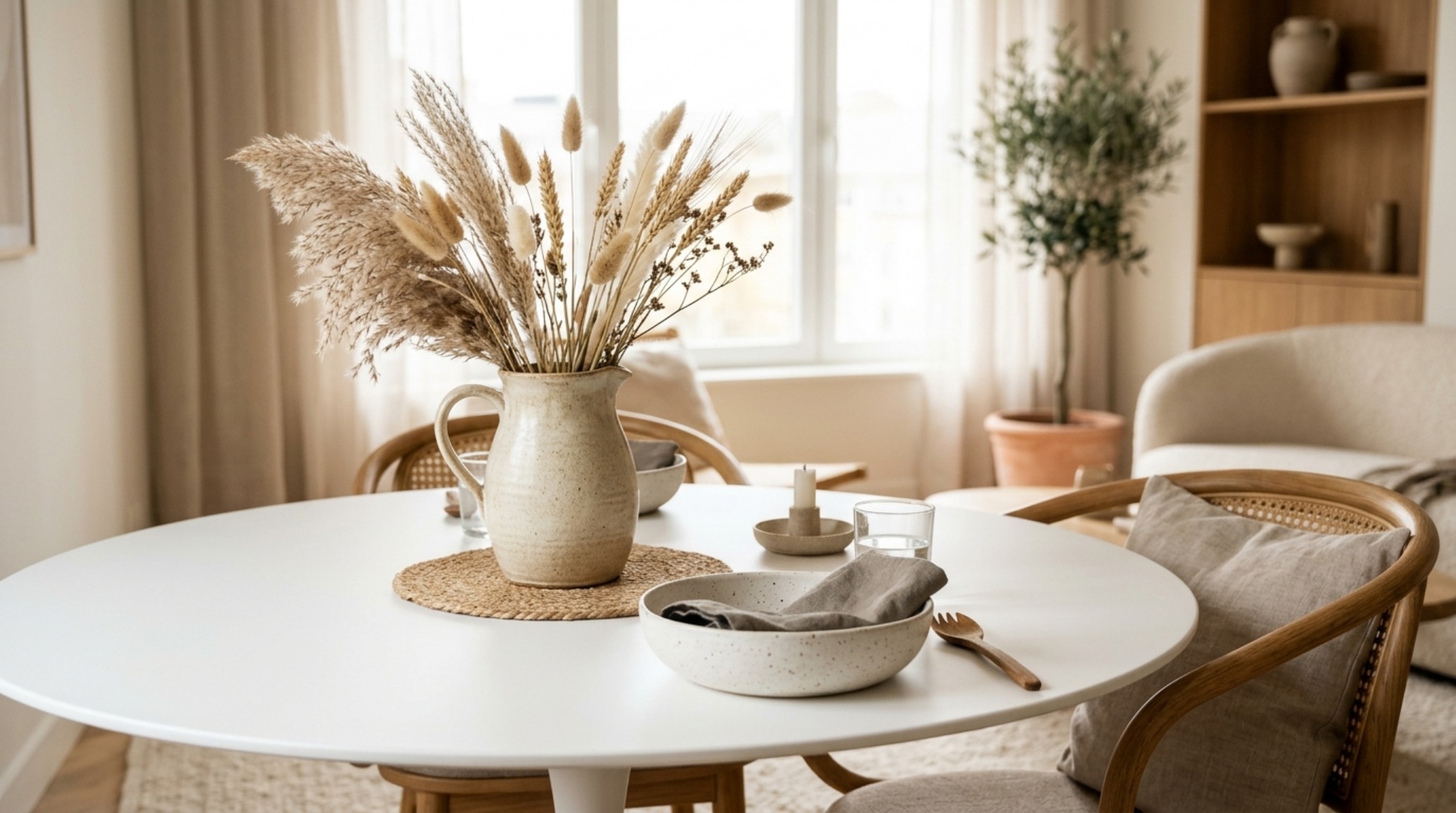
High-haptic luxury thrives on the tension between the rugged and the refined. In your living room, strive for at least three distinct textures in every 18-inch radius. For example, on a coffee table, you might have: 1) a smooth, polished marble tray (look for off-cuts at stone yards), 2) a rough-hewn ceramic vase, and 3) the organic, papery texture of a dried fan palm or a stack of linen-bound books. This density of tactile information tricks the brain into perceiving ‘luxury’ because the environment feels layered and intentional rather than mass-produced.
Spatial Cadence & Lighting Vignettes: Respecting Architectural Clearances
One of the most common mistakes in budget decorating is ignoring the ‘Spatial Cadence’—the rhythm of how one moves through a room. A space feels expensive when it feels easy to inhabit. Professional designers adhere to strict architectural clearances that ensure the flow is never interrupted. In your rental, ensure you maintain a 36-inch standard walkway clearance for primary paths. Your coffee table should be placed exactly 18 inches from the edge of the sofa—close enough to reach for a drink, far enough to allow for comfortable legroom.
These measurements aren’t just for comfort; they provide visual ‘air.’ When furniture is crammed against walls or squeezed too tightly together, it broadcasts a lack of space. By pulling your sofa just 3 inches away from the wall (a technique known as ‘floating’), you create a shadow line that suggests the room is larger than it is. This is a zero-cost way to implement inexpensive apartment decorating ideas that yield high-end results. It’s about the luxury of space, even if that space is only a few inches of intentional gap.
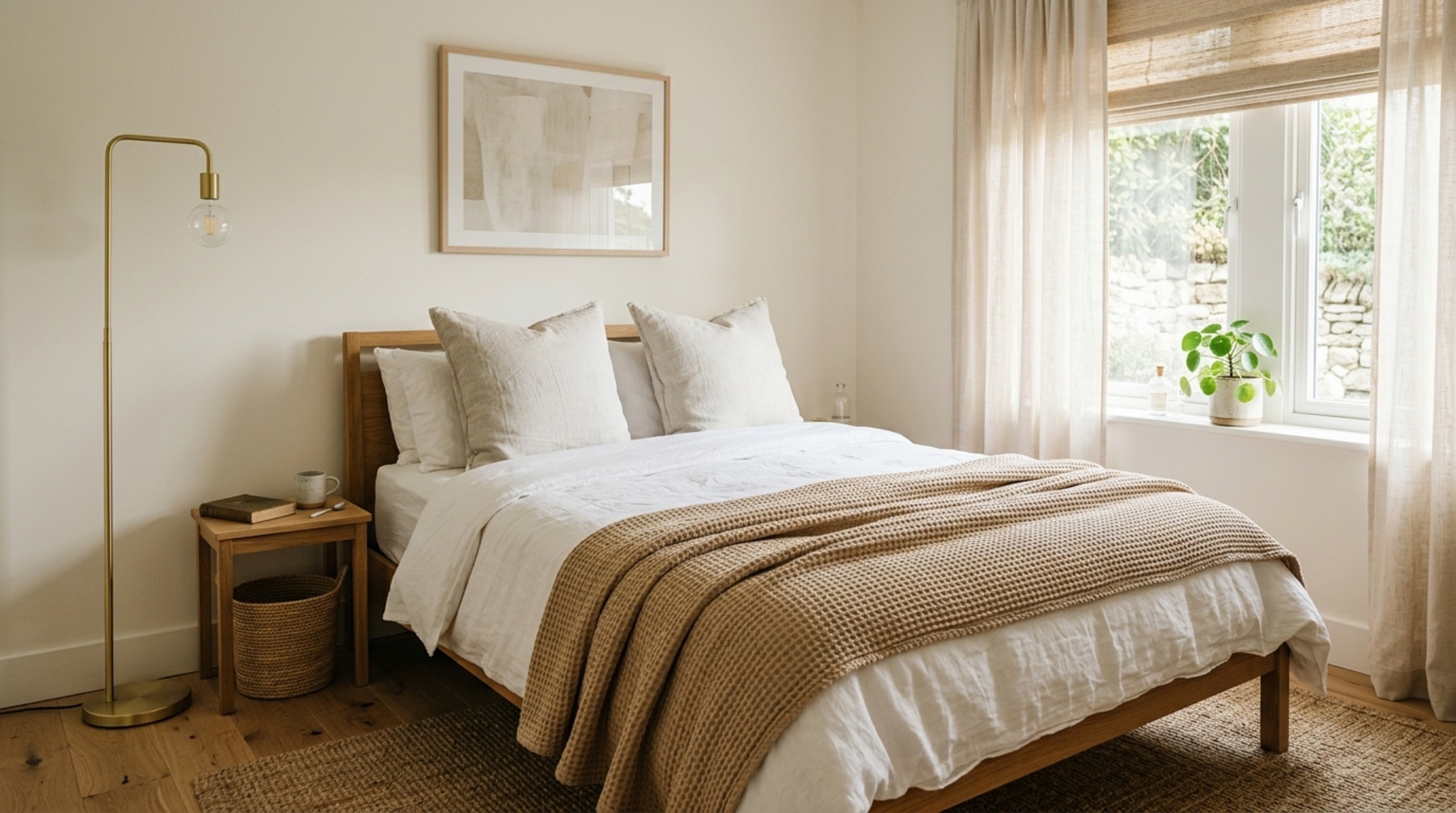
Curated Visual Chronicle: Elevating the ‘Generic’ Bedroom
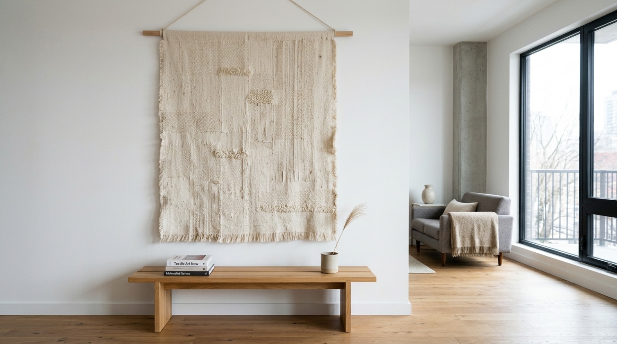
The rental bedroom is often the most neglected space, characterized by a metal bed frame and a lone dresser. To infuse this with ‘Quiet Luxury,’ focus on the ‘Headboard Horizon.’ If you cannot afford a custom upholstered headboard, consider a large-scale textile wall hanging in a heavy linen or a row of oversized, 26-inch Euro pillows in a contrasting texture like waffle-weave or velvet. This creates a focal point that anchors the room.
Lighting here should be even more intimate. Replace the standard plastic switch plates with brushed brass or matte black versions (keep the originals for when you move). Use ‘Sightline Alignment’ to place your bedside lamps at a height where the bottom of the shade is level with your chin when sitting up in bed. This prevents glare and creates a cozy, localized pool of light. These small, technical adjustments are what differentiate a ‘decorated’ apartment from a ‘designed’ home.
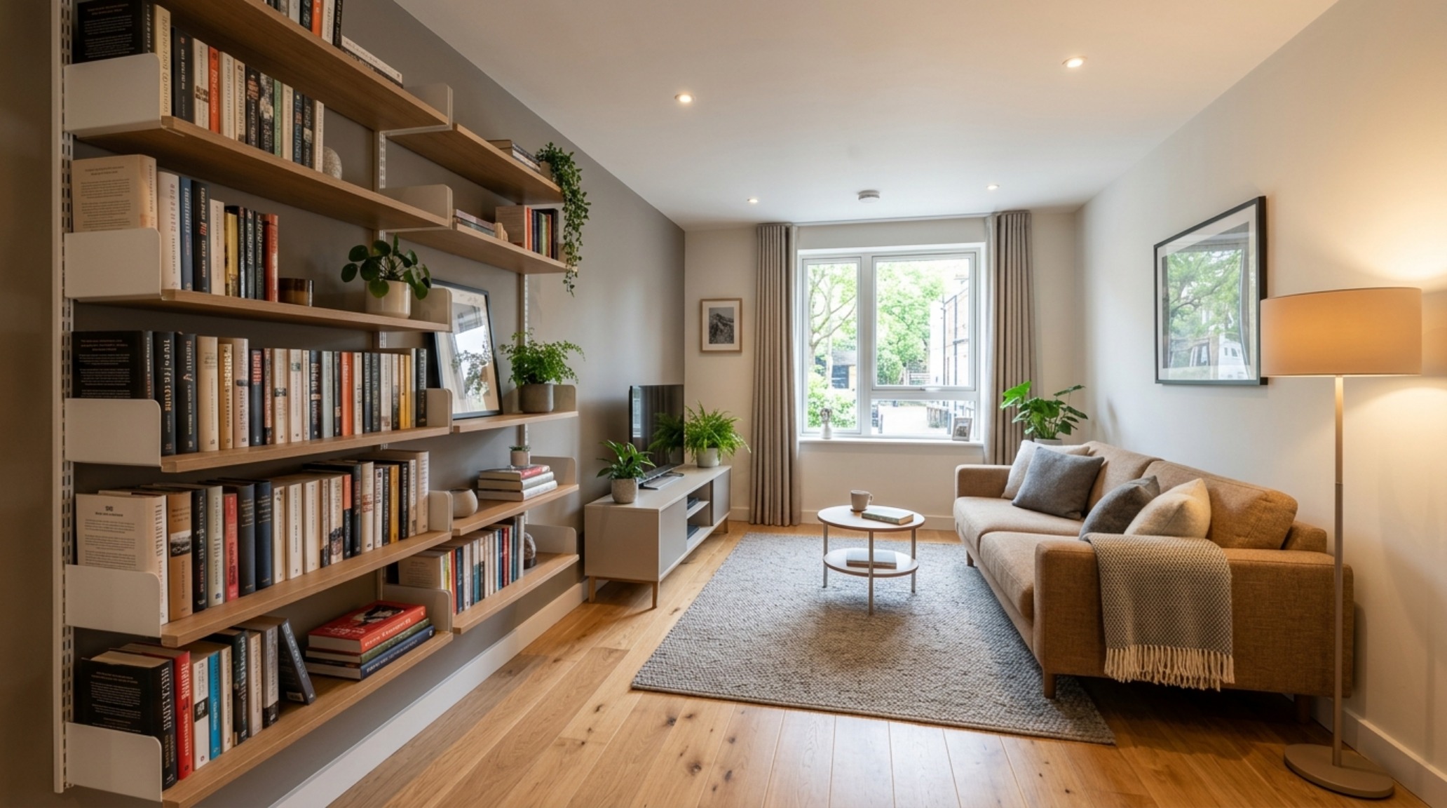
The Visual Anthology of Spatial Living: Sourcing the Soul
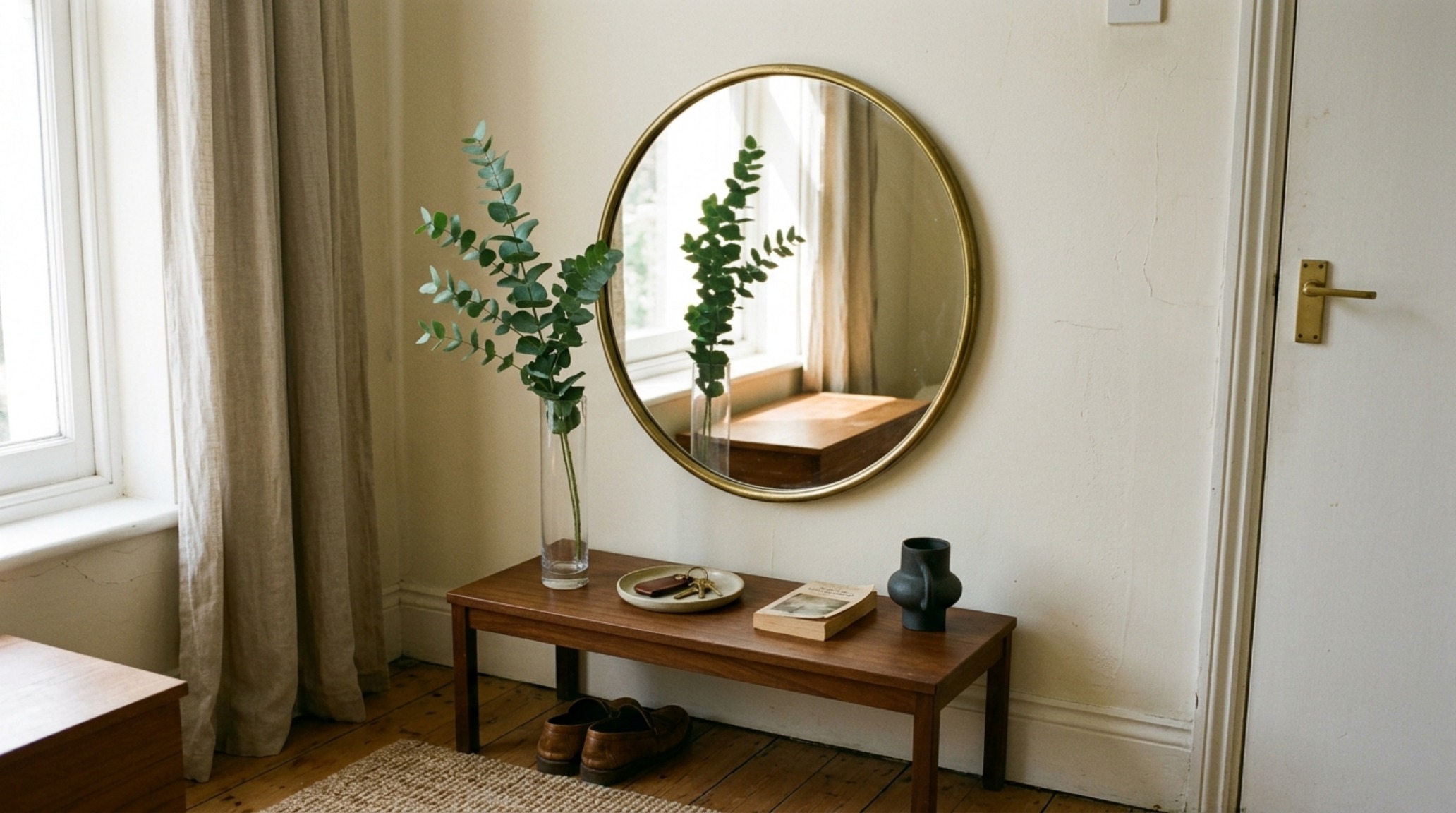
Thrifting for Quiet Luxury requires a disciplined eye. You aren’t looking for ‘trendy’ pieces; you are looking for ‘Honest Materials.’ Seek out solid wood, heavy metals, real stone, and natural fibers. A brass lamp with a slight patina is infinitely more luxurious than a shiny, gold-painted plastic one. When browsing for inexpensive apartment decorating ideas, look for items with ‘Architectural Integrity’—strong lines, balanced proportions, and a lack of unnecessary ornamentation.
Don’t be afraid of ‘The Edit.’ Often, the most luxurious thing you can do for a rental is to remove items. Clear the clutter from your surfaces and allow a few high-impact pieces to breathe. A single, large-scale thrifted vessel on a sideboard makes a much stronger statement than fifteen small tchotchkes. This ‘curatorial’ approach mimics the high-end galleries of SoHo or Paris, where the objects are given the space to be truly seen.
Curated Materiality & Technical Dimensions Guide
Curated tactile palette, spatial dimensions, and atmospheric lighting index for this design scheme.
Ultimately, a rental is not a waiting room for your ‘real’ life. It is a laboratory for your personal style. By leaning into the nuances of light, the discipline of architectural clearances, and the sensory richness of haptic layering, you transcend the limitations of a budget and a lease. True luxury is not found in a catalog; it is found in the way the afternoon sun hits a raw oak grain, the way a 2700K glow warms a corner, and the quiet satisfaction of a space that feels deeply, authentically yours. These inexpensive apartment decorating ideas serve as the foundation for a home that doesn’t just house your body, but nourishes your spirit through the steady, tactile language of thoughtful design.
Editorial Silo • Recommended Architecture Studies
- The Tactile Aesthetic of Luxury Prefab Homes: Materials, Moods & Lighting Kelvin — Archival Design Case Study
- The Architectural Blueprint: Mastering Spatial Flow with an IKEA Kitchen Designer Strategy — Archival Design Case Study
Architectural Harmony & Finishes
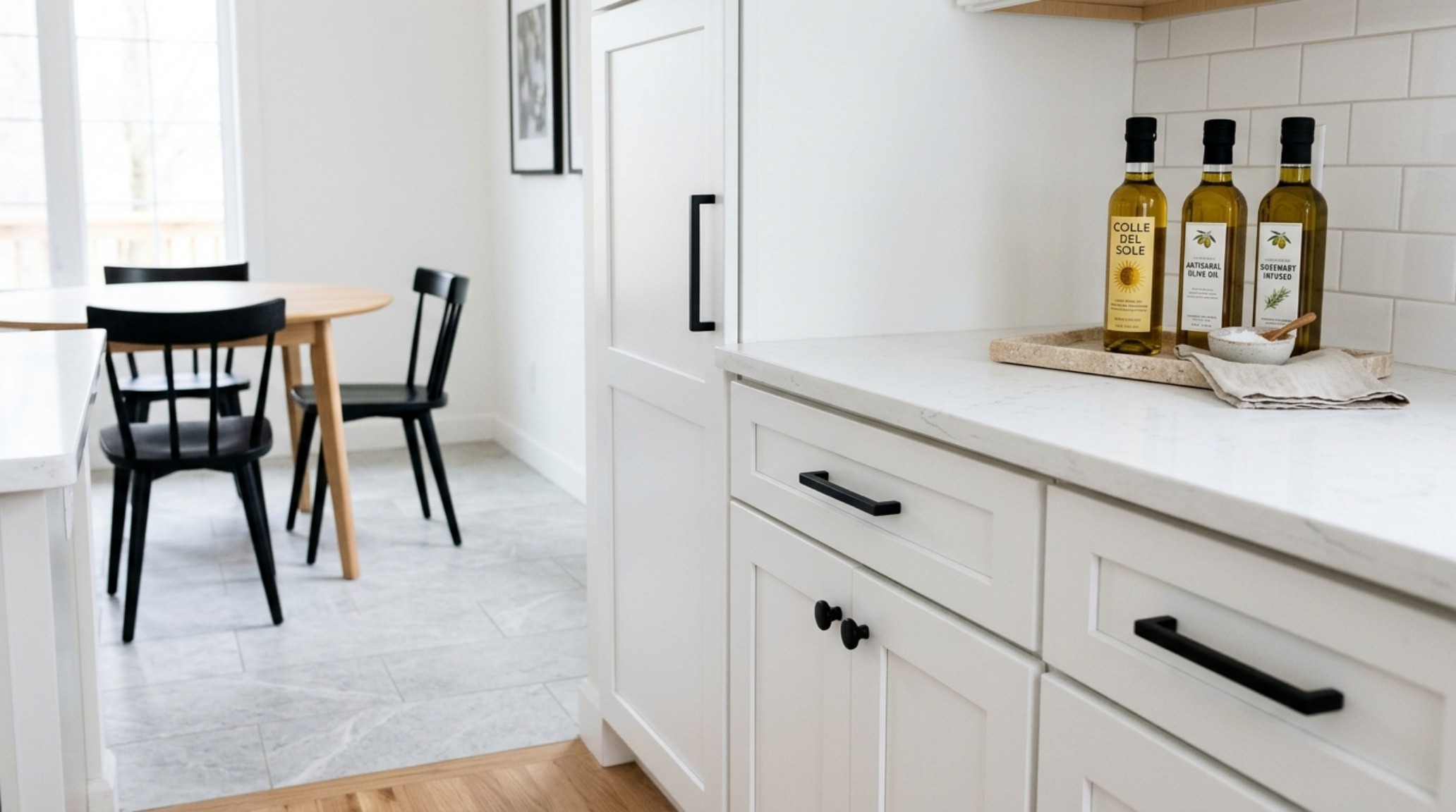
Curated spatial snapshots examining the quiet dialogue between architectural daylight and tactile surfaces.
Curated Visual Lookbook
Design Gallery & Spatial Studies
A visual curation of architectural arrangements, lighting concepts, and material palettes featured in this space.