The Evolution of Millwork: From Bulky Boxes to Sculptural Utility
For decades, domestic storage was a secondary architectural thought, often relegated to the heavy, cumbersome mahogany armoires of the 19th century or the cookie-cutter, mass-produced particle board boxes that plagued suburban developments in the late 1990s. These historical conventions frequently fought against the architecture of a room, creating awkward dead zones and suffocating visual clutter. However, we have entered a sophisticated era where cabinetry is no longer a static container but a fluid extension of the walls themselves. This evolution has paved the way for unique cabinets that prioritize ergonomic precision over mere volume, transforming forgotten alcoves into hyper-functional nodes of efficiency without sacrificing the aesthetic soul of the home.
Today’s design landscape demands more than just a place to hide the clutter. It requires a spatial cadence that respects the negative space breathing room necessary for modern mental clarity. When we discuss ergonomic mastery in cabinetry, we aren’t just talking about height; we are talking about the tactile interaction between the inhabitant and the object. It’s the way a touch-latch feels under the fingertip, the silent glide of a soft-close runner, and the strategic placement of storage at the ‘strike zone’—the area between the shoulders and knees where the human body moves most naturally.
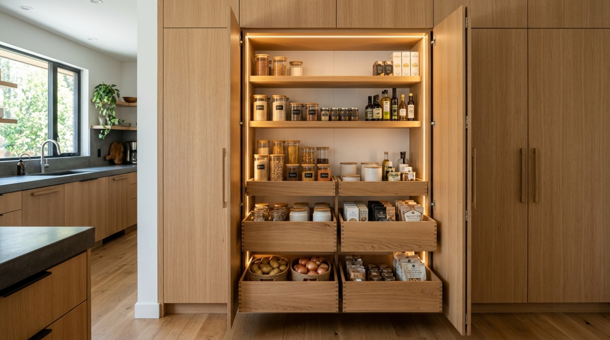
Small Space Unique Cabinets: Navigating the Urban Footprint
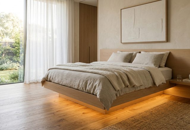
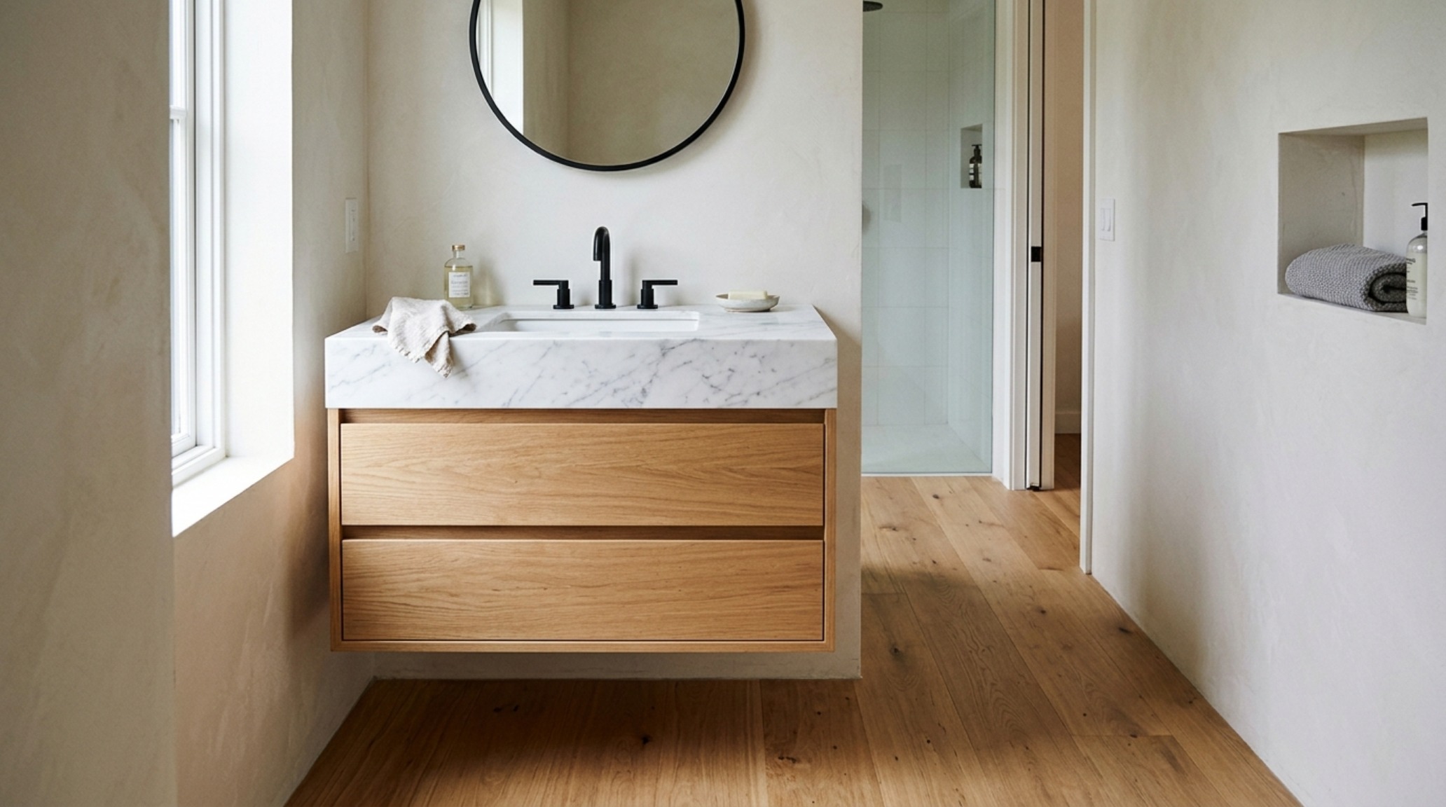
In metropolitan environments where every square inch is a premium asset, the 18-inch depth becomes a sacred measurement. Standard 24-inch cabinetry can often choke a small kitchen or hallway, violating the crucial 36-inch primary circulation rule. By employing small space unique cabinets, we can reclaim the floor plane. Floating units, for instance, create a continuous visual line of flooring that extends all the way to the wall, tricking the eye into perceiving a larger room.
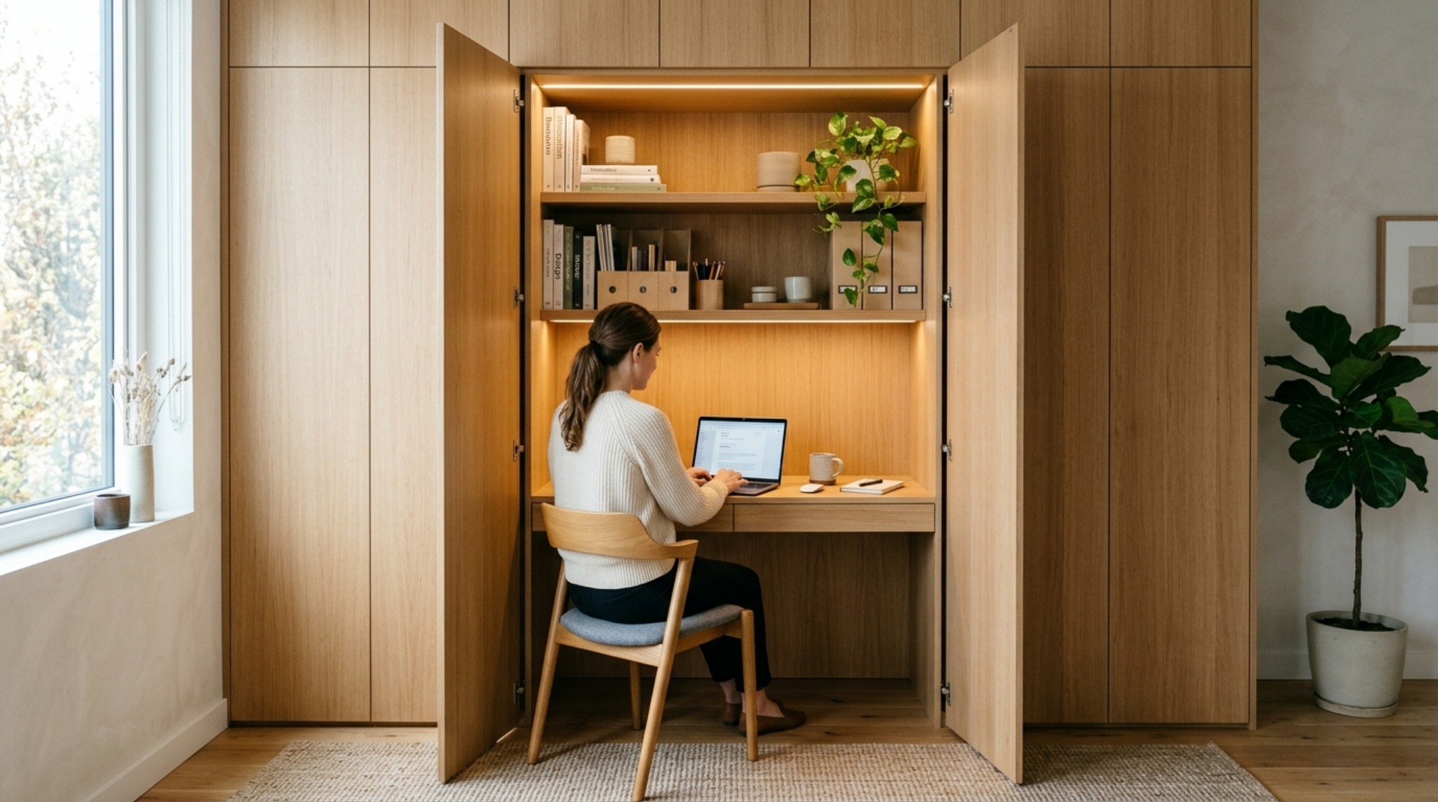
Consider the ‘pocket office’ hidden behind a bi-fold door system. When open, it provides a full workstation; when closed, it maintains the serene architectural envelope of the living room. To achieve this, use a 30-inch height for the desk surface—perfect for standard ergonomic seating—and ensure the interior is finished in a lighter tone than the exterior, such as Benjamin Moore Swiss Coffee, to reflect light into the workspace. This contrast between the outer shell and the inner sanctum adds a layer of ‘spatial discovery’ that is a hallmark of high-end custom design.
Modern Unique Cabinets Ideas: The Integration of Multi-Functional Nodes
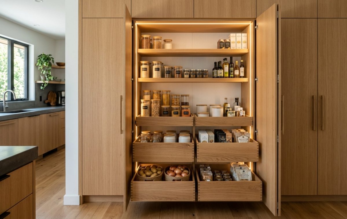
We are seeing a massive shift toward ‘chameleon cabinetry’—units that serve three or four purposes simultaneously. A mudroom bench isn’t just a place to sit; it is a charging station, a shoe repository, and a vertical pantry for seasonal gear. The key to success here is the internal configuration. Instead of deep, dark shelves where items go to die, use full-extension pull-outs with high-sided galleries. This allows for total visibility of the contents, eliminating the ‘archeological dig’ often required in traditional cupboards.
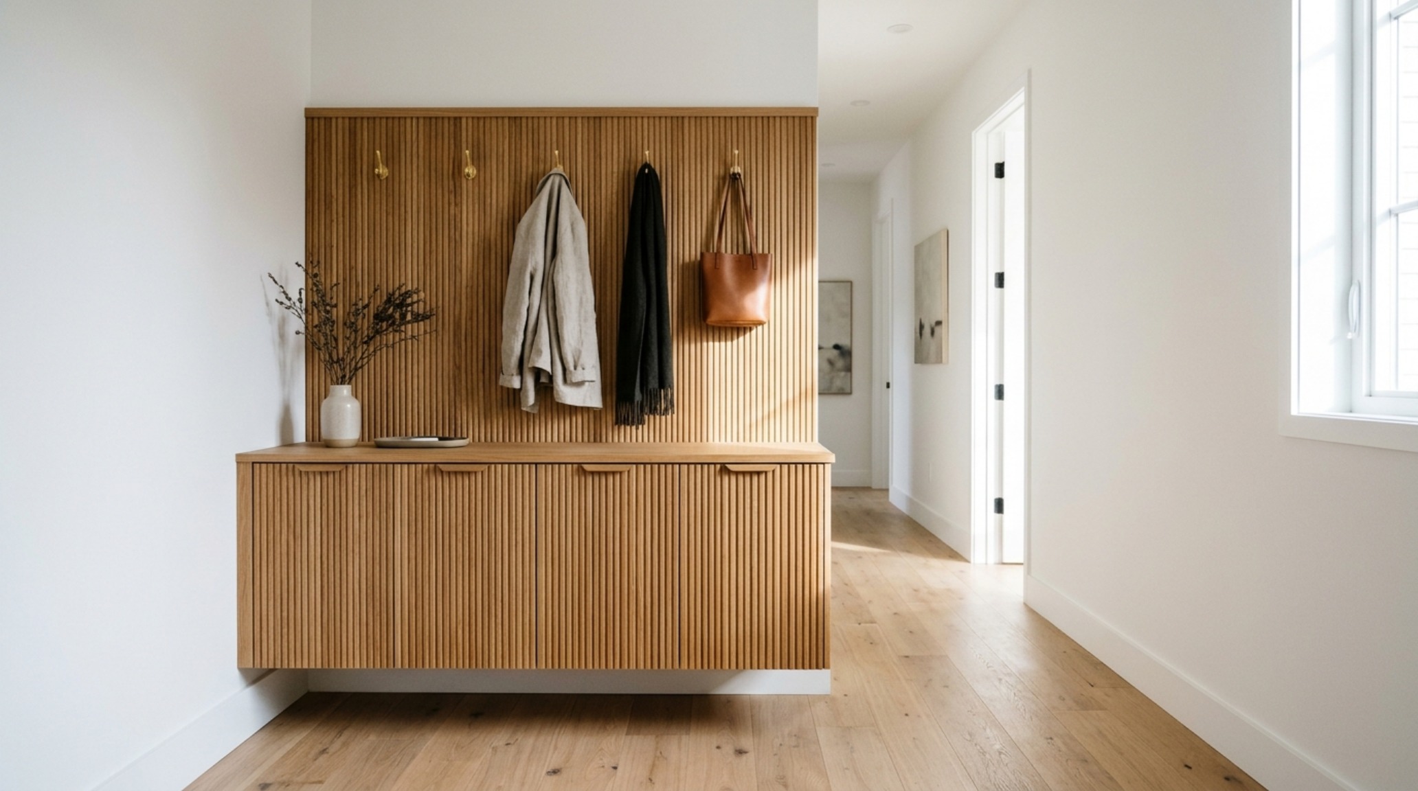
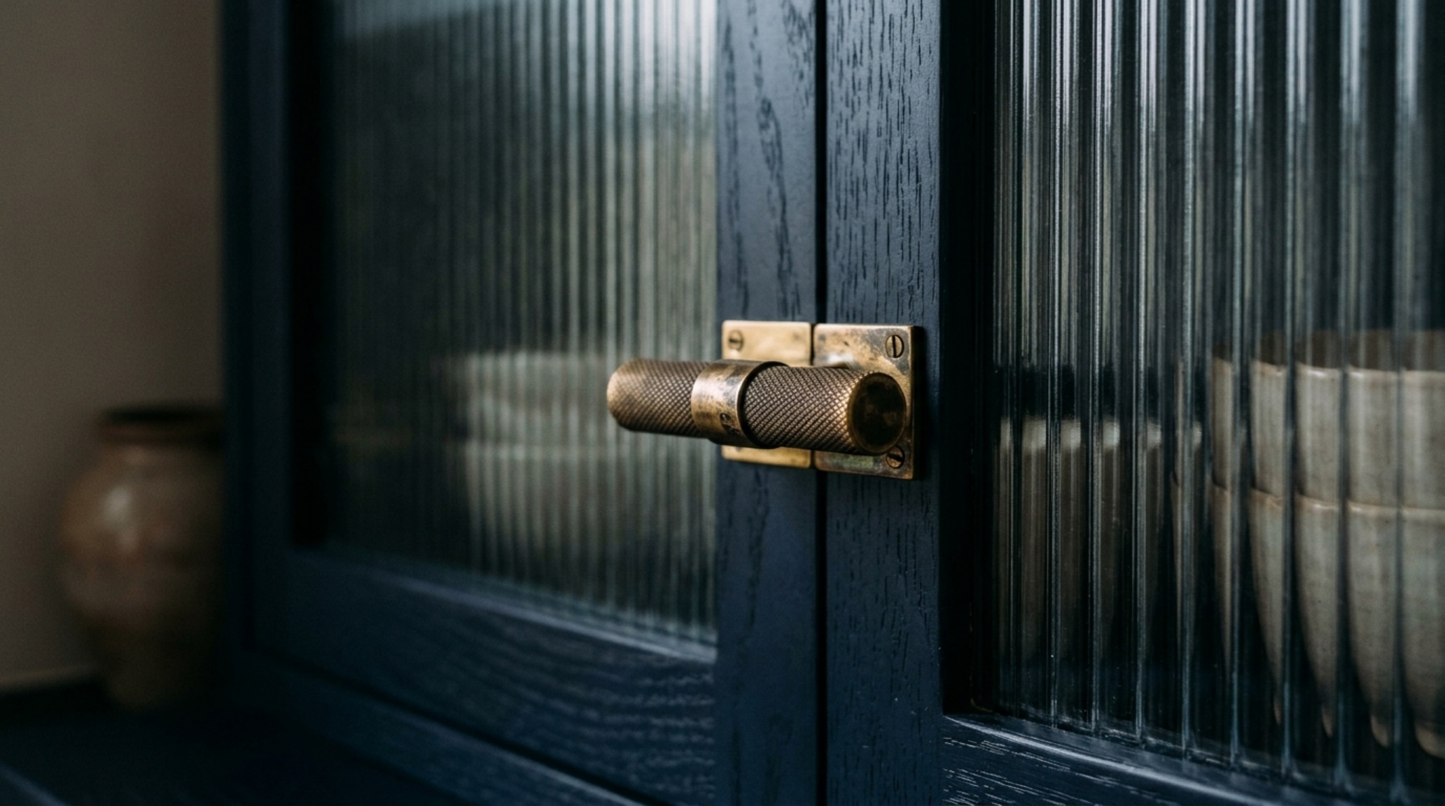
Another rising trend in modern unique cabinets ideas is the integrated beverage station or ‘morning bar.’ This is usually tucked away behind fluted or reeded glass doors. The materiality here is vital: think honed travertine counters paired with dark oak interiors. The 18-inch coffee table reach translates here to a 15-inch upper cabinet depth, ensuring that you don’t hit your head while prepping your morning espresso. It is about aligning the sightlines so that the hardware—perhaps a knurled brass pull—is perfectly positioned at a 42-inch height for effortless access.
Luxury Unique Cabinets Textures: The Tactile Language of Millwork
Luxury is increasingly defined by the hand-feel of a surface. We are moving away from high-gloss lacquers toward matte, organic finishes that invite touch. Luxury unique cabinets textures such as wire-brushed white oak, sandblasted ash, or even leather-wrapped door panels provide a sensory grounding that synthetic materials simply cannot replicate. Using a deep, evocative shade like Farrow & Ball Railings or Setting Plaster creates a shadow play that highlights the grain of the wood.
When specifying these textures, the lighting must be intentional. A flat, overhead light will wash out the beauty of a fluted panel. Instead, use grazing light—low-profile LED strips tucked into a 1/2-inch reglet—to cast long, soft shadows across the texture. This emphasizes the three-dimensionality of the cabinet, turning a functional storage piece into a piece of wall art. The goal is to achieve a High CRI of 90+, ensuring that the rich undertones of the wood or paint are rendered accurately, rather than looking muddy or gray.
Architectural Details & Spatial Cadence
In the transition between rooms, cabinetry can act as a bridge. A floor-to-ceiling unit that wraps around a corner doesn’t just store books; it guides the inhabitant through the space. This is where the concept of ‘sightline alignment’ becomes critical. If a cabinet sits at the end of a long hallway, its proportions must be calibrated to the architecture. A 4-inch recessed toe-kick creates a ‘shadow gap’ that makes the unit appear to hover, reducing its perceived mass and keeping the spatial flow light and airy.
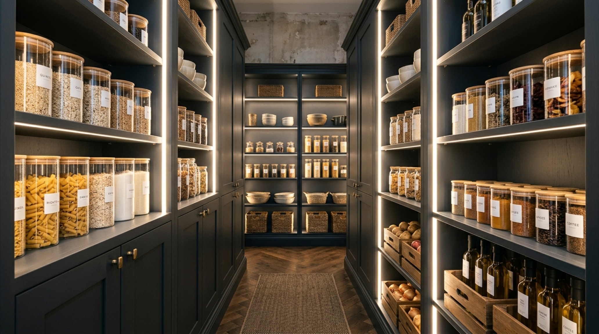
Furthermore, the internal hardware is where the true ergonomic mastery lies. Brands like Blum or Grass offer hinges that allow for zero-protrusion, meaning pull-out drawers can bypass the door entirely. This is essential for narrow pantry configurations where every millimeter counts. When designing unique cabinets, always account for the ‘swing’ of the door. A 90-degree stop is often necessary to prevent the hardware from impacting adjacent walls, especially in tight corner conditions where a 1-inch filler strip is the difference between a functional drawer and a stuck one.
Unique Cabinets Lighting Guide: Illuminating Shadow and Depth
Lighting is the ‘invisible’ material that defines the success of any cabinetry project. Without a proper unique cabinets lighting guide, even the most expensive millwork can feel cavernous and uninviting. The gold standard is a layered approach: ambient, task, and accent lighting. Inside a deep pantry, 3000K task lighting is preferable for clarity, while a 2700K warm ambient glow is better for glass-fronted display units in a dining room.
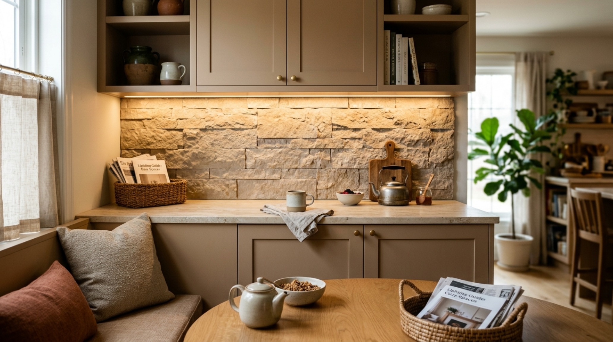
Integrating sensors is a modern necessity. Imagine opening a drawer to find it softly illuminated by a concealed LED strip that activates upon movement. This isn’t just a luxury; it is a functional hack for aging-in-place and general ease of use. For those working with darker palettes, such as Charcoal or Navy, interior lighting is non-negotiable. Dark surfaces absorb light, making it difficult to find small items. By lining the interior with a lighter wood veneer or adding vertical LED channels, you create a luminous ‘jewelry box’ effect that elevates the entire experience of the home.
Consider the ‘halo’ effect—placing LED tape on top of upper cabinets to wash the ceiling with light. This draws the eye upward, emphasizing the height of the room and creating a soft, secondary light source that reduces the need for harsh overhead cans. It is these small, technical details that separate a standard renovation from a professional architectural intervention.
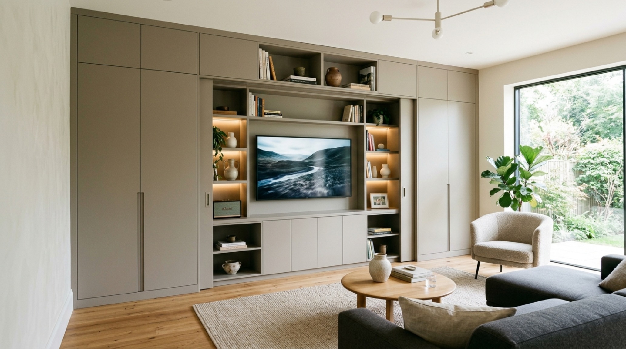
The Ergonomics of Reach and Clearance
Designing for the human body means respecting the 30-inch dining chair clearance and the 36-inch primary walkway. If a cabinet door is 24 inches wide, it requires a significant amount of ‘swing space.’ In tighter rooms, switching to sliding bypass doors or ‘flipper’ doors that slide back into the cabinet body can save significant floor area. This is the essence of ergonomic mastery: removing the physical obstacles that impede daily movement.
We must also consider the ‘visual weight’ of hardware. Oversized pulls on a small cabinet can make the piece feel cluttered, while no-hardware ‘finger pulls’ or ‘J-channels’ maintain a minimalist, architectural facade. For those who prefer a traditional touch, a 6-inch center-to-center pull is the ergonomic sweet spot for most hands, providing enough leverage for heavy drawers without dominating the face of the cabinetry. These decisions should always be grounded in the tactile materiality of the project—a cold steel pull feels different than a warm, vegetable-tanned leather tab.
Material Schedule & Specification Sheet
Bespoke specification schedule outlining tactile textures, lighting ambiance, and ergonomic proportions.
Ultimately, the mastery of unique cabinets lies in the marriage of the mechanical and the poetic. It is the understanding that a home is a living, breathing organism that requires both the rigid discipline of architectural clearance and the soft, expressive touch of curated materiality. As we continue to blur the lines between furniture and architecture, the most successful designs will be those that disappear into the background, providing a silent, supportive framework for the beauty of everyday life. We are no longer just building storage; we are sculpting the very way we inhabit our private sanctuaries, one perfectly aligned hinge at a time.
Editorial Silo • Recommended Architecture Studies
- Beds That Save Space: The Architectural Blueprint & Spatial Flow Guide — Archival Design Case Study
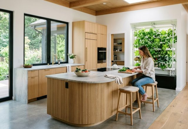
- The Closed-Loop Life: Mastering the Functional Ergonomics of Self Sustaining Homes — Archival Design Case Study
Spatial Balance & Form Lookbook
Photographic compositions framing clean architectural sightlines and layered sensory textures.

Curated Visual Lookbook
Design Gallery & Spatial Studies
A visual curation of architectural arrangements, lighting concepts, and material palettes featured in this space.