The Physics of Flow: Navigating Modern Design On A Budget
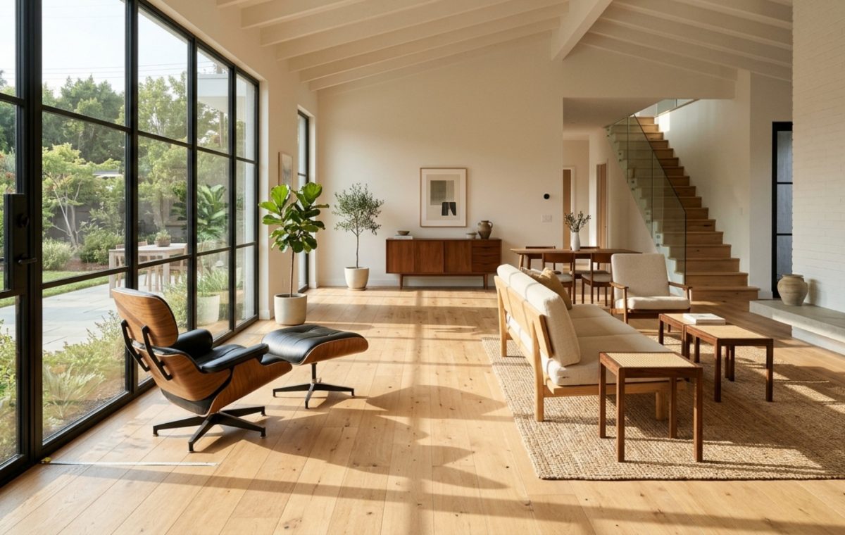
Walking into a room isn’t just an act of entry; it is a physical interaction with volume and void. To achieve true modern design on a budget, one must first respect the immutable laws of spatial physics—the 36-inch primary circulation path that allows two bodies to pass without a choreographed dance, and the 12-inch clearance required for a door to swing without clipping the edge of a mid-century sideboard. When we prioritize these ergonomic clearances, the architecture begins to breathe. We aren’t just placing furniture; we are choreographing movement. By mapping out sightline paths that lead the eye toward natural light, even the most modest footprint gains a sense of curated intentionality that feels expensive, yet costs nothing but a tape measure and a discerning eye.
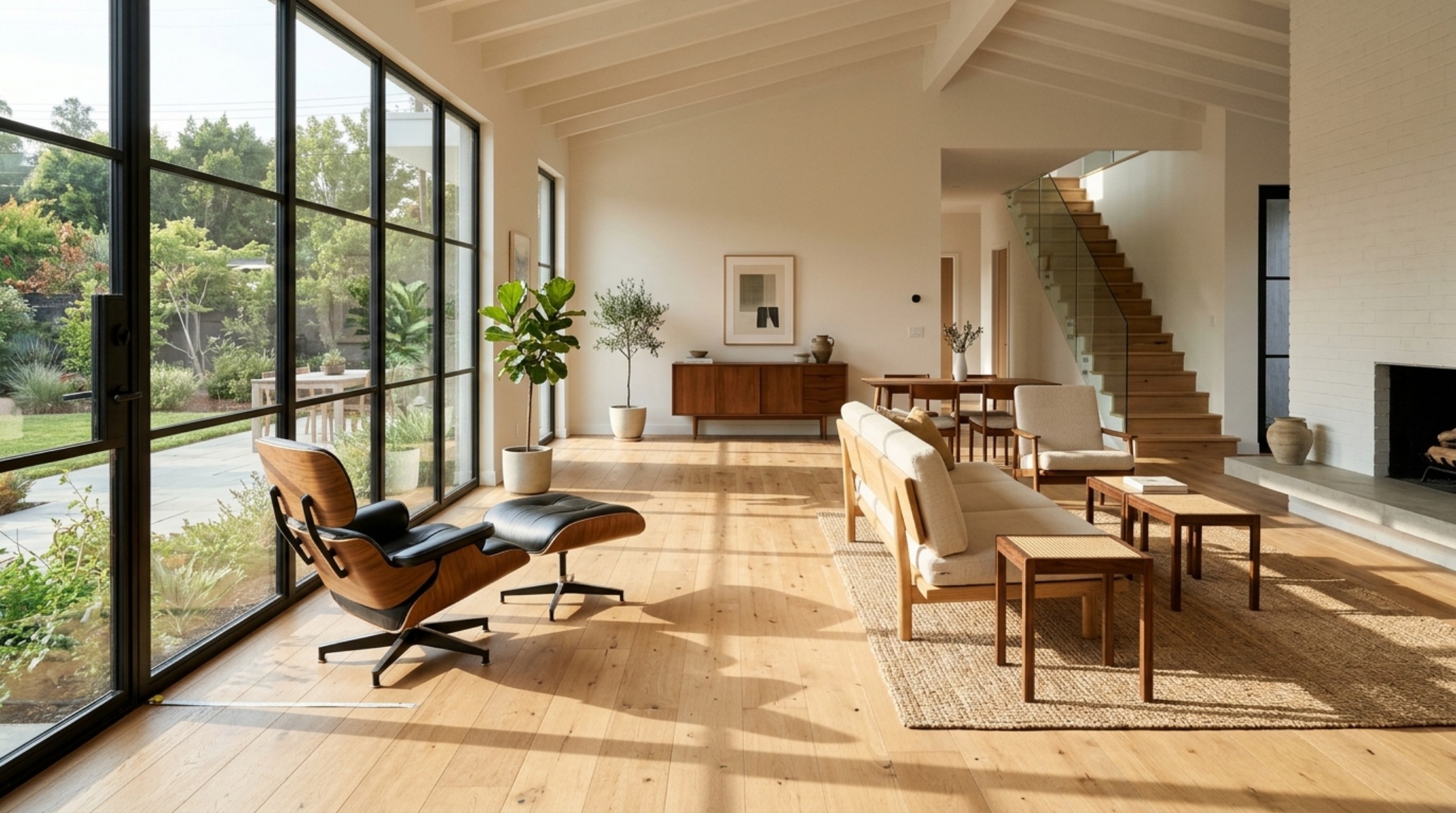
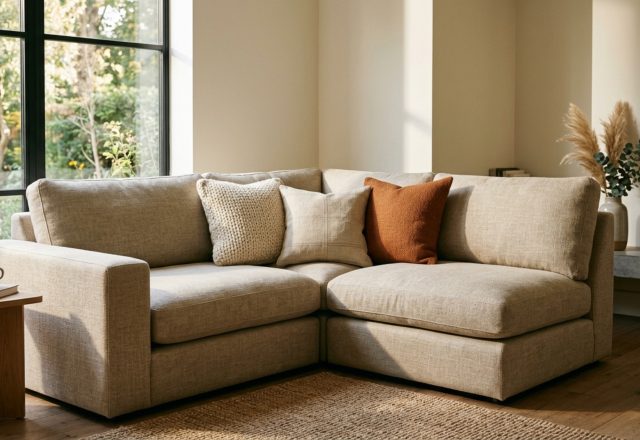
The secret to high-end spatial cadence lies in the tension between furniture and the negative space surrounding it. In a living room, the 18-inch reach from a sofa to a coffee table is a functional necessity that defines the ‘conversational anchor.’ If that gap is too wide, the room feels cold; too narrow, and it feels cluttered. For those of us navigating the constraints of a budget, achieving this balance often means opting for ‘leggy’ furniture—pieces that sit high on tapered oak or blackened steel frames—to keep the floor plane visible. This visual continuity tricks the brain into perceiving more square footage than actually exists, turning a cramped apartment into an airy sanctuary.
Spatial Perspectives & Lighting Vignettes: The Art of the Layered Glow
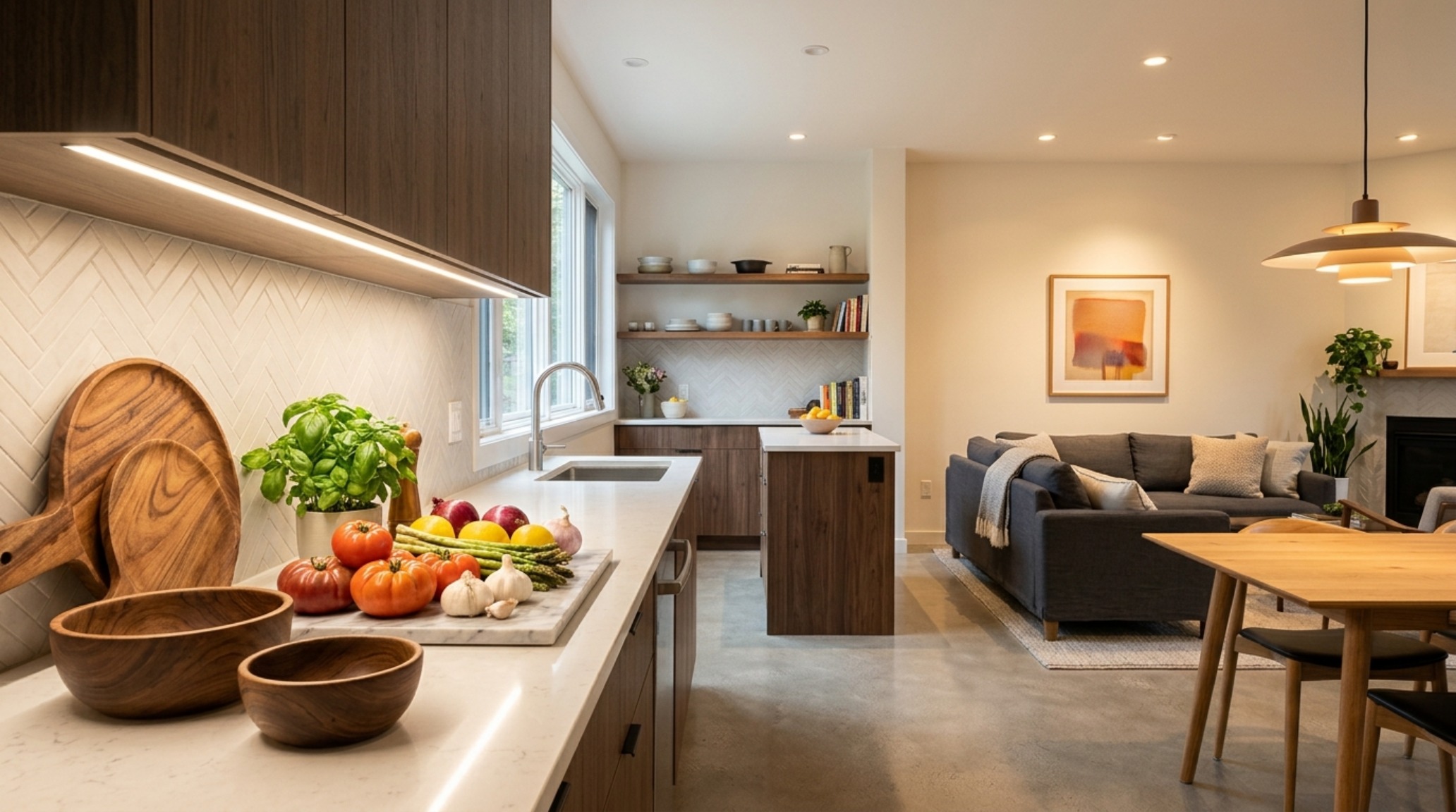
Lighting is the architectural invisible hand. Without a proper modern design on a budget lighting guide, even the most beautifully curated room falls flat under the oppressive glare of a single overhead ‘boob light.’ We think in layers: ambient, task, and accent. For a warm, residential feel that mimics the glow of a high-end boutique hotel, I always recommend a 2700K Kelvin temperature for ambient layers, ensuring a soft, golden hue that smooths out the imperfections of budget-friendly drywall.
When you transition to task areas—the kitchen island or the reading nook—move slightly cooler to a 3000K bulb with a High CRI (Color Rendering Index) of 90+. This ensures that the textures of your materials, perhaps a honed butcher block or a linen-weave rug, are rendered with true-to-life vibrancy. Positioning a sconce exactly 60 inches from the floor creates a sophisticated vertical rhythm, drawing the eye upward and highlighting the height of the room. This strategic placement of light is where ergonomic mastery meets aesthetic luxury; it directs the user’s focus and defines zones within an open-concept layout without the need for physical partitions.
Small Space Modern Design On A Budget: Mastering Multi-Functional Integration
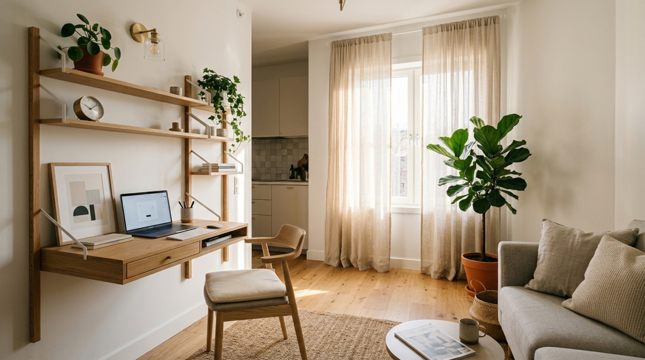
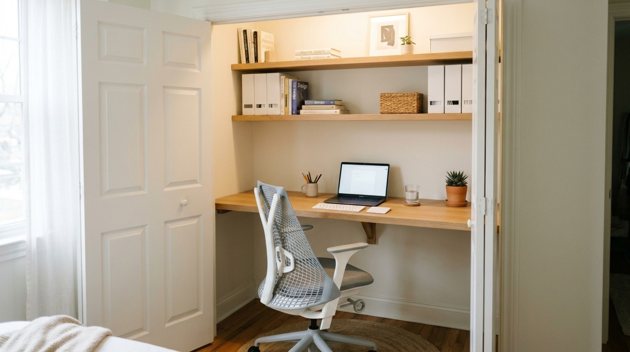
In the realm of small space modern design on a budget, every square inch must justify its existence twice over. The most ingenious solutions are those that remain hidden until the moment of utility. Consider the ‘Cloffice’—a standard 24-inch deep reach-in closet transformed into a streamlined workstation. By removing the doors and installing a floating desk at the standard 29-inch height, you reclaim a room’s footprint while maintaining a dedicated zone for productivity. Use a soft, receding paint color like Benjamin Moore Swiss Coffee on the interior of the nook to prevent it from feeling like a dark cavern.
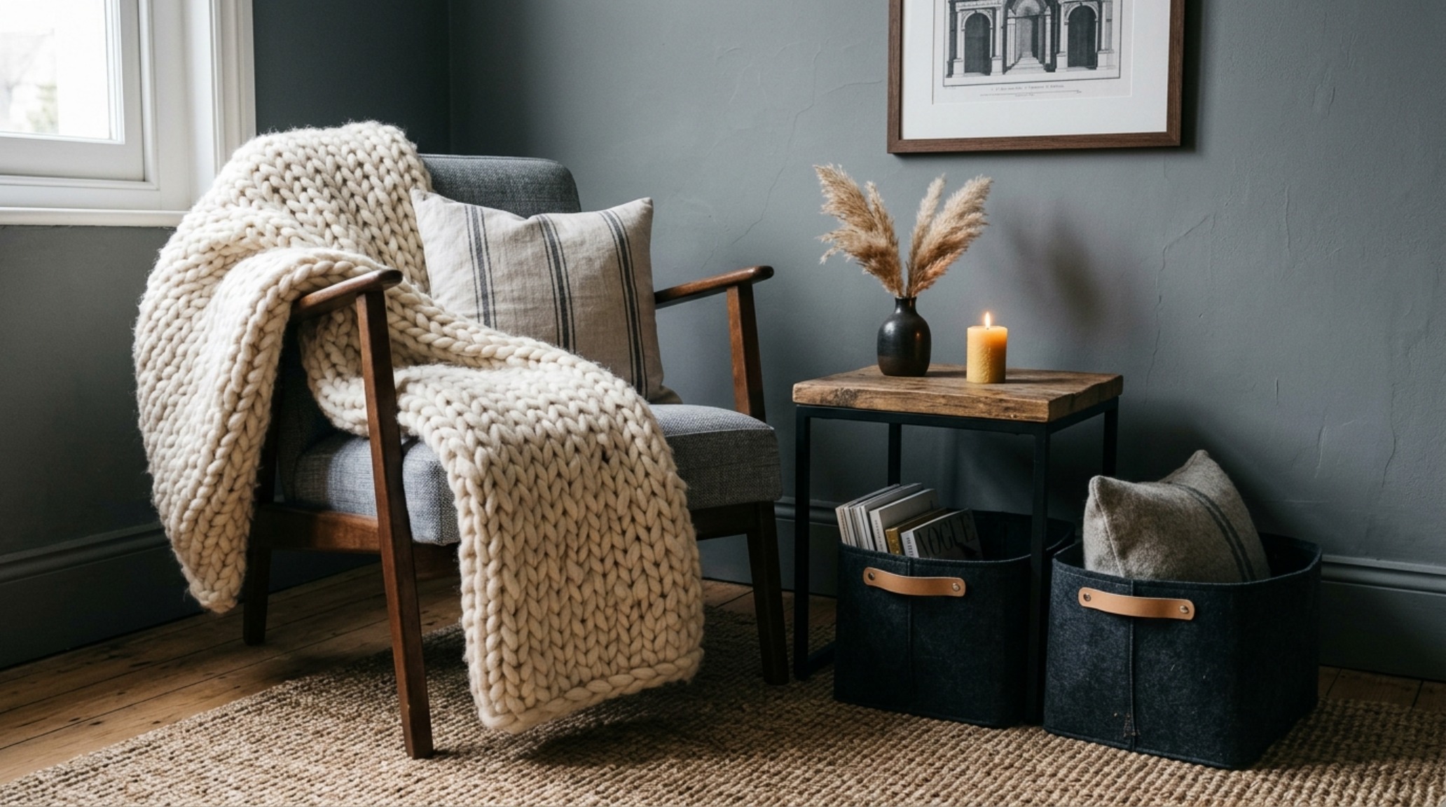
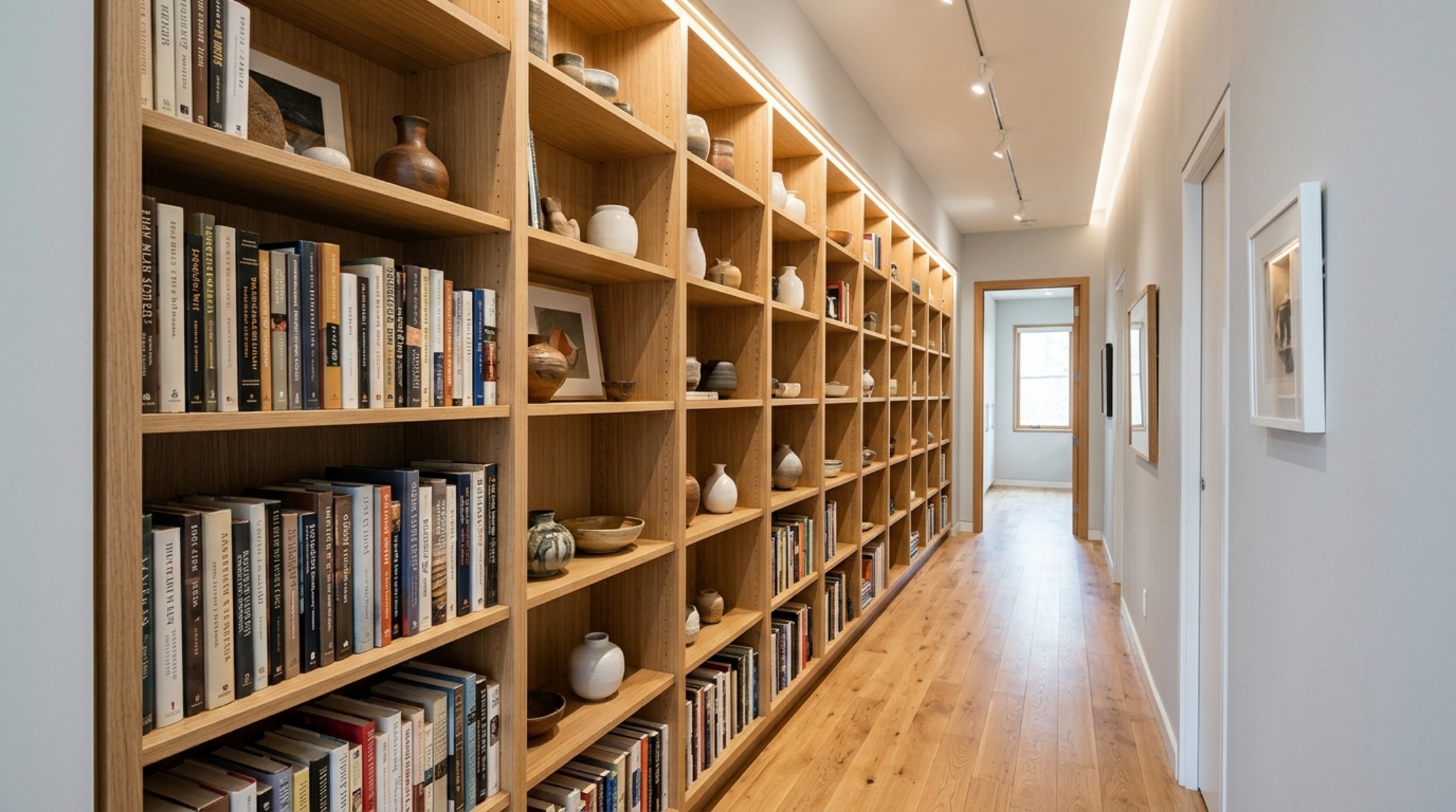
Verticality is your greatest ally. Instead of wide, sprawling bookshelves that eat into your 36-inch walkways, opt for floor-to-ceiling shelving units that emphasize the ‘Y-axis’ of the room. This draws the gaze toward the ceiling, creating a sense of grandeur. To keep the look cohesive, use uniform storage bins in a tactile material like woven seagrass or matte grey felt. This minimizes visual noise, which is the primary enemy of modern minimalism. When the eye can travel across a room without being snagged by clutter, the space feels exponentially larger and more refined.
The Visual Concept Gallery: Texture as a Tool for Depth
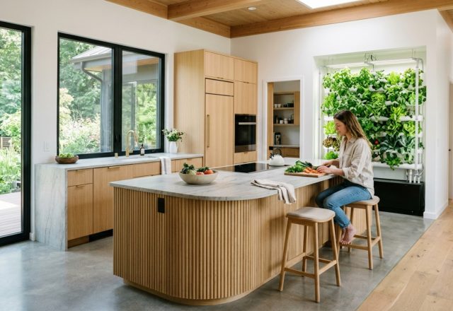
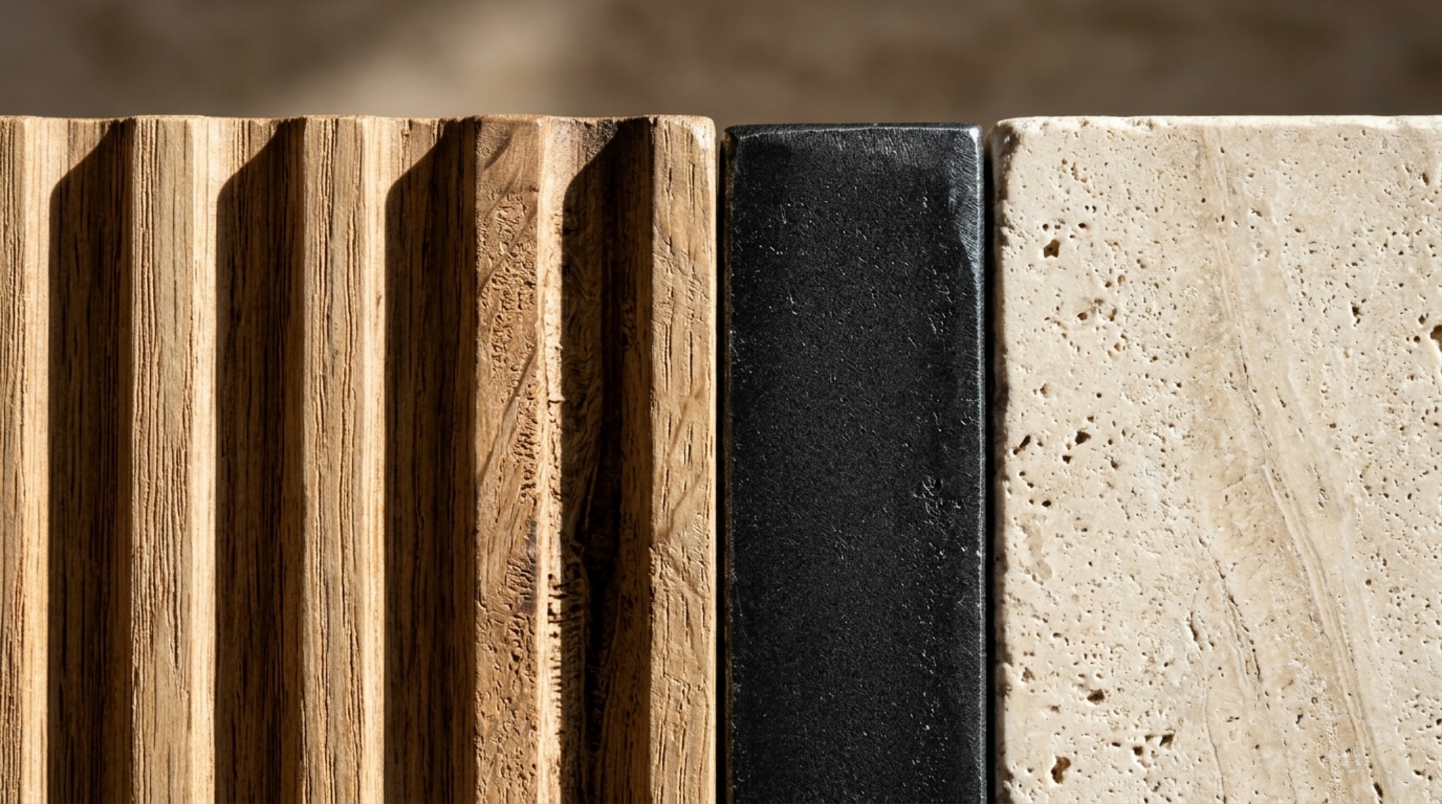
Materiality is where a budget-conscious project truly earns its ‘luxury’ stripes. You don’t need slabs of Calacatta marble to evoke a sense of opulence; you need luxury modern design on a budget textures that engage the sense of touch. I often look toward fluted wood panels or ribbed glass to introduce a play of light and shadow. A fluted DIY headboard made from simple dowels, painted in a deep, grounded hue like Farrow & Ball Railings, provides a rhythmic backdrop that feels custom-architectural.
Contrast is the driver of visual interest. Pair a smooth, cool surface—like a powder-coated metal side table—with something rough and organic, such as a chunky wool throw or a jute rug. This juxtaposition prevents a modern room from feeling like a sterile showroom. In the kitchen, replacing standard hardware with brushed brass or matte black knurled pulls is a tactile upgrade that users interact with daily. These touchpoints are where the ‘ergonomic mastery’ is felt; a heavy, well-designed handle provides a physical sensation of quality that belies its modest price point.
Modern Modern Design On A Budget Ideas: The Power of Intentional Subtraction
We often think of design as an additive process, but in modern architecture, it is frequently subtractive. Some of the best modern modern design on a budget ideas involve removing ‘builder-grade’ clutter to reveal the clean lines beneath. Take off the ornate, dusty crown molding; swap out the yellowed plastic light switches for clean-lined screwless plates. By simplifying the ‘envelope’ of the room, you create a gallery-like backdrop for your hero pieces.
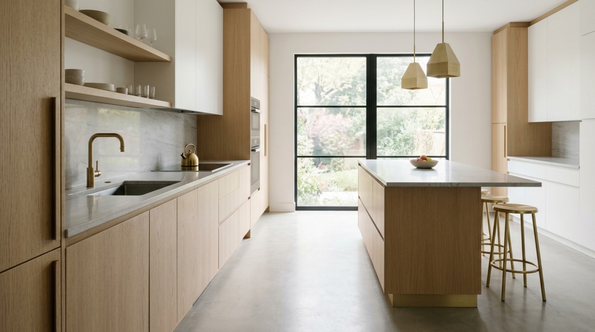
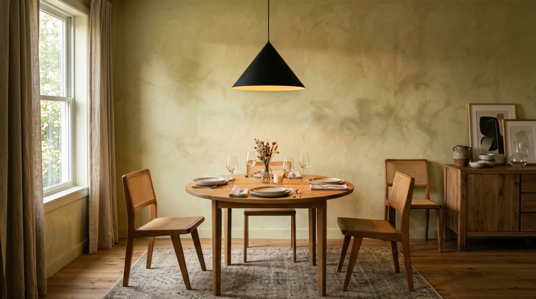
When selecting furniture for a dual-purpose room, look for ‘transformative ergonomics.’ A dining table that expands from 48 inches to 72 inches allows for intimate daily use without sacrificing the ability to host. However, remember the 30-inch clearance rule: you need 30 inches between the table edge and the wall to allow someone to comfortably pull out a chair and sit down. If your space doesn’t allow for this, consider a built-in banquette with hidden storage underneath. It hugs the wall, saves precious floor space, and offers a cozy, custom-built feel that is both functional and evocative of a high-end bistro.
Architectural Vignettes & Spatial Flow: Refining the Private Quarters
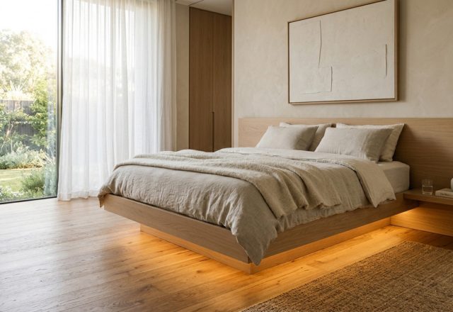
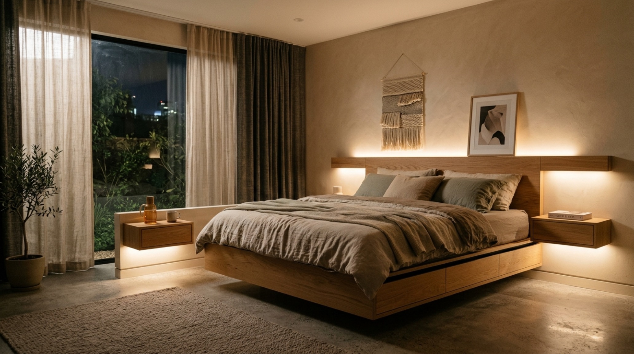
The bedroom should be a masterclass in soft ergonomics. Here, the clearances are about more than movement; they are about tranquility. Maintain at least 24 inches on either side of the bed to allow for easy bed-making and nighttime navigation. Lighting should be low and diffused—think 2200K to 2400K for bedside lamps to signal the body’s circadian rhythm that it’s time to wind down. A high CRI 92+ rating is less critical here than the ability to dim the output to a mere whisper of light.
For storage in the bedroom, think beyond the dresser. A platform bed with integrated soft-close drawers provides the equivalent of a six-drawer chest without occupying any additional floor area. This keeps the perimeter of the room clear, preserving those vital sightlines from the doorway to the window. When the floor is visible under the bed (or the bed appears to float), the room feels less ‘heavy,’ promoting a psychological sense of lightness that is essential for a rest-focused environment.
Materiality, Palette & Dimension Blueprint
Architectural breakdown detailing authentic surfaces, paint references, and standard circulation clearances.
Ultimately, achieving modern design on a budget is a discipline of restraint and rhythmic arrangement. It is the realization that a room is not a collection of objects, but a container for human experience. When we align our furniture with the natural flow of our lives—honoring the 36-inch path and the 2700K glow—we create spaces that feel inherently ‘correct.’ It is a quiet form of architectural mastery that doesn’t scream for attention but offers a steady, tactile comfort that endures long after the trends have faded. Design is not about what we spend, but how we inhabit the shadows and light of the places we call home.
Editorial Silo • Recommended Architecture Studies
- Beds That Save Space: The Architectural Blueprint & Spatial Flow Guide — Archival Design Case Study
- The Closed-Loop Life: Mastering the Functional Ergonomics of Self Sustaining Homes — Archival Design Case Study
Interior Form & Detail Lookbook
Photographic compositions framing clean architectural sightlines and layered sensory textures.
Curated Visual Lookbook
Design Gallery & Spatial Studies
A visual curation of architectural arrangements, lighting concepts, and material palettes featured in this space.