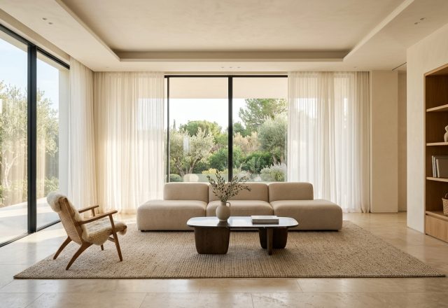
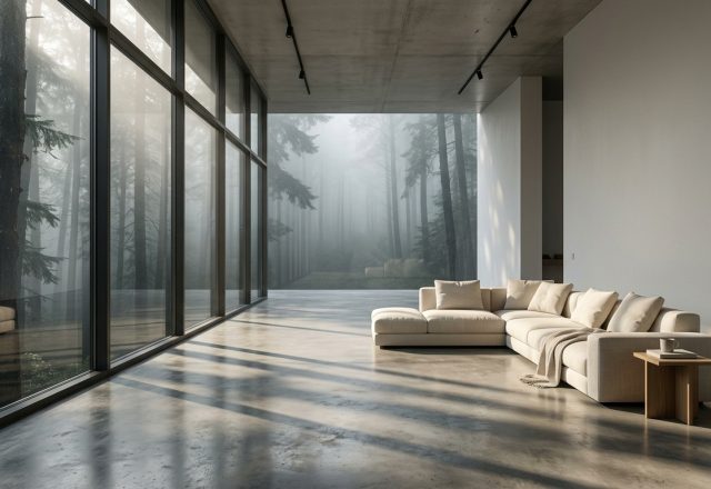
Every home possesses a hidden architectural pulse, often found in the neglected vacuum beneath the primary staircase. For years, these triangular voids were relegated to the shadows of storage, housing forgotten coats and seasonal clutter. But today, a sophisticated shift is occurring. Homeowners and architects are recognizing that this specific geometry offers a unique opportunity for high-performance design. The creation of a powder room under stairs is no longer just a clever use of space; it is an exercise in rigorous engineering and aesthetic daring. By mastering the strictures of the International Residential Code (IRC) and leaning into the constraints of a sloped ceiling, we can transform a structural necessity into a home’s most talked-about sanctuary.

The Geometric Blueprint: Decoding the 80-Inch Rule
Designing within a staircase’s footprint requires a cold, hard look at verticality. The architectural pivot point of any successful under-stair renovation is the ceiling height. According to the IRC, a bathroom must have a ceiling height of not less than 80 inches at the center of the required area around fixtures. When you are dealing with a pitch that might drop to 48 inches or lower at the far end, every millimeter of floor plan counts. I often advise clients to map out the ‘headroom arc’ before a single stud is placed. This is where the engineering of a sub-floor ‘stub stack’ becomes vital. By slightly raising the finished floor or utilizing a rear-discharge drainage system, you can gain the critical inches needed to ensure a tall guest doesn’t feel the pinch of the architecture. The goal is a spatial cadence that feels intentional, not accidental. In the hero visual above, notice how the door alignment allows for immediate entry into the highest point of the room, instantly grounding the visitor in a sense of openness despite the compact footprint.
The Mechanical Core: Wall-Hung Systems and Stub Stacks
Traditional floor-mounted toilets are the enemy of the small-scale half bath. They consume precious floor real estate and complicate the cleaning of a tight corner. The professional move is the integration of an in-wall tank system, such as those engineered by Geberit. By concealing the cistern within the wall cavity at the highest pitch of the ceiling, we reclaim roughly six to nine inches of depth. This choice is as much about structural integrity as it is about visual lightness. When the floor remains visible from wall to wall, the human eye perceives a larger room. Furthermore, the technical execution of a stub stack—a vertical drainpipe that doesn’t extend through the roof—allows for seamless drainage in these often-isolated central home locations without major structural upheaval of the upper stories.

Masterstroke Design: Aesthetics of the Powder Room Under Stairs
Once the spatial logic is locked, the fun of the ‘Jewel Box’ aesthetic begins. Because these rooms are transitional and small, they are the perfect laboratory for maximalism or ultra-refined quiet luxury. This is where the powder room under stairs truly earns its keep as a design feature. I frequently turn to the ‘Maximalist Jewel Box’ approach, using deep, saturated tones or immersive wallpapers that wrap the entire volume—ceiling included. In the architectural layout viewed previously, the transition from the bright, airy hallway to a moody, texture-rich interior creates a powerful sensory experience. Think Farrow & Ball Setting Plaster for a soft, plaster-like glow, or Benjamin Moore Swiss Coffee for a crisp, gallery-like finish that allows architectural shadows to do the talking. The sloped ceiling isn’t a flaw; it’s a canvas for shadow play and intimate lighting.
Tactile Grounding: Materials That Command Attention
In a space where you can reach out and touch every wall, materiality is paramount. There is no room for faux finishes or cheap substitutes here. Use tactile grounding to make the space feel expensive. A vanity carved from a single block of honed travertine or a fluted oak cabinet adds a layer of craftsmanship that resonates. These materials respond beautifully to the directional natural sunlight that might peek through a small high-level window or the glow of a well-placed sconce. When a guest runs their hand along a cool, hand-applied limewash wall, the smallness of the room disappears, replaced by an appreciation for the artisanal quality of the build.

The image above highlights the interplay of these textures. The contrast between the rigid lines of a fluted stone sink and the organic, soft curves of the sloped ceiling creates a balanced tension. This is spatial optimization at its most refined. We aren’t just fitting a bathroom into a hole; we are curating a moment of quiet luxury. By keeping the color palette monochromatic but varying the textures—linen-fold wood, unlacquered brass, and matte stone—the room feels expansive and cohesive rather than cluttered.
The Atmosphere: Lighting as an Architectural Tool
Lighting in a confined, sloped environment requires a surgical approach. Avoid the standard ‘big light’ in the center of the ceiling; it will only highlight the awkward angles and create harsh, unflattering shadows. Instead, think in layers. I specify 2700K warm ambient lighting for general presence, but I lean on 3000K task lighting with a high CRI of 90+ at the vanity to ensure skin tones look natural. Linear LED strips tucked into the ‘dead’ corner where the ceiling meets the floor can wash the slope in light, effectively pushing the walls back visually. This technique, often seen in high-end hospitality design, turns a cramped corner into a glowing architectural feature.

Atmospheric mood is the difference between a functional closet and a professional-grade cloakroom. In the lighting-focused visual above, the use of a single, well-placed pendant near the highest point, paired with a soft floor-level wash, demonstrates how to handle the unique angles of a staircase void. The shadow play becomes part of the decor, adding depth where physical space is lacking. This is the essence of modern home spatial optimization: using physics and light to overcome the limitations of the floor plan.
Ergonomics and the Human Scale
Beyond the codes and the finishes, the room must function with grace. This means respecting the 36-inch standard walkway clearance whenever possible, though you can occasionally squeeze to 30 inches in a private residential setting if the sightline alignment is perfect. Every placement should feel ergonomic. The towel ring should be within a 18-inch reach of the sink; the toilet paper holder should be positioned precisely for comfort, not just where it fits. Even the swing of the door matters—a pocket door is the gold standard, but if space allows for an out-swing door, it can save significant internal maneuvering room.

As seen in this functional snapshot, the placement of the fixtures allows for a natural flow. The user never feels trapped by the geometry. The vanity is scaled to the room, perhaps a custom 12-inch depth with a side-mounted faucet to save space while maintaining a high-design profile. This meticulous attention to detail ensures that the powder room under stairs is a high-value asset that enhances the daily rhythm of the home. It is a testament to the fact that when we engineer with empathy for the human scale, even the most challenging architectural pivot can yield a masterpiece of interior design. We are not just building a bathroom; we are reclaiming the soul of the home’s architecture, one meticulously planned inch at a time.
Architectural Inspiration Lookbook
A high-resolution study in spatial proportions, tactile materiality, and light choreography curated for enduring modern living.


Curated Visual Lookbook
Design Gallery & Spatial Studies
A visual curation of architectural arrangements, lighting concepts, and material palettes featured in this space.