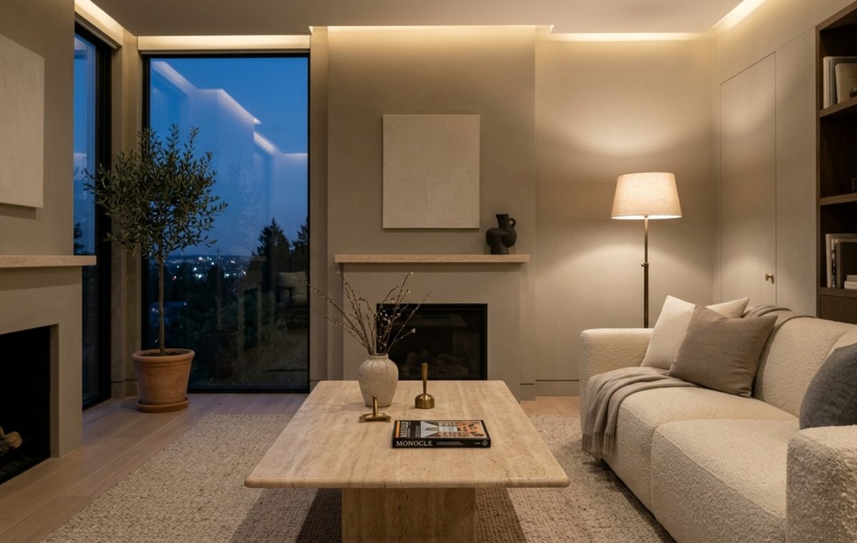
There is a specific, fleeting moment in a well-designed room—usually just as the sun dips below the horizon and the warm glow of integrated LEDs takes over—where the walls either sing or they go silent. For those of us chasing the ‘Quiet Luxury’ aesthetic, that silence isn’t a lack of sound, but a lack of soul. Standard off-the-shelf paint often fails here. It can look flat under the amber weight of 2700K bulbs or, worse, reveal jarring green or yellow undertones that fight against your carefully curated travertine coffee table. Learning how to mix custom paint decor ideas into your design process is no longer a hobbyist’s weekend project; it is the essential final layer of architectural refinement that bridges the gap between raw materiality and atmospheric comfort.
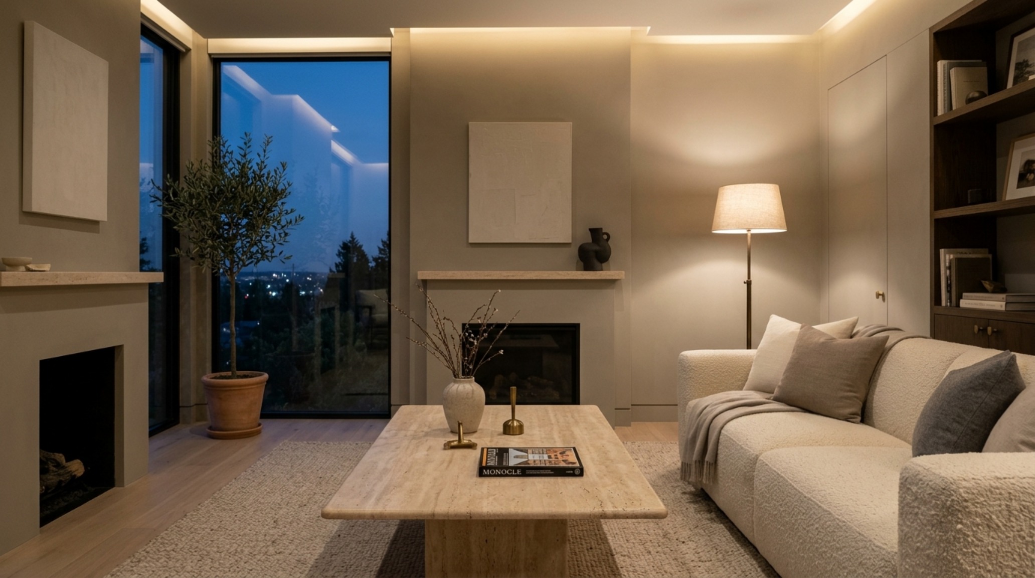
The Science of Atmospheric Hues: Why 2700K Lighting Changes Everything
In the world of high-end residential design, 2700K is the gold standard for ambient warmth. It mimics the gentle flicker of candlelight and the softness of the ‘golden hour.’ However, this specific Kelvin temperature carries a heavy yellow-to-orange bias. When you apply a standard ‘cool’ white like Benjamin Moore’s Paper White or a neutral gray under 2700K, the light actually ‘pulls’ the pigment, often resulting in a muddy, sallow appearance. This is where architectural color theory becomes your most potent tool. To achieve that velvety, ‘Organic Modern’ finish, we must look beyond the flat surface of a swatch and consider how interior paint undertones interact with a high CRI (Color Rendering Index) light source.
The goal isn’t just to find a color you like; it’s to create a bespoke pigment that accounts for the ‘yellowing’ effect of warm light. This requires a shift in perspective. Instead of fighting the warmth, we lean into it, using a technique I call the ‘Secret Third Color.’ By introducing a microscopic amount of a neutralizing pigment—usually a desaturated violet or a dusty terracotta—you can ‘lock’ the color, ensuring it remains airy and sophisticated even when the dimmers are turned low.
Decoding the ‘Secret Third Color’ Technique
Most designers stop at mixing two colors—perhaps a bit of Farrow & Ball’s Setting Plaster with a crisp white. But the secret to bespoke paint pigments that feel three-dimensional is that third, unexpected addition. In a space dominated by 2700K lighting, a ‘bridge’ color is necessary. If you are aiming for a soft, stony taupe, your third color might be a deep, bruised plum. Added in tiny increments, the violet cancels out the excess yellow in the 2700K light, leaving you with a neutral that feels clean but never cold.
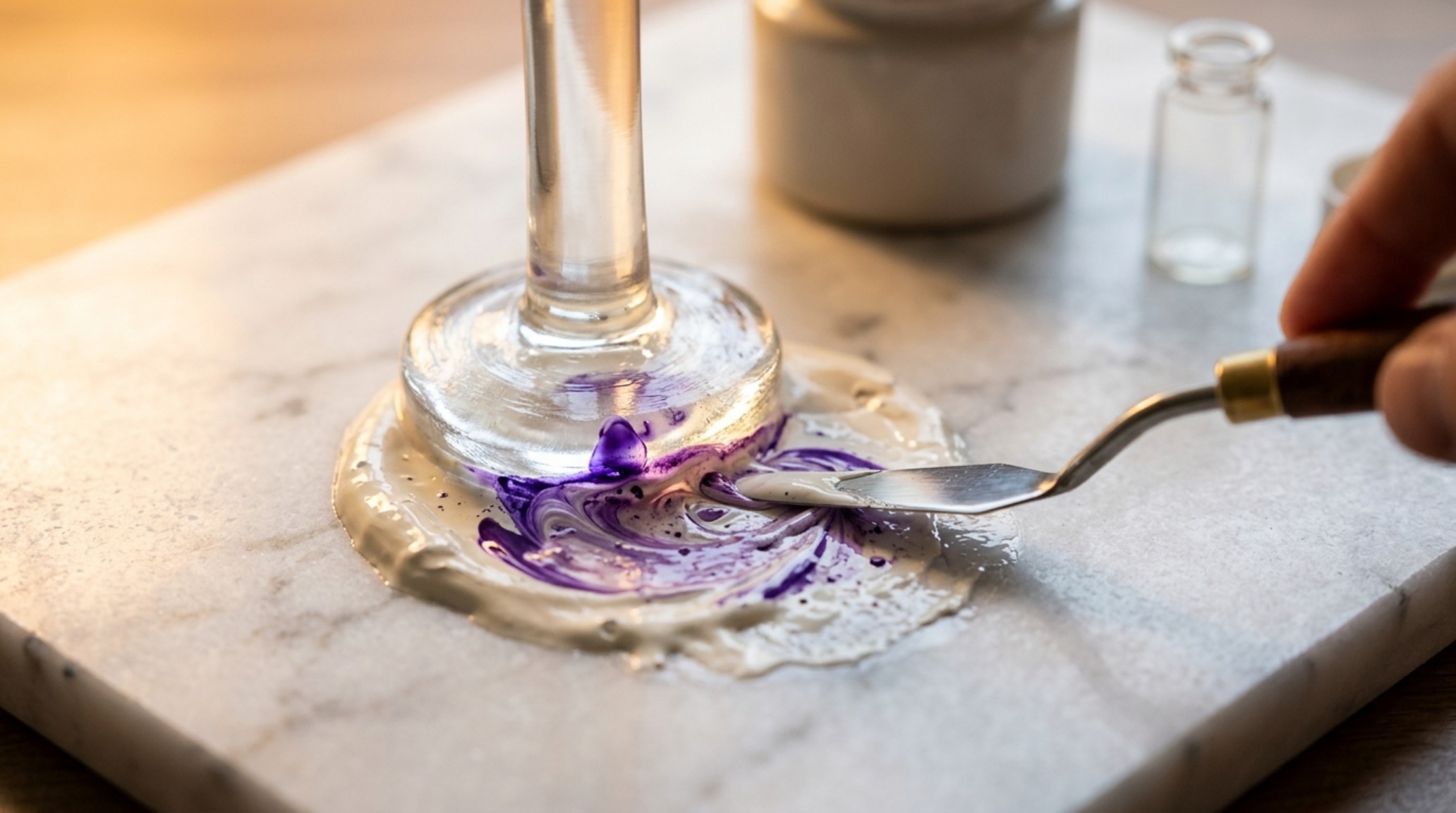
How to Mix Custom Paint Decor Ideas for a Seamless Quiet Luxury Aesthetic
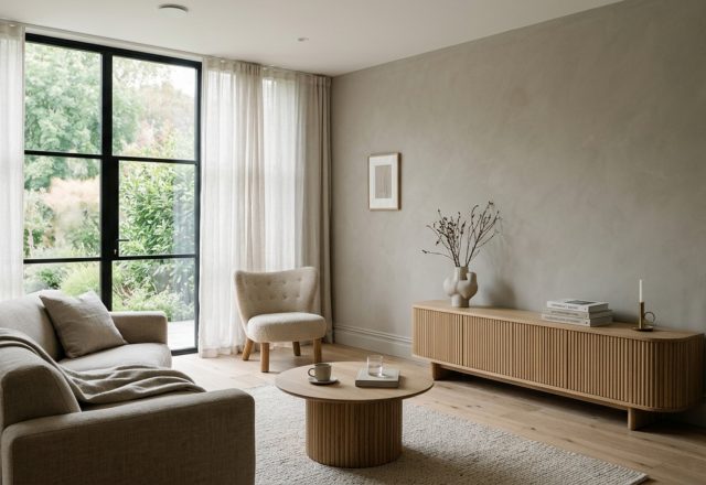
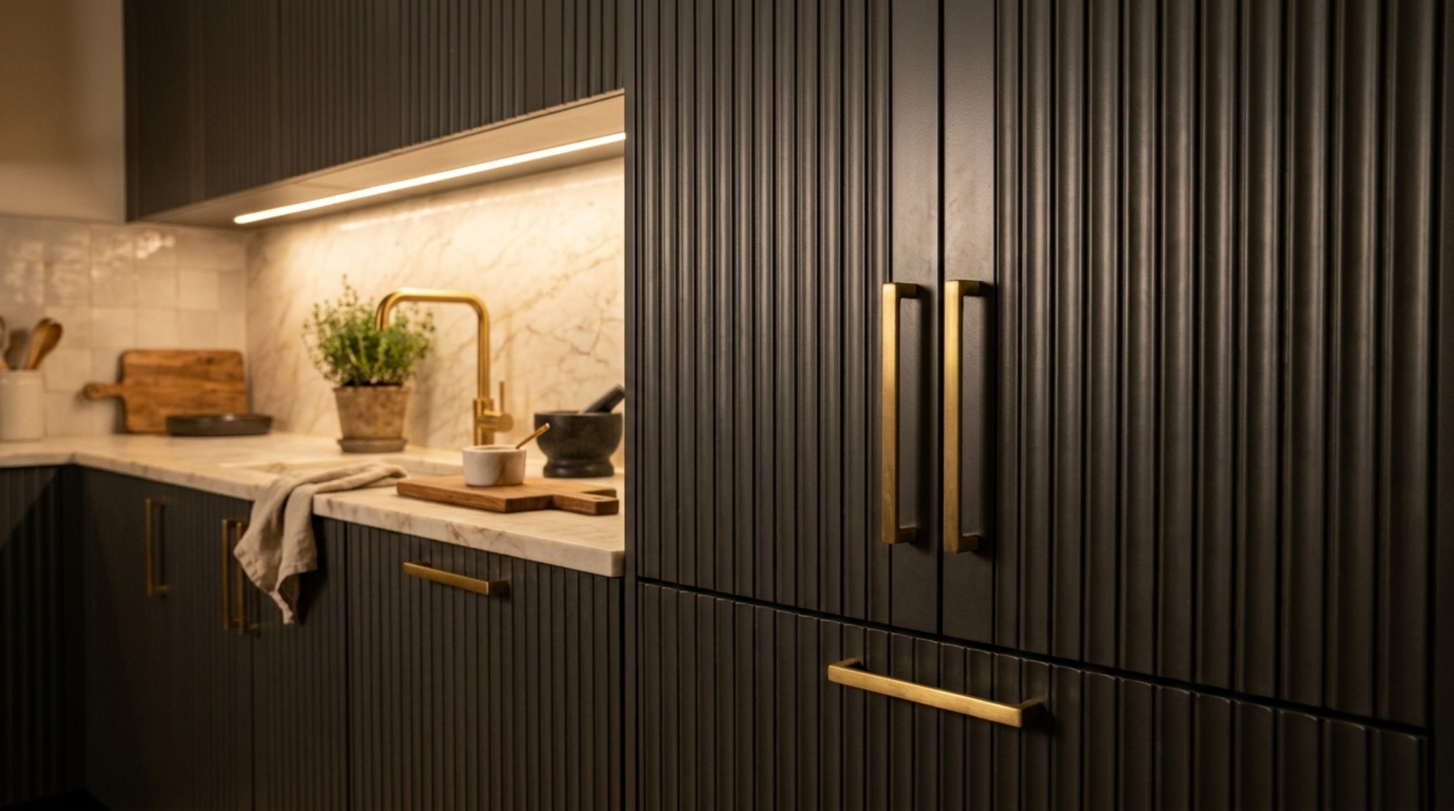
The transition from a ‘renovated house’ to a ‘curated home’ often happens in the details of the wall finish. When we discuss how to mix custom paint decor ideas, we are really talking about the relationship between light and texture. In a room featuring heavy tactile elements—think a honed travertine fireplace surround or fluted white oak cabinetry—the paint needs to act as the atmospheric glue. A standard matte finish won’t cut it. We are looking for a ‘chalky’ depth, something that feels like it has been there for decades.
To start your custom mix, always begin with a high-quality base. I often suggest starting with Benjamin Moore Swiss Coffee at 75% strength as a foundation. From there, you can introduce your bespoke paint pigments. Use a syringe for precise measurements; this isn’t about guessing. If you find your room feels too ‘clinical,’ add a drop of ochre. If it feels too ‘sunny’ and you want that moody, color drenching effect, add a touch of raw umber. The key is to test these mixes on 2-foot by 2-foot boards and move them around the room at different times of the day.
“Color is not a static element; it is a living, breathing participant in the room’s spatial cadence. A custom hue is the only way to ensure the wall doesn’t just hold the light, but enhances it.”
Spatial Cadence and the Rule of Proportions
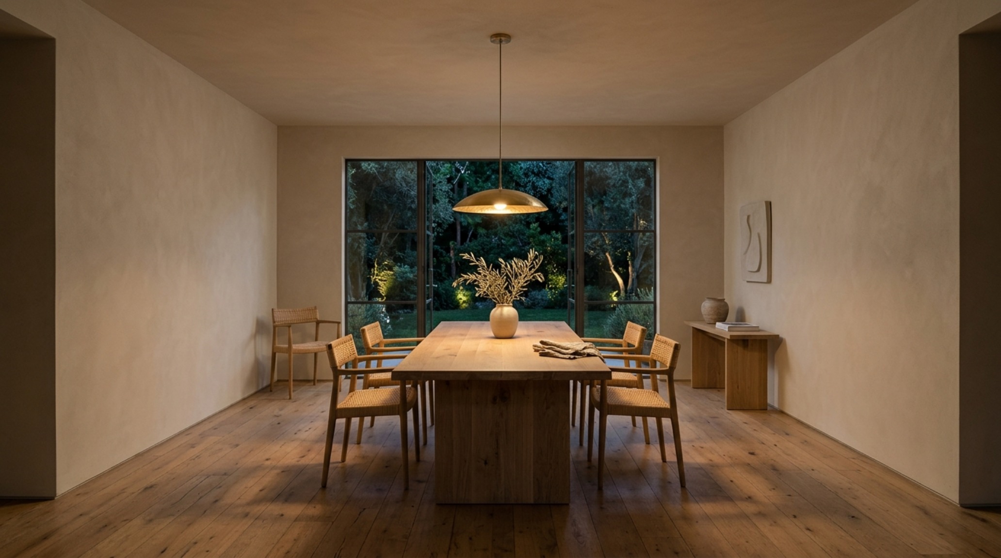
While color creates the mood, architectural clearances dictate the comfort. No matter how perfect your custom ‘warm alabaster’ mix is, the room will feel off if the spatial cadence is disrupted. In an Organic Modern layout, we must respect the physical reality of the human body. This means maintaining a 36-inch primary circulation path for major walkways and ensuring a 30-inch dining chair clearance so guests can move with ease. When these proportions are met, the custom paint color has the ‘negative space breathing room’ it needs to truly shine. A cramped room makes even the most expensive bespoke paint pigments feel oppressive.
The Art of Color Drenching in Moody, Organic Interiors
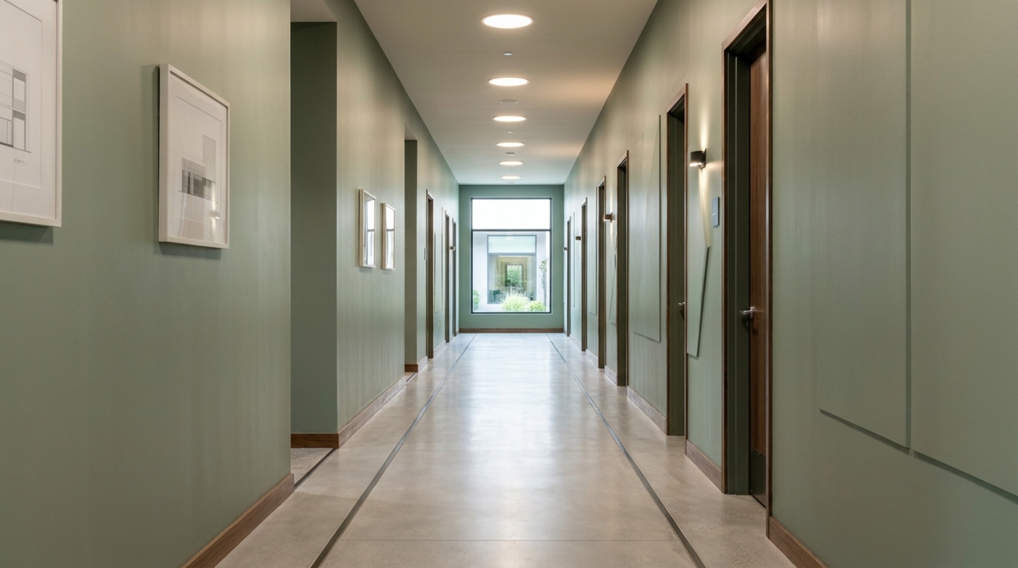
One of the most significant color drenching trends currently dominating architectural circles is the use of a single, custom-mixed hue across walls, trim, and even the ceiling. This technique eliminates visual ‘noise’—those sharp white lines of standard trim that break up a room’s height. When you mix a custom color for drenching, you must adjust the sheen levels rather than the pigment. Use a flat or ‘dead flat’ finish for the ceiling, an eggshell or ‘estate emulsion’ for the walls, and a soft satin for the millwork. This creates a subtle play of light where the color appears to shift slightly in depth based on the surface texture, even though the pigment is identical.
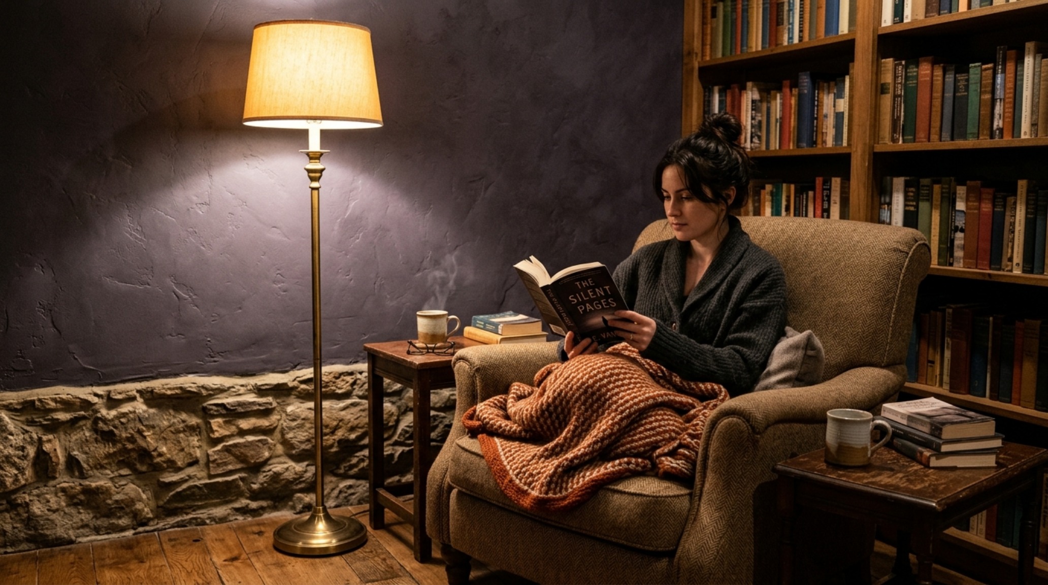
For a recent project in a Pacific Northwest home, we mixed a custom ‘shadow’ gray that had a hidden base of forest green. Under the natural, cool daylight of the morning, the room felt like a misty forest. At night, under the 2700K atmospheric lighting, the green base was suppressed by the warm light, turning the room into a cozy, coco-like sanctuary of charcoal and bronze. This is the power of interior paint undertones when they are intentionally manipulated.
Practical Steps for DIY Paint Mixing in Organic Modern Spaces
- The Foundation: Select two ‘sister’ shades from a reputable brand (e.g., Farrow & Ball’s Ammonite and Purbeck Stone).
- The Ratio: Start with a 70/30 split. The 70% should be your lighter base to maintain luminosity.
- The Neutralizer: Introduce your ‘Secret Third Color.’ For 2700K lighting, use a tiny amount of a cooler-toned pigment to prevent the mix from becoming too ‘peach’ or ‘yellow.’
- The Texture Test: Apply the mix next to your most prominent material—perhaps a soft bouclé sofa or a brushed brass light fixture. The paint should ‘melt’ into these textures, not stand apart from them.
- The 24-Hour Observation: View the sample at 8 AM, 1 PM, and 8 PM. If the 2700K lights make it look sallow in the evening, add a touch more of your neutralizing pigment.
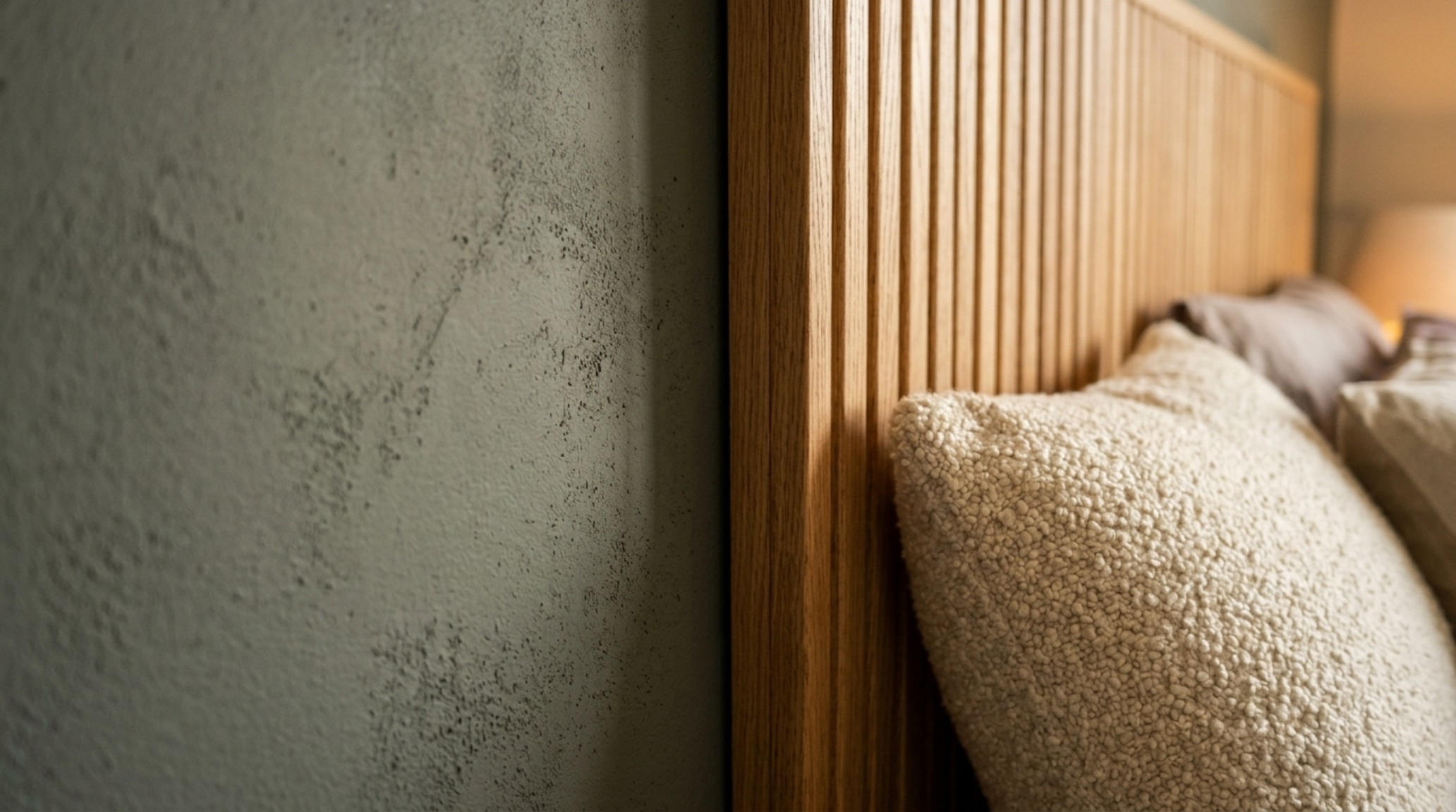
Architectural Grounding: Textures that Anchor Custom Hues
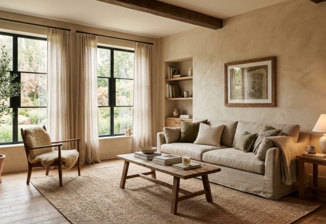
A wall is never just a wall; it is a backdrop for life. To truly master how to mix custom paint decor ideas, you must understand what that wall is ‘holding.’ In Quiet Luxury design, we often use tactile grounding—materials that have physical weight and history. If you have a floor of wide-plank European Oak, your wall color needs to share the same ‘DNA.’ By taking a small shaving of your actual flooring or a piece of your honed travertine to the mixing station, you can see the literal pigments that exist in nature and replicate them in your paint.
This level of detail is what separates a standard interior from a bespoke architectural experience. It’s about creating a ‘sightline alignment’ where the eye moves seamlessly from a velvet armchair to a custom-painted wall, and then to a stone fireplace, without ever feeling a ‘stutter’ in the visual language. The 2700K lighting acts as the golden thread that sews these disparate elements together into a single, cohesive atmosphere.
Architectural Specification & Material Matrix
Curated tactile palette, spatial dimensions, and atmospheric lighting index for this design scheme.
In the end, the most beautiful rooms are not those filled with the most expensive objects, but those where the light and color have been invited to dance together. Mastering how to mix custom paint decor ideas allows you to curate an environment that feels deeply personal and architecturally sound. As the evening sets in and your 2700K lights begin to glow, your walls shouldn’t just reflect the light—they should embrace it, turning a simple room into a living portrait of warmth, texture, and quiet, enduring luxury.
Editorial Silo • Recommended Architecture Studies
- The New Tactility: Why Designers are Replacing Sterile Whites with Warm Plaster Tones and Sensory Earth Neutrals — Archival Design Case Study
- Ergonomic Color Zoning: Utilizing Creative Paint Decor Ideas to Reshape Small-Space Living — Archival Design Case Study
Architectural Inspiration Lookbook
A high-resolution study in spatial proportions, tactile materiality, and light choreography curated for enduring modern living.
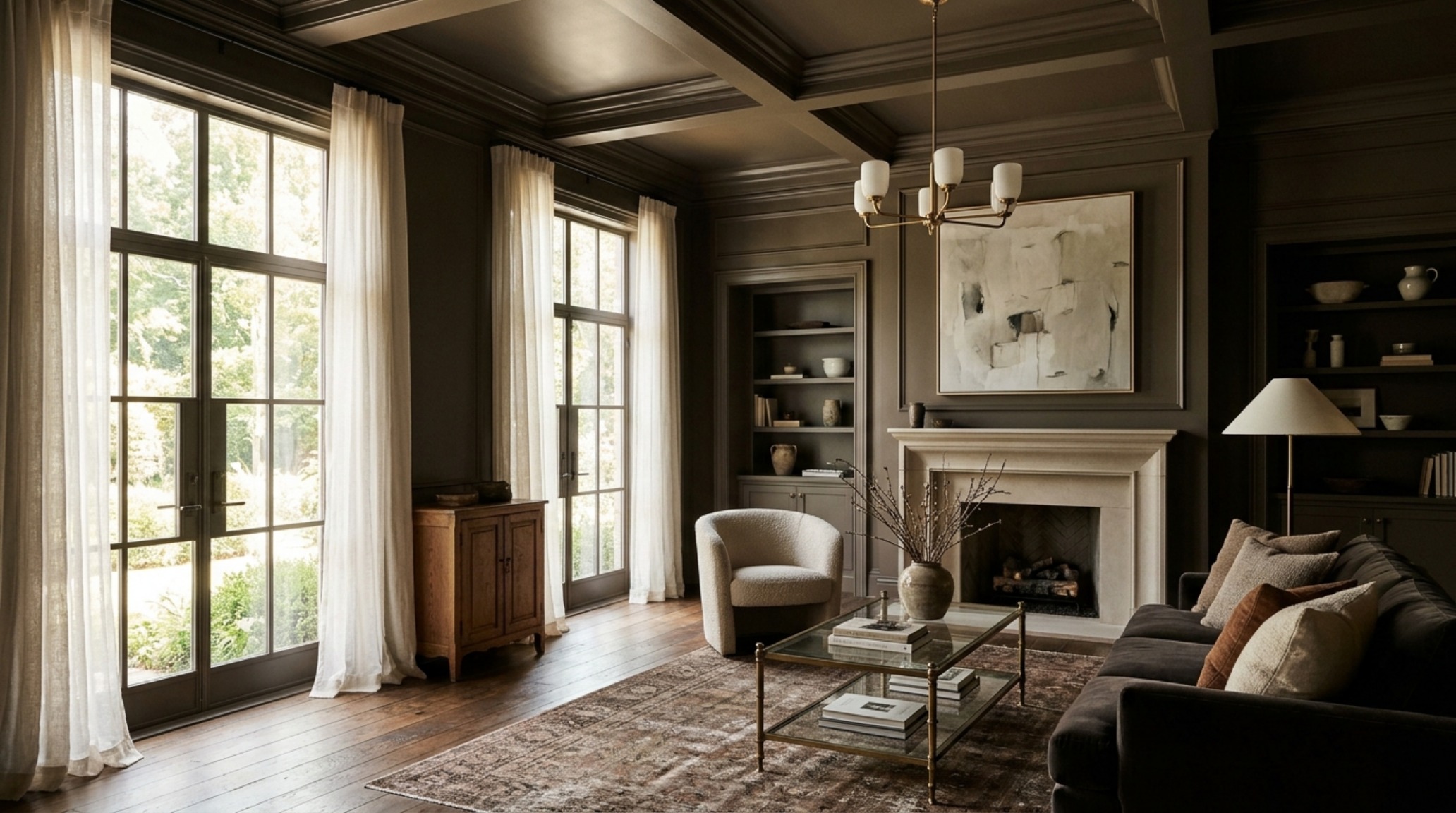
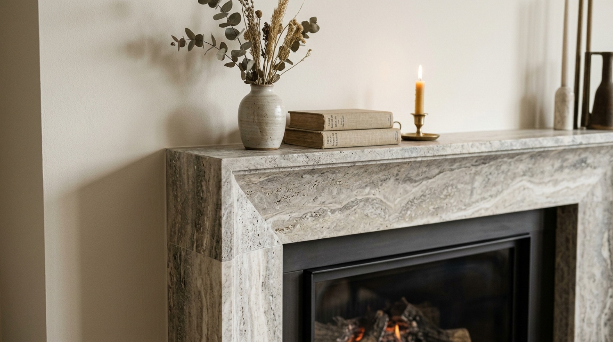
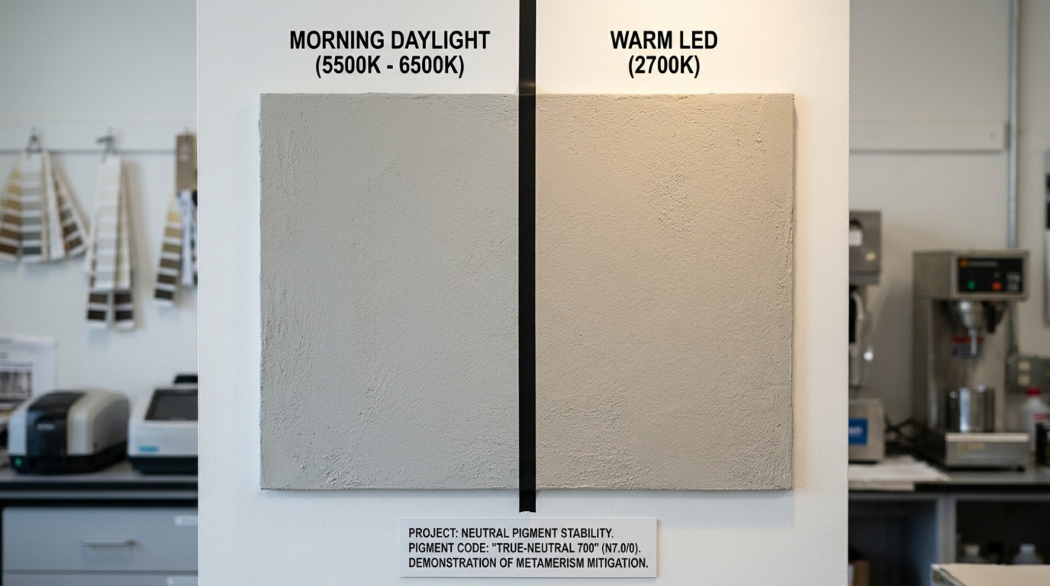
Curated Visual Lookbook
Design Gallery & Spatial Studies
A visual curation of architectural arrangements, lighting concepts, and material palettes featured in this space.