There is a specific, quiet alchemy that occurs when the clinical precision of grey meets the sun-drenched warmth of beige. For years, the design world dismissed neutrals as the ‘safe’ choice, a default for the undecided. But in the contemporary architectural landscape, we are witnessing a sophisticated evolution. Greige paint decor ideas are no longer about playing it safe; they are about creating a high-fidelity sensory experience where the wall color acts as a living canvas for light and texture. To master this palette is to understand the physics of light, the honesty of raw materials, and the ergonomics of a well-lived space.
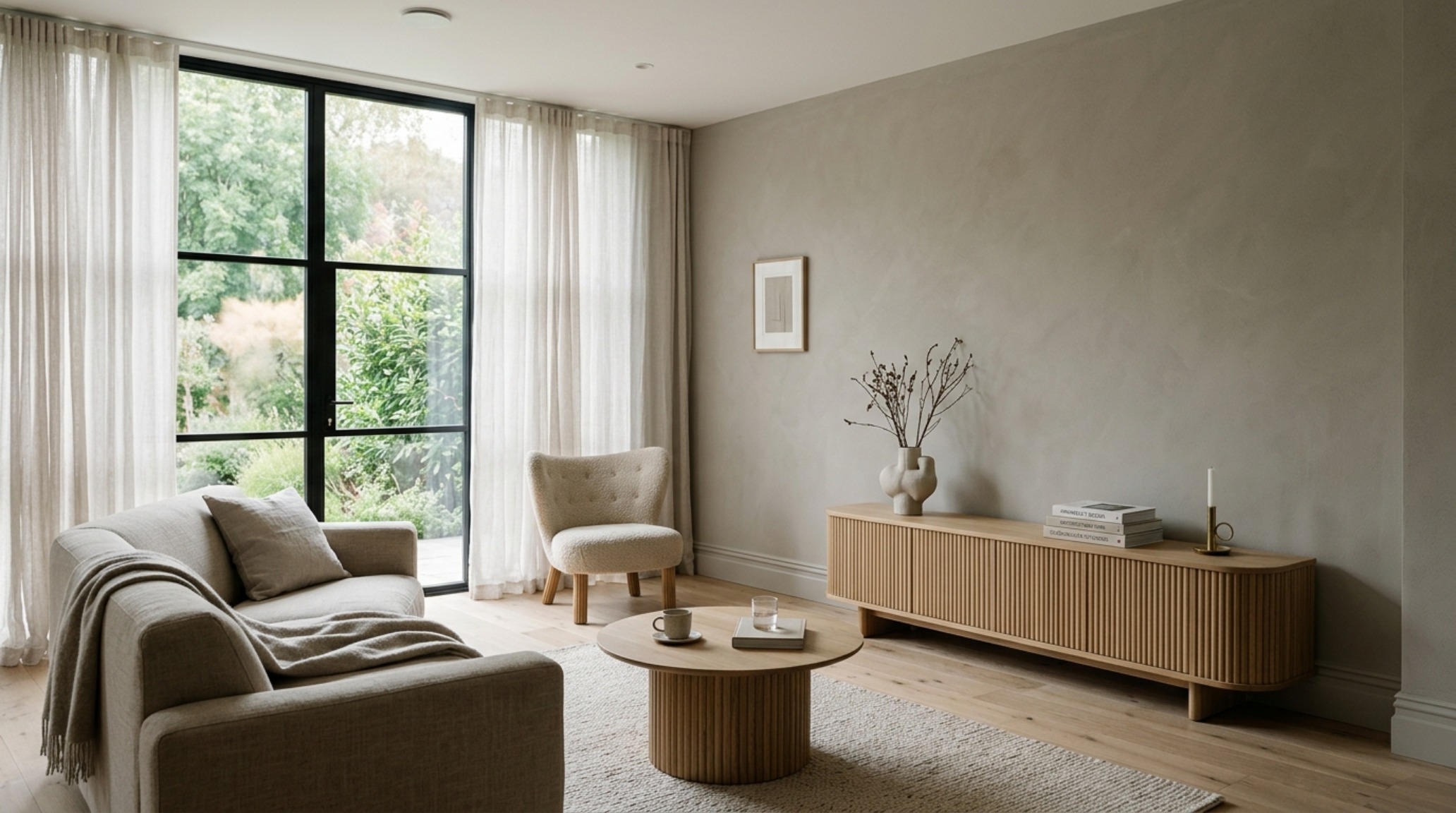
The Science of Atmospheric Resonance: Why Kelvin Matters
The most common mistake in interior design isn’t the color choice itself, but the failure to account for the Color Rendering Index (CRI) and Kelvin temperature of the light hitting that color. Greige is a metamorphic beast. Under a standard 2700K warm incandescent bulb, a balanced greige like Benjamin Moore Revere Pewter can lean heavily into its yellow undertones, losing its crisp architectural edge. Conversely, in a north-facing room with cool, blue-tinted natural light, that same shade can feel sterile and stony.
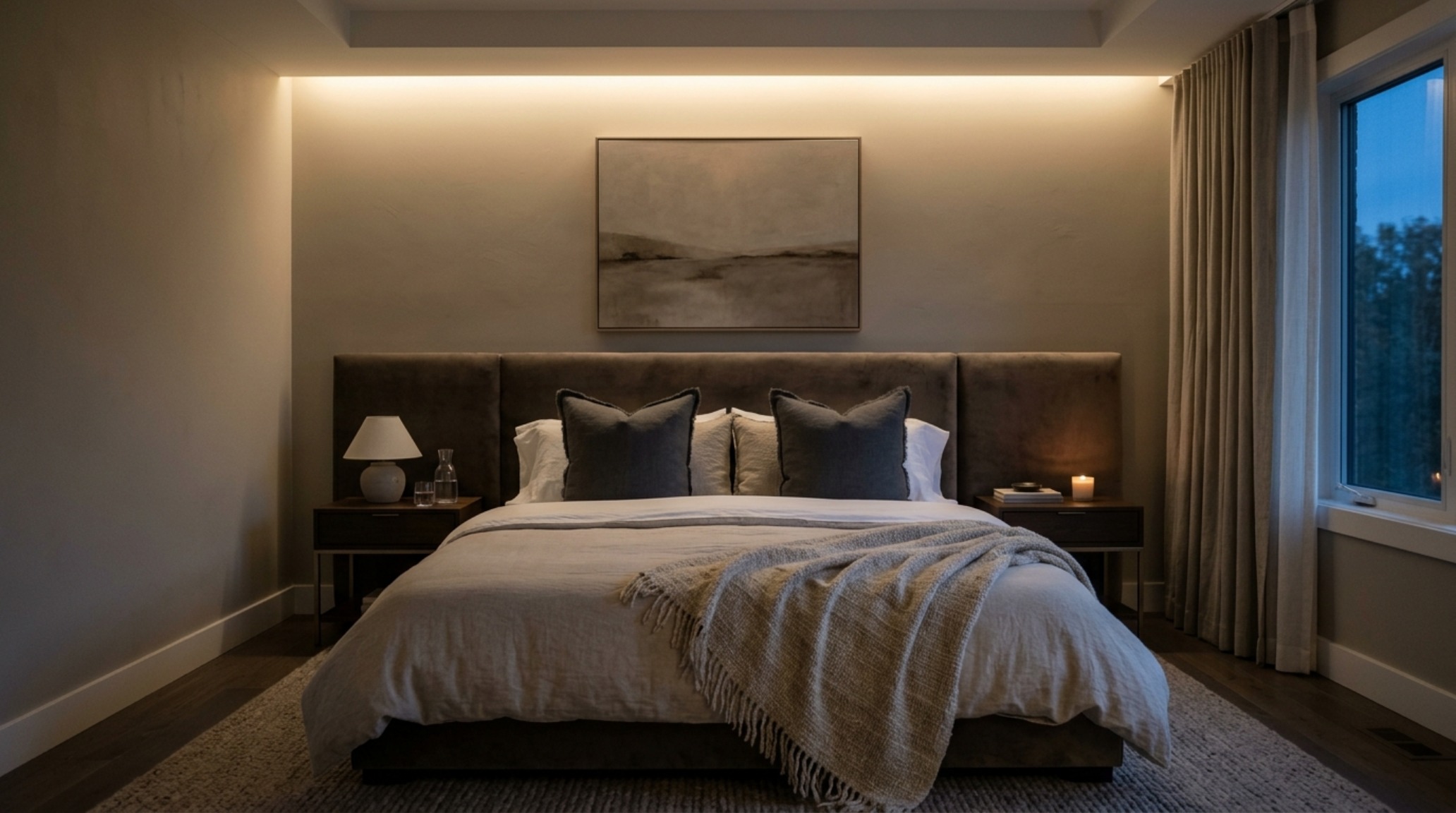
For a serene sanctuary, I always recommend a lighting plan centered around 3000K LEDs with a CRI of 90 or higher. This ‘warm white’ spectrum preserves the sophisticated neutrality of greige paint decor ideas without sacrificing the cozy, residential feel. We want the shadows to have depth, not to look muddy. When you specify a high CRI, you are ensuring that the subtle green or violet undertones in high-end paints—think Farrow & Ball’s Elephant’s Breath—are revealed in their full, intended complexity.
Spatial Cadence and the 36-Inch Rule
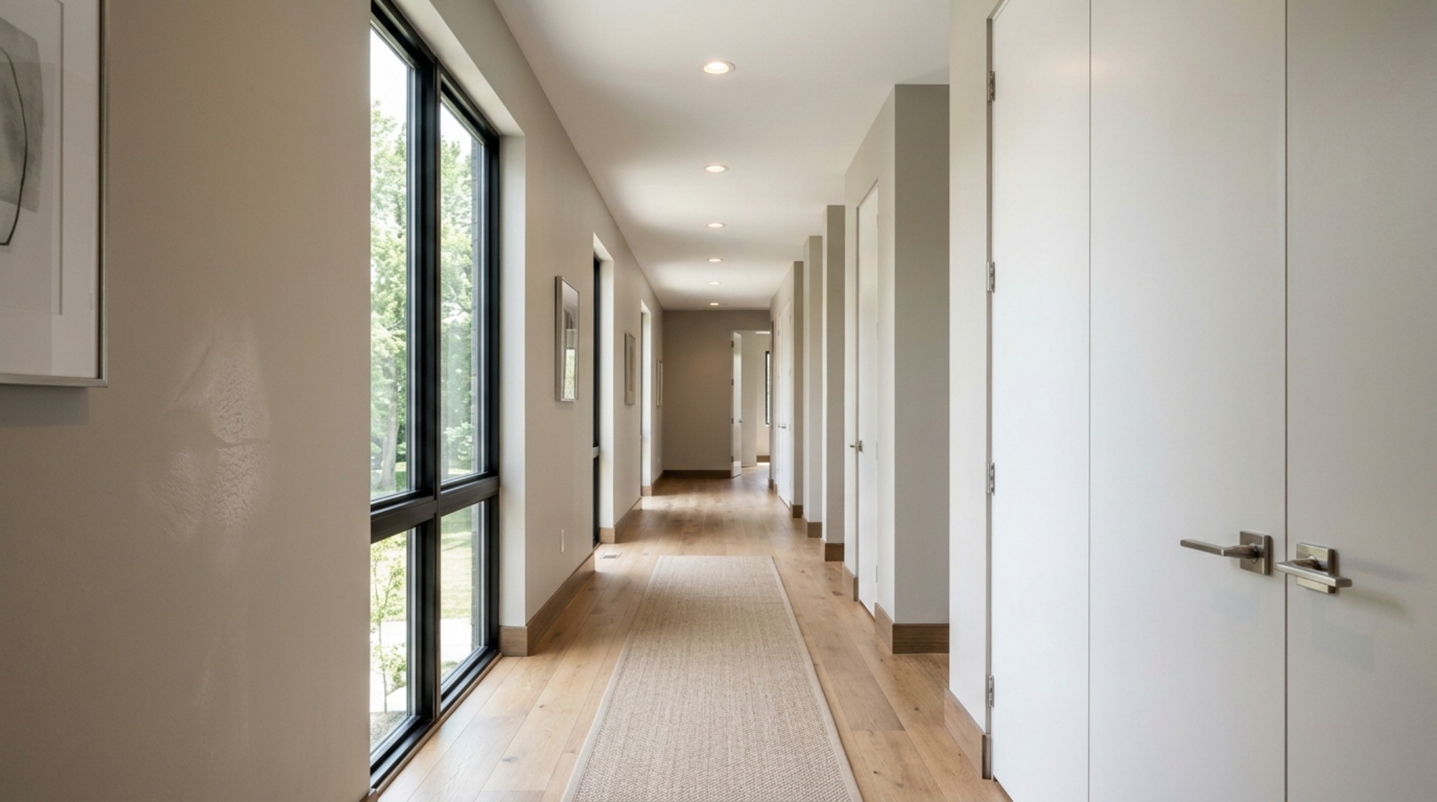
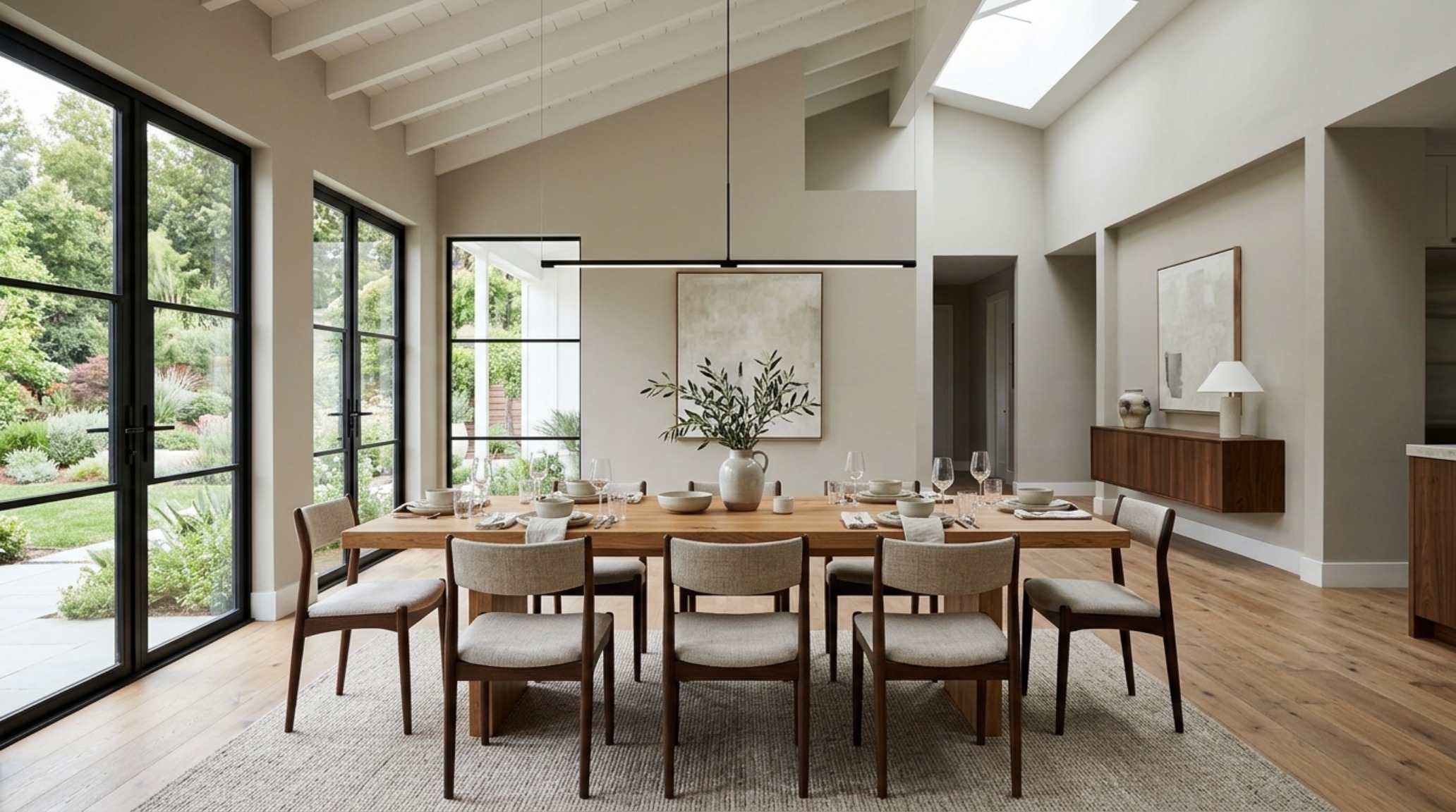
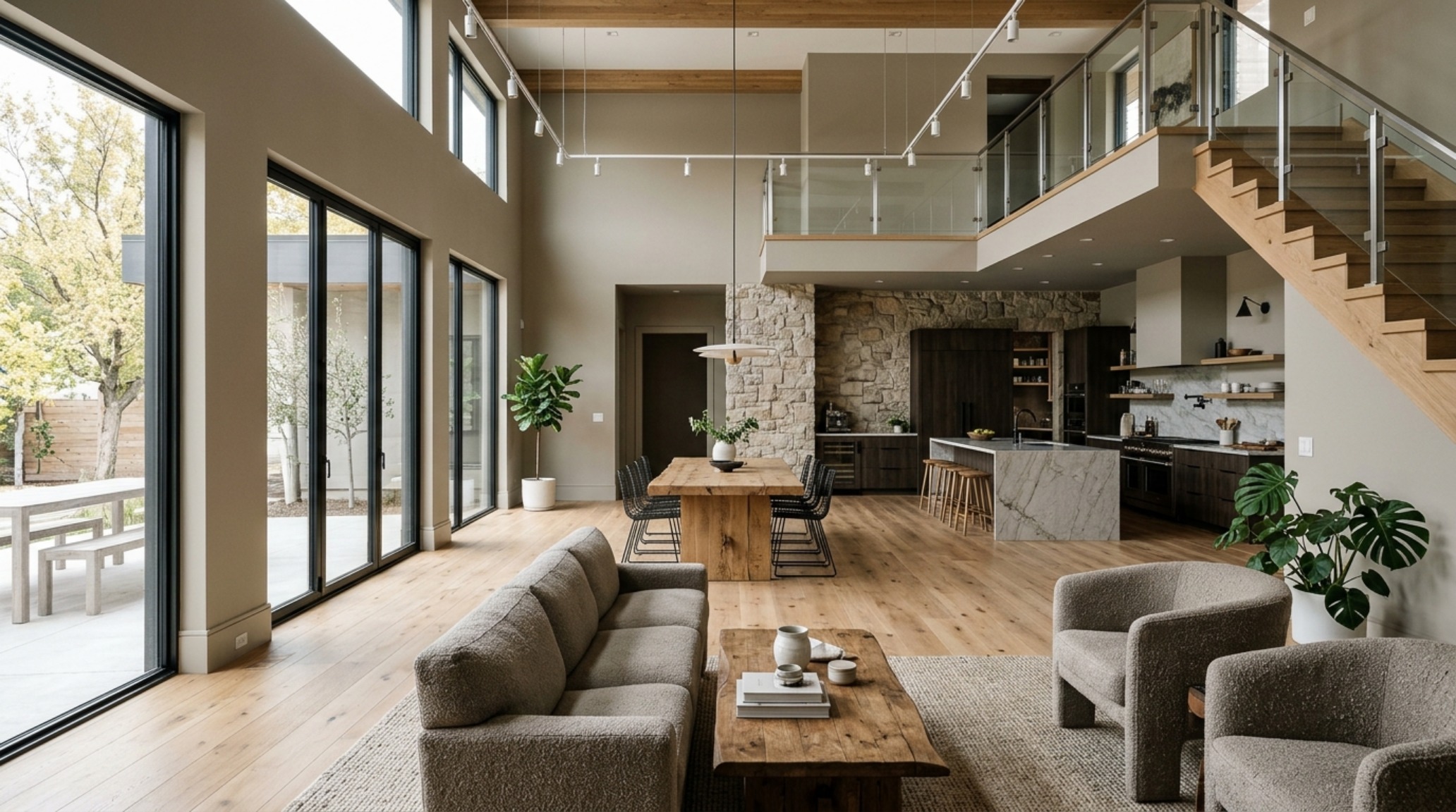
Design is as much about the void as it is about the solid. In a greige-centric home, the ‘negative space breathing room’ becomes a tangible element. To maintain an air of luxury, one must respect architectural clearances. A 36-inch standard walkway clearance is non-negotiable for primary circulation paths. This allows the greige walls to ‘breathe’ rather than feeling like they are closing in. When your sightline alignment is clear, the subtle shifts in the paint’s value as it moves from sunlit corners to shaded alcoves create a natural rhythm that guides the eye through the home.
Modern Greige Paint Decor Ideas: A Study in Texture
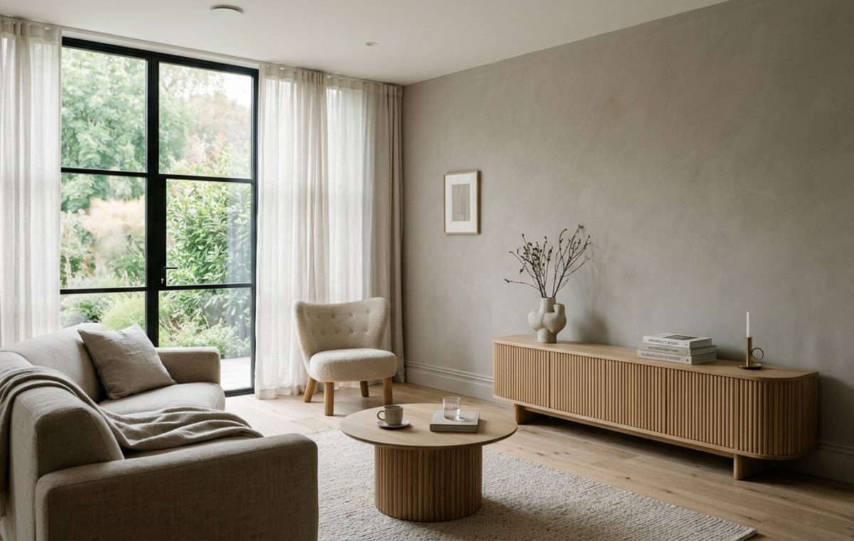
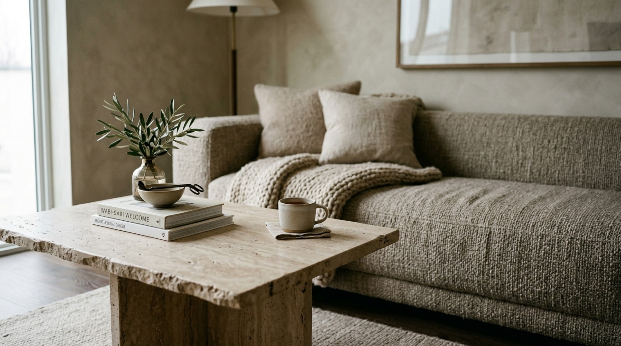
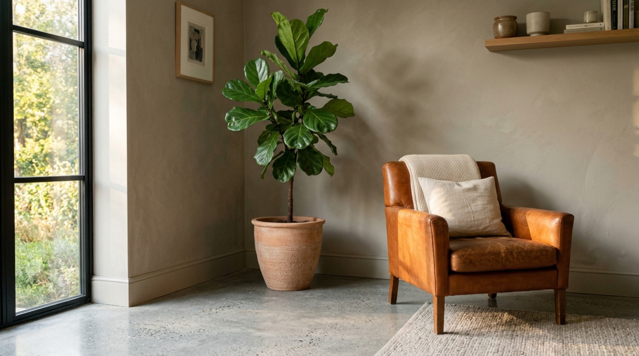
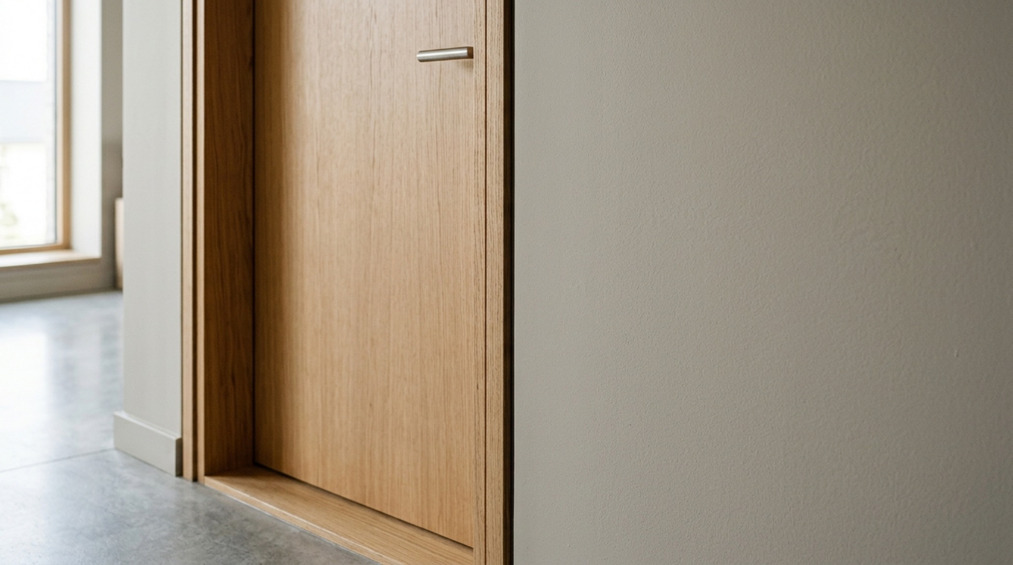
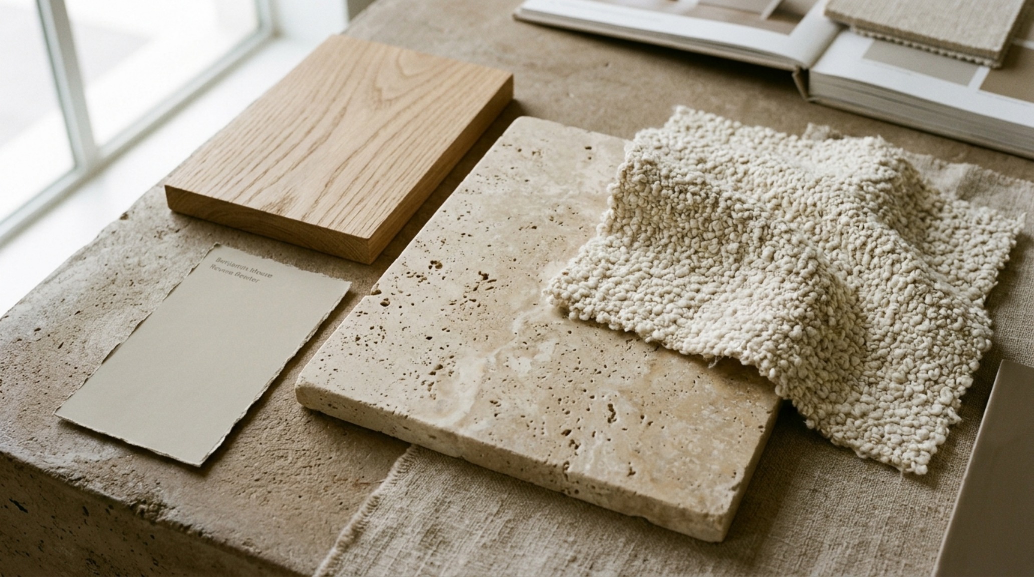
If the paint is the melody, texture is the harmony. To prevent a neutral room from feeling flat, we must introduce what I call ‘tactile grounding.’ This involves layering materials that speak different sensory languages. Imagine a wall swathed in a matte, sueded greige finish. Against this, we place a fluted white oak sideboard. The verticality of the wood grain provides a rhythmic contrast to the expansive smoothness of the wall.
We then layer in the heavy hitters: a honed travertine coffee table, perhaps an 18-inch reach from the sofa for optimal ergonomics, and a Belgian linen rug. These organic finishes don’t compete with the wall color; they validate it.
“The most successful neutral interiors aren’t defined by a lack of color, but by a surplus of texture. Greige is the silent partner that allows the soul of the material to speak.”
Ergonomics and Greige Paint Decor Ideas Layout
When planning a layout within a greige envelope, furniture placement must be intentional. In a living area, a 30-inch dining chair clearance ensures movement is fluid, mirroring the calm of the color palette. In smaller environments, small space greige paint decor ideas often involve painting the baseboards, walls, and crown molding in the same hue—a technique known as ‘color drenching.’ This eliminates visual breaks, tricking the brain into perceiving a higher ceiling and a more expansive volume. It’s an architectural sleight of hand that transforms a cramped footprint into a cohesive retreat.
Lighting as an Architectural Tool
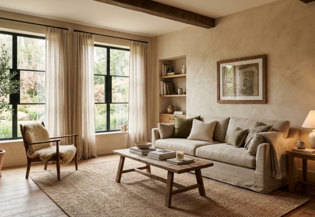
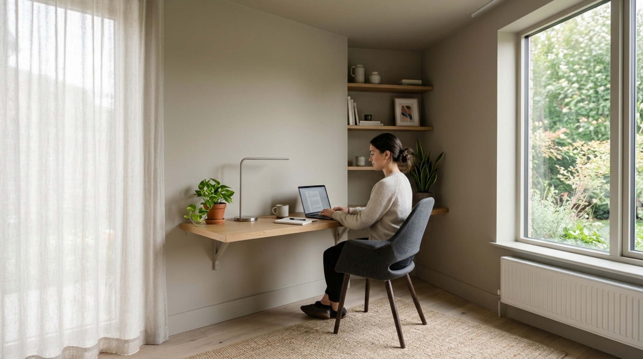
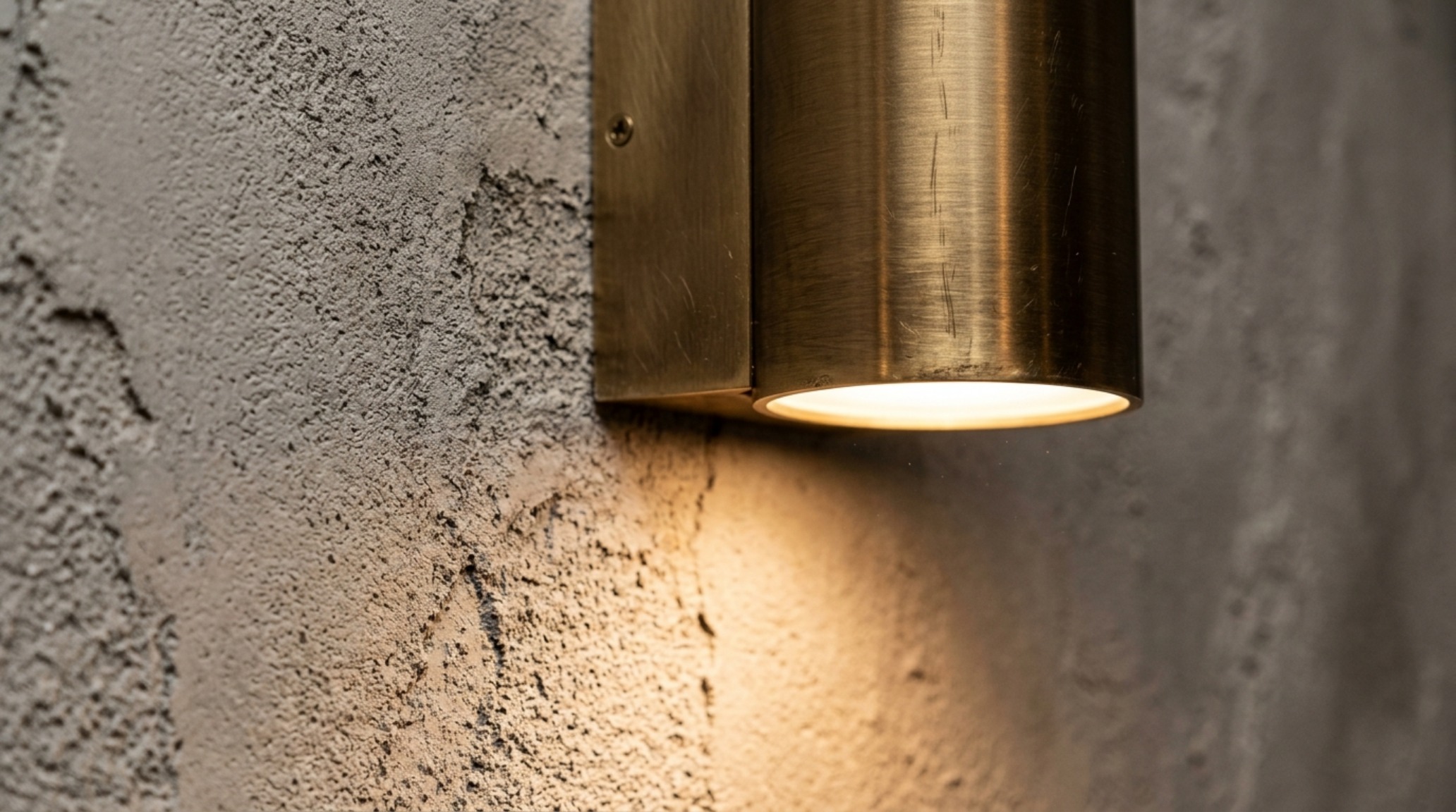
Beyond the primary bulbs, atmospheric lighting is the secret sauce. Directional natural sunlight is our best friend, but we must manage it. Sheer linen drapes in a soft oatmeal can diffuse harsh afternoon sun, casting a soft, painterly glow across a greige wall. At night, we shift to layers. A diffused directional floor lamp pointing toward a textured corner creates ‘shadow play,’ adding three-dimensional interest to a flat surface. This is where luxury greige paint decor ideas textures truly shine—the light catches the weave of a wallcovering or the slight lime-wash movement in a specialty mineral paint.
The Luxury of the Understated
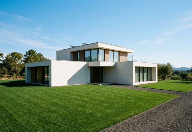
High-end design today is moving away from the ‘loud’ and toward the ‘felt.’ We see this in the rise of greige paint decor ideas architecture that prioritizes the interface between the interior and exterior. Large-format windows framed in slim, black steel provide a structural counterpoint to soft greige interiors. This ‘framing’ of the outdoors uses the interior wall as a matte border for the vibrant colors of nature. It is a sophisticated way to bring life into a neutral space without cluttering the visual field.
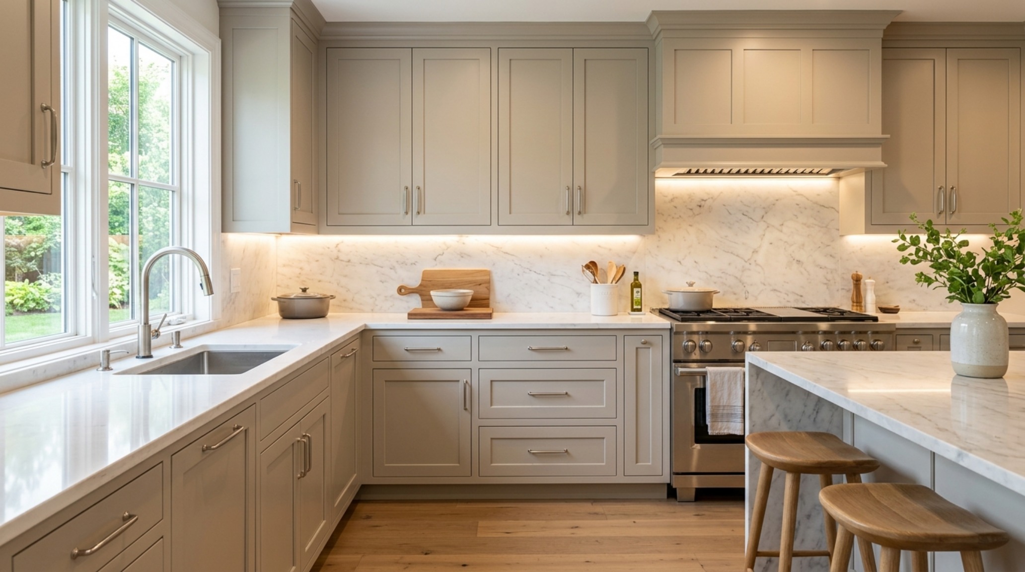
As we move deeper into the nuances of spatial design, the focus shifts to the micro-details. Brushed brass hardware, for instance, adds a flicker of warmth that pulls the beige tones forward, while matte black accents lean into the grey, providing a modern, sharp edge. It is this versatility that makes greige the most powerful tool in a designer’s arsenal. It is the ultimate chameleon, shifting its personality to match the hardware, the wood species, and the temperature of the light.
Architectural Specification & Material Matrix
Curated tactile palette, spatial dimensions, and atmospheric lighting index for this design scheme.
Ultimately, the success of greige paint decor ideas lies in the restraint of the designer and the quality of the materials selected. When we strip away the noise of high-contrast colors, we are left with the fundamental elements of architecture: light, shadow, form, and texture. It is a design philosophy that doesn’t demand attention but rewards it, creating a sanctuary that feels both timeless and profoundly of the moment. We are building spaces that don’t just look beautiful in a photograph but feel resonant and grounded under the soles of our feet and the touch of our hands.
Editorial Silo • Recommended Architecture Studies
- The New Tactility: Why Designers are Replacing Sterile Whites with Warm Plaster Tones and Sensory Earth Neutrals — Archival Design Case Study
- Ergonomic Color Zoning: Utilizing Creative Paint Decor Ideas to Reshape Small-Space Living — Archival Design Case Study
Architectural Inspiration Lookbook
A high-resolution study in spatial proportions, tactile materiality, and light choreography curated for enduring modern living.
Curated Visual Lookbook
Design Gallery & Spatial Studies
A visual curation of architectural arrangements, lighting concepts, and material palettes featured in this space.