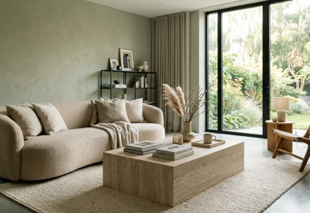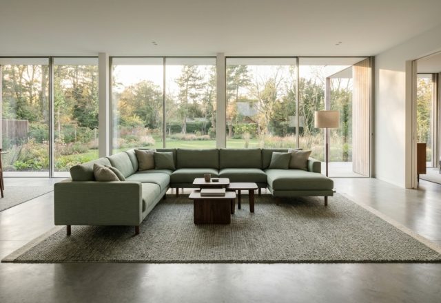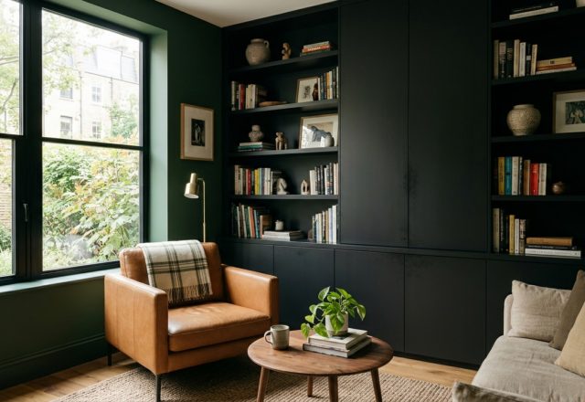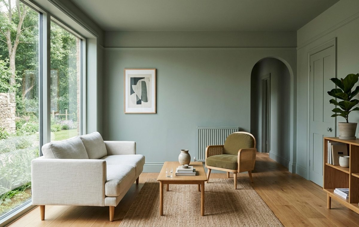
There is a pervasive myth in the design world that small footprint living requires a retreat into the sterile safety of stark white walls. We have been conditioned to believe that saturation is the enemy of the compact. However, as we look toward more intentional, emotive interiors, the most sophisticated sage green living room ideas are currently challenging this notion through a technique known as architectural color drenching. By enveloping a room in a single, cohesive hue—extending from the baseboards across the wall planes and over the fifth wall, the ceiling—we can effectively dissolve the visual boundaries that define a cramped space. When we apply this to a sophisticated gradient of chameleon colors like muted sage and slate blue, we aren’t just decorating; we are performing a structural sleight of hand.
The secret lies in the ‘recessive’ nature of these specific tones. Sage green, with its earthy, organic undertones, and slate blue, with its cool, shadowy depth, possess a unique ability to push walls away from the eye rather than pulling them in. This is not about a simple accent wall; it is about creating a monochromatic zone that prioritizes spatial cadence and shadow play over high-contrast clutter.
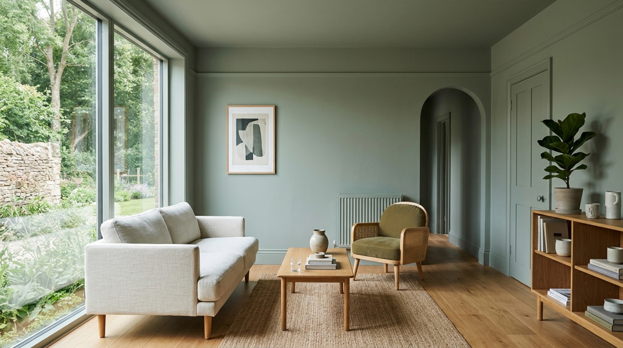
The Geometry of Chameleon Colors: Why Sage and Slate Rule the Small Footprint
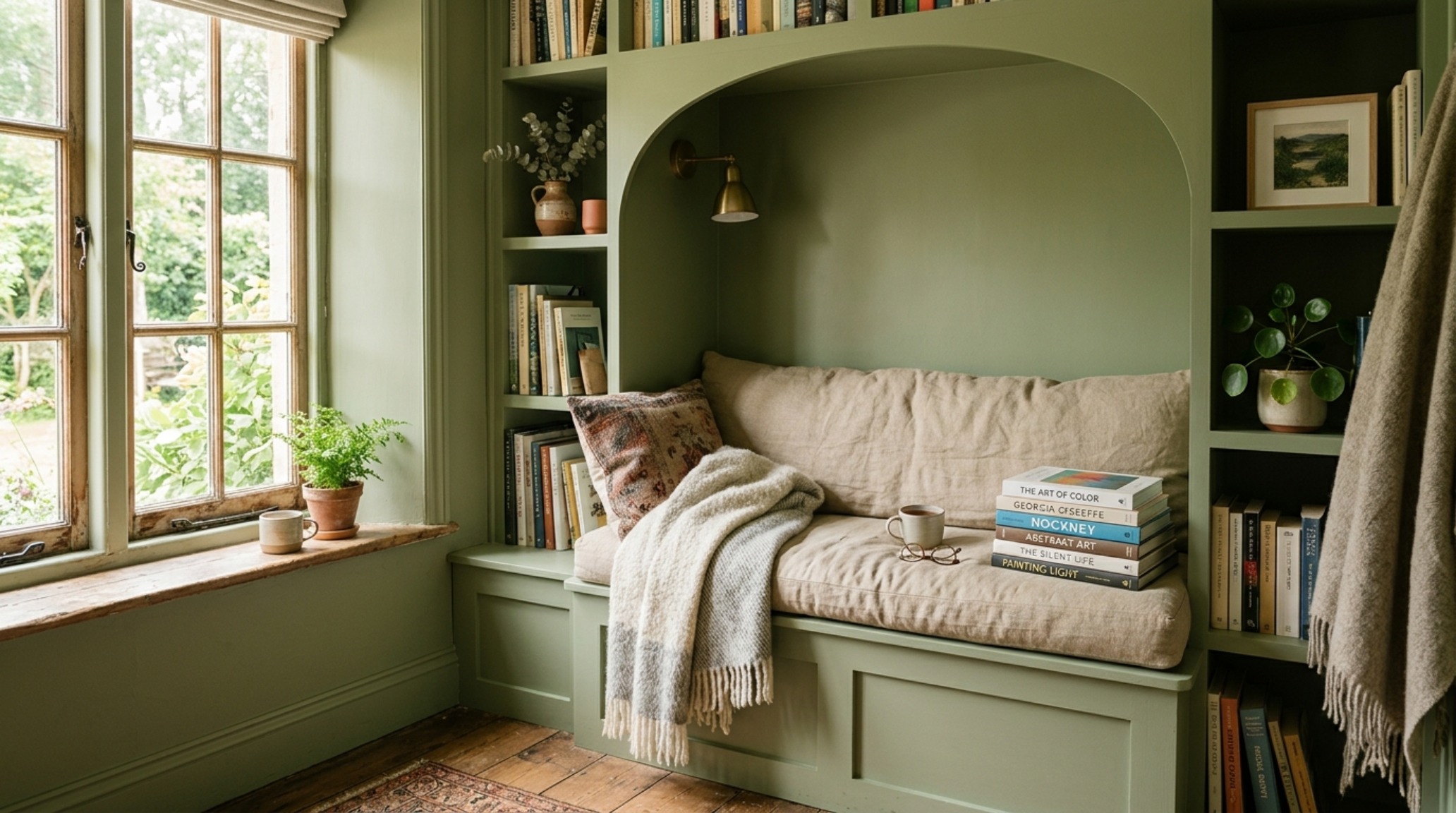
In the lexicon of the Organic Modern aesthetic, ‘chameleon colors’ are those that shift their identity based on the quality of light. Sage green is the ultimate protagonist here. It sits at the intersection of a neutral and a chromatic, allowing it to behave like a quiet backdrop while still providing the emotional nourishment of the natural world. When exploring sage green living room ideas for a studio or a narrow terrace house, the goal is to use the color to bridge the gap between the interior and the exterior, a core tenet of biophilic interior design.
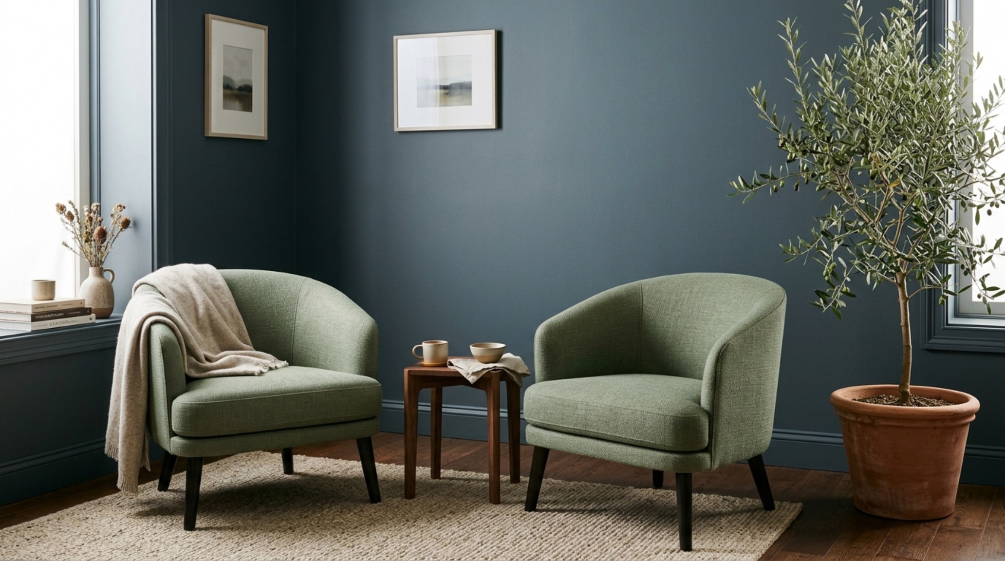
Slate blue acts as its perfect architectural counterweight. While sage brings the warmth of lichen and moss, slate blue introduces the ‘Quiet Luxury’ of a stormy sky or a deep lake. When these two are used in a gradient—perhaps a deep slate on the lower third of a room transitioning into a misty sage—the eye is tricked into seeing more height. The weight of the darker blue grounds the room, while the lighter green allows the upper atmosphere of the space to feel airy and expansive.
Architectural Molding as a Spatial Tool
Color drenching reaches its full potential when paired with structural molding. In a small living room, adding vertical picture frame molding or a simple shaker-style wainscoting provides ‘rhythm’ to a flat wall. When you drench these moldings in the same pigment as the wall, you create a play of light and shadow that adds depth without the ‘noise’ of different colors. This technique creates a sense of architectural permanence, making even the most modest apartment feel like a curated heritage home.
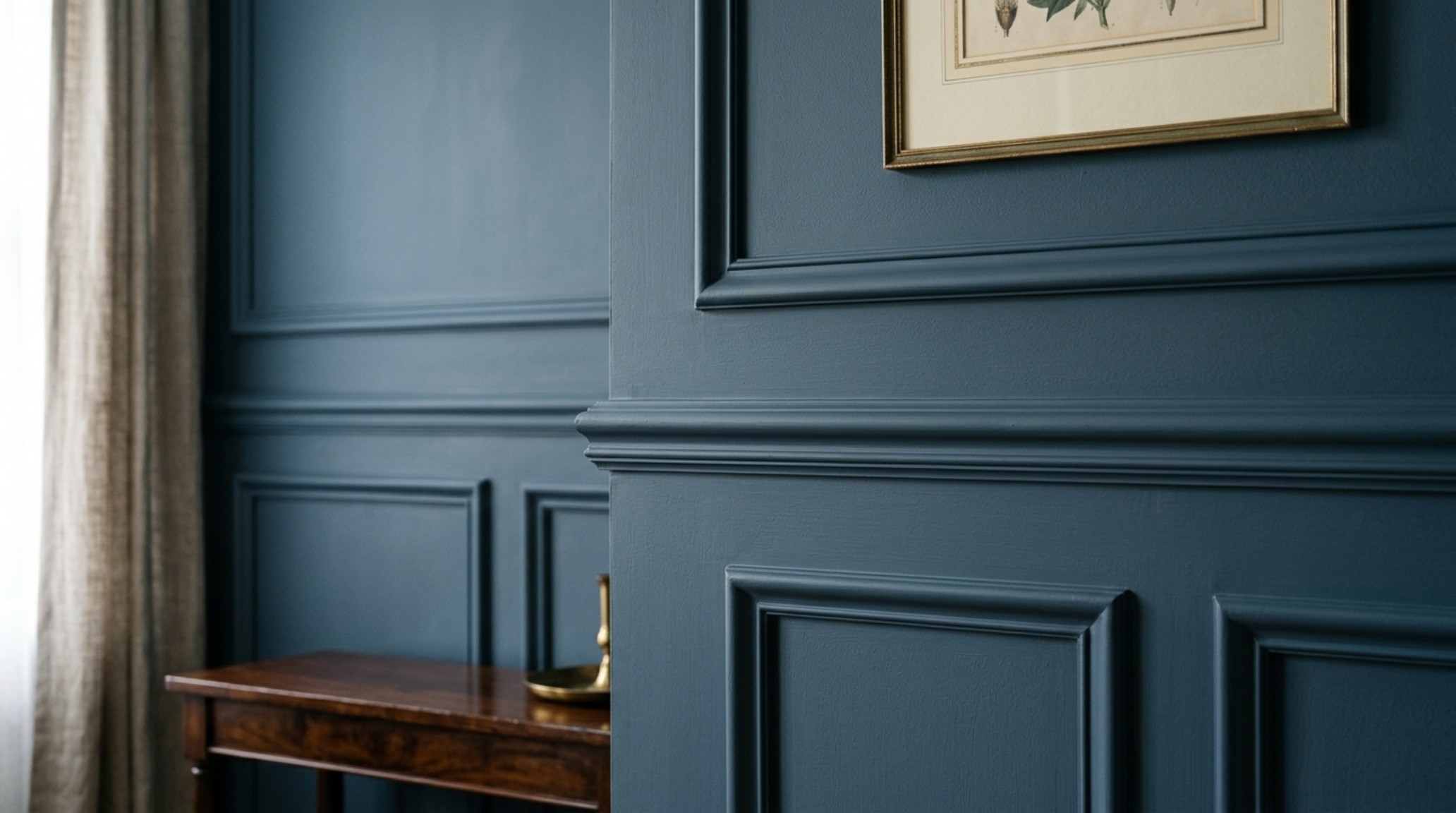
Mastering the Monochromatic Zone: Strategic Sightlines
In compact living areas, we often deal with multifunctional spaces where the living, dining, and workspace collide. Traditional wisdom suggests using rugs to define zones, but architectural color drenching allows us to use ‘monochromatic zoning.’ Imagine a living nook drenched entirely in a deep, desaturated blue-green, while the adjacent dining area transitions into an earthy neutral green living room palette. This creates a clear visual boundary without the need for physical partitions that would otherwise interrupt the 36-inch standard walkway clearances required for fluid movement.
By maintaining a consistent tonal value across different zones, you preserve the ‘negative space breathing room.’ The eye doesn’t get snagged on sharp transitions; instead, it glides across the gradient. To execute this, consider the sightlines from your primary seating area. If your sofa faces a small entryway, drenching that entryway in a slightly darker slate blue creates a sense of ‘forced perspective,’ making the living area beyond it feel significantly brighter and larger by comparison.
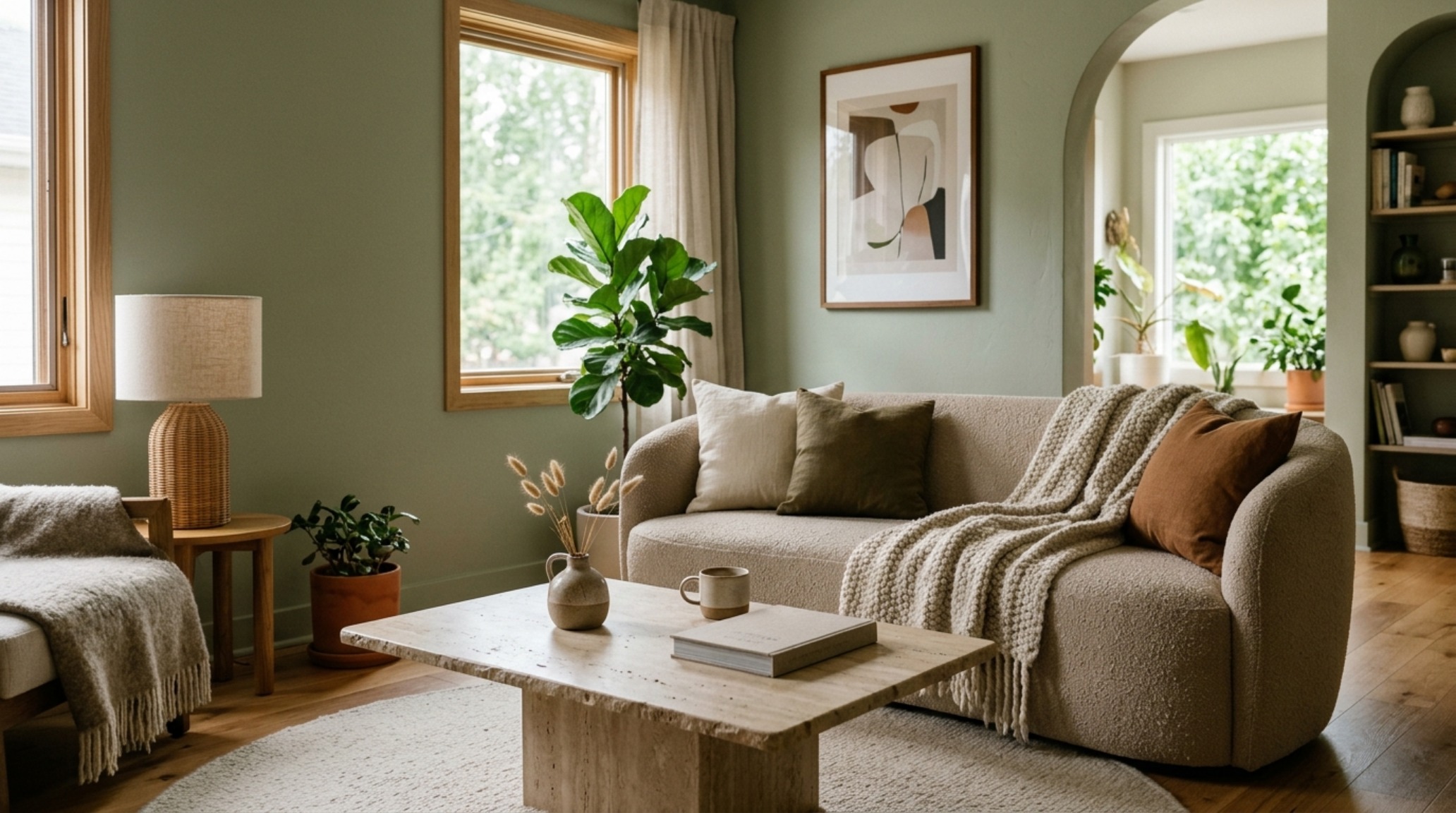
Tactile Materiality: Balancing Color with Organic Modernity
A common pitfall of a blue green color palette for living room designs is the risk of the space feeling cold or clinical. To prevent this, we must anchor the color with tactile materiality. This is where the ‘Organic Modern’ influence becomes essential. If your walls are a matte, velvety sage, your furniture must provide the warmth that the color lacks. A sage green with beige sofa combination is a classic for a reason; the beige (ideally in a heavy linen or a nubby bouclé) provides a soft, luminous contrast that feels grounded rather than floating.
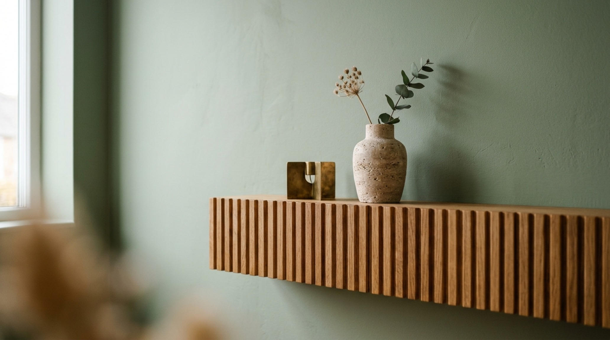
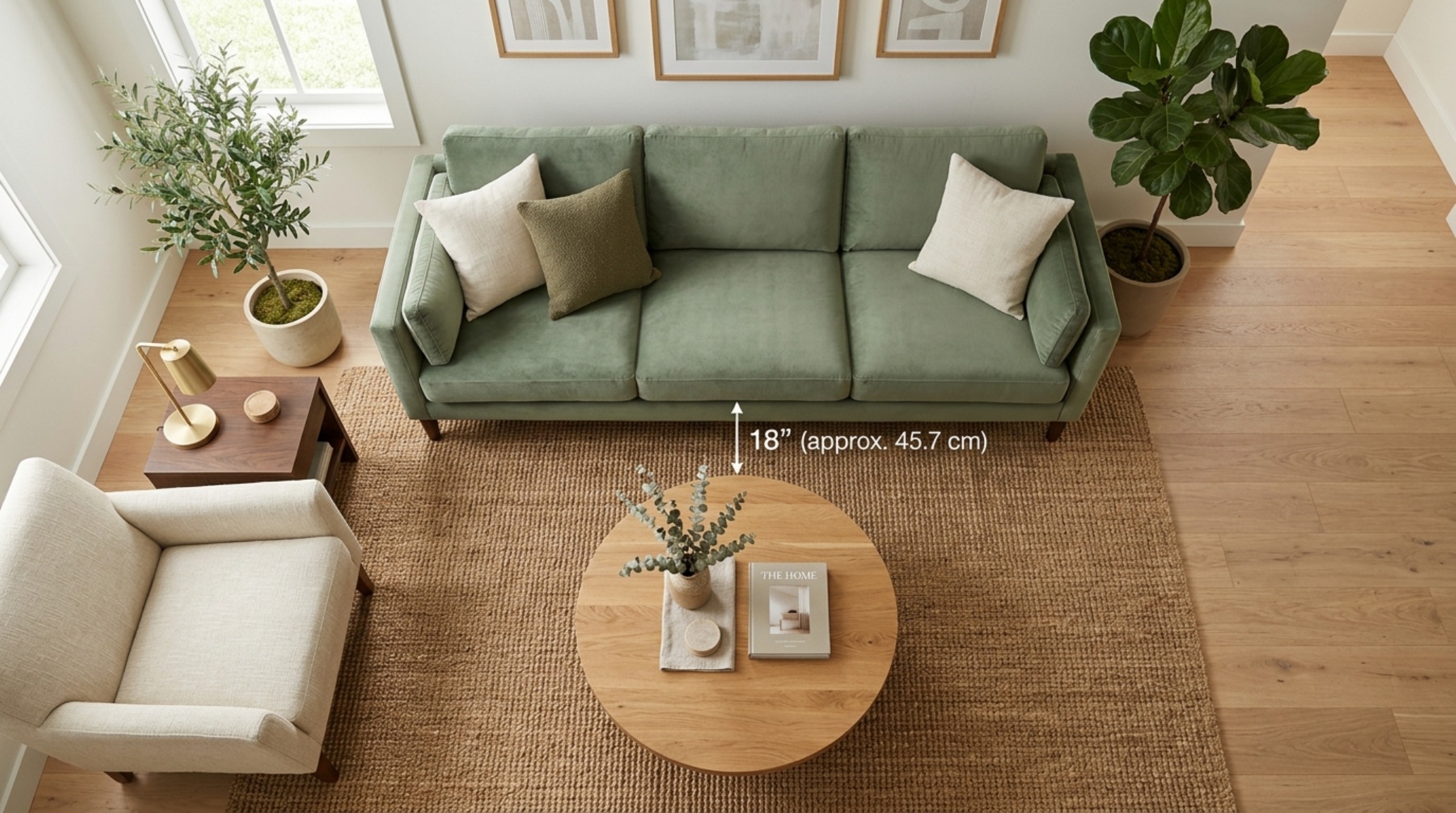
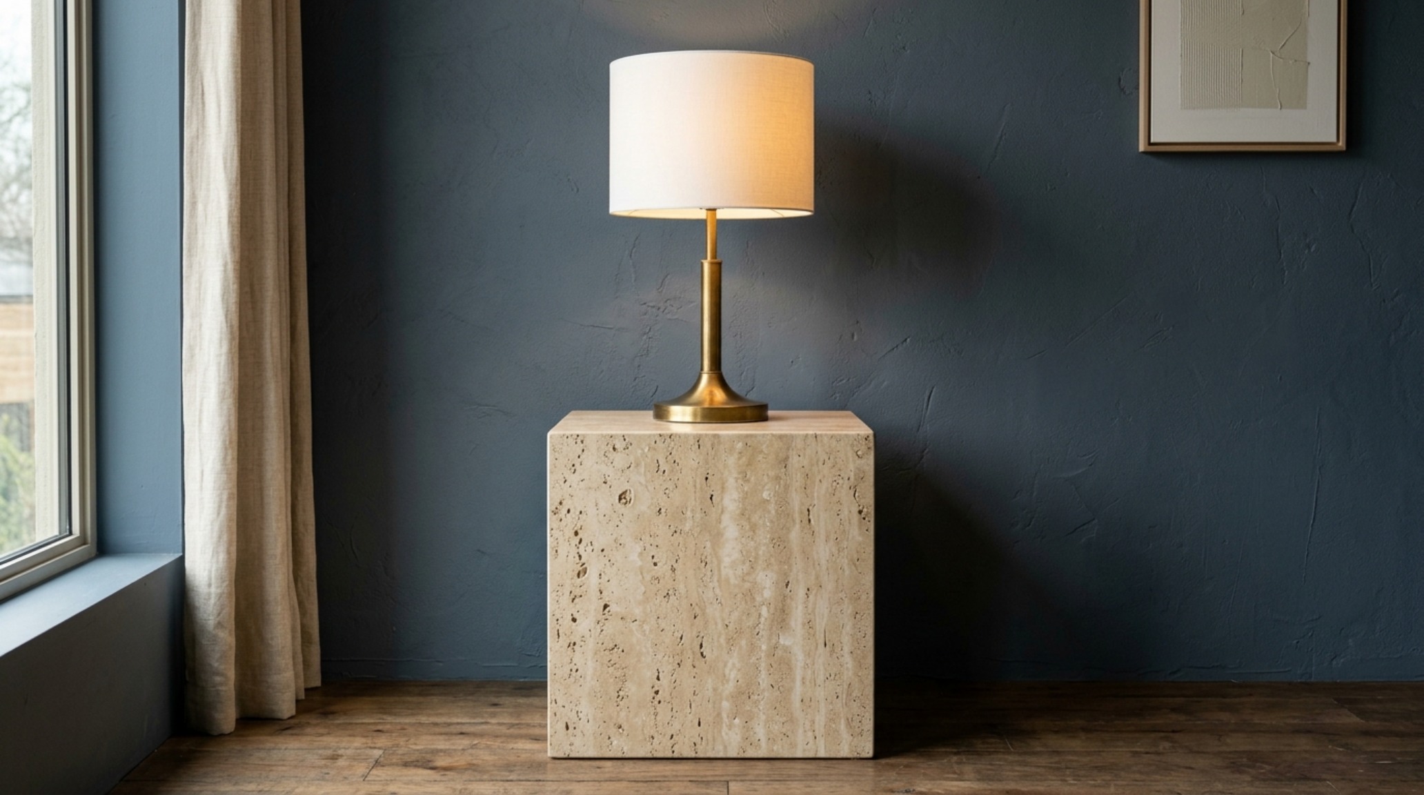
Introduce materials that have a ‘living’ quality. Honed travertine, fluted white oak, and brushed brass are the three pillars of this look. A coffee table in a light oak should be placed exactly 18 inches from the sofa edge—a standard architectural clearance that ensures functionality without crowding the ‘flow.’ The warmth of the wood grain slices through the coolness of the green, creating a balanced, high-end sensory experience.
Lighting the Gradient: 2700K vs. 3000K
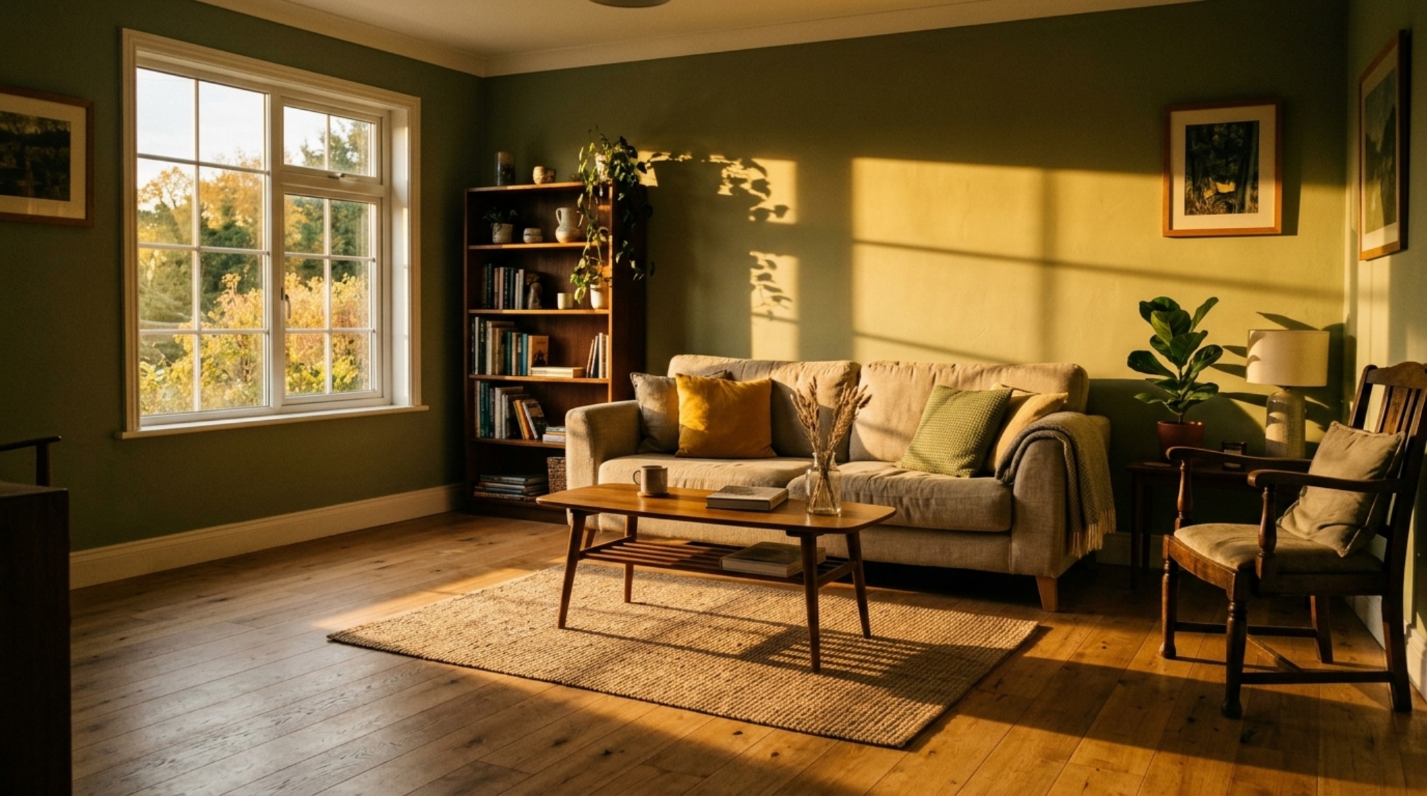
The success of an earthy living room depends entirely on the Kelvin temperature of your lighting. Sage and slate are notoriously sensitive to light. Under a 4000K office-style bulb, they can look sickly or grey. For a true ‘Quiet Luxury’ atmosphere, utilize 2700K warm ambient lighting. This golden-hour glow interacts with the green pigments to bring out the yellow undertones, making the room feel cozy and protective. For task areas, such as a reading nook, a 3000K bulb with a High CRI (Color Rendering Index) of 90+ ensures that your colors remain true and vibrant even after the sun sets.
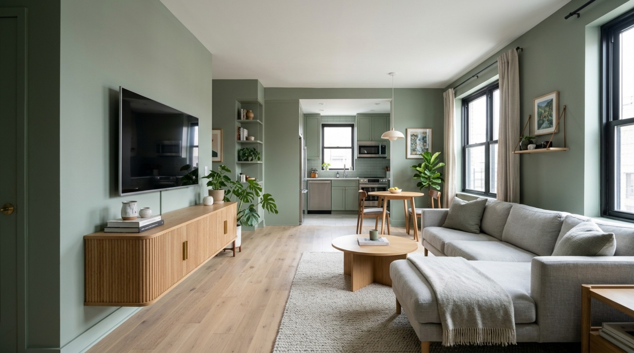
The Small Sage Green Living Room Layout: A Lesson in Proportion
When working within a restricted footprint, every inch is a commodity. A small sage green living room layout should prioritize ‘floating’ furniture. By using a sofa with slender legs or a wall-mounted media console, you allow the color-drenched floor and baseboards to be visible beneath the furniture. This trick of showing more floor area is a classic architectural move to increase perceived square footage.
Maintain a 30-inch clearance for any dining chairs and ensure that your primary circulation paths are never less than 3 feet wide. If the room feels tight, look to the vertical. Utilizing sage green accent wall decor—such as tone-on-tone floating shelves or oversized botanical sketches—draws the eye upward, celebrating the height of the room rather than its narrow width. This verticality is reinforced when the ceiling is painted in a half-strength tint of the wall color, a technique that softens the ‘lid’ of the room and makes the ceiling height feel indeterminate.
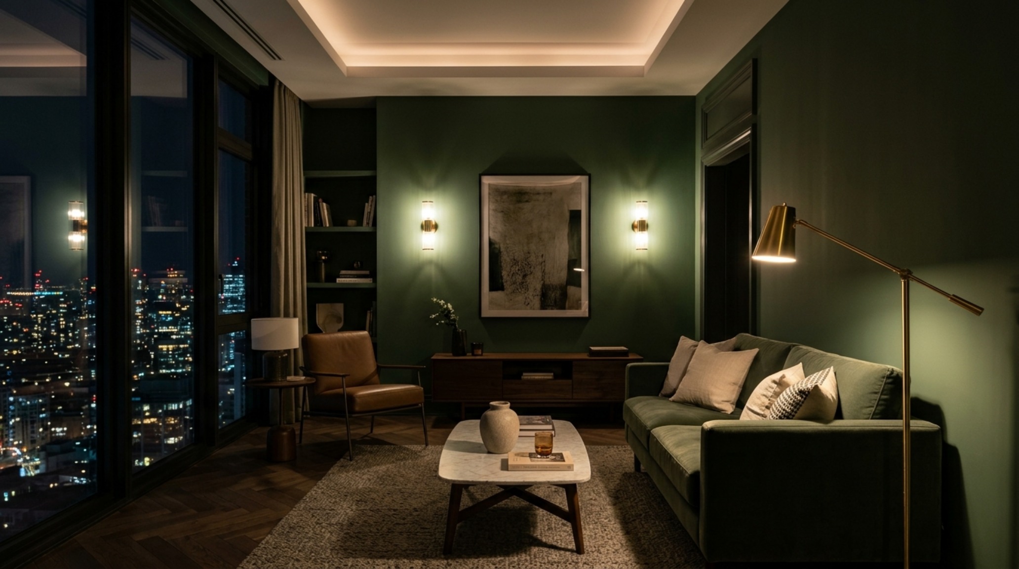
Scaling the Gradient: From Slate to Sage
Applying a gradient doesn’t necessarily mean a literal ombre effect on the wall. Instead, think of it as a ‘spatial gradient.’ Start with the heaviest, darkest tones (the slate blues) near the floor or in the most recessed corners of the room. As you move toward the windows and the ceiling, transition into the lighter, more airy sage greens. This mimics the natural world, where the earth is dark and the canopy is light, providing a subconscious sense of stability and calm.
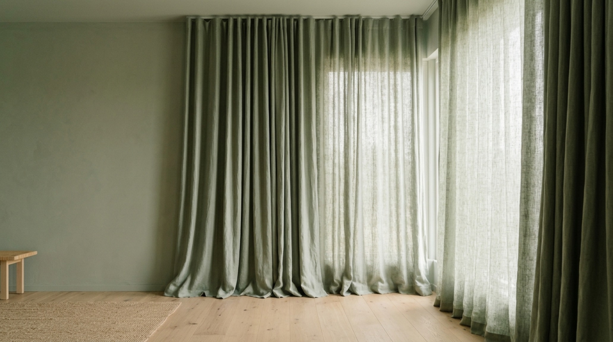
For those seeking sage green living room ideas that feel truly bespoke, consider ‘color drenching’ your window treatments. Using floor-to-ceiling linen curtains in the exact shade of your sage walls creates an unbroken line of color that expands the room’s perimeter. When the curtains are closed, the room becomes a seamless, meditative cocoon; when open, the fabric provides a soft, pleated texture that breaks up the flat wall planes.
Architectural Specification & Material Matrix
Curated tactile palette, spatial dimensions, and atmospheric lighting index for this design scheme.
Ultimately, the mastery of sage green living room ideas in small spaces is an exercise in restraint and architectural bravery. By stepping away from the safety of white and embracing the depth of a drenched, tonal palette, we transform a limitation of square footage into a triumph of atmosphere. As we continue to blur the lines between the organic and the built environment, these slate-to-sage gradients offer a roadmap for living deeply, beautifully, and expansively, no matter the scale of the room. It is in the quiet intersection of a shadowed corner and a velvet-finished wall that we find the true potential of modern residential design—a space that doesn’t just house our belongings, but elevates our very perception of home.
Editorial Silo • Recommended Architecture Studies
- Tactile Serenity: Fusing Sage Green with Raw Earth Textures and 2700K Ambient Mastery — Archival Design Case Study
- The Architectural Anchor: Engineering Spatial Flow and Visual Symmetry with Sage Green Geometries — Archival Design Case Study
Architectural Inspiration Lookbook
A high-resolution study in spatial proportions, tactile materiality, and light choreography curated for enduring modern living.

Curated Visual Lookbook
Design Gallery & Spatial Studies
A visual curation of architectural arrangements, lighting concepts, and material palettes featured in this space.