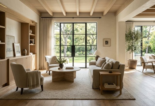
Modern painted rooms are defined by the 8-inch threshold rule—a precise vertical measurement where painting a baseboard the exact hue of the wall effectively raises the perceived ceiling height by nearly a foot while grounding the room’s furniture in a unified field. This architectural sleight of hand is the foundation of contemporary spatial design, where pigment is no longer just a surface treatment but a structural tool. In the current era of high-end residential interiors, the focus has shifted away from the safe, sterile ‘re-sale white’ toward a deep obsession with the tactile and sensory qualities of modern pigments. We are seeing a renaissance of 2025’s warm earth tones—terracottas that feel like baked clay and ochres that mimic late-afternoon sun—fused with saturated jewel palettes that provide a sense of permanence and weight to a space.
The Problem: The ‘Static Box’ and Visual Fragmentation
For decades, the standard approach to interior painting was a binary choice: a white ceiling and a different color on the walls, often separated by high-contrast white trim. While safe, this creates what architects call ‘visual noise,’ where the eye is constantly interrupted by the harsh transitions between planes. In a typical room with a standard 36-inch walkway clearance, these sharp lines of contrast can make a space feel smaller, more cluttered, and emotionally detached. A flat, low-grade latex paint further exacerbates this by absorbing light unevenly, leaving the corners feeling dead and the central planes looking chalky and two-dimensional. This ‘static box’ effect fails to account for the way light moves across a room throughout the day, ignoring the architectural potential of the walls themselves.
The Solution: 2025 Interior Paint Trends & the New Organic Warmth
To solve the flatness of traditional interiors, designers are looking toward 2025 interior paint trends that prioritize ‘living’ color. This involves a departure from cool grays in favor of ‘new neutrals’ that possess high-pigment loads and complex undertones. Think of shades like Benjamin Moore’s Swiss Coffee (LRV 82) or Farrow & Ball’s Setting Plaster. These colors are designed to react to both 2700K warm ambient lighting and the blue-shifted light of a northern exposure. By selecting pigments with organic origins—siennas, umbers, and deep mineral greens—we create a palette that feels as though it was pulled from the earth, providing a tactile grounding that makes a room feel settled. In a primary living zone, where an 18-inch coffee table reach is standard, these warm tones create a sense of intimacy that a stark white simply cannot foster.
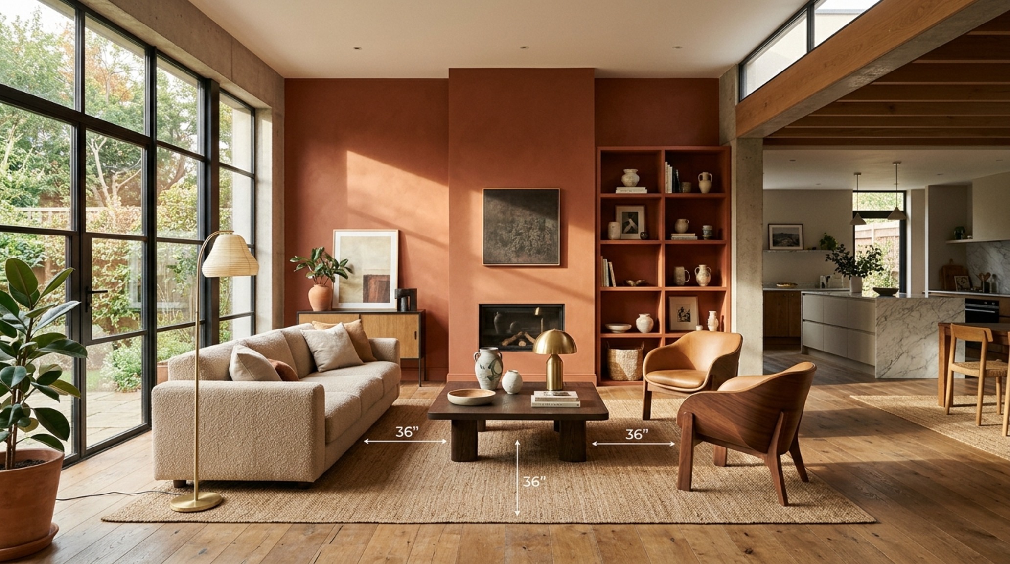
When implementing these palettes, the key is to consider the CRI (Color Rendering Index) of your light sources. A high CRI 90+ rating is essential for modern painted rooms; it ensures that the nuances of a deep terracotta or a moody sage don’t collapse into a muddy brown when the sun goes down. The interaction between these pigments and the architectural volume transforms a simple room into a curated experience of shadow and light.
The Problem: The Sterile Disconnection of Open-Plan Living
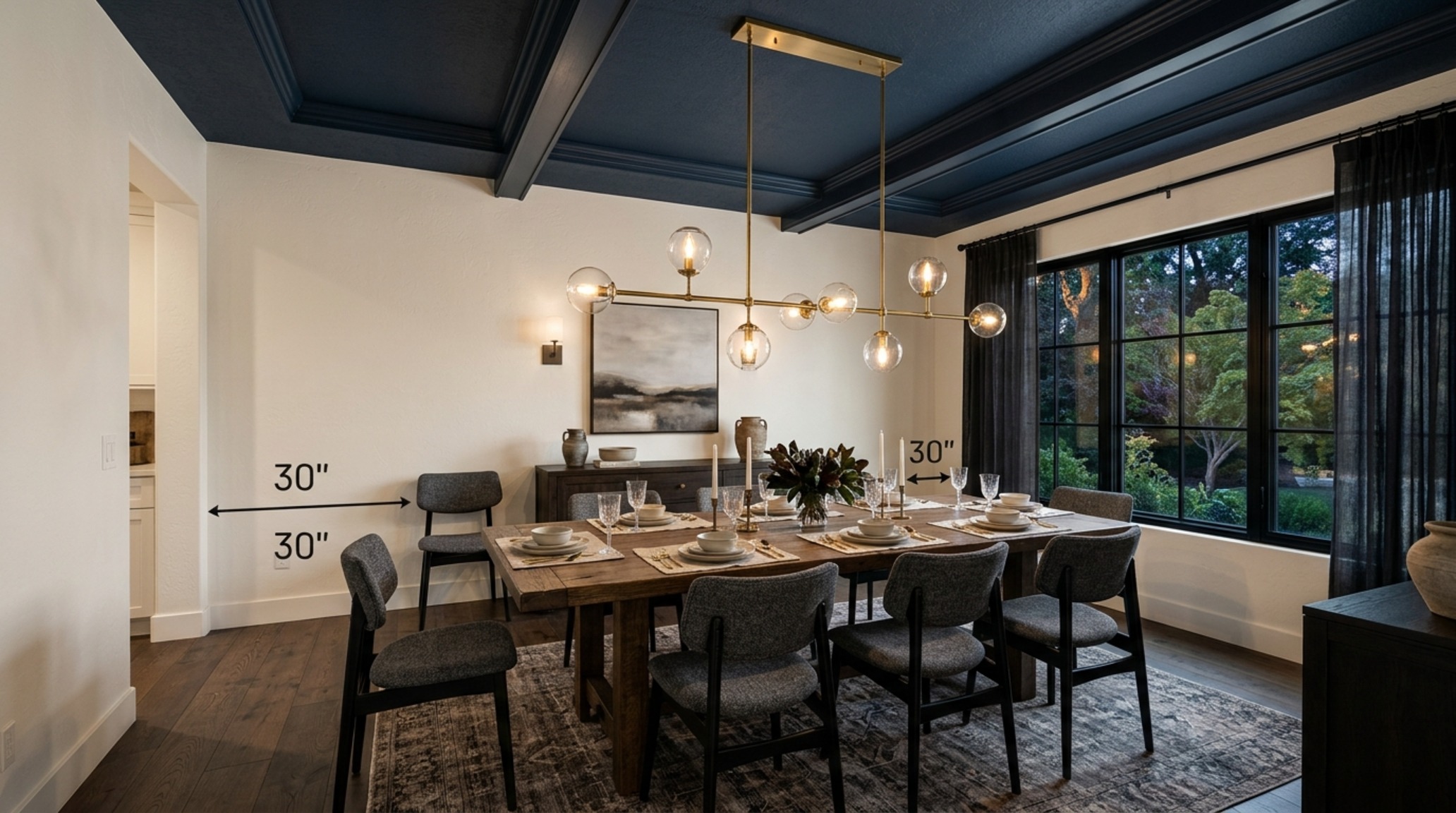
Modern architecture often prioritizes open-concept layouts, but these can quickly become cavernous and directionless. Without physical walls to define zones, the ‘flow’ often feels like a lack of purpose. A dining area might bleed into a lounge space with no sense of transition, leaving furniture feeling like it is floating in a void. Standard architectural clearances—such as the 30-inch dining chair clearance required for comfortable movement—are often ignored when the entire floor plate is a single, monotonous shade. The result is a home that feels like a gallery rather than a residence, lacking the cozy ‘nesting’ quality that humans naturally crave.
The Solution: Color Drenching Techniques for Unified Volume
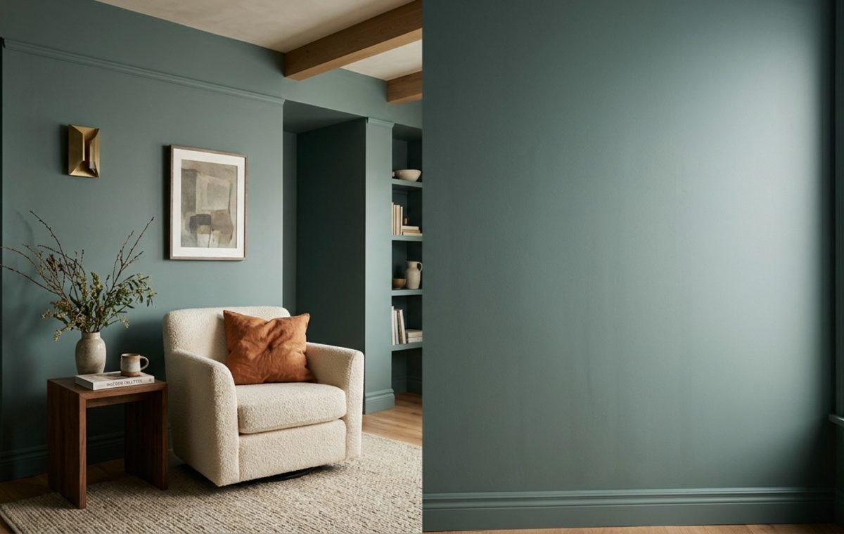
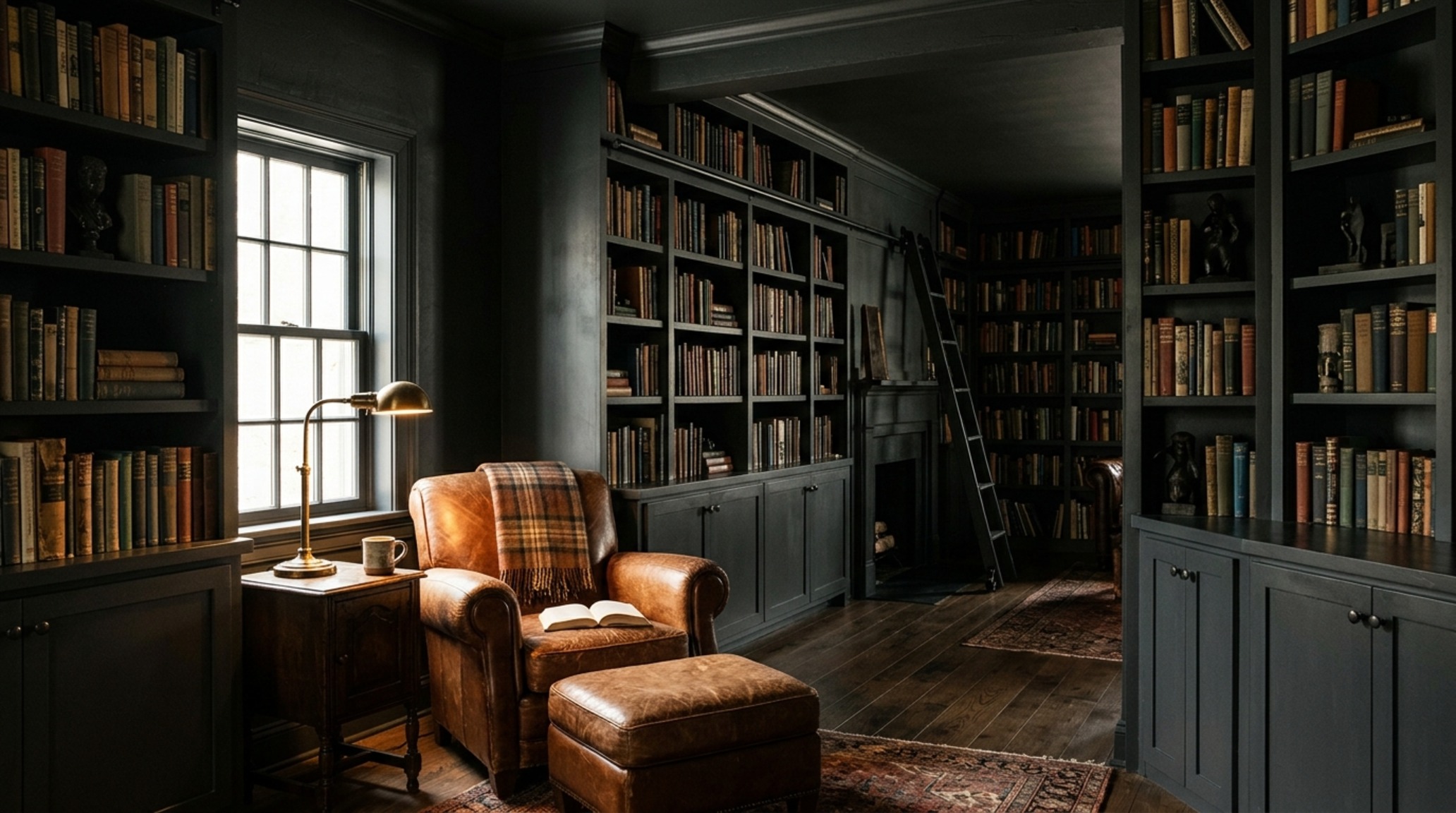
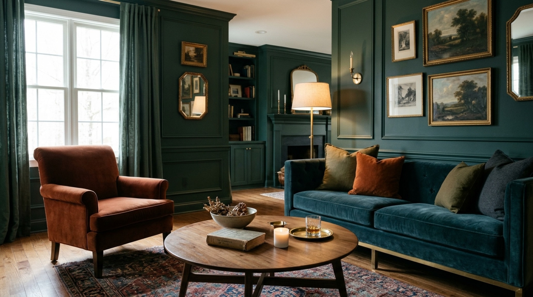
One of the most powerful ways to solve the problem of fragmented open plans is through color drenching techniques. This involves painting the walls, trim, doors, casings, and sometimes even the ceiling in a single, monochromatic hue. By removing the high-contrast ‘outline’ of white trim, the architectural features of the room become sculptural elements rather than just boundaries. In a library or a home office, color drenching in a deep charcoal or a forest green creates a cocoon-like atmosphere that minimizes visual distractions. This technique leverages the way shadow play works in a corner; the absence of a white trim line allows the shadow to blend softly into the wall, blurring the hard edges of the room and making the ceiling appear to lift. When you have a 36-inch primary circulation path, color drenching makes that transition through the home feel seamless and fluid, as if you are moving through a single, cohesive narrative.
The Problem: The Lack of Material Depth in Synthetic Finishes
Traditional flat and semi-gloss paints are synthetic and uniform. While they are easy to clean, they are visually ‘closed.’ They don’t allow light to penetrate the surface, which results in a plastic-like sheen that can feel cheap under 3000K task lighting. In rooms where natural materials like fluted white oak or honed travertine are present, these synthetic paint finishes create a material mismatch. The wall feels like a sticker rather than a part of the building’s soul. This is particularly noticeable in modern painted rooms that attempt to achieve a minimalist aesthetic but end up feeling cold and hollow.
The Solution: Modern Wall Finishes and the Rise of Lime-wash
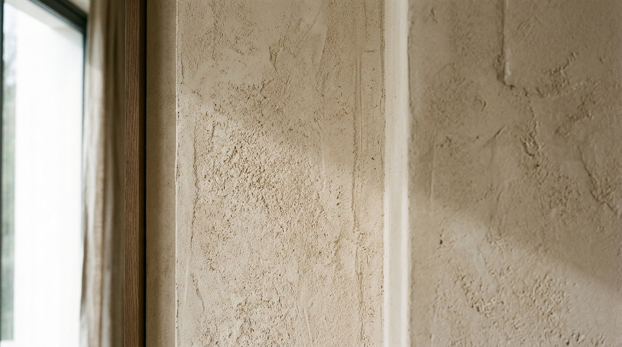
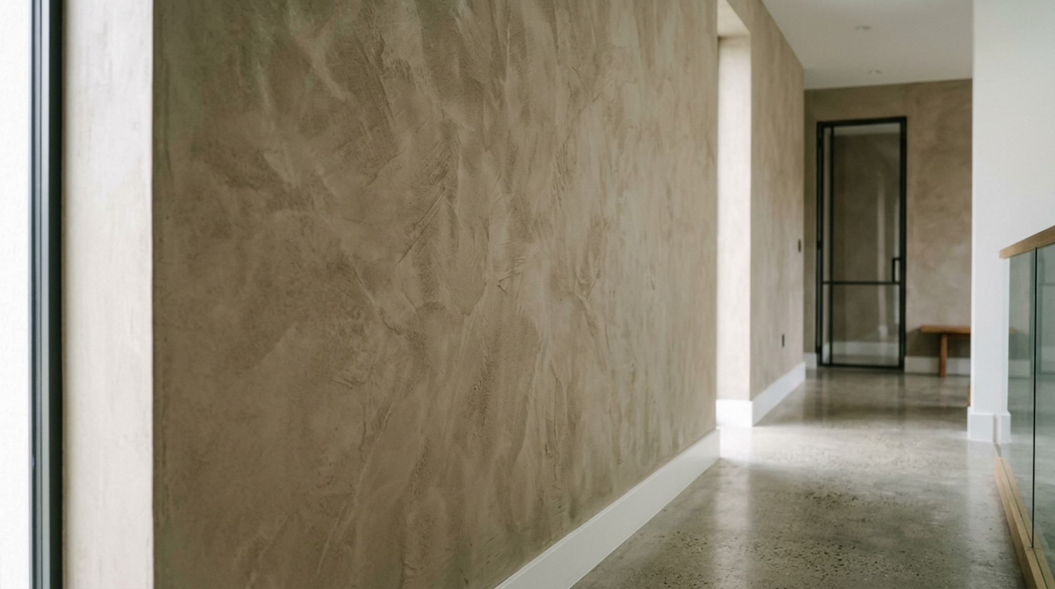
The solution lies in the revival of mineral-based finishes. Modern wall finishes such as lime-wash and Roman Clay offer a depth of materiality that is impossible to achieve with standard acrylics. Lime-wash is a natural mineral paint that reacts with the carbon dioxide in the air to form a calcite layer, creating a finish that is breathable and visually mottled. It possesses a velvety, suede-like texture that catches the light at different angles, suggesting movement and history. When paired with 2700K warm ambient lighting, lime-washed walls glow from within, providing a perfect backdrop for a 30-inch high dining table or a low-slung Italian sofa. This finish acts as a bridge between the architecture and the furniture, ensuring that the ‘negative space breathing room’ around a piece of art or a sculpture is just as interesting as the object itself.
The Problem: The Oppressive ‘Fifth Wall’
In many homes, the ceiling—often called the fifth wall—is treated as an afterthought. It is almost always painted a flat ‘ceiling white.’ However, in modern painted rooms with standard 8 or 9-foot heights, a stark white ceiling can actually make the room feel shorter. The high contrast between a saturated wall color and a bright white ceiling creates a sharp visual ‘cutoff’ that stops the eye, making the room feel horizontally compressed and vertically restricted. This is a common design flaw that robs a space of its potential drama.
The Solution: Moody Accent Ceilings for Vertical Expansion
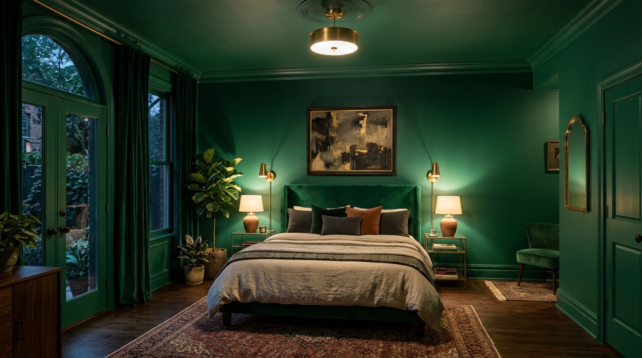
To overcome vertical compression, designers are increasingly turning to moody accent ceilings. By painting the ceiling a color that is 20-30% darker than the walls, or by continuing the wall color onto the ceiling, you create a sense of infinite depth. Contrary to the myth that dark colors make a room feel smaller, a dark ceiling in a matte finish can actually recede from the eye, similar to the night sky. This is especially effective in bedrooms or media rooms where you want to emphasize a sense of rest. Using a high-CRI 92+ diffused light source on a dimmer allows you to control the ‘atmospheric weight’ of the ceiling, shifting the room from a bright workspace to an intimate lounge with a single gesture. In a space where you’ve respected the 18-inch coffee reach, a moody ceiling pulls the entire composition together into a singular, immersive environment.
The Problem: Functionless Voids in Open Layouts
Even with beautiful paint, a large room can feel ‘unprogrammed.’ A wall that stretches for 20 feet without any interruption can become a visual wasteland. This is where modern painted rooms often fail—they lack the ‘spatial cadence’ that tells the occupant how to use the space. Without visual cues, the transition from a reading nook to a hallway is lost, leading to a home that feels poorly organized and architecturally lazy.
The Solution: Architectural Color Blocking and Functional Zoning
Architectural color blocking offers a sophisticated solution to zoning without the need for physical partitions. By using a bold, contrasting color in a specific geometric section—for instance, painting a 5-foot wide vertical strip behind a desk or a reading chair—you create a ‘room within a room.’ This technique relies on sightline alignment; when you view the room from the entrance, the color block acts as a focal point that anchors the furniture. This is functional art. In an open-plan kitchen and dining area, architectural color blocking can define the ‘active’ zone of the kitchen with a durable, mid-sheen finish in a deep navy, while the ‘social’ dining area remains in a warm minimalist sand tone. This ensures that the 30-inch dining chair clearance feels intentional and part of a larger, curated spatial strategy.
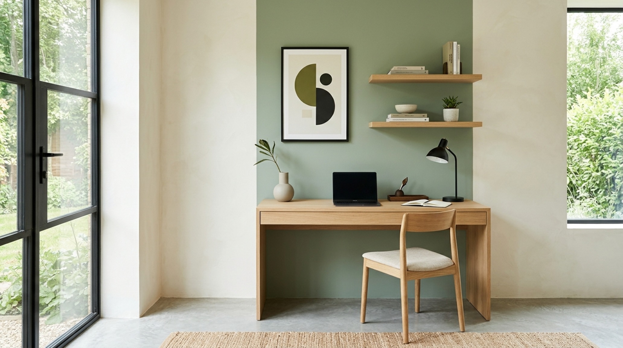
Spatial Perspectives & Material Curation
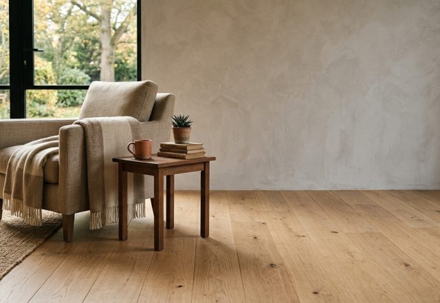
Integrating these concepts requires a keen understanding of the dialogue between the floor plane and the vertical surfaces. When choosing your palette, always look at your samples on the floor, next to your primary flooring material. A warm minimalist wall color like Alabaster or Pale Oak only works if it doesn’t clash with the yellow tones of a white oak floor or the cool gray of a polished concrete slab. The goal is to create a contemporary monochromatic room that doesn’t feel one-note, but rather a layered composition of varying sheens and textures. By mixing a matte wall with an eggshell trim and a lime-wash accent, you create ‘micro-contrasts’ that keep the eye engaged without the need for jarring color shifts.
Technical Breakdown & Material Schedule
Summary of authentic finishes, designer paint selections, and standard architectural clearances.
When planning your next renovation, look for these key materials to achieve a high-end finish: low-VOC mineral-based lime-wash, a high-quality 2.5″ angled sash brush for clean ‘cutting in,’ microfiber 3/8″ nap rollers for a seamless matte application, and high-CRI LED bulbs to ensure your pigments remain true. Architecture is ultimately a study of how we inhabit the space between the walls; by treating those walls as luminous, tactile planes of color, we elevate the daily experience of living. Modern painted rooms reflect a shift toward a more emotional, sensory-driven design philosophy where pigment and light work in perfect, silent harmony.
Editorial Silo • Recommended Architecture Studies
- The Structural Strategist: How To Become Interior Decorator & How to Become an Interior Decorator by Mastering Spatial Architecture — Archival Design Case Study
- The Structural Secret: Make Bay Window Seat Cushion & Engineering a High-Density Seating Oasis with Integrated Functional Flow — Archival Design Case Study
The Interior Perspective Vault
An editorial archive chronicling proportions, bespoke architectural joinery, and tranquil daylighting.
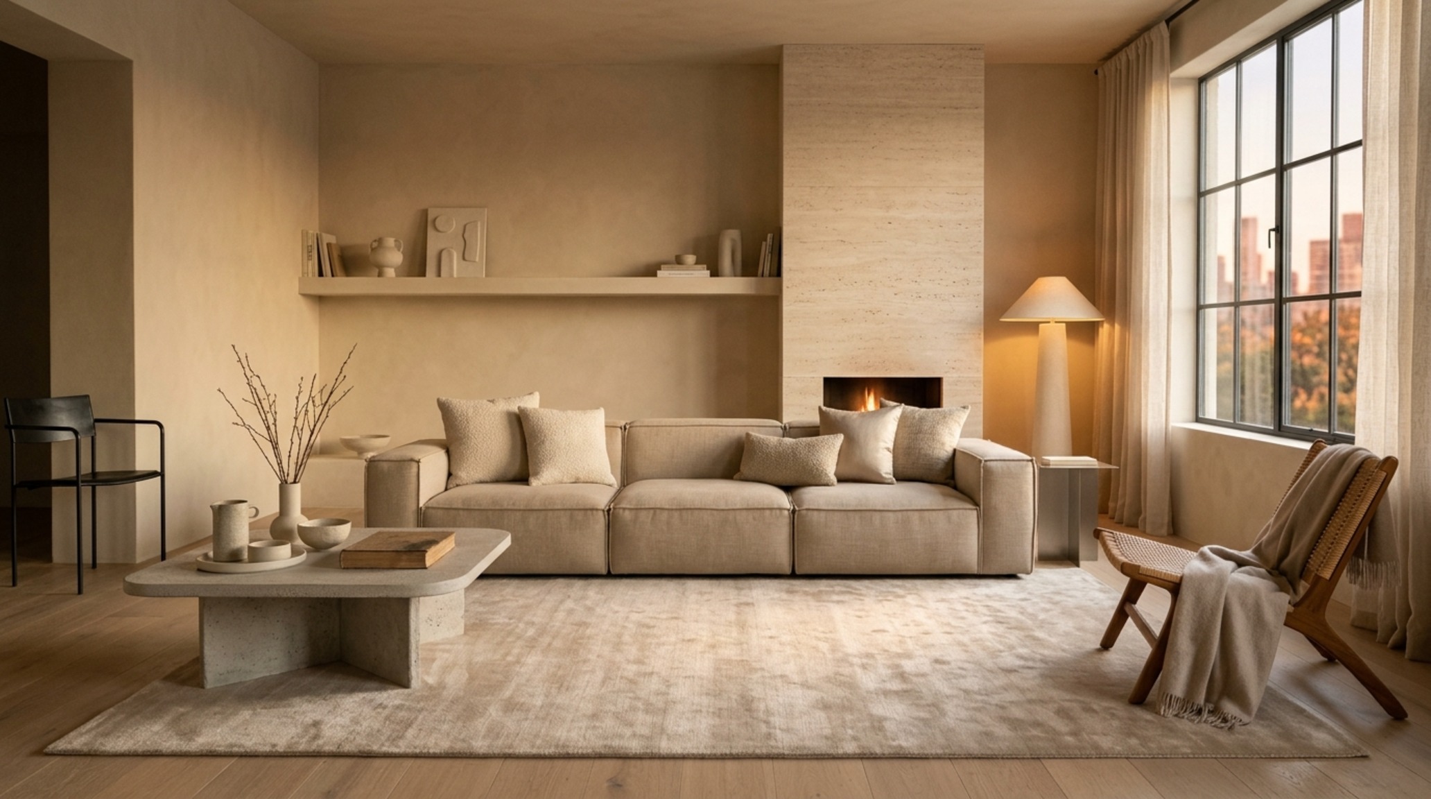
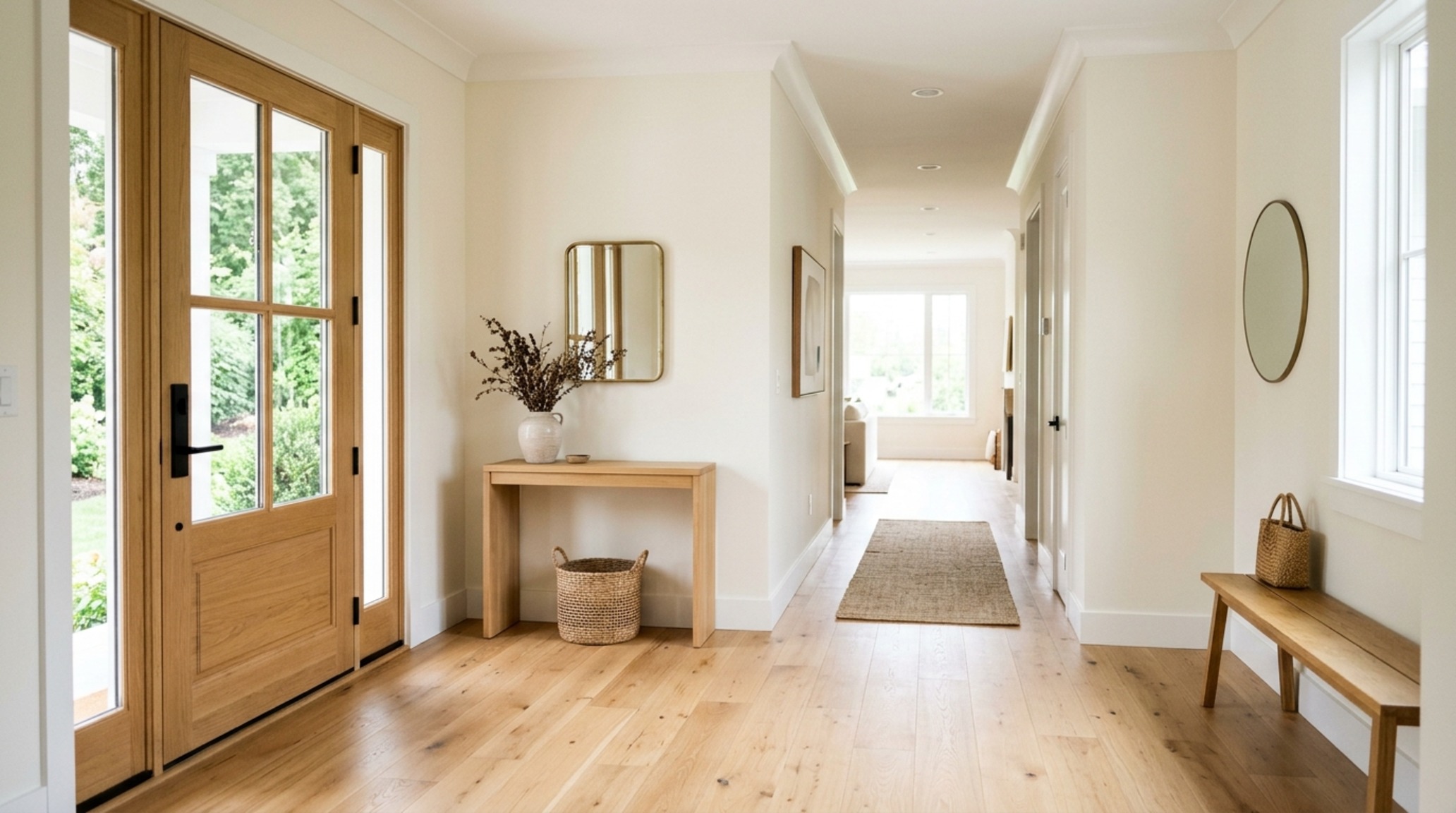
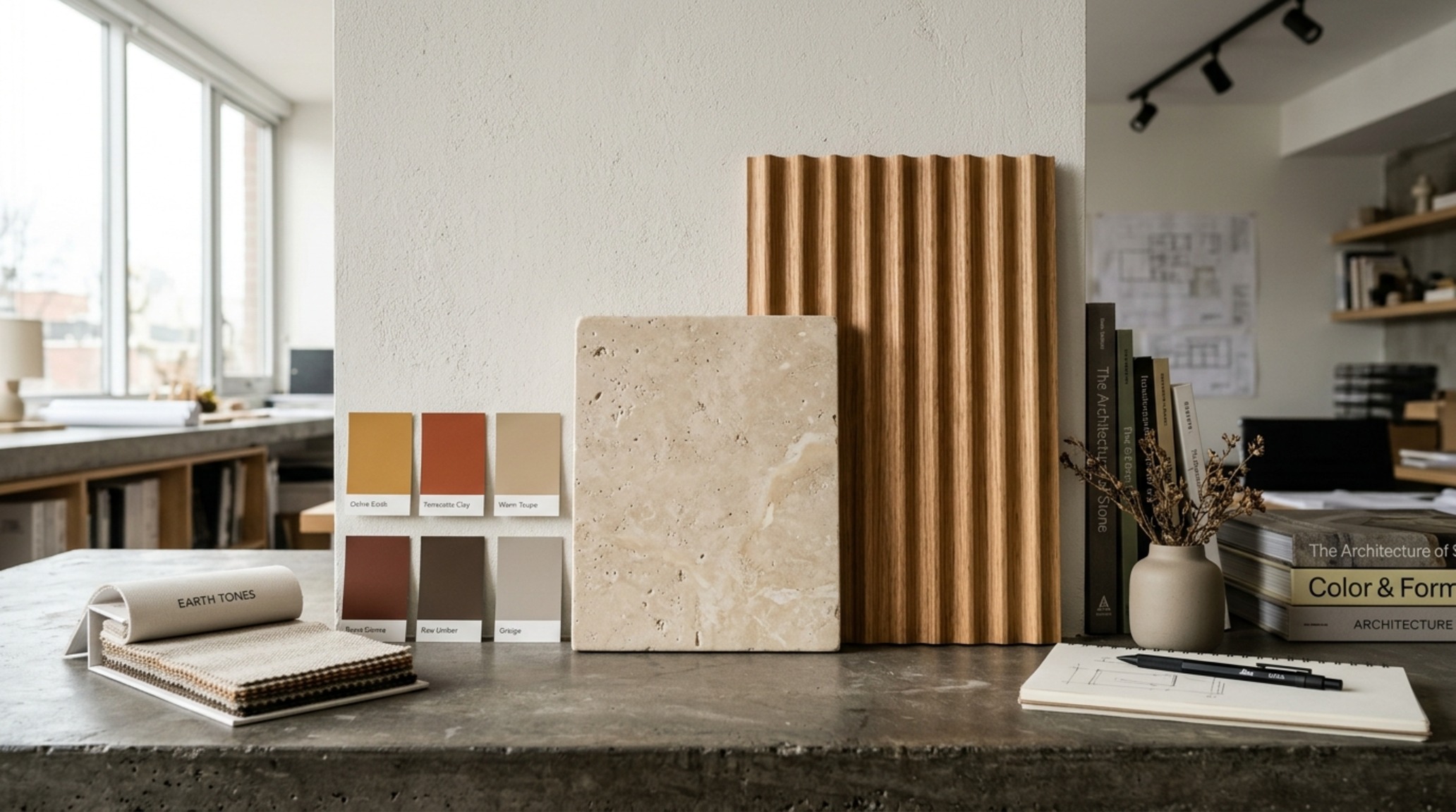
Curated Visual Lookbook
A visual curation of architectural arrangements, lighting concepts, and material palettes featured in this space.
Design Gallery & Spatial Studies