I remember standing in a 650-square-foot ADU in Venice Beach last spring, watching the morning light slice through a series of clerestory windows. These modern california homes are masterclasses in architectural compression, proving that a footprint doesn’t define the volume of a life lived within it. The space felt twice its size, not because of a lack of furniture, but because of a precise, rhythmic alignment of sightlines and structural transparency. It was a visceral reminder that when we strip away the excess, the remaining inches must perform with athletic efficiency.
The challenge of the West Coast urban landscape today isn’t just about finding space; it’s about inventing it. We are seeing a profound shift toward high-performance living, where the pragmatics of square footage meet the poetry of light. From the rise of the luxury Accessory Dwelling Unit (ADU) to the meticulous renovation of mid-century ranch houses, the goal remains the same: maximizing every cubic inch through floating architecture and custom-engineered cabinetry. This is a guide to the new California standard—where space-saving isn’t a compromise, but a sophisticated design discipline.
The Invisible Footprint: Spatial Perspectives & Material Curation
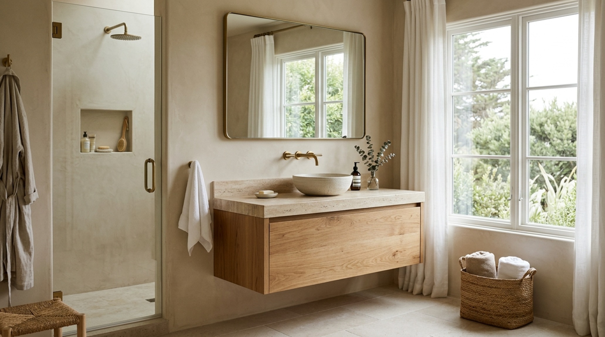
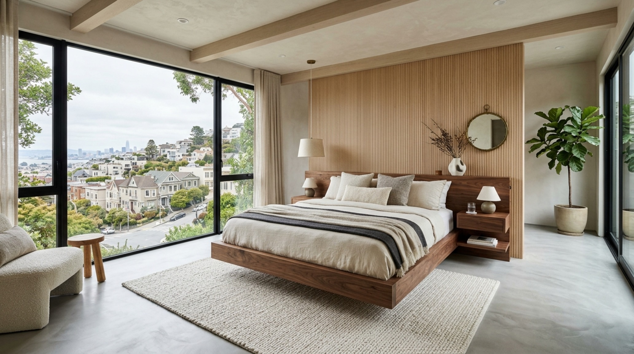
To achieve a seamless spatial flow, one must first look at the floor plane as a sacred, uninterrupted surface. The moment you clutter the floor, the room shrinks. This is why floating elements are the cornerstone of the modern aesthetic. By utilizing cantilevered cabinetry and wall-mounted vanities, you allow the eye to travel all the way to the baseboard, creating an illusion of expansive floor area. In a tight 36-inch primary circulation path, every inch of visible floor matters.
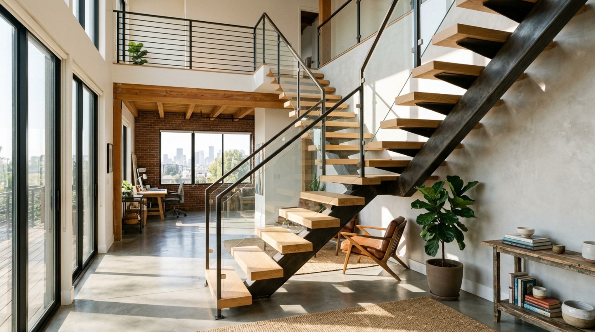
Verticality is the next frontier. We often see the integration of custom-engineered solutions from Beach City Stairs, where the staircase isn’t just a utility but a sculpture of light. Steel-stringer stairs with open oak treads allow light to pass through the structure, maintaining a visual connection between levels that a traditional closed staircase would sever. This vertical transparency is essential in smaller modern california homes where a solid wall would feel claustrophobic. By treating the stairwell as a light well, you draw the eye upward, effectively doubling the perceived height of the room.
Ergonomic Storage & Floating Architecture
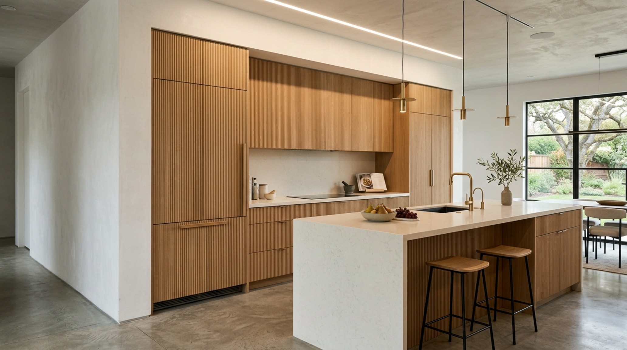
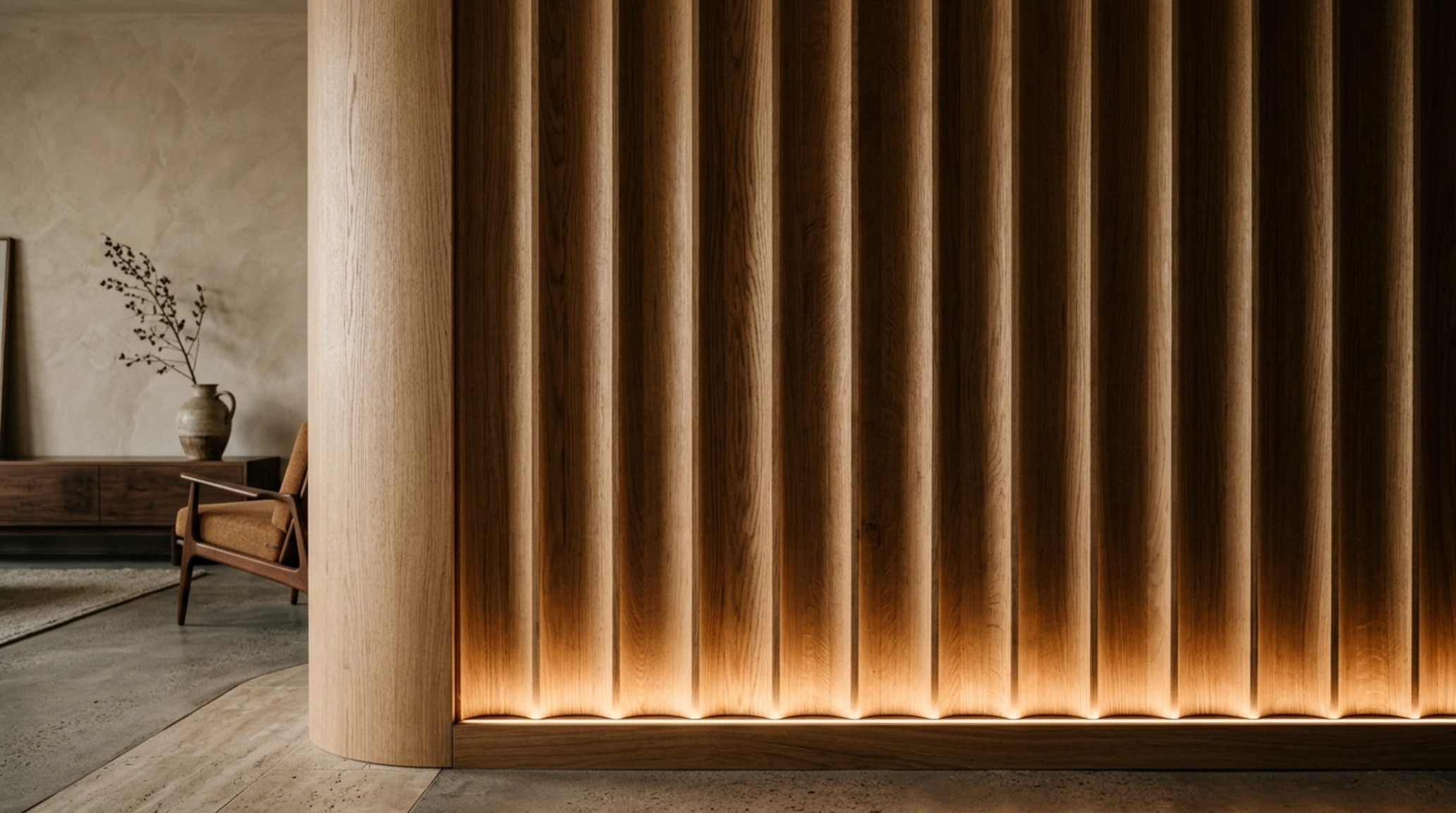
Storage in a high-performance home should be felt, not seen. This brings us to the concept of the ‘stealth wall’—a floor-to-ceiling cabinetry system, often crafted in materials like fluted white oak by Prizmawood, that blends into the architecture. When these units are handle-less and color-matched to the walls (think Benjamin Moore Swiss Coffee in a matte finish), they disappear. This allows for a 30-inch dining chair clearance without the visual noise of a bulky credenza or a hutch. It is about the editing of the physical world to prioritize the emotional experience of the space.
Materiality and High-Performance Customization
The california casual interior design ethos relies heavily on tactile grounding. In a compact home, the materials you touch must carry the weight of the design. We are seeing a move away from cold, high-gloss finishes toward the ‘quiet luxury’ of honed travertine and micro-cement. These materials provide a soft, velvet-like patina that absorbs light rather than reflecting it harshly, which can make a small room feel jittery.
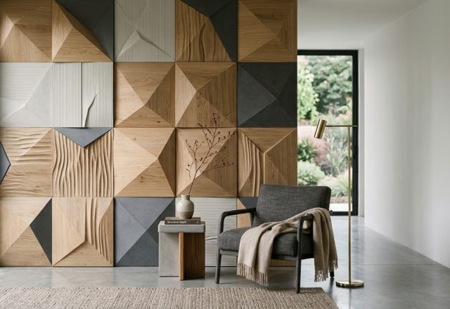
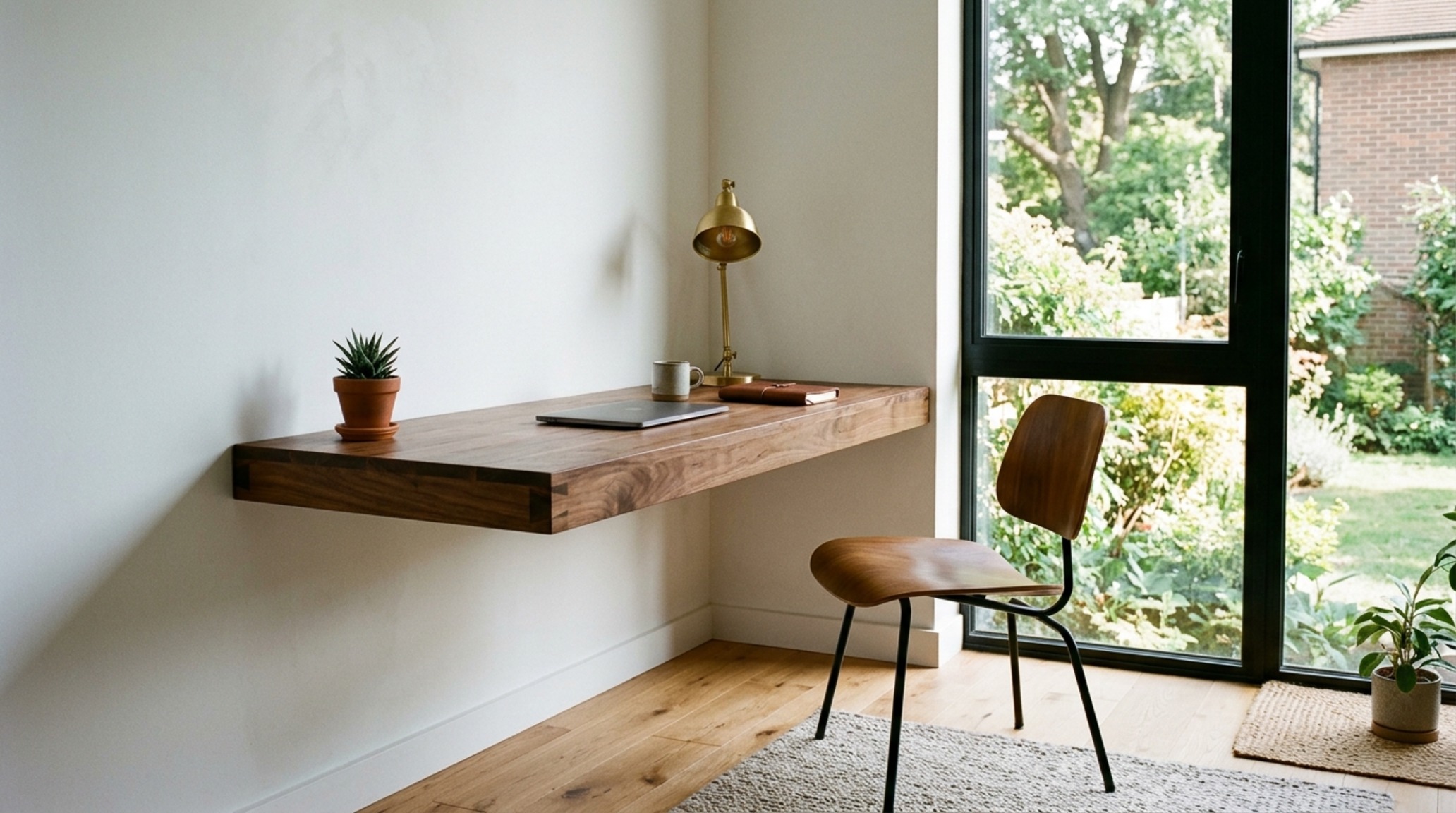
When selecting wood species for space-saving cabinetry, the grain direction is a powerful tool. Running a rift-sawn oak grain vertically on a tall pantry wall can elongate a room, while horizontal graining can help a narrow hallway feel wider. It’s a psychological trick of the trade that works in tandem with architectural reality. Standard 18-inch coffee table reaches and 42-inch kitchen aisles must be respected, but the materials used within those zones can change the way those dimensions are perceived. A floating walnut desk in a corner office nook provides the same utility as a freestanding one but leaves the floor clear, maintaining that crucial sense of airiness.
“Design is not just what it looks like and feels like. Design is how it works, especially when the footprint is limited and the expectations for luxury remain high.”
The Chroma of Expansion: Visual Anthology of Spatial Living
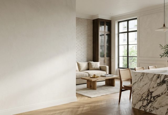
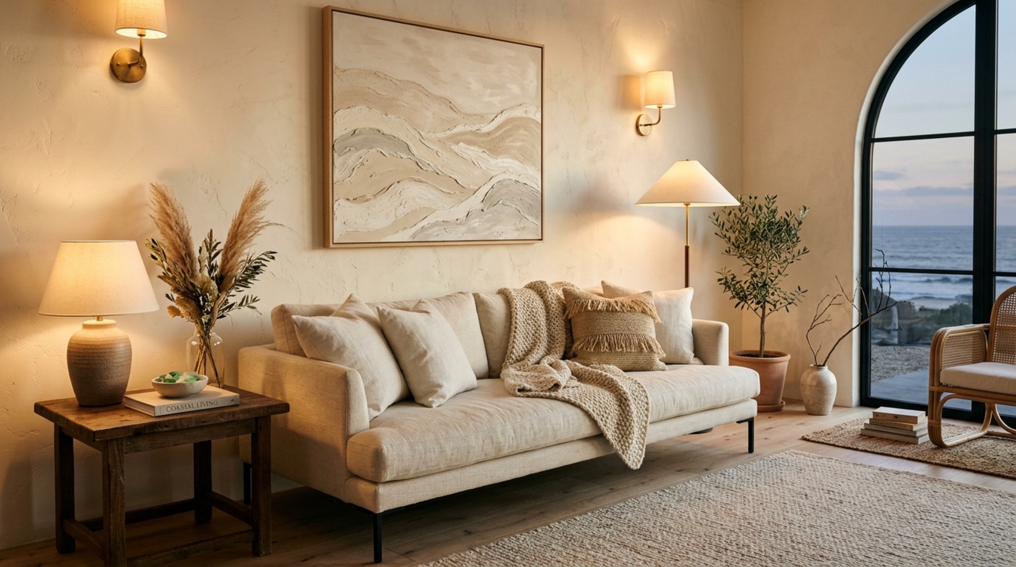
Color is perhaps the most misunderstood tool in the space-saving arsenal. While the instinct is to paint everything a sterile gallery white, contemporary coastal living trends suggest a more nuanced approach. A monochromatic palette doesn’t have to be flat. By layering varying shades of off-white—such as Farrow & Ball School House White on the walls and Setting Plaster on a focal ceiling—you create depth through shadow play. This prevents the ‘box effect’ common in smaller rooms.
In modern california homes, we often use darker, grounding tones in transitional spaces. A charcoal-washed hallway can make the light-filled living room at the end of it feel even more expansive. It’s about the squeeze and the release. When you move from a darker, tighter space into a bright, open one, the brain registers the open space as even larger than it is. This is the spatial cadence of a well-designed home.
Luminous Layers: Architectural Perspectives Showcase
Lighting is the final, and most critical, layer of the space-saving puzzle. In luxury west coast glass architecture, the sun is the primary light source, but the artificial layers must be equally sophisticated. We move away from the dreaded ‘Swiss cheese’ ceiling of recessed cans and toward integrated LED channels and soft, diffused task lighting. The magic happens at 2700K—that warm, golden-hour glow that makes natural wood tones sing.
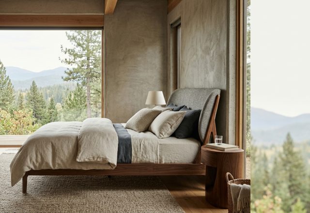
High CRI (Color Rendering Index) ratings of 90+ are non-negotiable. This ensures that the honed stone and textured linens in your home look authentic, not muddy. By placing LED strips underneath floating vanities or behind a cantilevered headboard, you create a ‘wash’ of light on the floor or wall that pushes the surfaces away, making the boundaries of the room feel softer and more distant. This ambient glow eliminates the harsh shadows that can make a small corner feel like a closet.
The Interaction of Glass and Light
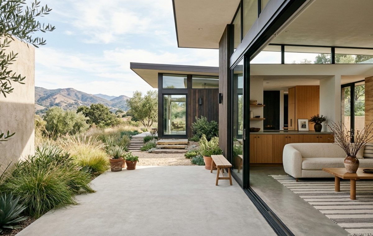
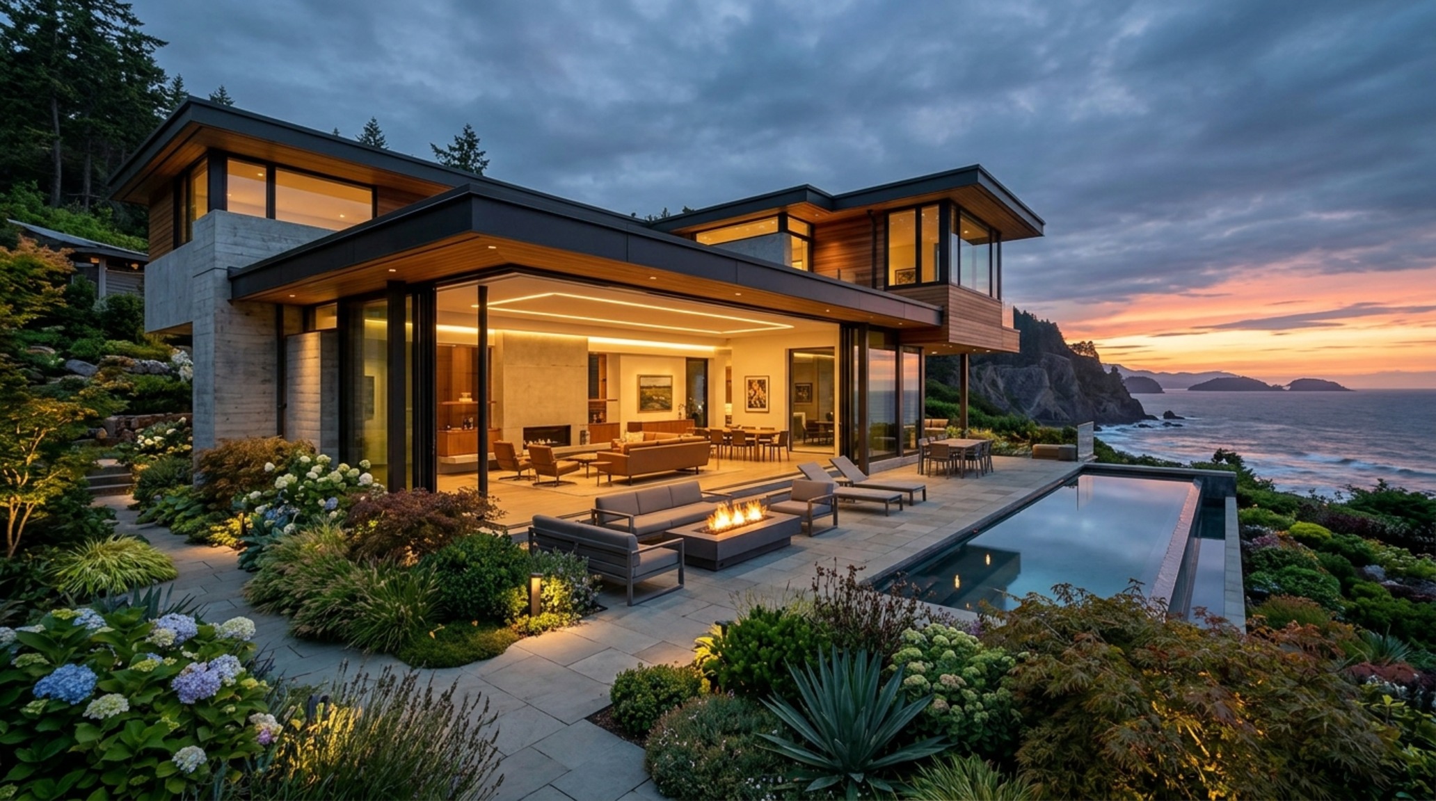
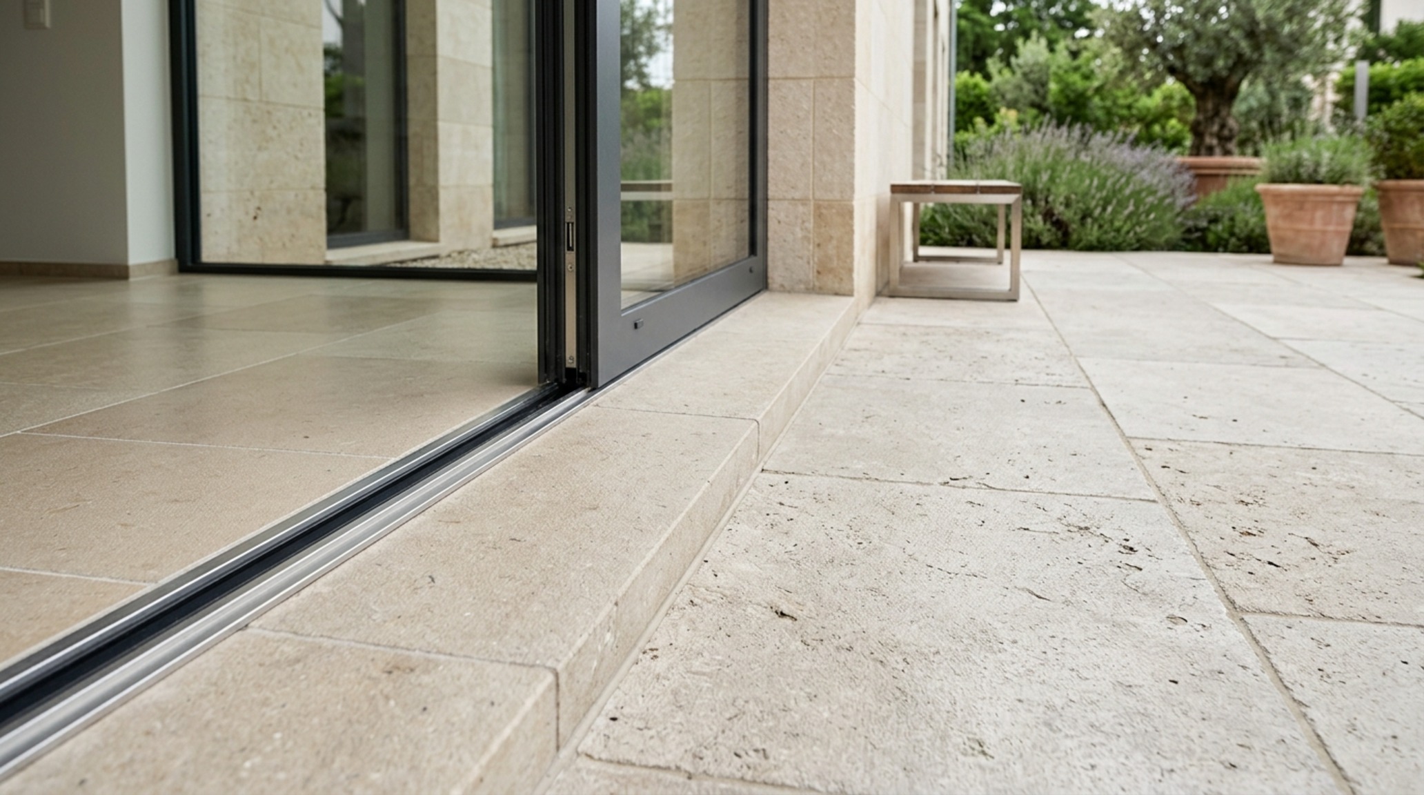
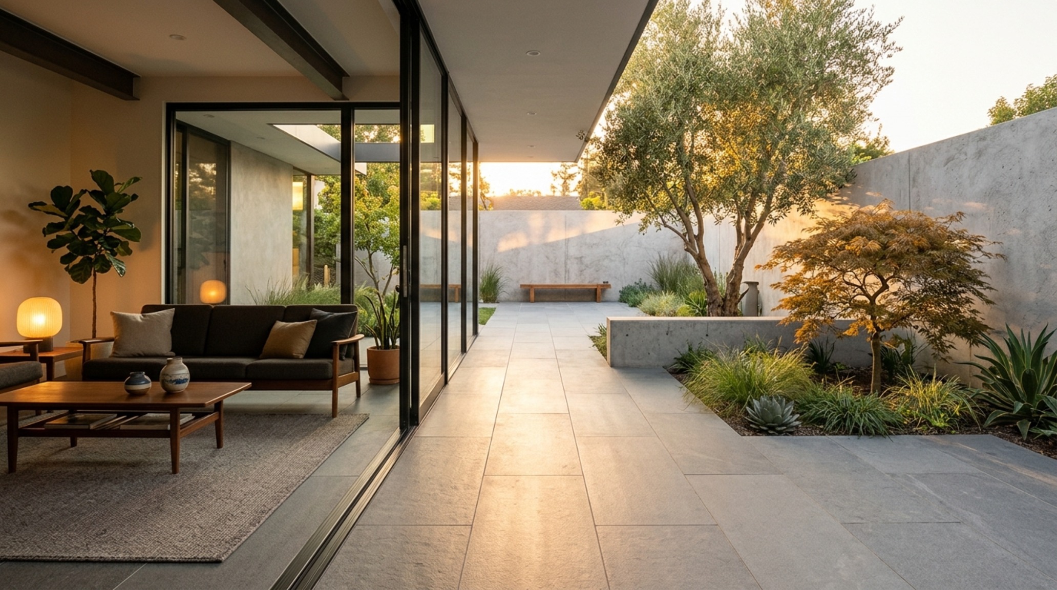
Large-format sliding glass doors are the hallmark of the indoor-outdoor floor plans that define this region. By aligning the interior floor material—say, a light-hued limestone—with the exterior patio stone, the boundary is erased. The living room doesn’t end at the glass; it ends at the property line. Even in a small urban lot, this visual extension is transformative. It’s about sightline alignment; if you can see the sky or a distant tree from the front door, the home feels infinite.
The Final Edit: Curated Concept Gallery & Spatial Vignettes
When approaching modern ranch house renovations, the goal is often to open up the cellular floor plan of the 1950s. By removing non-structural walls and replacing them with functional ‘islands’ of storage or glass partitions, we maintain the integrity of the home while updating it for 21st-century lifestyles. Every piece of furniture must be considered for its ‘visual weight.’ A sofa on legs feels lighter than one that sits directly on the floor. A glass-topped coffee table provides a surface without blocking the view of a beautiful rug. This is the discipline of the edit.
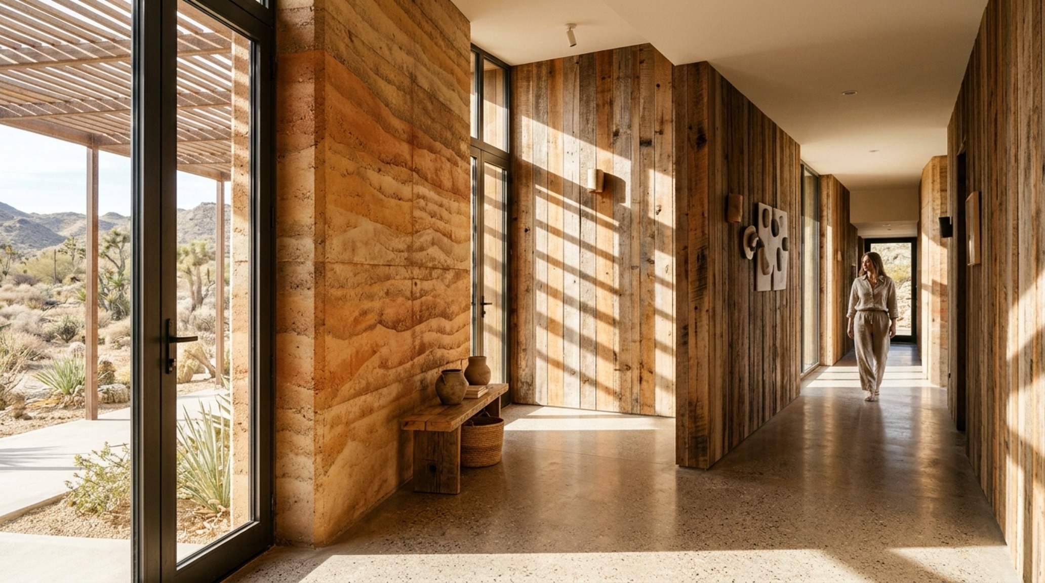
We focus on the intersections—where the oak floor meets the travertine hearth, where the glass wall meets the cedar ceiling. These details are where the quality of a home is felt. In smaller footprints, you cannot hide behind grand gestures; you must rely on the perfection of the small ones. The use of sustainable desert home materials like rammed earth or reclaimed wood adds a layer of history and texture that grounds the modern geometry, preventing it from feeling cold or clinical.
Comprehensive Material & Proportions Schedule
Architectural breakdown detailing authentic surfaces, paint references, and standard circulation clearances.
Living efficiently in modern california homes requires a shift in perspective. It is an invitation to curate your life with intention, favoring the quality of your surroundings over the quantity of your rooms. As you look at your own space, consider these three foundational shifts:
- Lift the Weight: Transition to floating vanities, desks, and cabinetry to expose the floor plane.
- Edit the Palette: Use light-reflective colors like Swiss Coffee but ground them with tactile, natural materials.
- Direct the Sightlines: Ensure every room has a clear visual path to a window or an open architectural feature.
Ultimately, the most successful homes aren’t those that have the most room, but those that understand how to use the room they have. It’s an architectural dialogue between the constraints of the land and the limitlessness of our imagination—a quiet, powerful way to dwell within the modern world.
Editorial Silo • Recommended Architecture Studies
- Organic Apartment renovation costs: Luxury finishes — Archival Design Case Study
- 15 Amazing Beds: Iconic Defining Modern Space — Archival Design Case Study
Bespoke Spatial Study Collection
Documenting spatial cadence through authentic materials, intentional voids, and sculpted architectural illumination.
Curated Visual Lookbook
Design Gallery & Spatial Studies
A visual curation of architectural arrangements, lighting concepts, and material palettes featured in this space.