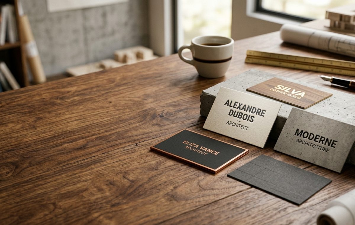
CURATORIAL CRITIQUE & DESIGN ANTHOLOGY: When I first stepped into the light-washed atelier of a mentor in Copenhagen, the scent of cedar and old vellum hung heavy in the air. He didn’t present a digital portfolio or a glossy brochure. Instead, he placed a singular object on the white oak table—a card that felt less like paper and more like a slab of cold-pressed limestone. In that silent exchange, I realized that architect business cards are not mere contact vehicles; they are the first physical encounter a client has with your structural philosophy. This tactile handshake carries the weight of your design intent before a single blueprint is even unrolled.
The Ephemeral Handshake: Why Standard Stationery Fails the Modern Visionary
In an industry defined by the permanence of steel, stone, and glass, the traditional thin-gauge business card feels remarkably discordant. Too often, architects spend months perfecting a 36-inch primary circulation path or agonizing over the high CRI 90+ lighting in a residential gallery, only to hand out a flimsy, gloss-coated card that feels like an afterthought. This material disconnect creates a subconscious friction. If your brand touchpoint lacks structural integrity, a client may wonder if your buildings will too.
The problem lies in the shift toward digital-first networking. We have prioritized the convenience of the scan over the gravitas of the touch. When a card lacks depth, it lacks memory. It is a spatial failure on a miniature scale—a missed opportunity to demonstrate your command over materiality, shadow, and proportion.
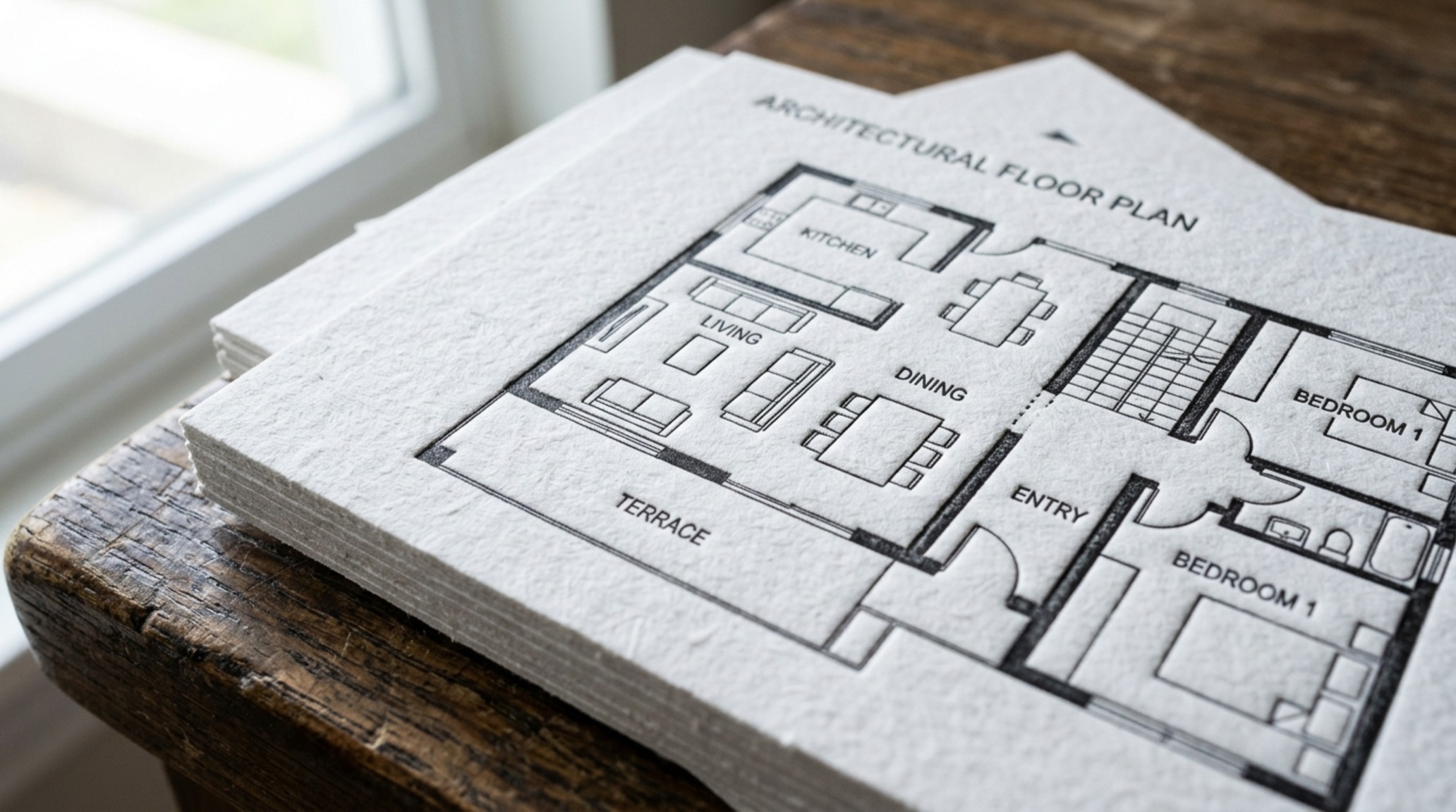
Architectural Firm Identity: Translating Structural Integrity to 3.5 x 2 Inches
The solution is to view your stationery as a material sample rather than a piece of paper. Your architectural firm identity should be etched, embossed, and weighted. By shifting the focus from mere graphic layout to the physical sensation of the object, you transform a standard networking tool into a miniature structural statement. This requires a deep understanding of paper chemistry and production techniques that mirror the construction process.
Consider the use of duplexing—the process of bonding two high-end stocks together. This allows for a card that mimics the layered complexity of a curtain wall. When you hand someone a card with a 600gsm weight, you are providing a sense of grounding and permanence. It suggests that your firm values substance over superficiality. The card becomes a tangible artifact that commands space on a desk, much like a well-placed 18-inch reach coffee table anchors a living room.
Letterpress Business Cards: The Depth of the Deboss
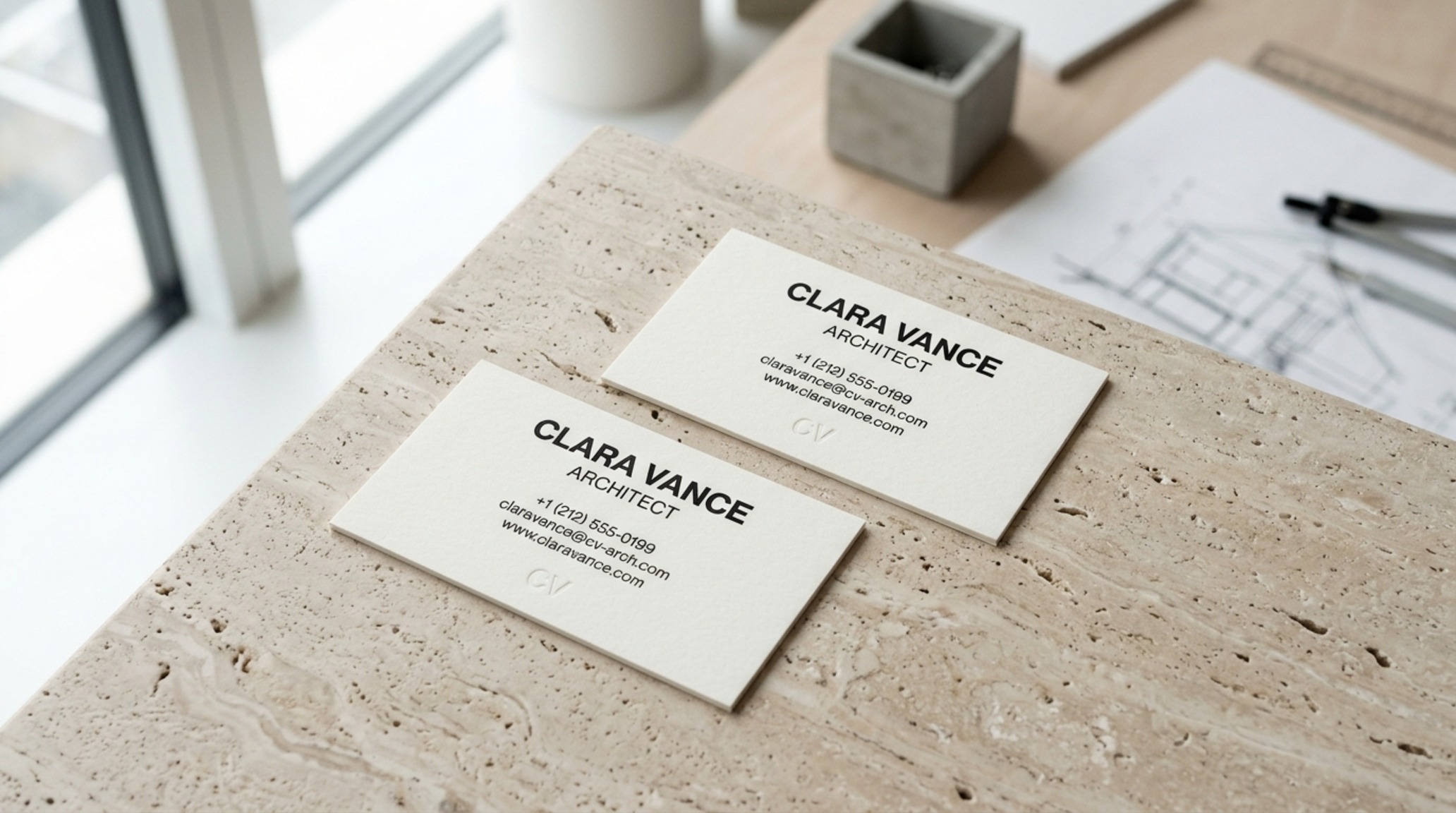
One of the most effective ways to introduce architectural depth is through letterpress business cards. Unlike digital printing, which sits on the surface, letterpress bites into the paper. Using a vintage Heidelberg press to drive type into a soft 100% cotton stock creates a sculptural effect. The resulting shadows within the debossed areas mirror the shadow play of a recessed window detail or a coffered ceiling. It invites the recipient to run their thumb across the surface, engaging their haptic senses and creating a lasting neural connection to your brand.
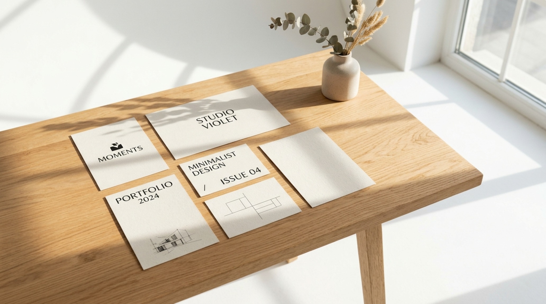
The Sterile Grid Problem: Why Your Layout Feels Secondary
A common pitfall in designer stationery is the over-reliance on a flat, digital grid that fails to breathe. When information is crowded or the negative space is poorly managed, the card feels claustrophobic—the graphic equivalent of a hallway with no natural light. Architects often struggle to translate their large-scale spatial expertise down to the dimensions of a business card, resulting in a layout that feels cluttered and uninspired.
This lack of spatial cadence is jarring. A card should have clear sightline alignment and a hierarchy that guides the eye effortlessly from the firm’s name to the contact details. Without this, the card is merely a container for text, rather than a reflection of the precise geometric logic that defines your built work.
Modern Card Layouts: Leveraging Negative Space and Proportional Balance
The antidote is to apply the same principles of spatial hierarchy that you would use in a floor plan. Modern card layouts for architects should prioritize white space—or ‘breathing room’—to highlight the most critical elements. Think of the card’s surface as a site plan. Where are the voids? Where is the mass? By utilizing a minimalist approach, you allow the material of the card to speak as loudly as the text.
Alignment is key. Using an asymmetrical grid can create a sense of movement and modernity. For instance, placing the logo in the lower third while leaving the top half entirely blank creates a visual tension that is sophisticated and intentional. This mirrors the contemporary architectural trend of cantilevered volumes and open-concept vistas. It shows a client that you are comfortable with restraint—a hallmark of high-end design.
Visual Narrative & Detail Studies: 15 Tactile Textures for the Discerning Architect
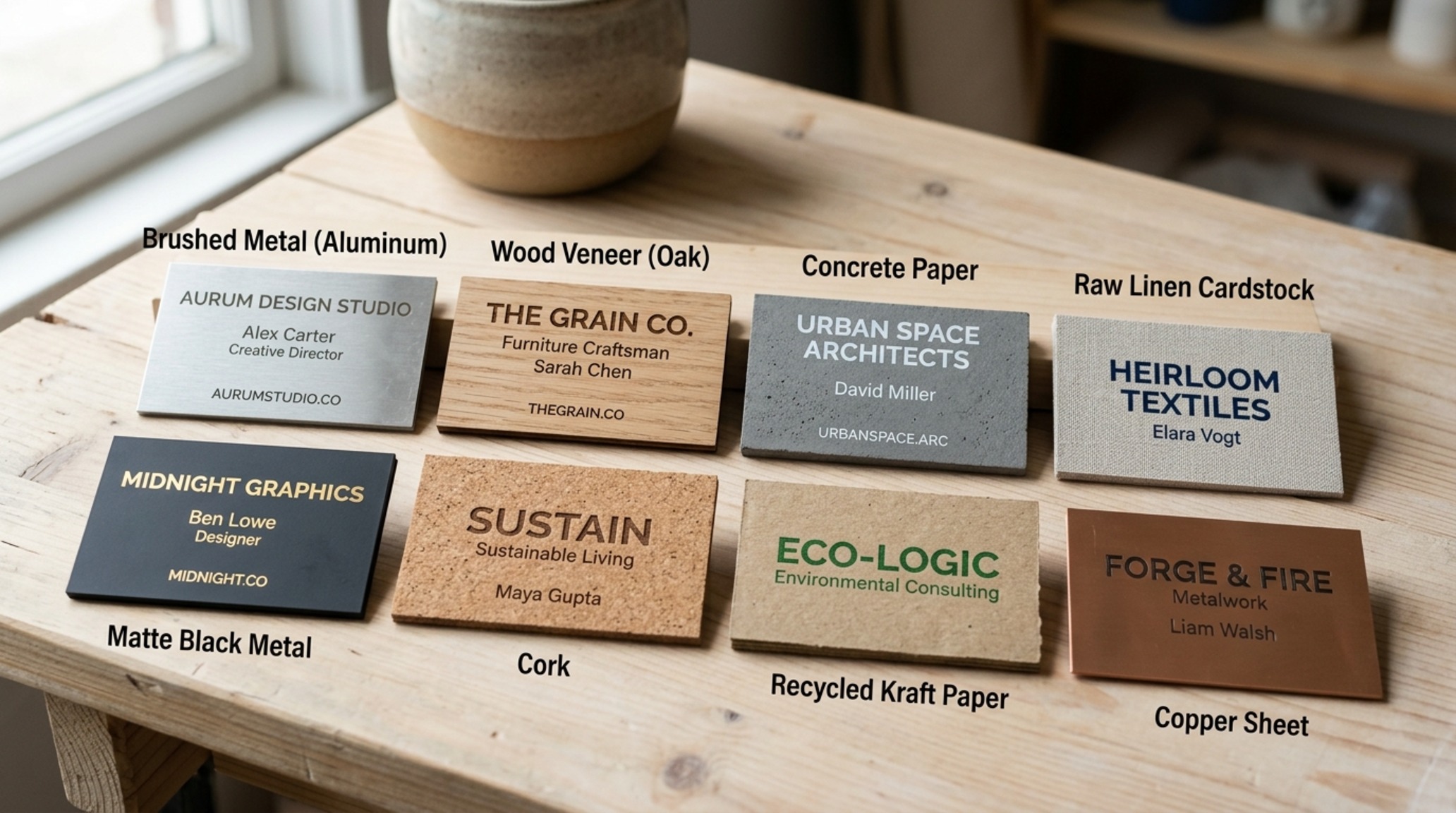
To truly stand out, you must look beyond standard paper. Here are fifteen material and textural directions that resonate with the architectural soul:
- 1. 600gsm Cotton Letterpress: A soft, pillowy texture that allows for deep, dramatic debossing.
- 2. Concrete-Infused Paper: Stocks like Gmund Heidi that provide a raw, industrial feel and a slightly speckled appearance.
- 3. Brushed Stainless Steel: For the high-tech firm, a thin metal card communicates precision and durability.
- 4. Laser-Cut Voids: Using a laser to cut out floor plan elements or geometric patterns, creating literal transparency.
- 5. Blind Embossing: Raising the paper surface without ink to create a subtle, light-dependent texture.
- 6. Duplexed Gmund Color Matt: Bonding two different colored stocks (e.g., Slate Grey and Warm Alabaster) for a multi-layered edge.
- 7. Translucent Vellum Overlays: Mimicking the experience of architectural tracing paper.
- 8. Raw Kraft Heavyweight: A nod to sustainable practices and organic materiality.
- 9. Suede-Touch Soft Touch: A luxurious, matte finish that feels like high-end upholstery.
- 10. Copper Foil Linework: Thin, metallic lines that evoke technical drawings and brass hardware.
- 11. Micro-Perforated Patterns: Adding a mechanical, grid-like texture that responds to light.
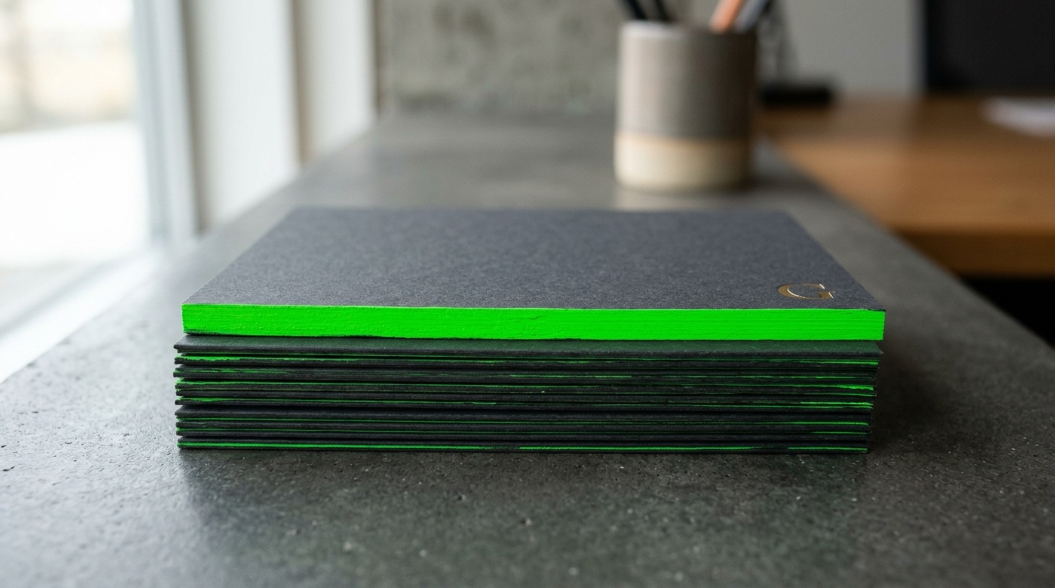
- 12. Hand-Painted Edges: Using a bold color like Farrow & Ball ‘Setting Plaster’ on the card’s edges for a pop of architectural detail.
- 13. Stone-Paper Composite: A heavy, waterproof material that feels uniquely mineral.
- 14. Topographic Debossing: Using 3D plates to create a card surface that feels like a site model.
- 15. Cork Wood Veneer: A warm, natural texture that references sustainable acoustic panels.
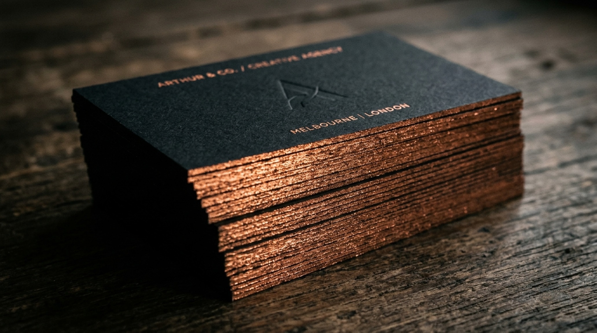
The Material Disconnect: When Your Brand Lacks Weight
When an architect chooses a standard 300gsm card, they are effectively choosing a material that lacks the ‘hand’ of quality. In interior design, we talk about the ‘hand’ of a fabric—the way it drapes and feels against the skin. Stationery has a ‘hand’ too. A thin card feels disposable. It doesn’t hold its shape in a pocket or a wallet. It wilts. This lack of physical presence can subtly undermine the authority of your architectural advice, especially when presenting to luxury clientele who are accustomed to the tactile richness of cashmere, marble, and solid oak.
Black Business Cards and Edge Painting: Depth Through Shadow and Pigment
To solve the problem of visual flatness, many firms are turning to black business cards. Black is not just a color; in design, it represents the absence of light and the presence of ultimate sophistication. When executed on a premium through-dyed stock (where the paper is black all the way through, rather than printed black), the card possesses an incredible depth. It doesn’t show white at the edges when cut, maintaining a seamless, monolithic appearance.
Pairing a black matte stock with a silver or copper foil creates a high-contrast architectural statement. To add a final layer of bespoke detail, consider edge painting. Applying a saturated pigment to the thickness of the card—perhaps a vibrant orange or a deep forest green—creates a ‘hidden’ design element that is only visible from the side. This is the graphic equivalent of a brightly colored door frame in an otherwise minimalist hallway; it is a delight found in the details.
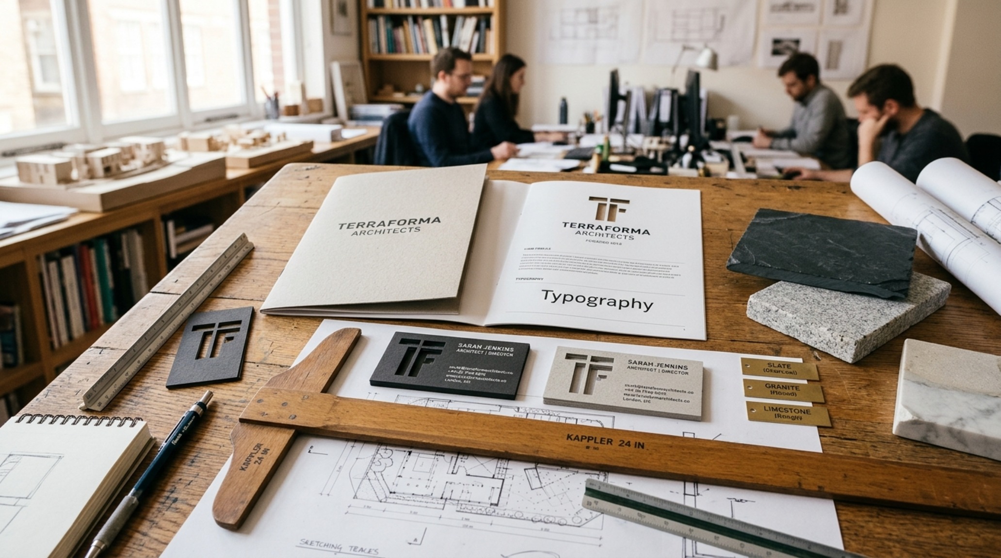
Materiality, Form & Light Vignettes: The Power of the Physical Sample
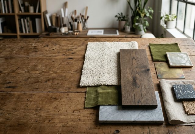
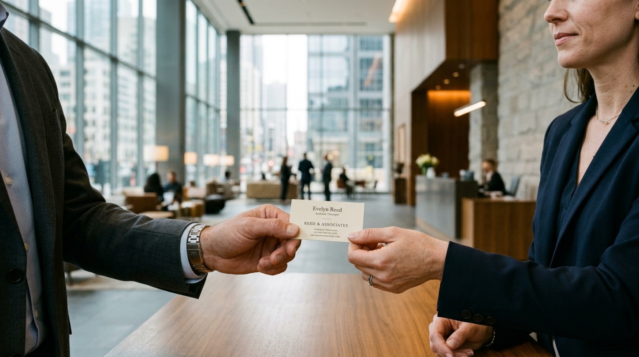
In the world of high-end design, the card should act as a miniature material board. When I present a project, I often include a card that utilizes the same metal finish or wood grain that I am proposing for the building’s facade. This creates a cohesive narrative. If you are known for your work with reclaimed timber, a wood-veneer card is not a gimmick; it is a brand alignment. It allows the client to carry a piece of your aesthetic world with them. This is the pinnacle of networking for architects—turning a brief meeting into a sensory experience that lingers long after the conversation has ended.
Structural Finishes & Design Anatomy
Essential specification summary: tactile finishes, spatial proportions, and ambient lighting index.
Designing your stationery is the ultimate exercise in restraint and precision. My final styling tip: when choosing your card thickness, aim for a weight that doesn’t bend when held by the corner, as this mimics the structural rigidity of a well-built wall. After all, if the card is the blueprint of your brand, shouldn’t it feel like it’s built to last? What is the one material that currently defines your firm’s aesthetic, and how can you bring that into the palm of your client’s hand?
Editorial Silo • Recommended Architecture Studies
- Interior Design Materials Layout Ideas: Proportions & Flow — Archival Design Case Study
- Walk in wardrobe designs: 10 Compact solutions — Archival Design Case Study
Spatial Photography & Textures
A sensory design chronicle exploring materiality, natural illumination thresholds, and spatial ease.
Curated Visual Lookbook
Design Gallery & Spatial Studies
A visual curation of architectural arrangements, lighting concepts, and material palettes featured in this space.