The soft, amber glow of a late afternoon sun slanting across a herringbone floor reveals more than just dust motes; it reveals the invisible grid that governs a masterfully designed room. Watching well known interior designers approach a raw shell is akin to observing a conductor before an orchestra—they aren’t looking at the paint swatches first, but rather at the rhythm of the windows and the weight of the negative space. These professionals understand that interior design is less about the objects we buy and more about the architectural laws that dictate how we move through a volume of air. To master your own home, you must first learn to see the ‘bones’ through the lens of structural logic.
Do: Prioritize Primary Sightlines; Don’t: Clutter the Visual Horizon
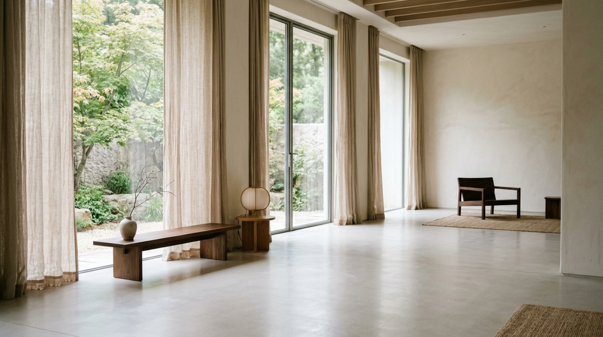
In the lexicon of world-renowned decorators, the sightline is the most sacred law of the home. When you stand at the threshold of a room, your eye should be led effortlessly toward a singular point of interest—a fireplace, a tall window, or a piece of large-scale art—without being snagged by mid-height clutter. This is the law of the unobstructed horizon. By keeping the ‘center-line’ of a room clear, you allow the architecture to breathe.
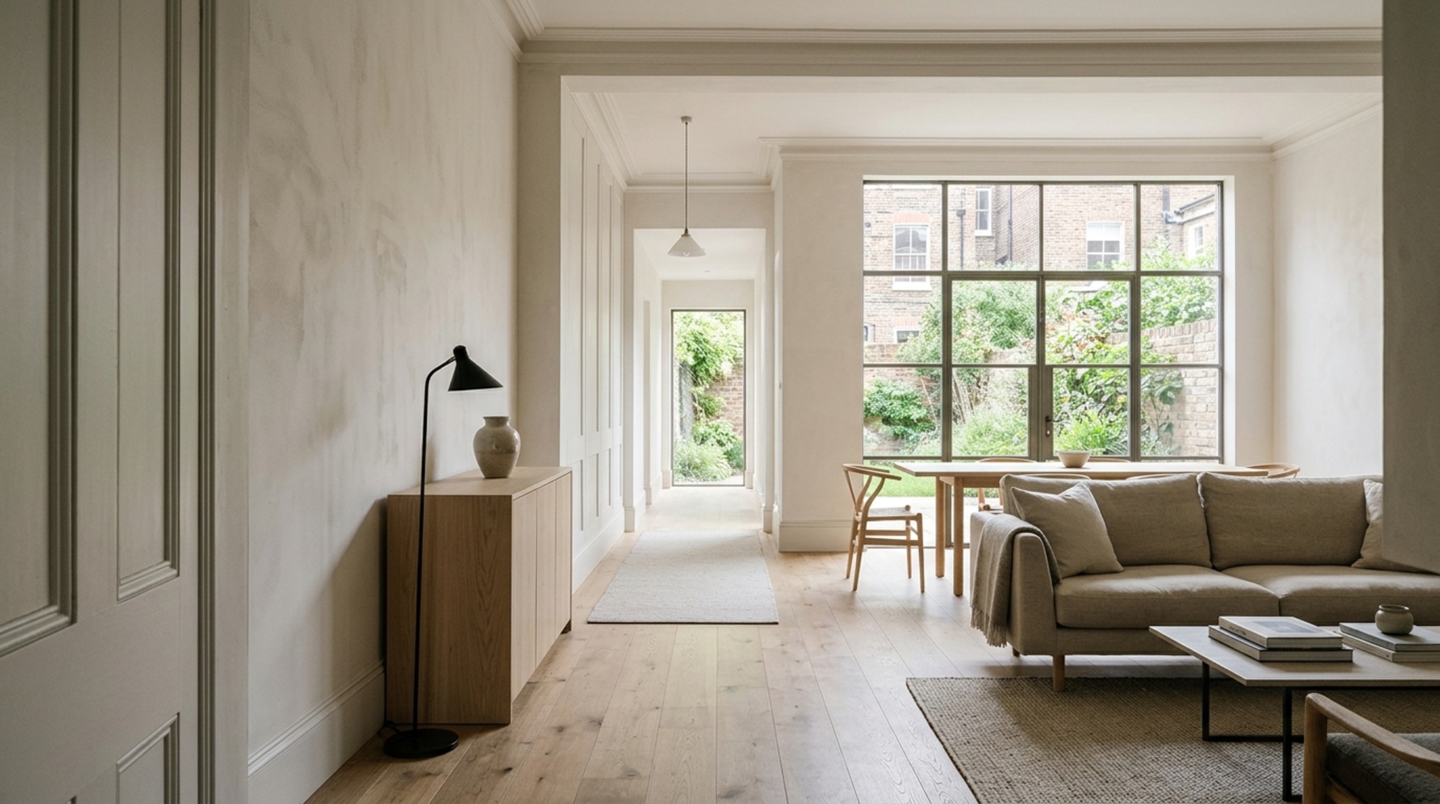
Pro Tip: Place your tallest furniture pieces against the walls to anchor the room’s perimeter. This preserves the internal volume and creates an atmospheric ‘hush’ that characterizes high-end spatial planning. When sightlines are respected, even a small room feels expansive because the eye isn’t constantly hitting ‘visual speedbumps’ like high-backed chairs in the middle of a walkway.
Famous Decorators and the Power of the Axis
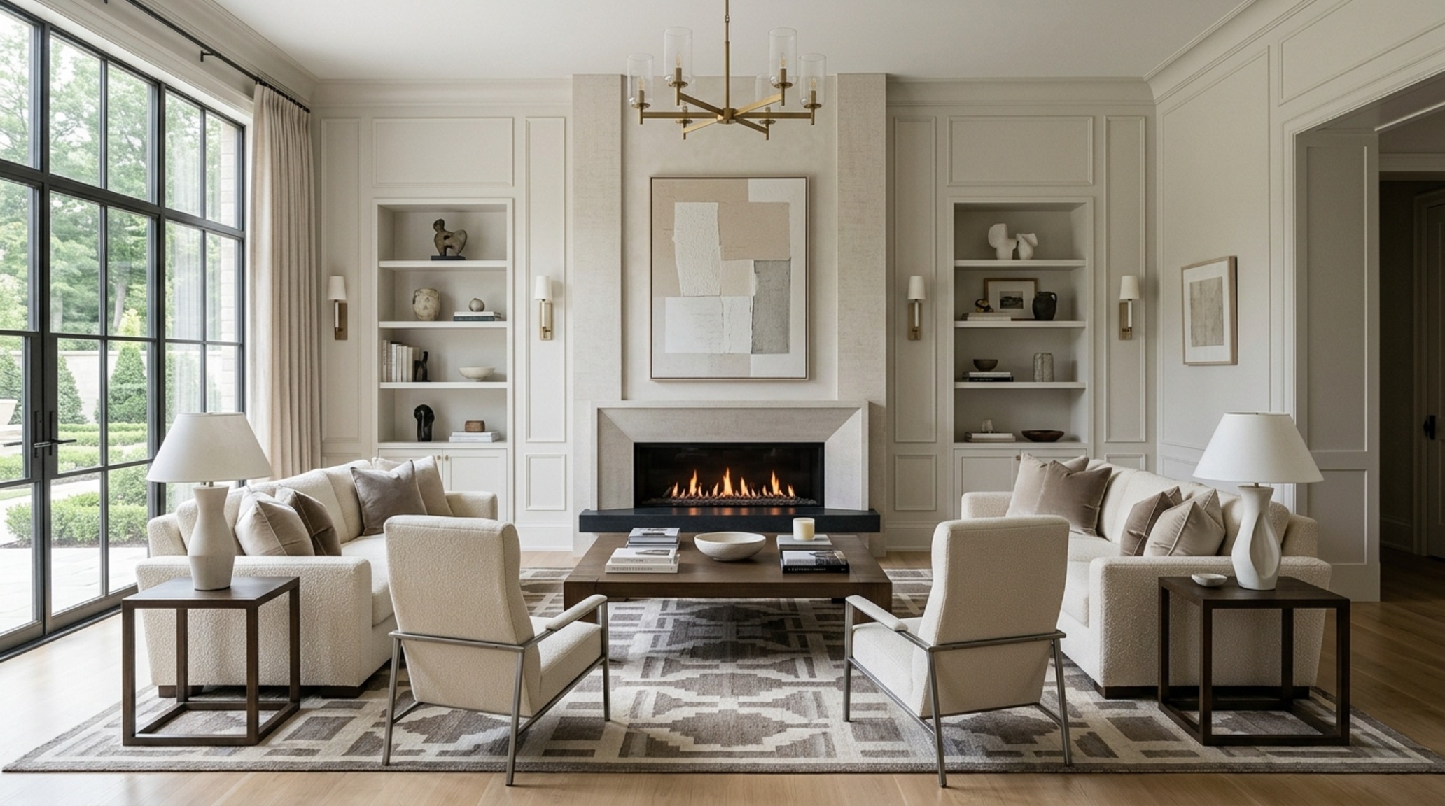
When studying the work of famous decorators, you’ll notice a recurring theme: the axis. An axis is an imaginary line that organizes a room. If you have a fireplace, that is your primary axis. Your furniture should not just be ‘near’ it; it should be mathematically aligned with it. This creates a sense of inevitability in the layout, a feeling that every chair and table was born to be exactly where it sits.
Do: Master the 36-Inch Circulation Rule; Don’t: Squeeze the Flow
Functionality is the silent partner of beauty. One of the most rigid spatial laws used by top design firms is the 36-inch rule. This is the minimum width required for a primary circulation path—the ‘highways’ of your home. Any path narrower than 36 inches will feel like a hallway rather than a living space. For secondary paths, such as the space between a sofa and a coffee table, 18 inches is the golden standard. It is just enough for a human leg to pass through comfortably while keeping the surface within arm’s reach.
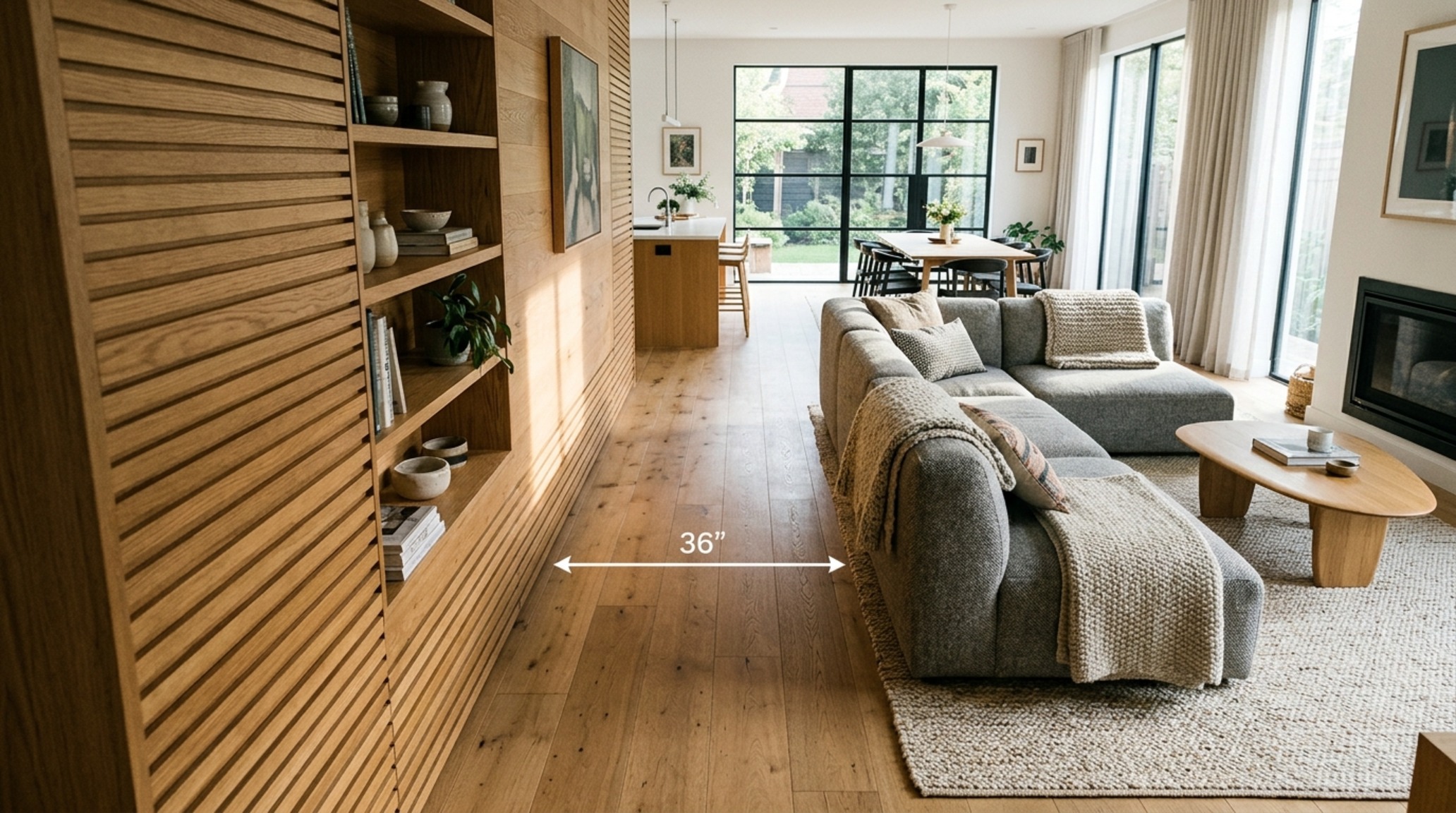
Pro Tip: Use painter’s tape to map out your furniture on the floor before purchasing. If you can’t walk around your dining table with at least 30 inches of clearance while the chairs are pulled out, the table is too large for the room. Respecting these clearances ensures that the room feels professional rather than ‘squeezed.’
Architectural Vignettes & Spatial Flow
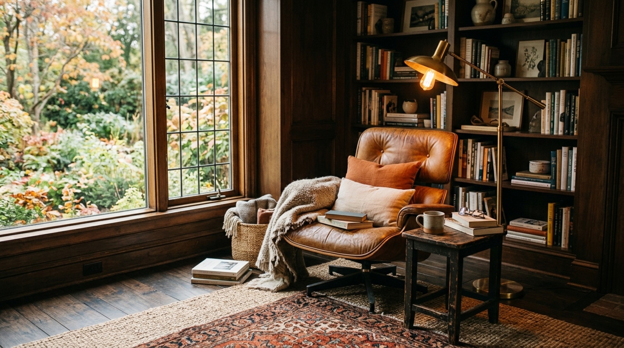
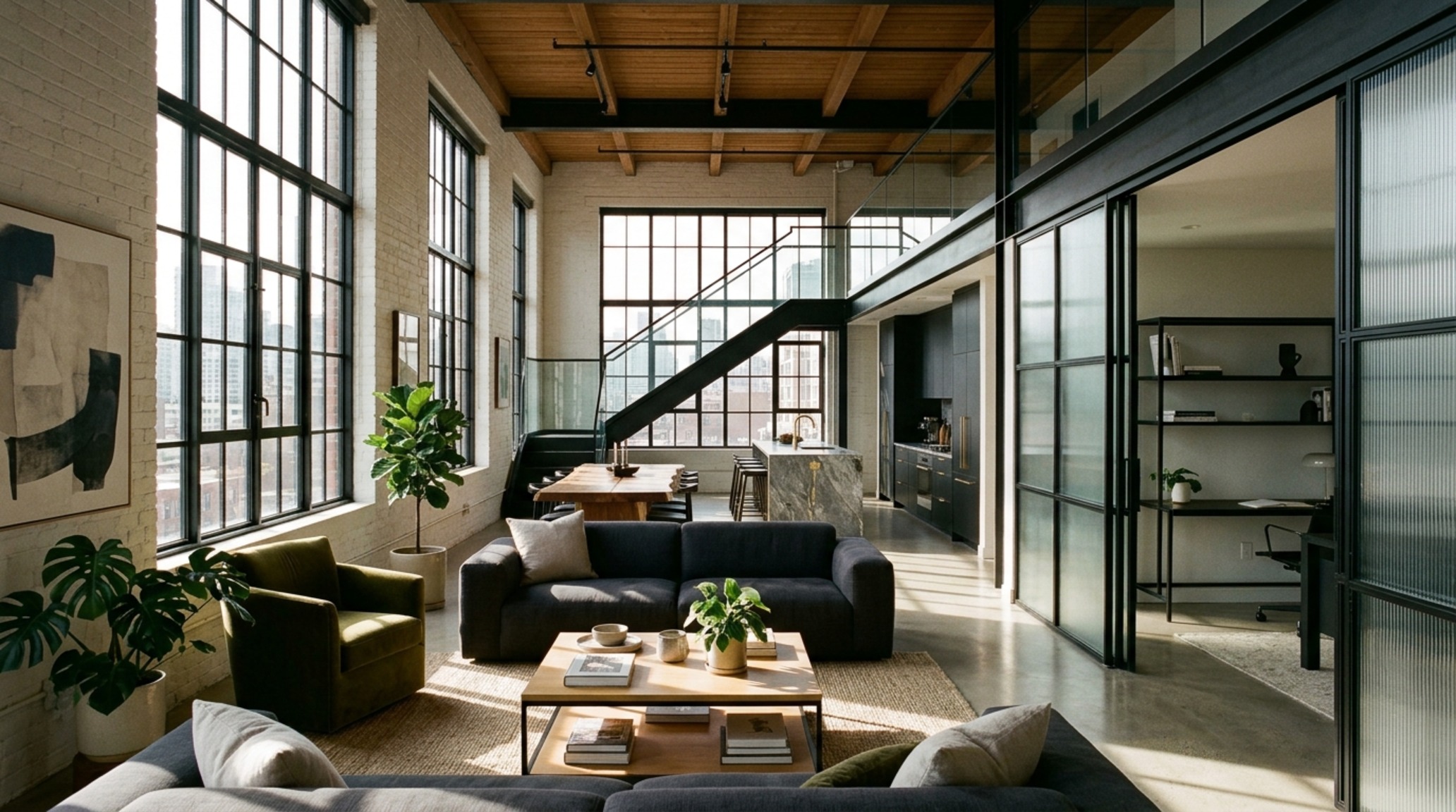
Transitioning between different zones in an open-plan home requires a delicate balance of material consistency and spatial distinction. High-end interior trends currently favor the ‘broken-plan’ layout, where glass partitions or varying ceiling heights suggest a change in function without closing off the light. This creates a spatial cadence where each ‘vignette’—a reading nook, a morning coffee corner—has its own identity while remaining part of the larger architectural narrative.
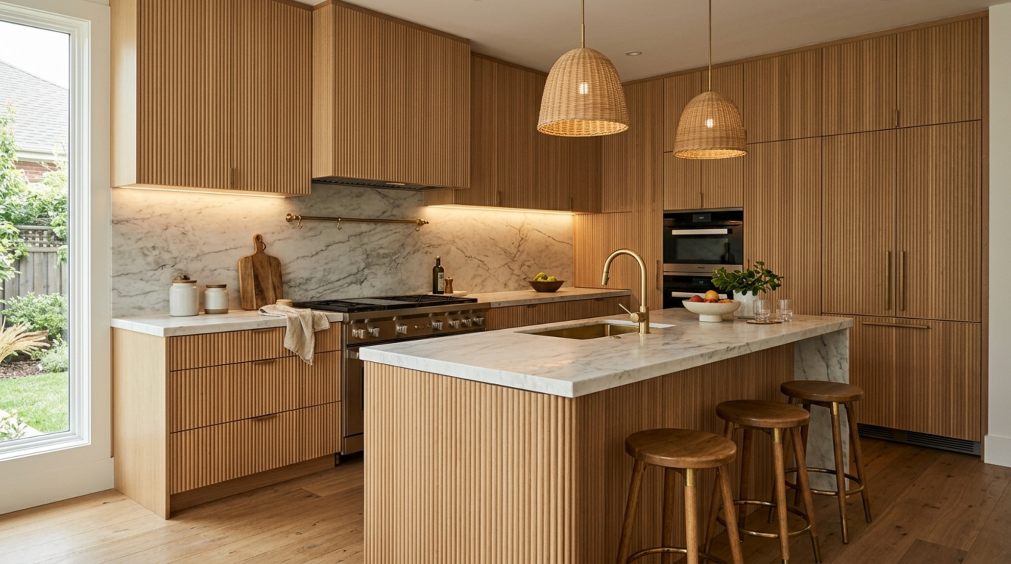
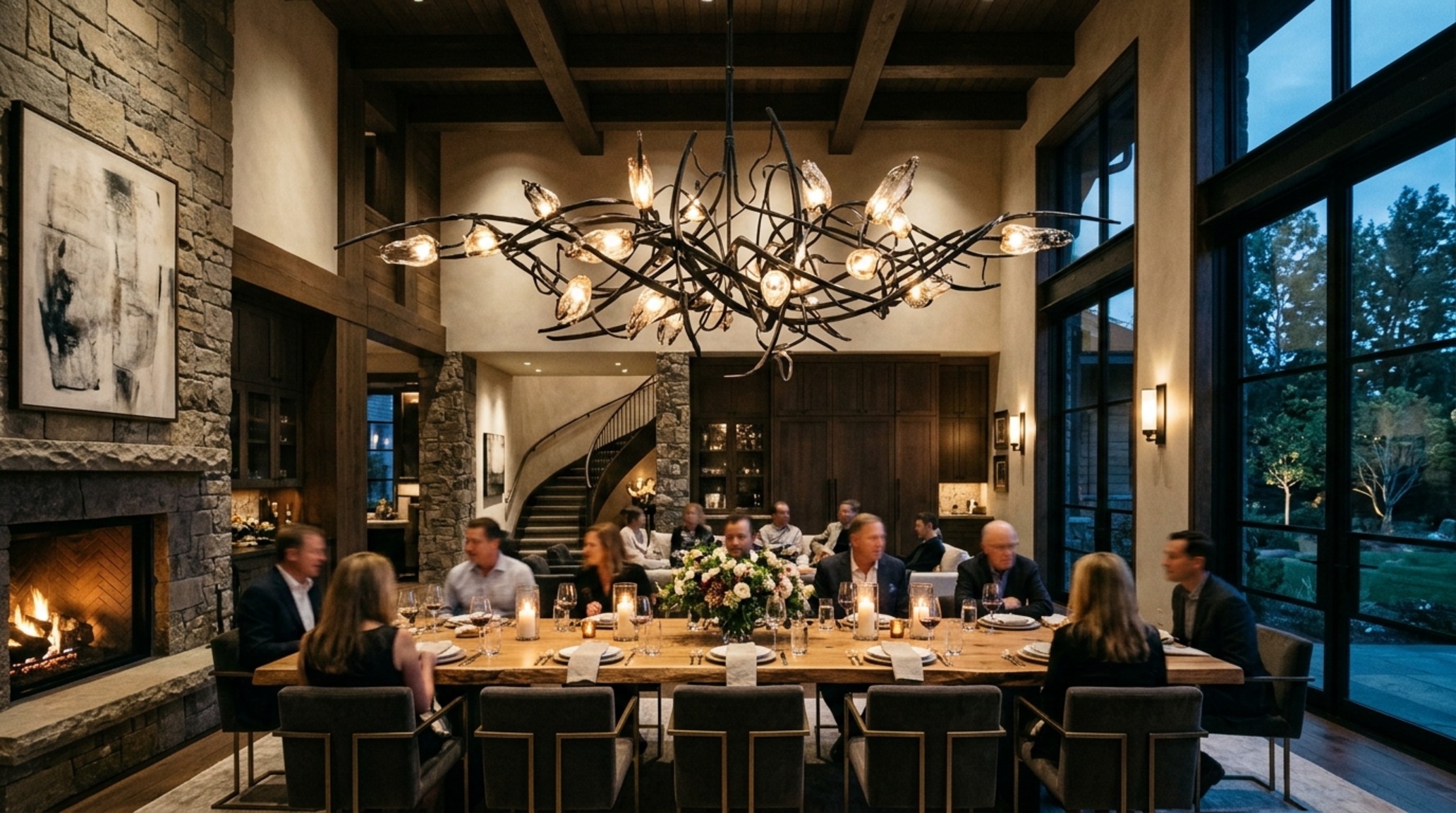
Consider the placement of lighting as a tool for spatial division. A low-slung pendant light over a dining table creates an ‘intimacy envelope’ that separates the eating area from the kitchen, even if no walls exist between them. This is how best interior designers 2024 manage large volumes without losing the sense of home.
Do: Layer Lighting by Kelvin; Don’t: Rely on Overhead ‘Swiss Cheese’
Lighting is the most transformative structural element, yet it is often the most neglected. Celebrity home stylists avoid the ‘Swiss cheese’ ceiling—a ceiling littered with too many recessed cans—at all costs. Instead, they layer light. Ambient light should be soft and diffused, typically achieved with 2700K (warm) bulbs that mimic the warmth of a candle. Task lighting, such as under-cabinet LEDs or reading lamps, can move slightly cooler to 3000K, but never beyond that for residential settings.
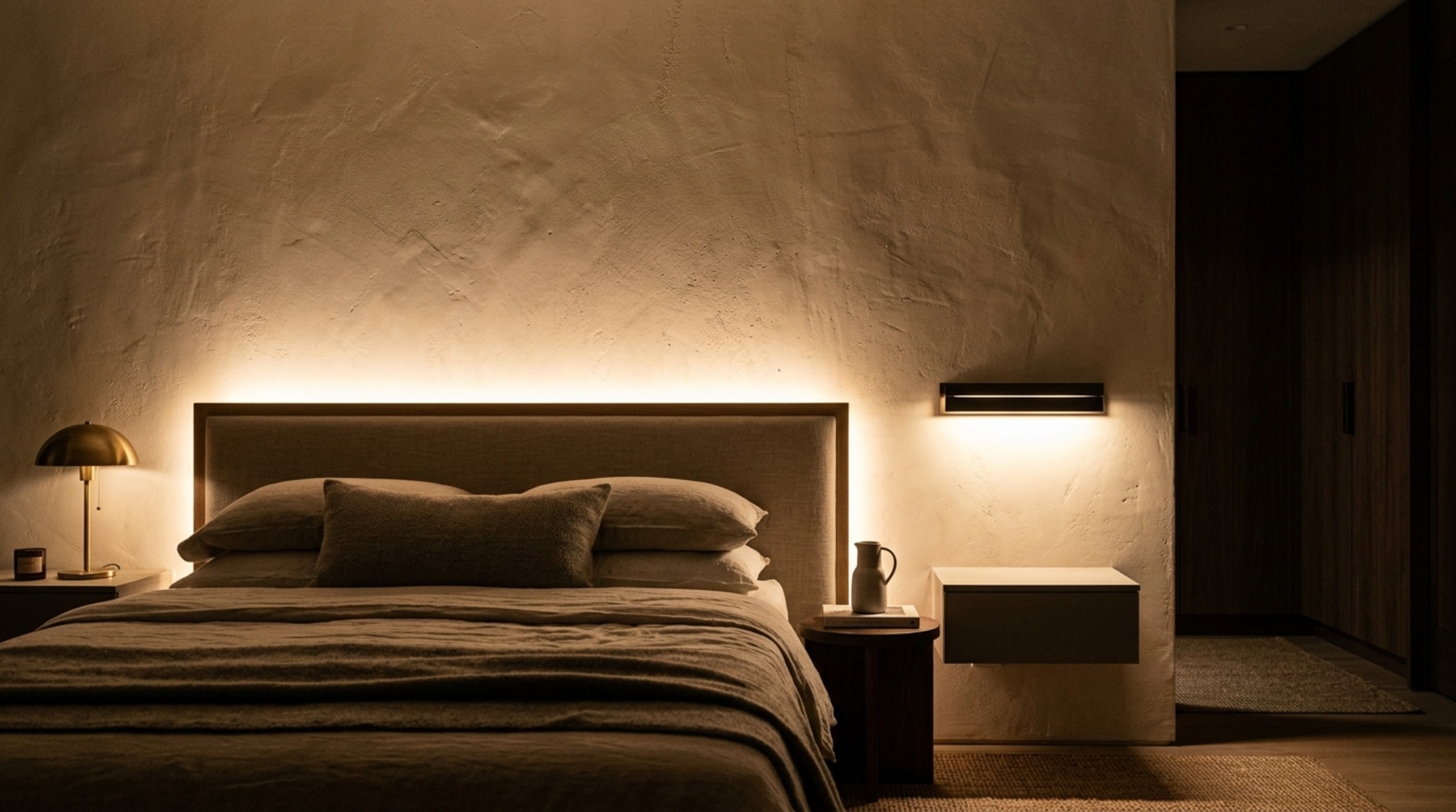
Pro Tip: Always aim for a Color Rendering Index (CRI) of 90 or higher. This ensures that the colors of your fabrics and paints appear authentic rather than muddy. Lighting should be architectural; use uplighting to highlight the texture of a stone wall or a wash of light to emphasize a ceiling cove. This adds ‘visual depth’ that flat overhead lighting simply cannot provide.
Do: Embrace the 1:1.5 Rug Ratio; Don’t: Let Furniture ‘Float’ on a Postage Stamp
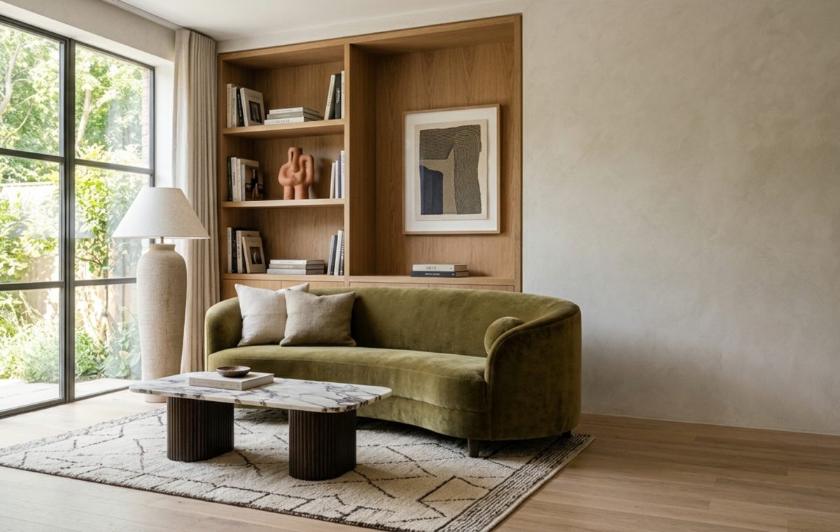
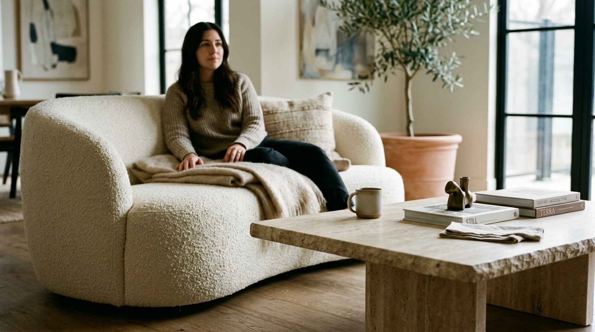
One of the most common errors that influential decor experts identify in amateur spaces is the ‘postage stamp’ rug. A rug that is too small for the room makes the furniture look like it is huddling together for warmth. The spatial law here is simple: all legs of the main furniture pieces (sofa, armchairs) should ideally sit on the rug. At the very least, the front legs must be anchored. A rug should extend 12 to 18 inches beyond the furniture to create a unified ‘island’ of conversation.
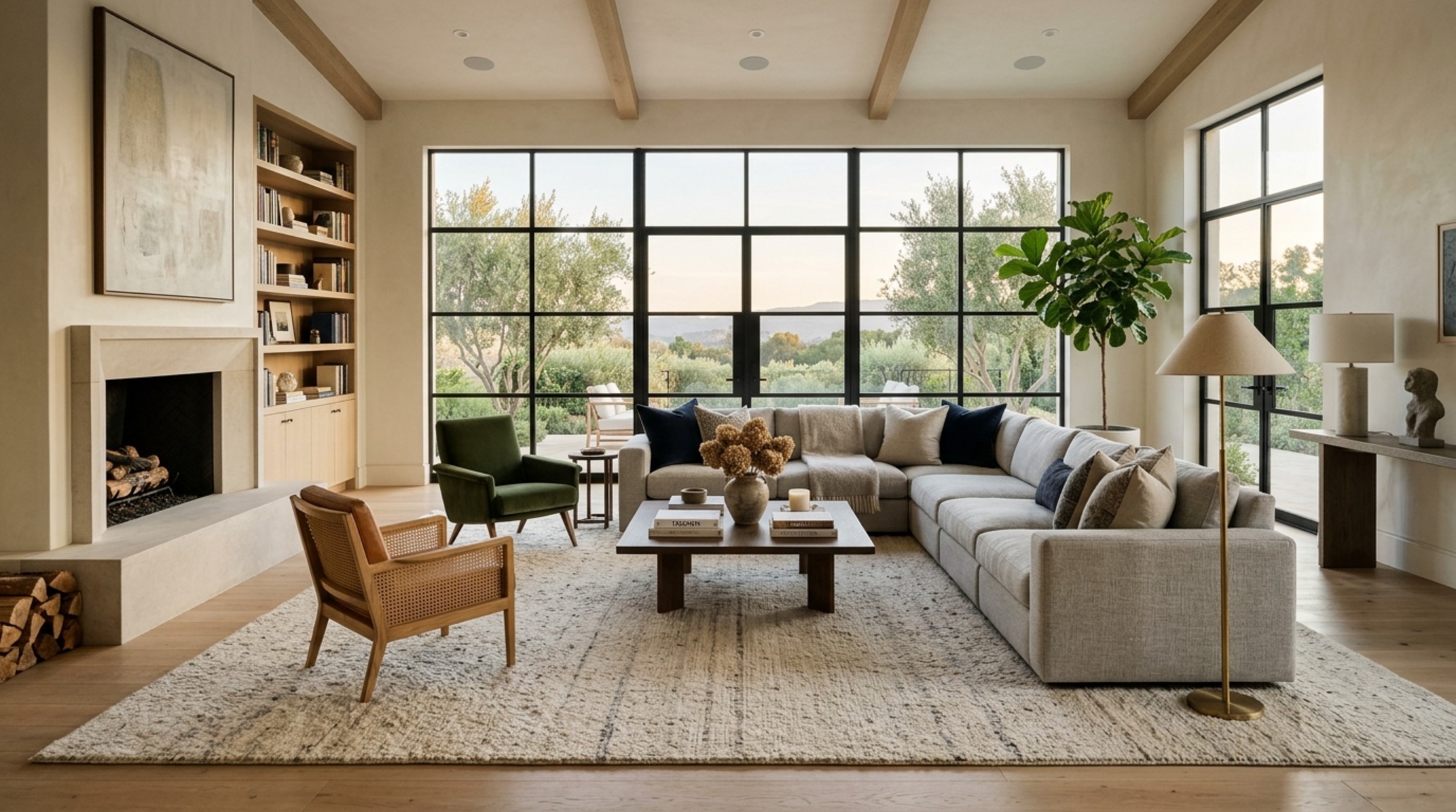
Pro Tip: If you find a vintage rug that you love but it is too small, layer it over a larger, neutral jute or sisal rug. This provides the necessary ‘architectural footprint’ while allowing the decorative piece to shine. This technique is a staple for creating the tactile luxury found in the portfolios of the world’s most well known interior designers.
Do: Curate with Material Weight; Don’t: Overload the Top-Heavy
In luxury home architecture, the concept of ‘visual weight’ is as important as physical weight. A room should feel grounded. This means placing heavier textures and darker colors lower in the room (floors, baseboards, upholstery) and lighter, airier elements higher up. If you have a dark, heavy ceiling and white floors, the room will feel oppressive. By keeping the ‘ground’ dark—think wide-plank oak or honed basalt—and the walls light (perhaps in a shade like Benjamin Moore Swiss Coffee), you create a natural sense of stability.
Interior Architecture Specification Sheet
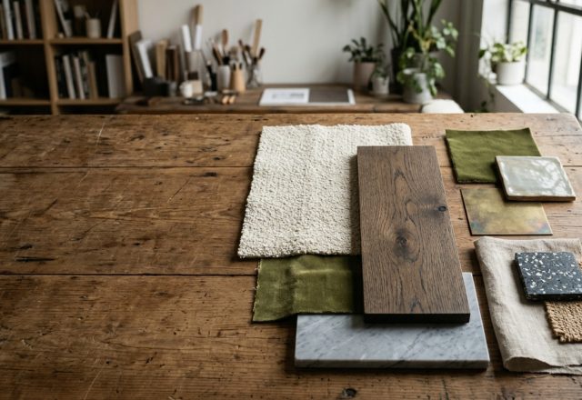
Comprehensive material guide featuring exact paint swatches, authentic finishes, and spatial clearances.
Common Spatial Design Questions
What is the most important rule for small spaces? The most important rule is the preservation of the floor plane. Using leggy furniture that allows you to see the floor underneath creates the illusion of more space. When a piece of furniture goes all the way to the floor (like a skirted sofa), it acts as a visual wall, stopping the eye and making the room feel smaller.
How do I choose the right scale for lighting? Most people choose fixtures that are too small. A dining chandelier should be roughly 1/2 to 2/3 the width of the table. If it’s smaller, it loses its architectural authority and looks like an afterthought. High-volume rooms require fixtures with presence to fill the vertical void.
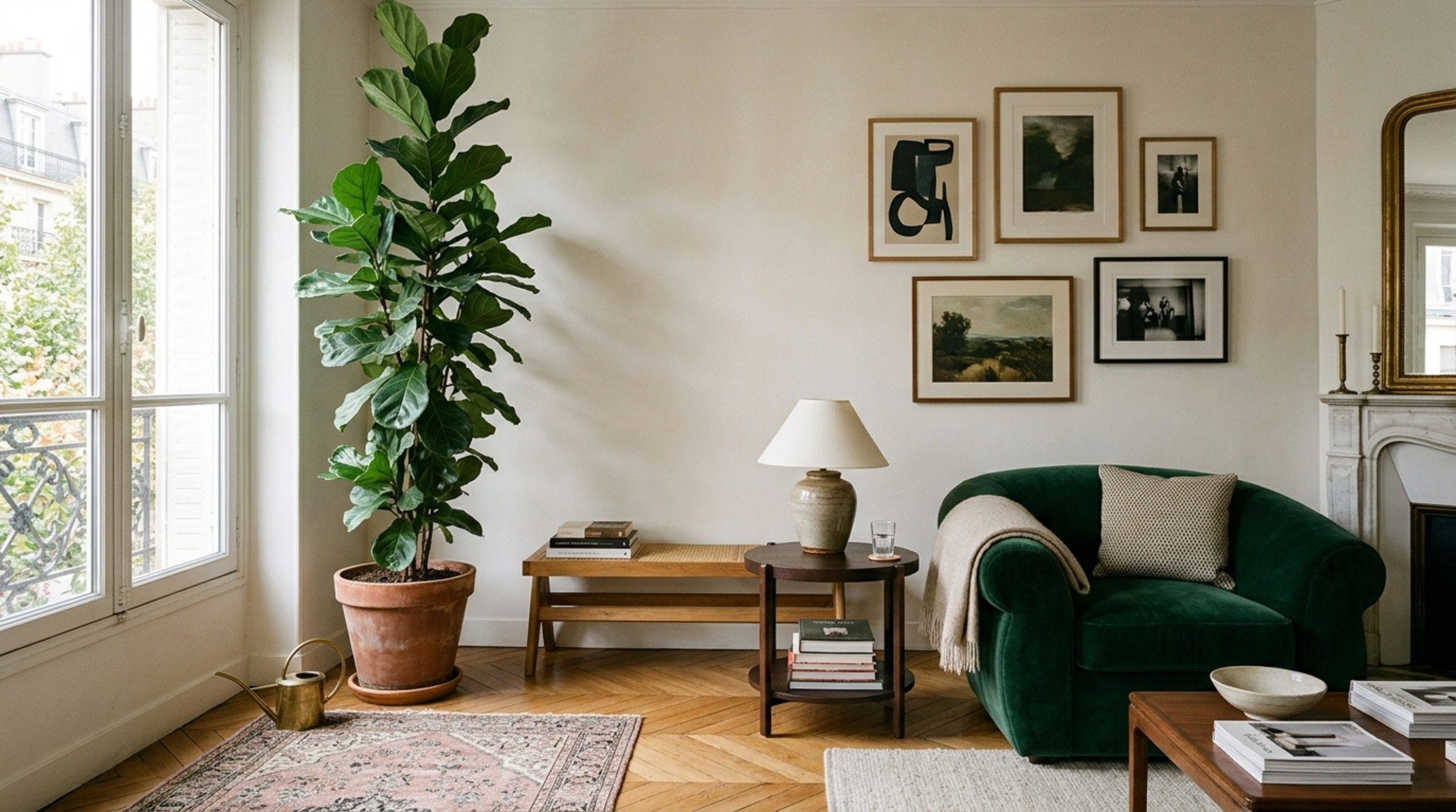
Is symmetry mandatory for a professional look? Not mandatory, but balance is. While well known interior designers often use formal symmetry (matching pairs of lamps or chairs) to create a sense of calm, asymmetrical balance—where a large plant balances a heavy armchair—is often more dynamic and modern. The key is ensuring the ‘visual weight’ on both sides of a room feels equal.
Ultimately, the laws of spatial design are about honoring the geometry of the home. When we respect the clearances, the sightlines, and the mathematical truths of a room, we create more than just a beautiful space; we create a sanctuary that feels inherently ‘right.’ The most enduring interiors aren’t defined by the trends they follow, but by the quiet, structural integrity they maintain long after the first coat of paint has dried.
Editorial Silo • Recommended Architecture Studies
- Interior Design Materials Layout Ideas: Proportions & Flow — Archival Design Case Study
- Walk in wardrobe designs: 10 Compact solutions — Archival Design Case Study
The Architectural Gallery
An intimate visual portfolio documenting the intersection of ergonomic utility and bespoke aesthetic warmth.
Curated Visual Lookbook
Design Gallery & Spatial Studies
A visual curation of architectural arrangements, lighting concepts, and material palettes featured in this space.