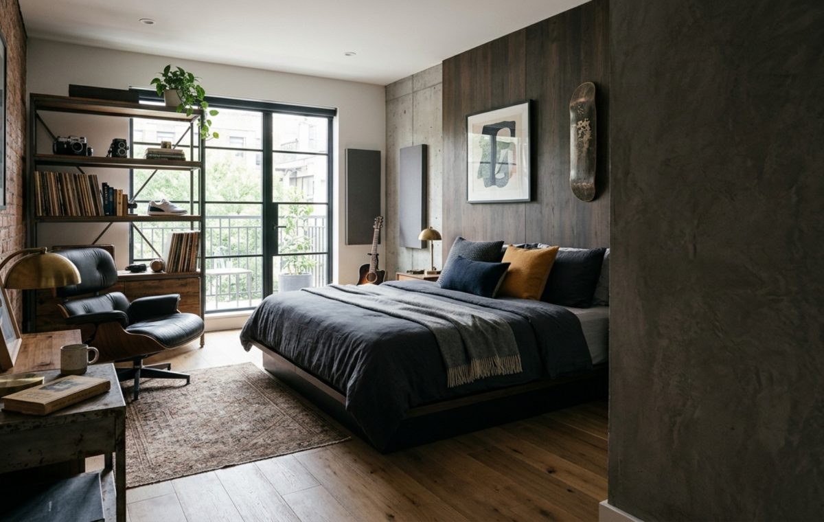
The late afternoon sun hit the raw concrete floor of my client’s Tribeca loft at an angle that made the entire space feel like a curated gallery rather than a bedroom. Achieving cool room designs for guys isn’t about filling a space with gadgets; it’s about honoring the architectural skeleton and creating a flow that feels intuitive rather than forced. I remember watching him move through the space—a natural, unobstructed path from his morning coffee station to his workspace, then eventually to the sleeping quarters. It was a lesson in spatial cadence: the house wasn’t just a container; it was a rhythmic response to his daily habits.
Tier 1: High-Impact Essentials for Modest Budgets
In smaller urban environments or when working within a restrained budget, the goal is to maximize the perceived volume of the room. We start by stripping away the visual noise. A common mistake in masculine design is the tendency to overcrowd with heavy, dark pieces. Instead, we look at the ‘mini-loft’ concept where zoning is achieved through rugs and lighting rather than physical barriers. By maintaining a 36-inch primary circulation path, even a standard 12×14 bedroom feels expansive.
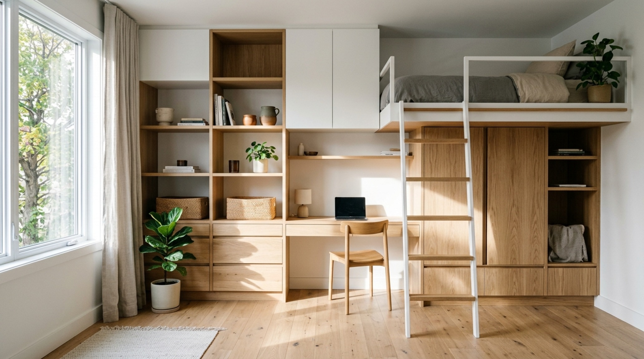
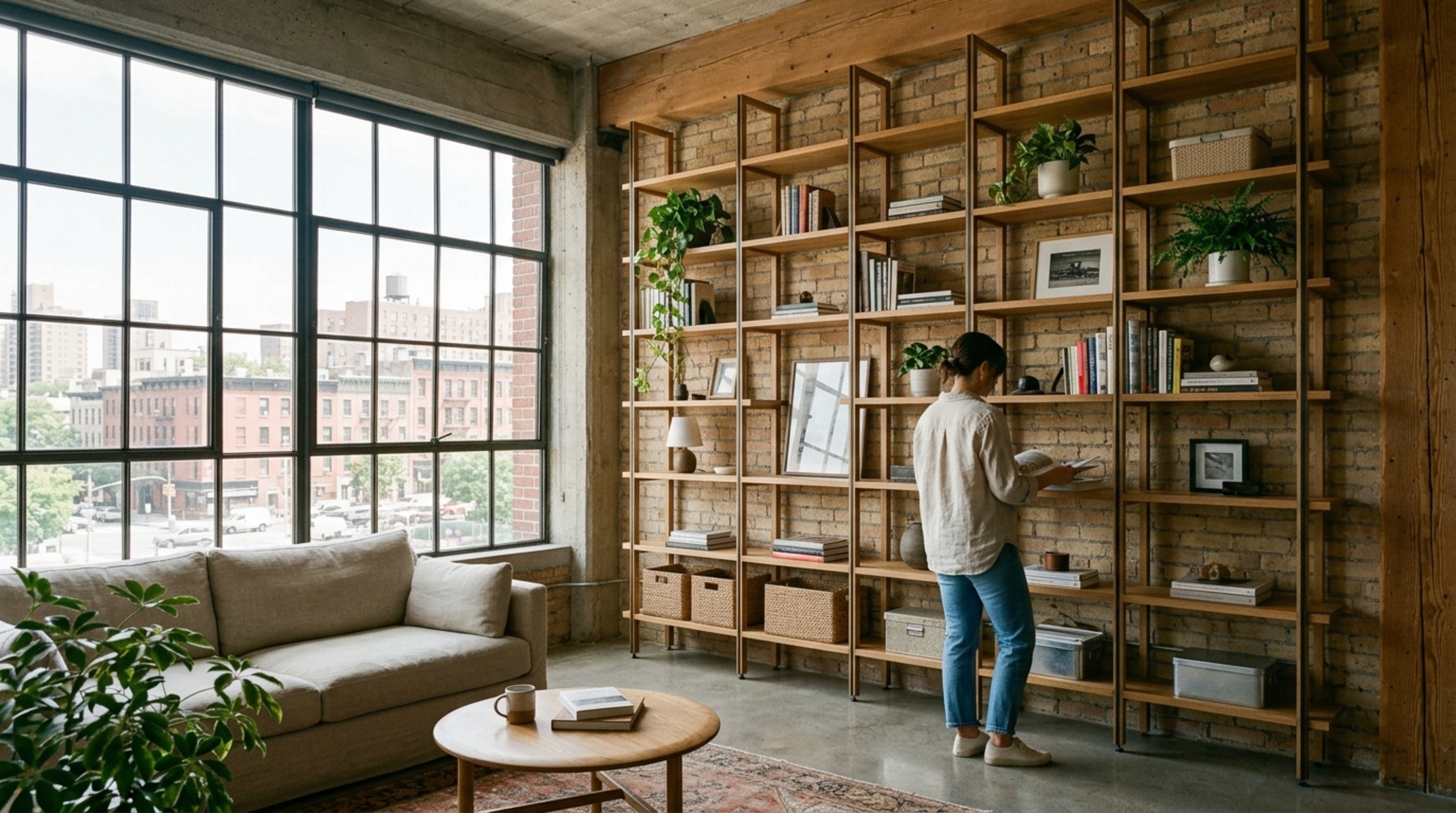
Our first four floorplans focus on the ‘Pivot Layout.’ This involves placing the bed on the longest wall but slightly off-center to allow for a dedicated ‘active’ zone. Space-saving storage becomes the architectural hero here. We utilize wall-mounted shelving systems that stop 12 inches short of the ceiling, which draws the eye upward and emphasizes vertical volume. Consider painting the walls in a soft, architectural grey like Benjamin Moore Stonington Gray (HC-170) to provide a neutral backdrop that catches the morning light without feeling cold.
Space-saving storage: Verticality and the Floating Plane
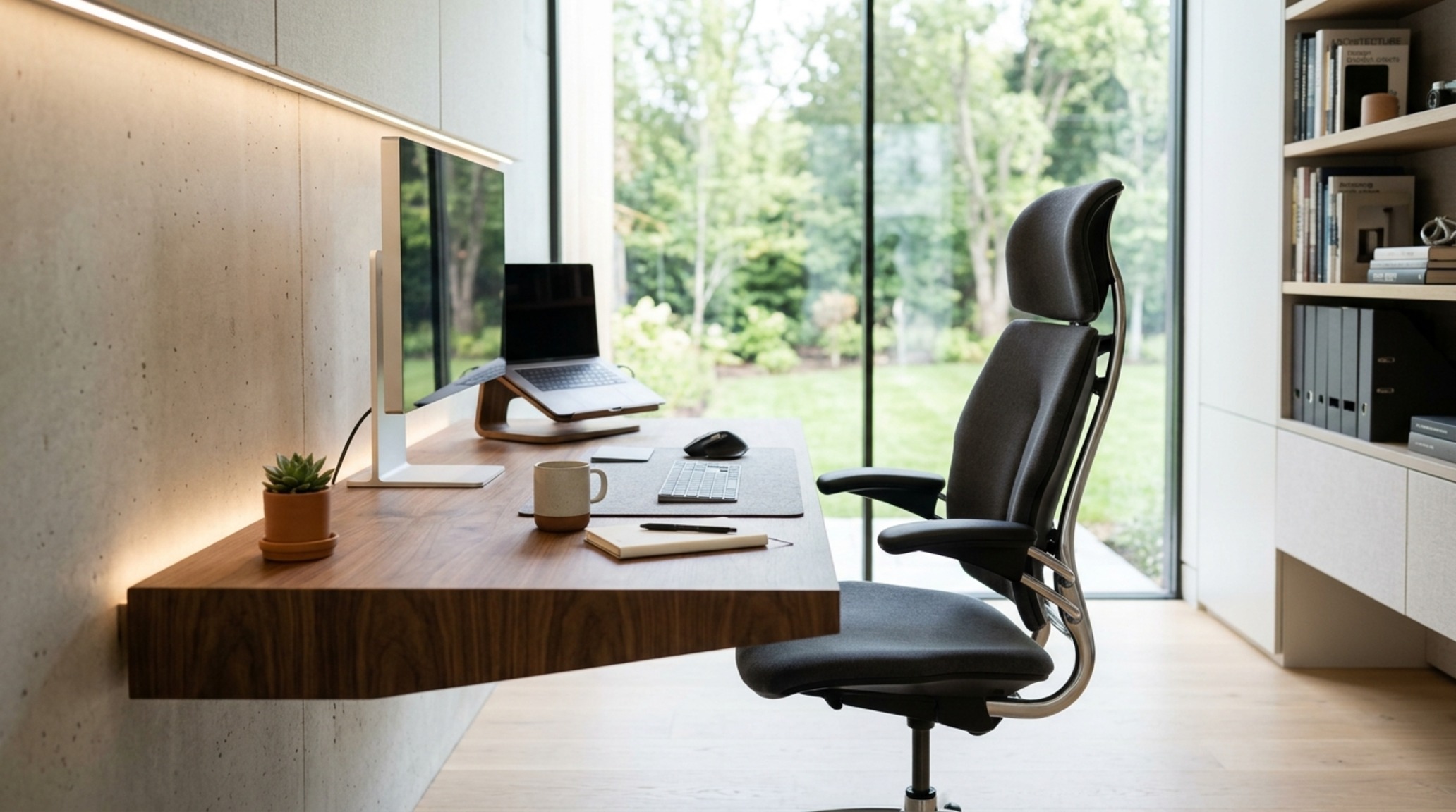
To keep the floor plane clear—essential for that high-end architectural feel—we lean into floating elements. A wall-mounted desk or a floating nightstand preserves the sightline of the floorboards, making the room appear significantly larger. Layout 1 features a ‘Linear Zone’ where the desk and storage occupy a single wall, while Layout 2 uses a ‘Corner Niche’ approach to tuck a reading chair into a window-lit pocket. Layout 3 and 4 experiment with the ‘Bed-as-Island’ configuration, pulled slightly away from the wall to create a walk-behind storage corridor.
The Visual Narrative & Detail Studies
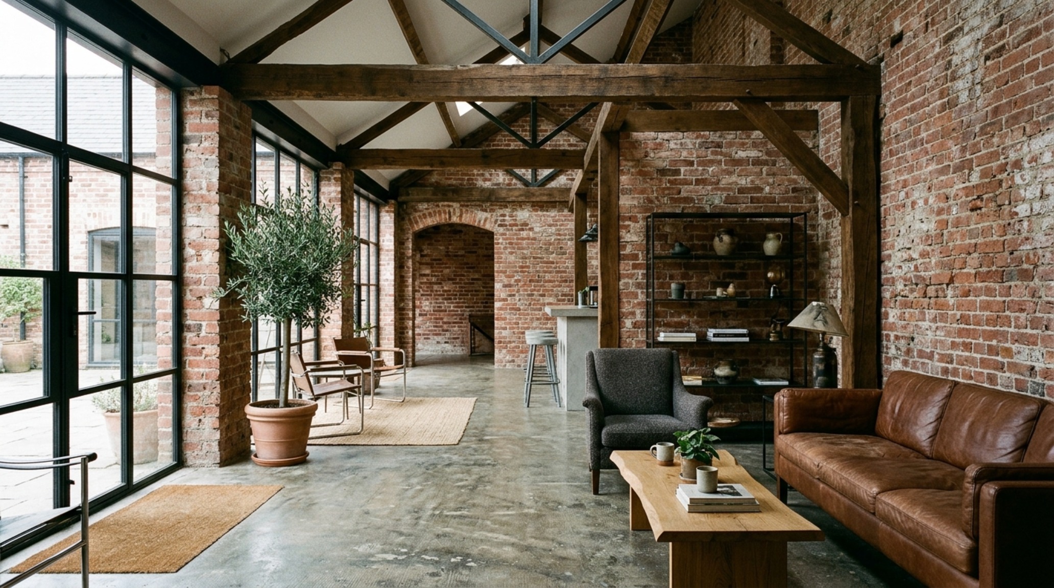
When we move into the mid-range budget, we begin to introduce minimalist industrial style elements that have more weight and permanence. This isn’t about faux-bricks; it’s about authentic materiality. Think powder-coated steel frames, blackened oak, and raw linen textures. The floorplans in this tier—Layouts 5 through 8—incorporate more robust zoning. We introduce the concept of ‘material thresholds,’ where a change in flooring texture or a large-format area rug defines the transition from the rest zone to the social zone.
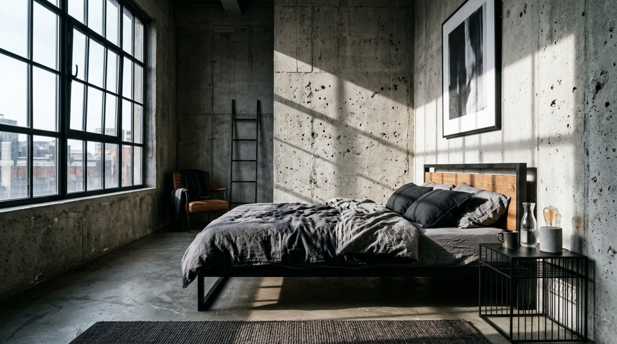
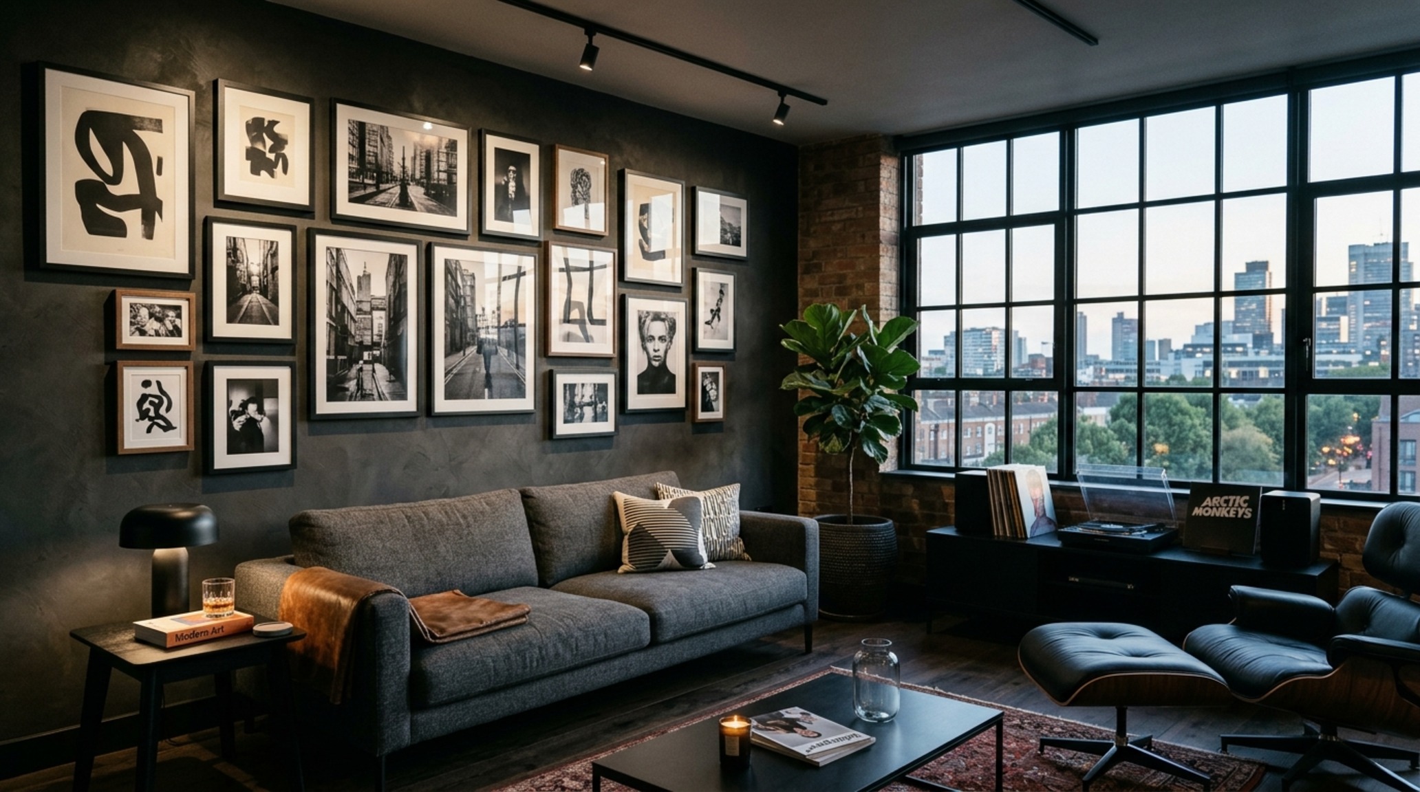
In Layout 5, we utilize a low-profile room divider—perhaps a slatted wood screen—to separate an ergonomic office setup from the sleeping area. This maintains the open-concept feel while providing a psychological boundary for work-life balance. Layout 6 focuses on the ‘Gallery Walk’ layout, where art and lighting are used to guide the eye through the space toward a primary focal point, such as a large window or a custom upholstered headboard. Layout 7 and 8 explore asymmetrical balance, using a single heavy piece—like a leather furniture accent chair—to anchor a corner while keeping the rest of the room light and airy.
Minimalist industrial style: Texture over Ornamentation
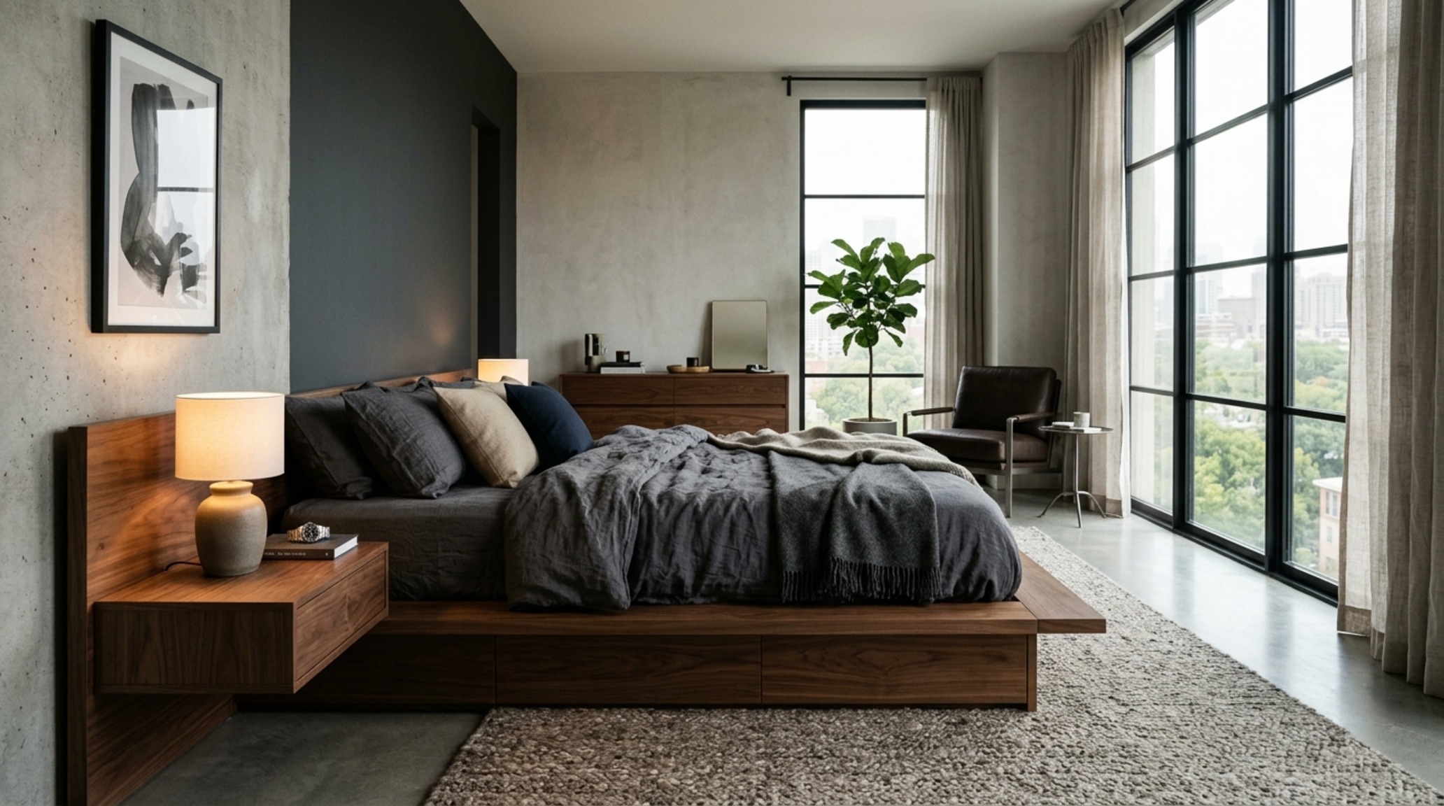
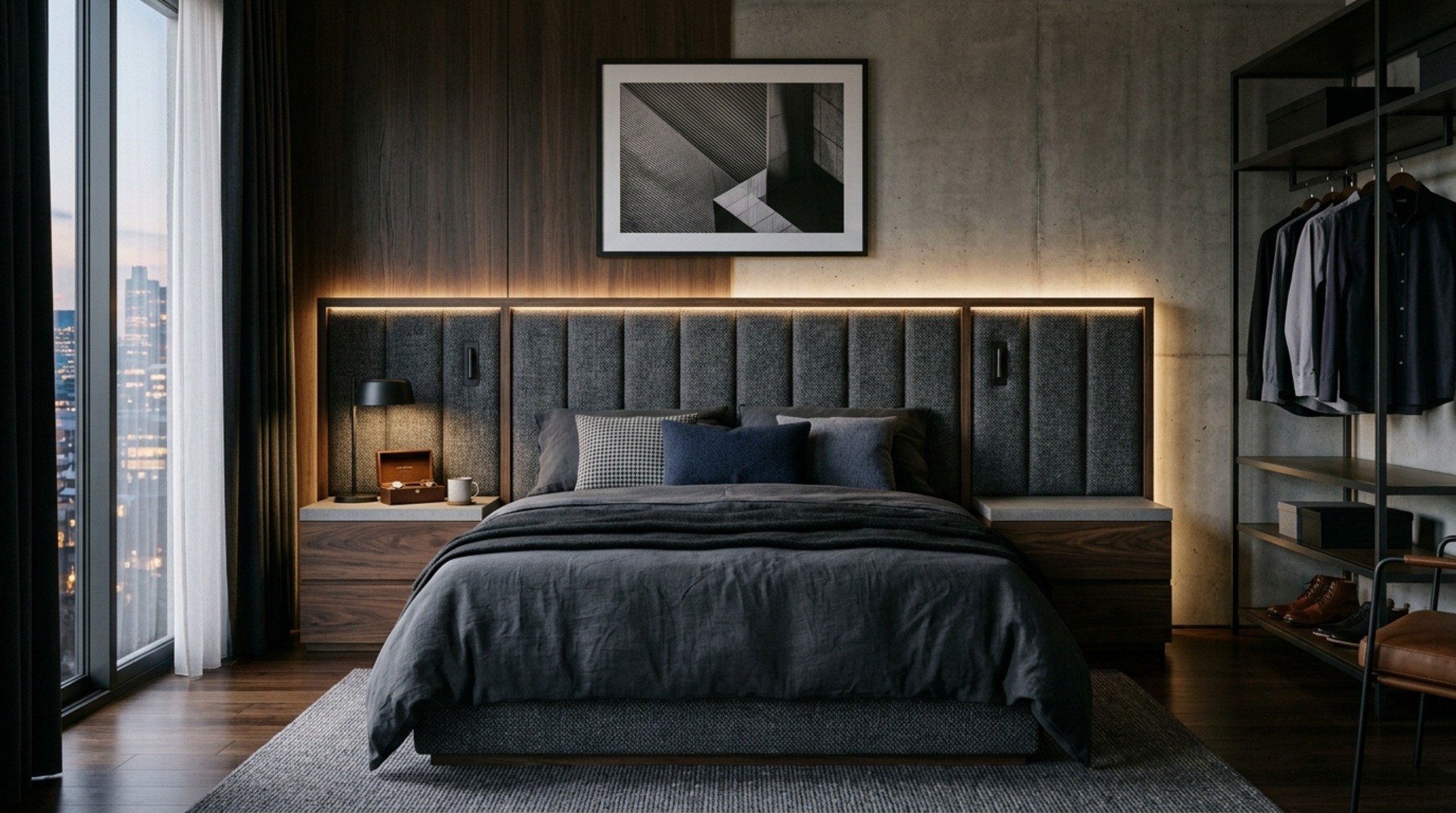
The beauty of the mid-tier design is the ability to invest in tactile quality. Instead of many small pieces, we opt for one or two ‘statement’ architectural items. A custom-built platform bed with integrated LED underscoring creates a sense of weightlessness. This 3000K task lighting provides a crisp, clean glow that highlights the grain of the wood or the matte finish of the metal. By adhering to 18-inch clearances for coffee tables and 30-inch clearances for desk chairs, the room feels professionally scaled and ergonomically sound.
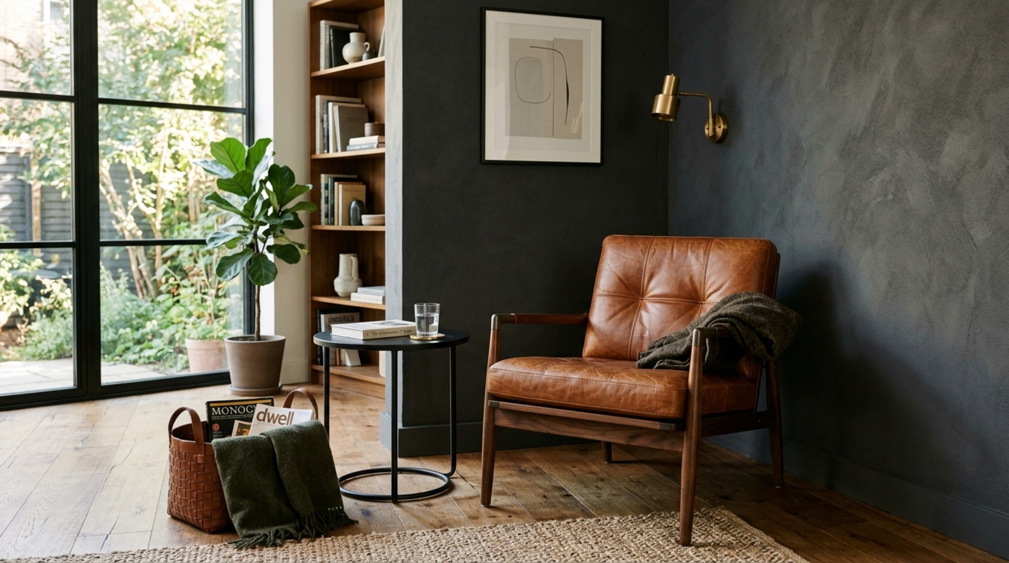
Leather furniture accents: Tactile Grounding in the Primary Zone
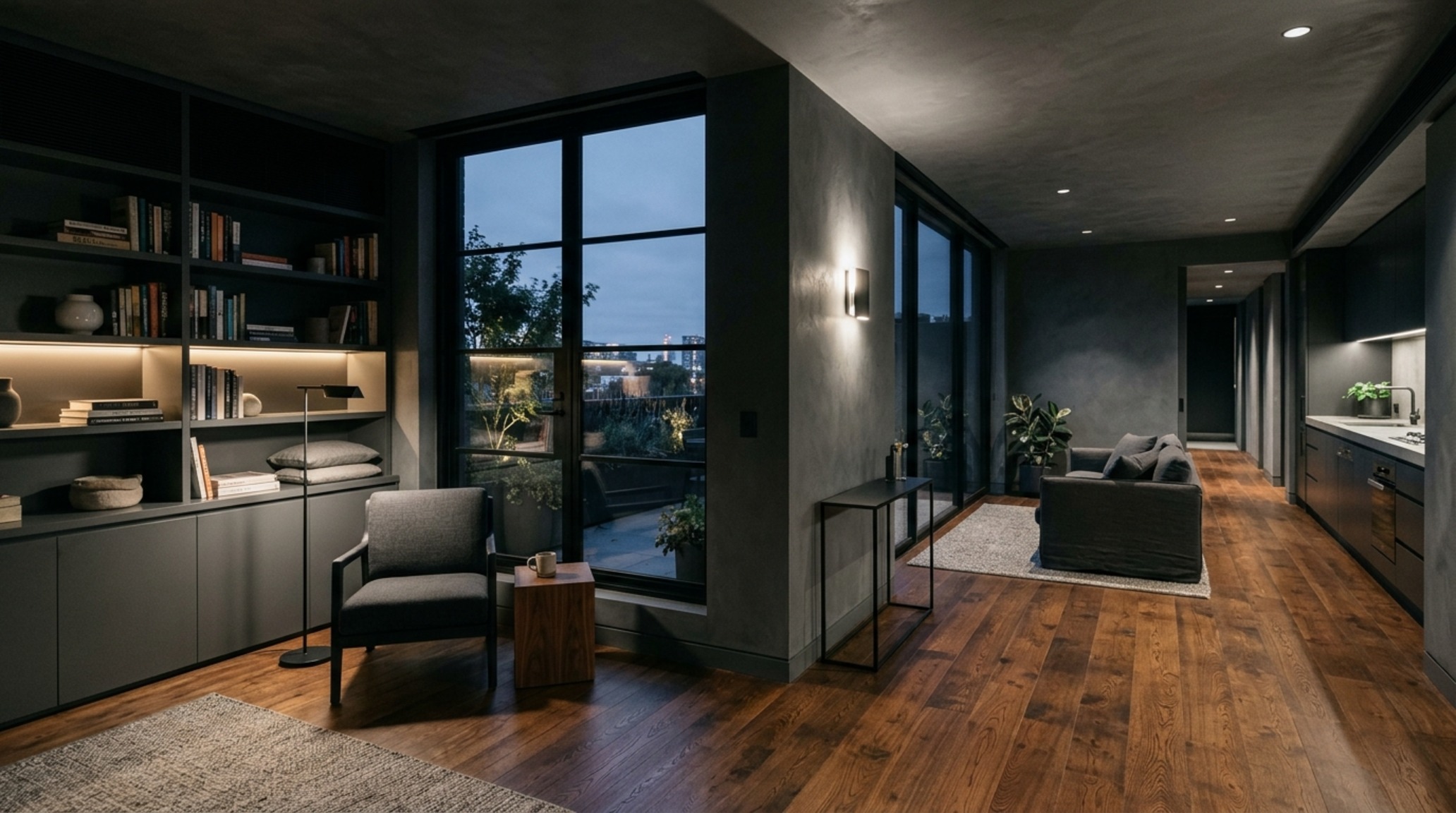
Leather brings an organic warmth that balances the hardness of industrial metals. In our eighth floorplan, we place a vintage-inspired cognac leather lounge chair in the corner of the room, paired with a floor lamp that casts a soft, 2700K warm ambient glow. This creates a ‘third space’ within the room—a place for reflection that isn’t the bed or the desk. The rich patina of the leather serves as a tactile anchor, grounding the room’s more ethereal elements.
Tier 3: The Architectural Splurge & Integrated Systems
At the highest tier of cool room designs for guys, we treat the space as a bespoke sanctuary. Every element is integrated into the architecture. Layouts 9 through 12 are characterized by built-in millwork, hidden storage, and high-tech integrations. Layout 9 features a ‘Floating Core’ where the bed is integrated into a central cabinetry unit that acts as a room divider, wardrobe, and media center all in one. This is the pinnacle of the mini-loft philosophy.
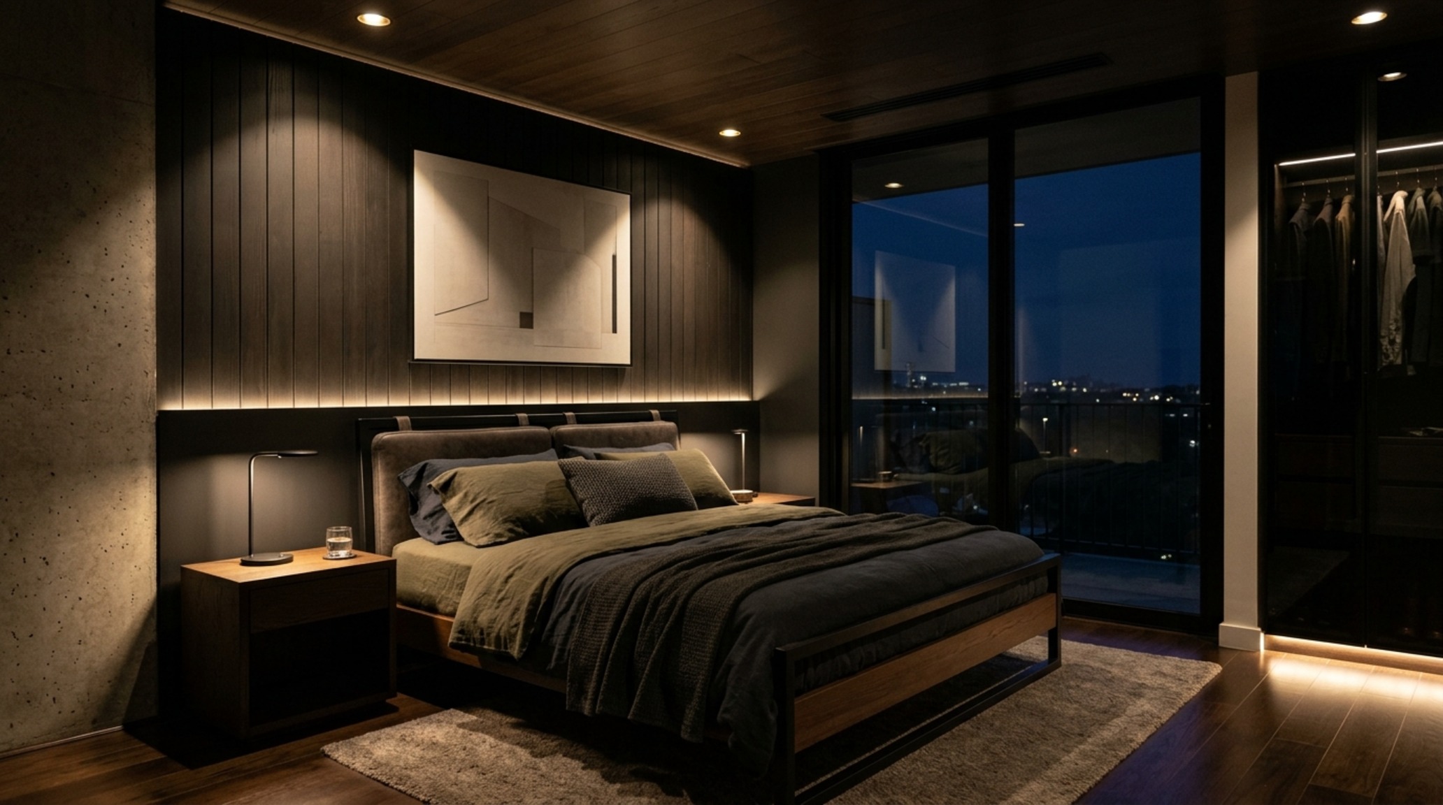
Layout 10 and 11 introduce the ‘Glass Partition’ concept, using Crittall-style steel and glass walls to define a walk-in closet or an en-suite bath without blocking natural light. Finally, Layout 12 is the ‘Total Integration’ floorplan, where automated systems manage the atmosphere. Smart home lighting is no longer just a bulb; it is a programmed scene that transitions from 5000K ‘Focus’ light during the workday to 2200K ‘Amber Sunset’ light in the evening, mirroring the natural circadian rhythm.
Smart home lighting: Designing with the Circadian Rhythm
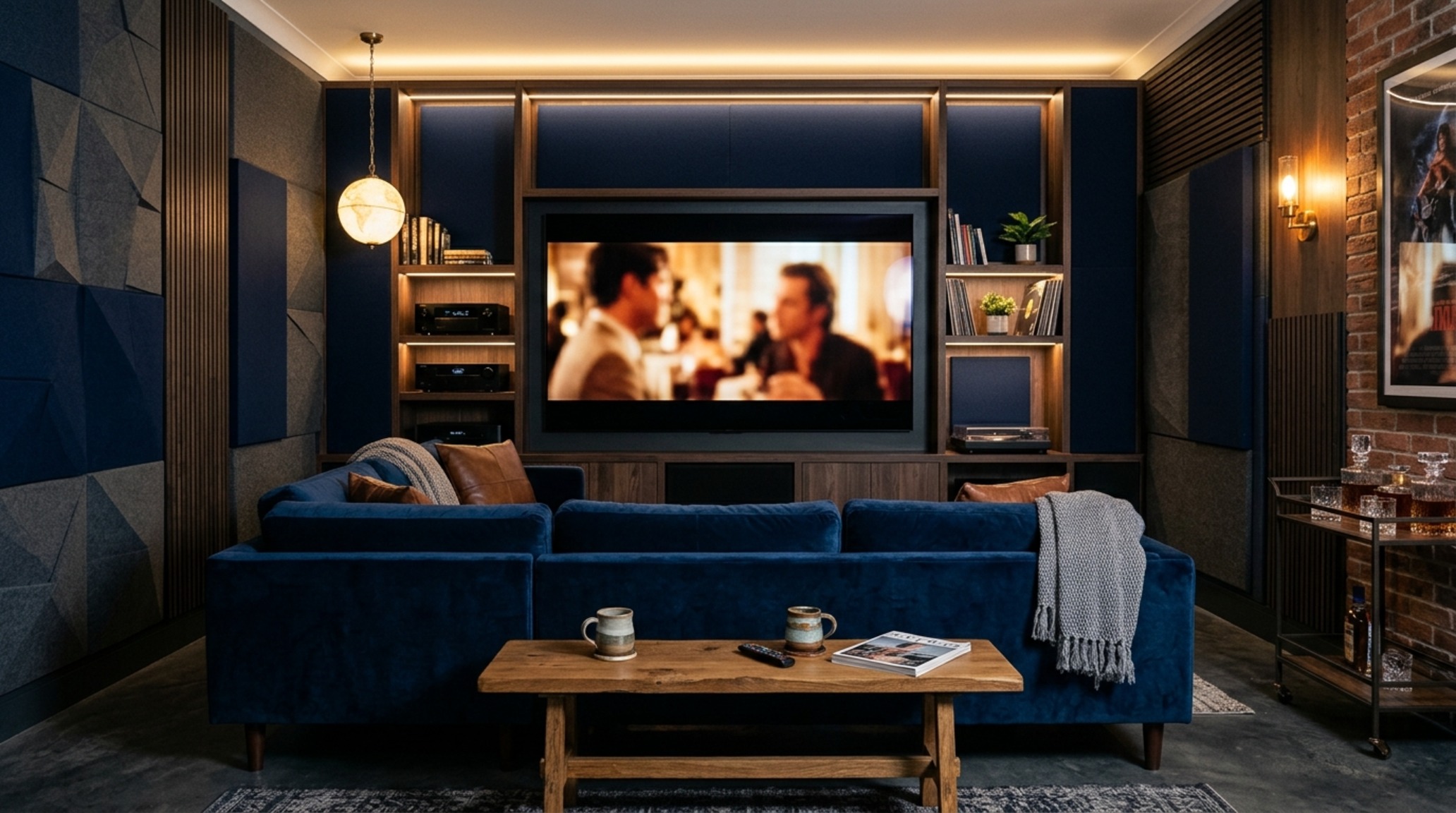
In these high-end spaces, we prioritize High CRI 90+ lighting to ensure that the colors of the materials—the deep charcoals, the walnut grains, the slate tiles—are rendered with absolute accuracy. We avoid ‘flat’ lighting by layering three levels: ambient, task, and accent. Recessed linear LED channels in the ceiling provide a wash of light that mimics architectural skylights, while discrete directional spots highlight specific textures or art pieces. This creates a sense of depth and shadow play that defines the room’s mood.
Ergonomic office setups: The Command Center Aesthetic
For the man who works from home, the office zone must be as sophisticated as the rest of the room. In Layout 12, the workspace is treated as a high-performance cockpit. A custom-milled desk in a dark color palette—perhaps Farrow & Ball Railings (#31)—is paired with a high-end ergonomic chair and integrated cable management. The sightline is carefully aligned so that while working, the occupant has a view of the room’s most attractive architectural features, reinforcing a sense of calm and control.
Spatial Anatomy & Material Specifications
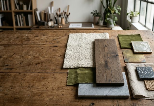
Curated architectural summary documenting material selections, color swatches, and spatial flow.
Ultimately, the most successful cool room designs for guys are those that prioritize the quiet confidence of good bones over the loud shouting of decor trends. When you focus on the structural balance of a room—ensuring that every piece of furniture has enough ‘negative space’ to breathe—you create an environment that feels timeless. It is the transition of light across a well-placed walnut desk or the tactile comfort of a leather chair that truly defines a space, providing a sanctuary that evolves with the person who inhabits it.
Frequently Asked Questions
What is the ideal lighting temperature for a masculine bedroom?
For general atmosphere, 2700K (Warm White) is ideal as it creates a cozy, relaxed vibe. However, for task areas like desks or reading nooks, 3000K offers better clarity without feeling too clinical. Always look for bulbs with a CRI of 90 or higher to ensure colors look natural.
How do I define zones in a single room without using walls?
Use architectural ‘anchors’ like large area rugs to define the bed and seating areas. Lighting also plays a major role; a low-hanging pendant light over a desk or a floor lamp by a chair creates a visual boundary that separates that area from the rest of the room.
What is the standard clearance needed around a bed for it to feel comfortable?
To maintain a professional, architectural feel, aim for at least 30 to 36 inches of walkway space on either side and at the foot of the bed. This prevents the room from feeling cramped and ensures a natural, easy flow of movement.
Editorial Silo • Recommended Architecture Studies
- Interior Design Materials Layout Ideas: Proportions & Flow — Archival Design Case Study
- Walk in wardrobe designs: 10 Compact solutions — Archival Design Case Study
Spatial Photography & Textures
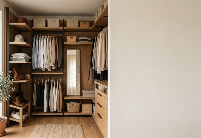
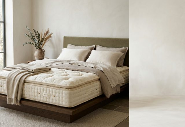
A visual anthology detailing craftsmanship, tailored millwork, and nuanced ambient illumination.
Curated Visual Lookbook
Design Gallery & Spatial Studies
A visual curation of architectural arrangements, lighting concepts, and material palettes featured in this space.