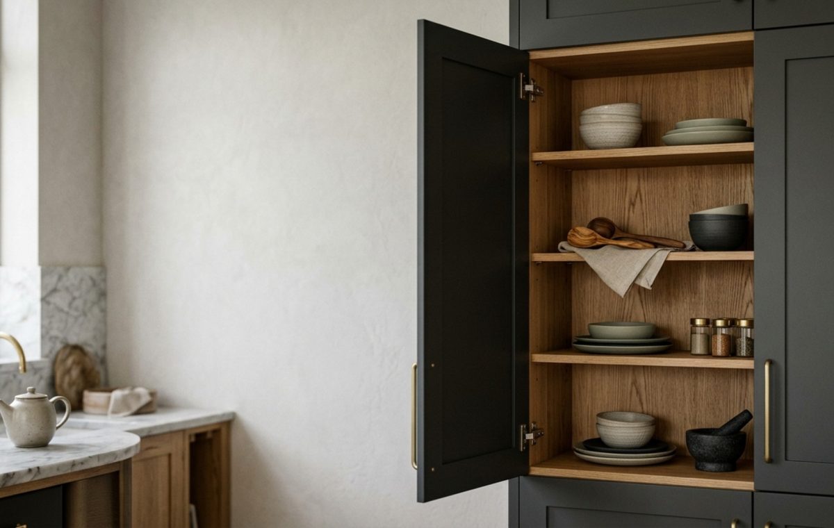
The most pervasive mistake in modern kitchen design is the ‘facade-first’ fallacy. We spend months agonising over the perfect slab of Arabescato marble for the island or the precise shade of greige for the shaker doors, only to settle for a cold, utilitarian white melamine once those doors swing open. It is a jarring sensory disconnect—a beautiful exterior hiding a sterile, forgotten void. The fix is a fundamental shift in perspective: treating the kitchen cabinet interior not as a storage cavity, but as an intimate design canvas that defines the daily ritual of the home.
Historically, the interior of a cupboard was a purely functional afterthought, often hidden behind heavy, light-blocking timber. However, as we move toward a more holistic architectural approach, the evolution of the kitchen cabinet interior has become the new hallmark of luxury. By mirroring the sophistication of the exterior on the inside, you transform a mundane task—reaching for a coffee mug or a spice jar—into a curated ‘unboxing’ experience. This philosophy isn’t just about aesthetics; it is about spatial cadence, tactile grounding, and the quiet joy of discovering a bespoke walnut grain or a soft-wash paint finish where you least expect it.
Refinement on a Budget: Subtle Surface Enhancements
Elevating your space doesn’t always require a total cabinetry overhaul. Often, the most profound shifts in mood come from thoughtful surface treatments that catch the light and provide a soft backdrop for your porcelain and glassware. When you focus on the tactile materiality of the surfaces within reach, the entire kitchen feels more intentional and grounded.
Inside Cabinet Paint Colors: The Curated Visual Palette
One of the most effective ways to create an immediate sense of luxury is through the strategic use of inside cabinet paint colors. Rather than sticking with standard white, consider a ‘tone-on-tone’ approach. If your exterior is a soft charcoal, painting the interior a muted slate or a deep navy creates a sophisticated shadow play that adds depth to the room. For a warmer, more ethereal feel, Benjamin Moore Swiss Coffee or Farrow & Ball Setting Plaster offers a delicate, chalky finish that feels soft to the touch and reflects light with a gentle, matte glow.
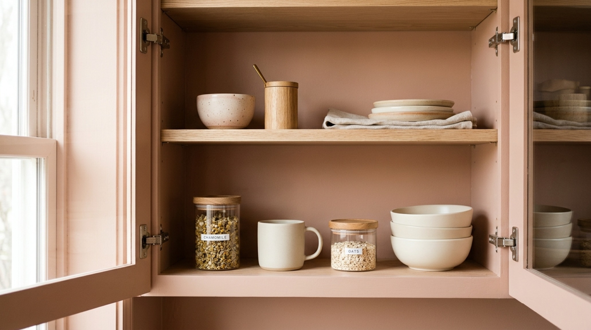
This approach works exceptionally well in glass-fronted cabinets where the interior color acts as a frame for your collection. A soft terracotta interior paired with white ceramic dishes creates a Mediterranean-inspired vignette that feels warm even on overcast days. The key is to use a high-quality cabinetry paint with a satin or eggshell finish; it must be durable enough to withstand the friction of sliding plates while maintaining its velvety appearance.
Corner Cabinet Organizers: Fluidity in Negative Space
Nothing kills the ‘luxe’ vibe faster than a cluttered, unreachable dark hole in the corner of your kitchen. Integrating high-end corner cabinet organizers is the functional equivalent of adding a precision-engineered engine to a beautiful car. Instead of the flimsy plastic ‘Lazy Susans’ of the past, contemporary solutions utilize matte anthracite metals and solid wood platforms that glide out with a silent, weighted elegance. These systems respect the spatial cadence of the kitchen, ensuring that every inch of the kitchen cabinet interior is accessible without disrupting the visual flow of the room.
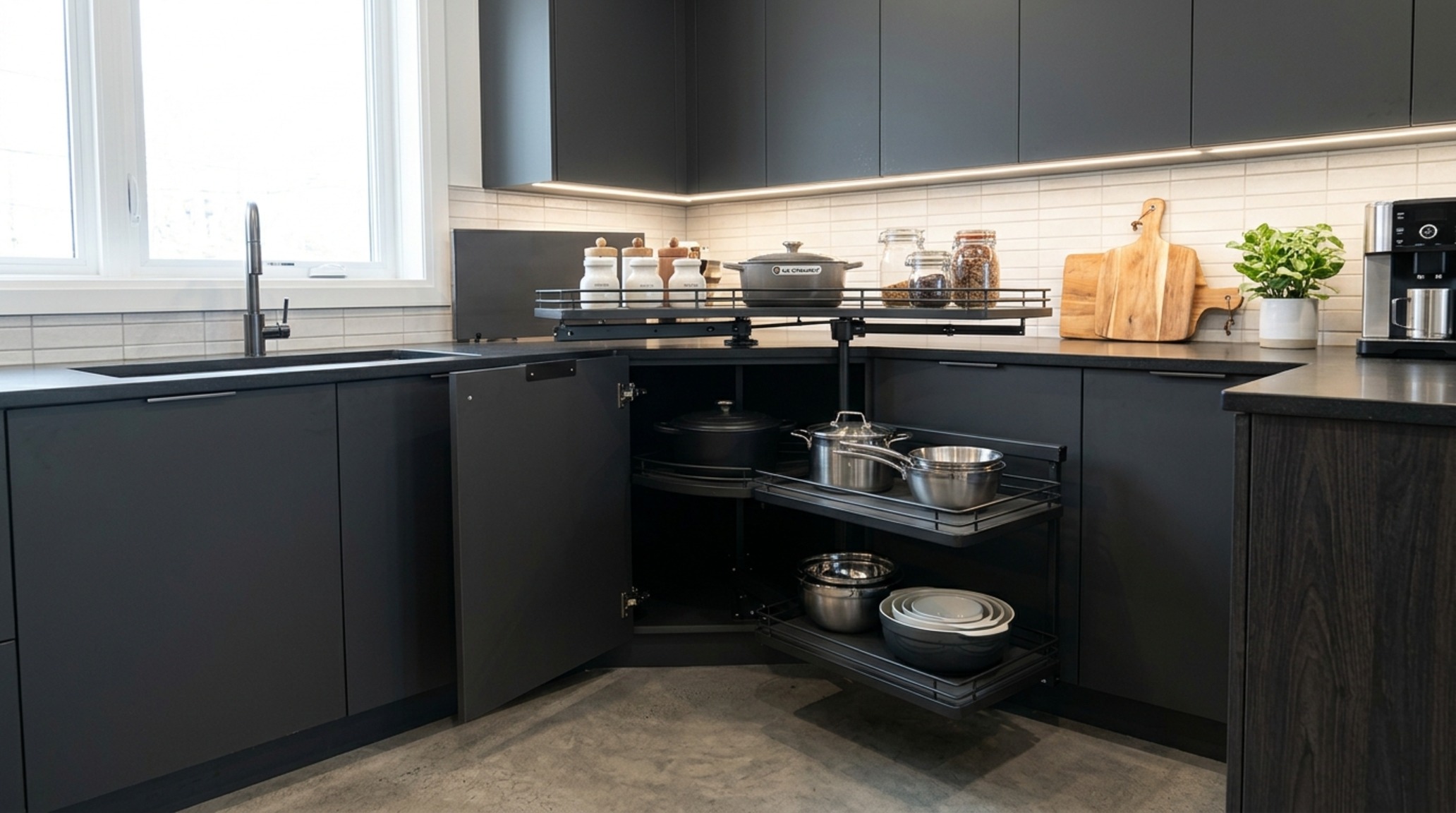
When selecting these organizers, look for those with ‘soft-close’ technology and anti-slip surfaces. The sound—or lack thereof—as a heavy pot-and-pan rack slides back into place is a subtle but powerful indicator of quality. It turns a frustrating search for a lid into a smooth, rhythmic interaction with your environment.
Mid-Tier Mastery: Engineering the Sensory Experience
Moving into the mid-tier budget allows for the integration of custom millwork elements and lighting specifications that were once reserved for high-end architectural projects. Here, we transition from surface updates to structural enhancements that prioritize cabinetry ergonomics and the ‘glow’ of the interior space.
Pull-Out Pantry Shelving: The Cadence of Accessibility
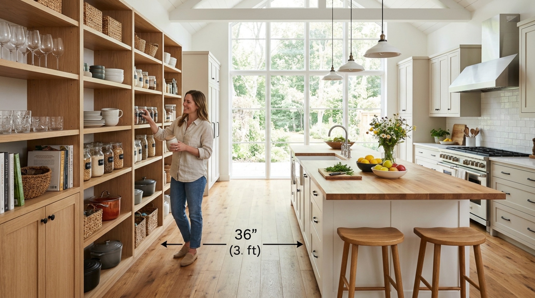
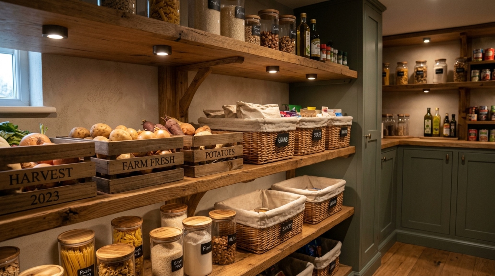
The pantry is the heart of the kitchen’s utility, yet it is often the most chaotic. Upgrading to pull-out pantry shelving made of rift-sawn white oak or walnut veneers transforms the pantry from a dark closet into a boutique-like display. These pull-outs allow you to view your inventory from above, eliminating the ‘archeological dig’ for a misplaced tin of tomatoes. Architecturally, these shelves should maintain a 36-inch primary circulation clearance when fully extended, ensuring the kitchen remains navigable even during heavy meal prep.
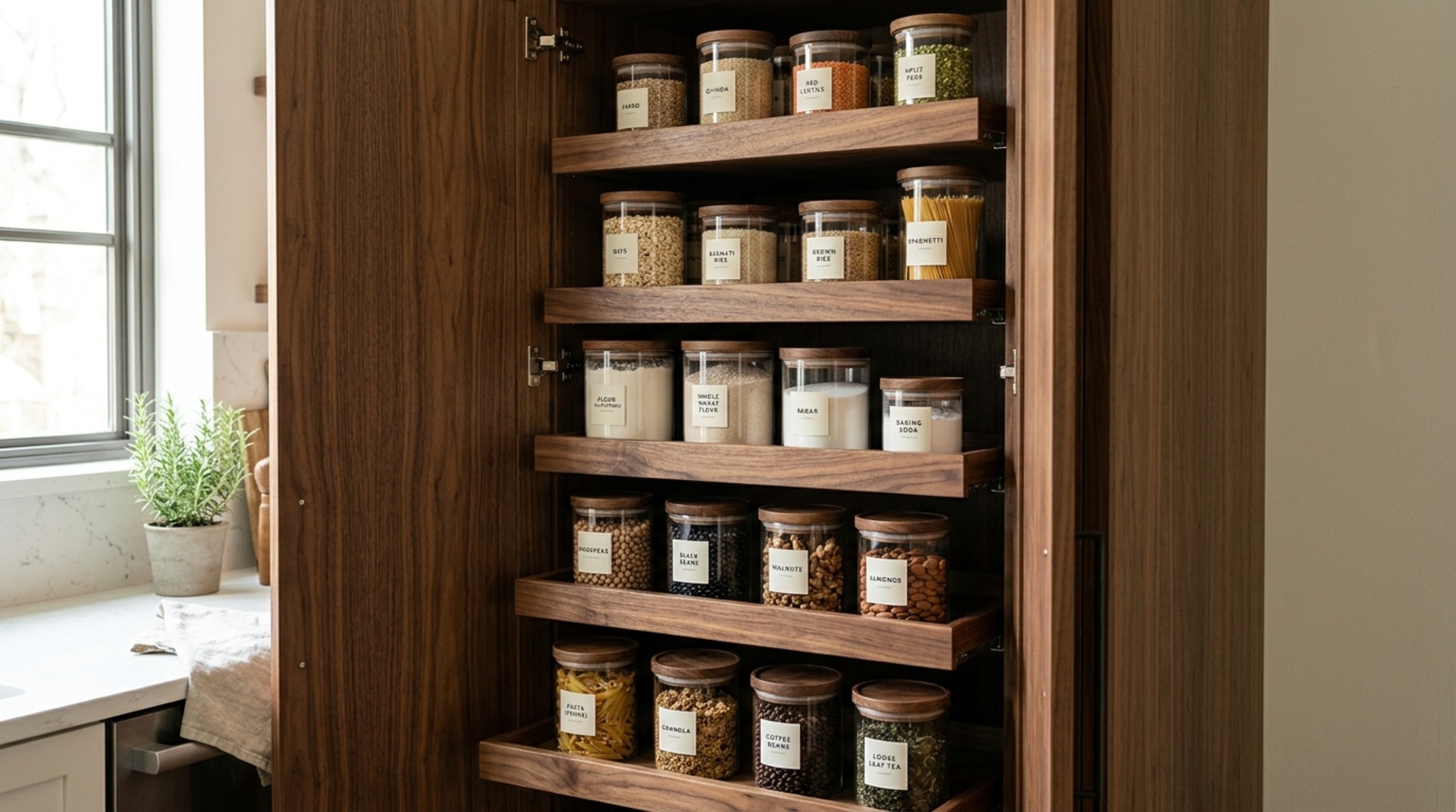
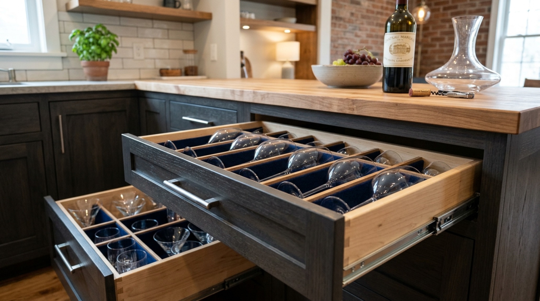
The visual impact of a row of perfectly aligned wooden pull-outs is undeniable. It introduces a repeating linear motif that grounds the kitchen’s design. To further the ‘unboxing’ effect, consider lining the bottom of these shelves with textured vegan leather or high-end felt; it dampens the sound of glass jars and provides a surprising tactile moment every time you reach for an ingredient.
The Nuanced Evolution of the Kitchen Cabinet Interior Lighting
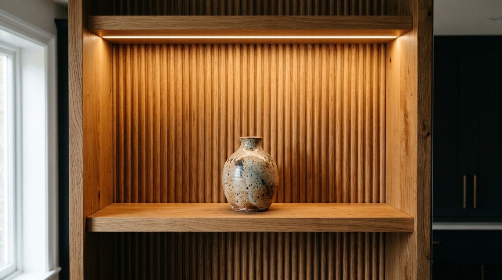
Lighting is the invisible architect of the kitchen. While task lighting under the cabinets is standard, integrated motion-sensor LED lighting within the kitchen cabinet interior is what truly elevates the mood. We recommend a 2700K warm ambient glow for residential spaces, as it mimics the softness of golden hour. High CRI (Color Rendering Index) ratings of 90+ are essential here; they ensure that the colors of your spices and the grains of your wood interiors appear vibrant and true to life.
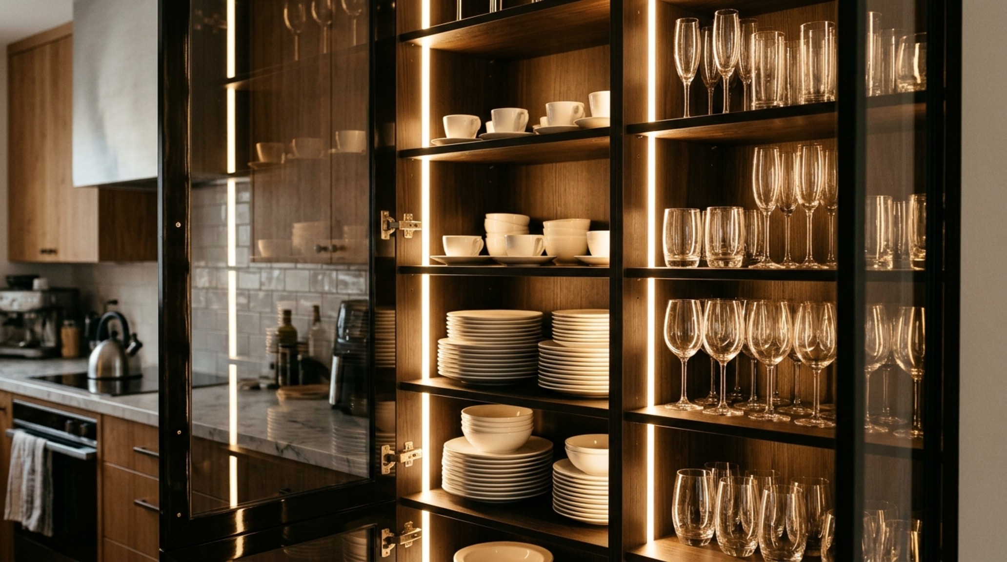
Strategic placement is vital. Recessed vertical LED strips hidden behind the face frame create a soft, diffused wash of light that eliminates harsh shadows. This type of lighting doesn’t just help you find things; it creates a ‘jewel box’ effect, turning your everyday glassware into a sparkling architectural feature. The transition from a dark room to a gently illuminated cabinet interior upon opening the door is a small, daily luxury that never loses its charm.
The Splurge: Bespoke Artistry & Invisible Logic
At the highest level of design, the kitchen cabinet interior is treated with the same reverence as a piece of fine furniture. Every joint, every hinge, and every material is a conscious choice intended to create a seamless, high-sensory environment.
Bespoke Cabinetry Details: Material Honesty & Tactile Grain
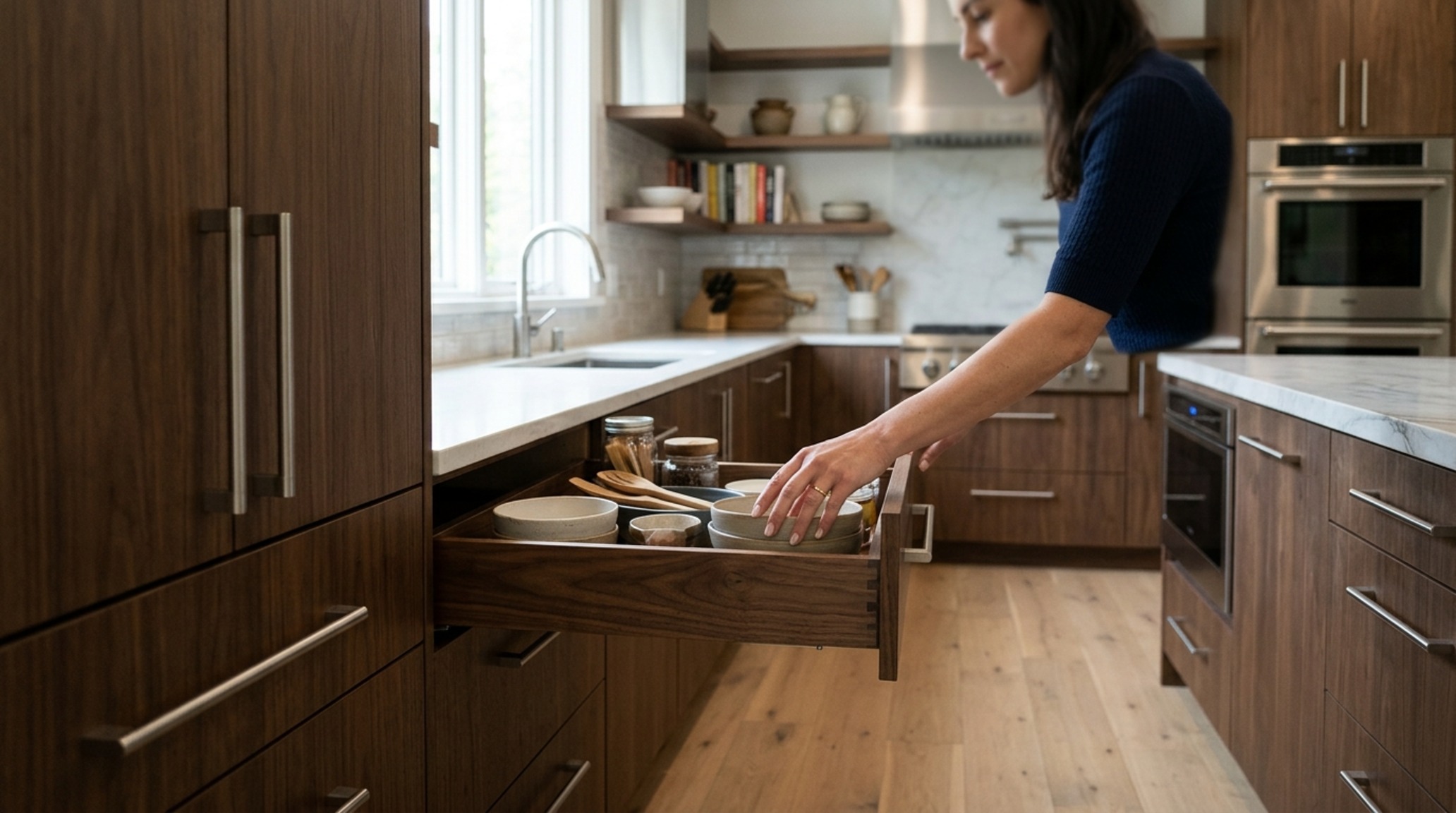
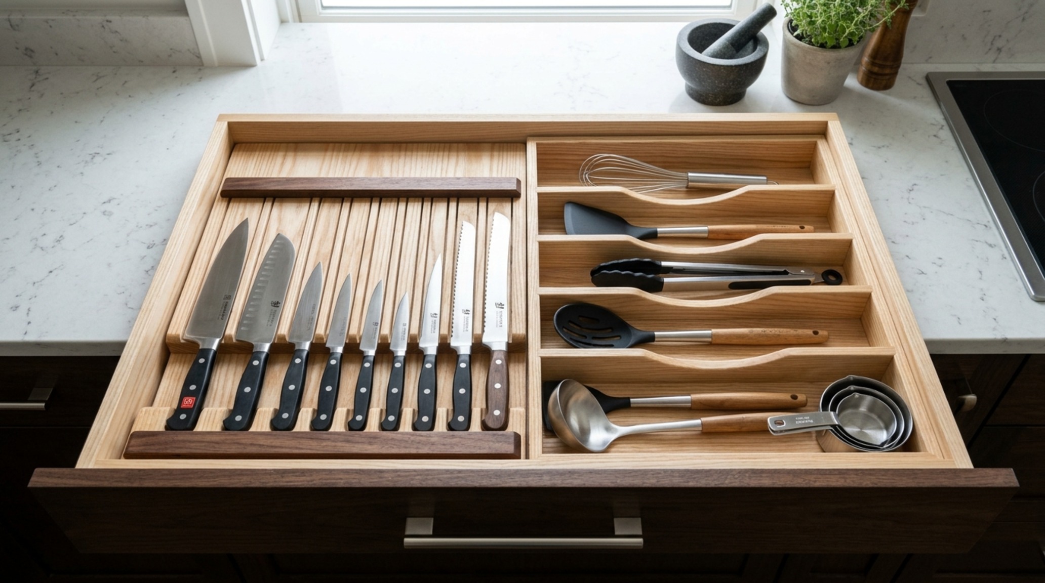
True luxury lies in the details that most people will never see. Bespoke cabinetry details, such as hand-dovetailed drawers made from solid American Walnut or aromatic Cedar, offer a level of material honesty that melamine simply cannot replicate. The scent of natural wood when you open a drawer is a powerful sensory anchor. In these high-end applications, the interior isn’t just a different color; it’s a different material entirely, providing a rich, dark contrast to a lighter exterior.
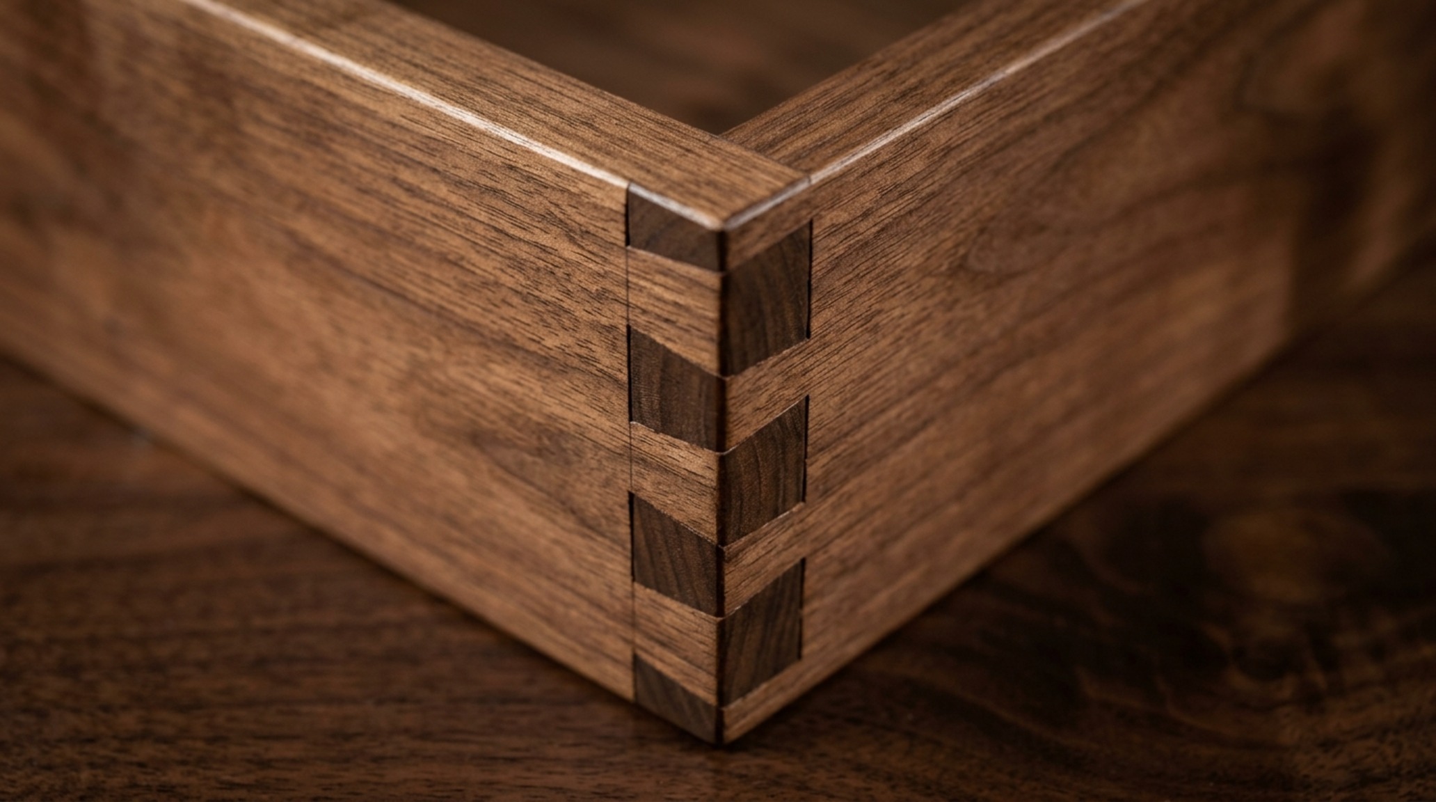
Consider the use of fluted wood backings or even stone-lined interiors for coffee stations. A honed travertine backpanel inside a breakfast cupboard provides a cool, tactile grounding that feels incredibly substantial. These choices reflect a commitment to quality that transcends trends, focusing instead on the enduring beauty of natural materials and expert craftsmanship.
Hidden Appliance Storage: The Vanishing Visual Plane
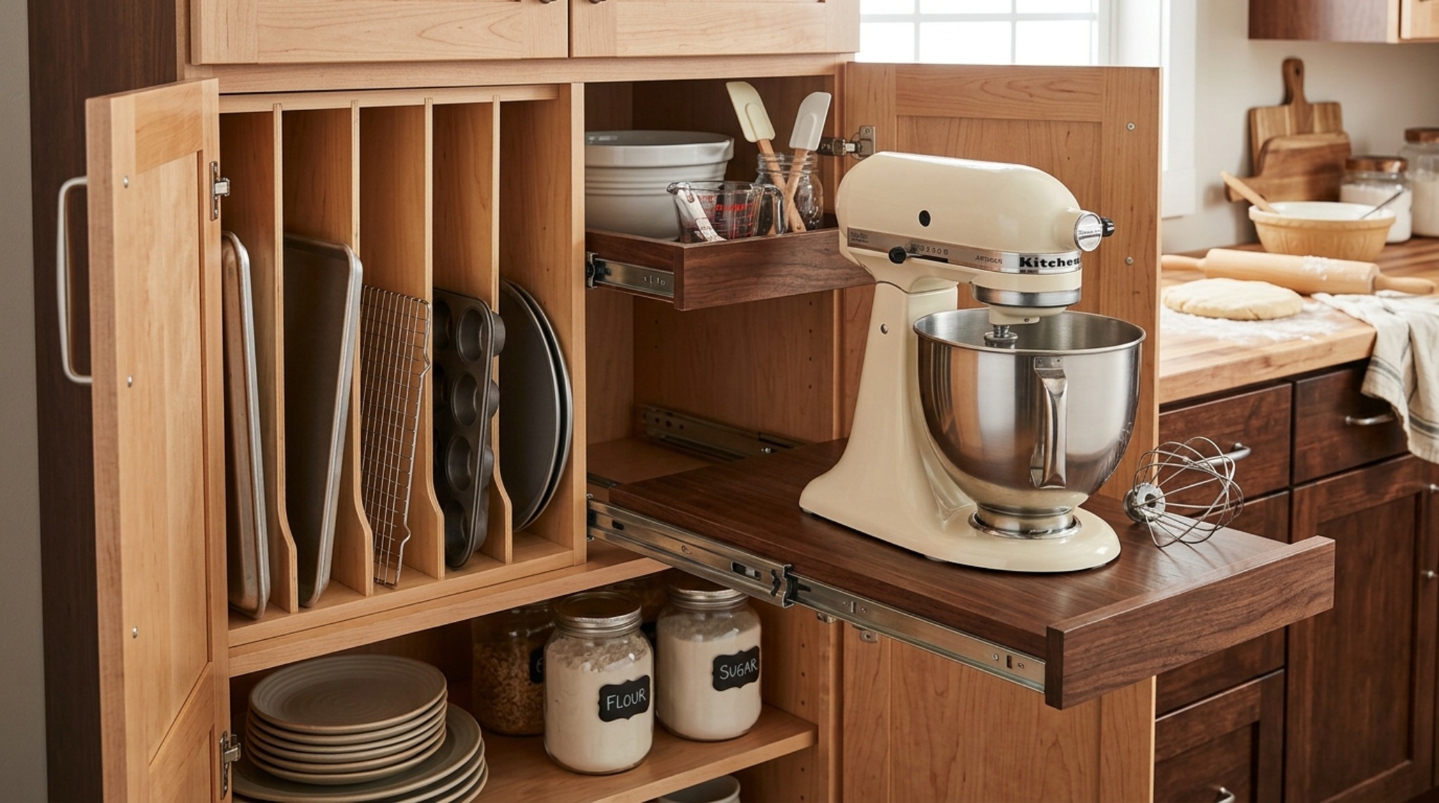
In a world of visual noise, the ultimate luxury is silence—visual silence. Hidden appliance storage, often referred to as ‘appliance garages,’ allows for a clutter-free countertop while keeping essential tools within reach. The magic happens in the mechanics: pocket doors that slide back into the kitchen cabinet interior, disappearing completely to allow for unobstructed workspace. These systems require precise architectural clearances—typically an 18-inch reach from the front of the counter—to ensure ergonomic comfort.
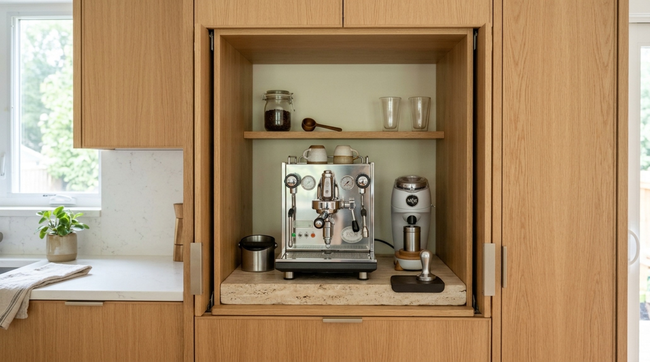
By housing the toaster, espresso machine, and stand mixer behind beautifully finished doors, you maintain the clean lines of the kitchen’s architecture. When these doors are open, the interior should be just as polished as the rest of the room, perhaps featuring a contrasting stone shelf or a bespoke metallic backsplash that catches the 3000K task lighting. It is a masterful vanishing act that prioritizes both form and function.
Architectural Specification & Material Matrix
Curated palette registry detailing authentic textures, lighting Kelvin ratings, and ergonomic reach.
Designing from the inside out is an act of architectural empathy. It acknowledges that the person using the kitchen—you—deserves to experience beauty in every interaction, not just when looking at the room from a distance. As you refine your kitchen cabinet interior, remember that the most luxurious spaces are those that feel deeply personal and meticulously cared for, even behind closed doors.
Final Interior Refinement Checklist
- Audit the Contrast: Does your interior finish provide a meaningful visual or tactile counterpoint to the exterior?
- Check the Glow: Is your lighting calibrated to a warm 2700K to enhance the natural grain of your materials?
- Measure the Flow: Have you prioritized ergonomic inserts that respect the 36-inch clearance rules for a seamless workflow?
The future of kitchen design lies in this quiet sophistication—a shift away from the performative and toward the lived experience. When we elevate the internal landscape of our homes, we create a spatial environment that doesn’t just look good, but feels inherently, fundamentally right.
Editorial Silo • Recommended Architecture Studies
- Apartment Kitchen Renovation Ideas Smart — Archival Design Case Study
- Kitchen Bay Window Ideas: Festive (2026) — Archival Design Case Study
Architectural Space Catalog
A refined visual analysis highlighting artisanal millwork, balanced geometry, and organic color palettes.
Curated Visual Lookbook
Design Gallery & Spatial Studies
A visual curation of architectural arrangements, lighting concepts, and material palettes featured in this space.