The Optical Expander: Using Earthy Palettes and Kinetic Textures to Reshape Visual Depth
There is a specific, quiet magic that occurs when the morning sun grazes a lime-washed wall, catching the micro-textures of a hand-applied finish. In these moments, the physical boundaries of a room seem to soften, dissolving into a play of shadow and light that defies the actual floor plan. Implementing successful narrow living room design ideas is rarely about finding ways to squeeze more in; rather, it is an exercise in editing the visual noise to prioritize atmospheric depth. By pivoting from a focus on square footage to a focus on sensory perception, we can transform a constrained, linear corridor into a layered sanctuary that breathes with intentionality and warmth.
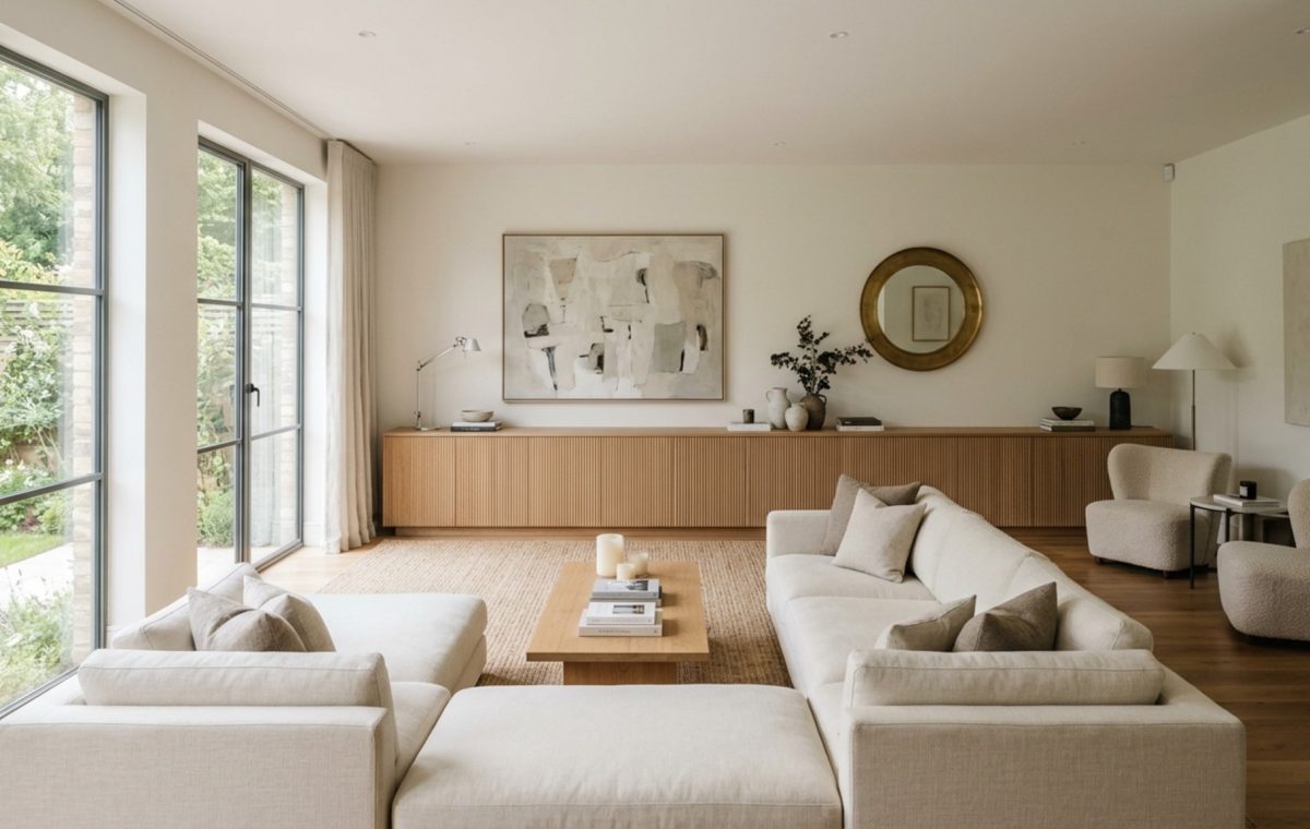
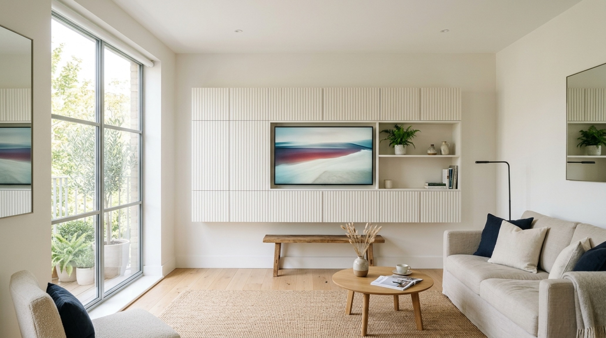
The challenge of a rectangular footprint often leads to the ‘bowling alley’ effect, where the eye rushes from one end to the other without pause. To counter this, we must introduce architectural friction—elements that slow the gaze and invite it to move horizontally rather than just vertically. This is where the concept of the kinetic texture comes into play. By utilizing materials like fluted white oak cabinetry or ribbed plaster wall treatments, we create a rhythmic cadence that ‘pushes’ the walls outward, tricking the brain into perceiving more lateral volume than the blueprint suggests.
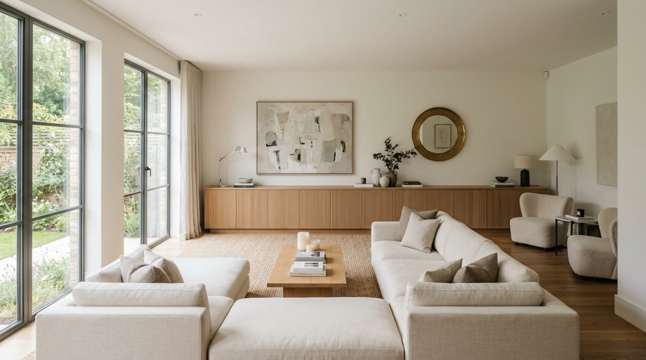
Zoning Long Living Rooms: The Kinetic Power of Horizontal Texture
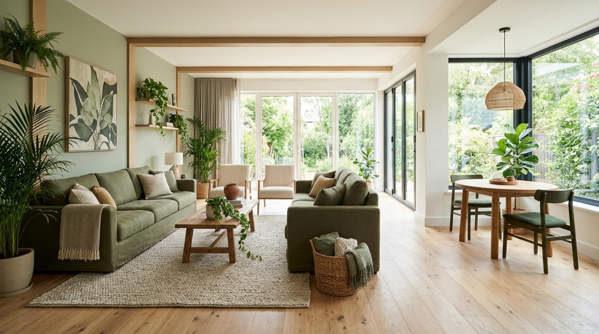
When we approach zoning long living rooms, the goal is to break the visual continuity of the ‘tube’ without resorting to physical barriers that choke the light. I often look to horizontal graining—think of a low-slung, custom walnut media console that spans twelve feet—to anchor the space. This long, low line draws the eye across the room’s width, emphasizing the horizon rather than the narrowness. Fusing this with a biophilic palette, perhaps using Farrow & Ball’s ‘French Gray’ or ‘Setting Plaster’, allows the walls to recede. These ‘earthy’ hues contain high amounts of gray and yellow pigment, which absorb and reflect light in a way that feels organic and expansive, unlike a flat, sterile white that can feel cold and restrictive in tight quarters.
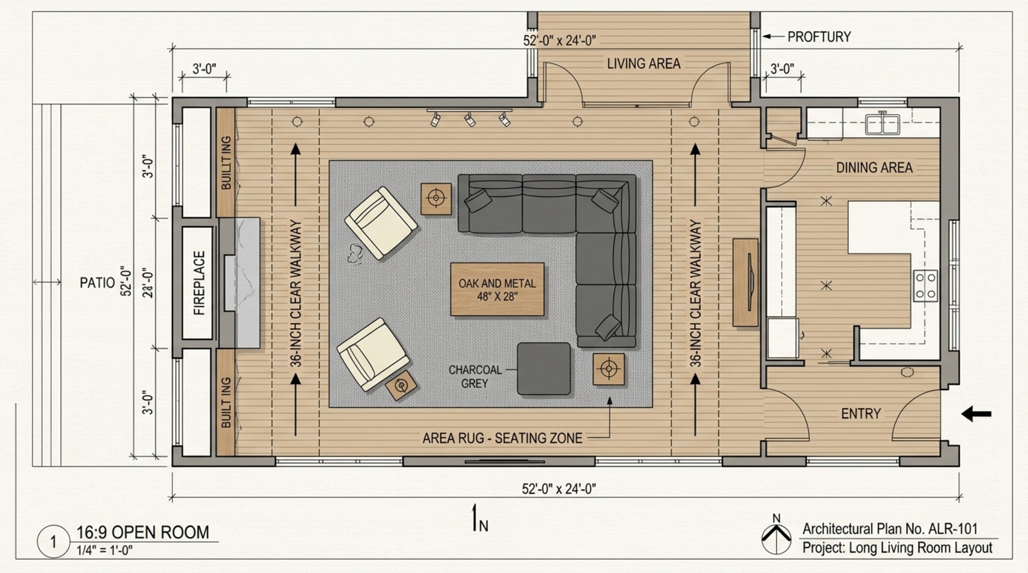
Consider the tactile grounding of a jute rug paired with a silk-wool blend topper. This layering isn’t just for comfort; it defines zones through texture. A seating area defined by a 9×12 rug creates a ‘room within a room,’ establishing a clear perimeter that signals a change in function. In these transitions, maintaining a 36-inch primary circulation path is non-negotiable. This standard architectural clearance ensures that the flow feels effortless, preventing that cramped ‘sideways-shimmy’ often found in poorly planned narrow spaces.
Floating Sofa Layout: Breaking the Corridor Effect
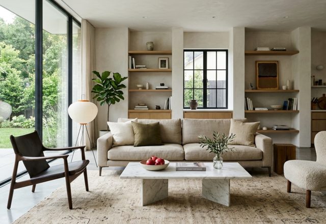
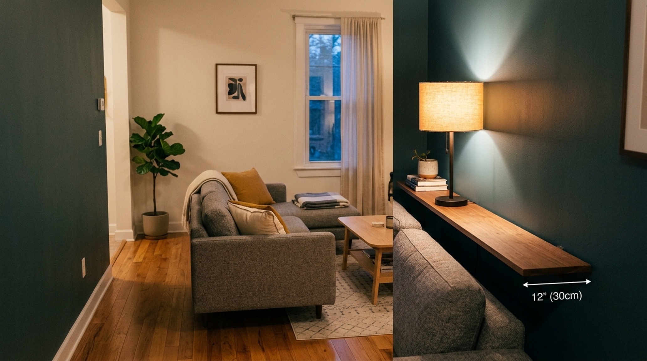
One of the most common mistakes in a constrained floor plan is the ‘wall-hugging’ syndrome—the instinct to push every piece of furniture against the perimeter. A floating sofa layout is the antidote to this claustrophobic habit. By pulling the sofa just 12 to 18 inches away from the wall, you create ‘negative space breathing room’ that immediately lightens the visual load. This gap allows light to wash down the wall behind the furniture, creating a sense of transparency and depth. It signals to the subconscious that there is ‘more’ to the room than what is immediately visible.
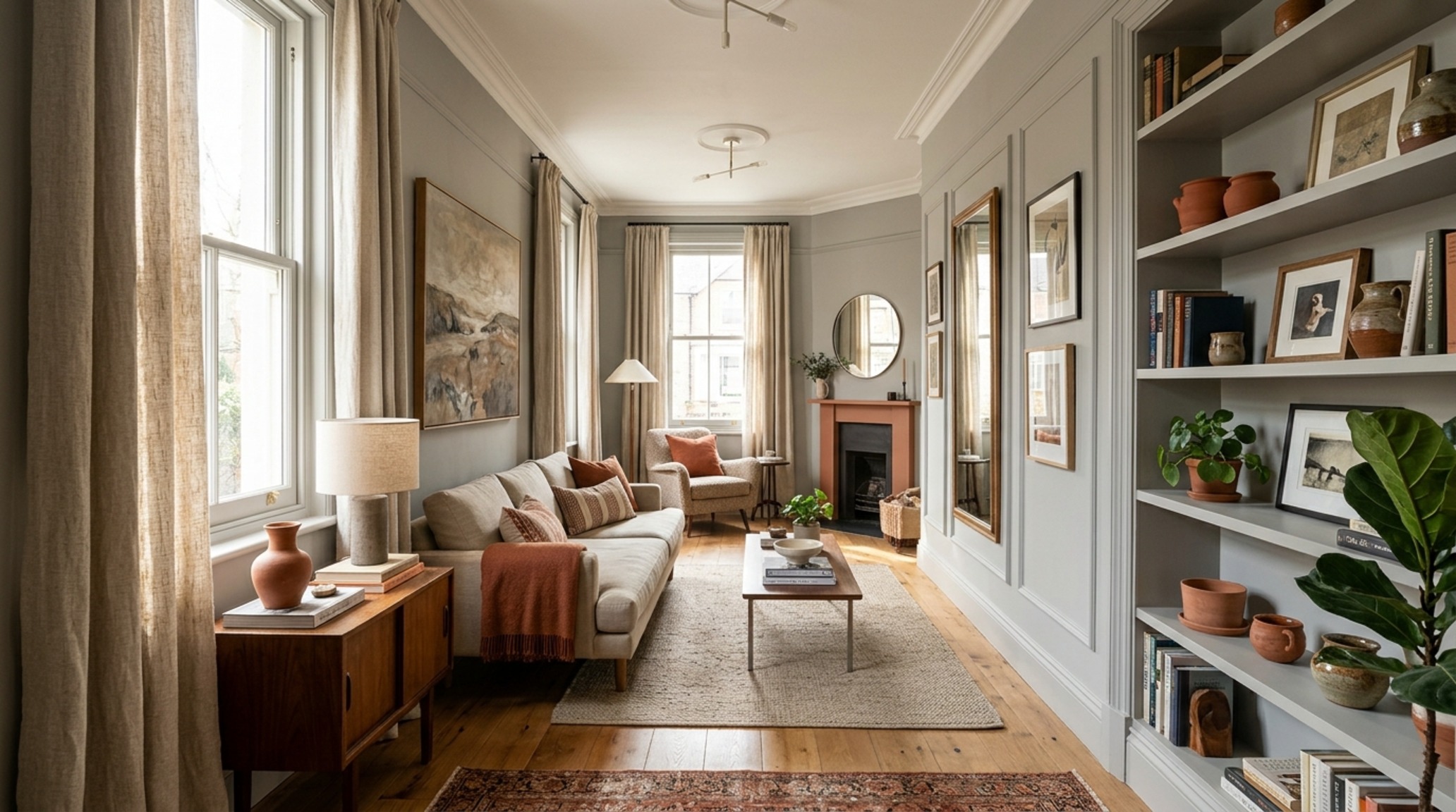
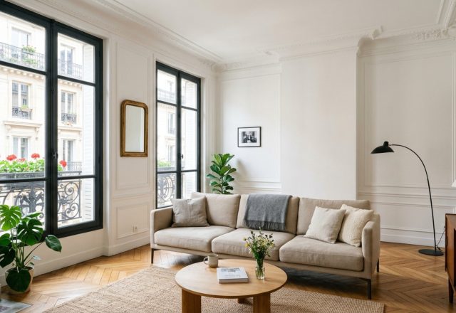
To make a floating arrangement work, look for a sofa with a low-profile back and slender, tapered legs. Furniture that sits directly on the floor acts like a visual block, stopping the eye at its base. However, when you can see the floor plane extending beneath a chair or sofa, the room feels significantly larger. This is a classic ‘optical expansion’ trick: the more continuous flooring the eye can track, the wider the room feels. I frequently specify sofas with at least a 6-inch leg clearance to maximize this effect.
Narrow Living Room Furniture Arrangement: The Rule of Leggy Profiles
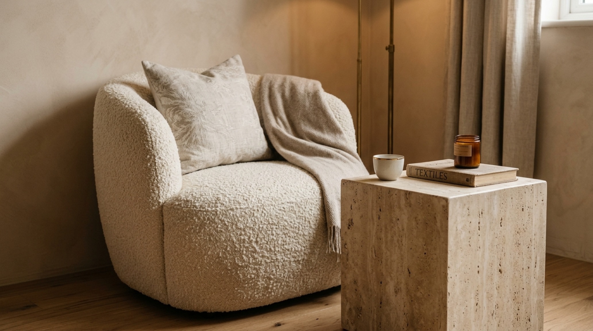
In a narrow living room furniture arrangement, every inch must earn its keep through both form and function. This is where we lean into the ‘leggy’ aesthetic—Mid-century modern or contemporary Scandinavian pieces that prioritize a light footprint. Instead of a heavy, monolithic coffee table, consider a pair of nesting tables in a material like honed travertine or glass. These pieces offer the necessary surface area for a 2700K ambient lamp or a book, yet their transparency or slender frames prevent them from becoming a visual anchor that weighs down the center of the room.
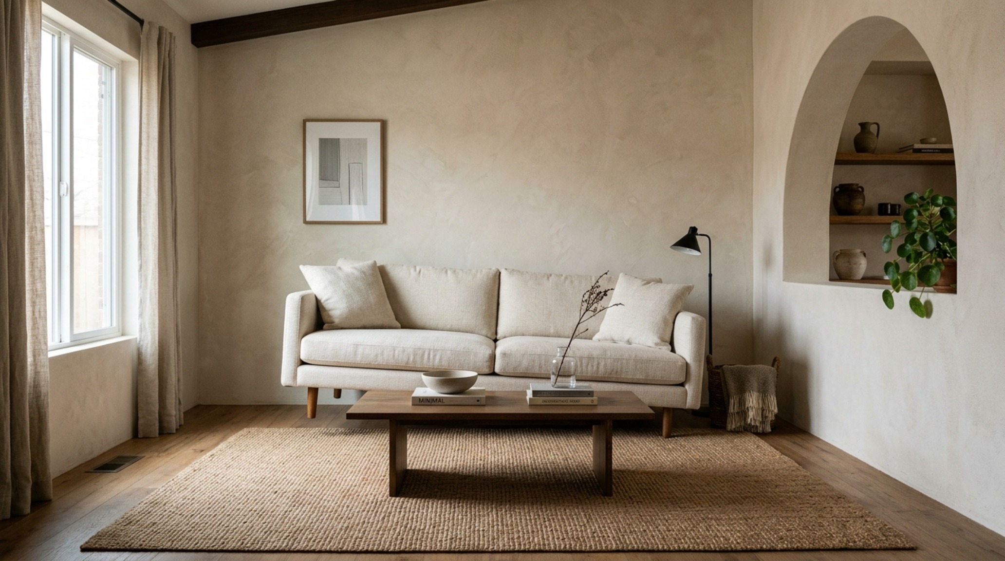
The relationship between the sofa and the coffee table is governed by the 18-inch reach rule. This distance is the ergonomic sweet spot—close enough to set down a drink without leaning, but far enough to allow for easy leg movement. In a narrow room, maintaining this precise clearance ensures the space feels professional and tailored rather than cluttered. When selecting side chairs, opt for ‘open arm’ designs. An armchair with a wooden frame and cane backing allows the eye to pass through the piece, maintaining the sightline alignment across the room.
Awkward Living Room Solutions: Managing Visual Weight and Scale
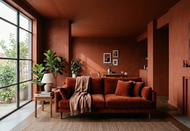
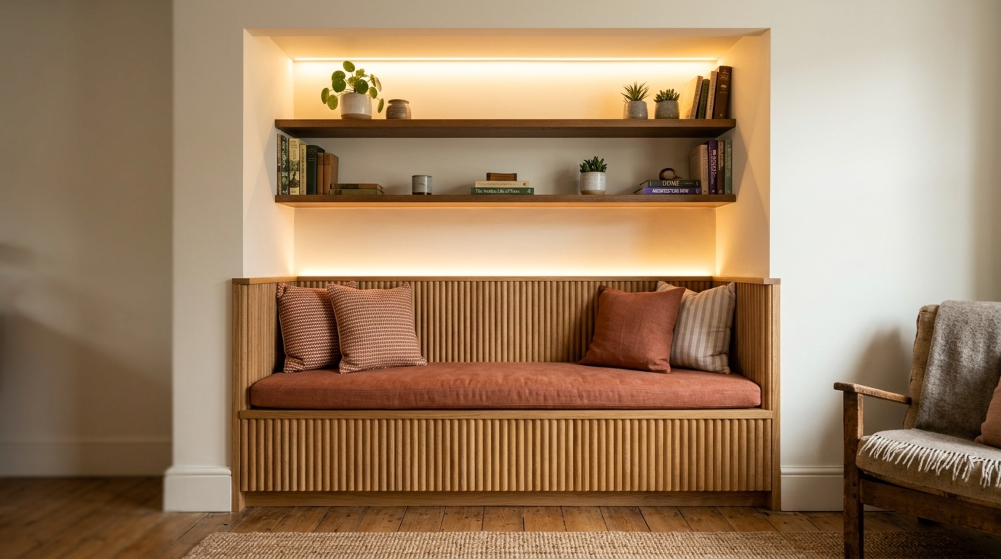
Every designer has faced the ‘dead corner’ or the ‘impossible niche.’ These awkward living room solutions often involve custom millwork that works with the architecture rather than against it. If you have a shallow alcove, don’t try to hide it. Instead, treat it with a ‘kinetic’ texture like fluted paneling or a bold terracotta lime wash. By making the awkward feature a focal point, you turn a spatial flaw into a ‘moment’ of architectural interest. This redirecting of the gaze is essential in reshaping the narrative of a room’s dimensions.
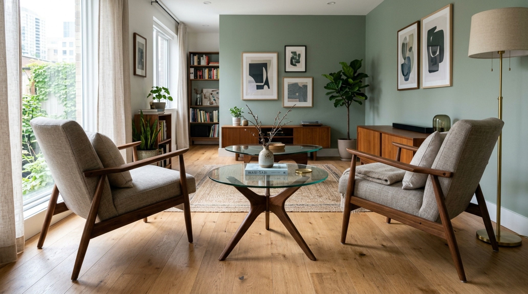
Lighting plays a pivotal role in managing these awkward zones. A common pitfall is relying on a single overhead ‘boob’ light, which flattens the space and highlights the corners. Instead, think in layers. Use high CRI 90+ LED strips tucked into coves to wash walls with 2700K warmth, and pair them with directional 3000K task lighting for reading nooks. This ‘shadow play’ creates depth by creating highlights and lowlights, effectively masking the true boundaries of the room and adding a sense of mystery and scale.
Space-Saving Living Room Tips for Vertical Integration
To truly expand the visual volume, we must look up. Implementing space-saving living room tips often involves shifting the storage burden from the floor to the walls. Floating shelves that match the wall color (try Benjamin Moore’s ‘Swiss Coffee’ for a creamy, expansive off-white) blend into the architecture, providing display space without the bulk of a traditional bookcase. When these shelves are installed in a staggered, asymmetrical pattern, they encourage the eye to move upward and diagonally, further breaking the linear monotony of a narrow room.
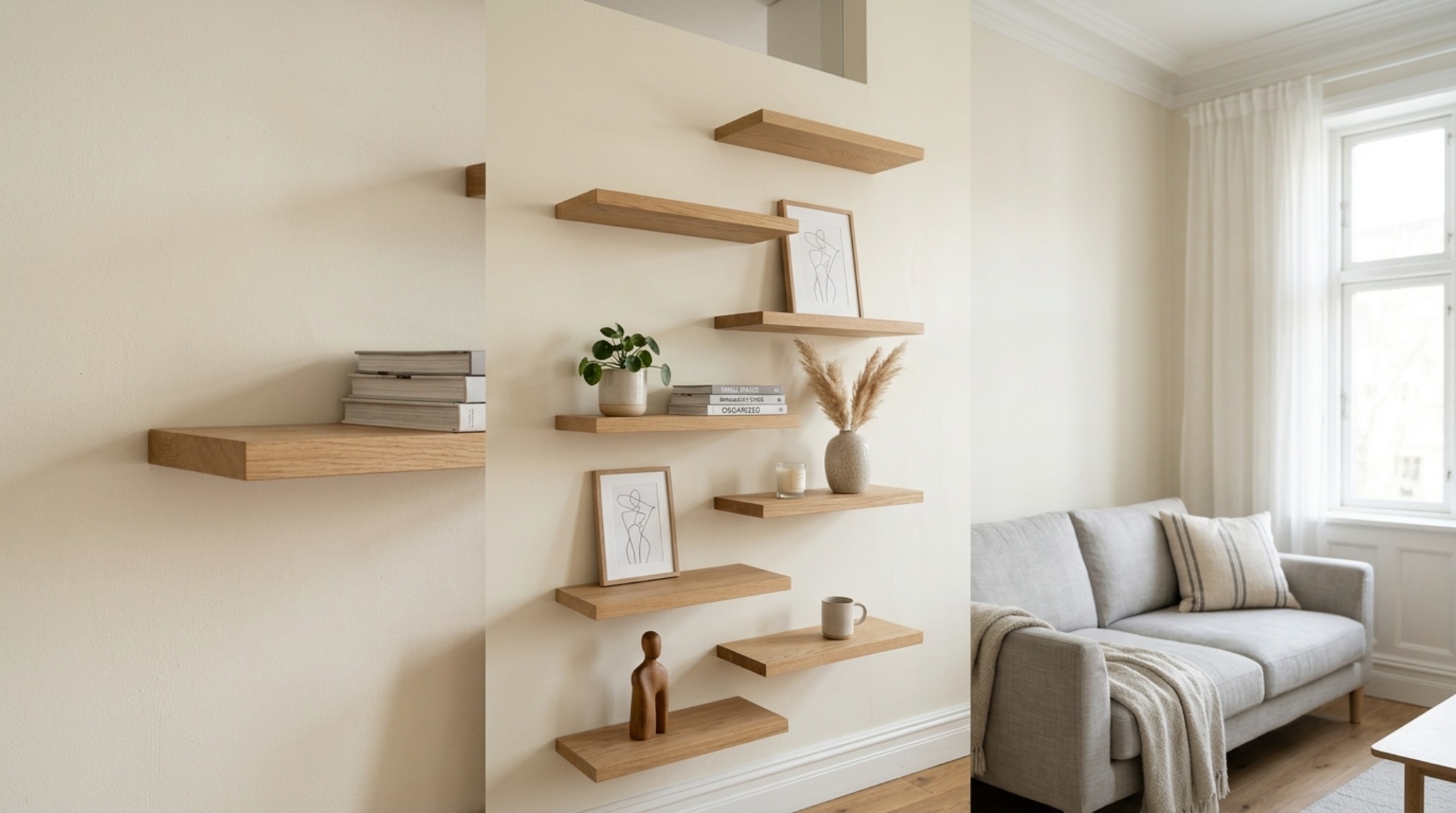
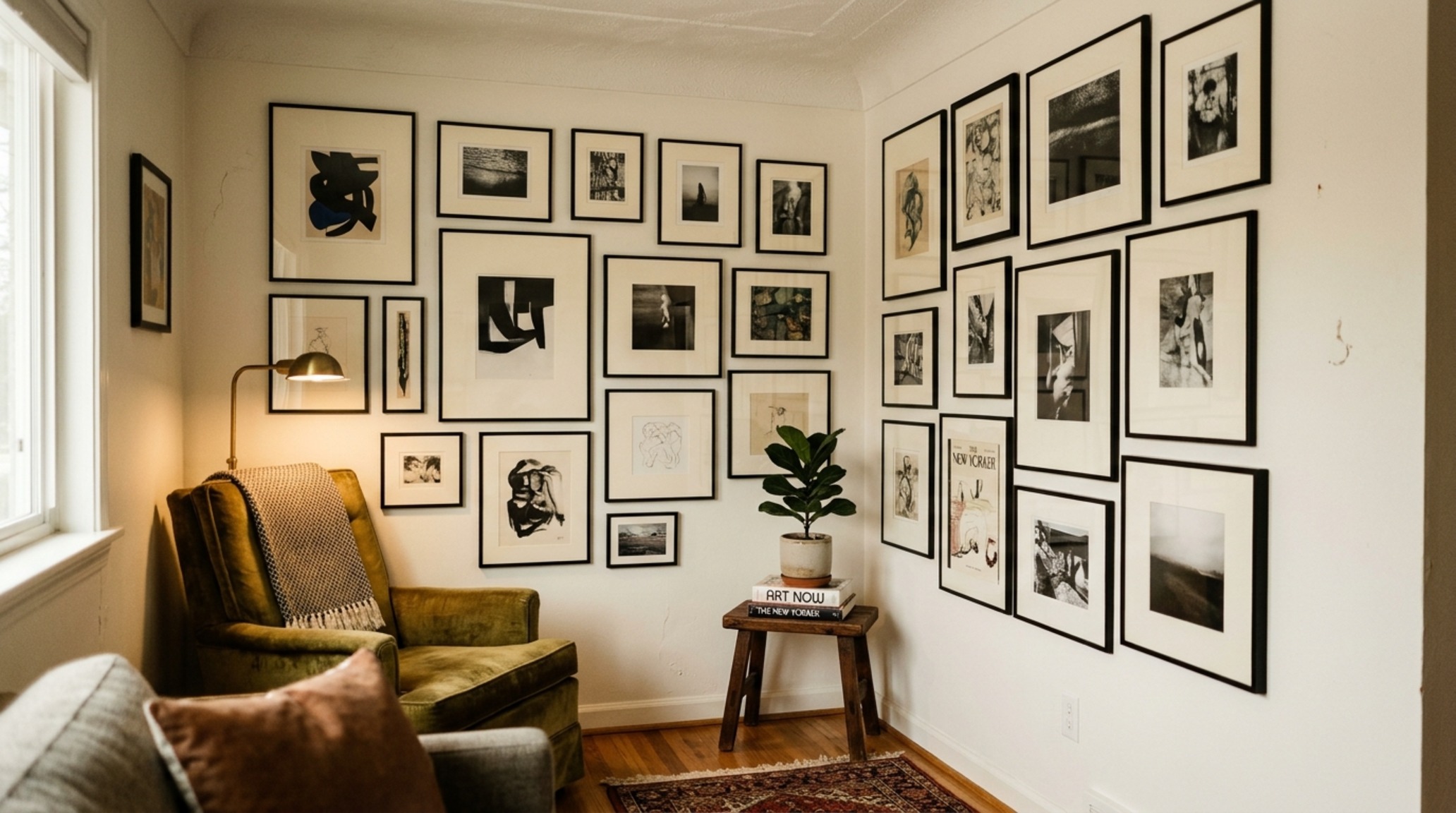
Art should also be used strategically. A single, vibrant statement piece on the narrowest wall can act as a ‘vanishing point,’ drawing the eye deep into the room and creating a sense of destination. Alternatively, a gallery wall that extends to the ceiling can trick the mind into perceiving higher rafters. The key is to keep the frames thin and the matting generous, allowing the art to ‘breathe’ within its own negative space.
Rectangular Living Room Ideas: Designing for Circular Flow
The final layer of a successful layout is the orchestration of movement. Effective rectangular living room ideas prioritize ‘circular flow’—the ability to move through the space without hitting a dead end. This is achieved by creating small ‘vignettes’ or secondary seating areas. Perhaps a small café table with two 30-inch clearance chairs at the far end near a window. This gives the long room a second purpose, transforming it from a simple passage into a multifunctional destination. By giving the ‘other end’ of the room a reason to exist, you effectively double the perceived utility of the footprint.
In these secondary zones, keep the materiality consistent but play with scale. If the main seating area features a chunky bouclé sofa, use a sleek leather or velvet for the accent chairs. This contrast in ‘tactile grounding’ keeps the eye engaged, preventing the space from feeling like a showroom. It’s about creating a spatial cadence that feels lived-in, curated, and above all, intentionally expansive.
Material Schedule & Specification Sheet
Detailed specifications outlining core tactile materials, lighting temperature, and room clearances.
The successful expansion of a narrow living room relies on the understanding that architecture is as much about how we feel as what we see. By manipulating sightlines with leggy furniture, anchoring the length with horizontal textures, and softening the perimeter with earthy, light-receding palettes, we transform a logistical challenge into a masterclass in intimacy. It is a reminder that in the world of high-end design, constraints are not limitations—they are the very sparks that ignite the most creative and resonant spatial transformations.
Editorial Silo • Recommended Architecture Studies
- The Science of Flow: Ergonomic Interior Decoration Ideas For Living Room Mastery — Archival Design Case Study
- Tactile Sophistication: Redefining Mood and Materiality in Small Contemporary Living Room Design Ideas — Archival Design Case Study
Tactile Design Anthology
Visual perspectives honoring architectural weight, understated craftsmanship, and layered atmospheric warmth.
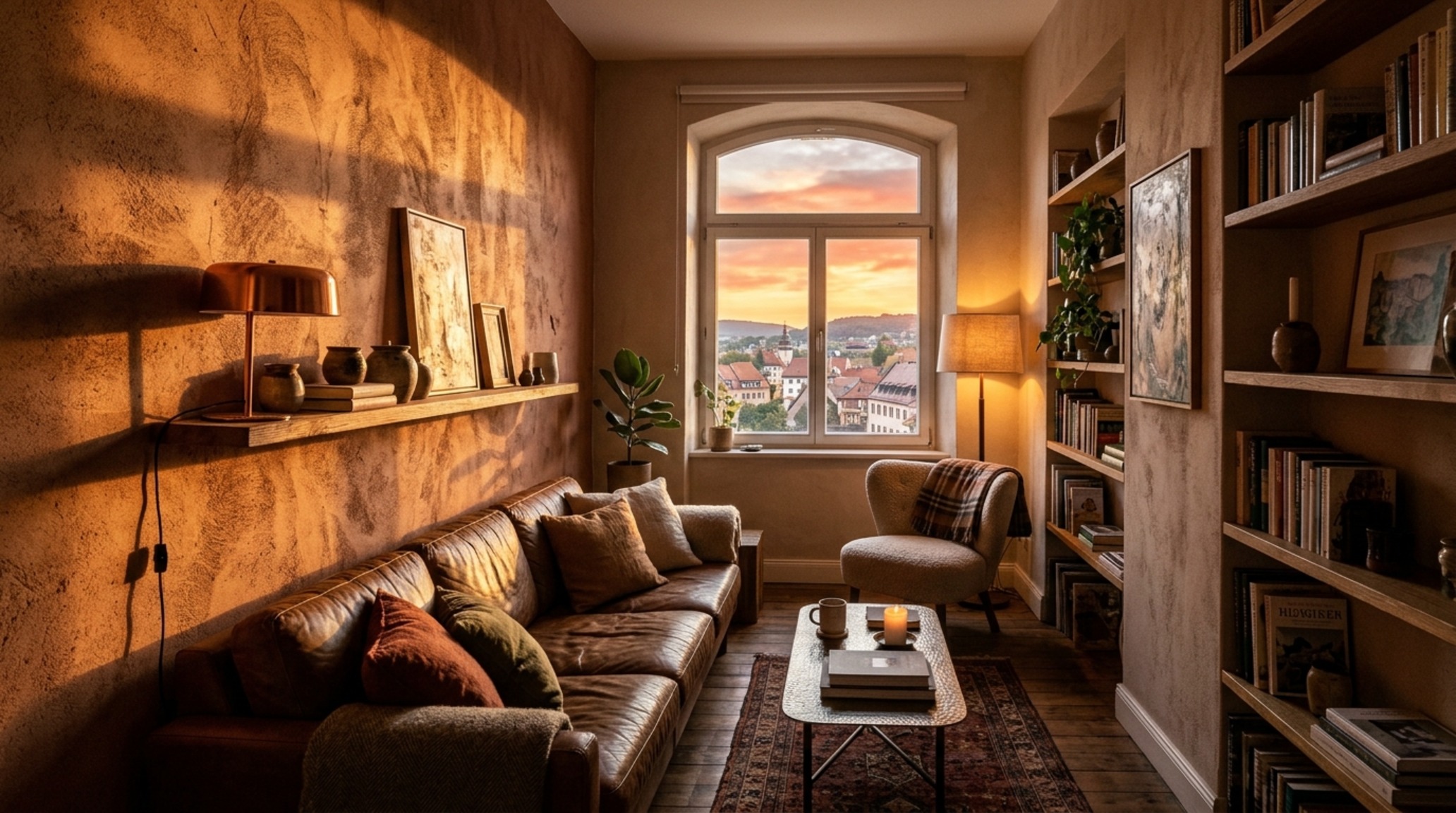
Curated Visual Lookbook
Design Gallery & Spatial Studies
A visual curation of architectural arrangements, lighting concepts, and material palettes featured in this space.