The Architect’s Palette: Where Texture Meets Tectonic Hue
The cold, velvet weight of honed Arabescato marble resting against the warmth of hand-applied lime wash creates a tension that is felt before it is seen; it is here, in this collision of texture, that we realize how color affects mood not as a superficial coating, but as a tectonic force. When we approach a floor plan, we aren’t just selecting swatches; we are manipulating the eye’s perception of height, depth, and volume. This is the geometry of hue—a discipline where color serves the structure, carving out quietude in a world of visual noise.
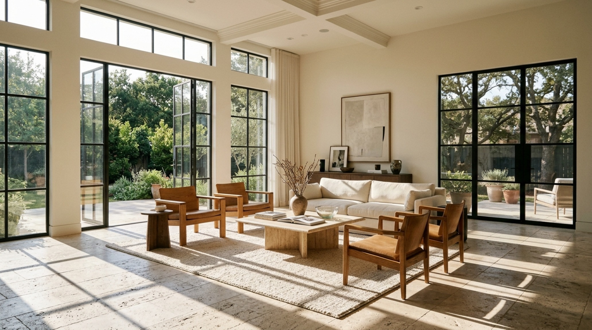
High-end interior design often ignores the ‘accent wall’ in favor of ‘color drenching’—the practice of applying a single, sophisticated tone across walls, trim, and ceilings. This radical color discipline removes visual friction. By neutralizing the transitions between planes, we allow the architectural silhouette to take center stage. For instance, using a low-chroma shade like Farrow & Ball’s Setting Plaster creates an atmospheric envelope that feels expansive rather than restrictive. It is about the interplay between light and volume, ensuring that every shadow becomes a deliberate design element rather than an accidental distraction.
Light Reflectance Value in Design: The Hidden Science of Expansion
To master spatial perception, one must understand Light Reflectance Value (LRV). Measured on a scale of 0 to 100, LRV determines how much light a color reflects. A common misconception is that all white paint expands a room. However, a high-LRV white in a room with North-facing light can often look muddy or gray. Instead, a designer might opt for a mid-LRV taupe to lean into the moodiness, creating a sense of cozy enclosure. When we understand how color affects mood through light return, we begin to treat paint as a light-modulating tool rather than a decorative choice.
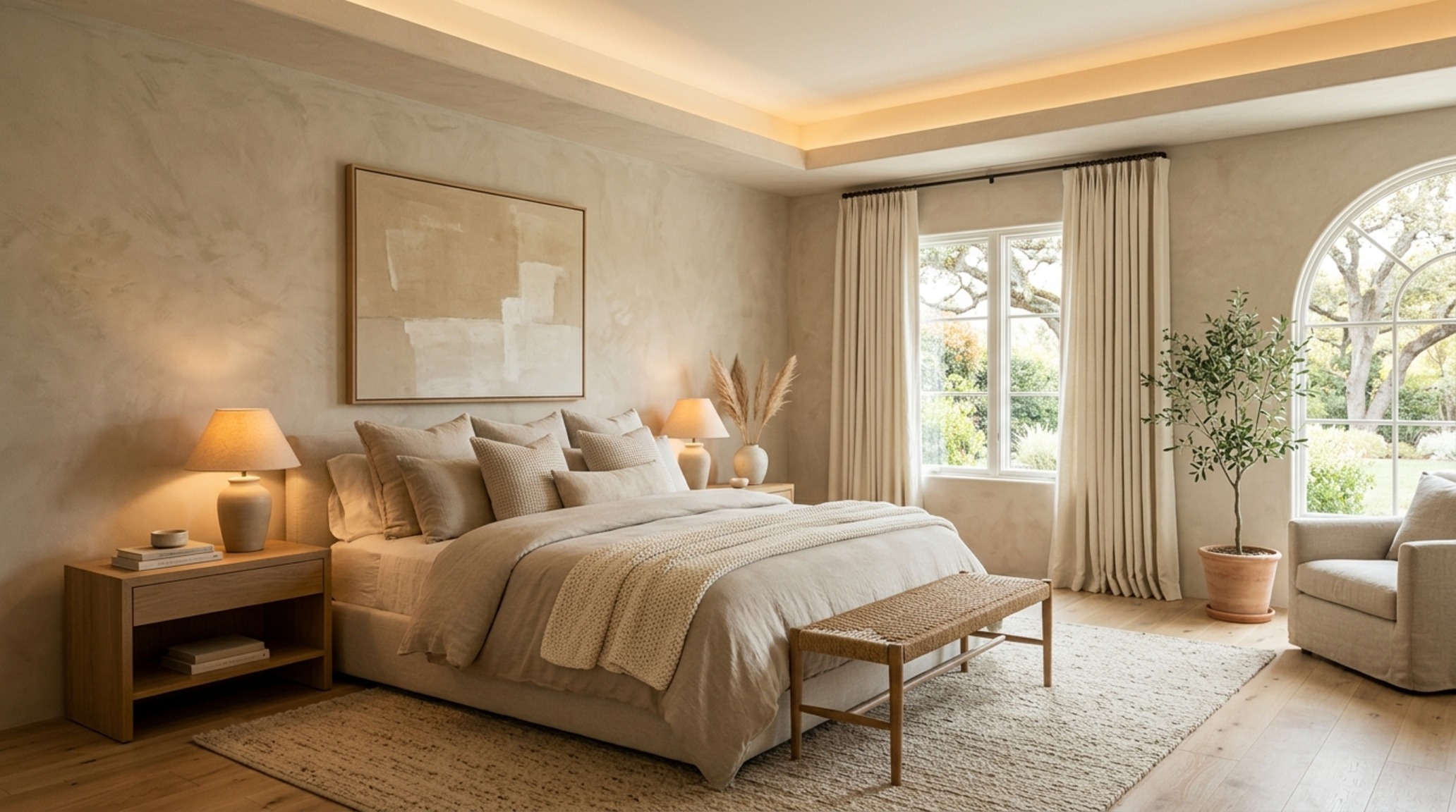
Consider a narrow hallway. By painting the end wall a deeper, more recessive tone like Benjamin Moore’s Hale Navy and keeping the side walls a luminous Swiss Coffee, the eye is drawn to the furthest point, effectively stretching the corridor. This is structural manipulation through pigment. The 36-inch standard walkway clearance feels more generous when the visual weight is balanced correctly. We are not just decorating; we are recalibrating the human experience of the built environment.
Psychology of Paint Colors and the Architecture of Depth
The psychology of paint colors extends far beyond the rudimentary ‘blue is calming’ trope. It is about the frequency of light and its impact on the autonomic nervous system. In spaces intended for high-level focus or deep relaxation, we utilize monochromatic layering to reduce cognitive load. When the floor, walls, and cabinetry share a similar value—though perhaps different textures—the brain ceases to map the boundaries of the room, leading to a state of ‘spatial serenity.’ This is where the 18-inch coffee table reach or the 30-inch dining chair clearance becomes part of a seamless flow rather than a series of obstacles.
“Color is not a finish; it is a structural component that defines the emotional boundaries of a home.”
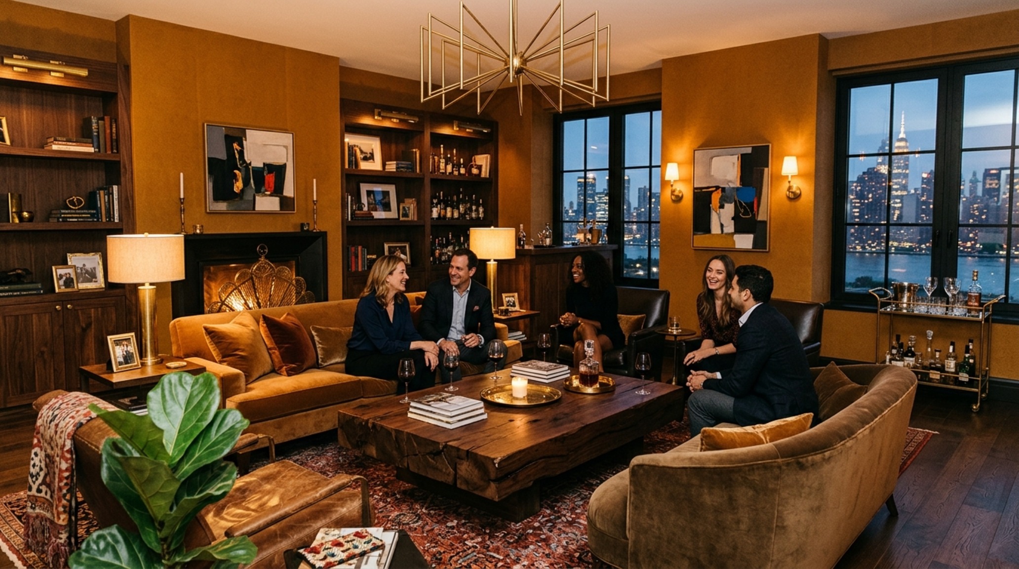
In a grand salon, the application of matte, mineral-based paints creates a soft-focus effect that softens hard 90-degree angles. By integrating 2700K warm ambient lighting with a high CRI of 90+, we can ensure that the selected pigments retain their integrity after sunset. The way color affects mood changes as the sun moves across the sky; a room that feels energizing at 10:00 AM must feel grounding at 8:00 PM. This requires a nuanced understanding of metamerism—how colors change under different light sources.
Neuro-interiorism Trends: Designing for the Subconscious
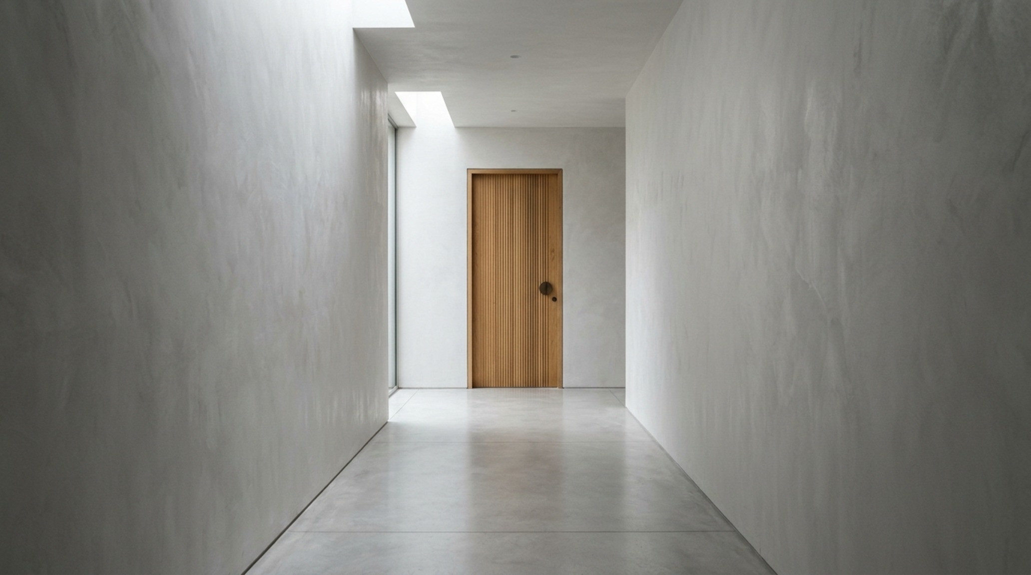
We are currently seeing a shift toward neuro-interiorism trends, where spaces are engineered to support specific neurological states. In the bedroom, we avoid high-contrast palettes that keep the brain in an ‘alert’ state. Instead, we look toward ‘hush’ tones—soft ochres, muted sages, and chalky grays. These are not merely aesthetic choices; they are biological imperatives. By reducing visual stimuli, we allow the parasympathetic nervous system to take over, facilitating deeper rest and psychological recovery.
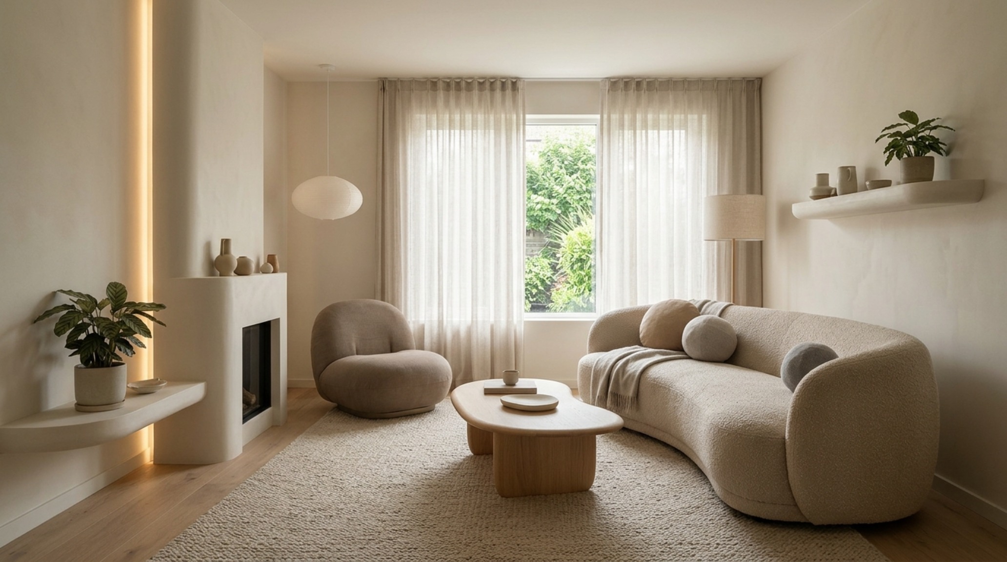
This structural approach also involves the concept of ‘negative space breathing room.’ A room should never feel over-saturated. Just as a gallery uses white space to highlight art, an architectural interior uses neutral transitions to highlight moments of material luxury, such as a fluted white oak vanity or a solid travertine hearth. In these moments, the way color affects mood is through its absence, allowing the tactile quality of the materials to speak.
Biophilic Design Palettes: Grounding the Vertical Plane
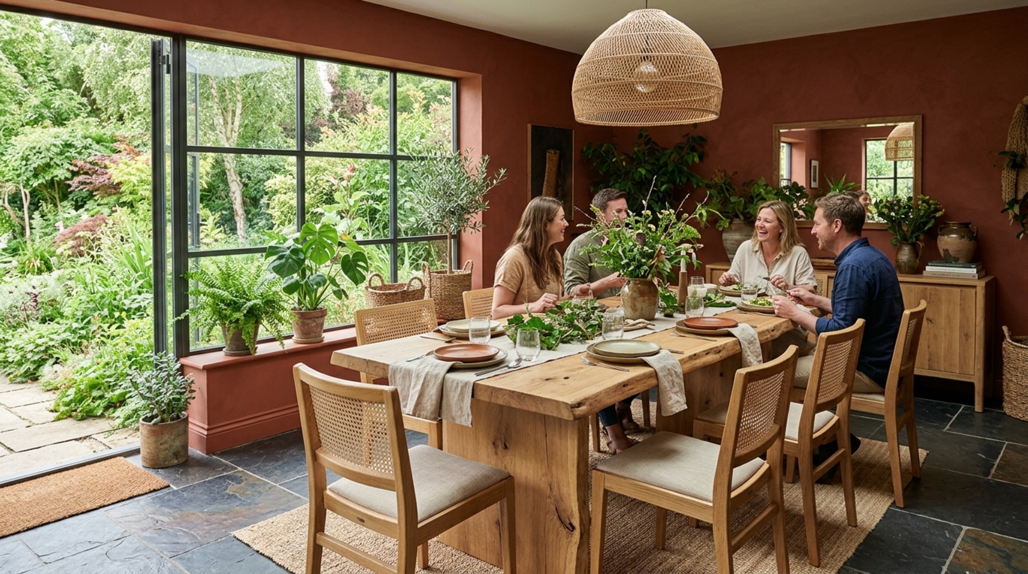
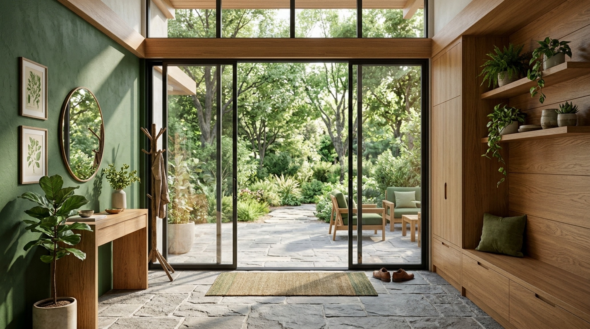
Integrating biophilic design palettes is perhaps the most effective way to unify a modern floor plan with its natural surroundings. This isn’t just about adding plants; it’s about using colors derived from the local geology and flora. A palette of slate, clay, and moss creates a visual bridge between the interior and the landscape. This connection is vital for urban dwellers, providing a sense of grounding that offsets the sterility of metropolitan living. When a room reflects the tones of the horizon, the walls seem to dissolve, and the color affects mood by providing a sense of primordial safety.
Color Zoning for Home Offices: The Geometry of Productivity
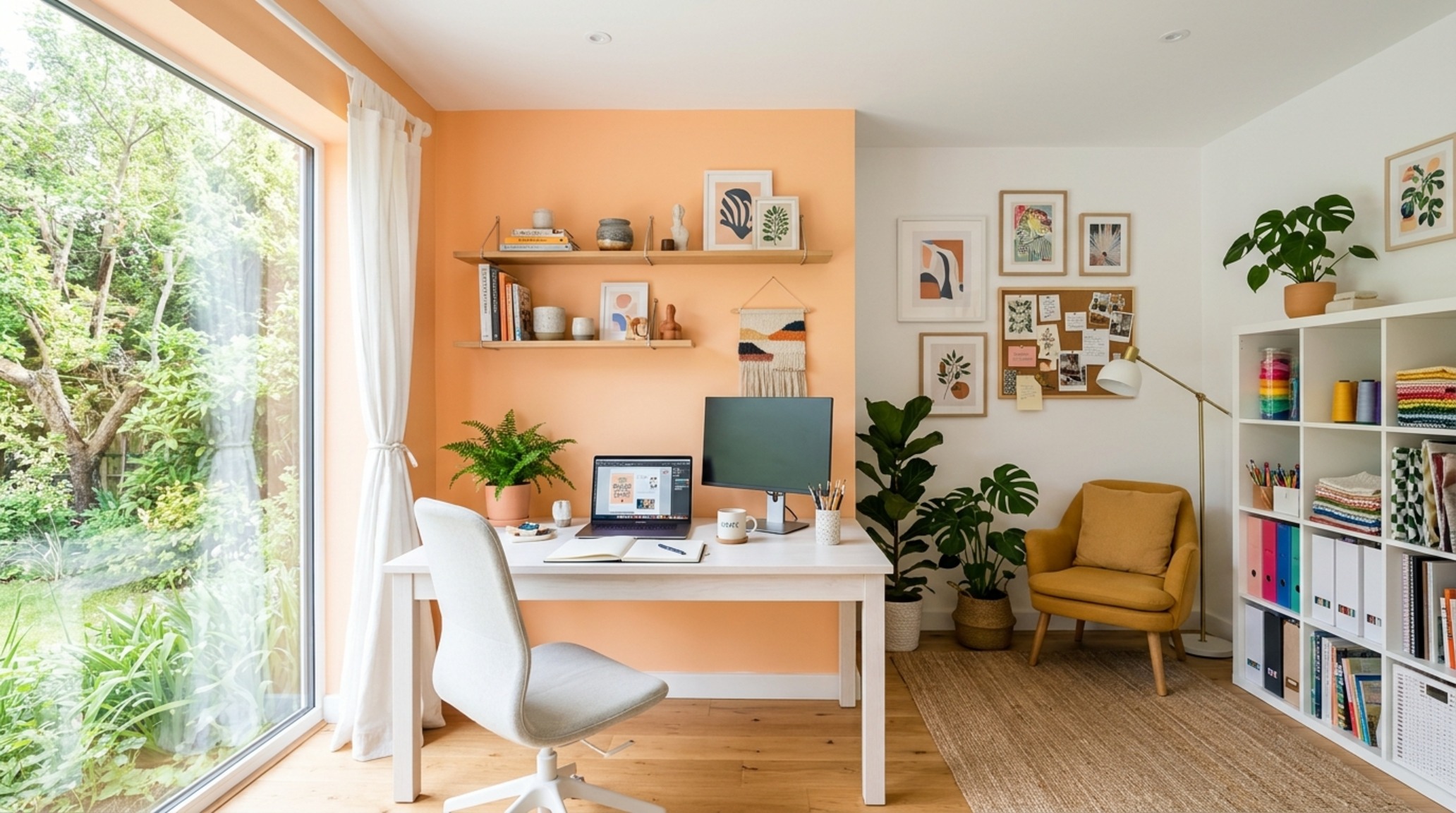
With the evolution of the hybrid home, color zoning for home offices has become a critical architectural strategy. We no longer rely on physical walls to define function; we use hue. A deep, forest green or a charcoal envelope in a designated work nook can create a ‘psychological container’ for deep work. This zone contrasts with the lighter, more airy tones of the living areas, signaling to the brain that it is time to transition from ‘production’ to ‘rest.’ This spatial cadence is essential for maintaining work-life boundaries in an open-concept environment.
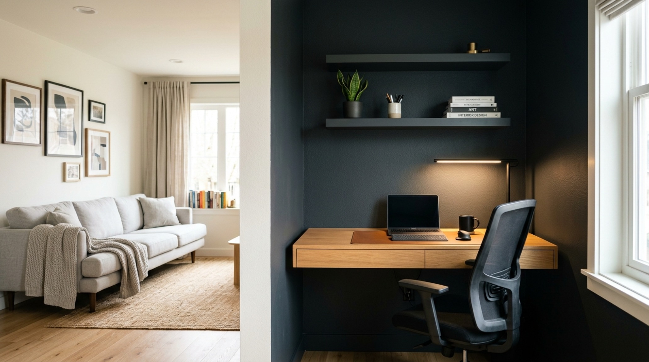
When implementing these zones, consider the sightline alignment. From the living room, does the office zone feel like a jarring intrusion or a sophisticated shadow? By selecting a color for the office that exists elsewhere in the home’s palette—perhaps as a textile or a piece of stone—you maintain a thread of continuity while achieving functional separation. It’s a delicate dance of color affects mood through contrast and harmony.
Emotional Effects of Room Colors: A Narrative of Restraint
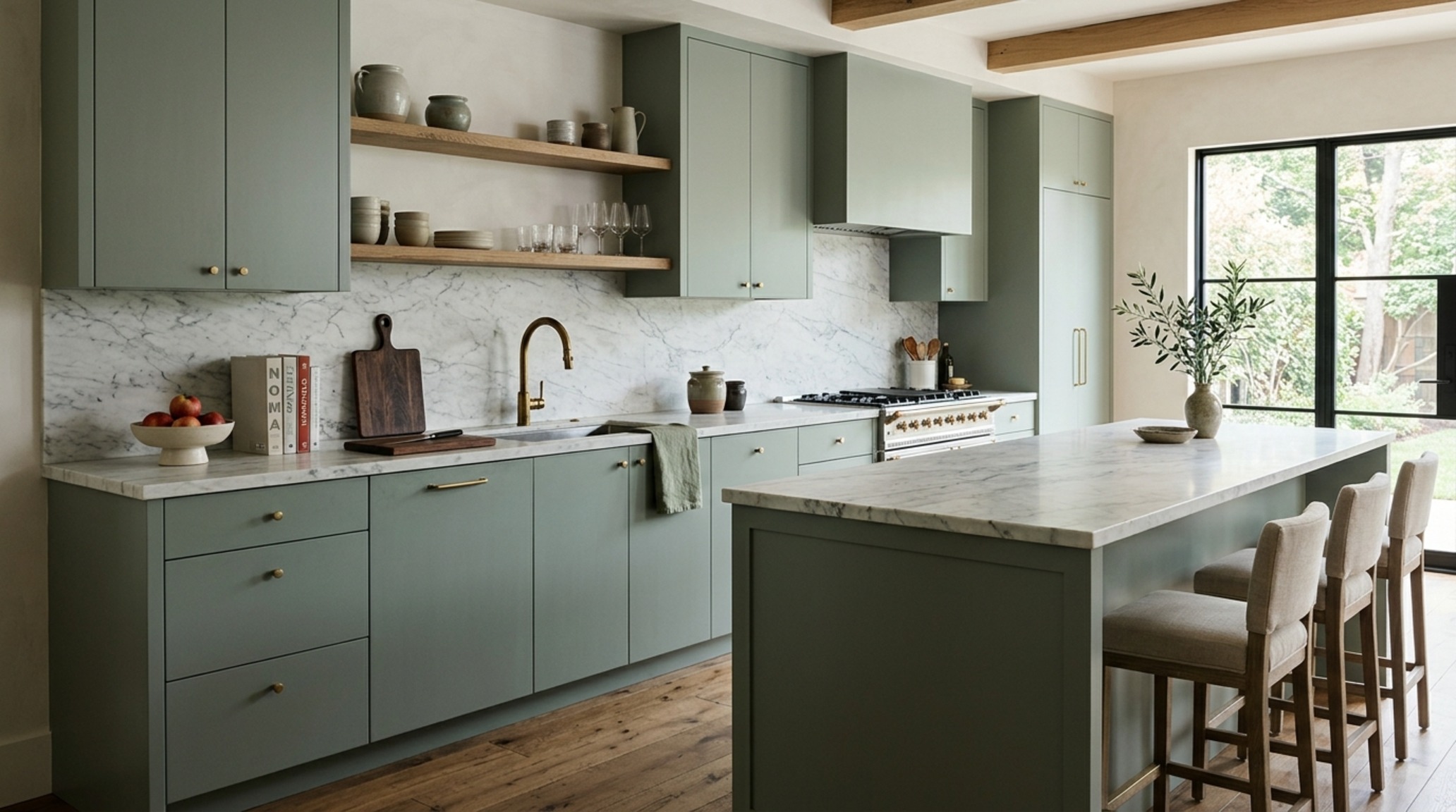
The emotional effects of room colors are most profound when they are least obvious. In a high-end kitchen, for instance, we might use a monochromatic palette of warm grays and off-whites. The subtle shift from a matte lacquer cabinet to a polished quartzite countertop provides just enough visual interest to prevent monotony without inducing stress. This is ‘quiet luxury’ in a literal sense—a space that hushes the senses. Here, color affects mood by creating an environment where the human presence is the most vibrant element in the room.
In the end, the goal is to create a home that feels like an extension of the self. Whether we are using high-LRV whites to pull in the morning sun or deep, saturated pigments to create a sanctuary of shadows, we are practicing an ancient art of shelter. We use the 30-inch dining clearance to ensure physical comfort, and we use the geometry of hue to ensure emotional resonance. The blueprint for immersive living is one where the structure and the surface are in perfect, silent alignment.
Materiality, Palette & Dimension Blueprint
Architectural breakdown detailing authentic surfaces, paint references, and standard circulation clearances.
As we look toward the future of residential design, the focus remains on the silent dialogue between light and shadow. The most successful spaces are those that don’t demand our attention but rather support our presence through a thoughtful application of volume and tone. By understanding how color affects mood through a structural lens, we transcend the fleeting nature of trends, creating homes that offer a timeless sense of architectural serenity and emotional clarity.
Editorial Silo • Recommended Architecture Studies
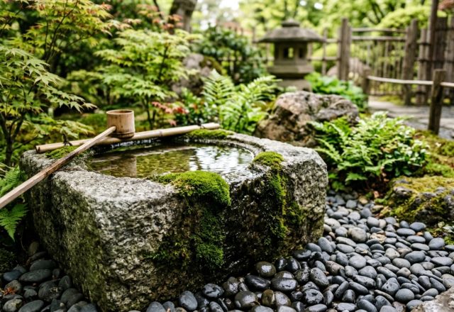
- The Geometry of Stillness: Architectural Directives for the Traditional Japanese Water Fountain — Archival Design Case Study
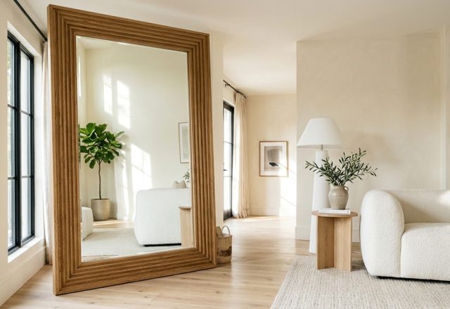
- The Luminous Gallery: Layering Materiality and Sensory Mood through Curated Mirror Decor Ideas — Archival Design Case Study
Design & Materiality Gallery
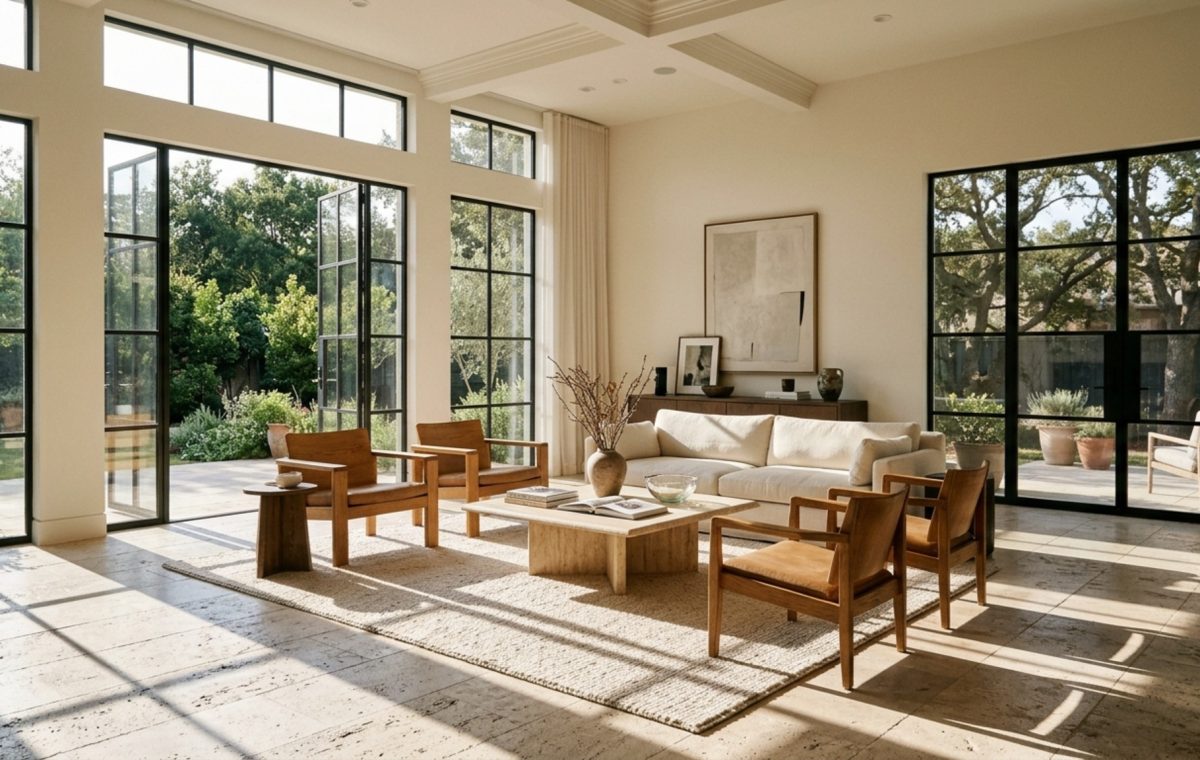
Curated spatial snapshots examining the quiet dialogue between architectural daylight and tactile surfaces.
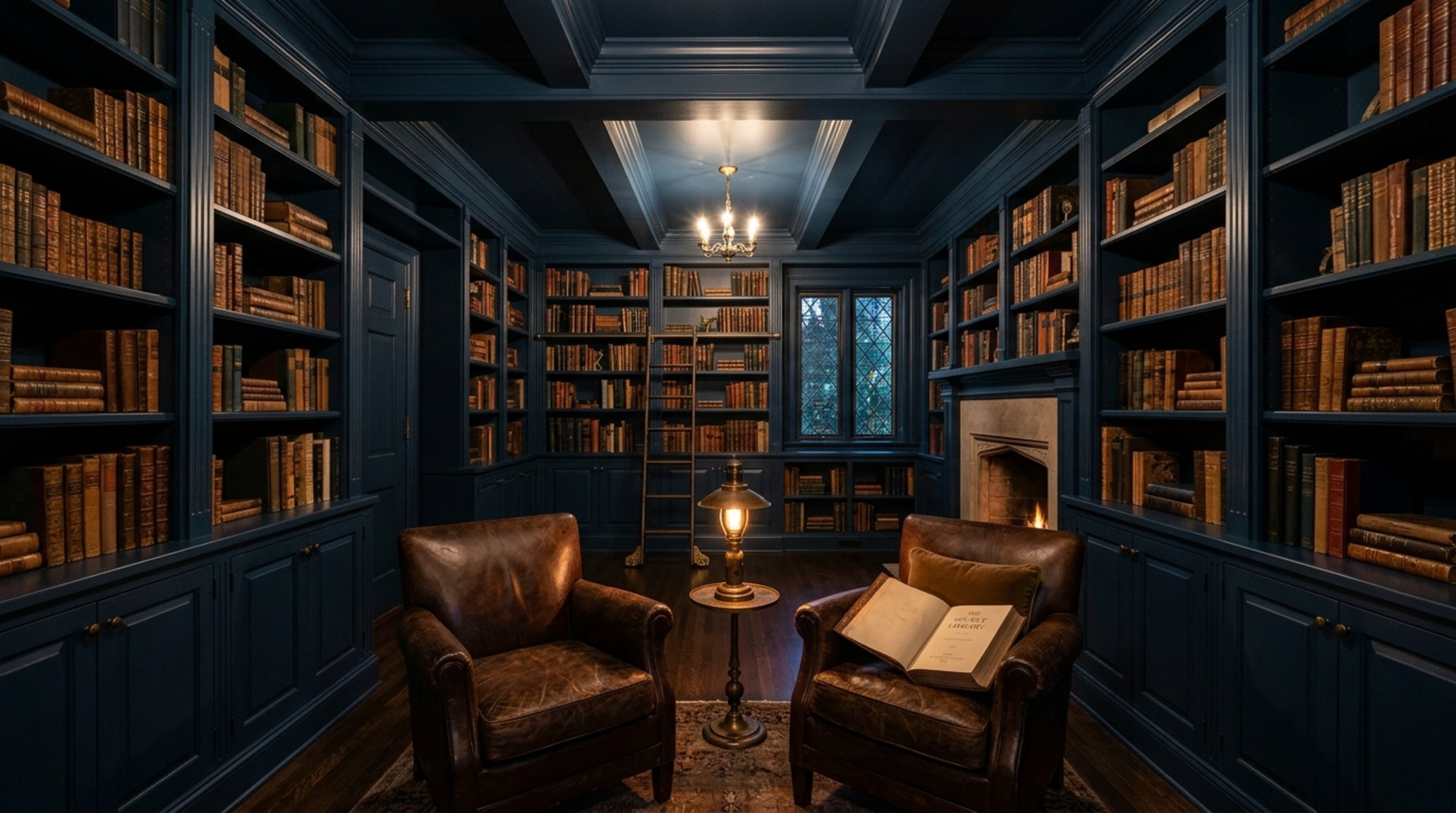
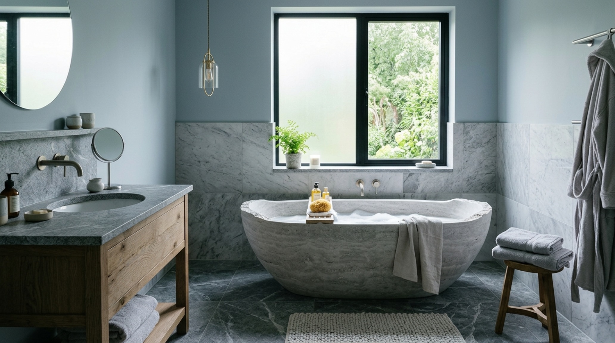
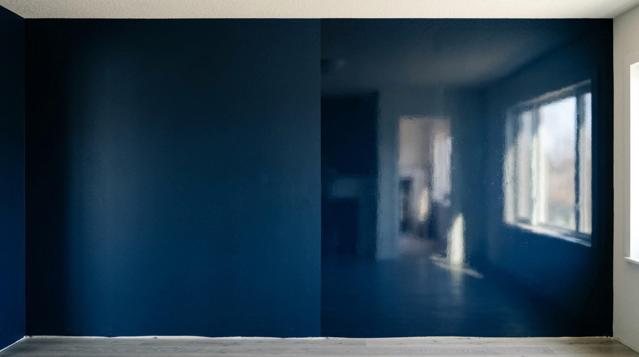
Curated Visual Lookbook
Design Gallery & Spatial Studies
A visual curation of architectural arrangements, lighting concepts, and material palettes featured in this space.