The Geometry of Ease: Beyond the Aesthetic Surface
There is a silent physics to a room that dictates how we feel before we even notice the color of the walls. It exists in the thirty-six inches of unobstructed breath between a kitchen island and a dining table, the effortless swing of a solid oak door, and the way a sightline carries your eye toward a window rather than a cluttered corner. When we approach design through the lens of a floor space planner, we aren’t just arranging furniture; we are choreographing the daily movements of our lives. Efficiency, in its truest form, is the ultimate modern luxury. It is the absence of friction. It is the ability to navigate a home in the dark without bumping a shin or snagging a sleeve, because the spatial cadence was calculated with surgical precision long before the first rug was rolled out.
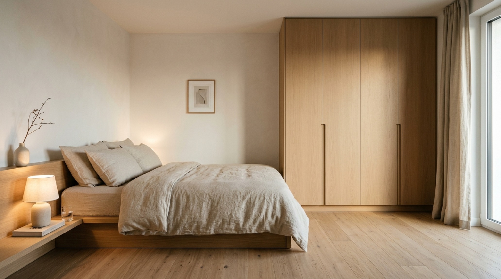
High-performance living is often born from constraint. In the era of the urban pied-à-terre and the sprawling yet segmented suburban estate, the challenge remains the same: how do we eliminate the ‘dead zones’ that eat into our usable square footage? We begin by acknowledging that a room is a three-dimensional puzzle where the floor is the foundation of the experience. By utilizing a floor space planner as a diagnostic tool, we can simulate the reality of a 10-by-12-foot bedroom, ensuring that the 30-inch clearance required for a dresser drawer to fully extend doesn’t clash with the footprint of a king-sized bed frame. It is this marriage of ergonomic data and sensory atmosphere that separates a house from a curated sanctuary.
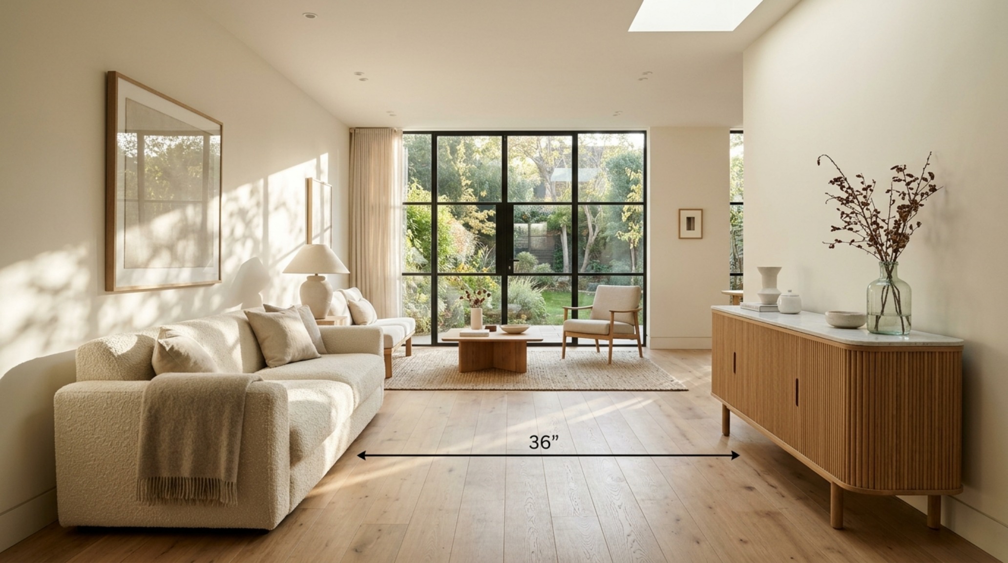
Architectural Spatial Flow: The Invisible Current
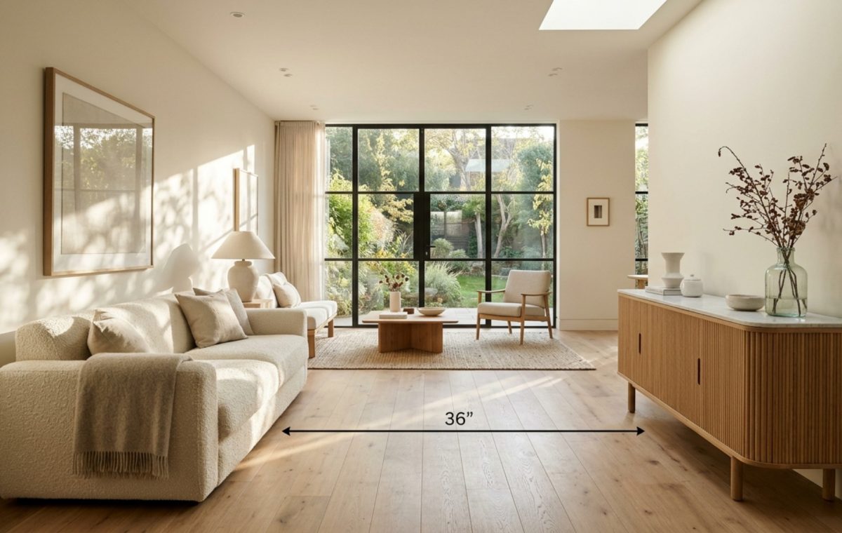
Movement is the most overlooked element in interior design. We often fall into the trap of ‘filling’ a room rather than ‘flowing’ through it. To achieve a sophisticated architectural spatial flow, one must respect the primary circulation paths. These are the highways of the home. A standard 36-inch walkway is the non-negotiable benchmark for comfort, allowing two people to pass or a single person to move with a sense of freedom. When these paths are squeezed to 30 inches or less, the home begins to feel claustrophobic, regardless of how high the ceilings may be or how expensive the Farrow & Ball Setting Plaster on the walls appears.
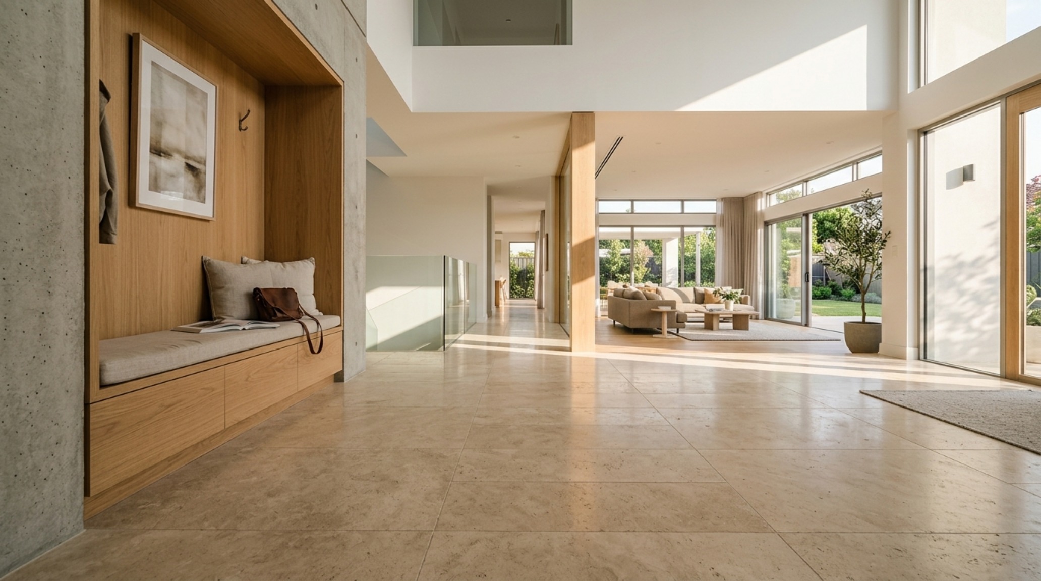
Consider the transition from a mudroom to a living area. This is a high-traffic zone that demands a ‘performance layout.’ Here, the floor space planner acts as a mediator between utility and elegance. We might specify a built-in bench that recedes into a niche, preserving the floor plane while providing a tactile grounding point. By aligning the edge of a rug with the architectural threshold of the room, we create a visual cue that signals a change in pace. This is where the psychology of space meets the reality of structural clearance. We aren’t just placing a bench; we are defining the rhythm of arrival.
Furniture Clearance Standards: The Math of Comfort
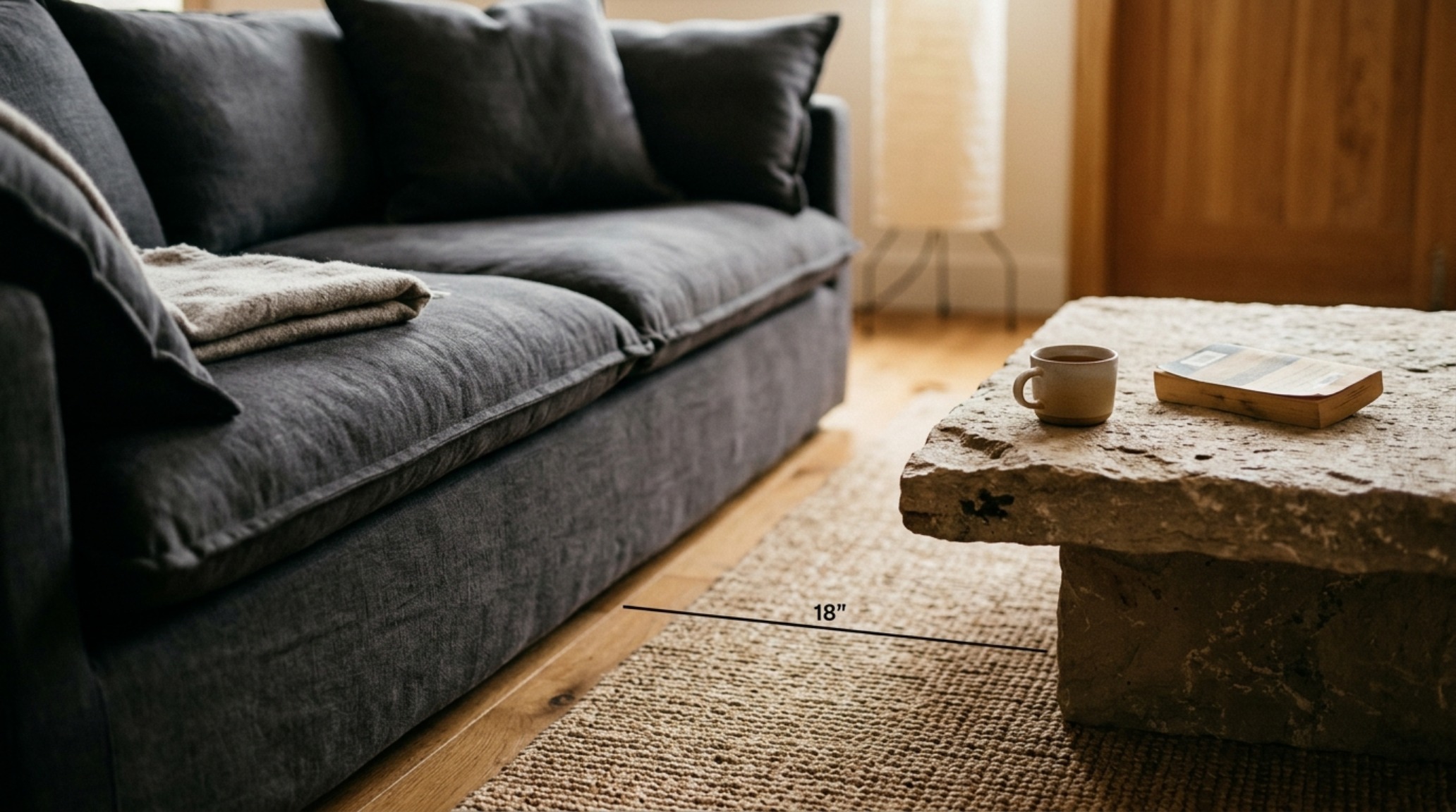
There is a specific, almost mathematical comfort in a well-proportioned seating group. To the uninitiated, it looks like a beautiful arrangement; to the designer, it is a masterclass in furniture clearance standards. The classic 18-inch distance between a sofa and a coffee table is the ‘reach’—it is the distance that allows a guest to set down a glass of wine without leaning uncomfortably forward, yet provides enough room for legs to stretch out. In a floor space planner, these dimensions are the ‘ghost lines’ that ensure a layout functions as well as it looks.
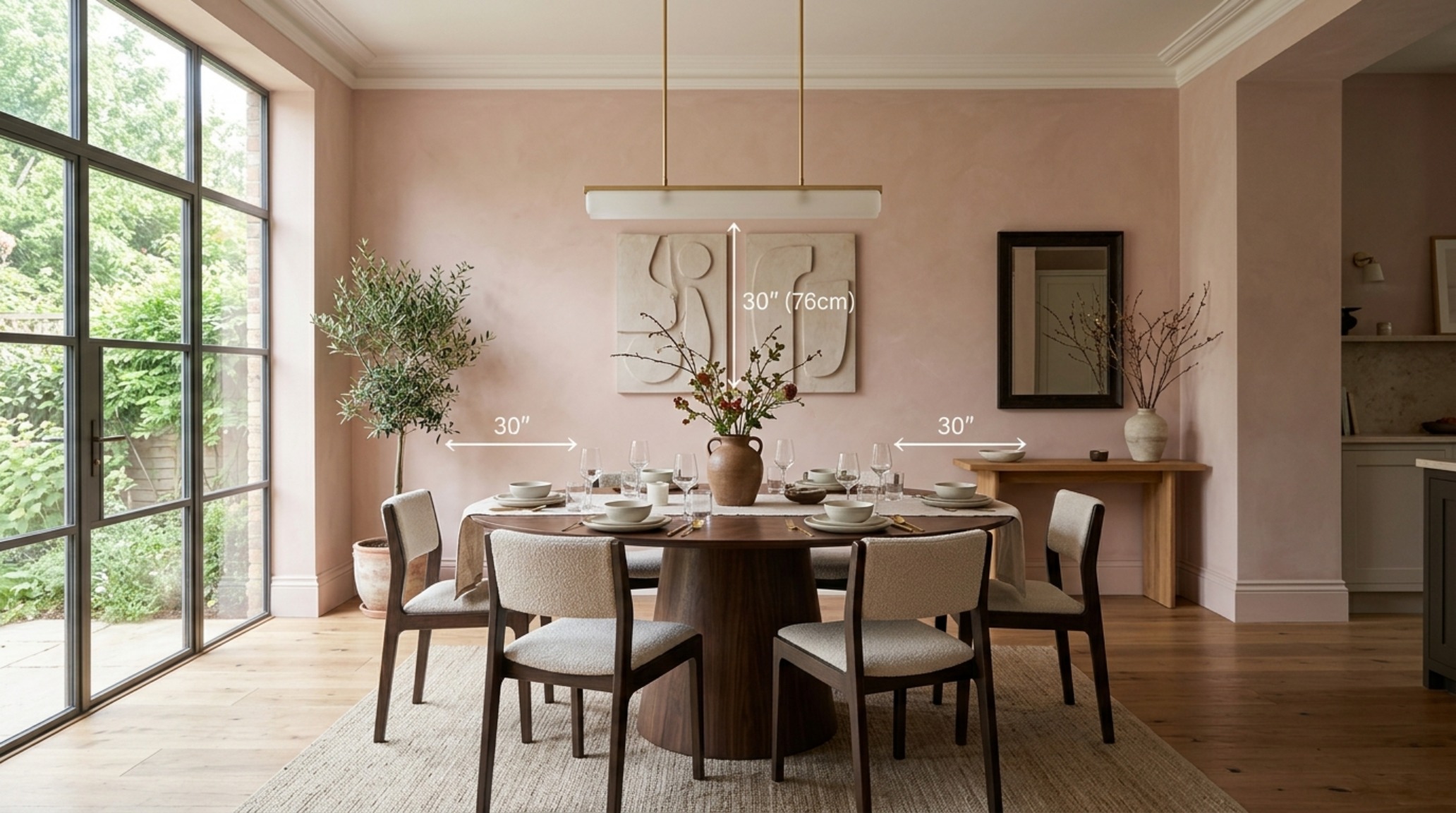
Dining areas present their own set of ergonomic hurdles. We require 30 to 36 inches of clearance behind a dining chair to allow someone to rise and depart the table without disrupting the person next to them or hitting a sideboard. In compact dining nooks, we often pivot to ‘spatial economy’ tactics, such as choosing a pedestal table over one with four legs to clear up the floor plane and reduce visual noise. When we layer in lighting—perhaps a minimalist linear pendant hung exactly 30 inches above the tabletop—the height-to-width ratio becomes a part of the ergonomic equation, framing the activity below without obstructing the sightline across the room.
Refining the Narrative: A Floor Space Planner in Practice
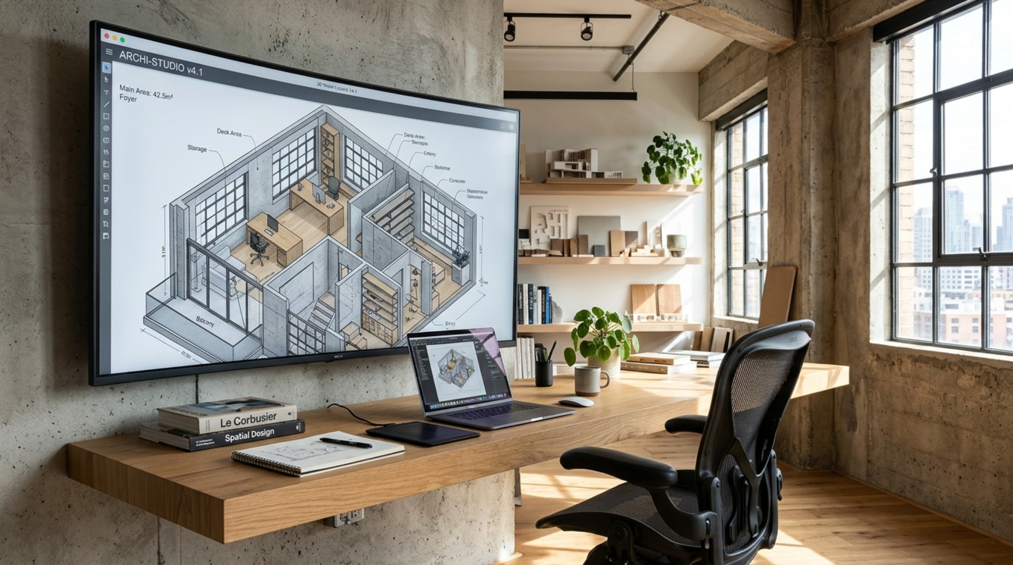
The transition from a 2D sketch to a 3D reality is where many designs lose their soul. This is why the modern floor space planner has become an essential companion for the resident who refuses to compromise. By testing the ‘negative space’—the empty areas around our furniture—we can ensure the room has enough ‘breathing room’ to feel airy. Negative space is not wasted space; it is the silence in the music that makes the notes stand out. It is the area where sunlight, perhaps bouncing off a wall in Benjamin Moore Swiss Coffee, can settle and expand the visual volume of the room.
Open Concept Floor Planning and the Art of Zoning
The challenge of the great room is its lack of definition. Without walls, how do we create intimacy? The answer lies in open concept floor planning that utilizes furniture as architecture. We use the ‘performance layout’ to create rooms within rooms. A large-scale sectional sofa doesn’t just provide seating; its back acts as a low-profile wall that separates the lounging zone from the dining zone. By using a floor space planner to position these ‘anchors,’ we can maintain 36-inch clearances around the perimeter, ensuring the open feel is preserved while the function is localized.
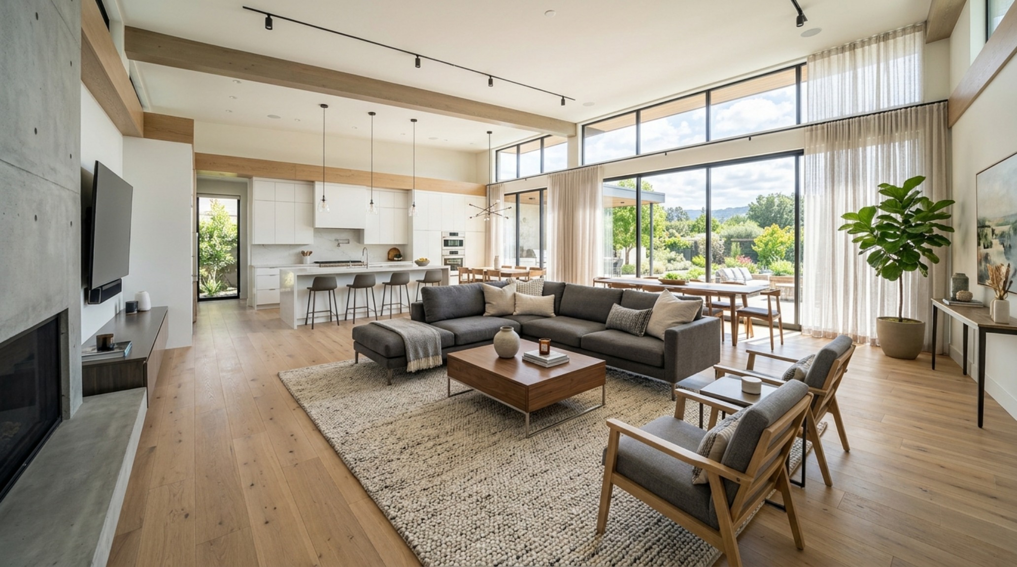
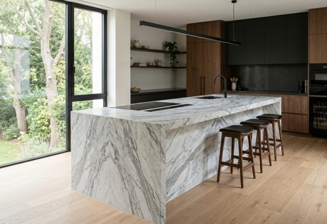
Texture plays a vital role here. A low-pile wool rug can define a conversation area, while a shift to honed travertine tile might signal the start of the kitchen. These material transitions are the subtle ‘texture mapping’ that guides the eye. We look for a high CRI 90+ lighting strategy to further define these zones—3000K task lighting over the marble island for precision, shifting to a 2700K warm ambient glow in the seating area to invite relaxation. The floor plan is the map, but the lighting and materials are the landscape.
Small Space Ergonomic Design: Maximum Utility, Minimal Footprint
In the constraints of a smaller footprint, every inch is a battleground. Small space ergonomic design is about the ‘Swiss Army Knife’ approach to interiors. We might integrate floating vanities in a bathroom to expose more of the floor, which trick the eye into perceiving a larger space. A floor space planner helps us visualize these ‘sightline paths’—ensuring that when you stand at the doorway, your view isn’t blocked by a heavy, floor-bound cabinet. Instead, the floor extends beneath the vanity, creating a sense of weightlessness.
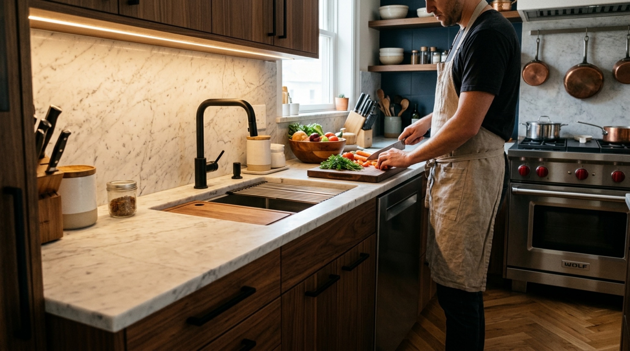
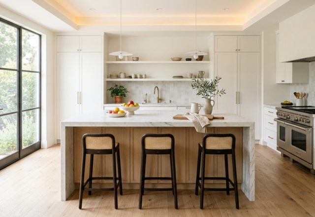
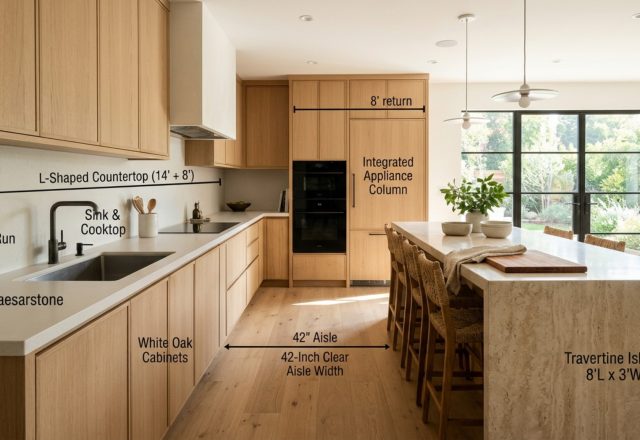
We also look at the ‘working triangle’ in the kitchen, but with a modern twist. In a high-performance compact kitchen, we might prioritize plumbing clearance for a deep, single-basin workstation sink that allows for food prep and cleanup in the same footprint. By utilizing vertical storage and ensuring that upper cabinets are placed 18 inches above the counter, we maintain the ergonomic ‘golden ratio’ that makes a small kitchen feel like a professional chef’s suite. The goal is always to reduce the number of steps taken to perform a task, turning the kitchen into a hub of effortless motion.
3D Room Layout Software as a Creative Catalyst
The leap from imagination to execution is shortened by 3D room layout software. It allows us to experiment with ‘shadow play’ and light penetration before a single piece of hardware is installed. We can see how a 9-foot ceiling interacts with a 7-foot doorway, or how a dark, Slate Charcoal accent wall might absorb the natural light from a south-facing window. This iterative process is the hallmark of the precision-driven designer. It allows us to fail in the digital space so we can succeed in the physical one, ensuring that the floor space planner we use is a bridge to a better reality.
Materiality remains the final layer of this ergonomic puzzle. We aren’t just choosing a finish; we are choosing a tactile experience. Fluted white oak adds a vertical rhythm that can make a low ceiling feel taller. Honed stone provides a cool, grounding touch underfoot. When these materials are aligned with a precise layout, the home feels intentional. It feels like every choice was made with your well-being in mind, which is the ultimate goal of high-performance living.
Interior Finish & Color Index
Architectural summary of tactile material selections, lighting specifications, and spatial ergonomics.
Design is a living, breathing discipline. It evolves as we do, adapting to our changing needs for sanctuary and productivity. By grounding our aesthetic aspirations in the firm reality of ergonomic clearances and thoughtful circulation, we create spaces that do more than just look beautiful in a photograph—they support the very rhythm of our existence. A masterfully applied floor space planner methodology ensures that every corner is an opportunity, every path is a pleasure, and every room is a definitive expression of spatial intelligence.
Editorial Silo • Recommended Architecture Studies
- The Tactile Aesthetic of Design Your Kitchen Layout: Materials, Moods & Lighting Kelvin — Archival Design Case Study
- The Social Spine: L Shaped Kitchen Floor Plans & Why L-Shaped Kitchen Floor Plans are the Anchor of Modern Open-Concept Living — Archival Design Case Study
Design & Materiality Gallery
Visual documentation of honest materials, natural ambient lighting, and refined architectural balance.
Curated Visual Lookbook
Design Gallery & Spatial Studies
A visual curation of architectural arrangements, lighting concepts, and material palettes featured in this space.