There is a persistent myth in the design world that square footage is the primary currency of luxury. We are taught to believe that grandeur requires vast, sweeping halls and cavernous ceilings. However, as an architectural journalist, I’ve found that the most profound design revelations often occur within the tightest constraints. Designing with modern furniture small spaces isn’t about compromise; it is an exercise in surgical precision. It is about the ‘architecture of the edit.’ When we strip away the superfluous, every silhouette, every shadow, and every material must justify its existence within the spatial cadence of the home.
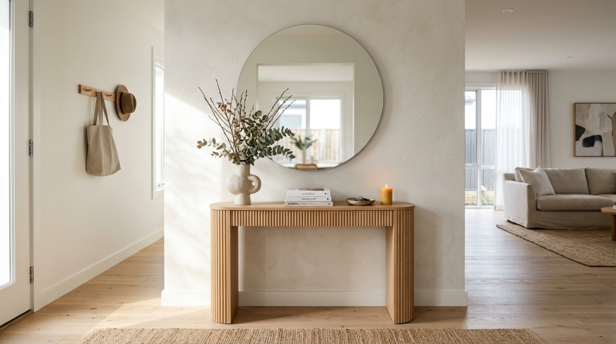
The true secret to elevated compact living lies in the mastery of sightlines. When you walk into a room, your eye shouldn’t hit a wall of heavy upholstery. Instead, it should travel through the space, finding moments of repose and visual breath. This is where the architectural blueprint comes into play. By prioritizing pieces with a ‘leggy’ profile or transparent materiality—think acrylic, glass, or slender steel frames—we allow the floor plane to remain visible. In the world of modern furniture small spaces, the more floor you can see, the larger the room feels. It is a psychological sleight of hand rooted in structural reality.
The Architectural Skeleton: Navigating Sightlines and Thresholds
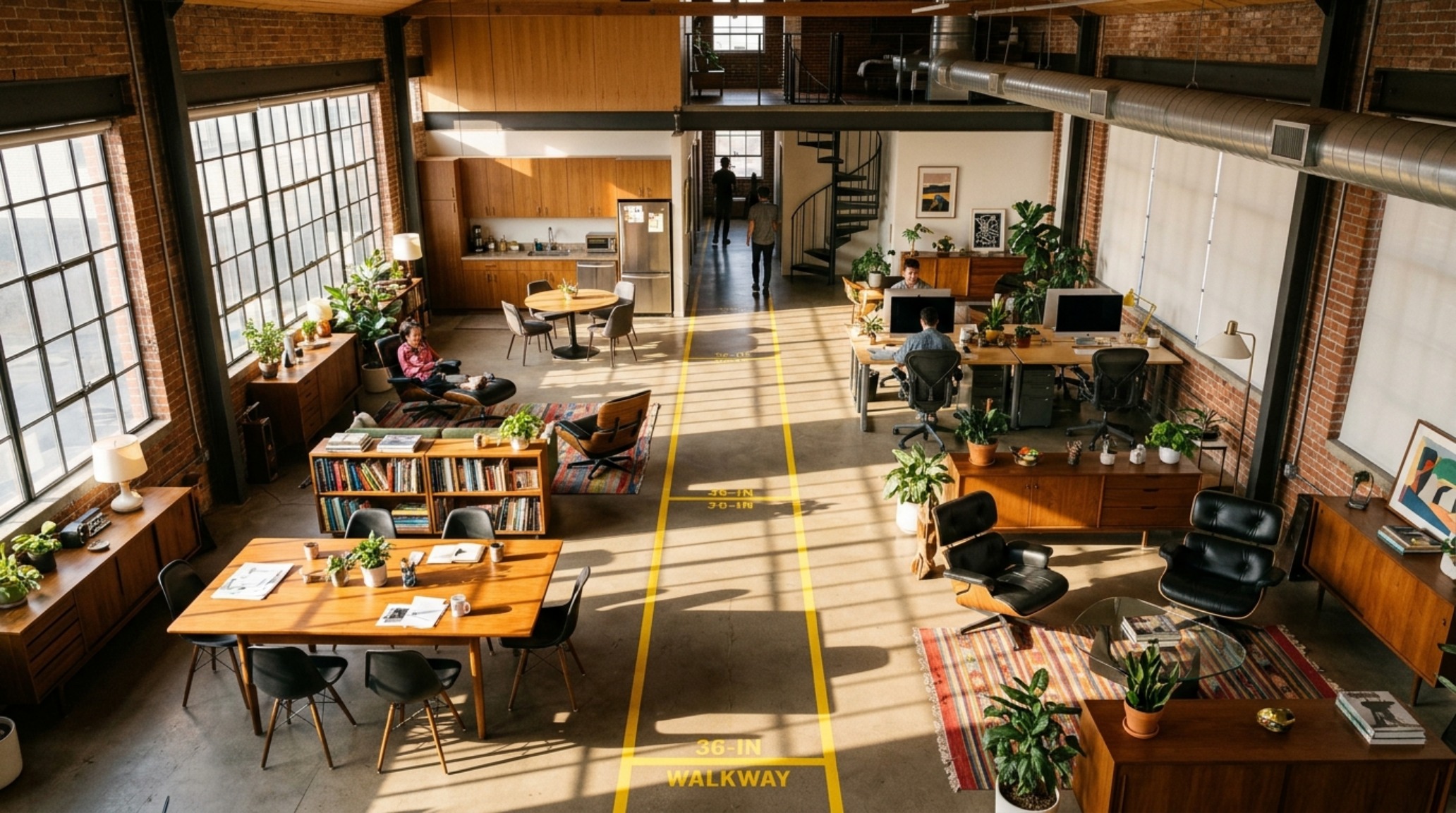
In a restricted floor plan, every inch is a precious commodity. Architects often speak of ‘circulation’—the paths we take to move from one zone to another. In a small footprint, these paths must be sacrosanct. A standard 36-inch primary circulation path is the gold standard, but in a compact urban loft, we can sometimes shave this down to 30 inches if the sightlines are clear. However, go any tighter, and the space begins to feel like a corridor rather than a sanctuary.
Consider the relationship between your seating and your storage. A common mistake is pushing every piece of furniture against the walls in a desperate attempt to create a central void. This actually emphasizes the room’s boundaries, making it feel boxed in. Instead, pull your sofa just six inches away from the wall. This creates a pocket of negative space that suggests the room extends further than it actually does. Use a low-profile sofa—something with a height of around 30 inches—to keep the vertical volume open. This allows the wall treatments, perhaps a soft wash of Benjamin Moore Swiss Coffee or a tactile limewash, to breathe.
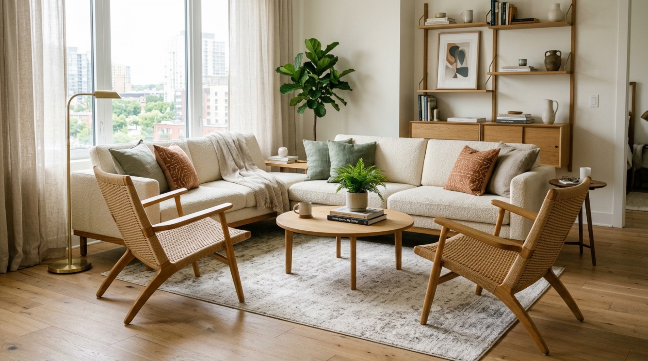
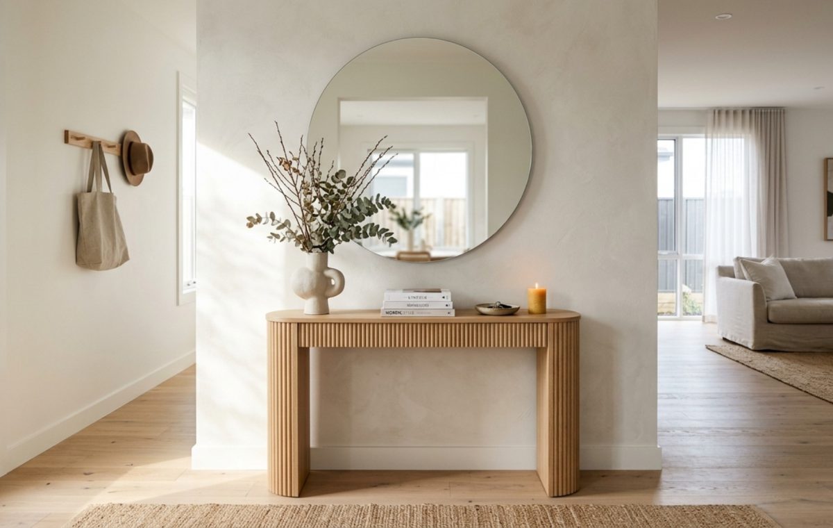
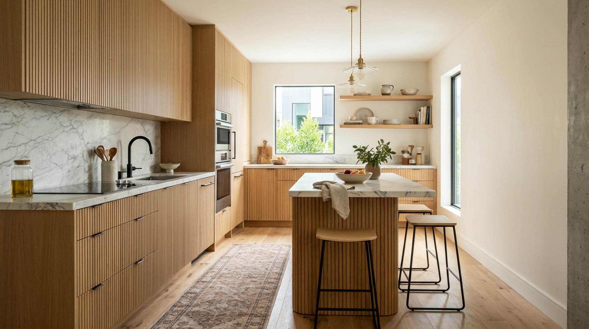
When selecting modern furniture small spaces, the silhouette is your most powerful tool. Avoid ‘skirted’ furniture which acts as a visual anchor, dragging the eye downward. Instead, opt for pieces on tapered legs or plinth bases that create a sense of levitation. A mid-century inspired sideboard in fluted white oak, for instance, provides essential storage while its vertical graining draws the eye upward, celebrating the height of the room rather than lamenting its width.
The Core Principles of Modern Furniture Small Spaces Layout
Layout is the silent director of our daily rituals. In a small home, furniture must be hard-working and multi-functional without looking utilitarian. The ‘nesting’ concept is a classic for a reason; a set of nesting tables in honed travertine and blackened steel can serve as a single sculptural element or be deployed as individual surfaces when entertaining. The ergonomic reach is also vital here. Ensure your coffee table is exactly 18 inches from the sofa edge—close enough for a drink, far enough to permit easy movement.
Ergonomics and the Art of the Reach
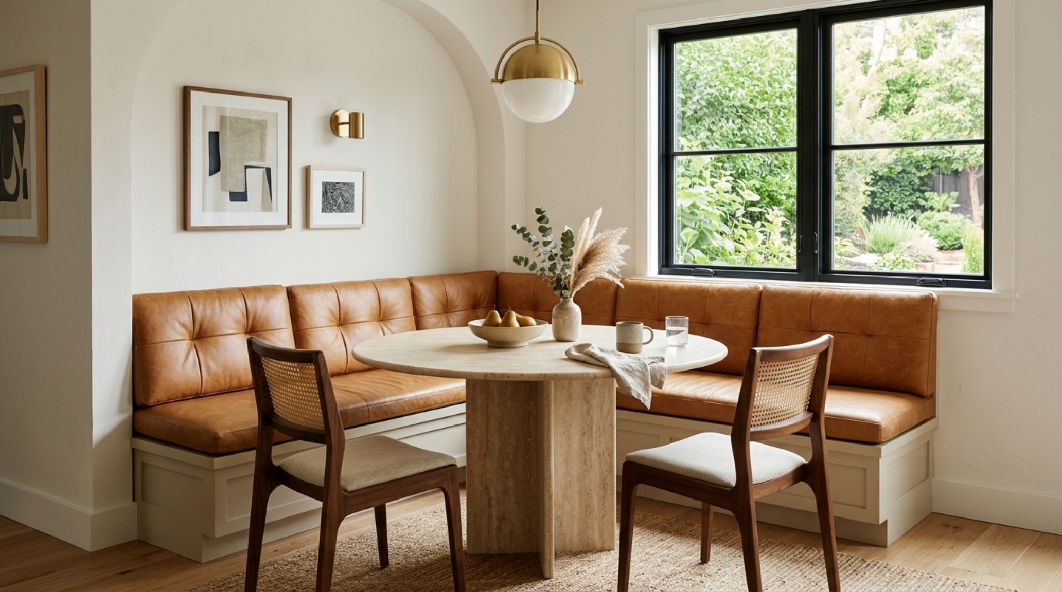
We often forget that furniture is a tool for the body. In modern furniture small spaces ergonomics, every piece must be scaled to the human form. A dining chair requires at least 30 inches of clearance behind it to allow someone to sit and rise comfortably. If you’re working with a tight dining nook, consider a built-in banquette. This utilizes the perimeter of the room efficiently and allows for a pedestal table, which eliminates the ‘leg forest’ that often clutters small dining areas.
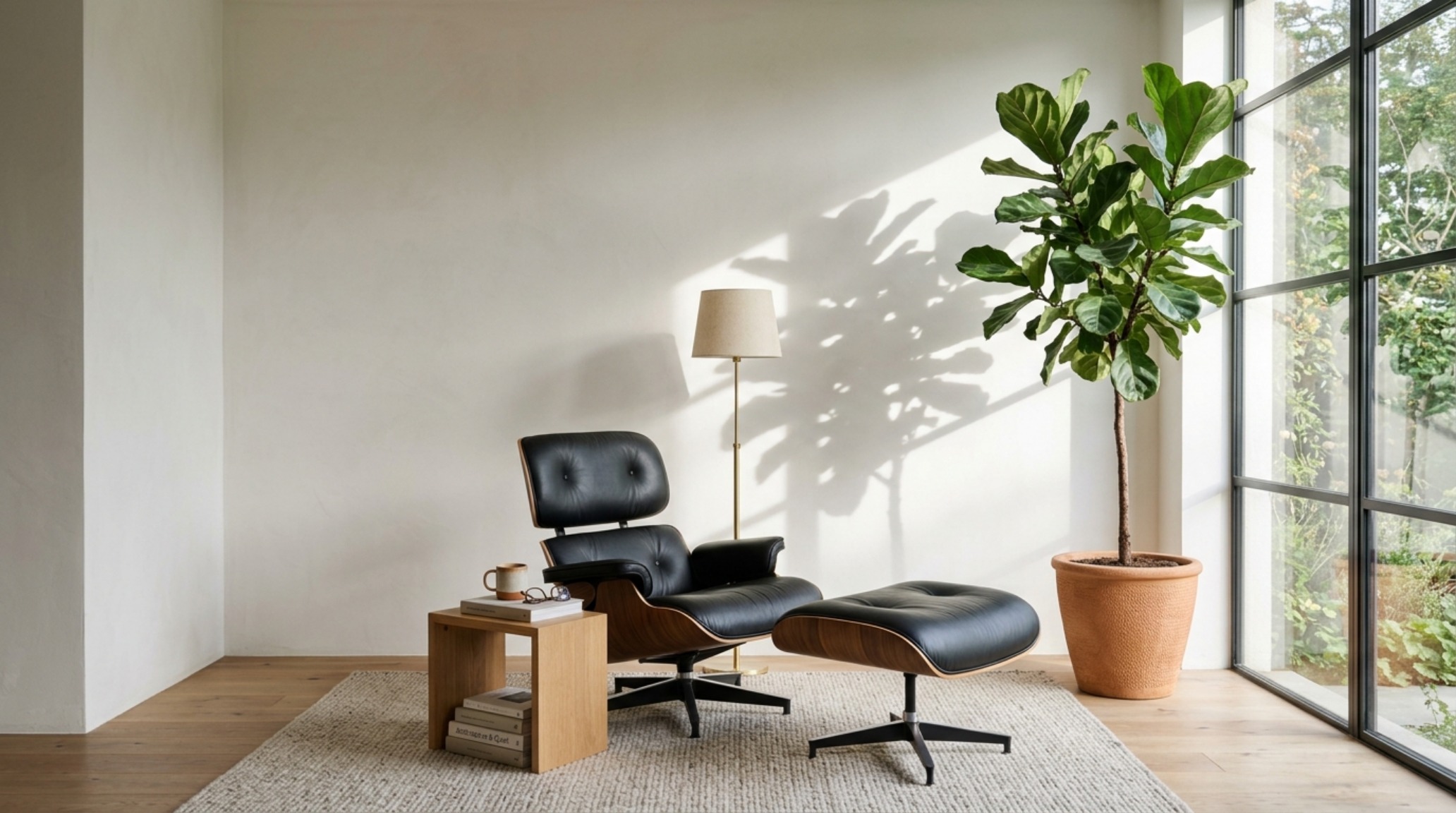
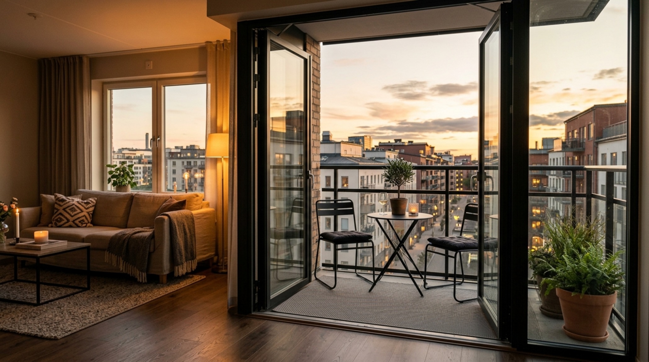
Lighting is the invisible architect. In a compact environment, a single overhead light source is a disaster; it flattens the room and creates harsh shadows. Instead, we layer. Start with an ambient base of 2700K warm light to mimic the golden hour. Then, add task lighting—perhaps a slender, articulated floor lamp in brushed brass—that illuminates a specific corner without consuming visual volume. High CRI (Color Rendering Index) ratings of 90+ are non-negotiable; you want your textures, from the nubby wool of a rug to the cool grain of a marble plinth, to register with absolute clarity.
Materiality and the Tactile Grounding of Compact Living
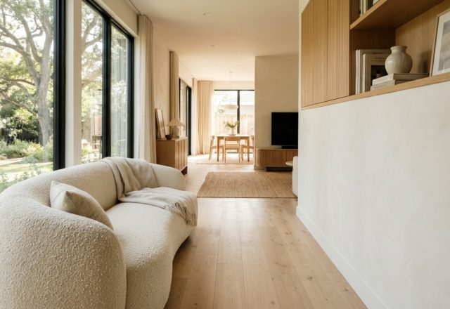
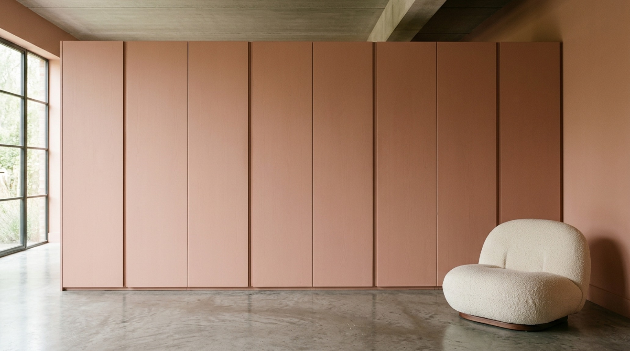
Small spaces demand a high level of materiality. When you are constantly in close proximity to your belongings, the quality of the finish becomes paramount. This is where luxury modern furniture small spaces textures come into play. Contrast is your friend. Pair a sleek, cold material like a honed Grigio Carnico marble table with the warmth of a bouclé chair. The tension between the smooth and the textured creates depth, preventing the room from feeling like a sterile box.
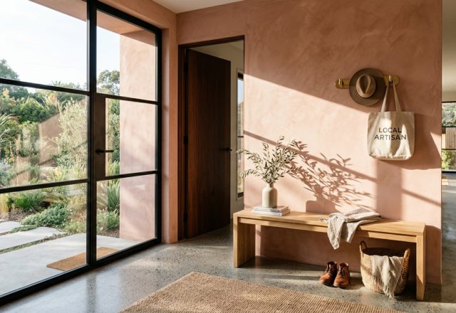
Color palettes in modern furniture small spaces architecture should be tonal rather than monochromatic. A monochromatic room can feel flat, but a tonal one—using varying shades of mushroom, clay, and sand—creates a sense of soft enclosure. Use a darker hue, such as Farrow & Ball Setting Plaster, on the ceiling to create a ‘cocoon’ effect, or keep the walls light and use the furniture as the primary color blocks. This shifts the focus from the walls to the objects within them, making the boundaries of the room less noticeable.
Luminous Volume: A Modern Furniture Small Spaces Lighting Guide
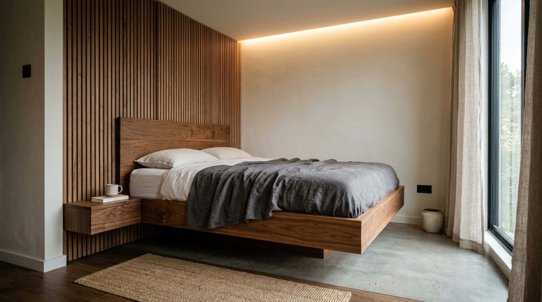
Beyond the bulb, consider how light interacts with surfaces. Reflective materials are often recommended for small spaces, but there is a fine line between ‘bright’ and ‘glaring.’ Instead of high-gloss mirrors, look for aged pewter or smoked glass. These provide a soft reflection that doubles the depth of the room without the harshness of a standard mirror. In a modern furniture small spaces lighting guide, we prioritize ‘up-lighting’ to highlight the architecture. A small floor can can be tucked behind a large plant, casting dramatic shadows on the ceiling and drawing the eye to the highest point in the room.
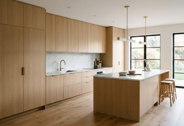
Storage should be integrated, not appended. The most successful small-scale interiors use ‘invisible’ storage—floor-to-ceiling cabinetry that mimics the wall surface. When the storage becomes the architecture, the furniture is free to be purely aesthetic. A single, iconic lounge chair becomes a focal point when it isn’t competing with a cluttered bookshelf. This is the essence of the ‘curated vignette’: selecting one or two high-impact pieces and allowing them the space to exist as art.
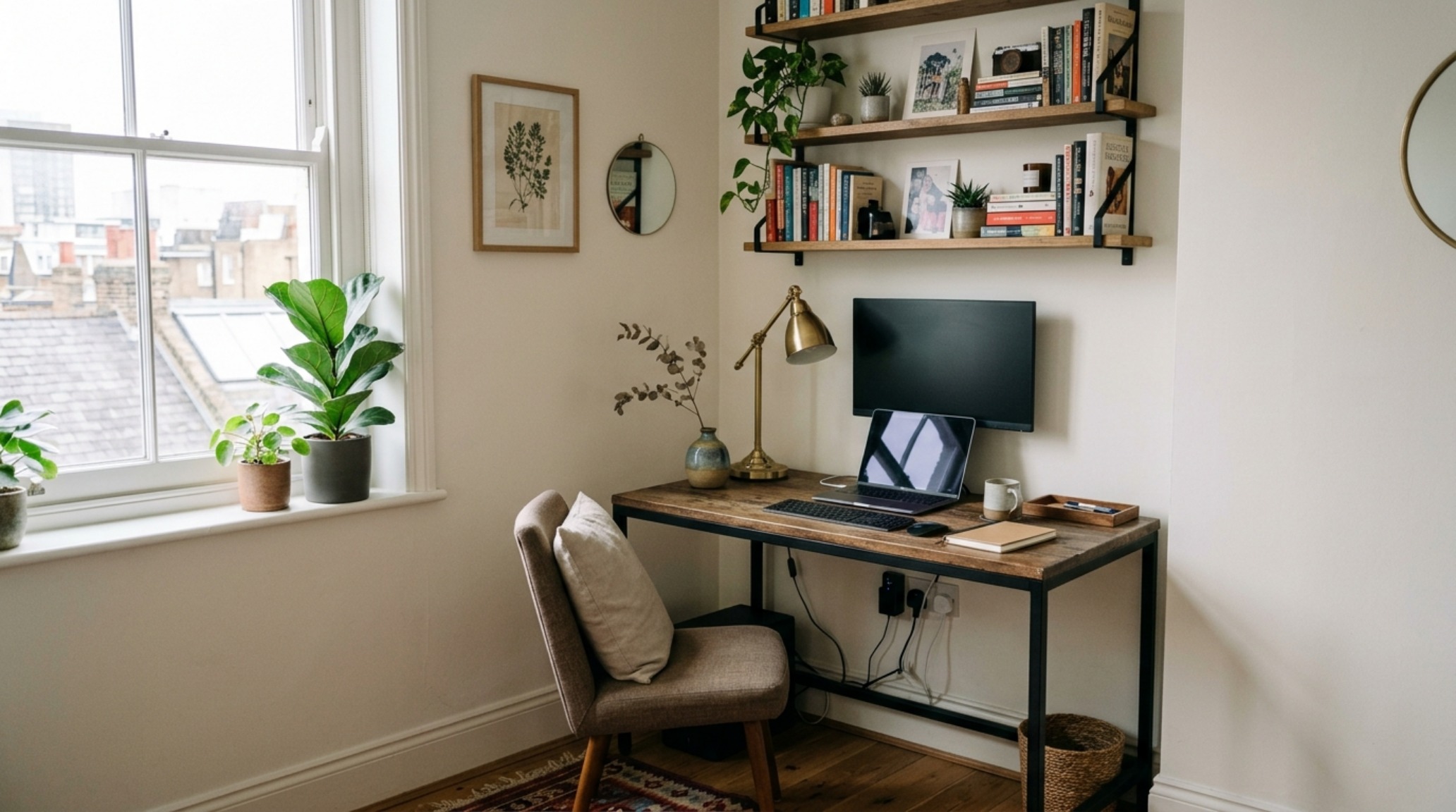
Architectural Perspectives Showcase
When we look at the most successful examples of modern furniture small spaces layout, a pattern emerges: the use of ‘zones’ created by rugs and lighting rather than walls. A low-pile jute rug can define the living area, while a different floor texture or a slight change in ceiling height signals the transition to the kitchen. This ‘open-plan’ logic is essential for maintaining a sense of airiness. Even in a studio apartment, these subtle cues tell our brains that we are moving through a sequence of rooms, which psychologically expands the footprint.
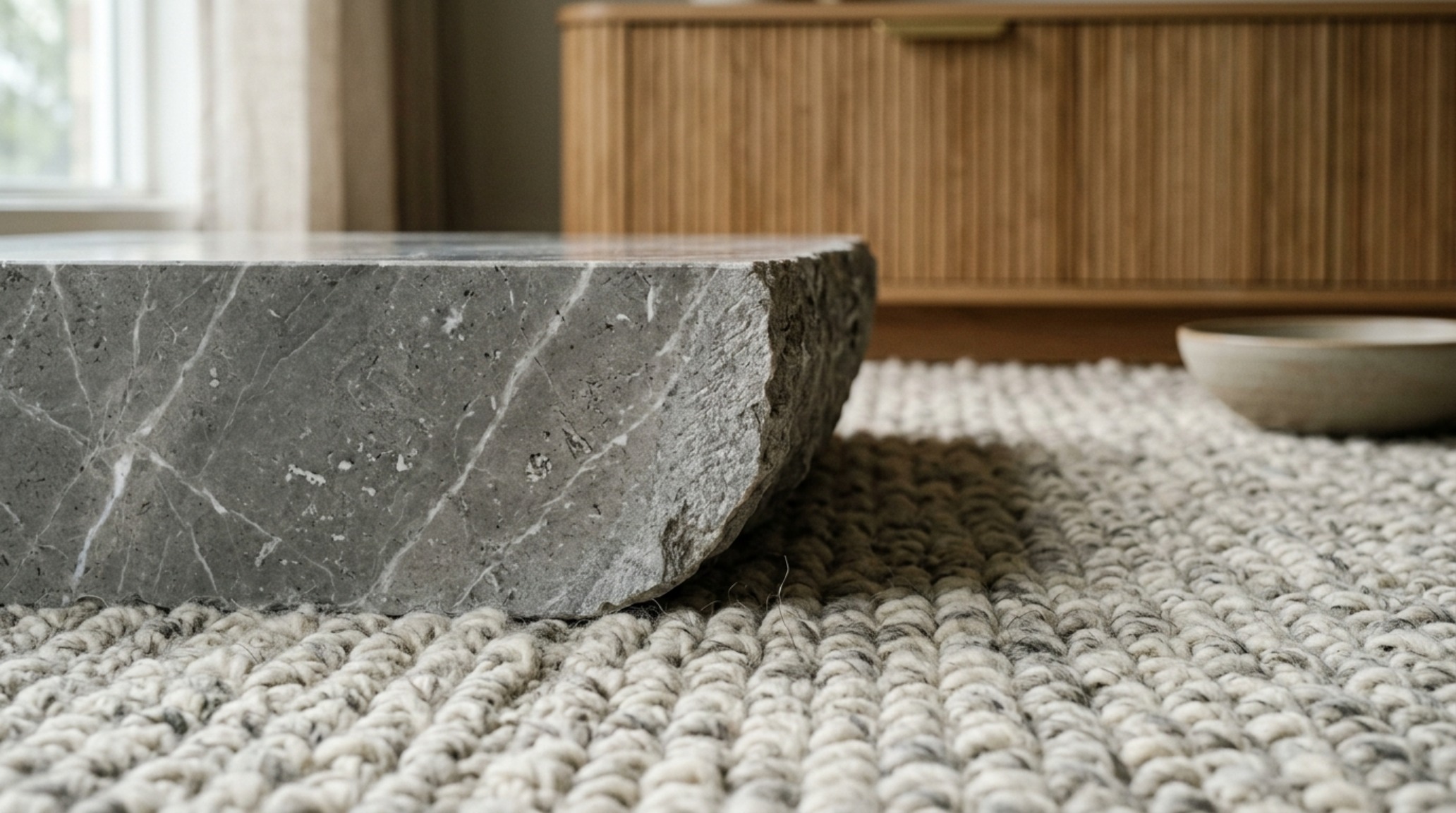
Materiality also extends to the windows. Ditch the heavy drapery for sheer linen or motor-driven solar shades. You want the maximum amount of natural light to penetrate the space, highlighting the ‘dust motes’ and the grain of the wood. The play of light and shadow across a well-designed piece of furniture is what brings a room to life. It is the difference between a house and a home.
Material Schedule & Specification Sheet
Comprehensive material guide featuring exact paint swatches, authentic finishes, and spatial clearances.
Ultimately, designing for modern furniture small spaces is an invitation to live more intentionally. It forces us to ask: what do I truly value? When every piece of furniture is selected with an architect’s eye for proportion and a poet’s eye for texture, the square footage ceases to matter. We aren’t just filling a room; we are composing a life. The result is a space that doesn’t just hold our things, but expands our perspective, proving that even the most modest floor plan can house a grand vision.
Editorial Silo • Recommended Architecture Studies
- The Tactile Aesthetic of Luxury Prefab Homes: Materials, Moods & Lighting Kelvin — Archival Design Case Study
- The Architectural Blueprint: Mastering Spatial Flow with an IKEA Kitchen Designer Strategy — Archival Design Case Study
Architectural Form Portfolio
An evocative photographic exploration balancing structural discipline with inviting tactile softness.
Curated Visual Lookbook
Design Gallery & Spatial Studies
A visual curation of architectural arrangements, lighting concepts, and material palettes featured in this space.