We often treat the pantry as a secondary thought—a utilitarian closet where the chaos of daily consumption is hidden behind a closed door. But in a compact home, every square inch must perform with the precision of a Swiss timepiece. When we look at small pantry organization ideas through the lens of architectural engineering rather than mere tidying, we stop seeing a cramped closet and start seeing a high-performance larder. A 15-square-foot footprint is not a limitation; it is a canvas for vertical depth and sightline symmetry. It is about the deliberate choreography of glass, wood, and light to create a space that feels expansive and monastic rather than cluttered and claustrophobic.
To achieve this, we must move beyond the plastic bins of the big-box era. We are looking for spatial cadence. We are looking for the way light hits a honed marble riser at 7:00 AM. We are looking for the structural optimization that allows a family of four to live out of a space no larger than a standard powder room. This is the intersection of high-end kitchen storage systems and the quiet luxury of professional ergonomics.
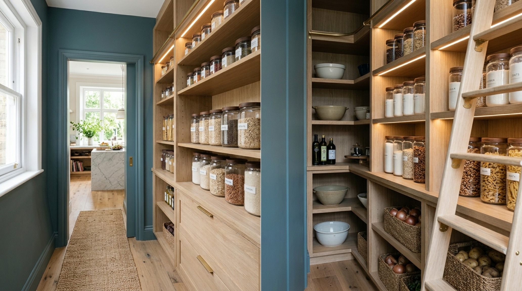
The Chromatic Volume: Using Farrow & Ball to Manipulate Perception
In a tight footprint, color is not merely decorative; it is a volumetric tool. Most homeowners default to a generic builder-grade white, thinking it makes a space feel larger. In reality, a flat white in a windowless pantry often feels dingy and shadow-heavy. To create perceived depth, we turn to the sophisticated palettes of Farrow & Ball. Consider Setting Plaster, a dusty, sunset pink that breathes a soft, architectural warmth into a narrow space. It has a way of softening the hard angles of shelving, making the walls feel as though they are receding into a gentle glow.
Conversely, for those seeking a sense of infinite recession, De Nimes—a grounded, elegant blue—works wonders. When applied to both the walls and the shelving (a technique known as color-drenching), the physical boundaries of the pantry blur. The shelves disappear into the shadows, leaving only the curated inventory to take center stage. This application of color is a foundational element in advanced small pantry organization ideas, as it shifts the focus from the enclosure to the contents. We pair these hues with a satin finish for the shelves to allow for easy cleaning, while keeping the walls in a Dead Flat finish to absorb light and eliminate harsh glares.
The Golden Ratio of Shelving Layout and Vertical Depth
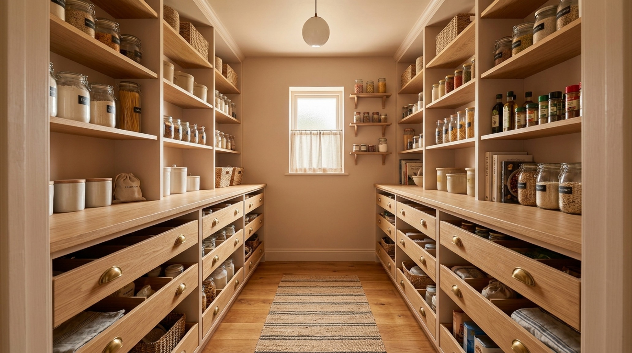
The standard pantry often fails because its shelves are too deep. A 16-inch deep shelf in a small pantry is a graveyard for expired cans and forgotten grains. To engineer true efficiency, we must adopt a varying depth strategy. The lower levels, intended for heavy Dutch ovens or bulkier kitchen storage systems, can maintain a 15-inch depth. However, as we move to eye level, we should taper to a 10-inch or even 8-inch depth. This creates a staggered vertical profile that keeps everything within a primary sightline.
The ‘Golden Ratio’ of shelving heights suggests that the most frequently used items should sit between 30 inches and 60 inches from the floor—the ‘strike zone.’ Below this, we utilize heavy-duty pull-out drawers that bring the depth of the cabinet to the user, eliminating the need to kneel. Above 60 inches, we transition to less frequent items, perhaps housed in uniform wicker baskets with leather pulls that provide a tactile grounding to the upper reaches of the room.
Engineering Sightlines: Tiered Risers and the Death of the Corner
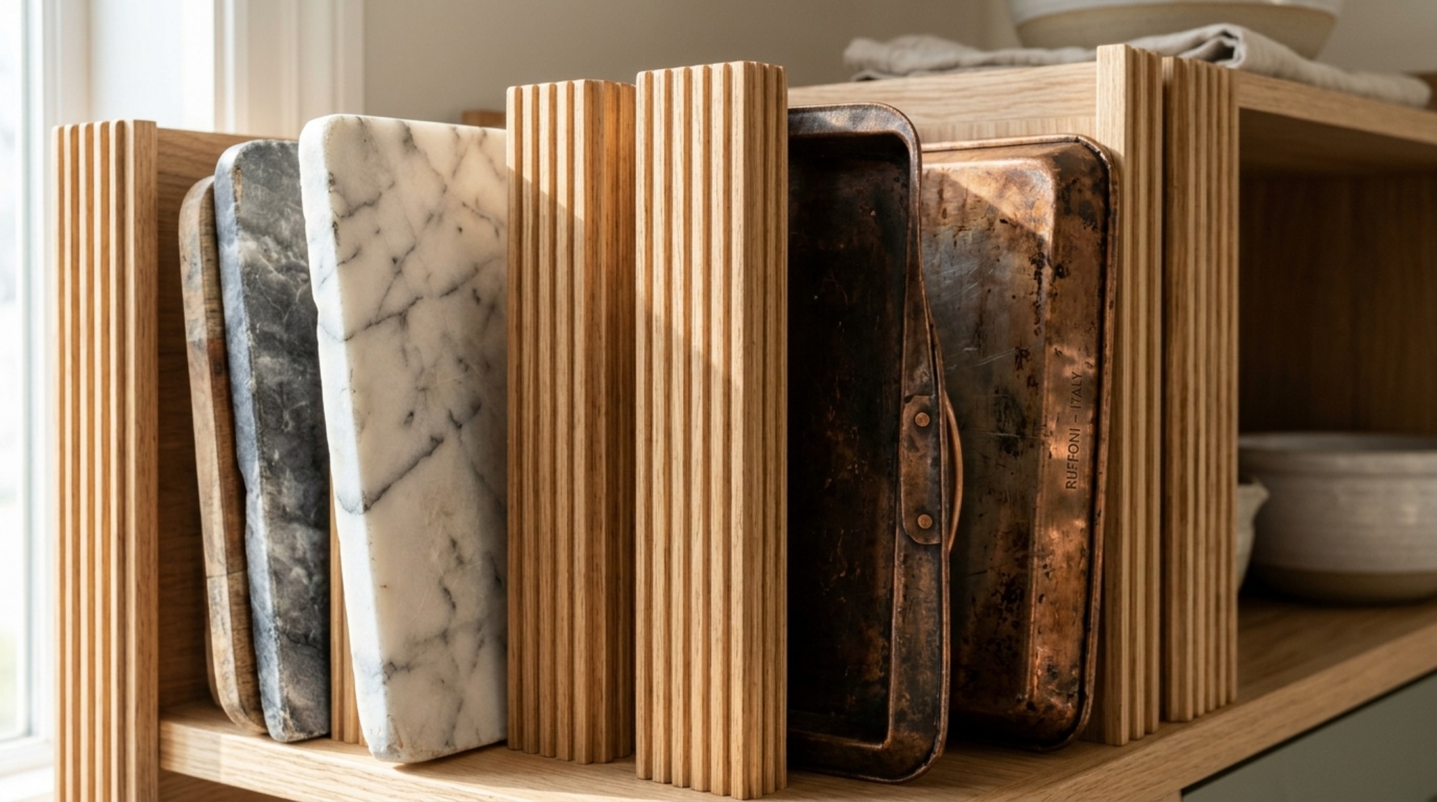
The most significant architectural failure in a small pantry is the ‘dead corner.’ When two shelves meet at a 90-degree angle, the resulting void becomes a black hole for inventory. Professional design avoids this through custom vertical dividers and the strategic use of tiered marble or white oak risers. By elevating the rear row of glass jars, we ensure that every label is visible from the doorway. This is not just about aesthetics; it is about cognitive load. When you can see every ingredient at a glance, the friction of meal preparation vanishes.
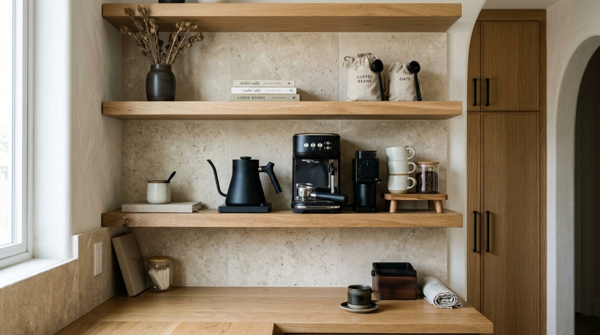
We also look at pantry shelving layout through the lens of materiality. Instead of wire racks that create visual noise and instability, we opt for solid surfaces. Honed travertine or marble offcuts used as liners for specific zones—like the coffee station or the oil and vinegar section—add a weight and permanence to the design. These materials also offer a thermal mass that keeps sensitive ingredients like chocolate or fine oils slightly cooler than the surrounding kitchen air.
The Materiality of Order: Sustainable Glass and Fluted Wood
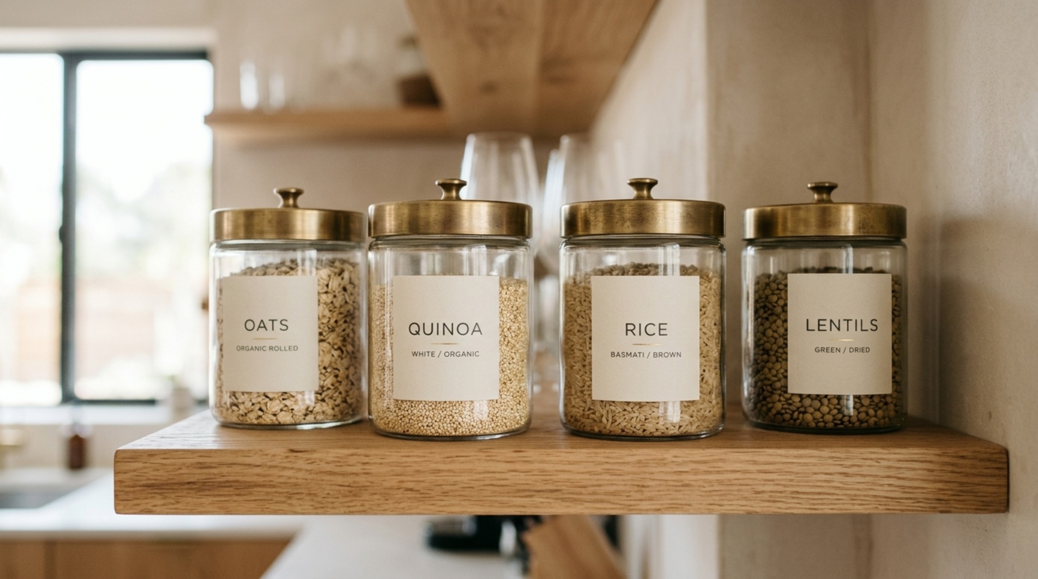
Aesthetic pantry decanting is often dismissed as a social media trend, but from a design perspective, it is an essential exercise in visual decluttering. By removing mismatched commercial packaging and moving to sustainable glass pantry storage containers with uniform lids (we prefer walnut or brushed brass), we eliminate the ‘visual static’ that makes a small space feel crowded. The transparency of glass also serves a functional purpose: it acts as a real-time inventory tracker, signaling exactly when staples are running low.
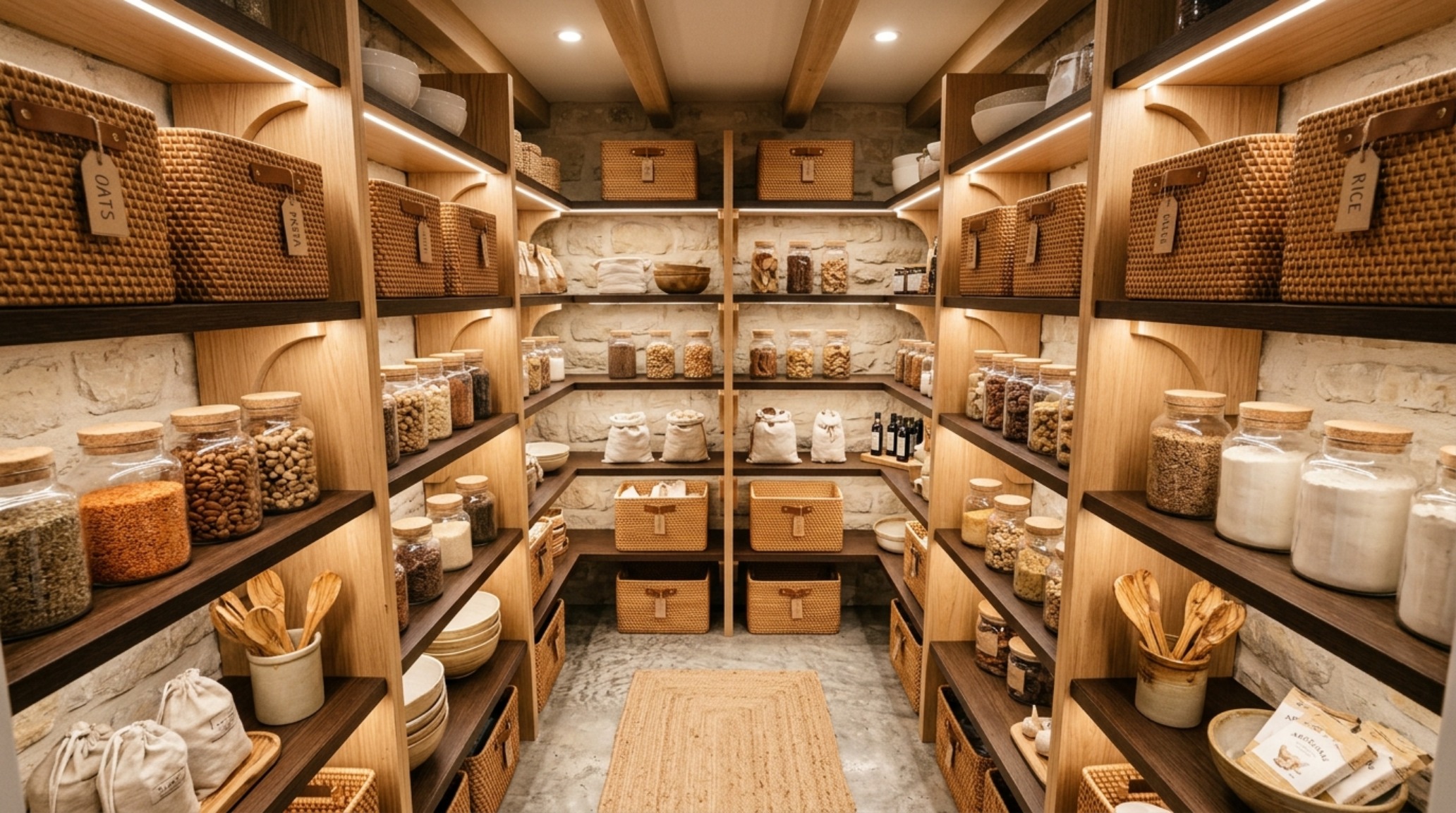
For hidden storage, such as root vegetables or snacks, we integrate fluted wood bins or breathable wire baskets with a high-end finish like oil-rubbed bronze. The fluting on the wood adds a vertical texture that draws the eye upward, reinforcing the height of the room. This tactile variety is what separates a professional architectural project from a basic DIY fix.
Lighting the Void: 2700K Warmth and High CRI Precision
In a windowless 15-square-foot space, lighting is the difference between a storage closet and a jewelry box. We strictly avoid the 4000K ‘daylight’ bulbs often found in utility spaces; they are too clinical and wash out the richness of natural wood and stone. Instead, we specify 2700K warm ambient lighting. This temperature mimics the soft glow of a late afternoon sun, creating an inviting, high-end atmosphere.
Furthermore, we insist on a High CRI (Color Rendering Index) of 90+. This ensures that the deep greens of an olive oil bottle or the rich reds of dried spices appear vibrant and true to life. The placement of light is equally critical. A single overhead fixture creates harsh shadows on the lower shelves. To combat this, we integrate recessed LED tape lighting under each shelf. This ‘halo effect’ illuminates every level of the food storage solutions, turning the pantry into a backlit display that feels twice its actual size. For the final touch, a motion-activated sensor allows for a seamless, hands-free experience as you enter the space.
The Back-of-Door Architecture
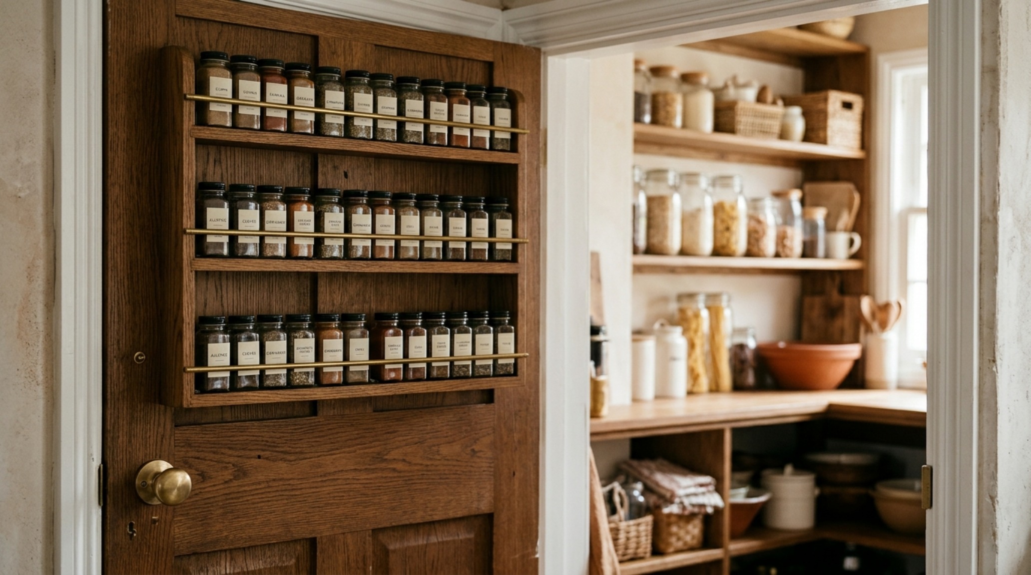
Every surface is an opportunity for engineering. The back of a solid core pantry door is prime real estate. Rather than using flimsy over-the-door organizers, we design integrated back of door spice rack solutions using the same wood species as the interior shelving. By mounting slim, 3-inch deep lipped shelves directly to the door, we create a specialized zone for small-format items like spices, vanilla extracts, and baking powders. This frees up primary shelf space for larger items and places the most frequently reached-for seasonings at chest height.
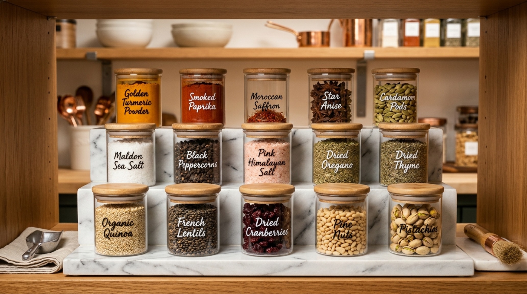
Architectural Specification & Material Matrix
Curated tactile palette, spatial dimensions, and atmospheric lighting index for this design scheme.
Ultimately, the successful execution of small pantry organization ideas relies on the understanding that storage is not a static state, but a dynamic flow. It is the realization that a well-placed marble riser or a perfectly calibrated 2700K light strip does more than organize food—it organizes the mind. When we apply architectural rigor to the smallest corners of our homes, we elevate the mundane acts of daily life into something resembling art. The 15-square-foot pantry is no longer a hidden closet; it is a masterclass in spatial intent, a quiet reminder that even the most constrained spaces can breathe with a sense of depth, order, and enduring beauty.
Editorial Silo • Recommended Architecture Studies
- Test Publish Latency Diagnostic — Archival Design Case Study
- The Sensory Entryway: Mastering Quiet Luxury with 2700K Glow and High-Texture Materiality — Archival Design Case Study
Architectural Inspiration Lookbook
A high-resolution study in spatial proportions, tactile materiality, and light choreography curated for enduring modern living.
Curated Visual Lookbook
Design Gallery & Spatial Studies
A visual curation of architectural arrangements, lighting concepts, and material palettes featured in this space.