There is a specific, quiet magic that happens in the transitional spaces of a home—those pockets of air between the chaos of a lived-in kitchen and the curated stillness of an architectural gallery. We often look at the sprawling, walk-in sculleries of historic English manors or the expansive Magnolia-styled estates in Waco and feel a sense of spatial envy. However, the true mark of a master designer isn’t what they do with ten thousand square feet; it’s how they command a standard five-foot reach-in. When we talk about small pantry organization ideas, we aren’t just talking about where to put the flour; we are talking about creating an illusion of abundance through the rigorous application of high-end ergonomics and tactile materiality.
The “Butler’s Pantry Illusion” is a design philosophy that treats a closet not as a storage bin, but as a secondary destination. It’s the realization that even a shallow reach-in can possess the spatial cadence of a professional scullery if you respect the sightlines. Joanna Gaines has long championed this approach, blending the clinical precision of a chef’s kitchen with the soulful, weathered textures of a farmhouse. To achieve this, we must move beyond the plastic-bin-and-label-maker mentality and start thinking like architects of the domestic interior.
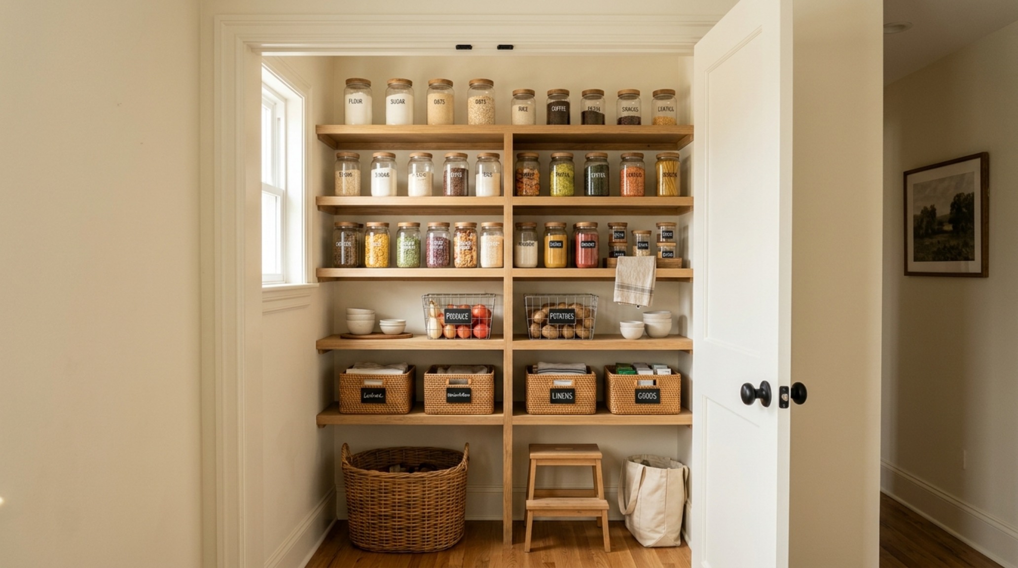
The Science of Spatial Cadence and the Golden Zone
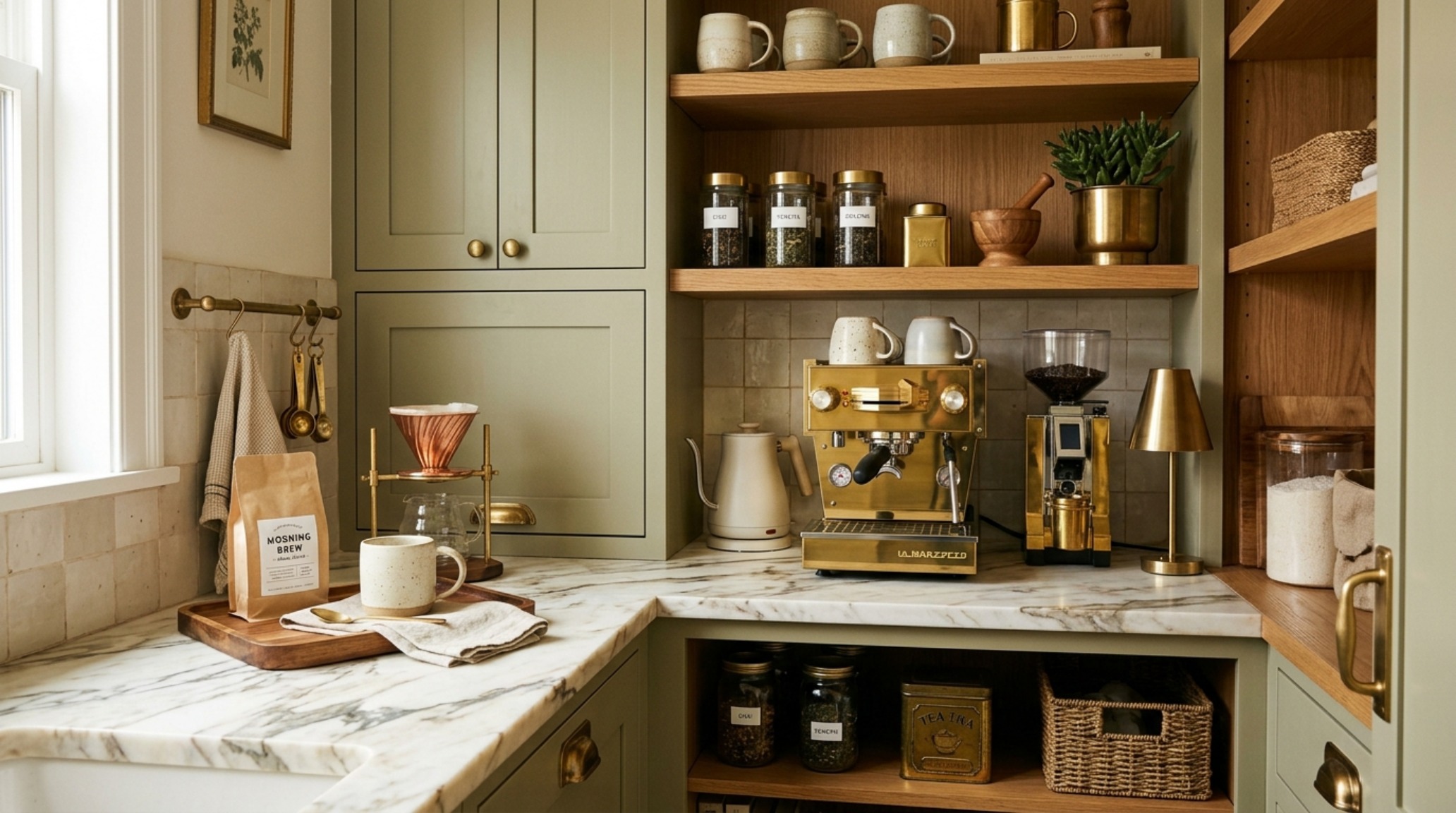
In architectural terms, ergonomics is the study of people’s efficiency in their working environment. In a pantry, this translates to the “Golden Zone”—the area between your hips and your eyes. This is where your most-used items must live. When implementing small pantry organization ideas, many homeowners make the mistake of uniform shelving. But a high-performance pantry requires a varied vertical rhythm. Items you reach for daily, like morning oats or artisanal coffee beans, should sit at a comfortable 48-inch to 60-inch height, requiring no more than a 12-inch reach depth.
Consider the clearance. A standard kitchen walkway requires 36 inches of primary circulation space, but inside the pantry itself, we often ignore the clearance for our hands. By using shallow, 12-inch shelves rather than deep, 24-inch caverns, you eliminate the “black hole” effect where cans go to die. Shallow shelving forces an editorial eye, ensuring every item is visible and accessible. This is the hallmark of the decant-and-display lifestyle: everything has a dedicated footprint, and that footprint is visible at a glance.
The Visual Rest Rule for Open Shelving
One of the most profound secrets of the Magnolia Home aesthetic is the “Visual Rest” rule. In a small space, the eye becomes overwhelmed by too much detail. If every square inch of your reach-in is packed with colorful packaging, it will always feel cluttered, no matter how organized the items are. To combat this, Gaines often leaves what designers call “negative space breathing room.” This might mean leaving a third of one shelf empty, save for a single antique stoneware crock or a small wooden bowl.
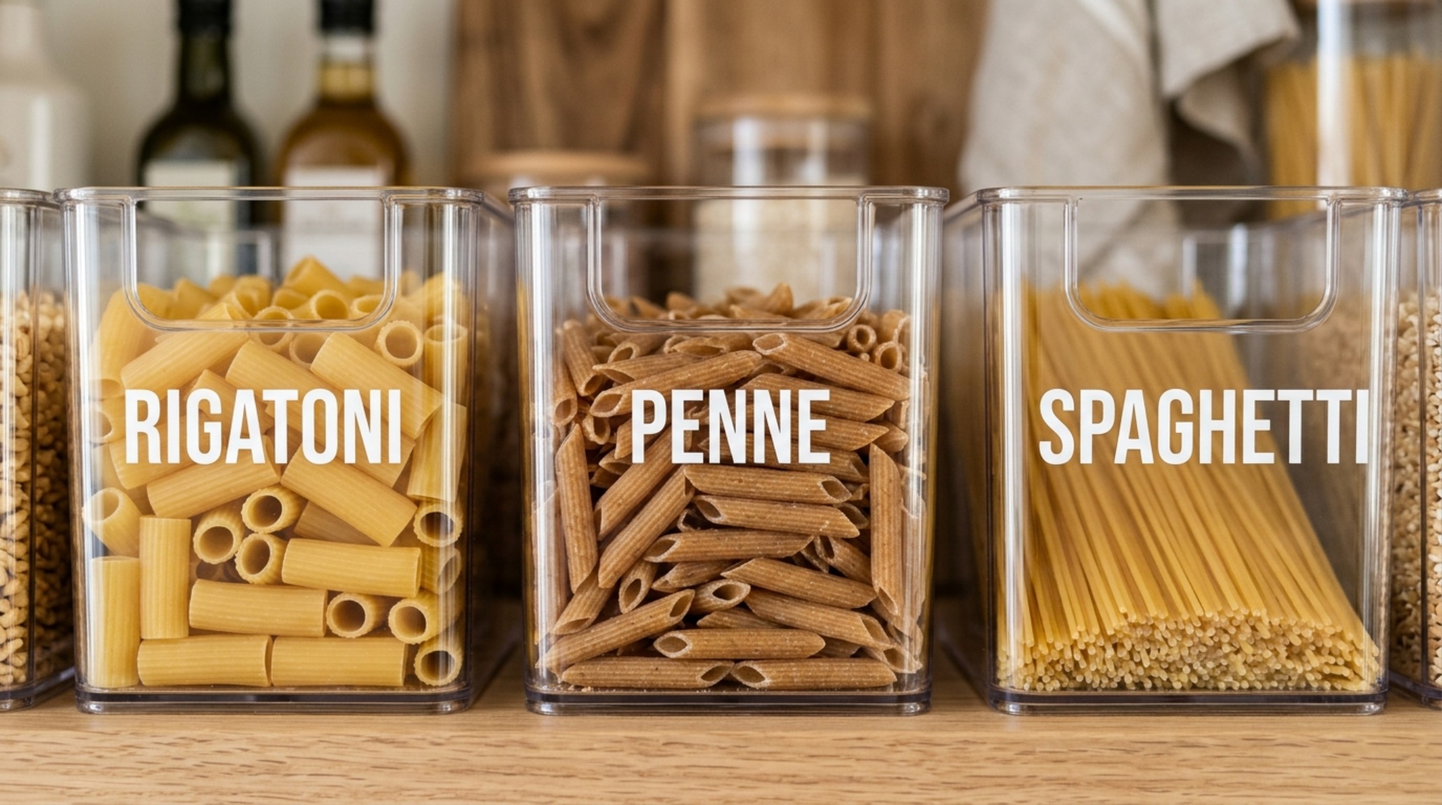
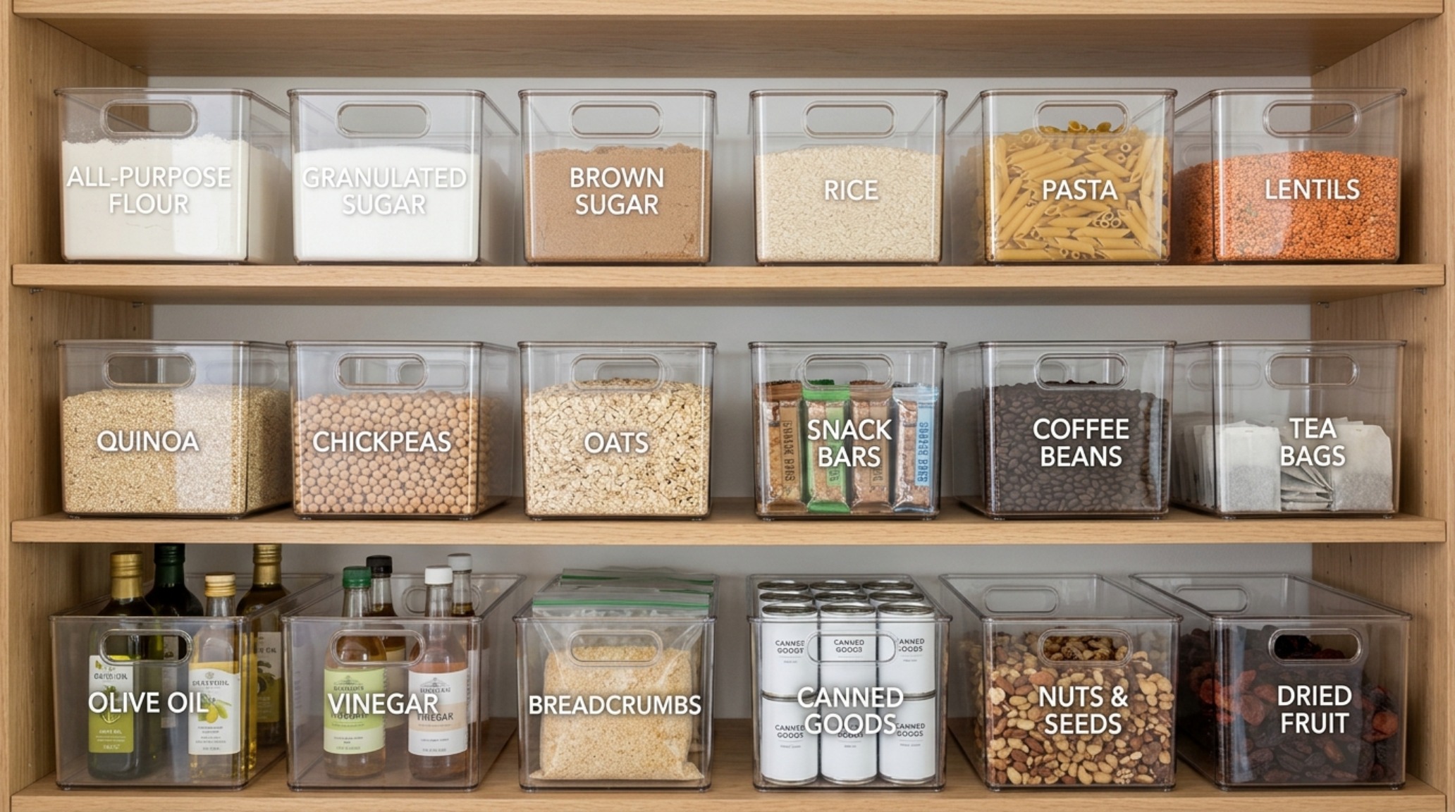
This intentional gap acts as a palette cleanser for the eyes. It signals to the brain that the space is not at capacity, immediately making the pantry feel larger and more intentional. When we look at clear acrylic pantry storage bins, their primary job isn’t just to hold snacks; it’s to create a uniform visual language that allows the eye to slide across the shelf without getting snagged on the chaotic typography of grocery store branding.
Materiality and the Decant-and-Display Lifestyle
To elevate a reach-in pantry from a closet to a masterpiece, we must focus on tactile grounding. This is where we move away from the purely functional and into the realm of the sensory. Instead of standard wire racks—which are the antithesis of luxury—we look toward organic materiality. Imagine shelves crafted from fluted white oak or painted in the soft, light-reflective glow of Benjamin Moore Swiss Coffee. This color, a favorite in the designer world, provides a creamy, warm-white backdrop that makes glass canisters pop and prevents the space from feeling clinical.
The decanting process is the cornerstone of this look. By transferring dry goods into uniform glass or high-quality clear acrylic bins, you remove the visual noise of marketing. This is particularly effective in small pantry shelves layouts where space is at a premium. Glass jars with airtight wooden lids provide a satisfying tactile experience every time you reach for a snack. It transforms a mundane chore into a ritual of care. When you use small pantry organization ideas that prioritize glass and wood over plastic, you aren’t just organizing; you are curating.
Zoning by Frequency and Weight
Architecturally, a pantry should be bottom-heavy. Large, heavy items like gallon-sized oils, bulk grains, or small appliances (the stand mixer you only use for holidays) should reside on the lowest levels, ideally on a reinforced shelf or even on the floor if it’s finished in a durable material like slate or honed travertine. This lowers the visual center of gravity and makes the pantry feel grounded.
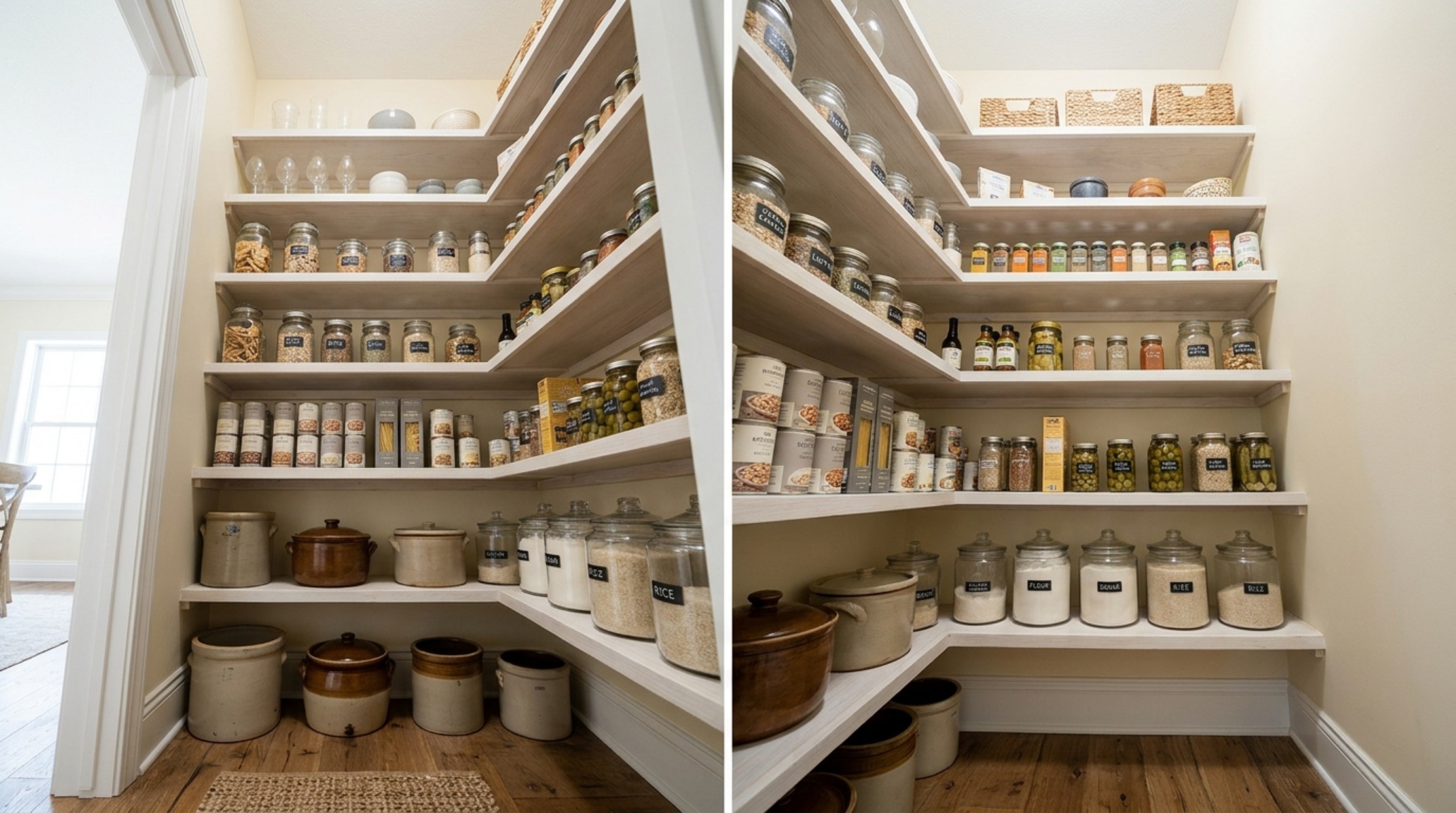
As you move upward, the items should get lighter and more decorative. The top shelves—those beyond the 80-inch mark—should be reserved for light items like paper towels or seasonal serving platters. If you have the height, consider a library-style rolling ladder or a beautiful, foldable oak step stool that lives on a dedicated hook. This turns the verticality of a small reach-in into an architectural feature rather than a storage challenge.
Lighting Strategy: The Hidden Hero of the Pantry
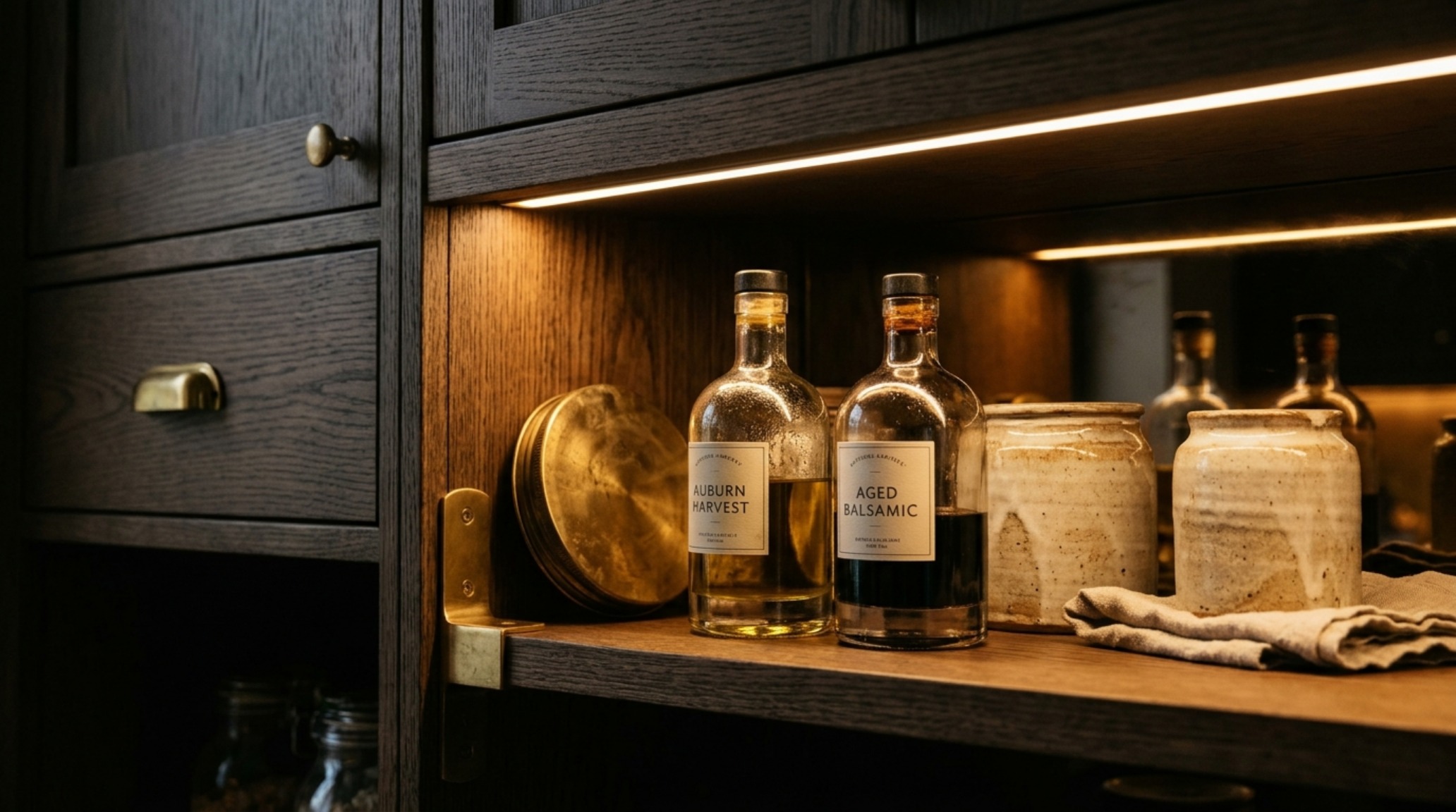
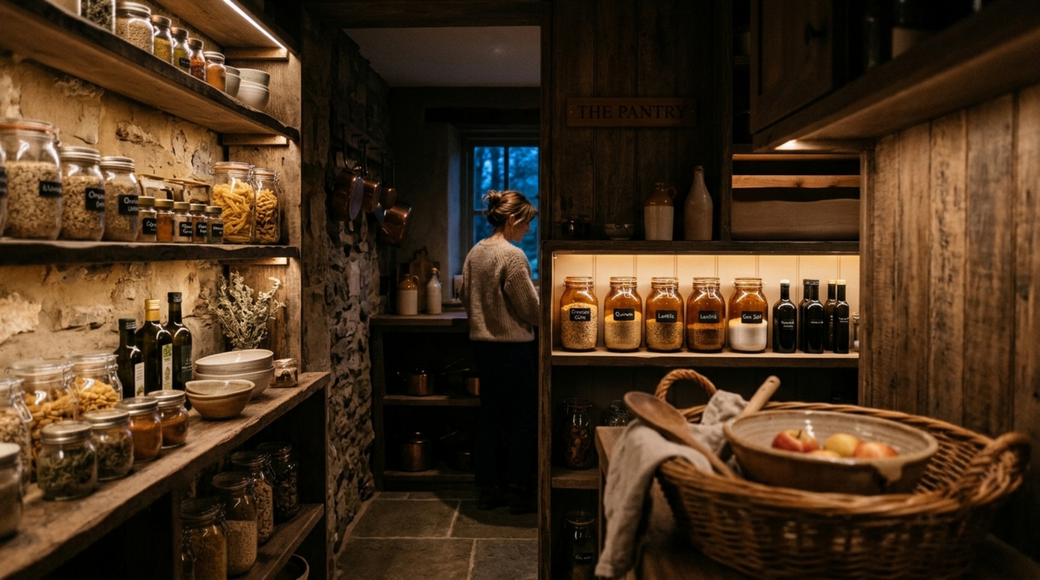
You cannot have a high-end pantry without a professional lighting plan. Most reach-in pantries suffer from a single, harsh overhead bulb that creates deep shadows and makes it impossible to read labels. To achieve the Magnolia Home kitchen storage look, we utilize layered lighting. Task lighting is essential—3000K LED strips hidden under the front edge of each shelf provide a crisp, clean glow that eliminates shadows. For a softer, more atmospheric feel, a 2700K warm ambient light can be used for the primary ceiling fixture, perhaps a small, aged brass flush mount.
High CRI (Color Rendering Index) ratings are vital here. Look for lighting with a CRI of 90 or higher. This ensures that the rich greens of your olive oil and the deep ambers of your honey look vibrant and true to life, rather than muddy. Lighting isn’t just about utility; it’s about drama. When you open the pantry doors and the interior glows like a jewelry box, the organization becomes an art form.
The Psychology of Maintaining the Clear Acrylic System
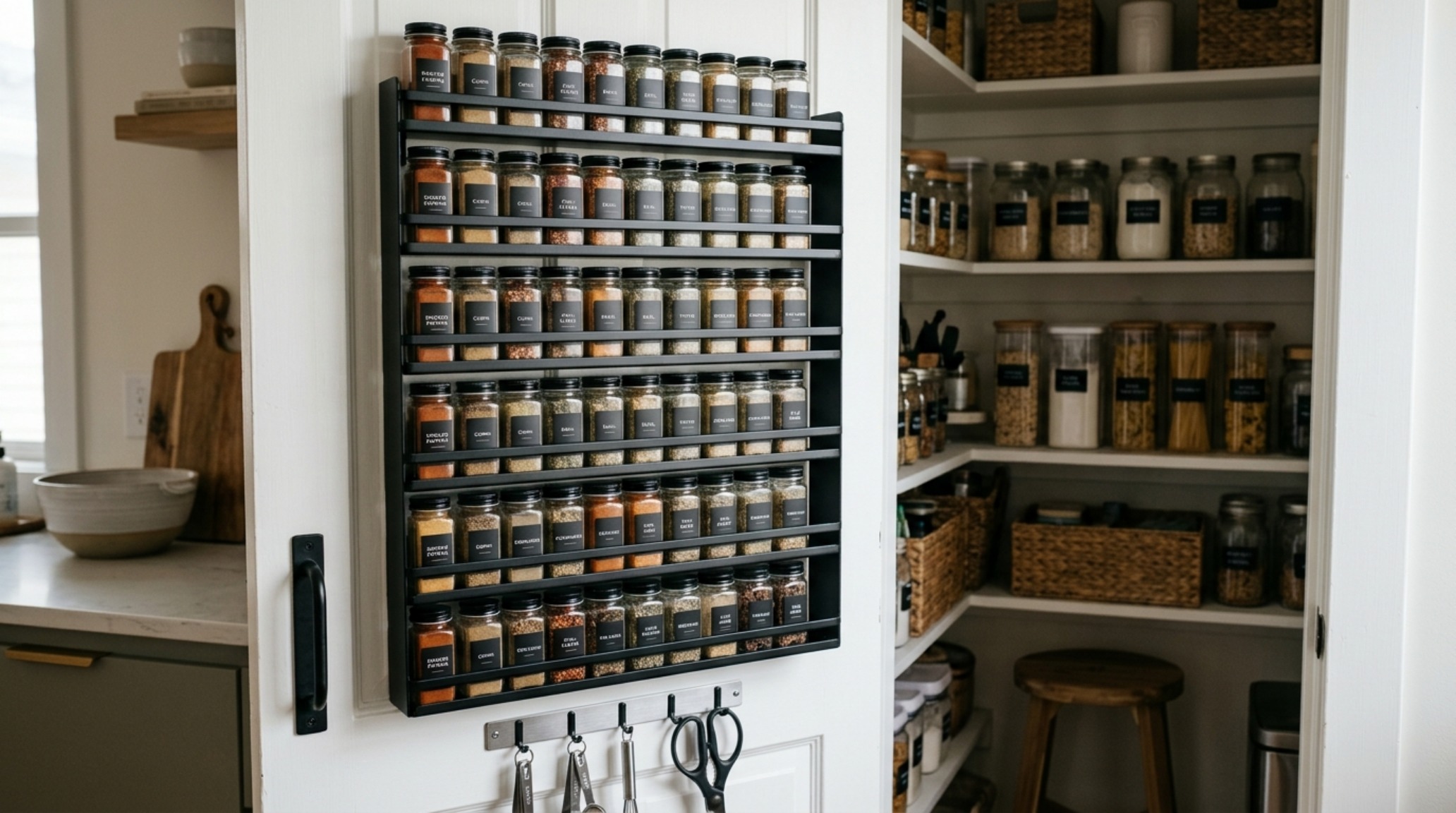
One of the biggest hurdles in small pantry organization ideas is maintenance. A clear acrylic bin system looks breathtaking on day one, but it requires a behavioral shift to stay that way. The secret is the “One-In, One-Out” rule combined with clear labeling. High-end organization often uses minimalist, sans-serif typography on waterproof vinyl labels. These aren’t just for identification; they are part of the visual rhythm.
When you decant your groceries, it forces you to confront exactly how much you have. You stop over-buying because the physical limit of the jar is your guide. This architectural restraint leads to less waste and a more streamlined inventory. Joanna Gaines often speaks about the “home as a story,” and your pantry is a chapter on nourishment. By maintaining this system, you are honoring that story every time you prepare a meal.
Integrating Antique Accents
To prevent the pantry from looking too modern or sterile, integrate antique accents. A vintage silver scoop in a jar of flour, an old wooden crate for potatoes, or a small piece of framed art tucked between the cookbooks provides the “lived-in” warmth that defines the Joanna Gaines style. It’s these unexpected details that create the butler’s pantry illusion. It tells the viewer that this space was designed for a human, not just for a shelf-stocking algorithm.
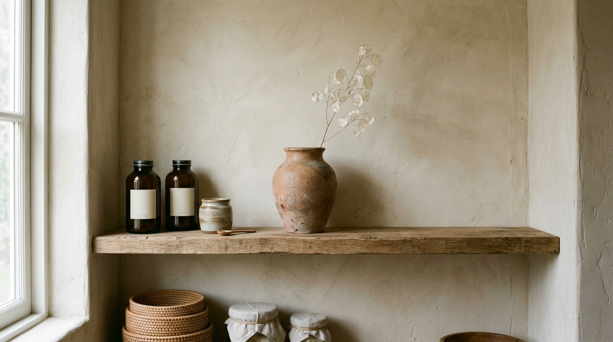
Architectural Specification & Material Matrix
Curated tactile palette, spatial dimensions, and atmospheric lighting index for this design scheme.
Ultimately, the success of your small pantry organization ideas hinges on the intersection of utility and beauty. When we apply architectural rigor to the humblest parts of our home, we elevate our daily experience. It isn’t just about having a place for the cereal; it’s about walking into a space that reflects your values of order, warmth, and intentionality. As we look at the future of kitchen design, the small pantry will no longer be an afterthought—it will be the quiet heart of the home, a perfectly calibrated engine of hospitality that proves that in design, as in life, it’s not the size of the room that matters, but the soul you breathe into it.
Editorial Silo • Recommended Architecture Studies
- Test Publish Latency Diagnostic — Archival Design Case Study
- The Sensory Entryway: Mastering Quiet Luxury with 2700K Glow and High-Texture Materiality — Archival Design Case Study
Architectural Inspiration Lookbook
A high-resolution study in spatial proportions, tactile materiality, and light choreography curated for enduring modern living.
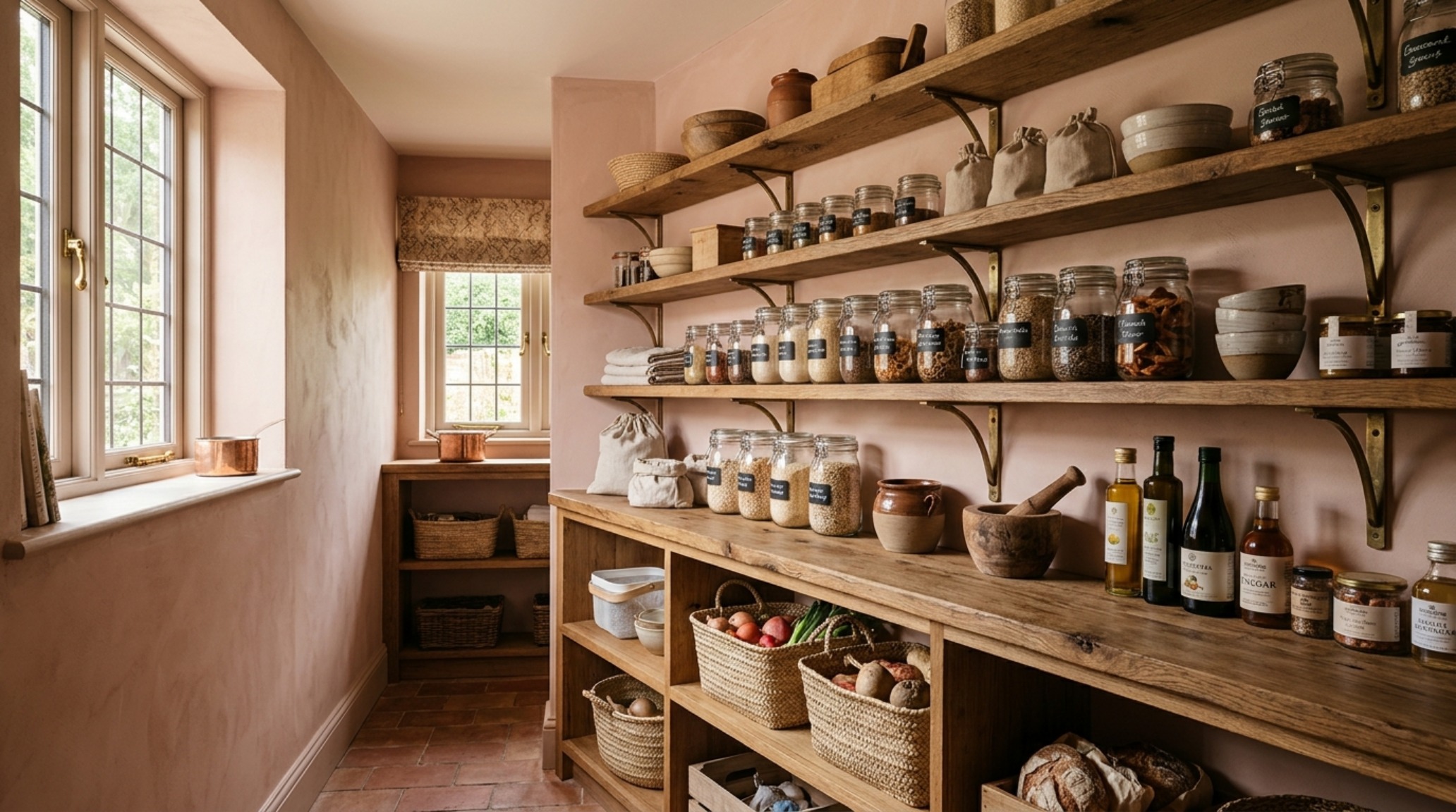
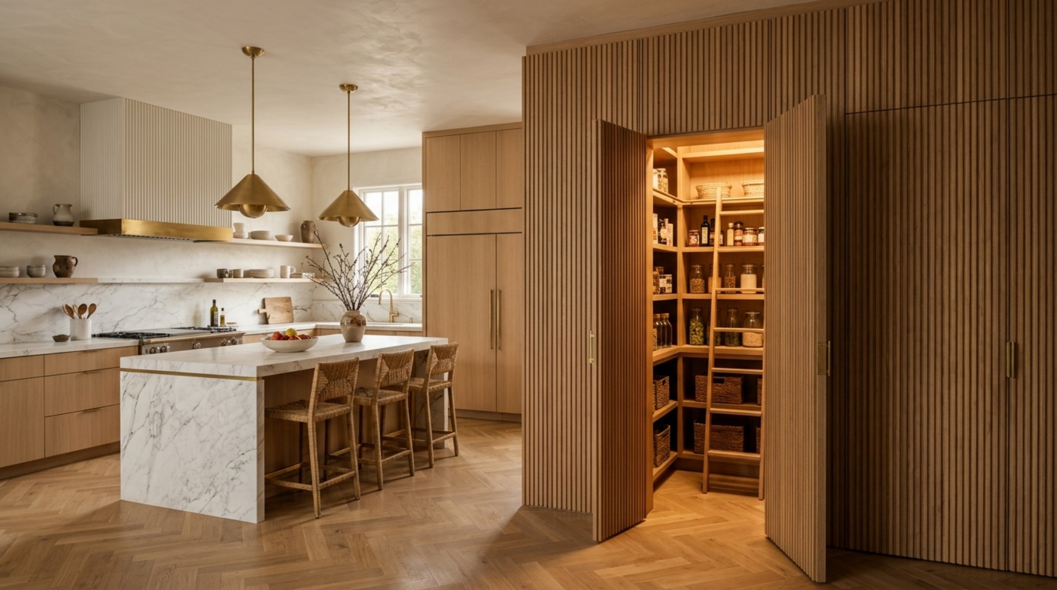
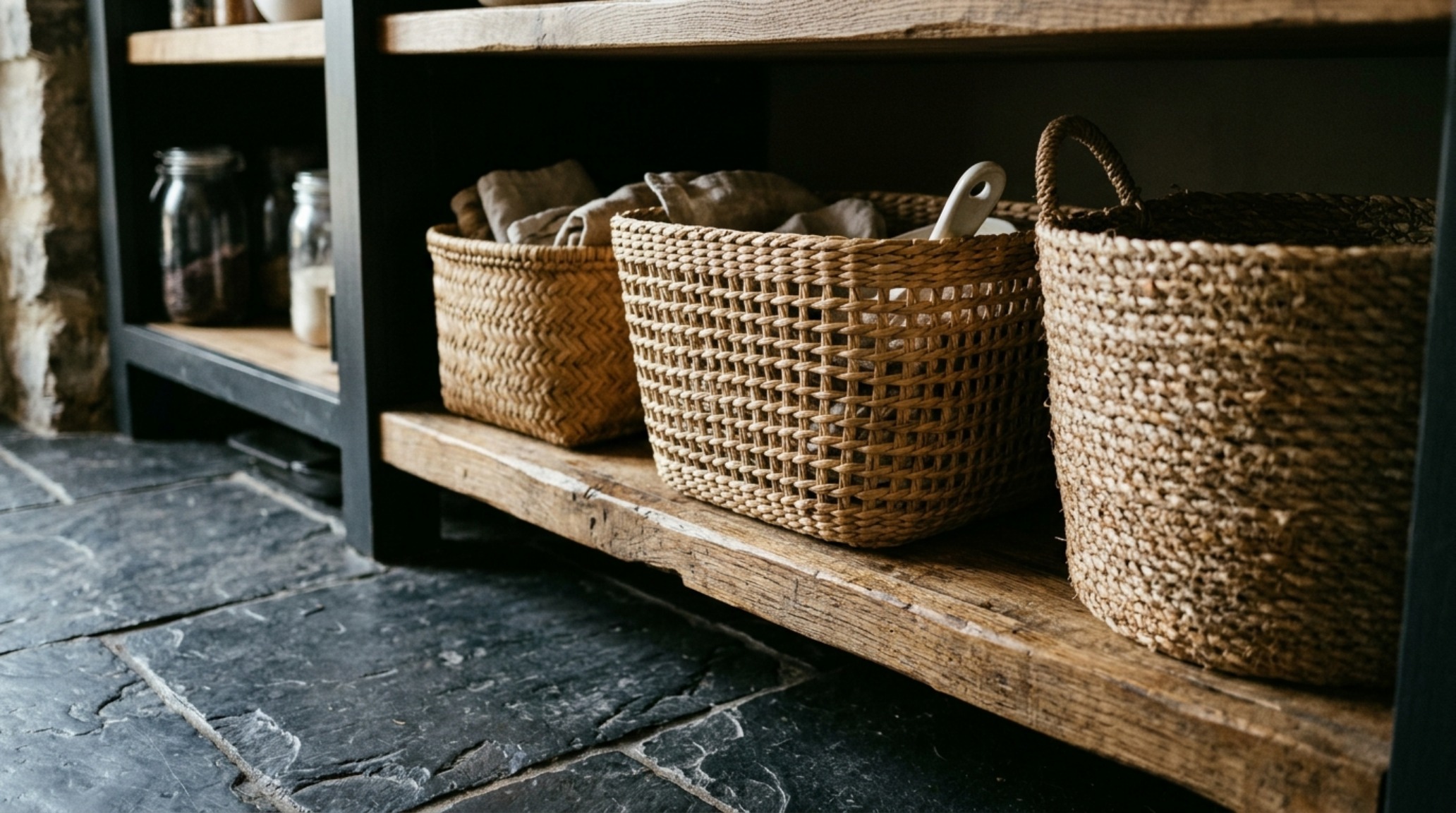
Curated Visual Lookbook
Design Gallery & Spatial Studies
A visual curation of architectural arrangements, lighting concepts, and material palettes featured in this space.