In the evolving landscape of urban architecture, square footage is no longer the ultimate luxury—fluidity is. As we increasingly demand our homes to function as offices, sanctuaries, and social hubs simultaneously, the traditional physical partitions of drywall and doorframes often feel more like obstacles than solutions. This is where the sophisticated application of creative paint decor ideas transcends mere aesthetics. We are moving beyond the ‘accent wall’ of the early 2000s and entering an era of ergonomic color zoning: a design philosophy where pigment serves as a structural tool to define movement, create psychological boundaries, and optimize the human experience within limited dimensions.
Ergonomic color zoning operates on the principle that the human eye perceives depth and boundary through contrast and saturation rather than physical mass. By strategically deploying architectural paint finishes, we can trick the brain into recognizing a 40-square-foot corner as a distinct ‘room’ without sacrificing the precious 36-inch primary circulation paths required for comfortable movement. This is not about choosing a pretty color; it is about spatial cadence—the rhythm of how we move from a high-energy workspace to a low-light relaxation zone within the same open-plan floor.
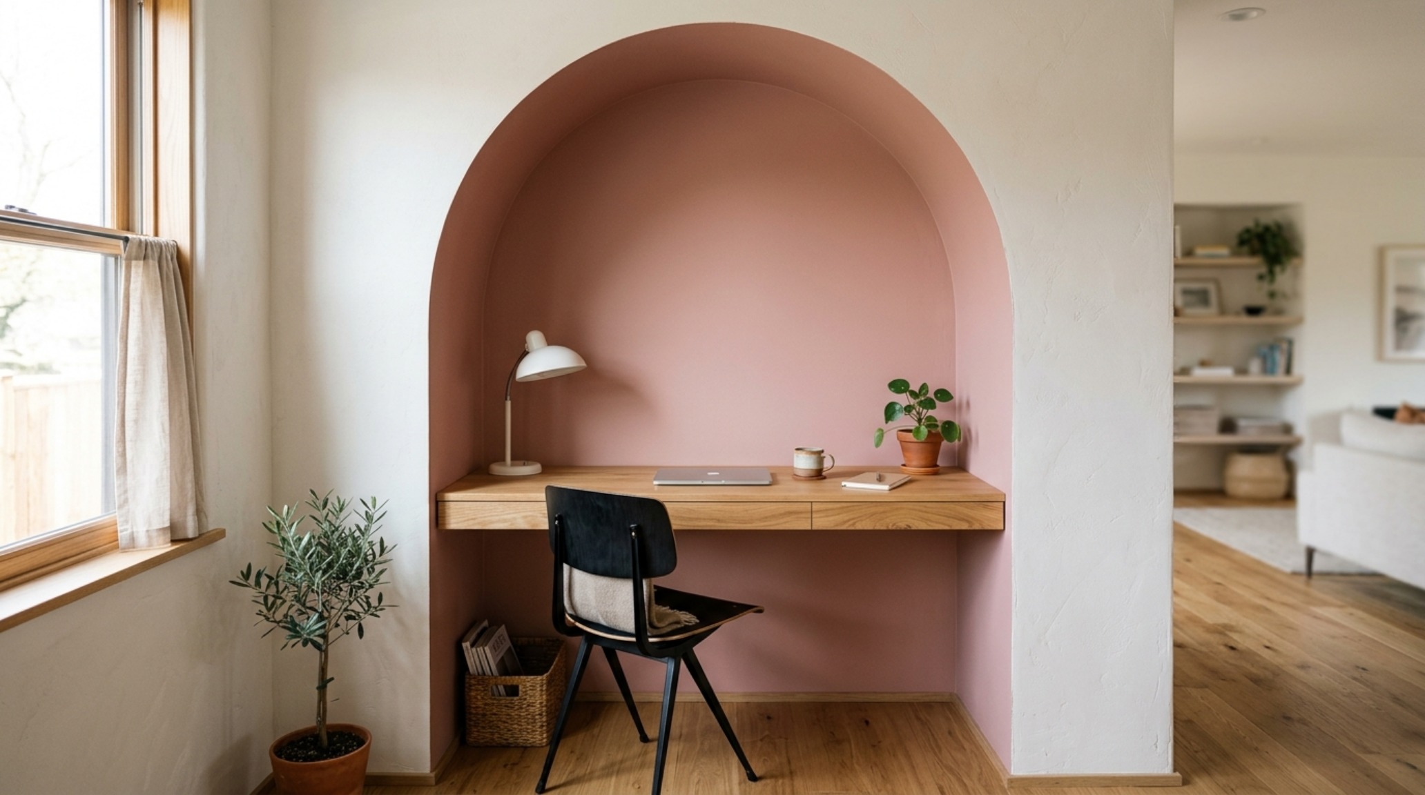
The Psychology of Spatial Color Theory and Sensory Boundaries
To master the art of zoning, one must first understand spatial color theory. Light colors advance, while dark colors recede—a basic tenet, yet its ergonomic application is nuanced. When we use a technique like color drenching bedroom techniques in a studio apartment, we aren’t just painting walls; we are creating a sensory ‘envelope’ that signals to the nervous system it is time to downshift. Using a saturated, mid-tone hue like Farrow & Ball’s Setting Plaster across the walls, ceiling, and baseboards eliminates the visual ‘noise’ of architectural intersections, making a small sleeping alcove feel infinitely more expansive yet grounded.
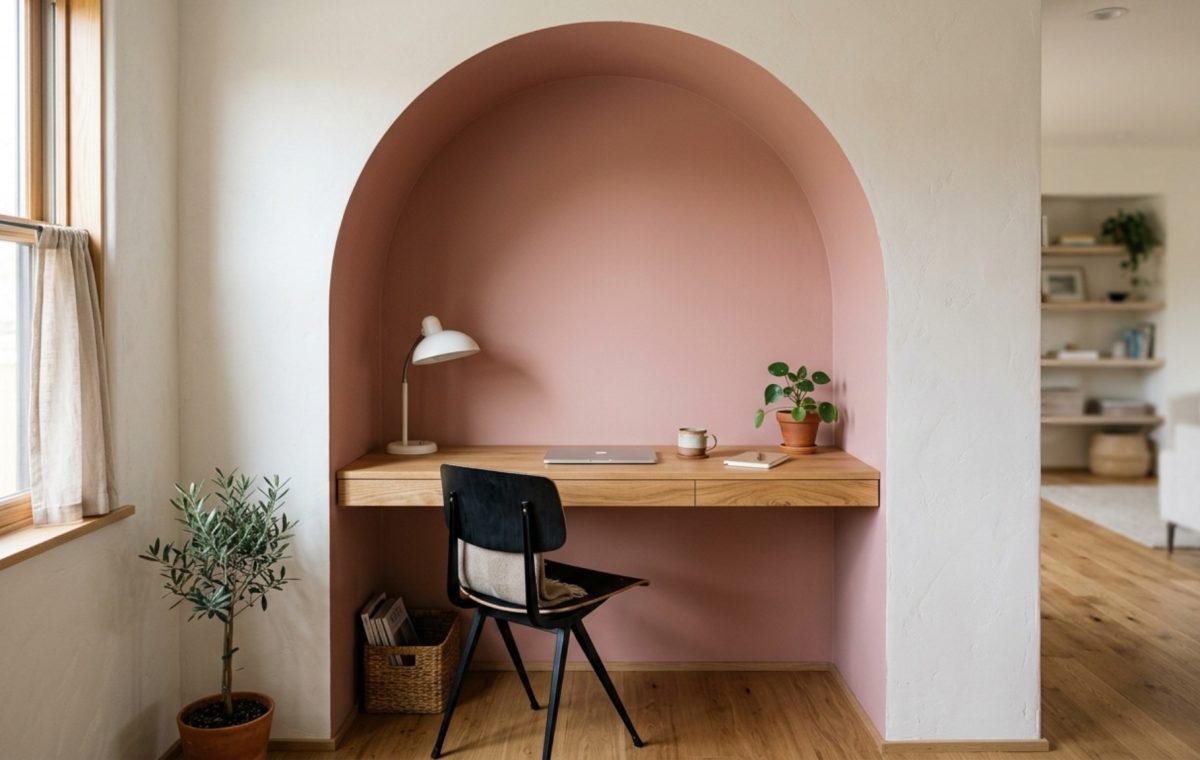
Contrast this with the ‘work-from-home’ alcove. Here, we require mental clarity and focus. Instead of a traditional desk pushed against a white wall, consider an ‘archival silhouette’—a painted geometric form that wraps from the wall onto the ceiling. This creates a visual canopy. When you step into this zone, the shift in pigment acts as a cognitive trigger. By maintaining a strict 30-inch clearance for your task chair and aligning the paint boundaries with the reach of your desk, the color becomes a functional architecture that protects your focus from the distractions of the surrounding living area.
The Camouflage Effect: Resolving Visual Clutter with Creative Paint Decor Ideas
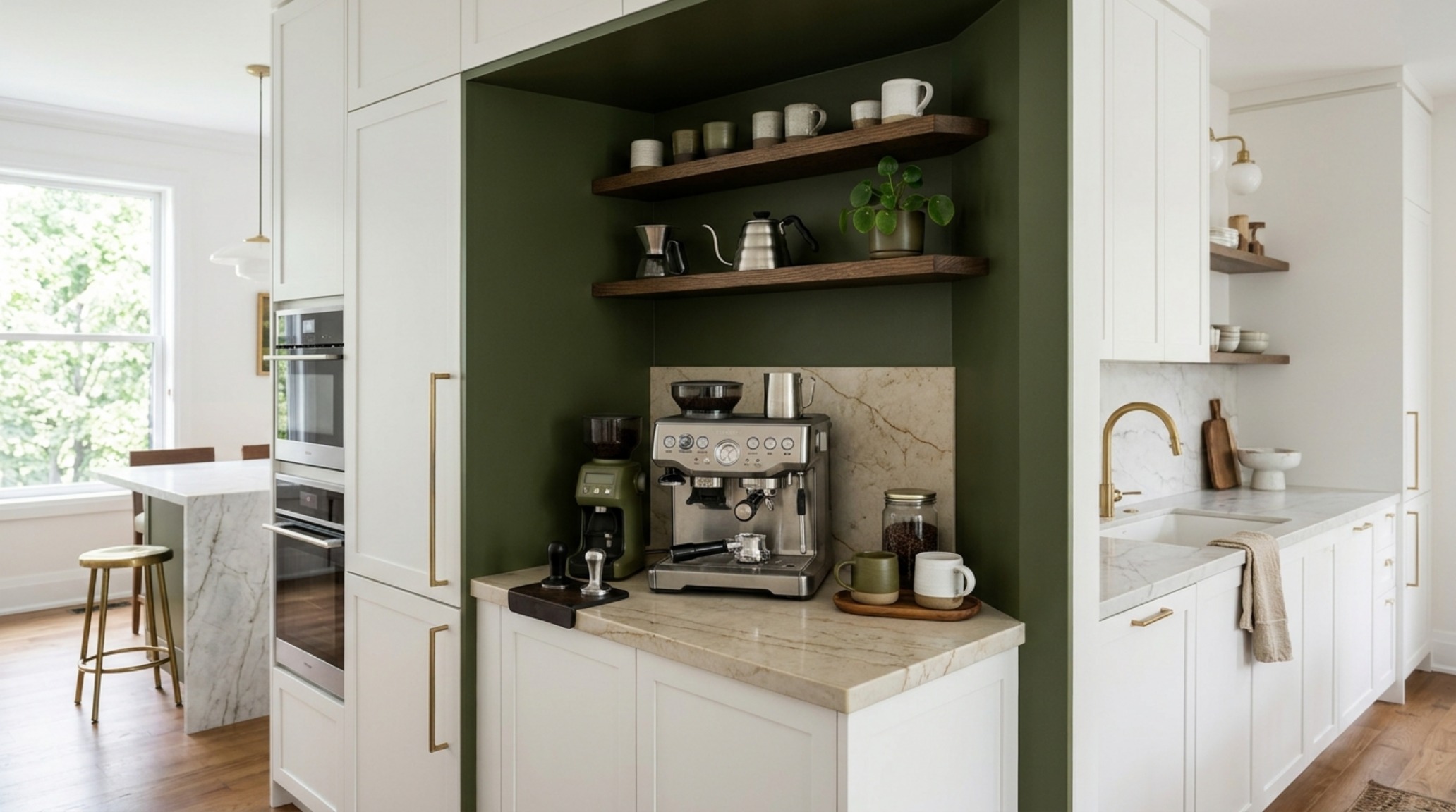
One of the greatest challenges in small-space living is the ‘visual static’ created by necessary but unsightly storage. Open shelving, media units, and radiators often break the visual flow, making a room feel stuttered and cramped. The professional solution is ergonomic camouflage. By color drenching these elements in the exact shade of the surrounding wall—such as a soft, nuanced neutral like Benjamin Moore’s Swiss Coffee—you effectively ‘erase’ the object’s footprint. This allows the eye to travel uninterrupted across the room, emphasizing the length of the wall rather than the bulk of the furniture.
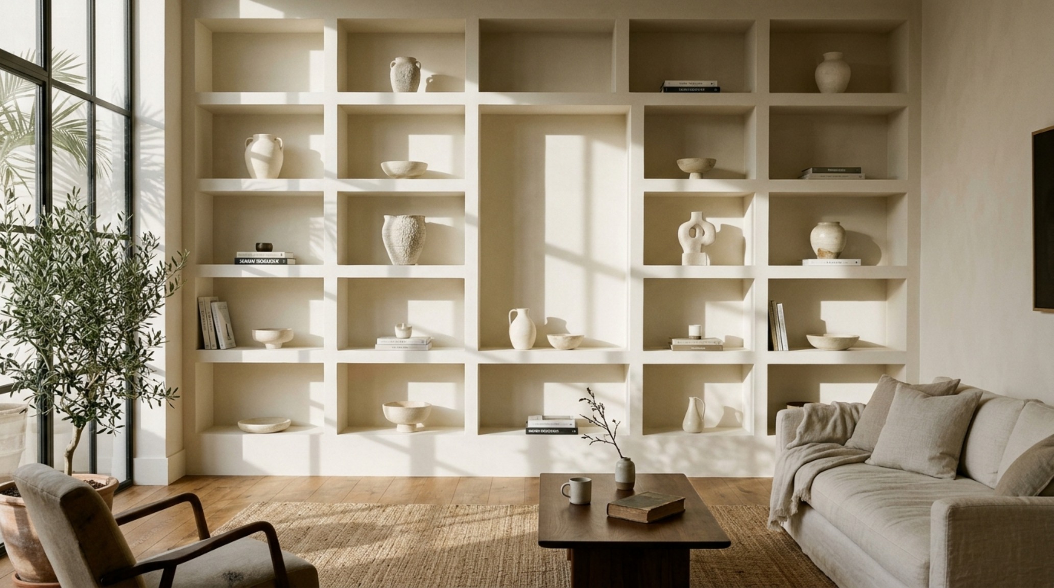
This technique is particularly effective when dealing with 18-inch deep shelving units. In a standard 12-foot wide room, these units can feel intrusive. However, when painted in a matte architectural finish that matches the wall, the shadows they cast become the only indicator of depth, turning a storage problem into a play of light and texture. This creates ‘negative space breathing room,’ a vital component in preventing the claustrophobia often associated with high-density living.
The Portal Technique: Navigating Transition Zones
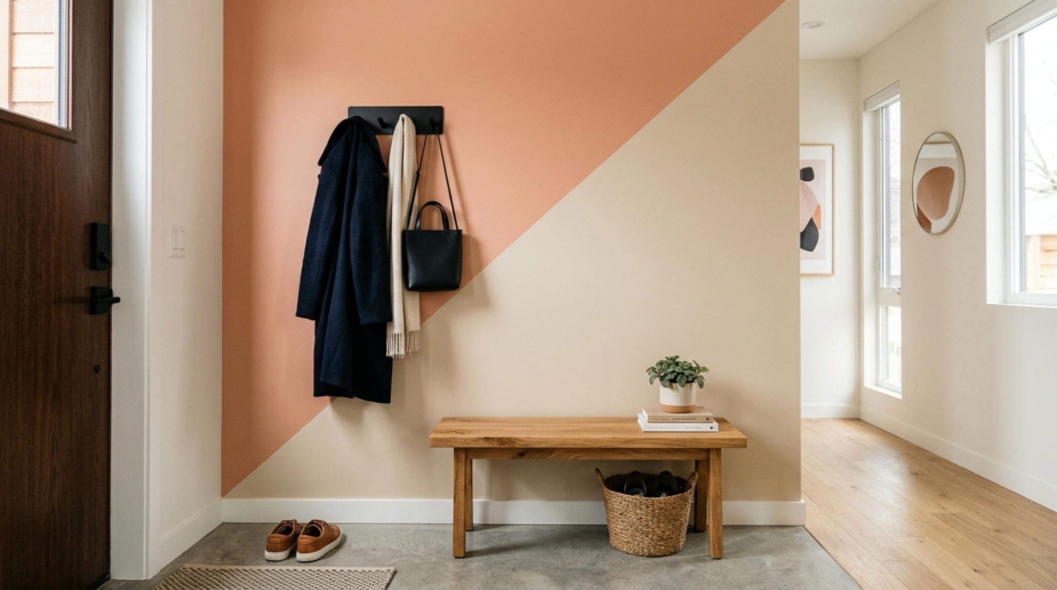
Transition zones—hallways, entryways, and the thresholds between the kitchen and living area—are the circulatory system of the home. In many modern layouts, these areas lack architectural definition. We can use ‘The Portal’—a high-contrast color block that wraps the entire doorway and a few inches of the surrounding wall—to signify a change in purpose. For example, painting a narrow hallway in a deep, moody charcoal like Iron Mountain while the adjoining living room remains a luminous off-white creates a dramatic compression and release. This makes the living area feel significantly brighter and larger by comparison, an ergonomic trick that relies on the retinal adjustment to light levels.
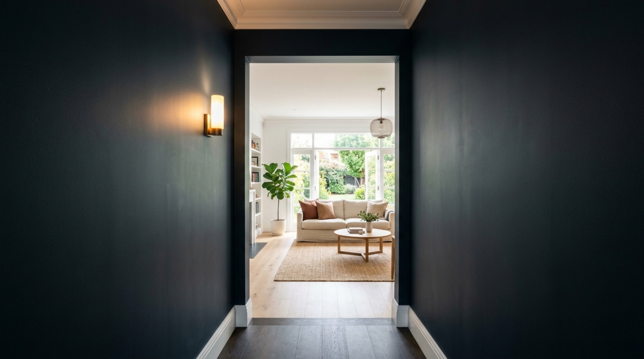
When implementing these portals, it is essential to respect architectural clearances. Ensure that the color transition aligns with natural break points—like the edge of a door casing or a 90-degree corner—to maintain a sense of structural integrity. A ‘floating’ paint line can feel accidental; a line that follows the 80-inch height of a standard door frame feels intentional and architectural.
Tactile Grounding: Elevating Architectural Paint Finishes
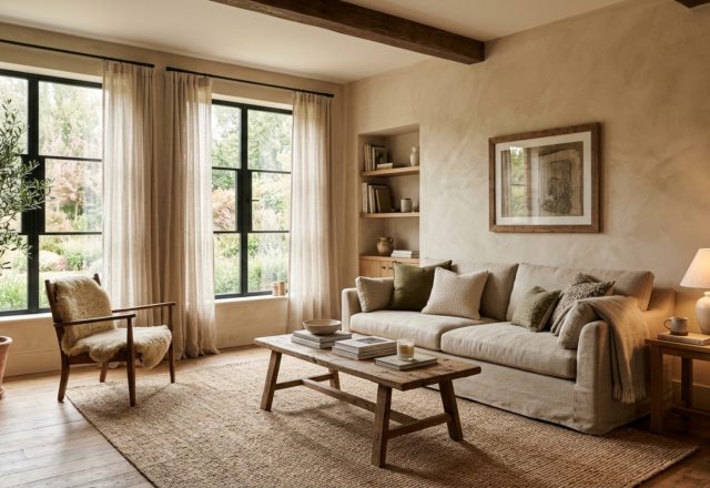
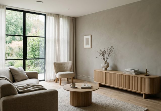
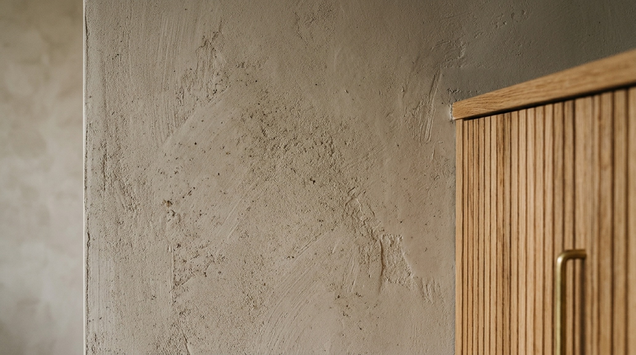
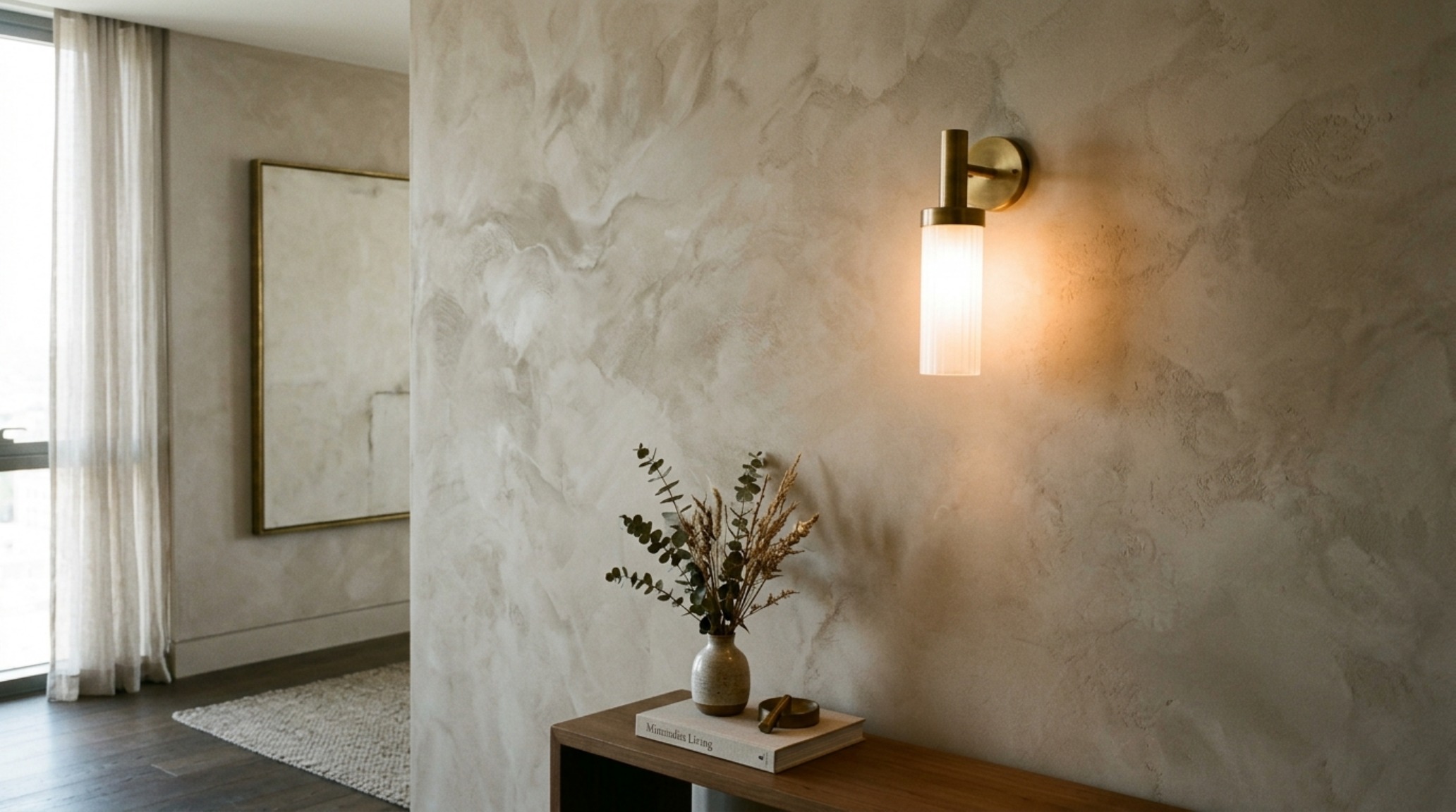
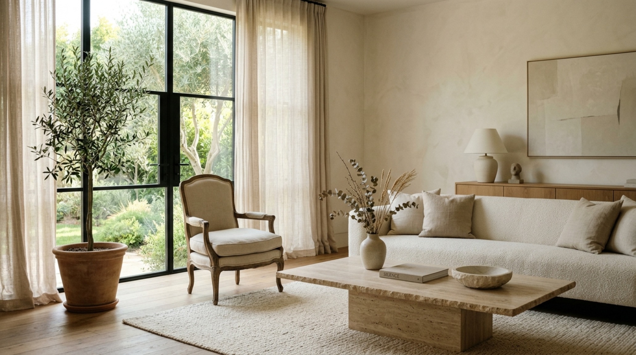
Beyond color, the texture of the paint itself dictates the ergonomic ‘feel’ of a room. Interior texture layering is the secret weapon of high-end designers. A flat, one-dimensional latex paint can feel cold and synthetic. In contrast, a modern limewash wall tutorial approach introduces a tactile, organic depth that mimics the patina of ancient stone. Limewash is not merely a visual trend; its high mineral content diffuses light in multiple directions, softening hard corners and making small rooms feel ‘breathable.’
In a bedroom, pairing a limewash finish with high CRI 90+ lighting (ideally at a warm 2700K) allows the walls to glow with a velvet-like quality. This atmospheric lighting index is crucial. Standard ‘cool’ LED bulbs can make even the most expensive paint look sickly and flat. By using warm, directional lighting that grazes the textured surface, you emphasize the material depth, providing a sense of ‘quiet luxury’ that doesn’t require expensive millwork or art. The texture becomes the art.
Functional Geometry: Accent Wall Geometry in the Kitchen and Dining Area
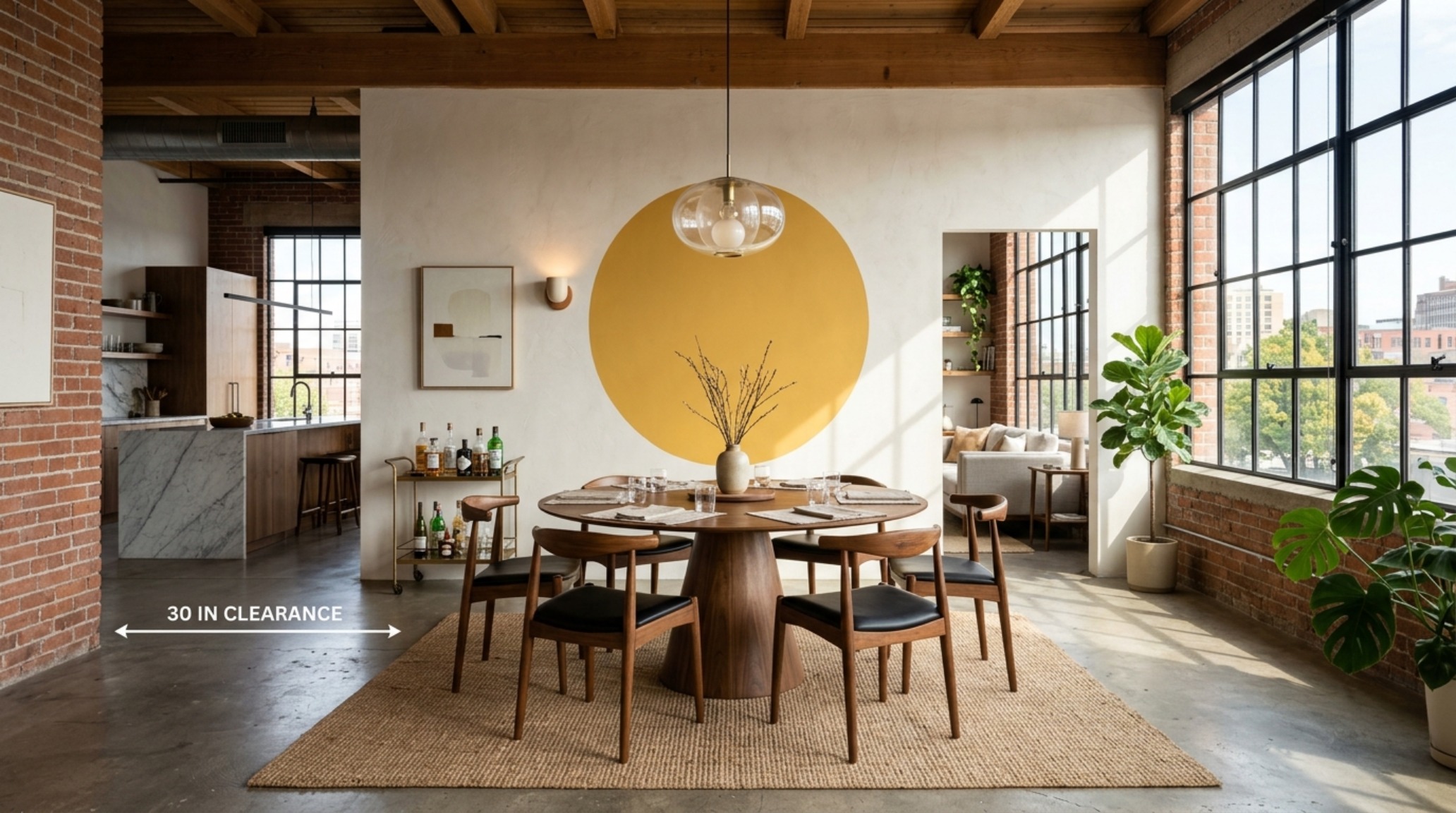
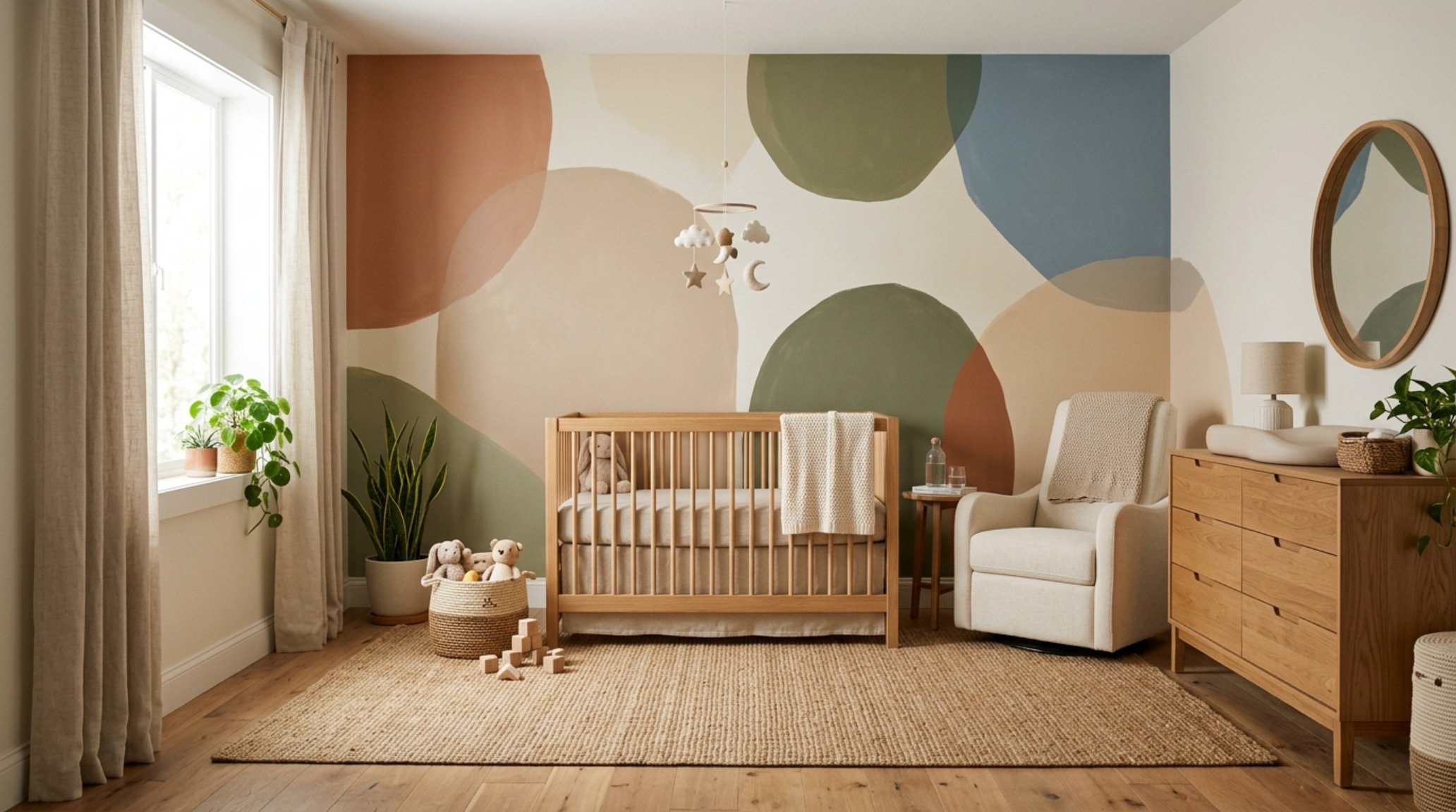
In open-plan layouts, the dining area often floats awkwardly between the kitchen and the sofa. Here, diy geometric color blocking can be used to anchor the furniture. A large, circular ‘horizon’ painted on the wall behind a round dining table provides a visual ‘tether.’ This circle should be sized proportionally to the table—if you have a 48-inch table, a 60-inch painted circle creates a balanced 6-inch halo that frames the setting perfectly. This provides a sense of ‘place’ even when the table is not in use.
This is where the 30-inch dining chair clearance becomes part of the design. The painted zone should ideally encompass the area where the chairs sit when pulled out, creating a cohesive ‘island’ of color. Use a durable scuff-resistant architectural finish here, as these high-traffic zones are prone to chair-back contact. Matte finishes are beautiful, but for ‘workhorse’ areas, a sophisticated ‘eggshell’ or ‘suede’ sheen offers the necessary longevity without the dated shine of semi-gloss.
Color Drenching Bedroom Techniques for Restorative Flow
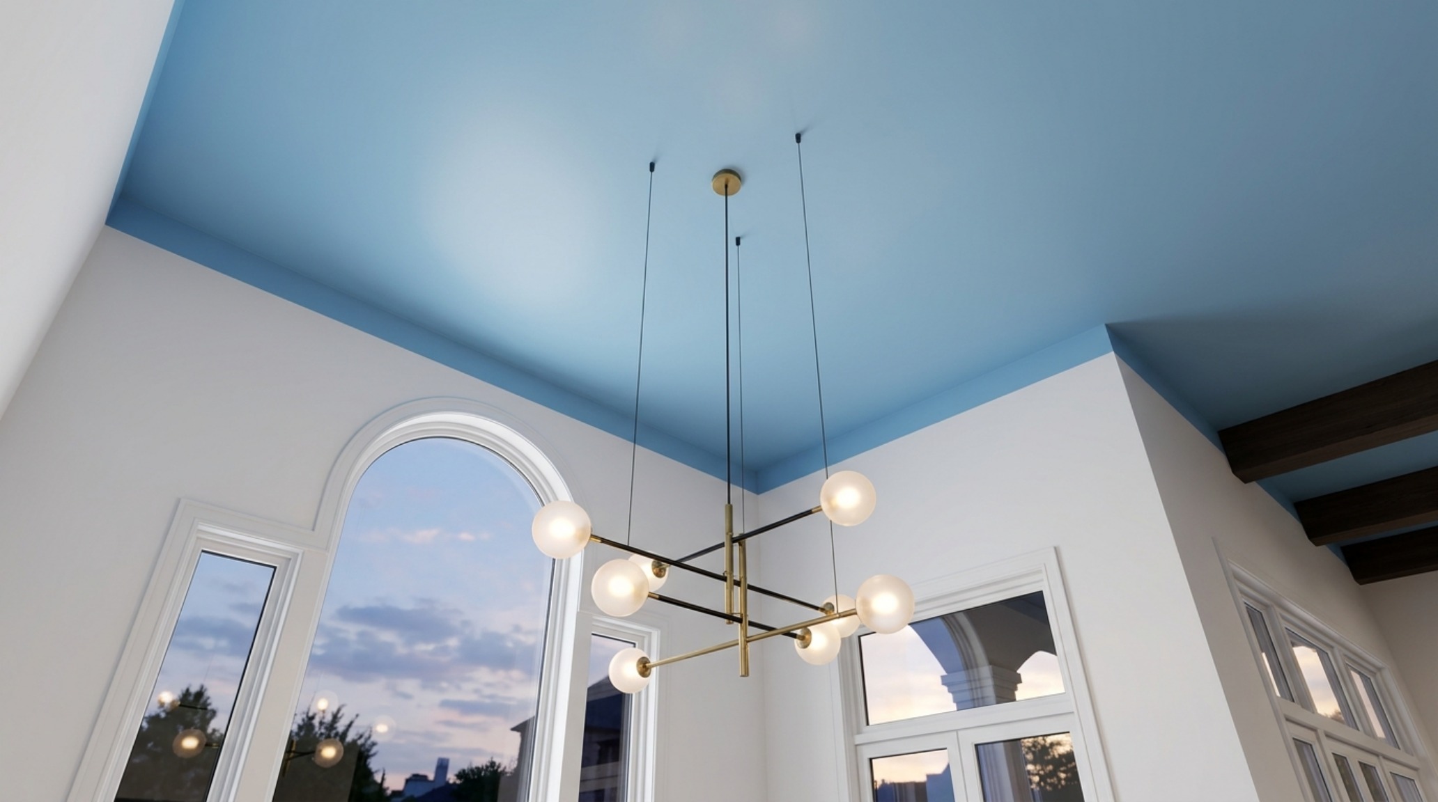
The bedroom is our ultimate retreat, yet it is often the most neglected room in terms of spatial creativity. Traditional layouts place a bed against a white wall with two nightstands. To create a truly ergonomic sanctuary, we look to color drenching bedroom techniques. This involves painting the ceiling—the ‘fifth wall’—in a slightly lighter or identical shade to the walls. In a small room, this eliminates the ‘lid’ effect of a bright white ceiling, which can make a space feel shorter and boxy.
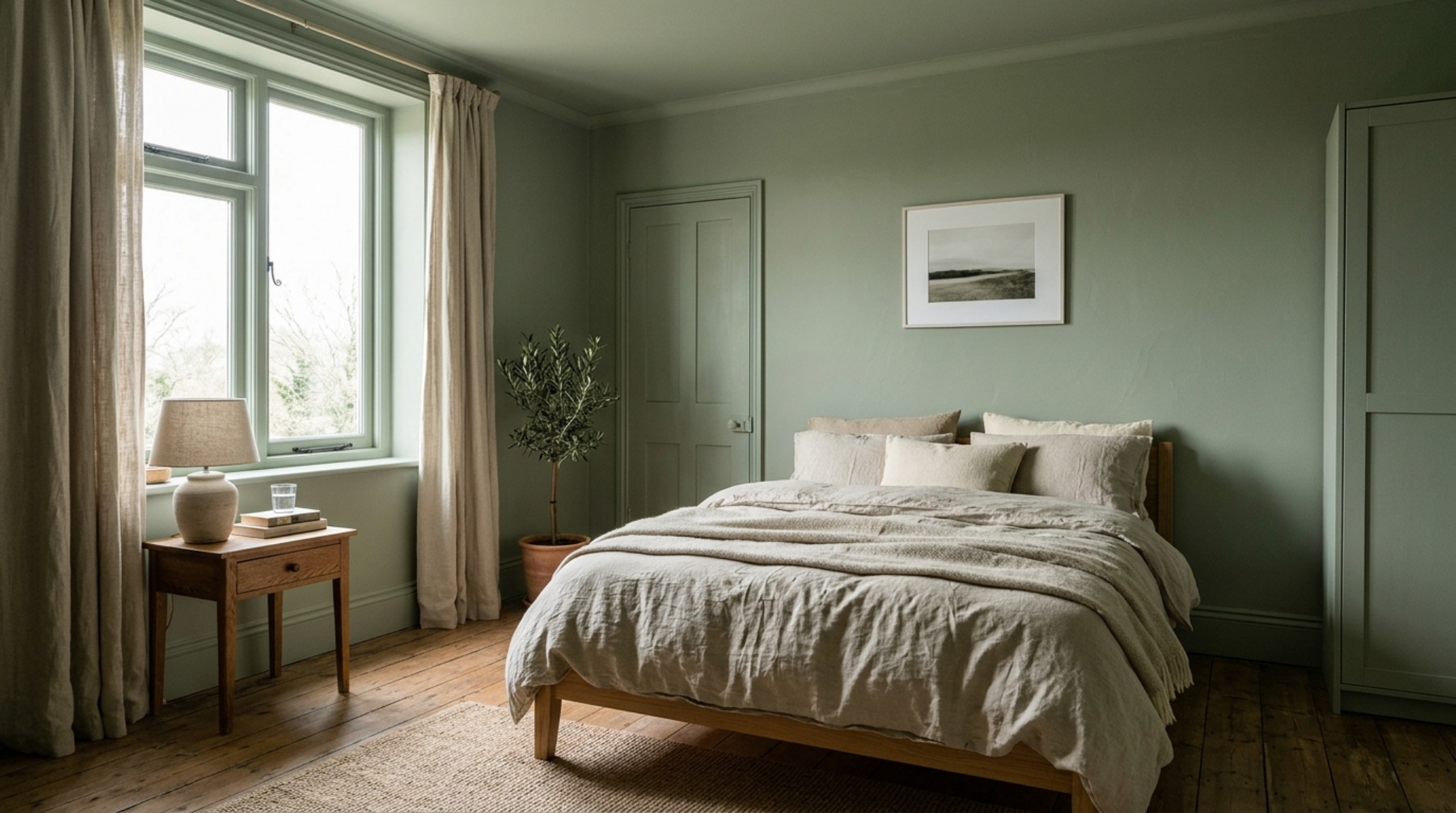
By bringing the wall color up and over, you soften the sightline alignment. Imagine a deep, forest-inspired sage green that wraps around you. When you lie down, your vision isn’t interrupted by a harsh white plane; instead, you are enveloped in a singular, calming hue. This biophilic interior paint trend connects the inhabitant to the natural world, even in a high-rise, fostering a sense of security and rest. Ensure your bedside reach (typically 18 inches from the mattress edge) is unobstructed by bulky furniture; instead, use floating shelves painted to match the wall for a seamless, ergonomic flow.
Architectural Specification & Material Matrix
Curated tactile palette, spatial dimensions, and atmospheric lighting index for this design scheme.
Ultimately, the success of a modern home lies in its ability to adapt to our biological needs. By looking past the surface of the wall and seeing it as a dynamic tool for spatial organization, we can transform even the smallest floor plans into intuitive, high-functioning environments. The legacy of creative paint decor ideas is not found in the trend cycle, but in the enduring comfort of a home that understands exactly how you live, move, and breathe within its walls. As we continue to blur the lines between architecture and interiority, pigment remains our most accessible and powerful instrument for human-centric design.
Editorial Silo • Recommended Architecture Studies
- The New Tactility: Why Designers are Replacing Sterile Whites with Warm Plaster Tones and Sensory Earth Neutrals — Archival Design Case Study
- The Tactile Aesthetic of Greige Paint: Materials, Moods & Lighting Kelvin — Archival Design Case Study
Architectural Inspiration Lookbook
A high-resolution study in spatial proportions, tactile materiality, and light choreography curated for enduring modern living.
Curated Visual Lookbook
Design Gallery & Spatial Studies
A visual curation of architectural arrangements, lighting concepts, and material palettes featured in this space.