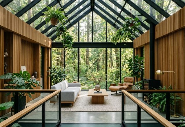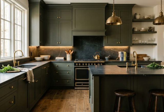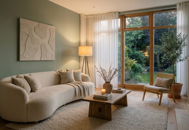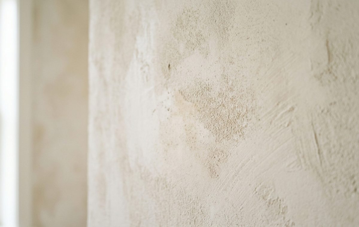
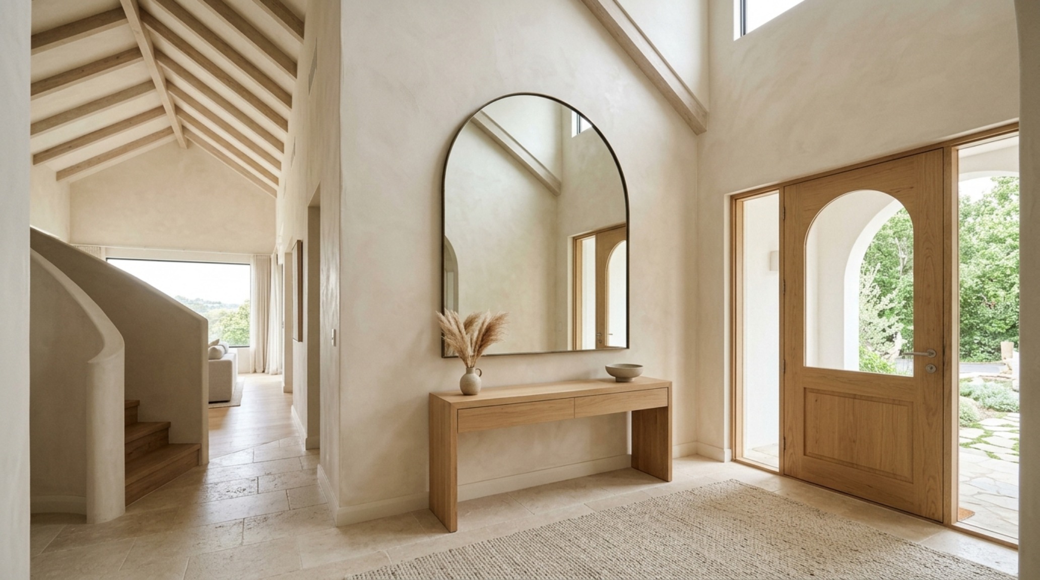
There is a specific, quiet alchemy that occurs when the first rays of morning light graze a hand-applied lime-wash wall. It is a departure from the clinical perfection of the last decade, a move toward an architecture that breathes and evolves with the passing hours. As we look for fresh paint color decor ideas, the conversation has shifted away from the flat, two-dimensional surfaces of traditional latex toward the sculptural depth of mineral-based finishes. This is design as a sensory experience, where the wall is no longer just a boundary but a participant in the room’s narrative.
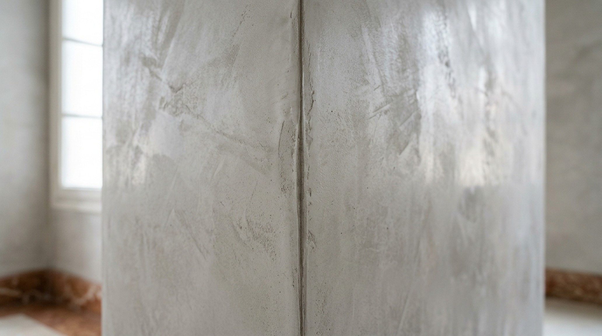
The current obsession with ‘Quiet Luxury’ in interior design isn’t about excess; it is about the integrity of materials. We are seeing a profound return to Roman Clay, Venetian Plaster, and Limewash—finishes that offer a soft, chalky patination that flat paint simply cannot replicate. These materials interact with light in a way that creates a ‘living’ wall. When you combine these ancient techniques with modern color theory and precise lighting specifications, you transform a standard room into a sanctuary of tactile grounding.
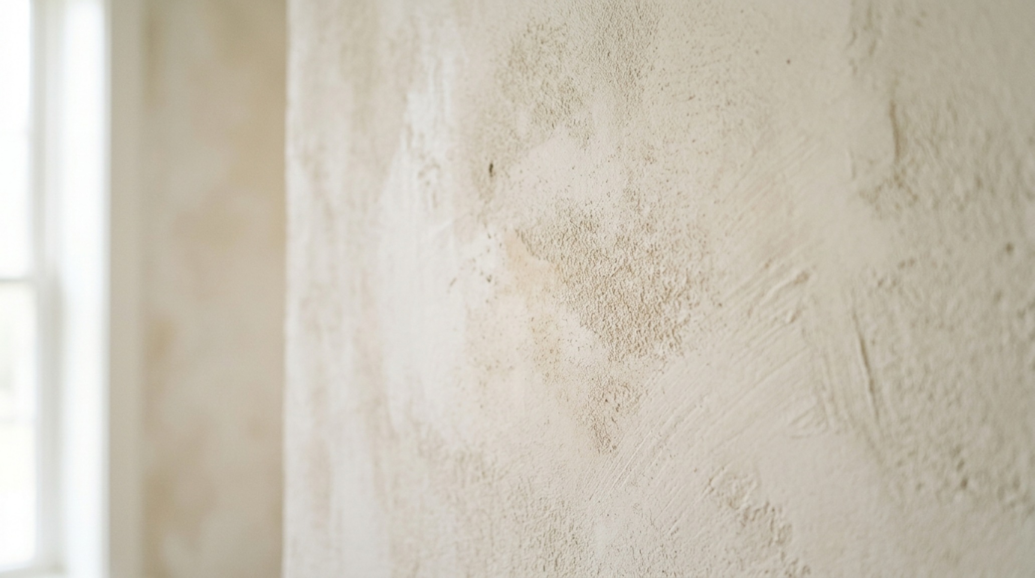
The Science of the Surface: Why Texture Changes Everything
To understand why these architectural paint finishes are dominating contemporary mood boards, we have to look at the physics of light reflection. A standard matte paint has a uniform surface that bounces light back in a predictable, flat manner. In contrast, limewash is composed of microscopic crystals that refract light in multiple directions. This creates a subtle mottling effect—a soft, cloud-like movement that gives the eye a place to rest.
When exploring interior color trends, designers are increasingly opting for ‘Color Drenching’—the practice of painting walls, trim, ceilings, and even cabinetry in the same hue. However, the secret to making this work without it feeling claustrophobic is varying the texture. Imagine a room drenched in Benjamin Moore’s ‘Swiss Coffee.’ By using a Roman Clay finish on the walls and a satin enamel on the baseboards, you create a tonal hierarchy. The walls absorb light, while the trim reflects it, providing just enough visual separation to define the architecture while maintaining a seamless, immersive feel.
The Psychology of Depth: Why Paint Color Decor Ideas Are Shifting Toward Texture
Our homes have become our primary retreats, and the psychological impact of our surroundings is more scrutinized than ever. Wall color psychology tells us that flat, high-contrast environments can be overstimulating. By introducing tactile hues, we introduce a sense of ‘organic modernism’ that feels rooted in nature. This isn’t just about aesthetics; it’s about spatial cadence—the rhythm of how we move through and perceive a space.
Take, for instance, the resurgence of Sherwin-Williams ‘Greek Villa.’ In a standard eggshell finish, it is a reliable, warm off-white. But apply it as a layered lime-wash, and it takes on the quality of aged stone. It softens the hard edges of a modern build, providing a ‘negative space breathing room’ that allows your furniture and art to stand out. In the modern living room, where we often balance sleek technology with natural elements, these textured walls provide the necessary bridge between the digital and the physical.
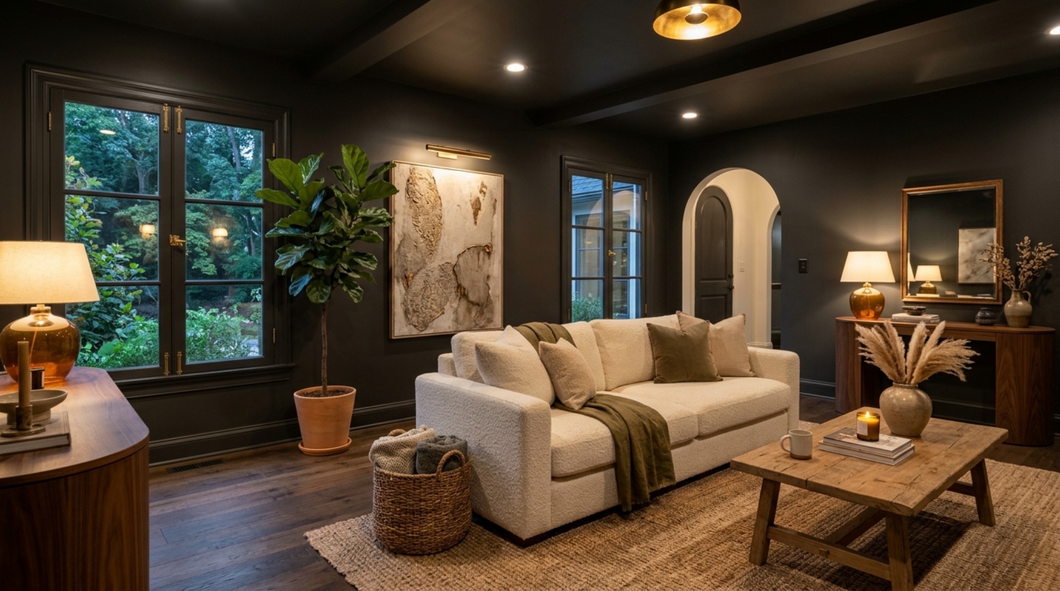
Mastering the Glow: The 2700K vs. 3000K Debate
No discussion of architectural finishes is complete without addressing light temperature. You could choose the most exquisite designer color palettes, but if your lighting is off, the entire scheme collapses. For a truly immersive, high-end atmosphere, the industry standard is shifting toward a strictly warm spectrum—specifically 2700K ambient lighting.
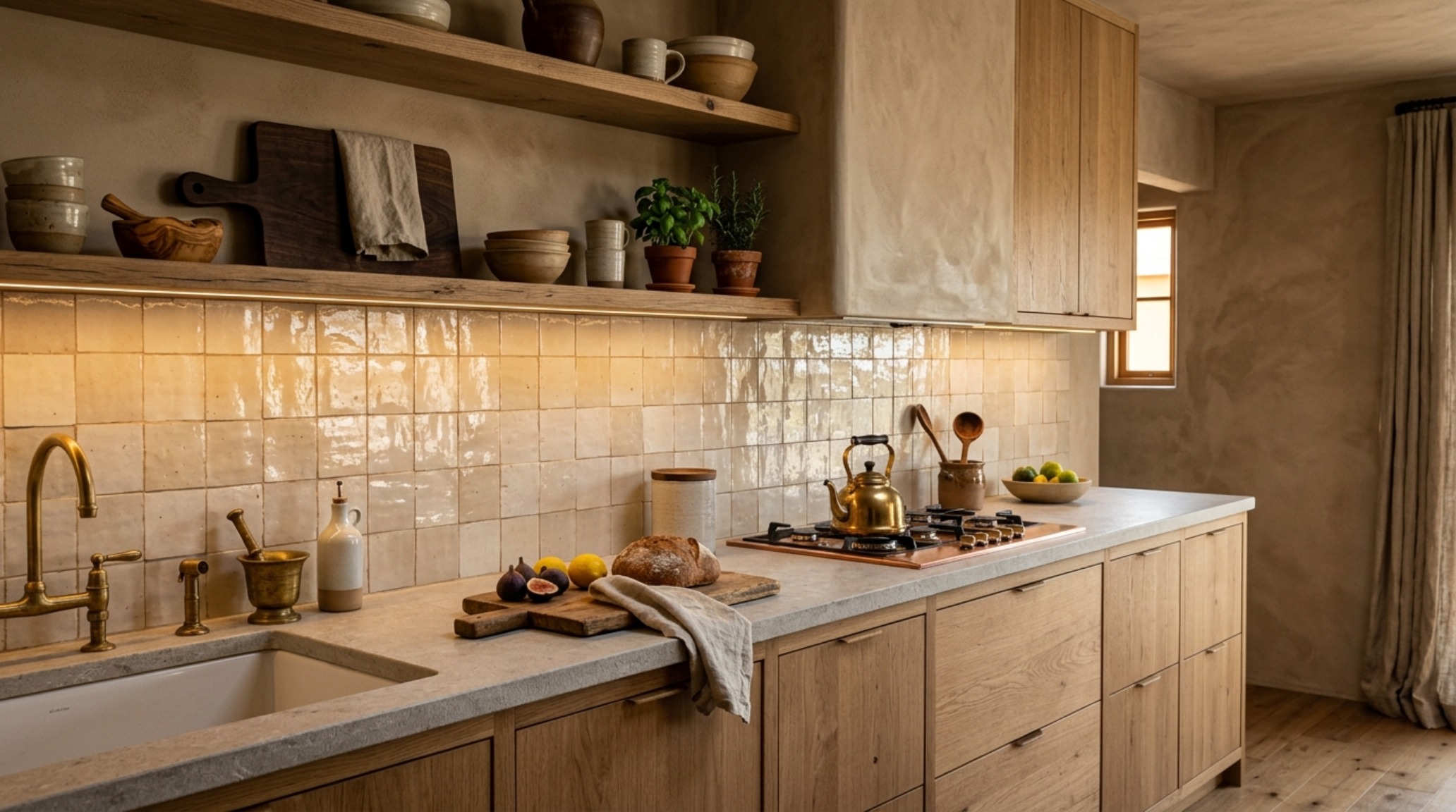
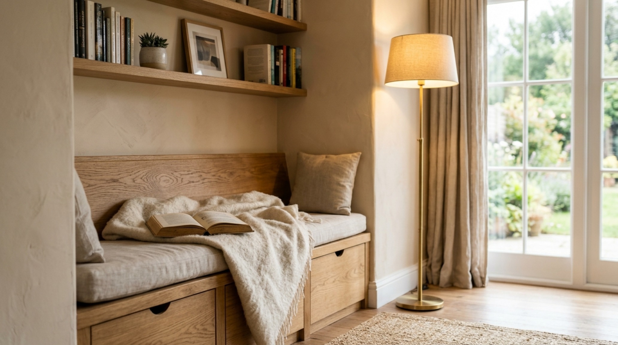
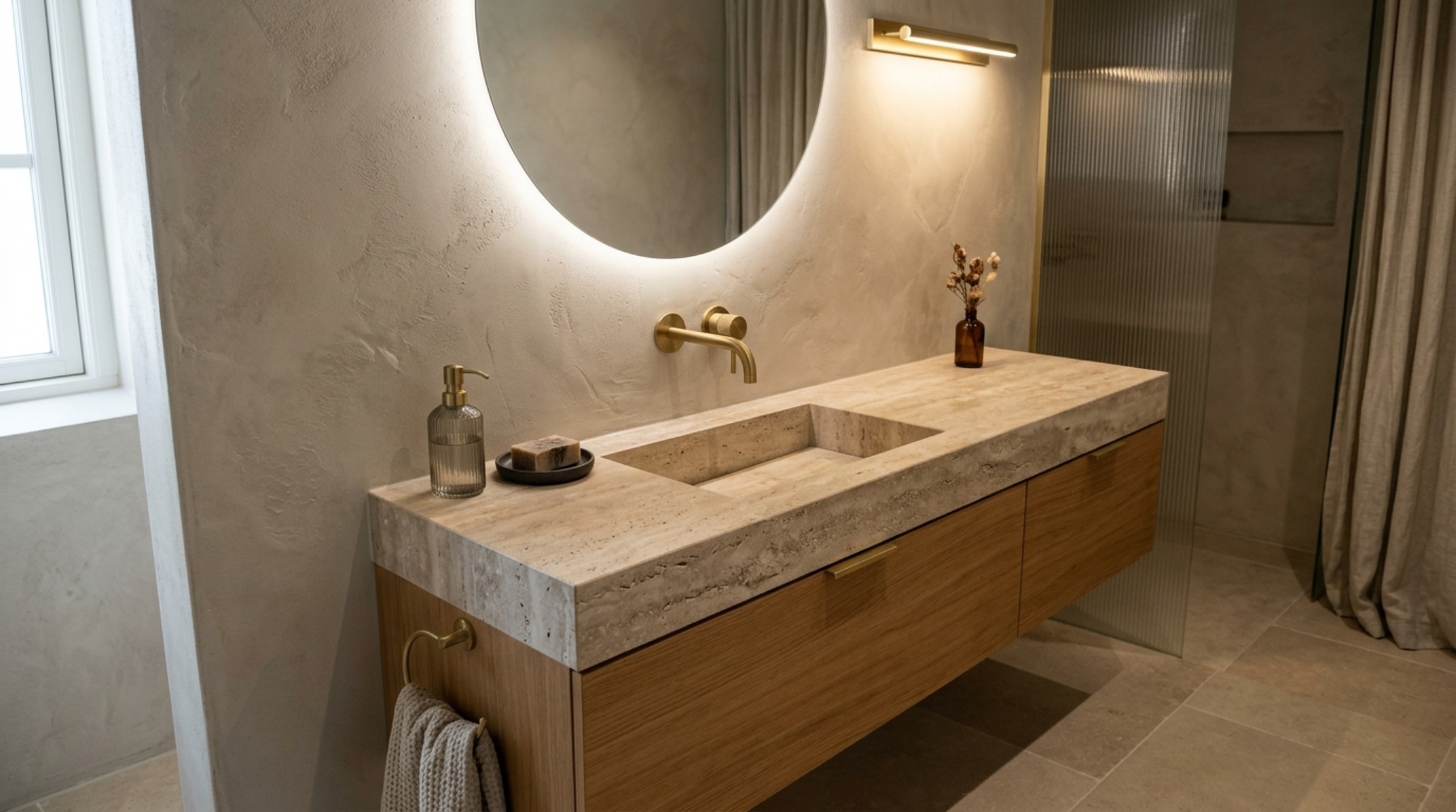
At 2700K, the light mimics the golden hour of a setting sun. This warmth activates the pigments in colors like Farrow & Ball’s ‘Setting Plaster,’ bringing out the underlying ochre and terracotta notes. If you move to 3000K, the light becomes cleaner and more ‘gallery-like,’ which is excellent for task areas like kitchens but can feel clinical on textured walls. To achieve the ‘Quiet Luxury’ look, I recommend a layered approach: 2700K for your primary ambient layers (recessed cans, floor lamps) and 3000K only where functional precision is required, ensuring all bulbs have a High CRI (Color Rendering Index) of 90 or above. This ensures that the ‘Iron Ore’ on your walls looks like a deep, velvety charcoal rather than a muddy green.
Spatial Alignment and Architectural Clearances
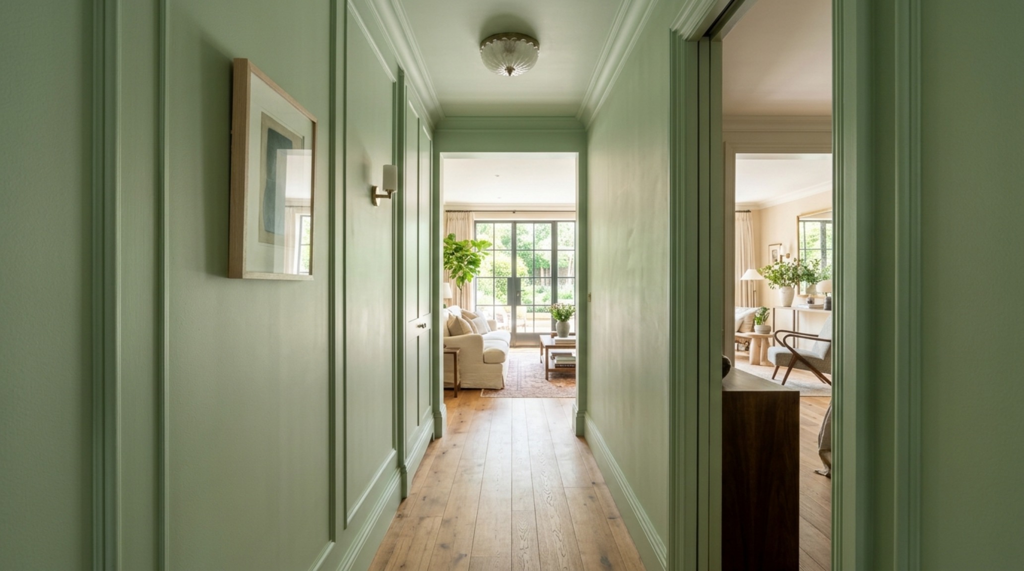
A beautiful wall is only as good as the space it encloses. Professional interior design is as much about math as it is about art. When planning your layout around these new textures, respect the physical clearances that define a comfortable home. In a primary circulation path, ensure a 36-inch standard walkway clearance. This allows the texture of the walls to be appreciated at a slight distance rather than being something you constantly brush against. Similarly, in a dining environment, a 30-inch clearance behind chairs is non-negotiable for flow, ensuring the sightline alignment remains unobstructed.
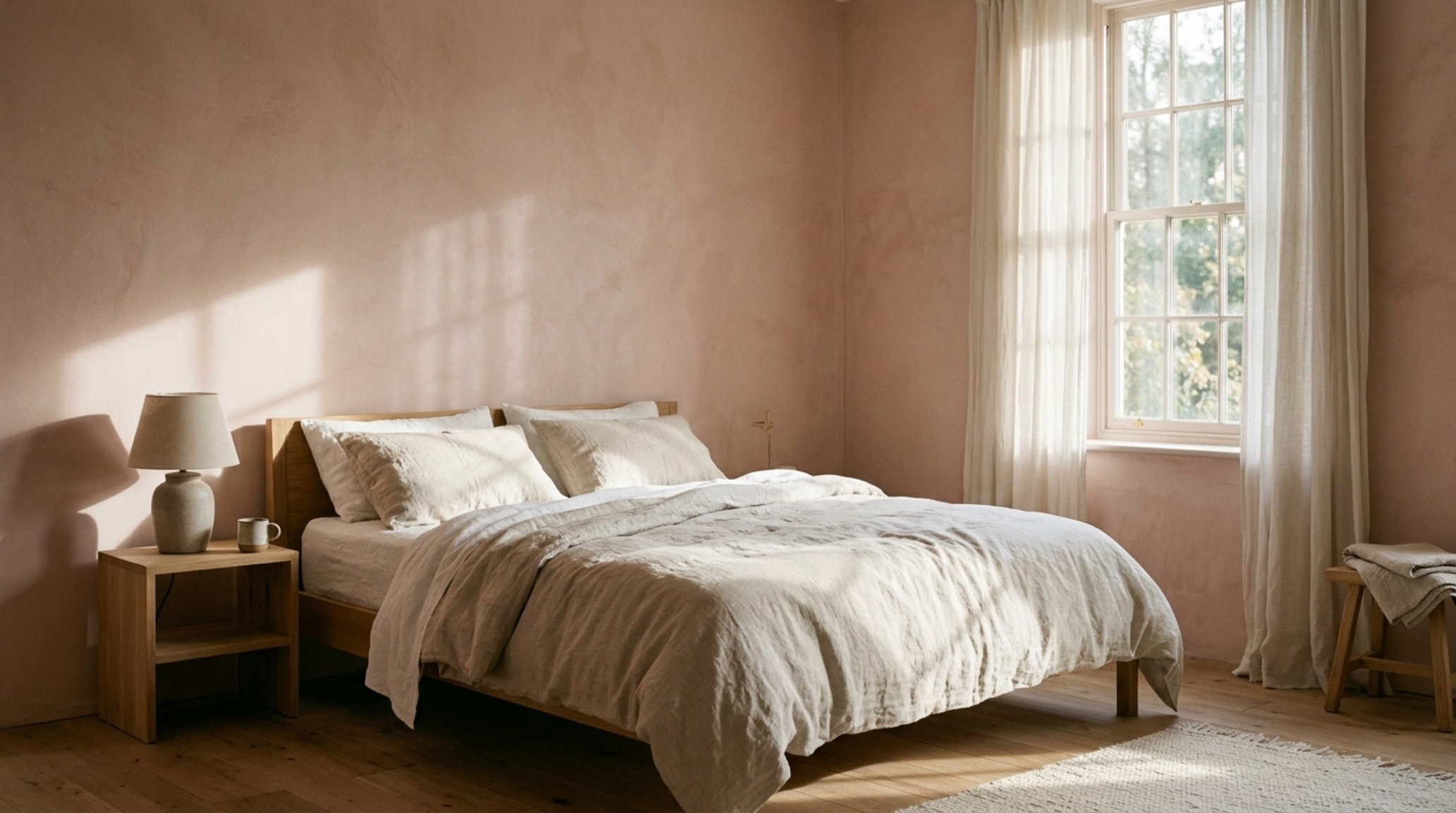
The New Neutrals: A Curated Palette for 2025
We are moving away from the ‘cool grays’ of the 2010s and into a landscape of ‘warm minimal’ paint colors. These are hues that have a high ‘Light Reflectance Value’ (LRV) but are tempered with gray or brown undertones to prevent them from feeling stark. Let’s look at a few essential swatches for your next project:
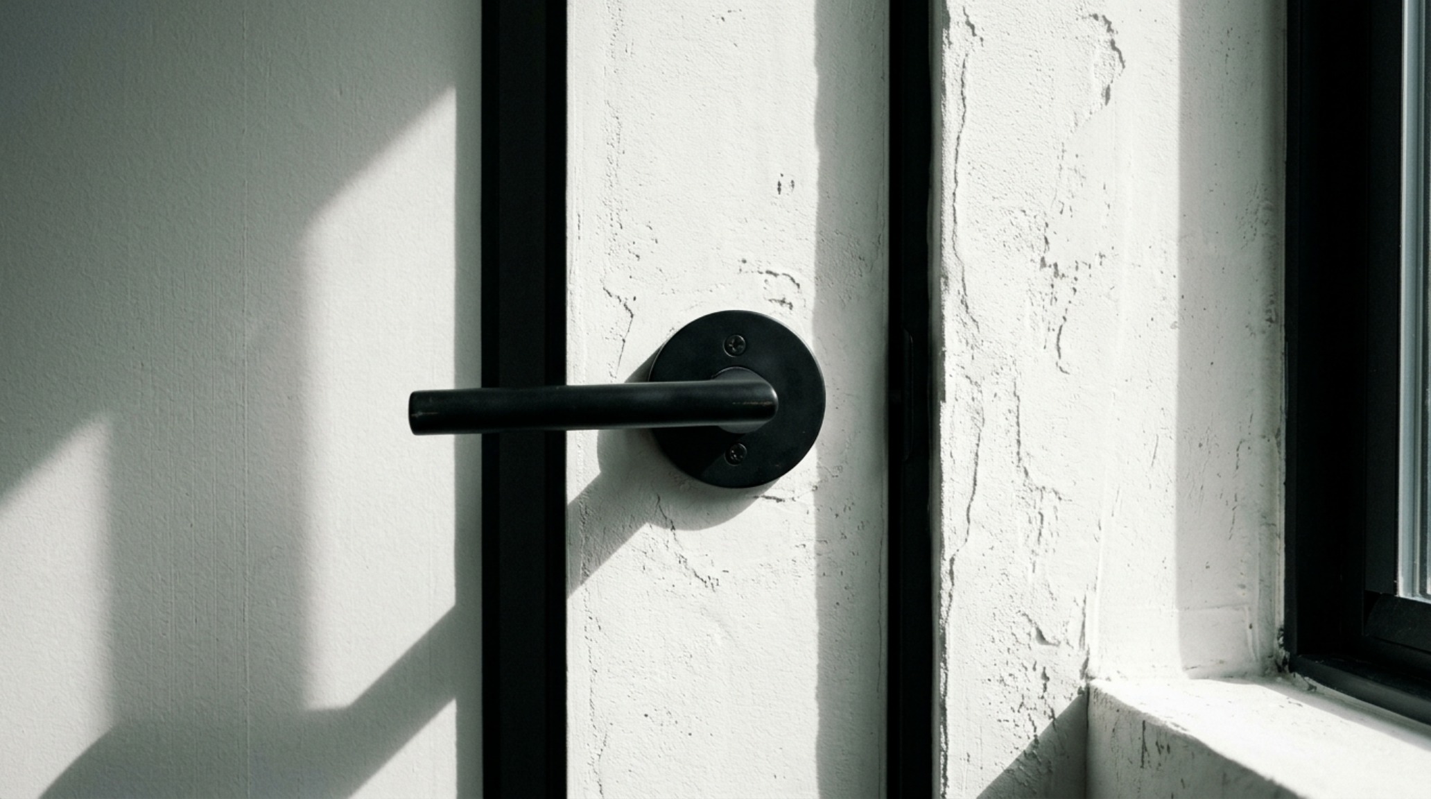
- Sherwin-Williams Iron Ore: A sophisticated, soft black. When used in a matte or limewash finish, it creates an incredible sense of intimacy in a den or primary suite.
- Benjamin Moore Swiss Coffee: The gold standard for warm whites. It pairs beautifully with fluted white oak cabinetry and honed travertine.
- Farrow & Ball Setting Plaster: A dusty, architectural pink that acts as a neutral. It is particularly effective in entryways where it creates a welcoming, sun-kissed glow.
The key to these aesthetic paint color interior trends 2025 is the interaction between the wall and the floor. A textured wall requires a grounded floor—think wide-plank European oak or large-format limestone tiles. The 18-inch coffee table reach from a sofa isn’t just a functional rule; it’s a visual one. It ensures that the scale of your furniture doesn’t overwhelm the delicate ‘movement’ of the limewash behind it.
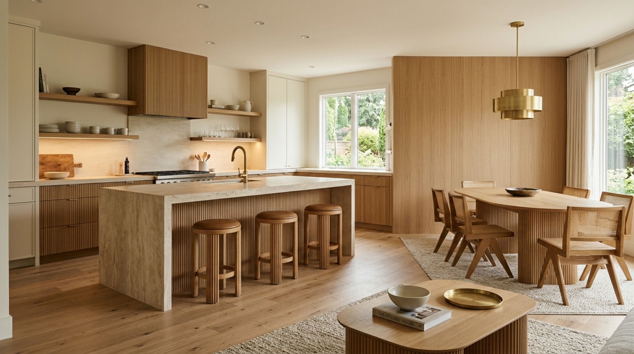
Zoning and Functional Materiality
Using different textures is an elite way to zone an open-concept floor plan. Instead of using physical dividers, use ‘Materiality Zoning.’ A feature wall in Venetian Plaster can define the dining area, while a softer Roman Clay defines the living space. This creates a psychological shift as you move from one ‘zone’ to another, without breaking the visual continuity of the home. This demand for functional zoning is a hallmark of modern high-end residential design, where every square foot must serve both a purpose and a feeling.
Architectural Specification & Material Matrix
Curated tactile palette, spatial dimensions, and atmospheric lighting index for this design scheme.
Ultimately, the evolution of paint color decor ideas represents a collective yearning for the authentic and the enduring. We are building spaces that prioritize how we feel within them—choosing the rough over the smooth, the warm over the cold, and the nuanced over the uniform. By embracing the imperfections of hand-applied finishes and the soulfulness of warm light, we create homes that don’t just look like a photograph but feel like a lived experience. It is a commitment to the quiet poetry of shadow and the timeless resonance of organic design.
Editorial Silo • Recommended Architecture Studies
- Ergonomic Mastery: Functional & Space-Saving Hacks for Concept House Greenhouse Experiment — Archival Design Case Study
- Verdant Shadows & Tactile Depth: Sophisticated Disney Go Away Green Decor Ideas for the Modern Sanctuary — Archival Design Case Study
Architectural Inspiration Lookbook
A high-resolution study in spatial proportions, tactile materiality, and light choreography curated for enduring modern living.
Curated Visual Lookbook
Design Gallery & Spatial Studies
A visual curation of architectural arrangements, lighting concepts, and material palettes featured in this space.