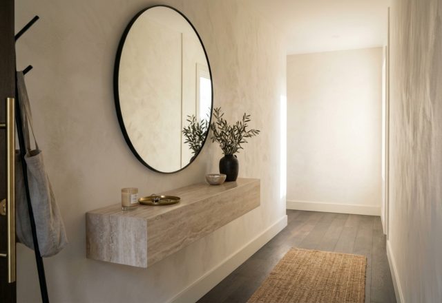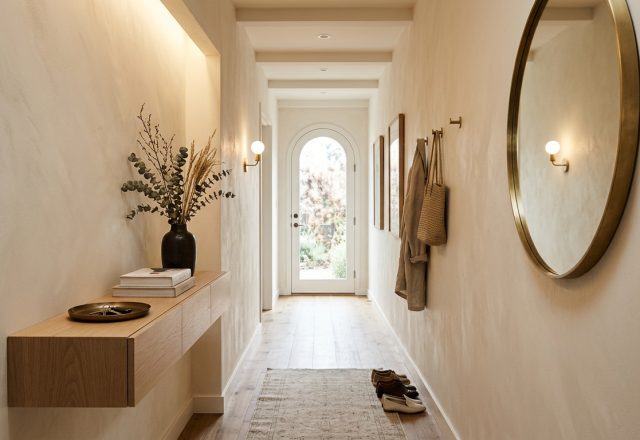
There is a specific, quiet tension that exists in the architecture of the threshold. It is the first breath of a home, yet so often, the narrow entryway becomes a spatial afterthought—a utilitarian transit zone cramped by the gravity of architecture. When we talk about narrow entryway ideas, we aren’t just discussing where to drop your keys; we are designing the cadence of arrival. To move from the chaotic exterior world into a curated interior requires a visual recalibration. By applying the ‘Gallery Perspective’ technique, we can intentionally manipulate vertical sightlines and leverage the Golden Ratio to transform a claustrophobic hallway into a rhythmic, expansive experience.
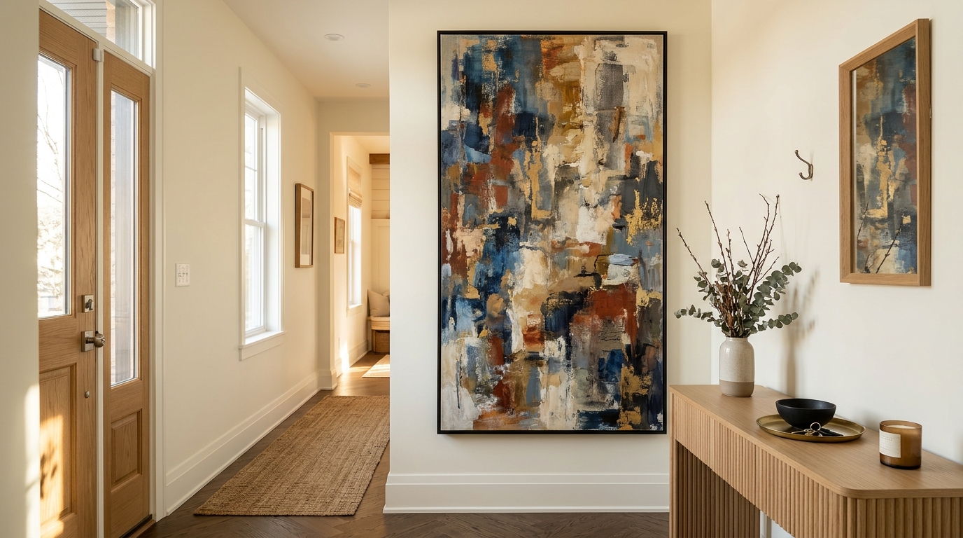
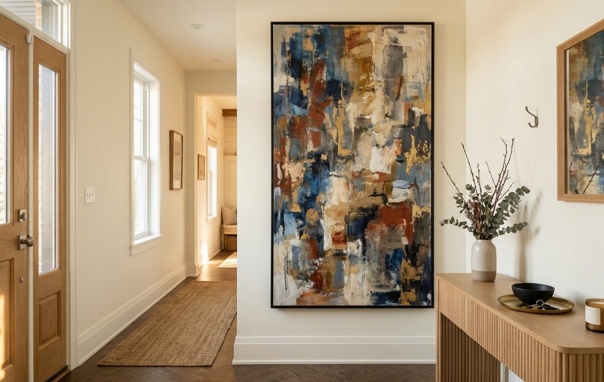
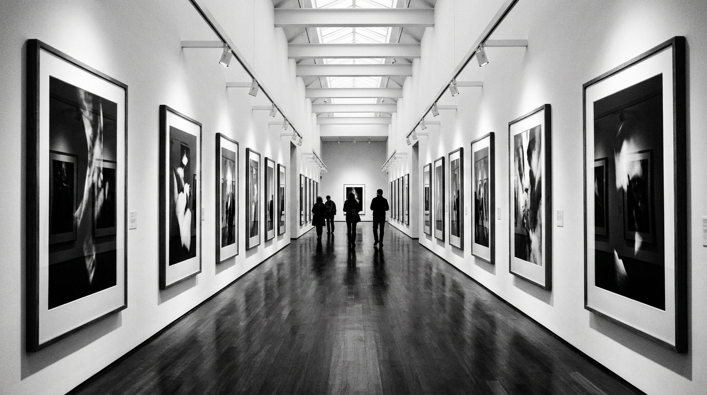
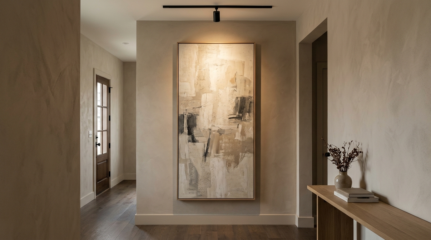
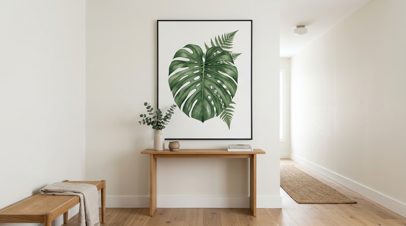
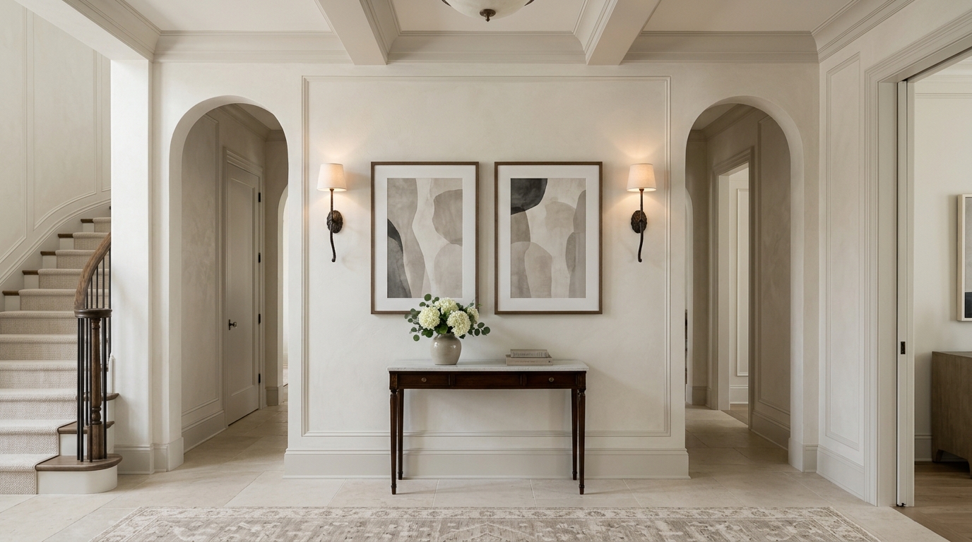
The fundamental mistake in foyer design is the impulse to scale down. When faced with a tight footprint, the instinct is to choose ‘small’ furniture and ‘small’ decor. However, a cluster of petite objects creates visual noise, making the walls feel as though they are closing in. Instead, we look toward the ‘Hero Statement’ rule. By swapping a cluttered gallery wall for a single, oversized, vertically-oriented piece of hallway wall art, we anchor the eye. This singular focal point breaks the ‘tunnel effect’ by establishing a vertical axis that draws the gaze upward toward the ceiling, effectively doubling the perceived height of the room.
The Architectural Geometry of Narrow Entryway Ideas
In professional interior design layout, we rely on the Golden Ratio (1:1.618) to dictate the placement of objects within a constricted space. For a narrow hallway, this means your primary artwork should occupy approximately 60% of the wall height, leaving 40% as negative space breathing room. This ratio prevents the art from feeling swallowed by the architecture or, conversely, from feeling suffocated by the ceiling line. When you lean into oversized art for narrow hallways, you are essentially creating a window where none exists.
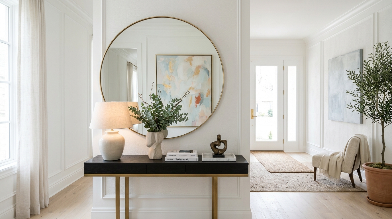
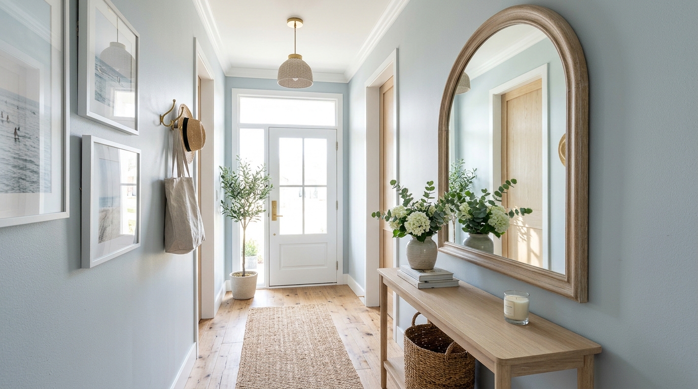
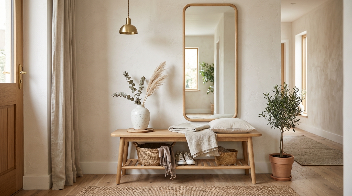
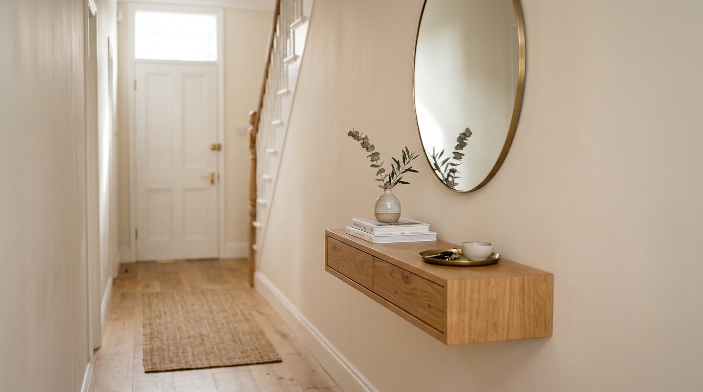
Consider the clearance. A standard primary circulation path requires a 36-inch walkway. In a truly narrow foyer, every inch is a negotiation. If your hallway is 48 inches wide, a 10-inch deep small entryway console table with mirror leaves you with 38 inches of breathing room—well within the ergonomic comfort zone. The mirror serves as a secondary ‘Hero,’ reflecting the vertical artwork on the opposite wall and creating a recursive loop of light and depth.
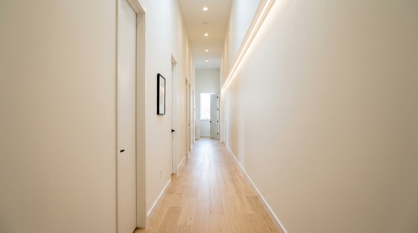
Chromatic Expansion: The Palette of Volume
Color is our most potent tool for altering architectural volume. While pure white can often feel clinical or highlight shadows in a windowless hall, we turn to complex neutrals with high Light Reflectance Values (LRV). Benjamin Moore’s ‘Swiss Coffee’ is a perennial favorite for its ability to hold a soft, creamy warmth without yellowing in low light. For those seeking a cooler, more ethereal atmosphere, Farrow & Ball’s ‘Skylight’ offers a pale, watery blue-gray that mimics the sky, pushing the walls outward visually.
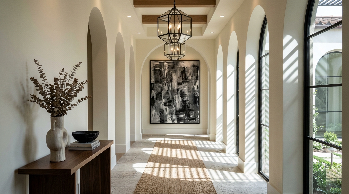
The relationship between entryway artwork and wall color should be one of ‘low-contrast harmony.’ A large canvas featuring soft, abstract forms in sand, ochre, and charcoal, set against a ‘Swiss Coffee’ backdrop, creates a tactile grounding. This prevents the artwork from jumping off the wall too aggressively, which can make a narrow space feel jumpy. We want the art to feel like a permanent architectural feature, not a temporary additive.
Tactile Materiality and the Grounding Effect
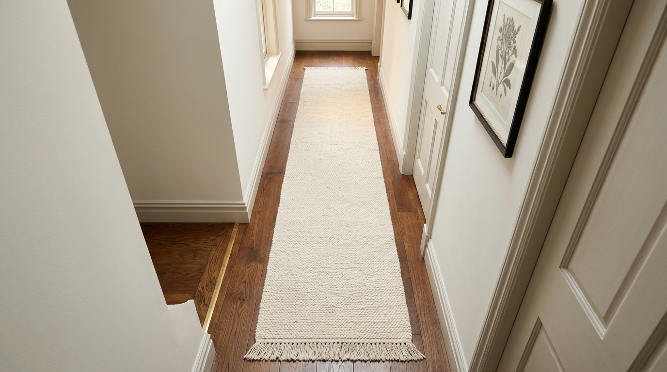
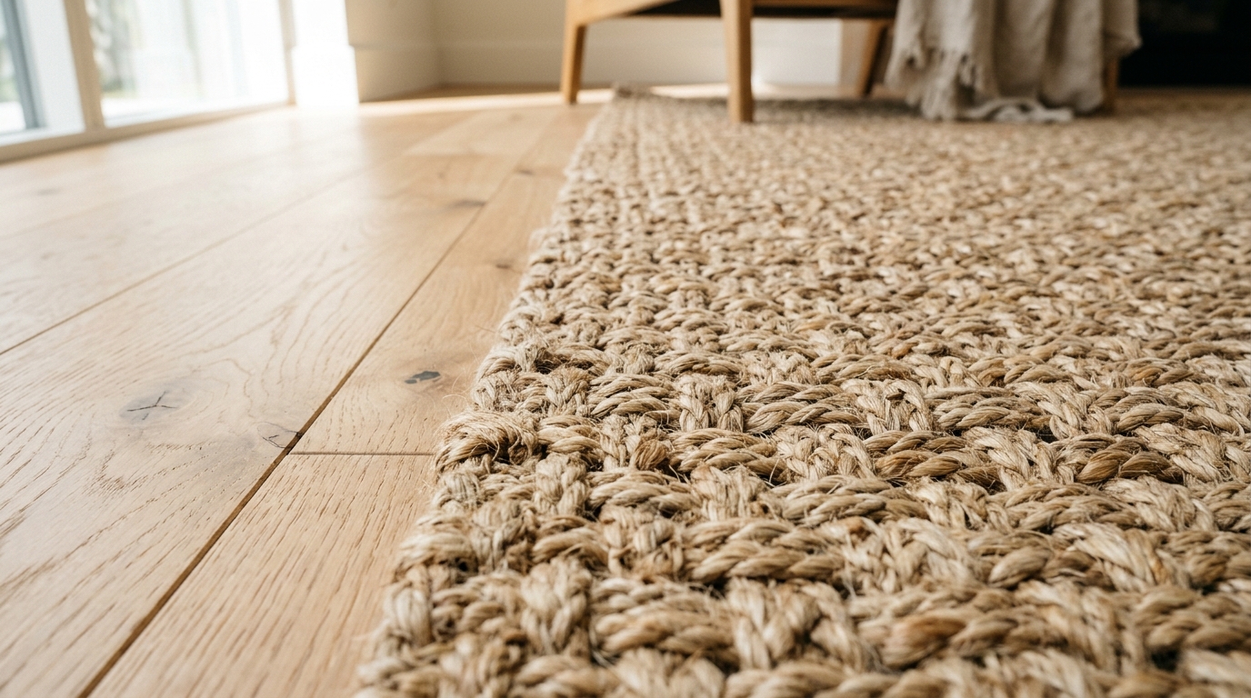
Design is a sensory experience that begins underfoot. A narrow hallway runner rug is more than a floor covering; it is a directional guide. Look for high-performance materials with subtle textures—think hand-knotted wool or jute with a fine weave. A rug that stops 6 inches short of the baseboards on all sides creates a ‘border’ effect, which paradoxically makes the floor feel wider by defining its limits. Avoid busy, small-scale patterns; instead, opt for a monochromatic texture or a large-scale, soft geometric that complements the modern foyer wall decor.
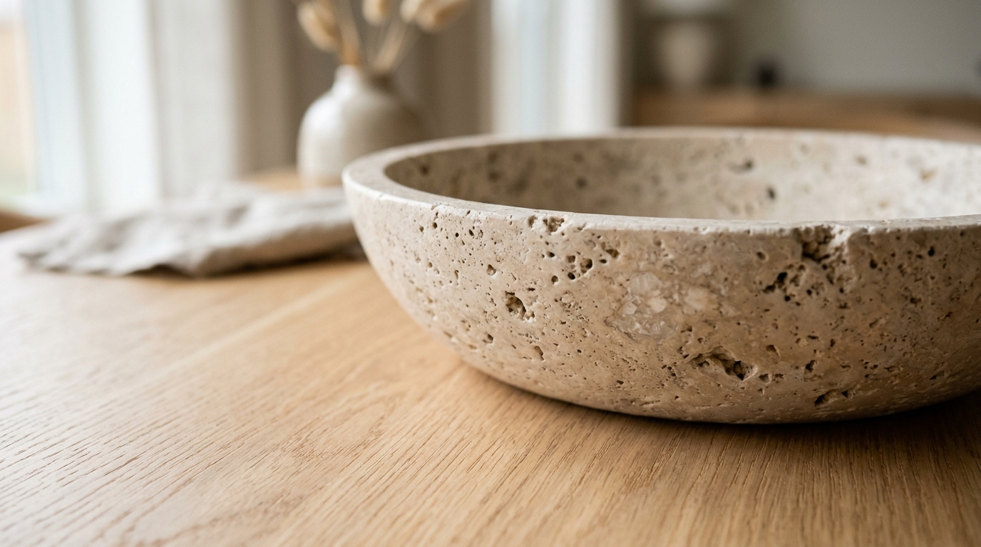
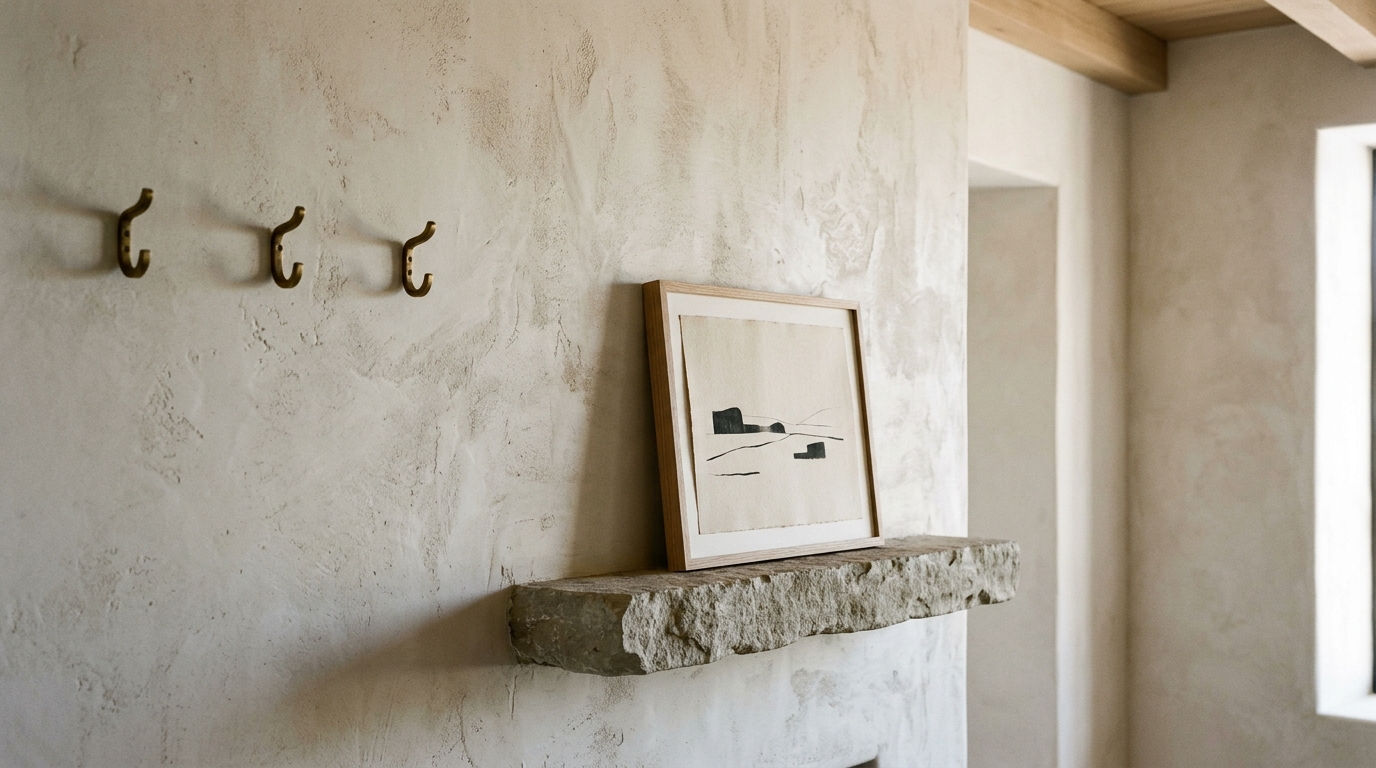
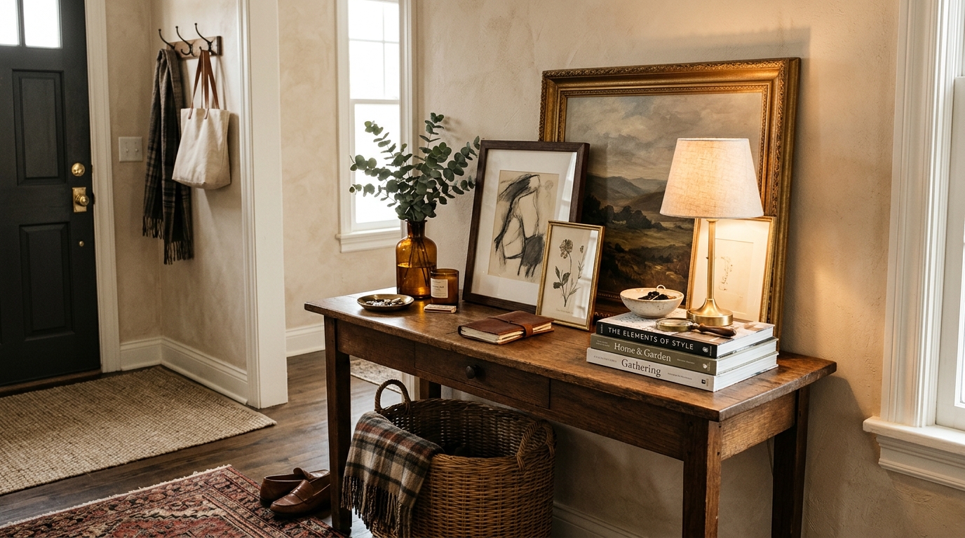
Materiality should extend to the surfaces we touch. A leaning artwork on console table arrangement allows for a layered, casual elegance. Pair this with a honed travertine bowl for mail or a fluted white oak console. The contrast between the cool, matte stone and the warm, vertical grain of the wood provides the ‘tactile materiality’ that distinguishes a high-end gallery space from a generic corridor.
Atmospheric Lighting: The 2700K Rule
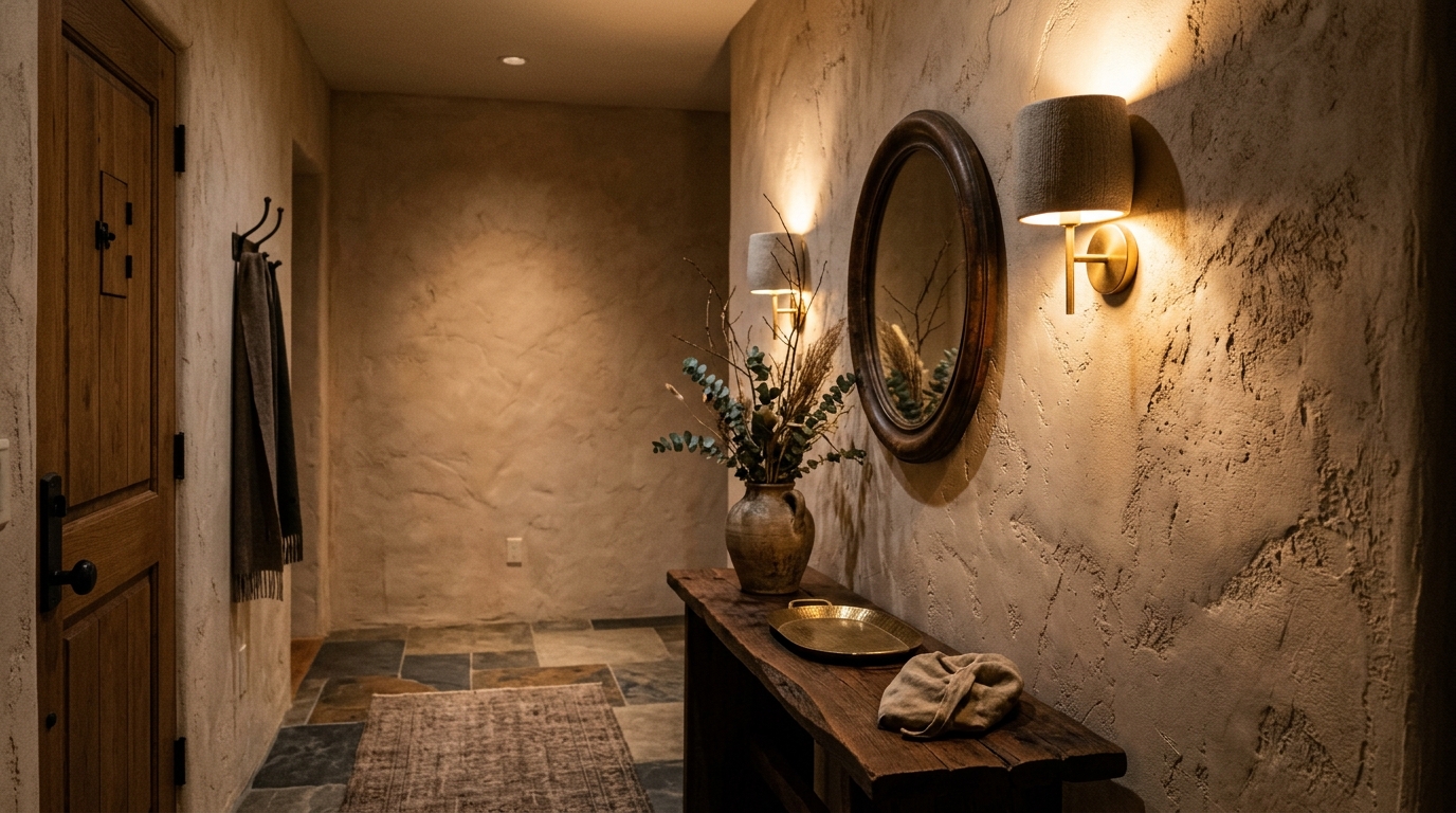
Lighting is the invisible architecture of the home. In a narrow entry, overhead lighting can often be harsh, casting unflattering downward shadows that emphasize the narrowness. To achieve a true ‘Gallery Perspective,’ we shift the focus to layers. We specify 2700K warm ambient lighting to mimic the golden hour, providing a welcoming, residential glow that 3000K task lighting simply cannot replicate.
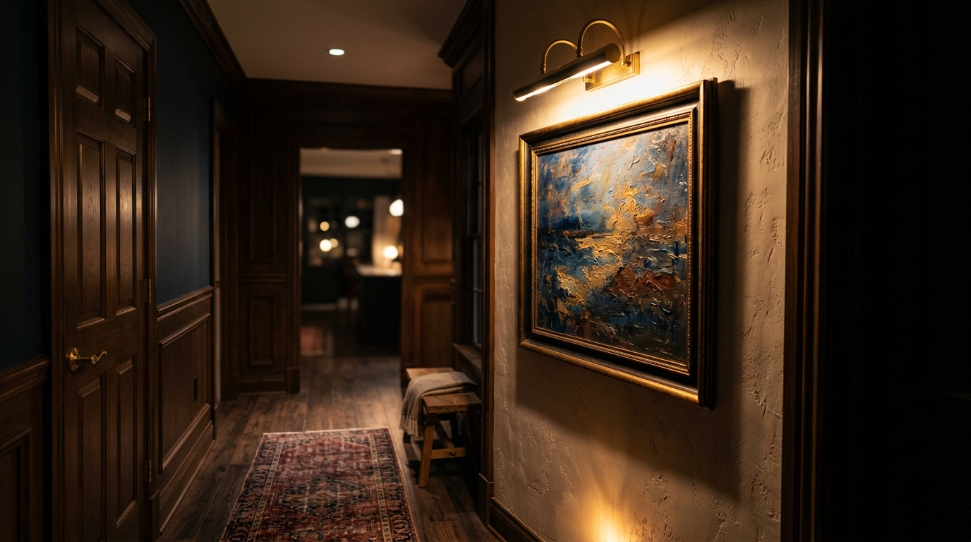
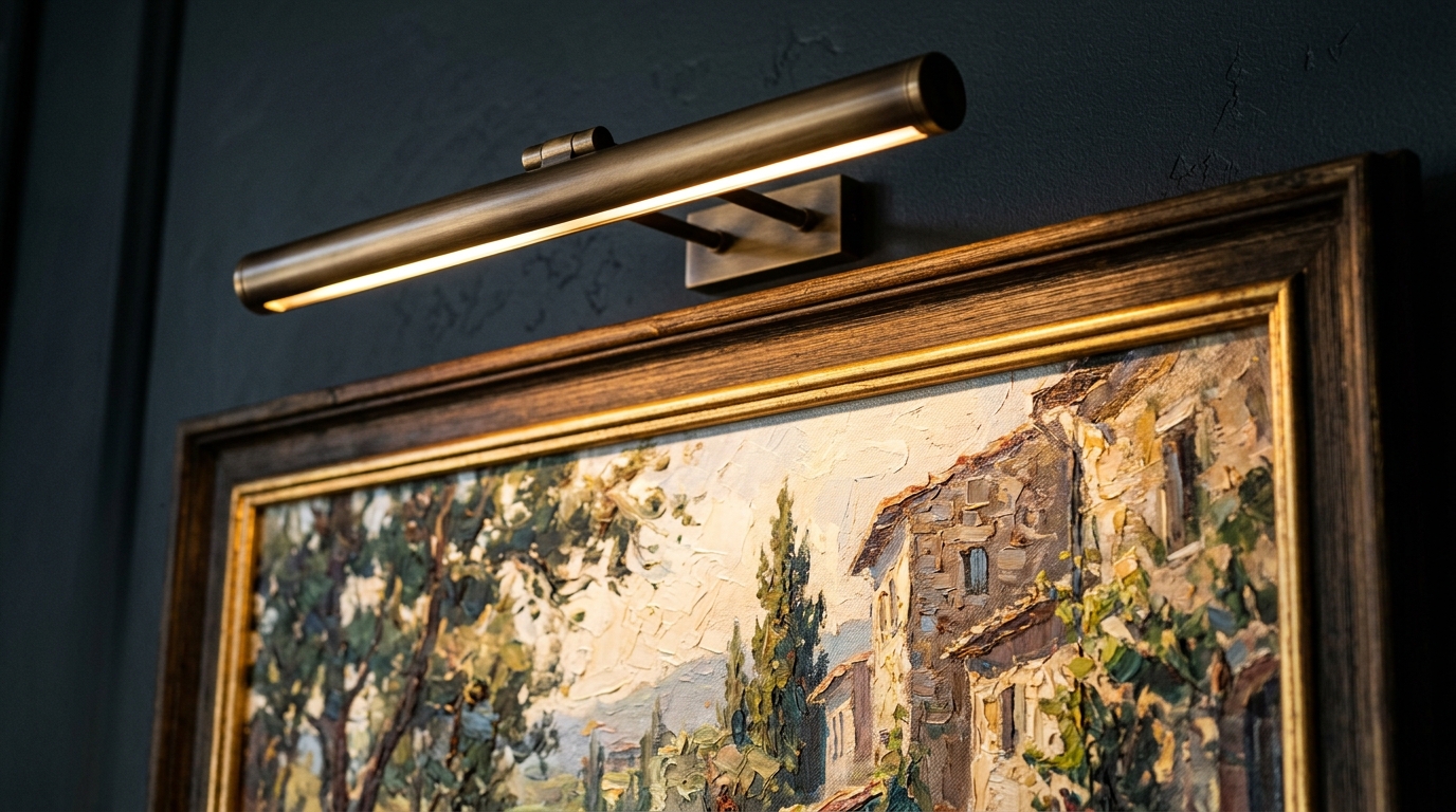
The secret is directional light with a high Color Rendering Index (CRI) of 90+. Wall-mounted picture lights or adjustable recessed spots should be aimed directly at the Hero artwork at a 30-degree angle. This creates ‘shadow play’ and highlights the texture of the canvas or the grain of the frame, pulling the viewer’s attention away from the proximity of the opposite wall. This directional focus is a hallmark of sophisticated small entryway decor ideas.
Ergonomics of the Threshold
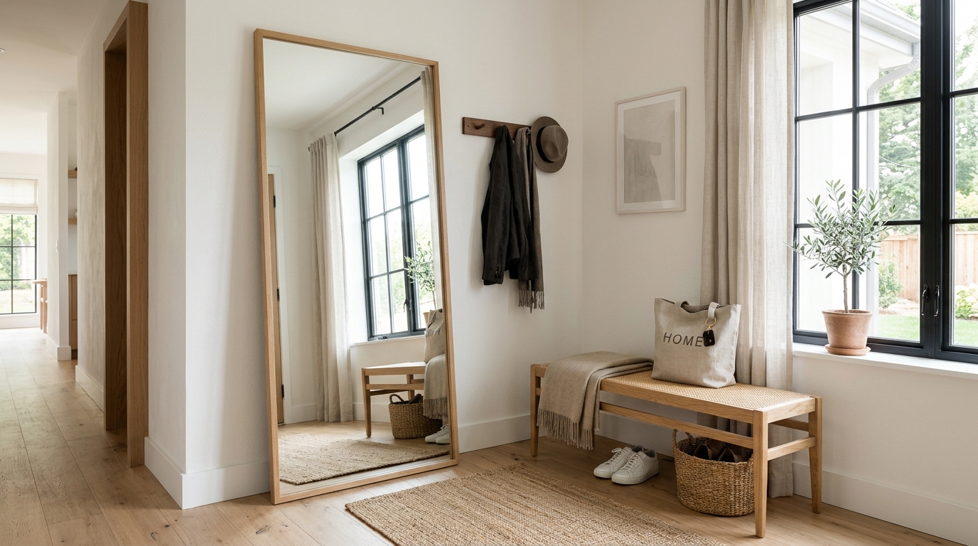
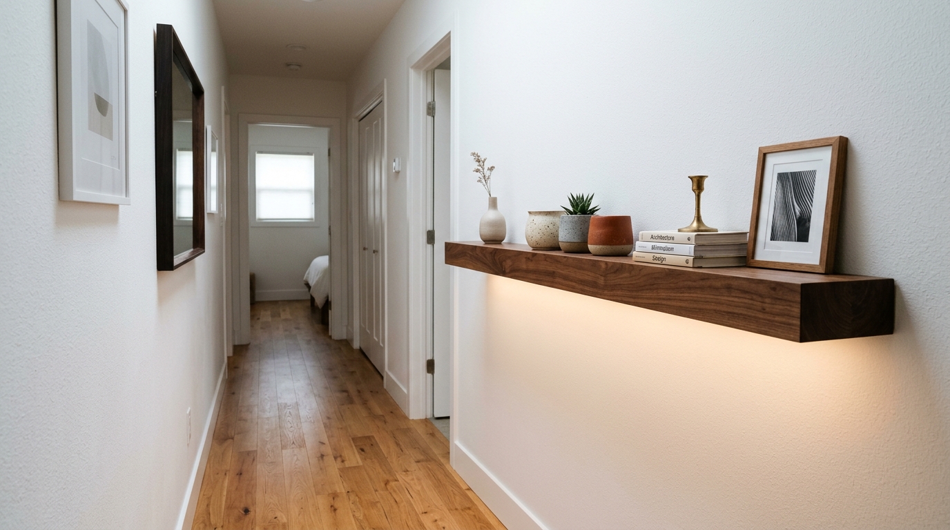
Every design choice must be grounded in the reality of human movement. A small entryway console table with mirror should sit at a standard height of 30 to 34 inches, allowing for a natural reach for keys or a phone. If the space is too tight for a console, a floating shelf at 36 inches provides the same functionality without the visual weight of legs. We also consider the ‘landing zone’—the 18 to 24 inches immediately inside the door where one pauses to shed the outside world. Keeping this area clear of heavy furniture ensures the architectural flow remains unobstructed.
Functionality does not have to be ugly. A minimalist wall-mounted hook in brushed brass or blackened steel, placed at 65 inches (standard eye level), becomes a sculptural element when not in use. This balance of utility and aesthetics is what defines a curated foyer.
Architectural Specification & Material Matrix
Curated tactile palette, spatial dimensions, and atmospheric lighting index for this design scheme.
Ultimately, the successful execution of narrow entryway ideas lies in the restraint of the designer. It is the refusal to fill every void and the courage to let one large, meaningful piece of art speak for the entire room. By aligning our choices with the Golden Ratio and prioritizing high-quality, atmospheric light, we don’t just decorate a hallway; we engineer an experience of homecoming. The entryway becomes a bridge—a soft transition that honors the architecture of the house while whispering a promise of the curated life that lies just beyond the threshold.
Editorial Silo • Recommended Architecture Studies
- Fabulous Designer Foyers: Masterful Narrow Entryway Ideas & Spatial Flow — Archival Design Case Study
- The Tactile Aesthetic of Narrow Entryway: Materials, Moods & Lighting Kelvin — Archival Design Case Study
Architectural Inspiration Lookbook
A high-resolution study in spatial proportions, tactile materiality, and light choreography curated for enduring modern living.
Curated Visual Lookbook
Design Gallery & Spatial Studies
A visual curation of architectural arrangements, lighting concepts, and material palettes featured in this space.