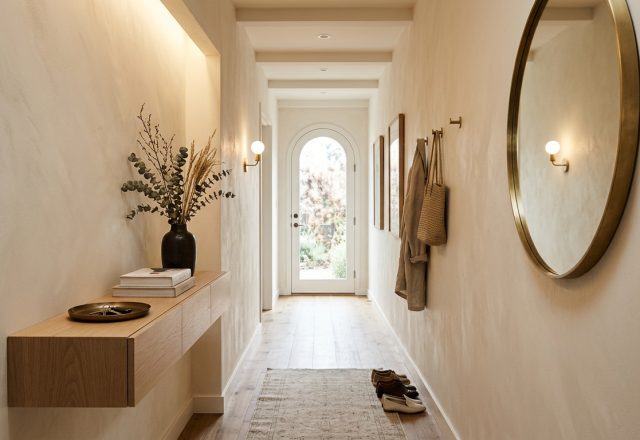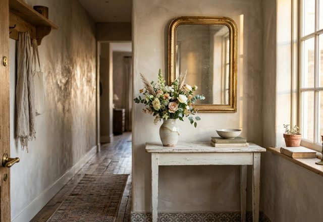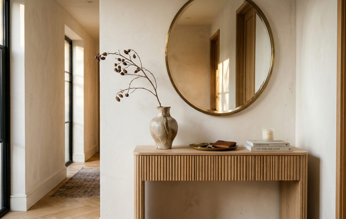
The entry to a home is a psychological threshold, a transition between the cacophony of the outside world and the curated sanctuary of the interior. Yet, when faced with a footprint that feels more like a transit corridor than a grand hall, many homeowners retreat into purely utilitarian choices. We see it often: a cluttered row of hooks, a bulky shoe rack that eats into the walkway, and a lack of visual cohesion. However, the most successful narrow entryway ideas leverage architectural constraints as a catalyst for high-art expression. By treating the foyer as a functional gallery, we can bridge the gap between necessary daily utility and a sophisticated aesthetic experience.
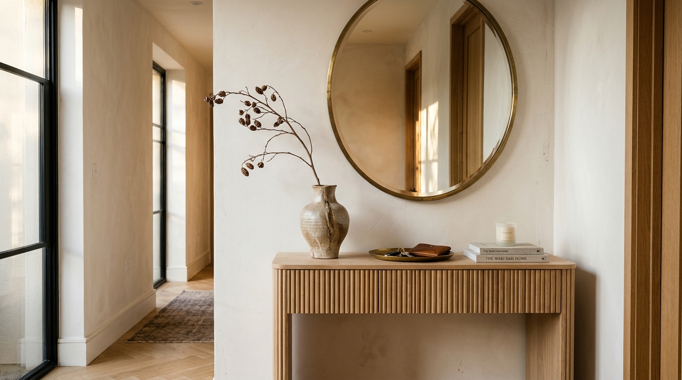
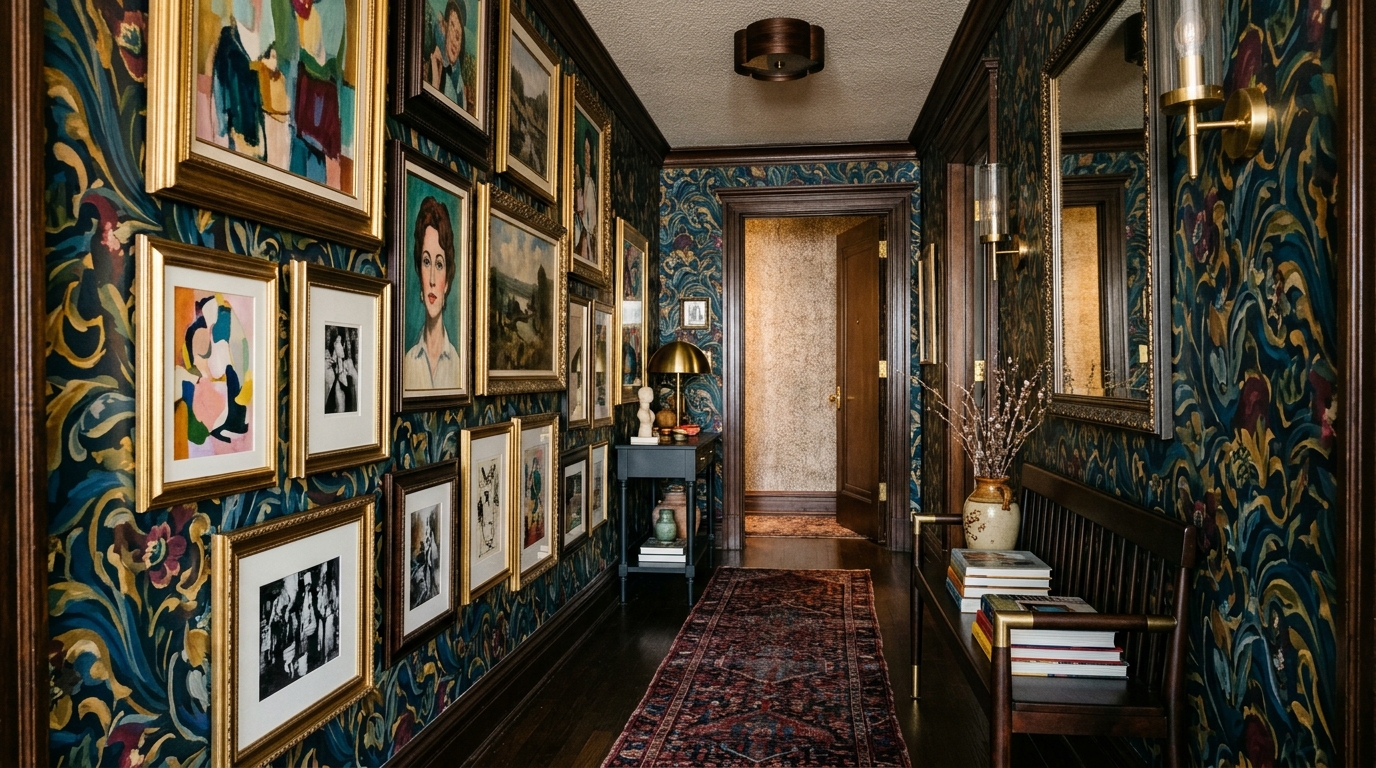
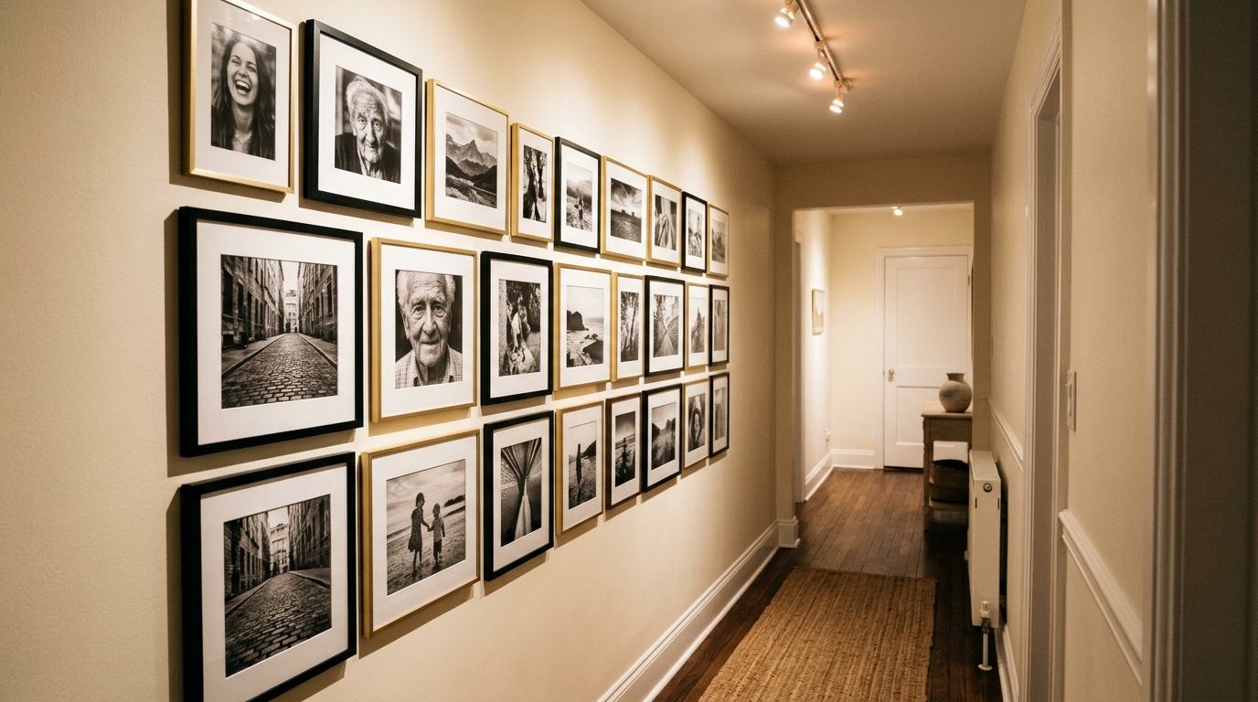
This approach isn’t about hiding the functions of a home; it’s about elevating them. When I look at the work of Joy Williams, particularly her transformation of the Adler on the Park project in Chicago, I see a masterclass in what she calls ‘cultured maximalism.’ Williams doesn’t shy away from the narrowness of the corridor. Instead, she leans into the spatial cadence of the hall, using movement and rhythm to lead the eye. She proves that a drop zone doesn’t need to look like a mudroom; it can feel like a private exhibition space where every object, from a sculptural key bowl to a custom-framed sketch, contributes to the narrative of the home.
Spatial Cadence and the 36-Inch Rule
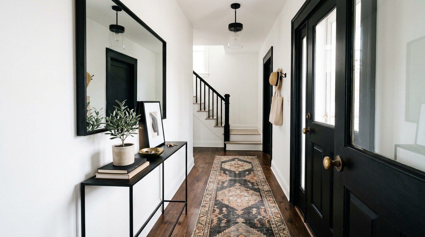
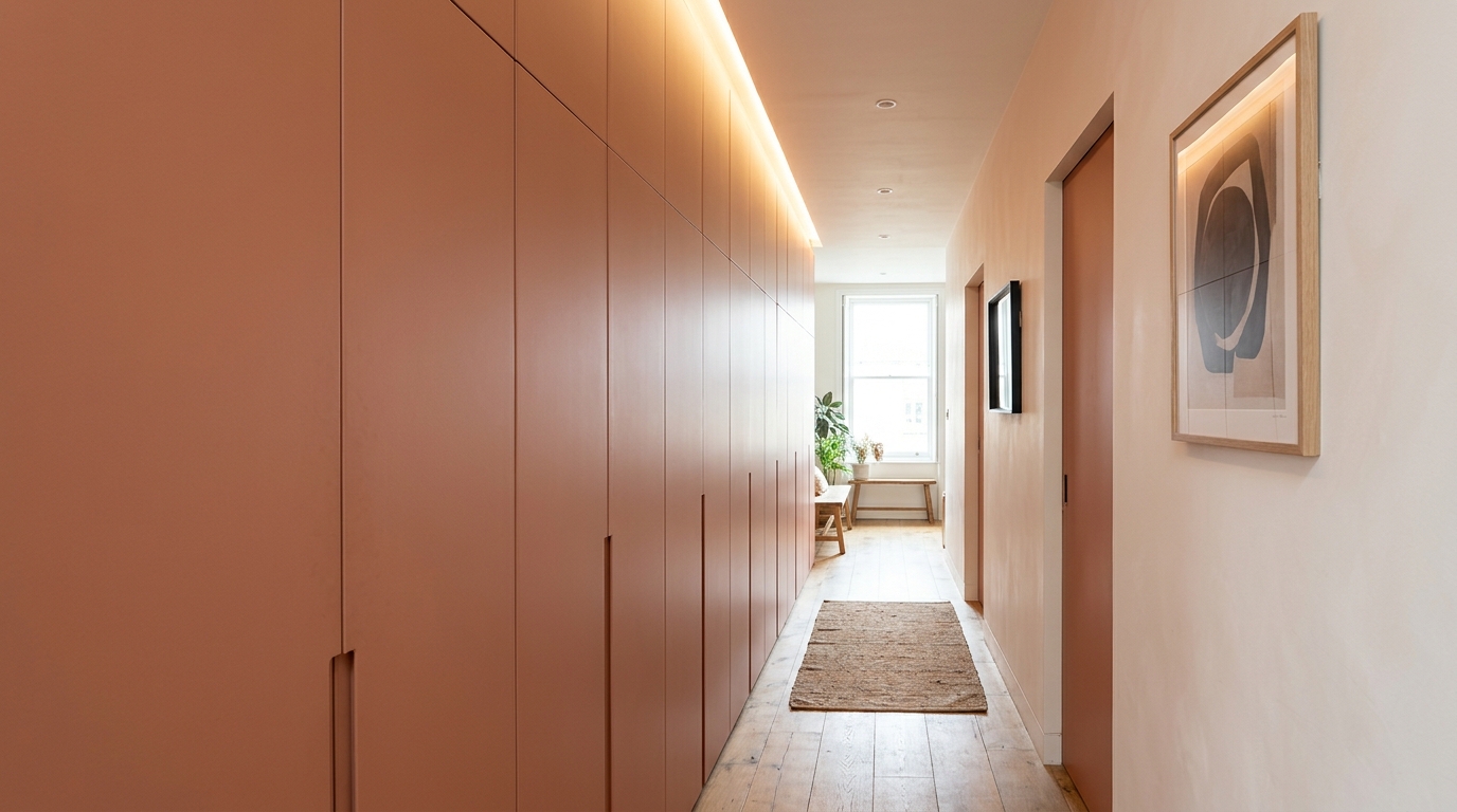
In the world of professional architecture, the success of a narrow corridor design hinges on the concept of ‘sightline alignment.’ Before selecting a single paint swatch, one must respect the physical reality of the human body in motion. The golden rule for high-traffic circulation is the 36-inch clearance. Maintaining a minimum of 36 inches of unobstructed walkway ensures that the space feels airy rather than claustrophobic. When exploring narrow entryway ideas, this dimension dictates the profile of your furniture. A standard 18-inch deep console table will choke a typical 48-inch wide hallway, leaving only 30 inches for passage—a recipe for bruised hips and a cramped atmosphere.
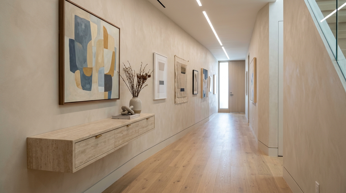
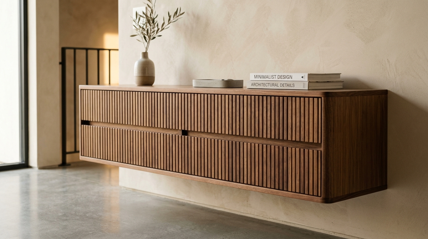
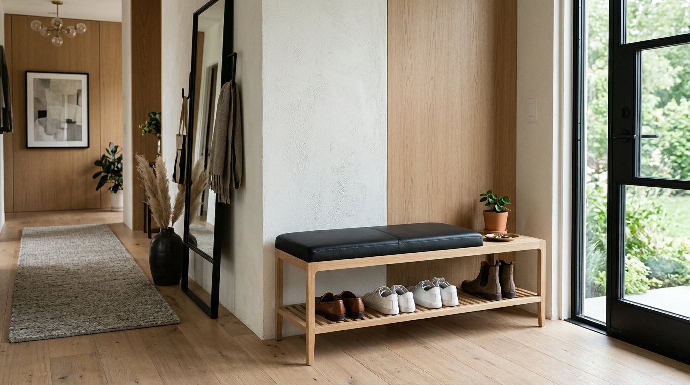
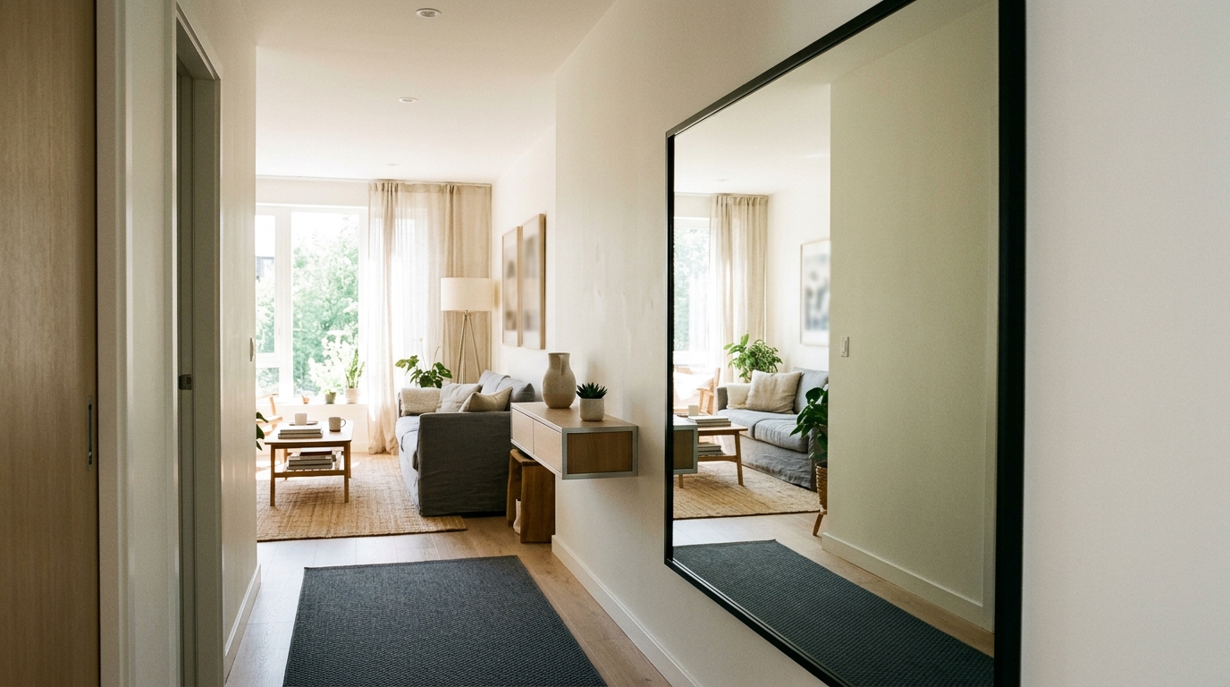
To solve this, we look toward slim-line consoles—pieces that range from 10 to 12 inches in depth. These ‘invisible’ silhouettes provide a surface for a sophisticated vignette without encroaching on the primary circulation path. Look for floating consoles or pieces with leggy, open bases that allow the floor to remain visible underneath. This trick of the eye—preserving the sightline of the floorboards or the rug—creates the illusion of more square footage while providing that essential ‘drop’ surface for the daily commute essentials.
The Materiality of First Impressions
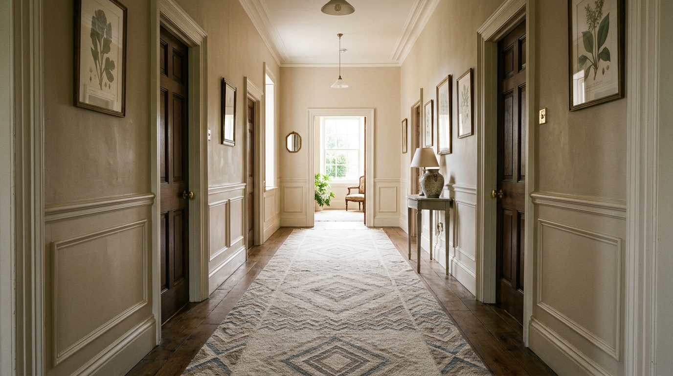
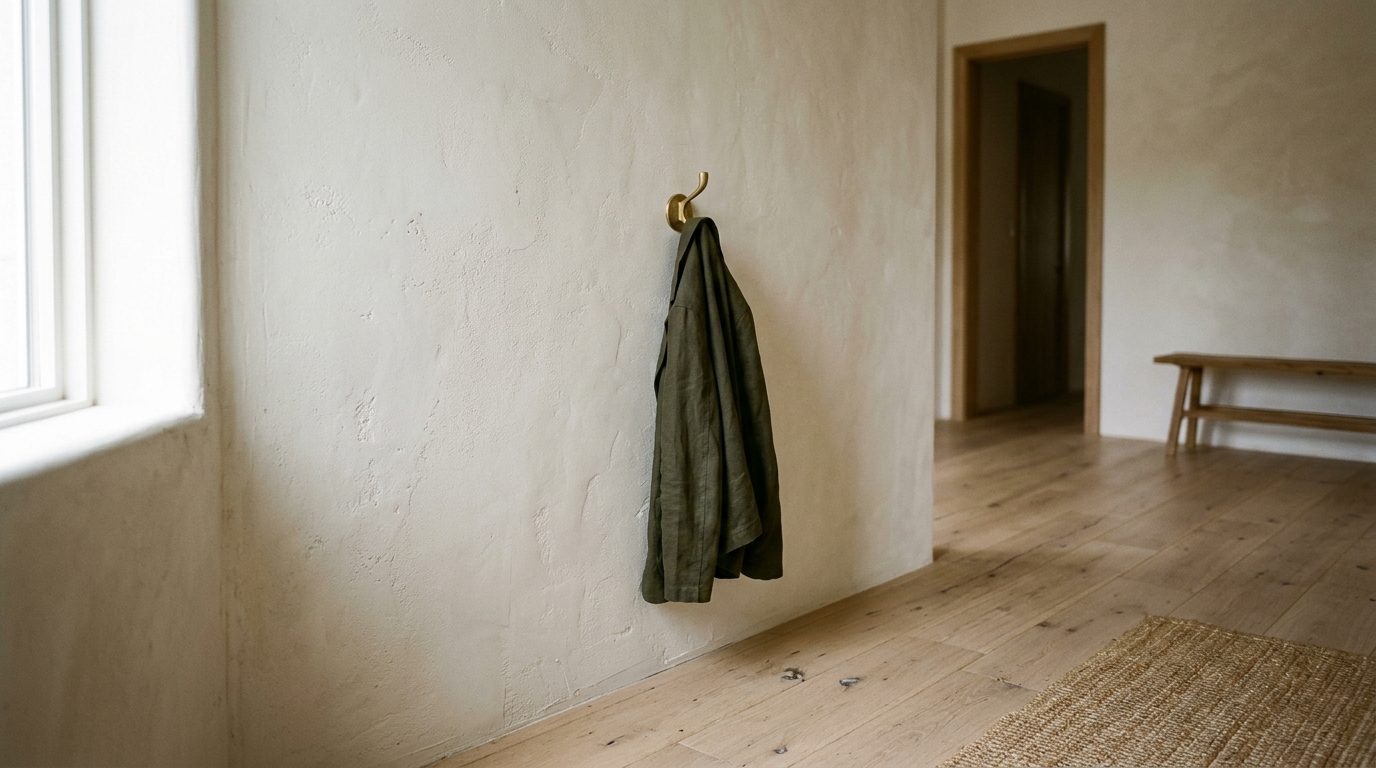
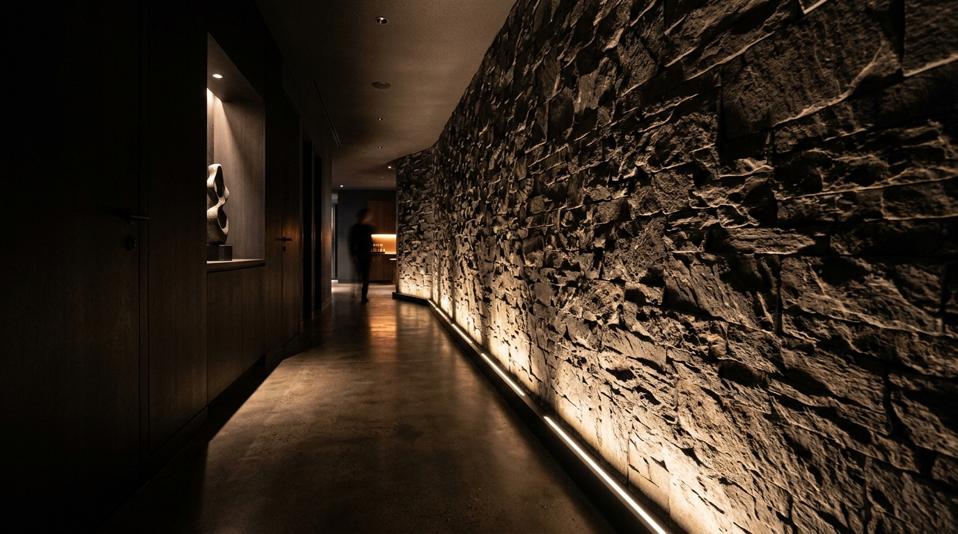
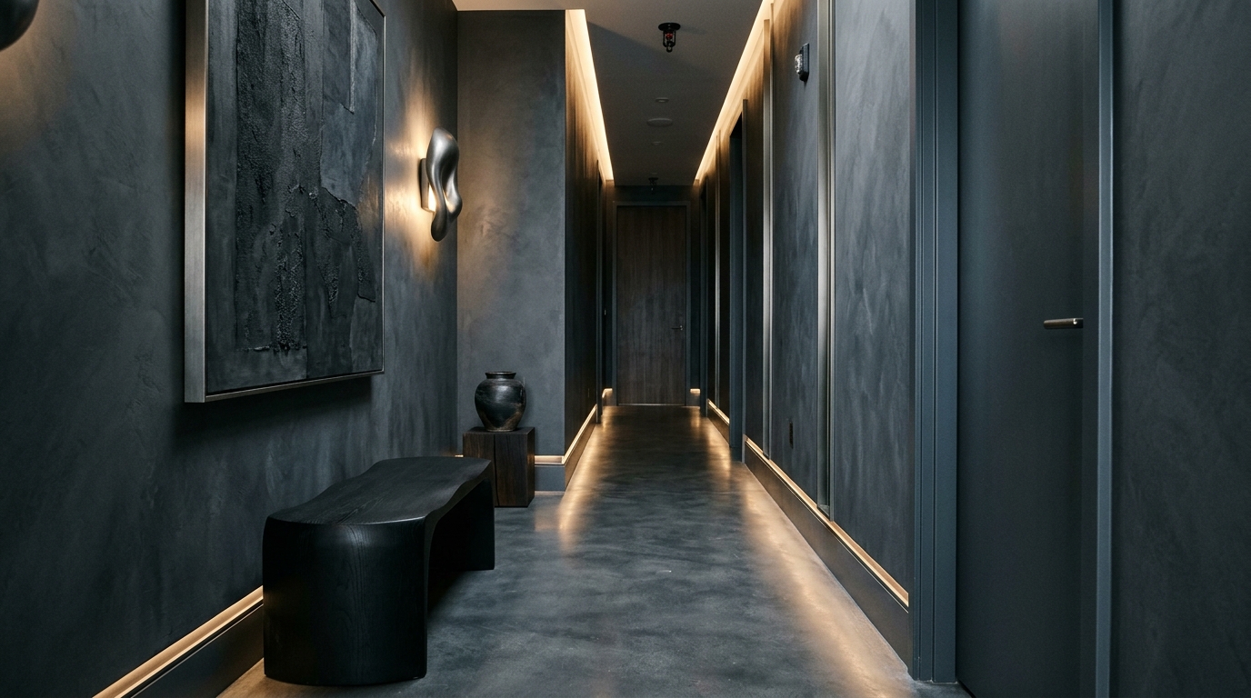
Once the spatial layout is locked, the tactile grounding of the space becomes the priority. A hallway is often a windowless box, making texture more important than in any other room. I often recommend a ‘tactile layering’ strategy that begins with the walls. Instead of flat latex paint, consider the depth offered by limewash or a textured wallcovering like Calico Wallpaper Nuance. The subtle gradient and organic movement of these materials prevent the walls from ‘closing in’ on the viewer. In Joy Williams’ Chicago showhouse inspiration, the use of bold, textured surfaces transforms a transitional zone into a destination. Pair this with a high-quality narrow hallway runner rug. A vintage Oushak or a modern wool-silk blend provides acoustic dampening—essential for long corridors—and introduces a layer of softness underfoot that contrasts with the hard surfaces of a console or a stone floor.
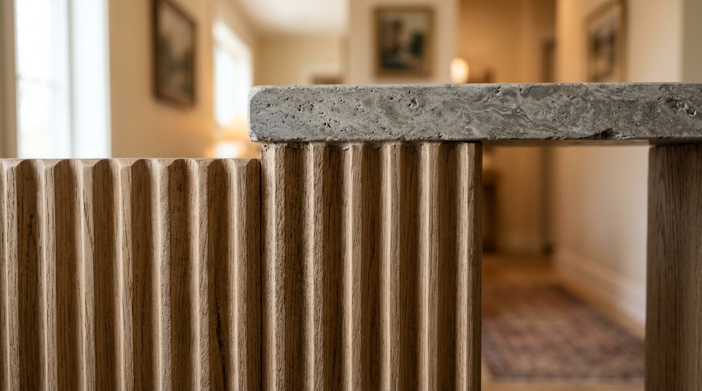
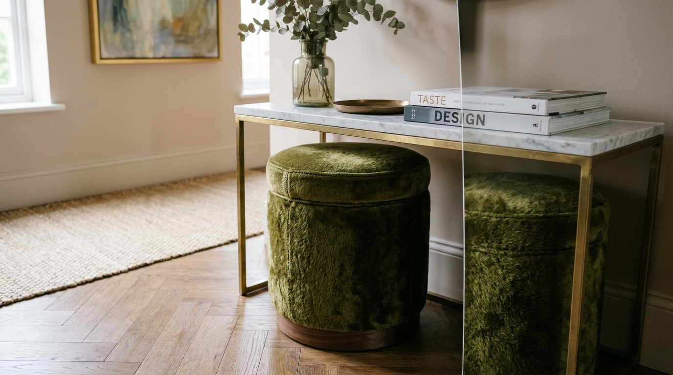
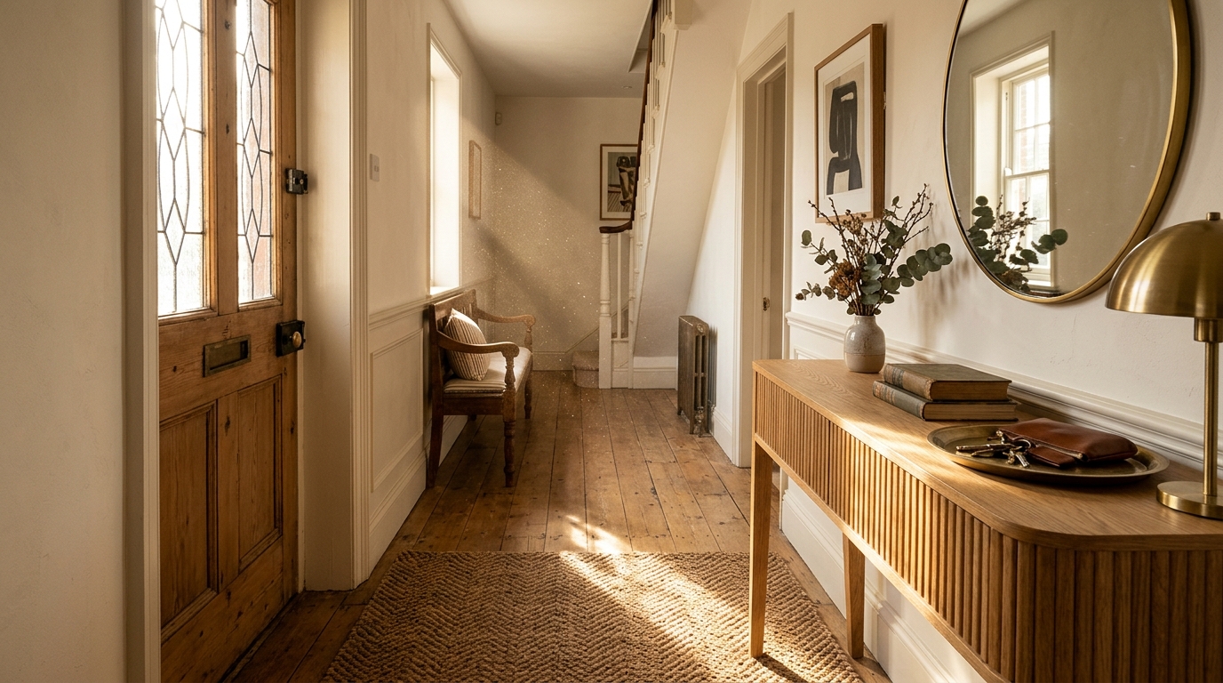
The choice of wood species and stone also plays a vital role. A console crafted from fluted white oak adds vertical rhythm, drawing the eye upward and emphasizing the ceiling height rather than the narrow width. Topping that console with a piece of honed travertine or a leather-wrapped tray grounds the ‘drop zone’ functionality in luxury. These materials are durable enough to handle the friction of keys and mail but refined enough to maintain the gallery aesthetic.
Atmospheric Lighting: The 2700K Standard
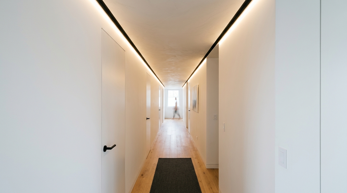
Lighting is the most frequently mishandled element in hallway makeovers. Most corridors suffer from ‘flat’ light—overhead recessed cans that cast harsh shadows and wash out color. To achieve a showhouse-level mood, we must think in layers. The foundation of a moody narrow hallway lighting scheme is the warm ambient glow of 2700K bulbs. This temperature mimics the soft light of a setting sun or a gentle flame, providing a welcoming, residential feel. Avoid 3000K or 4000K in these spaces; they are too clinical and tend to make a narrow space feel like a commercial office.
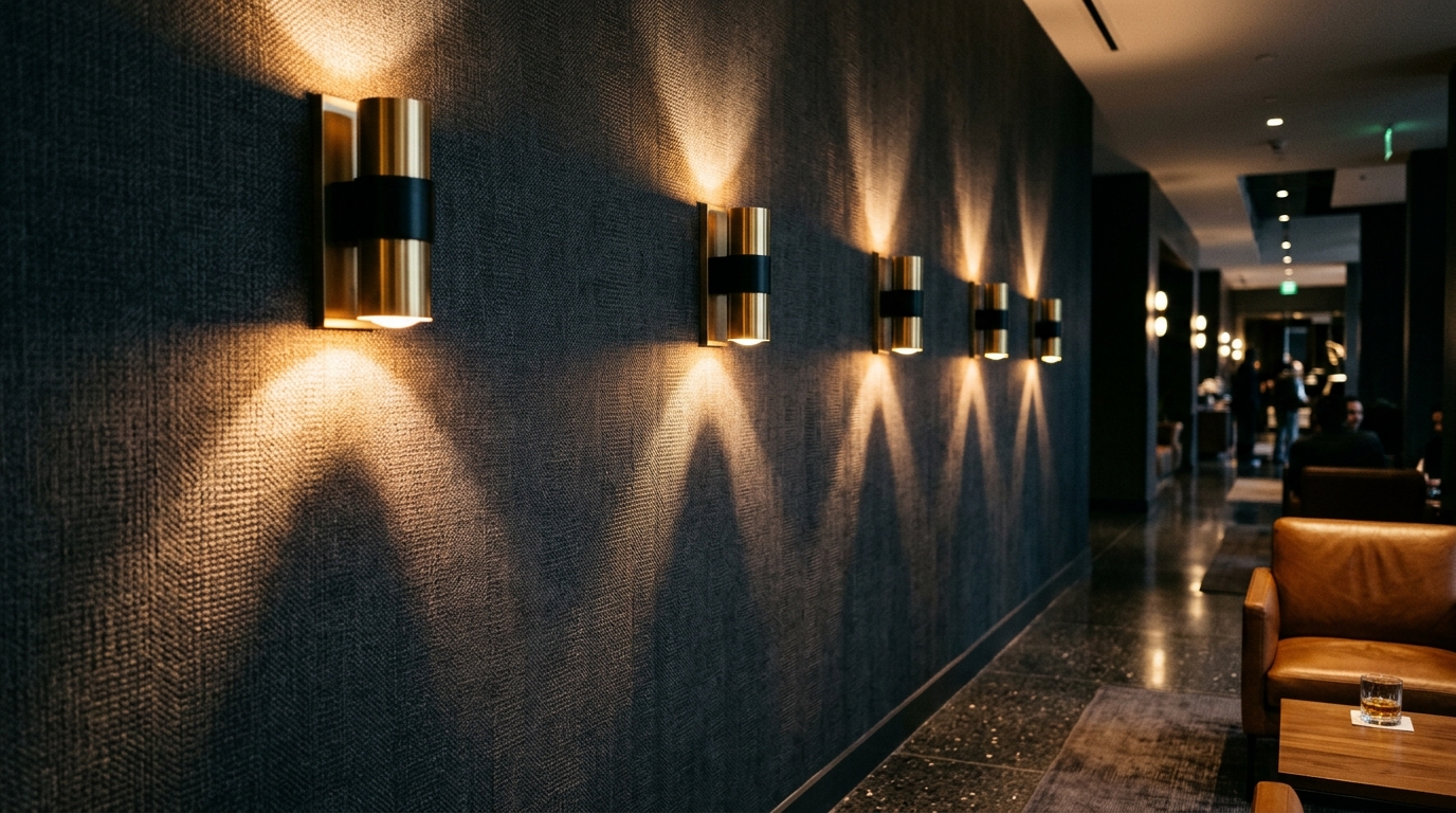
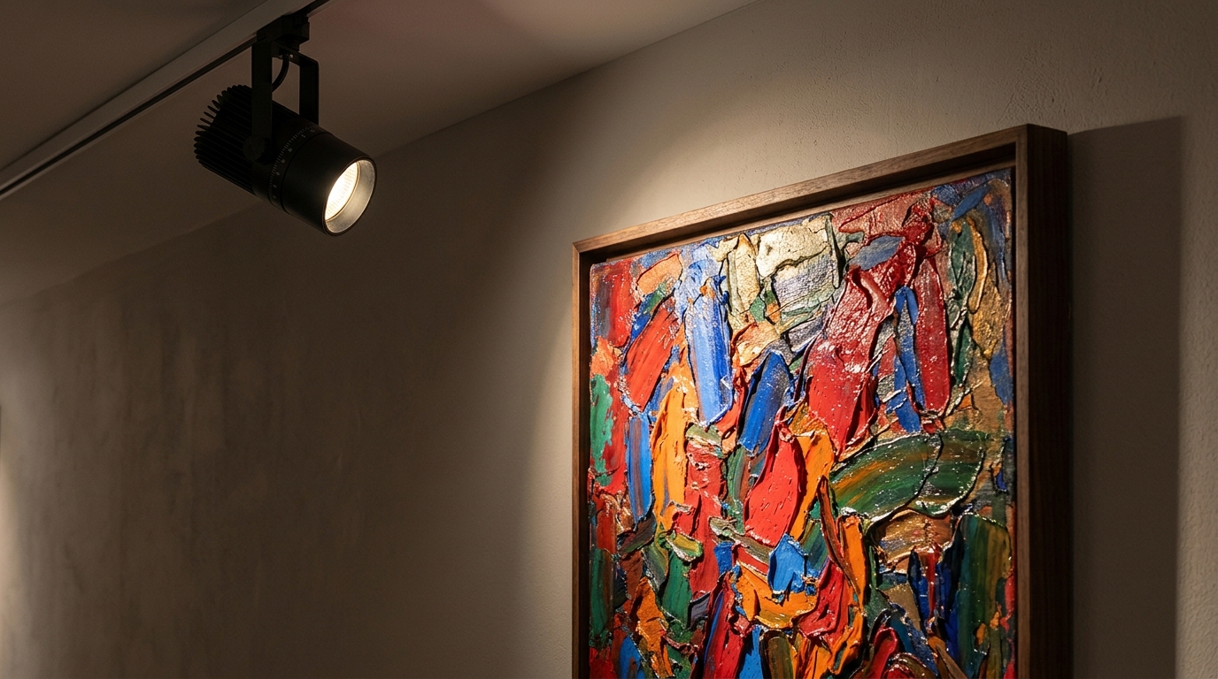
High CRI (Color Rendering Index) ratings of 90+ are non-negotiable if you plan to display art. You want the deep ochres and muted charcoals of your gallery wall to appear true to life. Beyond the ambient light, introduce directional task lighting. A pair of slim, architectural wall sconces mounted at eye level (roughly 60 to 64 inches from the floor) creates a sequence of pools of light that breaks up the length of the hall. This shadow play adds drama and depth, making the walls feel further apart than they actually are. If hardwiring isn’t an option, a cordless, rechargeable gallery lamp placed on the console can provide that same targeted glow on a curated vignette.
Refining the Drop Zone: Styling the Vignette
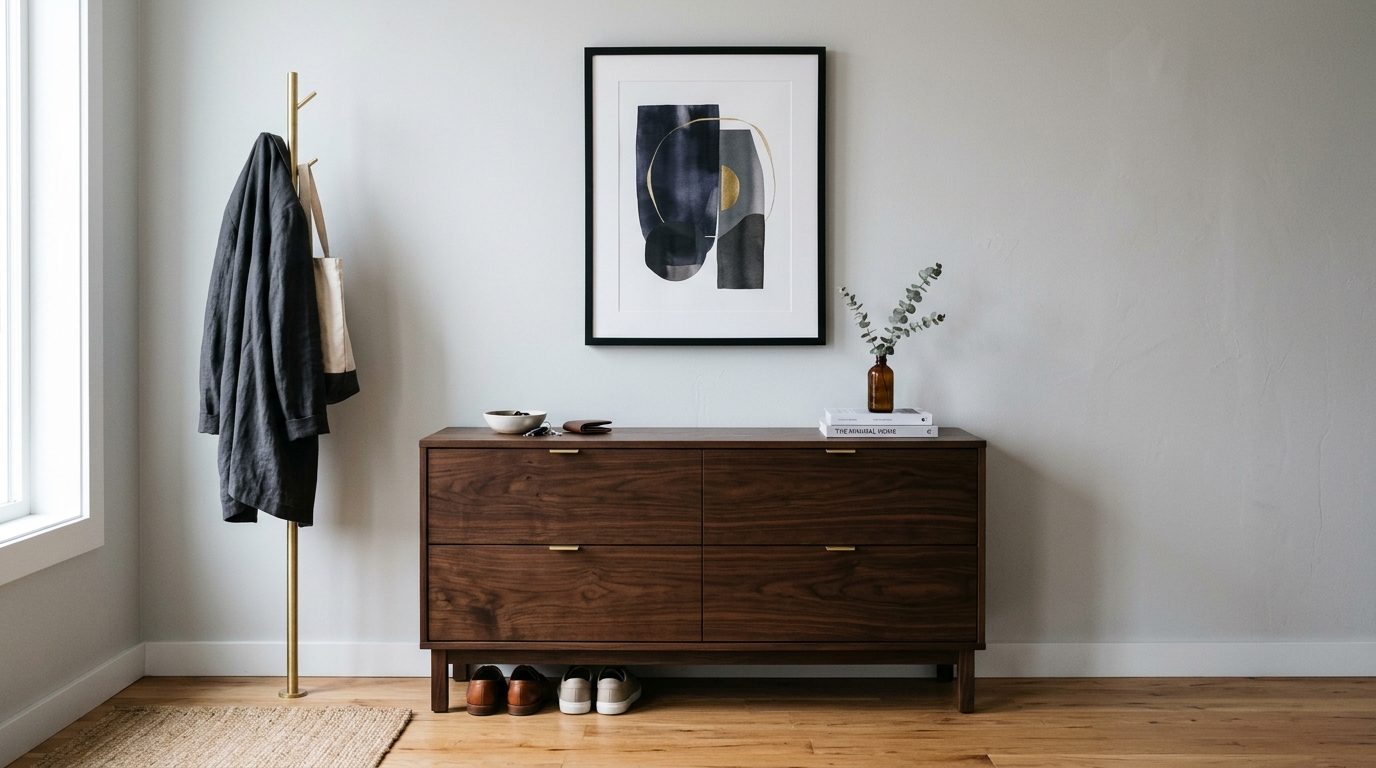
The challenge of the ‘drop zone’ is managing the mundane. Keys, sunglasses, and the day’s post are inevitable, but they don’t have to be eyesores. This is where small entryway decor ideas must be both beautiful and strategic. Use the ‘Rule of Three’ to organize your console surface: a vertical element (a tall vase or a piece of leaning art), a horizontal element (a stack of coffee table books or a marble tray), and an organic element (a single branch of eucalyptus or a sculptural bowl). A small entryway console table with mirror is another essential tool; the mirror should be oversized to maximize light reflection, effectively doubling the perceived width of the room.
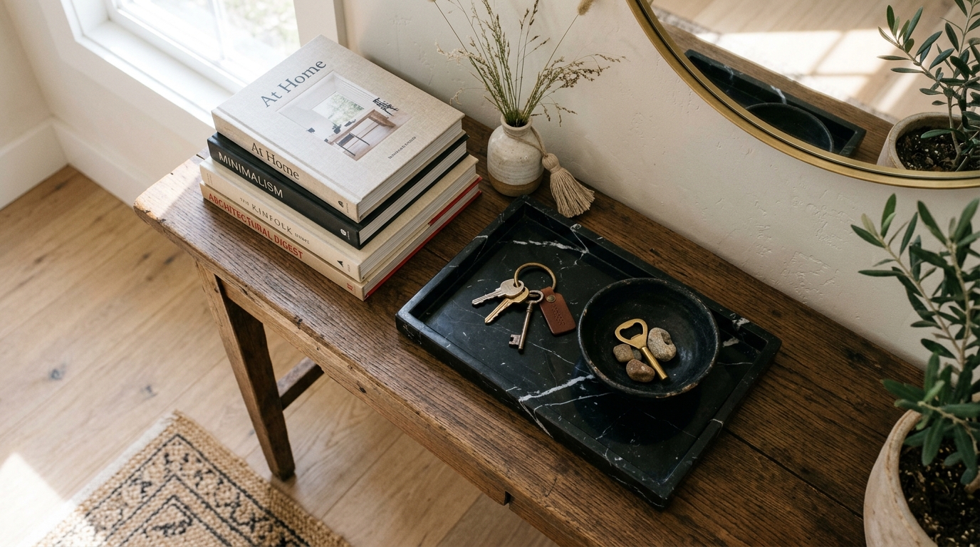
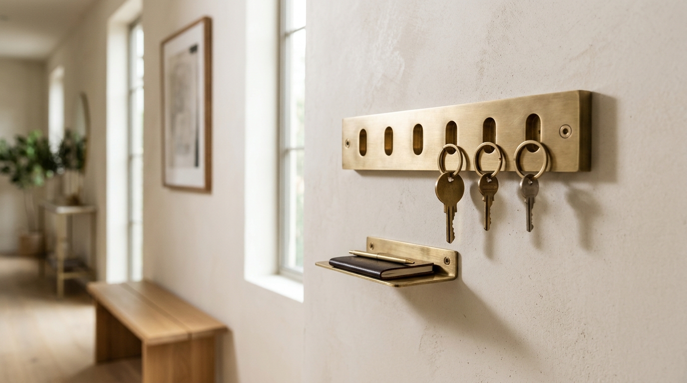
By placing a deep, sculptural vessel—perhaps in a dark basalt or a polished brass—on the tray, you create a designated spot for keys that feels like a deliberate design choice. For larger items like umbrellas or daily-wear shoes, ‘invisible’ storage is the secret. A bespoke bench with a hidden flip-top or a set of minimal, wall-mounted oak pegs can handle the load without disrupting the visual flow. The goal is to ensure that even when the space is ‘in use,’ it retains the curated composure of a gallery.
Architectural Specification & Material Matrix
Curated tactile palette, spatial dimensions, and atmospheric lighting index for this design scheme.
Ultimately, the transformation of a hallway is about recognizing that every square inch of a home deserves an architectural voice. When we apply intentional narrow entryway ideas that prioritize both the 36-inch rule and the emotional impact of a 2700K glow, we stop rushing through our foyers and start experiencing them. It is in these liminal spaces—the corridors and landings—where the soul of a home’s design is often most clearly articulated. By merging the efficiency of a drop zone with the soul of a gallery, we create a daily ritual of arrival that feels less like a chore and more like an homecoming to a curated life.
Editorial Silo • Recommended Architecture Studies
- The Tactile Aesthetic of Narrow Entryway: Materials, Moods & Lighting Kelvin — Archival Design Case Study
- Tactile First Impressions: Mastering the Materiality and Mood of a Narrow Hallway Gallery — Archival Design Case Study
Architectural Inspiration Lookbook
A high-resolution study in spatial proportions, tactile materiality, and light choreography curated for enduring modern living.

Curated Visual Lookbook
Design Gallery & Spatial Studies
A visual curation of architectural arrangements, lighting concepts, and material palettes featured in this space.