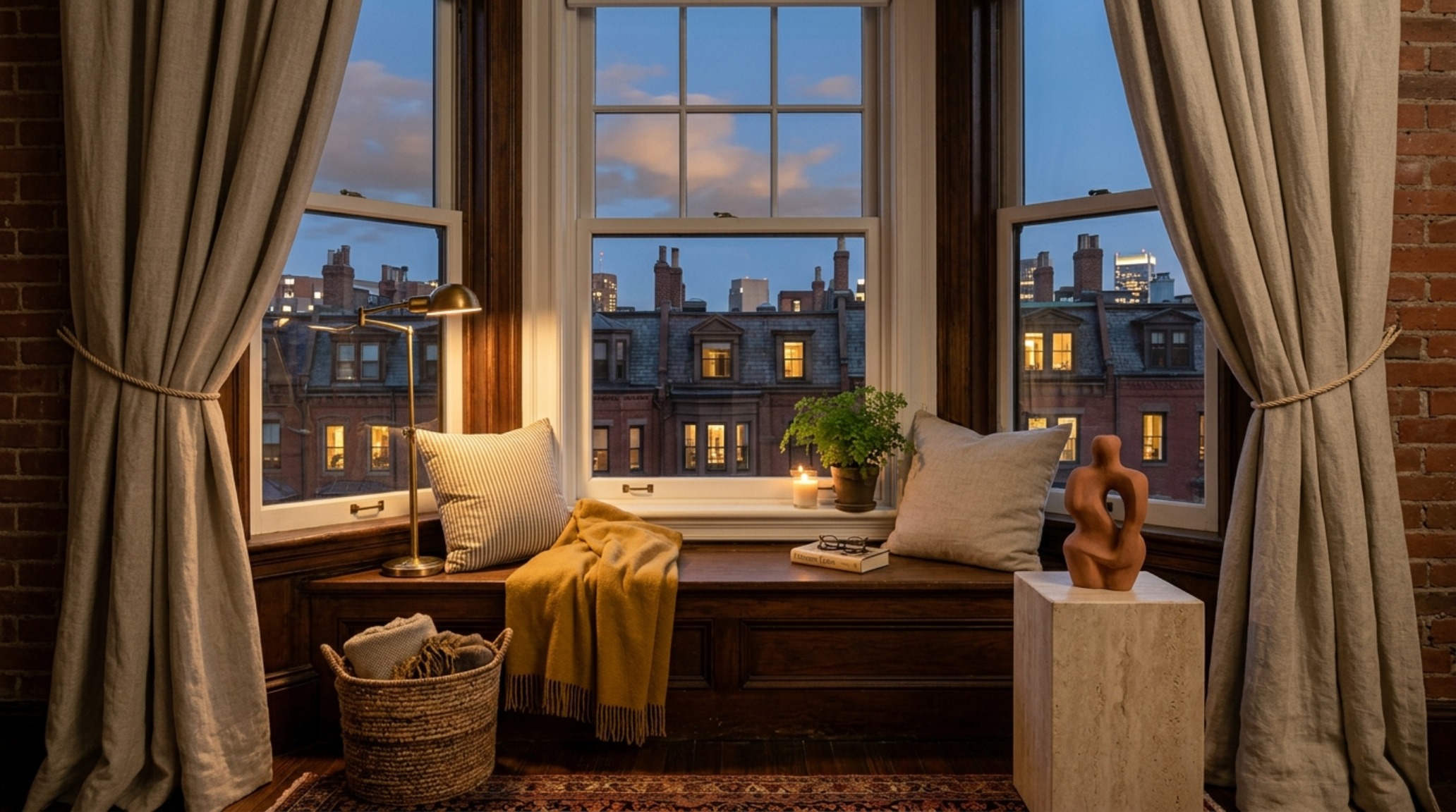
There is a specific, quiet magic that descends upon a Boston brownstone as the sun dips below the skyline and the city’s historic masonry begins to cool. Inside, the transition from daylight to evening shouldn’t just be a change in visibility; it should be an emotional shift. When conceptualizing art filled boston apartment decor ideas, we often find ourselves caught between the desire for a clean, gallery-like exhibition space and the deep-seated need for a home that feels like a sanctuary. The solution lies in a design philosophy I call the ‘Tactile Gallery’—a sophisticated interplay of 2700K warm-dim lighting, organic materials, and a deliberate spatial cadence that honors the history of New England architecture while embracing modern, quiet luxury.
The Golden Hour Protocol: Why 2700K is Non-Negotiable
In many modern renovations, there is a clinical obsession with 3000K or even 4000K lighting. While high-CRI (Color Rendering Index) is essential for seeing the true pigments in a piece of oil-on-canvas, a flat, cool light can strip the soul from a living space. To achieve that coveted ‘Quiet Luxury’ aesthetic, we must prioritize the 2700K spectrum. At this temperature, light mimics the soft, amber glow of a late-afternoon sun or a flickering candle. It softens the edges of a room, allowing the architecture to recede and the textures to emerge.
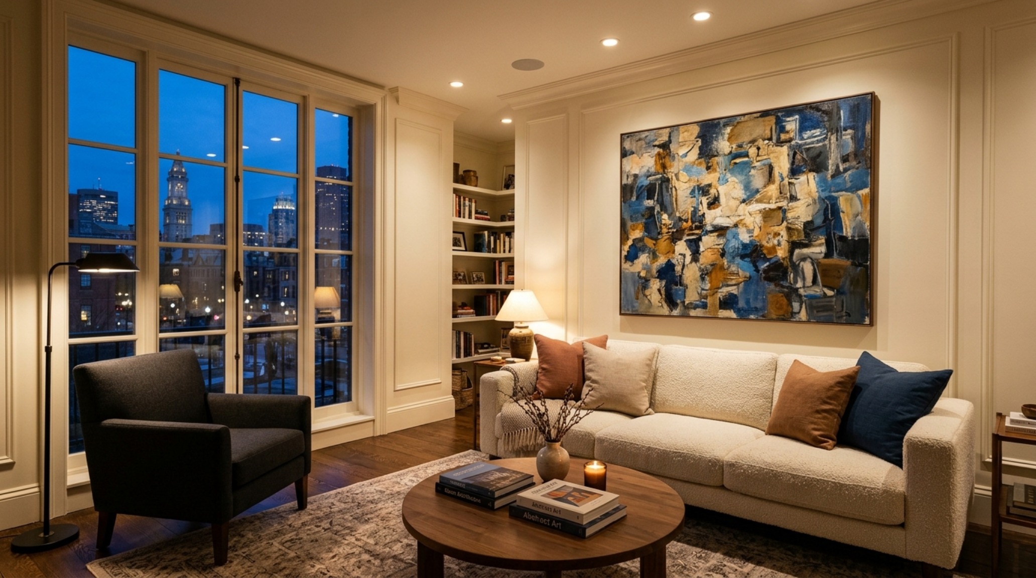
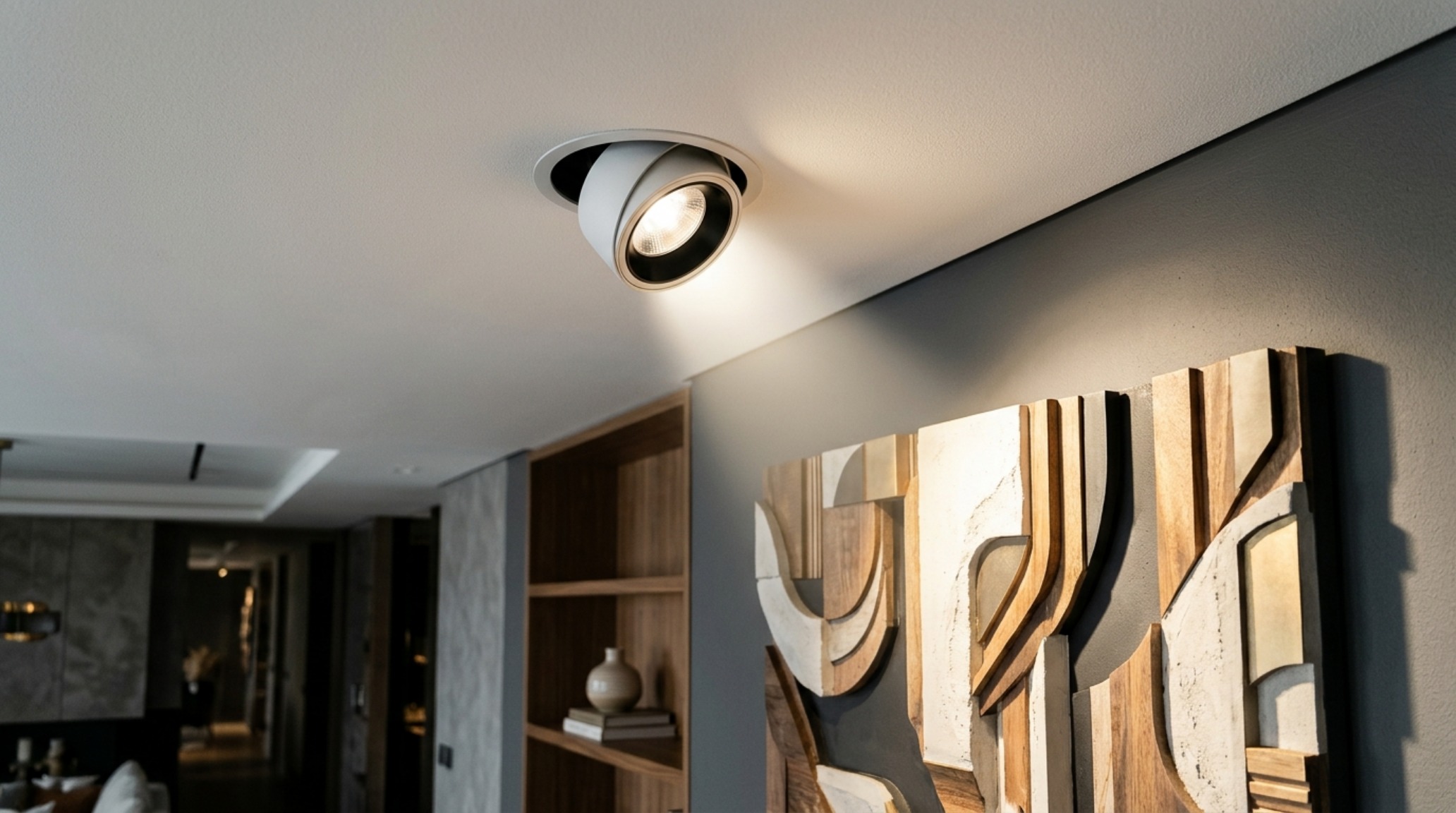
When you walk into a room bathed in 2700K light, your heart rate slows. It is the perfect backdrop for highlighting architectural nuances like crown molding or a original marble mantelpiece. By using directional spotlighting—small, high-CRI gimbal fixtures tucked into the ceiling or discreetly mounted on a picture rail—you can wash a singular piece of art in warmth without flooding the entire room in glare. This creates pockets of shadow, or ‘negative space’ for the eyes, which is just as important as the light itself in a high-contrast interior.
The Palette of Softness: Swiss Coffee and Ammonite
The foundation of a gallery-inspired home is the wall color. For a Boston setting, where the natural light can be notoriously fickle and blue-toned in the winter, I steer clear of stark, ‘refrigerator’ whites. Instead, we look toward Benjamin Moore’s Swiss Coffee or Farrow & Ball’s Ammonite. Swiss Coffee offers a creamy, sophisticated warmth that doesn’t read as yellow, while Ammonite provides a subtle, stony grey-beige that feels grounded and historic. These shades act as a soft-focus lens for the room, allowing the art to pop without the jarring contrast of a pure white gallery wall.
Curating Art Filled Boston Apartment Decor Ideas with Spatial Integrity
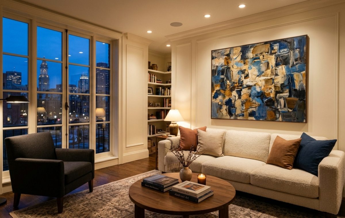
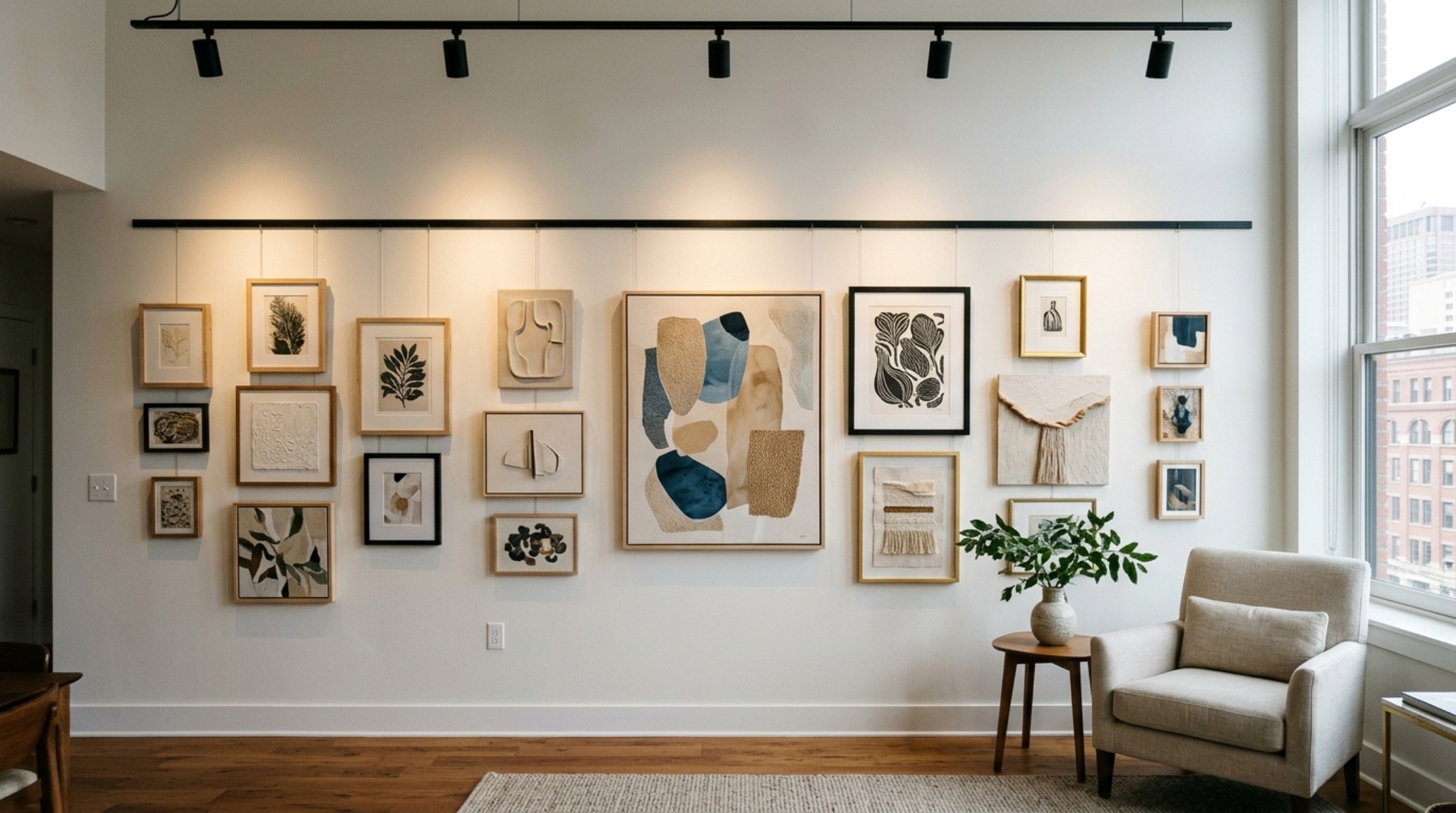
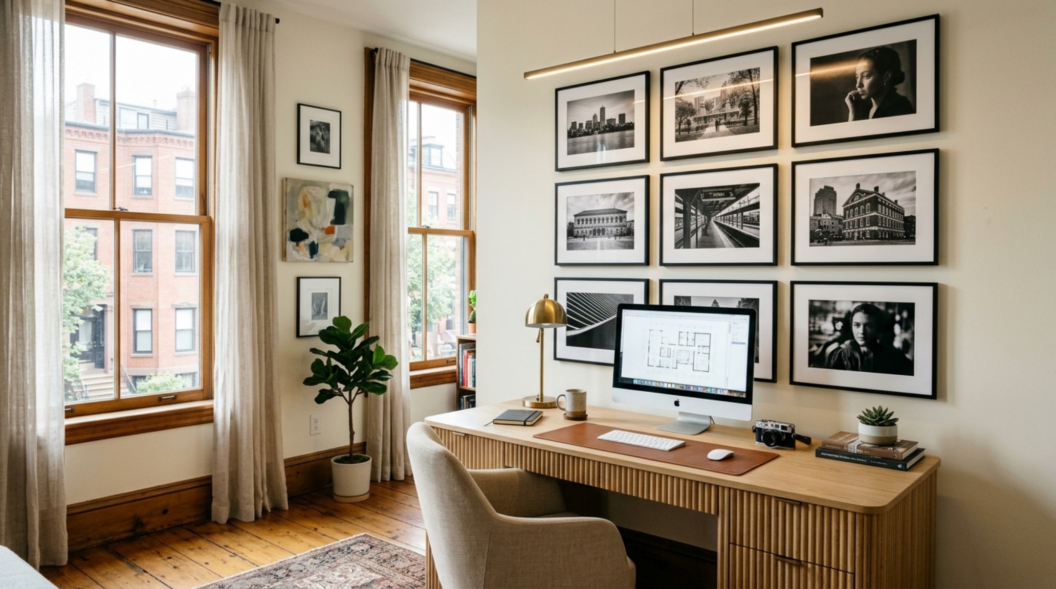
Boston apartments, particularly in the Back Bay or South End, often present a unique challenge: soaring ceilings paired with narrow footprints. To avoid a ‘cluttered’ feel, we must approach art curation with a curator’s eye for sightline alignment. Instead of a chaotic scatter of frames, consider a disciplined grid or a single, oversized statement piece that commands the wall. This is where art filled boston apartment decor ideas evolve from mere decoration into architectural intervention.
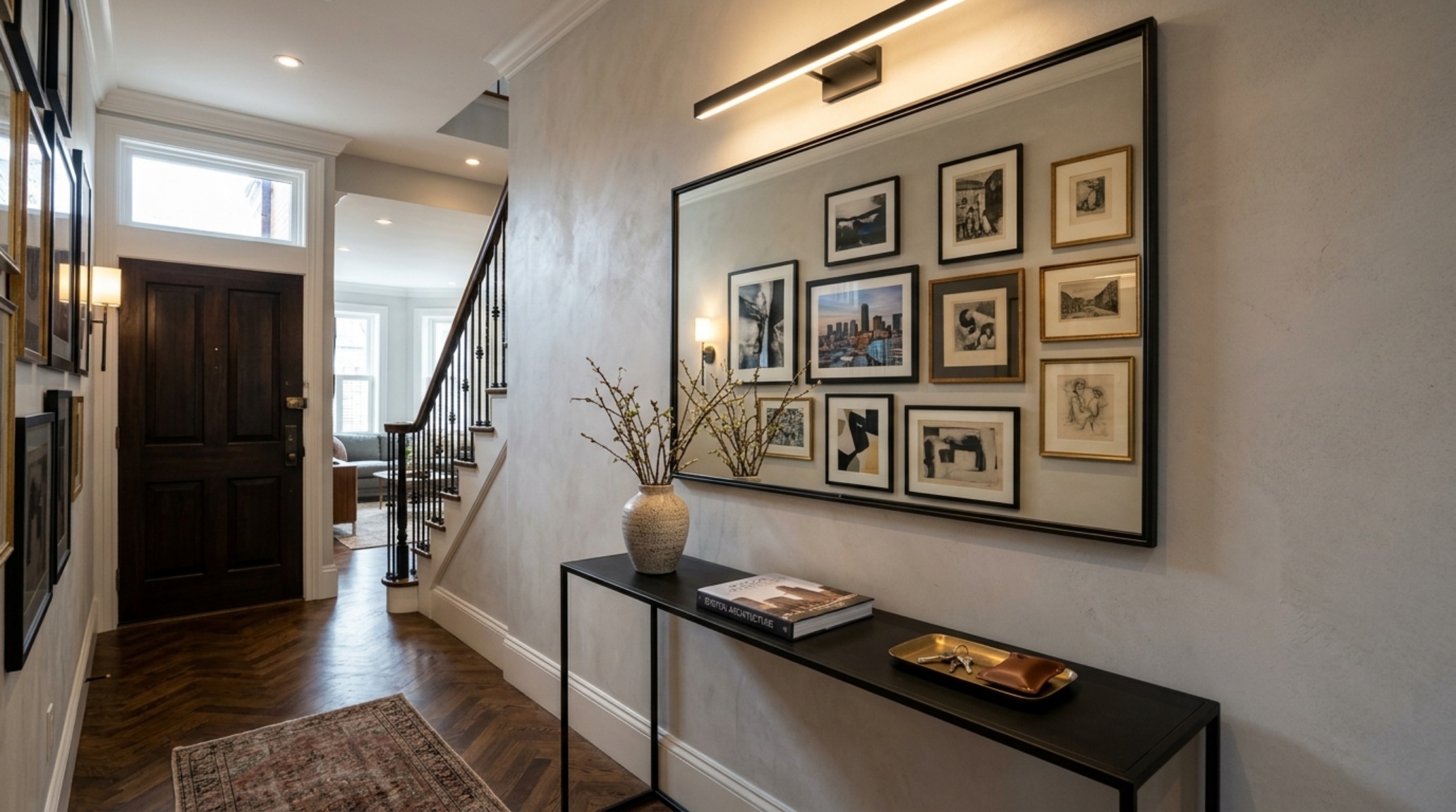
Integrating a picture-rail system is a classic Boston architectural hack that feels incredibly modern when executed in a matte black or brushed brass finish. It allows for the flexibility of a rotating collection without the commitment of drilling into 19th-century plaster. This verticality draws the eye upward, celebrating the height of the room while keeping the floor level focused on tactile comfort. In a high-density urban environment, creating these visual breathers—areas of wall left entirely blank—is what separates a professional design from an over-decorated one.
The Materiality of Quiet Luxury: Travertine and Bouclé
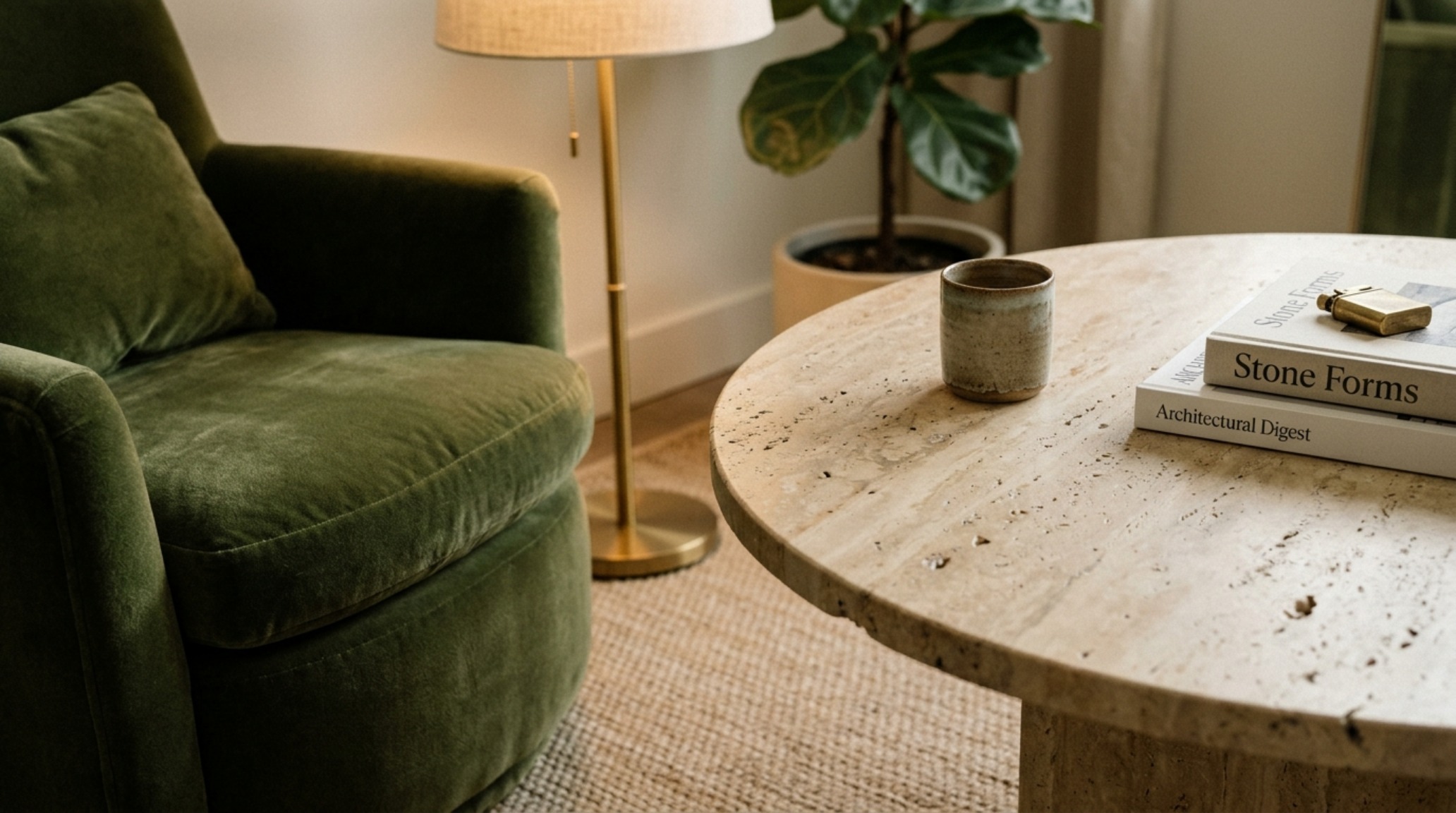
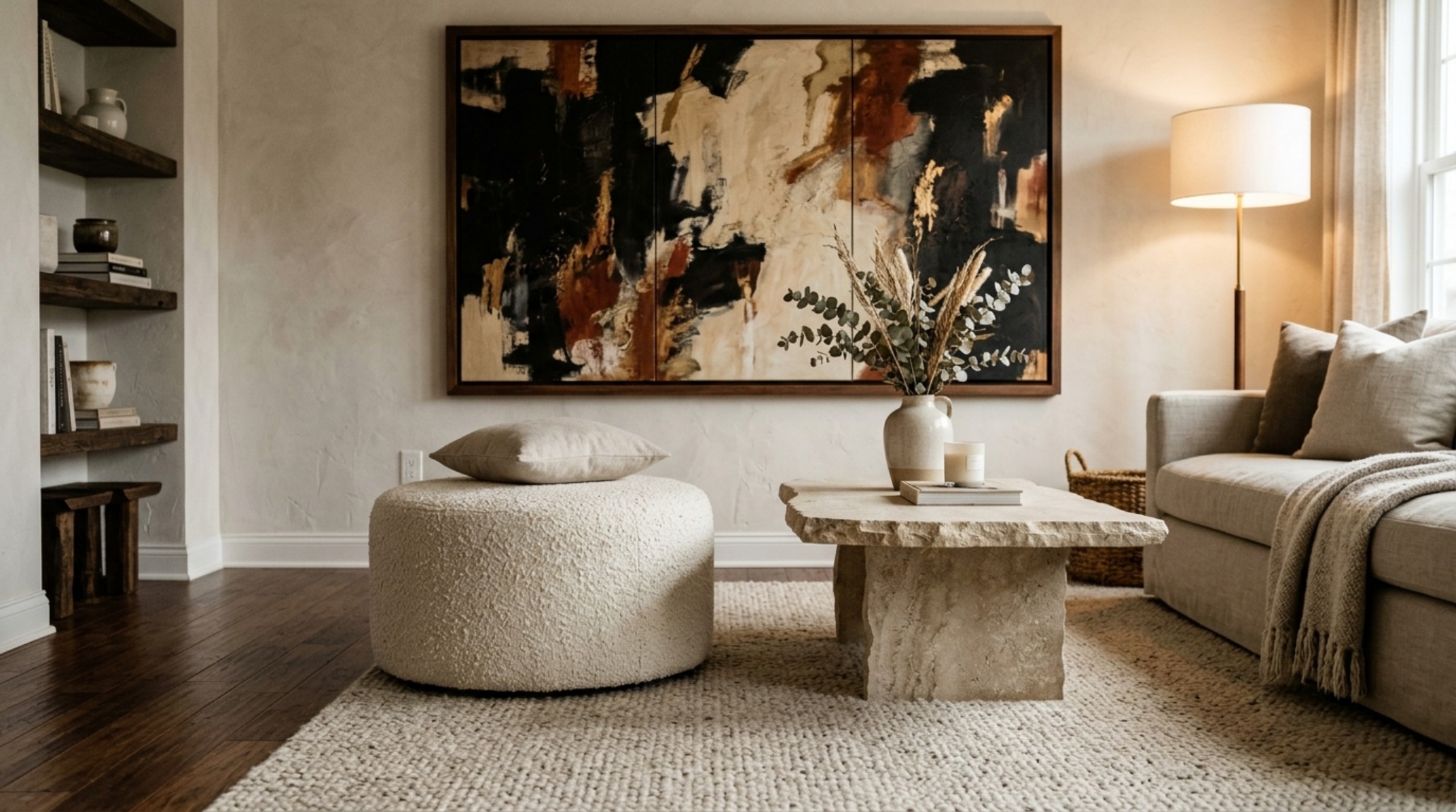
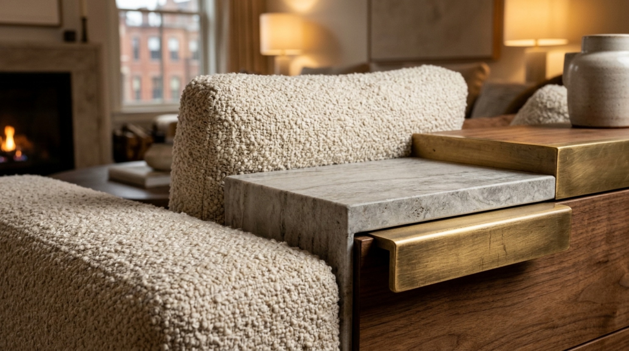
If the walls and lighting provide the atmosphere, the furniture provides the grounding. To prevent a gallery-inspired home from feeling ‘clinical,’ we layer in high-contrast textures. Imagine the cool, matte surface of a honed travertine coffee table paired with the nubby, inviting warmth of a cream bouclé sofa. This juxtaposition is the hallmark of modern organic decor. Travertine, with its porous, ancient feel, brings a sense of permanence and history, while bouclé provides the sensory softness required for a ‘cozy’ gallery experience.
The Geometry of Comfort: Architectural Clearances and Flow
Design is as much about the space between objects as the objects themselves. In a Boston apartment, where every square inch is hard-earned, we must respect the physical laws of circulation. A primary walkway should never be less than 36 inches wide; anything tighter and the space begins to feel like a storage unit rather than a home. The relationship between the sofa and the coffee table is equally vital. An 18-inch reach ensures that a drink can be set down naturally without leaning, maintaining the ‘spatial cadence’ of a well-ordered room.
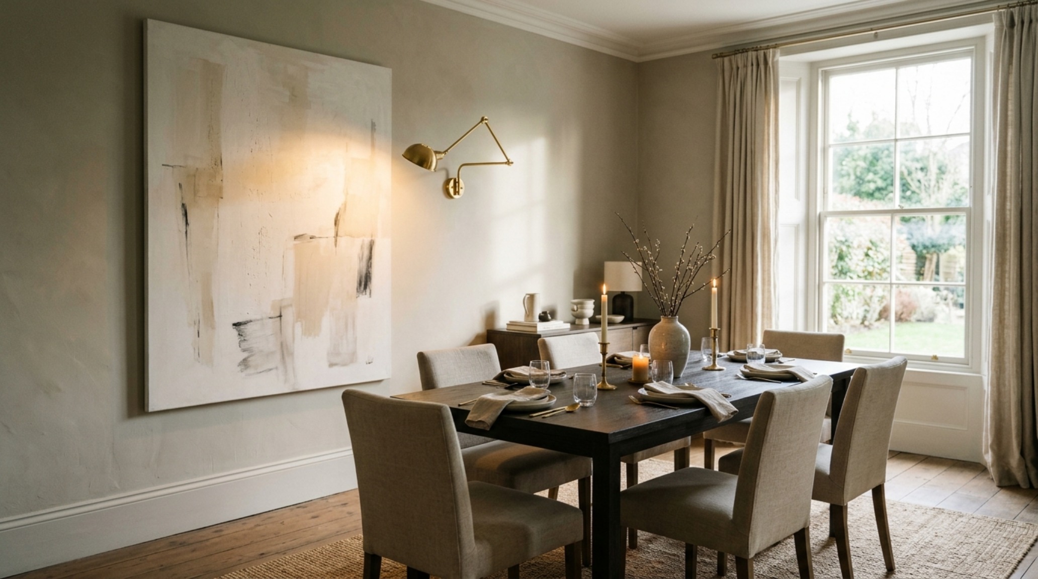
When placing dining chairs, a 30-inch clearance from the table edge to the nearest wall or piece of furniture is the gold standard. This allows guests to rise comfortably without the friction of a cramped space. These measurements are the silent bones of a luxury interior. When the proportions are correct, the mind is at ease, allowing the resident to focus on the more evocative elements of the home, like the way the 2700K light catches the grain of a fluted oak sideboard or the pile of a heavy velvet curtain.
Shadow Play and the Art of the Sconce
While overhead lighting provides the base, eye-level lighting provides the drama. In a gallery-inspired home, I often replace traditional floor lamps with architectural wall sconces. By mounting a sleek, articulated arm light next to a large-scale painting, you create a dedicated ‘moment’ for that artwork. This directional light creates ‘shadow play’ across the organic textures of the room—highlighting the weave of a wall-hanging or the depth of a sculpture—enhancing the high-contrast aesthetic that defines this look.
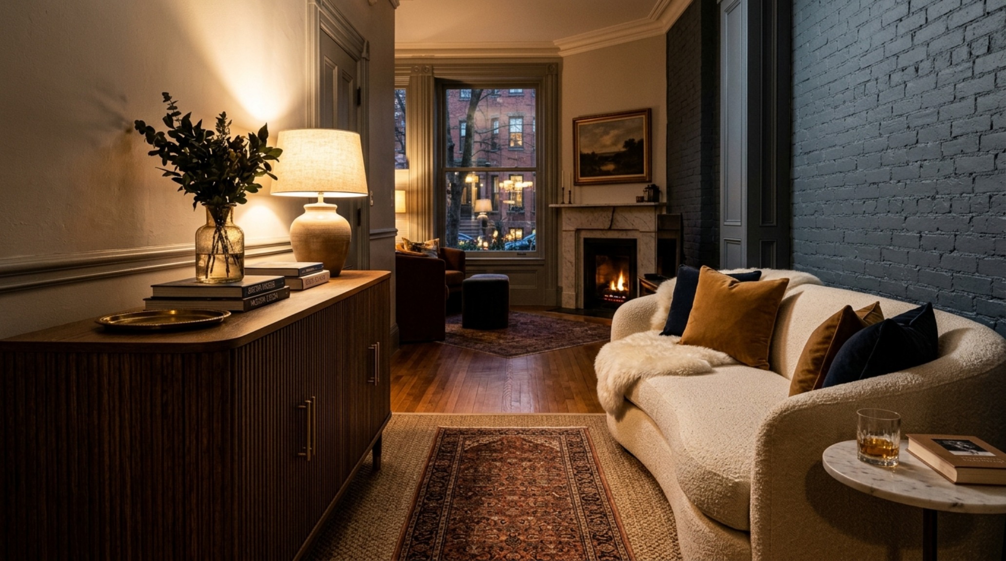
The choice of metal finish also plays a role in this tactile narrative. Brushed brass or blackened steel adds a ‘weight’ to the room that polished chrome often lacks. These living finishes patina over time, echoing the historical evolution of the Boston buildings they inhabit. When we talk about apartment storage hacks, we often forget that lighting can be a tool for organization; by highlighting specific zones, we define the ‘purpose’ of a space without needing to build physical partitions.
Mastering the High-Contrast Aesthetic
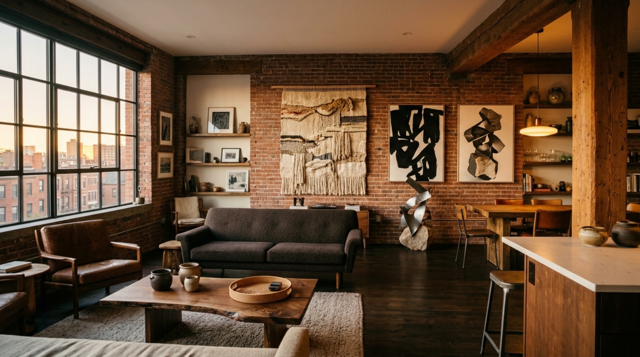
High-contrast isn’t just about black and white; it’s about the tension between the smooth and the rough, the old and the new, the light and the dark. In our Tactile Gallery, we might pair a sleek, mid-century modern chair in cognac leather with a rough-hewn antique wooden stool. We might hang a contemporary abstract piece in a heavy, gilded Victorian frame. This friction creates interest and depth, preventing the ‘Quiet Luxury’ trend from becoming a one-dimensional, beige-on-beige bore.
By grounding the room in organic textures like wool, linen, and stone, we provide a soft landing for the more ‘intellectual’ elements of the art collection. The velvet of a deep-seated armchair absorbs light, while the honed stone of a side table reflects it subtly. This balance ensures that the home remains a place of rest, even as it functions as a showcase for a sophisticated art filled boston apartment decor ideas strategy.
Architectural Specification & Material Matrix
Curated tactile palette, spatial dimensions, and atmospheric lighting index for this design scheme.
Designing an art filled boston apartment decor ideas project is ultimately an exercise in restraint and sensory awareness. It is about understanding that a home is not just a gallery, but a living vessel for light and shadow. As the evening settles and those 2700K gimbals illuminate the subtle textures of travertine and velvet, the urban density of Boston fades into the background. What remains is a curated sanctuary—a tactile gallery that feels as timeless as the city itself, proving that true luxury isn’t found in excess, but in the quiet, perfectly lit alignment of materiality and space.
Editorial Silo • Recommended Architecture Studies
- Ergonomic Mastery: Functional & Space-Saving Hacks for Bjorn Wallander Manhattan Apartment Tour — Archival Design Case Study
- Chinoiserie Meets Equestrian Chic: A Masterclass in High-Octane Materiality from Carson Kressley’s Suite — Archival Design Case Study
Architectural Inspiration Lookbook
A high-resolution study in spatial proportions, tactile materiality, and light choreography curated for enduring modern living.
Curated Visual Lookbook
Design Gallery & Spatial Studies
A visual curation of architectural arrangements, lighting concepts, and material palettes featured in this space.