The Atmosphere of Materiality: Beyond the Utility Surface
There is a specific, quiet magic that occurs when the first low-angled light of dawn strikes a hand-glazed surface, transforming a utilitarian workspace into a shimmering sanctuary of shadow and reflection. Selecting the right kitchen tile options is perhaps the most consequential decision in a remodel, acting as the architectural anchor that mediates between the hard edges of cabinetry and the soft fluidity of daily life. When we move beyond the binary of ‘splash protection,’ we begin to see the kitchen wall as a vertical canvas—a sensory interface that dictates the entire emotional resonance of the home.
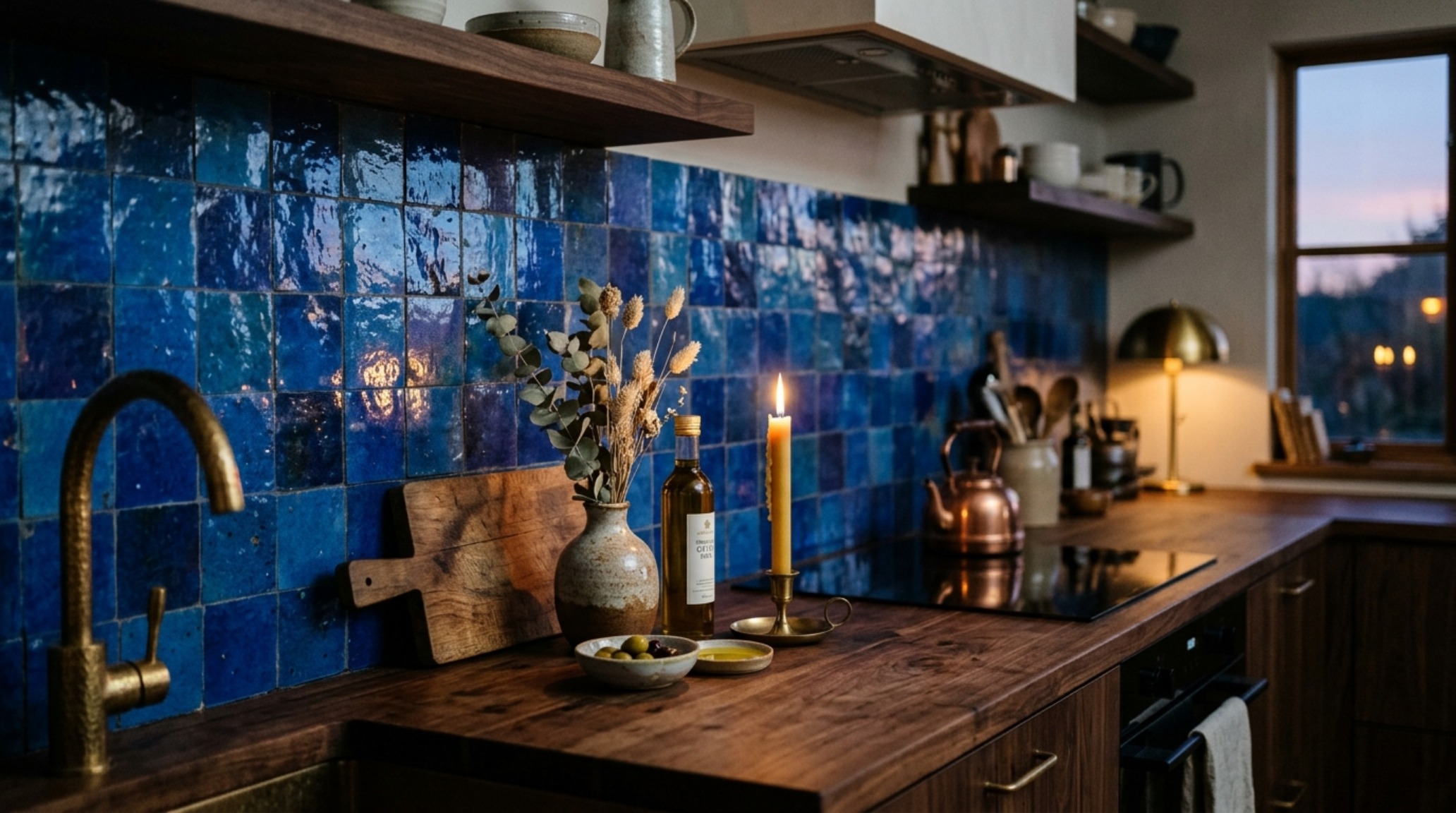
We are currently witnessing a profound shift away from the sterile, monolithic aesthetics of the last decade toward what I call ‘The New Tactility.’ This movement favors surfaces that feel as though they have been touched by human hands. It is an exploration of depth, where a tile isn’t just a color, but a vessel for light. In this high-atmosphere approach, we prioritize materials that react to the environment—the way a zellige tile reflects a flickering candle during a dinner party, or how honed travertine provides a grounding, earthy matte finish under the high-intensity glow of morning prep work.
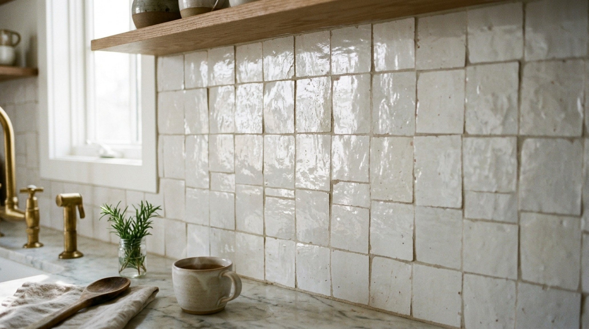
Zellige Tile Kitchen Aesthetics: The Art of Radiant Imperfection
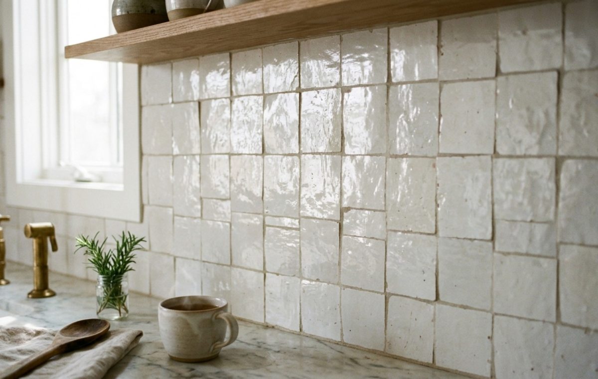
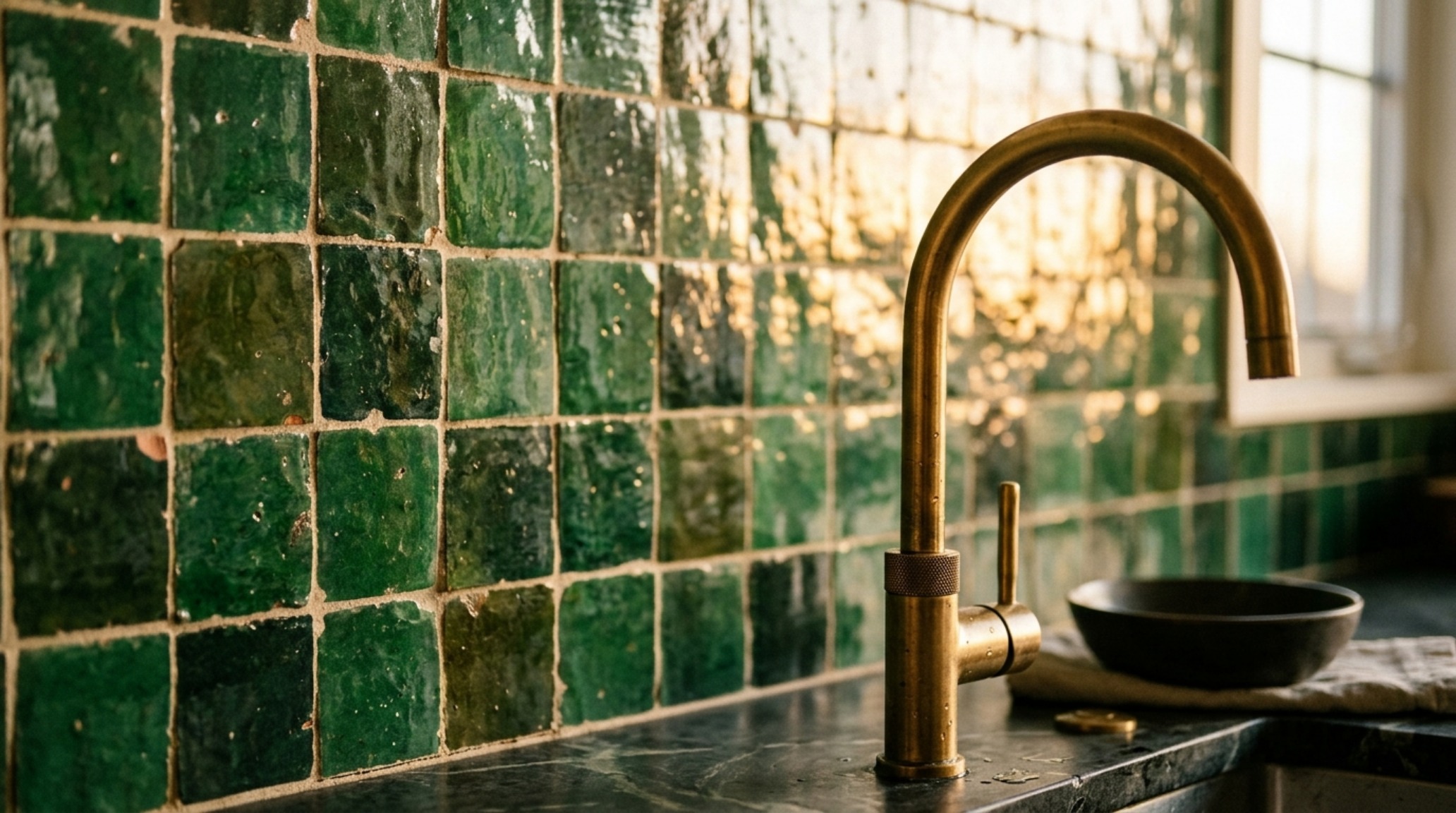
The obsession with zellige tile kitchen aesthetics stems from a collective desire for soulfulness in our architecture. These Moroccan terracotta tiles are traditionally hand-chiseled, meaning no two pieces are perfectly square and no two surfaces are perfectly flat. This variance is exactly where the beauty lies. When installed ‘butt-jointed’—without visible grout lines—the resulting surface creates a rhythmic, undulating texture that traditional ceramic simply cannot replicate.
From a lighting perspective, zellige is transformative. Because each tile sits at a slightly different angle, they capture and bounce light in disparate directions. If you are working with a kitchen that suffers from low natural light, a high-gloss white or ‘tea rose’ zellige backsplash can act as a natural light amplifier. Conversely, in a sun-drenched space, a deep charcoal or forest green glaze provides a moody, sophisticated depth that shifts in hue as the sun moves across the sky. When pairing these with lighting, I always recommend a high CRI (Color Rendering Index) of 90 or above to ensure the subtle tonal shifts in the glaze aren’t washed out by poor-quality LEDs.
Modern Kitchen Backsplash Patterns: Structural Rhythm and Visual Cadence
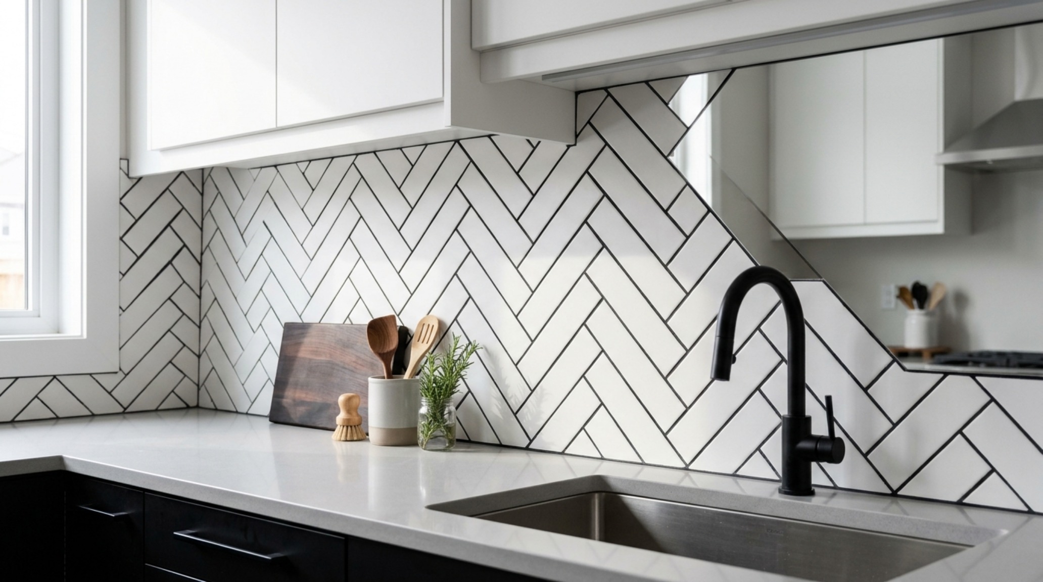
While materiality is the soul, the layout is the heartbeat of the design. Exploring modern kitchen backsplash patterns allows us to introduce architectural order to the space. We are seeing a move away from the standard 3×6 subway ‘brick’ lay toward more intentional, vertically oriented stacks. A vertical stack creates an immediate sense of height, drawing the eye upward toward custom range hoods or architectural ceiling details, making even a modest 8-foot ceiling feel more expansive.
For those looking for a more nuanced geometric play, the ‘chevron’ or ‘herringbone’ remains a staple, but with a modern twist: using oversized tiles. Imagine a 4×12-inch tile in a matte terra-cotta finish laid in a tight herringbone pattern. It feels ancient yet entirely contemporary. The key to successful pattern play is ‘spatial breathing room.’ If your cabinetry is ornate or high-contrast, your tile pattern should be monochromatic and rhythmic to avoid visual clutter. We want the eye to glide across the surface, not get trapped in a web of busy grout lines.
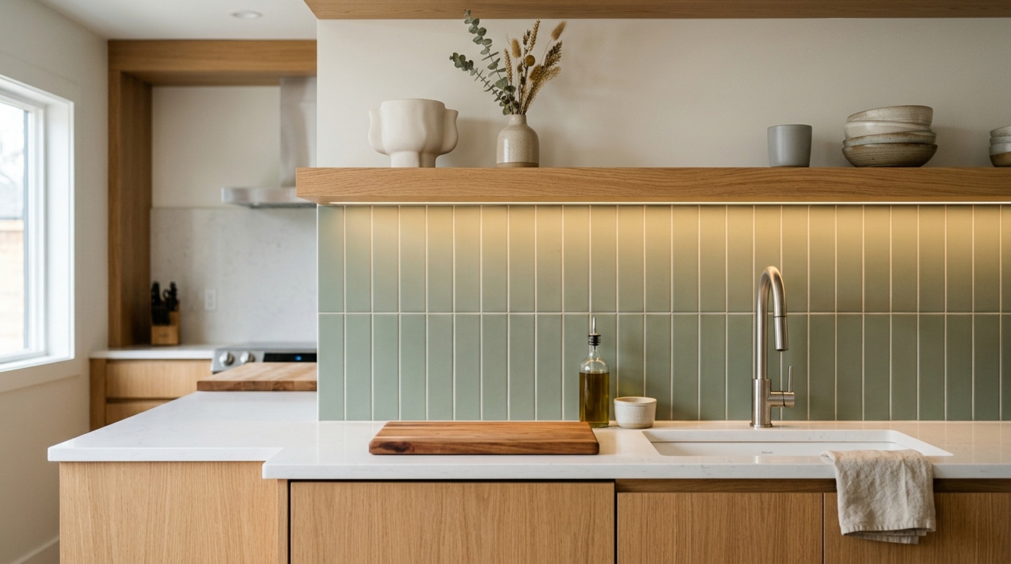
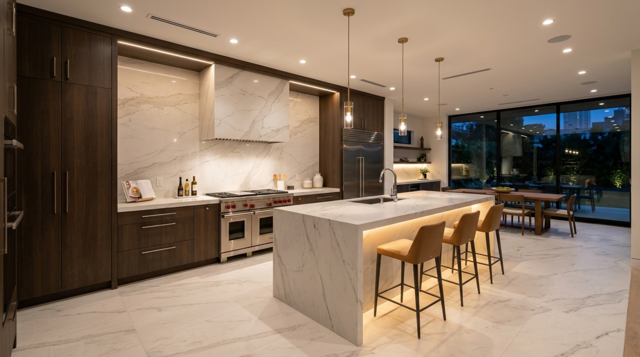
Large Format Porcelain Slabs: The Seamless Architectural Statement
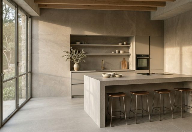
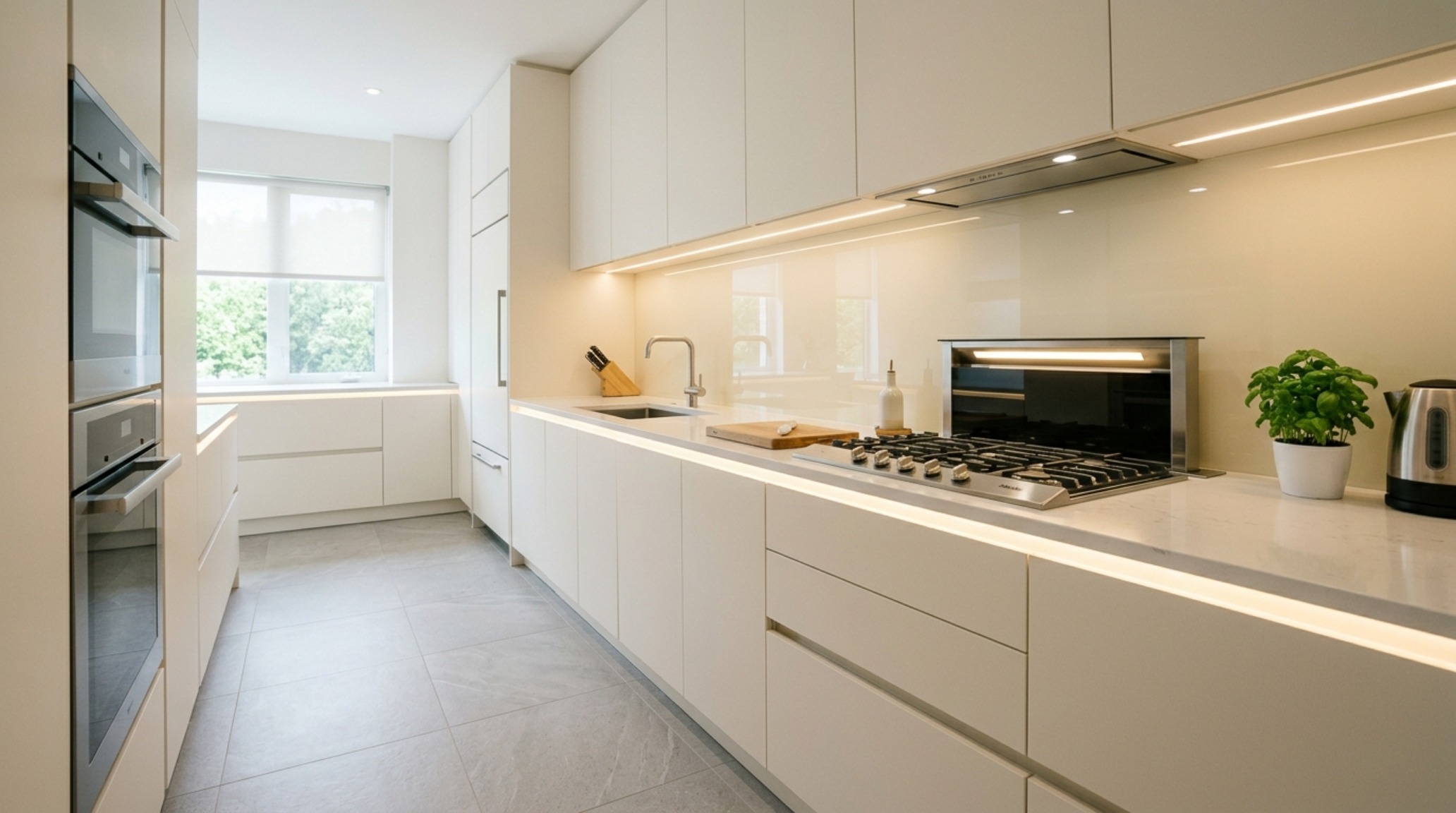
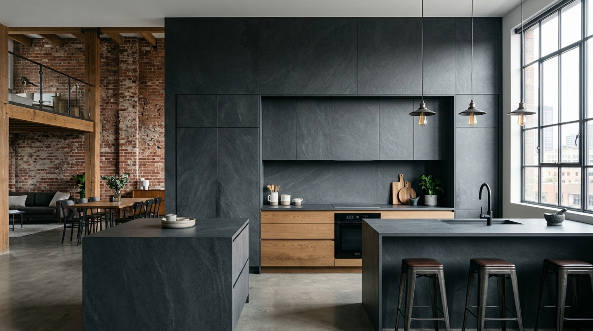
For the modernist who craves a monastic, uninterrupted aesthetic, large format porcelain slabs have revolutionized the kitchen landscape. Gone are the days when porcelain was relegated to 12×12 squares. We are now seeing panels as large as 5×10 feet, allowing for a single, seamless sheet of material to cover an entire backsplash or waterfall island. This lack of grout lines creates a ‘quiet’ visual field that highlights the stone’s veining rather than the tile’s grid.
The technical advantage here is significant. Porcelain is virtually non-porous, meaning it resists the staining of red wine, oils, and acids that would easily mar natural marble. From a design standpoint, these slabs allow us to carry the same material from the countertop up the wall, a technique known as ‘full-height splash.’ This creates a sense of structural permanence. When specifying these slabs, ensure your fabricator uses a mitered edge for corners to maintain the illusion of a solid block of stone, providing that high-end, bespoke architectural finish.
Durable Kitchen Flooring Types: Balancing Ergonomics and Aesthetics
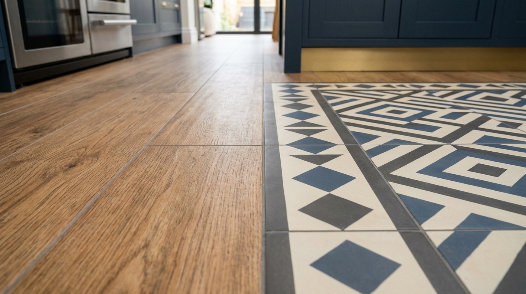
While the backsplash is the jewelry of the kitchen, the floor is the foundation of the home’s flow. When selecting durable kitchen flooring types, we must reconcile the need for a ‘forgiving’ surface underfoot with the harsh realities of high-traffic zones. Hardwood is beautiful but prone to water damage; natural stone is timeless but can be cold and unforgiving on the joints during a three-hour Sunday roast session.
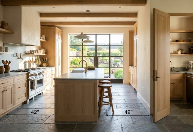
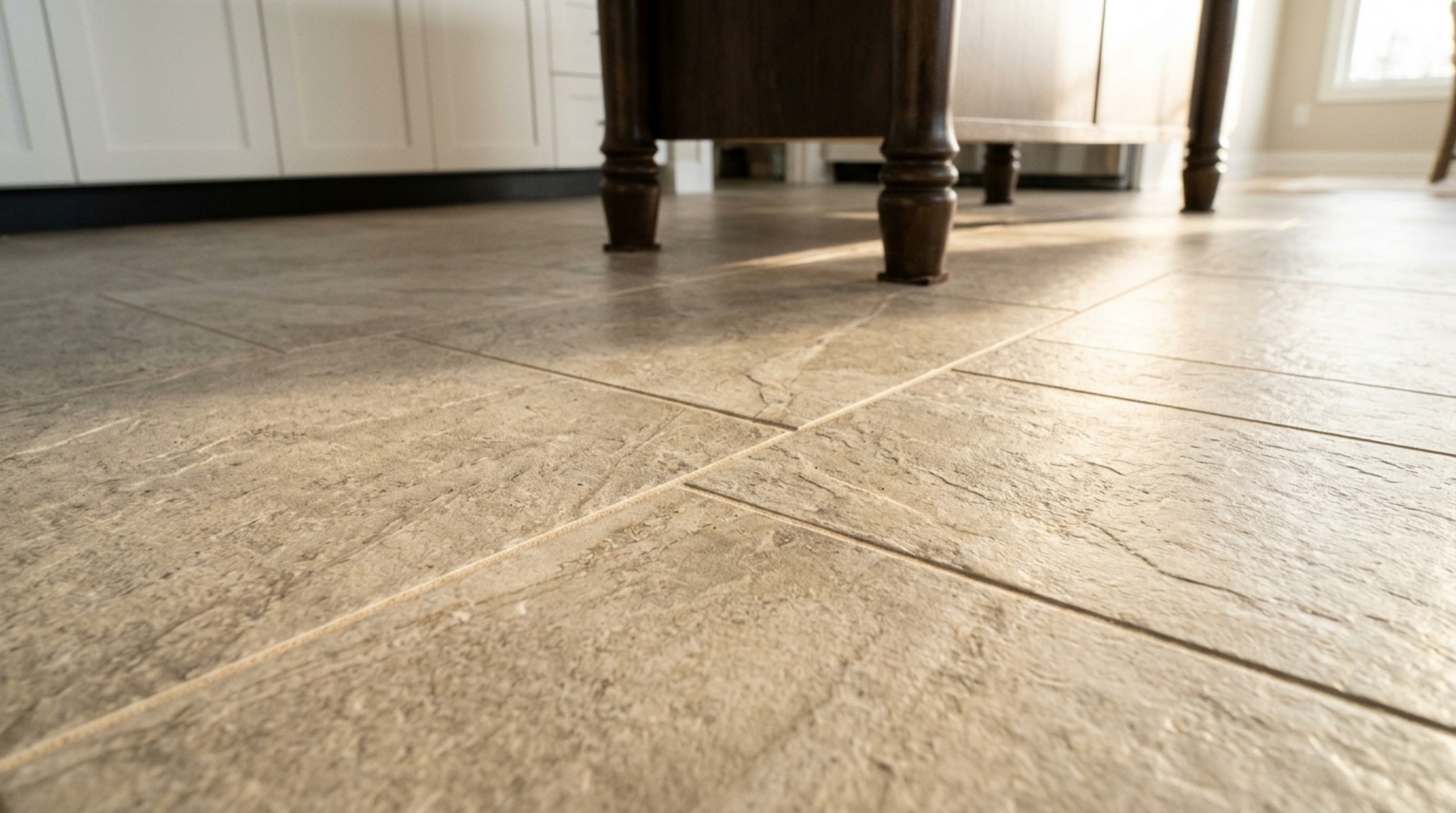
The modern solution is ‘lived-in’ porcelain—tiles that mimic the texture of Belgian bluestone or aged limestone but offer the indestructible nature of engineered ceramic. Look for a ‘honed’ or ‘brushed’ finish rather than ‘polished.’ A polished floor in a kitchen is a slip hazard and shows every water spot and crumb. A matte, textured finish hides the ‘life’ that happens in a kitchen, while a slip-resistance rating (DCOF) of 0.42 or higher ensures safety in a wet environment. For circulation paths, maintain at least 36 to 42 inches of clearance between islands and perimeter counters to ensure the flooring’s pattern isn’t interrupted by cramped spatial planning.
Best Tile for High Traffic Kitchens: Engineering the Family Hub
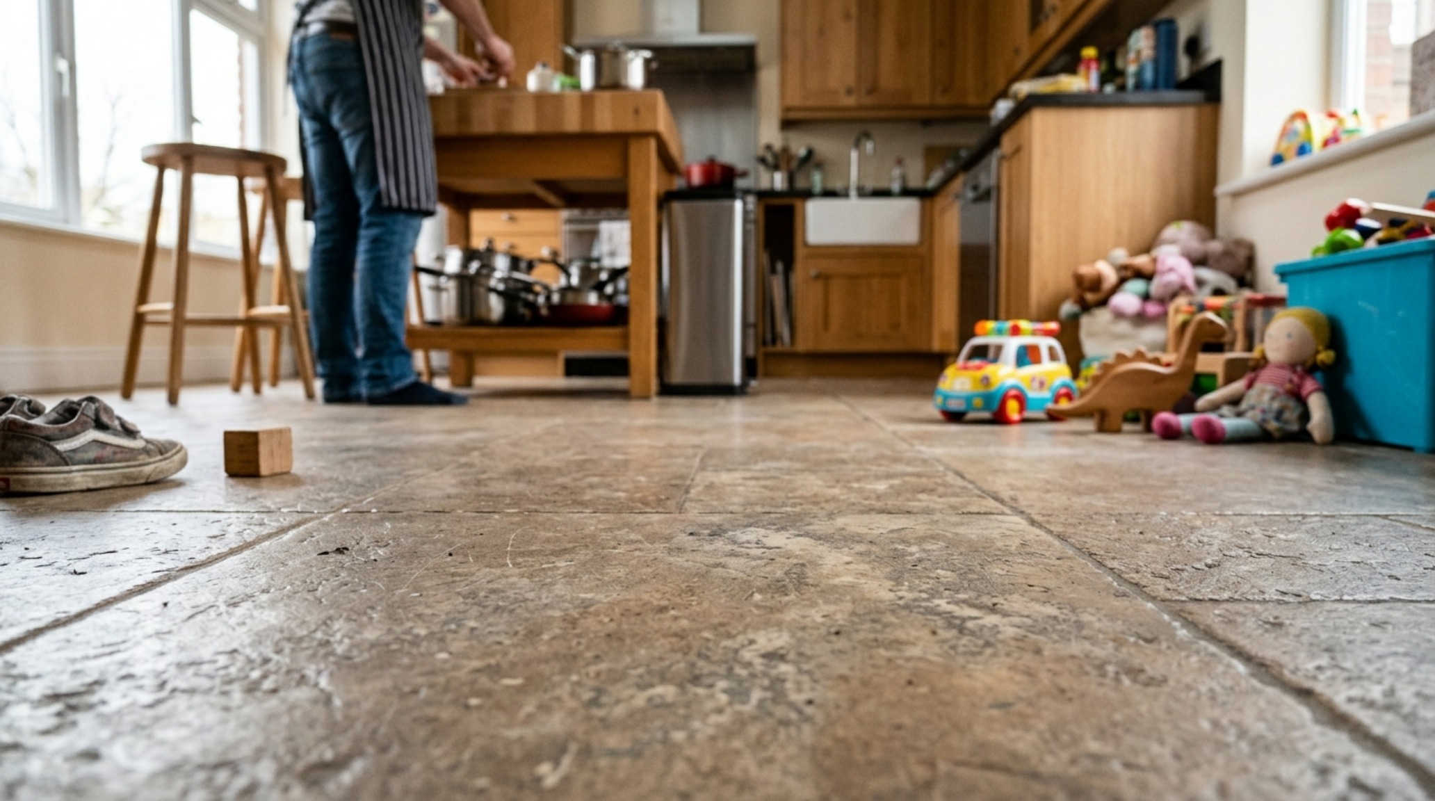
In homes where the kitchen is a 24/7 command center, the best tile for high traffic kitchens is almost always a through-body porcelain. Unlike glazed ceramic, where the color is only on the surface, through-body porcelain has the color and pattern consistent throughout the entire tile. If you drop a heavy cast-iron skillet and chip the tile, the ‘wound’ is nearly invisible because the color underneath is the same as the top.
I often suggest ‘rectified’ tiles for these high-use areas. These tiles are mechanically cut to exact dimensions, allowing for razor-thin 1/16-inch grout lines. This isn’t just about looks—thin grout lines mean less surface area for dirt and grime to accumulate, significantly reducing your long-term maintenance. In these spaces, I also advocate for a mid-tone palette. Extremely dark floors show dust instantly, and extremely light floors show every muddy paw print. A mid-gray, warm taupe, or ‘greige’ provides the perfect camouflaging baseline for a busy household.
Low Maintenance Kitchen Tiles: The Luxury of Ease
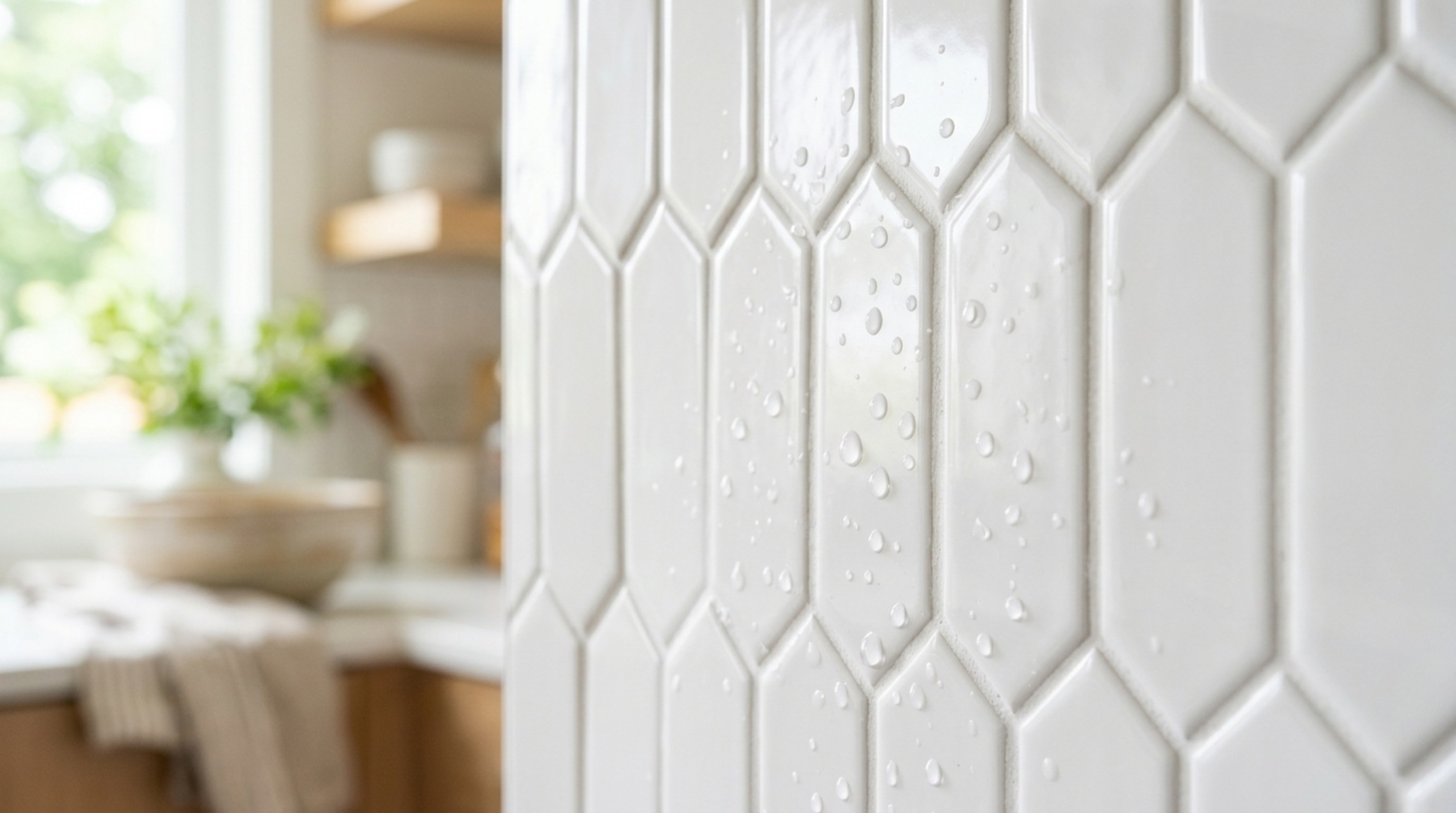
True luxury is time. Investing in low maintenance kitchen tiles allows you to enjoy your space rather than scrubbing it. Glass tile is an often-overlooked champion in this category. Non-porous and chemically resistant, a simple wipe with a microfiber cloth and water is usually enough to restore its luster. Modern glass tiles have moved away from the ‘bathroom mosaic’ look of the early 2000s; today, we see large-format back-painted glass panels and slumped glass with organic, wavy textures that feel incredibly sophisticated.
Another maintenance trick is ‘power-grout.’ Avoid traditional cement-based grouts which are porous and prone to staining. Instead, specify epoxy or high-performance urethane grouts. They are color-consistent, crack-resistant, and entirely waterproof. When these are paired with a textured ceramic tile, you get the aesthetic of an artisanal surface with the cleanup speed of a commercial kitchen.
Visual Narrative & Detail Studies: The Intersection of Light and Form
In the final layers of design, we look at how these kitchen tile options interact with the secondary elements of the room. The transition between a tile backsplash and a plastered wall should be intentional. Using a ‘Schluter’ strip in a brass or blackened steel finish can provide a crisp, architectural edge that ties into your cabinet hardware. It’s these micro-details—the way a tile edge is finished or the way the grout color is ‘color-drenched’ to match the tile—that separate a standard renovation from a professional editorial project.
Lighting should be layered. Use under-cabinet tape lighting at 3000K for task work, but ensure you have a dimmer for your 2700K ambient pendants. This allows you to dial back the intensity in the evening, letting the reflective glazes of your backsplash provide a soft, secondary glow that makes the kitchen feel less like a workspace and more like a lounge.
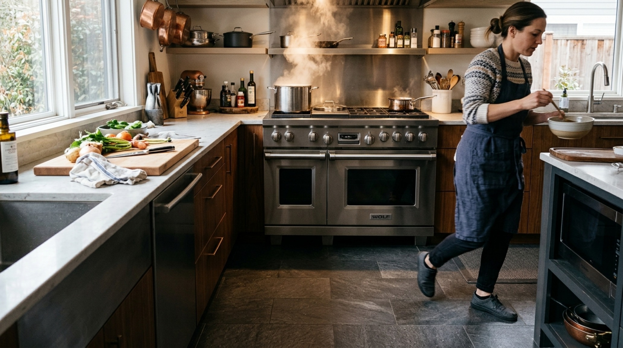
Architectural Detailing & Material Schedule
Curated palette registry detailing authentic textures, lighting Kelvin ratings, and ergonomic reach.
Ultimately, the kitchen is an ecosystem of touchpoints. By selecting kitchen tile options that honor both the eye and the hand, we create spaces that transcend their functional requirements. We build sanctuaries where the act of making a morning espresso becomes a moment of architectural appreciation. As you curate your palette, remember that the most beautiful kitchens aren’t those that follow a trend, but those that understand the dialogue between light, material, and the people who move within them. Look for the glint of the sun on a glaze, the cool temperature of a stone floor, and the rhythm of a well-placed pattern—these are the elements that turn a house into a sensory home.
Editorial Silo • Recommended Architecture Studies
- The Materiality Manifesto: Curation, Color Theory, and Sensory Depth in Modern House Design Blogs — Archival Design Case Study
- The Architectural Blueprint: Mastering Spatial Flow with Monolithic Kitchen Tile Options — Archival Design Case Study
Contemporary Living Lookbook
A sensory design chronicle exploring materiality, natural illumination thresholds, and spatial ease.
Curated Visual Lookbook
Design Gallery & Spatial Studies
A visual curation of architectural arrangements, lighting concepts, and material palettes featured in this space.