We have long viewed the pantry as a hidden engine room—a utilitarian box designed for concealment rather than celebration. However, as our homes evolve into sanctuaries of slow living, the way we archive our sustenance is shifting. Implementing elevated small pantry organization ideas today is less about the rigid, clinical plastic of the past decade and more about structural materiality and sensory resonance. By moving away from the jarring transparency of acrylic and the coldness of wire racking, we can transform a standard utility closet into a curated gallery that honors the ritual of the kitchen.
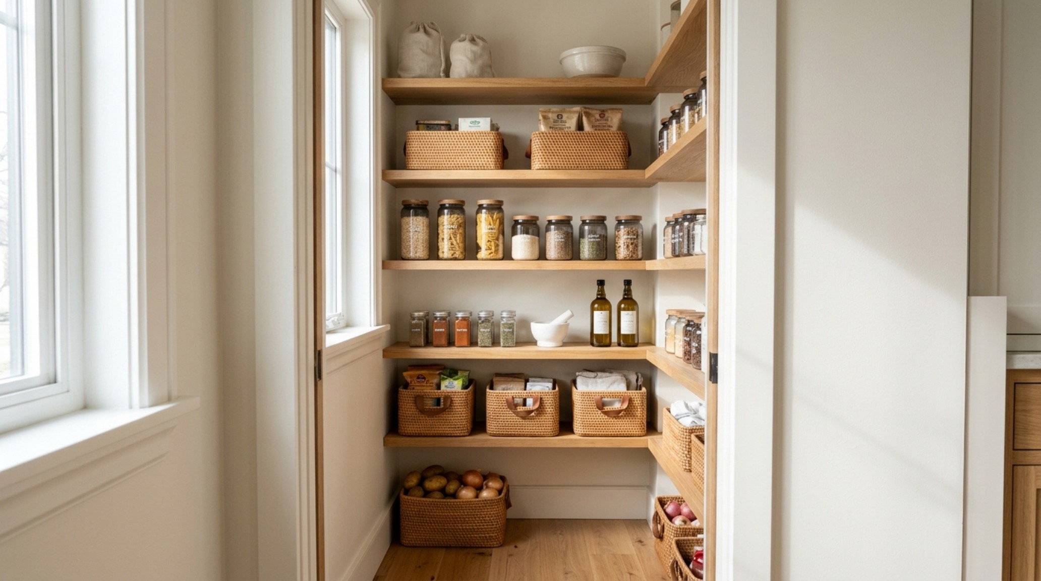
The concept of ‘The Organic Modern Pantry’ relies on the principle of tactile grounding. It is the realization that even a space as functional as a cereal shelf can provide a moment of architectural pause. This approach favors a palette of Farrow & Ball Shaded White—a greige that feels soft and lived-in—paired with the honest grain of white oak. When we treat these small square footages with the same reverence as a living room or a library, the act of preparation becomes an atmospheric experience rather than a chore.
The Architectural Foundation: Spatial Cadence and Clearance
Before we discuss the beauty of smoked glass or the weave of a seagrass basket, we must address the bones. Professional small pantry organization ideas are fundamentally rooted in ergonomics. In a tight kitchen footprint, a standard 36-inch primary circulation walkway is the gold standard, but in a reach-in pantry, the depth of the shelving is the most critical variable. Deep shelves are the enemies of order; they encourage the ‘lost layer’ where canned goods go to expire. Instead, we aim for a spatial cadence of 12 to 14 inches for dry goods, allowing every item to breathe within the sightline alignment.
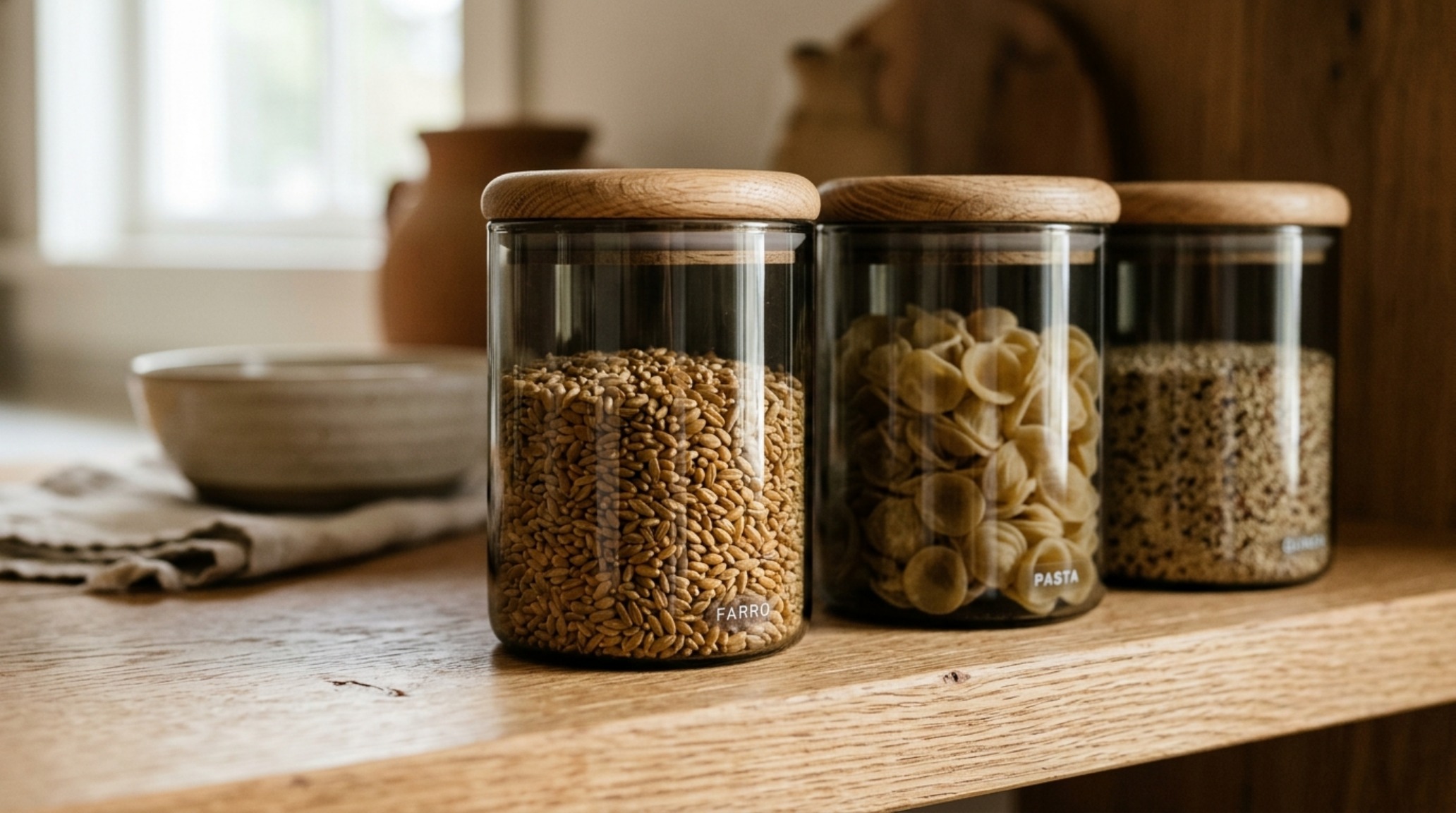
Negative space breathing room is often overlooked in pantry design. We feel the urge to fill every square inch, but the most luxurious pantries—those seen in the pages of Architectural Digest—utilize the ‘pause.’ By leaving small gaps between categories of ingredients, you create a visual rhythm that prevents the eye from feeling overwhelmed. This is where the transition from ‘storage’ to ‘curation’ truly happens. We are not just housing flour; we are composing a landscape of textures.
Curating the Aesthetic: Small Pantry Organization Ideas for the Sensory Home
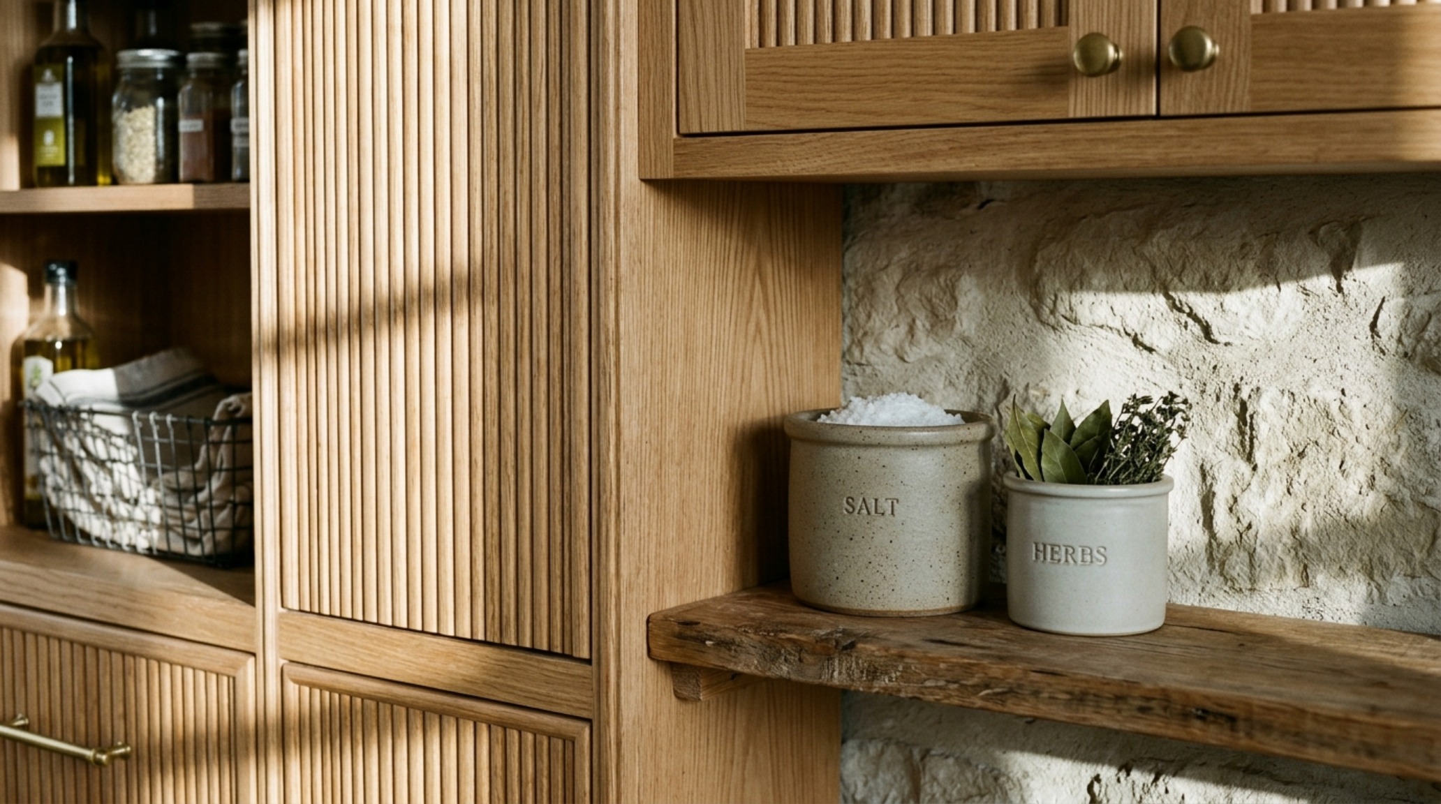
To achieve the ‘Quiet Luxury’ look, we must audit our materials. The viral ‘Home Edit’ look of clear plastic bins has its place, but for an organic modern aesthetic, we pivot toward smoked glass canisters and stoneware. Smoked glass offers a sophisticated veiling; it hides the visual ‘noise’ of multi-colored pasta or legumes while still allowing you to monitor inventory levels. When these are set against a backdrop of white oak timber shelving, the contrast is immediate and grounding.
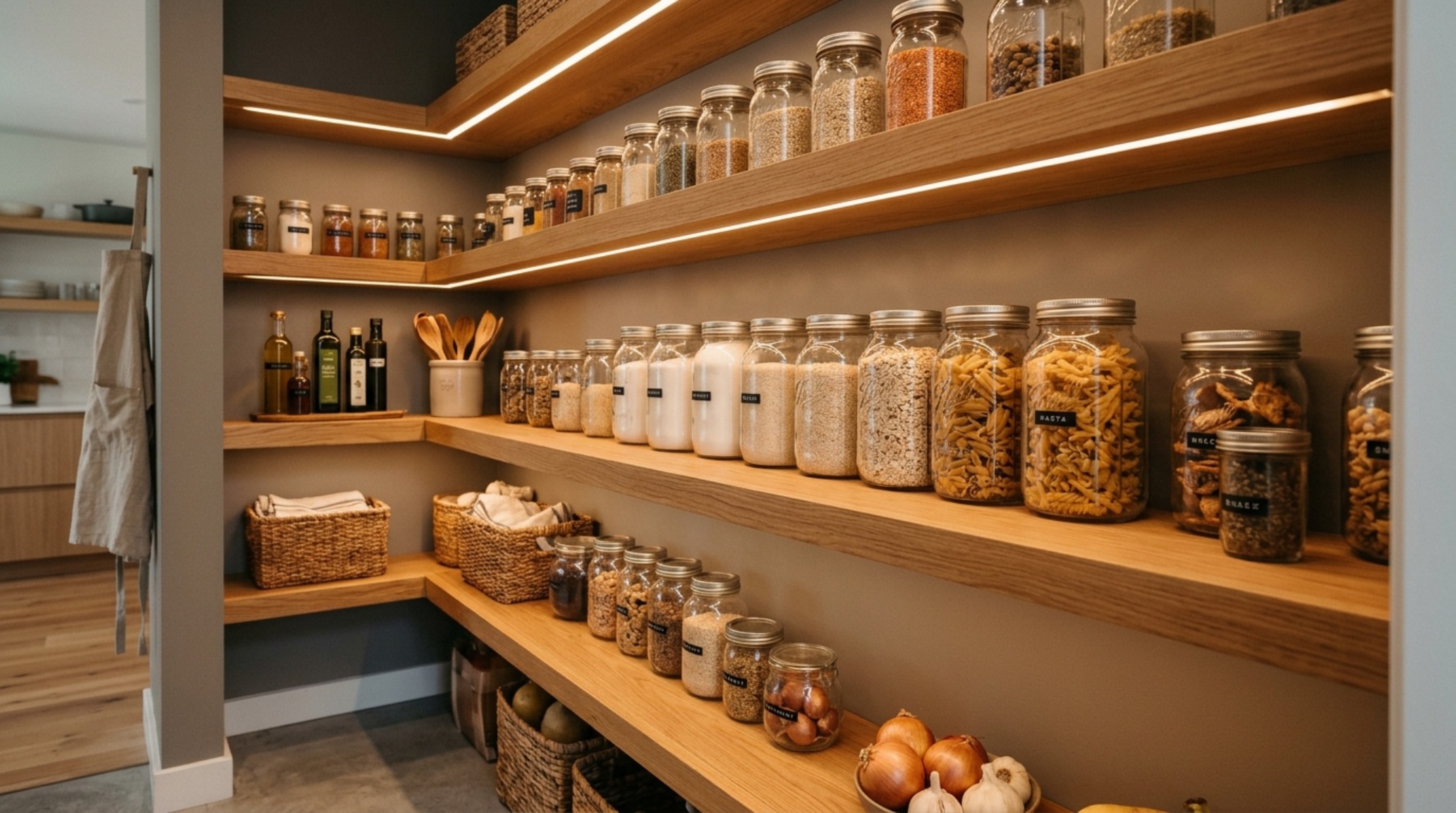
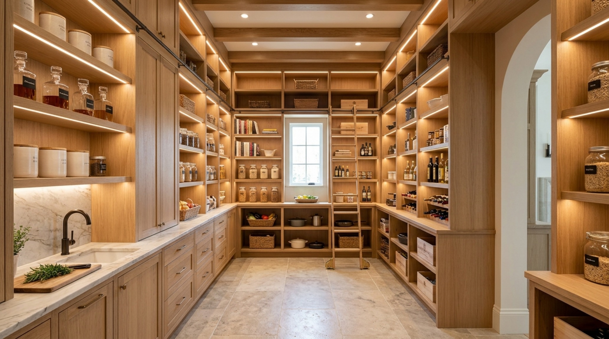
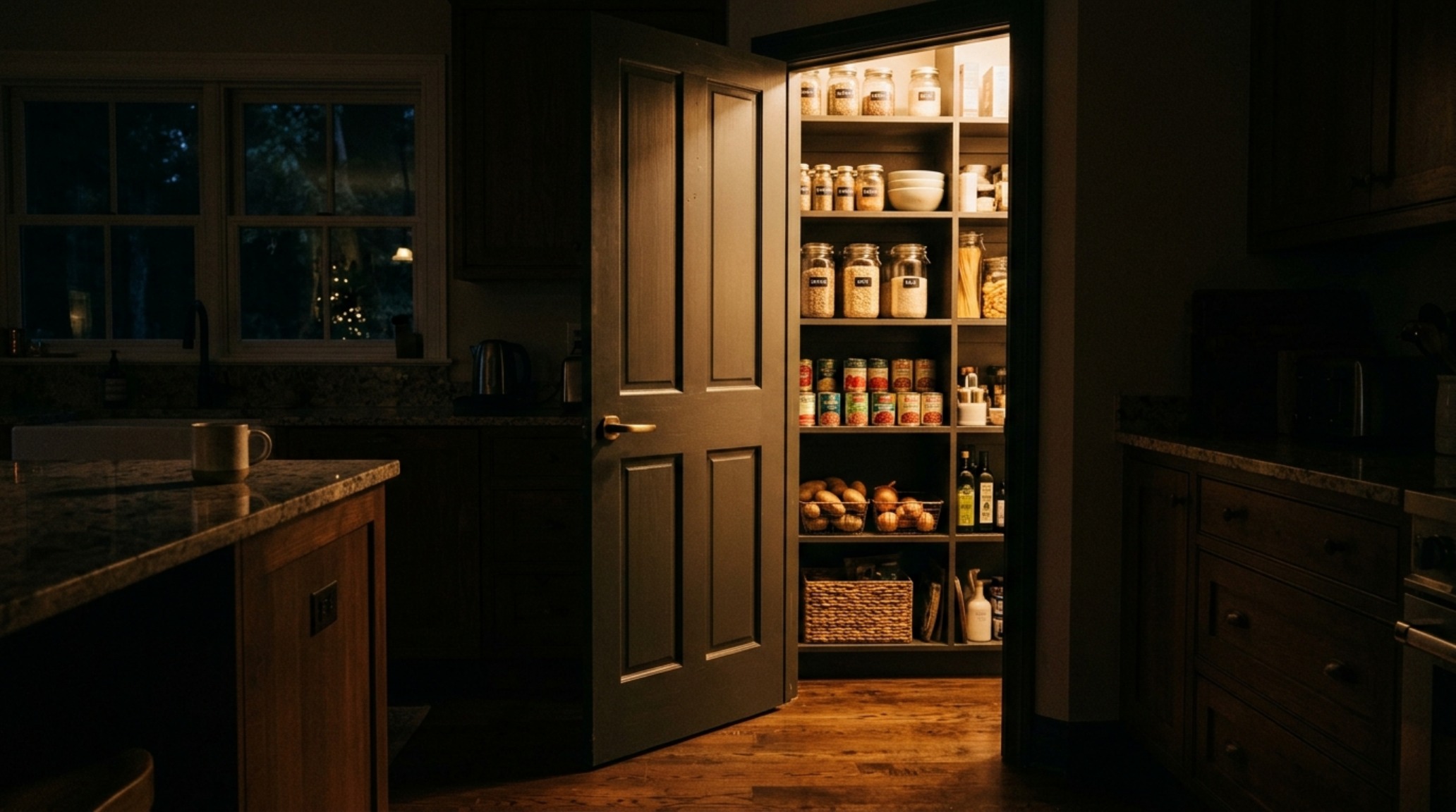
Lighting is the secret weapon of the high-end pantry. Most builder-grade closets suffer from a single, harsh 4000K overhead bulb that flattens textures and creates a cold, institutional glare. We advocate for a shift to 2700K ambient LED strips integrated into the underside of each shelf. This warm, diffused light creates shadow play and highlights the grain of the wood. With a high CRI (Color Rendering Index) of 90+, the rich oranges of lentils and the deep greens of specialty oils look vibrant and appetizing, mimicking the glow of a high-end boutique.
The Materiality of Decanting
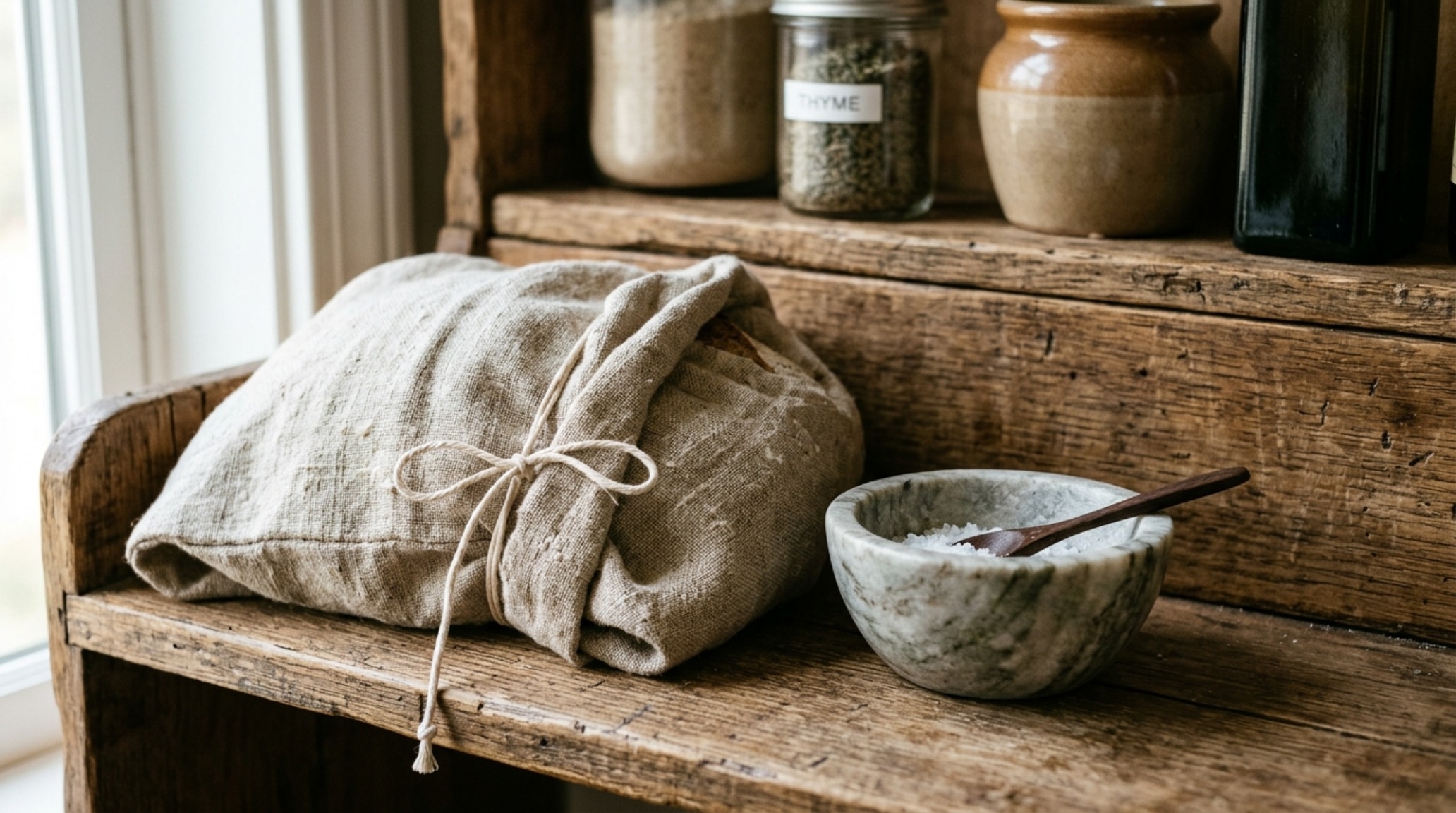
Decanting is often criticized as an unnecessary step, but in the context of small pantry organization ideas, it is a structural necessity. Commercial packaging is designed to shout for your attention on a supermarket shelf with clashing colors and aggressive typography. By transferring staples into uniform vessels, you remove that psychological clutter. Use heavy-bottomed glass with gaskets of real wood or brushed brass. The weight of the glass in your hand provides a tactile grounding that plastic simply cannot replicate.
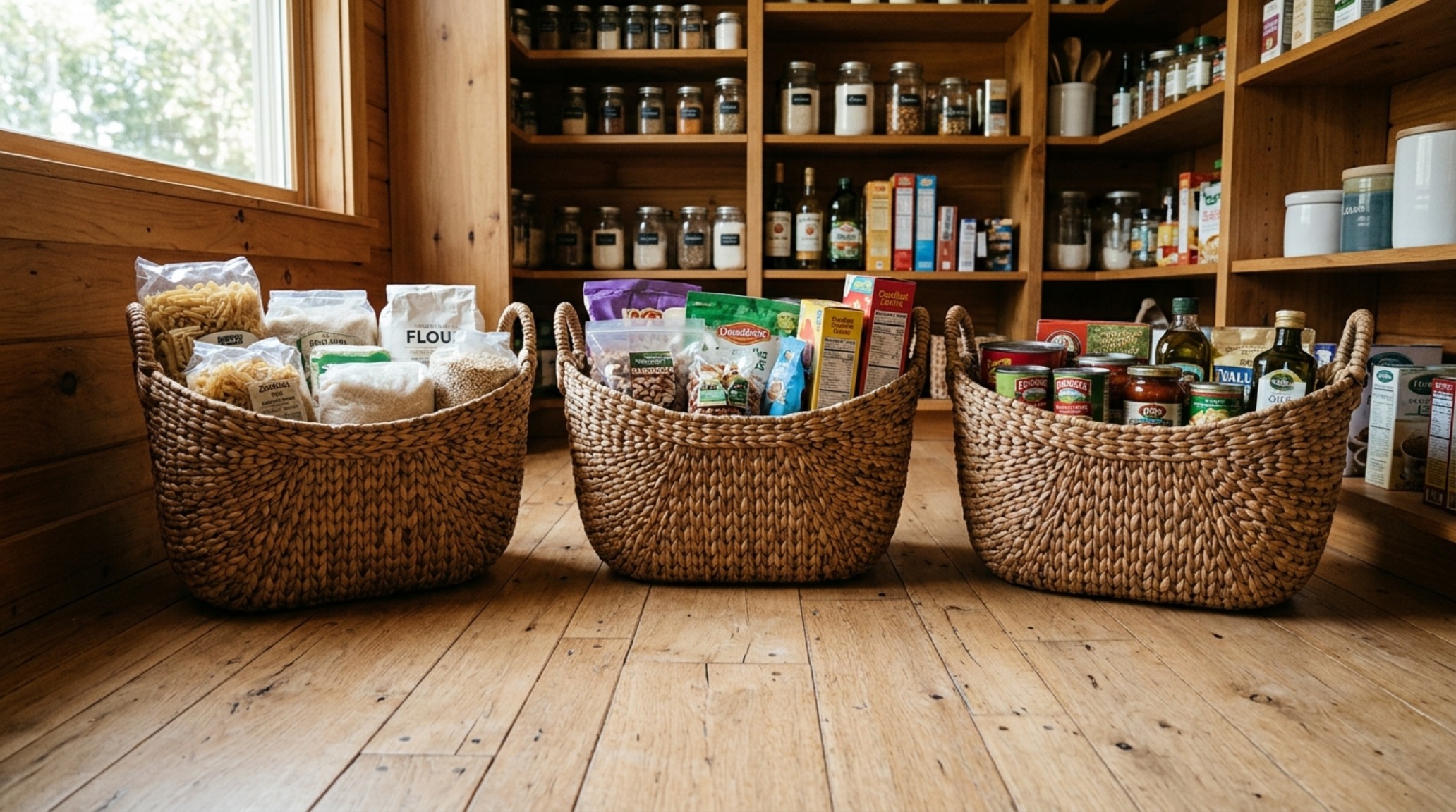
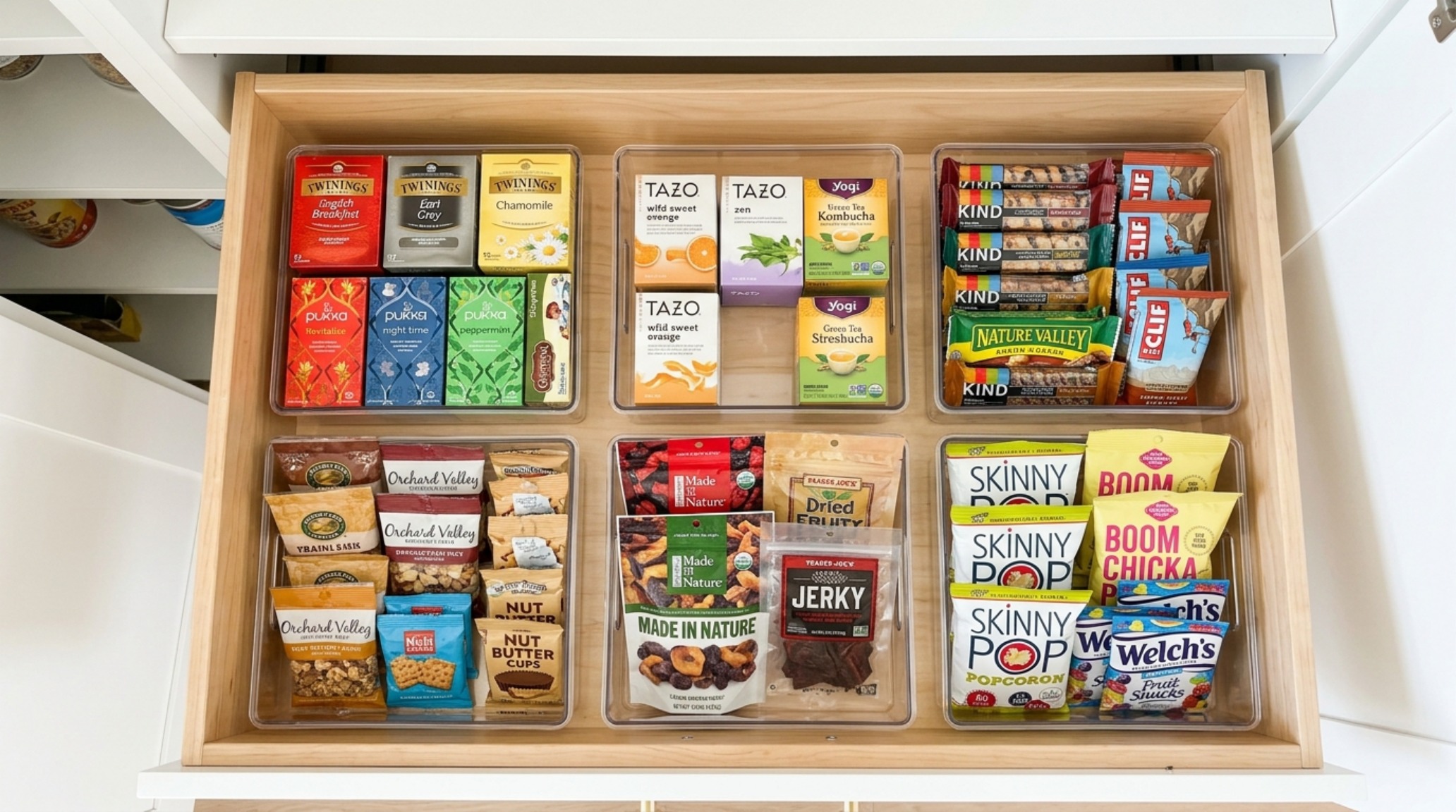
For items that cannot be decanted—think snack bags or specialty flours—we look to woven textures. Water hyacinth or bankuan grass baskets introduce an artisanal, organic element that softens the hard lines of the cabinetry. These serve as ‘visual anchors’ on the lower shelves, grounding the composition. Pro tip: ensure your bottom-tier baskets are at least 12 inches tall to hide bulkier items while maintaining a clean, uniform horizon line across the floor level.
The Logic of Vertical Hierarchy
In a small space, verticality is your greatest asset. We organize by ‘frequency of touch.’ The eye-level ‘golden zone’ (between 30 and 60 inches from the floor) is reserved for daily essentials: coffee, grains, and spices. Below this, we place heavier items and pull-out pantry shelving solutions that allow you to access the back of the cabinet without kneeling. Above the 60-inch mark, we store seasonal items—the Thanksgiving platters or the oversized stockpots—using the height to keep the daily workspace clear.
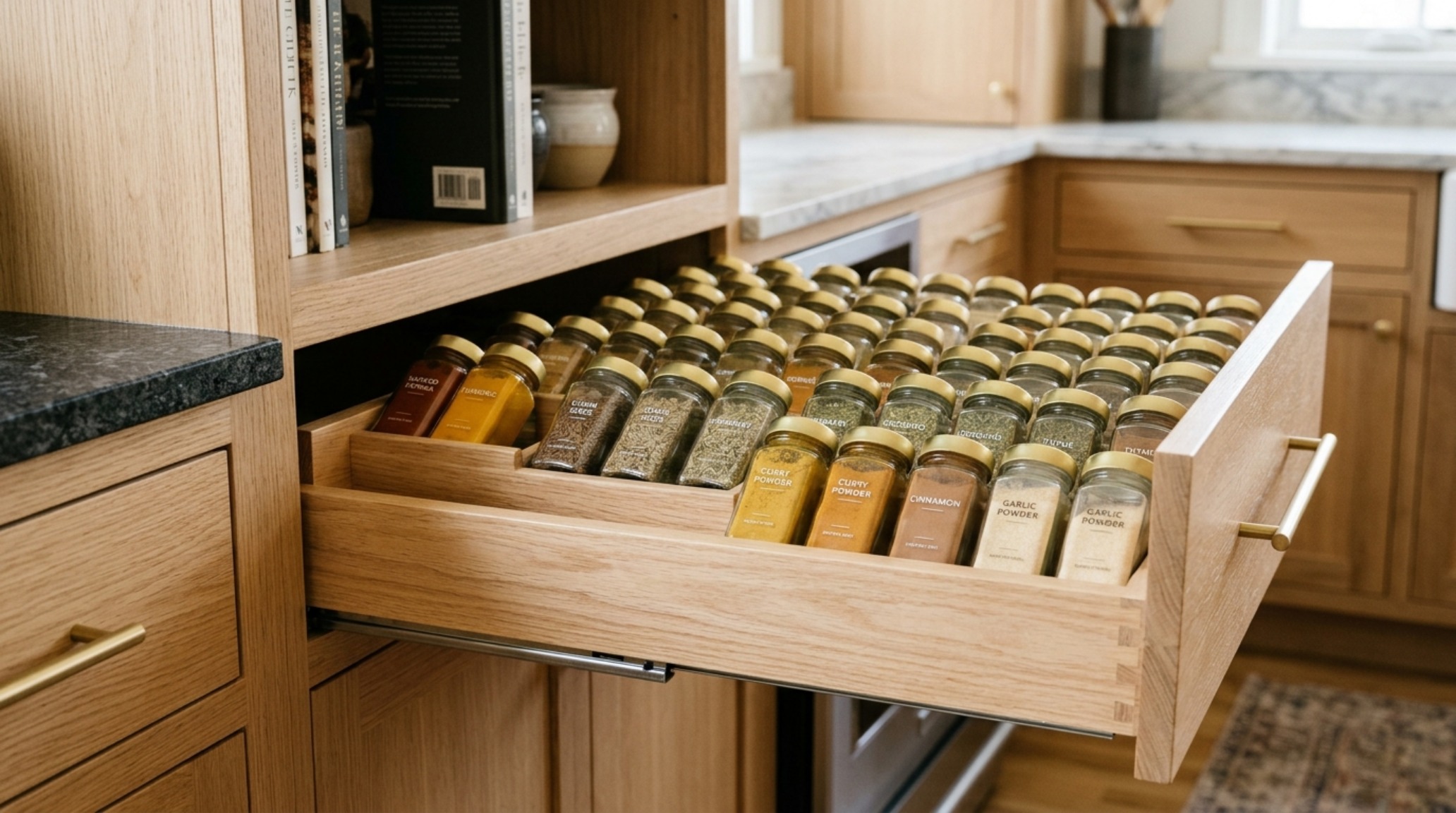
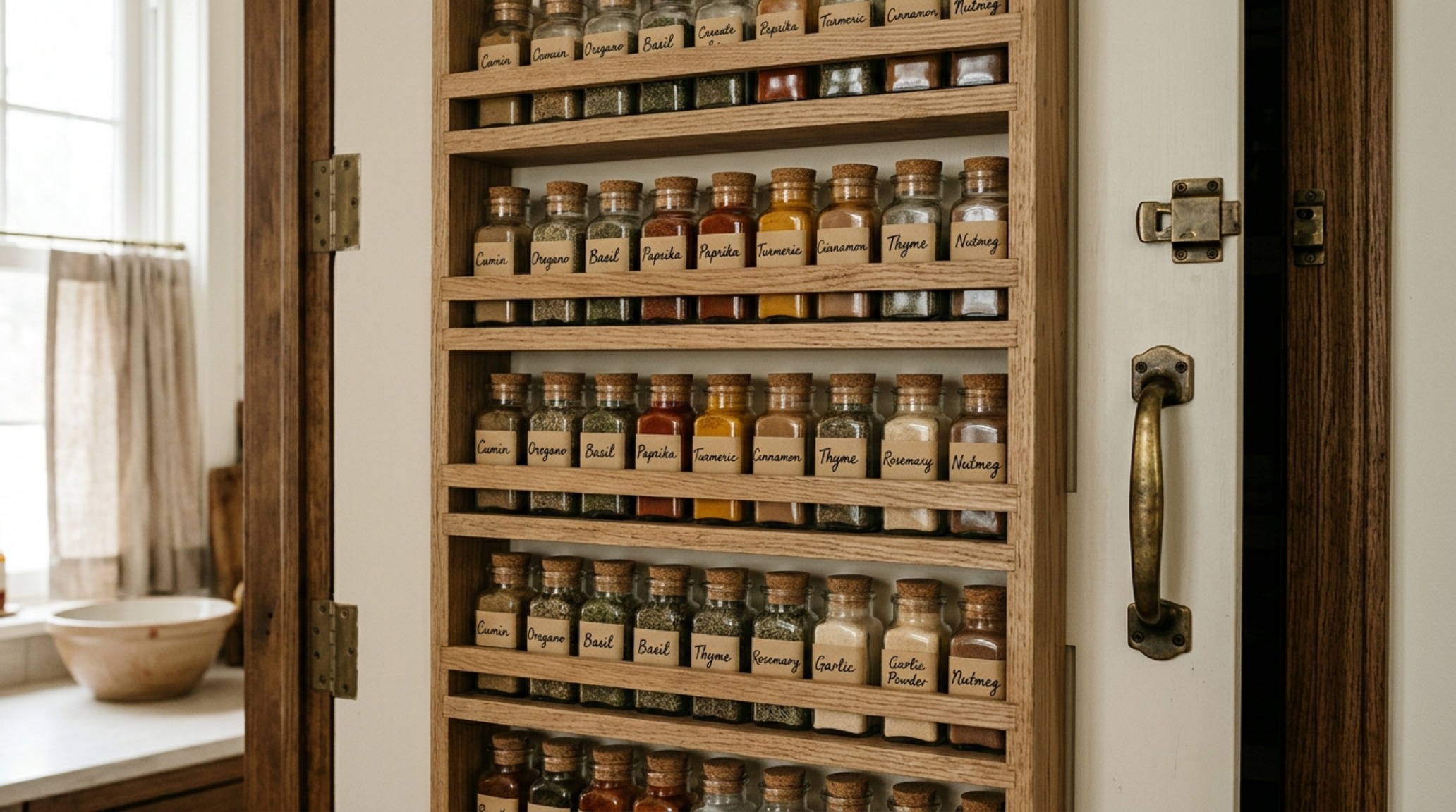
Hidden kitchen pantry design often utilizes the back of the door, but we must be careful. Traditional wire over-the-door racks feel temporary and cluttered. Instead, consider custom shallow oak shelving built directly onto the door frame. This creates a ‘spice library’ effect that feels intentional and architectural rather than an afterthought. It is about maximizing every square inch without sacrificing the ‘breath’ of the room.
The Finishing Details: Labels and Sightlines
Labeling is the final layer of the design discipline. To maintain the organic modern aesthetic, avoid the neon-colored or overly whimsical fonts of the 2010s. We prefer a minimalist approach: embossed black tape, small brass label holders, or even direct glass etching. The goal is for the label to be a subtle guide rather than a focal point. This ensures that the aesthetic pantry labeling systems enhance rather than distract from the materiality of the jars themselves.
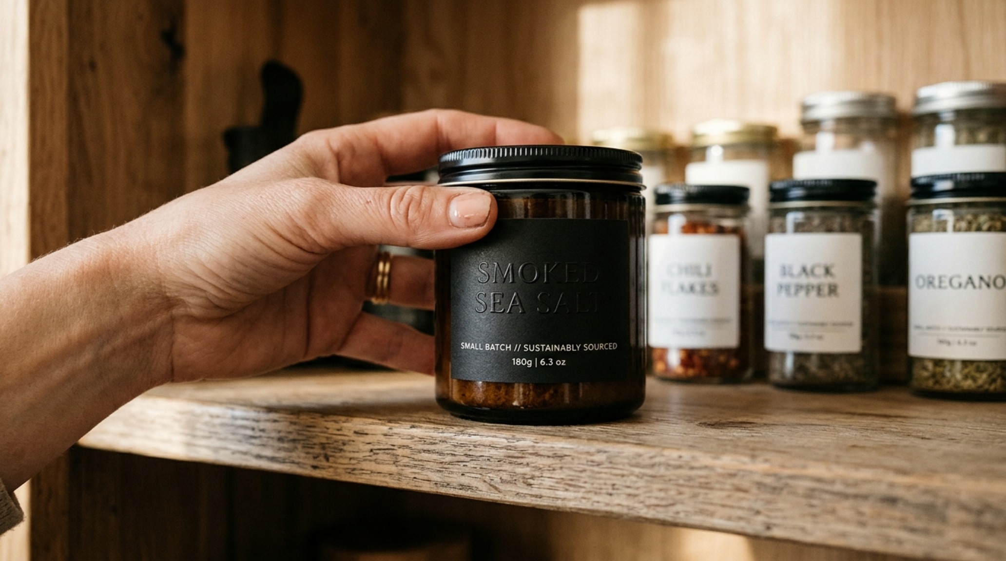
Consider the ‘sightline alignment’ from the kitchen. If your pantry door is glass or frequently left open, the pantry becomes a secondary focal point. By aligning the height of your canisters and keeping a consistent color palette—perhaps all creams, woods, and blacks—the pantry functions as a piece of stationary furniture. It becomes a testament to the idea that utility does not have to be ugly.
Architectural Specification & Material Matrix
Curated tactile palette, spatial dimensions, and atmospheric lighting index for this design scheme.
Designing an elevated pantry is an exercise in restraint and intentionality. It is about understanding that the spaces we inhabit for only minutes a day still contribute to the overall emotional frequency of the home. By moving beyond the generic and embracing the architectural, we create a sense of order that feels effortless rather than forced. Whether you are dealing with a tiny reach-in or a grand walk-in, the application of these small pantry organization ideas will transform your relationship with your kitchen, turning the daily act of reaching for an ingredient into a moment of genuine aesthetic pleasure.
Editorial Silo • Recommended Architecture Studies
- Tactile Materiality: Crafting a ‘Quiet Luxury’ Sanctuary with Bouclé and 2700K Glow — Archival Design Case Study
- How To Paint Tile: The Architectural Blueprint & Spatial Flow Guide — Archival Design Case Study
Architectural Inspiration Lookbook
A high-resolution study in spatial proportions, tactile materiality, and light choreography curated for enduring modern living.
Curated Visual Lookbook
Design Gallery & Spatial Studies
A visual curation of architectural arrangements, lighting concepts, and material palettes featured in this space.
