There is a profound psychological shift that occurs when you step into a space where the architecture does the talking. We often call it the ‘Museum Effect’—that rare, breathable atmosphere where the walls seem to recede, and the very air feels curated. Achieving this isn’t merely about removing clutter; it is a deliberate exercise in structural proportions and the mastery of negative space. When exploring minimalist white house decor ideas, the objective isn’t to create a clinical void, but to craft a sanctuary of ‘Visual Silence’ where every shadow, texture, and light beam serves a purpose. This is the evolution of minimalism: moving away from the stark, cold galleries of the early 2000s and toward an organic, tactile modernism that feels both expansive and deeply grounded.
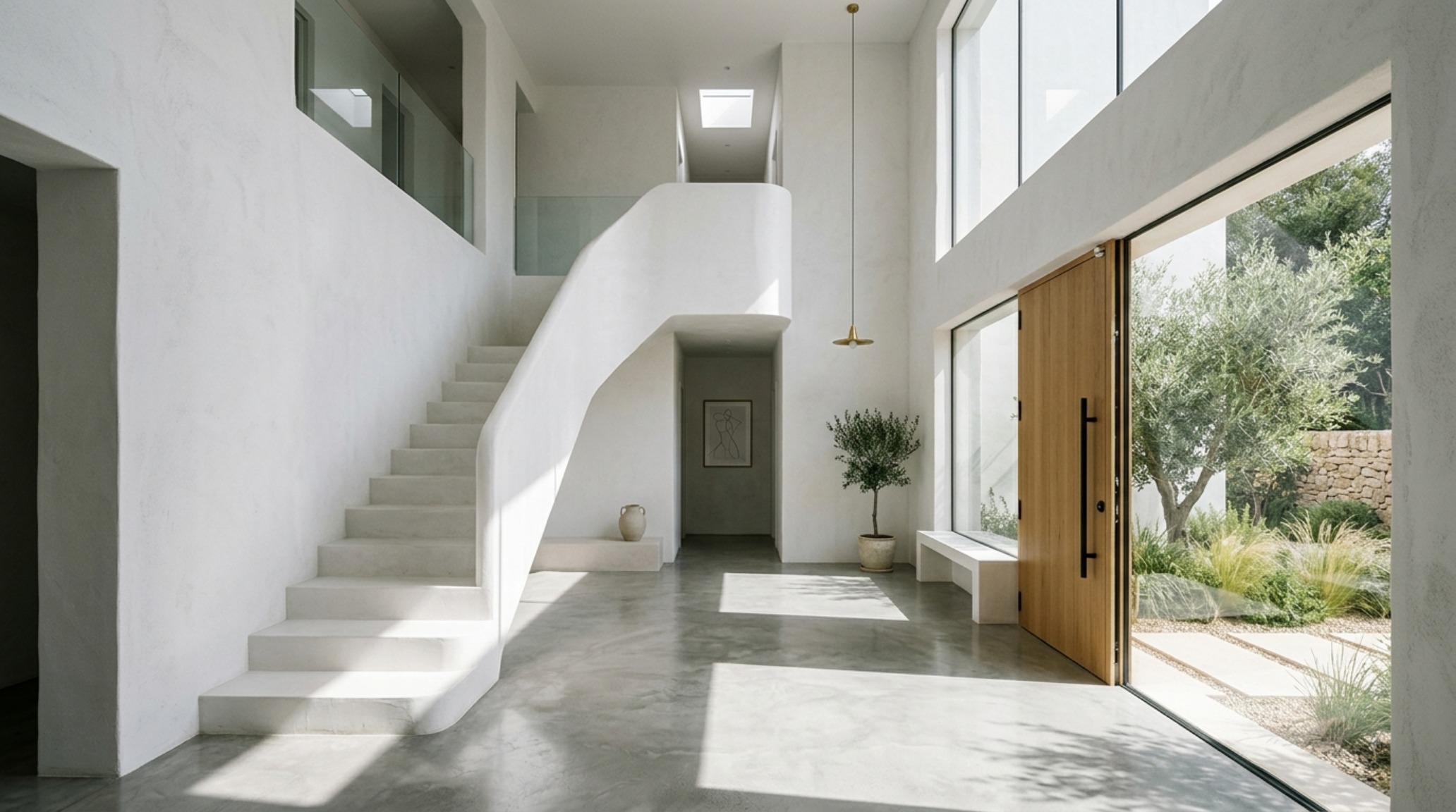
The Architecture of Silence: Prioritizing Spatial Cadence
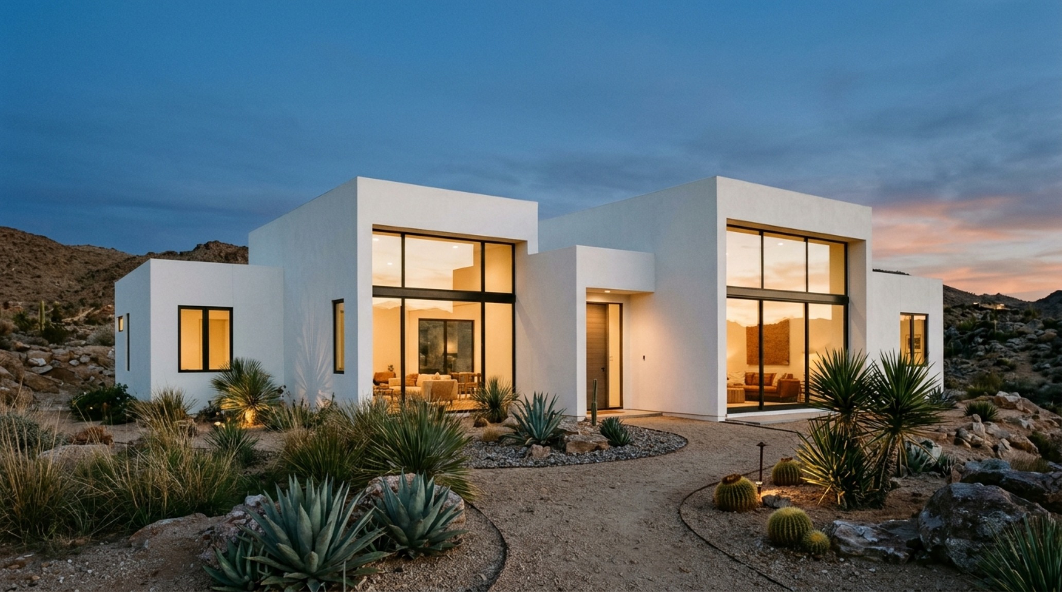
In high-end minimalist interior design, the floor plan is the most important piece of furniture you own. The Museum Effect relies on what architects call ‘spatial cadence’—the rhythm of moving through open volumes and compressed transitions. To master this, one must view walls not as barriers, but as planes of light. A successful white house architecture project utilizes 10-foot or higher ceilings and wide 36-inch primary circulation paths to ensure that the body never feels restricted. This openness allows the eye to travel across the room without snagging on visual noise, emphasizing the sculptural quality of the building itself.
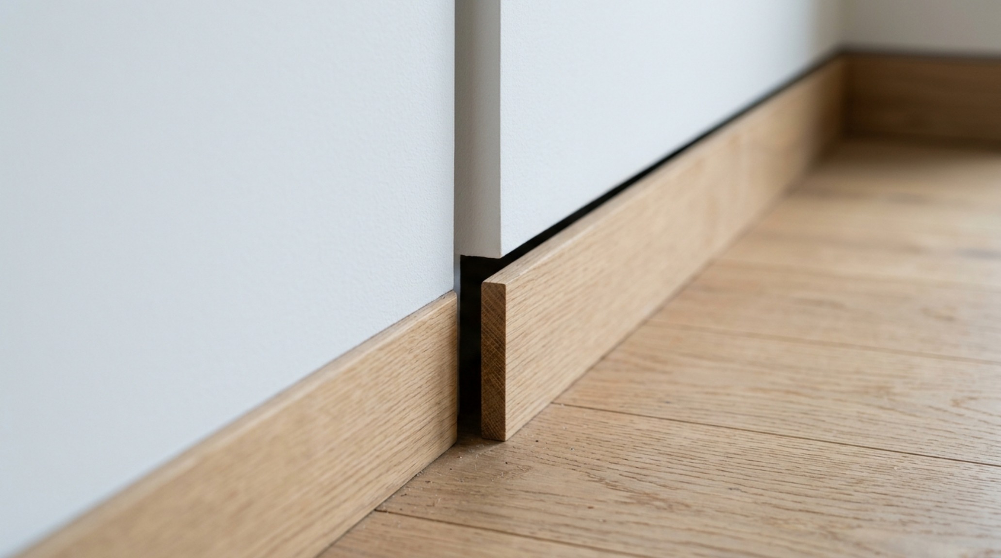
Negative space—the ’emptiness’ between objects—is your most powerful tool. It is the breathing room that allows a single piece of furniture or a lone architectural detail to resonate. When we discuss minimalist white house decor ideas, we are really talking about the restraint required to leave a corner empty or a wall bare. This restraint creates a gallery-like atmosphere, where the intersection of a shadow gap baseboard and a polished concrete floor becomes a moment of high-design interest. By respecting architectural clearances—such as the 30-inch dining chair clearance or the 48-inch kitchen work aisle—the home feels effortless rather than cramped.
The Interplay of Natural Light and Shadow
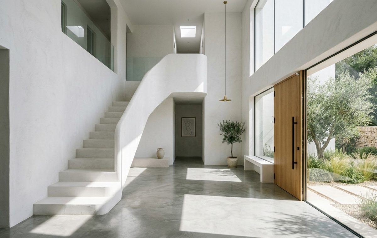
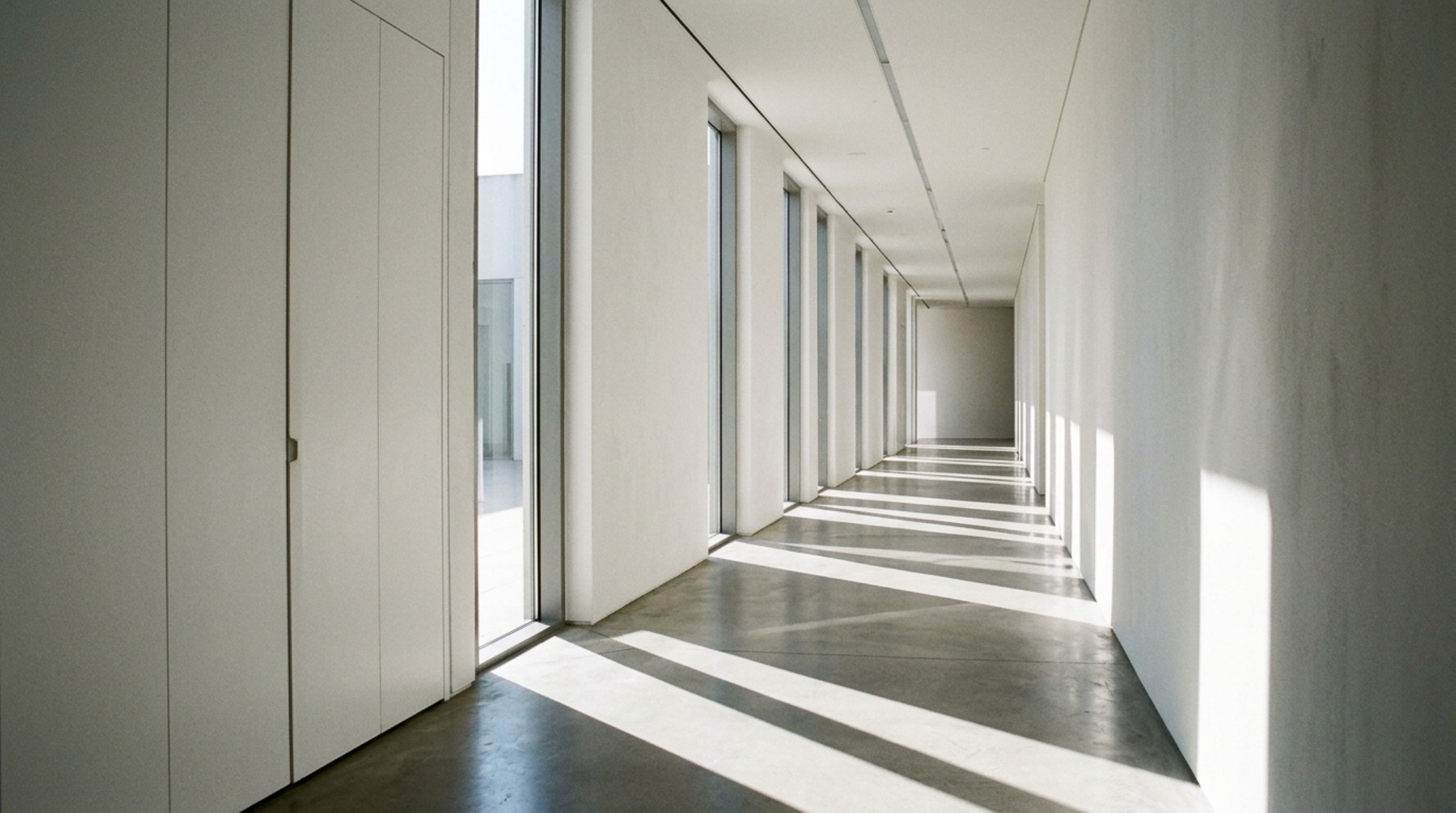
Light is the true medium of the white house. Without the correct orientation, an all-white room can feel flat or ‘dead.’ The inclusion of clerestory windows—high, narrow horizontal panes placed near the roofline—is a hallmark of this style. They invite ‘passive light’ that washes across the ceiling, illuminating the depths of the home without sacrificing privacy. This creates a soft, diffused glow that shifts throughout the day, turning the walls into a canvas for the sun’s movement.
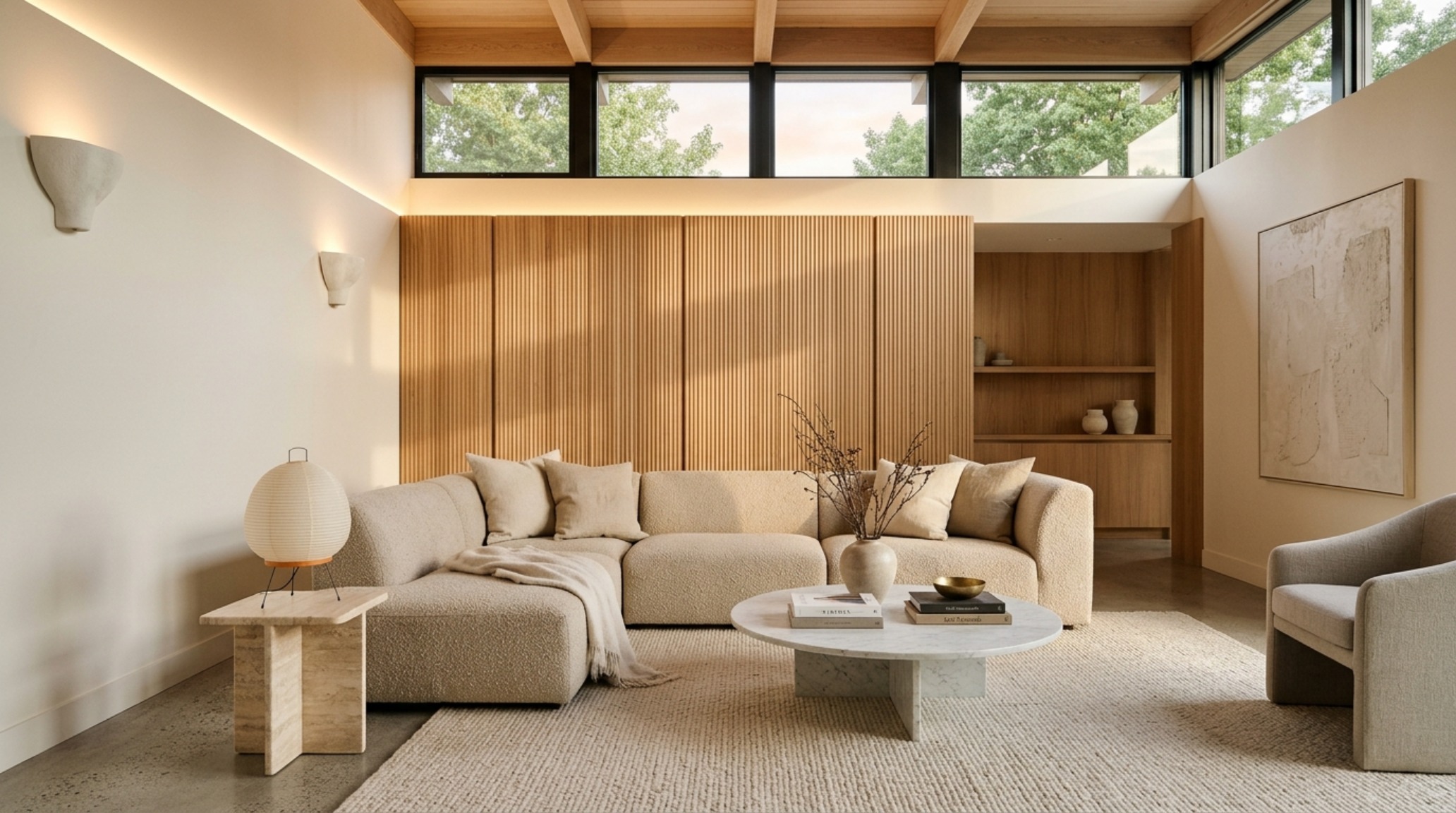
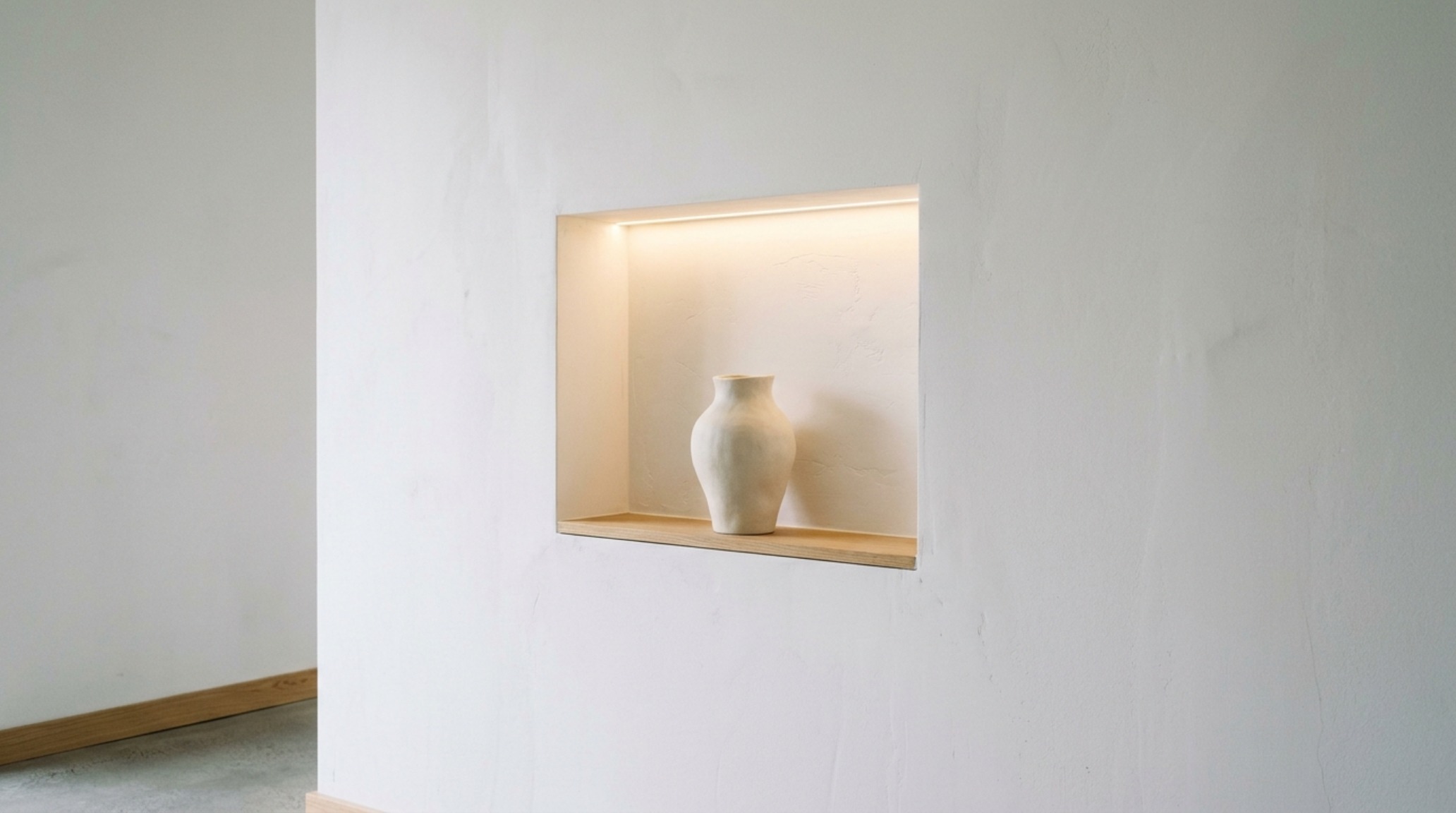
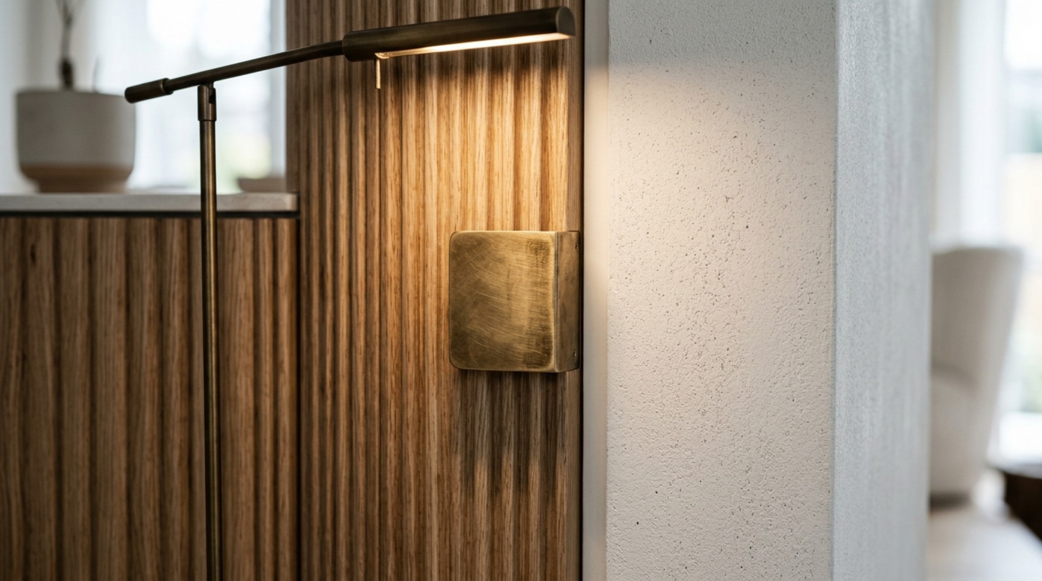
Shadow play is equally vital. In monochromatic home styling, we rely on ‘site-line alignment’ to create depth. When light hits a fluted oak panel or the soft curve of a plaster staircase, it creates micro-shadows that provide the tactile grounding necessary for a space to feel warm. This is the ‘Organic Modern’ synthesis: using natural light to highlight raw, architectural materials. Instead of adding color, we add dimension through 3D architectural elements like recessed niches and integrated shelving that disappear into the wall planes.
Refining the Palette: Beyond Clinical White
The most common mistake in modern minimalism is choosing a ‘hospital white’ that reflects blue or green light, making the home feel sterile. To achieve a sophisticated Museum Effect, one must master the nuances of warm white minimalist living room palettes. Designers often reach for swatches like Benjamin Moore Swiss Coffee at 75% strength or Farrow & Ball All White to provide a soft, chalky finish that absorbs harsh glare.
The secret lies in layering ‘Off-Whites’ and ‘Warm Alabasters’ with varying sheens. A flat, matte finish on the walls provides that signature ‘gallery’ texture, while a satin or eggshell finish on the trim adds just enough definition to catch the light. This layering prevents the monochromatic look from feeling one-dimensional. When you pair these tones with natural materials like honed travertine or a light-bleached white oak, the space begins to breathe. It becomes a tactile experience rather than just a visual one, bridging the gap between high architecture and lived-in comfort.
Ergonomic Geometry and Hidden Storage
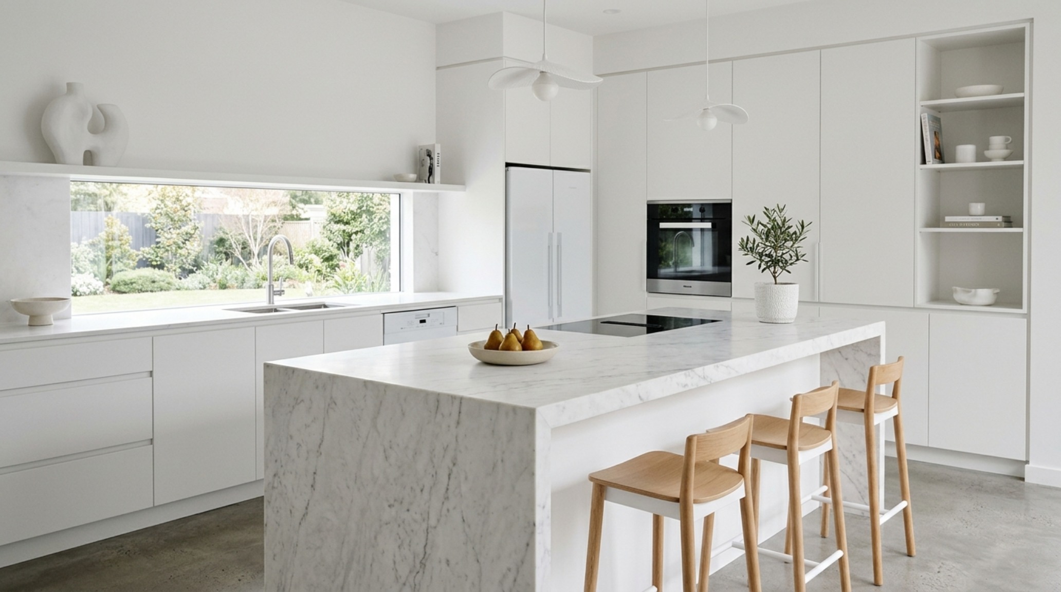
A minimalist white house is only as successful as its ability to hide the chaos of daily life. The ‘Museum Effect’ is maintained through ‘invisible’ architecture—storage solutions that are integrated so seamlessly into the walls that they appear to be part of the structural geometry. We see this in handle-less kitchen cabinetry that mimics wall paneling and floor-to-ceiling closets that lack traditional molding, creating a continuous, uninterrupted plane.
In the kitchen, the focus shifts to ‘Visual Quiet.’ Integrated appliances and the removal of upper cabinets allow the backsplash—perhaps a single, massive slab of Calacatta marble—to stand as a piece of art. By keeping the countertops clear, the kitchen becomes an extension of the living space rather than a utilitarian zone. This is where minimalist white house decor ideas merge with high-end engineering; it is about the luxury of what you don’t see, allowing the architectural proportions of the room to remain the primary focus.
Curating the Object: Sculptural Furniture in White Interiors
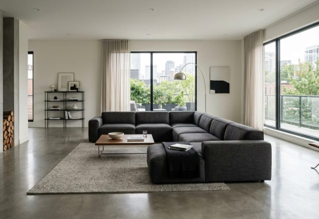
When the architecture is this intentional, the furniture must be equally considered. Each piece must function as a sculpture within the void. Instead of a multi-piece living room set, consider a single, oversized modular sofa in a heavy bouclé or linen. The scale should be generous but the profile low, ensuring it doesn’t interrupt the sightlines of the room. A common professional tip is to maintain an 18-inch reach from the edge of the seating to the coffee table, ensuring the layout is as functional as it is beautiful.
“True minimalism isn’t the absence of things, but the presence of clarity. Every object should either serve a vital function or possess a silhouette that justifies its place in the light.”
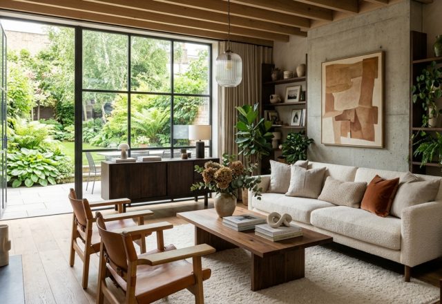
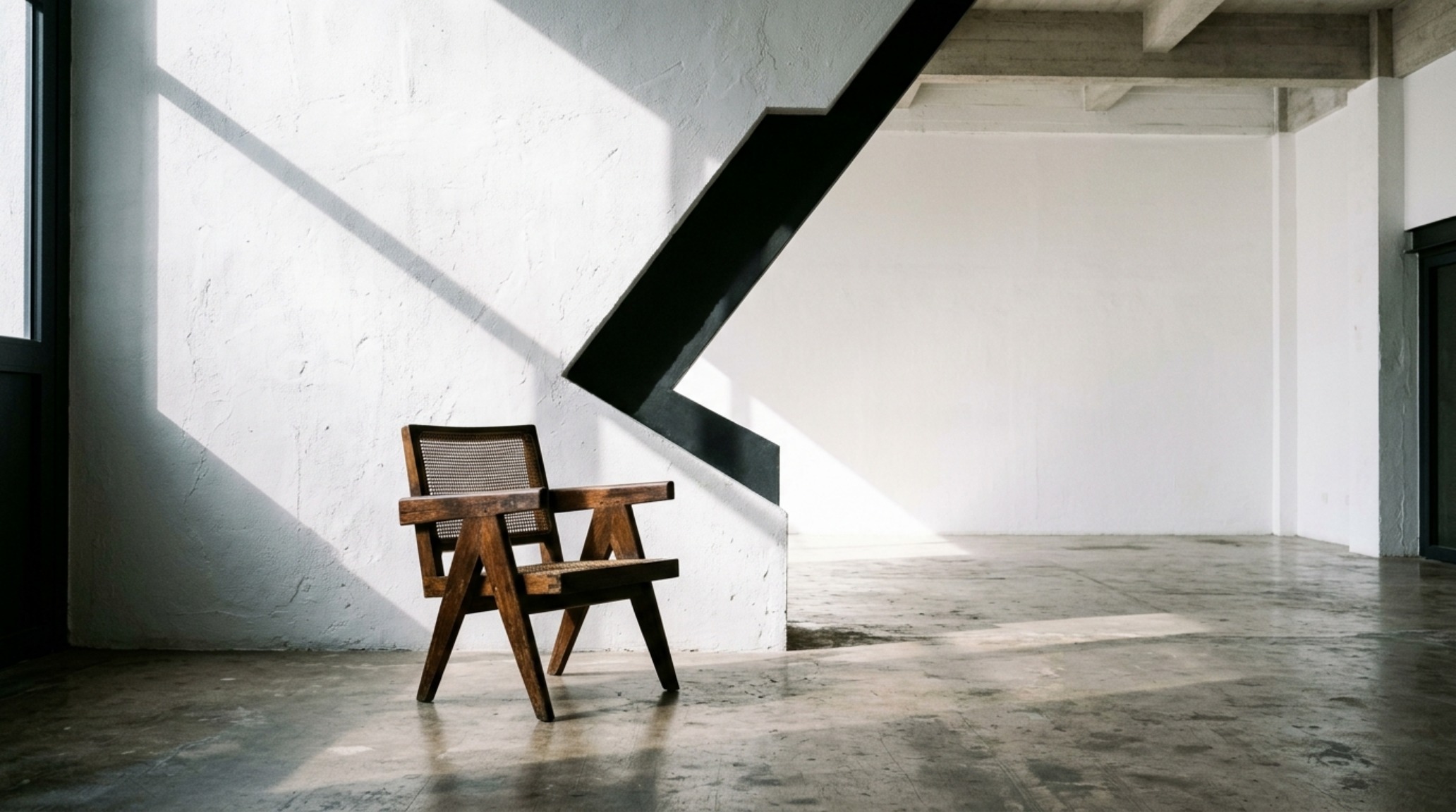
In an aesthetic white house interior design, the ‘hero’ pieces are often those with organic shapes—a Pierre Jeanneret-inspired chair or a custom-carved stone plinth. These items provide a necessary contrast to the sharp, linear lines of the architecture. By sticking to a monochromatic palette for the furniture, you emphasize form over color, allowing the ‘Museum Effect’ to remain undisturbed. The textures—the grit of a ceramic vase, the grain of a wooden stool—provide the ‘soul’ that keeps the minimalism from feeling empty.
The Technicality of Atmosphere: Lighting and CRI
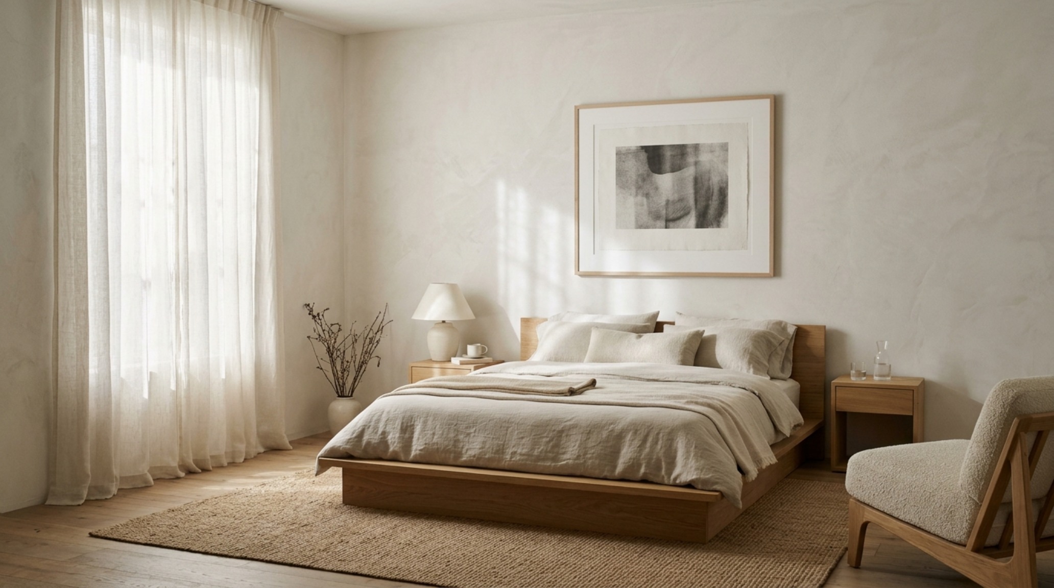
To truly replicate a gallery atmosphere, the technical specifications of your lighting are non-negotiable. We move away from generic ‘cool white’ bulbs and toward high CRI (Color Rendering Index) lighting, specifically 90+. This ensures that the whites look crisp and the natural wood tones look rich, rather than muddy. The goal is a 2700K warm ambient glow for the evenings, which mimics the softness of candlelight, contrasted with 3000K for task-oriented areas like the kitchen or study.
Layered lighting is the key. Instead of a grid of recessed cans, which can ‘pepper’ a ceiling and create visual clutter, use perimeter cove lighting or directional ‘wall washers.’ These fixtures direct light toward the vertical surfaces, emphasizing the height of the room and creating a soft, reflected glow that feels more natural than overhead glare. It is this attention to the invisible details that separates a basic white house from a masterpiece of architectural minimalism.
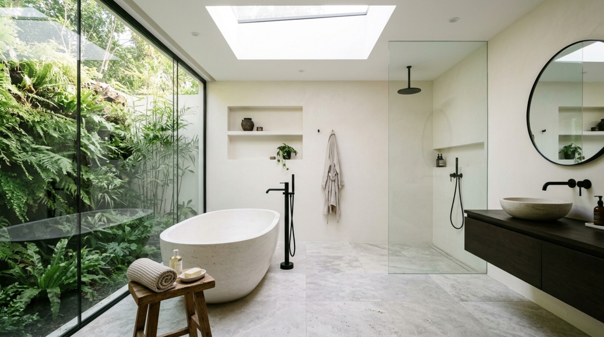
Architectural Specification & Material Matrix
Curated tactile palette, spatial dimensions, and atmospheric lighting index for this design scheme.
Mastering the Museum Effect is a journey into the soul of a home. It is a commitment to quality over quantity, where the minimalist white house decor ideas you choose are secondary to the way you handle light, air, and volume. By prioritizing the structural integrity of the space and embracing the ‘Visual Silence’ of the Organic Modern trend, you create more than just a residence; you create a living sculpture. As the light shifts across your lime-washed walls at sunset, you realize that the most profound luxury isn’t what you’ve added to the room, but the clarity you’ve allowed to remain.
Editorial Silo • Recommended Architecture Studies
- Refining the Modern Male Home: Innovative Minimalist Bachelors Pad Decor Ideas for High-Performance Living — Archival Design Case Study
- Scandinavian Industrial Loft: The Architectural Blueprint & Spatial Flow Guide — Archival Design Case Study
Architectural Inspiration Lookbook
A high-resolution study in spatial proportions, tactile materiality, and light choreography curated for enduring modern living.
Curated Visual Lookbook
Design Gallery & Spatial Studies
A visual curation of architectural arrangements, lighting concepts, and material palettes featured in this space.